Rich Lederer • Baseball Beat
Patrick Sullivan • Change-Up
Jeremy Greenhouse • Touching Bases
Dave Allen • F/X Visualizations
Sky Andrecheck • Behind the Scoreboard
Marc Hulet • Around the Minors
Al Doyle • Past Times
Retired Uniforms:
Bryan Smith • WTNY
Joe Sheehan • Command Post
Jeff Albert • The Batter's Eye
RSS Feed
Home
*Examining the Past, Present, and Future*
Lineup Card
Recent Entries
» Putting Together a Reality Team
» Historical Hall of Fame Vote Comparisons: 2012
» An All-Christmas Team
» The New-Look Angels
» John Denny: The Forgotten Cy Young Award Winner
» Money Isn't Everything
» What Would It Take to Hit .400 in the 21st Century?
» Halos Heaven
» Brandon McCarthy's Breakout Season
» Link-o-Rama
» Historical Hall of Fame Vote Comparisons: 2012
» An All-Christmas Team
» The New-Look Angels
» John Denny: The Forgotten Cy Young Award Winner
» Money Isn't Everything
» What Would It Take to Hit .400 in the 21st Century?
» Halos Heaven
» Brandon McCarthy's Breakout Season
» Link-o-Rama
Best of Baseball Beat
Abstracts From the Abstracts
1977 Baseball Abstract
1978 Baseball Abstract
1979 Baseball Abstract
1980 Baseball Abstract
1981 Baseball Abstract
1982 Baseball Abstract
1983 Baseball Abstract
1984 Baseball Abstract
1985 Baseball Abstract
1986 Baseball Abstract
1987 Baseball Abstract
1988 Baseball Abstract
1978 Baseball Abstract
1979 Baseball Abstract
1980 Baseball Abstract
1981 Baseball Abstract
1982 Baseball Abstract
1983 Baseball Abstract
1984 Baseball Abstract
1985 Baseball Abstract
1986 Baseball Abstract
1987 Baseball Abstract
1988 Baseball Abstract
Bert Blyleven Series
Meeting Up and Hanging Out with Bert
The Results Are In And...
Aficionado Heavily Invested in Blyleven
Latest on Blyleven's Chances for the HOF
The Internet Zealot Responds
400 Down and 5 to Go...
Bert Be Home By Eleven?
Blyleven's Forgotten Season (1973)
HeyMan, Your Comments Don't Hold Water
The Waiting is the Hardest Part
Another Addition to the Blyleven Series
Search for the Truth
As Dominant as His HOF Contemporaries
Listen, Buster
A Larger Step for Blyleven
Answering the Naysayers (Part Two)
Another Small Step for Blyleven
Q&A: Blyleven on the Twins
The Majority Rules, Right?
It's All Dutch to Some
The Hall of Fame Case for Bert Blyleven
Q&A: Blyleven on Felix Hernandez
Clemens Rocketing Up Charts
Poz: An Interview With a KC Star
A HOF Chat with Tracy Ringolsby
Up Close and Personal
A Peek Into the Mind of a HOF Voter
Answering the Naysayers
It's That Time of the Year (Again)
"If Cooperstown is Calling..."
The Bert Alert
One Small Step for Blyleven...
Only the Lonely
Exclusive Interviews
Lee Sinins
Alex Belth
David Pinto
Will Carroll
Mike Carminati
Aaron Gleeman
Joe Sheehan
Jay Jaffe
Jeff Peek
Tracy Ringolsby
Joe Posnanski
Bill James Part I, II, III
Jon Lalonde
Chuck Tiffany
Dayn Perry
Fay Vincent
Nate Silver
Alex Belth
David Pinto
Will Carroll
Mike Carminati
Aaron Gleeman
Joe Sheehan
Jay Jaffe
Jeff Peek
Tracy Ringolsby
Joe Posnanski
Bill James Part I, II, III
Jon Lalonde
Chuck Tiffany
Dayn Perry
Fay Vincent
Nate Silver
Bullpen
Rich Lederer
The Odd Couple (with Alex Belth)
The MostUnder Over Underrated Player in Baseball (with Brian Gunn)
Three Wise Men (roundtable by Alex Belth)
Infrequently Asked Questions (interview with Matt Welch)
Interview (Orioles Think Tank)
Bernie and the Yanks (Bronx Banter)
Hope and Faith: How the LAA Win the World Series (Baseball Prospectus)
NL West (The Soul of Baseball)
Greatest Living Hitter? (Sports Illustrated)
Roundtable: 2008 HOF Ballot (Armchair GM)
The Most
Three Wise Men (roundtable by Alex Belth)
Infrequently Asked Questions (interview with Matt Welch)
Interview (Orioles Think Tank)
Bernie and the Yanks (Bronx Banter)
Hope and Faith: How the LAA Win the World Series (Baseball Prospectus)
NL West (The Soul of Baseball)
Greatest Living Hitter? (Sports Illustrated)
Roundtable: 2008 HOF Ballot (Armchair GM)
Patrick Sullivan
Designated Hitters
David Bromberg (Q&A: John Denny)
Mark Armour (H. Killebrew and Versatility)
Joe Lederer (Soundtrack of a Prospect)
David Bromberg (Clemente's Autograph)
David Bromberg (Woody Fryman)
D. Baumstein (WAR Against Age: Pitchers)
Doug Baumstein (The WAR Against Age)
Doug Baumstein (A Lifetime on the Road)
John Fraser (Pick Six)
Mark Armour (How to Score More Runs?)
Bill Parker (What Opening Day Tells Us)
Stan Opdyke (Pat Rispole)
Chris Jaffe (Evaluating Baseball's Mgrs)
Stan Opdyke (Baseball Radio in NYC, 1953)
A. Nathan (Performance of Baseball Bats)
Michael Weddell (Edgar Martinez/HOF)
Jon Weisman (100 Things Dodgers Fans...)
Stan Opdyke (Connie Mack and Vin Scully)
Eric Walker (Evaluating Run Production)
Brent Mayne (The Intangibles of Catching)
Chris Moore (Best Fastballs in Baseball)
Dave Baldwin (The Batter’s Brain)
Shawn Haviland (Ivy League to MLB)
Larry Granillo (Walking Off)
Rob Iracane (Solo HR Won't Break You)
Tommy Bennett (Charm of AM Radio)
Harry Pavlidis (Johan Santana's Fast Start)
John Walsh (WAR and Remembrance)
Eric Walker (Precisely Inaccurate)
Bob Timmermann (As They See 'Em)
Geoff Young (Unicycles and Delusions)
Baseball Analysis at Tufts (Groundballers)
Baseball Analysis at Tufts (GB Out Rates)
G. Rybarczyk ('09 Hit Tracker Projections)
Joe Lederer (Curt Schilling/HoF)
Conor Gallagher (Hall of Fallacies)
Chris Green (Jim Rice, HoF, the Numbers)
Shawn Hoffman (Baseball's Bear Mkt?)
Paul Anthony (Manny Syndrome)
Ross Roley (World Series Odds)
B. Timmermann (Catcher's Interference)
R.J. Anderson (Waiting the Hardest Part)
Maury Brown (Cubs, MLB, and Cuban...)
Myron Logan (Dee-Fense, Dee-Fense)
Craig Calcaterra (Frivolity, Part I, Part II)
Chad Finn (Ode to Baseball Cards)
David Cameron (Mariners Foibles)
Chris Dial (Chipper Jones)
Pat Lederer (Memory Lane)
David Appelman (Clutch Pitching)
Bob Rittner (DH)
Jonathan Mayo (Roger Clemens)
Lisa Winston (My Son-in-Law...)
Russ McQueen (The Yellow Hammer)
Bob Rittner (I'm OK, You're OK)
Mark Armour (In Defense of the HOF)
Pat Jordan (Friends)
Dan Levitt (Analysis of Terry Ryan)
Doug Baumstein (Trading Econ 101)
Ross Roley (Runner's Reluctance II)
Ross Roley (Runner's Reluctance I)
Mark Armour (No-Longer Lovable Sox)
Bruce Regal (Stealthy and Wise)
Brian Gunn (Roid Monster)
Current/McEvoy (Value of the SB)
John Rickert (Sinister Thefts)
Nate Silver (Sabermetrics)
David Vincent (Home Run Production)
Joe P. Sheehan (Enhanced Gameday II)
Mark Armour (An Ode to Sport)
David Gassko (All-Time Worm Burners)
Joe P. Sheehan (Enhanced Gameday)
John Walsh (When Titans Clash)
Fox/Williams (Quantifying Coaches II)
Fox/Williams (Quantifying Coaches I)
Jacob Luft (Bull Durham Rant)
Chad Finn (Strat-O-Matic)
Lisa Winston (Rotisserie Baseball)
Dave Studeman (Baseball Stats)
Steve Treder (Roger Craig)
Marc Normandin (Jeff Bagwell)
D. Appelman (Expanding Strike Zone)
Jeff Sackmann (Worst MiL Defenders)
Jeff Sackmann (Best MiL Defenders)
Maxwell Kates (Van Lingle Mungo)
David Appelman (Pitch Location)
Kent Bonham (Danny Ray Herrera)
Glenn Stout (Two Baseball Poems)
Bruce Regal (The Challenge Round)
Mark Lamster (Barry & Ty)
Geoff Young (NL West)
Tom Lederer (The Ryan Express)
Brian Erts (Great Leap Forward)
David Pinto (Parity and the N.L.)
Jacob Luft (Fathers and Daughters)
Jamey Newberg (Pete's Sake)
Jeff Albert (A. Jones Swing Analysis)
Jeff Albert (A-Rod Swing Analysis)
Keith Law (Death, Taxes, and Waivers)
Peter Abraham (Tales of Torre Tales)
Larry Borowsky (Let 'er Rip II)
Dan Levitt (Empirical Analysis of Bunting)
Jonah Keri (If I Met Warren Cromartie...)
Bob Klapisch (War Stories)
Bob Timmermann (John F. Kennedy HS)
Kent Bonham (Aluminum Adjustments)
Al Doyle (More Than Superstars)
Ross Roley (Instant Replay)
David Vincent (Barry Bonds Homers)
Chad Finn (Our Favorite Obscurities)
Bill Deane (1979 NL MVP)
Mark Armour (Rise/Fall of Artificial Turf)
Jeff Angus (Wally Moon Camp)
David Berri (Money and Baseball)
Larry Borowsky (Baseball w/o the #s)
Derek Zumsteg (The Irrational Market)
David Regan (Free Agent Contracts)
Peter Schmuck (Steroids and the HOF)
David Appelman (Pitchers, Pitch by Pitch)
Dan Fox (Swinging, Taking, Fouling, Etc)
Patrick Sullivan (Study of NYY CF/BOS LF)
Will Leitch (Baseball Journalism)
Jeff Sullivan (Pitcher Release Points)
Steve Treder ('69-'70 Giants)
Maury Brown (Charlie Finley)
John Brattain (Bob Johnson)
Bob Klapisch (The Case for Bert Blyleven)
Jeff Peek (Pride and Prejudice)
Dayn Perry (Bert and Warren)
Rob Neyer (If Don Sutton Was Great...)
Lisa Winston (Minor League Memories)
Alex Belth (Otis Redding Was Right)
David Cameron (Long Live the King)
Jeff Angus (Baserunning Study)
Bert Blyleven (Baseball Playoffs)
Boyd Nation (Not a Prospect List)
James Click (Batters-Baserunners Study)
Jeff Shaw (Why I Love Baseball)
David Gassko (BIP/BFP Fielding Study)
Jay Jaffe (Milwaukee Sausage Race)
Jamey Newberg (Remember When)
Bob Klapisch (Press Box to the Mound)
Dan Levitt (Predictive Value of BB)
David Vincent (Official Scorer)
Jon Weisman (Rick Monday)
Larry Borowsky (Let 'er Rip)
Will Carroll (Fictional Short Story)
Bob Timmermann (Japanese Baseball)
Cyril Morong (Best Pitching Seasons)
Sean Forman (Monte Carlo Win-Loss)
Brian Gunn (My Little Blue Book)
Joe Lederer (My Dad and Baseball)
Bill Deane (Bob Gibson, 1968)
Mark Armour (1977 Yankees)
Darren Viola (Retrosheet)
David Pinto (RFK)
Dayn Perry (Brave Heart)
Matt Welch (Dave Hansen)
Kevin Kernan (Jack McKeon)
Tom Lederer (Dodgers Road Trip)
Steve Lombardi (Slider)
Studes (Picturing Baseball)
Mike Carminati (Luck of the Drawl)
Eric Neel (Vin Scully)
J.C. Bradbury (Leo Mazzone)
John Sickels (Bill James)
Search Baseball Analysts
Archives
By Category:
Around the Majors Content Only
Around the Minors Content Only
Baseball Beat Content Only
Baseball Beat/Change-Up Content Only
Baseball Beat/WTNY Content Only
Behind the Scoreboard Content Only
Change-Up Content Only
Change-Up/Around the Majors Content Only
Command Post Content Only
Crunching the Numbers Content Only
Designated Hitter Content Only
F/X Visualizations Content Only
Past Times Content Only
Saber Talk Content Only
The Batter's Eye Content Only
Touching Bases Content Only
Weekend Blog Content Only
WTNY Content Only
By Month:
February 2012
January 2012
December 2011
October 2011
September 2011
August 2011
July 2011
June 2011
May 2011
April 2011
March 2011
February 2011
January 2011
December 2010
November 2010
October 2010
September 2010
August 2010
July 2010
June 2010
May 2010
April 2010
March 2010
February 2010
January 2010
December 2009
November 2009
October 2009
September 2009
August 2009
July 2009
June 2009
May 2009
April 2009
March 2009
February 2009
January 2009
December 2008
November 2008
October 2008
September 2008
August 2008
July 2008
June 2008
May 2008
April 2008
March 2008
February 2008
January 2008
December 2007
November 2007
October 2007
September 2007
August 2007
July 2007
June 2007
May 2007
April 2007
March 2007
February 2007
January 2007
December 2006
November 2006
October 2006
September 2006
August 2006
July 2006
June 2006
May 2006
April 2006
March 2006
February 2006
January 2006
December 2005
November 2005
October 2005
September 2005
August 2005
July 2005
June 2005
May 2005
April 2005
March 2005
February 2005
January 2005
December 2004
November 2004
October 2004
September 2004
August 2004
July 2004
June 2004
May 2004
April 2004
March 2004
February 2004
January 2004
December 2003
November 2003
October 2003
September 2003
August 2003
July 2003
June 2003
Reference
Organizational Stats
Arizona Diamondbacks Bat / Pitch
Atlanta Braves Bat / Pitch
Baltimore Orioles Bat / Pitch
Boston Red Sox Bat / Pitch
Chicago Cubs Bat / Pitch
Chicago White Sox Bat / Pitch
Cincinnati Reds Bat / Pitch
Cleveland Indians Bat / Pitch
Colorado Rockies Bat / Pitch
Detroit Tigers Bat / Pitch
Florida Marlins Bat / Pitch
Houston Astros Bat / Pitch
Kansas City Royals Bat / Pitch
Los Angeles Angels Bat / Pitch
Los Angeles Dodgers Bat / Pitch
Milwaukee Brewers Bat / Pitch
Minnesota Twins Bat / Pitch
New York Mets Bat / Pitch
New York Yankees Bat / Pitch
Oakland Athletics Bat / Pitch
Philadelphia Phillies Bat / Pitch
Pittsburgh Pirates Bat / Pitch
St. Louis Cardinals Bat / Pitch
San Diego Padres Bat / Pitch
San Francisco Giants Bat / Pitch
Seattle Mariners Bat / Pitch
Tampa Bay Devil Rays Bat / Pitch
Texas Rangers Bat / Pitch
Toronto Blue Jays Bat / Pitch
Washington Nationals Bat / Pitch
All-Star Links
Official Websites
News and Notes
Baseball News Blog
Baseball Newstand
ESPN Baseball
Fox Sports Baseball
Pro Sports Daily
Roto World
The Roto Times
USA Today Baseball
Baseball Newstand
ESPN Baseball
Fox Sports Baseball
Pro Sports Daily
Roto World
The Roto Times
USA Today Baseball
Reference and Analysis
Baseball Almanac
Baseball America
Baseball Archive
Baseball Contracts
Baseball Cube
Baseball Graphs
Baseball Library
Baseball Musings Player Database
Baseball Page
Baseball Primer
Baseball Prospectus
Baseball Reference
Baseball Statistics
Baseball Truth
Boxscore Central
Diamond Mind Baseball
Doug's Stats
FanGraphs
Fast Balls (pitchfx catalog)
Hardball Dollars
Hardball Times
Hit Tracker
Retrosheet
Rotobase/Rotoblog
Stat Corner
STATS
Tango on Baseball
Yahoo Sports MLB
Web Gems
Bill James Primer
Sabermetric Manifesto (Grabiner)
Pitching and Defense (McCracken)
Pitching and Defense (Tippett)
Transactions Primer (Neyer)
Baseball Stats (Batter's Box)
Prospect Report (Cameron)
Pitcher Workloads (Sheehan)
Goodbye to Old Baseball Ideas (Rickey)
Sabermetric Manifesto (Grabiner)
Pitching and Defense (McCracken)
Pitching and Defense (Tippett)
Transactions Primer (Neyer)
Baseball Stats (Batter's Box)
Prospect Report (Cameron)
Pitcher Workloads (Sheehan)
Goodbye to Old Baseball Ideas (Rickey)
Columnists
Baseball Blogs
Around the Majors
Athletics Nation
Baseball Crank
Baseball Musings
Baseball-Reference Blog
Batter's Box
Big League Stew
Bronx Banter
Catfish Stew
Cub Town
Dan Agonistes
Dodger Thoughts
DRays Bay
Ducksnorts
Futility Infielder
Halos Heaven
Inside the Rockies
It Might Be Dangerous
Knuckle Curve
LoHud Yankees Blog
Lookout Landing
Management by Baseball
Metaforian
Metsgeek
Mike's Baseball Rants
Only Baseball Matters
Redbird Nation
Red Reporter
Sabernomics (Braves)
Seth Speaks
ShysterBall
6-4-2 (Angels/Dodgers)
The Book
TheCubdom
The Cutting Edge
The House That Dewey Built
The View From The Bleachers
Tiger Blog
U.S.S. Mariner
Viva El Birdos
Where's Kernan
Minor Leagues
Arizona Fall League
BA Player Finder
Cal Leaguers
Jamey Newberg
JDM's Scoresheet Baseball
Minor League Baseball
Minor League Park Factors
Minor League Splits
No Pepper
Sickels' Minor League Ball
Warm October Nights
BA Player Finder
Cal Leaguers
Jamey Newberg
JDM's Scoresheet Baseball
Minor League Baseball
Minor League Park Factors
Minor League Splits
No Pepper
Sickels' Minor League Ball
Warm October Nights
Amateur
Boyd's World (College)
Cape Cod Baseball League
College Baseball Blog
College Baseball Insider
Collegiate Baseball Newspaper
College Splits
College Splits Blog
Dirtbags Baseball (Long Beach State)
NCAA Baseball
NCBWA
Team One Baseball (High School)
Texas A&M & Baseball
Cape Cod Baseball League
College Baseball Blog
College Baseball Insider
Collegiate Baseball Newspaper
College Splits
College Splits Blog
Dirtbags Baseball (Long Beach State)
NCAA Baseball
NCBWA
Team One Baseball (High School)
Texas A&M & Baseball
Historical
Cuban Baseball
House of David
Jim "Mudcat" Grant's Web Page
Negro League Baseball Players Assoc
Negro Leagues Baseball Museum
1919 Black Sox
Pacific Coast League
Philadelphia Athletics Historical Society
Shoeless Joe Jackson Society
SABR-L Archives
Walter O'Malley
House of David
Jim "Mudcat" Grant's Web Page
Negro League Baseball Players Assoc
Negro Leagues Baseball Museum
1919 Black Sox
Pacific Coast League
Philadelphia Athletics Historical Society
Shoeless Joe Jackson Society
SABR-L Archives
Walter O'Malley
Miscellaneous
Forums
Credits
Ticket Center
Tickets to Baseball -
Premium Red Sox Tickets - Tickets to Marlins Games - Cardinals Game Tickets - NY Yankee Tickets - Tickets Oakland Athletics - Dallas Cowboys Tickets - Arizona Cardinals Tickets - Tickets Seattle Seahawks - Buffalo Bills Tickets Online - Tickets to Dolphins Football
Buy Boston Red Sox tickets,
Philadelphia Phillies tix,
NY Yankees tickets,
NY Mets tickets, and
MLB All Star game tickets at ABC tickets
Not sure where to find the best online sportsbooks? Start your search with PlayersJet.
Get deals at SportsMemorabilia.com on baseball apparel, including Phillies jerseys and more for adults and children.
Shop the largest selection baseball equipment on sale at Sports Unlimited. Check out tons of baseball gloves, youth baseball gloves and catchers gear from Rawlings, Wilson, Nike & Under Armour.
2011 Draft Order
Courtesy of Baseball America
First-Round:
 1. Pirates (57-105)
 2. Mariners (61-101)
 3. Diamondbacks (65-97)
 4. Orioles (66-96)
 5. Royals (67-95)
 6. Nationals (69-93)
 7. Diamondbacks (for B. Loux)
 8. Indians (69-93)
 9. Cubs (75-87)
10. Padres (for Karsten Whitson)
11. Astros (76-86)
12. Brewers (77-85)
13. Mets (79-83)
14. Marlins (80-82)
15. Brewers (for Dylan Covey)
16. Dodgers (80-82)
17. Angels (80-82)
18. Athletics (81-81)
19. Red Sox (from DET for Martinez)
20. Rockies (83-79)
21. Blue Jays (85-77)
22. Cardinals (86-76)
23. Nationals (from CWS for Dunn)
24. Rays (from BOS for Crawford)
25. Padres (90-72)
26. Red Sox (from TEX for Beltre)
27. Reds (91-71)
28. Braves (91-71)
29. Giants (92-70)
30. Twins (94-68)
31. Rays (from NYY for Soriano)
32. Rays (96-66)
33. Rangers (from PHI for Lee)
Supplemental First Round:
34. Nationals (Dunn)
35. Blue Jays (Downs)
36. Red Sox (Martinez)
37. Rangers (Lee)
38. Rays (Crawford)
39. Phillies (Werth)
40. Red Sox (Beltre)
41. Rays (Soriano)
42. Rays (Balfour)
43. Diamondbacks (LaRoche)
44. Mets (Feliciano)
45. Rockies (Dotel)
46. Blue Jays (Buck)
47. White Sox (Putz)
48. Padres (Garland)
49. Giants (Uribe)
50. Twins (Hudson)
51. Yankees (Vazquez)
52. Rays (Benoit)
53. Blue Jays (Olivo)
54. Padres (Torrealba)
55. Twins (Crain)
56. Rays (Choate)
57. Blue Jays (Gregg)
58. Padres (Correia)
59. Rays (Hawpe)
| Command Post | April 26, 2007 |
That Sinking Feeling
This week I wanted to look more in-depth at the aerodynamic fingerprints of different pitches, particularly sinkers. A sinker is a two-seam fastball that drops as it approaches the batter and is frequently pounded into the ground by a hitter. Pitchers who throw good sinkers tend to rely heavily on the pitch and don't need to worry as much as a "normal" pitcher about changing speeds.
The whole point of changing speeds and throwing different pitches is to induce weak contact (or strike-outs), but when a sinker is thrown properly, a batter generally makes poor contact and hits it on the ground anyway. Armed with detailed information about each pitch, I looked at three sinkerballers and made some interesting observations about each of them.
Derek Lowe was the first pitcher I studied. Here's a graph showing the breaks of Lowe's three pitches, a sinker, slider and curveball over parts of two starts this season, on 4/13 and 4/24. Lowe pitched well in both these outings, allowing four runs over 16 innings of work.
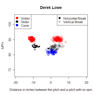
One thing that immediately jumps out to me in the chart is the consistent horizontal break, compared to a non-spinning pitch, of his sinker. Most breaks that I have seen, both horizontal and vertical, have been much more spread out, similar to how the vertical break of his sinker appears. As I mentioned in my previous article with regard to release point, I'm not sure whether consistency is necessarily a good thing for pitchers. While having a consistent break on a pitch would seem to help the catcher receive the ball and give the pitcher confidence that he knows where he's throwing to, it would also help a hitter who could prepare for only one type of break on the sinker. If Lowe is always this consistent though, it hasn't really been a problem for him.
Another thing to notice on this chart is Lowe's curveball. He throws the pitch infrequently, but both the horizontal and vertical break (compared to a pitch with no spin) are around zero inches. According to the data his curve ends up almost exactly where a pitch with no spin would, and with a speed of 82 MPH, appears to be a meat-ball. Fortunately for Lowe, this isn't the case. The pitch has some movement, measured by the length of the break (defined as the measurement of the greatest distance between the trajectory of the pitch at any point between the release point and the front of home plate, and the straight line path from the release point and the front of home plate) which is 11.5 inches, the greatest of any of his pitches. The hump in Lowe's curveball creates enough deception to allow him to throw it on occasion without getting burned.
Colorado's Aaron Cook is another sinkerball artist. While I had 200 pitches over two starts for Lowe, I only had 103 pitches from Cook, all of them from his start on 4/8. This was a fantastic start for Cook, despite a no decision, as he pitched 9 innings and allowed only one run. Here's a chart showing the break on his pitches in that start.
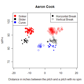
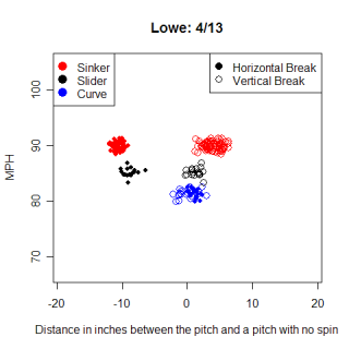
Comparing the horizontal break on Cook's sinker to Lowe's reinforces how consistent Lowe was. The chart on the right shows Lowe's start on April 13, and even though Lowe had a more consistent break (a tighter bunching of clusters) for all of his pitches compared to Cook, the horizontal break of the sinker was especially consistent. Cook's curve has a break pattern that is typical of a curveball, with the pitch ending up lower than would be expected with a non-spinning pitch. Compared with Lowe's curve, the vertical break is on the left of the horizontal break in the chart, which I believe is a graphic indicator of a curveball. Despite these differences in the way their sinkers moved, Lowe and Cook both had excellent starts in the games I examined, so there are clearly multiple ways to skin a cat here.
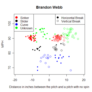
I wanted to look at another NL West sinkerball, Brandon Webb, but Gameday has only tracked 83 pitches for Webb so far this season, leading to a much murkier chart than Lowe's or Cook's. There are three basic clusters of pitches, but there is also a collection of scattered points, which I'm unsure how to identify. Even the clusters I'm able to identify are much further apart than most pitchers I've examined. I have noticed some obvious inconsistencies in the data so far, mostly involving the speed and release point, so this break information could be wrong too. The pitches I was unable to identify could be another pitch that Webb throws, but I'd like to see another start worth of information from Webb before I form an opinion on his pitches or their movement.
Excluding Webb, the only other true sinkerball I had a reasonable amount of data for was Carlos Silva. I have information on 110 pitches that Silva threw over two different starts, 4/07 and 4/18, and when I created his chart, I found he has only thrown two pitches, a sinker and change up. Because of the inconsistent way Gameday collected data from those two starts, Silva could have thrown other pitches that weren't collected by Gameday. However, I think if he did have another pitch, he would have thrown it more than a couple of times over 110 random pitches.
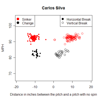
The table below shows some interesting information about the three sinkers examined. The numbers measuring the pitches are all median values as opposed to mean values. Silva relies on his sinker more than Cook or Lowe, but his sinker has less of a downward break, measured by both the vertical break compared to a non-spinning ball and the length of the break, which is the number I used to describe the hump in Lowe's curveball. Silva's average sinker ended roughly nine inches higher than a non-spinning pitch would have, while Lowe's and Cook's pitches ended roughly four inches above the imaginary terminus. The backspin on a pitch is what causes it to end up higher than a non-spinning pitch would, so Silva's sinker must have more backspin than Lowe's or Cook's. When a hitter hits a sinker with too much backspin, he still hits a grounder, but as Dan Quisenberry famously put it, "in this case, the first bounce is 360 feet away."
An average sinker from Silva reached its high point roughly seven inches above an imaginary line from release point to home plate, compared to roughly nine inches for Lowe and Cook, leading to a smaller vertical drop for Silva. These observations seem to jive pretty well with reality, as Lowe and Cook are both thought to have better sinkers than Silva, and one thing that could lead to a more effective sinker is getting more downward movement on the pitch.
Name   Sinker%   Speed    Horizontal Break   Vertical Break    Break Length
Lowe   65%       90 MPH   -10.75"            3.68"             9.00"
Cook   68%       93 MPH   -10.02"            4.60"             8.30"
Silva  77%       93 MPH   -10.74"            9.39"             6.85"
For the sake of comparison, and to make sure I wasn't drawing conclusions about a trend that didn't exist, I wanted to get the average values for several four-seam fastballs and see how they compare to these sinkers. For this, I used Matt Morris and Jake Peavy. The table below shows the same information as above, but for Morris' and Peavy's fastballs.
Name     Fastballs  Speed    Horizontal Break   Vertical Break    Break Length
Morris   79         89 MPH   -9.01"             9.47"             6.70"
Peavy    104        95 MPH   -10.32"            8.49"             6.60"
With all the usual warnings about a small sample size, the sinkers appear to be different from the four-seam fastballs, which is a great finding. The fastballs have different horizontal and vertical breaks and a much smaller break length relative to the sinkers. One interesting thing was the similarity of Silva's sinker to the four-seam fastballs. Silva struggled in spring training this year with controlling his sinker and maintaining the sink on the pitch, so perhaps this is numerical evidence of those struggles. Either that, or that's just how Silva's sinker typically behaves, and his normal sinker is different that Lowe's or Cook's.
I was very pleased to discover that pitches were able to be identified using just the horizontal and vertical break values from Gameday. In the future, I'd like to continue looking at different pitches and see the differences between say, Barry Zito and Rich Hill's curveballs, or Johan Santana and Cole Hamels' change up. The fact that there was a distinct difference between a four-seam fastball and a two-seam fastball gives me hope that sifting through the database to find the different types of pitches a pitcher throws is an attainable goal.
Comments
It would be interesting to see Silva's patterns in 2005, when he gave up just 9 walks in 187 IP. I believe he was also in the AL top 10 in ERA. The sinker didn't sink last year when Silva went 11-15 with a 5.94 ERA.
With the perpetual pitching shortage, I often wonder why teams don't take marginal velocity/good control minor leaguers and see how they do with the sinker. It worked for Cy Young winner Randy Jones, who usually threw around 75 MPH.
Posted by: Al Doyle at April 27, 2007 6:48 AM
Is Yankee Stadium set up to capture this type of information? I'd love to see a breakdown like this for Wang.
Posted by: Reno at April 27, 2007 9:44 AM
Very, very, very cool (can't emphasize the very's enough).
I finally figured out how (and from where) to load the gameday data into excel. the First things I looked at was Felix Herndandez's first start compared to Jarrod Washburn's first start. A couple things stood out at me, beyond just average velocity and break length. The difference in break on the fastball was signifigant, and of course so was the speed. The "break_length" field was not that different for their fastballs (which was surprising), but Felix had a greater average pfx_x and a lower pfx_z. I thought PFX was the break, but they also have a "break length" field, and break y. I'd assume pfx_x is horizontal break, and pfx_z is where it starts to break (I'm actually not sure on this). If that's the case, Felix's fastballs break more, in a shorter ammount of time (this is obvious visually). The differential in start and end speed of their fastballs was different, Washburn had a difference of ~8.4 mph (I think, dont have the data handy at work), and Felix ~10 mph. This may be normal for hard throwers, I'm not sure, nor do I know what that means, but found it fascinating. FWIW, Cla Merideth had some nasty nasty wicked break on his pitches (average break_length ~13), at least for one appearance I looked at.
The sinker thing was something I was curious about (relative to a predominately 4-seam pitcher), so this was a cool article (not that ll of your gameday XML articles haven't been) to find today :)
Posted by: Chris Miller at April 27, 2007 11:22 AM
I'd LOVE to see the data a couple/few Wakefield starts. Another application that I'd love to see /wrt Gameday data is someone to do pitch reconstructions using the data, to visually see the differences in speed and movement, in a way that models the actually path of the pitches.
Posted by: Chris Miller at April 27, 2007 12:45 PM
Chris Miller,
a few of the gameday parks already do this, showing the arc/location of the pitch. It is slowly being rolled out to all parks (I'm supposed to be doing it in Milwaukee) but the usual contractual issues are holding up the full operation of this app.
Posted by: the other christopher miller at April 27, 2007 3:47 PM
Chris
For your first point, the fields that are listed in the XML are a bit confusing. Pfx_x is the horizontal break (the filled-in circles) of a pitch while Pfx_z is the vertical break (the open circles). These values are both relative and compared to where a pitch thrown the same way as the pitch in question, but without any spin would end up. I'm not totally sure what you mean when you say Pfx_z is when the ball starts to break, and I think that the PFX value given in the Gameday app is the pythagorean sum of the two vectors. PFX^2=(Pfx_x^2)+(Pfx_z^2). I have some trouble wrapping my head around what PFX itself means, and prefer to use the two vectors.
Break Length is the field I used when talking about Lowe's curveball. It's the max height of a pitch over an imaginary line from release point to home plate. The MLB Gameday blog has the exact definition. Barry Zito's curve would have a high break length, while an ordinary fastball wouldn't. I haven't taken the time to find out why, but some sidearmers/submariners have very high break number, maybe because their release point is so low.
Wakefield ruins the idea of where a "non-spinning" pitch would end up, as his pitches don't spin, but end up in random places. His pitch charts are weird/interesting to look at.
What do you mean about actually modeling the path of the pitch? That sounds pretty cool to take a crack at.
Posted by: joe at April 27, 2007 5:50 PM
You should be able to create an accurately animated model of the path of each pitch using the new gameday data. You could animate it from the point it leaves the hand to the point it reaches the plate, perhaps from different views. I think it would be an intuitive way to present the pitch data, and doesn't seem like it would be too hard to do. You could do side by side animations of pitches from various pitchers, to get a real-time idea of how they compare. Or you could compare the same pitch from two different pitchers, or two different pitches from the same pitcher, and probably plenty of other reasons. What I think would be neat is an animated model of a 3D baseball, and show the batters view, the pitchers view, as well other views. I think it would be really cool to do the same sort thing with the hittracker data.
Posted by: Chris Miller at April 28, 2007 12:05 AM
Data on Matsuzaka and Wang would be really interesting.
Posted by: EJ at April 28, 2007 11:00 PM
Is the pitch classification correct? I would have thought the curve would have had a lot more movement than is suggested by the blue dots on the graphs. Couldn't those blue dots be change ups?
Posted by: Alex R at April 29, 2007 2:28 AM
Alex
I've gotten a couple of questions about the classifications of pitches and after reading them, looking some other pitchers, I think I made a mistake with classifying some of the pitches. For Lowe and Cook, they both throw sinkers, change-ups and a breaking ball, a slider for Lowe and a curve for Cook. I made a mistake in thinking they both had two breaking balls. The black dots for both pitchers are in fact change-ups, and not a second breaking ball. The change-ups move similar to the fastball, which makes sense from a deception point of view.
The blue dots are the breaking ball for each pitcher. These charts aren't totally intuitive to read, because they are relative to a pitch that without spin. The blue dots don't mean that the pitch had no movement, but rather, they ended up where a pitch without spin would have. The break length essentially measures the highest height of the pitch, and Lowe's slider (I say curveball in the article) has the highest break length for any of his pitches, so he does have movement on the pitch. Lowe's slider might end up roughly where a non-spinning pitch would, but it has movement on the way there.
Posted by: joe at April 29, 2007 6:56 AM
EJ
Wang made his only start of the season so far in TB, which doesn't have the system and the one start I have for Matsuzaka looks like Webb's, with dots all over the place. For whatever reason, the system has been installed in only a handful of stadiums so far, and even where it's installed, there are sometimes inconsistencies, although based on the number of pitches that some announcers credit Dice-K with, it might not be a problem in his start.
Posted by: joe at April 29, 2007 7:04 AM
Joe
Thanks for that. I hear you on the break length. I'd have thought that a curve would have had a lot of 12-6 spin on it, thereby meaning it would drop a lot more than a pitch with no spin? Is this wrong ... why you imply by the break length would seem to indicate so
Thanks
Alex
Posted by: Alex R at April 29, 2007 3:30 PM