Rich Lederer • Baseball Beat
Patrick Sullivan • Change-Up
Jeremy Greenhouse • Touching Bases
Dave Allen • F/X Visualizations
Sky Andrecheck • Behind the Scoreboard
Marc Hulet • Around the Minors
Al Doyle • Past Times
Retired Uniforms:
Bryan Smith • WTNY
Joe Sheehan • Command Post
Jeff Albert • The Batter's Eye
RSS Feed
Home
*Examining the Past, Present, and Future*
Lineup Card
Recent Entries
» Putting Together a Reality Team
» Historical Hall of Fame Vote Comparisons: 2012
» An All-Christmas Team
» The New-Look Angels
» John Denny: The Forgotten Cy Young Award Winner
» Money Isn't Everything
» What Would It Take to Hit .400 in the 21st Century?
» Halos Heaven
» Brandon McCarthy's Breakout Season
» Link-o-Rama
» Historical Hall of Fame Vote Comparisons: 2012
» An All-Christmas Team
» The New-Look Angels
» John Denny: The Forgotten Cy Young Award Winner
» Money Isn't Everything
» What Would It Take to Hit .400 in the 21st Century?
» Halos Heaven
» Brandon McCarthy's Breakout Season
» Link-o-Rama
Best of Baseball Beat
Abstracts From the Abstracts
1977 Baseball Abstract
1978 Baseball Abstract
1979 Baseball Abstract
1980 Baseball Abstract
1981 Baseball Abstract
1982 Baseball Abstract
1983 Baseball Abstract
1984 Baseball Abstract
1985 Baseball Abstract
1986 Baseball Abstract
1987 Baseball Abstract
1988 Baseball Abstract
1978 Baseball Abstract
1979 Baseball Abstract
1980 Baseball Abstract
1981 Baseball Abstract
1982 Baseball Abstract
1983 Baseball Abstract
1984 Baseball Abstract
1985 Baseball Abstract
1986 Baseball Abstract
1987 Baseball Abstract
1988 Baseball Abstract
Bert Blyleven Series
Meeting Up and Hanging Out with Bert
The Results Are In And...
Aficionado Heavily Invested in Blyleven
Latest on Blyleven's Chances for the HOF
The Internet Zealot Responds
400 Down and 5 to Go...
Bert Be Home By Eleven?
Blyleven's Forgotten Season (1973)
HeyMan, Your Comments Don't Hold Water
The Waiting is the Hardest Part
Another Addition to the Blyleven Series
Search for the Truth
As Dominant as His HOF Contemporaries
Listen, Buster
A Larger Step for Blyleven
Answering the Naysayers (Part Two)
Another Small Step for Blyleven
Q&A: Blyleven on the Twins
The Majority Rules, Right?
It's All Dutch to Some
The Hall of Fame Case for Bert Blyleven
Q&A: Blyleven on Felix Hernandez
Clemens Rocketing Up Charts
Poz: An Interview With a KC Star
A HOF Chat with Tracy Ringolsby
Up Close and Personal
A Peek Into the Mind of a HOF Voter
Answering the Naysayers
It's That Time of the Year (Again)
"If Cooperstown is Calling..."
The Bert Alert
One Small Step for Blyleven...
Only the Lonely
Exclusive Interviews
Lee Sinins
Alex Belth
David Pinto
Will Carroll
Mike Carminati
Aaron Gleeman
Joe Sheehan
Jay Jaffe
Jeff Peek
Tracy Ringolsby
Joe Posnanski
Bill James Part I, II, III
Jon Lalonde
Chuck Tiffany
Dayn Perry
Fay Vincent
Nate Silver
Alex Belth
David Pinto
Will Carroll
Mike Carminati
Aaron Gleeman
Joe Sheehan
Jay Jaffe
Jeff Peek
Tracy Ringolsby
Joe Posnanski
Bill James Part I, II, III
Jon Lalonde
Chuck Tiffany
Dayn Perry
Fay Vincent
Nate Silver
Bullpen
Rich Lederer
The Odd Couple (with Alex Belth)
The MostUnder Over Underrated Player in Baseball (with Brian Gunn)
Three Wise Men (roundtable by Alex Belth)
Infrequently Asked Questions (interview with Matt Welch)
Interview (Orioles Think Tank)
Bernie and the Yanks (Bronx Banter)
Hope and Faith: How the LAA Win the World Series (Baseball Prospectus)
NL West (The Soul of Baseball)
Greatest Living Hitter? (Sports Illustrated)
Roundtable: 2008 HOF Ballot (Armchair GM)
The Most
Three Wise Men (roundtable by Alex Belth)
Infrequently Asked Questions (interview with Matt Welch)
Interview (Orioles Think Tank)
Bernie and the Yanks (Bronx Banter)
Hope and Faith: How the LAA Win the World Series (Baseball Prospectus)
NL West (The Soul of Baseball)
Greatest Living Hitter? (Sports Illustrated)
Roundtable: 2008 HOF Ballot (Armchair GM)
Patrick Sullivan
Designated Hitters
David Bromberg (Q&A: John Denny)
Mark Armour (H. Killebrew and Versatility)
Joe Lederer (Soundtrack of a Prospect)
David Bromberg (Clemente's Autograph)
David Bromberg (Woody Fryman)
D. Baumstein (WAR Against Age: Pitchers)
Doug Baumstein (The WAR Against Age)
Doug Baumstein (A Lifetime on the Road)
John Fraser (Pick Six)
Mark Armour (How to Score More Runs?)
Bill Parker (What Opening Day Tells Us)
Stan Opdyke (Pat Rispole)
Chris Jaffe (Evaluating Baseball's Mgrs)
Stan Opdyke (Baseball Radio in NYC, 1953)
A. Nathan (Performance of Baseball Bats)
Michael Weddell (Edgar Martinez/HOF)
Jon Weisman (100 Things Dodgers Fans...)
Stan Opdyke (Connie Mack and Vin Scully)
Eric Walker (Evaluating Run Production)
Brent Mayne (The Intangibles of Catching)
Chris Moore (Best Fastballs in Baseball)
Dave Baldwin (The Batter’s Brain)
Shawn Haviland (Ivy League to MLB)
Larry Granillo (Walking Off)
Rob Iracane (Solo HR Won't Break You)
Tommy Bennett (Charm of AM Radio)
Harry Pavlidis (Johan Santana's Fast Start)
John Walsh (WAR and Remembrance)
Eric Walker (Precisely Inaccurate)
Bob Timmermann (As They See 'Em)
Geoff Young (Unicycles and Delusions)
Baseball Analysis at Tufts (Groundballers)
Baseball Analysis at Tufts (GB Out Rates)
G. Rybarczyk ('09 Hit Tracker Projections)
Joe Lederer (Curt Schilling/HoF)
Conor Gallagher (Hall of Fallacies)
Chris Green (Jim Rice, HoF, the Numbers)
Shawn Hoffman (Baseball's Bear Mkt?)
Paul Anthony (Manny Syndrome)
Ross Roley (World Series Odds)
B. Timmermann (Catcher's Interference)
R.J. Anderson (Waiting the Hardest Part)
Maury Brown (Cubs, MLB, and Cuban...)
Myron Logan (Dee-Fense, Dee-Fense)
Craig Calcaterra (Frivolity, Part I, Part II)
Chad Finn (Ode to Baseball Cards)
David Cameron (Mariners Foibles)
Chris Dial (Chipper Jones)
Pat Lederer (Memory Lane)
David Appelman (Clutch Pitching)
Bob Rittner (DH)
Jonathan Mayo (Roger Clemens)
Lisa Winston (My Son-in-Law...)
Russ McQueen (The Yellow Hammer)
Bob Rittner (I'm OK, You're OK)
Mark Armour (In Defense of the HOF)
Pat Jordan (Friends)
Dan Levitt (Analysis of Terry Ryan)
Doug Baumstein (Trading Econ 101)
Ross Roley (Runner's Reluctance II)
Ross Roley (Runner's Reluctance I)
Mark Armour (No-Longer Lovable Sox)
Bruce Regal (Stealthy and Wise)
Brian Gunn (Roid Monster)
Current/McEvoy (Value of the SB)
John Rickert (Sinister Thefts)
Nate Silver (Sabermetrics)
David Vincent (Home Run Production)
Joe P. Sheehan (Enhanced Gameday II)
Mark Armour (An Ode to Sport)
David Gassko (All-Time Worm Burners)
Joe P. Sheehan (Enhanced Gameday)
John Walsh (When Titans Clash)
Fox/Williams (Quantifying Coaches II)
Fox/Williams (Quantifying Coaches I)
Jacob Luft (Bull Durham Rant)
Chad Finn (Strat-O-Matic)
Lisa Winston (Rotisserie Baseball)
Dave Studeman (Baseball Stats)
Steve Treder (Roger Craig)
Marc Normandin (Jeff Bagwell)
D. Appelman (Expanding Strike Zone)
Jeff Sackmann (Worst MiL Defenders)
Jeff Sackmann (Best MiL Defenders)
Maxwell Kates (Van Lingle Mungo)
David Appelman (Pitch Location)
Kent Bonham (Danny Ray Herrera)
Glenn Stout (Two Baseball Poems)
Bruce Regal (The Challenge Round)
Mark Lamster (Barry & Ty)
Geoff Young (NL West)
Tom Lederer (The Ryan Express)
Brian Erts (Great Leap Forward)
David Pinto (Parity and the N.L.)
Jacob Luft (Fathers and Daughters)
Jamey Newberg (Pete's Sake)
Jeff Albert (A. Jones Swing Analysis)
Jeff Albert (A-Rod Swing Analysis)
Keith Law (Death, Taxes, and Waivers)
Peter Abraham (Tales of Torre Tales)
Larry Borowsky (Let 'er Rip II)
Dan Levitt (Empirical Analysis of Bunting)
Jonah Keri (If I Met Warren Cromartie...)
Bob Klapisch (War Stories)
Bob Timmermann (John F. Kennedy HS)
Kent Bonham (Aluminum Adjustments)
Al Doyle (More Than Superstars)
Ross Roley (Instant Replay)
David Vincent (Barry Bonds Homers)
Chad Finn (Our Favorite Obscurities)
Bill Deane (1979 NL MVP)
Mark Armour (Rise/Fall of Artificial Turf)
Jeff Angus (Wally Moon Camp)
David Berri (Money and Baseball)
Larry Borowsky (Baseball w/o the #s)
Derek Zumsteg (The Irrational Market)
David Regan (Free Agent Contracts)
Peter Schmuck (Steroids and the HOF)
David Appelman (Pitchers, Pitch by Pitch)
Dan Fox (Swinging, Taking, Fouling, Etc)
Patrick Sullivan (Study of NYY CF/BOS LF)
Will Leitch (Baseball Journalism)
Jeff Sullivan (Pitcher Release Points)
Steve Treder ('69-'70 Giants)
Maury Brown (Charlie Finley)
John Brattain (Bob Johnson)
Bob Klapisch (The Case for Bert Blyleven)
Jeff Peek (Pride and Prejudice)
Dayn Perry (Bert and Warren)
Rob Neyer (If Don Sutton Was Great...)
Lisa Winston (Minor League Memories)
Alex Belth (Otis Redding Was Right)
David Cameron (Long Live the King)
Jeff Angus (Baserunning Study)
Bert Blyleven (Baseball Playoffs)
Boyd Nation (Not a Prospect List)
James Click (Batters-Baserunners Study)
Jeff Shaw (Why I Love Baseball)
David Gassko (BIP/BFP Fielding Study)
Jay Jaffe (Milwaukee Sausage Race)
Jamey Newberg (Remember When)
Bob Klapisch (Press Box to the Mound)
Dan Levitt (Predictive Value of BB)
David Vincent (Official Scorer)
Jon Weisman (Rick Monday)
Larry Borowsky (Let 'er Rip)
Will Carroll (Fictional Short Story)
Bob Timmermann (Japanese Baseball)
Cyril Morong (Best Pitching Seasons)
Sean Forman (Monte Carlo Win-Loss)
Brian Gunn (My Little Blue Book)
Joe Lederer (My Dad and Baseball)
Bill Deane (Bob Gibson, 1968)
Mark Armour (1977 Yankees)
Darren Viola (Retrosheet)
David Pinto (RFK)
Dayn Perry (Brave Heart)
Matt Welch (Dave Hansen)
Kevin Kernan (Jack McKeon)
Tom Lederer (Dodgers Road Trip)
Steve Lombardi (Slider)
Studes (Picturing Baseball)
Mike Carminati (Luck of the Drawl)
Eric Neel (Vin Scully)
J.C. Bradbury (Leo Mazzone)
John Sickels (Bill James)
Search Baseball Analysts
Archives
By Category:
Around the Majors Content Only
Around the Minors Content Only
Baseball Beat Content Only
Baseball Beat/Change-Up Content Only
Baseball Beat/WTNY Content Only
Behind the Scoreboard Content Only
Change-Up Content Only
Change-Up/Around the Majors Content Only
Command Post Content Only
Crunching the Numbers Content Only
Designated Hitter Content Only
F/X Visualizations Content Only
Past Times Content Only
Saber Talk Content Only
The Batter's Eye Content Only
Touching Bases Content Only
Weekend Blog Content Only
WTNY Content Only
By Month:
February 2012
January 2012
December 2011
October 2011
September 2011
August 2011
July 2011
June 2011
May 2011
April 2011
March 2011
February 2011
January 2011
December 2010
November 2010
October 2010
September 2010
August 2010
July 2010
June 2010
May 2010
April 2010
March 2010
February 2010
January 2010
December 2009
November 2009
October 2009
September 2009
August 2009
July 2009
June 2009
May 2009
April 2009
March 2009
February 2009
January 2009
December 2008
November 2008
October 2008
September 2008
August 2008
July 2008
June 2008
May 2008
April 2008
March 2008
February 2008
January 2008
December 2007
November 2007
October 2007
September 2007
August 2007
July 2007
June 2007
May 2007
April 2007
March 2007
February 2007
January 2007
December 2006
November 2006
October 2006
September 2006
August 2006
July 2006
June 2006
May 2006
April 2006
March 2006
February 2006
January 2006
December 2005
November 2005
October 2005
September 2005
August 2005
July 2005
June 2005
May 2005
April 2005
March 2005
February 2005
January 2005
December 2004
November 2004
October 2004
September 2004
August 2004
July 2004
June 2004
May 2004
April 2004
March 2004
February 2004
January 2004
December 2003
November 2003
October 2003
September 2003
August 2003
July 2003
June 2003
Reference
Organizational Stats
Arizona Diamondbacks Bat / Pitch
Atlanta Braves Bat / Pitch
Baltimore Orioles Bat / Pitch
Boston Red Sox Bat / Pitch
Chicago Cubs Bat / Pitch
Chicago White Sox Bat / Pitch
Cincinnati Reds Bat / Pitch
Cleveland Indians Bat / Pitch
Colorado Rockies Bat / Pitch
Detroit Tigers Bat / Pitch
Florida Marlins Bat / Pitch
Houston Astros Bat / Pitch
Kansas City Royals Bat / Pitch
Los Angeles Angels Bat / Pitch
Los Angeles Dodgers Bat / Pitch
Milwaukee Brewers Bat / Pitch
Minnesota Twins Bat / Pitch
New York Mets Bat / Pitch
New York Yankees Bat / Pitch
Oakland Athletics Bat / Pitch
Philadelphia Phillies Bat / Pitch
Pittsburgh Pirates Bat / Pitch
St. Louis Cardinals Bat / Pitch
San Diego Padres Bat / Pitch
San Francisco Giants Bat / Pitch
Seattle Mariners Bat / Pitch
Tampa Bay Devil Rays Bat / Pitch
Texas Rangers Bat / Pitch
Toronto Blue Jays Bat / Pitch
Washington Nationals Bat / Pitch
All-Star Links
Official Websites
News and Notes
Baseball News Blog
Baseball Newstand
ESPN Baseball
Fox Sports Baseball
Pro Sports Daily
Roto World
The Roto Times
USA Today Baseball
Baseball Newstand
ESPN Baseball
Fox Sports Baseball
Pro Sports Daily
Roto World
The Roto Times
USA Today Baseball
Reference and Analysis
Baseball Almanac
Baseball America
Baseball Archive
Baseball Contracts
Baseball Cube
Baseball Graphs
Baseball Library
Baseball Musings Player Database
Baseball Page
Baseball Primer
Baseball Prospectus
Baseball Reference
Baseball Statistics
Baseball Truth
Boxscore Central
Diamond Mind Baseball
Doug's Stats
FanGraphs
Fast Balls (pitchfx catalog)
Hardball Dollars
Hardball Times
Hit Tracker
Retrosheet
Rotobase/Rotoblog
Stat Corner
STATS
Tango on Baseball
Yahoo Sports MLB
Web Gems
Bill James Primer
Sabermetric Manifesto (Grabiner)
Pitching and Defense (McCracken)
Pitching and Defense (Tippett)
Transactions Primer (Neyer)
Baseball Stats (Batter's Box)
Prospect Report (Cameron)
Pitcher Workloads (Sheehan)
Goodbye to Old Baseball Ideas (Rickey)
Sabermetric Manifesto (Grabiner)
Pitching and Defense (McCracken)
Pitching and Defense (Tippett)
Transactions Primer (Neyer)
Baseball Stats (Batter's Box)
Prospect Report (Cameron)
Pitcher Workloads (Sheehan)
Goodbye to Old Baseball Ideas (Rickey)
Columnists
Baseball Blogs
Around the Majors
Athletics Nation
Baseball Crank
Baseball Musings
Baseball-Reference Blog
Batter's Box
Big League Stew
Bronx Banter
Catfish Stew
Cub Town
Dan Agonistes
Dodger Thoughts
DRays Bay
Ducksnorts
Futility Infielder
Halos Heaven
Inside the Rockies
It Might Be Dangerous
Knuckle Curve
LoHud Yankees Blog
Lookout Landing
Management by Baseball
Metaforian
Metsgeek
Mike's Baseball Rants
Only Baseball Matters
Redbird Nation
Red Reporter
Sabernomics (Braves)
Seth Speaks
ShysterBall
6-4-2 (Angels/Dodgers)
The Book
TheCubdom
The Cutting Edge
The House That Dewey Built
The View From The Bleachers
Tiger Blog
U.S.S. Mariner
Viva El Birdos
Where's Kernan
Minor Leagues
Arizona Fall League
BA Player Finder
Cal Leaguers
Jamey Newberg
JDM's Scoresheet Baseball
Minor League Baseball
Minor League Park Factors
Minor League Splits
No Pepper
Sickels' Minor League Ball
Warm October Nights
BA Player Finder
Cal Leaguers
Jamey Newberg
JDM's Scoresheet Baseball
Minor League Baseball
Minor League Park Factors
Minor League Splits
No Pepper
Sickels' Minor League Ball
Warm October Nights
Amateur
Boyd's World (College)
Cape Cod Baseball League
College Baseball Blog
College Baseball Insider
Collegiate Baseball Newspaper
College Splits
College Splits Blog
Dirtbags Baseball (Long Beach State)
NCAA Baseball
NCBWA
Team One Baseball (High School)
Texas A&M & Baseball
Cape Cod Baseball League
College Baseball Blog
College Baseball Insider
Collegiate Baseball Newspaper
College Splits
College Splits Blog
Dirtbags Baseball (Long Beach State)
NCAA Baseball
NCBWA
Team One Baseball (High School)
Texas A&M & Baseball
Historical
Cuban Baseball
House of David
Jim "Mudcat" Grant's Web Page
Negro League Baseball Players Assoc
Negro Leagues Baseball Museum
1919 Black Sox
Pacific Coast League
Philadelphia Athletics Historical Society
Shoeless Joe Jackson Society
SABR-L Archives
Walter O'Malley
House of David
Jim "Mudcat" Grant's Web Page
Negro League Baseball Players Assoc
Negro Leagues Baseball Museum
1919 Black Sox
Pacific Coast League
Philadelphia Athletics Historical Society
Shoeless Joe Jackson Society
SABR-L Archives
Walter O'Malley
Miscellaneous
Forums
Credits
Ticket Center
Tickets to Baseball -
Premium Red Sox Tickets - Tickets to Marlins Games - Cardinals Game Tickets - NY Yankee Tickets - Tickets Oakland Athletics - Dallas Cowboys Tickets - Arizona Cardinals Tickets - Tickets Seattle Seahawks - Buffalo Bills Tickets Online - Tickets to Dolphins Football
Buy Boston Red Sox tickets,
Philadelphia Phillies tix,
NY Yankees tickets,
NY Mets tickets, and
MLB All Star game tickets at ABC tickets
Not sure where to find the best online sportsbooks? Start your search with PlayersJet.
Get deals at SportsMemorabilia.com on baseball apparel, including Phillies jerseys and more for adults and children.
Shop the largest selection baseball equipment on sale at Sports Unlimited. Check out tons of baseball gloves, youth baseball gloves and catchers gear from Rawlings, Wilson, Nike & Under Armour.
2011 Draft Order
Courtesy of Baseball America
First-Round:
 1. Pirates (57-105)
 2. Mariners (61-101)
 3. Diamondbacks (65-97)
 4. Orioles (66-96)
 5. Royals (67-95)
 6. Nationals (69-93)
 7. Diamondbacks (for B. Loux)
 8. Indians (69-93)
 9. Cubs (75-87)
10. Padres (for Karsten Whitson)
11. Astros (76-86)
12. Brewers (77-85)
13. Mets (79-83)
14. Marlins (80-82)
15. Brewers (for Dylan Covey)
16. Dodgers (80-82)
17. Angels (80-82)
18. Athletics (81-81)
19. Red Sox (from DET for Martinez)
20. Rockies (83-79)
21. Blue Jays (85-77)
22. Cardinals (86-76)
23. Nationals (from CWS for Dunn)
24. Rays (from BOS for Crawford)
25. Padres (90-72)
26. Red Sox (from TEX for Beltre)
27. Reds (91-71)
28. Braves (91-71)
29. Giants (92-70)
30. Twins (94-68)
31. Rays (from NYY for Soriano)
32. Rays (96-66)
33. Rangers (from PHI for Lee)
Supplemental First Round:
34. Nationals (Dunn)
35. Blue Jays (Downs)
36. Red Sox (Martinez)
37. Rangers (Lee)
38. Rays (Crawford)
39. Phillies (Werth)
40. Red Sox (Beltre)
41. Rays (Soriano)
42. Rays (Balfour)
43. Diamondbacks (LaRoche)
44. Mets (Feliciano)
45. Rockies (Dotel)
46. Blue Jays (Buck)
47. White Sox (Putz)
48. Padres (Garland)
49. Giants (Uribe)
50. Twins (Hudson)
51. Yankees (Vazquez)
52. Rays (Benoit)
53. Blue Jays (Olivo)
54. Padres (Torrealba)
55. Twins (Crain)
56. Rays (Choate)
57. Blue Jays (Gregg)
58. Padres (Correia)
59. Rays (Hawpe)
| Command Post | July 26, 2007 |
Not an Article about Pitching at Altitude
This entry was supposed to be about how pitches moved and behaved at different altitudes. I briefly wrote about differences in pitch movement for a Weekend Blog in May and I was planning to revisit the topic when there were more stadiums supplying the data. After the All-Star break, several new stadiums went on-line with the pitch f/x system, including Chase Field in Arizona, the stadium with the second highest elevation in baseball, and I thought I was in business. I examined how pitches moved at Chase Field (or Turner Field, the third highest stadium in baseball) compared with how they moved at parks closes to sea level, such as Petco, Safeco or McAfee, but I found virtually no changes in how pitches moved at the different altitudes. This didn't seem right intuitively and it wasn't.
To make a long story short, I had forgotten to account for the distance traveled by the ball. MLB.com has varied the distance they begin tracking the pitch, called y0, and although it appears to have recently stabilized around 50 feet, it began the season at 55 feet and after June 4th varied from 40-55 feet depending on the game. Needless to say, where the pitch is initially picked up is going to make a huge difference on the distance it breaks and after going back and looking at my results again, I didn't have enough pitchers who had the same y0 value at both a high-altitude and low-altitude park. That pretty much shot the column idea, so this post turned into a catch-all, with some updates and cool graphs that I haven't had a chance to post yet.
**********
Despite not writing about differences due to altitude, I wanted to share two conflicting results I got when looking at altitude differences. The first result is about Rich Hill. Curveballs are thought to be very adversely affected by the high altitude at Coors Field and while Hill hasn't made a start in Colorado, he did start at Turner Field in Atlanta, which is roughly 945 feet above sea-level. Comparing Hill's start in Atlanta to a start he made at sea level in San Diego, his curveball broke 12 inches down in San Diego, but only 8 inches down in Atlanta. All of his pitch types dropped roughly 3 inches more in San Diego compared to Atlanta. It makes sense that balls thrown in the higher altitude would tend to "hang" more and not break as much. However, a pair of starts by Noah Lowry makes it seem like this isn't the case. Lowry has made a start in both Coors Field and Petco Park, but all of his pitches had a bigger drop at Coors. This is the opposite of what is expected and I have no idea what could be causing it, other than possibly something technical. I'd still like to revisit this topic in the future, but it might end up being more complicated than just waiting for more data.
**********
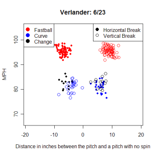
This is a pitch chart for Justin Verlander's start on 6/23 at Atlanta. The chart is remarkable for several reasons and I've been trying to come up with an excuse to use it for more than a month. One thing you need to know to appreciate the graph is that the initial tracking point for the pitches in the game was 40 feet from home, and his fastball is still averaging 95 MPH. Even when the initial point is 55 feet from home, which is where my most pitches were tracked from, very few pitchers are able to throw 95 MPH. Another cool feature on the graph is the mess of points around 75-85 MPH. Verlander's change-up and curveball both travel the almost exactly same speed, but they move in completely opposite directions. Not only does the hitter need to recognize a speed difference between Verlander's pitches, but he then has to react very quickly to hit the fastball or try to identify which off speed pitch is coming.
Not many pitchers have a graph this "clean", with no pitches thrown in a 10 MPH range. (81-91 MPH) Josh Beckett has a similarly "clean" graph, making me think that could be a trait of power pitchers who consistently throw their fastball hard, instead of occasionally taking something off of it. This graph is a very obvious example of Verlander's pitches, but even looking at other starts he has made in pitch f/x equipped stadiums, the "clean" pattern remains the same.
**********
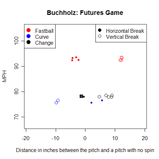
Speaking of "clean" graphs, here's Clay Buchholz's pitch graph from the Futures Game. Buchholz is a top-prospect in the Red Sox system, and while 11 pitches aren't nearly enough to say for certain, it appears that Buchholz relies on vertical movement for his success and throws his fastball consistently fast. His fastball and changeup both have little horizontal movement in this graph, although again, this is based on 11 pitches. He also appears to throw both his change and curveball at the same speed, and similar to Verlander, the two pitches move in opposite directions.
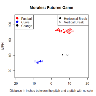
This chart is for Franklin Morales of the Colorado Rockies system. Morales is another young, hard throwing pitcher, this time a left-hander with a big curve. His curve has similar vertical movement compared with Rich Hill's curve, although Hill gets more horizontal movement away from LHH. There's a huge difference between pitching in an exhibition game against other minor leaguers and pitching in the majors and I'm not saying that Morales is going to be as good as Hill or Buchholz will be as good as Verlander, only that some of their pitches look similar right now. I don't know how movement on pitches translates from the minors to the majors, if there could be something like MLEs for movement, but wild speculation about prospects is always fun.
**********
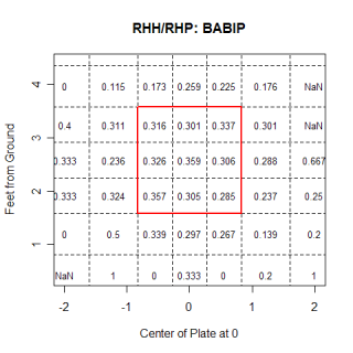
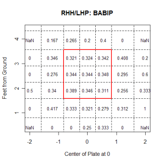
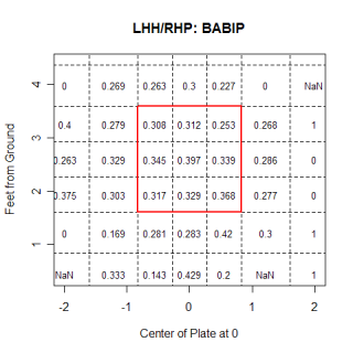
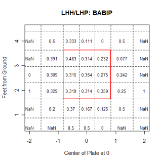
These graphs show the Batting Average on Balls in Play (BABIP), broken up by batter/pitcher splits. I ran these in one of my first posts and had been updating them every couple of weeks since then. As a reminder, they are from the catcher's perspective, so the right hand side of the graph is inside for a LHH. For the most part, they've stayed pretty constant for the duration, but there are a couple of changes of note. In the RHH/RHP graph, the middle of the strike zone now has the highest BABIP, which wasn't the case the first time I showed the graphs. Another interesting note is the difference between the BABIP on high-inside and outside pitches. This is particularly noticeable for LHH against LHP, but all hitters have a higher BABIP on high-outside pitches compared with high-inside pitches. This connects with Perry Husband's invention of "Effective Velocity", a theory on hitting and pitching. He writes why certain pitches are tougher to hit than others, and if you click on his name and go to the bottom of that page, there is a graphic explaining it. He found that, everything else being equal, a fastball thrown high and inside looks 4 MPH faster than the same pitch thrown outside. The MPH difference isn't the only thing that goes into hitting a ball solidly, but it is interesting to think about. I'm not sure where he came up with the 4 MPH, but Husband's philosophy makes intuitive sense. In order to hit an inside pitch, the hitter needs to react quicker and meet the ball in front of the plate, leaving less reaction time, which serves the same purpose as an increase in MPH. It's interesting when two people arrive at similar conclusions using different processes.
Also, I haven't done this yet, but it would be interesting to see what these breakdowns look like using the strike-zone as it is actually called by umpires.
**********
That's it for this entry. I promise that next time I have a good idea for an article, I'll make sure all the data are correct before I do the research and start writing.
Update: 11:20 AM- I fixed the BABIP charts that John mentions in his comment.
Comments
Joe,
Nice work, as usual. Couple of comments:
1) Verlander has that nice clean plot because he does not throw a slider or cut fastball, which have speed and movement somewhere between fastball and curve. I think most pitchers have around 10 mph of difference between fastball and curve or changeup.
2) I love your BABIP charts, but you appear to have included the LHH charts twice and left out the righties.
3) The effective velocity stuff is interesting, I hadn't seen it before. If the high inside pitch really appears 4 mph faster, you might expect more swing-throughs on those pitches as well as lower BABIP. It would be interesting to see percentage of swinging strikes as a function of pitch location.
Posted by: John Walsh at July 26, 2007 6:38 AM
I find the idea fascinating that managers may want to align their rotation so that certain pitchers with certain strengths avoid ballparks that are detrimental to them. If it turns out that data like this shows conclusively something like "curveballs break x% less at stadium z", pitchers with a power curveball would seem to be prone to struggling.
Re: the BABIP graphs, is there anyway to determine from the data what % of BIP in each zone become groundballs, linedrives and flyballs?
Posted by: azruavatar at July 26, 2007 8:37 AM
John
Regarding Verlander, I was so happy with my theory about him and Beckett that I overlooked the obvious explanation about not throwing a slider. Peavy, who does throw a slider, has the same speed fastball as Peavy, but a much more cluttered graph.
This is somewhat unrelated, but Beckett's graph is pretty interesting too. The basic difference between him and Verlander is that Verlander's change is the same speed as his curve, while Beckett's change is distinctly faster than his curve. With Beckett, there are 3 distinct groups of pitches, all with unique velocities.
A commenter pointed me to the Effective Velocity stuff. It's interesting and while I couldn't find out how he got the values for each quadrent, like I said, they make sense intuitively.
Posted by: joe p at July 26, 2007 8:40 AM
Joe,
Great stuff as usual.
I suspect the differences in pitching break are a result of them being just that....different days. My son is a High School pitcher and there are days when his breaking pitch is working and others when it is not. (more break) Although I do not see MLB pitchers every day, I have seen days when Derek Low's sinker was breaking much more than other days. I think this is just the nature of pitching. So I imagine to get the real answer you would have to look a a statistically significant sample of either the same pitcher at two ball parks (difficult) or a large number of pitchers at two ball parks and compare the data. My intuition tells me that the day-to-day difference in a pitcher may be greater than the differences in ball parks you are trying to measure. I think the humidor in Colorado may be unmasking the real differences from park to park also.
Either way there is more stuff here to analyze and write about.
BTW we look over your charts quite often and mess around with different grips and arm slots to try to understand and duplicate pitches from various pitchers you analyze. Your stuff with a reputable pitching coach has the potential of making an interesting book.
Posted by: DG at July 26, 2007 1:11 PM
Wow, this is a great article. I think that you have a large enough sample, but there are too many variables to take into consideration. I'm not sure if humidity, wind, temp, and variances in delivery for a pitcher on a given day can all be accounted for. I'm sure there is a difference pitching at altitude, but I'm not sure there's a 4 inch or 33% difference due to altitude. I suspect the value to be more around 5%. Keep up the good work though, this is quite interesting.
www.beegcellent.com
Posted by: Beeg at July 26, 2007 5:24 PM
Joe,
The last post reminded me of something that I have previously read in Dr. Adair's book "The Physics of Baseball" (great read even for the non-technical person) and another ball sport...golf. I did not go back and verify his number but I believe in his book he indicates around a 10% variance in ball flight from Colorado to Sea Level (approx 5,000') I do know from experience that the differences in ball flight from California sea level to Colorado approximately a 10-15% difference in ball distance from the same club. I am not sure how this might correlate to pitch break but another another data point to consider.
Posted by: DG at July 27, 2007 6:49 AM
What about the humidor? Its certainly done its job for the CO pitching staff the last two years, wouldn't it explain why Lowry, like the rest of the CO staff, is not longer so aversely effected by the elevation?
Posted by: Kyle Willkomm at July 27, 2007 7:49 AM
I'm pumped for when Colorado gets the system online, and hopefully it happens soon. The NL West has the two highest parks in baseball and two parks at sea level in San Fran and San Diego, so there should be a good sized sample of pitchers from both high and low altitude stadiums by the end of the season.
Finding how much variation exists day-to-day for a pitcher is also very important. When I looked at Halladay's different starts, I didn't find much difference between the starts, but a more in-depth look is probably warrented. Clearly there are days when pitchers appear to have better stuff than others.
I'm not sure how much the humidor would influence the break values of a ball. My limited knowledge on the humidor is that it primarily impacts the coefficient of restitution (COR) of a ball, by adding moisture back to the ball that would othewise evaporate due to the altitude. The COR measures how the ball reacts to being hit by a bat, and the humidor lowers the COR of the ball, either to MLB/Rawlings specs. (as the Rockies claim) or below them (as critics claim). There might be a side-effect that does something with the break values, but I think the problem with pitches not breaking at altitude has to do with the air density, not the ball. I could be wrong about this so if someone knows more, let me know.
Posted by: joe p at July 27, 2007 11:08 AM
Using my analysis technique, the Magnus force is determined, independent of the initial tracking location. That should allow comparison among all data sets. I don't work with the values of "break" or pfx_x, etc. provided in the .xml file. Instead I use the 9-parameter fit to the entire trajectory to derive quantities such as the Magnus force (the force responsible for the break). For an example of such an analysis, see http://webusers.npl.uiuc.edu/~a-nathan/pob/Analysis.pdf
Posted by: Alan Nathan at August 9, 2007 8:20 PM
Re break and humidity:
The break should be directly proportional to the air density. Dry air (such as at Coors) is more dense than humid air (a nitrogen molecule is more massive than a water molecule). I would expect that to be a very small effect compared to the altitude effect, where the air density in Denver is about 80% of that at sea level. That should directly show up in the size of the Magnus force (i.e., only 80%) and in the break of the pitch. But be careful: if you use the "break" number in the .xml file, that number is largely dominated by gravity. Better to use the pfx_x and pfx_z numbers, which is the break due just to the Magnus force.
I am working on a brief article about the difference between pfx_x,pfx_z and "break". Others have written about this also. I will give some specific numerical examples to show the difference.
Posted by: Alan Nathan at August 9, 2007 8:27 PM