Rich Lederer • Baseball Beat
Patrick Sullivan • Change-Up
Jeremy Greenhouse • Touching Bases
Dave Allen • F/X Visualizations
Sky Andrecheck • Behind the Scoreboard
Marc Hulet • Around the Minors
Al Doyle • Past Times
Retired Uniforms:
Bryan Smith • WTNY
Joe Sheehan • Command Post
Jeff Albert • The Batter's Eye
RSS Feed
Home
*Examining the Past, Present, and Future*
Lineup Card
Recent Entries
» Putting Together a Reality Team
» Historical Hall of Fame Vote Comparisons: 2012
» An All-Christmas Team
» The New-Look Angels
» John Denny: The Forgotten Cy Young Award Winner
» Money Isn't Everything
» What Would It Take to Hit .400 in the 21st Century?
» Halos Heaven
» Brandon McCarthy's Breakout Season
» Link-o-Rama
» Historical Hall of Fame Vote Comparisons: 2012
» An All-Christmas Team
» The New-Look Angels
» John Denny: The Forgotten Cy Young Award Winner
» Money Isn't Everything
» What Would It Take to Hit .400 in the 21st Century?
» Halos Heaven
» Brandon McCarthy's Breakout Season
» Link-o-Rama
Best of Baseball Beat
Abstracts From the Abstracts
1977 Baseball Abstract
1978 Baseball Abstract
1979 Baseball Abstract
1980 Baseball Abstract
1981 Baseball Abstract
1982 Baseball Abstract
1983 Baseball Abstract
1984 Baseball Abstract
1985 Baseball Abstract
1986 Baseball Abstract
1987 Baseball Abstract
1988 Baseball Abstract
1978 Baseball Abstract
1979 Baseball Abstract
1980 Baseball Abstract
1981 Baseball Abstract
1982 Baseball Abstract
1983 Baseball Abstract
1984 Baseball Abstract
1985 Baseball Abstract
1986 Baseball Abstract
1987 Baseball Abstract
1988 Baseball Abstract
Bert Blyleven Series
Meeting Up and Hanging Out with Bert
The Results Are In And...
Aficionado Heavily Invested in Blyleven
Latest on Blyleven's Chances for the HOF
The Internet Zealot Responds
400 Down and 5 to Go...
Bert Be Home By Eleven?
Blyleven's Forgotten Season (1973)
HeyMan, Your Comments Don't Hold Water
The Waiting is the Hardest Part
Another Addition to the Blyleven Series
Search for the Truth
As Dominant as His HOF Contemporaries
Listen, Buster
A Larger Step for Blyleven
Answering the Naysayers (Part Two)
Another Small Step for Blyleven
Q&A: Blyleven on the Twins
The Majority Rules, Right?
It's All Dutch to Some
The Hall of Fame Case for Bert Blyleven
Q&A: Blyleven on Felix Hernandez
Clemens Rocketing Up Charts
Poz: An Interview With a KC Star
A HOF Chat with Tracy Ringolsby
Up Close and Personal
A Peek Into the Mind of a HOF Voter
Answering the Naysayers
It's That Time of the Year (Again)
"If Cooperstown is Calling..."
The Bert Alert
One Small Step for Blyleven...
Only the Lonely
Exclusive Interviews
Lee Sinins
Alex Belth
David Pinto
Will Carroll
Mike Carminati
Aaron Gleeman
Joe Sheehan
Jay Jaffe
Jeff Peek
Tracy Ringolsby
Joe Posnanski
Bill James Part I, II, III
Jon Lalonde
Chuck Tiffany
Dayn Perry
Fay Vincent
Nate Silver
Alex Belth
David Pinto
Will Carroll
Mike Carminati
Aaron Gleeman
Joe Sheehan
Jay Jaffe
Jeff Peek
Tracy Ringolsby
Joe Posnanski
Bill James Part I, II, III
Jon Lalonde
Chuck Tiffany
Dayn Perry
Fay Vincent
Nate Silver
Bullpen
Rich Lederer
The Odd Couple (with Alex Belth)
The MostUnder Over Underrated Player in Baseball (with Brian Gunn)
Three Wise Men (roundtable by Alex Belth)
Infrequently Asked Questions (interview with Matt Welch)
Interview (Orioles Think Tank)
Bernie and the Yanks (Bronx Banter)
Hope and Faith: How the LAA Win the World Series (Baseball Prospectus)
NL West (The Soul of Baseball)
Greatest Living Hitter? (Sports Illustrated)
Roundtable: 2008 HOF Ballot (Armchair GM)
The Most
Three Wise Men (roundtable by Alex Belth)
Infrequently Asked Questions (interview with Matt Welch)
Interview (Orioles Think Tank)
Bernie and the Yanks (Bronx Banter)
Hope and Faith: How the LAA Win the World Series (Baseball Prospectus)
NL West (The Soul of Baseball)
Greatest Living Hitter? (Sports Illustrated)
Roundtable: 2008 HOF Ballot (Armchair GM)
Patrick Sullivan
Designated Hitters
David Bromberg (Q&A: John Denny)
Mark Armour (H. Killebrew and Versatility)
Joe Lederer (Soundtrack of a Prospect)
David Bromberg (Clemente's Autograph)
David Bromberg (Woody Fryman)
D. Baumstein (WAR Against Age: Pitchers)
Doug Baumstein (The WAR Against Age)
Doug Baumstein (A Lifetime on the Road)
John Fraser (Pick Six)
Mark Armour (How to Score More Runs?)
Bill Parker (What Opening Day Tells Us)
Stan Opdyke (Pat Rispole)
Chris Jaffe (Evaluating Baseball's Mgrs)
Stan Opdyke (Baseball Radio in NYC, 1953)
A. Nathan (Performance of Baseball Bats)
Michael Weddell (Edgar Martinez/HOF)
Jon Weisman (100 Things Dodgers Fans...)
Stan Opdyke (Connie Mack and Vin Scully)
Eric Walker (Evaluating Run Production)
Brent Mayne (The Intangibles of Catching)
Chris Moore (Best Fastballs in Baseball)
Dave Baldwin (The Batter’s Brain)
Shawn Haviland (Ivy League to MLB)
Larry Granillo (Walking Off)
Rob Iracane (Solo HR Won't Break You)
Tommy Bennett (Charm of AM Radio)
Harry Pavlidis (Johan Santana's Fast Start)
John Walsh (WAR and Remembrance)
Eric Walker (Precisely Inaccurate)
Bob Timmermann (As They See 'Em)
Geoff Young (Unicycles and Delusions)
Baseball Analysis at Tufts (Groundballers)
Baseball Analysis at Tufts (GB Out Rates)
G. Rybarczyk ('09 Hit Tracker Projections)
Joe Lederer (Curt Schilling/HoF)
Conor Gallagher (Hall of Fallacies)
Chris Green (Jim Rice, HoF, the Numbers)
Shawn Hoffman (Baseball's Bear Mkt?)
Paul Anthony (Manny Syndrome)
Ross Roley (World Series Odds)
B. Timmermann (Catcher's Interference)
R.J. Anderson (Waiting the Hardest Part)
Maury Brown (Cubs, MLB, and Cuban...)
Myron Logan (Dee-Fense, Dee-Fense)
Craig Calcaterra (Frivolity, Part I, Part II)
Chad Finn (Ode to Baseball Cards)
David Cameron (Mariners Foibles)
Chris Dial (Chipper Jones)
Pat Lederer (Memory Lane)
David Appelman (Clutch Pitching)
Bob Rittner (DH)
Jonathan Mayo (Roger Clemens)
Lisa Winston (My Son-in-Law...)
Russ McQueen (The Yellow Hammer)
Bob Rittner (I'm OK, You're OK)
Mark Armour (In Defense of the HOF)
Pat Jordan (Friends)
Dan Levitt (Analysis of Terry Ryan)
Doug Baumstein (Trading Econ 101)
Ross Roley (Runner's Reluctance II)
Ross Roley (Runner's Reluctance I)
Mark Armour (No-Longer Lovable Sox)
Bruce Regal (Stealthy and Wise)
Brian Gunn (Roid Monster)
Current/McEvoy (Value of the SB)
John Rickert (Sinister Thefts)
Nate Silver (Sabermetrics)
David Vincent (Home Run Production)
Joe P. Sheehan (Enhanced Gameday II)
Mark Armour (An Ode to Sport)
David Gassko (All-Time Worm Burners)
Joe P. Sheehan (Enhanced Gameday)
John Walsh (When Titans Clash)
Fox/Williams (Quantifying Coaches II)
Fox/Williams (Quantifying Coaches I)
Jacob Luft (Bull Durham Rant)
Chad Finn (Strat-O-Matic)
Lisa Winston (Rotisserie Baseball)
Dave Studeman (Baseball Stats)
Steve Treder (Roger Craig)
Marc Normandin (Jeff Bagwell)
D. Appelman (Expanding Strike Zone)
Jeff Sackmann (Worst MiL Defenders)
Jeff Sackmann (Best MiL Defenders)
Maxwell Kates (Van Lingle Mungo)
David Appelman (Pitch Location)
Kent Bonham (Danny Ray Herrera)
Glenn Stout (Two Baseball Poems)
Bruce Regal (The Challenge Round)
Mark Lamster (Barry & Ty)
Geoff Young (NL West)
Tom Lederer (The Ryan Express)
Brian Erts (Great Leap Forward)
David Pinto (Parity and the N.L.)
Jacob Luft (Fathers and Daughters)
Jamey Newberg (Pete's Sake)
Jeff Albert (A. Jones Swing Analysis)
Jeff Albert (A-Rod Swing Analysis)
Keith Law (Death, Taxes, and Waivers)
Peter Abraham (Tales of Torre Tales)
Larry Borowsky (Let 'er Rip II)
Dan Levitt (Empirical Analysis of Bunting)
Jonah Keri (If I Met Warren Cromartie...)
Bob Klapisch (War Stories)
Bob Timmermann (John F. Kennedy HS)
Kent Bonham (Aluminum Adjustments)
Al Doyle (More Than Superstars)
Ross Roley (Instant Replay)
David Vincent (Barry Bonds Homers)
Chad Finn (Our Favorite Obscurities)
Bill Deane (1979 NL MVP)
Mark Armour (Rise/Fall of Artificial Turf)
Jeff Angus (Wally Moon Camp)
David Berri (Money and Baseball)
Larry Borowsky (Baseball w/o the #s)
Derek Zumsteg (The Irrational Market)
David Regan (Free Agent Contracts)
Peter Schmuck (Steroids and the HOF)
David Appelman (Pitchers, Pitch by Pitch)
Dan Fox (Swinging, Taking, Fouling, Etc)
Patrick Sullivan (Study of NYY CF/BOS LF)
Will Leitch (Baseball Journalism)
Jeff Sullivan (Pitcher Release Points)
Steve Treder ('69-'70 Giants)
Maury Brown (Charlie Finley)
John Brattain (Bob Johnson)
Bob Klapisch (The Case for Bert Blyleven)
Jeff Peek (Pride and Prejudice)
Dayn Perry (Bert and Warren)
Rob Neyer (If Don Sutton Was Great...)
Lisa Winston (Minor League Memories)
Alex Belth (Otis Redding Was Right)
David Cameron (Long Live the King)
Jeff Angus (Baserunning Study)
Bert Blyleven (Baseball Playoffs)
Boyd Nation (Not a Prospect List)
James Click (Batters-Baserunners Study)
Jeff Shaw (Why I Love Baseball)
David Gassko (BIP/BFP Fielding Study)
Jay Jaffe (Milwaukee Sausage Race)
Jamey Newberg (Remember When)
Bob Klapisch (Press Box to the Mound)
Dan Levitt (Predictive Value of BB)
David Vincent (Official Scorer)
Jon Weisman (Rick Monday)
Larry Borowsky (Let 'er Rip)
Will Carroll (Fictional Short Story)
Bob Timmermann (Japanese Baseball)
Cyril Morong (Best Pitching Seasons)
Sean Forman (Monte Carlo Win-Loss)
Brian Gunn (My Little Blue Book)
Joe Lederer (My Dad and Baseball)
Bill Deane (Bob Gibson, 1968)
Mark Armour (1977 Yankees)
Darren Viola (Retrosheet)
David Pinto (RFK)
Dayn Perry (Brave Heart)
Matt Welch (Dave Hansen)
Kevin Kernan (Jack McKeon)
Tom Lederer (Dodgers Road Trip)
Steve Lombardi (Slider)
Studes (Picturing Baseball)
Mike Carminati (Luck of the Drawl)
Eric Neel (Vin Scully)
J.C. Bradbury (Leo Mazzone)
John Sickels (Bill James)
Search Baseball Analysts
Archives
By Category:
Around the Majors Content Only
Around the Minors Content Only
Baseball Beat Content Only
Baseball Beat/Change-Up Content Only
Baseball Beat/WTNY Content Only
Behind the Scoreboard Content Only
Change-Up Content Only
Change-Up/Around the Majors Content Only
Command Post Content Only
Crunching the Numbers Content Only
Designated Hitter Content Only
F/X Visualizations Content Only
Past Times Content Only
Saber Talk Content Only
The Batter's Eye Content Only
Touching Bases Content Only
Weekend Blog Content Only
WTNY Content Only
By Month:
February 2012
January 2012
December 2011
October 2011
September 2011
August 2011
July 2011
June 2011
May 2011
April 2011
March 2011
February 2011
January 2011
December 2010
November 2010
October 2010
September 2010
August 2010
July 2010
June 2010
May 2010
April 2010
March 2010
February 2010
January 2010
December 2009
November 2009
October 2009
September 2009
August 2009
July 2009
June 2009
May 2009
April 2009
March 2009
February 2009
January 2009
December 2008
November 2008
October 2008
September 2008
August 2008
July 2008
June 2008
May 2008
April 2008
March 2008
February 2008
January 2008
December 2007
November 2007
October 2007
September 2007
August 2007
July 2007
June 2007
May 2007
April 2007
March 2007
February 2007
January 2007
December 2006
November 2006
October 2006
September 2006
August 2006
July 2006
June 2006
May 2006
April 2006
March 2006
February 2006
January 2006
December 2005
November 2005
October 2005
September 2005
August 2005
July 2005
June 2005
May 2005
April 2005
March 2005
February 2005
January 2005
December 2004
November 2004
October 2004
September 2004
August 2004
July 2004
June 2004
May 2004
April 2004
March 2004
February 2004
January 2004
December 2003
November 2003
October 2003
September 2003
August 2003
July 2003
June 2003
Reference
Organizational Stats
Arizona Diamondbacks Bat / Pitch
Atlanta Braves Bat / Pitch
Baltimore Orioles Bat / Pitch
Boston Red Sox Bat / Pitch
Chicago Cubs Bat / Pitch
Chicago White Sox Bat / Pitch
Cincinnati Reds Bat / Pitch
Cleveland Indians Bat / Pitch
Colorado Rockies Bat / Pitch
Detroit Tigers Bat / Pitch
Florida Marlins Bat / Pitch
Houston Astros Bat / Pitch
Kansas City Royals Bat / Pitch
Los Angeles Angels Bat / Pitch
Los Angeles Dodgers Bat / Pitch
Milwaukee Brewers Bat / Pitch
Minnesota Twins Bat / Pitch
New York Mets Bat / Pitch
New York Yankees Bat / Pitch
Oakland Athletics Bat / Pitch
Philadelphia Phillies Bat / Pitch
Pittsburgh Pirates Bat / Pitch
St. Louis Cardinals Bat / Pitch
San Diego Padres Bat / Pitch
San Francisco Giants Bat / Pitch
Seattle Mariners Bat / Pitch
Tampa Bay Devil Rays Bat / Pitch
Texas Rangers Bat / Pitch
Toronto Blue Jays Bat / Pitch
Washington Nationals Bat / Pitch
All-Star Links
Official Websites
News and Notes
Baseball News Blog
Baseball Newstand
ESPN Baseball
Fox Sports Baseball
Pro Sports Daily
Roto World
The Roto Times
USA Today Baseball
Baseball Newstand
ESPN Baseball
Fox Sports Baseball
Pro Sports Daily
Roto World
The Roto Times
USA Today Baseball
Reference and Analysis
Baseball Almanac
Baseball America
Baseball Archive
Baseball Contracts
Baseball Cube
Baseball Graphs
Baseball Library
Baseball Musings Player Database
Baseball Page
Baseball Primer
Baseball Prospectus
Baseball Reference
Baseball Statistics
Baseball Truth
Boxscore Central
Diamond Mind Baseball
Doug's Stats
FanGraphs
Fast Balls (pitchfx catalog)
Hardball Dollars
Hardball Times
Hit Tracker
Retrosheet
Rotobase/Rotoblog
Stat Corner
STATS
Tango on Baseball
Yahoo Sports MLB
Web Gems
Bill James Primer
Sabermetric Manifesto (Grabiner)
Pitching and Defense (McCracken)
Pitching and Defense (Tippett)
Transactions Primer (Neyer)
Baseball Stats (Batter's Box)
Prospect Report (Cameron)
Pitcher Workloads (Sheehan)
Goodbye to Old Baseball Ideas (Rickey)
Sabermetric Manifesto (Grabiner)
Pitching and Defense (McCracken)
Pitching and Defense (Tippett)
Transactions Primer (Neyer)
Baseball Stats (Batter's Box)
Prospect Report (Cameron)
Pitcher Workloads (Sheehan)
Goodbye to Old Baseball Ideas (Rickey)
Columnists
Baseball Blogs
Around the Majors
Athletics Nation
Baseball Crank
Baseball Musings
Baseball-Reference Blog
Batter's Box
Big League Stew
Bronx Banter
Catfish Stew
Cub Town
Dan Agonistes
Dodger Thoughts
DRays Bay
Ducksnorts
Futility Infielder
Halos Heaven
Inside the Rockies
It Might Be Dangerous
Knuckle Curve
LoHud Yankees Blog
Lookout Landing
Management by Baseball
Metaforian
Metsgeek
Mike's Baseball Rants
Only Baseball Matters
Redbird Nation
Red Reporter
Sabernomics (Braves)
Seth Speaks
ShysterBall
6-4-2 (Angels/Dodgers)
The Book
TheCubdom
The Cutting Edge
The House That Dewey Built
The View From The Bleachers
Tiger Blog
U.S.S. Mariner
Viva El Birdos
Where's Kernan
Minor Leagues
Arizona Fall League
BA Player Finder
Cal Leaguers
Jamey Newberg
JDM's Scoresheet Baseball
Minor League Baseball
Minor League Park Factors
Minor League Splits
No Pepper
Sickels' Minor League Ball
Warm October Nights
BA Player Finder
Cal Leaguers
Jamey Newberg
JDM's Scoresheet Baseball
Minor League Baseball
Minor League Park Factors
Minor League Splits
No Pepper
Sickels' Minor League Ball
Warm October Nights
Amateur
Boyd's World (College)
Cape Cod Baseball League
College Baseball Blog
College Baseball Insider
Collegiate Baseball Newspaper
College Splits
College Splits Blog
Dirtbags Baseball (Long Beach State)
NCAA Baseball
NCBWA
Team One Baseball (High School)
Texas A&M & Baseball
Cape Cod Baseball League
College Baseball Blog
College Baseball Insider
Collegiate Baseball Newspaper
College Splits
College Splits Blog
Dirtbags Baseball (Long Beach State)
NCAA Baseball
NCBWA
Team One Baseball (High School)
Texas A&M & Baseball
Historical
Cuban Baseball
House of David
Jim "Mudcat" Grant's Web Page
Negro League Baseball Players Assoc
Negro Leagues Baseball Museum
1919 Black Sox
Pacific Coast League
Philadelphia Athletics Historical Society
Shoeless Joe Jackson Society
SABR-L Archives
Walter O'Malley
House of David
Jim "Mudcat" Grant's Web Page
Negro League Baseball Players Assoc
Negro Leagues Baseball Museum
1919 Black Sox
Pacific Coast League
Philadelphia Athletics Historical Society
Shoeless Joe Jackson Society
SABR-L Archives
Walter O'Malley
Miscellaneous
Forums
Credits
Ticket Center
Tickets to Baseball -
Premium Red Sox Tickets - Tickets to Marlins Games - Cardinals Game Tickets - NY Yankee Tickets - Tickets Oakland Athletics - Dallas Cowboys Tickets - Arizona Cardinals Tickets - Tickets Seattle Seahawks - Buffalo Bills Tickets Online - Tickets to Dolphins Football
Buy Boston Red Sox tickets,
Philadelphia Phillies tix,
NY Yankees tickets,
NY Mets tickets, and
MLB All Star game tickets at ABC tickets
Not sure where to find the best online sportsbooks? Start your search with PlayersJet.
Get deals at SportsMemorabilia.com on baseball apparel, including Phillies jerseys and more for adults and children.
Shop the largest selection baseball equipment on sale at Sports Unlimited. Check out tons of baseball gloves, youth baseball gloves and catchers gear from Rawlings, Wilson, Nike & Under Armour.
2011 Draft Order
Courtesy of Baseball America
First-Round:
 1. Pirates (57-105)
 2. Mariners (61-101)
 3. Diamondbacks (65-97)
 4. Orioles (66-96)
 5. Royals (67-95)
 6. Nationals (69-93)
 7. Diamondbacks (for B. Loux)
 8. Indians (69-93)
 9. Cubs (75-87)
10. Padres (for Karsten Whitson)
11. Astros (76-86)
12. Brewers (77-85)
13. Mets (79-83)
14. Marlins (80-82)
15. Brewers (for Dylan Covey)
16. Dodgers (80-82)
17. Angels (80-82)
18. Athletics (81-81)
19. Red Sox (from DET for Martinez)
20. Rockies (83-79)
21. Blue Jays (85-77)
22. Cardinals (86-76)
23. Nationals (from CWS for Dunn)
24. Rays (from BOS for Crawford)
25. Padres (90-72)
26. Red Sox (from TEX for Beltre)
27. Reds (91-71)
28. Braves (91-71)
29. Giants (92-70)
30. Twins (94-68)
31. Rays (from NYY for Soriano)
32. Rays (96-66)
33. Rangers (from PHI for Lee)
Supplemental First Round:
34. Nationals (Dunn)
35. Blue Jays (Downs)
36. Red Sox (Martinez)
37. Rangers (Lee)
38. Rays (Crawford)
39. Phillies (Werth)
40. Red Sox (Beltre)
41. Rays (Soriano)
42. Rays (Balfour)
43. Diamondbacks (LaRoche)
44. Mets (Feliciano)
45. Rockies (Dotel)
46. Blue Jays (Buck)
47. White Sox (Putz)
48. Padres (Garland)
49. Giants (Uribe)
50. Twins (Hudson)
51. Yankees (Vazquez)
52. Rays (Benoit)
53. Blue Jays (Olivo)
54. Padres (Torrealba)
55. Twins (Crain)
56. Rays (Choate)
57. Blue Jays (Gregg)
58. Padres (Correia)
59. Rays (Hawpe)
| Baseball Beat | February 20, 2009 |
Using Z-Scores to Rank Pitchers
If you're not a stathead, fantasy geek, or a baseball nerd, then you might want to skip ahead to the rankings of pitchers in the middle and at the bottom of this article. Or you just may want to skip this article altogether and check out Deadspin, the Onion, or read the latest story or opinion on Alex Rodriguez and his cousin.
You see, I've been sorting and manipulating spreadsheets on the computer in my parents' basement (kind of embarrassing when you're 53) for the past several days. However, I'm not only planning on seeing the light of day this afternoon, I will be one of the fortunate souls who will attend two season openers today: Stephen Strasburg and San Diego State are facing Bethune-Cookman at 2 p.m. PT at the MLB Youth Academy in Compton and the Dirtbags are meeting the Trojans at 6:30 p.m. at Dedeaux Field on the campus of USC. I'll be sure to trade in my pajamas and green eyeshade for a pair of jeans and a Long Beach State (my hometown team) and USC (my college) baseball caps.
In the meantime, thanks to loyal reader and baseball enthusiast Ryan Thibodaux, I have developed a system to rank pitchers based on their strikeout, walk, and groundball rates. I had categorized pitchers by K and GB rates last week before adding BB to the mix earlier this week. The K and GB rankings were grouped in quadrants while the K-BB-GB rankings were presented in eight different sets.
On average, we know that pitchers in the northeast quadrant and those with above-average K-BB-GB rates fared better than their peers, yet many of the top hurlers fell into the southeast quadrant despite sporting strikeout rates – the most important variable of the three – that were superior to many of their counterparts in the more tony neighborhood of the NEQ. So which one is better? A pitcher with above-average K and GB/K-BB-GB rates or one with an outstanding K rate and more modest BB-GB rates?
To help answer that question, Ryan posted a spreadsheet with z-scores on a fantasy baseball website that linked to one of my articles above. After reading the thread and a comment that he left on our site, I contacted him and proposed that he weight the three variables by their relative impact rather than evenly. The deltas in above-average and below-average ERA and R (vs. their means) for each of the various classifications as well as the individual K, BB, and GB correlations to ERA and RA suggested to me that strikeout rates were nearly two times as important as walk rates and five times as important as groundball rates. The best-fit ratio was approximately 5:3:1 or 5:2.5:1.
If you're one of the statheads, fantasy geeks, or baseball nerds still with me, here are the correlation coefficients for strikeout, walk, and groundball rates to ERA and RA for the universe of 135 starting pitchers with 100 or more innings last year:
           K          BB          GB
ERA     -0.5786     0.3306     -0.1121
RA      -0.5918     0.3118     -0.0796
Using standard deviations (4.32% for K, 2.29% for BB, and 6.70% for GB), Ryan created z-scores (which indicate how many standard deviations an observation is above or below the mean) and then weighted them using the 5:2.5:1 ratios as mentioned above. The latter produced correlations of -0.7228 for ERA and -0.7203 for RA. By squaring these correlations, we produce coefficient of determinations (R²) that provide measures of how well outcomes are predicted by the model. Accordingly, the 5:2.5:1 weighting explains about 50 percent of a pitcher's ERA and RA, which is incredibly high given that team defense accounts for the lion's share of the unexplained balance. While we can improve the R² by substituting HR rates for GB, the former is not as reliable as the latter in terms of predicting future performance.
The K-BB-GB rates and z-score rankings can be accessed in this spreadsheet. The 135 qualifying pitchers were separated in quintiles by color. As such, there are 27 starters in each grouping or about one per team. If you'd like, think in terms of each quintile as No. 1s, No. 2s, No. 3s, No. 4s, and No. 5s in starting rotations. The reality is that front, middle, and back of the rotation starters are determined based on quality (which is the sole determinant of these rankings) and quantity (ability to pitch every fifth day, go deep into games, and amass a lot of innings over the course of a season).
The top quintile is presented below.
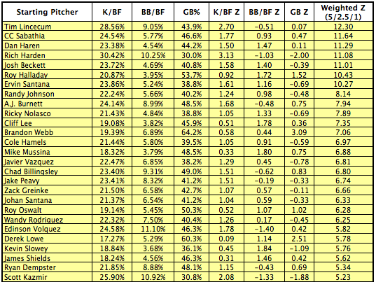
Tim Lincecum, CC Sabathia, Dan Haren, Roy Halladay, A.J. Burnett, Cliff Lee, Brandon Webb, Mike Mussina, Chad Billingsley, Roy Oswalt, Edinson Volquez, Derek Lowe, James Shields, and Ryan Dempster are all residents of the northeast quadrant. Sabathia, Haren, Halladay, Lee, Webb, Mussina, Oswalt, Lowe, and Shields are nine of the dozen pitchers from the K+/BB+/GB+ grouping. The other three are John Lackey, who heads up the second quintile; Andy Pettitte, ranked fourth in the second quintile and 31st overall; and Jon Lester, another member of the second quintile.
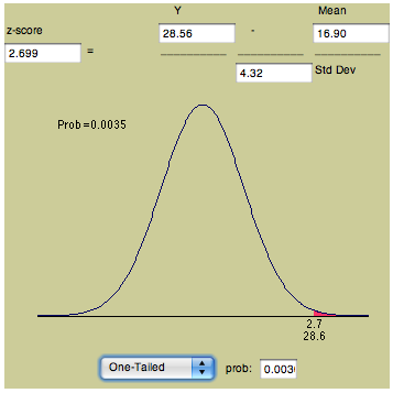
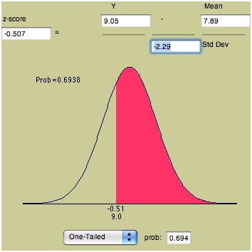
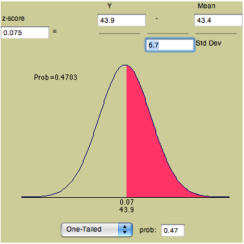
For purposes of illustration, I have included Lincecum's z-scores for K/BF and BB/BF (top row) and GB (bottom row) below. The colored portion of the normal distribution represents the area of probability. (You can compute your own z-scores in this applet.)
Lastly, here are the top 30 relievers as measured by z-scores.
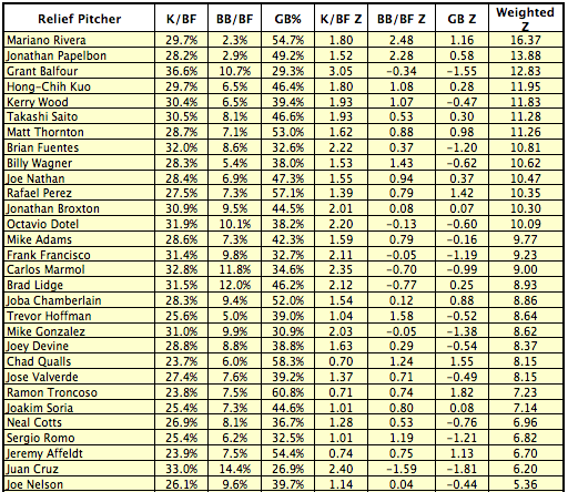
Mariano Rivera and Jonathan Papelbon 1-2. There must be something to this methodology.
Comments
Nice article. The spreadsheet did not upload, but I will blame my computer rather than your file.
Posted by: David Rasmussen at February 20, 2009 9:34 AM
I've been pushing the strikeouts and groundball pitcher type for a long time too, so I'm not complaining, but this is basically just xFIP with a slightly different proxy for batted ball stats, no?
I grabbed the data from THT, stuck in the spreadsheet, and the correlation between Weighted Z and xFIP was -.93. That's about as strong as an inverse correlation as you're going to get from two things that aren't completely identical.
Posted by: David Cameron at February 20, 2009 10:20 AM
Z-scores ... I love them. So simple, yet so informative.
Clearly you have to choose the best stats for it to work correctly, which is done here, though the sample size of each pitcher may need adjusting (see Grant Balfour). I've been tempted to create a multivariate effeciency control chart with similar metrics, but with weightings of my creation. However, I don't have the time to work on this ... just throwing it out there.
Posted by: Nate at February 20, 2009 10:29 AM
David: Yes. I didn't compute the correlation between the weighted z-scores and xFIP but noticed the strong similarity when comparing the two rankings. However, I had never seen anyone place an actual weighting on these variables but apologize if it is something I've overlooked. Furthermore, I like my presentation (showing the K, BB, and GB rates in percentage terms, particularly compared to the means, as well as detailing the standard deviations for each variable) and believe it is more comprehensive and revealing for those who wish to study the whys and wherefores of ERA, RA, FIP, or xFIP.
Posted by: Rich Lederer at February 20, 2009 10:40 AM
As a roto "not so geek", this stuff is genius in identifying Highly skilled pitchers and pockets of value. I mean, Mike Adams? Whos going to bid on Mike Adams? I might now after I look at him further.
Nice work!
Posted by: Rotodog at February 20, 2009 11:22 AM
This is probably inane (or just wrong) to somebody with a deep understanding of statistics, but...12.3 standard deviations from the norm?! That's way the hell out there, no? If these skills were distributed normally, that would be like the 99.9999999th percentile or something. Wow.
Posted by: Mark R at February 20, 2009 12:13 PM
Indeed, this is a fine piece of work and very helpful.
I believe, however, that Mike Adams is currently hurt and not expected to pitch much this season.
Posted by: TimberLee at February 20, 2009 12:13 PM
@Mark R: Keep in mind that you're looking at weighted Z-scores in that final column, so Lincecum is not 12.3 standard deviations from the mean.
He is, however, 2.70 standard deviations from the mean with regard to K/BF. Weighted at 5x, that puts his weighted Z for K/BF at 13.5. Then he loses a little bit due to his walk rate (-.51 * 2.5 = -1.275) and gains a mere 0.07 back from his GB% Z-score (weighted at 1x). Totaled, that's how we get 12.30.
Posted by: Ryan T at February 20, 2009 12:44 PM
wish it included last three years..
Posted by: curious at February 20, 2009 1:11 PM
Curious,
I like your line of thinking...
Posted by: wimbo at February 20, 2009 2:52 PM
Ryan:
Thanks for the clarification.
What significance does the weighted z-score end up having, though? Isn't it supposed to approximate the pitcher's total effectiveness relative to his peers?
Posted by: Mark R at February 20, 2009 6:05 PM
@Mark R: Yes, these Weighted Z's provide a measure of overall skill relative to other pitchers. However, that measure doesn't have a direct relationship to mean and standard deviation any longer once weightings are applied and totaled.
Notice that if you do a simple sum of Z-scores in individual skill categories, C.C. Sabathia actually has a higher cumulative Z-score than Lincecum (3.17 to 2.26). But, as Rich explained, K/BF is about 5 times as important as GB% and BB/BF is about 2.5 times as important as GB%, hence the 5:2.5:1 weightings.
Even though C.C. had better walk and ground ball rates in 2008, Lincecum's superior K-rate brings his weighted Z-score total above C.C.'s.
Posted by: Ryan T at February 20, 2009 11:19 PM
This is a very good method to identify the best pitchers. I use a similar method when I approximate fantasy baseball values. But, what does this add? It's a solid method and extremely well done, but I'm not sure I understand why this is any different than just ranking pitchers by QERA or adjusting FIP for neutral HR/FB numbers. It seems like somewhat of a lateral move, albeit an effective method with probably solid implications for other evaluations. Is there something I'm missing? Even if I'm not, it's definitely a very solid method, and I'm sure it's useful in many contexts. Well done.
Posted by: MattS at February 21, 2009 10:31 PM
Very nice! This is easy to understand intuitively, and the single-score summation gives a very nice way of ranking and comparing the pitchers.
If I could suggest one improvement: Instead of just selecting weights for the parameters ad hoc, it might be more effective to run a regression of the three weights on RA or ERA and use the parameters estimated by the regression (or some factor of them if you want to scale them) for the weights. It will probably improve your correlation between weighted mean and RA/ERA and might make it easier to explain where the weights came from.
Posted by: mravery at February 22, 2009 12:27 PM
are these adjusted for league and/or park? thanks.
Posted by: Travis G. at February 22, 2009 1:23 PM
The weighs were not selected ad hoc. I calculated and provided the correlations on each of the three variables as well as various weighted combinations. The latter correlations max out at just over .72 with the best fit at approximately 5-3-1 or 5-2.5-1, both of which produced almost identical correlations.
No, the K, BB, and GB rates, standard deviations, and z-scores are not adjusted for league or park effects.
Posted by: Rich Lederer at February 22, 2009 9:11 PM
Just out of curiosity what program are you using to generate the probability graphs?
Posted by: Ross at February 28, 2009 6:14 AM
This is really cool!! Do you think there is a way to calculate a team's z score?
Posted by: Amy at March 3, 2009 4:04 AM
Ross: The link to the applet for creating those probability graphs was provided directly above the images.
Amy: Sure. We didn't calculate z-scores for teams but the idea would apply at the club level as well. The spreadsheet is available via a link in the article should you wish to pursue this matter.
Posted by: Rich Lederer at March 3, 2009 7:23 AM
I ment to do a z-score for the entire team, not just the pitchers. I am actually doing a presentation for my MBA on the theory if the Phillies can win the world series title again in 2009. I have done a complete anaylsis on the stats from 2008 along with payroll and manager performamce, but was wondering if a z score could be done, and if so would it be a factor.I used the Cubs, Red Sox and rays in this anaylsis. Any help would be great.
Posted by: Amy at March 3, 2009 8:02 AM