Rich Lederer • Baseball Beat
Patrick Sullivan • Change-Up
Jeremy Greenhouse • Touching Bases
Dave Allen • F/X Visualizations
Sky Andrecheck • Behind the Scoreboard
Marc Hulet • Around the Minors
Al Doyle • Past Times
Retired Uniforms:
Bryan Smith • WTNY
Joe Sheehan • Command Post
Jeff Albert • The Batter's Eye
RSS Feed
Home
*Examining the Past, Present, and Future*
Lineup Card
Recent Entries
» Putting Together a Reality Team
» Historical Hall of Fame Vote Comparisons: 2012
» An All-Christmas Team
» The New-Look Angels
» John Denny: The Forgotten Cy Young Award Winner
» Money Isn't Everything
» What Would It Take to Hit .400 in the 21st Century?
» Halos Heaven
» Brandon McCarthy's Breakout Season
» Link-o-Rama
» Historical Hall of Fame Vote Comparisons: 2012
» An All-Christmas Team
» The New-Look Angels
» John Denny: The Forgotten Cy Young Award Winner
» Money Isn't Everything
» What Would It Take to Hit .400 in the 21st Century?
» Halos Heaven
» Brandon McCarthy's Breakout Season
» Link-o-Rama
Best of Baseball Beat
Abstracts From the Abstracts
1977 Baseball Abstract
1978 Baseball Abstract
1979 Baseball Abstract
1980 Baseball Abstract
1981 Baseball Abstract
1982 Baseball Abstract
1983 Baseball Abstract
1984 Baseball Abstract
1985 Baseball Abstract
1986 Baseball Abstract
1987 Baseball Abstract
1988 Baseball Abstract
1978 Baseball Abstract
1979 Baseball Abstract
1980 Baseball Abstract
1981 Baseball Abstract
1982 Baseball Abstract
1983 Baseball Abstract
1984 Baseball Abstract
1985 Baseball Abstract
1986 Baseball Abstract
1987 Baseball Abstract
1988 Baseball Abstract
Bert Blyleven Series
Meeting Up and Hanging Out with Bert
The Results Are In And...
Aficionado Heavily Invested in Blyleven
Latest on Blyleven's Chances for the HOF
The Internet Zealot Responds
400 Down and 5 to Go...
Bert Be Home By Eleven?
Blyleven's Forgotten Season (1973)
HeyMan, Your Comments Don't Hold Water
The Waiting is the Hardest Part
Another Addition to the Blyleven Series
Search for the Truth
As Dominant as His HOF Contemporaries
Listen, Buster
A Larger Step for Blyleven
Answering the Naysayers (Part Two)
Another Small Step for Blyleven
Q&A: Blyleven on the Twins
The Majority Rules, Right?
It's All Dutch to Some
The Hall of Fame Case for Bert Blyleven
Q&A: Blyleven on Felix Hernandez
Clemens Rocketing Up Charts
Poz: An Interview With a KC Star
A HOF Chat with Tracy Ringolsby
Up Close and Personal
A Peek Into the Mind of a HOF Voter
Answering the Naysayers
It's That Time of the Year (Again)
"If Cooperstown is Calling..."
The Bert Alert
One Small Step for Blyleven...
Only the Lonely
Exclusive Interviews
Lee Sinins
Alex Belth
David Pinto
Will Carroll
Mike Carminati
Aaron Gleeman
Joe Sheehan
Jay Jaffe
Jeff Peek
Tracy Ringolsby
Joe Posnanski
Bill James Part I, II, III
Jon Lalonde
Chuck Tiffany
Dayn Perry
Fay Vincent
Nate Silver
Alex Belth
David Pinto
Will Carroll
Mike Carminati
Aaron Gleeman
Joe Sheehan
Jay Jaffe
Jeff Peek
Tracy Ringolsby
Joe Posnanski
Bill James Part I, II, III
Jon Lalonde
Chuck Tiffany
Dayn Perry
Fay Vincent
Nate Silver
Bullpen
Rich Lederer
The Odd Couple (with Alex Belth)
The MostUnder Over Underrated Player in Baseball (with Brian Gunn)
Three Wise Men (roundtable by Alex Belth)
Infrequently Asked Questions (interview with Matt Welch)
Interview (Orioles Think Tank)
Bernie and the Yanks (Bronx Banter)
Hope and Faith: How the LAA Win the World Series (Baseball Prospectus)
NL West (The Soul of Baseball)
Greatest Living Hitter? (Sports Illustrated)
Roundtable: 2008 HOF Ballot (Armchair GM)
The Most
Three Wise Men (roundtable by Alex Belth)
Infrequently Asked Questions (interview with Matt Welch)
Interview (Orioles Think Tank)
Bernie and the Yanks (Bronx Banter)
Hope and Faith: How the LAA Win the World Series (Baseball Prospectus)
NL West (The Soul of Baseball)
Greatest Living Hitter? (Sports Illustrated)
Roundtable: 2008 HOF Ballot (Armchair GM)
Patrick Sullivan
Designated Hitters
David Bromberg (Q&A: John Denny)
Mark Armour (H. Killebrew and Versatility)
Joe Lederer (Soundtrack of a Prospect)
David Bromberg (Clemente's Autograph)
David Bromberg (Woody Fryman)
D. Baumstein (WAR Against Age: Pitchers)
Doug Baumstein (The WAR Against Age)
Doug Baumstein (A Lifetime on the Road)
John Fraser (Pick Six)
Mark Armour (How to Score More Runs?)
Bill Parker (What Opening Day Tells Us)
Stan Opdyke (Pat Rispole)
Chris Jaffe (Evaluating Baseball's Mgrs)
Stan Opdyke (Baseball Radio in NYC, 1953)
A. Nathan (Performance of Baseball Bats)
Michael Weddell (Edgar Martinez/HOF)
Jon Weisman (100 Things Dodgers Fans...)
Stan Opdyke (Connie Mack and Vin Scully)
Eric Walker (Evaluating Run Production)
Brent Mayne (The Intangibles of Catching)
Chris Moore (Best Fastballs in Baseball)
Dave Baldwin (The Batter’s Brain)
Shawn Haviland (Ivy League to MLB)
Larry Granillo (Walking Off)
Rob Iracane (Solo HR Won't Break You)
Tommy Bennett (Charm of AM Radio)
Harry Pavlidis (Johan Santana's Fast Start)
John Walsh (WAR and Remembrance)
Eric Walker (Precisely Inaccurate)
Bob Timmermann (As They See 'Em)
Geoff Young (Unicycles and Delusions)
Baseball Analysis at Tufts (Groundballers)
Baseball Analysis at Tufts (GB Out Rates)
G. Rybarczyk ('09 Hit Tracker Projections)
Joe Lederer (Curt Schilling/HoF)
Conor Gallagher (Hall of Fallacies)
Chris Green (Jim Rice, HoF, the Numbers)
Shawn Hoffman (Baseball's Bear Mkt?)
Paul Anthony (Manny Syndrome)
Ross Roley (World Series Odds)
B. Timmermann (Catcher's Interference)
R.J. Anderson (Waiting the Hardest Part)
Maury Brown (Cubs, MLB, and Cuban...)
Myron Logan (Dee-Fense, Dee-Fense)
Craig Calcaterra (Frivolity, Part I, Part II)
Chad Finn (Ode to Baseball Cards)
David Cameron (Mariners Foibles)
Chris Dial (Chipper Jones)
Pat Lederer (Memory Lane)
David Appelman (Clutch Pitching)
Bob Rittner (DH)
Jonathan Mayo (Roger Clemens)
Lisa Winston (My Son-in-Law...)
Russ McQueen (The Yellow Hammer)
Bob Rittner (I'm OK, You're OK)
Mark Armour (In Defense of the HOF)
Pat Jordan (Friends)
Dan Levitt (Analysis of Terry Ryan)
Doug Baumstein (Trading Econ 101)
Ross Roley (Runner's Reluctance II)
Ross Roley (Runner's Reluctance I)
Mark Armour (No-Longer Lovable Sox)
Bruce Regal (Stealthy and Wise)
Brian Gunn (Roid Monster)
Current/McEvoy (Value of the SB)
John Rickert (Sinister Thefts)
Nate Silver (Sabermetrics)
David Vincent (Home Run Production)
Joe P. Sheehan (Enhanced Gameday II)
Mark Armour (An Ode to Sport)
David Gassko (All-Time Worm Burners)
Joe P. Sheehan (Enhanced Gameday)
John Walsh (When Titans Clash)
Fox/Williams (Quantifying Coaches II)
Fox/Williams (Quantifying Coaches I)
Jacob Luft (Bull Durham Rant)
Chad Finn (Strat-O-Matic)
Lisa Winston (Rotisserie Baseball)
Dave Studeman (Baseball Stats)
Steve Treder (Roger Craig)
Marc Normandin (Jeff Bagwell)
D. Appelman (Expanding Strike Zone)
Jeff Sackmann (Worst MiL Defenders)
Jeff Sackmann (Best MiL Defenders)
Maxwell Kates (Van Lingle Mungo)
David Appelman (Pitch Location)
Kent Bonham (Danny Ray Herrera)
Glenn Stout (Two Baseball Poems)
Bruce Regal (The Challenge Round)
Mark Lamster (Barry & Ty)
Geoff Young (NL West)
Tom Lederer (The Ryan Express)
Brian Erts (Great Leap Forward)
David Pinto (Parity and the N.L.)
Jacob Luft (Fathers and Daughters)
Jamey Newberg (Pete's Sake)
Jeff Albert (A. Jones Swing Analysis)
Jeff Albert (A-Rod Swing Analysis)
Keith Law (Death, Taxes, and Waivers)
Peter Abraham (Tales of Torre Tales)
Larry Borowsky (Let 'er Rip II)
Dan Levitt (Empirical Analysis of Bunting)
Jonah Keri (If I Met Warren Cromartie...)
Bob Klapisch (War Stories)
Bob Timmermann (John F. Kennedy HS)
Kent Bonham (Aluminum Adjustments)
Al Doyle (More Than Superstars)
Ross Roley (Instant Replay)
David Vincent (Barry Bonds Homers)
Chad Finn (Our Favorite Obscurities)
Bill Deane (1979 NL MVP)
Mark Armour (Rise/Fall of Artificial Turf)
Jeff Angus (Wally Moon Camp)
David Berri (Money and Baseball)
Larry Borowsky (Baseball w/o the #s)
Derek Zumsteg (The Irrational Market)
David Regan (Free Agent Contracts)
Peter Schmuck (Steroids and the HOF)
David Appelman (Pitchers, Pitch by Pitch)
Dan Fox (Swinging, Taking, Fouling, Etc)
Patrick Sullivan (Study of NYY CF/BOS LF)
Will Leitch (Baseball Journalism)
Jeff Sullivan (Pitcher Release Points)
Steve Treder ('69-'70 Giants)
Maury Brown (Charlie Finley)
John Brattain (Bob Johnson)
Bob Klapisch (The Case for Bert Blyleven)
Jeff Peek (Pride and Prejudice)
Dayn Perry (Bert and Warren)
Rob Neyer (If Don Sutton Was Great...)
Lisa Winston (Minor League Memories)
Alex Belth (Otis Redding Was Right)
David Cameron (Long Live the King)
Jeff Angus (Baserunning Study)
Bert Blyleven (Baseball Playoffs)
Boyd Nation (Not a Prospect List)
James Click (Batters-Baserunners Study)
Jeff Shaw (Why I Love Baseball)
David Gassko (BIP/BFP Fielding Study)
Jay Jaffe (Milwaukee Sausage Race)
Jamey Newberg (Remember When)
Bob Klapisch (Press Box to the Mound)
Dan Levitt (Predictive Value of BB)
David Vincent (Official Scorer)
Jon Weisman (Rick Monday)
Larry Borowsky (Let 'er Rip)
Will Carroll (Fictional Short Story)
Bob Timmermann (Japanese Baseball)
Cyril Morong (Best Pitching Seasons)
Sean Forman (Monte Carlo Win-Loss)
Brian Gunn (My Little Blue Book)
Joe Lederer (My Dad and Baseball)
Bill Deane (Bob Gibson, 1968)
Mark Armour (1977 Yankees)
Darren Viola (Retrosheet)
David Pinto (RFK)
Dayn Perry (Brave Heart)
Matt Welch (Dave Hansen)
Kevin Kernan (Jack McKeon)
Tom Lederer (Dodgers Road Trip)
Steve Lombardi (Slider)
Studes (Picturing Baseball)
Mike Carminati (Luck of the Drawl)
Eric Neel (Vin Scully)
J.C. Bradbury (Leo Mazzone)
John Sickels (Bill James)
Search Baseball Analysts
Archives
By Category:
Around the Majors Content Only
Around the Minors Content Only
Baseball Beat Content Only
Baseball Beat/Change-Up Content Only
Baseball Beat/WTNY Content Only
Behind the Scoreboard Content Only
Change-Up Content Only
Change-Up/Around the Majors Content Only
Command Post Content Only
Crunching the Numbers Content Only
Designated Hitter Content Only
F/X Visualizations Content Only
Past Times Content Only
Saber Talk Content Only
The Batter's Eye Content Only
Touching Bases Content Only
Weekend Blog Content Only
WTNY Content Only
By Month:
February 2012
January 2012
December 2011
October 2011
September 2011
August 2011
July 2011
June 2011
May 2011
April 2011
March 2011
February 2011
January 2011
December 2010
November 2010
October 2010
September 2010
August 2010
July 2010
June 2010
May 2010
April 2010
March 2010
February 2010
January 2010
December 2009
November 2009
October 2009
September 2009
August 2009
July 2009
June 2009
May 2009
April 2009
March 2009
February 2009
January 2009
December 2008
November 2008
October 2008
September 2008
August 2008
July 2008
June 2008
May 2008
April 2008
March 2008
February 2008
January 2008
December 2007
November 2007
October 2007
September 2007
August 2007
July 2007
June 2007
May 2007
April 2007
March 2007
February 2007
January 2007
December 2006
November 2006
October 2006
September 2006
August 2006
July 2006
June 2006
May 2006
April 2006
March 2006
February 2006
January 2006
December 2005
November 2005
October 2005
September 2005
August 2005
July 2005
June 2005
May 2005
April 2005
March 2005
February 2005
January 2005
December 2004
November 2004
October 2004
September 2004
August 2004
July 2004
June 2004
May 2004
April 2004
March 2004
February 2004
January 2004
December 2003
November 2003
October 2003
September 2003
August 2003
July 2003
June 2003
Reference
Organizational Stats
Arizona Diamondbacks Bat / Pitch
Atlanta Braves Bat / Pitch
Baltimore Orioles Bat / Pitch
Boston Red Sox Bat / Pitch
Chicago Cubs Bat / Pitch
Chicago White Sox Bat / Pitch
Cincinnati Reds Bat / Pitch
Cleveland Indians Bat / Pitch
Colorado Rockies Bat / Pitch
Detroit Tigers Bat / Pitch
Florida Marlins Bat / Pitch
Houston Astros Bat / Pitch
Kansas City Royals Bat / Pitch
Los Angeles Angels Bat / Pitch
Los Angeles Dodgers Bat / Pitch
Milwaukee Brewers Bat / Pitch
Minnesota Twins Bat / Pitch
New York Mets Bat / Pitch
New York Yankees Bat / Pitch
Oakland Athletics Bat / Pitch
Philadelphia Phillies Bat / Pitch
Pittsburgh Pirates Bat / Pitch
St. Louis Cardinals Bat / Pitch
San Diego Padres Bat / Pitch
San Francisco Giants Bat / Pitch
Seattle Mariners Bat / Pitch
Tampa Bay Devil Rays Bat / Pitch
Texas Rangers Bat / Pitch
Toronto Blue Jays Bat / Pitch
Washington Nationals Bat / Pitch
All-Star Links
Official Websites
News and Notes
Baseball News Blog
Baseball Newstand
ESPN Baseball
Fox Sports Baseball
Pro Sports Daily
Roto World
The Roto Times
USA Today Baseball
Baseball Newstand
ESPN Baseball
Fox Sports Baseball
Pro Sports Daily
Roto World
The Roto Times
USA Today Baseball
Reference and Analysis
Baseball Almanac
Baseball America
Baseball Archive
Baseball Contracts
Baseball Cube
Baseball Graphs
Baseball Library
Baseball Musings Player Database
Baseball Page
Baseball Primer
Baseball Prospectus
Baseball Reference
Baseball Statistics
Baseball Truth
Boxscore Central
Diamond Mind Baseball
Doug's Stats
FanGraphs
Fast Balls (pitchfx catalog)
Hardball Dollars
Hardball Times
Hit Tracker
Retrosheet
Rotobase/Rotoblog
Stat Corner
STATS
Tango on Baseball
Yahoo Sports MLB
Web Gems
Bill James Primer
Sabermetric Manifesto (Grabiner)
Pitching and Defense (McCracken)
Pitching and Defense (Tippett)
Transactions Primer (Neyer)
Baseball Stats (Batter's Box)
Prospect Report (Cameron)
Pitcher Workloads (Sheehan)
Goodbye to Old Baseball Ideas (Rickey)
Sabermetric Manifesto (Grabiner)
Pitching and Defense (McCracken)
Pitching and Defense (Tippett)
Transactions Primer (Neyer)
Baseball Stats (Batter's Box)
Prospect Report (Cameron)
Pitcher Workloads (Sheehan)
Goodbye to Old Baseball Ideas (Rickey)
Columnists
Baseball Blogs
Around the Majors
Athletics Nation
Baseball Crank
Baseball Musings
Baseball-Reference Blog
Batter's Box
Big League Stew
Bronx Banter
Catfish Stew
Cub Town
Dan Agonistes
Dodger Thoughts
DRays Bay
Ducksnorts
Futility Infielder
Halos Heaven
Inside the Rockies
It Might Be Dangerous
Knuckle Curve
LoHud Yankees Blog
Lookout Landing
Management by Baseball
Metaforian
Metsgeek
Mike's Baseball Rants
Only Baseball Matters
Redbird Nation
Red Reporter
Sabernomics (Braves)
Seth Speaks
ShysterBall
6-4-2 (Angels/Dodgers)
The Book
TheCubdom
The Cutting Edge
The House That Dewey Built
The View From The Bleachers
Tiger Blog
U.S.S. Mariner
Viva El Birdos
Where's Kernan
Minor Leagues
Arizona Fall League
BA Player Finder
Cal Leaguers
Jamey Newberg
JDM's Scoresheet Baseball
Minor League Baseball
Minor League Park Factors
Minor League Splits
No Pepper
Sickels' Minor League Ball
Warm October Nights
BA Player Finder
Cal Leaguers
Jamey Newberg
JDM's Scoresheet Baseball
Minor League Baseball
Minor League Park Factors
Minor League Splits
No Pepper
Sickels' Minor League Ball
Warm October Nights
Amateur
Boyd's World (College)
Cape Cod Baseball League
College Baseball Blog
College Baseball Insider
Collegiate Baseball Newspaper
College Splits
College Splits Blog
Dirtbags Baseball (Long Beach State)
NCAA Baseball
NCBWA
Team One Baseball (High School)
Texas A&M & Baseball
Cape Cod Baseball League
College Baseball Blog
College Baseball Insider
Collegiate Baseball Newspaper
College Splits
College Splits Blog
Dirtbags Baseball (Long Beach State)
NCAA Baseball
NCBWA
Team One Baseball (High School)
Texas A&M & Baseball
Historical
Cuban Baseball
House of David
Jim "Mudcat" Grant's Web Page
Negro League Baseball Players Assoc
Negro Leagues Baseball Museum
1919 Black Sox
Pacific Coast League
Philadelphia Athletics Historical Society
Shoeless Joe Jackson Society
SABR-L Archives
Walter O'Malley
House of David
Jim "Mudcat" Grant's Web Page
Negro League Baseball Players Assoc
Negro Leagues Baseball Museum
1919 Black Sox
Pacific Coast League
Philadelphia Athletics Historical Society
Shoeless Joe Jackson Society
SABR-L Archives
Walter O'Malley
Miscellaneous
Forums
Credits
Ticket Center
Tickets to Baseball -
Premium Red Sox Tickets - Tickets to Marlins Games - Cardinals Game Tickets - NY Yankee Tickets - Tickets Oakland Athletics - Dallas Cowboys Tickets - Arizona Cardinals Tickets - Tickets Seattle Seahawks - Buffalo Bills Tickets Online - Tickets to Dolphins Football
Buy Boston Red Sox tickets,
Philadelphia Phillies tix,
NY Yankees tickets,
NY Mets tickets, and
MLB All Star game tickets at ABC tickets
Not sure where to find the best online sportsbooks? Start your search with PlayersJet.
Get deals at SportsMemorabilia.com on baseball apparel, including Phillies jerseys and more for adults and children.
Shop the largest selection baseball equipment on sale at Sports Unlimited. Check out tons of baseball gloves, youth baseball gloves and catchers gear from Rawlings, Wilson, Nike & Under Armour.
2011 Draft Order
Courtesy of Baseball America
First-Round:
 1. Pirates (57-105)
 2. Mariners (61-101)
 3. Diamondbacks (65-97)
 4. Orioles (66-96)
 5. Royals (67-95)
 6. Nationals (69-93)
 7. Diamondbacks (for B. Loux)
 8. Indians (69-93)
 9. Cubs (75-87)
10. Padres (for Karsten Whitson)
11. Astros (76-86)
12. Brewers (77-85)
13. Mets (79-83)
14. Marlins (80-82)
15. Brewers (for Dylan Covey)
16. Dodgers (80-82)
17. Angels (80-82)
18. Athletics (81-81)
19. Red Sox (from DET for Martinez)
20. Rockies (83-79)
21. Blue Jays (85-77)
22. Cardinals (86-76)
23. Nationals (from CWS for Dunn)
24. Rays (from BOS for Crawford)
25. Padres (90-72)
26. Red Sox (from TEX for Beltre)
27. Reds (91-71)
28. Braves (91-71)
29. Giants (92-70)
30. Twins (94-68)
31. Rays (from NYY for Soriano)
32. Rays (96-66)
33. Rangers (from PHI for Lee)
Supplemental First Round:
34. Nationals (Dunn)
35. Blue Jays (Downs)
36. Red Sox (Martinez)
37. Rangers (Lee)
38. Rays (Crawford)
39. Phillies (Werth)
40. Red Sox (Beltre)
41. Rays (Soriano)
42. Rays (Balfour)
43. Diamondbacks (LaRoche)
44. Mets (Feliciano)
45. Rockies (Dotel)
46. Blue Jays (Buck)
47. White Sox (Putz)
48. Padres (Garland)
49. Giants (Uribe)
50. Twins (Hudson)
51. Yankees (Vazquez)
52. Rays (Benoit)
53. Blue Jays (Olivo)
54. Padres (Torrealba)
55. Twins (Crain)
56. Rays (Choate)
57. Blue Jays (Gregg)
58. Padres (Correia)
59. Rays (Hawpe)
| Touching Bases | May 07, 2009 |
Findings from the Free Agent Market
Curt Flood really started something with this whole free agency thing, huh? Using ESPN’s Free Agent Tracker, I collected data for all free agents since 2006 and used regression analysis to pick up on some trends.
WAR to Wages
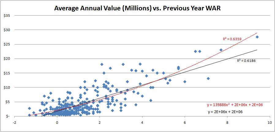
This offseason, Fangraphs unveiled its Wins Above Replacement measure in the Value section of its stats pages. WAR is a statistic that combines offensive, defensive and positional value and sets it against a replacement-level baseline to find the marginal wins a player contributes to his team. There has been debate over how to convert these marginal wins into a marginal value in terms of dollars. One of the first things I looked at was whether the relationship between WAR and salary was linear or nonlinear. I plotted the WAR from each free agent's contract year—excluding those who were injured all year or who came over from Japan—against the average annual value of the contract they signed.
I admit that before having seen any data, I had a bias toward the nonlinear relationship, since it just makes intuitive sense to me.
The regression lines look rather similar. It would appear that the nonlinear regression has an advantage at the extremes, since it won’t predict negative salaries for very negative WAR and it better captures the exponential value of superstar players. However, there is little difference between the regression lines for the vast majority of players, those between 0 WAR and 5 WAR. The R2 values, which measure the percentage of variance of Average Annual Value that is explained by WAR,, are similar at an impressive .62-.64 range. This affirms that a single year of WAR captures a lot of a player’s value. Keep in mind when looking at these R2 values that the R2 will always increase in a polynomial equation due to the nature of adding a new term, so we definitely cannot make any conclusions about either method from this graph alone.
Time 100’s own Nate Silver, in deriving Marginal Value Over Replacement Player, used a nonlinear form of WARP . I have duplicated his graph here which projects WARP for 2005's free agent class by using three years of WARP from 2002-2004 instead of the one previous year of WAR I used for 2006-2008 free agents. I have superimposed a rough line of best fit to portray the difference between a linear and nonlinear model.
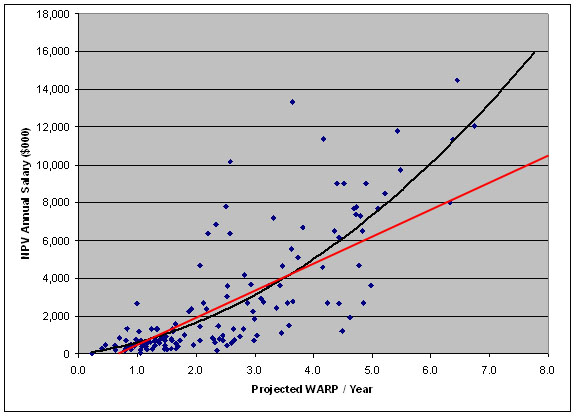
The thinking behind a nonlinear model is that there is an abnormal distribution of talent in baseball, which makes top talent disproportionately more valuable than average talent.
Phil Birnbaum shows that individual skills in the major leagues may be normally distributed. Anecdotally, this is reaffirmed by the 20-80 scouting scale, which is based on a normal distribution with a mean of 50 and standard distribution of 10. Furthermore, Tom Tango shows that “when you consider the number of opportunities each player gets (in the Major Leagues), the total effective talent distribution is rather typical.”
However, when observing only the Major Leagues, we neglect the fact that most subpar baseball talent resides at another level. There is an abundance of freely available talent that could provide marginal upgrades to current Major Leaguers. What this means in terms of player value is that below-average players will be disproportionately underpaid compared to above-average players due to the difference in the supply within each pool.
Bill James once wrote “talent in baseball is not normally distributed. It is a pyramid. For every player who is 10 percent above the average player, there are probably twenty players who are 10 percent below average.” I believe this theory holds if by baseball he means the total baseball universe and by average he means the Major League average. So, Tango may be right that, at the Major League level, talent follows a normal distribution, but when we add talent from all player pools, the curve does begin to look like the right tail of a normal distribution.
Think of it this way: would you rather have the right side of the Cardinals’ infield or the Reds’ infield? The combinations of Albert Pujols/Skip Schumaker and Joey Votto/Brandon Phillips will both produce 8 WAR, give or take. Through the currently dominant model for fair-market evaluation, both sets of players are worth some $35 million if you simply multiply their WAR by $4-5 million. But my intuition tells me that I'd rather have the pair on the Cardinals. The key is that Pujols takes up only one roster spot and provides the same value of a pair of players who take up two. I might be able to upgrade over Schumaker on the cheap eventually. We also must account for the fact that freely available talent is, well, free, while the superstars who bring in 5+ WAR will need to be acquired through trading or bidding.
Furthermore, I found statistically significant evidence that the Type A tag for free agents is correlated with increased pay. In a practical sense, the Type A label decreases a player's value in a free market since it costs prospective teams a first-round pick to acquire the player or the label costs the player in leverage if he tries to re-sign with his former team. However, Type A free agents tend to be the best players in my sample, so it is evident that teams ignore the Type A tag and are willing to spend what it takes to reel in superior players.
Separating position players and pitchers, I find that is much easier to predict position players' salaries in general, and the nonlinear regression fits better for position players than it does for pitchers. In separating the two pools of players, I decided to test for some skills that do not translate into a hitter’s or pitcher’s WAR, but still might directly relate to his salary.
General Managers dig the fastball
Fangraphs keeps track of pitch usage and velocity for all pitchers since 2002, and all the data can be easily exported to a spreadsheet. This is a good thing for baseball analysts. Dave Allen and Dan Turkenopf both used pitch f/x data to show how velocity relates to production. In these regressions, I account for a player’s WAR, and therefore can try to isolate the effect of a pitcher’s fastball velocity on his salary. Here is the regression output.
      Source |       SS       df       MS              Number of obs =     149
-------------+------------------------------           F(  4,   144) =   62.82
       Model |  1.7252e+15     4  4.3131e+14           Prob > F      =  0.0000
    Residual |  9.8863e+14   144  6.8655e+12           R-squared     =  0.6357
-------------+------------------------------           Adj R-squared =  0.6256
       Total |  2.7139e+15   148  1.8337e+13           Root MSE      =  2.6e+06
------------------------------------------------------------------------------
         aav |      Coef.   Std. Err.      t    P>|t|     [95% Conf. Interval]
-------------+----------------------------------------------------------------
         WAR |    2399138   153233.6    15.66   0.000      2096260     2702016
         fbv |   164514.8   72588.22     2.27   0.025     21038.76    307990.9
          o7 |  -423055.5   545027.9    -0.78   0.439     -1500344    654233.1
          o8 |   -1365307   508682.7    -2.68   0.008     -2370757   -359857.4
       _cons |  -1.19e+07    6496299    -1.83   0.069    -2.47e+07    954444.2
------------------------------------------------------------------------------
This means that there is statistically significant evidence that fastball velocity (fbv) contributes to a pitcher’s salary. Every additional mile per hour harder a pitcher throws, he is paid about $165,000. Fastball velocities typically range from 85 MPH to 95 MPH, so if two players were to put up the same WAR, but one was a soft tosser and the other a flame thrower, in an auction teams may bid up to a couple million dollars more for the harder thrower, based on that skill alone.
I created two player pools, separating those with above-average fastball velocities and those with below-average fastball velocities. The average fastball in my sample of 149 pitchers travels 89.7 miles per hour. The WAR of both player pools is nearly identical, as the harder throwers average .97 WAR compared to .96 WAR for the softer throwers. Yet the harder throwers earned $4.9 million per year in free agency compared to $4.2 million for the latter group. Perhaps fastball velocity predicts future performance, or perhaps there is an allure to signing a player who can light up the radar gun, or maybe fans come out to see fast pitchers. No matter the case, throwing hard gets you paid.
I also included time-fixed effects in this regression, setting dummy variables to represent the year during which the pitcher became a free agent. We find statistically significant evidence of deflation in 2008. While 2006 and 2007 appear stable in terms of free agent salaries, pitchers with similar production in 2008 were liable to lose on average a million dollars per year on their contract because they hit the market at the wrong time.
General Managers dig the longball
By longball, I don’t mean home runs. I mean actual distance. From Hit Tracker, I included the average true distance in feet of home runs for all players in my dataset..I also included weight of a player in pounds, which might measure raw power or might measure nothing, but was significant in the regression. Unfortunately, weight is also probably the least accurate data point I could use since there are no reliable sources for it.
      Source |       SS       df       MS              Number of obs =     169
-------------+------------------------------           F(  3,   165) =  123.05
       Model |  2.5996e+15     3  8.6653e+14           Prob > F      =  0.0000
    Residual |  1.1620e+15   165  7.0421e+12           R-squared     =  0.6911
-------------+------------------------------           Adj R-squared =  0.6855
       Total |  3.7616e+15   168  2.2390e+13           Root MSE      =  2.7e+06
------------------------------------------------------------------------------
         aav |      Coef.   Std. Err.      t    P>|t|     [95% Conf. Interval]
-------------+----------------------------------------------------------------
         WAR |    2256088   125521.3    17.97   0.000      2008253     2503923
        true |   28062.52   13259.32     2.12   0.036     1882.712    54242.32
      weight |    24497.9   10709.87     2.29   0.023     3351.842    45643.95
       _cons |  -1.49e+07    4881150    -3.05   0.003    -2.45e+07    -5253468
------------------------------------------------------------------------------
These measures are essentially independent of WAR but do affect salary. I believe home run distance and weight are actually capturing the phenomenon that has shown that there is a stronger correlation between slugging percentage and salary than between salary and most any other basic statistic. Weight and True Distance correlate very well with slugging percentage. We can say with confidence that there is a bias toward heavier players who hit for power, all else being equal. For every ten pounds of weight or ten feet in home run distance, a hitter can expect a positive return averaging around 250 grand.
This is not to say whether paying these players more for the ability to throw fast or hit long home runs is efficient or not. I did this analysis to observe trends in the market over the last few years, and I am not trying to comment on any sort of inefficiencies that may exist.
Thanks to all the data sources I used in this study including ESPN, Fangraphs, Hit Tracker, Forbes, and Fantasypitchfx
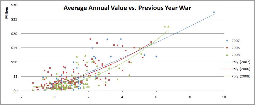
Edit: At Jake's request, I have separated the data series by year and added separate trendlines for each year.
Comments
Easy suggestion: use "millions of dollars" instead of just dollars. It will just make it easier on the eyes.
Posted by: Alex at May 7, 2009 5:57 AM
Why did you regress against the previous year WAR instead of some sort of projection of next year WAR? For example Marcel's 5/3/2 weighing of the last 3 years seems like a sensible choice.
The criticism of regressing salary against WARP was that WARP had a very low replacement level, which made the resulting line have a parabolic shape. Tango's opinion was that with a properly constructed WAR (fangraphs uses his research I believe) a linear relationship was better.
Posted by: Anonymous Coward at May 7, 2009 6:16 AM
Alex, thanks for the suggestion. I'll try that out for the graph.
Anonymous, I agree that creating a projection would have been a better method, and a 5/3/2 rating as Silver and Marcel did would have been easy. It was just that I collected data a couple months ago and when I decided to use it for these purposes I was too lazy to go back and find players' previous years worth of WAR. Not really any excuse.
I am aware of the criticism of regressing salary against WARP. I am not sure which relationship is "better," but a parabolic shape is inevitable when using a second-order polynomial equation, as Silver did, and I repeated. A linear shape appears to be less complicated, which is a plus, and seems to get similar results to more complicated models for 90% of players, which is also a point in its favor.
Posted by: Jeremy Greenhouse at May 7, 2009 9:28 AM
Interesting.
In the first chart, I might make a suggestion for the data visualization. Since you lumped several years of contracts into one graph it misses a chance to explain a whole lot more. A new chart (same basic format) with the contracts grouped by the time of signing would allow us to distinguish year-by-year patterns. I see the chart is from excel, it would be quite painless to assign different groups different colored dots.
The external environment makes a huge deal as we saw this past free agent period.
Posted by: Jake Russ at May 7, 2009 9:32 AM
The correlation between home run distance and fast ball speed and salary is not surprising. For projecting future performance, a player who hits the ball farther or throws faster would appear less likely to regress and have a greater possibility of breaking out than the weaker, but equally valuable player.
Posted by: Doug B. at May 7, 2009 10:54 AM
Doug, agreed. The important thing is that the numbers bear that out.
Posted by: Jeremy Greenhouse at May 7, 2009 12:47 PM
Jeremy,
Interesting.
I have a suggestion for the first chart, if you group the scatter points by years, you can get excel to plot the groups in different colors.
This would add a lot to the graph, there is a lot going on and being able to see the patterns based on the years would be very helpful to the message you are trying to get across.
As we saw this free agent period, the external market factors can have a big play on salaries.
Posted by: Jake Russ at May 7, 2009 1:20 PM
Jake, thanks for the suggestion. I don't currently have the data in front of me, but I'll try playing around with it when I do.
Great article on the height of Major Leaguers. I tested for height but nothing significant came up in its relationship with salary. Maybe I should have broken it down into tall, average, and short players since the relationship with height and production isn't linear apparently.
Posted by: Jeremy Greenhouse at May 7, 2009 11:05 PM
Opps on the double post. I figured 5 hours after I'd originally posted the comment and more people had been put up there that mine had failed somehow.
Would love to see the chart again after you make whatever adjustments to it.
Appreciate the comment on my article, I'm not surprised height wasn't significant. It hasn't been shown to be significant influence on any performance metric I'm aware of either. And its not a case of not being 95% sig, its not even been close. I've been looking at that question a while a now. Plus the data doesn't have enough variation in it because 95% of MLB pitchers are between 6'0 - 6'8". So when we see outcomes that persist in this fashion, I have to chalk it up to natural selection telling us something.
Posted by: Jake Russ at May 8, 2009 6:00 AM