Rich Lederer • Baseball Beat
Patrick Sullivan • Change-Up
Jeremy Greenhouse • Touching Bases
Dave Allen • F/X Visualizations
Sky Andrecheck • Behind the Scoreboard
Marc Hulet • Around the Minors
Al Doyle • Past Times
Retired Uniforms:
Bryan Smith • WTNY
Joe Sheehan • Command Post
Jeff Albert • The Batter's Eye
RSS Feed
Home
*Examining the Past, Present, and Future*
Lineup Card
Recent Entries
» Putting Together a Reality Team
» Historical Hall of Fame Vote Comparisons: 2012
» An All-Christmas Team
» The New-Look Angels
» John Denny: The Forgotten Cy Young Award Winner
» Money Isn't Everything
» What Would It Take to Hit .400 in the 21st Century?
» Halos Heaven
» Brandon McCarthy's Breakout Season
» Link-o-Rama
» Historical Hall of Fame Vote Comparisons: 2012
» An All-Christmas Team
» The New-Look Angels
» John Denny: The Forgotten Cy Young Award Winner
» Money Isn't Everything
» What Would It Take to Hit .400 in the 21st Century?
» Halos Heaven
» Brandon McCarthy's Breakout Season
» Link-o-Rama
Best of Baseball Beat
Abstracts From the Abstracts
1977 Baseball Abstract
1978 Baseball Abstract
1979 Baseball Abstract
1980 Baseball Abstract
1981 Baseball Abstract
1982 Baseball Abstract
1983 Baseball Abstract
1984 Baseball Abstract
1985 Baseball Abstract
1986 Baseball Abstract
1987 Baseball Abstract
1988 Baseball Abstract
1978 Baseball Abstract
1979 Baseball Abstract
1980 Baseball Abstract
1981 Baseball Abstract
1982 Baseball Abstract
1983 Baseball Abstract
1984 Baseball Abstract
1985 Baseball Abstract
1986 Baseball Abstract
1987 Baseball Abstract
1988 Baseball Abstract
Bert Blyleven Series
Meeting Up and Hanging Out with Bert
The Results Are In And...
Aficionado Heavily Invested in Blyleven
Latest on Blyleven's Chances for the HOF
The Internet Zealot Responds
400 Down and 5 to Go...
Bert Be Home By Eleven?
Blyleven's Forgotten Season (1973)
HeyMan, Your Comments Don't Hold Water
The Waiting is the Hardest Part
Another Addition to the Blyleven Series
Search for the Truth
As Dominant as His HOF Contemporaries
Listen, Buster
A Larger Step for Blyleven
Answering the Naysayers (Part Two)
Another Small Step for Blyleven
Q&A: Blyleven on the Twins
The Majority Rules, Right?
It's All Dutch to Some
The Hall of Fame Case for Bert Blyleven
Q&A: Blyleven on Felix Hernandez
Clemens Rocketing Up Charts
Poz: An Interview With a KC Star
A HOF Chat with Tracy Ringolsby
Up Close and Personal
A Peek Into the Mind of a HOF Voter
Answering the Naysayers
It's That Time of the Year (Again)
"If Cooperstown is Calling..."
The Bert Alert
One Small Step for Blyleven...
Only the Lonely
Exclusive Interviews
Lee Sinins
Alex Belth
David Pinto
Will Carroll
Mike Carminati
Aaron Gleeman
Joe Sheehan
Jay Jaffe
Jeff Peek
Tracy Ringolsby
Joe Posnanski
Bill James Part I, II, III
Jon Lalonde
Chuck Tiffany
Dayn Perry
Fay Vincent
Nate Silver
Alex Belth
David Pinto
Will Carroll
Mike Carminati
Aaron Gleeman
Joe Sheehan
Jay Jaffe
Jeff Peek
Tracy Ringolsby
Joe Posnanski
Bill James Part I, II, III
Jon Lalonde
Chuck Tiffany
Dayn Perry
Fay Vincent
Nate Silver
Bullpen
Rich Lederer
The Odd Couple (with Alex Belth)
The MostUnder Over Underrated Player in Baseball (with Brian Gunn)
Three Wise Men (roundtable by Alex Belth)
Infrequently Asked Questions (interview with Matt Welch)
Interview (Orioles Think Tank)
Bernie and the Yanks (Bronx Banter)
Hope and Faith: How the LAA Win the World Series (Baseball Prospectus)
NL West (The Soul of Baseball)
Greatest Living Hitter? (Sports Illustrated)
Roundtable: 2008 HOF Ballot (Armchair GM)
The Most
Three Wise Men (roundtable by Alex Belth)
Infrequently Asked Questions (interview with Matt Welch)
Interview (Orioles Think Tank)
Bernie and the Yanks (Bronx Banter)
Hope and Faith: How the LAA Win the World Series (Baseball Prospectus)
NL West (The Soul of Baseball)
Greatest Living Hitter? (Sports Illustrated)
Roundtable: 2008 HOF Ballot (Armchair GM)
Patrick Sullivan
Designated Hitters
David Bromberg (Q&A: John Denny)
Mark Armour (H. Killebrew and Versatility)
Joe Lederer (Soundtrack of a Prospect)
David Bromberg (Clemente's Autograph)
David Bromberg (Woody Fryman)
D. Baumstein (WAR Against Age: Pitchers)
Doug Baumstein (The WAR Against Age)
Doug Baumstein (A Lifetime on the Road)
John Fraser (Pick Six)
Mark Armour (How to Score More Runs?)
Bill Parker (What Opening Day Tells Us)
Stan Opdyke (Pat Rispole)
Chris Jaffe (Evaluating Baseball's Mgrs)
Stan Opdyke (Baseball Radio in NYC, 1953)
A. Nathan (Performance of Baseball Bats)
Michael Weddell (Edgar Martinez/HOF)
Jon Weisman (100 Things Dodgers Fans...)
Stan Opdyke (Connie Mack and Vin Scully)
Eric Walker (Evaluating Run Production)
Brent Mayne (The Intangibles of Catching)
Chris Moore (Best Fastballs in Baseball)
Dave Baldwin (The Batter’s Brain)
Shawn Haviland (Ivy League to MLB)
Larry Granillo (Walking Off)
Rob Iracane (Solo HR Won't Break You)
Tommy Bennett (Charm of AM Radio)
Harry Pavlidis (Johan Santana's Fast Start)
John Walsh (WAR and Remembrance)
Eric Walker (Precisely Inaccurate)
Bob Timmermann (As They See 'Em)
Geoff Young (Unicycles and Delusions)
Baseball Analysis at Tufts (Groundballers)
Baseball Analysis at Tufts (GB Out Rates)
G. Rybarczyk ('09 Hit Tracker Projections)
Joe Lederer (Curt Schilling/HoF)
Conor Gallagher (Hall of Fallacies)
Chris Green (Jim Rice, HoF, the Numbers)
Shawn Hoffman (Baseball's Bear Mkt?)
Paul Anthony (Manny Syndrome)
Ross Roley (World Series Odds)
B. Timmermann (Catcher's Interference)
R.J. Anderson (Waiting the Hardest Part)
Maury Brown (Cubs, MLB, and Cuban...)
Myron Logan (Dee-Fense, Dee-Fense)
Craig Calcaterra (Frivolity, Part I, Part II)
Chad Finn (Ode to Baseball Cards)
David Cameron (Mariners Foibles)
Chris Dial (Chipper Jones)
Pat Lederer (Memory Lane)
David Appelman (Clutch Pitching)
Bob Rittner (DH)
Jonathan Mayo (Roger Clemens)
Lisa Winston (My Son-in-Law...)
Russ McQueen (The Yellow Hammer)
Bob Rittner (I'm OK, You're OK)
Mark Armour (In Defense of the HOF)
Pat Jordan (Friends)
Dan Levitt (Analysis of Terry Ryan)
Doug Baumstein (Trading Econ 101)
Ross Roley (Runner's Reluctance II)
Ross Roley (Runner's Reluctance I)
Mark Armour (No-Longer Lovable Sox)
Bruce Regal (Stealthy and Wise)
Brian Gunn (Roid Monster)
Current/McEvoy (Value of the SB)
John Rickert (Sinister Thefts)
Nate Silver (Sabermetrics)
David Vincent (Home Run Production)
Joe P. Sheehan (Enhanced Gameday II)
Mark Armour (An Ode to Sport)
David Gassko (All-Time Worm Burners)
Joe P. Sheehan (Enhanced Gameday)
John Walsh (When Titans Clash)
Fox/Williams (Quantifying Coaches II)
Fox/Williams (Quantifying Coaches I)
Jacob Luft (Bull Durham Rant)
Chad Finn (Strat-O-Matic)
Lisa Winston (Rotisserie Baseball)
Dave Studeman (Baseball Stats)
Steve Treder (Roger Craig)
Marc Normandin (Jeff Bagwell)
D. Appelman (Expanding Strike Zone)
Jeff Sackmann (Worst MiL Defenders)
Jeff Sackmann (Best MiL Defenders)
Maxwell Kates (Van Lingle Mungo)
David Appelman (Pitch Location)
Kent Bonham (Danny Ray Herrera)
Glenn Stout (Two Baseball Poems)
Bruce Regal (The Challenge Round)
Mark Lamster (Barry & Ty)
Geoff Young (NL West)
Tom Lederer (The Ryan Express)
Brian Erts (Great Leap Forward)
David Pinto (Parity and the N.L.)
Jacob Luft (Fathers and Daughters)
Jamey Newberg (Pete's Sake)
Jeff Albert (A. Jones Swing Analysis)
Jeff Albert (A-Rod Swing Analysis)
Keith Law (Death, Taxes, and Waivers)
Peter Abraham (Tales of Torre Tales)
Larry Borowsky (Let 'er Rip II)
Dan Levitt (Empirical Analysis of Bunting)
Jonah Keri (If I Met Warren Cromartie...)
Bob Klapisch (War Stories)
Bob Timmermann (John F. Kennedy HS)
Kent Bonham (Aluminum Adjustments)
Al Doyle (More Than Superstars)
Ross Roley (Instant Replay)
David Vincent (Barry Bonds Homers)
Chad Finn (Our Favorite Obscurities)
Bill Deane (1979 NL MVP)
Mark Armour (Rise/Fall of Artificial Turf)
Jeff Angus (Wally Moon Camp)
David Berri (Money and Baseball)
Larry Borowsky (Baseball w/o the #s)
Derek Zumsteg (The Irrational Market)
David Regan (Free Agent Contracts)
Peter Schmuck (Steroids and the HOF)
David Appelman (Pitchers, Pitch by Pitch)
Dan Fox (Swinging, Taking, Fouling, Etc)
Patrick Sullivan (Study of NYY CF/BOS LF)
Will Leitch (Baseball Journalism)
Jeff Sullivan (Pitcher Release Points)
Steve Treder ('69-'70 Giants)
Maury Brown (Charlie Finley)
John Brattain (Bob Johnson)
Bob Klapisch (The Case for Bert Blyleven)
Jeff Peek (Pride and Prejudice)
Dayn Perry (Bert and Warren)
Rob Neyer (If Don Sutton Was Great...)
Lisa Winston (Minor League Memories)
Alex Belth (Otis Redding Was Right)
David Cameron (Long Live the King)
Jeff Angus (Baserunning Study)
Bert Blyleven (Baseball Playoffs)
Boyd Nation (Not a Prospect List)
James Click (Batters-Baserunners Study)
Jeff Shaw (Why I Love Baseball)
David Gassko (BIP/BFP Fielding Study)
Jay Jaffe (Milwaukee Sausage Race)
Jamey Newberg (Remember When)
Bob Klapisch (Press Box to the Mound)
Dan Levitt (Predictive Value of BB)
David Vincent (Official Scorer)
Jon Weisman (Rick Monday)
Larry Borowsky (Let 'er Rip)
Will Carroll (Fictional Short Story)
Bob Timmermann (Japanese Baseball)
Cyril Morong (Best Pitching Seasons)
Sean Forman (Monte Carlo Win-Loss)
Brian Gunn (My Little Blue Book)
Joe Lederer (My Dad and Baseball)
Bill Deane (Bob Gibson, 1968)
Mark Armour (1977 Yankees)
Darren Viola (Retrosheet)
David Pinto (RFK)
Dayn Perry (Brave Heart)
Matt Welch (Dave Hansen)
Kevin Kernan (Jack McKeon)
Tom Lederer (Dodgers Road Trip)
Steve Lombardi (Slider)
Studes (Picturing Baseball)
Mike Carminati (Luck of the Drawl)
Eric Neel (Vin Scully)
J.C. Bradbury (Leo Mazzone)
John Sickels (Bill James)
Search Baseball Analysts
Archives
By Category:
Around the Majors Content Only
Around the Minors Content Only
Baseball Beat Content Only
Baseball Beat/Change-Up Content Only
Baseball Beat/WTNY Content Only
Behind the Scoreboard Content Only
Change-Up Content Only
Change-Up/Around the Majors Content Only
Command Post Content Only
Crunching the Numbers Content Only
Designated Hitter Content Only
F/X Visualizations Content Only
Past Times Content Only
Saber Talk Content Only
The Batter's Eye Content Only
Touching Bases Content Only
Weekend Blog Content Only
WTNY Content Only
By Month:
February 2012
January 2012
December 2011
October 2011
September 2011
August 2011
July 2011
June 2011
May 2011
April 2011
March 2011
February 2011
January 2011
December 2010
November 2010
October 2010
September 2010
August 2010
July 2010
June 2010
May 2010
April 2010
March 2010
February 2010
January 2010
December 2009
November 2009
October 2009
September 2009
August 2009
July 2009
June 2009
May 2009
April 2009
March 2009
February 2009
January 2009
December 2008
November 2008
October 2008
September 2008
August 2008
July 2008
June 2008
May 2008
April 2008
March 2008
February 2008
January 2008
December 2007
November 2007
October 2007
September 2007
August 2007
July 2007
June 2007
May 2007
April 2007
March 2007
February 2007
January 2007
December 2006
November 2006
October 2006
September 2006
August 2006
July 2006
June 2006
May 2006
April 2006
March 2006
February 2006
January 2006
December 2005
November 2005
October 2005
September 2005
August 2005
July 2005
June 2005
May 2005
April 2005
March 2005
February 2005
January 2005
December 2004
November 2004
October 2004
September 2004
August 2004
July 2004
June 2004
May 2004
April 2004
March 2004
February 2004
January 2004
December 2003
November 2003
October 2003
September 2003
August 2003
July 2003
June 2003
Reference
Organizational Stats
Arizona Diamondbacks Bat / Pitch
Atlanta Braves Bat / Pitch
Baltimore Orioles Bat / Pitch
Boston Red Sox Bat / Pitch
Chicago Cubs Bat / Pitch
Chicago White Sox Bat / Pitch
Cincinnati Reds Bat / Pitch
Cleveland Indians Bat / Pitch
Colorado Rockies Bat / Pitch
Detroit Tigers Bat / Pitch
Florida Marlins Bat / Pitch
Houston Astros Bat / Pitch
Kansas City Royals Bat / Pitch
Los Angeles Angels Bat / Pitch
Los Angeles Dodgers Bat / Pitch
Milwaukee Brewers Bat / Pitch
Minnesota Twins Bat / Pitch
New York Mets Bat / Pitch
New York Yankees Bat / Pitch
Oakland Athletics Bat / Pitch
Philadelphia Phillies Bat / Pitch
Pittsburgh Pirates Bat / Pitch
St. Louis Cardinals Bat / Pitch
San Diego Padres Bat / Pitch
San Francisco Giants Bat / Pitch
Seattle Mariners Bat / Pitch
Tampa Bay Devil Rays Bat / Pitch
Texas Rangers Bat / Pitch
Toronto Blue Jays Bat / Pitch
Washington Nationals Bat / Pitch
All-Star Links
Official Websites
News and Notes
Baseball News Blog
Baseball Newstand
ESPN Baseball
Fox Sports Baseball
Pro Sports Daily
Roto World
The Roto Times
USA Today Baseball
Baseball Newstand
ESPN Baseball
Fox Sports Baseball
Pro Sports Daily
Roto World
The Roto Times
USA Today Baseball
Reference and Analysis
Baseball Almanac
Baseball America
Baseball Archive
Baseball Contracts
Baseball Cube
Baseball Graphs
Baseball Library
Baseball Musings Player Database
Baseball Page
Baseball Primer
Baseball Prospectus
Baseball Reference
Baseball Statistics
Baseball Truth
Boxscore Central
Diamond Mind Baseball
Doug's Stats
FanGraphs
Fast Balls (pitchfx catalog)
Hardball Dollars
Hardball Times
Hit Tracker
Retrosheet
Rotobase/Rotoblog
Stat Corner
STATS
Tango on Baseball
Yahoo Sports MLB
Web Gems
Bill James Primer
Sabermetric Manifesto (Grabiner)
Pitching and Defense (McCracken)
Pitching and Defense (Tippett)
Transactions Primer (Neyer)
Baseball Stats (Batter's Box)
Prospect Report (Cameron)
Pitcher Workloads (Sheehan)
Goodbye to Old Baseball Ideas (Rickey)
Sabermetric Manifesto (Grabiner)
Pitching and Defense (McCracken)
Pitching and Defense (Tippett)
Transactions Primer (Neyer)
Baseball Stats (Batter's Box)
Prospect Report (Cameron)
Pitcher Workloads (Sheehan)
Goodbye to Old Baseball Ideas (Rickey)
Columnists
Baseball Blogs
Around the Majors
Athletics Nation
Baseball Crank
Baseball Musings
Baseball-Reference Blog
Batter's Box
Big League Stew
Bronx Banter
Catfish Stew
Cub Town
Dan Agonistes
Dodger Thoughts
DRays Bay
Ducksnorts
Futility Infielder
Halos Heaven
Inside the Rockies
It Might Be Dangerous
Knuckle Curve
LoHud Yankees Blog
Lookout Landing
Management by Baseball
Metaforian
Metsgeek
Mike's Baseball Rants
Only Baseball Matters
Redbird Nation
Red Reporter
Sabernomics (Braves)
Seth Speaks
ShysterBall
6-4-2 (Angels/Dodgers)
The Book
TheCubdom
The Cutting Edge
The House That Dewey Built
The View From The Bleachers
Tiger Blog
U.S.S. Mariner
Viva El Birdos
Where's Kernan
Minor Leagues
Arizona Fall League
BA Player Finder
Cal Leaguers
Jamey Newberg
JDM's Scoresheet Baseball
Minor League Baseball
Minor League Park Factors
Minor League Splits
No Pepper
Sickels' Minor League Ball
Warm October Nights
BA Player Finder
Cal Leaguers
Jamey Newberg
JDM's Scoresheet Baseball
Minor League Baseball
Minor League Park Factors
Minor League Splits
No Pepper
Sickels' Minor League Ball
Warm October Nights
Amateur
Boyd's World (College)
Cape Cod Baseball League
College Baseball Blog
College Baseball Insider
Collegiate Baseball Newspaper
College Splits
College Splits Blog
Dirtbags Baseball (Long Beach State)
NCAA Baseball
NCBWA
Team One Baseball (High School)
Texas A&M & Baseball
Cape Cod Baseball League
College Baseball Blog
College Baseball Insider
Collegiate Baseball Newspaper
College Splits
College Splits Blog
Dirtbags Baseball (Long Beach State)
NCAA Baseball
NCBWA
Team One Baseball (High School)
Texas A&M & Baseball
Historical
Cuban Baseball
House of David
Jim "Mudcat" Grant's Web Page
Negro League Baseball Players Assoc
Negro Leagues Baseball Museum
1919 Black Sox
Pacific Coast League
Philadelphia Athletics Historical Society
Shoeless Joe Jackson Society
SABR-L Archives
Walter O'Malley
House of David
Jim "Mudcat" Grant's Web Page
Negro League Baseball Players Assoc
Negro Leagues Baseball Museum
1919 Black Sox
Pacific Coast League
Philadelphia Athletics Historical Society
Shoeless Joe Jackson Society
SABR-L Archives
Walter O'Malley
Miscellaneous
Forums
Credits
Ticket Center
Tickets to Baseball -
Premium Red Sox Tickets - Tickets to Marlins Games - Cardinals Game Tickets - NY Yankee Tickets - Tickets Oakland Athletics - Dallas Cowboys Tickets - Arizona Cardinals Tickets - Tickets Seattle Seahawks - Buffalo Bills Tickets Online - Tickets to Dolphins Football
Buy Boston Red Sox tickets,
Philadelphia Phillies tix,
NY Yankees tickets,
NY Mets tickets, and
MLB All Star game tickets at ABC tickets
Not sure where to find the best online sportsbooks? Start your search with PlayersJet.
Get deals at SportsMemorabilia.com on baseball apparel, including Phillies jerseys and more for adults and children.
Shop the largest selection baseball equipment on sale at Sports Unlimited. Check out tons of baseball gloves, youth baseball gloves and catchers gear from Rawlings, Wilson, Nike & Under Armour.
2011 Draft Order
Courtesy of Baseball America
First-Round:
 1. Pirates (57-105)
 2. Mariners (61-101)
 3. Diamondbacks (65-97)
 4. Orioles (66-96)
 5. Royals (67-95)
 6. Nationals (69-93)
 7. Diamondbacks (for B. Loux)
 8. Indians (69-93)
 9. Cubs (75-87)
10. Padres (for Karsten Whitson)
11. Astros (76-86)
12. Brewers (77-85)
13. Mets (79-83)
14. Marlins (80-82)
15. Brewers (for Dylan Covey)
16. Dodgers (80-82)
17. Angels (80-82)
18. Athletics (81-81)
19. Red Sox (from DET for Martinez)
20. Rockies (83-79)
21. Blue Jays (85-77)
22. Cardinals (86-76)
23. Nationals (from CWS for Dunn)
24. Rays (from BOS for Crawford)
25. Padres (90-72)
26. Red Sox (from TEX for Beltre)
27. Reds (91-71)
28. Braves (91-71)
29. Giants (92-70)
30. Twins (94-68)
31. Rays (from NYY for Soriano)
32. Rays (96-66)
33. Rangers (from PHI for Lee)
Supplemental First Round:
34. Nationals (Dunn)
35. Blue Jays (Downs)
36. Red Sox (Martinez)
37. Rangers (Lee)
38. Rays (Crawford)
39. Phillies (Werth)
40. Red Sox (Beltre)
41. Rays (Soriano)
42. Rays (Balfour)
43. Diamondbacks (LaRoche)
44. Mets (Feliciano)
45. Rockies (Dotel)
46. Blue Jays (Buck)
47. White Sox (Putz)
48. Padres (Garland)
49. Giants (Uribe)
50. Twins (Hudson)
51. Yankees (Vazquez)
52. Rays (Benoit)
53. Blue Jays (Olivo)
54. Padres (Torrealba)
55. Twins (Crain)
56. Rays (Choate)
57. Blue Jays (Gregg)
58. Padres (Correia)
59. Rays (Hawpe)
| Behind the Scoreboard | June 15, 2009 |
Draft Picks and Expected Wins Above Replacement
Last week here at Baseball Analysts, we covered the baseball draft in detail with player interviews, scouting reports, and a live blog of the draft. Each team of course has high hopes for the players they draft - hopes that often go unrealized. Of course, a great deal of the expectations heaped upon a player are determined by the pick which he was drafted. Teams understandably expect more out of the #1 overall pick than they do with a 30th round choice. But how much contribution can a team really expect out of each pick?
This is a subject which has been covered before, over at Beyond the Boxscore, by Hardball Times' Victor Wang, and by other places. Here I intend to add to the discussion by adding a theoretical model to the mix to predict the lifetime win contributions from a particular draft pick. Obviously, it's no secret that the higher the pick is, the more production we can expect from a player, but just what is the difference between, say, the #1 and the #500 pick?
Baseball Reference recently has listed all draft picks in the history of the draft, which provides a handy reference from which to start this research. I collected all picks from #1 to #50 and then the picks from every 25th pick after that. This gave me a database of over 2,500 picks to analyze. I then matched this data with Sean Smith's lifetime Wins Above Replacement (WAR) values (due to data issues I actually used a home-brewed method of calculating WAR for very low achieving players - however the vast majority of WAR are from Sean's actual data).
WAR is probably the best metric out there for assessing a player's total value to major league teams, and so I use this as my statistic of interest. I use career WAR rather than WAR over the first six years (pre-free agency), although I think both are probably useful. Since I used career WAR, I had to either make some assumptions about the rest of recent players' careers or throw out a lot of data. I chose to impute the rest of recently drafted players' careers. I assumed that players drafted in 2001 had by now accumulated 50% of their lifetime win shares, gradually going back and increasing that amount to assume that the 1996 draft class had already earned 100% of their win shares. Draft classes 2002 and after were thrown out since it is too soon to predict a player's career win shares.
Fitting A Model
Looking at all data gives quite a messy picture. Of course there are many, many players at every pick clustered at the point where WAR equals zero. These players either succumbed to injury, flamed out, or otherwise never made it to the big show. A few players have slightly below zero values, meaning that they made it to the majors but performed so poorly that they played worse than a replacement player could. Then of course, there are the players with positive contributions, ranging from Barry Bonds' 174 Wins Above Replacement to Harold Baines' 40 WAR, down to the many, many Dave Clark's and Franklin Stubbs' who made a positive, but quite small contribution to their teams.
We can clean this data picture up, by plotting the average WAR at each draft pick, rather than plotting all possible data points. What we see is below:
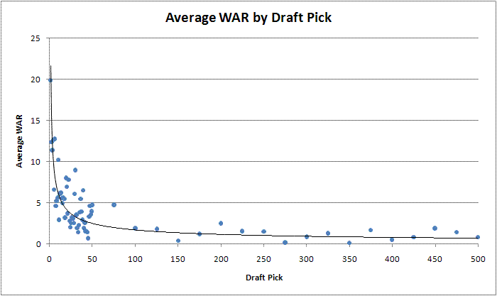
As you can see, there is a lot of variability even when looking at the average WAR of each pick. However, you can also see that the data follows a definite curve. There is a major advantage to having the very first pick in the first round vs. having the last pick in the first round (#30 overall). The point where the expected WAR tends to level off also seems to be around the end of the first round of the draft. Mathematically we'd like to fit this curve to a model to get a theoretical valuation of each pick. The data certainly isn't linear, but instead seems to follow a definite power law and can be explained by the following formula:
WAR= a * (selection#)^ b, where a and b are the parameters of the model.
Running a non-linear regression, we find those parameters equal to a=19.8 and b=-.50. The model fits very well as you can see from the graph above.
What can we learn from it? Plugging the picks into the formula, we see that the #1 overall selection will accumulate an average of about 19.8 WAR over the course of his career. Meanwhile, it drops significantly to 14.0 WAR for the #2 pick. From there it drops rapidly to an expected 6.2 WAR for pick #10 before leveling off at 3.6 WAR for #30, 2.0 WAR for #100, and 0.9 WAR for #500. The model-based approach makes sense because it uses a relationship which both fits the data and matches our preconceived notions that the #1 pick is likely to become an excellent player, followed by a sharp drop-off in value with each successive pick until leveling off.
Other Factors Affecting Expected WAR
The beauty of a model is that we can also add other variables to the data to determine if other factors affect the curve. Going back to the full dataset (which gives the same parameter estimates as using the average by pick data), we can add terms to our model to differentiate between college players and high school players as well as between pitchers and hitters. The model was defined as the following:
WAR= (a + college*c + pitcher*p)* (selection#)^ b, where a and b are the usual parameters and c adds or subtracts to the scale parameter if the player is in college and p adjusts the scale parameter if the player is a pitcher.
We get the following results from our model. Others have talked about the wisdom of choosing hitters as well as college players and here we have a model that backs up this assertion. The results are below:
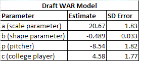
In formula form we get:
Expected Lifetime WAR = (20.7 + (-8.5 * pitcher) + (4.6 * college)) * selection ^ (-.49)
where pitcher is equal to 1 if a player is a pitcher, college is equal to 1 if he is a college player, and selection is equal to the # overall selection in the draft.
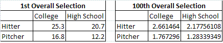
Here we see a major penalty in WAR for teams choosing a pitcher. If the player is a #1 selection, we would expect a difference of 8.5 WAR between a hitter and a pitcher. Meanwhile choosing a college player is indeed a benefit. The benefit of choosing a college player as the #1 pick amounts to about 4.6 WAR. Both of these numbers of course decrease in proportion to the power law as the draft goes on, so the difference between choosing a high school pitcher and a college pitcher is quite small in absolute terms by the time you get down to the 100th selection in the draft. Below is a pair of charts showing the expected WAR for each type of player at both the 1st and the 100th overall selection.
You can also take a look at a graph of each of the 4 types of players according to the model. As you can see, the shapes remain the same, with the hitters and college players having a higher expected WAR.
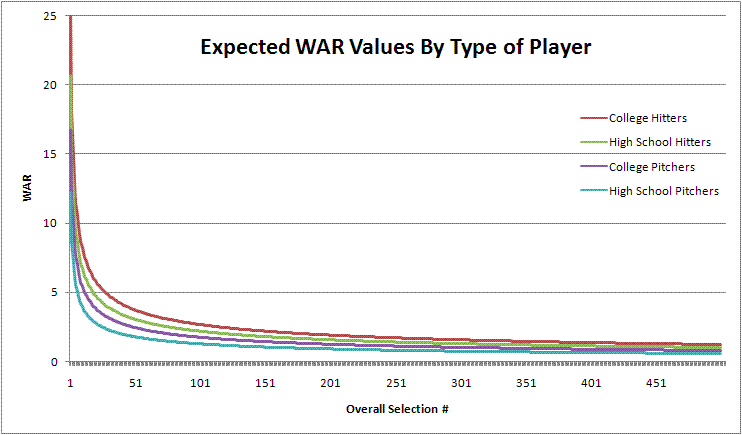
The model given above is just the final model with significant terms. I also tried using parameters for college players and pitchers in the exponent to see if the overall shape of the WAR curve changes depending on the type of player. However, this gave a null result, indicating that the pitchers, hitters, college players, and high schoolers all follow the same basic curve - just that hitters and college players start with a higher win expectation. An interaction term between the pitcher and college parameters also came up null, as did parameters distinguishing between various types of position players.
Conclusion
Overall, this analysis backs up the assertion made by others that college hitters have historically been best type of player to draft on draft day, meaning that sabermetrically minded teams can take advantage of this information (and some have been!). Of course, the more teams that catch on to this trend, the less advantageous taking hitters and college players will be. If all teams were drafting with an eye for maximum value with this information, all types of players would eventually have the same Expected WAR. However, I don't believe we are at that point yet.
Aside from measuring the effects of drafting pitchers and college players, this study is useful because it fits a nice smooth curve to easily quantify the expected WAR of each pick, allowing teams and fans to know what type of player to expect with each pick using a simple formula. Armed with this information, we can know what to realistically expect from the players recently selected on June 9th.
Comments
I did a study long ago studying the draft and my point then, I think still applies now: averages don't mean for much when the odds of any one draftee becoming a good major league player is so low. One of the key points is that the vast majority of players don't become a good major league player, even high in the draft (though what you do here is very good work on separating out the different type of players).
A low probability of success has huge implications for analyzing and understanding the draft. People see the low bonus a major leaguer got when he was drafted, but with a low probability, you need to account for all the bonuses paid to draftees who never made it when analyzing the true cost of developing a major league star.
With a low probability, it means that losing a draft pick due to signing a free agent is not that big a deal, as that pick most likely will not turn into a good player.
With a low probability, it means that when you lose a good player to free agency, you are probably better off trading to get known prospects, known quantities, than to wait for the draft for your two picks which probably don't even add up to 20% probability of selecting a good player, it's probably closer to 15%.
In addition, I see studies of the draft using averages but never pointing out the implications of that. For example, the average WAR in your study for someone drafted in around the 20-30 picks overall appear to around 5. So I started looking for someone with that. Mark Loretta has 18.7, so he's better. Julio Lugo has 13.9. Ah, Felipe Lopez has 4.9, but he'll pass that soon since his career is not over. OK, here is a good one, Terrence Long has a career WAR of 6.3 and it appears his career is over. So, the average player selected in the back of the first round, on average, is worse than a Terrence Long. Not too useful, right?
What is more important is figuring out the odds of selecting a good baseball player with each draft pick, and my study found that it starts out less than a coin flip for the very top of the draft, and by the end of the first round, is no better than roughly 10%. Which are horrible odds, but fans go crazy over these first round draft picks, like they are going to become a star player, but the odds are that they are going to fail miserably at that, they are only lottery tickets giving hope to the fans, but ultimately disappointing them.
Posted by: obsessivegiantscompulsive at June 16, 2009 9:21 AM
FYI, the BP draft study also examined this distinction between HS and College, and found that the difference had lessened over time (FYI: they split their data in half and examined the relative differences).
Also, I have never seen a study examine what the market value of hitters vs. pitchers. Using your study (and BP's), one could assume that it is better to draft hitters, they offer more value, on average. And many fans do.
However, what I have not seen is what the value of that is. Is it relatively harder to find pitchers of equal value to hitters? If so, they are rarer and thus could be more valuable to a team. Even if their average career WAR is lower than a hitter's, if it is harder to find such a pitcher - and since the averages are clearly lower all through the draft, that appears to be so - then a lower WAR value pitcher could be just as valuable as a hitter, as it is not like you can field a team of all high WAR hitters, you need to include pitchers in to the mix.
Thus, it is interesting that hitters create more WAR than pitchers, but the more pertinent question is whether that is more valuable to the team? There is a balance each team has to have, between the hitters and pitchers, so even if a hitter might be more valuable, you still need pitching.
Posted by: obsessivegiantscompulsive at June 16, 2009 9:34 AM
I think you need to DEFINITELY look only at the WAR prior to them hitting free agency. This is the only thing a team is buying at below market value.
Posted by: TangoTiger at June 16, 2009 12:04 PM
Tango, I absolutely would like to look at the first-six-year data as well, and I probably will do so soon, since as you mention, it is more useful for team management purposes.
However, I also think there is value in looking at career data from a more general fan standpoint of "how good will this player be", regardless of monetary considerations and the current MLB salary structure.
Posted by: Sky Andrecheck at June 16, 2009 12:29 PM
OGC, Thanks for your comments. I agree that looking at the distribution of player values within each pick is also important and could be another study of analysis. You make your own point though, when saying that it's better to take known quantities over draft picks - the average #10 overall pick turns out to be about only the value of Felipe Lopez. Of course, some players will be much more valuable than that while others are complete busts.
On your point about hitters vs. pitchers, obviously it's possible to have a glut of one type of players in your system, so I wouldn't advise teams to take a hitter with every single pick, but all being equal a hitter will provide more value.
Posted by: Sky Andrecheck at June 16, 2009 5:52 PM
"how good will this player be"
Sky, you've got the average first round pick as having 6.4 career WAR. That's one typical MVP season! So, I do not think the question you are asking will have much value to the fan.
Would it be possible to send me (or post) your data, say:
careerWAR, selectionNumber, playerId, playerName
Posted by: TangoTiger at June 17, 2009 7:08 AM
Could you plot, say, the 50th percentile WAR value for each pick, and the 80th%, and the 95th%?
Posted by: eb at June 17, 2009 1:36 PM
Good suggestions and ideas all around (both here and at the Book Blog). I'll be following up with another article soon.
Posted by: Sky Andrecheck at June 17, 2009 1:45 PM
Per OGC's comments, I think a good way to separate the values of these players might be to look at the probability of each draft pick to sustain above average WAR for their first six years. The way I might do this is to take each year in those 6 and subtract their WAR by 2, and give it a sum, then average among all your players. Because as has been said, the absolute WAR is only a small fraction of the picture. One guy like Griffey, with a long career, and great performance is going to skew the picture greatly, especially if you're not showing error bars. Another way to break it down might be to show the simple percent of players that average more than 2 WAR per season over the first 6 years, with maybe the percents of averaging more than 1 and 3, to give glimpse of the distribution.
Also, I didn't notice an R^2 term for your fit? On that note, in jumping from the 50th pick to the 75th, you may be dragging down the curve to far to soon. It seems possible the 50th-75th picks might remain around the 3-4 WAR. Though I fully understand the reasons for making this jump.
Just some ideas for those that actually want to go through the analysis. But really cool stuff, and a great start.
Posted by: Wally at June 18, 2009 9:08 AM