Rich Lederer • Baseball Beat
Patrick Sullivan • Change-Up
Jeremy Greenhouse • Touching Bases
Dave Allen • F/X Visualizations
Sky Andrecheck • Behind the Scoreboard
Marc Hulet • Around the Minors
Al Doyle • Past Times
Retired Uniforms:
Bryan Smith • WTNY
Joe Sheehan • Command Post
Jeff Albert • The Batter's Eye
RSS Feed
Home
*Examining the Past, Present, and Future*
Lineup Card
Recent Entries
» Putting Together a Reality Team
» Historical Hall of Fame Vote Comparisons: 2012
» An All-Christmas Team
» The New-Look Angels
» John Denny: The Forgotten Cy Young Award Winner
» Money Isn't Everything
» What Would It Take to Hit .400 in the 21st Century?
» Halos Heaven
» Brandon McCarthy's Breakout Season
» Link-o-Rama
» Historical Hall of Fame Vote Comparisons: 2012
» An All-Christmas Team
» The New-Look Angels
» John Denny: The Forgotten Cy Young Award Winner
» Money Isn't Everything
» What Would It Take to Hit .400 in the 21st Century?
» Halos Heaven
» Brandon McCarthy's Breakout Season
» Link-o-Rama
Best of Baseball Beat
Abstracts From the Abstracts
1977 Baseball Abstract
1978 Baseball Abstract
1979 Baseball Abstract
1980 Baseball Abstract
1981 Baseball Abstract
1982 Baseball Abstract
1983 Baseball Abstract
1984 Baseball Abstract
1985 Baseball Abstract
1986 Baseball Abstract
1987 Baseball Abstract
1988 Baseball Abstract
1978 Baseball Abstract
1979 Baseball Abstract
1980 Baseball Abstract
1981 Baseball Abstract
1982 Baseball Abstract
1983 Baseball Abstract
1984 Baseball Abstract
1985 Baseball Abstract
1986 Baseball Abstract
1987 Baseball Abstract
1988 Baseball Abstract
Bert Blyleven Series
Meeting Up and Hanging Out with Bert
The Results Are In And...
Aficionado Heavily Invested in Blyleven
Latest on Blyleven's Chances for the HOF
The Internet Zealot Responds
400 Down and 5 to Go...
Bert Be Home By Eleven?
Blyleven's Forgotten Season (1973)
HeyMan, Your Comments Don't Hold Water
The Waiting is the Hardest Part
Another Addition to the Blyleven Series
Search for the Truth
As Dominant as His HOF Contemporaries
Listen, Buster
A Larger Step for Blyleven
Answering the Naysayers (Part Two)
Another Small Step for Blyleven
Q&A: Blyleven on the Twins
The Majority Rules, Right?
It's All Dutch to Some
The Hall of Fame Case for Bert Blyleven
Q&A: Blyleven on Felix Hernandez
Clemens Rocketing Up Charts
Poz: An Interview With a KC Star
A HOF Chat with Tracy Ringolsby
Up Close and Personal
A Peek Into the Mind of a HOF Voter
Answering the Naysayers
It's That Time of the Year (Again)
"If Cooperstown is Calling..."
The Bert Alert
One Small Step for Blyleven...
Only the Lonely
Exclusive Interviews
Lee Sinins
Alex Belth
David Pinto
Will Carroll
Mike Carminati
Aaron Gleeman
Joe Sheehan
Jay Jaffe
Jeff Peek
Tracy Ringolsby
Joe Posnanski
Bill James Part I, II, III
Jon Lalonde
Chuck Tiffany
Dayn Perry
Fay Vincent
Nate Silver
Alex Belth
David Pinto
Will Carroll
Mike Carminati
Aaron Gleeman
Joe Sheehan
Jay Jaffe
Jeff Peek
Tracy Ringolsby
Joe Posnanski
Bill James Part I, II, III
Jon Lalonde
Chuck Tiffany
Dayn Perry
Fay Vincent
Nate Silver
Bullpen
Rich Lederer
The Odd Couple (with Alex Belth)
The MostUnder Over Underrated Player in Baseball (with Brian Gunn)
Three Wise Men (roundtable by Alex Belth)
Infrequently Asked Questions (interview with Matt Welch)
Interview (Orioles Think Tank)
Bernie and the Yanks (Bronx Banter)
Hope and Faith: How the LAA Win the World Series (Baseball Prospectus)
NL West (The Soul of Baseball)
Greatest Living Hitter? (Sports Illustrated)
Roundtable: 2008 HOF Ballot (Armchair GM)
The Most
Three Wise Men (roundtable by Alex Belth)
Infrequently Asked Questions (interview with Matt Welch)
Interview (Orioles Think Tank)
Bernie and the Yanks (Bronx Banter)
Hope and Faith: How the LAA Win the World Series (Baseball Prospectus)
NL West (The Soul of Baseball)
Greatest Living Hitter? (Sports Illustrated)
Roundtable: 2008 HOF Ballot (Armchair GM)
Patrick Sullivan
Designated Hitters
David Bromberg (Q&A: John Denny)
Mark Armour (H. Killebrew and Versatility)
Joe Lederer (Soundtrack of a Prospect)
David Bromberg (Clemente's Autograph)
David Bromberg (Woody Fryman)
D. Baumstein (WAR Against Age: Pitchers)
Doug Baumstein (The WAR Against Age)
Doug Baumstein (A Lifetime on the Road)
John Fraser (Pick Six)
Mark Armour (How to Score More Runs?)
Bill Parker (What Opening Day Tells Us)
Stan Opdyke (Pat Rispole)
Chris Jaffe (Evaluating Baseball's Mgrs)
Stan Opdyke (Baseball Radio in NYC, 1953)
A. Nathan (Performance of Baseball Bats)
Michael Weddell (Edgar Martinez/HOF)
Jon Weisman (100 Things Dodgers Fans...)
Stan Opdyke (Connie Mack and Vin Scully)
Eric Walker (Evaluating Run Production)
Brent Mayne (The Intangibles of Catching)
Chris Moore (Best Fastballs in Baseball)
Dave Baldwin (The Batter’s Brain)
Shawn Haviland (Ivy League to MLB)
Larry Granillo (Walking Off)
Rob Iracane (Solo HR Won't Break You)
Tommy Bennett (Charm of AM Radio)
Harry Pavlidis (Johan Santana's Fast Start)
John Walsh (WAR and Remembrance)
Eric Walker (Precisely Inaccurate)
Bob Timmermann (As They See 'Em)
Geoff Young (Unicycles and Delusions)
Baseball Analysis at Tufts (Groundballers)
Baseball Analysis at Tufts (GB Out Rates)
G. Rybarczyk ('09 Hit Tracker Projections)
Joe Lederer (Curt Schilling/HoF)
Conor Gallagher (Hall of Fallacies)
Chris Green (Jim Rice, HoF, the Numbers)
Shawn Hoffman (Baseball's Bear Mkt?)
Paul Anthony (Manny Syndrome)
Ross Roley (World Series Odds)
B. Timmermann (Catcher's Interference)
R.J. Anderson (Waiting the Hardest Part)
Maury Brown (Cubs, MLB, and Cuban...)
Myron Logan (Dee-Fense, Dee-Fense)
Craig Calcaterra (Frivolity, Part I, Part II)
Chad Finn (Ode to Baseball Cards)
David Cameron (Mariners Foibles)
Chris Dial (Chipper Jones)
Pat Lederer (Memory Lane)
David Appelman (Clutch Pitching)
Bob Rittner (DH)
Jonathan Mayo (Roger Clemens)
Lisa Winston (My Son-in-Law...)
Russ McQueen (The Yellow Hammer)
Bob Rittner (I'm OK, You're OK)
Mark Armour (In Defense of the HOF)
Pat Jordan (Friends)
Dan Levitt (Analysis of Terry Ryan)
Doug Baumstein (Trading Econ 101)
Ross Roley (Runner's Reluctance II)
Ross Roley (Runner's Reluctance I)
Mark Armour (No-Longer Lovable Sox)
Bruce Regal (Stealthy and Wise)
Brian Gunn (Roid Monster)
Current/McEvoy (Value of the SB)
John Rickert (Sinister Thefts)
Nate Silver (Sabermetrics)
David Vincent (Home Run Production)
Joe P. Sheehan (Enhanced Gameday II)
Mark Armour (An Ode to Sport)
David Gassko (All-Time Worm Burners)
Joe P. Sheehan (Enhanced Gameday)
John Walsh (When Titans Clash)
Fox/Williams (Quantifying Coaches II)
Fox/Williams (Quantifying Coaches I)
Jacob Luft (Bull Durham Rant)
Chad Finn (Strat-O-Matic)
Lisa Winston (Rotisserie Baseball)
Dave Studeman (Baseball Stats)
Steve Treder (Roger Craig)
Marc Normandin (Jeff Bagwell)
D. Appelman (Expanding Strike Zone)
Jeff Sackmann (Worst MiL Defenders)
Jeff Sackmann (Best MiL Defenders)
Maxwell Kates (Van Lingle Mungo)
David Appelman (Pitch Location)
Kent Bonham (Danny Ray Herrera)
Glenn Stout (Two Baseball Poems)
Bruce Regal (The Challenge Round)
Mark Lamster (Barry & Ty)
Geoff Young (NL West)
Tom Lederer (The Ryan Express)
Brian Erts (Great Leap Forward)
David Pinto (Parity and the N.L.)
Jacob Luft (Fathers and Daughters)
Jamey Newberg (Pete's Sake)
Jeff Albert (A. Jones Swing Analysis)
Jeff Albert (A-Rod Swing Analysis)
Keith Law (Death, Taxes, and Waivers)
Peter Abraham (Tales of Torre Tales)
Larry Borowsky (Let 'er Rip II)
Dan Levitt (Empirical Analysis of Bunting)
Jonah Keri (If I Met Warren Cromartie...)
Bob Klapisch (War Stories)
Bob Timmermann (John F. Kennedy HS)
Kent Bonham (Aluminum Adjustments)
Al Doyle (More Than Superstars)
Ross Roley (Instant Replay)
David Vincent (Barry Bonds Homers)
Chad Finn (Our Favorite Obscurities)
Bill Deane (1979 NL MVP)
Mark Armour (Rise/Fall of Artificial Turf)
Jeff Angus (Wally Moon Camp)
David Berri (Money and Baseball)
Larry Borowsky (Baseball w/o the #s)
Derek Zumsteg (The Irrational Market)
David Regan (Free Agent Contracts)
Peter Schmuck (Steroids and the HOF)
David Appelman (Pitchers, Pitch by Pitch)
Dan Fox (Swinging, Taking, Fouling, Etc)
Patrick Sullivan (Study of NYY CF/BOS LF)
Will Leitch (Baseball Journalism)
Jeff Sullivan (Pitcher Release Points)
Steve Treder ('69-'70 Giants)
Maury Brown (Charlie Finley)
John Brattain (Bob Johnson)
Bob Klapisch (The Case for Bert Blyleven)
Jeff Peek (Pride and Prejudice)
Dayn Perry (Bert and Warren)
Rob Neyer (If Don Sutton Was Great...)
Lisa Winston (Minor League Memories)
Alex Belth (Otis Redding Was Right)
David Cameron (Long Live the King)
Jeff Angus (Baserunning Study)
Bert Blyleven (Baseball Playoffs)
Boyd Nation (Not a Prospect List)
James Click (Batters-Baserunners Study)
Jeff Shaw (Why I Love Baseball)
David Gassko (BIP/BFP Fielding Study)
Jay Jaffe (Milwaukee Sausage Race)
Jamey Newberg (Remember When)
Bob Klapisch (Press Box to the Mound)
Dan Levitt (Predictive Value of BB)
David Vincent (Official Scorer)
Jon Weisman (Rick Monday)
Larry Borowsky (Let 'er Rip)
Will Carroll (Fictional Short Story)
Bob Timmermann (Japanese Baseball)
Cyril Morong (Best Pitching Seasons)
Sean Forman (Monte Carlo Win-Loss)
Brian Gunn (My Little Blue Book)
Joe Lederer (My Dad and Baseball)
Bill Deane (Bob Gibson, 1968)
Mark Armour (1977 Yankees)
Darren Viola (Retrosheet)
David Pinto (RFK)
Dayn Perry (Brave Heart)
Matt Welch (Dave Hansen)
Kevin Kernan (Jack McKeon)
Tom Lederer (Dodgers Road Trip)
Steve Lombardi (Slider)
Studes (Picturing Baseball)
Mike Carminati (Luck of the Drawl)
Eric Neel (Vin Scully)
J.C. Bradbury (Leo Mazzone)
John Sickels (Bill James)
Search Baseball Analysts
Archives
By Category:
Around the Majors Content Only
Around the Minors Content Only
Baseball Beat Content Only
Baseball Beat/Change-Up Content Only
Baseball Beat/WTNY Content Only
Behind the Scoreboard Content Only
Change-Up Content Only
Change-Up/Around the Majors Content Only
Command Post Content Only
Crunching the Numbers Content Only
Designated Hitter Content Only
F/X Visualizations Content Only
Past Times Content Only
Saber Talk Content Only
The Batter's Eye Content Only
Touching Bases Content Only
Weekend Blog Content Only
WTNY Content Only
By Month:
February 2012
January 2012
December 2011
October 2011
September 2011
August 2011
July 2011
June 2011
May 2011
April 2011
March 2011
February 2011
January 2011
December 2010
November 2010
October 2010
September 2010
August 2010
July 2010
June 2010
May 2010
April 2010
March 2010
February 2010
January 2010
December 2009
November 2009
October 2009
September 2009
August 2009
July 2009
June 2009
May 2009
April 2009
March 2009
February 2009
January 2009
December 2008
November 2008
October 2008
September 2008
August 2008
July 2008
June 2008
May 2008
April 2008
March 2008
February 2008
January 2008
December 2007
November 2007
October 2007
September 2007
August 2007
July 2007
June 2007
May 2007
April 2007
March 2007
February 2007
January 2007
December 2006
November 2006
October 2006
September 2006
August 2006
July 2006
June 2006
May 2006
April 2006
March 2006
February 2006
January 2006
December 2005
November 2005
October 2005
September 2005
August 2005
July 2005
June 2005
May 2005
April 2005
March 2005
February 2005
January 2005
December 2004
November 2004
October 2004
September 2004
August 2004
July 2004
June 2004
May 2004
April 2004
March 2004
February 2004
January 2004
December 2003
November 2003
October 2003
September 2003
August 2003
July 2003
June 2003
Reference
Organizational Stats
Arizona Diamondbacks Bat / Pitch
Atlanta Braves Bat / Pitch
Baltimore Orioles Bat / Pitch
Boston Red Sox Bat / Pitch
Chicago Cubs Bat / Pitch
Chicago White Sox Bat / Pitch
Cincinnati Reds Bat / Pitch
Cleveland Indians Bat / Pitch
Colorado Rockies Bat / Pitch
Detroit Tigers Bat / Pitch
Florida Marlins Bat / Pitch
Houston Astros Bat / Pitch
Kansas City Royals Bat / Pitch
Los Angeles Angels Bat / Pitch
Los Angeles Dodgers Bat / Pitch
Milwaukee Brewers Bat / Pitch
Minnesota Twins Bat / Pitch
New York Mets Bat / Pitch
New York Yankees Bat / Pitch
Oakland Athletics Bat / Pitch
Philadelphia Phillies Bat / Pitch
Pittsburgh Pirates Bat / Pitch
St. Louis Cardinals Bat / Pitch
San Diego Padres Bat / Pitch
San Francisco Giants Bat / Pitch
Seattle Mariners Bat / Pitch
Tampa Bay Devil Rays Bat / Pitch
Texas Rangers Bat / Pitch
Toronto Blue Jays Bat / Pitch
Washington Nationals Bat / Pitch
All-Star Links
Official Websites
News and Notes
Baseball News Blog
Baseball Newstand
ESPN Baseball
Fox Sports Baseball
Pro Sports Daily
Roto World
The Roto Times
USA Today Baseball
Baseball Newstand
ESPN Baseball
Fox Sports Baseball
Pro Sports Daily
Roto World
The Roto Times
USA Today Baseball
Reference and Analysis
Baseball Almanac
Baseball America
Baseball Archive
Baseball Contracts
Baseball Cube
Baseball Graphs
Baseball Library
Baseball Musings Player Database
Baseball Page
Baseball Primer
Baseball Prospectus
Baseball Reference
Baseball Statistics
Baseball Truth
Boxscore Central
Diamond Mind Baseball
Doug's Stats
FanGraphs
Fast Balls (pitchfx catalog)
Hardball Dollars
Hardball Times
Hit Tracker
Retrosheet
Rotobase/Rotoblog
Stat Corner
STATS
Tango on Baseball
Yahoo Sports MLB
Web Gems
Bill James Primer
Sabermetric Manifesto (Grabiner)
Pitching and Defense (McCracken)
Pitching and Defense (Tippett)
Transactions Primer (Neyer)
Baseball Stats (Batter's Box)
Prospect Report (Cameron)
Pitcher Workloads (Sheehan)
Goodbye to Old Baseball Ideas (Rickey)
Sabermetric Manifesto (Grabiner)
Pitching and Defense (McCracken)
Pitching and Defense (Tippett)
Transactions Primer (Neyer)
Baseball Stats (Batter's Box)
Prospect Report (Cameron)
Pitcher Workloads (Sheehan)
Goodbye to Old Baseball Ideas (Rickey)
Columnists
Baseball Blogs
Around the Majors
Athletics Nation
Baseball Crank
Baseball Musings
Baseball-Reference Blog
Batter's Box
Big League Stew
Bronx Banter
Catfish Stew
Cub Town
Dan Agonistes
Dodger Thoughts
DRays Bay
Ducksnorts
Futility Infielder
Halos Heaven
Inside the Rockies
It Might Be Dangerous
Knuckle Curve
LoHud Yankees Blog
Lookout Landing
Management by Baseball
Metaforian
Metsgeek
Mike's Baseball Rants
Only Baseball Matters
Redbird Nation
Red Reporter
Sabernomics (Braves)
Seth Speaks
ShysterBall
6-4-2 (Angels/Dodgers)
The Book
TheCubdom
The Cutting Edge
The House That Dewey Built
The View From The Bleachers
Tiger Blog
U.S.S. Mariner
Viva El Birdos
Where's Kernan
Minor Leagues
Arizona Fall League
BA Player Finder
Cal Leaguers
Jamey Newberg
JDM's Scoresheet Baseball
Minor League Baseball
Minor League Park Factors
Minor League Splits
No Pepper
Sickels' Minor League Ball
Warm October Nights
BA Player Finder
Cal Leaguers
Jamey Newberg
JDM's Scoresheet Baseball
Minor League Baseball
Minor League Park Factors
Minor League Splits
No Pepper
Sickels' Minor League Ball
Warm October Nights
Amateur
Boyd's World (College)
Cape Cod Baseball League
College Baseball Blog
College Baseball Insider
Collegiate Baseball Newspaper
College Splits
College Splits Blog
Dirtbags Baseball (Long Beach State)
NCAA Baseball
NCBWA
Team One Baseball (High School)
Texas A&M & Baseball
Cape Cod Baseball League
College Baseball Blog
College Baseball Insider
Collegiate Baseball Newspaper
College Splits
College Splits Blog
Dirtbags Baseball (Long Beach State)
NCAA Baseball
NCBWA
Team One Baseball (High School)
Texas A&M & Baseball
Historical
Cuban Baseball
House of David
Jim "Mudcat" Grant's Web Page
Negro League Baseball Players Assoc
Negro Leagues Baseball Museum
1919 Black Sox
Pacific Coast League
Philadelphia Athletics Historical Society
Shoeless Joe Jackson Society
SABR-L Archives
Walter O'Malley
House of David
Jim "Mudcat" Grant's Web Page
Negro League Baseball Players Assoc
Negro Leagues Baseball Museum
1919 Black Sox
Pacific Coast League
Philadelphia Athletics Historical Society
Shoeless Joe Jackson Society
SABR-L Archives
Walter O'Malley
Miscellaneous
Forums
Credits
Ticket Center
Tickets to Baseball -
Premium Red Sox Tickets - Tickets to Marlins Games - Cardinals Game Tickets - NY Yankee Tickets - Tickets Oakland Athletics - Dallas Cowboys Tickets - Arizona Cardinals Tickets - Tickets Seattle Seahawks - Buffalo Bills Tickets Online - Tickets to Dolphins Football
Buy Boston Red Sox tickets,
Philadelphia Phillies tix,
NY Yankees tickets,
NY Mets tickets, and
MLB All Star game tickets at ABC tickets
Not sure where to find the best online sportsbooks? Start your search with PlayersJet.
Get deals at SportsMemorabilia.com on baseball apparel, including Phillies jerseys and more for adults and children.
Shop the largest selection baseball equipment on sale at Sports Unlimited. Check out tons of baseball gloves, youth baseball gloves and catchers gear from Rawlings, Wilson, Nike & Under Armour.
2011 Draft Order
Courtesy of Baseball America
First-Round:
 1. Pirates (57-105)
 2. Mariners (61-101)
 3. Diamondbacks (65-97)
 4. Orioles (66-96)
 5. Royals (67-95)
 6. Nationals (69-93)
 7. Diamondbacks (for B. Loux)
 8. Indians (69-93)
 9. Cubs (75-87)
10. Padres (for Karsten Whitson)
11. Astros (76-86)
12. Brewers (77-85)
13. Mets (79-83)
14. Marlins (80-82)
15. Brewers (for Dylan Covey)
16. Dodgers (80-82)
17. Angels (80-82)
18. Athletics (81-81)
19. Red Sox (from DET for Martinez)
20. Rockies (83-79)
21. Blue Jays (85-77)
22. Cardinals (86-76)
23. Nationals (from CWS for Dunn)
24. Rays (from BOS for Crawford)
25. Padres (90-72)
26. Red Sox (from TEX for Beltre)
27. Reds (91-71)
28. Braves (91-71)
29. Giants (92-70)
30. Twins (94-68)
31. Rays (from NYY for Soriano)
32. Rays (96-66)
33. Rangers (from PHI for Lee)
Supplemental First Round:
34. Nationals (Dunn)
35. Blue Jays (Downs)
36. Red Sox (Martinez)
37. Rangers (Lee)
38. Rays (Crawford)
39. Phillies (Werth)
40. Red Sox (Beltre)
41. Rays (Soriano)
42. Rays (Balfour)
43. Diamondbacks (LaRoche)
44. Mets (Feliciano)
45. Rockies (Dotel)
46. Blue Jays (Buck)
47. White Sox (Putz)
48. Padres (Garland)
49. Giants (Uribe)
50. Twins (Hudson)
51. Yankees (Vazquez)
52. Rays (Benoit)
53. Blue Jays (Olivo)
54. Padres (Torrealba)
55. Twins (Crain)
56. Rays (Choate)
57. Blue Jays (Gregg)
58. Padres (Correia)
59. Rays (Hawpe)
| F/X Visualizations | February 05, 2010 |
Thoughts on a New Box Score
I have fond memories of, as a child, reading box scores in the newspaper. In the pre-internet, or at least pre-internet in my house, days box scores in newspapers was the medium by which I, and I assume, most people consumed baseball data. The data were all there, tightly yet efficiently packed in a format that allowed you to pull out any or all you wanted without feeling overwhelmed. Each was small enough for box scores for all the day's games to fit on one page.
I still read box scores, the medium has changed to the internet, but the box score itself is largely the same. I guess the format has stayed largely the same since the mid-1800s. Some of the stats are different but the layout is very similar. Over 150 years with little change shows that the format is remarkably successful, but that does not mean there cannot be innovations. FanGraphs's WPA charts are not box scores per se, but are a very effective way of presenting what happened in a game.
I thought it would be an interesting exercise to attempt to create a new box score. I wanted it to retain the original box score's quality of presenting a relatively large amount of information in a relatively small space, but making that data accessible and not overwhelming. Beyond that I hoped my new method gave a more immediate feeling for the pace and tenor of the game, like the WPA chart does.
Here is my attempt. The image is may be too small, but I kept it that way so that it didn't push out the right margin of the page. You can click on it for a larger version. I used game one of the 2009 World Series for the example.
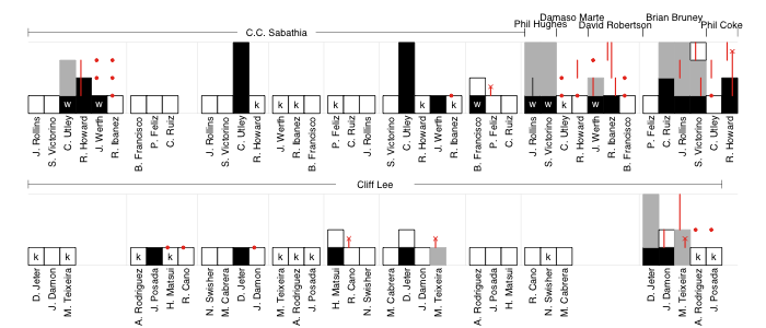
Each at-bat is represented by a bar, the height of which denotes the base the batter reached. White bars are for outs, black for hits or walks. The batter's progression around the rest of the bases that inning is indicated in gray (steals have a vertical black line through them). Runners on-base during an at-bat are indicated in red: circles for those not moved over in the at-bat, lines to show their progression as a result of the at-bat and an 'ex' if they were thrown or tagged out in that at-bat.
The score can be counted along as the black or gray bars reach the top. That also allows you to count individual batter's runs scored or pitcher's runs allowed. Red lines that reach the top are RBIs.
Compared to a traditional box score it is harder to find an individual player's line. For example to see that Chase Utley went 2-4 with 2 HRs, 2 runs, 2 RBIs, a strikeout and a walk you have to go through, find his at-bats and count all of the events. But the trade-off is, I think, this formulation gives a better feel for the pace of the game, and allows the events to be easily recreated: in the top of the first CC Sabathia escaped a base-loaded two-outs jam; Phil Hughes took over to start the eighth and walked the only two batters he faced, both of whom came around to score on Raul Ibanez's single; Utley's two solo-HRs were the only runs through the first seven innings; Cliff Lee didn't allow a runner past first until the ninth, and up to that point faced just three batters over the minimum; the Yankees burned through five relievers, who gave up four runs, in the last two innings; the top of the ninth ended with Shane Victorino getting thrown out at home on a Ryan Howard double and the game ended with two more Cliff Lee strikeouts. All of this can be easily seen through a close, but not difficult, reading of the chart.
What do you think of this format: Complicated and poorly laid out? Hard to read? Brilliant? I welcome constructive criticism in light of what you want from a representation of a baseball game.
Comments
Kind of like it, but don't hold your breath getting it adopted. I LOVED the Bill James boxscore idea, but the editor of The Sporting News told me "Forget it! It'd be a nightmare to proofread." I imagine he'd same the same thing in this case. Of course, where, exactly, is TSN these days?
Posted by: mcb at February 5, 2010 1:38 PM
There's definitely promise in your re-design. These things stood out to me as an illustration of game flow.
1. Cliff Lee dominated across a complete game (good story hook), while Yankees juggled a half-dozen relievers late.
2. Yankees didn't do anything until the 3rd time through the lineup
Text in traditional box scores all flows the same direction, which helps the reader move from area-to-area. Unfortunately, the criss-crossing info obscures other compelling events.
1. Utley's 2 homers (as you said)
2. Player substitutions
3. Fantasy value
A box score that's both fantasy-friendly (for individual players) and indicates game flow would probably catch on. We've already seen the NFL significantly re-shape their stat reporting to match fans' fantasy interest.
Posted by: Matthew Glidden at February 5, 2010 2:11 PM
I applaud the creativity. I think it would make a fantastic scorecard. I wonder how difficult it would be to do this same type of thing with just pencil and paper. Simulating the multiple colors would be the trick.
This reminds me of another very creative chart. It's a History of the New York Yankees chart.
Posted by: ewdewald at February 5, 2010 2:47 PM
First, I love the project, as I'm sure many feel the same about box scores being so accessible and concise, while at the same time wanting more information. The inclusion of pace and "aesthetics" is a great idea. (On that point, I do think Fangraphs WPA charts give good impression of "swings" in games, if not necessarily pace.)
My reservation is that I can't imagine the traditional box score totals ever being wholly replaced, especially when they have proven to be so useful for collecting data while maintaining brevity and clarity.
I guess some key questions arise up front of just what data is truly necessary/desirable. Only then can you we do our best Edward Tufte impression and come up with a better box score.
Posted by: Cory at February 5, 2010 4:06 PM
i thoroughly enjoyed this. it gives the reader a finger on the pulse of the game. visually appealing and easy enough to read once you remember what the indicators mean.
agreed, it is a tad more difficult to find an individual players line, but i enjoyed looking ahead every 8 or so batters... gives you a better feel for how the game is progressing.
in terms of adoption: i don't see why not. tradition aside, we're fast becoming a different kind of fan base. we have more room in our newspapers (not to mention the internet) and an increasing desire to understand the game better. this is an inventive and streamlined solution that speaks to an visually-oriented culture.
Posted by: shibboleth at February 5, 2010 5:18 PM
I think you mean "Brian" Bruney.
I love the boxes showing base advancing. It's clear, simple, easy to understand at a glance. Really nice. I'm less pleased with the red lines for moving runners. In highly active innings like the Phillies' ninth, it's too busy and tough to decipher without stopping to think about it. An ideal box score should be immediately comprehensible. But this is a great start. Kudos.
Posted by: Bob at February 5, 2010 7:22 PM
I read this post via a link from Baseball Primer.
This is more of a play-by-play graphic than a substitute for a box score, in my opinion.
As I commented at Baseball Primer, if you wanted to condense your graphic, you could use a "sparkline." Edward Tufte has done a lot to popularize sparklines, or word-sized graphics useful for depicting sequences and time-series of data, such as the W-L and standings progress of a team over a season. On his message board in 2006, he posted:
It's actually 27 plate appearances. I'll use S, D, T, H instead of verticals for the basehits and arabic numbers instead of whiskers for the RBI.:
...../../.S...S.DD..T...H..
        1     1  2  1   3 1
I would think you could adapt such a scheme to present play-by-play sequences in a very small space. Here's my best shot of a portion of the posted example, the Phillies' batting innings from game one of the 2009 World Series, with each inning separated by a space:
I added : to represent a double play (and I (tried to underlined the final out, which was a baserunning out, to distinguish it from a batter's out). It's not all the information, but it's a quick and dirty start, presented in far less space.
Other changes I thought to make, that I tried out below:
- change the / to a W for walk
- change the strikeouts from . to K
- add a row representing the batter's place in the batting order
123456 789 1234 567 891 23456 789 1234567 8912342
..WDW. ... ..HK KK. K.. .HKSK W:. WWK.WS. .DSS.D.
             1           1             2    1  1
Posted by: bobm at February 5, 2010 7:48 PM
I find this to be, in essence, an interesting failure. A lot of people are going to have a hard time translating that graphic into anything meaningful. There are people in the world who are intimidated by vary basic graphs. This . . . this will overwhelm a lot of people.
Also, it doesn't tally up totals, which is a fundamental problem.
Posted by: Linus at February 5, 2010 7:52 PM
I always want to see how each player did in the game. The traditional box score gives me that at a glance. This makes me work far too hard to find those numbers. Does your graph add something: Yes. But not what I want.
Posted by: Travis Bickle at February 6, 2010 6:31 AM
My initial reaction is it is too visually busy. It really is more like a play by play, and frankly a three paragraph AP article can capture the essence of a game. I don't think people look at a box score to get a sense of the flow of the game, which an article can do just as well or better, but to get a quick sense how players did.
Posted by: DB at February 6, 2010 9:34 AM
mcb,
could you link an example of Bill James's box score?
ewdewlad,
I guess you are right that it is more scorecard than box score. And thanks for linking that History of the New York Yankees chart. That is very cool.
Cory,
I like that way that you address the problem, by starting off thinking about which data are important to include and then based on that thinking about a structure. I guess for me recreating the narrative of the game is more important than listing each player's stats, but, based on the comments, it looks like I am in the minority on this point.
Bob,
thanks for noting this mistake. I corrected it. I do think that that base runners could be done better. I really wanted to include them, but don't feel this way is totally natural.
bobm,
I am a huge fan of Tufte's work and I like to think his ideas inform my work. The spark lines you present are interesting. They are smaller and easier to make than mine while keeping maybe 75% of the data. I wonder if there is an easy way to add the base runner information in another line or two.
Linus,
The Tufte-ian in me would say that almost anyone has the capacity to understand graphs, charts, tables and maps with huge quantities of data as long as they are well laid-out. So the fundamental problem is not that some people cannot understand a chart with too much data, but that people cannot understand a poorly laid-out chart. From that principle if this chart is overwhelming it is not inherent to the fact that it is char or that it includes too much data, but because I designed it poorly.
Travis,
Fair enough. I will try and find a way so that a future version has what you want, to easily see how each player did, and what I want, an easy way to recreate the narrative of the game in your head.
DB,
I think what I like about this format is that it allows someone to get a sense of the flow of the game without having to read an AP article. There is no way a three-paragraph AP article could contain all of the data in that graphic, so the author distills what he thinks are the salient events and narratives in the game. But in the time it took you to read that article -- two or three minutes -- you could inspect this chart and find those events and narratives on your own, as well as many minor ones that might only interest you. As Tufte would say, a well designed chart allows the viewer to engage the data with his own 'cognitive style.'
Anyway, thanks to everyone for their comments.
Posted by: Dave Allen at February 6, 2010 10:52 AM
Glad to see so many fans of Tufte! Great job taking initiative with the sparklines bobm.
Another simple but useful graphic could be graph lines showing the team's respective scores rather than digits in grid form. This could be good first because the visual representation could easily emphasize pace and magnitute, and also because you could overlay more data (e.g., win probability and leverage) without losing the clarity.
In part agreement with some other commenters, I think the totals for players remains important, but luckily new media isn't so constrained as newspapers regarding size, color, etc. There should be a way to combine the best of both scoresheets and box scores.
Posted by: Cory at February 6, 2010 11:36 AM
The great thing about the new world of information is that there doesn't have to be only one type of boxscore. There can be many. And proofreading is no longer an issue, if they are generated automatically.
I agree that aligning a single player's effort is important. So one suggest would be to keep the graphical improvements, but put it back into a format more like Bill James's idea, with the names on the left like a traditional box and the play-by-play items progressing down the column and wrapping to the top where necessary. That's something anyone who has kept a scorecard knows how to interpret. Displaying the pitchers becomes difficult in this scenario, but it's not intractable.
Posted by: SJ at February 6, 2010 5:44 PM
SJ - by Bill James's idea, do you mean something like this?
                INNING
              123456789  AB R H RBI BB SO
JRollins   SS . . .  WS   4 2 1  0   1  0
SVictorino CF . .  . WS-  4 1 1  1   1  0
CUtley     2B W H  H K.   4 2 2  2   1  1
RHoward    1B D K  K .D   5 0 2  1   0  2
JWerth     RF W  K S W    2 0 1  0   2  1
RIbanez    DH .  K K S    4 0 1  2   0  2
BFrancisco LF  . .  W.    3 0 0  0   1  0
PFeliz     3B  .  K : .   4 0 0  0   0  1
CRuiz       C  .  . . D   4 1 1  0   0  0
Runs          001001022  34 6 9  6   6  7
Posted by: bobm at February 6, 2010 6:10 PM
I quite like this approach, but that's partly because I'm more interested in getting the feel of the game at first glance rather than the player by player stats. If this were to exist at some of the sites reporting box scores but not all, then I could get the player by player data when I want it from the sites with more traditional box scores.
Posted by: Telnar at February 7, 2010 6:02 AM
Dave,
I personally enjoyed your format, and I believe it to be a better supplement (in the non-static print world), compared to the Bill James style, to the totals for a player (which I also believe are still important).
What I would suggest for improvements:
. Indicate what type of out it is in the "out"
box (since it is blank):
G - Ground out
F - Fly out
C - Caught Stealing
S - Sacrifice
etc.
. Remove the red dots and the red x's
(including the red lines to them). Even though
current box scores (like those on MLB.com)
indicate which players left however many
players on base (and yours supplements that
with where), I personally do not care for that
information. I am much more concerned about
what a player did than that which he did not
do.
If a player is thrown out at a certain base,
that would be indicated by the "out" box and
an indication of C (caught stealing) or S
(sacrifice). To me, it is not important as to
whose at-bat that out took place in.
. Even though the red lines are helpful in
indicating that there was player movement
during an at-bat, the only thing that I found
of benefit was that it denoted that the batter
advanced runners or had RBI.
Trying to determine who the runners were that
advanced (or scored) was somewhat confusing.
Personally, I don't know what the best way to
graphically indicate that would be.
You are to be congratulated for your efforts. I, too, am more interested (based on how much time I have to break down a game) in what actually occurred during the course of a game rather than just know what the totals were. Your method definitely gives one more of a sense of actually being at the game.
Posted by: BobK at February 7, 2010 9:12 AM
Part of the box score format (including the James one) is being able to type in. Presumably you could use a spreadsheet program with a template for yours and copy/paste what you want. And the player's line could be put in with his name on the last appearance.
Oh, and "Some of the stats are different but the layot is very similar" should have said "layout".
Posted by: Gilbert at February 8, 2010 8:23 AM
I like it. These are a few recommended changes:
1. The red lines and dots were not intuitive, and judging from the comments above they can be left out, since the information to clutter ratio is a bit low.
2. If a player got a RBI, as someone suggested that should be indicated by a number above the player's at bat box. The number would be the current number of runs scored for a team, so if a player got three RBIs there would be three numbers, separated by commas. Then it would be easier to tell when the runs scored during a game.
3. I don't think there is any real need to show runners how runners advanced, especially if they don't score. If this information is to be included, it would be better shown as a line drawn between the base the runner advanced to, and the at bat when they advanced. For example, on the right, there would be two diagonal left sloping lines leading from the middle and the top of the Jeter grey stock, the first sloping to the Cabrera at bat and the second sloping to the Teixera at bat.
3. Stolen bases should be indicated in the black and grey stacks.
4. You may want to indicate home runs and triples, with a "HR" and a "T" in the black grey stack.
But good work on the whole. Am I correct in assuming that the pitching lines, and the totals for things like home runs and RBIs amassed by each player would still be shown separately?
Posted by: Ed at February 8, 2010 1:42 PM
Why should this replace the traditional box score, rather than supplement it? With the internets, this would be a tremendous "quick look" at the play-by-play, and incredibly informative. Then, below this image, the traditional box score (or whatever innovations we come up with to keep it relevant) could allow for the easy reading of Chase Utley or CC Sabathia's game line. Regardless, this is a fantastic way to visualize the key events in a game. How difficult was this to create? Could it be easily automated using MLB's play-by-play data? I'd love to see this on the Web.
Posted by: Mitch at February 8, 2010 4:02 PM
BobK and Ed,
Thanks for the suggestions. If I do another version I will implement many of these.
Gilbert,
Thanks for pointing out that mistake.
Mitch,
Yeah it is completely automate-able from MLB's GameDay XML play-by-play data.
Posted by: Dave Allen at February 8, 2010 4:15 PM
Baseball and its box scores are for the average fan, not for sabermetricians and writers. You as a baseball writer might lose sight of that, but I as a fan have not. What average fan wants to feel he's studying science when he reads the newspaper or checks a website for yesterday's game? The way it is now is fine. Here's a suggestion to all you baseball analysts - if you think YOUR fans are interested in all that, put it on YOUR website and the fans can check it each day. No need to campaign for a NEW box score across baseball.
The number one mistake of people who try to change the world is that they try to change the world. Change the people who want to be changed first and work your way up.
Posted by: Eric at February 8, 2010 6:59 PM
Do you play fantasy sports Eric? Do you look at more than just a final score? Those come from "average fans" who wanted a bit more information than "5-4 Cardinals."
Personally, I'm no BBWAA writer or member of SABR, but as an average fan with a brain, I appreciate it when I'm not pandered to as a luddite.
Anyway, the entire point of this piece is to devise a more informative box score that still maintains clarity for luddites like yourself. If it can be done, fans will follow. That's why current box scores thrived, despite using symbols and so forth, because they provide interesting information in a reasonably clear way to all fans.
Posted by: Socrates at February 8, 2010 8:19 PM
I don't like it at all. I can't tell from Utley's line that he scored at all. Nothing reaches the top...
Posted by: N at February 9, 2010 10:43 AM
Why not just reproduce a mini-scorecard? Yes it would take up marginally more space, but it would be completely clear as to what happened in the game.
Posted by: J.O. at February 9, 2010 2:56 PM
What an enjoyable post! I really like how the density and spacing of 1/2 innings gives a feel for the pace of the game. It does seem immediately clear to me that Utley has two HR - the two full height black bars make that obvious.
For me, the weaker point is deciphering the advancement of baserunners...
I might print this horizontally v. vertically. Would make reading player names easier and high scoring games wouldn't be squeezed to the margins.
Posted by: Ryan at February 17, 2010 5:55 AM
Ryan,
thanks for your comments. I actually addressed your baserunner concern in my next version here.
Posted by: Dave Allen at February 17, 2010 6:22 AM