I have fond memories of, as a child, reading box scores in the newspaper. In the pre-internet, or at least pre-internet in my house, days box scores in newspapers was the medium by which I, and I assume, most people consumed baseball data. The data were all there, tightly yet efficiently packed in a format that allowed you to pull out any or all you wanted without feeling overwhelmed. Each was small enough for box scores for all the day's games to fit on one page.
I still read box scores, the medium has changed to the internet, but the box score itself is largely the same. I guess the format has stayed largely the same since the mid-1800s. Some of the stats are different but the layout is very similar. Over 150 years with little change shows that the format is remarkably successful, but that does not mean there cannot be innovations. FanGraphs's WPA charts are not box scores per se, but are a very effective way of presenting what happened in a game.
I thought it would be an interesting exercise to attempt to create a new box score. I wanted it to retain the original box score's quality of presenting a relatively large amount of information in a relatively small space, but making that data accessible and not overwhelming. Beyond that I hoped my new method gave a more immediate feeling for the pace and tenor of the game, like the WPA chart does.
Here is my attempt. The image is may be too small, but I kept it that way so that it didn't push out the right margin of the page. You can click on it for a larger version. I used game one of the 2009 World Series for the example.
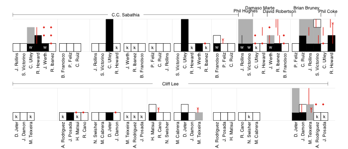
Each at-bat is represented by a bar, the height of which denotes the base the batter reached. White bars are for outs, black for hits or walks. The batter's progression around the rest of the bases that inning is indicated in gray (steals have a vertical black line through them). Runners on-base during an at-bat are indicated in red: circles for those not moved over in the at-bat, lines to show their progression as a result of the at-bat and an 'ex' if they were thrown or tagged out in that at-bat.
The score can be counted along as the black or gray bars reach the top. That also allows you to count individual batter's runs scored or pitcher's runs allowed. Red lines that reach the top are RBIs.
Compared to a traditional box score it is harder to find an individual player's line. For example to see that Chase Utley went 2-4 with 2 HRs, 2 runs, 2 RBIs, a strikeout and a walk you have to go through, find his at-bats and count all of the events. But the trade-off is, I think, this formulation gives a better feel for the pace of the game, and allows the events to be easily recreated: in the top of the first CC Sabathia escaped a base-loaded two-outs jam; Phil Hughes took over to start the eighth and walked the only two batters he faced, both of whom came around to score on Raul Ibanez's single; Utley's two solo-HRs were the only runs through the first seven innings; Cliff Lee didn't allow a runner past first until the ninth, and up to that point faced just three batters over the minimum; the Yankees burned through five relievers, who gave up four runs, in the last two innings; the top of the ninth ended with Shane Victorino getting thrown out at home on a Ryan Howard double and the game ended with two more Cliff Lee strikeouts. All of this can be easily seen through a close, but not difficult, reading of the chart.
What do you think of this format: Complicated and poorly laid out? Hard to read? Brilliant? I welcome constructive criticism in light of what you want from a representation of a baseball game.