Rich Lederer • Baseball Beat
Patrick Sullivan • Change-Up
Jeremy Greenhouse • Touching Bases
Dave Allen • F/X Visualizations
Sky Andrecheck • Behind the Scoreboard
Marc Hulet • Around the Minors
Al Doyle • Past Times
Retired Uniforms:
Bryan Smith • WTNY
Joe Sheehan • Command Post
Jeff Albert • The Batter's Eye
RSS Feed
Home
*Examining the Past, Present, and Future*
Lineup Card
Recent Entries
» Putting Together a Reality Team
» Historical Hall of Fame Vote Comparisons: 2012
» An All-Christmas Team
» The New-Look Angels
» John Denny: The Forgotten Cy Young Award Winner
» Money Isn't Everything
» What Would It Take to Hit .400 in the 21st Century?
» Halos Heaven
» Brandon McCarthy's Breakout Season
» Link-o-Rama
» Historical Hall of Fame Vote Comparisons: 2012
» An All-Christmas Team
» The New-Look Angels
» John Denny: The Forgotten Cy Young Award Winner
» Money Isn't Everything
» What Would It Take to Hit .400 in the 21st Century?
» Halos Heaven
» Brandon McCarthy's Breakout Season
» Link-o-Rama
Best of Baseball Beat
Abstracts From the Abstracts
1977 Baseball Abstract
1978 Baseball Abstract
1979 Baseball Abstract
1980 Baseball Abstract
1981 Baseball Abstract
1982 Baseball Abstract
1983 Baseball Abstract
1984 Baseball Abstract
1985 Baseball Abstract
1986 Baseball Abstract
1987 Baseball Abstract
1988 Baseball Abstract
1978 Baseball Abstract
1979 Baseball Abstract
1980 Baseball Abstract
1981 Baseball Abstract
1982 Baseball Abstract
1983 Baseball Abstract
1984 Baseball Abstract
1985 Baseball Abstract
1986 Baseball Abstract
1987 Baseball Abstract
1988 Baseball Abstract
Bert Blyleven Series
Meeting Up and Hanging Out with Bert
The Results Are In And...
Aficionado Heavily Invested in Blyleven
Latest on Blyleven's Chances for the HOF
The Internet Zealot Responds
400 Down and 5 to Go...
Bert Be Home By Eleven?
Blyleven's Forgotten Season (1973)
HeyMan, Your Comments Don't Hold Water
The Waiting is the Hardest Part
Another Addition to the Blyleven Series
Search for the Truth
As Dominant as His HOF Contemporaries
Listen, Buster
A Larger Step for Blyleven
Answering the Naysayers (Part Two)
Another Small Step for Blyleven
Q&A: Blyleven on the Twins
The Majority Rules, Right?
It's All Dutch to Some
The Hall of Fame Case for Bert Blyleven
Q&A: Blyleven on Felix Hernandez
Clemens Rocketing Up Charts
Poz: An Interview With a KC Star
A HOF Chat with Tracy Ringolsby
Up Close and Personal
A Peek Into the Mind of a HOF Voter
Answering the Naysayers
It's That Time of the Year (Again)
"If Cooperstown is Calling..."
The Bert Alert
One Small Step for Blyleven...
Only the Lonely
Exclusive Interviews
Lee Sinins
Alex Belth
David Pinto
Will Carroll
Mike Carminati
Aaron Gleeman
Joe Sheehan
Jay Jaffe
Jeff Peek
Tracy Ringolsby
Joe Posnanski
Bill James Part I, II, III
Jon Lalonde
Chuck Tiffany
Dayn Perry
Fay Vincent
Nate Silver
Alex Belth
David Pinto
Will Carroll
Mike Carminati
Aaron Gleeman
Joe Sheehan
Jay Jaffe
Jeff Peek
Tracy Ringolsby
Joe Posnanski
Bill James Part I, II, III
Jon Lalonde
Chuck Tiffany
Dayn Perry
Fay Vincent
Nate Silver
Bullpen
Rich Lederer
The Odd Couple (with Alex Belth)
The MostUnder Over Underrated Player in Baseball (with Brian Gunn)
Three Wise Men (roundtable by Alex Belth)
Infrequently Asked Questions (interview with Matt Welch)
Interview (Orioles Think Tank)
Bernie and the Yanks (Bronx Banter)
Hope and Faith: How the LAA Win the World Series (Baseball Prospectus)
NL West (The Soul of Baseball)
Greatest Living Hitter? (Sports Illustrated)
Roundtable: 2008 HOF Ballot (Armchair GM)
The Most
Three Wise Men (roundtable by Alex Belth)
Infrequently Asked Questions (interview with Matt Welch)
Interview (Orioles Think Tank)
Bernie and the Yanks (Bronx Banter)
Hope and Faith: How the LAA Win the World Series (Baseball Prospectus)
NL West (The Soul of Baseball)
Greatest Living Hitter? (Sports Illustrated)
Roundtable: 2008 HOF Ballot (Armchair GM)
Patrick Sullivan
Designated Hitters
David Bromberg (Q&A: John Denny)
Mark Armour (H. Killebrew and Versatility)
Joe Lederer (Soundtrack of a Prospect)
David Bromberg (Clemente's Autograph)
David Bromberg (Woody Fryman)
D. Baumstein (WAR Against Age: Pitchers)
Doug Baumstein (The WAR Against Age)
Doug Baumstein (A Lifetime on the Road)
John Fraser (Pick Six)
Mark Armour (How to Score More Runs?)
Bill Parker (What Opening Day Tells Us)
Stan Opdyke (Pat Rispole)
Chris Jaffe (Evaluating Baseball's Mgrs)
Stan Opdyke (Baseball Radio in NYC, 1953)
A. Nathan (Performance of Baseball Bats)
Michael Weddell (Edgar Martinez/HOF)
Jon Weisman (100 Things Dodgers Fans...)
Stan Opdyke (Connie Mack and Vin Scully)
Eric Walker (Evaluating Run Production)
Brent Mayne (The Intangibles of Catching)
Chris Moore (Best Fastballs in Baseball)
Dave Baldwin (The Batter’s Brain)
Shawn Haviland (Ivy League to MLB)
Larry Granillo (Walking Off)
Rob Iracane (Solo HR Won't Break You)
Tommy Bennett (Charm of AM Radio)
Harry Pavlidis (Johan Santana's Fast Start)
John Walsh (WAR and Remembrance)
Eric Walker (Precisely Inaccurate)
Bob Timmermann (As They See 'Em)
Geoff Young (Unicycles and Delusions)
Baseball Analysis at Tufts (Groundballers)
Baseball Analysis at Tufts (GB Out Rates)
G. Rybarczyk ('09 Hit Tracker Projections)
Joe Lederer (Curt Schilling/HoF)
Conor Gallagher (Hall of Fallacies)
Chris Green (Jim Rice, HoF, the Numbers)
Shawn Hoffman (Baseball's Bear Mkt?)
Paul Anthony (Manny Syndrome)
Ross Roley (World Series Odds)
B. Timmermann (Catcher's Interference)
R.J. Anderson (Waiting the Hardest Part)
Maury Brown (Cubs, MLB, and Cuban...)
Myron Logan (Dee-Fense, Dee-Fense)
Craig Calcaterra (Frivolity, Part I, Part II)
Chad Finn (Ode to Baseball Cards)
David Cameron (Mariners Foibles)
Chris Dial (Chipper Jones)
Pat Lederer (Memory Lane)
David Appelman (Clutch Pitching)
Bob Rittner (DH)
Jonathan Mayo (Roger Clemens)
Lisa Winston (My Son-in-Law...)
Russ McQueen (The Yellow Hammer)
Bob Rittner (I'm OK, You're OK)
Mark Armour (In Defense of the HOF)
Pat Jordan (Friends)
Dan Levitt (Analysis of Terry Ryan)
Doug Baumstein (Trading Econ 101)
Ross Roley (Runner's Reluctance II)
Ross Roley (Runner's Reluctance I)
Mark Armour (No-Longer Lovable Sox)
Bruce Regal (Stealthy and Wise)
Brian Gunn (Roid Monster)
Current/McEvoy (Value of the SB)
John Rickert (Sinister Thefts)
Nate Silver (Sabermetrics)
David Vincent (Home Run Production)
Joe P. Sheehan (Enhanced Gameday II)
Mark Armour (An Ode to Sport)
David Gassko (All-Time Worm Burners)
Joe P. Sheehan (Enhanced Gameday)
John Walsh (When Titans Clash)
Fox/Williams (Quantifying Coaches II)
Fox/Williams (Quantifying Coaches I)
Jacob Luft (Bull Durham Rant)
Chad Finn (Strat-O-Matic)
Lisa Winston (Rotisserie Baseball)
Dave Studeman (Baseball Stats)
Steve Treder (Roger Craig)
Marc Normandin (Jeff Bagwell)
D. Appelman (Expanding Strike Zone)
Jeff Sackmann (Worst MiL Defenders)
Jeff Sackmann (Best MiL Defenders)
Maxwell Kates (Van Lingle Mungo)
David Appelman (Pitch Location)
Kent Bonham (Danny Ray Herrera)
Glenn Stout (Two Baseball Poems)
Bruce Regal (The Challenge Round)
Mark Lamster (Barry & Ty)
Geoff Young (NL West)
Tom Lederer (The Ryan Express)
Brian Erts (Great Leap Forward)
David Pinto (Parity and the N.L.)
Jacob Luft (Fathers and Daughters)
Jamey Newberg (Pete's Sake)
Jeff Albert (A. Jones Swing Analysis)
Jeff Albert (A-Rod Swing Analysis)
Keith Law (Death, Taxes, and Waivers)
Peter Abraham (Tales of Torre Tales)
Larry Borowsky (Let 'er Rip II)
Dan Levitt (Empirical Analysis of Bunting)
Jonah Keri (If I Met Warren Cromartie...)
Bob Klapisch (War Stories)
Bob Timmermann (John F. Kennedy HS)
Kent Bonham (Aluminum Adjustments)
Al Doyle (More Than Superstars)
Ross Roley (Instant Replay)
David Vincent (Barry Bonds Homers)
Chad Finn (Our Favorite Obscurities)
Bill Deane (1979 NL MVP)
Mark Armour (Rise/Fall of Artificial Turf)
Jeff Angus (Wally Moon Camp)
David Berri (Money and Baseball)
Larry Borowsky (Baseball w/o the #s)
Derek Zumsteg (The Irrational Market)
David Regan (Free Agent Contracts)
Peter Schmuck (Steroids and the HOF)
David Appelman (Pitchers, Pitch by Pitch)
Dan Fox (Swinging, Taking, Fouling, Etc)
Patrick Sullivan (Study of NYY CF/BOS LF)
Will Leitch (Baseball Journalism)
Jeff Sullivan (Pitcher Release Points)
Steve Treder ('69-'70 Giants)
Maury Brown (Charlie Finley)
John Brattain (Bob Johnson)
Bob Klapisch (The Case for Bert Blyleven)
Jeff Peek (Pride and Prejudice)
Dayn Perry (Bert and Warren)
Rob Neyer (If Don Sutton Was Great...)
Lisa Winston (Minor League Memories)
Alex Belth (Otis Redding Was Right)
David Cameron (Long Live the King)
Jeff Angus (Baserunning Study)
Bert Blyleven (Baseball Playoffs)
Boyd Nation (Not a Prospect List)
James Click (Batters-Baserunners Study)
Jeff Shaw (Why I Love Baseball)
David Gassko (BIP/BFP Fielding Study)
Jay Jaffe (Milwaukee Sausage Race)
Jamey Newberg (Remember When)
Bob Klapisch (Press Box to the Mound)
Dan Levitt (Predictive Value of BB)
David Vincent (Official Scorer)
Jon Weisman (Rick Monday)
Larry Borowsky (Let 'er Rip)
Will Carroll (Fictional Short Story)
Bob Timmermann (Japanese Baseball)
Cyril Morong (Best Pitching Seasons)
Sean Forman (Monte Carlo Win-Loss)
Brian Gunn (My Little Blue Book)
Joe Lederer (My Dad and Baseball)
Bill Deane (Bob Gibson, 1968)
Mark Armour (1977 Yankees)
Darren Viola (Retrosheet)
David Pinto (RFK)
Dayn Perry (Brave Heart)
Matt Welch (Dave Hansen)
Kevin Kernan (Jack McKeon)
Tom Lederer (Dodgers Road Trip)
Steve Lombardi (Slider)
Studes (Picturing Baseball)
Mike Carminati (Luck of the Drawl)
Eric Neel (Vin Scully)
J.C. Bradbury (Leo Mazzone)
John Sickels (Bill James)
Search Baseball Analysts
Archives
By Category:
Around the Majors Content Only
Around the Minors Content Only
Baseball Beat Content Only
Baseball Beat/Change-Up Content Only
Baseball Beat/WTNY Content Only
Behind the Scoreboard Content Only
Change-Up Content Only
Change-Up/Around the Majors Content Only
Command Post Content Only
Crunching the Numbers Content Only
Designated Hitter Content Only
F/X Visualizations Content Only
Past Times Content Only
Saber Talk Content Only
The Batter's Eye Content Only
Touching Bases Content Only
Weekend Blog Content Only
WTNY Content Only
By Month:
February 2012
January 2012
December 2011
October 2011
September 2011
August 2011
July 2011
June 2011
May 2011
April 2011
March 2011
February 2011
January 2011
December 2010
November 2010
October 2010
September 2010
August 2010
July 2010
June 2010
May 2010
April 2010
March 2010
February 2010
January 2010
December 2009
November 2009
October 2009
September 2009
August 2009
July 2009
June 2009
May 2009
April 2009
March 2009
February 2009
January 2009
December 2008
November 2008
October 2008
September 2008
August 2008
July 2008
June 2008
May 2008
April 2008
March 2008
February 2008
January 2008
December 2007
November 2007
October 2007
September 2007
August 2007
July 2007
June 2007
May 2007
April 2007
March 2007
February 2007
January 2007
December 2006
November 2006
October 2006
September 2006
August 2006
July 2006
June 2006
May 2006
April 2006
March 2006
February 2006
January 2006
December 2005
November 2005
October 2005
September 2005
August 2005
July 2005
June 2005
May 2005
April 2005
March 2005
February 2005
January 2005
December 2004
November 2004
October 2004
September 2004
August 2004
July 2004
June 2004
May 2004
April 2004
March 2004
February 2004
January 2004
December 2003
November 2003
October 2003
September 2003
August 2003
July 2003
June 2003
Reference
Organizational Stats
Arizona Diamondbacks Bat / Pitch
Atlanta Braves Bat / Pitch
Baltimore Orioles Bat / Pitch
Boston Red Sox Bat / Pitch
Chicago Cubs Bat / Pitch
Chicago White Sox Bat / Pitch
Cincinnati Reds Bat / Pitch
Cleveland Indians Bat / Pitch
Colorado Rockies Bat / Pitch
Detroit Tigers Bat / Pitch
Florida Marlins Bat / Pitch
Houston Astros Bat / Pitch
Kansas City Royals Bat / Pitch
Los Angeles Angels Bat / Pitch
Los Angeles Dodgers Bat / Pitch
Milwaukee Brewers Bat / Pitch
Minnesota Twins Bat / Pitch
New York Mets Bat / Pitch
New York Yankees Bat / Pitch
Oakland Athletics Bat / Pitch
Philadelphia Phillies Bat / Pitch
Pittsburgh Pirates Bat / Pitch
St. Louis Cardinals Bat / Pitch
San Diego Padres Bat / Pitch
San Francisco Giants Bat / Pitch
Seattle Mariners Bat / Pitch
Tampa Bay Devil Rays Bat / Pitch
Texas Rangers Bat / Pitch
Toronto Blue Jays Bat / Pitch
Washington Nationals Bat / Pitch
All-Star Links
Official Websites
News and Notes
Baseball News Blog
Baseball Newstand
ESPN Baseball
Fox Sports Baseball
Pro Sports Daily
Roto World
The Roto Times
USA Today Baseball
Baseball Newstand
ESPN Baseball
Fox Sports Baseball
Pro Sports Daily
Roto World
The Roto Times
USA Today Baseball
Reference and Analysis
Baseball Almanac
Baseball America
Baseball Archive
Baseball Contracts
Baseball Cube
Baseball Graphs
Baseball Library
Baseball Musings Player Database
Baseball Page
Baseball Primer
Baseball Prospectus
Baseball Reference
Baseball Statistics
Baseball Truth
Boxscore Central
Diamond Mind Baseball
Doug's Stats
FanGraphs
Fast Balls (pitchfx catalog)
Hardball Dollars
Hardball Times
Hit Tracker
Retrosheet
Rotobase/Rotoblog
Stat Corner
STATS
Tango on Baseball
Yahoo Sports MLB
Web Gems
Bill James Primer
Sabermetric Manifesto (Grabiner)
Pitching and Defense (McCracken)
Pitching and Defense (Tippett)
Transactions Primer (Neyer)
Baseball Stats (Batter's Box)
Prospect Report (Cameron)
Pitcher Workloads (Sheehan)
Goodbye to Old Baseball Ideas (Rickey)
Sabermetric Manifesto (Grabiner)
Pitching and Defense (McCracken)
Pitching and Defense (Tippett)
Transactions Primer (Neyer)
Baseball Stats (Batter's Box)
Prospect Report (Cameron)
Pitcher Workloads (Sheehan)
Goodbye to Old Baseball Ideas (Rickey)
Columnists
Baseball Blogs
Around the Majors
Athletics Nation
Baseball Crank
Baseball Musings
Baseball-Reference Blog
Batter's Box
Big League Stew
Bronx Banter
Catfish Stew
Cub Town
Dan Agonistes
Dodger Thoughts
DRays Bay
Ducksnorts
Futility Infielder
Halos Heaven
Inside the Rockies
It Might Be Dangerous
Knuckle Curve
LoHud Yankees Blog
Lookout Landing
Management by Baseball
Metaforian
Metsgeek
Mike's Baseball Rants
Only Baseball Matters
Redbird Nation
Red Reporter
Sabernomics (Braves)
Seth Speaks
ShysterBall
6-4-2 (Angels/Dodgers)
The Book
TheCubdom
The Cutting Edge
The House That Dewey Built
The View From The Bleachers
Tiger Blog
U.S.S. Mariner
Viva El Birdos
Where's Kernan
Minor Leagues
Arizona Fall League
BA Player Finder
Cal Leaguers
Jamey Newberg
JDM's Scoresheet Baseball
Minor League Baseball
Minor League Park Factors
Minor League Splits
No Pepper
Sickels' Minor League Ball
Warm October Nights
BA Player Finder
Cal Leaguers
Jamey Newberg
JDM's Scoresheet Baseball
Minor League Baseball
Minor League Park Factors
Minor League Splits
No Pepper
Sickels' Minor League Ball
Warm October Nights
Amateur
Boyd's World (College)
Cape Cod Baseball League
College Baseball Blog
College Baseball Insider
Collegiate Baseball Newspaper
College Splits
College Splits Blog
Dirtbags Baseball (Long Beach State)
NCAA Baseball
NCBWA
Team One Baseball (High School)
Texas A&M & Baseball
Cape Cod Baseball League
College Baseball Blog
College Baseball Insider
Collegiate Baseball Newspaper
College Splits
College Splits Blog
Dirtbags Baseball (Long Beach State)
NCAA Baseball
NCBWA
Team One Baseball (High School)
Texas A&M & Baseball
Historical
Cuban Baseball
House of David
Jim "Mudcat" Grant's Web Page
Negro League Baseball Players Assoc
Negro Leagues Baseball Museum
1919 Black Sox
Pacific Coast League
Philadelphia Athletics Historical Society
Shoeless Joe Jackson Society
SABR-L Archives
Walter O'Malley
House of David
Jim "Mudcat" Grant's Web Page
Negro League Baseball Players Assoc
Negro Leagues Baseball Museum
1919 Black Sox
Pacific Coast League
Philadelphia Athletics Historical Society
Shoeless Joe Jackson Society
SABR-L Archives
Walter O'Malley
Miscellaneous
Forums
Credits
Ticket Center
Tickets to Baseball -
Premium Red Sox Tickets - Tickets to Marlins Games - Cardinals Game Tickets - NY Yankee Tickets - Tickets Oakland Athletics - Dallas Cowboys Tickets - Arizona Cardinals Tickets - Tickets Seattle Seahawks - Buffalo Bills Tickets Online - Tickets to Dolphins Football
Buy Boston Red Sox tickets,
Philadelphia Phillies tix,
NY Yankees tickets,
NY Mets tickets, and
MLB All Star game tickets at ABC tickets
Not sure where to find the best online sportsbooks? Start your search with PlayersJet.
Get deals at SportsMemorabilia.com on baseball apparel, including Phillies jerseys and more for adults and children.
Shop the largest selection baseball equipment on sale at Sports Unlimited. Check out tons of baseball gloves, youth baseball gloves and catchers gear from Rawlings, Wilson, Nike & Under Armour.
2011 Draft Order
Courtesy of Baseball America
First-Round:
 1. Pirates (57-105)
 2. Mariners (61-101)
 3. Diamondbacks (65-97)
 4. Orioles (66-96)
 5. Royals (67-95)
 6. Nationals (69-93)
 7. Diamondbacks (for B. Loux)
 8. Indians (69-93)
 9. Cubs (75-87)
10. Padres (for Karsten Whitson)
11. Astros (76-86)
12. Brewers (77-85)
13. Mets (79-83)
14. Marlins (80-82)
15. Brewers (for Dylan Covey)
16. Dodgers (80-82)
17. Angels (80-82)
18. Athletics (81-81)
19. Red Sox (from DET for Martinez)
20. Rockies (83-79)
21. Blue Jays (85-77)
22. Cardinals (86-76)
23. Nationals (from CWS for Dunn)
24. Rays (from BOS for Crawford)
25. Padres (90-72)
26. Red Sox (from TEX for Beltre)
27. Reds (91-71)
28. Braves (91-71)
29. Giants (92-70)
30. Twins (94-68)
31. Rays (from NYY for Soriano)
32. Rays (96-66)
33. Rangers (from PHI for Lee)
Supplemental First Round:
34. Nationals (Dunn)
35. Blue Jays (Downs)
36. Red Sox (Martinez)
37. Rangers (Lee)
38. Rays (Crawford)
39. Phillies (Werth)
40. Red Sox (Beltre)
41. Rays (Soriano)
42. Rays (Balfour)
43. Diamondbacks (LaRoche)
44. Mets (Feliciano)
45. Rockies (Dotel)
46. Blue Jays (Buck)
47. White Sox (Putz)
48. Padres (Garland)
49. Giants (Uribe)
50. Twins (Hudson)
51. Yankees (Vazquez)
52. Rays (Benoit)
53. Blue Jays (Olivo)
54. Padres (Torrealba)
55. Twins (Crain)
56. Rays (Choate)
57. Blue Jays (Gregg)
58. Padres (Correia)
59. Rays (Hawpe)
| F/X Visualizations | January 10, 2012 |
Historical Hall of Fame Vote Comparisons: 2012
For the past two years I have written a post taking a graphical look at Hall of Fame vote histories for players with similar first-year vote totals to players on the current year's ballot. Here is 2010's, which includes a description of the graphs, and here is 2011's. As I said these graphs are not meant as sophisticated projection into the future, but rather just a rough look at historical precedent. Folks like Chris Jaffe of the Hardball Times have a better handle on the dynamics of HoF voting and future ballot composition in order to make better prediction.
This year's ballot had only one first-year player, Bernie Williams, who broke 5% and will be included on future ballots. Williams got 9.6% of the vote. Here I highlighted the vote trajectories of everyone else who got within 2.5% (7.1% to 12.1%) in their first year on the ballot.
There are a number of historical players who are not going to be a good guide for Williams' trajectory; Hall of Fame voting was much different in the past. Carl Hubbell, for example, was on 9.7% of the ballots in 1945, his first year; shot up to 50% in his second year; and by 1947 was inducted with 87%. Williams will not see a similar rise. More recent players in Williams's pool have fallen below the 5% cut off rather quickly. I left off the names because they would all bunch together but they include: Orel Hershiser, Graig Nettles, Bob Boone, Dave Stewart, Albert Belle, and Pete Rose. It will be interesting to see whether Williams can stick around for years like Don Larsen or fall off quickly like Hershiser and others.
With no other first-year guys above 5%, I am going to look at some guys who have been on the ballot for a couple of years. In each case I chose a salient feature of their vote history to create a comparison pool. Up first is Jack Morris, who, on his 13th year on the ballot, was on 66.7% of the ballots. This is a pretty big jump from last year's total of 53.5%. With no great first year players on the ballot, it seems voters were a little more liberal with their votes on returning players, many of whom saw a double digit rise. For Morris's comparison I looked at anyone else who received between 65% and 70% on some ballot after their 10th.
All these guys eventually made it. Three through the standard 75% BBWAA voting, and then Red Ruffing through a runoff ballot, and Enos Slaughter and Jim Bunning through the Veterans Committee. So things look promising for Morris.
Jeff Bagwell also had a nice increase, from 41.7% to 56%. Here are the players within 10% of these two vote totals.
This picks up other fast risers. Ryne Sandberg and Barry Larkin are bad comps because they are at the very high end of my comparison window for both years; Bagwell is not going to make it next year. He might slowly pick up steam like Andre Dawson or Tony Perez and make it around year ten. But with the amount of talent coming on and the PED stuff, I am not so sure.
I will skip Lee Smith and turn to Tim Raines. Raines has had a nice increase in vote share over the past three years, and is now at 48.7%. I looked at players within 10% of his year-3 to -5 ballots (because they are much higher than his first two years).
Except for Smith who is still on the ballot, all these guys are in the Hall. Johnny Evers and Bunning made it through the VC. As with the Bagwell example this might paint too sunny a picture for Raines.
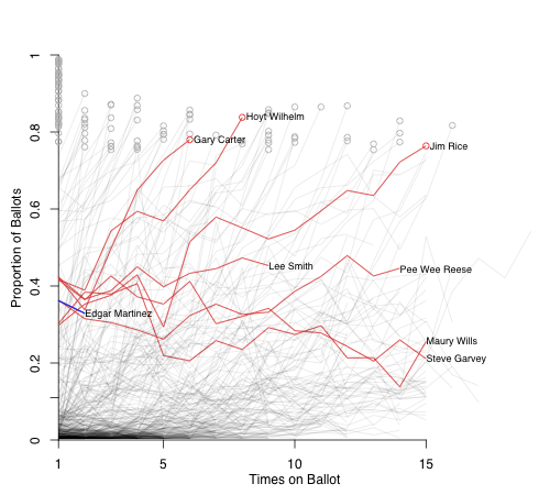
Finally I look at Edgar Martinez. He did not get quite the same bump the other guys did, and has been pretty stagnant over his first three years. Here are players within 12.5% of each of his three vote totals.
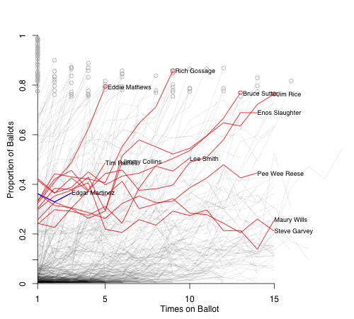
Jack Moore at FanGraphs made the Pee Wee Reese comparison. I think that Jack is right that Martinez will probably end up with a Reese-, Maury Wills-, or Steve Garvey-like trajectory, and not one that takes him up rapidly like Eddie Mathews or Rich Gossage.
| F/X Visualizations | August 09, 2011 |
Brandon McCarthy's Breakout Season
One of the biggest success stories of the 2011 season has been Brandon McCarthy. From 2005-2009 he never posted an FIP better than 4.7, and twice had a FIP above 5. Then he spent 2010 injured and in the minors. But over 108 innings thus far this year, more than he has ever thrown in a season, he has a FIP of 2.69: a pretty incredible improvement. The immediate reasons are a big drop in walks — just 1.33 per nine fourth best for a pitcher this year with at least 100 innings — and an increase in ground balls. These improvements turned McCarthy from an average-control, fly-ball pitcher to an amazing-control, ground-ball pitcher, while not losing any of his strikeouts. That is going to lead to changes for the better — as it has for McCarthy.
Rob Neyer has a nice interview with McCarthy (which along with McCathry's great last start inspired this post), in which McCarthy discusses some of the adjustments he has made coming into this year. The main one was developing a fastball with more movement, and then the confidence that gave him. They also discuss McCarthy's injury history, which led him to average just 75 innings a year from 2005 to 2009. Kyle Boddy looked at pitchf/x data and film to examine mechanical changes McCarthy had made between 2009 and 2011. Boddy's mechanical analysis is always very interesting, this article is worth a read, and the upshot is that Boddy likes that changes that McCarthy has made, and that they may help him prevent injuries in the future.
So we know that McCarthy reworked his both his approach and mechanics heading into this season. Based on the pitchf/x data it also looks like he radically changed his pitching arsenal. McCarthy has all but abandoned his slider and change up; switched from mostly a four-seam to a mostly two-seam fastball; and added a cutter.
Before this year McCarthy's fastballs, which he threw around 65% of the time, were almost all four-seamers and were fly-ball pitches, getting just 31% grounders. Those have largely been replace by cutters and two-seam fastballs, which have ground-ball rates of 38% and 55% respectively. This explains his increase in grounders. He is also throwing the ball harder. His fastballs used to average 89 mph, but this year they average 91 mph. This is very surprising when going from predominately four-seam fastballs to two-seam fastballs, since two-seam fastballs tend to be slower. The change in mechanics look to have paid off.
Turning to his newfound command, here are the locations of his fastballs to right-handed batters in 2009 compared to his fastballs and cutters to right-handed batters in 2011:
As expected by his drop in walks McCarthy's pitch-level command is dramatically better. The pitches are in the zone more often, but more than that they cluster very tightly on the outside half of the strike zone. Meaning McCarthy is simultaneously better at pitching in the zone, but not in the down-and-in wheelhouse of right-handed batters.
Here are his fastballs in 2009 compared to his fastballs and cutters in 2011 to left-handed batters:
Again his pitches cluster much tighter in and around the strike zone in 2011. Interestingly he has gone inside more to lefties than he is to righties, the opposite of most right-hand pitchers. But it hasn't hurt him so far, as he has succeed against batters on both sides of the plate this year.
You really have to tip your hat to McCarthy, he seems to have completely retooled his arsenal for the better. With his two-seam fastball and cutter he has shown incredible command, while at the same time getting tons more ground balls (thanks mostly to the two-seam fastball) while not losing whiffs (thanks mostly to the cutter). He also has a very funny twitter account.
| F/X Visualizations | July 08, 2011 |
Bartolo Colon Strikes Them Out Looking
Last night Bartolo Colon threw a clunker fo the New York Yankees against the Tampa Bay Rays. But, what makes that clunker so amazing is that after twelve starts for the Yankees this was just the third bad start for Colon. After not pitching in 2010 and with just limited success since 2005, Colon's 2011 has been a major surprise. He is striking out 7.9 batters per nine innings, the best since 2001, while maintaining his great command.
Colon is getting the majority of these strikeouts on called strikes. Typically high-strikeout guys get lots of swinging strikes, and Jeff Sullivan showed that swinging-strike rate correlates very well with strikeout rate. But Colon is in the bottom ten among starters at getting swinging strikes, but is solidly above average at getting strikeouts. Jeff Sullivan actually wrote about this strange fact back in May. Colon's strikeouts are coming overwhelmingly on called strikes. He has the highest rate of called strikes (called strikes per pitches) among pitchers with over 500 pitches at 23.7%. The major league average is 17.5%, the next highest is Carlos Marmol with 23.1% and the next starting pitcher is Kyle Lohse with 21.9%.
Colon throws almost all fastballs, 84%. That makes the called strikes that much more interesting. Batters almost surely know that a fastball is coming, but Colon gets takes in the zone anyway. A big part of this comes down to location. Here are the locations of his two- and four-seam fastballs in 2011, with called strikes circled.
To left-handed batters:
To right-handed batters:
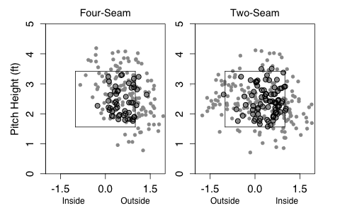
He paints the four-seam fastball on the outer half of the plate, and just piles up called strikes. The two-seam fastball he throws over a wider swath of the plate, but still gets called strikes even over the heart of the plate — most likely from the two-seamer's heavy sink and tail.
Here are three possible — though non-exhaustive and nonexclusive — explanations for his called strikes: (a) Colon hits the corners better than other pitchers; (b) hitters take his pitches in the zone more often than against other pitchers; and (c) umpires call his taken pitches on the edges more often than other pitchers.
Looking at (a):
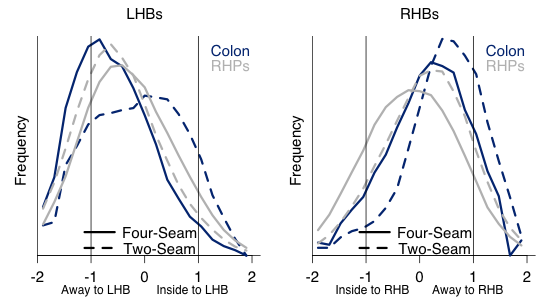
To left-handed batters Colon does throw his four-seam fastball more consistently away than most right-handed pitchers. But his two-seam is throw across the zone, and much more inside than most right-handed pitchers will throw it. Against right-handed batters he goes more consistently away with both his two- and four-seam fastballs than the average pitcher. This already could account for the additional called strikes because these pitches right on the edge of the zone should be more likely to be taken.
Turing to (b), here I just look at pitches that are vertically in the zone (between sz_top and sz_bot):
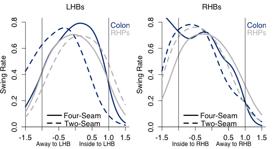
Against left-handed batters Colon gets considerable more swings away on his two-seamer, but fewer inside. This works well for him as he often throws the two-seam inside to lefties. It looks like they aren't expecting it and often take it. Against right-handed batters he gets swings at about the same rate as average. The swings on his inside four-seamers are probably just noise because he rarely throws inside four-seamers to right-handed batters.
Finally looking at (c), again these are pitches within the zone vertically:
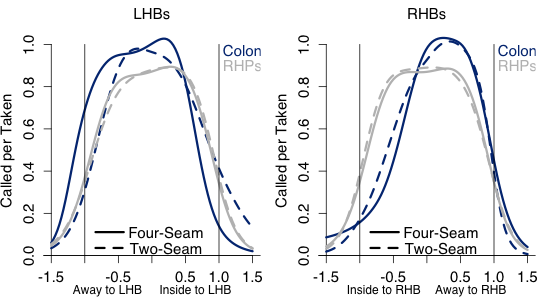
Generally Colon gets more called strikes than average. This could be because he gets the benefit of the doubt since he is always around the zone. Or because his pitches are vertically closer to the center of the zone than the average pitcher's. That is even though I am just looking at pitches between the top and bottom of the zone, Colon's could still be, on average, closer to the heart of the zone. But either way Colon is getting more called strikes on taken pitches.
Overall Colon benefits from all three possible factors: he throws more pitches on the edge of the zone than the average pitcher; his inside two-seam fastball is taken at a very high rate; and his taken pitches are more likely to be called strikes. His last start not withstanding, I am not sure whether he can keep this up. Maybe the league will get on to him and start swinging at his pitches more often. Historically it has been very hard to keep a strikeout rate that high missing so few bats.
| F/X Visualizations | June 06, 2011 |
Jose Bautista: Patience and Power
Jose Bautista’s breakout has been one of baseball’s most interesting stories of the past two years. From 2006 to 2009 Bautista was a slightly below-average hitter for the Pittsburgh Pirates and Toronto Blue Jays, hitting between 13 and 16 home runs each year. But since the start of 2010 Bautista has hit more HRs, 74, than anyone else in the majors — Albert Pujols is second with 55. Over that time he also leads the league in walks taken with 152 and walks per plate appearance, 16.6%. All those walks and home runs make Bautista the best hitter, as measured by wOBA, since the start of 2010. Here I am going to look deeper into Bautista’s success.
Bautista is a pronounced pull-HR hitters. Of his 74 HRs since the start of 2010 just three have gone to the opposite field (that is had a horizontal angle of less than 90° according HitTracker). That is fewer opposite-field HRs than any other player on the 2010-2011 top 10 HR list — even though he tops the list.
With this extreme pull power one would assume he couldn’t handle away pitches as well. Pitchers have assumed as much, Garik16 showed that pitchers have incredibly pitched him away. But he also showed that Bautista has gotten better over the past three years at dealing with those outside pitches, and now has a positive run value on them. Here is a big reason why. This graph shows the horizontal pitch location on each pitch Bautista has hit for a HR since the start of 2010, and then the angle of that HR in play.
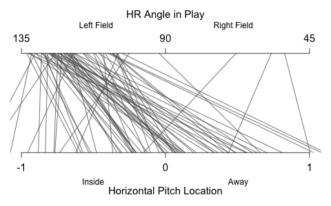
A large number of Bautista’s HRs have come off pitches on the outer half of the plate, and he has still been able to pull those pitches to left field. In fact he has three pulled HRs on pithes far off the plate away. (On a side note Max Marchi has a great article analyzing this type of data at the Hardball Times.)
With that prodigious power pitchers have responded by increasingly pitching around Bautista. He has eight IBBs so far this year second in baseball to Miguel Cabrera’s 12. And even when he is not intentionally walked he is not given much to hit; he sees the fewer pitches in the zone than any other hitter.
Here is a set of graphs showing the how often Bautista sees pitches in each location, based on the intensity of the blue, and Bautista’s 50% swing contour. So Bautista was more likely than not to swing at a pitch within the contour, and more likely than not to take a pitch outside it.
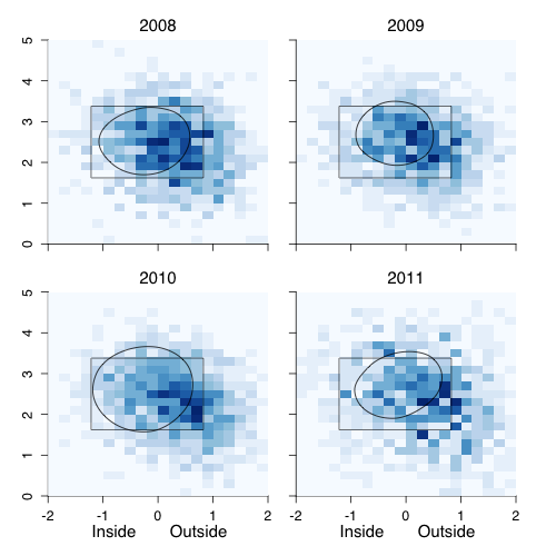
In 2008 and 2009 pitchers pitched to Jose Bautista as they would to most average hitters: throwing mostly in the zone and slightly away. With Bautista’s breakout starting in the end of 2009 and continuing in 2010, pitchers increasingly threw away and down. This change in location is partially a consequence of Bautista seeing fewer fastballs and more breaking and off-speed pitches. Bautista’s swing zone has remained fairly static, and as a result he is walking much more.
Around the end of April Dave Cameron suggested that Jose Bautista might be the best hitter in the AL. Since then Bautista has continued to hit like crazy, and his ZIPS rest of the season projected wOBA is now the best in baseball: an amazing ascent for a batter who went into the 2010 as an at-best average hitter.
| F/X Visualizations | May 09, 2011 |
Does the Ump Care How Long the Game Is?
During this weekend's Boston-Minnesota series there was another Joe West kerfuffle and the play-by-play guys brought up Joe West's history with Boston. They mentioned West's comments last year that he did not like the Boston Red Sox and New York Yankee style of play, particularly those teams' long games. Setting aside one's own opinion game length and how appropriate it is for an umpire to criticize particular teams, I am sure that umpires — like everyone else — notice when games drag on. But unlike everyone else they are in a unique position to do something about it. So based on West's comments I wondered whether umpires expand the strike zone during long games to speed things along.
To look at this I used the, conveniently time-stamped, pitchf/x data. I collected all pitches made in the sixth through eighth innings and the looked at how long into the game each was made. For example, the average pitch in the sixth inning was made 1 hour and 48 minutes after the start of the game. Then I formed two subsets of these pitches, those in the top 5% of length for their half inning, and those in the bottom 5% of length for their half inning. For example the 'long' group included pitches from the bottom of the eighth inning that were thrown 3 hours and 14 minutes or more after the game started. Pitches from the bottom of the eighth inning were included in the 'short' group if they were thrown before 2 hours and 1 minute since the game started. And similarly for other half innings. The top and bottom of the inning were done separately so that pitches from the top of innings didn't over represent in the 'short' group and bottom of the inning pitches in the 'long' group.
So these pitches come from situations where the game has already gone on for a very long or short time when they were thrown. Now we are interested in how the strike zone was called on these two groups. Unfortunately there might already be a sampling bias in the data. 'Long' games might have umps with smaller strike zones, that being why the game has gone on so long. So a more clever WOWY approach would be preferential, but I couldn't come up with one.
With that limitation in mind let's see how the strike zones of the two groups compared. To first see how the top and bottom of the zone were called I considered taken pitches that were clearly in the zone horizontally ( -0.5 > px < 0.5), and looked at their called strike rate by normalized pitch height.
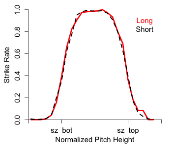
Effectively no difference. The top and bottom of the zone were called at close to the same spot for both samples of pitches (and very close to sz_bot and sz_top, showing that the stringers do a pretty good job with these values).
Turning to the horizontal zone I similarly looked at pitches that were clearly in the zone vertically (pz in the middle half of the interval between sz_top and
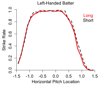
Again there is almost no difference. And if anything there is a very slight difference on the right edge of the zone (from the umpire's perspective), with the 'long' zone slightly smaller. The opposite effect if the umpire was trying speed the game up. Although the difference is tiny.
So overall, at least by this methodology, there is no difference in how the zone is called in long versus short games. If the umpires are annoyed by having to call a game going into its third hour in the seventh inning they don't seem to let it affect their strike zone. Score one for the boys in blue.
| F/X Visualizations | March 31, 2011 |
Comparing 2011 Division Projections
Last year before the 2010 season started I looked at how a couple different projection systems saw the season playing out. With this season just one day old, I wanted to do the same for the 2011 projections. Here I take a graphical look at the number of wins six systems project for every team and plot those out for each division separately. This gives a good picture of the range of predictions and how much consensus there is across systems.
I used five projection systems for which I could get win totals and the Vegas regular season over/under win totals. I grabbed the Marcel, Bill James and Cairo projections complied by the folks at RLYW who ran the player-level projections for those systems through the Diamond Mind Simulator to get win totals. I also used THT's Oliver and BPro's Pecota projections (as of March 30th). The Vegas lines are from Pinnacle Sports, so they are not really Vegas's numbers but the offshore ones (also as of March 30th).
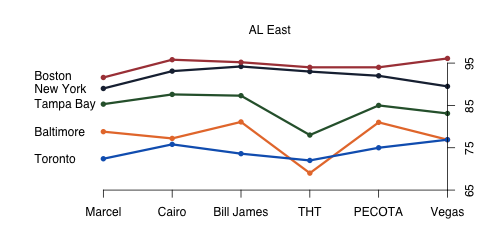
All of the projections systems see a pretty clear ordering of the five AL east teams, with a slight disagreement in the cellar dweller Toronto (Marcel, Cairo, Bill James, Pecota) or Baltimore (THT, Vegas). I was surprised to see Baltimore come out on top of Toronto in so many projections. Although not a difference in ordering, THT is not nearly as fond of Tampa Bay as the other systems are. And interestingly Vegas has a lower win total for the Yankees than any other system, I always assumed that there would be a pro-Yankees bias among bettors.
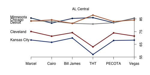
All six projections see the AL Central as pretty clearly two-tiered — with Minnesota, Chicago and Detroit competing for the division title and then Cleveland and KC a solid ten wins behind. Though everyone likes Cleveland more than Kansas City. As in the AL East THT has some outlier values, projecting more extreme values for Detroit, Cleveland and Kansas City
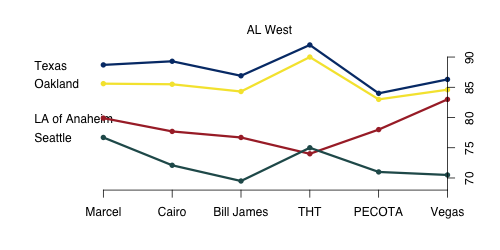
The AL West is similarly two-tiered — with Texas and Oakland at the top, and Los Angeles and Seattle bringing up the rear. There is only one disagreement in the ordering with THT thinking Seattle is above Los Angeles. THT also likes the top two teams much more than the other systems do. Vegas is pretty high on LA, seeing them just a slight step behind the Texas and Oakland. If you have faith in the projection systems over the bettors and bookmakers an under on the Angels is a clear play.
There is a farily well agreed upon ordering in the NL East,.THT is again something of an outlier projecting New York and Florida as fairly even while everyone else clearly prefers Florida, and is the only system that likes Atlanta over Philadelphia to win the division. If you trust the projections systems over Vegas this division offers two opportunities: the under on Philly and the over on New York.
Sorry about the color choice here. Both St. Louis and Cincinnati deserve red, but their lines are very close so to keep things distinct. So I went with black for Cincinnati and red for St. Louis. This is another two-tiered division with four teams fairly close at the top (though Chicago is at the bottom of the top tier in most systems) and then two bottom dwellers. Like the AL Central this is projected to be a pretty competitive conference. Again THT is something of an outlier liking Cincinnati and St. Louis much more than the other systems.
Five of the six systems like San Francisco to repeat at NL West champions, with Marcel the lone dissenter picking Los Angeles. THT is again the most bullish about the favorite's win total, as it is the only system projecting more than 90 wins for San Francisco. Vegas likes Colorado by a fairly big margin compared to the projection systems, so there is another play if you are so inclined.
| F/X Visualizations | February 04, 2011 |
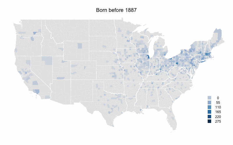
US-Born Baseball Players' Birthplaces over Time
The composition of MLB players had changed dramatically over MLB's history, with the game opening up to new groups and the rising popularity of the game internationally. For example, the number of foreign-born players has increased over the history of the game, though it dropped back down to its lowest rate since 2006 last year. But I was interested in changes over time in the birthplaces of US-born players. As the population of the United States moved west and south, and MLB opened up to blacks and others I wanted to see how that changed where US-born players came from.
To look at this I color-coded a US map by number of MLB players born in each county during five time periods. I got birthplaces from the Lahman database and then linked those up with the current county that birthplace is in. The maps are color-coded by raw number of players per county rather than the more desirable players per capita. The problem is that some of these counties are new entities, so there is no population data for them going back that to the 1800s or early 1900s.
I broke up the time periods so that the number of players born during each is close to equal (about 3000). Here is the first map for players born before 1887.
Not surprisingly the northeast has the highest levels. The population of the US was heavily concentrated in the northeast at this time. Cook County (Chicago), Philadelphia County (very small right on the southern border of PA and NJ), and New York County (also hard to see right at the base of Long Island) have the highest. There are very few players from counties south of the Ohio river or west of the Mississippi river.
Already there is a shift south and west. The southeastern states, those just west of the Mississippi, Texas and southern California all see increases.
The decline in part of the northeastern US continues. Northern New England and upstate New York are now almost devoid of players. But the Northeast's large cities are still solid, and Wayne County, MI (Detroit) has a big increases. But the main story is southern California where the number of players counties to increase.
Rural areas in most of the country really start to fall off here. Outside of major metropolitan areas the eastern US has considerably fewer players. The one exception is Florida which has its highest numbers yet. Arizona and Washington also see increases in their numbers. Southern California increases further.
Again rural counties throughout most of the country have very low numbers. On the other hand Florida, Arizona, and to a lesser extent Washington state continue their increases. Clark County, NV (Las Vegas) sees a big increase and southern California still has very high levels.
As a whole these numbers mirror the south and west movement of people in the US, and the movement from more rural counties to more urban/sub-urban counties. At the same time I think that southern California (and the adjacent Clark County, NV and areas of Arizona) are far over represented by baseball players even when accounting for this areas large population.
Though the maps would be better in per capita form, I still think this offers an interesting picture of the history of US-born baseball players. Here they are in animated gif form.
| F/X Visualizations | January 07, 2011 |
Historical Hall of Fame Vote Comparisons
Congratulations to Bert Blyleven and Roberto Alomar for being voted into the Hall of Fame. A great honor for two deserving players. Of course I also want to send my best to Rich, who I am sure is also enjoying Wednesday's news. If you haven't already please read Sully's post from yesterday.
Last year's I ran a piece looking at BBWAA vote histories for players with similar first-year vote totals to first-year players on last year's ballot, and I will do that again here. This is not meant to be a sophisticated projection of the future. Folks like Chris Jaffe of the Hardball Times have a good handle on the dynamics of HoF voting and the future ballot composition to make better prediction. This is more of a rough look at historical precedent.
First off we have Jeff Bagwell who was on 41.7% of the ballots. Here are the BBWAA votes histories for other players who received between 46.7% and 36.7% of the votes their first year.
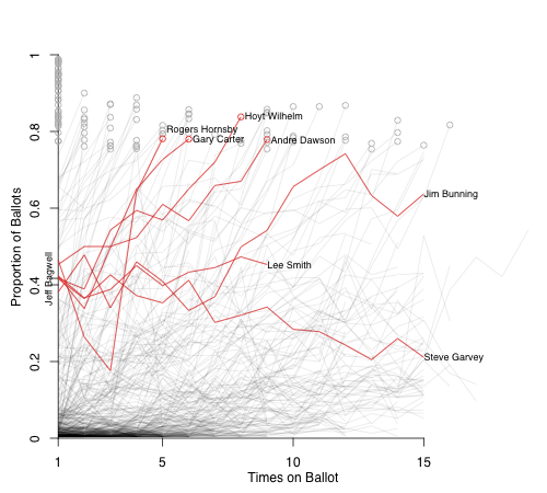
There are a total of seven players, four of whom were elected to the HoF by the BBWAA sometime between the fifth and ninth ballot. Lee Smith is still on the ballot, but it is doesn't look too good for him. Jim Bunning came very close on his 12th year, but then lost support and was inducted by the Veterans Committee. Steve Garvey never made it. Jaffe thinks this is a good start and notes that Garvey is the only player not currently on the ballot to have received over 31% on his first ballot and not be elected. Craig Calcaterra is not as sanguine. He thinks the PED moralists will keep his total down; Mark McGwire has not seen any movement in his total — though McGwire has much more of a PED connection than Bagwell. In addition, as Rob Neyer notes, there is just an insane amount of talent coming on the ballot in 2013-2015. Writers usually do not like to vote for too many guys at once, the Harvard Sports Analysis Collective notes that even though talent fluctuates between ballots the average number of players on per ballot is roughly constant. Unless Bagwell makes a huge jump next year — in a weak 2012 ballot — it gets rough starting in 2013.
Larry Walker got 20.3%, here are the players who received between 22.8% and 17.8% on their first ballot.
One guy in this group made it through the BBWAA vote; Roger Bresnahan made it through the Old Timers Committee; Red Schoendienst through the Veterans Committee; three guys are still on the ballot; and then three others never really broke 40%. Given the talent that is coming on the ballot it is hard to see Walker having a Don Drysdale-like rise to induction.
After that you have Rafael Palmeiro at 11%, Juan Gonzalez at 5.2% and a host of guys below the 5% cutoff. There is not much interesting to see with their comps. Instead I will turn my attention to a couple of guys who have been on the ballot for a couple of years and look at comparable players based on multi-year data.
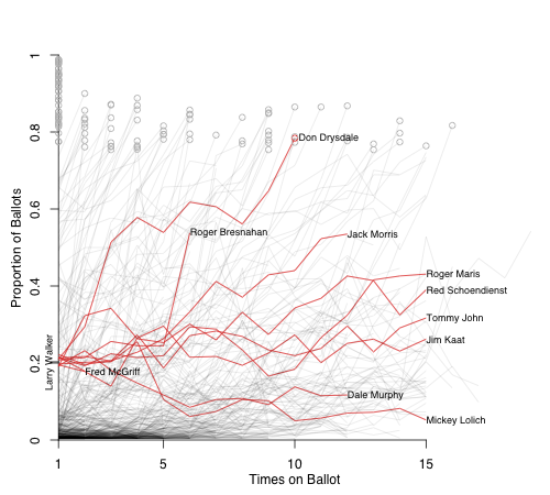
First off is Barry Larkin. Here are the three players who were within 5% of both his first year (51.6% last year) and second year totals (62.1% this year).
Things look good for Larkin. Ryne Sandberg and Fergie Jenkins made it on the next ballot while Robin Roberts on the one after that. It really seems like 2012 is Larkin's year, given his strong vote totals in the past two years and the weaker group of first-timers on the 2012 ballot (Bernie Williams is probably the best guy on the ballot).
Next up is Edgar Martinez, also a second-year guy. He saw a drop from 36.2% to 32.9%. Here are the players within a 7.5% of both of those totals (I had to make a bigger envelope to get a good number of players).
Three guys made it through the BBWAA votes; Pee Wee Reese got in on the Veterans Committee; Lee Smith is still on; and two guys didn't make it. Given the guys coming, Martinez's role as a DH, and his drop in vote share it does not look good for Martinez. I think this comparison group probably overstates his chances.
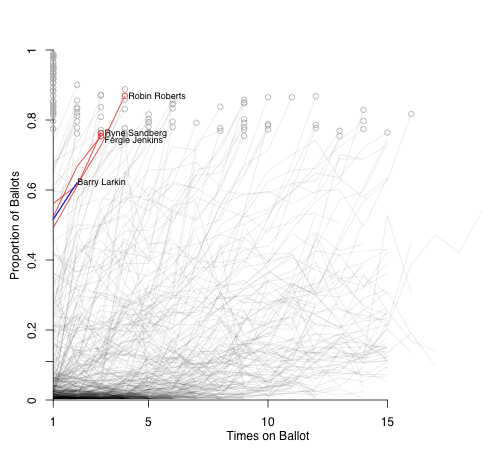
Here is Mark McGwire. His numbers have held fairly constant over the first five years on the ballot. I had to widen range to those within 10% of the five ballots to match up a big enough pool to McGwire.
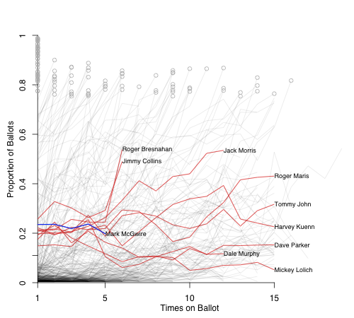
Things don't look too good. Bresnahan and Jimmy Collins had big jumps in their BBWAA numbers and were inducted by the Old Timers Committee; Jack Morris and Dale Murphy are still the on the ballot; and then you have six guys who never got past 40%. Unless there is a sea change in how the voters view the PED issue I think these six guys are a pretty good guide for what McGwire's time on the ballot will look like.
Finally I will look at Tim Raines' numbers. The comps here didn't work out as well. I had to extend the window to 12.5% and even there I don't think it is a great group.
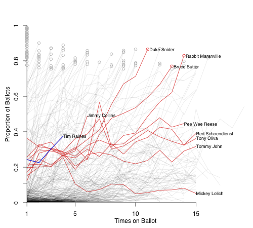
The group matches Raines over the first three years, but in year four they are all below Raines (through all years they are still within the 12.5%). This shows the limitation to this comparison method. Raines has had a good couple of years, from a low point in 2009 of 22.6%, to 30.4% last year, and then 37.5% this year. So he is moving in the right direction.
If there is anyone else you would like to see? Or do you have any suggestions for the graphs? If so mention them in the comments.
| F/X Visualizations | December 06, 2010 |
Two Yankees Re-Sign
It was a crazy weekend leading up to the Winter meetings. Yesterday as I was planning and writing this post, the Adrian Gonzalez trade was off and then back on, in between the Nationals signed Jayson Werth to a huge deal, and then the Brewers and Blue Jays swapped Shaun Marcum and Brett Lawrie. Because of the timing of these developments I didn't include these transitions here, and anyway Rich had a great take on the Gonzalez deal and lots will be written about the moves anyway. Instead I focused on two smaller deals that happened over the past couple days: the Yankees re-signing Derek Jeter and Mariano Rivera. Thought neither was terribly surprising, I wanted to check in on each player's 2010 and what they portend for 2011 and beyond.
Derek Jeter
Of course there is a big back story in these negotiations, but in the end is played out pretty much as everyone expected it would. Jeter re-signed with the Yankees for three years and $51 million dollars. Probably a bit over the value he will give them, but in the ballpark for the Yankees and Jeter.
With Jeter signed we can turn our attention to his performance. Although 2010 was his worst year since his rookie season (both fWAR and brWAR see it that way), 2009 was his best year since 1999 (again fWAR and brWAR agree on that). No one expects another 2009-like, six-win season, but a rebound from 2010 is perfectly reasonable. A big question looms of how much longer Jeter can stay at short, but here I wanted to check in on his offense. His near career-worse WAR was driven by his first sub-100 RC+ (under league-average offense) since his rookie year.
The big culprit here was his career high 65.7% GB rate, that lead the league by a big margin, and was the highest full-season rate since Luis Castillo's 66.7% in 2007. Jeter has always hit a lot of ground balls, but hitting nearly two-thirds of his balls in play on the ground makes it very hard to hit for much power and results in tons of GDPs. Here I show Jeter's GB% base on pitch height for 2010 compared to 2007-2009, with standard error indicated.

For a given pitch height in the strike zone Jeter hit about 10% more ground balls in 2010 compared to the previous years. If Jeter is going to regain some of his offensive value it is going to have to start with getting his GB% back to a reasonable level.
Mariano Rivera
Rivera signed a two-year $30 million dollar contract, and said that it might be his last. There is not much new to say about Rivera on the pitchf/x front: no other player has been more pitchf/x-dissected . For those who might have missed a couple recent additions: a cool by-count breakdown by Albert Lyu, In Depth Baseball's look at Rivera, and a great New York Times video. The take-home message of all that is Rivera routinely hits both edges of the plate without hitting the heart against both RHBs and LHBs with his cutter. No other pitcher has his ability to pitch strikes without getting the fat of the plate.
Although his overall numbers have been amazing forever, his strikeout numbers took a little dip this year. Digging into it a little more it looks to me like the whiff rate on his cutter versus LHBs was the big culprit (17% from 2007 to 2009, just 9% in 2010). Here is what the whiff rate looks like based on the horizontal location of the pitch.
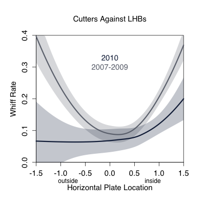
You can see how the whiff rate is high on the edges of the plate (where he pitches the most), but that in 2010 it was lower on both sides, and much lower away. This could just be noise, a one year fluke, but age has to catch up to everyone, even Rivera. But even if his strikeout rate is a little lower Rivera will most likely still be a great pitcher in 2011 and 2012 (as he was in 2010). His other skills are just too good: he doesn't walk many batters, gets lots of ground balls, and as a walking counter-example to DIPS has the ability to depress his BABIP and HR/FB (career rates of .273 and 6.3%).
So as expected going into the offseason Jeter and Rivera re-signed with the Yankees, and anything else would have been just wrong. Now we will see how these two aging Yankees perform over the next couple years.
| F/X Visualizations | November 05, 2010 |
Tim Lincecum's New Slider
First off congratulations to the Giants on their first World Series title since moving to San Francisco, and first title in 56 years. They played very good baseball since September 1st in order to pass the Padres to get into the playoffs, and then beat the Braves, Phillies and Rangers once they got there. One of the keys was, of course, very good pitching from their two top pitchers, Matt Cain and Tim Lincecum. I wrote about Matt Cain throwing lots of change ups over at FanGraphs, and interestingly Tim Lincecum has also drastically changed his pitch usage in the past couple months.
Lincecum's pitch usage shift went more noticed in the media, with reports that he had changed the grip on his slider and was throwing it more. Classifying Lincecum's pitches from the pitchf/x data is not as easy as some other pitchers from; particularly troublesome is differentiating his slider and his change up. Here is one example game where you can see how closely they cluster. I think the best way to tell the pitches apart is to look at the spin direction and speed of each pitch. Here is a polar plot comparing these two values with the different pitch types color coded.
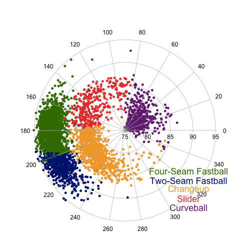
His sliders and change ups are still very close together, but you can vaguely see that they constitute two separate 'blobs'. The exact breakpoint might be a little arbitrary, but I am fairly comfortable with the classification.
At least one report claimed that Lincecum changed his grip on September 12th, so I wanted to see whether his slider was any different since then. Here I plot the spin and speed of his slider, this time on a rectangular, non-polar plot. Sliders since September 12th are circled.
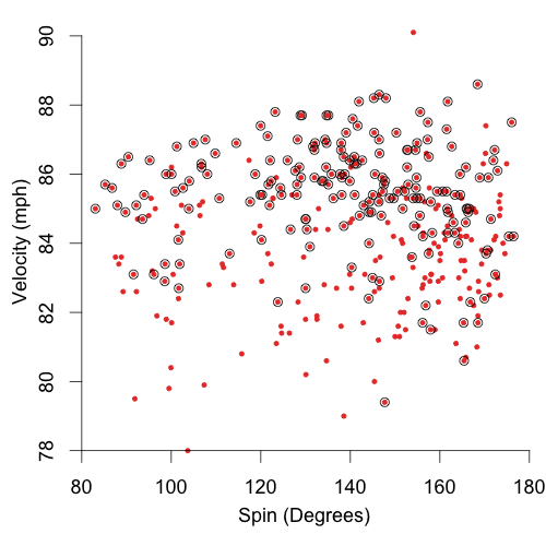
It is very clear that those since Sept 12 are not just a random sample of his sliders. Since then his sliders have been noticeably faster, about 3mph. His other pitches -- fastballs, change ups and curves -- are only about 0.2 mph faster in since then. So it does look like the new grip has resulted in a new, faster slider. Since that date he has also thrown the slider much more often. Here are the fraction of his pitches that are sliders and curves by start (his change up and fastball fraction are much more consistent).
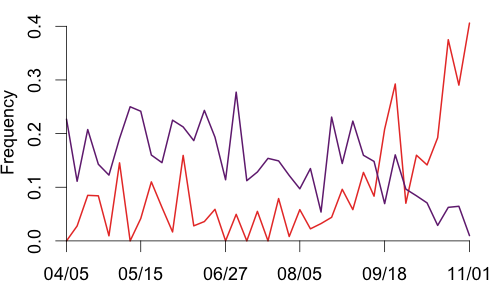
You can see the increase beginning in early September and continuing through to the end of the season, with a resultant drop in curves. In fact on the final game of the season, Game Five of the World Series, 41 of Lincecum's 101 pitches were sliders (with just one curveball). Those 41 pitches induced 23 with an amazing 13 misses. The 10 contacted sliders resulted in five fouls, three outs, a single and the Nelson Cruz home run. He also got six called strikes.
In Lincecum's two Cy Young years, 2008 and 2009, he complemented his great fastball with a with a mix of about 15% curves and 20% change ups and under 5% sliders. Up until September of this year his pitch selection was similar. But since early September he has embraced his slider and thrown it often (18% of the time). That culminated in the last game of the season when he threw it 40% of the time. It will be interesting to see how he decides to pitch next year having established multiple excellent secondary pitches.
| F/X Visualizations | October 01, 2010 |
Robinson Cano's Walks
Earlier in the week I was looking at the AL WAR leader board I was taken aback by Robinson Cano's position. I knew he was having a good year, but not such a great one. Digging into it I saw he had nearly doubled his walk rate. It looks like someone else also took note and as I was planning this post on it I read Albert Lyu's FanGraphs piece. Here I will take a slightly different angle than Albert to present a complimentary picture of Cano's walk rate.
Like Albert I was struck by the fact that Cano had such a higher walk rate in spite of his higher 2010 Swing% (and especially for out-of-the-zone pitches: 37% this year compared to 31% last year). That is from FanGraphs who get the data from BIS. The pitchf/x data sees a similar, though not as extreme, increase from 32% to 34%.
So where are the extra walks coming from? Part of the reason is a slight drop in Contact%. As Albert points out, less contact obviously means more strikes (and thus more strikeouts), but it also makes at-bats last longer, potentially leading to more walks. But the biggest reason seems to be a drop in Zone%. The BIS numbers see a drop from 50% in 2009 to 43% in 2010; Pitchf/x saw 51% in the zone in 2009 and 44% in 2010.
This was my jumping off point: what is the difference in pitches Cano saw in 2010 compared to 2009, and what was the difference in which he swung at? To do that I took all the pitches he saw in 2009 and 2010, binned them, color-coded the bins by number of pitches (darker is more), and separated by year and pitcher handedness. On top of that I plotted Cano's 50% swing contour. Pitches inside the curve Cano swung at more often than not, while pitches outside the curve Cano took more often than not.
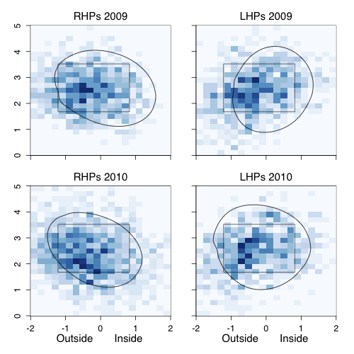
Looking first against RHPs you can see that there is a much greater spread of pitches in 2010 compared to 2009, with fewer pitches in the strike zone. Particularly he saw more pitches away and down. And even within the zone he saw more pitches in the bottom corner, which might not be called as strikes anyway because the zone is called more like an oval than a rectangle. His 50% swing contour against RHPs in 2010 is shifted slightly away and maybe a little bit smaller
Against LHPs again there are fewer pitches in the strike zone. But in this case Cano is clearly swinging more often, with his 50% swing contour almost entirely out of the rectangular zone.
These data suggest that a part of Cano's increased walk rate seems to be that he is seeing fewer pitches in the strike zone. This could be because of his better power numbers in 2009 and 2010 -- making pitchers wary of giving him good pitches to hit. Thus the walks seem to be as much a result of pitchers' changing approach to facing Cano as Cano's changing plate discipline. But either way they have come about, those walks, combined with his low K-rate and solid power at second base, make him a very valuable baseball player.
| F/X Visualizations | September 03, 2010 |
PITCHf/x Summit 2010 Recap
A week ago today I was on my way to San Francisco for the 3rd annual PITCHf/x summit. The summit is put on by Sportvision, the company that developed the PITCHf/x system. I went last year, when I had a great time and was looking forward to this one -- it did not disappoint.
PITCHf/x summit is a bit of a misnomer because at this point Sportvision is expanding its f/x-family and this summit was largely centered around Sportvision's new FIELDf/x system. This camera-based system aims to track the the movement of all players on the field as well as the ball in play and throws between fielders. The system has been running on a test basis at AT&T park since April and Sportvision hopes to have the system in all MLB parks by next year. The availability of this future data to the public is at this point not known as Sportvision works out the business side of the project.
As part of this year's summit Sportvision released 13 games of the FIELDf/x data from AT&T to a limited number of analysts to analyze and present on at the summit. Although Sportvision is working on tracking the ball with the FIELDf/x system, that is still a work in progress and they released 'just' the player tracking data. About half of the talks at the summit were based on the FIELDf/x data and the other half on other topics. Here I present a brief recap of these talks. The presentations should be available to download in the future, and looks like they will be here when they are.
Part 1 non-FIELDf/x
Matt Lentzner and Mike Fast started off. Matt said that he has always been troubled by how movement numbers are reported, citing the often reported fact that according to PITCHf/x's spin deflection numbers (pfx_x and pfx_z) fastballs have a lot of spin deflection, or movement, while sliders have very little. Matt suggested the difference between these data and our expectations is because the spin deflection is defined, as Matt put it, from the perspective of the ball, while we think about movement from he perspective of the batter. Matt suggested that it would be useful to define two new values, the horizontal (x) and vertical (z) velocity of the pitch just as it crosses the plate. These value are affected not only by the pfx_x and pfx_z of the pitch, but also its trajectory, and could better represent the movement of a pitch as it is observed by a batter.
Matt had Mike run the numbers to see how well these metrics correlated with swinging strike rate, and also presented the leader and laggard boards for starters' fastballs' vertical plate-crossing velocity. The results were preliminary but very cool. Hopefully Mike and Matt will continue to develope this idea and share more results with us in the future.
Up next were Glenn (Doc) Schoenhals and Fred Vint of Scientific Baseball. Scientific Baseball is looking to "close the gap between the science and the game." They have leased the pitchf/x system, installed it in a training facility in Oklahoma, and combined it with a number of cameras that capture the motion of the pitcher at a high number of frames per second. They use this for player evaluation and development with players of all ages. Doc talked about the challenges of dealing with lots of PITCHf/x data, combining it with some of the visual data from the cameras, and finding a way to communicate all of that to young players, their parents and coaches who might not familiar with measures like horizontal spin deflection. Doc also has a very accurate pitching machine which he can use to fire pitches just on the edge of the strike zone, using that and the pitch/x system he has held little league (?) umpire training and practice sessions.
At that point Matt Lentzner was back up talking about an interesting pitch he has seen from Hideki Okajima. It is referred to as a rainbow curve, but is not held like a curve and does not have the movement of one. In fact, the pitch has pfx_x and pfx_z values close to zero: Matt thinks that it is a gyro ball.
Next up was Alan Nathan, who with Peter Jensen organized the summit. Alan presented the results from a series of experiments he conducted to measure the spin rate of batted balls. The pitchf/x system calculates the spin rate of pitched balls based on the fit trajectory, but not is much is known about the spin of the batted ball. This spin plays a large role in making the ball drop faster on line drives (front spin) or stay in the air longer on some fly balls (backspin). It also makes the ball slice towards the foul line (side spin). Alan directly measured the spin on the ball by firing a marked baseball at a cylindrical piece of wood bolted to a wall at 100mph and taking pictures of the ball as it came off.
Alan found a number of interesting things. The spin direction of the ball off the 'bat' was largely independent of the spin direction of the incoming ball (Alan varied the spin direction of the incoming ball). Also it in the moments when it hit the bat the ball experienced sheer deformation, causing it to 'grip' the bat. As I could understand it this stopped the spin of the ball which is why the spin of the incoming ball did not play a big role in determining the spin of the ball coming off. This 'gripping' and deformation caused the ball to come off the bat with a huge spin rate: Alan observed balls coming off with over 4000 rpm, much higher than previous estimates. Alan was very surprising by how high these values were. He is hoping to incorporate these results into a model of the bat-ball collusion.
Part 2 FIELDf/x
Vidya Elangovan, a sportvision engineer, introduced us to the fieldf/x system and some of the technical challenges of capturing the data. As noted the system is up and running at AT&T and has been since April, the hope is to have the system in all parks by the 2011 season. Vidya said that the full tracked and recorded data is ready within 20-30 minutes after the game, but at this point is not completely 'real-time' like the pitchf/x system.
The system has two to four cameras placed up high above the field and trained on the entire field of play. At AT&T they use two cameras, one between 1st and home, and the other between 3rd and home, both very high, it seems placed on stadium lights. The cameras are higher resolution than the pitchf/x cameras and take pictures every 15th of a second. A computer algorithm picks out the players, coaches and umpires, turns them into a blob and finds the center of mass of each blog and attaches a location to that point. The system also records events: pitcher releases the ball, batter hits the ball, fielder gains possession of a ball (fields it, or catches it from a throw) and fielder throws the ball. The time of each of these events is recorded along with the identify of the fielder. In the future the system will also track the location of the ball in play and throw, although those data were not released with the 13 games.
Vidya highlighted a number of the technical challenges. Shadows over part of the field during day games are challenging because they push the limits of the dynamic range of the cameras to pick up both shadowed and non-shadowed areas. Shadows of players can also artificially increase the size of player blobs, resulting in incorrect player centers. Green uniforms blend in with the grass, tricking the algorithm that picks out players from background. Similarly if players stand too still for a long time the algorithm can lose them. Finally the system picks up ridiculously large amounts of data. If Sportvision kept all those high-resolution pictures taken every 15th of a second for every game of a MLB season they would end up with petabytes of data. With just the location data for all players every 15th of a second they get one million lines of data a game. Effectively storing, transmitting and analyzing this data will be a huge challenge.
Maybe the bloggers could give us some hope.
Peter Jensen showed how he took this huge quantity of data, moved it into a databased and then into an excel-based simulation which could replay the movement of the players and ball (extrapolated from player events). Peter's simulation was well done and while it ran it also displayed some of the important pieces of information (throw speeds, distance between base runners and the next base, etc.). Whoever gets this data, teams bloggers, etc. will need to do something like Peter did to make sense of this data.
John Walsh spoke at the beginning of the data, by Skype because he was in Italy, but his talk fits in better here. John analyzed grounders. Since we had just 13 games worth (and only bottom halves of innings) and less than a month to work with the data it was hard to do more than just descriptive looks at the data. Still the descriptive look was very cool. John calculated how long each fielded grounder took to get to the fielder: the average play to 3B took about 1.5 seconds, while those to SS or 2B took about two seconds. So middle infielders get, on average, about half a second extra to get the ball. John also showed that with the data it is possible to break down the time it takes to make a double play into its consistent parts: time it takes for the ball to be fielded, time the fielder holds the ball, the time it takes for the ball to get to the next fielder, and so on.
At that point I was up. I looked at fielders' routes to balls in the air. With the data you could see how direct, or not, paths to the ball were. I showed some plays where the paths were particularly direct and some where they not so direct. Ultimately I showed a graph of hang time versus distance the fielder was from the ball for fielded balls in the air. With the trajectory of non-fielded balls as well we could add those to this graph, adding how far a fielder was to the ball and how long he would have had to get there. I noted that this would be a great basis for a fielding metric, Greg will talk more about this in his talk.
Next up was Mike Fast, who analyzed base runners. First he showed the base-running trajectories for a number of plays. When players go between two bases they take roughly the straight line between the two, but when they are going for two bases they take a rounder, almost circular approach. Based the on data Mike looked at he didn't see a lot of variability between the paths take between different players taking two bases. Mike also looked in depth at two runners, plotting their instantaneous speed at each 1/15 second interval. He showed how the runner sped up or slowed down when the pitcher started his windup, released the ball, the ball was hit, and so on. One of the runners Mike showed got up to a top speed of 18 mph.
Baseball Analyst Jeremy Greenhouse was up next. He presented two models he had parameterized with the FIELDf/x data. The first was a model to predict stolen base success probability based on a number of parameters: length of lead, amount of time it takes the base runner to get to the next base, pitch type, pitch speed, catcher pop time (time between when the catcher gets the ball to when he throws it), amount of time it takes the catcher's throw to get to second (or third). Jeremy noted that his model would not account for the baserunner's sliding ability or the fielder's tagging ability. The released FIELDf/x data had only four steal attempts so a complete parameterazation of his model was not possible, but with a larger set of data it would be very cool to see what this model would show. Jeremy had a similar model for estimating the success of fielding a fly ball.
Matt Thomas uses a DSLR to take pictures of the field of play from the press box at Busch Stadium in St. Louis. From what I understand he captures the initial position of players as each play begins and then the position when the ball is fielded. It is very cool to see the amount and level of data that Matt can collect with a consumer-level camera and his photometry skills. Matt showed distributions for the initial locations of fielders for each position based on batter handedness, batting order, inning and a number of other game states. He also showed the probability that an infielder fields a grounder based on the difference between the angle where the fielder is positioned and the angle of the grounder, it follows a relatively nice Gaussian centered just off of zero.
Max Marchi, all the way from Italy by way of NYC, Cooperstown, Syracuse, Buffalo, South Bend and Chicago, gave us examples of how you could use PITCHf/x, HITtf/x and FIELDf/x to scout players. He had a number of examples from the blogoshpere (his work, Jeremy's work, my work). It was a very cool talk to see all of the ways these data can be used to measure players' abilities.
Greg Rybarczyk was up next. Like me he looked at fielders playing balls in the air, but he added the next step to the analysis. He went through 13 innings and looked at all balls in the air and found the landing location and hang time of balls that dropped in for hits. With this he could do want I wanted to do and plot both hits and fielded balls in hang time/distance between fielder and ball space. With enough data points one could assign a probability that the average fielder fields a ball based on these two values (another value that Greg noted was important was the angle the player had to go to get the ball). Then each fielder could be assessed based on the probability the average fielder makes plays that he made or didn't. Most agreed this would be more accurate than the current zone-based methods, but it is still a question whether this method would make fielding metrics converge any faster than current methods
All presenters did a tremendous amount of work in their presentations and this is just a small sample of each presentation. If you are interested further I suggest you download the slides and look over them. Also if I mis-stated anything here please note any corrections in the comments.
If you are looking for more recaps or liveblogs you can check out Colin's, Ben's, Rob's or Dan's.
I had a great time at the summit, it was lots of fun to see some of the other members of the PITCHf/x-community. Thanks to Sportvision for putting on the conference and Alan and Peter for helping to organize it.
| F/X Visualizations | August 09, 2010 |
SABR 40's New Technologies in Baseball Panel
Edit: Alan has uploaded PDFs of our talks for download here.
This past weekend I had the pleasure of attending the SABR 40 in Atlanta. I had never been to a SABR meeting before, but was invited to be on the New Technologies in Baseball panel by Alan Nathan. It was a great opportunity to talk with and hear the ideas of the other panel members: Alan; Rand Pendleton of Sportvision; Rob Ristango of Trackman; and Josh Kalk, former THT writer and current Baseball Operations Analyst for the Tampa Bay Rays. It was also cool to meet or reconnect with some people I had usually know only over the internet, Cory Schwartz, Dave Studeman, Cyril Morong, Sean Forman, Eric Van, and the great Rob Neyer.
I thought it would be interesting to give a quick recap of the New Technologies in Baseball Panel. Rand led off and gave a quick history of Sportvision (they started in 1998 and their first big thing was putting the 1st and ten line on NFL broadcasts). He then gave the history of the pitchf/x and hitf/x systems, which have been written about before and I will not rehash here. But then he talked a little bit about Sportvision's new product fieldf/x.
Most of us got our first preview of fieldf/x in last year's NYT article and then at last year's pitchf/x summit. Rand said the system is being tested right now in AT&T park in San Francisco. Like the pitchf/x system fieldf/x uses two cameras, but these cameras have higher resolution than the pitchf/x ones and are framed on the entire field rather than just the pitcher-catcher area. The aim is to track everything on the field: fielders, runners, the ball in play, throws. That is a very exciting prospect and the video from it that Rand showed was very cool. We will know more about the fieldf/x system in a couple weeks at this year's pitchf/x summit.
Next was Rob Ristango who talked about Trackman, that is a doppler-radar system that also tracks the pitch and ball in play. The system was originally designed for golf, where it is widely used, but is now being used in baseball, cricket, and soccer. The system has one radar, high and behind home plate. Rob said that the system is installed and running in a number of MLB parks, when pressed for a specific number by a questioner he responded that the number is greater than one but less than thirty.
Trackman, which measures the location of the ball 48,000 times every second, directly measures the spin of the ball, rather than back calculating it form the trajectory like the pitchf/x system. Based on this Rob showed some very cool data already collected by the Trackman system. For example, curveballs with a higher spin rate had a greater swing and miss rate than those with a smaller spin rate. He also showed that the lower the vertical release angle on a curve out of a pitcher's hand the higher the swing and miss rate. Rob explained that since curves are slower and have more drop coming to the plate than other pitches pitchers have to release them at a higher angle else they end up in the dirt. But if the angle is too high batters can easily tell the pitch is a curve. So the lower the release angle, though still higher than the release on a fastball, the better the deception and higher the swinging strike rate.
Finally Rob said that although the Trackman data is not pubically available if you would like to contact them about your ideas of the data you can get in touch with Josh Orenstein who heads the Trackman Insights Lab (jko@trackman.dk).
I was next and I discussed some of my results on the success of a pitch based on its location in the strike zone. Readers here have surely seen this before and I will not bore you with a rehashing of that.
Next up was Josh Kalk. Josh, a former physics teacher, gave a great prop-based talk on the red dot that appears on sliders. As background he played some audio from an interview Reggie Jackson did on NPR's Fresh Air. On the clip Jackson talked about how good hitters have to be able recognize different pitches, and specifically mentioned the red dot seen on a slider.
To talk about how the red dot happens Josh showed how different pitches spin. Josh had a baseball with a dowel drilled in it. Josh held the dowel out so it was parallel to the lines of seats of the audience. He twisted the dowel back towards himself and told them to picture the ball coming towards them. This was pure backspin, the type of spin you would find on a four-seam fastball and that causes the pitch to drop less than expected due to gravity as it travels to the plate — a rising fastball. Then he twisted the dowel in the other direction, towards the audience. This was pure front spin: the type of spin that causes a pitch to drop more than expected due to gravity, and is found curveball.
Then Josh held the dowel perpendicular to the audience, holding the dowel with the ball out in front of him towards the audience. Again he told the audience to think of the ball coming towards them and he twisted the dowel clockwise (from the audience's perspective). He told the audience this clockwise spin had a rifling effect, this spin will not cause the pitch to 'move' off its initial trajectory and will actually work to keep the pitch on this initial trajectory (like the rifling action of a bullet out of a rifle). The gyroball has this type of spin, and in pitchf/x parlance would have close to 0 pfx_x and 0 pfx_z. Sliders — which tend to have small pfx_x and pfx_z values — have a spin very close to, though not exactly, this rifling spin. Now picture if a seam is facing the batter while the pitch spins this way. Part of the seam will always be right in the middle of the ball as it rifles towards the batter. This will cause a red dot to appear. Because of the way pitchers hold the ball when they throw a slider there will tend to be a seam facing the batter.
To demonstrate this phenomenon Josh had another prop, a ball affixed to the end of a power drill. When Josh fired up the drill the ball spun around and the red dot appeared. Josh slowly panned the drill around so that all members of the audience could get a chance to see it. Unfortunately the ball was not perfectly attached, and part way through the demonstration the ball went flying off, nearly hitting Alan and bouncing under the table were we sat. Some real excitement! Even with the technical difficulties, and maybe because of them, Josh gave quite an informative and entertaining talk.
Alan was up last and gave four examples of new technology in baseball. The first two involved Marinao Rivera, showing his incredible bimodal pitch distribution, which I have talked about here, and then showing how the trajectory on Rivera's cutter gives it the illusion of having late break. Alan then showed, using hitf/x data, how BABIP and HR rate vary by launch angle and exit speed. BABIP peaked at 11 degrees while HRs at 30 degrees. This demonstrated the tradeoff between hitting for average, high-BABIP line drives, and hitting for power, high-HR fly balls. Finally Alan showed how he used hitf/x and Hit Tracker combined to reconstruct the full trajectories of HRs from 2009. With the complete trajectory he could compare how far the HRs actually went to how far they would have a vacuum. He used this quantity to measure the effect environment (wind, temperature, elevation) on fly balls in each park. This was work Alan had presented at the 2009 pitchf/x summit.
All in all it was a great time and very cool to see the work that Sportvision and Trackman are doing to develop new ball-tracking technologies and the work that others (people like Alan, Josh and me) are doing to analyze that data.
| F/X Visualizations | July 02, 2010 |
Musing on Pitch Type Platoon Splits
The platoon splits on different pitch types are well documented: John Walsh calculated them in the 2008 THT Annual, I did in these pages, and recently Max Marchi broke down the pitch types into finer buckets and showed the splits for each bucket. Here I am interested in understanding, at least in a qualitative sense, why different pitch types have different platoon splits. In no way is this going to be a complete explanation, but an attempt at a first step. Here I am going to focus on the slider, a pitch with a large platoon split (much better against same-handed batters), and the changeup, a pitch with no platoon split (does roughly the same against same- and opposite-handed batters).
Since almost all pitchers pitch off of the fastball I think it is best to compare both pitches against the fastball. Here is a chart I made for the 2009 THT Annual showing the approximate movement of the different pitch types for right-handed pitchers.
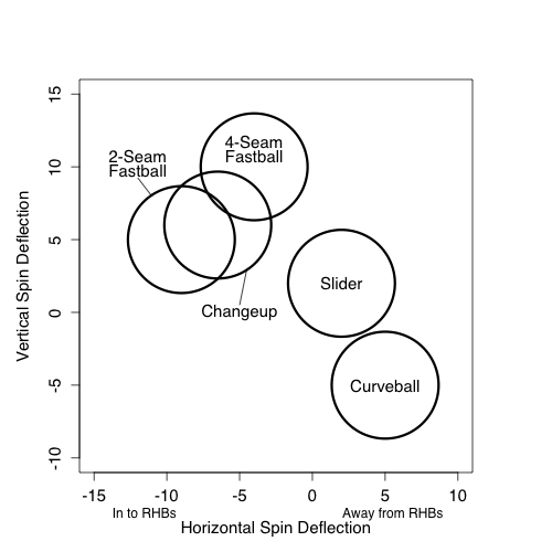
Using the four-seam fastball as a guide you can see that a slider in comparison moves down and away from same-handed batters (in to opposite-handed batters). The changeup moves moves down and in to same-handed batters (away from opposite-handed batters). I think this is part of the reason platoon split for the two pitches.
If a pitcher can release his fastball and slider with roughly the same initial trajectory and locate his fastball around the middle of the zone the difference in movement will put his slider down and away to a same-handed batter and down-and-in to an opposite handed batter. If he does the same with his changeup the pitch will end up down and away to the opposite-handed batter and down and in to the same-handed batter. All else being equal a down-and-away pitch is much better than a down-and-in pitch. Looking back at my run value by location maps down and away is the best place to pitch, while down and in is, other than the heart of the strike zone, the worse place to be in within the zone.
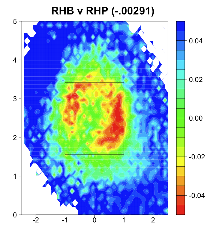
So when a pitcher repeats his motion well with his pitches, starts his pitches on roughly the same trajectory and locates his fastball in the zone the movement relative to fastball movement will take a changeup into a good spot against opposite-handed batters and a poor spot against same-handed batters and vice versa for a slider. This, I think, is a big reason for the platoon splits, or lack thereof, for the two pitch types.
Another source for the platoon split is the different vantage points a batter has against same- and opposite-handed pitchers. A same-handed batter most likely doesn't get as good a view of the pitch as it is released. Mike Fast takes this into account very well by showing pitch trajectories from the view point of the batter (Scroll a little more than half way down this post to see).
Josh Kalk theorized that minimizing the difference between a slider and a fastball along the beginning of their trajectories might be a key to a slider's effectiveness. I thought it would be cool to check that out from a same-handed versus opposite-handed batter's perspective. My physics chops are not the equal of Mike Fast's so I sort of fudged the perspective projection.
From RHB's perspective:
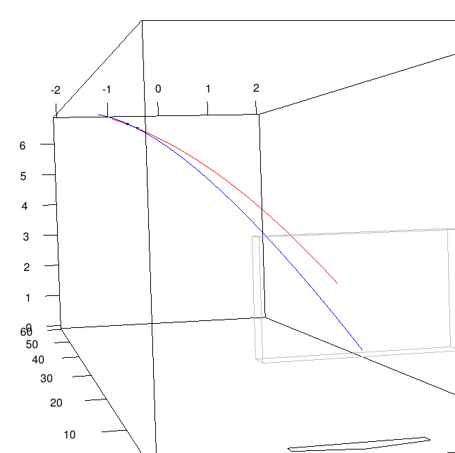
From LHB's perspective:
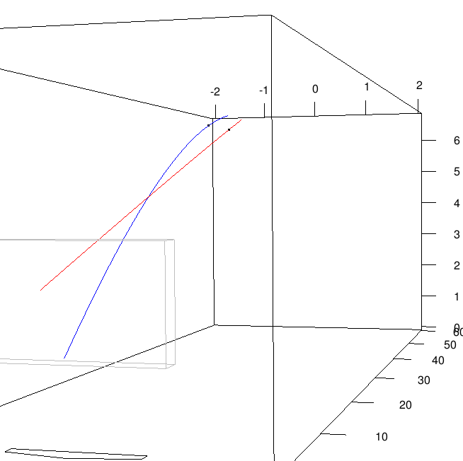
These are a subsequent fastball (red) and slider (blue) from Brad Lidge, a prototypical fastball-slider pitcher. The black dots indicate the pitch location 0.075 seconds into the pitch's trajectory, approximately when a batter must decided to swing or not. To the right-handed batter the two trajectories are almost identical up to that point. The fastball is slightly farther along but it is very close. For the left-handed batter the two pitches appear much farther apart. My perspectives are not perfect, but I think this could indicate another possible reason for sliders' large platoon split.
| F/X Visualizations | June 04, 2010 |
Three Perfect* Games
Even before Wednesday we had witnessed a remarkable thing: two perfect games in the course of a single season -- that last happened in 1880. But then Armando Galarraga seemingly had the third of the season. You know the story by now and much has been written about the game, the call, and how the parties have responded (I can add my voice to the chorus of voices praising how they have). In addition there has discussion about whether Selig should overturn Joyce's call and give Galarraga the perfect game, which he will not, with reasonable and considered opinions on both sides (studes and Dave Cameron for calling it a perfect game, MGL and Craig Calcaterra seeing that as setting a dangerous precedent). I will leave that discussion to them and at least consider it a perfect game for the sake of this pitchf/x tribute to the three games.
In each case I show the location of the pitches thrown in the game, separated by handedness of batter, color coded by pitch type, called strikes have a white '+', swinging strikes a black '+' and those put in play are encircled.
Dallas Braden
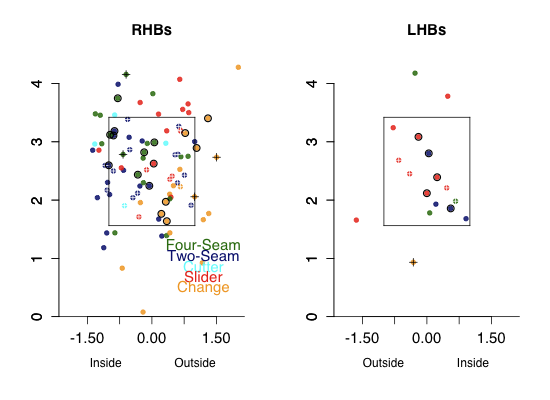
Braden throws five pitches and his best is a very slow (72mph) changeup. Although he works relatively high in the zone he did a great job of keeping his change down-and-away to RHBs where it got a couple of swinging strikes, but also some contact. Contact on that nasty change so far away is going to be pretty weak, probably leading to easily field-able balls in play. To both LHBs and RHBs Braden was around the zone with all his pitches, resulting in no walks.
Roy Halladay
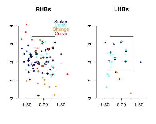
You can see how much lower in the zone Halladay works compared to Braden, one of the reasons he gets so many more ground balls. Halladay's change rather than being down-and-away is just down. Look at all those changes below the zone, four of them resulted in swingings strikes. Halladay pounded his sinker (two-seam fastball) down-and-in against RHBs. Against LHBs Halladay threw lots of cutters.
Armando Galarraga
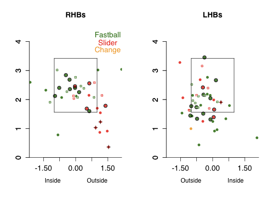
Galarraga, mostly a fastball/slider pitcher, did a great job of keeping his pitches down to RHBs, with his fastball inside and his slider down-and-away. That slider got a good number of swinging strikes on pitches way out of the zone. Against LHBs Galarraga keeps his pitches almost perfectly on the outer half of the plate, where LHBs are less dangerous. He only got one swinging strike against LHBs, but by keeping his pitches away all of the contact was harmless
| F/X Visualizations | May 21, 2010 |
Soriano's Fly Balls
Alfonso Soriano is having a resurgent year after his forgettable 2009. On the strength of his seven HRs (and a total of 23 extra-base hits) and a 0.386 OBP, Soriano has an amazing 0.432 wOBA, putting him in the top ten in the league.
Soriano is blasting everything skyward, as his GB% is second lowest in the league at 25%. He has always has always been a fly-ball hitter, but this ground-ball rate is well below his career average of 32%. Ground-ball rate is tied to pitch height, so l looked at Soriano's swing rate by pitch height to see whether there was anything going on.
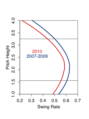
Nope, it looks like Soriano is swinging at about the same height of pitches, though he is swinging at fewer pitches this year compared to the others in the pitchf/x era. Instead it looks like no matter the pitch height Soriano has, so far this year, hit a lower rate of balls in play on the ground compared to previously. It looks like this is particularly true for pitches up in the zone.
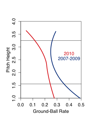
What is making Soriano so successful this year is not that those fly balls are leaving the park at a rate higher than his career average (actually his HR/FB this year is a tad lower than his career average), rather they are dropping in for hits more often. Since 2002 Soriano has a 0.146 BABIP on fly balls (as classified by BIS and courtesy of FanGraphs), but so far this year his BABIP on fly balls has been has been 0.341.
Soriano has 44 non-HR fly balls in 2010 and 15 non-HR fly-ball hits. Had he gotten fly-ball hits at his career rate he would have just six or seven non-HR fly-ball hits. If we take away eight of his singles he ends up with a OBP of 0.331 and a wOBA of 0.389. If we took those eight hits away as five singles and three doubles his wOBA would drop to 0.383. Both still very good, but no longer in the top ten in the league.
Obviously what is done is done and those 15 fly-ball hits are money in the bank for Soriano and the Cubs. But unless you think Soriano can continue to get a hit on a third of his non-HR flyballs, don't think he is going to keep up this torrid pace (and probably not one though he would to begin with). Just another reminder of the fickleness of BABIP. After being on the short-end of the BABIP-luck stick last year Soriano has seen his fortunes flip this year.
| F/X Visualizations | May 14, 2010 |
The Network Structure of Baseball Blogs: Part 2
Two weeks ago I posted about the network structure of baseball blogs. In the framework of a network (or graph) each blog is a node and two blogs are connected together by an edge if one links another. The edges are directed, each link goes from one blog to another, and weighted, I looked over the course of 100 posts and counted the number of links so if there were more than one that edge was given a greater weight.
In the quick look in my last post I first showed the structure of the overall network, with Baseball Analysts and a number of other sabermeteric blogs clustering out together at the center of the larger network of baseball blogs. Around the periphery were sub-clusters of team specific blogs, which tended to be heavily connected with blogs covering the same team.
In that post to keep the network fairly simple I only connected two blogs if they were linked three or more times. This dropped many connections and blogs out of the network. That was a good solution to look at the smaller set of central blogs, but it lost most of the structure. I was also interested in how different sub-clusters of team focused blogs arranged in the network.
To look at this I plotted out all the 150 or so team-specific of the top 200 blogs. Here I included all links but weighted them by how many there were. The nodes are labeled by my code for the blog name, which are color-coded for each team. The colors are not perfect, but with the code from the name they should be clear. Click on the image for a larger version.
There is a lot going on with this diagram and I couldn't begin to write about all of it, but I will note some of the things I find interesting. At the bottom of the network are the Yankees and Mets blogs, which are well connected (we saw this last week too). To the upper-right of the Mets is most of the NL East: the big constellation of Nats blogs, a couple Florida blogs off that, and then, more centrally located, four Phillies blogs. To the left of the Yankees is a fairly large group of Red Sox blogs and not too far from that, but also more centrally located, the four Rays blogs. Both the Rays and Phillies have most of their blogs close to the center of the web. My guess is this because of their recent history of in the World Series. Outside of the AL and NL East the structure is not as clear. The NL Central clusters out fairly well in the upper right of the graph, but the other divisions are not as clear.
This is a fairly qualitative analysis, it would be interesting to make it more quantitative looking at the percentage of potential links filled within versus without divisions, based on the geographical location of the teams.
| F/X Visualizations | April 30, 2010 |
The Network Structure of Baseball Blogs: Part 1
Earlier in the week I read about the network structure of twitter employees' accounts and that got me thinking about the network structure of baseball blogs. Network theory (or graph theory) looks at the structure of objects connected by pairwise connections. It has been used to study the structure of the internet, email networks, the phone and power grids, epidemiological networks, food webs and tons of other things. In this case you can think of baseball blogs as vertices and then connect them with edges if they link one another, then graph out all the connected blogs and see whether there is any structure.
I used the data from BallHype to generate the web. I looked at their top 200 baseball blogs and then went back to each blog's last 100 posts and saw which of the other 200 blogs linked to that post. These are links from posts to posts not general links from a blog to another blog. Here are all the blogs with at least one connection to the main component, with an edge draw whenever one blog links another.
To make the image a little more simple and only show the stronger connections I re-drew this graph with edges only when one blog linked another one three or more times. I dropped out blogs which were not connected to the main component using this new edge definition. Each link is directed with an arrow going from the linking blog to the linked blog.
The algorithm tries to draw the vertices in positions such that they are close to blogs that linked them and which they linked. So you can sort of see clusters of blogs which should be similar (linked to and from similar blogs). Here I have labeled the top 15 blogs (a cutoff that conveniently includes Baseball Analysts -- BA).
Here you can see BA cluster out with the well-connected center of the network particularly close to its sabermetric brethren: the Hardball Times, Baseball Prospectus, The Book Blog, FanGraphs and Beyond the Box Score.
Next I wanted to see how strongly blogs following the same teams clustered out together in the network. I should say that the vertices are not all of the blogs, because of the cutoff I am only showing blogs which connect to this strongly connected component (remember my definition for an edge is three or more links). The Reds Sox, Cubs, Cardinals and Angles all have lots of blogs in the top 200 but most of these fell away, presumably because they either did not link enough or did not have a enough links in (I am not saying anything about the quality of these blogs based on that). Some other teams with a lot fewer blogs had more stay in the network.
The Yankees and Mets are well represented with many blogs that are well connected, and a couple connections between the two. There are a handful of blogs which cover both Mets and Yankees, such as Mike Silva's Blog and the New York Time's Bats Blog, and I just randomly assigned those to either the Yankees or Mets. Having one blog that links to lots of other team blogs really keeps lots in the network which would other wise drop out. Fack Youk is the Yankee blog with may links going out. Amazing Avenue, the main hub of the Mets network, has many connections going out and coming in.
Then you have some surprising teams. Who knew there were so many Nats blogs? You can see this is largely driven by one, Federal Baseball, which regularly links a number of other Nats blogs. On the other hand the Pirates section is driven by one blog, PBC blog, which receives links in from a number of other blogs. There is an interesting blog in there, Call to the Pen, which links to Padres, Mariners and Pirates blogs, as well as many others.
I am not trying to make a value statement that having blogs in this network is a better than not (e.g., I am not saying that the Nationals blog community is any better or worse than the Red Sox blog community). I am just showing the network based on my arbitrary way of defining a connection.
This is a first pass at the data and next week I will dig a little deeper into the network structure. How connected is the network? What is the average distance between two random blogs? Do any teams cluster out together?
| F/X Visualizations | April 23, 2010 |
Looking at Some Games with My New Score Card
Before the season I talked about considering a new box score. I got a lot of great feedback and worked on a second version with a lot of input from Matt Lentzner. I probably created the wrong impression by initially calling the graph a box score, I was corrected that it would be better to consider it a score card. It functions better as such and does not raise the same kind of assumptions (seeing each player's numbers).
Anyway with a couple weeks in the books I wanted to see how the score card did with a handful of the more interesting games played. I should say that it took me a little bit of work to get the system completely automated and I still have some kinks to work out (the end of some innings look like double plays or triple plays when they shouldn't be), if you see any other problems please tell me in the comments so I can try and fix them. I kept the length of each image the same so I didn't push the margin of the page out too far, but this means that each image has a different scale. Click on it for a full sized version.
First off here is a wild game the Padres played on April 12th in which they scored ten runs in a single inning.
That inning included four straight singles followed, later, by three straight doubles and then a home run.
Next I wanted to check out was last Saturday's epic 20-inning match between the Mets and Cardinals.
Here the scaling becomes a big issue. This 20-inning game stretches the score card out very far. Sean Forman suggested the I flip it so that the game progresses down rather than to the left. I like having it go to the left so you 'read' the game as you would a sentence (obviously reading to the left is just the way some people read). But websites scroll down way more than they scroll to the left so having the card progress down would be a more natural flow for web viewing.
Next here is Ubaldo Jimenez's no hitter.
You can see Jimenez actually had quite a number of base runners early in the game. Through the first five innings he gave up six walks, but the last four innings were perfect. I also think there is a balk in there that my algorithm is not picking up.
Next I choose Tuesday's game in which Jonathan Sanchez and the Giants one-hit the Padres, but still lost.
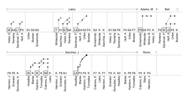
You can see how in the fourth the one hit off Sanchez, a Chase Headley line drive single to center, turned into the game's only run. With Kyle Blanks batting Headley stole 2nd and then advanced to third on Blanks's foul pop out to first. He then scored on Scott Hairston's fly out to right.
Finally here is yesterday's 20-0 rout of the Pirates by the Brewers.
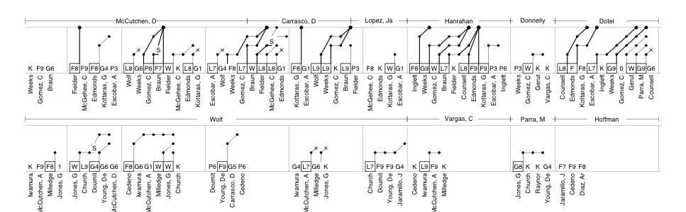
Baseball games are wonderfully diverse and I enjoying thinking about ways of reporting and displaying that diversity. Over the season I want to make some more tweaks to this method, including trying out Sean's suggestion of flipping the orientation.
| F/X Visualizations | April 16, 2010 |
How Nasty Was that Pitch?
Every year Sportvision and MLBAM fine tune and make additions to their already excellent pitchf/x system. This year is no different. Mike Fast covered this year's changes over at the Hardball Times, and I wanted to expand on a couple points. Some of the changes involve tweaks to the classification algorithm. It looks to me like the algorithm is classifying more two-seam fastballs (also called sinkers) and doing a pretty good job of it. They have also added some pitch types. Mike noted the knuckle curve, and they also added a Eephus pitch (thrown by Vicente Padilla) and the screwball (thrown by Daniel Ray Herrera).
Another addition is the 'nasty' metric that MLBAM has attached to every pitch. I wanted to check out what makes a pitch nasty in the eyes of MLBAM. As Mike noted the nasty metric does not seem to be related to the speed or movement of a pitch, but the big determinate, it looks to me and Mike, is pitch location at least for fastballs.
Here is a smoothed average of the nasty-ness of four-seam fastballs by location for RHBs versus RHPs.
Here is LHBs versus RHPs (the other two are here and here).
It looks like nasty score varies widely by pitch location, with those pitches far out of the zone or down the middle of the plate having the lowest score and those around the edges of the zone the best. Particularly pitches down-and-away, up-and-in and to a less extent those up-and-away have a very high nasty score. These values match up very well with the run values by pitch location that I showed about a year ago. So it looks to me like the nastiness of a pitch is a measure of how hard the pitch is to hit based on its location, with nasty pitches in a hard to hit location and a non-nasty pitches either in the fat of the plate or a clear ball.
The results are similar for other pitch types. Here for the slider:
And here for the changeup:
Overall I think this is a nice addition to the pitchf/x values for the casual Gameday watcher. The speed of a pitch is something that is easily understood and even the movement, although less than the speed, can be put in context (that fastball had a lot of 'rise). The nasty value helps to put the location in context, "that pitch was in a hard to hit location."
| F/X Visualizations | April 09, 2010 |
The First Five Days in Home Runs
With the first couple days of the season in the books I thought it would be cool to look at the superlative HRs of the season -- not as any real analysis, just for the fun of it. I have been playing around with ways to display HRs that show information about the pitch the HR was hit off of and the HR itself. My current version combines these pieces of information into a single graph with two different scales: a finer scale shows the location of the pitch in the strike zone (the box at the base of the image), this box in the x-z plane; and then the larger scale showing the approximate angle of the HR in play connected to the dot of the pitch, this now in the x-y plane. The superlatives HRs are marked in red. All data through last night.
Here are the HRs by RHBs off RHPs.
These include four of the superlatives I looked at. First off you have the farthest inside HR. It is easy to see in the image (right by the 'B' in RHB) and was 14 inches inside of the center of the plate. That was Delmon Young's HR off of a Fernando Rodney changeup yesterday. The highest HR is also easy to see. It was 3 feet 9 inches high, a four-seam fastball from Kevin Millwood hit by Evan Longoria on Tuesday. Below and slightly to the left of that was the HR off the fastest pitch. That was Yuniesky Betancourt's unlikely HR on Monday off of Justin Verlander's 98.6 MPH fastball. The last HR, to the right of the fastest, was the shortest HR, Miguel Cabrera's 342-foot shot off of Joakim Soria on Wednesday (distance by HitTracker).
Here are the HRs by RHBs off of LHPs.
This includes two superlative HRs. The HR on the farthest outside pitch -- 12.75 inches off of the center of the plate -- was Mark DeRosa's HR off of a 86mph Tim Byrdak fastball on Monday. The other HR here was the HR off of the slowest pitch. That is Rajai Davis's HR on a 70mph Ryan Rowland-Smith curve.
Here are the HRs by LHBs off of RHPs
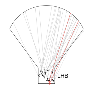
Here you have the HR off of the lowest pitch, Wednesday's Travis Ishikawa HR on a Jeff Fulchino change just 1.5 feet high. The other HR here is the farthest, Jason Heyward's Monday HR, the first of his career, a 476-foot blast off of Carlos Zambrano.
Finally, the HRs by LHBs off of LHPs.
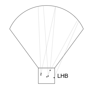
Here there were no superlative HRs based on the categories I looked at.
I guess I am guilty of 'digging the long ball' and finding ways of looking at them, but I hope forgive this prosaic impulse.
| F/X Visualizations | April 03, 2010 |
Saying Goodbye to the Metrodome
Earlier today Jeremy chatted with Aaron Gleeman about the Twins and they noted Target Field, the new home of the Twins. It sounds like Aaron is pretty excited about it, as I am sure all Twins fans are. But I wanted to take a brief moment to note the passing of the Metrodome as the home of the Twins. I will do so in the same way that I did for the two New York parks this time last year and the only way I could think to do so: a run value map based on the Gameday recorded locations of balls in play and home runs at the Metrodome.
The locations are again taken from Gameday and then translated by Peter Jensen's factors. Gameday records where the balls are fielded not where they landed (Jensen has not yet released the 2009 transition factors so for 2009 I used the 2008 values). Each event (out, double play, single, …) is given its run value and then the run values for each location were fit using a loess regression. The the run value for each location, as predicted by the regression, was color coded. I have finally taken Studes' advice and flipped the color scheme so that blue is low (good for the pitcher) and red is high (good for the batter).
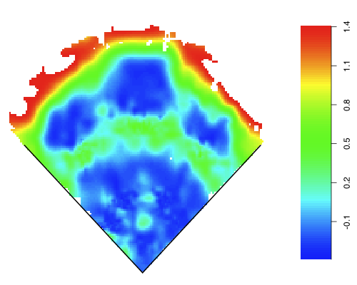
This is not meant as a serious statistical analysis (for serious analysis using the Gameday locations go to Jensen's series or hold tight for Colin Wyer's Gameday-based defensive metric), rather a pretty picture and a way to say goodbye to the Metrodome.
| F/X Visualizations | March 26, 2010 |
Comparing Division Projections
Last week I did a statistical comparison of a handful of system's team win totals. Here I am going to take a division-by-division graphical approach to highlight: the amount of agreement between they systems in each division, which teams are the favorites within each division, and the relative spread in talent within each division. I use the same six projection systems from last week.
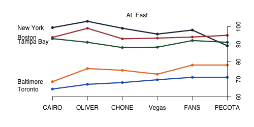
The AL East, unsurprisingly, has two tiers that are separated by a big gap. Three 90-win teams and two sub-80 win teams. No other division has quite the spread. All the projection systems see these two tiers, and all the systems but PECOTA project the same NY-BOS-TB-BAL-TOR ordering. This is the most consistently-predicted division, with only PECOTA as a slight outlier. CAIRO and OLIVER see the biggest spread between the two tiers.
I readjust the y-axis for each division, so even though the spread between the lines looks similar in this case it is much less than in the AL East. And ignoring Kansas City most of the projection systems see not much separating the top-four teams. Even so Minnesota seems to be the team to beat with only OLIVER not projecting the most wins for Minnesota, and OLIVER has them a close second to Cleveland. Again CAIRO and OLIVER has the biggest spread, in this case between Kansas City and everyone else. Vegas, the FANS and PECOTA all have the same ordering.
First note that the scale here is very small, there is little variation in the number of wins projected across teams in this division. Because the range of win projections is small the differences in win totals across projection systems result in very different orderings. OLIVER and CHONE like Texas, but don't think much of anyone else in the division. The other systems are pretty high on Seattle, while only Vegas thinks much of LA (Rich can take solace in at least someone respecting the Angels). But again because just 5 or 10 wins separates every team in every system there is broad consensus that the division is anyone's to win.
The NL East has, like the AL East, has a large spread in talent and board consensus over the ordering of teams, although not as a clear front-runner like the Yankees in the AL East. Three systems like Philadelphia the best and three Atlanta. After that all the systems see a pretty clear ordering of Florida, then New York, then Washington.
Here we have our first, and only, division with the same team projected at the top by all systems (although the Yankees were very close). After St Louis, there is a general consensus that Cincinnati, Milwaukee (dark blue) and Chicago (light blue) form a second tier and then Pittsburgh and Houston a third. The spread in talent between St Louis, at the top, and Pittsburgh and Houston, at the bottom, is quite large and seen across the six systems.
The NL West, like the AL West, is fairly muddled. Each system sees either Colorado (dark purple) or Los Angeles (light blue) as the top team, although the FANS like Arizona too. In any case each system sees the top teams fairly tightly clustered. Vegas and PECOTA see less than five games difference in talent between the top four teams. These two are also fairly down on the fifth team, San Diego.
All of this will, of course, be moot in a little over a week when the season actually starts and we can watch some baseball again.
| F/X Visualizations | March 19, 2010 |
Comparing Team-Win Projections
I love preseason projections: the fact that so many smart people put some much work into it, the promise of the season to come, thinking about my own ideas for the season, and comparing across projections. I hope you will indulge my impulse to do this last one.
Here I am going to compare the projected win totals -- but it would be very cool to do the same for player projections -- across six different projections systems. First the projected win totals based on the FAN projections as fangraphs; BPro's PECOTA; THT's OLIVER; Rally's CHONE; RLYW's CAIRO and, though it is not a projection per se, the Vegas over/under lines.
Here are the RMSE between each of the six projections systems.
Interestingly the FANS are the closest to the other projection systems. PECOTA's, CHONE's and THT's most similar projection system is the FANs. On the other end CAIRO is often the most dissimilar, with PECOTA, the FANS and THT all having CAIRO as the most dissimilar projection. That is not to say that makes the FANS 'right' and CAIRO 'wrong.' I don't think similarity to other projection systems makes it any more or less likely to be right, just an interesting thing to notice.
Another way of analyzing this is to use principal component analysis (PCA). Picture each projection system as a 30-valued vector. You could plot each of the six systems in 30-space and see how close they are to each other, but, unfortunately, I cannot display 30-space on the computer screen. PCA is a tool to reduce the dimensionality of a data set. As an example if all the systems projection projected the same number of wins for all teams expect the Yankees and Red Sox, we could just look at their projections for the Yankees and Red Sox and get all of the information of the variation between the systems. In this case it is not as neat, but we can still find the teams which account for the most variation between the systems. By reducing dimensionality you lose some information, but the hope is the information lost is largely correlated (redundant) and much of the variation can be reduced to a handful of dimensions.
Each principal component is a linear combination weighting the importance of each team's projection, so in the example above all teams except the Red Sox and Yankees would be weighted as zero. Principal component one is the component that accounts for the greatest amount of variation. The most heavily weighted teams are the ones that drive each projection's score on the component and are most responsible for producing the variation in the projections. In this case projections that score high on component one project lots of wins for the Yankees and Reds, while those that score low on component one project lots of wins for the Orioles, Royals and Astros.
Here you can see the FANS and CHONE clustering out relatively closely, with Vegas and PECOTA not that far off. Then THT and CAIRO falling out far away. CAIRO because of its love of the Reds, Twins and Mariners, while THT for its love of the Braves and Rangers, and to a lesser extent the Yankees. Again it would be very cool to do this for player projections and see whether the principal components to fall out as particular player types.
Finally I wanted to see which teams had the most disagreement or consensus. Here is the average pair-wise disagreement for each team.
Florida has almost no variation. THT likes them to win 78 games, but everyone else sees them winning 80. On the other end of the spectrum the Yankees' difference is driven by THT, 103 wins, and PECOTA, 89 wins.
| F/X Visualizations | March 05, 2010 |
How Can I Get My Hands on the Pitchf/x Data?
I often get emails from my readers here and at fangraphs asking how they can access the Pitchf/x and batted-ball location data I use in my posts. In the past couple months a host of new tools have become available online that make the data much more accessible. So in this post I thought I would highlight these new, and the longstanding, online tools for accessing the data.
The Basics
First off Major League Baseball Advanced Baseball (MLBAM) releases the GameDay data (pitchf/x, batted ball, boxscore, etc.) every day in .xml files. For the casual fan it is a bit tricky to find these data. And even once they do each game has its own series of files so pulling out all the data by hand would be a Herculean task. And finally once you have all the data, over a million pitches each with tens of values (start speed, end speed, break, pfx_x, pfx_z, the nine fit parameters,…) it is just too much data to handle in excel, so a database is necessary.So let's look at the online tools to address each of these potential stumbling blocks. First off actually finding the .xml files and making sense of them. The best place for this is Alan Nathan's tutorial. He directs you to the site and then clearly defines each of the values in the pitchf/x data set.
Web Tools
Still this .xml file might not be of the most use to everyone. If you want to look at one pitcher's pitchf/x numbers over the course of a single game there is a great tool that has been around for while. Brooks Baseball displays pitch statistics, pitch speed over the course of a pitcher's appearance, a strikezone plot, and a number of pitch identification (movement vs speed) plots. The site makes if very easy to see, and download, an individual pitcher's data for a single game.Another easy resource are the pitcher pages at FanGraphs. Each pitcher page has a 'PitchFX' section that, like Brooks Baseball, gives charts for individual games (they do not have the strike zone plots like Brooks but add a release point chart). Beyond the individual game section they have an overview section with the percentage thrown, average velocity, and horizontal and vertical spin deflection for each pitch the pitcher throws. Finally they have season-long velocity charts for each pitch type. So you can see, for example, how Jon Lester gained speed on his fastball through 2008 and kept those gains in 2009.
Recently two new tools allow you to slice the data a little finer. The F/X tool by TexasLeaguers allows you to split out any pitcher's data by batter handedness, count, and date range. They produce similar plots as Brooks (pitch location, horizontal by vertical spin deflection, also release point and pitch trajectory) but for the range of dates considered rather than a single game. In addition it gives results (percent swing, whiff, in play) for each pitch type. This site also has pitch data for batters: percentage of each pitch type seen and statistics against them each of them. For batters it also creates graphs with batted ball locations and swing/take/called strike zone charts. Again you can split out by pitcher handedness, count and date range.
But if you would rather get the data in excel and create your own charts or do your own statistics you can use Joe Lefkowitz's pitchf/x tool. Here you can slice and dice the data in innumerable ways (pitcher, batter, pitching team, batting team, umpire, date, pitch type, runners on …) and then choose which pitchf/x numbers you want spit out into an excel file.
Another new tool to view the batted ball data (whose locations are from the MLBAM's gameday) including the ability to overlay an individual player's or park's locations on a different park's outline can be found here here. Peter Jensen showed that these batted-ball locations are not terribly out of line from BIS and STATS's, which unlike the MLB's are not free. But that does not mean we should take them as gospel, there is a great discussion of the limitations of this type of overlaying of data over at the Book Blog, particularly germane are the concerns of Nick Steiner and Greg Rybarczyk. Still a very cool site that promises more in the future.
Getting the Raw Data
Still some people are going to want even more unfettered access to the data, and if that is you, you will most likely need computer skills beyond the ability to use excel and a web browser. If so you could head over to Darrell Zimmerman's Pitchf/x database. It is in MySQL (a very popular open source database system) format. This way you get all the data in a nice database without having to scrape it off MLBAM's site yourself.Still if you want to have the data updated daily you need to scrape it for yourself. So that brings us to Mike Fast's instructions to scrape the data using a perl script and then get it into a MySQL database. These are an incredibly helpful set of instructions have been around since almost the beginning of the pitch/x era and helped many current, including this one, get access to the data. Nick Steiner used them as a guide to show how to do it with a Mac.
Finally as of just days ago Josh Hermsmeyer, who brought us the injury database, has a pitchf/x and MILB data extractor for Mac users. The extractor is built on PHP rather than perl and has GUI interface that probably makes it easier to use that command-line based systems. I have not tried it yet, but it looks great to me and would love to hear how it works.
Anyway I hope that helps. If there are any other tools I am missing please mention them in the comments and if I have incorrectly stated what one of these data sources offers people email me or tell me in the comments to I can correct it.
| F/X Visualizations | February 12, 2010 |
Another Attempt
There were many of comments to my post last week about re-formatting the box score. Although some liked it, the majority applauded the effort but were not pleased with result. Outside of one disgruntled commenter who thought that the very act of attempting a new box score was an assault on the game of baseball for 'the average fan', the reasoned objections could be distilled to two: you could not easily find each player's stats for the game, and following the baserunners progression was hard.
I admitted the first limitation to begin with, and even though it was raised by a large number of people, I am going to ignore it. I guess I should have called the graph a score card rather than a box score -- as some commenters suggested -- so people would not assume they could find those stats. As I stated in the comments I was more interested in producing a graph that allowed easy reconstruction of the game in your mind than finding a new way to report game statistics.
For that reason the second issue, not being able to easily follow the base runners, I found more troubling. Some commenters suggested I just leave it out entirely but I wanted to keep it. I thought the information was needed to give a feel for how important individual at-bats were, whether a team stranded a lot so runners, when runners were moved over and other things very important to the flow of a baseball game. The problem was not too much data, but data improperly displayed.
Luckily in stepped Matt Lentzner. Matt sent me an emailing suggesting an ingenious way to deal with this problem and make the runner progression very easy to see. I hope you find the solution as satisfying as I do.
Another addition, which was suggested by a commenter in last week's post, was to include the type of ball in play (bunt, grounder, pop-up, fly and line drive) and the fielder. So F8 is a fly to center. If that is a hit the F8 is boxed. So here is the result, and let me say again it owns a huge debt to Matt.
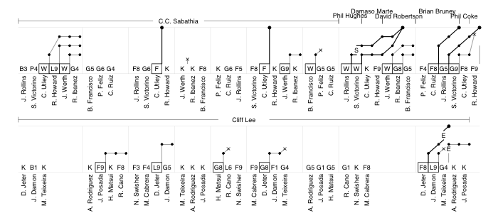
Free to reproduce for non-profit/personal use, but we reserve the right to license it to for-profit enterprises.
The runner progression is done very nicely, I think, as it allows you to follow each individual runner and to see how each batter did at progressing the runners. Runner who eventually score have their line bolded. Progression by steals and errors are indicated with letters and runners thrown out on the base paths with exes. Fielder's choices and reaching on a dropped 3rd strike are also possible (In the top of the fourth Jayson Werth was thrown out at first on a dropped third strike). This format keeps all the aspects I liked about the original format:
This formulation gives a better feel for the pace of the game, and allows the events to be easily recreated: in the top of the first CC Sabathia escaped a base-loaded two-outs jam; Phil Hughes took over to start the eighth and walked the only two batters he faced, both of whom came around to score on Raul Ibanez's single; Utley's two solo-HRs were the only runs through the first seven innings; Cliff Lee didn't allow a runner past first until the ninth, and up to that point faced just three batters over the minimum; the Yankees burned through five relievers, who gave up four runs, in the last two innings; the top of the ninth ended with Shane Victorino getting thrown out at home on a Ryan Howard double and the game ended with two more Cliff Lee strikeouts. All of this can be easily seen through a close, but not difficult, reading of the chart.
This approach has the added benefit of being easily recreated by hand on graph paper, as alternative way to score games. Anyway thanks to the readers, and especially to the commenters and Matt, for humoring my bizarre impulse for a second week.
| F/X Visualizations | February 05, 2010 |
Thoughts on a New Box Score
I have fond memories of, as a child, reading box scores in the newspaper. In the pre-internet, or at least pre-internet in my house, days box scores in newspapers was the medium by which I, and I assume, most people consumed baseball data. The data were all there, tightly yet efficiently packed in a format that allowed you to pull out any or all you wanted without feeling overwhelmed. Each was small enough for box scores for all the day's games to fit on one page.
I still read box scores, the medium has changed to the internet, but the box score itself is largely the same. I guess the format has stayed largely the same since the mid-1800s. Some of the stats are different but the layout is very similar. Over 150 years with little change shows that the format is remarkably successful, but that does not mean there cannot be innovations. FanGraphs's WPA charts are not box scores per se, but are a very effective way of presenting what happened in a game.
I thought it would be an interesting exercise to attempt to create a new box score. I wanted it to retain the original box score's quality of presenting a relatively large amount of information in a relatively small space, but making that data accessible and not overwhelming. Beyond that I hoped my new method gave a more immediate feeling for the pace and tenor of the game, like the WPA chart does.
Here is my attempt. The image is may be too small, but I kept it that way so that it didn't push out the right margin of the page. You can click on it for a larger version. I used game one of the 2009 World Series for the example.
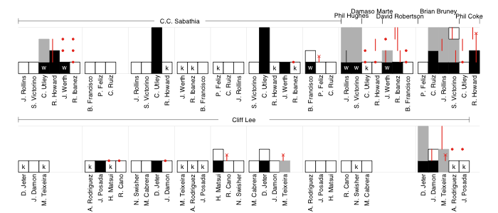
Each at-bat is represented by a bar, the height of which denotes the base the batter reached. White bars are for outs, black for hits or walks. The batter's progression around the rest of the bases that inning is indicated in gray (steals have a vertical black line through them). Runners on-base during an at-bat are indicated in red: circles for those not moved over in the at-bat, lines to show their progression as a result of the at-bat and an 'ex' if they were thrown or tagged out in that at-bat.
The score can be counted along as the black or gray bars reach the top. That also allows you to count individual batter's runs scored or pitcher's runs allowed. Red lines that reach the top are RBIs.
Compared to a traditional box score it is harder to find an individual player's line. For example to see that Chase Utley went 2-4 with 2 HRs, 2 runs, 2 RBIs, a strikeout and a walk you have to go through, find his at-bats and count all of the events. But the trade-off is, I think, this formulation gives a better feel for the pace of the game, and allows the events to be easily recreated: in the top of the first CC Sabathia escaped a base-loaded two-outs jam; Phil Hughes took over to start the eighth and walked the only two batters he faced, both of whom came around to score on Raul Ibanez's single; Utley's two solo-HRs were the only runs through the first seven innings; Cliff Lee didn't allow a runner past first until the ninth, and up to that point faced just three batters over the minimum; the Yankees burned through five relievers, who gave up four runs, in the last two innings; the top of the ninth ended with Shane Victorino getting thrown out at home on a Ryan Howard double and the game ended with two more Cliff Lee strikeouts. All of this can be easily seen through a close, but not difficult, reading of the chart.
What do you think of this format: Complicated and poorly laid out? Hard to read? Brilliant? I welcome constructive criticism in light of what you want from a representation of a baseball game.
| F/X Visualizations | January 22, 2010 |
How Do Pitchers Change Their Approach Against Good Hitters?
Nick Steiner, who over the last couple months has been producing some great pitchf/x content, had an interesting piece asking how many HRs Albert Pujols would hit if he saw the same pitches as Juan Pierre. He wrote the piece in mid-September and concluded he would have hit 62 HRs up to that point in the season. It is a very cool question, and implicit in it the question is the understanding that pitchers pitch differently to good hitters than they do to not-quite-as good hitters.
I think this is a very interesting idea to explore further, and the PITCHF/X data set is a great tool for it. To do that I created two groups of hitters. First the twenty regulars with the top wOBAs in 2009 (wOBA is a stat of TangoTiger's construction that measures overall offensive impact), and second the twenty regulars with the lowest wOBAs in 2009.
One common assumption is that good hitters see fewer fastballs and this analysis bears this out. The top-wOBA group saw 58.4% fastballs versus 61.5% for the bottom-wOBA group. But that actually understates the difference. The top group saw many more pitches in hitter's counts and pitchers throw more fastballs in hitter's counts. It is best to consider the difference in each count.
Fastball Frequency by count
        top   bottom
0-0   0.626    0.663
0-1   0.551    0.545
0-2   0.549    0.511

1-0   0.587    0.664
1-1   0.542    0.559
1-2   0.497    0.484

2-0   0.659    0.780
2-1   0.579    0.679
2-2   0.530    0.528

3-0   0.717    0.848
3-1   0.735    0.823
3-2   0.591    0.705
Here you can see the difference is largely driven by hitter's counts (e.g., 1-0, 2-0, 2-1, 3-0, 3-1) where the top group saw on average 10% fewer fastballs than the bottom group. Interestingly in pitcher's counts (e.g., 1-2, 2-2) the differences are very small.
The next thing we can look at is where those pitches end up. Here I plot the location of fastballs to the two groups. Areas where the top-wOBA group sees more pitches are red and where the bottom-wOBA group are blue.
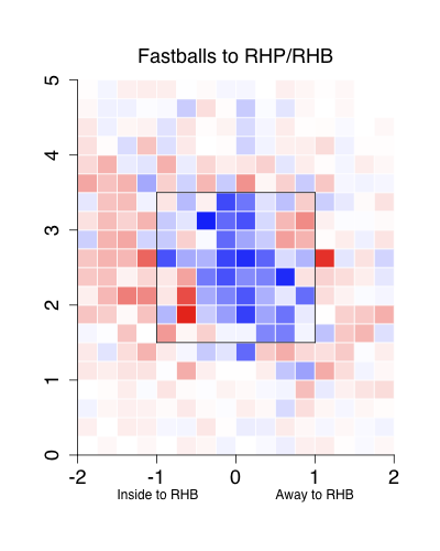
Not surprisingly the top group sees many fewer balls in the strike zone. The extra pitches end up inside more than they end up outside, which is a little surprising to me. This also shows that the pattern of good hitters seeing fewer pitches in the zone is not just a result of them seeing fewer fastballs, which are more likely to be in the zone. That is good hitters see fewer fastballs AND the ones they do see are less likely to be in the strike zone.
Overall the top group saw 47.6% of their pitches in the strike zone, compared with 51.8% for the bottom group. But again this 4% difference understates the difference because the top group gets more hitter's counts in which pitchers should be around the zone. Breaking up by count we see:
Proportion of pitches in the strike zone
        top   bottom
0-0   0.507    0.548
0-1   0.428    0.473
0-2   0.325    0.325

1-0   0.505    0.575
1-1   0.478    0.526
1-2   0.376    0.424

2-0   0.505    0.592
2-1   0.545    0.580
2-2   0.443    0.489

3-0   0.471    0.554
3-1   0.607    0.646
3-2   0.553    0.598
Here the difference increases to 4% to 7% in each count. It is clear the pitchers avoid the heart of the zone, and the zone as a whole, against the better batters.
This is another example where the pitchf/x data support the prevailing assumptions: good hitters see fewer fastballs and fewer pitches in the zone. But there are some interesting patterns: the smaller frequency of fastballs seen by good batters is largely driven by a much smaller frequency in hitter's counts -- not all counts across the board -- and the out of zone fastballs that good hitters see are more likely to be inside than outside.
| F/X Visualizations | January 15, 2010 |
The Tigers and Pirates Sign Probable Closers
Yesterday the Tigers and Pirates signed their probable closers. Both teams had question marks at the back-end of their bullpens and found free agents who should have no problem sliding in to the closing roles.
Octavio Dotel
The Pirates -- who had non-tendered Matt Capps leaving their closer position empty -- signed Octavio Dotel. Using a fielding-independent pitcher-evaluation framework that gives pitchers credit for strikeouts, ground balls and avoiding walks (a framework Rich used to rank pitchers back in February), Dotel succeeds in spite of giving up a lot of walks and not getting many grounders by striking out just under 11 batters per nine innings.
Although he also throws a slider and curve ball, Dotel throws his fastball almost exclusively. Last year he threw it over 82% of the time and you have to go back to 2003 to find a year he threw it less than eight times out of ten. Relievers who throw a fastball that often usually bring the heat -- think David Aardsma, Mike MacDougal or Matt Thornton -- but Dotel's fastball averages just 92 MPH. In fact among the ten relievers who throw a fastball most often Dotel has the slowest fastball.
Still this slow fastball is very good . Batters miss a quarter of the time they swing at it, compared to an average whiff rate of just 14%. The result is that over the past three years he is in the top fifteen among relievers for whiff rate (or the lowest fifteen for contact rate).
Part of the reason for this is Dotel pitches up in the zone where batters whiff more often, though rarely hit grounders. I broke the zone into bins and compared the fraction of his fastballs in each bin to the average RHPs fastball to RHBs, the more red the color represents bins where Dotel throws fastball more frequently and the blue less.
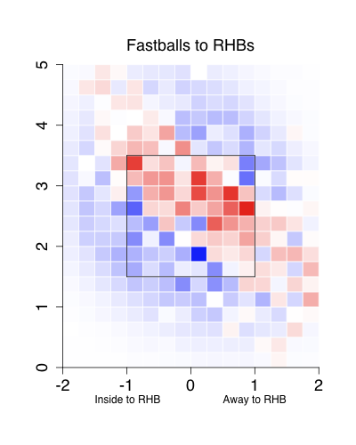
Dotel has a consistent swath, from up-and-in to down-and-away, where he throws his fastball. In that swath he throws the ball more often than the average righty and outside he throws the ball less. This is a pretty good place to be, as up-and-in and down-and-away are the most successful locations for a fastball.
The Pirates get a very good relief pitcher in Dotel: his career ERA out of the pen is 3.11, supported by a FIP of 3.36. This should make him a solid closer. (Thanks to Rich for noting my error, including his innings as a starter in his ERA, here.)
Jose Valverde
Valverde has a good pedigree of closing games for the Diamondbacks and then the Astros. He should take the Tigers' closing role, as they had three flame throwers, Ryan Perry,
Valverde is a little bit better than Dotel. He strikes out just as many batters but is a little better at limiting walks and gets a few more grounders, though still is predominately a fly-ball pitcher.
Valverde brings the heat with a 96-mph fastball, but mixes in a splittler which he throws about a quarter of the time. The splitter is a very good pitch. He throws it slightly more to lefties, and the pitch, like a changeup, has a very small platoon split. In fact over the past three years -- before that he did not throw it as often -- he has had small to negative platoon splits.
Also, while his fastball is an extreme fly-ball pitch, getting just 31% balls in play on the ground, the splittler, which 'sinks' in comparison to his fastball and is thrown lower in the zone, gets 57% ground balls per ball in play. So the pitch keeps him from being as extreme a fly-ball pitcher as Dotel.
Valverde is also a very good relief pitcher, he solidifies the back-end of the Tigers bullpen and should be a good closer. Still some found the price, a two-year 14-million dollar deal and a draft pick, a little high.
| F/X Visualizations | January 08, 2010 |
Looking at Some BBWAA Vote Trajectories
First off congratulations to Andre Dawson on his election to the Hall of Fame.
In this post I want to look at the some of the other players on the ballot and see what we can say about their possible vote trajectory based on looking at historic comparables. But just to be clear from the outset, these are not predictions, as the small sizes are quite small.
In these plots I show how the vote share of each player changed over his subsequent ballots. Along the x-axis is the number of times on the BBWAA ballot, and on the y-axis the proportion of votes he got on that ballot. Circles indicate when a player reached the 75% level. I do not indicate players elected by any manner other than the BBWAA. For each graph I highlight a group of comparable players in red.
First off let's look at Roberto Alomar. He got 73.7%; that is the closest a first-year player has come to 75%. So I compared him to all players who received less than 75% but greater than 60%.
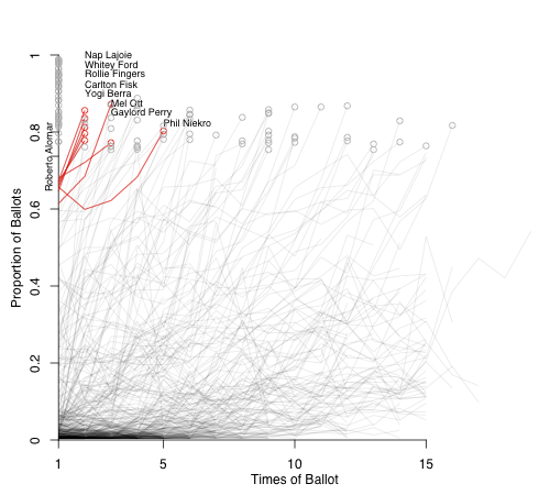
These players were all elected relatively quickly, with most elected the next year. Phil Niekro lost some support in his second year and had to wait the longest, five years, before induction.
Barry Larkin was next among first-year players. He got 51.6% and I looked at players who received within 5% points of that total.
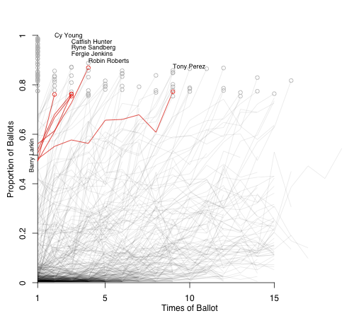
These players were, also, all eventually inducted. Cy Young, the only player in this group to get in on the second try, was not in the Hall's first class, but his vote total shot up the next year and he was elected. I don't think this is the best comparison for Larkin; he will probably have to wait more than one more year. In this group Tony Perez took the longest, as his votes meandered upward for a number of years before being elected in 2000 on his 9th ballot. But history looks good for Larkin.
Next among first-year players is Edgar Martinez, who had 36.2%. There are a lot more players in this range so I just looked at those within 2.5% points.
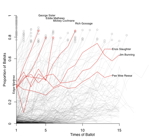
Four of these players shot up quickly and were elected before their tenth time on the ballot. The other three never reached 75% -- although Jim Bunning came painfully close on his 12th time on the ballot -- but all were, ultimately, inducted by the Veterans Committee.
The only other first-year player to reach 5% was Fred McGriff. I highlight others withing 2.5% points of his 21.5%.
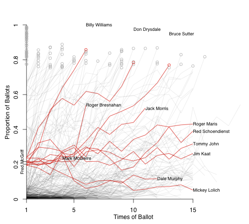
This presents a more muddled picture. Three guys reached 75%, in as fast as six years or as long as 13 ballots. Roger Bresnahan was elected by the Old Timers Committee, a precursor to the Veterans Committee. Red Schoendienst was elected by the Veterans Committee. Three of his comparables are still on the ballot and the last four didn't make it in.
Finally I am going to turn my attention to the two saber-darlings on the ballot: Tim Raines and Bert Blyleven. For these two we have more data than just their first year vote total so I am going to construct their comparables differently.
Blyleven, as Rich covered yesterday, came very close, falling just five votes shy. Here I highlight all other players who received over 70% but less than 75% on a ballot late in the process (tenth ballot or after).
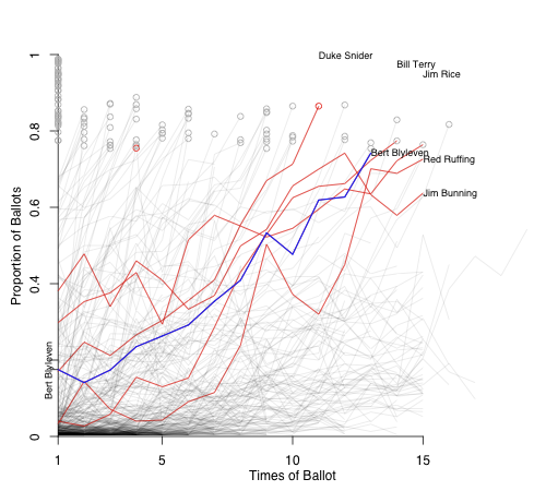
Going by initial vote starting from the highest: Bunning's first total was just under 40% and he -- as noted above -- reached 74.2%, but that was his high-water mark and was ultimately inducted by the VC. Next is Jim Rice who got 74.2% in his 14th year on the ballot and was elected on his 15th ballot last year. Duke Snider started with a total very close to Blyleven's and road a steady growth to the fastest induction among this group. Bill Terry started at just 4% -- this was before players who did not reach 5% were dropped -- and his vote share increased steadily and he was elected in his 14th year. Finally Red Ruffing, who also started below 5%, increased steadily and in his 14th year, 1967, received 72.6%. At the time if no player was elected the BBWAA would hold a runoff and the top vote getter would be inducted. Ruffing was elected in the 1967 runoff.
Tim Raines has been on the ballot for three years with the following totals: 24.3%, 22.6% and 30.4%. For his group I chose players who got between 15 and 35% in each of their first three years.
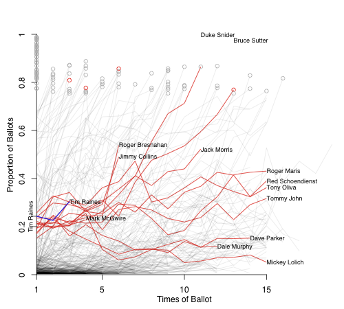
This is a mixed bag. Jimmy Collins and Bresnahan were inducted by the Old Timers Committee, and Schoendienst by the VC. Two guys reached 75%, four are still on the ballot and the other four didn't make it. We will see how it goes for Raines.
Again with the small sample size these are in no way predictions, but an attempt to put these players's vote totals in some historical perspective.
| F/X Visualizations | December 18, 2009 |
The Pitchers of the Next 'Big Trade'
Last week I looked at the pitchers involved in the Winter Meetings's 'big trade,' and then this week an even bigger trade went down. The Blue Jays sent the Phillies Roy Halladay for a package of three prospects. The Phillies then turned around and sent Cliff Lee to the Mariners for slightly lesser group of three prospects. By now there has been extensive analysis of the trade, but the emerging consensus is: the Blue Jays needed to trade Halladay before he became a free agent after failing to do so last season; the Phillies took a slight hit to their farm system for an upgraded ace willing to sign a long-term deal rather than test the free agent waters; and the Mariners, looking to compete for the AL West title in 2010, picked up one of the game's best pitchers.
As I did last week, I am going to take a pitchf/x look at the major league pitchers in the deal. They are two of the best pitchers in baseball. Over the past two years they are two of just seven starters to post an ERA below three. They did so throwing 482 (Halladay) and 455 (Lee) innings, only CC Sabathia has thrown more over that period. They rank one and two in lowest BB/9 and one and three for the highest K/BB ratio over that period. Halladay adds the third leg to the stool, by also inducing over 50% GB per BIP, which makes him a little bit better than Lee. Still these are two of the best pitchers in the game. Additionally by limiting walks they are able to go deep in games, which helps their teams by reducing bullpen strain.
Roy Halladay
I have written two articles at FanGraphs looking at Halladay's pitchfx numbers. The first broke down his pitches to RHB and LHB. It showed that he has a very even pitch distribution, throwing one of three pitches -- two-seam fastball, cutter or curve -- often to both LHBs and RHBs.
+-------------------+------+------+
|                   | vRHB | vLHB |
+-------------------+------+------+
| Two-Seam Fastball | 0.34 | 0.31 |
| Cutter            | 0.39 | 0.43 |
| Curveball         | 0.26 | 0.20 |
| Changeup          | 0.01 | 0.06 |
+-------------------+------+------+
Batters cannot go up and expect one specific pitch over 60% of the time like they do with against some pitchers.
The second post showed that he uses his cutter and two-seam fastball to give him a pitch to go inside and outside against both LHBs and RHBs. His two-seam fastball used inside against RHBs and outside against LHBs, and his cutter is the opposite. This allows him to avoid the middle of the plate, while varying the location of his pitches -- inside and outside -- to both RHBs and LHBs.
This helps explain his strike outs and walks, but whence the grounders? The obvious place to look is pitch height. Here Halladay's pitches are in red and the average in gray.
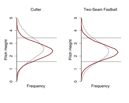
His cutter is much lower in the zone than the average cutter, probably leading to his great groundball rate. His two-seam fastball is not that much lower than average, rather much more often in the zone, further reason for his low walk rate.
Cliff Lee
Over the past two years -- since Lee really emerged as a dominant pitcher -- no pitcher has a had a more successful fastball, which is a surprising fact. Part of this is that no one is better than Lee at getting his pitches, and his fastball particularly, in the zone.
To look at this in a spatially explicit manner I broke the strike zone and area around in into a number of bins. I calculated the frequency of Lee's fastballs in each bin and than compared that to the frequency for the average lefty's fastaball. Bins in which Lee had a higher frequency than the average lefty were red and a lower frequency blue. The intensity of the color indicates the size of the difference. As always the images are from the catcher's perspective, so RHBs stand at -2 and LHBs at 2.
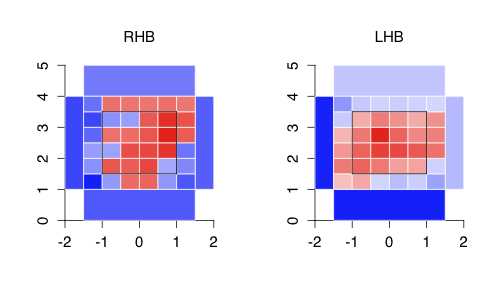
Against RHBs Lee locations his pitches more up and away than average, and as a whole more in the zone and just out of the zone than average. This is as expected. Against LHBs the pattern is even more extreme. In every strike zone bin he has a higher frequency than average, and is much lower in the farthest away from the zone bins.
Overall it was another exciting week. The Blue Jays cashed in on Halladay and to continue their rebuilding process. The Phillies got one of the best pitchers in the game, whose grounders should play very well in their small park and locked him up for years. And the Mariners picked a great pitcher, who as a lefty mitigates opposing LHBs's advantage at Safeco, as they look to compete in 2010.
| F/X Visualizations | December 11, 2009 |
The Pitchers of the 'Big Trade'
In terms of excitement the Winter Meetings were underwhelming, particularly compared to their intense coverage. But, for three teams there was excitement in spades. As you surely know the Tigers, Diamondbacks and Yankees pulled off a big trade. Here I will give a pitchf/x-based look at some of the pitchers in the trade as an introduction to their new fans.
Edwin Jackson
Jackson had a breakout year in 2009. For the first time he got his BB/9 below three, and also for the first time the value was below league average. He was probably the beneficiary of some BABIP based luck, but he still was a very good pitcher.He is, for the most part, a two-pitch pitcher.
+-------------+-----+-----+
| Pitch Type  | RHB | LHB |
+-------------+-----+-----+
| Fastball    | 60% | 67% |
| Slider      | 37% | 20% |
| Curve       |  2% |  4% |
| Change      |  1% |  9% |
+-------------+-----+-----+
Righties see the slider or fastball 97% of the time, and lefties 87% of the time. That is what you can do if you throw your fastball in the mid-90s and have a devastating slider.
It looks to me that the big step forward for Jackson was the out-of-zone swing rate on his fastballs. In 2007 the rate was 21%, then 25% in 2008 and now 28% in 2009. Swings at out of zone pitches turns balls into strikes or weak contact. Jackson's in zone percentage did not change much this year, so I think the decrease in walks was from batters swinging at his out of zone fastballs at a greater rate. It would take a little more digging to see why exactly they did that.
Ian Kennedy
In his 60 MLB innings Kennedy has not lived up to his incredible minor league numbers; Jeff Sackmann's Minor League Splits gives him a major league equivalent FIP of 3.83 based on his minor league career. The refrain is that his meager stuff can get the job done in the minors, but will not translate directly to the Bigs. But just 60 innings is not enough to make such a designation and, anyway, the Diamondbacks would be happy with a lot worse than a 3.83 FIP.
Kennedy throws a fastball that averages just south of 90 mph, a slider, curve and change that is about 10mph slower than his fastball. In limited time in the majors he did a good job of keeping his fastball away to LHBs and the change down and away.
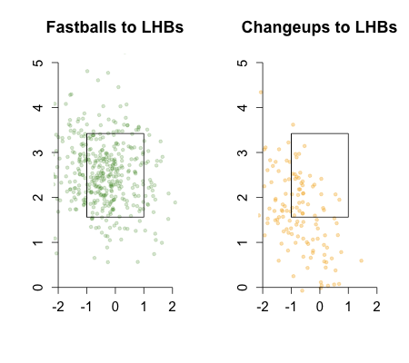
In Arizona he should get a solid shot to establish himself as a starter on a longer leash than when he was in New York.
Max Scherzer
Scherzer is an exciting pitcher, striking out over a batter an inning while walking just 3.34 per nine. At 25 he is one of the game's top young pitchers. The consensus is that Arizona was concerned about his long-term health and wanted to cash in on him while he is still healthy.
He throws three pitches.
+-------------+-----+-----+
| Pitch Type  | RHB | LHB |
+-------------+-----+-----+
| Fastball    | 70% | 72% |
| Slider      | 20% |  7% |
| Change      | 10% | 21% |
+-------------+-----+-----+
Scherzer's fastball works in the mid-90s. His secondary pitch is a slider to RHBs and a change to LHBs. What make Scherzer an exciting and potentially elite pitcher is his ablity to miss bats, as evidence by his strike out per inning and also by his bottom 15 contact rate (in other words top 15 whiff rate). The extra whiffs come courtesy of his excellent fastball.
Whiff Rate
+-------------+-----+-----+
| Pitch Type  | Sch.| Ave.|
+-------------+-----+-----+
| Fastball    | 20% | 14% |
| Slider      | 26% | 27% |
| Change      | 26% | 29% |
+-------------+-----+-----+
You can see that the only place Schzerer is better than average is with his fastball. But because most pitchers, Schzerer included, throw mostly fastballs, so having a fastball that is far above average is going to lead to tons of strikeouts.
Daniel Schlereth
Schlereth is an electric reliever, over the course of his minor league career he averaged 12.8 K/9, but also 4.9 BB/9. He joined the Diamondbacks pen part way through and pitched about how one expect, 22 Ks and 15 BBs in just 18 innings. If he can cut down on the walks while keeping the big strikeouts he will be an elite reliever.
The most interesting thing about Schlereth's usage so far, and be warned this is based on just 18 innings, is he throws curveballs over 40% of the time. No full time reliever threw that many curves in 2009 . The curve is nasty with a 40% whiff rate. It will be interesting to see his pitch usage over a full year coming out Detroit's bullpen.
Both Detroit and Arizona have two very interesting new pitchers to follow next year. In addition we recently heard that Detroit might try Phil Coke as a starter, which is another intriguing aspect of the trade.
| F/X Visualizations | December 04, 2009 |
Pitchf/xing Passed Balls and Wild Pitches: Part Two
Two weeks ago I introduced the idea of evaluating catcher's ability to prevent wild pitches and passed balls using the pitchf/x data. In that post I presented the idea and some preliminary findings.
Here I will present that evaluation. I constructed a model which gives the probability a pitch gets passed the catcher based on the pitch type, its location and the handedness of the batter/pitcher.
Before presenting how the catchers ranked under this model I will address some questions posed by commenters. First MGL:
Obviously most WP are pitches thrown in the dirt (I assume), and almost no PB are pitches in the dirt. That is important. Also, a fastball in the dirt is extremely difficult to catch. A slider is somewhat difficult and a curve ball is not all that difficult
The pitchf/x system gives pz, the height of a pitch as it crossed the plate. Negative values are possible, those pitches have hit the ground before they got to the plate, and if they could keep going down they would have ended up somewhere below the plate. Other pitches that are very low, but positive, when they cross the plate will end up in the dirt. If one were not lazy, like me, he could go back and calculate, roughly, if a pitch will have a negative height before it reaches the catcher. I did not do this, but just looked at the reported height as it crosses the plate. Anyway here is how sliders, curves and fastballs vary for PB+WP% by height.
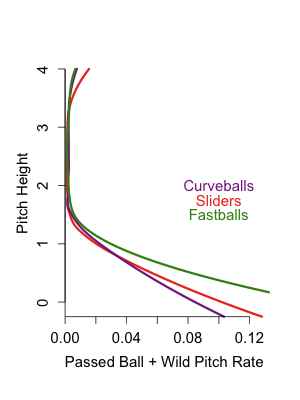
It looks like MGL is correct low fastballs are much more likley to get by the cacher than low sliders or curves.
Now Guy:
Dave: You mention that catchers have more trouble with inside pitches. While that could be the presence of the hitter, it might also be that catchers have more trouble with balls on the glove side of their body. What does this pattern look like for RHP vs. LHB? And with LHPs?
Another great question. In my post I showed just the RHB/RHP image and inferred that since inside pitches were harder because of the batter, but without looking at the other ones it could be for other reasons.
Here is the rate by horizontal location. RHBs are in black, LHBs in gray. RHPs are solid and LHPs dotted.
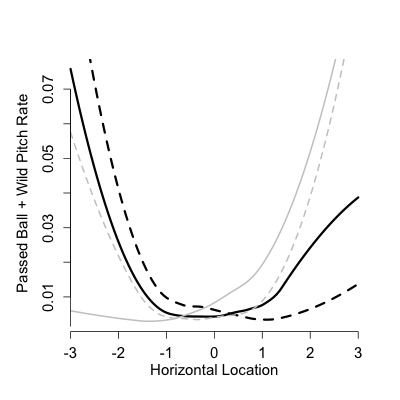
First off since the black lines both increase sharply to the left of the graph and gray lines to the right, we have that inside pitches do in fact have the highest passed ball rates regardless of handedness of the pitcher or batter. Outside pitches get by the catcher more often in same-handed at-bats than opposite for some reason. [On the left sided the dotted gray line (LHB/LHP) above the solid gray (LHB/RHP) and on the right side the solid black line (RHB/RHP) is above the dotted black (RHB/LHP) ].
Ok now for the catcher evaluations. I went through each pitch a catcher saw with men on base and based on its location and pitch type gave it a probability that the average catcher lets it by. First off there is considerable variation in expected number of passed balls/wild pitches a given catcher sees. Over the course of the pitchf/x era (part of 2007 and all of 2008 and 2009) Gregg Zaun saw the toughest pitches, with an expected 10.2 getting by him for every 1000 pitches with men on base. On the other hand Jason Varitek saw the easiest pitches. The average catcher would only let 7.1 by per 1000 pitches with men on. So it seems the model does project some variation.
It turns out that both these catchers do a good job. Here are the leaders and laggards in difference between expected and actual WP+PBs in the pitchf/x era. Each one is worth 0.28 runs, so over about two and a half years the best catcher is only about one win over average and the worst only one win below average.
+--------------------+-------+
| Catcher   WP+PB - expected |
+--------------------+-------+
| Zaun, Gregg        | -32.1 |
| Suzuki, Kurt       | -32.1 |
| Ruiz, Carlos       | -30.2 |
| Molina, Yadier     | -26.7 |
| McCann, Brian      | -24.5 |
| Varitek, Jason     | -23.7 |
| Coste, Chris       | -21.1 |
| Quintero, Humberto | -18.1 |
| Barajas, Rod       | -14.8 |
| Torrealba, Yorvit  | -14.7 |
+--------------------+-------+
| Iannetta, Chris    |  11.4 |
| Montero, Miguel    |  11.7 |
| Doumit, Ryan       |  14.4 |
| Snyder, Chris      |  14.7 |
| Burke, Jamie       |  15.4 |
| Navarro, Dioner    |  15.7 |
| Molina, Jose       |  16.5 |
| Shoppach, Kelly    |  16.7 |
| Olivo, Miguel      |  29.9 |
| Molina, Bengie     |  30.2 |
| Posada, Jorge      |  36.4 |
+--------------------+-------+
| F/X Visualizations | November 20, 2009 |
A Pitchf/x Look at Passed Balls and Wild Pitches
Catcher defense is one of the more enigmatic areas of baseball study. It has developed relatively independently of other position player defensive analysis. This is probably because, although catchers field some ground balls and pop ups, their main defensive contribution is very different from that of all other position players. This contribution is mostly in preventing stolen bases, passed balls and wild pitches.
The difference in ability to do those things, as well as not make fielding and throwing errors, resulted in a range of 13 runs above average (Gerald Laird) to ten runs below(Mike Napoli) in 2009 by devil_fingers' calculation. This is about the same range of catcher performance that Brian Cartwright predicted before the 2009 season. About one extra win picked up best the best defensive catcher, and one run given up by the worst.
These analyses are based on Tangotiger's WOWY method. He calculates each pitchers' rate of PBs and WPs and then predicts how many PBs and WPs a specific catcher should expect to have based on how many PAs he has with each pitcher. The difference between these predictions and the actual amount he gave up is a measure of his ability to prevent PBs and WPs. David Gassko takes a similar approach, but uses pitching staff numbers: strikeouts, earned runs and hits batsmen, which predict PBs and WPs quite well. Then finds the difference between expected, based on these numbers, and actual for each catcher.
With the availability of the pitchf/x data we can take the same idea, but on a per pitch basis. By examining the pitchf/x characteristics of each pitch we can create a model which predicts how often the average catcher lets a pitch pass (as a PB or WP). From there we can predict the number of PBs and WPs that the average catcher gives up if he saw the pitches seen by a given catcher, and then how many more or fewer PBs and WPs that catcher gave up.
One limitation here, which has been discussed before, is we do not know where the pitch was supposed to go. Maybe a catcher called the pitch on the outside and it was on the inside edge, a place most catchers do not give up a PB, but since he was expecting it elsewhere it gets by. In a pitch position based model the catcher would be penalized in such a scenario.
In this post I will briefly summarize some findings concerning pitchf/x and PBs and WPs, and then present a full model and catcher evaluation in a future piece.
The first thing we can look at is the difference between a passed ball and a wild pitch, which is obviously a subjective decision of the scorer. Here I plot the frequency distribution for the distance from the center of the plate for all pitches, passed balls and wild pitches.
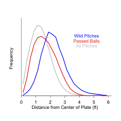
You can see that passed balls are a little farther from the center of the plate than the average pitch, but that wild pitches are drastically so. Thus scorer are calling pitches far out of the zone wild pitches while those that look more like a normal pitch a passed ball, but there is considerable overlap.
Next we can look at the probably that a pitch gets by the catcher, if it is passed or wild, based on its location. I think this is going to depend on the handedness of the batter and pitcher so here I show the graph for RHB v RHP. The image is from the catcher's perspective so the batter stands at, roughly, -2.
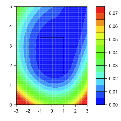
There is a strong directionality. Inside pitches are more like to get by the catcher than outside. This could have to do with batter being in the way, making inside pitches harder to see, or could be the pitch location versus expectation of location issue I talked about above. Also catchers miss balls in the dirt more often then they miss high pitches.
Finally we can see the wild pitch/passed ball rate on each pitch type. This is the rate of these occurrences per non-contacted pitch of each type.
+-------------+-------+
| Pitch Type  |  Rate |
+-------------+-------+
| Fastball    | 0.24% |
| Changeup    | 0.49% |
| Curve       | 0.60% |
| Slider      | 0.73% |
| Knuckleball | 1.37% |
+-------------+-------+
Again the results here are not very surprising. Fastballs have very small rate, while knuckleballs are off the charts. There is definitely an interaction here between pitch type and pitch location, fastballs are less likely to be far out of the zone than a curve or knuckleball. In addition it would be interesting to see how spin deflection and break of a pitch affect it. I will combine all of these in the next post into a larger model predict passed ball and wild pitch rates and then using that to evaluate catchers.
| F/X Visualizations | November 06, 2009 |
The Best Pitch of 2009
Everyone loves end of the season superlatives, so I thought I would join the fun and present 2009's best pitch. First let me say that this is a shameless rip-off of John Walsh's original 'Searching for the game's best pitch' when he looked at the 2007 season's best. I use Walsh's metric which values each pitch by the change in run expectancy from before and after the pitch. Walsh came up with the idea and describes it in that article, it is the way I have always done it and is the way FanGraphs values pitches. The caveat is that it is not stripped of the influence of ballpark, defense or luck. Harry Pavlidis has addressed that with his Expected Run Value, but here I am sticking with the original.
Another way to look at and value pitches is as Chris Moore and Jeremy Greenhouse have done here at Baseball Analysts looking at the process rather than the results. They value fastballs by their expected value based on movement, speed and location. But, again, I am going to go 'old fashioned' and just go with change in expectancy.
A second thing to note is that the owner of the best pitch of 2009 was in the news yesterday for something other than having the best pitch in baseball. I didn't notice until reading it over at Shysterball this morning. The timing is purely conicidental, my only hope is that this news will provide the pitcher a degree of solace if he is feeling down about the recent events.
Anyway, the best pitch of 2009 is Tim Lincecum's changeup. By FanGraphs' reckoning it reduced the run expectancy of Giant's opponents by 35 runs, no other single pitch was above 30 runs. On a rate basis (per pitch) it is the best for any pitch thrown over 200 times. I get the similar results (different numbers but Lincecum's change still comes out on top) when I run it with my pitch classifications and run values (FanGraphs goes with the BIS pitch identifications).
With each year since his debut Lincecum has thrown fewer fastballs, thrown them slower and thrown more changeups. It looks like he is really getting more comfortable throwing other pitches and taking a little bit off his fastball. In 2009 he threw the changeup 13% of the time to RHBs and 26% of the time to LHBs. It is nine mph slower than his fastball.
Here are Lincecum's pitches based on their spin deflection (Mike Fast has told me this is a better term for pfx_x and pfx_z than horizontal movement and vertical movement).
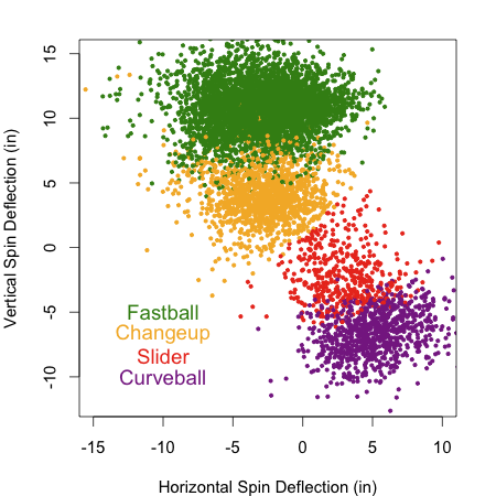
This spin deflection is more like that of a splitter than a normal changeup. Most pitcher's changeups 'drop' more than that pitcher's fastball, but also tail in more to same handed batters (have more horizontal spin deflection). I think that is the movement of a circle change. Lincecum, I think, uses a split finger grip for his change and the result is that the horizontal spin deflection is similar to his fastball and the different in deflection is only in the vertical component. It is interesting to note the Josh Kalk found that a splitter performs better after a fastball than a changeup performs after a fastball.
Here is how that looks in regards to where the pitch ends up.
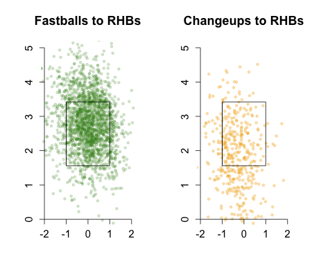
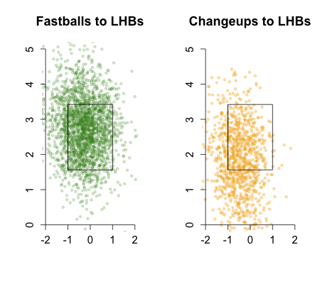
Just as the spin deflection would suggest the pitch ends up down in the zone or below the zone compared to his fastball.
A big reason for the pitch's success is its whiff rate, that is the percentage of time that a batter misses it when he swings at it. Lincecums' changeup has a whiff rate of 43%, while the average change just 28%. The rate at which batters swing at his change and whiff when they do swing is highly dependent on the height of the pitch. Here are those rates for Lincecum's change (orange) and the average change (gray).
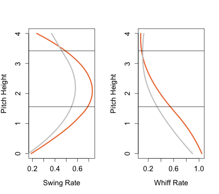
Lincecum is better at inducing swings on his change and better at getting whiffs, particularly low in and below the strike zone.
In the middle of the season I checked in on Lincecum's chanegup over at FanGraphs and noted that its value was dependent on its speed differential from the preceding fastball and the number of fastballs preceding it in the at-bat. So we cannot say that Lincecum's changeup succeeds in a vacuum; its success is predicated on his fastball. That is one of the limitations of this pitch valuation system. Another is that Lincecum gets credit for the Giants excellent defense, pitching in the NL and pitching half his game in a pitcher's park.
With those caveats in mind, there you have it Tim Lincecum's changeup, 2009's best pitch.
| F/X Visualizations | October 23, 2009 |
Angels Send the Series Back to New York
Unfortunately Rich's Dodgers are out of it, but they had a solid season and reached the NLCS for a second year in a row. His Angels, on the other hand, won two of three in Anaheim and the series heads back to New York. The series resumes this weekend on Saturday and potentially Sunday, with the Angles needing to win both. Rich was treated to quite the game on Monday from the first row, as he watched the Angels beat the Yankees in extra innings in a bullpen extravaganza. The two teams used fourteen pitchers, the kind of game you get when there are so many extra rest days between games and so much rides on every out. I am sure Rich enjoyed the game thoroughly.
The Yankees dominated Tuesday's Game 4, but the Angels won last night. The seventh inning was key. In the top half, the Yankee bats came alive after being shut down by John Lackey all night. They scored six to take the lead. A.J. Burnett started the bottom of the seventh giving up a hit and walk, and was relieved by Damaso Marte who gave up a sacrifice bunt and then a ground out that scored a run. That left one out, the Yankees up by one and Erick Aybar on third. So the Yankees turned to Phil Hughes, who has been a dominating reliever for them, posting a FIP of 1.83 on the strength of amazing strikeout (11.4 per 9) and walk (2.28 per 9) rates. Unfortunately he was not at his best last night
He walked Torii Hunter, throwing all fastballs and cutters. Since he got behind early he could not go to his very good curve. He then gave up a single to Vladimir Guerrero on a fastball in a four pitch at-bat. Then another single to Kendry Morales also on a fastball in a five pitch at-bat. Finally he struck out Maicer Izturis, throwing three curves in a four pitch at-bat.
Hughes usually has great command on his fastball, but last night because of nerves or just randomly he did not. Here are the fastballs:
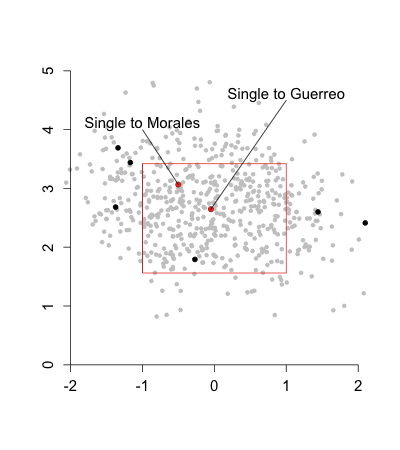
In gray are all his fastballs over the season, in black his from last night with the two hits in red. You can see how he usually gets a high percentage in the zone, but last night only three out of eight. The single to Guerrero was on a pitch right down the middle of the plate and the pitch to Morales (a switch hitter who was batting lefty) was up-and-away, a good but not great location for a fastball to a LHB.
The Angels capitalized on a rare off-night for Hughes and send the series back to New York.
| F/X Visualizations | October 06, 2009 |
Porcello Versus the Twins' Lineup
Yesterday I wrote about the Porcello/Baker pitching matchup, another interesting facet of tonight's game is the match up between Rick Porcello and the Twins' lineup. Porcello succeeds by getting lots of ground balls, over 54% per ball in play fifth best in the league. The Twins on the other hand have a high ground ball (3rd highest), high BABIP (7th best) offense. It seems this match up would play into the Twins favor, as their hitters hit lots of grounders and beat them out for singles or on ones through the gaps for extra base hits.
I wanted to see how much this is the case for individual Twins. So here are the career BABIP on grounders and SLG on grounders for some probable Twins starters. I also included the 2009 AL average for these values for comparison. I left out Jose Morales and Matt Tolbert as they had too few grounders. I sorted by SLG on grounders. All these numbers are from Baseball Reference.
                BABIPgb   SLGgb
Carlos Gomez     0.268    0.317
Denard Span      0.275    0.302
Delmon Young     0.260    0.281
Michael Cuddyer  0.252    0.277
Orlando Cabrera  0.240    0.263
Joe Mauer        0.253    0.261
Nick Punto       0.245    0.260
AL AVERAGE       0.240    0.260
Jason Kubel      0.197    0.211
With the exception of Kubel all these hitters have average or better slugging on ground balls. It looks like this may partially neutralize Porcello's main strength.
| F/X Visualizations | October 05, 2009 |
Baker-Porcello: A Study in Batted Ball Contrasts
Tomorrow's one game playoff between the Tigers and Twins features an interesting pitching match up. Rick Porcello and Scott Baker exist on opposite ends of the fly ball- ground ball spectrum. Porcello who throws a 'sinking' two-seam fastball over 60% of the time and gets grounders on 54% of his balls in play compared to just 29% fly balls. Baker throws a 'rising' four-seam fastball and gets grounders on just 34% of his balls in play to 47% fly balls. That puts Porcello in the top five GB% for starting pitchers and Baker in the bottom five. You can see an explanation for this difference by looking at the frequency distribution of the heights of their fastballs.
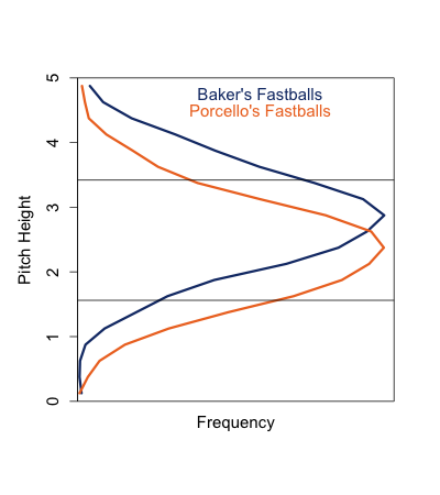
Recall there is a tradeoff in ground ball rate and whiff rate for fastballs based on the height of the pitch. Porcello works down in the zone where he gets grounders, but not many whiffs and consequently has one of the lowest strikeout rates in baseball. While Baker works up in the zone, gives up tons of fly balls (a good number of the desirable infield variety), but has an above average strikeout rate.
So tomorrow's game is not only an exciting one-game playoff of utmost importance to both teams, but a nice demonstration of the strikeout/ground ball trade off based on fastball height.
| F/X Visualizations | October 02, 2009 |
Mariano Rivera: Another Appreciation
For my last post of the regular season I wanted to examine one of the most singular and interesting players in major league baseball, Mariano Rivera. I know I have written about him before but the amazing Sports Illustrated cover of him inspired me to look deeper into his pitchf/x numbers.
In two months Rivera will turn forty and the average speed on his cutter is down a couple MPH in the last couple years, but his performance is still amazing. Unless something ridiculous happens in the next couple days he will finish up his ninth consecutive year with a FIP under 3, sixth out of the last seven years with an ERA under 2 and 12th of the last 13 years with at least 30 saves.
Rivera, famously, throws a cutter almost exclusively. He mixes in a four-seam fastball about 15% of the time to RHBs, but only 1% to lefties. So against RHBs it is about 85% cutters and against LHBs almost all cutters. As I have mentioned before his cutter has an incredible bimodal horizontal location distribution, which I have seen in no other pitch. Here it is to lefties, about 58% of the pitches inside to LHBs (Rivera's glove-side):
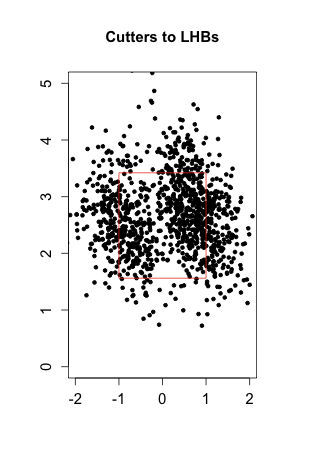
Here are his cutters to RHBs, 64% outside (Rivera's glove-side):
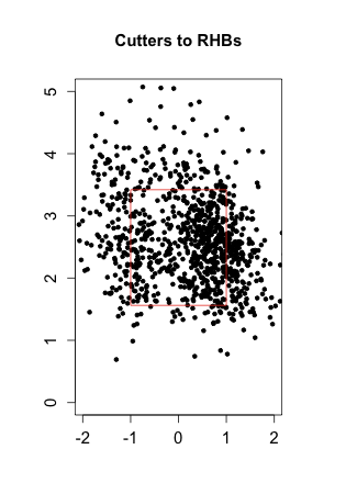
His fastball is thrown extremely inside to RHBs.
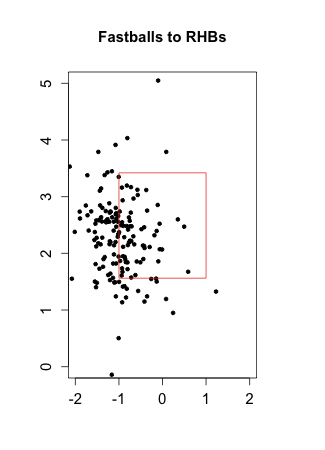
Effectively he has two pitches to LHBs (inside and outside cutter) and three to RHBs (inside and outside cutter and an inside four-seam fastball). Throughout this article I classify each pitch as either inside (x<0 to RHBs, x>0 to LHBs) or outside (x>0 to RHBs, x<0 to LHBs). Here is how the five pitches do by run value and some other per-pitch-metrics. FA denotes fastball, FCi inside cutter, rv100 is the run value per 100 pitches with negative good, whiff is the percentage of swings that miss the ball, oswing is the percentage of pitches out of the zone swung at, called is called strikes per pitch, gb% is ground balls per ball in play, iff% infield flies per ball in play and slgcon is slugging on contacted pitches.
          rhb-FA   rhb-FCi  rhb-FCo  lhb-FCi  lhb-FCo
rv100     -1.3      -0.2     -1.8     -3.6     -2.5
whiff      0.10      0.25     0.26     0.17     0.21
oswing     0.43      0.29     0.36     0.50     0.18
called     0.11      0.21     0.16     0.11     0.36
gb%        0.63      0.42     0.44     0.55     0.69
iff%       0.04      0.15     0.06     0.20     0.0
slgcont    0.333     0.597    0.408    0.273    0.408
Generally he gets more whiffs against RHBs, but much poorer contact against LHBs. His slugging on contact against lefties with his inside pitch is 0.273, much lower than the average BABIP. Amazing. The result is his remarkable reverse platoon split, evident in the run value numbers. The glove-side version of his cutter is better than the arm-side version, that is inside to lefties (Rivera's glove-side) is better than outside to lefties (Rivera's arm-side) and outside to righties (Rivera's glove-side) is better than inside (Rivera's arm-side) to righties.
Rivera also provides a really interesting place to start to look at pitch sequencing. I think that pitch sequencing is the next big area for pitchf/x analysts to examine. It is something that Joe Sheehan, Josh Kalk, Max Marchi and Jonathan Hale have looked at, but for the most part is understudied.
Rivera offers a relatively simple jumping off point since he has so few pitch types. In this case I am going to look at how the location of last pitch influences the success of the next one. To keep things even simpler I am going to lump together his inside four-seam fastball and inside cutter to RHBs.
Proportion of pitches thrown inside
                          vLHB    vRHB
all                       0.58    0.45
following inside pitch    0.63    0.55
following outside pitch   0.40    0.37
Against both RHBs and LHBs he is more likely to throw inside after an inside pitch and more likely to throw outside after an outside pitch. I am not sure if this is because Rivera knows there are certain batters who have trouble with inside or outside pitching and throws them one or the other more frequently. Or, alternatively, he might be playing a reverse expectation game, after coming inside he thinks the batter expects it outside, so he goes back inside again. I am not sure.
Here is how the location of the last pitch affects the current.
rv100 vLHBs
                           inside    outside
following inside pitch     -3.9      -3.4
following outside pitch    -2.8      -2.3

rv100 vRHBs
                           inside    outside
following inside pitch     -1.7      -0.4
following outside pitch     1.4      -2.7
Against LHBs the difference is not statistically significant, but against RHBs it is. In that case an inside pitch does better after an inside pitch and an outside pitch does better after an outside pitch. So Rivera is correct in his sequencing. I am not sure why the pattern shows up only for RHBs. This is just the tip of the iceberg in terms of how pitch sequencing affects success, but is an interesting first step.
Another great season for Rivera, more data for folks like me to see just how he does it.
| F/X Visualizations | September 25, 2009 |
A Last Look at Home Runs
In my last post I looked at how the horizontal location of a pitch hit for a HR related to the angle of that HR in play. I thought the result was aesthetically pleasing and did a good job of showing the strongest trend (most HRs are pulled), but I thought that it may have hidden some other underlying structures or patterns.
So in the short post I want to take a last look at the data in a slightly different way. I broke up the plate into 10 bins and angle of HRs in play into 10 bins. Then counted the number of HRs that went from each of the 10 plate bins into each of the 10 angle of balls in play bins. Here is the result for RHBs.
Here you can see that most HRs are hit from pitches middle-in and pulled to left field, just as the previous figure showed. What this shows even better, though, is that the majority of opposite field HRs come on pitches away. In fact inside pitches are very rarely hit for opposite field HRs.
The same overall trend is seen for LHBs
| F/X Visualizations | September 22, 2009 |
Correction to Last Friday's Post
I made a rather large error in my post last Friday about home runs. The error was in the last two figures that showed the relationship between the horizontal location of a pitch and the horizontal angle in play of the resulting HR. This error led to an incorrect conclusion. Here is what the graph should look like for RHBs.
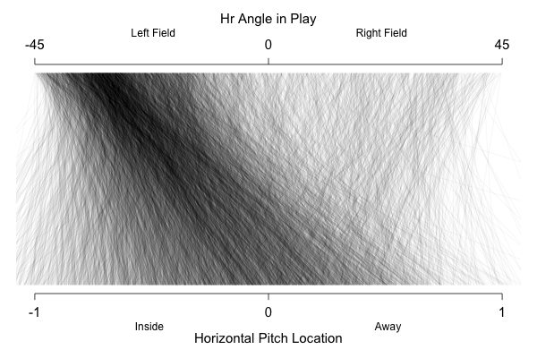
And here for LHBs.
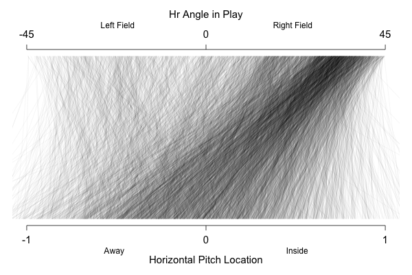
I want to thank Mike Fast who pointed out the problem to me and also apologize to the readership here at Baseball Analysts for this error. I have edited the original post with the correct graphs and text.
| F/X Visualizations | September 18, 2009 |
Home Runs: Where Did You Come From, Where Are You Going?
Last week I looked at Carlos Pena's HRs, examining the angle in play based on the horizontal location of the pitch. Today I am going to do so for all batters. First off it is important to understand how pitchers pitch differently to RHBs and LHBs. Here is the frequency of fastballs thrown to RHBs and LHBs by horizontal location. I flipped the horizontal location for lefties so the inside of the plate is on the same side of the graph for both groups.
As you can see pitchers throw much further away to lefties than to righties. This is true of both LHPs and RHPs, so it is not an artifact of say opposite handed at-bats tending to be pitched farther away and there being more RHPs. Pitches to RHBs are centered only slightly away of the center of the plate. Strangely the power profile of lefties and righties suggest that pitchers should do the exact opposite.
Although both have more power inside, the difference is more pronounced for RHBs that for LHBs. So that RHBs have slightly more power inside than LHBs inside, while LHBs have much more power away than RHBs away.
So we have a situation in which LHBs seen most of their pitches far away in the zone and have relatively good power there, while RHBs see pitches most of their pitches closer to the center of the plate, maybe shifted slightly outside. But their power is much greater middle-in.
This section is a correction of the original version.
The result for RHBs is that most of their HRs come from the middle of the plate, where they see a lot of pitches and still have good power.
The highest density of HRs are on pitches middle-in and most of those are pulled to left field. Even pitches that are slightly away are generally pulled. It is a little hard to see, but most of the opposite field HRs are on away pitches. That is there are few steep lines going from the bottom left of the graph to the top right of the graph.
Now, recall that lefties see mostly outside pitches, and that they have fairly good power on those pitches. The result is that most of their HRs come from pitches away.
You can see the higher density of HRs middle-away compared to the RHBs higher density middle-in. With that exception the image is largely a mirror image of the RHBs image, with most of the HRs pulled to right field. This graph also shows that my conclusion from last week probably wrong, Carlos Pena is really not that extreme in his HRs. I do think that Pena's HRs did come even more away than most lefties, but this does show that Pena is just an exaggerated version of what most average lefties looks like, not a major outlier.
| F/X Visualizations | September 11, 2009 |
Another Look at Carlos Pena's HRs
Before the season I looked at HR rate by pitch location and noted batters who hit HRs in locations most do not. One batter I profiled was Carlos Pena, as he hits HR predominately on pitches away while most batter hit them on middle-in pitches. Part way through the season he was one of the league leaders in HRs so I did a follow up. Now he is out for the season with two broken fingers, but is still leading the AL in HRs. So I thought it I should check on where the pitches he hit his 39 HRs were in the strike zone.
Here are all of his HRs plotted over the grayscale rate for all LHBs.
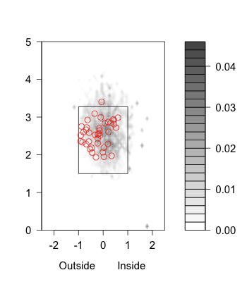
Most of his HRs are the outer half of the plate, with a big number on the outer quarter where most LHBs hit very few. In the middle-in section where most LHBs have the most HRs he has surprisingly few.
I talked in the original post about one problem with this method. I am comparing the rate of HRs hit by the average batter to the actual number for Pena, not his rate. Maybe he has few HRs inside because he gets few pitches there. To get around this below I plot the HR/FB rate for an average lefty and for Pena based the on horizontal location of the pitch.
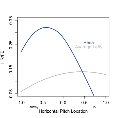
So it does in fact look like Pena gets much more power on the outside of the plate than the average lefty, and actually less than the average lefty on the inside quarter. In my post in the middle of the season Rich asked how he did this. Most batters have more power on pulled balls and pull more inside pitches. So is Pena's outside power from opposite field power or from an ability to pull outside pitches? To examine this I took inspiration from Max's work looking at relationship the between the horizontal location of a pitch and the horizontal angle of the resulting ball in play. In this case I just looked at Pena's HRs. Remember that -45 is the third base line and 45 is the first base line.
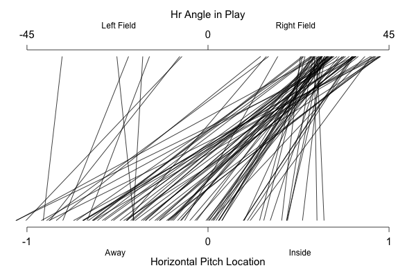
Pena has hit only a handful of opposite field HRs, all from pitches away (I checked those are all on fastballs). But the bulk of his power is from hitting pitches on the outer half and even quarter of the plate to right field. He routinely pulls HRs on pitches on the outer edge of the plate.
Pena is a great story. He kicked around for years before busting out with the Rays two years ago. We will see if the lead he has in HRs in the AL holds up over the next couple weeks.
| F/X Visualizations | September 04, 2009 |
Break versus Movement
As we all know by know the pitchf/x data is an incredible resource for baseball analysts. For each pitch thrown in a major league game we get scads of data, so much so that it is hard to even know where to begin. And once we have begun it is easy to just go with the flow of analyzing what others have analyzed. At the PITCHf/x summit Alan Nathan noted that one piece of information, the break of a pitch, is rarely looked at in pitchf/x studies.
In my posts when I have examined the movement of pitches I have used the word 'break', but done so incorrectly, using it to describe the movement of a pitch. So I thought it was important to make a post clearing up the difference between the two pitchf/x terms and make a preliminary examination of pitch break
MLB's GameDay calls movement: (images and descriptions from MLB Advanced Media here).
The Pitch-f/x or 'PFX' value is the distance between the location of the actual pitch, and the calculated location of a ball thrown by the pitcher in the same way but with no spin; this is the amount of 'movement' the pitcher applies to the pitch. A faster, straighter pitch like a fastball will have a higher Pitch-F/x value than a slower, breaking ball like a curveball.
As stated this leads to the counterintuitive result that fastballs 'move' more than curveballs. Here is a histogram of the movement of the four main pitch types.
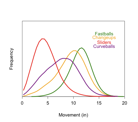
Here his how GameDay defines the break of a pitch.
Break is the greatest distance between the trajectory of the pitch at any point between the release point and the front of home plate, and the straight line path from the release point and the front of home plate. Curve balls and sliders will have larger break value than fastballs. Pitch trajectories shown in blue indicate breaking pitches.
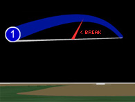
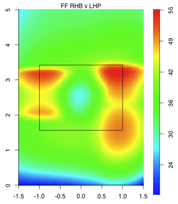
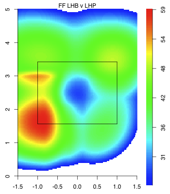
This leads to a more intuitive result that fastballs break the least and curves the most. Here is a histogram of the 'break' in inches of the four major pitch types.
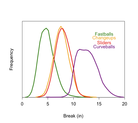
In my posts where I have examined the results of a pitch by its movement I have exclusively used the PFX or movement value, which is often broken up into its vertical, pfx_z, and horizontal, pfx_x, correspondents. These are often used to produce the horizontal versus vertical movement graphs that are show the different pitch types of a given pitcher.
Since break is a more intuitive value I wanted to know if it did as well at predicting the results of a pitch as movement. Here I will just look at curveballs, which I assume is the pitch whose outcome is most impacted by its break.
Here is the run value (again negative is good for the pitcher) of a curveball based on its break, on the left, and movement, on the right. The gray indicates the error.
As you can see if you could choose just one piece of information, the break or the movement, of a curve in order to predict its success you would definitely choose movement. The error bars are smaller and non-overlapping. That is if you have a curve with 6 inches of movement it is quite likely to have a different run value than one with, say, 10 inches of movement. On the other hand if you have a pitch with 10 inches of break on average its run value is lower than one with a break of 14, but we are no where near as certain.
It is too bad, the intuitive value is not as good a predictor as the non-intuitive value. Still it is an interesting piece of information, which is currently not often reported or examined.
| F/X Visualizations | August 28, 2009 |
The Interaction of Speed and Location on Fastball Success
One thing I have been interested in is how pitch location and speed interact. Are there pitch locations where it is especially important for a fastball to be fast (up in the zone) and others where a slow fastball does just as well as a fast one (the outside edge)? We have some assumptions going in, but I wanted to see what the data have to say. I am going to restrict my attention here to four-seam fastballs.
We know about fastball success by speed. Josh Kalk showed the faster the better for fastballs, not too surprising. And Max Marchi gave us the success of a fastball by location. For horizontal location you get a 'W' shaped graph. That is pitches outside the zone and down the middle of the plate result in higher run outcomes (the outer branches and middle of the 'W'), while pitches on the edge of the zone result in lower run outcomes.
To see how these two factors interacted I plotted fastball success by horizontal location for three groups of four-seam fastballs: all fastballs, those over 95 mph and those under 87.5 mph. The result below is just for those pitched to RHBs, so the inside is negative numbers and outside is positive numbers. The error bars are the shaded bands. The run value is the change in run expectancy so negative is better for the pitcher.
Outside of the zone there is no difference between the three groups. So a batter's ability to lay off a fastball inside or outside the zone is, seemingly, unaffected by the pitch speed.
The difference is pitches over the plate. With the largest difference in the middle of the plate. The slower the pitch the more pronounced the 'W', so the more penalty for hitting the fat of the plate. Pitches on the edges of the zone are fairly close, slow and average fastballs do almost as well as fast ones.
Let's look at the same pattern for vertical location. I normalized the zone so that each batter had the average top and bottom of the zone, which are indicated. I also flipped the graph so that the dependent variable (pitch height) is along the vertical axis.
Here pitch speed can cover up an inability to hit the zone, but just above the strike zone. Fast fastballs above the zone do much better than slow or average fastballs. This difference between fast and average is maintained through the top third of the zone, and between fast and slow through all but the bottom fifth of the zone. For fastballs low in the zone there is no difference based on pitch speed.
Generally we do see some interesting interactions of fastball speed and location on fastball success. A faster fastball will not save someone who cannot get the ball in the zone, but fastball speed gives a pitcher a lot of leeway to hit the fat part of the plate and pitch up in the zone.
| F/X Visualizations | August 21, 2009 |
Do Batters Swing Too Often in a Full Count?
A while ago iamawesomer wrote an interesting piece about the game theory of swinging at 3-2 pitches, and MGL often talks about how he thinks batters swing too often in a full count. The idea intrigued me and I wanted to examine it.
First off a little background, batters tend to swing more as they get more strikes. This makes sense, with no strikes they can be selective and wait for their pitch. But with two strikes letting a strike go by ends the at bat. Similarly batters tend to swing less when they have three balls compared to fewer. Again this is a good strategy. The benefit of going from 3 to 4 balls is more than going from 0 to 1 balls. So taking a pitch, that could be a ball or a strike, is better with three balls than with fewer.
It seems like this trend of breaks down when the count is full. Consider the two counts 2-2 and 3-2. In both counts the penalty for taking a strike is the same--a strikeout--but the benefit from taking a ball is greater at 3-2. Taking a ball at 3-2 results in a walk, while taking a ball at 2-2 just brings the count full. If a pitch is right on the border of a strike/ball a batter has more incentive to take that pitch at 3-2 than 2-2. But that is not what they do. Batters swing at more pitches at 3-2, the trend is true for pitches in the zone and pitches out of the zone. Also if you look at pitches in a given location batters swing at that pitch more often at 3-2 than 2-2. So batters are either swinging too often at 3-2 or too rarely at 2-2 or both. For this post I am going to look at the full count.
I am going to restrict my attention to RHB/RHP. I think the results would be similar in other cases, but I have not checked. Here is the swing rate by pitch location at 3-2.
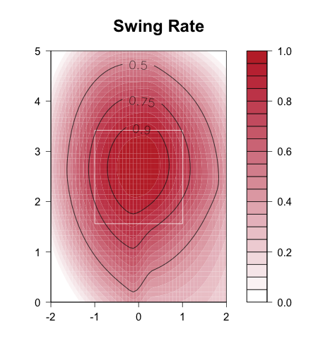
In other at-bats batters swing at pitches inside more often than outside, but this preference breaks down when the count is full. Overall this is a huge area over which batters swing.
I took the run value by location of 3-2 pitches swung at (swinging strikeouts, fouled off and balls in play) and subtracted the run value of a 3-2 pitch taken (walks and called strikeouts). That value I plotted in colors with red negative (penalty for swinging) and blue positive (better to swing). On top I plotted the 50%, 75% and 90% swing contours.
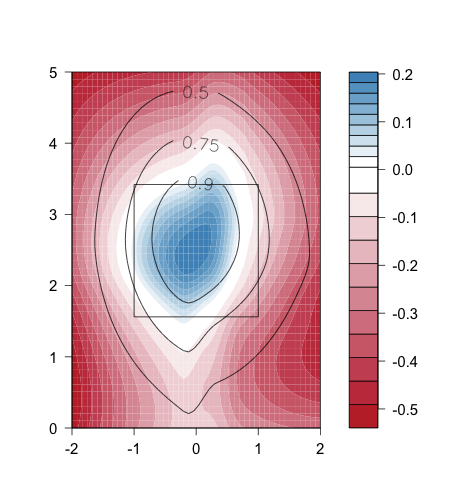
The white is the break even. The average batters, if he knew the exact locatoin a pitch would end up and preformed optimally, would swing at pitches inside that white band and take outside.
In the blue region batters swing over 75% and for most of it over 90% of the time. So batters do a good job of swinging at pitches they need to. In the red region just outside the break even batters swing between 75 and 50% of the time. So they swing at a large number of pitches they should take, they do not do a good job of taking pitches they should take.
Generally a batter would want to swing inside the blue and always take inside the red. It is not possible to do this perfectly, the batter does not know where the ball will end up when he swings. Most likely if he tried to be more selective and take more balls (those in the red area), then he would also end up taking some additional strikes (those in the blue). Right now it looks like batters are too swing-happy, they should be more selective, and give up some called third strikes in exchange for more walks.
| F/X Visualizations | August 14, 2009 |
One of the Game's Stranger Hitters
One of the things that I, and I assume most of us, love about baseball are its peculiarities and oddities. The historical oddities, like when was the last time a pitcher gave up two triples in the first inning of his first major league start. Strange park dimensions like the Green Monster. And players who succeed in atypical manners. One such player is Pablo Sandoval.
He seemingly takes a horrible approach at the plate, swinging at tons of pitches out of the zone, but he is a very productive hitter. He is not particularly fast or hit that many line drives, but he has sustained a high BABIP over his major league and minor league career. He has two great nicknames. In this post I want to highlight what makes Sandoval such a stranger hitter.
The most remarkable fact is that he swings at almost 45% of pitches out of the strike zone, second only by his teammate Bengie Molina. I wanted to show just how extreme this is. So below I have his 50% swing contour compared to the average hitter. What I mean by this is a plotted all the pitches he swung at and took. Then I had the computer draw a smooth line so that pitches inside the line are more likely to be swung at and those outside are more likely to be taken. I discuss the methodology more specifically in the comments section of this post. Sandoval is a switch hitter so I broke it up for his at-bats as a lefty and righty. Sandoval is in orange and the average hitter is in gray.
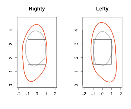
There is a drastic difference between his and the average. Remember that the images are the catcher's perspective so as a RHB he stands to the left of the zone and as a LHB to the right. So it seems he is particularly fond of the low and inside pitches. The only place where he is close to league average is away when batting as a righty, he lays off those pitches. But everywhere else he swing zone is much larger than the average batter. It looks like he swings at more pitches batting lefty than righty.
He can get away with this because, somehow, he can make contact while swinging at these pitches far out of the zone. He makes contact on out of zone swings 76% of the time, solidly above league average of 62% for out of zone swings. And not only can he just make contact he makes good contact out of the zone. Check out the location of his extra base hits.
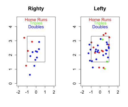
If you compare that to my HR heat-chart and the locations of other specific hitters HRs you will see this is a very strange pattern. He is hitting lots of HRs out of the zone, below the zone, above it and in from it. Batting lefty he has a large number of doubles off pitches off the zone away, opposite field doubles I would guess. Sandoval is leading the league in out-of-zone HRs and out-of-zone extra base hits. Not surprising, I guess since he swings at some many pitches out of the zone. It all shows that he can swing at pitches way out of the zone regularly, and not only make contact, but make very solid contact.
A batter's job is to score runs, to do that you need some combination of hitting for power and not making outs. Sandoval goes about that in one of the stranger ways possible. He hits for power even when swinging at pitches way out of the zone. He can avoid outs because he rarely strikes out, he has good contact skills even when swinging at pitches way out of the zone, and it seems he can sustain a high BABIP. All of this in some one who just celebrated his 23rd birthday. San Francisco fans, and baseball fans, have lots more of Sandoval's strange ways to enjoy.
| F/X Visualizations | August 07, 2009 |
Regression and Pineiro
Recently there has been some discussion about estimating a player’s true talent level. The idea is that a player's true talent, and how we should expect him to perform going forward, is not the player’s current level of production. Rather it is a weighted average of his current year and past production (with more recent production weighted more heavily) and then this average is regressed to league average, with the amount of regression depending on how many plate appearances (for batters) or batters faced (for pitchers) or inning played (for fielders). The details of how to do the weighting and to which population’s mean you regress are important and discussed at the Book Blog and THT.
I wanted to look at an example of a player whose current year production is far out of line from a long career of established production. Joel Pineiro leads all starters in ground ball rate, at 60.4% ground balls per ball in play. Since 2002 his GB rate ranged between 44% and 48%. In addition, Pineiro leads all starters league in BB per batter faced at 2.6%, again far out of his previous range of 5.4% to 8.5%. This is a rather huge shift in his numbers.
Here are his five pitches.
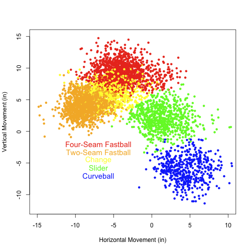
The movement on these pitches is fairly standard. It is important to note his two-seam fastball ‘sinks’ compared to his four-seam fastball. Here is the breakdown of his pitch usage over the past three years, those covered by PITCHf/x.
+--------------------+------+------+------+
|                    | 2007 | 2008 | 2009 |
+--------------------+------+------+------+
| Four-Seam Fastball | 0.54 | 0.36 | 0.11 |
| Two-Seam Fastball  | 0.03 | 0.23 | 0.60 |
| Slider             | 0.16 | 0.20 | 0.11 |
| Curve              | 0.16 | 0.09 | 0.09 |
| Changeup           | 0.11 | 0.12 | 0.09 |
+--------------------+------+------+------+
His two-seam fastball is hit on ground just under 68% of the time it is put in play, so his increased usage of that explains the jump in grounders. He gets his fastballs in the zone about 54% of the time while his breaking and off speed pitches are in the zone under 50% of the time (47% for his change, 42% for his curve and 49% for his slider). Finally batters swing at and make more contact with his fastballs than his off-speed and breaking pitches. As a result he has many fewer walks and strikeouts (he has struck out just 10% of batters the lowest rate in his career).
I think this is an interesting example in which the PITCHf/x data partially explains a recent abrupt change in numbers. Obviously we do not expect Pineiro to continue to walk under 3% of batters faced and get over 60% of his balls in play on the ground. An estimate of true talent and expectation going forward must include some weighting of past performance and regression to the mean. But I think the PITCHf/x data, just like scouting data, can be used to adjust the weighting, maybe weight this year even more heavily if we expect him to use this pitch break down going forward, or regress to different pool, one with this breakdown of pitches, to get a better estimate of his true talent going forward.
| F/X Visualizations | August 06, 2009 |
Strikeouts and Ground Balls
The main tenet of defense independent pitching theory is that pitchers can only control strikeouts, walks and the types of batted balls (grounders, fly balls, line drives, pop ups) they give up. Under such a theory the best pitchers are those who give up few walks, line drives (likely to be hits), and fly balls (likely to be HRs), while getting lost of strikeouts, pop ups (almost always outs) and ground balls (rarely extra base hits). In this short post I want to consider the relationship between strikeouts and ground balls. The holy grail of pitchers is the one who can get tons of strikeouts and ground balls, while giving up few walks. Why is this combination so rare?
In black below is the relationship between whiffs (misses per swings) and the vertical location of a four-seam fastball. Also on the graph in blue is the relationship between ground ball per ball in play and vertical location. The graph is a little hard to understand because vertical location is the independent variable so it is along the horizontal axis, and there are two dependent variables displayed at the same time. The red lines indicate the average top and bottom of the strike zone.
The overwhelming trend within the strike zone is for whiff rate to increase with vertical location and for ground ball rate to decrease with vertical location. This is why it is rare to find an extreme ground ball pitcher who also gets a lot of strikeouts. The one exception here is the bottom of half foot of the strike zone where ground ball rate is very high and whiff rate has bottomed out and starts to rise again. If a pitcher could regularity locate in that bottom half foot, he could get whiffs and grounders, but as I noted last Friday it is important to consider just how accurately a pitcher can locate his pitches. Most likely few pitchers could regularity hit that spot.
| F/X Visualizations | July 31, 2009 |
Measuring a Pitcher's Ability to Locate a Pitch
In many of my past posts I have displayed heat maps showing how a specific value, HR rate, run value, BABIP, varies over pitch location. One thing I mentioned in passing in the BABIP post, but probably should have been mentioning all along is that just because a location is the best to pitch to does not mean a pitcher should attempt to throw it there. We must think about a pitcher's ability to locate and what happens if he misses his spot. MGL put it best in asking this question, in this post at the Book Blog:
Let’s say that pitch f/x data tells us the following about a particular pitcher or group of pitchers:On the average, the run value of a high inside fastball is -.001 where minus is good for the pitcher. The run value of a low outside fastball is +.001. In other words, the run value of the former is better than the run value of the latter.
Now, put all pitch sequence and game theory stuff aside.
In an average situation against an average batter, where those run values above absolutely apply, which pitch should a pitcher attempt to throw, and why? We are just talking about one pitch, and again, put aside anything to do with pitch sequences and game theory.
Zach Sanders provided the answer.
Low and away.Your phrasing: “which pitch should a pitcher attempt to throw, and why?” The key word is attempt. If you make a mistake down and away, you probably won’t get burned as much as if you make a mistake going up.
If he has perfect control, then by all means take the one which the better value, but there is human error involved.
And MGL's further explanation.
You CANNOT use the run values of pitch locations based on hit f/x data to make any decisions about what pitches to throw unless you consider what happens when you miss your exact location (and the distribution of those misses, location-wise), which will happen some non-trivial percentage of the time.I was thinking about the pitch f/x article or two a while back that told us exactly what I told you - that the high inside fastball was a very effective pitch. What the data and article did NOT tell you was the run value of a pitch that was ATTEMPTED to be thrown high and inside. ...
In general the reason why pitchers do NOT throw high and/or inside that much in this day and age is not because they are not man enough anymore as some broadcasters would have you believe, but it is not necessarily because a high inside fastball is a bad pitch (if it hits that location). It is because a miss on that pitch will more often result in a HR (or extra base hit) or a hit batter. As well, batters will take a difficult to hit high and inside pitch more often now than they would in the old days when the strike zone was higher than it is now.
Here is a visual representation of what he is talking about. Below is the run value of a pitch from a right handed pitcher to a left handed batter.
Suppose location B, up and in, has a slightly better for the pitcher run value than location A. So if a pitcher could hit location B exactly that would be the best place to pitch. But if in throwing to B some fraction of the time he misses and the pitch will end up in less favorable place than if he misses pitching to location A. Depending how often he hits his spot, and by far how off he misses he might be better off pitching to spot with a worse run value.
Ultimately what we would want to know is for a particular pitcher, pitch type and pitch location the probability density function of where the pitch will end up. This combined with the run value map would give us an expectation of the run value if that pitcher attempts to throw to a given location.
We do not have that information now, and we will probably never have anything that specific. But, if we knew the location of the catcher's mitt we would have some indication of where a pitch was intended. This was brought up at both pitchf/x summits and Marv White of Sportvision said that is it possible given the current technology, but not at the top of their list of things to do. There is some discussion over at the Book Blog about how hard it would be to collect this data and how much information it would give us. Either way I add my vote to that of other analysts interested in that data.
Without that though, I wanted to see if I could estimate how close a pitcher comes to hitting his spots. Again, without knowing where each pitch was intended to go this is impossible, but I think we can get an estimate for at least one pitcher. Again I turn to Mariano Rivera. Check out the location of his pitches to LHBs.
The vertical location varies quite a bit, but there are two clear horizontal areas he pitches to. If we assume that he intends to throw all of his pitches to just either inside the right edge of the zone or just inside the left edge of the zone we can then see how close he is, along the horizontal axis, to hitting his spot.
I do think he probably varies the intended horizontal location by count. Probably intending to pitch closer to the zone when he has three balls, and pitching even farther on the edge when he is ahead in the count. So I am goign to restrict my attention to pitches from 0-0, 1-0, 0-1 and 1-1 counts.
Since the horizontal location varies by vertical location I am going to look at the deviation from the black lines below.
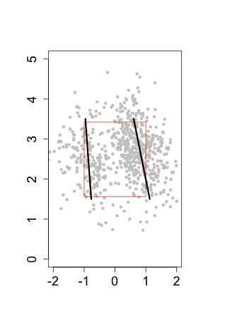
Here is a histrogram of the deviations from these black lines.
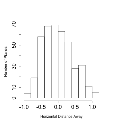
Over 75% of his pitches are within half a foot to either side of the target along the horizontal axis. In other words 75% of the time he can get his pitch within a 1-foot horizontal strip. Over 50% of his pitches are within 1/3 of a foot to either side of his target along the horizontal axis. So half the time he gets it in a 8-in horizontal strip.
This all assumes that you believe that he is always throwing at one of two targets. If you think he aims at a range of horizontal locations, then the variation I have measured is partially from those range of locations and partially from his ability to locate. In that case I am ascribing some variation in intended location to his ability to locate, so I think you can these numbers as the least accurate he could possibly be. They, also, says nothing about how far he is from his intended target along the vertical axis, because I have no way of knowing his intended vertical target.
I think of this as a first attempt at measuring how close a pitcher is to hitting his intended location. Catcher mitt location data will get us closer to measuring it, but it is probably something we will never be able to fully measure.
| F/X Visualizations | July 17, 2009 |
Can Pitchers Control Their BABIP by Controlling Pitch Location?
At the PITCHf/x summit I gave a presentation about making the type of contour and heat maps that I often show here. In the presenatation I listed some of the things one could do with such maps and I said 'for example you can see how BABIP varies by pitch location.' A questioner at the end of the talk asked if I had done so. He thought if BABIP did in fact vary by pitch location, and pitchers can control the locatoin of their pitches then pitchers could control their BABIP. I, at that point, had to fess up that it was just an example and I had not in fact looked at it. Unfortunately I don't know the name of the person who asked the question, but here it is.
There is a long history of examination of how much control a pitcher has of his BABIP (batting average of balls in play). The first major work was by Voros McCracken who, in 2001, suggested that pitchers do not have the ability to prevent hits on balls in play. In 2003, Tom Tippett found that some pitchers, in particular knuckleballers, had the ability to suppress hits on balls in play throughout their career. In addition, the BABIP of a ground ball is higher than that of a fly ball and we know pitchers do control their ground ball rate. So, we should expect BABIP differences between ground ball and fly ball pitchers. The general understanding, at this point, is that pitcher's have some, but probably a very small, amount of contrl over their BABIP beyond their control over batted ball type.
Obviously pitcher's control the location of their pitches, so if BABIP varies by pitch location could this be how some pitcher's have the ability to depress their BABIP? Let's see how BABIP varies by location. Here I am just looking at RHB.
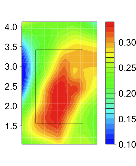
There is some trend for pitches down in the zone to have a higher BABIP. I am sure this is driven by the fact that high-BABIP ground balls are more likely on hits low in the zone while low-BABIP fly balls are more likely up in the zone.
EDIT: In my initial post I had the outside/inside orientation flipped in my interpretation. Below I have corrected that. I would like to thank Mike Fast for bringing this to my attention and apologize for any confusion this might have caused. As always the images are from the catcher's perspective.
Along the horizontal axis pitches in the middle of the plate have the highest BABIP, which is not surprising. Beyond that, though, on pitches low in the zone those inside have a higher BABIP than those away, and pitches up in the zone those away have a higher BABIP than those inside. For those down in the zone, which will most likely be ground balls, those inside pitches will be pulled and pulled ground balls to the left side of the infield are more likely to be hits. On pitches up and in are most likely to be home runs, which are not counted as balls in play. This might be partially responsible for the drop in BABIP up there. Also maybe these pitches 'tie up' the hitter causing popups which have a near zero BABIP.
I wanted to examine the horizontal gradient further, so I took a one-foot-high band of pitches centered at y = 2.5. My hope is to see how much the BABIP changes by horizontal location to see if it is reasonable for a pitcher to depress his BABIP based on the location of his pitches. Again this is just for RHB.
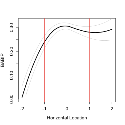
So there is definitely a trend. The farther inside a pitch is hit the lower the BABIP. But look at the error bars the BABIP is effectively unchanged from x = 2 to x = -0.5. A pitch really has to be on the inside fourth of the plate before there is a significant drop in BABIP. From there to outside the zone away there is a big drop in BABIP.
It looks to me for a pitcher to seriously decrease his BABIP based on the horizontal loation of his pitches he either needs to induce swings (and contact) inside of the zone or be able to locate on the inner fourth of the plate.
If a pitcher could regularity locate pitches in the string zone, but just on the inner edge he could drastically lower his BABIP. I am not sure there are a lot of pitches with the control to pitch with the speed and movement required to get out major league hitters AND locate the ball that finely. If they miss too much to one side it is a ball, too much to the other it hits the heart of the plate. The one pitcher, off the top of my head, who I think might be able to do this is Mariano Rivera. Check out the location of his cutters to RHBs.
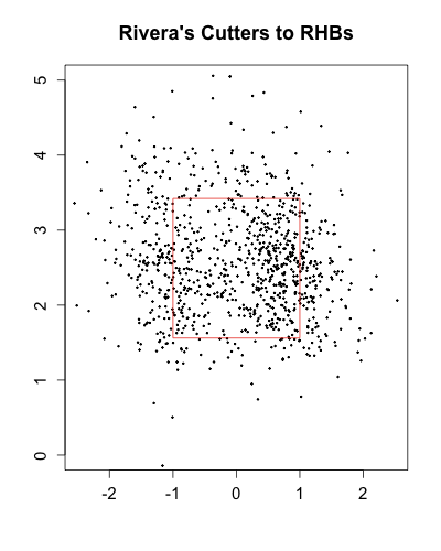
While most of the pitches are on the outer half, he locates a good number on the inner quarter. Exactly the type of pitches that are in the zone AND can depress BABIP.
| F/X Visualizations | July 09, 2009 |
Felix Hernandez's Power Change
A while ago I looked at the success of a changeup based on its speed separation from the preceding fastball. Since then I had the pleasure of answering some of Dave Cameron's questions on the Mariners. He asked me about Felix Hernandez's changeup, which keeps getting faster.
At the same time his fastball has actually slowed slightly, so that the separation between the two pitches has gotten smaller. The difference averaged 9mph in 2007 and is down to 5mph this year. My work suggests that on a pitch by-pitch basis a separation between 5 mph and 10 mph is optimal, while others showed that on an overall average basis the bigger separation the better. Either of these results would suggest that Hernandez's changeup should be getting worse every year. But that is not he case. Remember that the run value is the change in run expectancy so negative is good for Hernandez.
+-------+------------------+-----------------+
| Year  | Changeup Run Val |  Aver CH/FB Dif |
+-------+------------------+-----------------+
| 2007  |           -0.017 |         9.0 mph |
| 2008  |           -0.022 |         7.1 mph |
| 2009  |           -0.032 |         5.2 mph |
+-------+------------------+-----------------+
At this point Hernandez's changeup is amazing, one of the top few in the game. It is interesting that his success runs counter to the prevailing trend. To examine it further I plotted the run value of his changeup based on its speed.
Overall felix's changeup gets better with increasing speed, which is very unlike the average player's changeup. As most pitcher's changeups get faster they start looking just like slow fastballs and get crushed, but since Hernandez throws such a fast changeup he can succeed throwing as his changeup fast as some pitchers throw their fastballs. Next I wanted to check out the success of his changeup based on how much slower it was than the preceding fastball.
Where as for the average pitcher there is a plateau in which the changeup is equally successful between 5 and 10 mph slower than the preceding fastball for Hernandez success peaks at 5 mph and falls off rapidly if it gets any slower. This again shows the Hernandez is succeeding with a fast changeup.
There are important limitations to studies that show trends for all pitchers averaged together; all pitchers are different. In this case Felix Hernandez succeeds with a power change that has little separation from his fastball. That same separation for the average pitcher, with a slower fastball, would be big trouble.
| F/X Visualizations | July 03, 2009 |
Angle of Ball in Play by Pitch Type and Speed
Last week I looked at the horizontal angle of a ball in play as a function of the location in the zone where it was hit. Although there is some trend for lower pitches to be pulled more, most of the trend is dictated by the horizontal location of the pitch. As expected inside pitches tend to be hit to the pull field and outside pitches more to the opposite field.
Below I reproduce the trend for just the horizontal location. I found the average angle of a ball in play as a function of the horizontal location of the pitch. The center of the strike zone is 0 and negative numbers indicate pitches that are inside to right hand batters and positive numbers outside. The strike zone extends from -1 (inside edge to a RHB ) to 1 (outside edge to a RHB). The angle of a ball in play follows the -45/0/45 convention (-45 is the third base line, 0 2nd base and 45 the first base line), so negative numbers indicate the pull field for a righty.
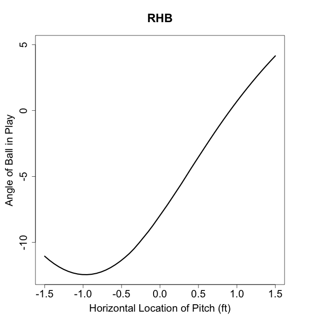
Starting away and moving towards the batter more and more balls are pulled, with the trend slowing and stopping at about the inside edge of the plate. Here you can see the overall pull tendency. At x=0, the middle of the plate, the average ball is hit to about 7.5° to the pull field and at x=1, the outside edge of the plate, the average ball is hit right up the middle.
I was interested in how this varied by pitch type. I expected that slower pitches would be pulled more, as hitter have more time to 'get around' on such pitches.
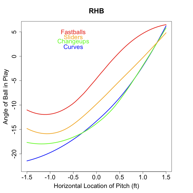
The results confirm our expectations. The slower a pitch type the more it is pulled, so that through much of the strike zone the average curveball or changeup is pulled 10° more than the average fastball in the same horizontal location. This shows part of the danger of coming inside with breaking and off-speed pitches. These pitches, if they are hit, will tend to be pulled heavily, which is where most hitters have the greatest power.
I also wanted to see how much speed affected pull, regardless of pitch type. Here I plot the average angle of a ball in play by pitch speed for three horizontal locations, away (but in the zone), down the middle and inside (but in the zone).
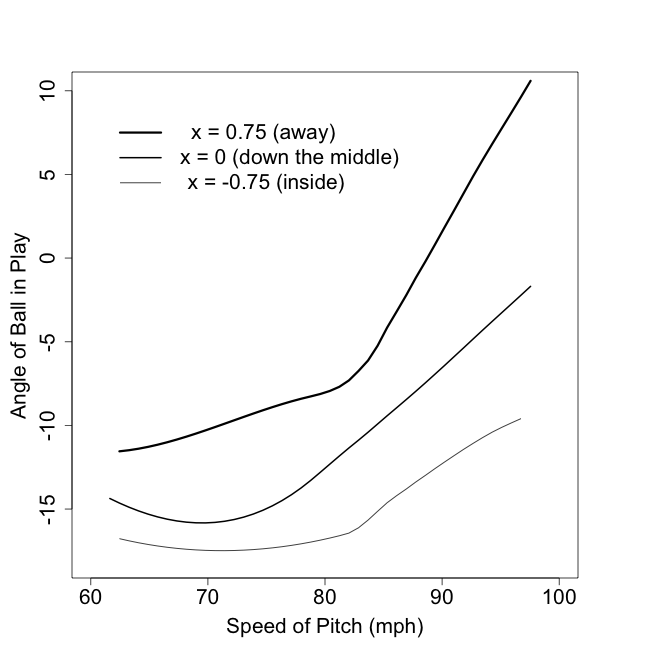
The effect of pitch speed is strong, nonlinear and interacts with location. So for inside pitches there is not much effect of speed, the pull rate of a very slow and very fast pitch are not that far off. Similarly there is not a lot of difference in the pull rate of very slow pitches across location, they are all pulled heavily. But outside pitches are strongly affected by pitch speed, with slow ones being pulled and fast ones going to the opposite field. And very fast pitches are strongly influenced by location, with inside ones being pulled and outside ones going to the opposite field.
The results here are not that surprising, but nicely confirm long-held baseball expectations.
| F/X Visualizations | June 26, 2009 |
Do the Red Sox Get More Hits than Visitors Off the Green Monster?
Two months ago when Sky was looking at predicting home field advantage based on ballpark qualities he determined that a 'quirky' ballpark generally had a larger home field advantage than a non-quirky one. I thought that was a very interesting result and wanted to try to see it for a specific example. Obvisouly the most famous quirky feature in any ball park is the Green Monster at Fenway Park.
Maybe Red Sox hitters are better able to take advantage of the Green Monster, thereby giving Fenway a larger home field advantage because of its quirky dimensions. Like much of my work this is heavily indebted to earlier work on the subject by John Walsh. In early 2007 he looked at which Red Sox hitters take the most advantage of the Green Monster and also which non-Red Sox would benefit most by hitting at Fenway.
Percent of balls in air towards Green Monster
If Red Sox do take advantage of the green monster than you would expect them to hit more balls in its direction, with RHBs trying to pull more balls and LHBs trying to go the other away with more when they are home than when they are away.
Here is the frequency distribution of the angle of fly balls and line dives to the outfield by RHBs . The plot on the left is for Red Sox hitters when home and away, and on the right for all visitors at Fenway and all non-Red Sox teams when they are at home. I use the same -45 (3B line), 0 (2nd base), 45 (1st base) orientation for my last post. The Green Monster is indicated in green.
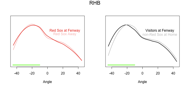
It looks like visitors at Fenway change their approach much more than Red Sox hitters. Red Sox hitters' home and away spray patterns are virtually indistinguishable, but for visitors the spray pattern is shifted a degree or two toward third base when batting at Fenway. I assume this is caused by these hitters trying to pull the ball more, but it could also be a result of Red Sox pitching (maybe they pound the inside of the zone more than the average pitcher).
Here is the same figure for left handed batters.
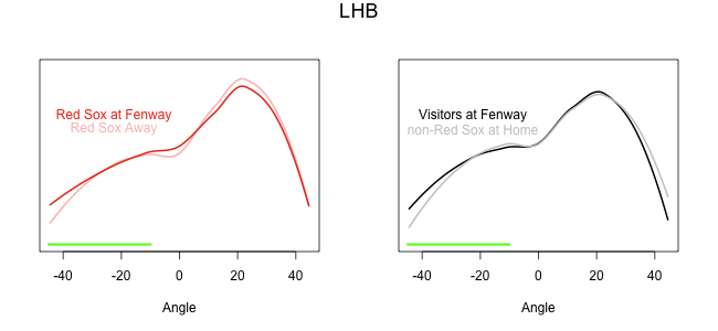
Both Red Sox and visiting lefties hit slightly more balls in play down the left field line at Fenway than elsewhere. Going along with that is a slight drop in the number of pulled balls in play at Fenway for both groups. The effect is subtle, but it looks like lefties might make some effort to go the other way more often at Fenway.
Here is an overview.
Proportion of outfield fly balls and line drives in direction of the Monster
+---------------------+--------+--------+
|                     |    RHB |    LHB |
+---------------------+--------+--------+
| Red Sox at Fenway   |  0.503 |  0.266 |
| Red Sox Away        |  0.511 |  0.257 |
| Visitors at Fenway  |  0.507 |  0.287 |
| Non-Red Sox at Home |  0.477 |  0.278 |
+---------------------+--------+--------+
Here you can see that Red Sox righties actually hit fewer balls in play in the direction of the Monster at Fenway than on the road. That is very surprising. Visiting RHBs see a big jump in their balls in play to that direction. For both Red Sox and visiting lefties there is a small increase in balls in play to that direction at Fenway compared to elsewhere.
Percent that actually hit monster
Ok so visiting hitters are hitting more balls in play towards the Green Monster, but are they actually getting more hits off it? I used the same technique as John Walsh and classified a ball in play as one off the monster if it was a fly ball or line drive that was a hit and fielded within 25 feet of the Monster (I am using the gameday batted ball locations with Peter Jensen's translation factors). When John went back and checked this he found that about 60% of the 'hits off the monster' were really that, so these numbers will be over estimates. But I don't think they will systematically over or under estimate Red Sox compared visitors.
Using such a definition here are the percentage of batted balls that I classified as 'hits off the monster.'
Proportion of balls in play that are hits fielded within 25 ft of the Monster
+---------------------+--------+--------+--------+
|                     |    RHB |    LHB |    All |
+---------------------+--------+--------+--------+
| Red Sox at Fenway   |  0.054 |  0.037 |  0.046 |
| Visitors at Fenway  |  0.060 |  0.041 |  0.052 |
+---------------------+--------+--------+--------+
These numbers seem very high, so I am sure that I am overestimating the number of Monster hits by quite a bit. Still it seems that visitors, both lefties and righties, get more hits off the Green Monster than Red Sox hitters. This seems very counter intuitive. If these hits would have been outs elsewhere the Green Monster is giving visitors an advantage. On the other hand if visitors are changing their approach at the plate to get more hits off the Monster maybe their contact to other areas is weaker.
Home Runs Over the Monster
The other thing the Green Monster offers is a short, but high, porch to hit HRs over. If Red Sox hitters can adapt their swings to hit more HRs over it, that could be where the advantage shows up. Here is the HR rate per ball in the air by angle, just in Fenway.
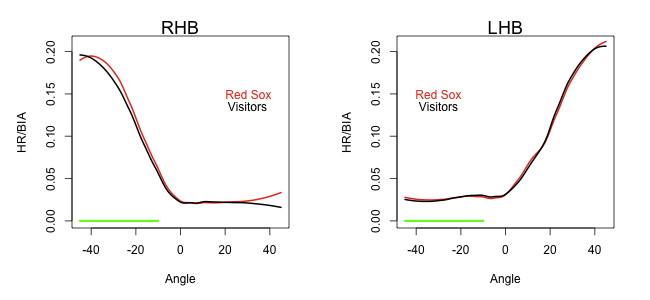
Now here is a big advantage to Red Sox hitters. Over the length of the Green Monster Red Sox righties have a big HR/BIA advantage over visitors. In the rest of the field, expect for just along the right-foul line, there is little difference in HR-rate. Does it look to you like Red Sox righties tailor their swings to getting HRs over the Green Monster?
The next step would be to put it all together. How much do the additional HRs by Red Sox hitters weigh against the additional hits off the Monster by visitors? Could we calculate the value of the Monster to the Red Sox in such a calculation? Maybe another day.
| F/X Visualizations | June 19, 2009 |
How Strong is the Tendency to Pull the Ball?
Last week I took my first look at the HITf/x data examining how the location of a pitch influences the speed of the ball off the bat and vertical angle of a resulting hit. In this post I am going to do the same for the horizontal (or spray) angle of the resulting hit. This is the angle of a batted ball into the field. Sportsvision reports this angle with 45° corresponding to the 1st base line, 90° straight up the middle (2nd base and center field) and 135° the 3rd baseline. Based on the discussion here it seems others find a -45/0/45 orientation more intuitive. So here I shifted to that orientation so 45° is the first base line, 0° straight up the middle and -45° the third baseline.
Max Marchi already looked at this topic using the GameDay hit location to determine the horizontal angle of the ball in play. He examined the tendency of hitters to pull inside pitches and go the other way with outside pitches. He also looked at the possibility of defensive realignment based on a given hitter's spray chart. Here I am going to look at the first topic and ignore the second which led to an, at times, heated discussion over at the Inside the Book blog.
In Max's work he looked at how much individual hitters pulled the ball based on the pitch location. Here I am going to average over all hitters to find a baseline. Below I show the horizontal angle of a batted ball based on the location of the pitch. Remember that negative angles correspond to to the left side of the field and positive to the right. In this case I chose a red-to-blue color scheme to high-light the difference between pulled and opposite field balls in play. I also flip the colors between RHBs and LHBs so that red is always pulled and blue opposite field. Like always the images are from the catcher's perspective.
Horizontal angle by pitch location
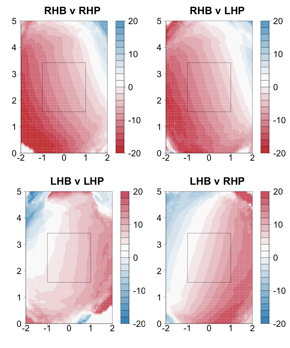
As expected inside pitches result in the furthest pulled balls and it is not until you get to the outside edge of the strike zone that the average ball in play is to the opposite field. So batters have a tendency to pull the ball, with a pitch down the middle on average being hit to about 5° to the pull side. In addition there is a slight trend for pitches low in the zone to be pulled more. It looks like RHBs pull the ball more than LHBs.
Horizontal angle by pitch location for ground balls versus balls in air
I was also interested in how strongly ground balls are pulled compared to balls in the air (fly balls, pop ups and line drives). Conventional wisdom is that ground balls are pulled more, as evidenced by the infield shifts that hitters like David Ortiz experience. In addition, Matt Lentzner set up a simple bat-ball collision model that predicted most ground balls go to the pull side and more balls in the air to the opposite field side.
So we have conventional wisdom and theory telling us what to expect, let's see what the data say. I redid the above analysis first with ground balls and then balls in the air. Instead of using the GameDay classification for GB versus LD or FB, I used the HITf/x vertical angle. Based on Harry Pavlidis' work here it looks like 7° is a rough cutoff between a ground ball and a ball in the air. So that is how I separated the batted balls.
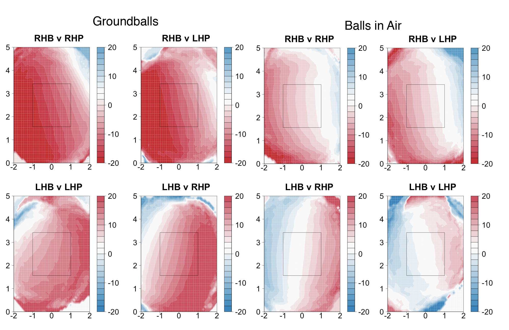
Just as expected ground balls go to the pull side much more often than balls in the air. For about the inside two thirds of the plate the average ground balls goes at least 10° to the pull side. Again RHBs show a stronger tendency to hit to the pull field. This could be because infield hits are more likely to the left side of the infield than to the right, so RHBs have an incentive to pull ground balls while LHBs have an incentive to go the other way with ground balls.
Fly balls, pop ups, and line drives have a much smaller tendency to be pulled and again it is weaker in LHBs. In fact there is almost no pull trend for LHBs on balls in the air; they tend to pull inside pitches and go the other way with outside ones.
Speed of ball off bat by horizontal angle
Finally I was interested in how much additional power a pulled ball has than one hit the other way. Mike Fast showed that pulled balls are more likely to be home runes, more likely to be line drives and have higher BABIP than opposite field balls in play. In fact, Mike showed, a pulled fly ball is ten times more likely to a home rune than an opposite field fly ball. I wanted to see the difference in speed off the bat responsible for this huge effect. Here is the horizontal speed of the ball off the bat by horizontal angle for LHBs and RHBs.
Batted ball horizontal speed reaches a maximum roughly between 5 and 25 degrees to the pull direction. Pulled balls are roughly 10 to 20 mph faster than those hit in the same angle to the opposite field.
Of course all of this analysis averages over all hitters. We know there are hitters who are assumed to be 'dead-pull' hitters or those with power to all fields. The data are now there, in a small sample with more coming, to examine these classifications. Do such hitting syndromes exist? How consistent are they for an individual hitter year to year? How does it impact a hitter's performance? It will be very interesting when enough HITf/x data become available to look at individual hitters at this level.
| F/X Visualizations | June 11, 2009 |
Bat Meets Ball: Checking in on the HitF/X data
To begin with I want to say great work to all my colleagues here on their draft coverage. The interviews they all posted were first rate, Marc's coverage has been exhaustive and Marc and Rich's liveblog was a perfect way for me to follow along with the first round. So great work team.
The draft was probably the most exciting baseball event of the past week, but a not too distant second, for some of us, was the release of the first batch of hitf/x data. This is the analogous data for batted balls that pitfchf/x gave us for pitches. Like pitchf/x it is captured by two high speed cameras at each stadium. Based on pictures of the ball just as it is struck by the bat and fractions of a second afterwards the batted ball's initial speed and trajectory are estimated. For a technical discussion about how this is done and the accuracy of the method check out this post at Tango's and MGL's Inside the Book blog.
This first release of hitf/x data covers all batted balls from this past April and gives the speed of the ball just it leaves the bat and its vertical angle (or launch angle) and horizontal angle (or spray angle). Analysis of this week-and-a-half old data has already poured in. Ryan Howard crushes the ball. The optimal vertical angle to hit the ball at is around 11 degrees (with 0 degrees being parallel to the ground). David Ortiz is in trouble, balls came off his bat at the same speed as balls of the bat's of Alexi Casilla and Endy Chavez.
It has been a little while since I have had a really nice heat-map heavy visualization post and I thought this data would be a great opportunity to rectify the situation. Since there is only one month of data available the heat-maps presented here are more 'smoothed' than ones I have presented previously. For this reason I am not 100% comfortable about the conclusions at the outer edges of the images. But in and around the strike zone, where there have been lots of hits, I think the results are good.
Vertical angle of a hit based on pitch location
First off let's look at the average vertical angle of a batted ball based the location in the strike zone where it was hit. We know that hit balls with a low vertical angle tend to be ground balls and pitches lower in the zone are hit more often for ground balls. Thus, we should expect that pitches down in the zone are hit for a low vertical angle. Is that the case?
The vertical angle ranges from 90 degrees (popped straight up), to -90 degrees (driven straight into the ground), with a zero degree hit being parallel to the ground. Also remember that the images are from the catcher's perspective, so negative x-values are inside to RHBs and positive x-values inside the LHBs.
As expected the lower in the zone the lower the vertical angle of the average hit ball. In opposite-handed at-bats there is an additional trend for away pitches to have a lower vertical angle off the bat. So pitches down-and-away are the most likely to be groundballs and pitches up-and-in are the most likely to be fly balls and pop ups. In same-handed at-bats this inside-outside trend is much weaker and the gradient is largely just based on vertical location of the pitch.
Horizontal speed off bat based on pitch location
The initial speed of the ball off the bat is not as important in determining the success of a hit as the initial horizontal speed. A hit popped straight up very fast is just as bad a hit popped straight that is a little slower off the bat. On the other hand, the horizontal speed (the speed of the hit in the horizontal plane) is important in determining how hard a ball is to field and how far it goes. So below I plot the average speed of a hit ball in the horizontal plane (in mph) versus pitch location. Based on my HR heat maps I expect the highest speed hits to be slightly up-and-in.
Wow, that is the opposite of my assumption. The peak speed is up-and-away, and far up-and-away. There is a large peak speed out of the strike zone. The area of high speed hits extends from up-and-away to down-and-in through the strike zone. This is actually the same trend we previously saw with the highest run value of contacted pitches. Remember this is just based on batted balls, so there could be something of a selection bias. Maybe the only pitches up-and-away that are swung at and hit get crushed. Still this result is very surprising to me.
Edit
Peter Jensen made the following comment:
I think you may want to choose actual SOB to graph instead of horizontal SOB. Balls hit with a greater vertical angle will have a smaller proportion of their speed as a horizontal component. A batter hitting a high inside fastball is almost forced to hit it in the air because he is hitting it during a portion of his swing where the bat angle has the head above the handle. That portion of the swing also is near the maximum swing speed so the batter will be trying to undercut the ball slightly to raise the vertical angle of the ball off the bat even more and maximize his distance and the possibility of a home run. So the batter is sacrificing horizontal speed off the bat to gain maximum hit ball distance
A batter hitting an outside high fastball. Will be doing just the opposite. His bat angle still has the head lower than the hands causing a lower vertical angle. Most batters should be trying to hit the ball as a line drive to the opposite field since their chances of hitting a home run a relatively small and a line drive to the opposite field maximizes their run value. It also lowers the overall vertical angle of the hit ball and maximizes the horizontal component of the total speed off the bat. That is why your second set of graphs look the way they do. Change from HSoB to SOB and they should look very different. Love the graph images by the way.
Here is the total speed off the bat by pitch location.
Just as Peter suggests this pulls the location of fastest balls off the bat closer to the batter and up. It is still slightly outside, but not far outside like before. The area of high horizontal speed hits down in the zone were, not surprisingly, slowish in total speed.
End of Edit
The next couple of weeks will be very exciting as this new wealth of data is examined. It affords a novel way to examine questions about baseball, and a potentially valuable tool to evaluate batters. If you have any general questions about the hitf/x data or any specific questions you think the data could answer feel free to post them in the comments. Also, make sure to check out Mike Fast's and Harry Pavlidis' early work with the data that I linked above.
| F/X Visualizations | May 28, 2009 |
PitchF/X Detective: Has Bradley's Strike Zone Been Widened
Last weekend Milton Bradley claimed that his strike zone had been expanded in retaliation for his early season run-in with umpire Larry Vanover.
This claim was brought to my attention in Craig Calcaterra's ShysterBall blog where he suggested that someone with "PITCHf/x-fu" could check this assertion. I am not 100% sure what "PITCHf/x-fu" is, but I like to think I have it. Either way I thought this was an exciting new application of the pitchf/x data, so I decided to take Craig up on it and see if Bradley's strike zone has been any different this year.Bradley believes his strike zone is being widened, forcing him to chase pitches he normally doesn't swing at or risk being called out on strikes.
Asked if there have been repercussions from Vanover's fellow umpires since the incident, Bradley didn't mince words.
"There always is," he replied. "No matter what, I'm the type of guy [where] I don't care what somebody does to a colleague of mine. I'm not going to treat him any differently. I do things straight up, because I'm a straight-up, honest individual.
"Unfortunately, I just think it's a lot of 'Oh, you did this to my colleague,' or 'We're going to get him any time we can. As soon as he gets two strikes, we're going to call whatever and see what he does. Let's try to ruin Milton Bradley.'
"It's just unfortunate. But I'm going to come out on top. I always do."
First off we need the smallest bit of background on the strike zone. It is called differently to right- and left-handed batters; the outside edge is extended out a couple inches to lefties. In addition, its size is count-dependent, expanding in hitter's counts and shrinking in pitcher's counts. These two facts make an assessment of Bradley's claims a little tricky. He is a switch hitter so we have to break up the analysis for him as a LHB and as a RHB. And any differences could be the result of differences in the fraction of time he is in hitter's versus pitcher's counts this year compared to the past.
The pitchf/x system was phased-in in 2007 and has been operational in every game since, so I am going to compare pitches Bradley took in the part of 2007 covered and all of 2008 to those he took in 2009 thus far (ignoring the count issue temporarily). Here are the pitches he took as a RHB. Remember, the images are from the catcher's, so negative values of x are inside to a RHB and positive inside to a LHB. The gray dots are balls and the black dots called strikes.
There are too few taken pitches in 2009 as a righty to make much of a firm conclusion, but it does not look terribly out of whack. There are two called strikes on the inside edge, but right below them are four balls also along the inside edge.
Here are pitches he took as a LHB.
Bradley has way more at-bats as a lefty and thus there are more taken pitches. These addition pitches allowed me to make called strike contours. These contours are closed lines such that a pitch inside the line is a strike 50% of the time or more and a pitch outside the line is a ball 50% of the time or more. Here you can see how the outside edge of the strike zone is shifted farther outside to Bradley as a lefty, as is the case to all LHBs. The inside edge of the pre-2009 and 2009 zones are almost exactly the same. Up and outside the pre-2009 zone is larger, but down and outside the 2009 zone is larger. As a whole the two are almost exactly the same size.
To make this conclusion statistically explicit, and correct for the count, I ran a binomial logistic regression. This is a regression in which the dependent variable only takes two values, in this case 1 if a taken pitch is called a strike and 0 if it is called a ball. The dependent variable is regressed against any number of ordinal and/or categorical variables. In effect this binomial logistic model uses these regressors to calculate the probability a taken pitch is called a strike, and tells you which of the regressors are statistically significant in determining that probability. The technique is identical to that taken in my earlier strike zone post, but this time I restrict the analysis to just Bradley's data.
I regressed Bradley's strike/ball taken pitches against the horizontal distance between that pitch and the horizontal middle of zone (with a different middle for Bradley as a LHB and RHB), the vertical distance from that pitch and the vertical middle of zone, the interaction of these two distances, the number of balls and strikes (to control for the count) and a categorical factor of pre-2009 or 2009.
 Binomial Logistic Regression
+-----------------+----------+------------+---------+------------+
|                 | Estimate | Std. Error | z Value |    P(>|z|) |
+-----------------+----------+------------+---------+------------+
| (Intercept)     |    5.995 |      0.370 |   16.21 |  < 2e-16 * |
| x Dist.         |   -0.364 |      0.022 |  -16.37 |  < 2e-16 * |
| y Dist.         |   -0.526 |      0.031 |  -17.48 |  < 2e-16 * |
| x*y Interaction |    0.012 |      0.000 |   13.87 |  < 2e-16 * |
| Num. Strikes    |   -0.897 |      0.178 |   -5.03 |  4.8e-07 * |
| Num. Balls      |    0.251 |      0.085 |    2.96 |    0.003 * |
| 2009            |   -0.023 |      0.217 |   -0.10 |    0.914   |
+-----------------+----------+------------+---------+------------+
Regressors with a negative estimate decrease the likelihood of a pitch being called a strike. So as the x or y distance increases the probability of a strike decreases, as expected. As the number of strikes increases the probability of a strike decreases (the strike zone shrinks in pitcher's counts) and as the number of balls increases the probability of strike increases (the strike zone expands in hitter's counts). All of these effects are strongly significant and mirror the results for all hitters.
The difference between the pre-2009 and 2009 zone is very slight, and if anything the 2009 zone is slightly smaller. Taken pitches in 2009, correcting for distance and count, are slightly less likely to be strikes. But this effect is very non-significant. There is over a 90% chance the difference between pre-2009 and 2009 zones is just due to chance alone. There is no statistical difference between Bradley's zone this year and his zone in 2007 and 2008.
I can understand Bradley was frustrated on Sunday. The Cubs had just lost seven straight games, and in five of those games they scored either zero or one run. He is hitting a meager .196/.322/.373 this season, but he has his decreased BABIP and LD% and increased GB% to blame for it, not the umpires.
| F/X Visualizations | May 22, 2009 |
Optimal Fastball-Changeup Speed Separation
A large part of the success of a changeup is assumed to be based on its deceptive nature. Hitters expect a fastball based on the changeup's delivery and movement, but the pitch is about 10% slower. This throws off the hitter's timing, hopefully causing him to whiff or make poor contact. If this is the case we should expect the success of the changeup to be at least partially based on the difference in velocity between it and the fastballs that precede it. In this post I am going to examine this assumption. Is the success of a changeup tied to this difference? What is the optimal difference is speed?
Josh Kalk examined this question in a slightly different manner, looking at the relationship between the success of a pitcher's changeup over the course of a season and the difference in speed between his average changeup and average fastball. He found a linear relationship with increasing success based on increasing difference. I wanted to take a more granular approach and look at the success of a changeup based on the difference in its speed from the last fastball thrown to the batter, all the fastballs thrown to the batter in that at-bat and all the fastballs thrown to the batter in that game.
Here is the run value of a changeup based on how much slower (release speed) it was than the most recent fastball thrown to the batter in the at-bat the changeup was thrown. Changeups thrown before any fastballs were thrown in an at-bat were excluded from this analysis.
This suggests that the optimal changeup is between 5% and 12% slower than the previous fastball. The gray lines show the standard error. The results are similar if you compare the changeup to all previous fastballs thrown in the at-bat and all previous fastballs the hitter has seen in the game. The results are highly non-linear. There is little difference between throwing a changeup between 5% and 12% slower, but if it is less than 5% or greater than 12% slower the effectiveness rapidly drops off. This rapid drop off it not surprising; changeups that are too fast are effectively slow fastballs and changeups that are too slow don't look enough like fastballs. But, I am very surprised by how flat the graph is between 5% and 12%.
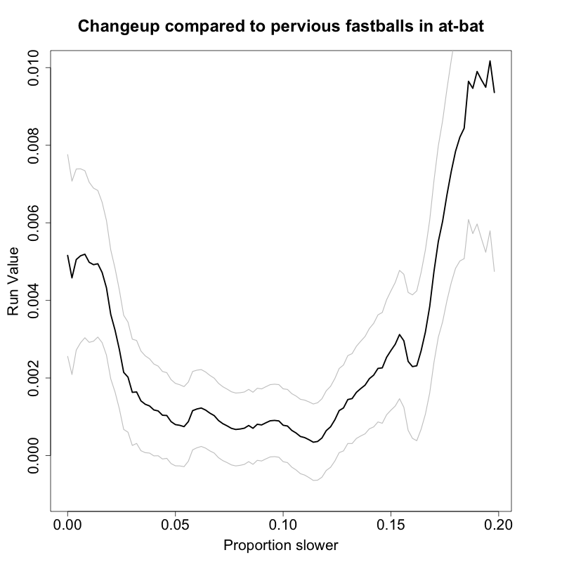
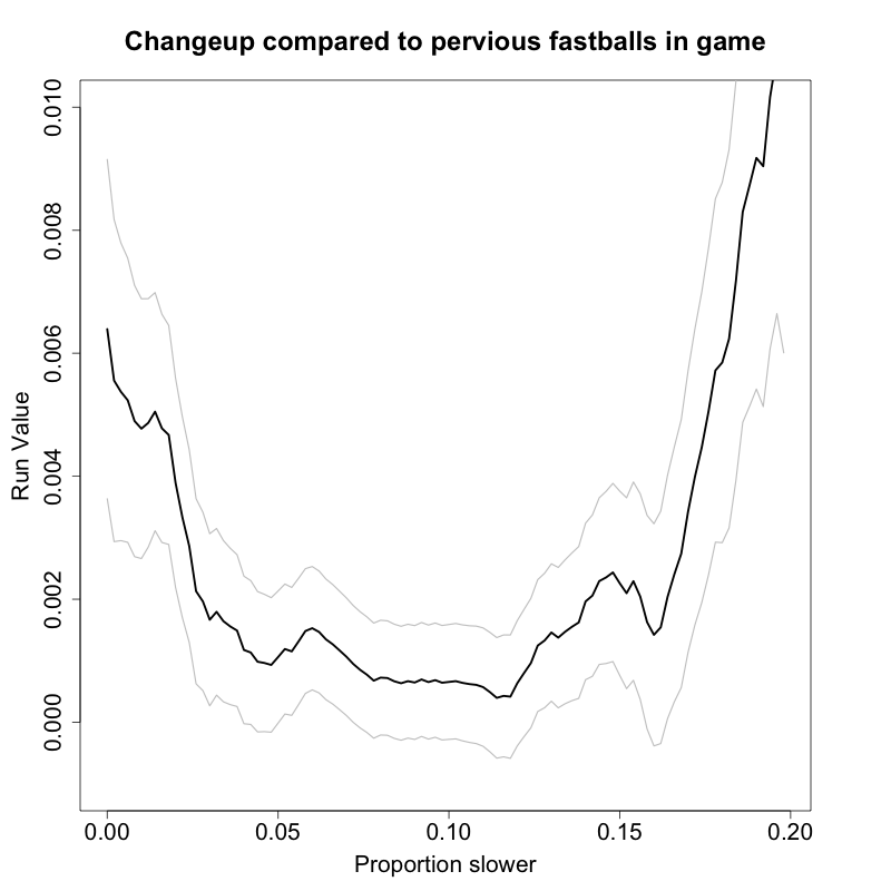
These results are seemingly at odds with Kalk's. He found that pitchers who average only 5 mph difference between their fastball and changeup over the course of a season have less successful changeups than those who average 10 or more mph difference. My results suggest that an individual changeup has about the same success if it is preceded by a fastball that is 5 mph or 10 mph faster. I am not sure how to reconcile these two different conclusions, but I am going to think about it more in the future and welcome any comments.
| F/X Visualizations | May 15, 2009 |
What Does a Fastball Hitter Look Like?
So far most of the pitchf/x analysis has focused on the pitcher, but each at-bat says just as much about a hitter as it does a pitcher. Thus, the pitchf/x data offers a wealth of information about batters that is currently underutilized. There have been some exceptions: Max Marchi's look at how the location in the zone of a hit pitch correlates with the location in the field of the resulting ball in play and Josh Kalk's look at how different hitters respond to first pitch fastballs. There have also been some great pitchf/x analyses of individual hitters: Jeremy's look at Micah Owings as a hitter, Trip Somers' look at Nelson Cruz's plate discipline and Mike Fast's examination of Jack Cust's performance against fastballs. In this post I want to continue this application of pitchf/x data to hitter analysis.
You often hear certain hitters referred to as 'fastball hitters.' I wanted to see if this is justified. Is there a certain subset of batters who do particularly well against fastballs? The stereotype is that fastball hitters are high strikeout, HR hitters. Is this the case? More generally, what can we say about the offensive performance of good fastball hitters versus good non-fastball hitters.
For every hitter in the pitchf/x database I found the average run value for all fastballs and all non-fastballs thrown to him during part of 2007 and all of 2008 (the pitchf/x system was added incrementally to different ballparks during the 2007 season). Here are the leaders and laggards:
+-------------------+--------+------------+-------------------+--------+------------+
| Name              | num FA | FA run val | Name              |num nFA |nFA run val |
+-------------------+--------+------------+-------------------+--------+------------+
| Albert Pujols     |   1973 |     0.0348 | Jody Gerut        |    412 |     0.0332 |
| Shin-Soo Choo     |    813 |     0.0313 | Lance Berkman     |   1284 |     0.0329 |
| Mark Teixeira     |   2657 |     0.0260 | Manny Ramirez     |   1351 |     0.0311 |
| Chipper Jones     |   2068 |     0.0251 | Magglio Ordonez   |   1121 |     0.0309 |
| Jack Cust         |   2337 |     0.0229 | Chris Davis       |    480 |     0.0298 |
| Alfonso Soriano   |   1545 |     0.0223 | Vladimir Guerrero |   1525 |     0.0290 |
| David Ortiz       |   1938 |     0.0217 | Milton Bradley    |    891 |     0.0272 |
| Josh Hamilton     |   1687 |     0.0217 | Nomar Garciaparra |    708 |     0.0261 |
| Carlos Quentin    |   1242 |     0.0215 | Alex Rodriguez    |   1147 |     0.0258 |
| Ryan Howard       |   2030 |     0.0210 | Matt Holliday     |   1178 |     0.0213 |
+-------------------+--------+------------+-------------------+--------+------------+
| Omar Vizquel      |   1227 |    -0.0178 | Craig Monroe      |    564 |    -0.0162 |
| Nomar Garciaparra |    936 |    -0.0180 | John McDonald     |    495 |    -0.0167 |
| Jose Molina       |    894 |    -0.0199 | Brad Ausmus       |    427 |    -0.0171 |
| Carlos Gonzalez   |    625 |    -0.0204 | Adam Kennedy      |    534 |    -0.0176 |
| Chris Burke       |    892 |    -0.0205 | Brandon Inge      |   1062 |    -0.0179 |
| Tony Pena         |    894 |    -0.0218 | Jacque Jones      |    605 |    -0.0180 |
| John McDonald     |   1026 |    -0.0236 | Yorvit Torrealba  |    715 |    -0.0204 |
| Omar Quintanilla  |    638 |    -0.0260 | Endy Chavez       |    429 |    -0.0230 |
| Andy LaRoche      |    686 |    -0.0261 | Corey Patterson   |    653 |    -0.0267 |
| Wily Mo Pena      |    549 |    -0.0290 | Tony Pena         |    504 |    -0.0348 |
+-------------------+--------+------------+-------------------+--------+------------+
Of course the leaders of both lists are going to be amazing hitters, this is almost by definition since we searched for the best fastball and non-fastball hitters. But there are some interesting names among the leaders, with Shin-Soo Choo surprisingly the second best fastball hitter in the pitchf/x era. Amazingly Jody Gerut was the best non-fastball hitter. Nomar Garciaparra was a great non-fastball hitter and a horrid fastball hitter. The laggards are mostly no-hit middle infielders and catchers. Tony Pena and John McDonald, mercilessly, end up on both laggard lists.
About 60% of pitches thrown are fastballs so the overall performance (against all pitches) of the best fastball hitters should be better than the overall performance of the best non-fastball hitters. That is the case: they have a higher walk rate (13% versus 11%), a higher HR per fly rate (21% versus 17%) and a higher OPS (.942 versus .920). The non-fastball hitters strike out less (16% versus 18%) and have a higher batting average of balls in play (.337 versus .322). This begins to bear out the stereotype that fastball hitters tend to be high K, high HR hitters. But I don't consider Albert Pujols a fastball hitter, he is an all around amazing hitter. I think a better metric of "fastball hitterness" is the difference between the average run value of fastballs and a non-fastballs thrown to a given hitter. Here are the leaders (perform better versus fastballs) and laggards (perform better against non-fastballs) for this metric.
+-------------------+--------+------------+------------+------------+
| Name              |    num | run val FA |run val nFA |        dif |
+-------------------+--------+------------+------------+------------+
| Shin-Soo Choo     |   1369 |     0.0313 |     0.0004 |     0.0309 |
| Jack Cust         |   4224 |     0.0229 |    -0.0027 |     0.0256 |
| Gary Matthews     |   3209 |     0.0099 |    -0.0144 |     0.0242 |
| Brandon Moss      |   1067 |     0.0069 |    -0.0149 |     0.0218 |
| Travis Hafner     |   2060 |     0.0089 |    -0.0128 |     0.0217 |
| Brian Schnieder   |   1662 |     0.0059 |    -0.0153 |     0.0212 |
| Reed Johnson      |   2101 |     0.0089 |    -0.0123 |     0.0211 |
| Michael Young     |   4299 |     0.0097 |    -0.0113 |     0.0211 |
| Chris Young       |   3910 |     0.0107 |    -0.0093 |     0.0200 |
| Jason Bay         |   3378 |     0.0164 |    -0.0031 |     0.0196 |
+-------------------+--------+------------+------------+------------+
| Mike Jacobs       |   2296 |    -0.0045 |     0.0198 |    -0.0243 |
| Austin Kearns     |   1859 |    -0.0126 |     0.0121 |    -0.0247 |
| Willie Bloomquist |   1295 |    -0.0128 |     0.0133 |    -0.0261 |
| Clint Barmes      |   1505 |    -0.0100 |     0.0171 |    -0.0271 |
| Kenji Johjima     |   2718 |    -0.0174 |     0.0103 |    -0.0277 |
| Omar Infante      |   1441 |    -0.0139 |     0.0156 |    -0.0295 |
| Chirs Davis       |   1143 |     0.0001 |     0.0298 |    -0.0297 |
| Omar Quintanilla  |   1012 |    -0.0260 |     0.0039 |    -0.0300 |
| Jody Gerut        |   1249 |    -0.0005 |     0.0332 |    -0.0337 |
| Nomar Garciaparra |   1644 |    -0.0180 |     0.0261 |    -0.0442 |
+-------------------+--------+------------+------------+------------+
A casual glance confirms our picture of fastball hitters as high strikeout, high power guys (Chris Davis seems really out of place among the non-fastball hitters). But it is hard to make any conclusions about what fastball hitters are like generally because fastball hitters are on average better hitters (since most pitches are fastballs). The measure of fastball hitterness (average fastball run value minus average non-fastball run value) is positively correlated with almost any offensive measure: HR per fly, BB rate, OBP, SLG, wOBA, BABIP, LD%. What I need to do is compare fastball hitters against non-fastball hitters who are just as good, and see in what respects they differ.
In order to make this comparison I am going to look at the relationship between a hitter's fastball run value minus non-fastball run value and a number of offensive metrics (K rate, HR per fly, BABIP, BB rate, GB%, LD%) relative to the hitter's overall offensive level. I use wOBA as my measure of a hitter's offensive level (wOBA, another TangoTiger creation, is one of the best metrics of a player's offensive value). The first thing to do is find the linear relationship between wOBA and all these measures (it is positively correlated with just about any meaningful offensive metric). Then for each batter I look at the difference between his value for a given measure and that expected based on his wOBA. This gives the hitter's performance for that measure relative to his overall offensive level.
An example would be helpful. The graph below displays the relationship between wOBA and walk rate. Generally the more a player walks the higher his wOBA, as you can see by the trend line I drew in. For each hitter I calculate the residual, which is how much more or less that player walks compared to his wOBA peers. The red line is the residual for Jermaine Dye. He walked 3.4% less than expected based on his wOBA, so his residual is -0.034. The blue line is Gregor Blanco who walked much more than his wOBA would suggest, so his residual is 0.059. The green dot is Carlos Quentin. His residual is just below zero.
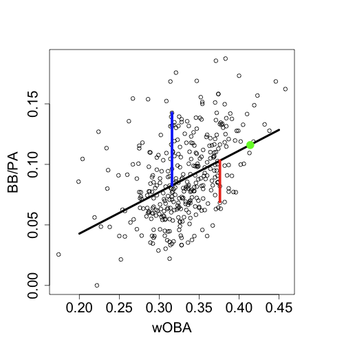
These residuals tell me if a player gets a greater than average amount of his offensive value from walks (like Blanco), or on the other hand if he gets less value from walks and gets his excess value elsewhere (like Dye does with his power). I calculated these residuals for all the offenses measure mentioned above. Now I am ready to see if fastball hitters get their value from walks, home runs, avoiding strikeouts (contact skills), having a high BABIP, or anything else by seeing the how my "fastball hitterness" correlates with each of these residuals.
The results confirm our initial assumptions. There is a strong positive correlation between fastball run value minus non-fastball run value and the HR per fly, BB% and K% residuals. So hitters who perform better against fastballs than non-fastballs hit more HRs, take more walks and strikeout more than the average hitter of the same offensive level. Fastball hitters tend to be power hitters. This would suggest that pitchers should throw fewer fastballs to power hitters, which is exactly what they do. It seems MLB pitchers knew all of this already, but I am happy to confirm for them.
| F/X Visualizations | May 13, 2009 |
Platoon Splits for Three Types of Fastballs
On Friday I looked at the run value of four-seam, two-seam and cutter fastballs based on pitch movement. In that post I noted, that it looked like two-seam fastballs had very extreme and cutters almost no platoon split. This comment was offhand, and I did not demonstrate that was the case. In this short post I will do that.
A month ago I looked at the platoon splits of fastballs, changeups, sliders and curves. My results reconfirmed what John Walsh showed in the 2008 Hardball Times Annual: fastballs have an intermediate platoon split, sliders a very extreme one, and changeups and curves none. In that post I grouped all fastballs together. Based on those results and the results of last week's post I was very curious to see the platoon splits for the different fastball types.

These results are consisitent with the remarks I made on Friday:
- Two-seam fastballs have an extremely large platoon split, as big as the slider platoon split.
- The platoon split for cutters is not statistically significant.
- Four-seam fastballs have a small yet significant split.
Interestingly, there is no trend for pitchers to throw the pitches in different proportions to lefties and righties. Approximately 48% of all pitches are four-seam fastballs, 8% are two-seam fastballs and 4% are cutters with almost no difference in same- and opposite-handed at-bats for either RHPs or LHPs. This is very strange it would seem pitchers would do well to throw two-seams fastballs much more in same-handed at-bats, as they do with sliders, and cutters in opposite-handed at-bats, as they do with changeups.
One pitcher who does this, and I would guess this is a big reason for his success, is Jon Lester. Lester, a lefty, throws all three of these fastballs. Here are the proportion of pitches to RHBs and LHBs that are each of the three fastball types.
+------------------+---------+---------+
| Fastabll Type    |     RHB |     LHB |
+------------------+---------+---------+
| Four-Seam        |   0.317 |   0.322 |
| Two-Seam         |   0.155 |   0.290 |
| Cutter           |   0.133 |   0.077 |
+------------------+---------+---------+
This is the type of breakdown I think pitchers should use, way more cutters to opposite-handed batters and more sinkers/two seamers to same-handed batters. I am surprised that is the not the case generally. It would be interesting to see if successful pitchers, like Lester, are more likely to show this breakdown than the average pitcher.
| F/X Visualizations | May 08, 2009 |
Fastball and Changeup Run Value by Movement
Two weeks ago I looked at the run value of curveballs, sliders and knuckleballs based on their movement. Today I am going to do the same for changeups and three kinds of fastballs: four-seam fastballs, two-seam fastballs and cutters. This work was motivated by Sky Kalkman's Understanding Pitch f/x Graphs piece in which commenters suggested they have a hard time putting pitch movement in perspective.
Here is how the pitchf/x system measures movement from my post two weeks ago.
The movement of a pitch is the difference between where you would expect the pitch to end up as it crosses the plate based solely on its velocity, trajectory and gravity and where it actually ends up as it crosses the plate. This difference is broken up into its horizontal and vertical components. Then you can plot the horizontal and vertical movements of a number of pitches together in a scatter plot to see the movement of a particular pitch type or from a particular pitcher.
As in the previous post I used all the pitches in the pitchf/x database to do the analysis. This presented a problem; in 2007 and 2008 the pitchf/x system classified almost all fastballs as generic fastballs making no distinction between four- or two-seam fastballs, sinkers, or cutters. Starting this year the system made these finer fastball classifications. So the first thing I had to do was go back and reclassify each pre-2009 fastball as a four-seam, a two-seam/sinker or a cutter. Although sinkers and two-seam fastballs are different pitches I had a hard time differentiating them using the pitchf/x data so I lumped them here.
I used a k-means clustering algorithm that assigned a pitch to a cluster based on its vertical and horizontal acceleration and its speed. I am fairly confident in my classifications. The average horizontal and vertical movement and speed of each of the three types of fastballs I classified are quite close to the values Josh Kalk found when he classified the pitches. One slight discrepancy is that my RHP's cutters do not have as much positive horizontal movement as Kalk's (and my LHP's cutters do not have as much negative horizontal movement as Kalk's). I think that Kalk reclassified some sliders as cutters and I am missing those since I am just reclassifying fastballs not all pitches.
Four-Seam Fastballs
For each pitch type I first show the range of movement for all RHPs throwing that pitch in gray, and then some specific examples in green, blue and red.
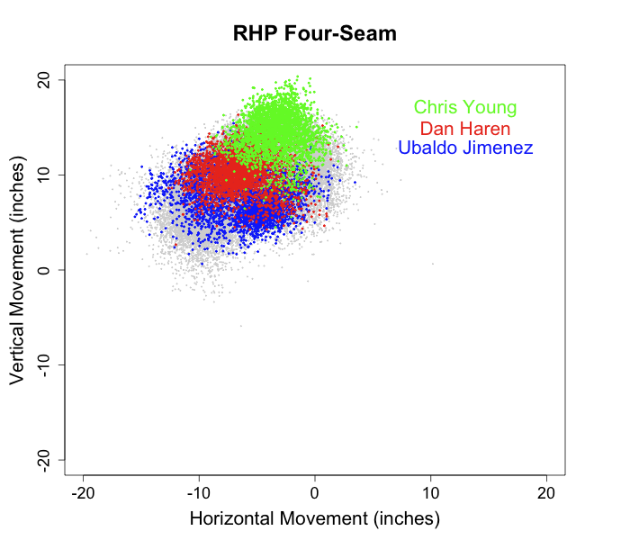
Four-seam fast are, on average, the fastest pitches (about 1.5 mph faster than two-seam fastballs and 3.5 mph faster than cutters), they 'rise' (drop less than expected from gravity) more than any other pitch and tail in to same-handed batters (away to opposite-handed batters) by about 5 inches. These fastballs include what are thought of as 'high-heat' fastballs. Chris Young has a very effective four-seam fastball that 'rises' more than a foot on average. Dan Haren as of last week had the best four-seam fastball of all starters. Four-seam fastballs have a large variation in horizontal movement both between different pitchers and between pitches thrown by the same pitcher, for example some of Ubaldo Jimenez's four-seam fastballs tail over 10 inches in to RHBs and others have almost no horizontal movement what-so-ever.
The run value images were created in the same way as described in the first post in this series. I just give the RHP ones to keep the post from data overload.
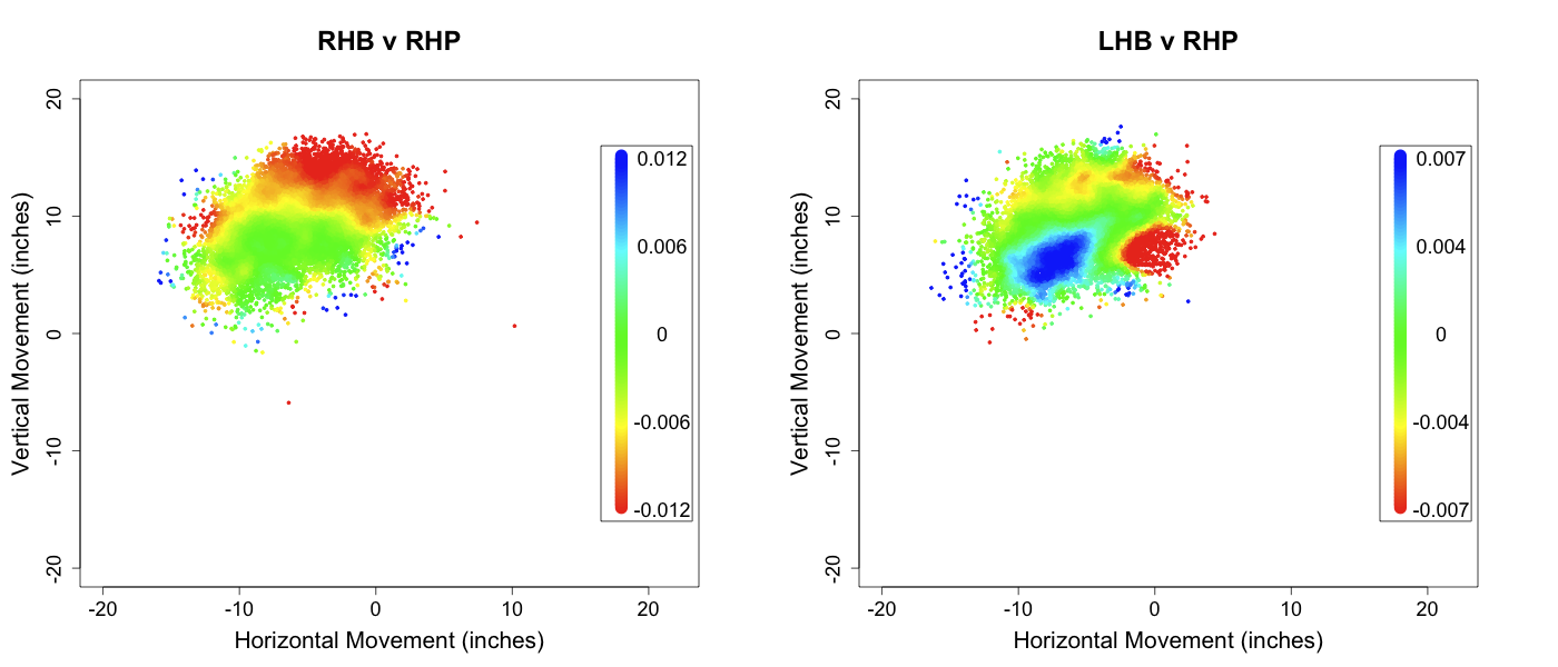
In same-handed at-bats the more vertical 'rising' movement the better. This trend is not unexpected, but strikingly consistent. For these same-handed at-bats horizontal movement has very little effect. In opposite handed at-bats a large central region of pitches has a very high run value. These fastballs have 'average' movement, and left handed batters have no trouble with them.
Two-Seam Fastballs

Two-seam fastballs are a little slower, tail in more to same-handed batters, and have much less, sometimes even negative, vertical movement than four-seam fastballs. As I said before this group of pitches includes both two-seam fastballs and sinkers. These fastballs, when they are effective, induce lots of groundballs. As of last week Derek Lowe had the best two-seam fastball. It has nice 'sink' and a wide range of horizontal movement. Brandon Webb's sinker is the one of the best in the game, it has even more 'sink' than Lowe's. Justin Masterson pitches from a three quarters arm slot and is able to get negative vertical movement on his sinker (it drops more than expected from gravity).
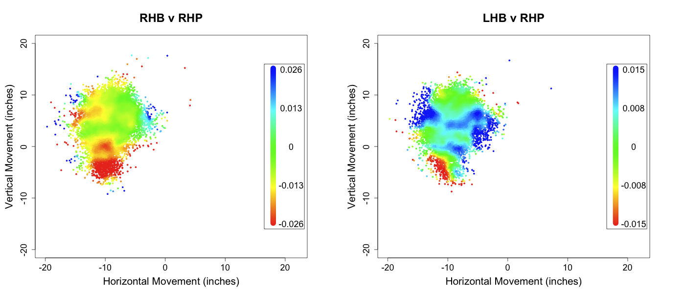
Two-seam fastballs have an incredible platoon split. Against same-handed batter they tend to be very good pitches improving slightly with more horizontal movement towards the hitter and greatly with more downward movement or 'sink'. Against opposite handed batters two-seam fastballs are not very effective, and those with intermediate levels of vertical movement get crushed.
Cutter
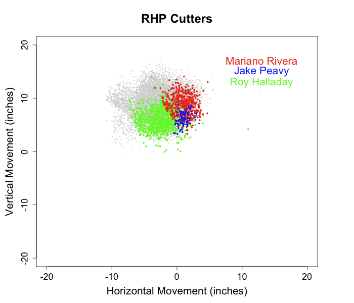
Cutters are, on average, slower than four- and two-seam fastballs by about 3.5 and 2 mph respectively. Their movement is intermediate to a four-seam fastball and a slider. You can't talk about cutters without mentioning Mariano Rivera's. It is amazingly successful, almost the only pitch he throws and one of the most unique pitches in the game. It has a wide range of vertical break and breaks away from RHBs. Roy Halladay has a very successful cutter with lots of 'sink'. Jake Peavy doesn't throw as many cutters as Halladay or Rivera, but his have very interesting movement too.
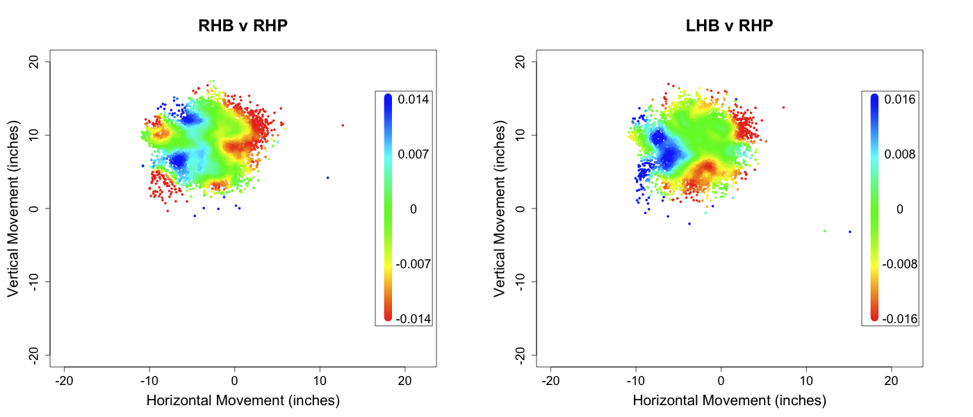
Cutters seem to have almost no platoon split. In fact the patterns look the same and are not mirror images of each other as is usually the case. So cutters from RHPs that break to the catcher's left do poorly against RHBs and LHBs, while those that break to the catcher's right do well against RHBs and LHBs. This is quite strange, and helps explain how Rivera can be so successful with just the one pitch.
Changeups
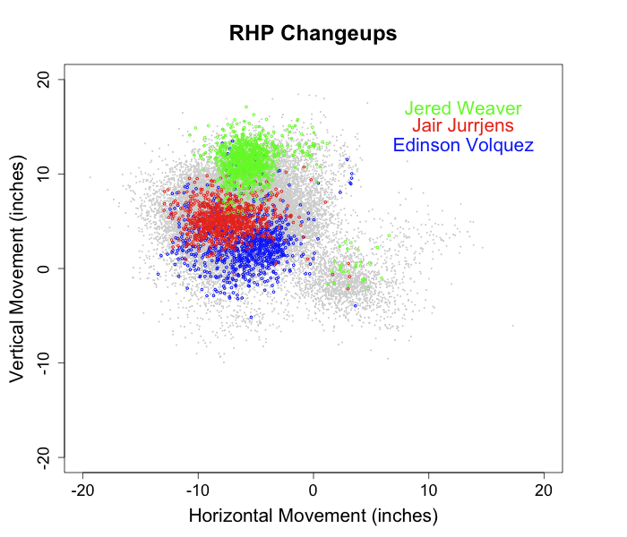
In 2008 no pitcher threw more changeups than Edinson Volquez. His changeups have very extreme down and in movement. Jair Jurrjens was also in the top five of changeups thrown percentage, his has intermediate movement. Jered Weaver's change has more 'rise' than any other.
Changeups are predominately throw in opposite-handed at-bats so I just present those images below.
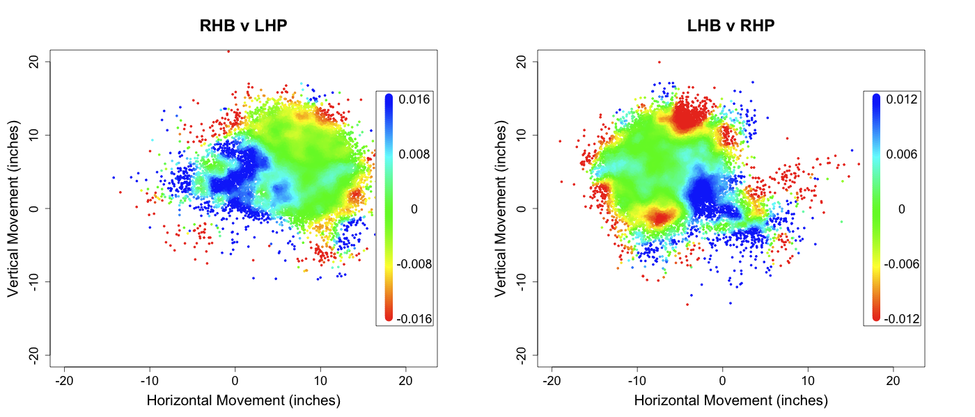
Changeups that have very little movement (close to 0,0) get crushed. Those with extreme vertical movement, either lots of rise or lots of sink, are very successful. Since changeups are thrown in opposite handed at-bats even those with neutral run values are good pitches.
Speed
The elephant in the room here is pitch speed. The success of a fastball or a changeup is very much tied to its speed, which this analysis ignores. In addition, pitch movement and speed are not independent. John Walsh showed fastball speed positively correlates with its vertical movement. So the success of four-seam fastballs with lots of rise might be since these tend to be faster pitches. In a future post I hope to examine this relationship between speed and movement, and see how they jointly affect a pitch's outcome.
| F/X Visualizations | May 01, 2009 |
Pena and Quentin: Home Runs from Down and Away
Before the season I looked at home run rate (per pitch) by pitch location. In that post I found that the highest home run rate was slightly up and in within the strike zone, a finding which has since been confirmed and expanded by Jonathan Hale. That post also presented some hitters who hit lots of home runs outside of that up and in region. Two examples I gave were Carlos Pena and Carlos Quentin. Here are the images I presented, with the average HR rate of all LHBs for Pena and RHBs for Quentin in gray and their 2007 and 2008 home runs plotted over that in red. Remember these images are from the catcher's perspective so Pena, a LHB, stands to the right of the strike zone and Quentin to the left of the zone.

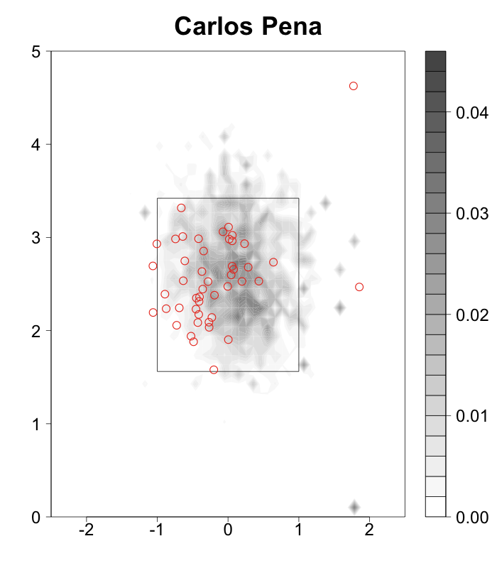
Both hit most of their home runs down and away, and very few in the traditional power region up and in. They also happen to be at the top of this year's early HR leader board, Pena tied for the lead with nine and Quentin just one behind with eight. It was interesting for me to see the two of them at the top of the list after profiling their abnormal home run hitting patterns before the season, so I wanted to check the pitch locations of their home runs so far this year. I used the images from above, shrunk the 2007 and 2008 home run indicators a little and plotted the 2009 home runs with larger circles.
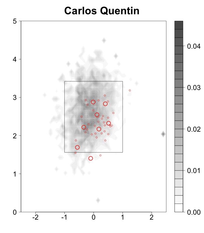
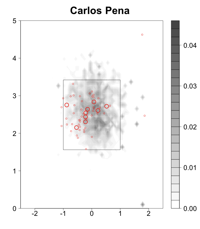
The home run locations are still fairly different from the average hitter and pretty close to the 2007 and 2008 locations. The centroid of Pena's 2007 and 2008 home runs was (-0.10,2.39) and of his 2009 home runs (-0.16,2.56). So his home runs so far have been even more outside than the last two years and slightly higher. Quentin's '07/'08 home run centroid was (0.18,2.33), and his '09 home run centroid is (0.03,2.26). So his home runs have moved in, but are even lower in the zone than the last two years. Both are still hitting more home runs in the outside half than in the inside half of the zone, which is very different than the average hitter. It is interesting that these two top home run hitters generate so much power in a location where most hitters have a near zero home run rate.
EDIT:In the comments Rich asked a great question about what type of pitches Quentin and Pena are hitting for home runs. Here is the breakdown of home run rate per pitch by pitch type for each of them and the over all league average.
+-------------------+-------------+-------------+-------------+
| HR rate per pitch |     Quentin |        Pena | Leag. Aver. |
+-------------------+-------------+-------------+-------------+
| Fastballs         |      0.0174 |      0.0163 |      0.0071 |
| Changeups         |      0.0132 |      0.0068 |      0.0075 |
| Sliders           |      0.0104 |      0.0180 |      0.0056 |
| Curveballs        |      0.0275 |      0.0089 |      0.0049 |
+-------------------+-------------+-------------+-------------+
Pena's per pitch rates are lower than Quentin's but his over all number of home runs is higher because he sees more pitches per plate appearance (4.0 versus 3.6). For almost every pitch type they hit more than league average, but the difference is very high for Pena with sliders and for Quentin with curves. So I graphed their home runs by pitch type.
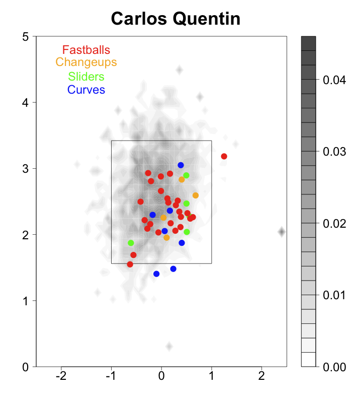
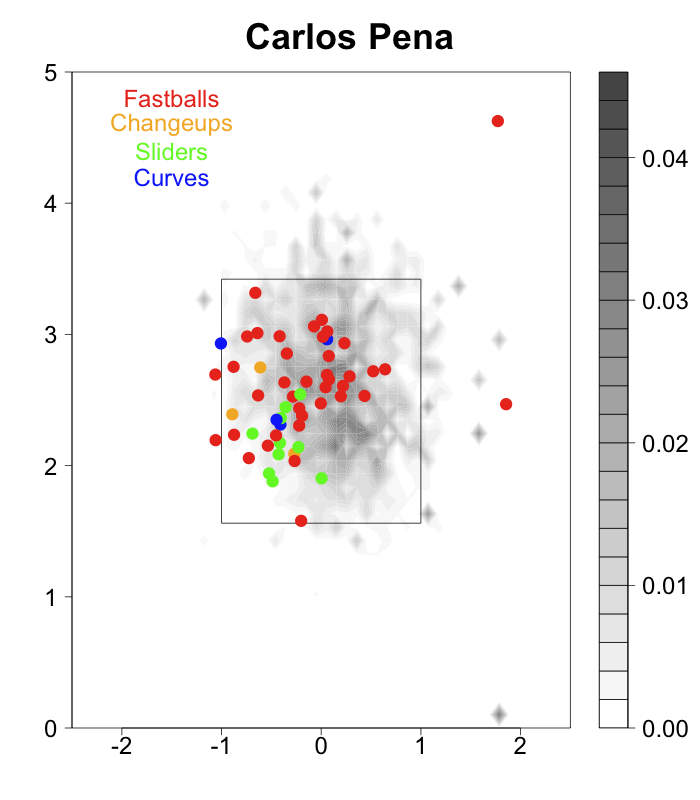
It looks like sliders for Pena and curves for Quentin are really pulling their average location down and away. Their fastballs are a little bit more away and down than the average hitter, but I think what makes their home run locations particularly distinctive is the large amount of breaking pitches they hit for home runs which are down and away. From Hale's article it does not look like most hitters sliders and curves for home runs in these locations. Great question Rich.
EDIT 2: Rich made another great suggestion of looking at the locations of where all these home runs ended up. First Quentin:
Rich's take, which I agree with:
I was surprised how many home runs he's pulling given your findings. I think it shows how strong he is as the average hitter wouldn't be able to turn on those breaking balls on the outer half of the plate like Carlos.
Now Pena:
Pena is hitting lots to dead center. It would be interesting to combine the two data sets, and see how the location of the pitch corresponds to the location of the home run, like Max Marchi did here. Or look at how the location of home run corresponds to the pitch type.
| F/X Visualizations | April 29, 2009 |
Looking Back at Burrell's Defense
I mentioned a couple of weeks ago how this offseason teams placed a greater emphasis on defense, and particularly outfield defense. Some teams went out of their way to create power-house outfield defenses, and on the other hand poor-fielding outfielders got much smaller contracts than expected. I have already checked in with an example of the former, now I want to look back at an example of the latter.
From 2005 to 2008 Pat Burrell cost the Phillies about 48 runs with his defense in left field--costing them almost 5 wins. I wanted to see if we could visualize this defensive ineptitude. I employed the run value by field location technique I first introduced here. This time I took all balls in play at Citizens Bank Park split up by when the Phillies were in the field and when the visitors were in the field. That way you can compare the defense of the Phillies's left fielders from 2005 to 2008 (mostly Pat Burrell) to all visiting left fielders in that time.
I had hoped that the results would be more dramatic, but you can definitely see that the red blob for the Phillies is smaller than the blob for the visitors. In addition there is much more deep green in left field for the Phillies than for the visitors. Good thing Burrell is now predominately a DH, too bad the Phillies replaced him with Raul Ibanez.
EDIT: In the comments LarryinLA suggested graphing the difference between the two images as a better way of displaying the information. In the image below positive areas (blue) are where the Phillies' defensive did better than the visitor's defense, and negative (red) where the Phillies' did worse.
I think this shows the difference even better. It looks like Burrell was particularly bad on balls hit down the foul line.
| F/X Visualizations | April 27, 2009 |
Best Pitches of the Year So Far
After the 2007 season John Walsh looked at the best pitches of each type for 2007. For example, that year Heath Bell had the best fastball. For every 100 fastballs he threw the opposing team scored 2.7 runs less than expected. For this quick post I wanted to check in on pitchers so far this year and see who had the best of each pitch type. Like John I am going to measure a pitch by its run value (in the link John has a great description of the run value of pitch).
+-----------------------+--------+-------------------+
| Four-Seam Fastball    | Number | Run Value per 100 |
+-----------------------+--------+-------------------+
| David Aardsma	        |    101 |              -4.6 |
| Jonathan Broxton      |     89 |              -4.3 |
| Brian Stokes          |     75 |              -4.2 |
| Frank Francisco       |     76 |              -4.1 |
| Dan Haren             |    201 |              -4.1 |
+-----------------------+--------+-------------------+
It is incredible that over twice as many pitches and as a starter Dan Haren's four-seam fastball is right up there with those of four hard throwing relievers. Heath Bell's fastball is still very good checking in at 9th on this list.
+-----------------------+--------+-------------------+
| Two-Seam/Sinker       | Number | Run Value per 100 |
+-----------------------+--------+-------------------+
| Derek Lowe	        |     44 |              -7.8 |
| Josh Beckett          |     32 |              -7.8 |
| Jamie Shields         |     37 |              -6.3 |
| Rick Porcello         |     64 |              -6.3 |
| Ramon Ramirez         |     32 |              -5.3 |
+-----------------------+--------+-------------------+
It is my understanding that the new pitchf/x pitch classification system calls two-seam fastballs sinkers for some pitchers, so I grouped both of them here. Tiger's fans must be thrilled to see Porcello's name on any list that includes Lowe, Beckett and Shields.
+-----------------------+--------+-------------------+
| Changeups             | Number | Run Value per 100 |
+-----------------------+--------+-------------------+
| Dallas Braden	        |     79 |              -6.5 |
| Shairon Martis        |     45 |              -6.1 |
| Anthony Reyes         |    100 |              -5.2 |
| Jered Weaver          |     44 |              -4.8 |
| Johan Santana         |     74 |              -4.4 |
+-----------------------+--------+-------------------+
Shairon who? Luckily Harry Pavlidis broke down his stuff for us about a month ago.
+-----------------------+--------+-------------------+
| Curves                | Number | Run Value per 100 |
+-----------------------+--------+-------------------+
| Javier Vazquez        |     62 |              -6.5 |
| Wandy Rodriguez       |    133 |              -5.1 |
| Jeff Niemann          |     44 |              -4.9 |
| Jose Veras            |     42 |              -4.6 |
| Paul Maholm           |     48 |              -3.9 |
+-----------------------+--------+-------------------+
Wandy had the top curveball in 2007. Erik Bedard just missed the top 5 with -3.6 runs per 100 on his 127 curves, so on a total run value basis he is second only to Rodriguez.
+-----------------------+--------+-------------------+
| Sliders               | Number | Run Value per 100 |
+-----------------------+--------+-------------------+
| John Danks            |     55 |              -6.0 |
| Kyle Davis            |     32 |              -5.1 |
| Santiago Casilla      |     34 |              -4.8 |
| Yovani Gallardo       |     29 |              -4.8 |
| Mark Lowe             |     30 |              -4.6 |
+-----------------------+--------+-------------------+
This is an interesting list with mostly younger pitchers.
One HUGE caveat here is that I did not adjust for the strength of the batters faced. So if a pitcher has only faced poor batters his numbers could be artificially inflated. Also if a pitcher tends to throw a particular pitch only against very good or very bad batters that could throw things off. When I make these lists again at the all-star break or at the end of the year I will properly adjust for the batters faced.
| F/X Visualizations | April 24, 2009 |
The Breaking and the Knuckling: Run Value by Pitch Movement
Over at Beyond the Box Score Sky Kalkman posted an introduction to understanding pitchf/x graphics. It is a great post for people who are having a hard time understanding these graphics. I also liked the comments section where there is some discussion of the state of pitchf/x analysis. In particular some commenters noted areas of the current analysis they found lacking.
Trey Hilman's Chin commented:
I do have one question to go along with all this. For any particular pitch, is there a range of movement that is generally recognized as “good” for that pitch classification? I am terrible at judging “stuff” simply by watching a pitch, but it would be nice to look at some of these charts and intuitively see that a particular pitch had a “nasty slider” tonight, etc.
Similarly, azruavatar wrote:
5 inches of break is absolutely meaningless to me in the context of a slider. I also question whether all 5 inches are created the same. Rivera’s cutter is notorious for late movement. If a pitch moves 5 inches over 20 feet compared to 5 inches over 60 feet that’s an incredible difference.
It seems that people are having the hardest time intuitively understanding pitch movement and putting an individual pitch's movement in perspective. Another commenter suggested Josh Kalk's two-part Anatomy of a League Average Pitcher series. The first broke down the league average fastball, sinker and cutter by presenting the frequency distribution of speed and movement for these pitches, and the second did so for off-speed and breaking pitches. These allow one to see if, say, a pitcher's curveball breaks more than the average curveball. But we are still left wondering if that additional movement makes the pitch any more successful. I will begin to address this question here for the breaking (and knuckling) pitches, and look at fastballs and changeups in a future post.
The pitchf/x system measures pitch movement in a number of ways but the two easiest to understand are the horizontal movement (pfx_x) and the vertical movement (pfx_z) of a pitch. Alan Nathan has a helpful description of the meaning behind these two values:
pfx_x,pfx_z: The deviation (in inches) of the pitch trajectory from a straight-line in the x (horizontal) and z (vertical) directions...[T]he effect of gravity has been removed from pfx_z, so that both parameters are the "break" of the pitch due to the Magnus force on a spinning baseball...[A positive value of pfx_x corresponds to] a deviation to the catcher's right and a negative value to the catcher's left. Similarly, a positive value of pfx_z is a pitch the drops less than it would from gravity alone (most pitches fall in this category), whereas a negative value is a pitch that drops more than from gravity alone (e.g., a "12-6" curveball).
So the movement of a pitch is the difference between where you would expect the pitch to end up as it crosses the plate based solely on its velocity, trajectory and gravity and where it actually ends up as it crosses the plate. This difference is broken up into its horizontal and vertical components. Then you can plot the horizontal and vertical movements of a number of pitches together in a scatter plot to see the movement of a particular pitch type or from a particular pitcher.
Curveballs
In gray, are all curveballs thrown by RHPs. You can see that most tail to the catcher's right by about 5 inches (meaning they tail away from RHBs) and break down by about 5 inches. On top I plotted the curveballs of three pitchers with distinctive and successful curves. Bronson Arroyo's curve has almost no vertical movement, but far and away the most horizontal movement of any curveball in the game. A.J. Burnett's curve, on the other hand, has some of the most downward movement of any pitcher's curve, but average horizontal movement. (Arroyo's curve's dependence on its heavy horizontal movement compared to Burnett's on its heavy vertical movement may partially explain Arroyo's more extreme platoon split compared to Brunett's). Zack Greinke combines intermediate levels of horizontal and vertical movement in his very successful curveball.
I am using the pitchf/x given pitch classifications and you can see three strange 'blobs' off of the central cluster of pitches. These are not curveballs. I think they are misclassified changeups. One cluster comes from sidearm pitchers and another from pitchers who throw sinking fastballs and changeups.
Now that we have seen the range of movement for all and a select group of individual pitchers's curves we can look at how curveball success varies by movement. In the images below I show the run value of a curve based on its movement. I decided to take a slightly different approach from my run value by location heat maps. I wanted to show not only the run value by movement, but also roughly the number of pitches with that movement. So I plotted the heat map colors on top of the scatter plot of pitches. Note that I change the color scale in each image, while this makes it harder to compare across images, it makes it easier to highlight differences within a particular image.
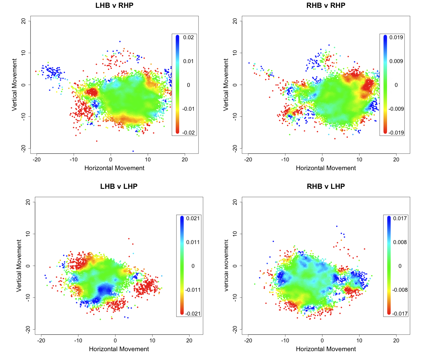
These are pretty messy complicated images. Studes suggests that at times these heat maps are too messy to be very informative. I think that is the case here (although I cannot agree too much or I lose my raison d'être). So I took a more traditional route below and plotted run value versus first the vertical movement (averaging over the horizontal) and then against the horizontal movement (averaging over the vertical).
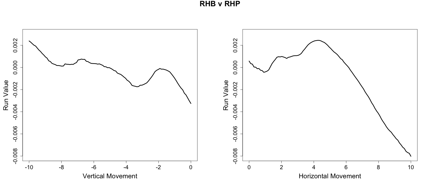
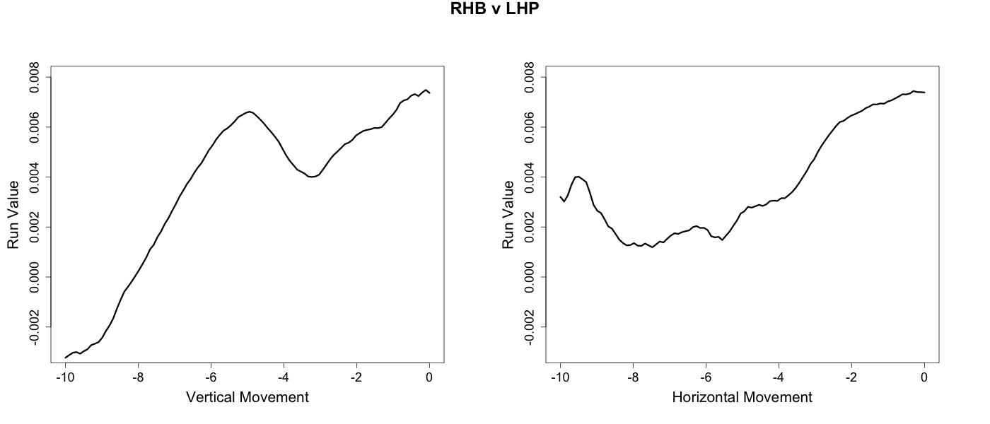
These figures reveal an interesting dichotomy between same handed versus opposite handed at-bats. In opposite handed at-bats the success of the curveball is mostly determined by its vertical break. The greater the downward break the more successful the curve. Conversely, in same handed at-bats the horizontal movement of the pitch largely drives the pattern. The more a curveball tails away from a batter the more successful it is.
Sliders

RHP's sliders, on average, have slight tailing away movement from RHBs and slight rising movement, although there is considerable variation. Greg Maddux's slider, for example, tailed in to RHBs. Justin Duchscherer's slider has little horizontal movement but above average rising movement. Carlos Marmol's slider is in the top five among sliders for both horizontal and downward movement, which makes it the slider with the most overall movement in the game.
I use the same technique described above for curveballs to produce the run value by movement images for sliders below. Since sliders are thrown overwhelmingly in same handed at-bats I only present those.
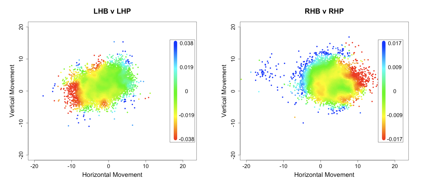
Here, I think, the heat maps show a relatively clear gradient, with sliders that tail away from the hitter the most being the most successful.
Knuckleballs
There are fewer knuckleballs thrown than sliders or curves, but I really wanted to include them. John Walsh wrote the seminal pitchf/x article on the knuckleball. He found that, unlike other pitches, knuckleballs do not have a consistent pattern of movement, but a random horizontal and vertical movement each anywhere from -15 to 15 inches (for Wakefield, at least). The success of an individual knuckleball varies directly with its, seemingly random, amount of movement; batters make less and poorer contact the more movement a knuckleball has. Using the method described above I am able to make one slight addition to Walsh's conclusion.
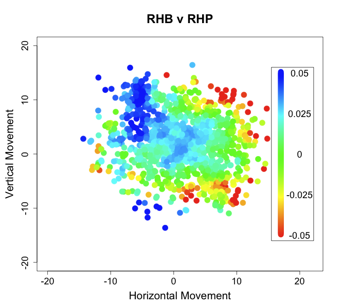
Outside of the north-west quadrant we get a confirmation of Walsh's results; there is a lower run value as the break increases. But knuckeballs with positive vertical movement and negative horizontal movement have even higher run values than those with no movement. Thus knuckleballs that break up and in to batters, even if they have a lot of movement, are very unsuccessful. This makes knuckleballs even more random; even if a pitcher can get lots of movement on his knuckleball if it happens to break up and in he could be in trouble.
In a future post I will look at fastball and changeup movement.
| F/X Visualizations | April 17, 2009 |
What Did We Know This Time Last Year?
This early in the season the leader and laggard boards often have some interesting names, and it is fun to theorize which of these are legitimate breakouts (or breakdowns) and which are small sample size flukes. The pitchf/x data adds a powerful tool in helping with this classification. It allows us to look deeper into why a pitcher may have struggled or succeeded in a start. We have already seen some great analysis along these lines. RJ Anderson has a series of posts looking at Lincecum's, Sabathia's and Wheeler's performances thus far based on pitch speed and movement and release point. River Avenue Blues broke down Wang's first two games to see what might be up.
These are good examples of using all the data pitchf/x offers to assess recent performance. Of course what often happens is people just look at fastball speed and ignore movement, location, and release point data. For example after Cole Hamels first poor start everyone focused on his 86 mph fasball, but, as Hamels said himself, he started off with a fastball in the mid-80s early last year too. The image below shows Hamels's average fastball speed by start. The x-axis is not scaled by date, but by start (so no matter how far apart in time two consecutive starts are they are always the same distance apart along the x-axis). The division between seasons in marked with a red line.
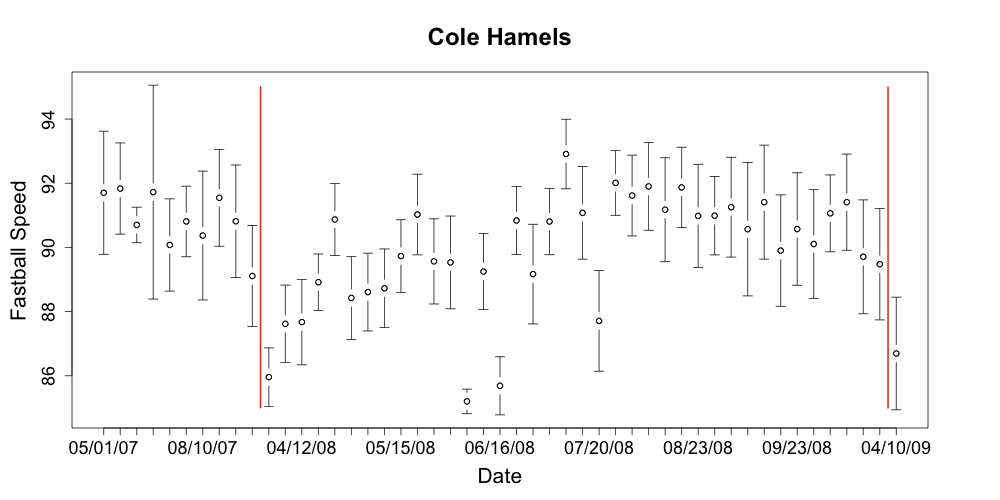
Hamels's fastball speed is right where it was last year (not to say that we should be worry free about Hamels; last year he pitched 261 innings after just 189 in 2007). This provides a useful way to see if a pitcher's speed is within his normal variation. Consider Wang:
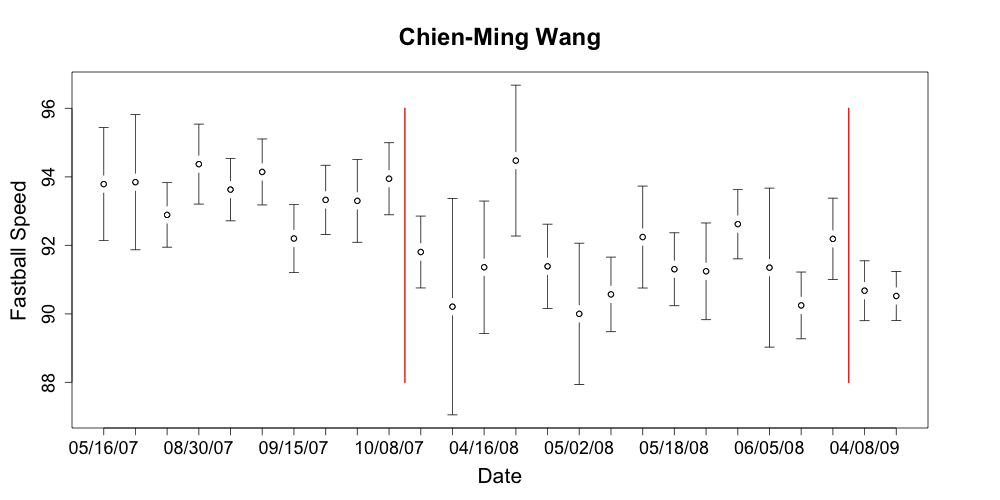
His fastball in his injury shortened 2008 was 2 mph slower than his fastball in 2007. For his first two starts of 2009 it is in the low range of his already low 2008 numbers. That could mean trouble.
As I noted earlier the best pitchf/x analysis will take into account all the data, but most people will be lazy. Like I just did, they will look at just fastball speed. So I wanted to know how much we could learn only looking at that. More specifically what can we say about performance for the rest of the season looking just at fastball speed thus far into the season. I looked back at last year to find out. Most starters have started two games with about 100 pitches per start, about half of them fastballs. So what can we know with 100 fastballs worth of data?
I started off with the average speed of every pitcher's first 100 fastballs in 2008 and then compared that with his average fastball speed for all of 2007. I wanted to see how well that pitcher performed from that point forward, so I found their FIP from the game after they reached their 100th fastball on in the 2008 season. (FIP stands for fielding independent pitching. Developed by Tangotiger, it roughly gives the expected ERA of a pitcher if he pitched in front of an average defense). From that I subtracted that player's preseason CHONE projected FIP (CHONE is one of the best projection systems. It was created by Sean Smith). The result is how the pitcher performed over the rest of the season relative to his projection. Here are the players with the biggest increase and decrease in fastball speed.
The second column is how much faster (or slower) the player's first 100 2008 fastballs were compared to his 2007 fastballs. A positive number is a faster fastball in 2008. The third is FIP minus projected FIP. Like ERA a low FIP is good, so a negative difference is outperforming the projection.
+---------------------+--------------+----------------+
| Name                | FB speed dif | FIP - proj FIP |
+---------------------+--------------+----------------+
| Ervin Santana	      |         2.28 |          -1.16 |
| Tim Lincecum        |         1.65 |          -0.83 |
| Josh Beckett        |         1.36 |          -0.45 |
| John Maine          |         1.07 |           0.10 |
| Santiago Casilla    |         1.06 |           0.92 |
| Wandy Roriguez      |         0.96 |          -0.84 |
| Manny Delcarmen     |         0.89 |          -0.86 |
| Wilfredo Ledezma    |         0.82 |          -0.05 |
| Shaun Marcum        |         0.79 |          -0.26 |
| Leo Nunez           |         0.77 |           0.05 |
+---------------------+--------------+----------------+
| Francisco Rodriguez |        -2.34 |           0.05 |
| Mike Mussina        |        -2.34 |          -1.37 |
| Daniel Cabrera      |        -2.49 |           0.82 |
| Brad Lidge          |        -2.51 |          -1.10 |
| Jeff Suppan         |        -2.61 |           0.80 |
| Oliver Perez        |        -2.81 |           0.21 |
| Chris Young         |        -3.42 |           0.41 |
| Bob Howry           |        -3.89 |           0.84 |
| Cole Hamels         |        -3.90 |           0.15 |
| Heath Bell          |        -4.01 |           0.30 |
+---------------------+--------------+----------------+
Although there is considerable variation seven of the ten pitchers with the largest increases in fastball speed outperformed their projection and eight of the ten with the largest decrease underperformed their projection. In addition the top two were two of the biggest breakout pitching performances of last year and you could have seen it just 100 fastballs into the season. Of course the trend is not perfect, 100 fastballs into the season Brad Lidge, Mike Mussina, Hamels and Francisco Rodriguez were way below their 2007 averages and they all had great seasons (although Hamels's and Rodriguez's performances were slightly worse than projected). Here are the results for all players.
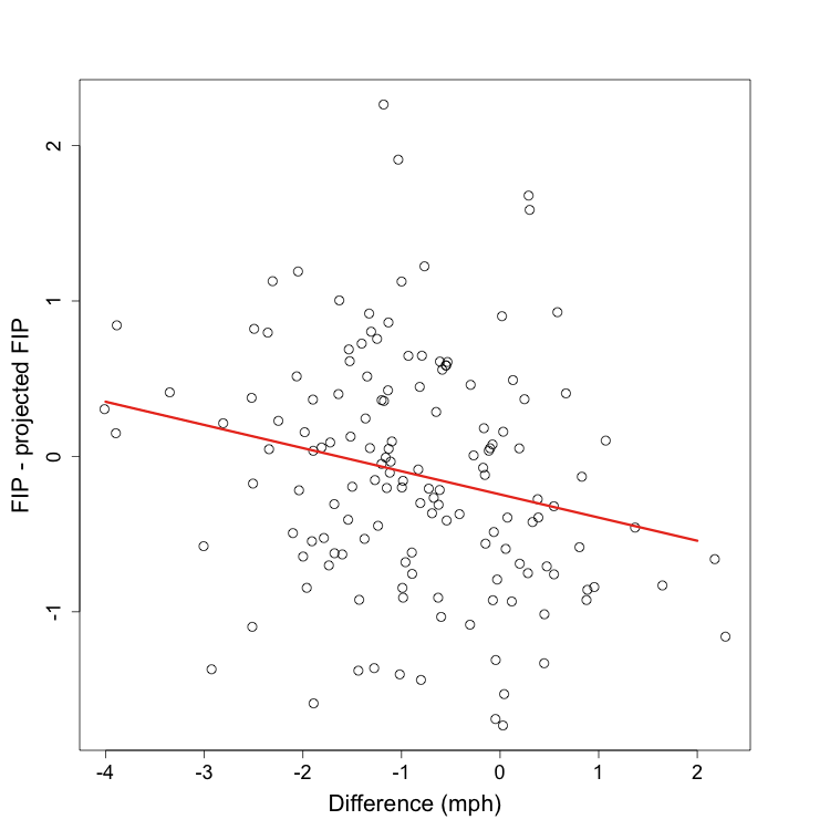
The relationship is very significant ( p < .01), but explains little of the variation (r2= 0.05). The equation for the best fit line is y = -0.24 - 0.15x. Where x is the difference in fastballs speeds (first 100 '08 fastballs minus '07 fastballs) and y is remaining 08 FIP minus projected FIP. So an increase of one mph is worth a 0.15 decrease in FIP (or each decrease of a mph is worth an increase of 0.15 FIP). Also if a pitcher is throwing just as fast in his first 100 fastballs of the season as he was all of last season (x = 0) you expect him to outperform his projection by almost 0.25 runs. If you thought going into the season he was a 4.00 FIP (or ERA) pitcher and his first 100 fastballs are just as fast as his fastballs the year before you would expect him to be a 3.75 FIP (or ERA) pitcher. But there is so much unexplained variation (95% in fact) this pitcher could end up performing very well or very poorly.
So, although the trend is significant, there is so much unexplained variation I would say with just the speed of the first 100 fastballs we don't know that much more than before. But that will not stop me from posting this season's leaders and laggards in fastball speed difference. Some of the pitchers have not reached the 100 fastball cutoff used in the above analysis. Remember someone at the top of the list could end up with very poor performance relative to projection, like Santiago Casilla last year. A pitcher at the bottom could end up like Mussina.
 Greatest difference between 09 fastball speed thus far and 08 fastball speed

+-------------------+--------+--------+
| Name              | Number |    Dif |
+-------------------+--------+--------+
| Todd Coffey       |     61 |   1.93 |
| Justin Verlander  |    119 |   1.81 |
| Kevin Correia     |    109 |   1.23 |
| Jonathan Sanchez  |     74 |   1.14 |
| Josh Johnson      |    163 |   1.14 |
| Matt Albers       |     55 |   1.13 |
| Chirs Volstad     |    117 |   1.09 |
| Adam Eaton        |     55 |   1.09 |
| Armando Galarraga |     97 |   0.98 |
| Jason Marquis     |    105 |   0.94 |
+-------------------+--------+--------+
| Geoff Geary       |     63 |  -2.04 |
| Matt Harrison     |     59 |  -2.05 |
| Daniel Cabrera    |    131 |  -2.25 |
| Manny Delcarman   |     68 |  -2.26 |
| Oliver Perez      |    126 |  -2.39 |
| Joe Saunders      |    128 |  -2.44 |
| Daisuke Matsuzaka |     62 |  -2.44 |
| Hideki Okajima    |     55 |  -2.66 |
| Dana Eveland      |     91 |  -2.88 |
| Dennis Sarfate    |     67 |  -3.12 |
+-------------------+--------+--------+
With all the caveats I will still venture that the pitchers at the top of the list, as a whole, out-perform their projections and the pitchers at the bottom under-perform. It will be interesting to see if any of the names on the top of this list turn out to be this season's Tim Lincecum or Ervin Santana.
Sorry this post was a little light on visualizations. I promise my next post will make up for it.
| F/X Visualizations | April 10, 2009 |
Checking in on Seattle's New Outfield
With about half a week's worth of games played I wanted to check in on a major story from the offseason: the increasing importance teams put on defense when acquiring players. We saw some all-hit no-glove guys get much smaller contracts than expected and we saw the Seattle Mariners trade for Franklin Gutierrez and Endy Chavez, two defensive standouts not know for their offense, and promptly make them two thirds of their starting outfield. The outfield hasn't reached its full defensive glory yet because Ichiro is the DL for a couple more days. But the first couple days the Ms still started a pretty good outfield with Gutierrez and Chavez every game and the third spot given to one of Ken Griffey Jr., Wladimir Balentien and Ronny Cedeno.
Their play has already received rave reveiws from Ms fans, so I wanted to see just how good it has been. Small sample size be damned, I thought I would check it out.
Again I am using Peter Jensen's Gameday defense metric as my guide (and his invaluable translation factors as my tool). In this case I took all balls in play at the Metrodome (from 2005 to 2008) and looked at the out percentage (1-BABIP) by location, those are the colors in the image. Over that I plotted all the non-homerun fly balls and line drives that Seattle's outfield saw in their first series, the filled circles are hits and the open outs. Now you can compare how Seattle's outfield did versus the average outfield at the Metrodome. A filled circle in the middle of blue is a hit in a location that most outfields turn into an out, and an open circle in yellow/red is an out which most outfields would let drop in for a hit.
The Mariner's outfield looks pretty good. A couple hits in the blue/green region (one of those in right is Griffey's fault) but a ton of outs in the yellow/green region. As a quick check I added up the expected number of outs and compared that to the number the Mariners actually made. There have been 40 balls in play to Seattle's outfield so far and the average outfield makes 21.75 outs. The Mariners made 25 outs. They are 3.25 outs above average just four games into the season (how many over Raul?).
Huge caveats apply here. 1) Jensen's translation factors that let you go from Gameday's pixel to feet sometimes change year to year and I am using the 2008 numbers for the 2009 hits. So the location of the hits could be off by a couple of feet. 2) Gameday records where the ball is fielded not where it lands, which would be more important. 3) This should be in no way viewed as a substitute for or peer of the real fielding metrics. Once they come out you can ignore these results.
| F/X Visualizations | April 07, 2009 |
Saying Goodbye
I know this post is supposed to be about opening day, but there was one more thing I wanted to do before turning my attention to the current season. Peter Jensen's amazing series on using the Gameday data to build a fielding metric prompted me to get that data and play around with it. The first thing I wanted to do was make a run value by hit location map. It seems only right to present such images for the two closed New York parks as a way of saying goodbye before really getting into the new season.
I used Jensen's hit factors to translate gameday's pixel into feet, so the two images should be to scale. The run value should include all hits, outs, foul outs and HRs since 2005.
| F/X Visualizations | April 06, 2009 |
Does the Umpire Know the Count?
In my previous posts I have averaged over all counts, but intuitively and empirically we know that pitchers and batters behave differently in different counts: Joe Sheehan showed that pitch location and batter's swing rates, John Walsh that pitch type frequency and Jonathan Hale that the size of the called strike zone all vary by pitch count. In this post I build on, combine, and present in a visual manner some of these previous results.
Below I reproduce the first panel from my deconstructing the run value map posts, but here separated by count and averaged over pitch types. The heat map is the batter swing rate, the percentage of pitches in a given location the batter swings at. Over that are the 25%, 50% and 75% strike contours for taken pitches. This means taken pitches inside the smallest contour are called strikes over 75% of the time, pitches between the smallest and middle contours are called strikes between 75% and 50% of the time and so on. The strike zone is called differently to RHBs and LHBs, so I restricted this analysis to just RHBs.
Swing Rate
Batters swing more when there are most strikes (going down a column). In favorable counts batters swing slightly more inside, but that tendecy is lost in pitcher's counts. In order to see the trends in swing rate better I averaged over all locations in and out of the strike zone (using the 50% strike contour not the rule book zone).
 Swing rate inside the zone
+-----------+---------+---------+---------+---------+
|           | 0 Balls |  1 Ball | 2 Balls | 3 Balls |
+-----------+---------+---------+---------+---------+
| 0 Strikes |   0.405 |   0.587 |  0 .559 |   0.096 |
| 1 Strike  |   0.727 |   0.762 |   0.795 |   0.742 |
| 2 Strikes |   0.850 |   0.880 |   0.898 |   0.927 |
+-----------+---------+---------+---------+---------+

 Swing rate outside the zone
+-----------+---------+---------+---------+---------+
|           | 0 Balls |  1 Ball | 2 Balls | 3 Balls |
+-----------+---------+---------+---------+---------+
| 0 Strikes |   0.171 |   0.249 |   0.232 |   0.049 |
| 1 Strike  |   0.330 |   0.350 |   0.385 |   0.325 |
| 2 Strikes |   0.414 |   0.478 |   0.484 |   0.568 |
+-----------+---------+---------+---------+---------+
There is no uniformly increasing or decreasing swing rate trend with number of balls like there is with number of strikes. Batters swing at roughly the same rate with one and two balls, and less than that when they have zero or three balls. But the size of this effect is quite variable depending on the number of strikes. It is very pronounced with no strikes and quite small with one or two. Interestingly batters swing more in 3&2 counts than in 2&2 counts (or any other count for that matter), which runs counter to the above trend. Intuitively this seems like a mistake on the part of batters and it would be interesting to see if this is case, perhaps taking a game theoretic approach like iamawesomer recently did.
Strike Zone
The size the of strike zone changes dramatically in the way that Hale previously demonstrated. As the number of strikes increases the strike zone shrinks and as the number of balls increases the strike zone expands. One thing we can do here, beyond Hale's original analysis, is see where this expansion and contraction take place. As the number of balls increase the top of the strike zone gets higher and the bottom lower, but the outside and inside edge do not change very much. As the number of strikes increase there is some small movement of the inside edge in, but most of the change is the top moving down and the bottom moving up. So most of the change is a vertical, not horizontal, expansion or contraction of the zone.
In addition this analysis allows us to measure just how big the strike zone is in each count. The measurements below are in square feet. (In the image the strikes count in the opposite direction from the swing rate images.)
 Area of the strike zone (sq ft)
+-----------+---------+---------+---------+---------+
|           | 0 Balls |  1 Ball | 2 Balls | 3 Balls |
+-----------+---------+---------+---------+---------+
| 0 Strikes |    3.01 |    3.02 |    3.18 |    3.26 |
| 1 Strike  |    2.46 |    2.59 |    2.71 |    2.74 |
| 2 Strikes |    2.06 |    2.34 |    2.45 |    2.49 |
+-----------+---------+---------+---------+---------+
There is a substantial change; at its largest the strike zone is over 1.5 times the size of the zone at its smallest. But are these changes statistically significant? I noted in a past post that it seemed different pitch types were called differently, and we know that the frequency of pitch types thrown in different counts is different. So maybe the changes we see are an interaction of these two facts. For example 3-0 pitches are overwhelmingly fastballs, maybe umpires call a larger strike zone for fastballs than other pitches and the differences we see are not driven by count, but by pitch type.
To address this, and the overall significance of the zone size changes, I ran a binomial logistic regression. This is a regression in which the dependant variable only takes two values, in this case 1 if a taken pitch is called a strike and 0 if it is called a ball. The dependant variable is regressed against any number of ordinal and/or categorical variables. I regressed strike/ball against horizontal distance from middle of zone (in inches), vertical distance from middle of zone, the interaction of these two distances, length of pitch break (in inches), the number of strikes, the number of balls and the pitch type (the analysis uses fastballs as the baseline and compares the other pitches to them). I used x distance, y distance and x by y interaction rather than just distance so the strike zone isn't forced to be a circle.
 Binomial Logistic Regression
+-----------------+----------+------------+---------+------------+
|                 | Estimate | Std. Error | z Value |    P(>|z|) |
+-----------------+----------+------------+---------+------------+
| (Intercept)     |    7.887 |      0.050 |  157.72 |  < 2e-16 * |
| x dist.         |   -0.570 |      0.003 | -163.49 |  < 2e-16 * |
| y dist.         |   -0.693 |      0.004 | -173.08 |  < 2e-16 * |
| x*y Interaction |    0.029 |      0.000 |  111.84 |  < 2e-16 * |
| Break           |    0.027 |      0.005 |    5.51 |  3.6e-08 * |
| Num. Strikes    |   -0.575 |      0.013 |  -44.91 |  < 2e-16 * |
| Num. Balls      |    0.213 |      0.010 |   21.76 |  < 2e-16 * |
| Changeups       |    0.012 |      0.039 |    0.31 |     0.76   |
| Curves          |    0.037 |      0.049 |    0.77 |     0.44   |
| Sliders         |   -0.038 |      0.026 |   -1.43 |     0.15   |
+-----------------+----------+------------+---------+------------+
So the effect of count is indeed significant. In fact, all else equal, each strike in the count decreases the likelihood of a pitch being called a strike the same amount as a pitch being one inch further away from the center of the zone (roughly equal estimates). The number of balls is also significant but the effect is less than half of that of the number of strikes (you can see in the image of strike zone area above, area decreases more as you increase strikes than it increases as you increase balls). The length of break is also significant, pitches with lots of break are slightly more likely to be called a strike. Once we control for break and count there is no significant difference in how the strike zone is called to different pitch types.
MLB is still interested in monitoring umpire performance and this year will replace QuesTec with a new Zone Evaluation system (which it seems is just the pitchf/x system). So I am sure MLB is aware, or will be aware soon, of the variable zone size based on count. I wonder if it is something they will try to change or if it is appreciated as being part of the fabric of the game.
| F/X Visualizations | March 30, 2009 |
Deconstructing the Non-Fastball Run Maps
In this post I continue, and finish, my series deconstructing the pitch specific run value maps that I first presented here. In the first entry I broke down the different events that contributed to the run value maps for fastballs, here I will do the same for the remaining three pitches I looked at: curveballs, changups and sliders.
Recall, from the fastball post, the methodology I use:
The run value of a pitch is determined by the outcome of four events.
- If the batter swings at the pitch or not.
- If no to 1, whether the taken pitch is called a ball or a strike.
- If yes to 1, whether the batter makes contact.
- If yes to 3, the run value of that contact.
Below I present a series of three images for each handedness combination that show how the outcomes of these four events vary by location for fastballs. Reading left to right:
At the top of each image is the average value over all locations.
- The first image addresses events 1 and 2. The heat map is the swing percentage by location to address 1. On top of that are three contour lines where 75%, 50% and 25% of taken pitches were called strikes to address 2. So if a batter took a pitch inside the smallest circle it was called a strike over 75% of the time. If he took a pitch in doughnut between the smallest and middle circles it was called a strike between 75% and 50% of the time, and so on.
- The second image addresses 3 showing the contact percentage of pitches swung at.
- The final image addresses 4 showing the run value of a contacted pitch (including foul balls).
Since there are fewer curveballs, changeups and sliders than fastballs I smoothed and regressed the data more to make the images below. Thus they are not as finely resolved as the fastball images, but, I think, still convey the patterns well.
For each pitch I first present the original run value map. Recall the number at the top of each image is the percentage of time that pitch type is thrown in those at-bats.

Curveballs are thrown roughly equally in the different handedness combinations and have a large area of negative to zero run valued pitches below the strike zone.
Batters swing less at curveballs than fastballs, and the swing map is much less coincident with the strike zone for curveballs than fastballs. So batters are taking more curveballs for strikes and swinging at more curveballs out of the zone compared to fastballs. In addition, batters whiff more against curveballs than fastballs. But when they do make contact the run value is positive compared to negative run-valued contact versus fastballs.
Batters tend to swing more at curveballs down and slightly away, but make contact at a higher rate and better contact at curveballs up and in. Most likely this is a result of the down and away break of curveballs. Pitches that do break (or break a lot) end up down and away, and batters miss them or make poor contact. Pitches that don't break (or not enough) end up up and in, and batters rarely miss and make good contact.
Another interesting aspect of these images is how the strike zone is called for curveballs. The top, bottom and away edges are called in the same manner as fastballs are to RHBs, but the inside edge seems different. Recall that fastballs were called correctly along the inside edge, but curveballs are called considerable away (the 25% strike contour is inside the rule book edge). So umpires are calling inside fastballs strikes against RHBs, but not inside curveballs. I am not sure if this is a statistically significant difference, but I will look at that in a future post.
As expected RHBs make more and better contact against curveballs from LHPs than curveballs from RHPs. The orientation of the contact percentage gradient has shifted and is now high up and away to low down and in. This is a result of LHPs' curveballs breaking in to RHBs.
The swing percentage and contact rates are similar to RHBvLHP, but the run value of contacted pitch is, strangely, much lower. The orientation of the contact percentage gradient is the same as the one we saw in RHBvRHP.
Like for fastballs lefties facing lefties have the lowest contact rate by a large margin. But surprisingly the run value of contacted pitches is highest here, which was not the case for fastballs.
The orientation of the contact percentage gradient here looks like that seen in RHBvLHP not like the one seen in LHBvRHP. With fastballs the contact percentage and run value location patterns were determine by the hitters (RHBvRHP was more similar to RHBvLHP than to LHBvRHP) but with curveballs it is the pitchers handedness that determines the pattern (RHBvRHP is more similar to LHBvRHP than to RHBvLHP). It seems that the break of the pitch (determined by the handedness of the pitcher) is more important in determining these patterns than the inside/outside preference of the batter, which drove the fastball patterns.
Now we turn our attention to changeups. Here are the overall run value maps.

Changeups are thrown mostly in at-bats when the pitcher and batter have opposite handedness. So I will only present and comment on those images. But you can see the rightie/rightie one here and leftie/leftie one here.
Batters swing at changeups more than either fastballs or curveballs, and the swing percentage map is more coincident with the strike zone contours for changeups than for fastballs and curveballs. Meaning batters take fewer changeups for strikes and swing at fewer changeups out of the zone than for the previous pitch types. The highest swing percentage is slightly away and down, rather than up and in for fastballs.
Although batters swing at a lot of changeups and swing at the right pitches (in terms of the strike zone), they whiff on changeups at a relatively high rate. The highest contact rate and run value of contact are both up and in. Contacted pitches have a very slightly negative run value.
The strike zone to RHBs is called away on both the inside and outside edges and high on both the bottom and top edges. To lefties it is called away just on the outside edge and high just on the bottom edge. Again I am not sure these are statistically significant differences.
Finally, looking at sliders, here are the overall run value maps.

Sliders are thrown mostly in at-bats when the pitcher and batter have same handedness. So I will only present and comment on those images. But you can see the other ones here and here.
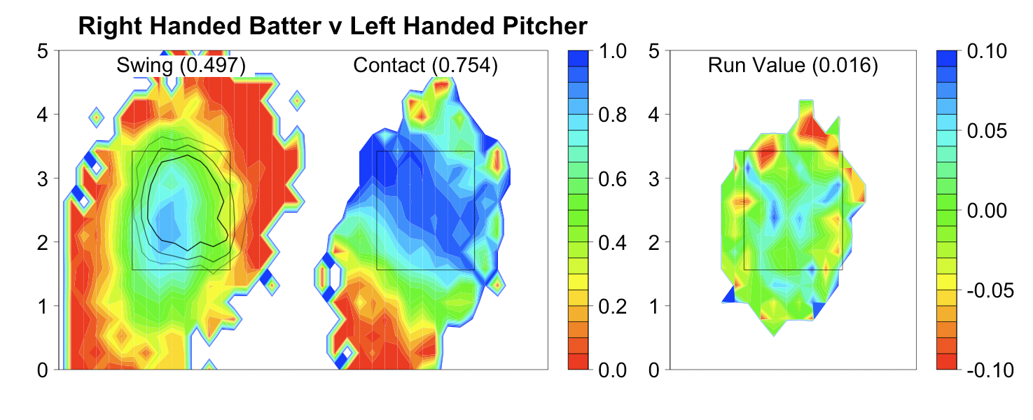
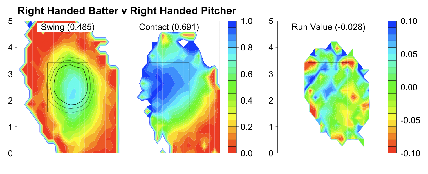
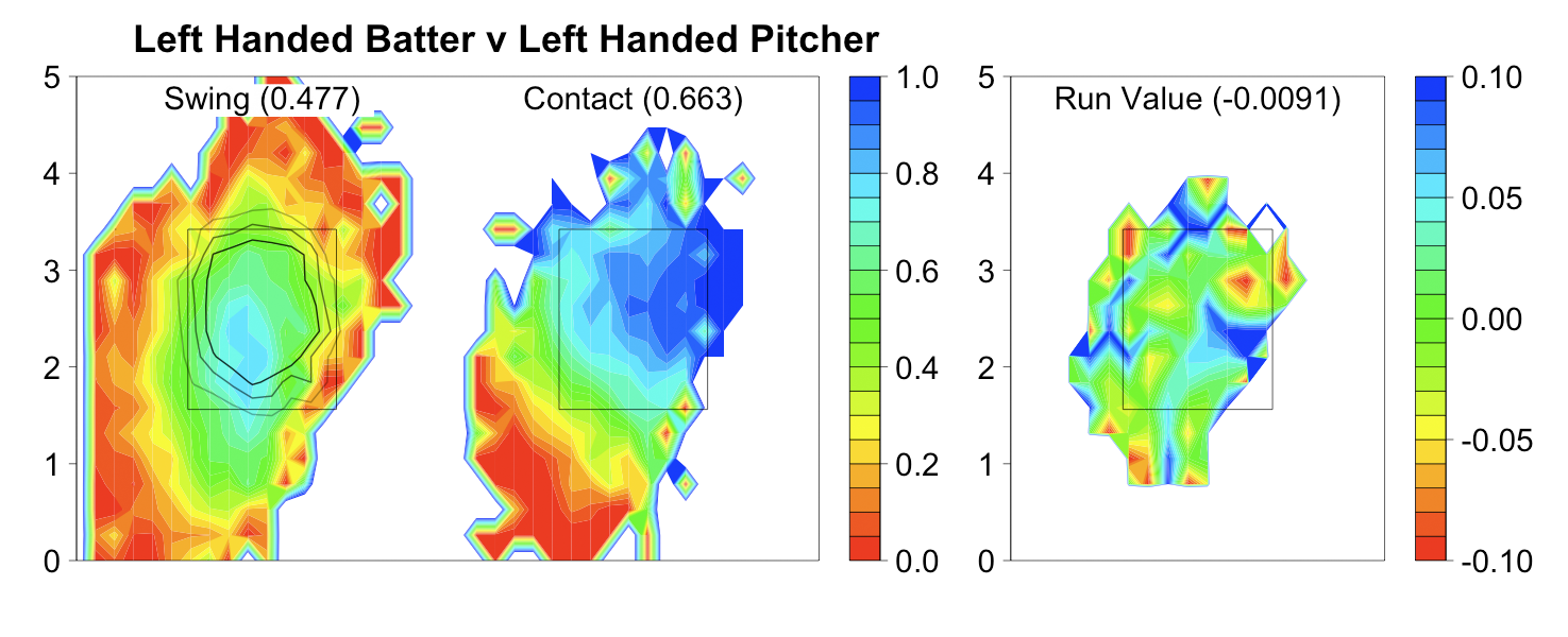
In same handed at-bats sliders are just nasty pitches. Batters swing at sliders slightly more often than fastballs (less than changeups and more than curves). But they are swinging at the wrong pitches, as the swing percentage map is considerably off from the strike zone (almost as bad as with curveballs). The whiff rate on sliders is enormous, considerably higher than any other pitch type. There is only a small part of the zone middle-in with a contact rate of over 85%. And then, even when batters make contact, the result has a negative run value.
.
Wrapping Up
We are now in a position to make some broad statements about what make the different pitch types successful.- Fastballs: With the exception of those directly above the strike zone, batters tend to swing at fastballs in the zone and take those out. They also whiff on fastballs at the lowest rate of any pitch. But contacted fastballs have very negative run values, the lowest of all pitches.
- Curveballs: Batters routinely take curveballs in the strike zone and swing at a high rate at curveballs below the strike zone. They whiff at a moderate rate. But when they make contact the run value is positive and higher than for all other pitches.
- Changeups: Batters tend to swing at changeups in the zone and take those out of the zone. But batters whiff against changeups at a moderate rate and contacted changeups have slightly negative run values.
- Sliders seem to have the best aspects of each pitch: the swing rate map is only slightly more coincident with the strike zone than that for curveballs, the whiff rate is higher than any other pitch, and contacted sliders have a negative run value (although not as low as contacted fastballs).
Below I present the overall run value per pitch separated by pitch type in a chart and figure. In the figure I indicate the standard errors.
 Run value per pitch
+------------+------------+------------+------------+------------+
| B/P hand   |  Fastballs | Curveballs |  Changeups |    Sliders |
+------------+------------+------------+------------+------------+
| RHB/RHP    |    -0.0032 |    -0.0009 |     0.0014 |    -0.0057 |
| RHB/LHP    |     0.0030 |     0.0031 |     0.0011 |     0.0056 |
| LHB/RHP    |     0.0034 |    -0.0008 |     0.0012 |     0.0013 |
| LHB/LHP    |    -0.0035 |     0.0005 |     0.0003 |    -0.0092 |
+------------+------------+------------+------------+------------+
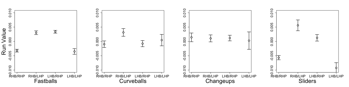
Fastballs and sliders show a statistically significant platoon split: there is a significantly lower run value outcome when the pitcher and batter have same handedness than when they have different. This makes sense with usage patterns for sliders, which are pitched more in at-bats when the batter and pitcher have the same handedness. You can also see here just how nasty sliders are to same handed batters, significantly lower than any other pitch.
Curveballs are interesting, there is no significant platoon split and there is a trend (although not significant) for curveballs from LHPs to have higher run value outcomes than curveballs from RHPs. This is strange as lefties throw curveballs more often than righties.
Changeups show no statistically significant platoon split. Which, again, is in line with what we expect based on their usage pattern. They are mostly thrown in opposite handed at-bats when fastballs or sliders would have a relatively higher run value.
This analysis has some serious limitations. I am using the MLB pitch classifications, which are far from perfect. There has been some work on developing better classification algorithms and I hope to incorporate one such algorithm in my future analysis. The pitches in this analysis are averaged over all pitch speeds and breaks, which is a major limitation. Just recently Dan Turkenkopf looked at how pitch speed impacted at-bat outcomes, and it would be interesting to see how pitch speed affects at-bat outcomes for each pitch type separately. Finally I average over all pitch counts. My next post will begin to address this last concern.
| F/X Visualizations | March 23, 2009 |
Deconstructing the Fastball Run Value Map
In a previous post I presented a map showing the run value of a fastball based on its location. In this post I will examine that map in more depth. Consider the two locations, A and B, in the figure below.
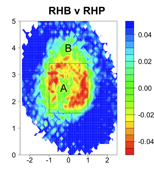
These locations have about the same run value, just below 0, but for different reasons. Taken pitches at location A are called strikes while taken pitches at location B are balls. In order for the two locations to have the same run value pitches swung at in location A must have, on average, higher run value outcomes than pitches swung at in B. Not brain-surgery so far, swinging at fastballs down the middle is better than swinging at fastballs a foot above the strike zone. We could try to intuitively guess at explaining the rest of the above pattern in a similar manner, but why try when we have the data to properly explain it. I will present that data in this post.
The run value of a pitch is determined by the outcome of four events.
- If the batter swings at the pitch or not.
- If no to 1, whether the taken pitch is called a ball or a strike.
- If yes to 1, whether the batter makes contact.
- If yes to 3, the run value of that contact.
Below I present a series of three images for each handedness combination that show how the outcomes of these four events vary by location for fastballs. Reading left to right:
- The first image addresses events 1 and 2. The heat map is the swing percentage by location to address 1. On top of that are three contour lines where 75%, 50% and 25% of taken pitches were called strikes to address 2. So if a batter took a pitch inside the smallest circle it was called a strike over 75% of the time. If he took a pitch in doughnut between the smallest and middle circles it was called a strike between 75% and 50% of the time, and so on.
- The second image addresses 3 showing the contact percentage of pitches swung at.
- The final image addresses 4 showing the run value of a contacted pitch (including foul balls).
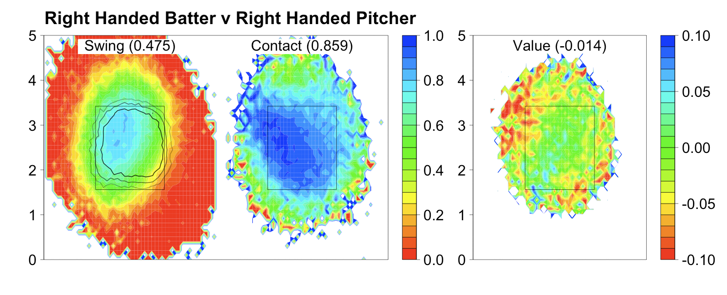
There is a lot going on in this series of images, and they might be intimidating at first. My suggestion is to focus on the leftmost image, spend sometime looking at it and once you understand it move on to the next. Do the same with the middle before moving on to the rightmost one.
With these images we can better explain the pattern in the overall fastball run value map. Consider location B in the first graph, the area of slightly negative run valued fastballs above the strike zone. Batters swing at pitches in this location over 50% of the time, make contact only around 70% of the time and the result of that contact is negatively valued. So the swung at pitches will have a quite low negative run value. The taken pitches are almost all called balls (this location is outside the largest strike contour) which have a very high positive run value. The result is the slightly negative value we see in the first image. Similar explanations can be made for any part of the run value map.
The region of highest swing percentage overlaps with the regions of highest contact percentage and run value of contacted pitches, and the 75% called strike contour, but is not entirely coincident with any of these. This means that hitters are not making entirely optimal swing decisions based on their ability to make contact, the value of that contact or how the strike zone is called.1
Contact percentage and run value of contacted pitches both reach their maximum slightly down and in from the center of the zone. But the overall regions of high contact percentage and run value of contacted pitches are not exactly the same. The region of high contact percentage is a diagonal swath from the top-in corner of the zone to the middle of the bottom of the zone. The region of high run value of contacted pitches is a diagonal swath from the bottom-in corner of the zone to the middle of the top of the zone.
Another interesting result is how the called strike zone compares to the rulebook strike zone. The inside and the top of the zone are called fairly well (the 50% contour runs along the rulebook zone on these edges), but the outside edge is shifted away a couple inches (the 75% contour runs along the rulebook zone's outside edge) and the bottom of the zone is shifted significantly up (the 25% contour is ABOVE the bottom edge). In addition, the strike zone is rounded rather than rectangular. These results are not new. John Walsh, David Pinto and Jonathan Hale have each shown all or some of these before, but it is nice to see that my analysis reproduces their results.
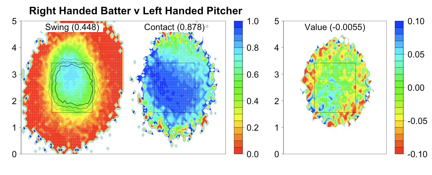
For the most part these are quite similar to the righty/righty images. One interesting thing we can address with these images is why RHBs do better against LHPs than RHPs. First, compare the location of the highest swing percentage relative to the strike contours in the RHB vs LHP and RHB vs RHP images. In the RHB vs LHP it is much more coincident along the horizontal axis, although it is still too high along the vertical axis . That means RHBs are swinging at more pitches in the called strike zone and taking more pitches outside the called strike zone against lefties than righties, which begins to explain their success. In addition, RHBs have a higher contact percentage and higher run value on contacted pitches versus LHPs compared to RHPs. So righties are better at each component of the at-bat against LHPs than RHPs.
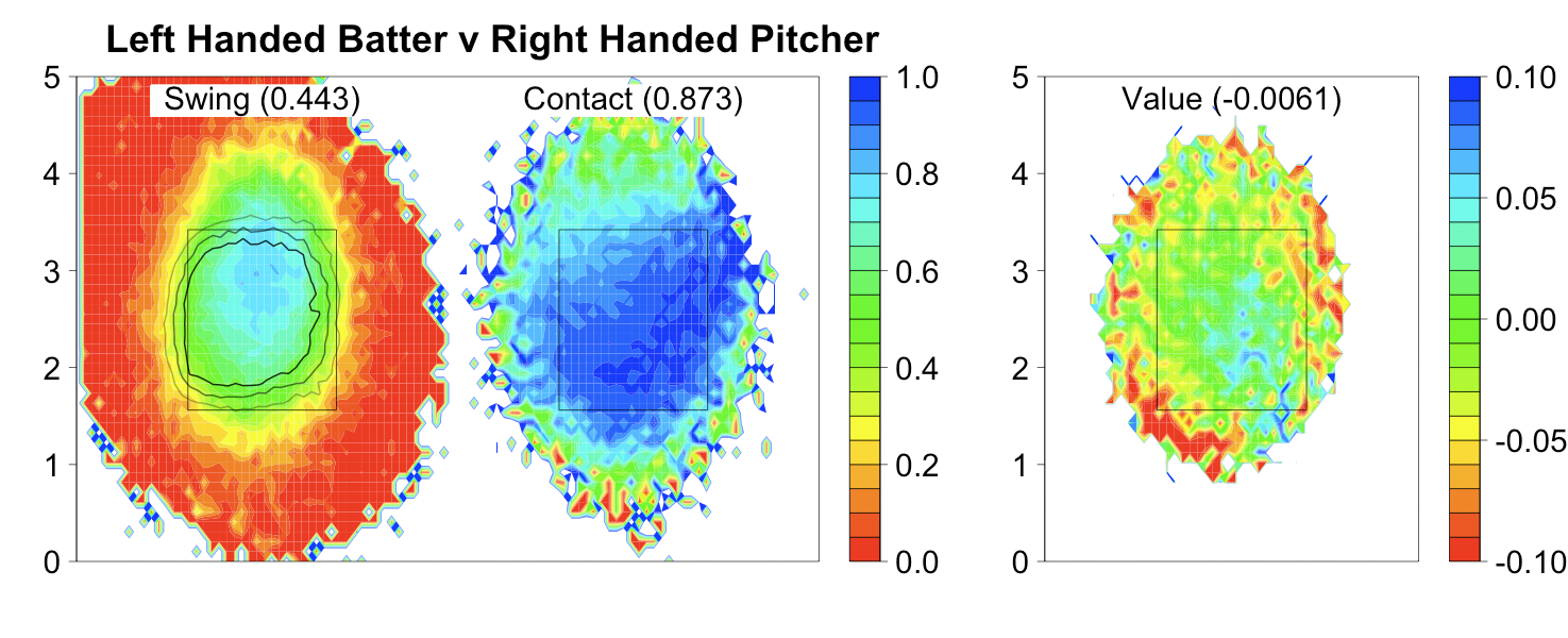
These are almost mirror images of RHB vs LHP above and the overall averages are very close. It is interesting to see how the strike zone is called differently to LHBs. The top is called well and the bottom is called very high just like to RHBs. The outside edge is shifted away as it is to RHBs, but that shift is larger with the 75% contour extending outside of the rulebook zone. The inside of the zone is also shifted outside a couple inches (the 25% contour runs along the rulebook edge), which was not the case to RHBs. Walsh and Pinto also observed these results.
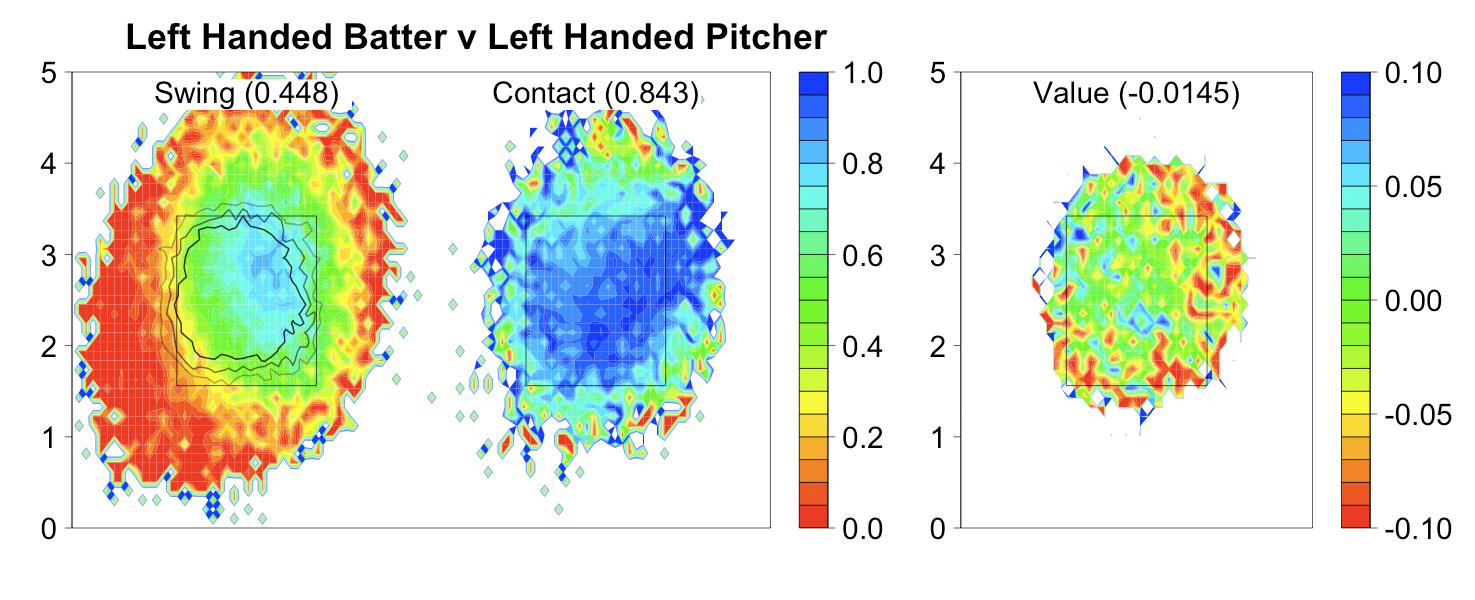
While LHBs' success against RHPs is very similar to RHBs' success against LHPs, LHBs fare much worse against LHPs than RHBs do against RHPs. Lefties swing at even more pitches outside the called zone, take more pitches inside the zone and make less and poorer contact against LHPs than RHBs do against RHPs.
Overall I was very surprised to see that in every case the average run value of a contacted fastball is negative. This is probably because I included foul balls in this group, but it is still surprising.
With these images one can understand the fastball run value maps in this post. Now if you go back, look at these maps and see something surprising, you can use the images presented here to understand what is going.
In future posts I will present similar images for the other pitch types.
1. Brian Cartwright made the following comment in this post:
One idea I never followed thru on is first identify hr% by location (and pitch type and count), as you have done here, then for each hitter (his favorite zones and pitches to go deep) then finally see how well each player recognizes the mashable pitches - what are the swing% for batters when they see a pitch in the best hitting zone? My opinion is that Barry Bonds and Brain Giles hit a high pct of homers because of superior pitch recognition, and putting the bat on the ball when they swung, not because of hitting the ball an extra-ordinary distance.This suggests an interesting way of evaluating batters: how well does their swing percentage map coincide with their home run rate map, contact percentage map or run value of contacted pitches map. It would be interesting to see if Giles' region of highest swing percentage is more inline with his region of highest run value than the average hitter, presented above.
| F/X Visualizations | March 17, 2009 |
Home Run Rate by Pitch Location
So far I have looked at the run value of a pitch based on its location as it passes the batter's plane. Today I am going to take a slightly prosaic break from that and look at everyone's favorite contributor to run value: the home run. Below are maps of HR rate per pitch by pitch location. Again I average over pitch type, count and speed, so there are some obvious limitations to the analysis. The number presented at the top of each figure is the average HR rate per pitch.


These figures confirm a number of assumptions:
- The highest home run rate is slightly in from the center of the strike zone.
- The extreme inside of the strike zone has a higher home run rate than the extreme outside.
- The home run rate is higher above the strike zone than it is below.
- The home run rate location is determined by the handedness of the batter and not the pitcher (the images are more similar going across a row than they are going down a column).
- There is a considerable area down-and-away within the strike zone that has a near-zero home run rate.
- There is a relatively large region in which the HR rate per pitch is over 2.5%, which seems high to me. For pitchers, this reinforces the importance of being able to locate a pitch in a corner of the zone.

Since the batter's handedness is more important than the pitcher's I averaged across the rows above to create just two maps, one for RHBs and one for LHBs. Over the composite map I plotted all the home runs for an individual hitter to see how he compares to his peers. Here are the HRs of everyone's favorite HR hitter, Jack Cust, plotted over the composite LHB map. Cust's home runs are, for the most part, where you expect for a left-handed batter: the highest density slightly in from the center of the zone, none in the down and away corner of the zone and more above the zone than below.

I made such images for a number of last year's top HR hitters and most resemble Cust's with the given player's HRs largely mapping to the regions of high home run rate in the composite map. But a handful of batters had quite different maps. Carlos Quentin's HRs are overwhelmingly away and down in the zone, and a large portion of the inside of the strike zone, where the average right handed batter has a high HR rate, is completely devoid of HRs. Since this is aggregated for all pitch types our insight is limited here. It will be interesting to see if players with HR maps very different from the composite map tend to also have a skewed distribution of which pitch types their HRs come from compared to average.
Here are two other batters I thought were particularly interesting. Alfonso Soriano is almost a caricature of a right-handed batter with his highest HR rate region even more down and in than expected. Carlos Pena, on the other hand, mashes outside pitching and the inside half of the zone has surprisingly few HRs. A possible explanation for this pattern could be that Pena just gets very few inside pitches because pitchers know he is a dangerous HR hitter. This shows one problem with my analysis. I am comparing the composite HR rate to a player's raw HRs not adjusted for the number of pitches a player sees in that region. I should be comparing that player's HR rate to the composite rate. For two reasons I did not do this: (1) I am having a hard time creating rate maps for individual players based on so few HRs and (2) even if I had such a map I cannot think of an effective way to overlay the two rate maps (individual player and composite) as nicely as I can overlay the actual HRs on the composite rate map. But it is something I am going to think about and work on in the future.


Oh and I have to assume the home run in Pena's map around (2,4.5) is a mistake.
| F/X Visualizations | March 16, 2009 |
Run Value by Pitch Type and Location
In my first post, I noted Tango and Lichtman's comment that run value by pitch location analysis was limited when averaged across pitch types and pitch counts. In this post, I will address the first concern by looking at the run value by pitch location of the different pitch types separately (but again averaging across count).
I split the data by handedness of the batter and the pitcher and then split this information into four different pitch types (based on the pitch fx classification). As in the first post, all images are from the catcher's perspective so that a right-handed batter stands to the left of the strike zone and a left-handed batter stands to the right of the strike zone. At the top of each image is the proportion of pitches between the given handedness combination made up of the given pitch type (out of the four pitch types considered). Counting just these four pitch types, 60.9% of pitches from a right-handed pitcher to a right-handed batter are fast balls.

Of the pitches considered, fast balls made up over 60% of pitches in each handedness combination. Thus, the overall run value maps in the first post are largely reflecting the run values for fast balls. But there are some small differences:
- In the overall maps, there was no region inside the strike zone with the deep blue >.04 run value. But, for fast balls, a bottom corner in each image has >.04 run value. I wonder if fast balls in this region of the strike zone are less likely to be called as strikes than other pitches.
- The region of negative to neutral run valued pitches directly above the center of the zone is even more pronounced for fastballs. The region of deep red <-.04 run valued pitches above the top of the strike zone is larger than the corresponding region in the overall map.
- The region of negative to neutral run valued pitches below the zone is much smaller than in the overall map and extends below just one side of the zone. The side to which it extends is determined by the pitcher's handedness not the batter's. In the overall map, this region extended below the entire strike zone not just one side.
- Fast balls are thrown in roughly the same proportion in all handedness combinations.
Changeups are overwhelmingly thrown when the pitcher is of the opposite handedness of the batter. Additionally, the few times when changeups are thrown when the pitcher and batter have the same handedness may be a highly non-random sample: pitchers with outstanding changeups and good pitcher's counts (this is just speculation). Because of this and the small data size we should not read too much into the same-handedness changeup maps.
- In opposite handedness at-bats the changeup has a large region of negative to neutral run valued pitches low and away extending far outside the strike zone.
Curves are thrown in relatively constant proportion in all handedness combinations, expect for leftie/leftie where they are thrown a little bit more.
- Compared to overall, the negative to neutral region for curves is much larger extending down and away predominately.
- With fewer curves thrown, it is hard to get as good resolution, but it seems that compared to other pitches there is less discernible structure within the strike zone (i.e. there are not as clear large regions of very low run value separated by large regions of larger run value).
Sliders are thrown more when the batter and pitcher have the same handedness (the opposite of changeups), thus the same caveats apply to reading too much into the opposite-handedness maps.
- A very large region of negative to neutral pitches extends below and away out of the strike zone.
- Sliders up and in have a higher run value compared to overall pitches up and in.
These separated by pitch type maps allow us to make some additional insights into the overall maps in the first post. The negative to neutral region above the strike zone is mostly the result of fastballs, while the negative to neutral region below the strike zone is mostly the result of non-fastball pitches. Within the strike zone, most pitches have the same overall structure with the center of the zone and down and in having the highest run value, although the pattern is not quite as apparent with curveballs.
| F/X Visualizations | March 16, 2009 |
Run Value by Pitch Location
[Editor's note: Dave Allen has agreed to join Baseball Analysts. He is a graduate student whose research involves analysis of spatial data and spatially explicit modeling. He also loves baseball. Dave will combine these two interests in the F/X Visualizations series.]
A lot of interesting new sabremeteric work has become possible over the past two years with the availability of the pitch fx data. In this new blog entry, I will continue this analysis and present the results in a simple, yet hopefully effective, visual manner.
This first post builds on work that Joe Sheehan did a year ago looking at the run value of each pitch based on its location. He placed each pitch into one of 25 bins and calculated the average run value in each bin. In the post he suggested that it would be interesting to get rid of the bins and take a continuous approach. A year later, it seems no one has accomplished that so I thought it would be a good way to launch my work.
Using the first table in this post, I assigned a run value to every pitch in the pitch fx database, not just pitches that ended an at-bat, and then averaged the run value of all the pitches in each location. I split the data up by handedness of the pitcher and batter. The number in parentheses is the average run value for all pitches regardless of location. The images are from the catcher's perspective so that a right-handed batter stands to the left of the strike zone and a left-handed batter stands to the right of the strike zone.

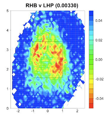

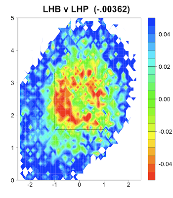
This method reproduces some of Sheehan's results:
- Pitches outside the strike zone have a higher run value than those inside the strike zone.
- Pitches down the middle of the zone have the highest run value of pitches in the strike zone.
- Inside pitches have higher run values than outside pitches.
- Pitches down and in have higher run values than those that are up and in.
This continuous approach also gives some additional insights beyond Sheehan's:
- Of outside pitches, those high in the zone have a slightly higher run value than those down in the zone. This is interesting as it seems hitters prefer inside pitches down in the zone and outside pitches up in the zone.
- The area of negative to zero to just slightly positive run value pitches (the red, yellow and green colored area) extends well beyond the defined strike zone.
- This zone of negative to zero valued pitches extends far above the strike zone peaking at x=0 over a foot above the top of the strike zone.
Tango and Lichtman made some important comments on the limitations of Sheehan's original work without splitting the data by swing/taken or pitch type. These critiques apply equally, if not more so, here because I did not split the data by count as Sheehan did.
I hope to address these points in future posts. For example, I assume the peak of negative to zero valued pitches a foot above the center of the zone is mostly the result of 'high heat' fastballs in pitcher's counts. By analyzing the run value of pitch locations for just fast balls in specific counts, I will be able to confirm or deny this assumption.