Rich Lederer • Baseball Beat
Patrick Sullivan • Change-Up
Jeremy Greenhouse • Touching Bases
Dave Allen • F/X Visualizations
Sky Andrecheck • Behind the Scoreboard
Marc Hulet • Around the Minors
Al Doyle • Past Times
Retired Uniforms:
Bryan Smith • WTNY
Joe Sheehan • Command Post
Jeff Albert • The Batter's Eye
RSS Feed
Home
*Examining the Past, Present, and Future*
Lineup Card
Recent Entries
» Putting Together a Reality Team
» Historical Hall of Fame Vote Comparisons: 2012
» An All-Christmas Team
» The New-Look Angels
» John Denny: The Forgotten Cy Young Award Winner
» Money Isn't Everything
» What Would It Take to Hit .400 in the 21st Century?
» Halos Heaven
» Brandon McCarthy's Breakout Season
» Link-o-Rama
» Historical Hall of Fame Vote Comparisons: 2012
» An All-Christmas Team
» The New-Look Angels
» John Denny: The Forgotten Cy Young Award Winner
» Money Isn't Everything
» What Would It Take to Hit .400 in the 21st Century?
» Halos Heaven
» Brandon McCarthy's Breakout Season
» Link-o-Rama
Best of Baseball Beat
Abstracts From the Abstracts
1977 Baseball Abstract
1978 Baseball Abstract
1979 Baseball Abstract
1980 Baseball Abstract
1981 Baseball Abstract
1982 Baseball Abstract
1983 Baseball Abstract
1984 Baseball Abstract
1985 Baseball Abstract
1986 Baseball Abstract
1987 Baseball Abstract
1988 Baseball Abstract
1978 Baseball Abstract
1979 Baseball Abstract
1980 Baseball Abstract
1981 Baseball Abstract
1982 Baseball Abstract
1983 Baseball Abstract
1984 Baseball Abstract
1985 Baseball Abstract
1986 Baseball Abstract
1987 Baseball Abstract
1988 Baseball Abstract
Bert Blyleven Series
Meeting Up and Hanging Out with Bert
The Results Are In And...
Aficionado Heavily Invested in Blyleven
Latest on Blyleven's Chances for the HOF
The Internet Zealot Responds
400 Down and 5 to Go...
Bert Be Home By Eleven?
Blyleven's Forgotten Season (1973)
HeyMan, Your Comments Don't Hold Water
The Waiting is the Hardest Part
Another Addition to the Blyleven Series
Search for the Truth
As Dominant as His HOF Contemporaries
Listen, Buster
A Larger Step for Blyleven
Answering the Naysayers (Part Two)
Another Small Step for Blyleven
Q&A: Blyleven on the Twins
The Majority Rules, Right?
It's All Dutch to Some
The Hall of Fame Case for Bert Blyleven
Q&A: Blyleven on Felix Hernandez
Clemens Rocketing Up Charts
Poz: An Interview With a KC Star
A HOF Chat with Tracy Ringolsby
Up Close and Personal
A Peek Into the Mind of a HOF Voter
Answering the Naysayers
It's That Time of the Year (Again)
"If Cooperstown is Calling..."
The Bert Alert
One Small Step for Blyleven...
Only the Lonely
Exclusive Interviews
Lee Sinins
Alex Belth
David Pinto
Will Carroll
Mike Carminati
Aaron Gleeman
Joe Sheehan
Jay Jaffe
Jeff Peek
Tracy Ringolsby
Joe Posnanski
Bill James Part I, II, III
Jon Lalonde
Chuck Tiffany
Dayn Perry
Fay Vincent
Nate Silver
Alex Belth
David Pinto
Will Carroll
Mike Carminati
Aaron Gleeman
Joe Sheehan
Jay Jaffe
Jeff Peek
Tracy Ringolsby
Joe Posnanski
Bill James Part I, II, III
Jon Lalonde
Chuck Tiffany
Dayn Perry
Fay Vincent
Nate Silver
Bullpen
Rich Lederer
The Odd Couple (with Alex Belth)
The MostUnder Over Underrated Player in Baseball (with Brian Gunn)
Three Wise Men (roundtable by Alex Belth)
Infrequently Asked Questions (interview with Matt Welch)
Interview (Orioles Think Tank)
Bernie and the Yanks (Bronx Banter)
Hope and Faith: How the LAA Win the World Series (Baseball Prospectus)
NL West (The Soul of Baseball)
Greatest Living Hitter? (Sports Illustrated)
Roundtable: 2008 HOF Ballot (Armchair GM)
The Most
Three Wise Men (roundtable by Alex Belth)
Infrequently Asked Questions (interview with Matt Welch)
Interview (Orioles Think Tank)
Bernie and the Yanks (Bronx Banter)
Hope and Faith: How the LAA Win the World Series (Baseball Prospectus)
NL West (The Soul of Baseball)
Greatest Living Hitter? (Sports Illustrated)
Roundtable: 2008 HOF Ballot (Armchair GM)
Patrick Sullivan
Designated Hitters
David Bromberg (Q&A: John Denny)
Mark Armour (H. Killebrew and Versatility)
Joe Lederer (Soundtrack of a Prospect)
David Bromberg (Clemente's Autograph)
David Bromberg (Woody Fryman)
D. Baumstein (WAR Against Age: Pitchers)
Doug Baumstein (The WAR Against Age)
Doug Baumstein (A Lifetime on the Road)
John Fraser (Pick Six)
Mark Armour (How to Score More Runs?)
Bill Parker (What Opening Day Tells Us)
Stan Opdyke (Pat Rispole)
Chris Jaffe (Evaluating Baseball's Mgrs)
Stan Opdyke (Baseball Radio in NYC, 1953)
A. Nathan (Performance of Baseball Bats)
Michael Weddell (Edgar Martinez/HOF)
Jon Weisman (100 Things Dodgers Fans...)
Stan Opdyke (Connie Mack and Vin Scully)
Eric Walker (Evaluating Run Production)
Brent Mayne (The Intangibles of Catching)
Chris Moore (Best Fastballs in Baseball)
Dave Baldwin (The Batter’s Brain)
Shawn Haviland (Ivy League to MLB)
Larry Granillo (Walking Off)
Rob Iracane (Solo HR Won't Break You)
Tommy Bennett (Charm of AM Radio)
Harry Pavlidis (Johan Santana's Fast Start)
John Walsh (WAR and Remembrance)
Eric Walker (Precisely Inaccurate)
Bob Timmermann (As They See 'Em)
Geoff Young (Unicycles and Delusions)
Baseball Analysis at Tufts (Groundballers)
Baseball Analysis at Tufts (GB Out Rates)
G. Rybarczyk ('09 Hit Tracker Projections)
Joe Lederer (Curt Schilling/HoF)
Conor Gallagher (Hall of Fallacies)
Chris Green (Jim Rice, HoF, the Numbers)
Shawn Hoffman (Baseball's Bear Mkt?)
Paul Anthony (Manny Syndrome)
Ross Roley (World Series Odds)
B. Timmermann (Catcher's Interference)
R.J. Anderson (Waiting the Hardest Part)
Maury Brown (Cubs, MLB, and Cuban...)
Myron Logan (Dee-Fense, Dee-Fense)
Craig Calcaterra (Frivolity, Part I, Part II)
Chad Finn (Ode to Baseball Cards)
David Cameron (Mariners Foibles)
Chris Dial (Chipper Jones)
Pat Lederer (Memory Lane)
David Appelman (Clutch Pitching)
Bob Rittner (DH)
Jonathan Mayo (Roger Clemens)
Lisa Winston (My Son-in-Law...)
Russ McQueen (The Yellow Hammer)
Bob Rittner (I'm OK, You're OK)
Mark Armour (In Defense of the HOF)
Pat Jordan (Friends)
Dan Levitt (Analysis of Terry Ryan)
Doug Baumstein (Trading Econ 101)
Ross Roley (Runner's Reluctance II)
Ross Roley (Runner's Reluctance I)
Mark Armour (No-Longer Lovable Sox)
Bruce Regal (Stealthy and Wise)
Brian Gunn (Roid Monster)
Current/McEvoy (Value of the SB)
John Rickert (Sinister Thefts)
Nate Silver (Sabermetrics)
David Vincent (Home Run Production)
Joe P. Sheehan (Enhanced Gameday II)
Mark Armour (An Ode to Sport)
David Gassko (All-Time Worm Burners)
Joe P. Sheehan (Enhanced Gameday)
John Walsh (When Titans Clash)
Fox/Williams (Quantifying Coaches II)
Fox/Williams (Quantifying Coaches I)
Jacob Luft (Bull Durham Rant)
Chad Finn (Strat-O-Matic)
Lisa Winston (Rotisserie Baseball)
Dave Studeman (Baseball Stats)
Steve Treder (Roger Craig)
Marc Normandin (Jeff Bagwell)
D. Appelman (Expanding Strike Zone)
Jeff Sackmann (Worst MiL Defenders)
Jeff Sackmann (Best MiL Defenders)
Maxwell Kates (Van Lingle Mungo)
David Appelman (Pitch Location)
Kent Bonham (Danny Ray Herrera)
Glenn Stout (Two Baseball Poems)
Bruce Regal (The Challenge Round)
Mark Lamster (Barry & Ty)
Geoff Young (NL West)
Tom Lederer (The Ryan Express)
Brian Erts (Great Leap Forward)
David Pinto (Parity and the N.L.)
Jacob Luft (Fathers and Daughters)
Jamey Newberg (Pete's Sake)
Jeff Albert (A. Jones Swing Analysis)
Jeff Albert (A-Rod Swing Analysis)
Keith Law (Death, Taxes, and Waivers)
Peter Abraham (Tales of Torre Tales)
Larry Borowsky (Let 'er Rip II)
Dan Levitt (Empirical Analysis of Bunting)
Jonah Keri (If I Met Warren Cromartie...)
Bob Klapisch (War Stories)
Bob Timmermann (John F. Kennedy HS)
Kent Bonham (Aluminum Adjustments)
Al Doyle (More Than Superstars)
Ross Roley (Instant Replay)
David Vincent (Barry Bonds Homers)
Chad Finn (Our Favorite Obscurities)
Bill Deane (1979 NL MVP)
Mark Armour (Rise/Fall of Artificial Turf)
Jeff Angus (Wally Moon Camp)
David Berri (Money and Baseball)
Larry Borowsky (Baseball w/o the #s)
Derek Zumsteg (The Irrational Market)
David Regan (Free Agent Contracts)
Peter Schmuck (Steroids and the HOF)
David Appelman (Pitchers, Pitch by Pitch)
Dan Fox (Swinging, Taking, Fouling, Etc)
Patrick Sullivan (Study of NYY CF/BOS LF)
Will Leitch (Baseball Journalism)
Jeff Sullivan (Pitcher Release Points)
Steve Treder ('69-'70 Giants)
Maury Brown (Charlie Finley)
John Brattain (Bob Johnson)
Bob Klapisch (The Case for Bert Blyleven)
Jeff Peek (Pride and Prejudice)
Dayn Perry (Bert and Warren)
Rob Neyer (If Don Sutton Was Great...)
Lisa Winston (Minor League Memories)
Alex Belth (Otis Redding Was Right)
David Cameron (Long Live the King)
Jeff Angus (Baserunning Study)
Bert Blyleven (Baseball Playoffs)
Boyd Nation (Not a Prospect List)
James Click (Batters-Baserunners Study)
Jeff Shaw (Why I Love Baseball)
David Gassko (BIP/BFP Fielding Study)
Jay Jaffe (Milwaukee Sausage Race)
Jamey Newberg (Remember When)
Bob Klapisch (Press Box to the Mound)
Dan Levitt (Predictive Value of BB)
David Vincent (Official Scorer)
Jon Weisman (Rick Monday)
Larry Borowsky (Let 'er Rip)
Will Carroll (Fictional Short Story)
Bob Timmermann (Japanese Baseball)
Cyril Morong (Best Pitching Seasons)
Sean Forman (Monte Carlo Win-Loss)
Brian Gunn (My Little Blue Book)
Joe Lederer (My Dad and Baseball)
Bill Deane (Bob Gibson, 1968)
Mark Armour (1977 Yankees)
Darren Viola (Retrosheet)
David Pinto (RFK)
Dayn Perry (Brave Heart)
Matt Welch (Dave Hansen)
Kevin Kernan (Jack McKeon)
Tom Lederer (Dodgers Road Trip)
Steve Lombardi (Slider)
Studes (Picturing Baseball)
Mike Carminati (Luck of the Drawl)
Eric Neel (Vin Scully)
J.C. Bradbury (Leo Mazzone)
John Sickels (Bill James)
Search Baseball Analysts
Archives
By Category:
Around the Majors Content Only
Around the Minors Content Only
Baseball Beat Content Only
Baseball Beat/Change-Up Content Only
Baseball Beat/WTNY Content Only
Behind the Scoreboard Content Only
Change-Up Content Only
Change-Up/Around the Majors Content Only
Command Post Content Only
Crunching the Numbers Content Only
Designated Hitter Content Only
F/X Visualizations Content Only
Past Times Content Only
Saber Talk Content Only
The Batter's Eye Content Only
Touching Bases Content Only
Weekend Blog Content Only
WTNY Content Only
By Month:
February 2012
January 2012
December 2011
October 2011
September 2011
August 2011
July 2011
June 2011
May 2011
April 2011
March 2011
February 2011
January 2011
December 2010
November 2010
October 2010
September 2010
August 2010
July 2010
June 2010
May 2010
April 2010
March 2010
February 2010
January 2010
December 2009
November 2009
October 2009
September 2009
August 2009
July 2009
June 2009
May 2009
April 2009
March 2009
February 2009
January 2009
December 2008
November 2008
October 2008
September 2008
August 2008
July 2008
June 2008
May 2008
April 2008
March 2008
February 2008
January 2008
December 2007
November 2007
October 2007
September 2007
August 2007
July 2007
June 2007
May 2007
April 2007
March 2007
February 2007
January 2007
December 2006
November 2006
October 2006
September 2006
August 2006
July 2006
June 2006
May 2006
April 2006
March 2006
February 2006
January 2006
December 2005
November 2005
October 2005
September 2005
August 2005
July 2005
June 2005
May 2005
April 2005
March 2005
February 2005
January 2005
December 2004
November 2004
October 2004
September 2004
August 2004
July 2004
June 2004
May 2004
April 2004
March 2004
February 2004
January 2004
December 2003
November 2003
October 2003
September 2003
August 2003
July 2003
June 2003
Reference
Organizational Stats
Arizona Diamondbacks Bat / Pitch
Atlanta Braves Bat / Pitch
Baltimore Orioles Bat / Pitch
Boston Red Sox Bat / Pitch
Chicago Cubs Bat / Pitch
Chicago White Sox Bat / Pitch
Cincinnati Reds Bat / Pitch
Cleveland Indians Bat / Pitch
Colorado Rockies Bat / Pitch
Detroit Tigers Bat / Pitch
Florida Marlins Bat / Pitch
Houston Astros Bat / Pitch
Kansas City Royals Bat / Pitch
Los Angeles Angels Bat / Pitch
Los Angeles Dodgers Bat / Pitch
Milwaukee Brewers Bat / Pitch
Minnesota Twins Bat / Pitch
New York Mets Bat / Pitch
New York Yankees Bat / Pitch
Oakland Athletics Bat / Pitch
Philadelphia Phillies Bat / Pitch
Pittsburgh Pirates Bat / Pitch
St. Louis Cardinals Bat / Pitch
San Diego Padres Bat / Pitch
San Francisco Giants Bat / Pitch
Seattle Mariners Bat / Pitch
Tampa Bay Devil Rays Bat / Pitch
Texas Rangers Bat / Pitch
Toronto Blue Jays Bat / Pitch
Washington Nationals Bat / Pitch
All-Star Links
Official Websites
News and Notes
Baseball News Blog
Baseball Newstand
ESPN Baseball
Fox Sports Baseball
Pro Sports Daily
Roto World
The Roto Times
USA Today Baseball
Baseball Newstand
ESPN Baseball
Fox Sports Baseball
Pro Sports Daily
Roto World
The Roto Times
USA Today Baseball
Reference and Analysis
Baseball Almanac
Baseball America
Baseball Archive
Baseball Contracts
Baseball Cube
Baseball Graphs
Baseball Library
Baseball Musings Player Database
Baseball Page
Baseball Primer
Baseball Prospectus
Baseball Reference
Baseball Statistics
Baseball Truth
Boxscore Central
Diamond Mind Baseball
Doug's Stats
FanGraphs
Fast Balls (pitchfx catalog)
Hardball Dollars
Hardball Times
Hit Tracker
Retrosheet
Rotobase/Rotoblog
Stat Corner
STATS
Tango on Baseball
Yahoo Sports MLB
Web Gems
Bill James Primer
Sabermetric Manifesto (Grabiner)
Pitching and Defense (McCracken)
Pitching and Defense (Tippett)
Transactions Primer (Neyer)
Baseball Stats (Batter's Box)
Prospect Report (Cameron)
Pitcher Workloads (Sheehan)
Goodbye to Old Baseball Ideas (Rickey)
Sabermetric Manifesto (Grabiner)
Pitching and Defense (McCracken)
Pitching and Defense (Tippett)
Transactions Primer (Neyer)
Baseball Stats (Batter's Box)
Prospect Report (Cameron)
Pitcher Workloads (Sheehan)
Goodbye to Old Baseball Ideas (Rickey)
Columnists
Baseball Blogs
Around the Majors
Athletics Nation
Baseball Crank
Baseball Musings
Baseball-Reference Blog
Batter's Box
Big League Stew
Bronx Banter
Catfish Stew
Cub Town
Dan Agonistes
Dodger Thoughts
DRays Bay
Ducksnorts
Futility Infielder
Halos Heaven
Inside the Rockies
It Might Be Dangerous
Knuckle Curve
LoHud Yankees Blog
Lookout Landing
Management by Baseball
Metaforian
Metsgeek
Mike's Baseball Rants
Only Baseball Matters
Redbird Nation
Red Reporter
Sabernomics (Braves)
Seth Speaks
ShysterBall
6-4-2 (Angels/Dodgers)
The Book
TheCubdom
The Cutting Edge
The House That Dewey Built
The View From The Bleachers
Tiger Blog
U.S.S. Mariner
Viva El Birdos
Where's Kernan
Minor Leagues
Arizona Fall League
BA Player Finder
Cal Leaguers
Jamey Newberg
JDM's Scoresheet Baseball
Minor League Baseball
Minor League Park Factors
Minor League Splits
No Pepper
Sickels' Minor League Ball
Warm October Nights
BA Player Finder
Cal Leaguers
Jamey Newberg
JDM's Scoresheet Baseball
Minor League Baseball
Minor League Park Factors
Minor League Splits
No Pepper
Sickels' Minor League Ball
Warm October Nights
Amateur
Boyd's World (College)
Cape Cod Baseball League
College Baseball Blog
College Baseball Insider
Collegiate Baseball Newspaper
College Splits
College Splits Blog
Dirtbags Baseball (Long Beach State)
NCAA Baseball
NCBWA
Team One Baseball (High School)
Texas A&M & Baseball
Cape Cod Baseball League
College Baseball Blog
College Baseball Insider
Collegiate Baseball Newspaper
College Splits
College Splits Blog
Dirtbags Baseball (Long Beach State)
NCAA Baseball
NCBWA
Team One Baseball (High School)
Texas A&M & Baseball
Historical
Cuban Baseball
House of David
Jim "Mudcat" Grant's Web Page
Negro League Baseball Players Assoc
Negro Leagues Baseball Museum
1919 Black Sox
Pacific Coast League
Philadelphia Athletics Historical Society
Shoeless Joe Jackson Society
SABR-L Archives
Walter O'Malley
House of David
Jim "Mudcat" Grant's Web Page
Negro League Baseball Players Assoc
Negro Leagues Baseball Museum
1919 Black Sox
Pacific Coast League
Philadelphia Athletics Historical Society
Shoeless Joe Jackson Society
SABR-L Archives
Walter O'Malley
Miscellaneous
Forums
Credits
Ticket Center
Tickets to Baseball -
Premium Red Sox Tickets - Tickets to Marlins Games - Cardinals Game Tickets - NY Yankee Tickets - Tickets Oakland Athletics - Dallas Cowboys Tickets - Arizona Cardinals Tickets - Tickets Seattle Seahawks - Buffalo Bills Tickets Online - Tickets to Dolphins Football
Buy Boston Red Sox tickets,
Philadelphia Phillies tix,
NY Yankees tickets,
NY Mets tickets, and
MLB All Star game tickets at ABC tickets
Not sure where to find the best online sportsbooks? Start your search with PlayersJet.
Get deals at SportsMemorabilia.com on baseball apparel, including Phillies jerseys and more for adults and children.
Shop the largest selection baseball equipment on sale at Sports Unlimited. Check out tons of baseball gloves, youth baseball gloves and catchers gear from Rawlings, Wilson, Nike & Under Armour.
2011 Draft Order
Courtesy of Baseball America
First-Round:
 1. Pirates (57-105)
 2. Mariners (61-101)
 3. Diamondbacks (65-97)
 4. Orioles (66-96)
 5. Royals (67-95)
 6. Nationals (69-93)
 7. Diamondbacks (for B. Loux)
 8. Indians (69-93)
 9. Cubs (75-87)
10. Padres (for Karsten Whitson)
11. Astros (76-86)
12. Brewers (77-85)
13. Mets (79-83)
14. Marlins (80-82)
15. Brewers (for Dylan Covey)
16. Dodgers (80-82)
17. Angels (80-82)
18. Athletics (81-81)
19. Red Sox (from DET for Martinez)
20. Rockies (83-79)
21. Blue Jays (85-77)
22. Cardinals (86-76)
23. Nationals (from CWS for Dunn)
24. Rays (from BOS for Crawford)
25. Padres (90-72)
26. Red Sox (from TEX for Beltre)
27. Reds (91-71)
28. Braves (91-71)
29. Giants (92-70)
30. Twins (94-68)
31. Rays (from NYY for Soriano)
32. Rays (96-66)
33. Rangers (from PHI for Lee)
Supplemental First Round:
34. Nationals (Dunn)
35. Blue Jays (Downs)
36. Red Sox (Martinez)
37. Rangers (Lee)
38. Rays (Crawford)
39. Phillies (Werth)
40. Red Sox (Beltre)
41. Rays (Soriano)
42. Rays (Balfour)
43. Diamondbacks (LaRoche)
44. Mets (Feliciano)
45. Rockies (Dotel)
46. Blue Jays (Buck)
47. White Sox (Putz)
48. Padres (Garland)
49. Giants (Uribe)
50. Twins (Hudson)
51. Yankees (Vazquez)
52. Rays (Benoit)
53. Blue Jays (Olivo)
54. Padres (Torrealba)
55. Twins (Crain)
56. Rays (Choate)
57. Blue Jays (Gregg)
58. Padres (Correia)
59. Rays (Hawpe)
| Behind the Scoreboard | November 30, 2009 |
WAR, Salary, and Service: Estimating Dollars Per Win
The Hot Stove League is in full swing, and what better way to dig in than by estimating player salaries. In this post I'll attempt to find a simple relationship between salaries, Wins Above Replacement (WAR), and years of service. In particular, how much of a pay cut do those in arbitration or under team control make compared to those eligible for free agency?
The WAR data is from Sean Smith, and the salary data comes from the Sean Lahman database. Data on service years is scarce, so I estimated years of service based on playing time - it's not perfect but it will do for now - I crossed checked it with actual service time for 2007 players and my method of estimating service wasn't too terrible (130 PA, 20 games pitched, or 50 inning pitched equaled one year of service). I divided the service time into three groups - those with less than three years of service, who presumably are held under team control. Those with 3-5 years of service, who are arbitration eligible, and those with 6 or more years of service, who are eligible for free agency.
There are two ways to examine the relationship between WAR and salary. One is to estimate the salary of the player based upon the player's WAR. Another way is to estimate the player's WAR based upon the salary.
Predicting Salary from Performance
Let's go with the first approach first. My independent variable is player salary and I want to estimate it by WAR, service category, and year. Lahman's salary data goes back to 1985, but for now I'll look at just 2008.
As others have found, the relationship between salary and WAR is linear. The model I estimated can be boiled down to three equations - one for each level of service . Here I'll present the results for 2008:
When under team control: Salary = .51 + WAR*.001
When Arb eligible: Salary = 2.26 + WAR*.31
When FA eligible: Salary = 5.53 + WAR*1.23
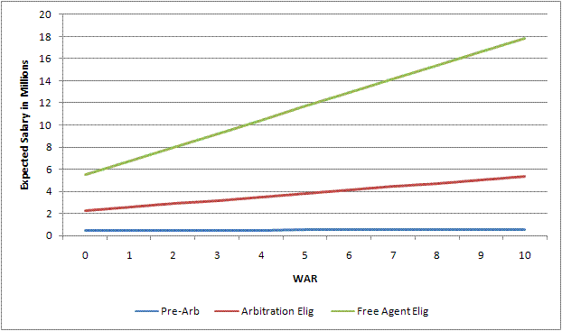
The $500,000 salary of pre-arbitration players seems reasonable. Not surprisingly, the players' actual contribution to the team is of very slight importance. Basically these players get close to the minimum for their efforts no matter what.
However, when looking at the free agent eligible players, things get interesting. According to the formula, a player producing absolutely nothing for the team is due to be paid $5.5 million. What team in their right mind would do that? Well, none of course, but plenty of teams DO pay a lot of money for no production. In fact, there's probably a do-nothing overpaid free agent sitting on your favorite team's bench right now. Chances are that if a team has a 0 WAR producing free agent, he'll be making over $5 million. Bad signings, injuries, bad luck, and a host of other problems can often cause a worthless free agent to be paid a lot of money.
High producing free agents do make more, of course, but not way more - $1.3 million per win. While a worthless free agent would be expected to make $5 million, a free agent player producing an MVP-type season of 6 WAR is expected to have pulled in $13.4 million.
Arbitration-eligible players fall in the middle as you might expect, with 0 WAR players making an expected $2.3 million, and players with great seasons making $4.1 million. What's the relationship between arbitration-eligible players and free agent-eligible players? It appears from the data that low-value free agents make about double the amount of low-value arbitration eligibles ($5.5 mil vs. $2.3 mil). However, as the player increases his performance, the gap widens. For a 5-WAR season, the free agent will make three times as much as the arbitration eligible player ($11.7 mil vs. $3.8 mil). Meanwhile, non-arb eligible players earn the same no matter what. As one might expect, the better the player, the greater the benefit of being a free agent.
How does this compare to the results from years past? Just for fun, here are the formulas from 1990:
When under team control: Salary = .14 + WAR*.02
When Arb eligible: Salary = .51 + WAR*.09
When FA eligible: Salary = .95 + WAR*.10
Obviously, these salaries are much lower than salaries of today. What's interesting is that the high WAR players did not make much more than low WAR players, even for free agents. In 1990, a 6 WAR player would be expected to make 64% more than a 0 WAR free agent. However, in 2008, a high WAR player would make 144% more than a 0 WAR free agent. Perhaps this is a sign that teams are getting more for their money, or a sign of some other change in the market. Perhaps I will explore this relationship over time in a later post.
Predicting Performance from Salary
While predicting salary from performance is interesting, perhaps more relevant is predicting performance from salary. A player's salary is determined before the player performs, so it makes more sense to analyze it this way. It's also useful to ask, "if we spend $10 million on a free agent, how many wins should we expect?"
We can answer this question using the same sets of models, with Salary and WAR swapped in the equations. In 2008, the numbers were:
When under team control: WAR = .84 + Salary*.002
When Arb eligible: WAR = .62 + Salary*.21
When FA eligible: WAR = 0 + Salary*.16
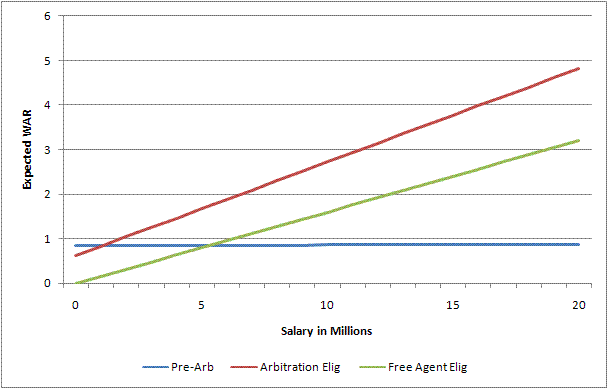
As expected the numbers are vastly different for each of the three categories. For those under team control, the player's salary basically has no correlation with the number of wins he is expected to produce - everybody is getting paid the same, good, bad, or ugly - hence the flat curve. For those arbitration eligible, a player getting paid the league minimum will be expected to produce 0.7 WAR, while producing .21 WAR for every million dollars after that. A star arbitration eligible player making $7 million will be expected to produce 2.1 WAR. In general, as the graph shows, teams get more value from high-priced arbitration eligible players than from high-priced free agents.
For free agents, the link between salary and performance is more tenuous. Those making the league minimum will be expected to produce 0.1 WAR. For every million dollars paid out after that, the average player will return .16 WAR. This means that a $10 million free agent will be likely to produce just 1.6 WAR. There are a lot of overpaid free agents out there.
The data show that on the open market, teams will have to pay about $6 million for an expected return of one win. This $6 million figure is a bit more than the $4.5 million that is commonly used as the dollar per win ratio. The Fangraphs method differs from mine in that it calculates the expected win value based upon an estimate of "true performance level," and then compares that to the amount that players are actually signing for on the free agent market. In contrast, my method compares salary to WAR in a particular year for all players, regardless of when a player was signed or what his true talent really is. Since there is more noise in a player's actual yearly WAR than in a player's true talent estimate, WAR and salary will have a lower correlation - hence the higher cost to gain an expected win.
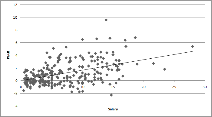
In 2008, Albert Pujols made a salary of $13.9 million and contributed a league best 9.6 WAR. A free agent eligible player making $13.9 million would have been expected to contribute 2.3 wins. The fact that Pujols actually contributed 9.6 wins means that he gave the Cardinals 7.3 wins more than they bargained for, making him the league's best value. To get an expected return of 9.6 WAR on the free agent market, a team would have to pay $59 million - making Pujols a huge bargain. While $59 million seems like a lot, think of all of the Jason Schmidt's and Andruw Jones' that might have been bought instead with no value to the team.
From Pujols' perspective however, he didn't make all that much less than expected. An average 9.6 WAR producer would have been expected to make $17.3 million compared to $13.9 million. Why the major discrepancy in Pujols' dollar value? The reason is the regression effect of course. Since dollars and wins are only loosely related, both will regress to the mean quite strongly. For teams, it means that you have to pay a lot to get a little. For players, it means that a season of great performance doesn't earn too much more than a season of mediocre performance.
As fans, we're probably more apt to care about how many wins can be squeezed out of dollars rather than the other way around, making the first formulation (where Pujols is worth $59 million) more apt. Since teams would have to spend $59 million to get an average return of 9.6 wins, this would have been a fair price had Pujols' value been guaranteed in advance to provide 9.6 wins.
In the next week or two, I'll be exploring this relationship a bit more in depth. However, this simple formulation does provide some insight on just how much teams are paying for marginal wins.
Update: I've had a few requests to see the data points plotted, so here they are for free agent eligibles in 2008. The data looks linear to me, and although the variance of the errors does get a little larger as salary increases, it doesn't seem like a major problem.
| Baseball Beat | November 30, 2009 |
The Best Baseball Analysts in the Country
The Baseball Analysts, which Bryan Smith and I co-founded in early 2005, is fast approaching its five-year anniversary. The new site was the result of a merger between Bryan's Wait 'Til Next Year and my Baseball Beat, whose origins go back to the spring of 2003.
Over the ensuing years, Baseball Analysts has witnessed Bryan's departure in 2006, followed by the additions of Jeff Albert that fall; Patrick Sullivan, Marc Hulet, and Joe P. Sheehan the following spring; and Jeremy Greenhouse, Dave Allen, and Sky Andrecheck during spring training 2009. Albert, Sullivan, Sheehan, and Greenhouse all debuted as guest columnists and their Designated Hitter articles earned them permanent spots in our starting lineup.
We eventually lost Albert and Sheehan to Major League Baseball. Albert was hired by the St. Louis Cardinals before the 2008 season to serve as the hitting instructor for the Batavia Muckdogs, its Short-Season Class A affiliate in the New York-Penn League. He was promoted to the Palm Beach Cardinals, the club's High-A affiliate in the Florida State League, prior to last season. Earlier this month, the Redbirds announced that Albert will be one of three minor-league hitting coaches returning to their positions for the 2010 campaign.
Sheehan received an internship with the San Diego Padres in 2008 and joined Dan Fox, a former writer for The Hardball Times and Baseball Prospectus, with the Pittsburgh Pirates at the conclusion of that season. Fox, who wrote a few guest columns for Baseball Analysts, is the Director of Baseball Systems Development and the architect of the team's Managing, Information, Tools and Talent (MITT) system.
Along these same lines, I'm proud to report that Sky Andrecheck, in addition to filling his normal Tuesday spot at Baseball Analysts, will be writing a weekly column during the offseason for SI.com. His first two Behind the Scoreboard articles can be accessed here. It says here that the sky is the limit for the statistician by day and baseball analyst and writer by night.
Andrecheck was also chosen by Dave Studenmund to serve as a guest writer for The Hardball Times Baseball Annual 2010. Sky wrote a piece on Championship Leverage Index. He introduced the concept last March in his second contribution at Baseball Analysts. Sky gives credit to Tom Tango for pioneering the concept of Leverage Index, which "puts a value on the importance of each moment in the game." Championship Leverage Index "takes the same idea and applies it in the context of an entire season. Like its in-game cousin, Champ LI quantifies each team's games in terms of the impact they are likely to have on winning a championship." Later in the article, he says Champ LI "essentially measures the probability that the outcome of one game will decide a playoff berth."
Dave Allen was also asked to write an article for THT Baseball Annual, which began shipping in the middle of November. Allen, who has contributed a weekly column for Baseball Analysts since last March and can also be found at Fangraphs, is one of the small number of PITCHf/x specialists. The title of his article is "Where Was That Pitch?" As with all of Dave's excellent studies, this piece is filled with graphs detailing the run values of two- and four-seam fastballs, curveballs, sliders, and changeups by pitch location.
The lowest run value is generally on pitches up and in, as these pitches have a low slugging rate on balls in play (many infield flies) and on pitches down-and-away, which have a low slugging average on balls in play (many ground balls) and a low contact rate. Pitches up-and-away and down-and-in tend to have intermediate run values and vary by pitch type.
Allen references five of his articles at Baseball Analysts and cites our own Joe Sheehan, one of the original PITCHf/x experts; Jeremy Greenhouse, who Mitchel Lichtman (also known as MGL) recently touted as a future front-office employee; and Chris Moore, author of the Best Fastballs in Baseball.
As an owner and connoisseur of the entire run of The Bill James Baseball Abstracts (1977-1988), I can tell you that The Hardball Times Baseball Annual is in that same league of annual baseball publications. You can trust its cover when it promises "timeless commentary, innovative stats, and great baseball writing."
James, in fact, is one of the contributors. He is the author of "Strong Seasons Leading Index," a system that seeks to produce "a list of the players who are most likely—and most unlikely—to sustain or improve on their 2009 seasons." Among players with 400 or more plate appearances last season, Dioner Navarro, Chris Young, and J.J. Hardy score the highest and Jorge Posada, Matt Diaz, and Craig Counsell the lowest. You might want to check out the full list when preparing for your fantasy baseball draft this winter.
Other guest columnists include Craig Wright, John Dewan, Tom Tango, Sean Smith, and Greg Rybarczyk. These highly regarded sabermetricians are joined by the stable of writers at The Hardball Times, including past Designated Hitters at Baseball Analysts Rybarczyk, Craig Calcaterra, David Gassko, Jeff Sackman, Dave Studenmund, Steve Treder, John Walsh, and Geoff Young.
For those readers who have purchased THT Baseball Annual in the past, this is a reminder that you need to get your order in now. For everyone else, I am confident that you will not be disappointed if you pick up a copy for the first time. You can help out the site and many of the best baseball analysts in the country by purchasing the book directly through this link. The small premium involved is a way of saying thanks for all the free stats, information, education, and entertainment you receive at The Hardball Times throughout the year.
| Change-Up | November 29, 2009 |
Bob Ryan & the Burgeoning Boston Chapter of the Alex Gonzalez Fan Club
Bob Ryan took to the pages of the Boston Globe yesterday to list Alex Gonzalez's departure for Toronto as the latest in a series of shortstop mishandlings by Red Sox General Manager Theo Epstein. The logic seems to go something like this: Gonzalez suits my eye when I watch him field a baseball. He even hits a little bit. Theo has no credibility on shortstops. Therefore Gonzalez should have been retained.
But let's be perfectly clear on Alex Gonzalez. He's one of the very worst hitters in Major League Baseball and has been for a number of years running. He's now 33 years-old, and while his solid glove has made him as good as an average player or so in his best seasons, there is no reason for a championship-aspirant club to simply hand such a mediocrity the role. Not with Jed Lowrie in the fold, and not with Marco Scutaro very much available. Here's the class of hitter Gonzalez finds himself in, presented in a table of the worst hitters since 2005 as measured by OPS+ (min 1700 PA's):
| Rk | Player | OPS+ | BA | OBP | SLG |
|---|---|---|---|---|---|
| 1 | Adam Everett | 64 | .239 | .287 | .344 |
| 2 | Cesar Izturis | 64 | .257 | .304 | .319 |
| 3 | Brad Ausmus | 67 | .241 | .323 | .313 |
| 4 | Willy Taveras | 68 | .276 | .321 | .328 |
| 5 | Corey Patterson | 69 | .241 | .277 | .378 |
| 6 | Aaron Miles | 73 | .278 | .319 | .351 |
| 7 | Nick Punto | 74 | .249 | .324 | .327 |
| 8 | Omar Vizquel | 74 | .265 | .328 | .341 |
| 9 | Jason Kendall | 76 | .261 | .336 | .321 |
| 10 | Clint Barmes | 77 | .256 | .298 | .414 |
| 11 | Bobby Crosby | 78 | .239 | .302 | .366 |
| 12 | Dioner Navarro | 78 | .252 | .312 | .363 |
| 13 | Geoff Blum | 80 | .244 | .303 | .373 |
| 14 | Pedro Feliz | 81 | .252 | .295 | .412 |
| 15 | Alex Gonzalez | 81 | .258 | .306 | .396 |
| 16 | Yadier Molina | 81 | .269 | .327 | .365 |
| 17 | Brian Schneider | 81 | .250 | .325 | .356 |
But in fairness to Gonzalez, we should incorporate fielding into our analysis, something we can easily do thanks to Fangraphs' Wins Above Replacement (WAR) statistic. For a direct comparison to Scutaro, consider that in Gonzalez's two best seasons were 2.8 and 2.5 in 2003 and 2007 respectively. On the other hand, Scutaro, in his first two seasons as a full-timer in 2008 and 2009, averaged 3.6 Wins. Even if Scutaro should sign with Seattle or Texas or the Dodgers, Sean Smith projects Lowrie at .249/.334/.385 to Gonzalez's .249/.291/.374. Like Gonzalez, Lowrie has held up quite well with the glove at shortstop.
I feel for Bob Ryan and his loyal followers that they will have to wait for Gonzalez's number retirement ceremony to welcome their hero back to Fenway. But in the meantime, trust me, the Red Sox will be just fine without Alex Gonzalez.
| Change-Up | November 28, 2009 |
The Cubs and the Virtues of Inaction
Coming off consecutive NL Central crowns, 97 wins in 2008, and with bigtime acquisitions like Rich Harden and Milton Bradley set to be in the fold for a full season, Chicago Cubs fans had every reason to believe that the 2009 edition of their club could finally end their century-old title drought. Then the Cardinals started hot, the Cubs suffered some injuries, good players did not play to their potential and before long, it was evident that 2009 was going to be anything but the Cubs' year.
Human nature compels us to identify and address problems. It also compels us to shield ourselves from external criticism. Action, therefore, trumps inaction. "Do something" and fail, heck, at least you tried. As the Cubs look to rebound from their disappointing 2009, the boys in the buffet line smell blood. Milton Bradley must go, say the mainstream baseball commentariat. "He's too volatile." "They need to just release him." But you know how the old saying goes, "If you're taking your player personnel cues from Jon Heyman, Jay Mariotti and Phil Rogers, you've already forfeited any hope for 85 wins." Or something like that.
Barring exceptional opportunities in the trade or free agent markets and outside of some run-of-the-mill year-to-year tinkering, Cubs GM Jim Hendry should more or less stand pat this off-season. He returns a top-notch pitching staff, and has a stable of bats ready to bounce back from down years. Let's look at the Cubs hitting in 2009 and compare it to how Sean Smith's CHONE projection system sees them in 2010. If you are skeptical of such improvement up and down the lineup, remember the unit that could only muster a team OPS+ of 88 in 2009 had the second best figure - 102 - in 2008. Coming off one of the finest years of his career, only Derrek Lee figures to regress.
               2009                   2010
          AVG  OBP  SLG          AVG  OBP  SLG
Soto     .218 .320 .382   Soto  .265 .354 .456
Lee      .306 .390 .579   Lee   .283 .363 .485
Cubs 2B  .254 .310 .357  Fntnot .260 .329 .397
Theriot  .286 .346 .372  Thriot .280 .350 .367
Cubs 3B  .278 .352 .466  Ramirz .291 .361 .504
Cubs LF  .240 .304 .414  Sriano .259 .312 .471
Cubs CF  .260 .358 .417  Fukdme .258 .363 .403
Cubs RF  .264 .373 .412  Bradly .275 .383 .461
On the pitching side, Chicago's 117 team ERA+ trailed only the San Francisco Giants in 2009. They return Carlos Zambrano, Ted Lilly, Ryan Dempster, Randy Wells and Tom Gorzelanny. They may miss Harden, the electric righty whose stuff can dominate when he manages good enough health to take the mound. But his high walk-rate and tendency to give up the long ball make him dispensable. Kudos to Hendry for not feeling as though he needed to retain Harden. In limited action last season, both Sean Marshall and Gorzelanny outpitched him.
Since any GM needs always to prioritize improving the club, Hendry should be on the lookout for a bigtime deal, should one present. Given their woeful center field defense, a play for someone like Curtis Granderson at the right price would make some sense. Replacing Soriano should be a priority, but that will be tough to do given Soriano's contract and besides, that option already seems to be available with their current personnel. Sam Fuld in center, with Fukudome and Bradley in left and right is arguably a better outfield. A great defensive 5th outfielder could help. Hendry might consider one more starter to provide a little insurance at the back end of the rotation. I think Mike Fontenot is a perfectly acceptable everyday option at second base but if you want to find an upgrade there, I understand.
The point is that, coming off of an 84-win Pythag season in which so much of the roster underperformed expectations, the Cubs should not feel in any way desperate to make sweeping changes. This is especially the case considering key free agents Matt Holliday and Joel Pineiro look set to depart the 2009 NL Central Champion Cardinals. Jim Hendry's approach should stem from two beliefs: (1) that Milton Bradley's value as a Cub far exceeds his trade market value and (2) that the Cubs are already darn close to a 90-win team as is. From there, a sober look at where the realistic and cost-effective upgrades can be had should get the North-siders right back into contention.
| Behind the Scoreboard | November 24, 2009 |
MVP Award Probabilities: Accounting for Sampling Variation
This week wraps up the MLB awards. In the AL, Joe Mauer took home the MVP and Zack Greinke took home the Cy Young. In the NL, the hardware will likely go to Albert Pujols for MVP. Meanwhile, in one of the tightest three-way races in recent memory, Tim Lincecum squeaked out a victory for the Cy Young. Since these four players won the awards, they must be the top players of 2009, right?
Surely, I jest. If you’re reading this, you probably have figured out long ago that the Baseball Writers Association of America does not always award the MVP and Cy Young to the most productive or valuable players (this year, however I happen to agree with all four of their picks). However, even making the quantum leap that the BBWAA is the population most qualified to determine the winners of these awards, there is still no guarantee that the small group of writers who actually get to vote for the awards will accurately mirror the opinions of the group they represent. The reason: simple statistical sampling variability. If we consider the actual voters as a simple sample of 32 voters (or 28 in the AL) who represent a hypothetical universe of similarly qualified baseball writers, analysts, and experts, we can see that there is natural variability in the votes of the MVP and Cy Young, and that the “right” player (defined as the consensus pick among the entire universe of qualified baseball experts) may not always be chosen.
On the basis of the 32 BBWAA writers’ votes, Tim Lincecum was deemed the best pitcher of 2009 by the baseball establishment. But was Lincecum’s really the consensus pick for the NL Cy Young? Or did Lincecum just get lucky while the majority of qualified experts really preferred somebody else? Based on the results of the voting, it’s clear that some baseball experts preferred Lincecum (11 first-place votes), some preferred Wainwright (9 first-place votes), and some preferred Carpenter (12 first-place votes). When the Cy Young votes were tallied, the group of 32 voters as a whole preferred Lincecum, but it was very close. Perhaps Lincecum simply got lucky and, just by chance, had more of his supporters in the sample of 32 voters. Perhaps the universe of qualified baseball experts as a whole actually thought Carpenter or Wainwright was most deserving of the award.
This article attempts to find the probability that Lincecum really did have the most support among the baseball establishment, and that the 32 voters who happened to have a vote this year really did select the “right” candidate.
Calculating the Probabilities
One way to estimate the variability associated with the MVP and Cy Young awards is to use a statistical resampling method, in which you basically take a sample of the 32 ballots with replacement. This method of essentially simulating the MVP balloting many times based upon the real MVP balloting would be great, except for one snafu: it appears very difficult, if not impossible, to find the results of each individual ballot. Without having the individual ballots, we can’t use this technique.
In the end I settled on a different kind of approach. To start with, I calculated both the mean and standard deviation of each player’s point total. I then used the normal distribution (which is applicable due to the Central Limit Theorem) to determine how likely it was that a player, given a certain “true” expected point total, would have scored as many points as he actually did in the Award voting. For instance, if Lincecum’s true expected Cy Young point total among the universe of all writers was 90, what was the probability that he would have scored the exactly the 100 points that he actually scored? In this case, about 2.4%. How about if Lincecum’s true average was 91? As expected, it's a little higher, at 2.7%. We do this for every potential “true” expected value of Lincecum’s point total.
In the end, we want to determine the probability that Lincecum’s “true” expected point value was the highest of all the Cy Young contenders? The problem of course is that Lincecum’s point total is highly correlated with the other contenders, so we can’t use assume independence among each pitchers to determine this probability. Furthermore determining the exact correlation between two players’ point totals is very difficult.
Instead, what we can do is estimate a point total required for victory, and calculate the odds of each player having a true value greater or equal to this necessary total. In a two-person race, this necessary total is usually simply half-way between the winner and the runner-up’s point total. In a three-way or other type of race, the number is a little trickier to figure. In the end, we can determine expected point value necessary to win by choosing the value for which the sum of all players’ probability totals 100%. For example in the 2009 Rookie of the Year voting, the points “necessary for victory” was 100. The probability that Chris Coughlin, who actually scored 105 points with a standard error of about 12 points, had a “true” expected point value of 100 points or higher was 70%. For J.A. Happ, who scored 94 points, the probability of having a true point value of 100 or higher was just 30%. This means that based on the sample of 32 votes, there was a 70% chance that Coghlan really was the consensus choice for Rookie of the Year among a greater universe of voters, and a 30% chance that Coghlan just lucked into the award and that Happ actually had more support among all potential voters.
The 2009 Awards
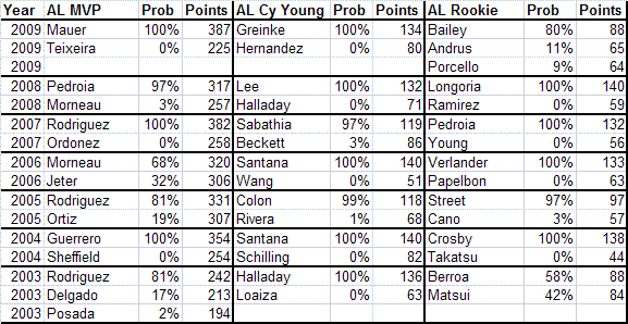
How did the rest of the awards go? In the AL MVP, Joe Mauer won 27 out of 28 first place votes and crushed Mark Teixeira with a point total of 387 to 225. In this case there was little doubt that the baseball writers as a whole preferred Mauer as the AL MVP, and this method shows Mauer with a virtually 100% chance of being the “true” writer’s choice. The same was true with the AL Cy Young, where Zack Greinke was almost certainly the writers' choice for the award.
In the NL however, things went much differently. Lincecum scored 100 points and was the winner of the Cy Young. Carpenter scored 94 points, while Wainwright scored 90 points. If just a handful of voters had switched his first-place vote from Lincecum to either Carpenter or Wainwright, the outcome would have been different. So, what was the probability that Lincecum was truly the choice of the baseball writers as a whole? Lincecum scored 100 points with a standard error of 9.2 points. Carpenter scored 94 points with a standard error of 9.2 points, while Wainwright scored 90 points, with a slightly higher standard error of 10.5 points.
So what was the probability that each pitcher’s true point value was greater than the roughly 99 points that were required to win the award? Lincecum had a 53% chance of having a true expected point total above 99. Carpenter had a 28% chance, and Wainwright had a 19% chance. This analysis shows that because there were only 32 voters in such a close vote, the true writers’ choice could have been any of the three. In the end, Lincecum was the lucky one, in garnering the most support from the 32 writers that actually had a vote. However, there is only a 53% chance that Lincecum had the most support from the hypothetical universe of all expert baseball writers. Carpenter or Wainwright may have been the ones who actually “deserved” the award. However, because MLB only surveys 32 writers, we’ll never know who the greater universe of writers’ true choice was.
Looking at the Rookie of the Year voting, we see similar uncertainty. The AL Rookie of the Year vote was fairly close, with Andrew Bailey winning 13 of 28 first place votes and winning by the margin of 88-65 over Elvis Andrus and Ricky Porcello. However, because of the small sample size, it’s no guarantee that Bailey truly had the writers' backing. There was an 80% chance that Bailey was the true choice, however Andrus and Porcello also may have been the true RoY winners, with an 11% and 9% chance respectively. Meanwhile the NL Rookie voting was a 70%-30% split as I mentioned previously.
Probability of Being the True MVP/Cy Young/RoY 2003-2009
Below you can see the probability of being the “true” MVP, Cy Young, and Rookie of the Year for each league over the several years.
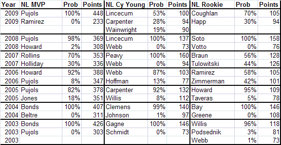
As you can see from the chart, many MVP and Cy Young Award winners were not certain winners. Had a different set of writers been voting, things might have turned out differently. As a general rule, one cannot be sure that the MVP has been selected "correctly" unless one candidate has about a 70 point lead in the voting. For instance, in 2008, Albert Pujols garnered 18 first-place votes and bested Ryan Howard by 61 points in the voting. However, there was still a 2% chance that Albert won by luck and that Ryan Howard was the true writers choice for MVP. A win of 40 points means that the winner had about a 90% likelihood of being the “true” MVP. Meanwhile a win of 20 points corresponds to about a 75% probability of being the true consensus selection.
In the Cy Young or Rookie of the Year, the margins required are not as steep. A 50-point lead or more virtually guarantees that the right person got the award. A 20-point lead means that the winner had about a 90% chance of being the true consensus pick, a 10-point lead corresponds to a 70% probability, while a 5-point lead corresponds to about a 60% probability.
MVP Award Probability vs. MVP Award Shares
This system, which I'll call MVP Award Probabilities is an alternative to the “MVP Award Shares” statistic, though they really measure seperate things. In that system, a player is given award shares even when it is clear that there was absolutely no chance that he was considered the most valuable player by the writers. For example, Mark Teixeira had an MVP award share of 57% this year, despite getting no first place votes and being undeniably NOT considered the best player in the AL by the BBWAA. Additionally, players can have very similar award shares even when it is fairly clear that one player was the consensus pick. For example, in the 2008 NL MVP race, Albert Pujols had a 98% chance of being the “true” MVP, but the difference in award shares was not very great (82% to 69%).
This Award Probability system also has the advantage of handing out exactly one award - if you sum the award probability percentages, they add to exactly 100%. With this method, we can give Albert Pujols 98% of an MVP and Ryan Howard 2% of an MVP in the 2008 race. Though Howard certainly had some support among the writers for MVP, it was fairly clear that the consensus choice was Pujols, hence we give him credit for nearly an entire MVP award. In the case of the 2009 Cy Young Award, even though Lincecum won the award, there was only about a 50% chance that he “deserved” it. Hence, we can award him about 50% of a Cy Young Award. This, in contrast to 2008, when Lincecum was clearly the Cy Young choice of the writers over Brandon Webb.
In the end, these Award Probabilities are useful for giving out partial awards in years when there was no consensus award winner. Because the sample size of voters is quite small, often we can't be sure who really had biggest backing of baseball experts. Calculating these probabilities is an interesting way of accounting for this uncertainty.
| Designated Hitter | November 23, 2009 |
Common Run-Production Formulae Evaluated
A Review of Basics
There are two sets of equations that together constitute the backbone of the art of modern statistical analysis: those that project team games won from runs scored and runs yielded, and those that project team runs scored (or yielded) from some combination of reasonably available team statistics. Since that second type is so important, it is worth taking a look at the many specimens out there—their logical bases and their actual performance.
Here we will look at what the more common formulations are and how they stack up against one another. The survey will cover the period of 1955 through 2009. The reason it starts in 1955 and no earlier is simply that several of these methods use stats that simply weren't available before 1955 (such as IBB or SF).
As an aside, let me say that in the course of preparing this overview I was struck by two things: how few people seem to understand how to write out equations, in particular how to use nested parentheses, and how many seem willing to specify some non-standard statistic without then defining it exactly. As to writing out equations, first consider this piece of simple arithmetic:
X = 3 x 5 + 7
Is the wanted answer 22 or 36? That depends on whether the writer intended--
X = (3 x 5) + 7
or
X = 3 x (5 + 7)
That is not an artificial example: one of the formulae evaluated below is given (in several places around the web) in exactly this form:
R = A*B/(B+C) + D |
Jolly good luck deciphering that without extrinsic information. On further examination of the associated text, it turned out that what was meant was—
R = (A x [B / { B + C } ]) + D
— which brings up the other point about writing out equations: there are other enclosure marks than the parenthesis, to wit the bracket and the brace, both of which are illustrated in the preceding example. Using them makes untangling nested expressions very much easier.
(In principle, there is an implied order of precedence for arithmetic operations such that parentheses are often not needed, but not only do few people know it—I'd have to look it up—but there is never any guarantee that the writer of a given equation knows it either, or even knows that it exists.)
My other peeve is illustrated by these sorts of formulae:
R = ( [1B x 3] + [2B x 5] + [3B x 7] + [HR x 9] + [BB x 2] + [SB x 1] - [Outs x 0.61] ) x 0.16
R = (0.47 x 1B) + (0.78 x 2B) + (1.09 x 3B) + (1.40 x HR) + (0.33 x (BB+HB) + (0.30 x SB) - (0.60 x CS) - (?? x [AB-H]) - (0.50 x OOB) — (ignore the ?? as it is not germane to the point here)
In the first, whatever is "Outs"? In the second, whatever is "OOB" (even when expanded to "Outs on Base")? Is "Outs" all outs made by the team? Outs made only by batters? A particular estimate of all outs (such as [AB - H] + SH + SF + CS + GDP)? And what about OOB? Is it all team outs minus batters' outs? Some particular combination of standard stats (such as GDP + CS)? Or what? Which bodily part experiences the pain if the actual, exact meaning is explicitly stated? (Mind, not every formula presenter is guilty of all, or even any, of those sins; but altogether too many are.)
An interesting side question is just what stats is it "fair" to use? For example, one writer states that he means a particular term in a particular formula to signify an out made by a player trying to stretch a single into a double or a double into a triple (or the rare case of a triple into an inside-the-park home run). That's clear, and no doubt meaningful in the context, but whence such data? OK, yes, Retrosheet.org has it all there for those with the diligence and patience to mine it, and Baseball-Reference.com has done an awful lot of that mining. But whether a particular stat is "readily" available can be a tough call.
I suppose at bottom much depends on ultimate purposes: if the idea is to write up a technical paper examining the mechanisms of run-scoring, then anything that can be extracted from the record is fair dinkum; but if the idea is to make a tool suited for frequent and straightforward work, then using stats not readily available would seem to render the equation containing them unsuited for its purpose.
There are, though, a couple of stats that are sort of on the margin. Those are CI, catcher's interference, a typically very small but nonetheless official and significant stat, significant in that it is a component of PA, plate appearances—but is almost universally left out of published PA tallies and almost never published in itself (and suppose there's a Dale Berra or Roberto Kelly on the subject team?). And there's Eb (opponents' errors allowing an otherwise-out batter to reach base, which Baseball-Reference lists as ROE for "Reached On Error"). Omitting CI will—for most teams in most years—have very little, if any, effect, but I am surprised that Eb is so generally unused. (In the one case it is used, estimating it instead of using the exact number decreases average accuracy by about 0.08 of a run, which is about 0.1%; that may not seem like a lot, but wait and you'll see.)
Before we get to specifics, we ought also to consider what we are looking for and how to determine if we are getting it. What we want, of course, is accuracy: we want to feed in the stats for a team and, ideally, always get back the exact number of runs actually scored by the team that posted those stats. Obviously, we will not in general be able to get perfect results, so the way we evaluate various equations is by how closely they approximate perfection.
Formula makers have devised various ingenious ways to measure how well such things do; here, I will use some simple metrics that seem to my possibly naive mind to well express what we are seeking. The first, and foremost, is simply average percentage error. If formula X estimates Rest runs for a given team in a given year, and that team actually scored Ract runs—so that the absolute error is Rest - Ract runs—the percentage error will be:
Epct = 100 x ( [Rest - Ract] / Ract)
Expressing error as a percentage is important, because absolute error sizes—actual numbers of runs off— are misleading: an absolute error of 10 runs signifies one level of accuracy for a team that scored 400 runs and quite another for one that scored 800 runs.
If we then take the unsigned value of the percentage error (that is, ignore whether it is positive or negative), we have a measure of the relative size of the error. We can then just average all the percentage error sizes over whatever time span we are examining to get an overall average percentage error size. That tells us how closely, on average, the subject formula's estimate of runs came out relative to the actual value.
But average size of error is not the only metric of importance. If a runs predictor is truly modelling run scoring fairly well, then its errors ought to be symmetrical: that is, they should scatter evenly around perfect accuracy. A formula that comes in with a given average size of error but has, say, twice as many over-estimates as under-estimates is clearly not working as well as one of roughly equal size accuracy that comes in with its errors about evenly divided between over and under.
Finally, we would expect that the better a runs-predictor is working, the more nearly its cumulative total error with + and - considered will trend to zero. That is, the cumulative sum of all its errors over the subject time span (with over- and under-estimates cancelling) should be nearly zero. This is related to but slightly different from the criterion above.
And for completeness, we should still also tabulate the absolute sizes of errors, both as an average error in runs and as—to keep the control freaks happy—as a standard deviation in runs.
With all that understood, we can turn to particular run-scoring formulae. All such run-scoring equations fall into two broad classes, which we can call "linear" and "multiplicative"; each has its devotees, and we will take an overview of each class separately.
The Formulae
The Multiplicative Approach
The Theory
The basic idea behind multiplicative approaches is quite simple: run-scoring consists in getting runners on, then driving them in. Equations based on that principle are "multiplicative" because they are probabilistic--that is, they seek to estimate the probability of runs scoring based on the occurence of certain game events. It is a base fact of probability analysis that the probability of two independent events both occuring is the multiplicative product of the independent probabilities of each one occurring: if the chance of a randomly selected person being male is 50%, and the chance of a randomly selected person being blue eyed is 16%, then the probability that a randomly selected person is a blue-eyed male is 8% (0.5 x 0.16). In multiplicative run-scoring equations, the factors being multiplied represent the probability of a batter getting on base and the probability of another batter advancing any runners already on base.
For the first term, the chances of a batter getting on base, it might seem that all that is needed is the now-familiar on-base percentage; but the OBP does not take into account the reality that a man who has successfully reached base may then be thrown out on the bases. A man thrown out on the bases may as well have never reached base (as far as the chances of his becoming a run scored), so multiplicative formulae need to in some way estimate net runners on base. That is not as easy as it might sound, because some data are not so easy to obtain. For example, by definition, total plate appearances equals runs plus left on base plus total outs:
PA = R + LOB + Outs
so that
R + LOB = PA - Outs
(And, of course, R + LOB is the number of men who reached base and were not later thrown out.) But total team Outs made is not so easy a datum to come by, unless one can find lines of "opponents' pitching"; otherwise, one has to assemble it from numerous pitching splits. If one has that capability, then one can use the exact datum; if not, one has to estimate it.
(Sidebar: for reasons best known to themselves, few if any stat services any longer tabulate LOB, once one of the fundamental stats ("No runs, two hits, one man left on base, and at the end of five . . . ." It can be adduced, using the simple equation above, if one can first assemble a total team Outs datum.)
If one has to estimate, some stats for runners thrown out on base are commonly available: caught stealing (CS) and grounded into a double play (GDP, or GIDP). But there are far more ways than those to be put out on the bases: pickoffs, throwouts trying to extend a hit, and so on. The general approach of multiplicative formulations is to either take the gross OB and multiply by an empirical estimation constant, or to take the gross OB, subtract what is known about outs on base, then apply an empirical estimation constant.
The base-advance component is the trickier of the two, and it is in constructing that component that multiplicative equations most differ from one another. The simplest and most obvious runner-advance stat is hits; moreoever, since the more extra bases a hit goes for the more it will advance any runners on, hits in any run-advance component are invariably weighted. The simplest weighting, one commonly used, is the Total Base (TB) value, which assigns each hit a weight equal to the number of bases (that is, for example, 3 for a triple). More advanced approaches use different weightings that presumably better represent the effective runner-advance value of a given hit. (To clarify: if one examines the eight possible base-occupancy situations, it is clear that overall a triple will not have 1.5 times the advance value of a double—what the exact relative values may be is something each formulator works out on his own, by such means as seem good to him.)
But, while hits must clearly dominate base-advancing, there are many other stats that reflect actions that can advance runners on base. Those include walks, hit batsmen, and catcher's interference, which will move along any runners on first or in sequence thereafter; stolen bases, which are pure (no batter action) base advances; sac bunts and sac flies; wild pitches and balks; and certain errors. Determining values for these lesser but not negligible actions is another thing each analyst working on the question has to do for himself.
(Note, though—and this applies to the linear methods, too—that while certain of the "lesser" stats may triflingly increase accuracy for a formula that works with actual, historical data, they will be deceptive if used when such formulae are to tried prospectively (that is, for predicting the future based on the past), because those actions are not under the control or influence of the offense. Such things as balks, wild pitches, and opponents' errors are essentially random happenings, and so a general empirical constant is best used to stand in for those things as a whole.)
The Formulations
I will here just list each and show the equation as I gleaned it from one or more sources on the web. If any of those equations seem to anyone reading this as incorrect expressions of the maker's intent, please email me. The accuracy surveys will come after we have introduced all the equations of both classes.
At least as early as 1964, a run-scoring equation of passable accuracy existed: Earnshaw Cook's "DX", which has an average accuracy of around 3½ percent, and which had a "simplified" form essentially identical to the original famous "Runs Created" formulation Bill James put forth 15 or 20 years later. For this evaluation, I tried to use all the current methods I could find documented around the web. I probably missed some, and would be pleased to hear from anyone who has one or more others to suggest (just email me with the formula—written out nicely, please, as spoken of earlier—and some info on who made it when), and if enough roll in I will try to assemble a follow-up survey. But for now, these are they:
Basic Runs Created:
        (H + BB) x TB

  RC =  -------------

           AB + BB
This (hereafter RCbasic) was Bill James' first opus. Its chief virtue is its extreme simplicity of both form and calculation: one can easily understand it, and one can easily reckon it.
Stolen-Bases Runs Created:
        (H + BB - CS) x (TB + [0.55 x SB])

  RC =  ----------------------------------

                    AB + BB
This (hereafter RCsb) is a modification of the "Basic" version to account for the value of, yes, stolen bases (and the corresponding caught-stealings).
"Technical" Runs Created:
  RC = (H + BB + HB - GDP - CS) x (TB + [0.26 x {BB - IBB + HB}] + [0.52 x {SH + SF + SB}]) / PA


     PA = AB + BB + HB + SH + SF
This (hereafter RCtech) is a substantially greater modification of the "Basic" version, to account for all sorts of other lesser data.
"Technical" Runs Created, 2nd Version:
  RC = (H + BB + HB - GDP - CS) x

     (TB + (0.26 x (BB - IBB + HB)) + (0.62 x SB) + (0.5 x (SH + SF) - (0.03 x SO) / PA


    PA = AB + BB + HB + SH + SF
This (hereafter RCtech2) is a minor variation of the form above.
"Technical" Runs Created, 2nd Version, alternate:
  RC = (H + BB + HB - GDP - CS) x

     (TB + [0.24 x {BB - IBB + HB}] + [0.62 x SB] + [0.5 x {SH + SF}] - [0.03 x SO]) / PA


    PA = AB + BB + HB + SH + SF
This (hereafter RCtech2a) is another very small variation of the RCtech2 form (0.26 becomes 0.24).
"Technical" Runs Created, 3rd Version:
  RC = (H + BB + HB - GDP - CS) x

     (BaseWeights + [0.29 * {BB - IBB + HB}] + [0.492 * {SB + SH + SF}] - [0.04 * SO]) / PA


    BaseWeights = [1.125 * 1B] + [1.69 * 2B] + [3.02 * 3B] + [3.73 * HR]

    PA = AB + BB + HB + SH + SF
This (hereafter RCtech3) is the most complex yet of the variations on the RC formula; it is the only one to assign non-TB weights to base hits.
Base Runs:
  BaseRuns = (A x [B / {B + C}]) + D


   where:
A - H + BB + HB - HR - (0.5 x IBB)
B - (BaseWeights + [0.1 x {BB - IBB + HBP}] + [0.9 x {SB - CS - GDP}]) x 1.1
C - (AB - H) + CS + GDP
D - HR
BaseWeights = [1.4 x TB] - [0.6 x H] - [3.0 x HR]
This (hereafter BR) is David Smyth's offering in this category. Wikipedia cites Tom Tango as stating that BaseRuns models the reality of the run-scoring process significantly better than any other run estimator. (We shall see.)
Total Offensive Productivity:
  AdvR = (BaseWeights + [0.301 x {BB + HB}] + [0.526 x SH] + [0.912 x SB]) / PA

  Adv = (AdvR x 0.867) + 0.0412

  OBnet = PA - Outs


  TOP = OBnet x Adv


     BaseWeights = 1B + [1.551 x 2B] + [3.455 x 3B] + [4.421 x HR]

     PA = AB + BB + HB + CI + SH + SF

     Outs = all team outs
This (hereafter TOP) is mine own. It is sufficiently complex that the making of it (above) is split into multiple pieces for comprehensibility, since it uses the y = mx + b method for best-fitting the relation between runners scored and base-advance events.
Total Offensive Productivity, Dumbed-Down:
This (hereafter TOPdd) is as above, but with all coefficients rounded to only two decimal places of accuracy. No recalculating was done (though the coefficients do interact). The point was to see if using three decimal places, which many but not all formulae do, made any material difference.
Total Offensive Productivity, No Error Data:
  PA = AB + BB + HB + CI + SH + SF

  AdvR = (1B + [1.551 x 2B] + [3.455 x 3B] + [4.421 x HR] + [0.301 x {BB + HB}] + [0.526 x SH] + [0.912 x SB]) / PA

  Adv = (AdvR x 0.867) + 0.0412

  OBnet = (0.907527925021 x [H + BB + HB + CI + Eb - HR - CS]) + HR

    Eb = 0.017734746015 x ([AB - H)] + SH + SF)


  TOP = OBnet x Adv
This (hereafter TOPnoEs) is the full formulation except with opponents' errors (Eb)—and thus net runners on base—estimated by a couple of empirical coefficients. I inserted it here to show how much estimating net on-base does or does not cost accuracy as compared to using exact values (because they are not always simple to obtain). Because this is estimating a datum that should be known exactly, it uses full-accuracy constants (no point in double-crippling it)
The Linear Approach
The Theory
In a sense, there is no theory to linear methods (usually referred to as "linear weights", though that really signifies only one such method). Linear methods are based on what we might call the "ant on a globe" principle: place an ant on the surface of a sufficiently large globe and the surface, though actually curved, will seem flat. Indeed, we humans experience that every day on planet Earth, which is why so many people believed it flat for so long. Linear methods are not concerned with the full shape (and hence describing equation) of the relations between common baseball stats and runs scored: they assume that over the relatively short stretches of such curves that we are in practice concerned with, the relations can be considered to be straight lines (hence "linear"). From that assumption, it follows that one can construct runs by simply adding up the effects of each stat that might have some influence on run scoring, with that stat appropriately "weighted" by an empirical constant derived from experience.
The chiefest objection to linear methods is that they do not actually model run-scoring, which is a non-linear process. Countering that indubitable assertion is the sheer fact that they can and do produce good results. Further, they have this virtue: you can construct team values from individual-player values by simple addition.
(You cannot do that for multiplicative methods because in general the product of the averages is not equal to the average of the products. What that mouthful means can be shown quite easily:
X x Y = Z
2 x 4 = 8
4 x 8 = 32
-------------
3 x 6 = 18 but ([8+32]/2) = 20
That is, averaging the X's and the Y's and multiplying those averages gives a different result than averaging the individual Z's.)
The Formulations
Estimated Runs:
    ER = ( [1B x  3] + [2B x 5] + [3B x 7] + [HR x 9] + [BB x 2] + [SB x 1] - [Outs x 0.61] ) x 0.16

          Outs = (AB - H) + CS + GDP
This (hereafter ER) was created by Paul Johnson and got a nice write-up from Bill James; James seems to despise linear methods, and it is widely reported around the web that he apparently did not recognize Johnson's formulation as a linear method. There are other variants of this method, as described farther below; which version came first I cannot readily ascertain.
Estimated Runs a:
    ER = ( [1B x  3] + [2B x 5] + [3B x 7] + [HR x 9] + [{BB + HB + CI} x 2] + [SB x 1] - [Outs x 0.61] ) x 0.16

          Outs = (AB - H) + CS + GDP
This (hereafter ERa) is the above, but with HB and CI included; I just tried those on an off chance, and it much the results, so I include it.
Estimated Runs 2:
ERP = ([2 x {TB + BB + HB}] + H + SB - [0.605 x {AB - H + CS + GDP}]) x 0.16
This (hereafter ER2) is a variation on the method above; as I said, I don't know which came first.
Estimated Runs 3:
ER3 = (TB * 0.318) + ([BB - IBB + HB - CS - GDP] * 0.333) + (H * 0.25) + (SB * 0.2) - (AB * 0.085)
This (hereafter ER3) is a yet another variation on the ER method. (The numbering, again, does not here imply a sequence.)
Extrapolated Runs:
  R = (0.50 x 1B) +

      (0.72 x 2B) +

      (1.04 x 3B) +

      (1.44 x HR) +

      (0.34 x [HB + BB - IBB]) +

      (0.25 x IBB) +

      (0.18 x SB) -

      (0.32 x CS) -

      (0.09 x [AB - H - SO]) -

      (0.098 x SO) -

      (0.37 x GDP) + (0.37 x SF) +

      (0.04 x SH)
This (hereafter XR) is one of Jim Furtado's efforts at a linear formula; there is another one, listed below. I am unsure of their order of creation.
Extrapolated Runs 2:
  xRun = (1B x .51) +

         (2B x .8) +

         (3B x 1.14) +

         (HR x 1.46) +

         ([{BB - IBB} + HBP] x .33) +

         ([IBB + SB] x .18) +

         ([SH + SF] x .21) +

         ([CS + GDP] x -.17) -

         (0.10 x Outs)

     Outs = (AB - H + SF + SH + CS + GDP)
This (hereafter XR2) is a modified version of the above. I am unsure, actually, which version preceded which.
The Shoot-Out
The Results
Just for fun, I also included, as a sort of baseline, what one might call an "worst-possible-way" method. All it does is assign every team in every season the league-average runs for that league and season—that is, it doesn't "predict" at all, but assumes every team is "average". Any way of "projecting" runs that does worse than this is actually "anti-predicting".
The column headings are mostly self-explanatory, but here are notes on a couple. "Cumulative Error" is all actual errors added up, with sign (that is, plus and minus); the lower, the better. "Per Team-Year Error" is just the Cumulative Error divided by the number of team-seasons it was gathered over; it is not terribly important, but helps put the cumulative number in some sort of perspective.
As noted, the data are from the years 1955 through 2009, inclusive. The formulations are listed in order of average percentage accuracy, lowest to highest. The envelope, please . . . .
| Method | Average Error Percentage |
Cumulative Error (Runs) |
Per Team-Year Error (Runs) |
Average Error Size (Runs) |
Standard Error (Runs) |
Percent Under |
Percent Exact |
Percent Over |
|---|---|---|---|---|---|---|---|---|
| Averaged | 7.67653288572 | +66 | +0.0484581497797 | 52.7459618209 | 66.1521968803 | 49.0% | 0.6% | 50.4% |
| ER | 2.95275569685 | -16061 | -11.7922173275 | 20.6174743025 | 25.9099639273 | 69.7% | 1.2% | 29.1% |
| RCbasic | 2.92417501178 | -2292 | -1.68281938326 | 20.281938326 | 25.6796805975 | 51.2% | 1.4% | 47.4% |
| RCsb | 2.90765660618 | -2690 | -1.97503671072 | 20.1820851689 | 25.416645688 | 51.9% | 1.2% | 46.8% |
| RCtech | 2.85383691716 | +9611 | +7.05653450808 | 20.0007342144 | 25.3367764524 | 38.5% | 2.1% | 59.3% |
| ER3 | 2.75487616896 | +4123 | +3.02716593245 | 19.1138032305 | 24.0931787811 | 46.2% | 1.3% | 52.5% |
| BaseRuns | 2.75190018218 | -11315 | -8.30763582966 | 19.1651982379 | 24.1673232912 | 64.3% | 2.1% | 33.6% |
| RCtech2a | 2.75003868729 | -2586 | -1.8986784141 | 19.1365638767 | 23.9341798885 | 53.5% | 1.6% | 44.9% |
| RCtech2 | 2.74082458403 | +1592 | +1.16886930984 | 19.1174743025 | 24.24.0136808913 | 48.9% | 1.5% | 49.6% |
| XR2 | 2.68914080266 | +7057 | +5.18135095448 | 18.6218795888 | 23.5352846865 | 41.4% | 1.4% | 57.2% |
| ERa | 2.68565957806 | -7257 | -5.3281938326 | 18.6439060206 | 23.6679360665 | 59.1% | 1.4% | 39.5% |
| ER2 | 2.67680686519 | +3144 | +2.30837004405 | 18.5374449339 | 23.4423017981 | 45.1% | 1.7% | 53.2% |
| TOPnoEs | 2.59951137936 | -323 | -0.237151248164 | 17.9596182085 | 22.8709281276 | 48.8% | 1.5% | 49.8% |
| RCtech3 | 2.5773991588 | +1858 | +1.36417033774 | 17.8325991189 | 22.5678176251 | 45.6% | 1.8% | 52.6% |
| XR | 2.53012140594 | +4370 | +3.20851688693 | 17.4948604993 | 22.1657307104 | 42.8% | 1.4% | 55.8% |
| TOPdd | 2.46168703878 | +2360 | +1.73274596182 | 16.9779735683 | 21.6911728627 | 45.3% | 2.3% | 52.3% |
| TOP | 2.44818804968 | +120 | +0.0881057268722 | 16.9133627019 | 21.6186642088 | 48.9% | 2.5% | 48.6% |
(The darker lines are multiplicative measures, while the lighter are linear.)
Some Reflections
First off, it is manifest that the best of the multiplicative and the best of the linear methods produce results that are quite close enough for folk music. Second, it is clear that the differences in performance of all these methods are far less consequential than the general accuracy of all. For perspective, let's keep in mind that a difference in accuracy of 0.14% is only about one run per team per season. Look at it: best to worst is only an average difference of less than 4 runs per team per season.
One thing, though, that is clear is that none of the linear methods is really close to a symmetrical distribution of its errors. That is scarcely a fatal flaw, but it does suggest that they are, as is known, not modelling process but empirically matching data. Now there are a lot of empirical constants in the multiplicative methods, too, but the thing is that the linear systems are their constants, and nothing else.
I thought it might be useful to take a look at graphical representations of a couple of these methods. For economy, I chose the best linear and the best multiplicative methods. Here they are:


There are differences, but you've got to look awfully hard to find them. And you will also notice—again, if you look carefully—what a tabled presentation would show better (but is too long for here), which is that these two rather different methods get mostly the same results for the same teams (look at the odd little dots that are fairly isolated), which demonstrates what we already knew: that variations from projection are essentially chance.
My own summing-up is that if you need convenient ease of use, as when doing calculations by hand, the XR method is easiest. If you want the sense that you're really modelling what happens, want best available accuracy, and have the use of a computer to do the heavy lifting of calculation, use the TOP formula. (The needed stats can be downloaded from various standard sources.)
The question of how these various methods can be used to analyze individual players is a fascinating one, but, owing to length, one for another time.
Eric Walker has been a professional baseball analyst for over a quarter-century. His paper "Winning Baseball", commissioned by the Oakland A's for the purpose, first instructed Billy Beane in the concepts later called "Moneyball"; Walker has also authored a book of essays, The Sinister First Baseman and Other Observations. Walker is now retired, but maintains the HBH Baseball-Analysis Web Site.
| F/X Visualizations | November 20, 2009 |
A Pitchf/x Look at Passed Balls and Wild Pitches
Catcher defense is one of the more enigmatic areas of baseball study. It has developed relatively independently of other position player defensive analysis. This is probably because, although catchers field some ground balls and pop ups, their main defensive contribution is very different from that of all other position players. This contribution is mostly in preventing stolen bases, passed balls and wild pitches.
The difference in ability to do those things, as well as not make fielding and throwing errors, resulted in a range of 13 runs above average (Gerald Laird) to ten runs below(Mike Napoli) in 2009 by devil_fingers' calculation. This is about the same range of catcher performance that Brian Cartwright predicted before the 2009 season. About one extra win picked up best the best defensive catcher, and one run given up by the worst.
These analyses are based on Tangotiger's WOWY method. He calculates each pitchers' rate of PBs and WPs and then predicts how many PBs and WPs a specific catcher should expect to have based on how many PAs he has with each pitcher. The difference between these predictions and the actual amount he gave up is a measure of his ability to prevent PBs and WPs. David Gassko takes a similar approach, but uses pitching staff numbers: strikeouts, earned runs and hits batsmen, which predict PBs and WPs quite well. Then finds the difference between expected, based on these numbers, and actual for each catcher.
With the availability of the pitchf/x data we can take the same idea, but on a per pitch basis. By examining the pitchf/x characteristics of each pitch we can create a model which predicts how often the average catcher lets a pitch pass (as a PB or WP). From there we can predict the number of PBs and WPs that the average catcher gives up if he saw the pitches seen by a given catcher, and then how many more or fewer PBs and WPs that catcher gave up.
One limitation here, which has been discussed before, is we do not know where the pitch was supposed to go. Maybe a catcher called the pitch on the outside and it was on the inside edge, a place most catchers do not give up a PB, but since he was expecting it elsewhere it gets by. In a pitch position based model the catcher would be penalized in such a scenario.
In this post I will briefly summarize some findings concerning pitchf/x and PBs and WPs, and then present a full model and catcher evaluation in a future piece.
The first thing we can look at is the difference between a passed ball and a wild pitch, which is obviously a subjective decision of the scorer. Here I plot the frequency distribution for the distance from the center of the plate for all pitches, passed balls and wild pitches.
You can see that passed balls are a little farther from the center of the plate than the average pitch, but that wild pitches are drastically so. Thus scorer are calling pitches far out of the zone wild pitches while those that look more like a normal pitch a passed ball, but there is considerable overlap.
Next we can look at the probably that a pitch gets by the catcher, if it is passed or wild, based on its location. I think this is going to depend on the handedness of the batter and pitcher so here I show the graph for RHB v RHP. The image is from the catcher's perspective so the batter stands at, roughly, -2.
There is a strong directionality. Inside pitches are more like to get by the catcher than outside. This could have to do with batter being in the way, making inside pitches harder to see, or could be the pitch location versus expectation of location issue I talked about above. Also catchers miss balls in the dirt more often then they miss high pitches.
Finally we can see the wild pitch/passed ball rate on each pitch type. This is the rate of these occurrences per non-contacted pitch of each type.
+-------------+-------+
| Pitch Type  |  Rate |
+-------------+-------+
| Fastball    | 0.24% |
| Changeup    | 0.49% |
| Curve       | 0.60% |
| Slider      | 0.73% |
| Knuckleball | 1.37% |
+-------------+-------+
Again the results here are not very surprising. Fastballs have very small rate, while knuckleballs are off the charts. There is definitely an interaction here between pitch type and pitch location, fastballs are less likely to be far out of the zone than a curve or knuckleball. In addition it would be interesting to see how spin deflection and break of a pitch affect it. I will combine all of these in the next post into a larger model predict passed ball and wild pitch rates and then using that to evaluate catchers.
| Touching Bases | November 19, 2009 |
Holliday-Bay: Visual Scouting Reports 1.0
Jason Bay and Matt Holliday are the two best hitters on the market. Holliday is a year younger than Bay, and will likely command a more lucrative contract. If you'd like to know how they stack up in left field, check out ESPN's recent articles analyzing the matter. But I’d like to concentrate on their hitting. Here’s how they stack up, per FanGraphs
Over the past two years, they’ve been rather even hitters. Using 2008-09 pitchf/x data, I’ll take a deeper look
A couple weeks ago, I introduced a series of graphs that try to provide a visual scouting report of sorts for hitters. Here's how each batter performs by pitch location.
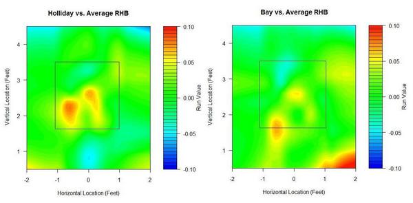
(Click on images to enlarge.)
They are strikingly similar compared to league average. Middle and lower in, they’re well above average, but they have weaknesses up and in. I'm surprised that hitters the caliber of Holliday and Bay perform worse than league average in any spots. Holliday also struggles more than the average batter on pitches down and out of the zone, while Bay appears to excel at pitches way down and away, likely a result of his excellent plate discipline.
No matter how I break these guys down, they'll turn out above league average at almost everything, so I prefer to compare them to themselves. The next set of graphs shows how they do relative to their own averages, as opposed to the league average. Therefore, every single batter will have some blue—even Pujols—and every single batter some red—even Tony Pena, and that's because every single batter has relative strengths and weaknesses.
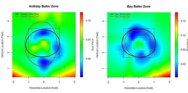
Bay appears to have a great knowledge of the strike zone, as his “swing zone” and “strike zone” nearly overlap. (These contour lines indicate where the probability shifts from greater than 50% to less than 50%. For example, pitches outside the black elipse are more likely to be called for a ball than a strike, and pitches inside the red elipse are more likely to be swung at than taken.) Holliday, however, has a distinct region outside the strike zone where he owns a negative run value. This seems to stem from Holliday's propensity to expand the strike zone. Yet he doesn’t face the same problems up in the zone, even though he’s willing to swing at high balls too.
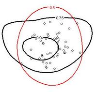
To look deeper into this, I plotted the same red 50% swing zone, and also included Holliday's contact zones at 75% and 90% intervals, which show where he's most likely to make contact when he swings. You can also see 50 separate points that indicate the location of pitches that resulted in Holliday's home runs.
What we're interested in is the very top and very bottom of his swing zone—the portions that extend beyond his strike zone. It turns out that these regions also extend beyond his 75% contact zones. There is slightly less area up top between his swing zone and contact zone as there is in the bottom region, meaning he is better at making contact on pitches at high pitches out of the strike zone than low pitches out of the strike zone. But he hasn't hit homers in either of those regions. He has swung half the time at these bad balls, and whiffed over a quarter of the time when he does pull the trigger. The most important thing to remember is that both of these swing-and-miss regions would be called for balls more often than not if he would just lay off.
How about their platoon splits? I use release point data for these. Like the previous graphs, these are from the batter's point of view.
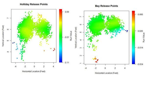
Bay exhibited a reverse platoon split two years ago, but over his career he has maintained a normal split. Normally I exclude Chad Bradford's release points, since they’re outliers, but I wanted to include them to show Bay’s success against submariners and sidearmers. He’s five-for-eight against Bradford in his career. Bay’s had less success against lefties with lower arm slots. He’s 0 for 16 with three walks against the likes of Brian Fuentes, Billy Wagner, and Javier Lopez. In 2009, Bay and Holliday both faced the highest rate of LHPs of their careers.
Now, I’m not sure if this next set of graphs will catch on, but I wanted to know how batters fare by pitch type, so here’s what I came up with. You have to have some knowledge of pitchf/x data to fully comprehend these graphs, but really all that I look for is to quickly see if there’s some type of obvious gradient from blue to red or red to blue that would suggest a batter does better against pitches of a certain velocity and break.
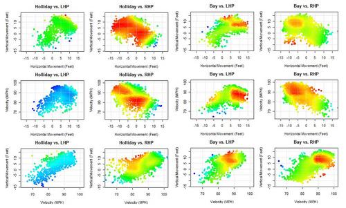
You can see very distinct sections in Bay's graphs where he excels against both LHPs and RHPs. These pitches have the same velocity and movement as your league average fastball (about 85-95 miles per hour with 5-10 inches of horizontal and vertical movement), which meshes with Bay's reputation as a fastball hitter. Over the past two seasons, Bay has been the fourth best hitter in baseball against the fastball. He’s not as good against curveballs, especially slower breaking pitches. I didn’t note anything remarkable in Holliday’s release point graphs nor his velocity/movement graphs, but Holliday does have interesting pitch splits. He saw 65% fastballs with the A’s and 55% with the Cardinals. In exchange, he saw his slider rate nearly double in St. Louis. The increase in slider percentage might have been part of the reason Holliday found renewed success, as he has been the top hitter in the Majors against the slider over the last two years.
Finally, hit locations.
Holliday was shipped out of Coors Field in the offseason, and he might have felt the hangover effect, having tailored his game to Coors where he has boasted a career OPS 160 points better than he has at all other venues. Or a combination of Oakland's pitcher's park, increased quality of competition, and decreased slider percentage plagued him. Or the first half of the season was just noise. His BABIP shot up from a career low .318 in Oakland to a career high .391 in St. Louis. Once he was traded, he hit more line drives and fewer infield flies. Due to its spacious foul grounds, the Coliseum's park factor for infield fly balls is around 104. More importantly, Holliday's home run per fly ball rate was just 9.7% in the Coliseum, well below his career rate of 16.5%. The average batter would see his homes runs per fly ball plummet some 30% in a move from Colorado to Oakland. (Batted ball park effects from David Gassko.)
 Meanwhile, Bay pulls balls at an extraordinary rate. Infielders should shift him to the pull side as much as is acceptable against right-handed batters. He pulls his fly balls at a high rate too.
Bay was traded to a haven in Fenway Park, where he could take advantage of the green monster in left field. Using Hit Tracker Online data, I plotted Bay's 2009 homers against his 2008 homers along with Fenway's and PNC's outfield dimensions.
15% of Bay's balls in play last year were fly balls to left, compared to 10% in 2008. Could this have been a conscious effort? In 2008, 43% of his flies to left were hits and 25% were homers. In 2009, 63% of Bay's flies to left were hits and 40% were homers. Thanks to the monster, He managed more more homers on flies to left last year than he had all of hits on flies to left two years ago. I'm sure the trade-off in opposite-field power for pull power yielded a net positive for Bay.
As always, these graphs are works in progress, so please feel free to leave comments on how to improve them.
| Change-Up | November 18, 2009 |
On Greinke and Things Related
Zack Greinke won the 2009 American League Cy Young Award yesterday, capturing 25 of 28 first place votes. I am going to dive into Baseball Reference's Play Index to try and gain some perspective on Greinke's 2009 season, but first let's have a look at a couple of mainstream baseball pieces that appeared yesterday.
Since we tend to wander into the realm of media criticism from time to time here, let's start off with the negative, a look at Steve Kornacki's defense of his first place vote for Justin Verlaner.
Writes Kornacki...
Verlander received my first-place vote because nobody was tougher on the mound with the season on the line for his team.He threw at least 120 pitches in six of his last eight outings and won his last three starts, forcing a one-game playoff against the Minnesota Twins with his final victory.
He was an inspirational "horse," using Tigers manager Jim Leyland's term for him, on a fading team.
Verlander was excellent in 2009, don't get me wrong. I don't know about "inspirational horse" but whatever, he was really good. But an honest 30-second comparison between Verlander and Greinke should do away with any confusion as to which pitcher had the better 2009 season. But Kornacki's writing in Detroit and more or less employed the classic BBWAA "I know what my eyes tell me" crutch to cast a vote for Verlander.
And that's fine. He's just one voter, and Greinke ran away with the thing. Unfortunately for Kornacki, as Tyler Kepner notes, yesterday may have represented a landmark in terms of advanced statistics infiltrating the mainstream, and Kornacki appears to have missed the boat. There's always next year, Steve!
You won't find a better piece of baseball writing all year in a daily newspaper, so be sure to go on over and check out Kepner's piece on yesterday's Greinke vote and its broader significance. But here are a couple of excerpts:
It was not surprising that Greinke won, since his earned run average, 2.16, was the lowest in the American League since 2000. But his decisive margin of victory over Seattle’s Felix Hernandez was a sign that voters overlooked his deficiency in another bedrock statistic: wins.
The article goes on to note that, thanks to his teammate Brian Bannister, Greinke has been turned on to more progressive pitching metrics. And really, in a world where so many still value wins, who can blame a Kansas City Royals starting pitcher for looking to convince himself that he really is pitching well? One can imagine how the dialogue between Bannister and Greinke might go:
Zack: Sheesh, sure feels like I am pitching well. But I only have 11 wins.
Brian: You are, and people are noticing. Here, check out Fangraphs. And Rob Neyer. And Poz.
Zack: Oh, cool. But wait, I have been digging into this stuff, and...wait...did we really just trade for Yuniesky Betancourt?
Brian: Let's not got there, Zack. Stay focused. You're an awesome pitcher.
I have read and re-read this next excerpt about 12 times now, because I can't even believe it. Kepner writes:
To that end, Bannister introduced Greinke to FIP, or Fielding Independent Pitching, the statistic Greinke named Tuesday as his favorite. It is a formula that measures how well a pitcher performed, regardless of his fielders. According to fangraphs.com, Greinke had the best FIP in the majors.“That’s pretty much how I pitch, to try to keep my FIP as low as possible,” Greinke said.
A big, hearty congrats to the guys over at Fangraphs. They're doing great work, and fans, media members and Cy Young Award winners alike are taking notice.
=====
OK, how great was Greinke in 2009? First of all, he eclipsed the 200 ERA+ mark. Let's just go ahead and put that one into perspective. Since 1959, it has been done 13 times by starters who have tossed at least 200 innings.
| Rk | Yrs | To | From | Age | ||
|---|---|---|---|---|---|---|
| 1 | Pedro Martinez | 3 | 1997 | 2000 | 25-28 | |
| 2 | Roger Clemens | 3 | 1990 | 2005 | 27-42 | |
| 3 | Greg Maddux | 2 | 1994 | 1995 | 28-29 | |
| 4 | Zack Greinke | 1 | 2009 | 2009 | 25-25 | |
| 5 | Kevin Brown | 1 | 1996 | 1996 | 31-31 | |
| 6 | Dwight Gooden | 1 | 1985 | 1985 | 20-20 | |
| 7 | Ron Guidry | 1 | 1978 | 1978 | 27-27 | |
| 8 | Bob Gibson | 1 | 1968 | 1968 | 32-32 |
Here is the complete list of 200-inning, 200 ERA+ or better seasons in the last 50 years. Zack's at the bottom, but he is also one of the youngest on the list. I bet we see him back on here in the next few seasons.
| Rk | Player | ERA+ | IP | Year | Age | Tm |
|---|---|---|---|---|---|---|
| 1 | Pedro Martinez | 291 | 217.0 | 2000 | 28 | BOS |
| 2 | Greg Maddux | 271 | 202.0 | 1994 | 28 | ATL |
| 3 | Greg Maddux | 262 | 209.2 | 1995 | 29 | ATL |
| 4 | Bob Gibson | 258 | 304.2 | 1968 | 32 | STL |
| 5 | Pedro Martinez | 243 | 213.1 | 1999 | 27 | BOS |
| 6 | Dwight Gooden | 228 | 276.2 | 1985 | 20 | NYM |
| 7 | Roger Clemens | 226 | 211.1 | 2005 | 42 | HOU |
| 8 | Roger Clemens | 221 | 264.0 | 1997 | 34 | TOR |
| 9 | Pedro Martinez | 219 | 241.1 | 1997 | 25 | MON |
| 10 | Kevin Brown | 216 | 233.0 | 1996 | 31 | FLA |
| 11 | Roger Clemens | 213 | 228.1 | 1990 | 27 | BOS |
| 12 | Ron Guidry | 208 | 273.2 | 1978 | 27 | NYY |
| 13 | Zack Greinke | 203 | 229.1 | 2009 | 25 | KCR |
But, as Tyler Kepner told us, yesterday was about pitching independent numbers. ERA and ERA+ both have quite a bit to do with the defense behind a pitcher. So let's stick with the same parameters as the last table, seasons where starters have thrown at least 200 innings since 1959 only this time we will sub in K/BB ratio for ERA+.
| Rk | Player | SO/BB | IP | Year | Age | Tm |
|---|---|---|---|---|---|---|
| 1 | Pedro Martinez | 8.88 | 217.0 | 2000 | 28 | BOS |
| 2 | Pedro Martinez | 8.46 | 213.1 | 1999 | 27 | BOS |
| 3 | Greg Maddux | 7.87 | 209.2 | 1995 | 29 | ATL |
| 4 | Greg Maddux | 5.03 | 202.0 | 1994 | 28 | ATL |
| 5 | Kevin Brown | 4.82 | 233.0 | 1996 | 31 | FLA |
| 6 | Zack Greinke | 4.75 | 229.1 | 2009 | 25 | KCR |
| 7 | Pedro Martinez | 4.55 | 241.1 | 1997 | 25 | MON |
| 8 | Bob Gibson | 4.32 | 304.2 | 1968 | 32 | STL |
| 9 | Roger Clemens | 4.29 | 264.0 | 1997 | 34 | TOR |
| 10 | Dwight Gooden | 3.88 | 276.2 | 1985 | 20 | NYM |
| 11 | Roger Clemens | 3.87 | 228.1 | 1990 | 27 | BOS |
| 12 | Ron Guidry | 3.44 | 273.2 | 1978 | 27 | NYY |
| 13 | Roger Clemens | 2.98 | 211.1 | 2005 | 42 | HOU |
========
As you can see from the company Greinke is keeping in the tables above, his 2009 campaign was truly one for the ages. That the voters recognized this, or that they at least looked past his win total and saw that he was the AL's best in 2009, is a great sign of progress. That Greinke himself, in the pages of the country's most famous newspaper, confessed to pitching to keep his FIP as low as possible, makes yesterday even more remarkable. And the cherry on top of it all is that Greinke is a genuinely modest and curious young man who has overcome incredible mental health struggles to get to where he is today. Baseball fans and suckers for compelling personal stories alike can get behind a story such as this one.
| Behind the Scoreboard | November 17, 2009 |
MVP Award Balloting: Is It Fair?
The MVP and Cy Young Awards are closely upon us, and soon we'll know this year's choices. As you know, the balloting for these awards is done by two baseball writers from each city. I'll spare the indignation about why award choices are limited to just two BBWAA members when there are a host of other highly qualified people who could be consulted on the awards, and concentrate on the balloting process.
For the MVP award, voters rank their top 10 choices for the award. Each 1st place vote receives 14 points, each 2nd place vote receives 9 points, each third place vote receives 8 points, etc, down to where each 10th place vote receives 1 point. The candidate with the most total points is the MVP. This weighting system seems fair enough. But is it? Why shouldn't a first place vote be worth 10 points? Or 20 points?
What's more, the Cy Young does things differently. There, the writers only select their top three players for the award. A first place vote gets 5 points, a second place vote gets 3 points, while a third place vote gets 1 point. This strikes me as odd, since it would seem that a system good enough for the MVP would be good enough for the Cy Young, and vice-versa.
Ballot Weighting Based on Empirical Win Values
An alternate, perhaps more accurate, method of balloting would be to have each voter assess the value of each player (perhaps measured in wins). Each voter would give a value score and the player with the highest average value among the writers would be the MVP. While in theory this would work, in practice this would probably be a mess. Writers would be working off of different internal scales and the votes would be all over the map. One guy might think that his first place choice is 10 times as valuable as his 10th place choice, while another guy might think that his first place choice is only twice as valuable. While this could represent real differences between the two writers' valuation of these players, more likely it would be a function of different perceptions of value, and the different scales each writer is using in their heads.
Because of these issues, the 1 through 10 balloting that currently takes place is probably the way to go. This essentially forces everyone to be on the same valuation scale. The #1 choice gets 14 times the weight as a #10 choice regardless of the individual writer's evaluation of their relative worth. But is the scale 14-9-8 scale that is used a good one?
Going with the theory that the weighting system should correspond proportionately to the value of the player, let's look at the Wins Above Replacement (WAR) values for the top players over the past 25 years. The following list shows the average WAR value for players ranked 1 through 10. The #1 player averaged 9.4 WAR, while the #2 player averaged 8.3 WAR. Meanwhile the #10 player averaged 5.9 WAR.
Needless, to say if we used these weights for the MVP balloting, the results would be vastly different. However, this wouldn't be right either, because it assumes that anybody left off of a ballot altogether has a value of 0. Of course, any writer would consider a serious MVP candidate to have a value far greater than zero, even if he did leave that player off his ballot. So, how to evaluate those unranked players? Since the writer didn't rank that player, we don't know how he values him. Assuming an 11th place vote for players left off the ballot seems a bit too optimistic, but a serious MVP candidate couldn't be too far behind. Subjectively, it seems reasonable to me to assume a 13th place ranking for unballoted MVP candidates - giving them an estimated WAR of 5.5.
Using this WAR scale (9.4 points for a 1st place finish, 8.3 points for 2nd place...5.9 points for 10th place, and 5.5 points for unranked players) would probably be the most fair ballot weighting system. How does this compare with the system MLB actually uses? While the weights seem to be very different, this is mostly because the systems are on two different scales. To make them comparable, we can convert the WAR system to a scale where 0 points are given to a player left off the ballot and there are 59 total points doled out altogether. When we do this, we see that in fact the two balloting systems are extremely similar.
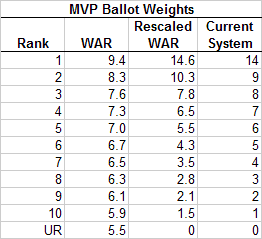
Overall, the WAR system advocates giving slightly more weight to players who finish 1st and 2nd in the balloting, while giving slightly less weight to those thereafter, with the exception of the 10th place vote. In particular, second place votes are undervalued (they are worth 9 points, whereas they should be worth 10.3 points). In all however, there is very little to quibble with. If I were starting from scratch I would choose a 15-10-8-7-etc system instead, however this is a very small difference. Kudos to Major League Baseball, which has used the same ballot weights since 1938. It really got it right with its MVP ballot system.
How about the Cy Young? As I mentioned previously, the current system gives 5 points for first place, 3 points for second, and 1 point for third. Going through this same process above for pitchers only, the WAR scale recommends 4.9 points for first place, 2.6 points for second and 1.4 points for third. Again, the this scale is fairly similar to the one used by MLB, though MLB slightly overvalues second place votes and undervalues third place votes. Though it might be better to go with a 14-9-8-etc system (or a 15-10-8-etc system) just so writers have a chance to rank more players, the current system works pretty well too.
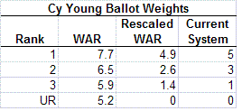
Conclusion
Overall, the method which MLB chooses its MVP and Cy Young Awards isn't the most important thing on Earth. However, it's nice to know that MLB is doing something right. It would have been fairly easy to screw these up. For instance, a 10-9-8-etc MVP ballot system would be off from reality by quite a bit. However, the systems currently in place do a good job of reflecting the actual differences in value of players as ranked by the sportswriters. Whoever was initially responsible for this system did his job well. For once, it's nice that the traditional way of doing things is also the right one.
| Baseball Beat | November 16, 2009 |
Holiday Shopping Ideas
"People ask me what I do in winter when there's no baseball. I'll tell you what I do. I stare out the window and wait for spring". — Rogers Hornsby
With the holiday season fast approaching, it's time to begin putting together your wish or gift list. You can do your part to stimulate the economy by purchasing an item or two in one of the many sports memorabilia auctions taking place in November and December.
In the 6th Annual Live Auction at Louisville Slugger Museum & Factory, Hunt Auctions just sold Curt Flood's 1963 Rawlings Gold Glove Award for $13,200 (vs. an estimate of $5,000-$7,000) and his 1964 St. Louis Cardinals World Series ring for $21,000 (vs. an estimate of $15,000-$20,000).
 Do not despair if you missed out on those items last weekend. There's still three days left to bid on a Frank Chance 1911-12 Chicago Cubs Game Used Home Jersey in the Legendary Auctions. The current bid has risen from $10,000 to $42,500. With bidding increments at $2,500 and an 18.5 percent buyer's premium, you might be able to land this jersey for $53,325.
For those of you who like offense more than defense at first base, you can be the first to bid on a circa 1933 Lou Gehrig New York Yankees Game-Used Home Flannel Jersey in the Grey Flannel 2009 Holiday Auction (shown at left). The minimum bid is only $225,000.
If you can't afford to lay out a quarter of a million dollars or more for the Gehrig jersey, then perhaps consider a 1927-1930 Benny Bengough New York Yankees Gamer. The platoon/backup catcher was a member of four World Series championship teams (1923, 1927, 1928, and 1932). He hit .258/.305/.322 (60 OPS+) in 95 games and 308 plate appearances for a team that went 69-85, yet finished 24th for the 1925 AL MVP Award. Bengough was either one helluva defensive catcher or had a relative who voted for him.
Bengough beat out Babe Ruth, who failed to garner a single vote in the only season from 1918-1931 in which the Bambino didn't lead the league in slugging, OPS, and OPS+.
According to Wikipedia, Ruth fell ill during spring training in 1925 and "returned to New York for what was reported as stomach surgery."
Ruth's ailment was dubbed "the bellyache heard round the world," when one writer wrote that Ruth's illness was caused by binging on hot dogs and soda pop before a game. Venereal disease and alcohol poisoning (caused by tainted liquor, a major health problem during the Prohibition) have also been speculated to be the causes of his illness. However, the exact nature of his ailment has never been confirmed and remains a mystery. Playing just 98 games, Ruth had what would be his worst season as a Yankee as he finished the season with a .290 average and 25 home runs. The Yankees team finished next to last in the American League with a 69-85 mark, their last season with a losing record until 1965.
Should jerseys not be your thing, you can pick up a 1927 Yankees (Murderers Row) autographed baseball. The signatures are faint but, hey, the bidding only starts at $5,000.
Boston Red Sox fans can add a 1972 Carl Yastrzemski Game-Used Home Flannel Jersey or a 2004 World Championship Ring to their collection. The latter belonged to Pablo Lantigua, a scouting supervisor who was fired last year for his involvement in the Dominican kickback scandal. The current bid is $12,100.
Lou Brock fans can bid on the Hall of Famer's 1974 Game Used Jersey (the one he wore to set the single-season stolen base record of 105) to the Game Used Base Stolen by him to break Ty Cobb's record to his 1967 World Championship Ring (current bid of $24,000) to a Game Used Glove or pair of Cleats to one of the many awards he won over the years. (View lots 1-78 here.)
If these items are out of your price range, consider bidding on a 1967 Jose Tartabull Boston Red Sox Worn & Autographed World Series Jacket. Heck, even if you're not a fan, this jacket might keep you warm during the cold winter months while waiting for Spring Training 2010. Only 104 days until March 1.
| Touching Bases | November 13, 2009 |
With the Jumping and the Diving and the Whole Thing
First there was the error. A century later, we finally have the natural antithesis to the error: the Web Gem.
The good people over at ESPN track all the best defensive plays in baseball on a daily basis, and come up with that short minute segment which is often a highlight of my night. This year, they began keeping track of who made each Web Gem, and were kind enough to share the data with me. Web Gems are intended solely for the purposes of the television viewer. They are simply the most entertaining plays to watch, and aren’t supposed to be used as a defensive measure. But errors really never should have been used as a defensive measure either. Nonetheless, these are all valuable data points, so my first order of business was to see how errors and Web Gems stack up. Here you have error to Web Gem ratio.
| Position | Ratio |
|---|---|
| C | 14 |
| 1B | 6 |
| 2B | 4 |
| 3B | 4 |
| SS | 4 |
| RF | 2 |
| CF | 1 |
| LF | 2 |
| P | 16 |
I assigned every player a position based on where he played the most innings, and all stats count toward that position.
There were five players who made no errors but tallied three or more Web Gems.
| Name | Position | Web Gems |
|---|---|---|
| Grady Sizemore | CF | 5 |
| Jason Bay | LF | 5 |
| David DeJesus | LF | 4 |
| Austin Kearns | RF | 3 |
| Omar Vizquel | SS | 3 |
Here, you see some hits and some misses. Sizemore and Vizquel are, by all accounts, excellent defensive players. David DeJesus and Austin Kearns are average. And then there’s Jason Bay. For the Jason Bays of the world, I submit to you the Gary Matthews Jr. effect. Matthews, you may recall, made a stupendously phenomenal catch a couple years ago that was replayed and analyzed like the Zapruder film. His defensive reputation was built off of one play. And you can't point out the number of errors for outfielders to disprove the reputation, since outfielders don't make errors. Anyway, I hope nobody signs Jason Bay to a GMJ-type contract.
But it’s the aughts, and we’ve moved past errors. In fact, Baseball Info Solutions came up with a similar method presented in the Fielding Bible II called Good Plays/Misplays that uses objective criteria to come up with a more advanced Web Gems/Errors. These data aren’t available to the public, but some BIS defensive data is. FanGraphs lists the number of expected outs each non-catcher position player should make based on the distribution of balls in his zone. So I'm going to call the amount of Web Gems per expected out each player's Web Gem percentage.
| Position | Percentage |
|---|---|
| 1B | 0.88% |
| 2B | 0.93% |
| 3B | 1.49% |
| SS | 1.11% |
| RF | 0.89% |
| CF | 1.25% |
| LF | 0.82% |
That looks much more like the defensive spectrum. Third basemen get a boost for playing the hot corner, where there are myriad opportunities to show off quick reactions as right-handed batters scorch balls down the line at over 100 MPH. 3Bs Ryan Zimmerman, Mark Reynolds, Brandon Inge, and David Wright were the only players to total double-digit Web Gems this year.
How does the ability to make the spectacular play match up with UZR, the most popular advanced defensive metric? For the rest of this article, I'll use the statistical method of correlation. A correlation coefficient returns the strength of the relationship between two variables. Closer to 1 indicates that there is a positive correlation, closer to -1 indicates a negative correlation, and closer to 0 means that there is no relationship. The overall correlation was .08, which is very weak. I think that on the Opening Day Web Gem segment, Karl Ravech should ask John Kruk* whether he knew that the .26 correlation coefficient between UZR and Web Gem percentage for third basemen was easily the strongest correlation of any position.
*How is it possible that someone who is so outspokenly anti-statistics literally walked away from the game the moment he reached a .300 career batting average?
I would venture that Web Gem percentage correlates with UZR not because Web Gems assess skill, but because they track the most influential plays. The average runs saved per play defensively is .8, a tick higher than that for outfielders. I’d venture that most Web Gems are plays made no better than 10% of the time on average. So for every web gem, you can probably attribute at least half a run to that player's value.
Tangotiger’s invaluable Fans' Scouting Reports finished balloting this week. I’m guessing that Web Gems will be even more influential in shaping the fan’s opinion than in swaying any defensive statistics. Here, I'll report the correlation coefficients between Web Gem percentage and several ratings from the FSR.
| Average Rating | Reaction | Acceleration | Velocity | Hands | Throwing Strength | |
|---|---|---|---|---|---|---|
| 1B | 0.28 | 0.26 | 0.30 | 0.33 | 0.23 | 0.27 |
| 2B | 0.24 | 0.21 | 0.24 | 0.25 | 0.22 | 0.21 |
| 3B | 0.47 | 0.49 | 0.56 | 0.43 | 0.38 | 0.41 |
| SS | 0.31 | 0.31 | 0.36 | 0.27 | 0.28 | 0.22 |
| LF | 0.24 | 0.15 | 0.22 | 0.15 | 0.19 | 0.15 |
| CF | 0.00 | -0.01 | 0.09 | 0.07 | 0.05 | -0.06 |
| RF | -0.16 | -0.11 | -0.08 | -0.17 | 0.00 | -0.18 |
You see that fans are likely more influenced by spectacular plays made by infielders than by outfielders. Since such a significant portion of a third baseman's fielding ability is making the remarkable play, Web Gems correlate well for 3Bs in both UZR and scouting reports. The only surprising result I found is that there isn't a positive correlation between throwing strength from right and center fielders and Web Gem percentage. I figured a lot of outfield Web Gems would be a result of throwing strength. Perhaps throwing strength isn't strongly correlated with outfield assists. Something to look into.
And since the Gold Gloves were announced this week, I'll leave you with a table of each Gold Glovers relevant statistics as well as the guys at each position who I consider to be the best not to have won the award. Adam Jones over Franklin Gutierrez really stands out as a poor selection.
| Name | Position | Errors | Gems | Rating | UZR | Dewan |
|---|---|---|---|---|---|---|
| Adam Wainwright | P | O | O | - | - | -1 |
| Mark Buehrle | P | 1 | O | - | - | 11 |
| Brad Bergesen | P | O | O | - | - | 6 |
| Yadier Molina | C | 5 | 3 | 4.6 | - | 4 |
| Joe Mauer | C | 3 | 1 | 4.5 | - | -1 |
| Gerald Laird | C | 3 | O | 4.3 | - | 5 |
| Adrian Gonzalez | 1B | 7 | 1 | 4.1 | 3.8 | 8 |
| Mark Teixeira | 1B | 4 | 3 | 4.1 | -3.7 | O |
| Albert Pujols | 1B | 13 | 3 | 4.2 | 1.3 | 12 |
| Orlando Hudson | 2B | 8 | 8 | 4.2 | -3.3 | 6 |
| Placido Polanco | 2B | 2 | 1 | 4.2 | 11.4 | 2 |
| Chase Utley | 2B | 12 | 2 | 4.3 | 10.8 | 11 |
| Ryan Zimmerman | 3B | 17 | 19 | 4.4 | 18.1 | 21 |
| Evan Longoria | 3B | 13 | 2 | 4.5 | 18.5 | 16 |
| Chone Figgins | 3B | 14 | 8 | 4.4 | 16.7 | 31 |
| Jimmy Rollins | SS | 6 | 4 | 4.6 | 2.7 | -2 |
| Derek Jeter | SS | 8 | 2 | 3.6 | 6.6 | 4 |
| Jack Wilson | SS | 12 | 9 | 4.4 | 14 | 27 |
| Matt Kemp | OF | 2 | 6 | 4.4 | 2.6 | -8 |
| Adam Jones | OF | 5 | 7 | 4 | -4.7 | -10 |
| Michael Bourn | OF | 3 | 7 | 4.6 | 8.6 | 5 |
| Torii Hunter | OF | 1 | 5 | 4.3 | -1.4 | 4 |
| Shane Victorino | OF | 1 | 4 | 4.5 | -4.1 | -13 |
| Ichiro Suzuki | OF | 4 | 3 | 4.6 | 10.5 | 12 |
| Franklin Gutierrez | OF | 7 | 4 | 4.6 | 29.1 | 31 |
| Carl Crawford | OF | 6 | 1 | 4.5 | 17.5 | 24 |
| Nyjer Morgan | OF | 4 | 6 | 4.7 | 27.8 | 23 |
Thanks to the Baseball Tonight staff for giving me access to the Web Gem data. The Baseball Tonight schedule can be found here, and Web Gem leaderboards are updated during the season on the BBTN Clubhouse page here.
| Designated Hitter | November 12, 2009 |
Exploring the Intangibles of Catching
Baseball and statistics go together like peanut butter and jelly. The fact is, just about every position on the field can be successfully evaluated with numbers. But, in my opinion, the catching position is one spot that requires closer inspection. Rating receivers is hard to quantify because this position relies so heavily on intangibles.
Allow me to explain and show you how I see it from a catcher’s perspective. For every pitch, you’ve got about eight million variables coming at you. Who is the hitter and how have I attacked him in the past? What is the game situation? What are your pitcher’s strengths and weaknesses? What is the game plan/scouting report? Who is the umpire and what is his strike zone today? What does your manager want? The list goes on and on. And you need to process all this information and put down the correct number...right now.
Because for me, calling a game and having a good relationship with your pitchers and the umpire may have more of an effect on your team than anything else you might do. These intangibles aren’t flashy and won’t put butts in the seats like a home run hitting catcher can, but it might translate to more wins for your team.
I also believe good receivers must be good psychologists. You’ve got to know every individual on the staff and know whether they need to be kicked in the ass or patted on the back. The same applies for the umpire behind you. You’ve got to figure out what makes these guys tick and how to get results. Whether it’s playing the tough guy, the smart guy, or just offering words of encouragement, a good catcher knows how to get the most out the people he works with.
In this essay, I’d like to briefly cover some of these intangibles—communicating with pitchers, pitch selection and pitch counts, and controlling the pace of game. Before I get into that though, I hope you’ll indulge me as I go off on a little jag about coaches calling pitches. One last note, forgive me if I come off like I’m teaching. I’m a coach’s son and have a lot of that blood in me!
Coaches, Please Don’t Call the Game
Hear me out as I get something off of my chest. It concerns the epidemic I see of coaches calling pitches from the dugout. This bothers me on so many different levels I don’t even know where to start. Honestly, I think it should be outlawed and banished from the game. To begin with, how about the time it takes for the catcher to look over every single time to get a pitch selection? It drives me nuts to watch games that drag on forever as the coach satisfies his ego. I mean, what is the upside? Shouldn’t the kid be learning his craft? What good are you doing as a coach if you are turning out pitchers and catchers who cannot think and make quality decisions for themselves? It’s like graduating from school and not knowing how to read. Trust me—coaches don’t call pitches in pro ball. And the way things are going, amateur baseball is unleashing heaps of brain-dead players into the professional ranks. Yes, kids are going to make mistakes; yes, they are going to make stupid decisions. But that is how they learn. As pitching great Christy Mathewson wisely stated, “you can learn little from victory. you can learn everything from defeat.” Calling a game is a huge part of a catcher’s and pitcher’s development. Having a coach call the games stunts growth.
The bottom line, anyway, is: the best pitch a kid can throw is the one he can un-leash with conviction, even if it’s not the perfect choice. There is no way he can do that if the pitch is coming from the dugout. Talk about handcuffs. How about the little subtleties and changes only the catcher can notice in a hitter’s stance? The coach can’t possibly see that from his perch. How can a receiver anticipate and plan ahead when he is just robotically putting down signals? None of it makes any sense, and it drives me crazy. You may see pro catchers glancing into the dugout to get signs and think that if it’s good for them, it’s good for you. Let me tell you that except for rare instances, these glances have nothing to do with pitch selection. they almost always deal with controlling the running game—when to pitch out, throw over, slide step, and so forth. If you pay close attention, you will notice that pro catchers rarely look over when no one is on base. To be honest, if I were the manager, I would let the battery control the running game, too. But that is a whole different subject. Don’t get me started!
I was very fortunate to play for coaches and managers who never put the hand-cuffs on me. They would make corrections when I was wrong and suggestions when appropriate; however, they never stunted my growth by taking away the reins. As a result, the ability to call a good game and the subsequent trust that developed with my staff turned out to be my strong points. They kept me in baseball a long time and made the house payments. I am very grateful to my coaches for trusting me and seeing me through the learning curve.
I’ll finish this little rant with a plea to amateur coaches everywhere. Please take your hands off the steering wheel and let go of some of the control. Teach your players well, and then unleash them on the game to do what they will. A smarter, better developed athlete will emerge, the pace of the game will improve, and, trust me, the decisions won’t be half bad—maybe even better than yours.
Communicating with Pitchers
Now let’s switch gears and focus on the importance of the pitcher and catcher being on the same page. A good receiver takes the time to know his pitcher’s likes and dislikes and finds out where he (the pitcher) feels his limits are. He’s a good communicator and asks questions. Questions like: Do you like to throw the fastball up when ahead in the count? Do you like to bounce your breaking ball in the dirt? If we are in a strikeout situation, what is your best “out” pitch? Ask him to list his pitches in order of his confidence level. As a catcher, you want to get to the point where you and the pitcher are of the same mind. Your pitch choices are the same as his. As he stands on the rubber and decides on the next pitch, you want your signal to more or less take the words right out of his mouth. Nothing is better than when a pitcher and catcher are on the same wavelength and together slice through the opposing lineup.
Taking the time to communicate and learning how to call a good game helps a catcher earn the trust of his staff. Most great receivers aren’t remembered as box of rocks. Having the ability to put down the right signs takes a huge load off the pitcher’s shoulders by letting him focus on execution rather than choices. Yogi Berra summed it up nicely when he wisely stated, “Think! How the hell are you gonna think and hit [or pitch] at the same time?” Helping shoulder the mental load of pitch calling can help your staff concentrate on what’s important: throwing strikes.
Pitch Selection and Pitch Counts
I don’t have an enormous amount of information regarding proper pitch selection because what might be right for one situation won’t fit another situation. A huge list of variables must be filtered through the mind of the catcher, and they are constantly in flux. Some of the components affecting the decision-making process are the strengths of the particular pitcher, the weaknesses of the hitter, the game situation, and the umpire, to name just a few. Like I said, the list goes on and on and is rarely the same twice. Even though there is nothing written in stone, here are a few of the guidelines I followed.
The catcher’s primary focus should be to help the pitcher get outs as quickly and efficiently as possible. Keep your pitcher focused, and don’t let him get caught up in the thrill of making hitters look bad or the trap of trying to make a perfect pitch. Realize that the idea is not so much to “trick” hitters but rather to pound the strike zone in good locations, resulting in quick outs. Keep the pitch count down. Make the opposition swing the bat often and early by keeping your pitcher around the strike zone. I’ll take a first pitch ground out over a strikeout any day of the week. Both scenarios result in an out; however, the ground out requires only one pitch whereas the strikeout takes at least three. Over the course of a game, those numbers can really add up. Keep the pitcher focused on being efficient rather than wasting energy on something else.
Along those same lines, it’s important for the catcher, coach, and pitcher to realize that there’s rarely a pitch you just can’t throw to someone. Usually, even a “bad” pitch selection thrown in the right spot will work. From years of experience seeing thousands of outs, I can tell you that more often than not success or failure depends on the location of the pitch. I will say that again: location, location, location. It’s like real estate. that being said, don’t fall into the trap of setting up on the corners too much or letting the pitcher get too “fine.” If he is obsessed with throwing the ball in the perfect location (i.e., down and right on the corner), then unless his name is Greg Maddux, he is not going to be throwing a lot of strikes. You don’t want to put the hitter in the driver’s seat by getting yourself in counts where you have to pipe a fastball. Again, make hitters swing the bat and get quick outs by pounding the strike zone early with quality pitches.
The last thing to mention on the subject of what pitch to call is always to go with your pitcher’s strength. For example, if confusion arises because a certain hitter is known as a great change-up hitter but that is also your pitcher’s best pitch, go with the change-up. Again, if that is the pitcher’s best chance of throwing a strike in a good location and he can do it with conviction, then that is the best choice no matter what the scouting report says. Always call the game according to your pitcher’s strength instead of the hitter’s weakness.
Pace of Game
As a catcher, you also control the pace of the game. You’re kind of like a point guard in basketball. You can push the ball up the court and play the fast break game or you can slow it down and stall. The speed pedal is under your foot, and by toying with it you can control momentum shifts. I’m not going to lie—as a general rule, I have a heavy bias for pushing the action. I love quick play and recommend it for a number of reasons. That being said, when the offense was rolling and crushing my pitcher, I definitely tried to break the opposing team’s momentum by slowing down the action. Outside of that situation, though, I tried to put the signs down quickly and confidently and felt that doing so positively impacted my team. How so? Well, for one thing, I liked to get my pitcher in the groove of getting the ball, getting on the rubber, and letting it go. Like I’ve said before, the less time a pitcher has to think, the better. Pushing the action also keeps your defense on its toes. I know from playing middle infield that there is nothing worse than a pitcher who takes a minute in between every pitch. How about this reason—fans love quick games. But probably the biggest and best reason for speeding up play is that you take the opposition out of its comfort zone. In general, ballplayers know how to play the game at one speed—slow. Most have no idea how to compete at a quick pace. Pushing the issue by getting the ball back to the pitcher right away and quickly putting down the signal makes good sense if for no other reason than it makes the opposition uncomfortable.
Brent Mayne was a major league catcher from 1989 to 2004. He played most of his career with the Kansas City Royals but also spent time with the Mets, A's, Giants, Rockies, Diamondbacks, and Dodgers. He ranks 75th in the history of baseball with 1,143 pro games caught, and his .993 career fielding percentage is 4th all-time. Brent also has the distinction of being the only catcher in the twentieth century to have won a game as a pitcher. He caught Bret Saberhagenʼs no-hitter in 1991. An All-American in college, Brent was drafted in the first round (13th pick overall) and inducted into the Orange Coast College Hall of Fame in 2006. Mayne was a decent hitter with occasional power and compiled a career high .301 batting average in consecutive seasons (1999-2000).
In retirement, Mayne has gone on to serve on the board of directors of the Braille Institute and the Center for Hope and Healing. He is also the author of a book titled "The Art of Catching" and creator of a website, blog and podcast series at www.brentmayne.com.
| Change-Up | November 11, 2009 |
Here's the Catch: Jorge Posada & Jason Varitek
Throughout baseball history, there have been a number of memorable positional rivalries that have unfolded within broader team battles. The 1950's in New York come to mind, when Duke Snider, Mickey Mantle and Willie Mays were all playing center field for their respective clubs. The Yankees also featured Phil Rizzutto while Brooklyn had Pee Wee Reese at shortstop. Bar room arguments raged.
Since the Boston Red Sox and New York Yankees could both reasonably lay claim to team of the decade thus far in the 21st century, positional battles within this rivalry have garnered attention. Nine or ten years ago, it looked like Derek Jeter and Nomar Garciaparra would battle head to head throughout their careers, but the Red Sox would trade Nomar away while Jeter remained and continues to perform at a remarkably high level. Nomar faded, but another positional dual emerged.
Jorge Posada has won 4 World Series rings and Jason Varitek 2. While nobody would dispute that Posada has had the better career, both are two of the finest catchers in the last 25 years or so, and with Posada coming off his latest title and Varitek looking like his time as a starter is coming to an end, a retrospective seems in order.
I want to be clear about one thing as it relates to Varitek and Posada. They are not comparable players. That statement takes nothing away from Varitek's terrific playing record and has everything to do with my belief that Posada is a first-ballot Hall-of-Famer. Posada's career OPS+ of 124 bests Varitek's season high of 123. Yes, they've both been very good players. But more than how they have performed on the field, it's their longevity, the number of times they've faced one another and the fact that each has toiled their entire MLB careers for the Yankees and Red Sox respectively that will forever link the two players.
Varitek has caught 1,381 games in his career, again, all as a Red Sox. Posada has caught 1,490 games, all as a Yankee. Varitek has played in 163 regular season games against the Yankees, Posada 184 against the Red Sox, They competed against one another in the 1999, 2003 and 2004 ALCS. They both won World Series championships with Johnny Damon.
The Red Sox and Yankee rivalry has had three separate "golden ages", if you will. There was the David Halberstam Summer of '49 era, when the Ted Williams Red Sox tried time and again to take down the Bronx Bombers. They managed to in 1946, but lost the World Series in 7 games to the St. Louis Cardinals. Meanwhile, the Yankees won the 1947 championship, their first of 6 titles in 7 years.
In the 1970's, the Red Sox once again boasted some great teams, except that their 1975 World Series appearance, which seemed at the time to portend great things for a young Red Sox club, turned out to be their only showing that decade in the Fall Classic. The Yankees won the AL pennant in 1976 and then took home the 1977 and 1978 titles. Like this most recent era, the Sox and Yanks each featured terrific catchers in Carlton Fisk and Thurmon Munson.
It's been better during the time of Jorge Posada and Jason Varitek that the rivalry has flourished more than any other period. For one, post-season expansion now allows for the Yanks and Sox to compete against one another in the LCS. Say what you will about the Wild Card, say what you will about how tired you are of the Red Sox and Yankees, but when these two clubs hook up in the post-season, it's just terrific theatre. Even the least dramatic of their three LCS tilts, the 1999 ALCS, was unbelievable. Like Posada and Varitek, I was at Fenway for Game 3 when Pedro Martinez faced Roger Clemens and I will never forget it. I haven't heard Fenway like it since. Not in 2003, 2004 or 2007. Game 3 of the 1999 ALCS was as loud and batsh*t insane as Fenway Park has ever been. So there's that - they now play each other sometimes in the playoffs. Also, the Red Sox now win World Series titles. The hammer and nail thing no longer applies. That makes the "rivalry" more of a rivalry.
Tim Wakefield played with Varitek on the 1999 Red Sox. Jeter, Andy Pettitte and Mariano Rivera were Posada's teammates on the '99 Yanks. These have been the mainstays (Pettite's Houston stint notwithstanding). But Varitek and Posada play the same position, and it's not just any position. It's catcher. They're field generals. They both switch hit. Varitek wears a big stupid "C" on his jersey. Their teammates gush over how important each player is, an attribute I typically don't care too much about but after 10+ years of it, you have to defer to the guys hanging around them everyday at some point, no? When Bill Simmons writes his Yankees/Red Sox book in 2034 looking back at this era of the rivalry, he had better devote a full chapter to the two backstops.
If you're a Yankees fan, how much do you love Posada for his ownership of Curt Schilling alone? Posada has tuned the loudmouth up for a .326/.383/.558 line in 47 plate appearances. Heck he has hit .274/.380/.493 against the Red Sox for his career. And these weren't the Aaron Sele and John Wasdin Red Sox. These were the Pedro, Derek Lowe, Schilling, Josh Beckett and Jon Lester Red Sox. Posada can go cold, he can be quiet for periods of time, but it's always his own doing. He is never, ever over-matched.
One cannot say the same of Varitek. In his career, he hit .171/.227/.214 against Mike Mussina. Against the Yankees, he managed just a .225/.305/.388 line. But on those big, bad, slugging 2003 Red Sox, how great was it when 'Tek would come to the plate right-handed against Pettitte or David Wells? Varitek slugged .630 for his career off of Wells and hit Pettitte at a .310/.388/.466 clip. Perhaps an indicator of his toughness, he has managed a .742 OPS against the immortal Mariano Rivera.
Over the last 30 years, of catchers with at least 5,000 plate appearances, Posada ranks 2nd with a .859 OPS and Varitek 5th with a .779 mark. Jorge is well on his way to Cooperstown, but Varitek might as well be joining him. That's because when fans look at Posada's plaque, they will always associate Varitek with him.
| Behind the Scoreboard | November 10, 2009 |
Economic Theory and Player Movement Throughout Baseball History
With the end of the World Series last Wednesday, the season is over and the Hot Stove League has begun. While there has always been a Hot Stove League, the general feeling is that it has become more intense since the advent of free agency since a plethora of players are easily available to any team. While free agency has perhaps made the winter more interesting, it's debatable whether it's improved the game overall. One of fans' biggest complaints is the effect it's had on increasing player turnover. It's reputed that today's players change teams so often that year-to-year continuity is lost. Of course, just because players are reputed to change teams more often doesn't make it so. There was plenty of player movement in the pre-free agency era from trades, player sales, players being released, etc. So have things really changed? And if so, for which types of players are things different?
The Theory
In the Wages of Wins (excerpt here), the authors cite the Coase Theorem and the Rottenberg Invariance Principle to argue that free agency has not changed the distribution of MLB players and that player movement remains the same as it would be under the reserve clause. These theories, they say, debunk claims that the free agency allows players to move too freely and kills competitive balance. According to Rottenberg's economic theory (posited in 1956), "a market in which freedom is limited by a reserve rule such as that which now governs the baseball labor market distributes players among teams about as a free market would." As a baseball fan, I tend to not quite believe that player movement would be the same under the reserve clause vs. free agency. To test this out, let's take a look back through history.
Player Movement
I examined all players in the modern baseball era and measured the turnover rate of all MLB players. The key measurement was what percentage of players changed teams each year?
The graph below shows the percentage of players who changed teams in a particular year. The data is smoothed to be a 5-year average of this turnover rate. As you can see, the early days of baseball were very unsettled, as leagues were forming and rules on player movement were being established. By the end of the first decade of the 20th century, however, things had settled down. This changed once again with the introduction of the Federal League and the turnover rates spiked dramatically during the years between 1914-1916.
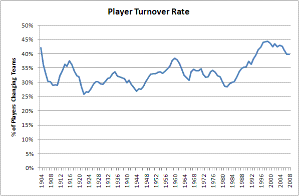
From the 1950's through the 1980's, the level of turnover fluctuated between 30%-35%. There was indeed, no noticeable bump in player movement during the first few years of free agency. The late 1980's however, saw a dramatic shift in the increase of player movement, continuing through the 1990's and 2000's. These decades saw player turnover hit almost 45%, meaning that from one year to the next, a club could have nearly half its roster changed around.
What About Star Players?
As a fan, I wouldn't really mind this as long as the key players remained constant. Were the players moving around team stars, or were they bit players and scrubs? The graph below shows the data split into four groups: Players who were worth less than 1 Win Above Replacement (WAR) in the previous year, players who were worth between 1-3 WAR, players who were worth 3-5 WAR, and players worth more than 5 WAR in the previous year. Each team usually has about half of their roster made up of players with WAR>1, several players worth 3-5 WAR, and just a couple of elite players worth greater than 5 WAR.
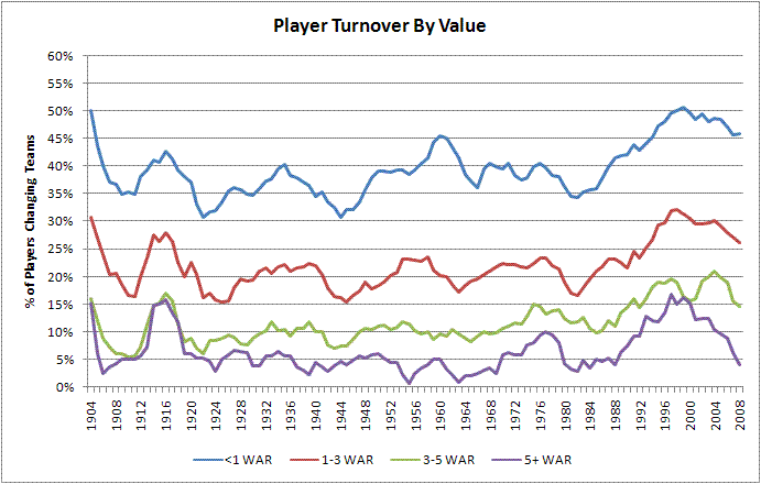
As we can see from the graph, the roster turnover for each type of player follows roughly the same pattern throughout baseball history. We can also see that, not surprisingly, the scrubs have a far higher turnover rate. For the bulk of baseball history, about 40% of these lower-tier players changed teams from one year to the next. For players who are real contributors to the team but not stars, this number drops to about a 20% player turnover rate. The handful of team stars usually changed teams about 10% of the time, while truly great players changed teams just 5% of the time. We saw an initial increase in player movement in the first years of free agency, particularly among better players, but this decreased again by the 1980's.
However, this all changed during the 1990's. In 1988, the (5-year average) rates were in line with the rest of baseball history. However, after the end of MLB collusion, the rates skyrocketed, particularly for the best players. By 1997, the landscape was entirely different. While the turnover rate for poor players increased somewhat from 41% to 50%, the turnover rate for 3-5 WAR players nearly doubled from 11% to 19%. For the truly elite, the turnover rate increased even more dramatically, going from 4% to 17%.
I'm not quite sure what caused this surge. Obviously, the lack of owner collusion was a big part of it. It was also during this period that salaries truly exploded and small-market clubs began to be unable to keep their star players. Prior to this period, most teams were able to sign and keep their stars if they so chose. But during the 90's some teams became simply unable to afford to sign their own top talent. This high turnover trend continued through much of the 2000's as well. Interestingly, and probably not coincidentally, this period of high turnover also coincides with baseball's period of greatest concern over parity between teams.
For fans, this high turnover rate is very disheartening. Having a 15-20% chance that your team's MVP-caliber player will fly the coop every winter is no way to go through life. Fans, being human, become attached to their teams stars and are disappointed when they leave in the prime of their careers.
However, there are signs that this trend has begun to reverse itself. Teams now seem more willing to lock up their stars to long-term contracts and elite player movement has been on the decline. Fewer teams seem willing to build through free agency, and thus more players are staying home. Average turnover rate has declined as a whole over the past 4 or 5 years. Turnover rate, particularly among star players, is back down to its late 1980's and early 1990's level. My data does not include the 2008-09 off-season, but there is reason to hope that player movement is on the downswing.
Player Turnover and Years of Service
Another way to analyze the data is by the number of years of service. While service year data was not available to me, I estimated it based upon the playing time for each player. The graph below shows the data based upon service time completed in the Majors for players who earned at least 1 Win Above Replacement in the previous year.
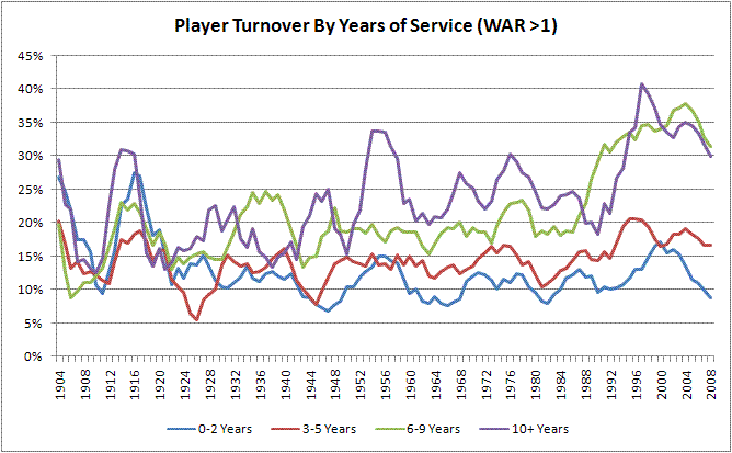
As we can see, the amount of player movement among players with 0-5 years of service is basically unchanged throughout baseball history, hovering about 10-15%. Also discernable from the graph is that veteran players have always been more likely to change teams than younger ones. As one might expect, players with 6 or more years of MLB service increased their likelihood of changing teams dramatically after the advent of free agency. Of course, this makes sense, since these are the very players who are eligible to be free agents. This number starts to increase at the beginning of the free-agent era, but particularly skyrockets during the late 1980's and 1990's. Players with 6-9 years of service went from about a 20% turnover rate in the late 1980's to a 35% turnover rate by the late 1990's. Here we see proof that the increase in player turnover is almost entirely coming from players who are free agent eligible.
Conclusion
As we can see, clearly there have been significant changes in player movement over time. A lot of these changes have been due to free agency. This has particularly manifested itself with players who are eligible for free agency (obviously), and with players who are especially valuable.
Though free agency surely played a part in this transformation, it's interesting that the turnover rate increased most prominently in the late 1980's, not at the beginning of the free agent era. There could be a few possible causes of this. Did players and teams take several years to figure out the free agent system? Did owners participate in collusion during the early 1980's as well as from 1985-1987? Or were other factors independent of free agency at play to create the increase in player movement? The bump in veteran and star player turnover at the beginning of free agency as well as a skyrocketing effect in the late 80's through today gives a hint that free agency likely played a large part in the changing player turnover rates.
So is the economic theory wrong? Not really. Both economic principles outlined earlier assume that things stay the same only if there are no transaction costs. But in Major League Baseball there are significant transaction costs and other barriers. Rottenberg's economic theory would argue that if the reserve clause still existed, the best players would still end up on the Yankees because the Yankees could buy or trade for the players directly. In reality though, the Yankees cannot simply buy Joe Mauer from the Twins for $50 million dollars. The Commissioner's Office would never allow it. Additionally there is the time and hassle that comes with identifying potential trade partners and hammering out a deal. Finally, no small matter is that selling Mauer would come at a significant public relations cost to the Twins, hence discouraging a deal. These restrictions are the reason why the Yankees haven't bought Mauer already and simply will wait to sign him after he becomes a free agent.
In theory, if no transaction costs existed we probably wouldn't see the dramatic differences in the graphs that we do today. However, the significant costs and barriers to the buying and selling of players means that the reserve clause likely does limit player mobility. Even so, we have seen a significant reduction in player mobility in the last few years. It will be interesting to see if this continues, and as a fan I hope that does.
| Baseball Beat | November 09, 2009 |
The Bill James Handbook 2010
What a pleasant surprise it was to receive a review copy of The Bill James Handbook 2010 on Halloween Day before the third game of the 2009 World Series. The Handbook is not only the first baseball stats annual to hit the market each year but the most comprehensive as well.
 The book, featuring Tampa Bay Rays third baseman Evan Longoria on the cover, combines many of the best features of The Sporting News Baseball Register and Baseball Guide—both of which are now defunct, thanks in no small part to Bill James and the team at Baseball Info Solutions and ACTA Sports. This is the eighth year of the Handbook, which I have been reviewing since the 2004 edition was released in November 2003.
Whereas The Bill James Abstracts from 1977-1988, the Bill James Baseball Books from 1990-1992, and The Bill James Player Ratings Books from 1993-1995 were full of commentary from James himself, the Handbook is devoted more to the presentation of stats. However, I'm happy to say that the number of pages penned by James has grown from five six years ago to over 30 this year.
In addition to staples like Team Statistics, the Player Career Register, Fielding Statistics, the Fielding Bible Awards, Park Indices (including the new Yankee Stadium and Citi Field), and Win Shares, new features in this year's book include a history of Instant Replay and Pinch Hitting Analysis.
Major League Baseball introduced instant replay in late August 2008 to determine whether disputable home runs were fair, foul, or interfered with by a fan. In just over one full season, umpires have consulted instant replay 65 times and 22 calls have been overturned. The Handbook provides the details of each and every instant replay review in 2008 and 2009.
James attaches his byline to Team Efficiency Summary, The Baserunners, 2009 Relief Pitchers, Manufactured Runs, The Manager's Record, Young Talent Inventory, Hitter Projections, Pitcher Projections, and Pitchers on Course for 300 Wins.
The most efficient team in baseball is usually the Los Angeles Angels—anyway it was in 2009, and it was in 2008, and it has been in other years. The Angels do little things so well that they are consistently able to grind five or ten more wins a year out of their team than what one would think was available. We don't really understand how they do this, to be frank, but since they do it every year, we know it's not luck. Saying that they "do the little things well" is just a way of covering for the fact that we don't actually know how they do it.If it wasn't for the Angels, we might think it was all luck. There are a couple of parts of the Angels' success that we do understand. For one thing, they run the bases extremely well. They picked up about 96 bases last year, or about 20 runs, just by running the bases better than the average team. Twenty-two of those bases are "stolen base gain," but 74 of them are bases gained by things like going first-to-third on a single or tagging up and advancing. That helps a lot. The Angels in 2009 had 221 "Manufactured Runs," by far the most of any major league team. Second, they usually have a good bullpen, which means that they can put a good pitcher on the mound when the game is close. Even in 2009, when they didn't have a really good bullpen, they also didn't have a really bad bullpen. Those things help to make a team "efficient," as we are using the term.
The least efficient team? The Washington Nationals. Based on category performance such as team batting average and home runs (both offensively and defensively), James contends that the Nationals and the Houston Astros "could have been expected to win about 70 games." Nonetheless, the Astros won 74 games and the Nats were "dreadfully inefficient" with only 59 victories.
The Career Register includes career stats through the 2009 season for every major league player who participated in a game last year, as well as 32 bonus players, including those who missed the entire campaign due to injuries (such as Justin Duchscherer and Ben Sheets) and "potential foreign imports" (like Ryota Igarashi and Hisanori Takahashi). With approximately four or five players per page, this section comprises nearly 270 of the 514 numbered pages.
The Handbook provides traditional and advanced fielding statistics (G, GS, Inn, PO, A, E, DP, Pct., and Range plus SBA, CS, CS%, CERA for catchers), Runs Saved and Plus/Minus leaders, and the Fielding Bible Award winners.
Here are the results of The 2009 Fielding Bible Awards, as determined by a panel of ten analysts, including James, John Dewan, Peter Gammons, Joe Posnanski, and Rob Neyer (with the following commentary provided by Dewan). A complete record of the voting can be found in The Bill James Handbook 2010.
1B: Albert Pujols, STL - Four Fielding Bible Awards in four years. What's left to say?
2B: Aaron Hill, TOR - Hill wins the tie-breaker on the strength of four first-place votes, as opposed to only one for runner-up Dustin Pedroia.
3B: Ryan Zimmerman, WAS - Third base is a strong, deep defensive position in baseball right now, but Zimmerman has set himself apart by becoming the leader in Defensive Runs Saved over the last three years.
SS: Jack Wilson, PIT/SEA - Even though he split time between leagues, Wilson was the best shorstop in baseball this year, leading all shorstops in Runs Saved by a wide margin (27 compared to Brendan Ryan's 19).
LF: Carl Crawford, TB - No player has ever won with a perfect record (10 first-place votes from 10 panelists), but Crawford came as close as possible, garnering nine out of ten possible first-place votes. His 99 total points is an all-time record.
CF: Franklin Gutierrez, SEA - Winner of the 2008 Fielding Bible Award for right field, Gutierrez moved over to center field in 2009. His 31 Runs Saved were tied with Chone Figgins for the most in baseball.
RF: Ichiro Suzuki, SEA - Hunter Pence gave Ichiro a run for his money, but Ichiro finished with 93 points to Pence's 84. This is Ichiro's second Fielding Bible Award.
C: Yadier Molina, STL - Everyone knows about Molina's incredible throwing arm (well, maybe not the eight guys he picked off this year), but Molina was also the third-best bad-pitch-blocking catcher in baseball behind Carlos Ruiz and Jason Varitek.
P: Mark Buehrle, CWS - Buerhle has defensive chops, but his ability to hold runners is legendary. In the last four years he's allowed a total of 15 stolen bases, picked off 14 baserunners, and thrown over to first—only to have the runner break for second and be thrown out—16 times.
The chapter on Baserunning is always one of my favorites, partly due to the hard-to-find numbers and the six pages of James' insights. While Baseball-Reference.com has advanced baserunning stats on each player page, I'm not aware of an alphabetized table that is as readable as those in the Handbook.
Before listing the best and worst baserunners by position, James compares Chone "Gone" Figgins (23-for-43 going from first-to-third on a single and 26-for-31 second-to-home on a single) with Prince Fielder (1-for-45 first-to-third on a single) and David Ortiz (2-for-16 second-to-home on a single), Emilio Bonafacio (10-for-10 first-to-home on a double) with Mike Lowell (0-for-10), and Denard Span (moved up a base 31 times on a WP, PB, Balk, SF, or Defensive Indifference) with Geoff Blum (never advanced a base on any of those plays).
| BEST | WORST | |||||
|---|---|---|---|---|---|---|
| C | Kurt Suzuki | +15 | C | Yadier Molina | -26 | |
| 1B | Carlos Pena | +9 | 1B | Adrian Gonzalez | -29 | |
| 2B | Chase Utley | +50 | 2B | Robinson Cano | -23 | |
| 3B | Chone Figgins | +35 | 3B | Mike Lowell | -27 | |
| SS | Jason Bartlett | +30 | SS | Yuniesky Betancourt | -28 | |
| LF | Ryan Braun | +35 | LF | Juan Rivera | -40 | |
| CF | Michael Bourn | +55 | CF | Kosuke Fukudome | -11 | |
| RF | Ichiro Suzuki | +32 | RF | Gabe Kapler | -19 |
Most people will tell you that we should have Carl Crawford in left field ahead of Ryan Braun, and people will tell you that Yadier Molina actually runs well for a catcher, or at least for a Molina. We don't base this on reputation. Carl Crawford was 8-for-27 going first-to-third on a single. Ryan Braun was 15-for-41, which is better. Crawford was 4-for-9 scoring from first on a double. Braun was 7-for-9. Crawford moved up 24 bases on Wild Pitches, Passed Balls, Balks, Sacrifice Flies and Defensive Indifference. Braun moved up 26 times. Crawford grounded into 7 double plays in 136 DP situations; Braun grounded into 7 in 172 situations. Braun was thrown out 5 times on the bases. Crawford was thrown out 10. Crawford is a very good baserunner—the second-best baserunner among major league left fielders in 2009, including his base stealing—but Braun was better. And Yadi Molina grounded into 27 frigging double plays, which is a record even for a Molina brother.
As James points out, "the difference between the best baserunner in the majors (Michael Bourn) and the worst (Juan Rivera) was 95 bases, or about 24 runs" [editor's note: equal to about 2 1/2 wins].
That's nowhere near as large as the difference between Ryan Howard's bat and Willie Bloomquist's. It is not as large as the difference between Tim Lincecum's arm and R.A. Dickey's, or the difference between Zach Greinke and Luke Hochevar. It is not as large as the difference between having Franklin Gutierrez in center field or Vernon Wells, nor even as large as the difference between Franklin Gutierrez and an average defensive center fielder.It is not that large, but it is not meaningless or insignificant, either. It counts. We count everything because everything counts; that's our motto, or ought to be. On a team level the difference between best and worst baserunners is about 170 bases, or 40+ runs.
In the section on Relief Pitchers, the Handbook details 22 categories (with attendant commentary by James), including Games Pitched, Early Entries, Pitching on ConsecutiveDays, Long Outings, Leverage Index, Inherited Runners, Inherited Runners Who Scored, Inherited Runners Allowed Percentage, Easy Save Opportunity, Clean Outing, Blown Save Win, Saves, Save Opportunities, Holds, Save/Hold Percentage, and Opposition OPS. The stats of every pitcher who appeared in relief are listed in a table sorted by team and by job (closer, setup man, lefty relief specialist, long man, utility reliever, and emergency reliever).
James defines Manufactured Runs "loosely as any run on which two of the four bases result from doing something other than playing station-to-station baseball)" and gives a more technical description encompassing six rules. He says "the most critical element to manufacturing runs, in modern baseball, is speed. . .the bunt, yes, but modern teams don't bunt that much, and it doesn't lead to a lot of runs even when they do."
The best teams in baseball at Manufacturing Runs, pretty much every year, are the Los Angeles Angels of Anaheim and the Minnesota Twins of Bloomington. Those two teams were 1-3 in 2006, 1-2 in 2007, 1-4 in 2008, and 1-2 in 2009. They're good at that. The Angels led the majors in 2009 with 221 Manufactured Runs.
In The Manager's Record, James admits "there are many things that a manager does that are beyond the scope of our analysis." However, he points out that there are "certain things that one manager does differently than another manager that we can study" (likes to use a fixed lineup or experiment; propensity to platoon; use of pinch hitters, pinch runners, and defensive substitutions; quick hooks and slow hooks; tolerance for long outings by starting pitchers; number of relievers and those used on consecutive days; stolen base and sacrifice bunt attempts; hit and run; pitchouts; and intentional walks).
After two years of including Young Talent Inventory, James decided that this item "does not really belong in this book"—opting to move it to the Bill James Gold Mine—for three reasons:
First, this is a book about facts, as opposed to a book of analysis that is in any way speculative. We try to make a record of the season, and we try to include information that has never been seen before, and we try to pull that together as quickly as we can so that we can make it available to you while the breath of the season still hangs in the air.Second, the work process necessary for this book is not compatible with the needs of the Young Talent Inventory. This book is pulled together at a breakneck pace in the ten days following the end of the regular season. There is not a lot of room here for contemplation and review—and wouldn't be, even if that was all we were trying to do.
Third, the issue of which team owns the most talent is a forward-looking question, the sort of thing that one asks in the spring, as the season is getting underway: Who owns the future?
Of course baseball fans care about the future of their franchise as much in the fall as they do in the spring; I'm not suggesting that they don't. But I think it's a question that is more naturally asked in a spring annual than a fall summary, and we're going to move it over there where it belongs. I hope you understand.
The Bill James Handbook 2010 has much, much more to offer, including 2009 Leader Boards, mostly derived from the complex pitch data collected by Baseball Info Solutions. A lot of this information can be found at Baseball-Reference and Fangraphs, but there is something magical about flipping through a book and stumbling across the ten longest home runs in the A.L. and N.L., the ten longest average home runs in each league, the lowest and highest first swing %, the best and worst batting average plus slugging on pitches outside the strike zone, and the most pitches thrown at 95 or 100 mph. Trust me, there's enough enjoyment here to get you through the long winter.
| F/X Visualizations | November 06, 2009 |
The Best Pitch of 2009
Everyone loves end of the season superlatives, so I thought I would join the fun and present 2009's best pitch. First let me say that this is a shameless rip-off of John Walsh's original 'Searching for the game's best pitch' when he looked at the 2007 season's best. I use Walsh's metric which values each pitch by the change in run expectancy from before and after the pitch. Walsh came up with the idea and describes it in that article, it is the way I have always done it and is the way FanGraphs values pitches. The caveat is that it is not stripped of the influence of ballpark, defense or luck. Harry Pavlidis has addressed that with his Expected Run Value, but here I am sticking with the original.
Another way to look at and value pitches is as Chris Moore and Jeremy Greenhouse have done here at Baseball Analysts looking at the process rather than the results. They value fastballs by their expected value based on movement, speed and location. But, again, I am going to go 'old fashioned' and just go with change in expectancy.
A second thing to note is that the owner of the best pitch of 2009 was in the news yesterday for something other than having the best pitch in baseball. I didn't notice until reading it over at Shysterball this morning. The timing is purely conicidental, my only hope is that this news will provide the pitcher a degree of solace if he is feeling down about the recent events.
Anyway, the best pitch of 2009 is Tim Lincecum's changeup. By FanGraphs' reckoning it reduced the run expectancy of Giant's opponents by 35 runs, no other single pitch was above 30 runs. On a rate basis (per pitch) it is the best for any pitch thrown over 200 times. I get the similar results (different numbers but Lincecum's change still comes out on top) when I run it with my pitch classifications and run values (FanGraphs goes with the BIS pitch identifications).
With each year since his debut Lincecum has thrown fewer fastballs, thrown them slower and thrown more changeups. It looks like he is really getting more comfortable throwing other pitches and taking a little bit off his fastball. In 2009 he threw the changeup 13% of the time to RHBs and 26% of the time to LHBs. It is nine mph slower than his fastball.
Here are Lincecum's pitches based on their spin deflection (Mike Fast has told me this is a better term for pfx_x and pfx_z than horizontal movement and vertical movement).
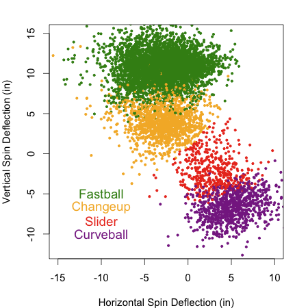
This spin deflection is more like that of a splitter than a normal changeup. Most pitcher's changeups 'drop' more than that pitcher's fastball, but also tail in more to same handed batters (have more horizontal spin deflection). I think that is the movement of a circle change. Lincecum, I think, uses a split finger grip for his change and the result is that the horizontal spin deflection is similar to his fastball and the different in deflection is only in the vertical component. It is interesting to note the Josh Kalk found that a splitter performs better after a fastball than a changeup performs after a fastball.
Here is how that looks in regards to where the pitch ends up.
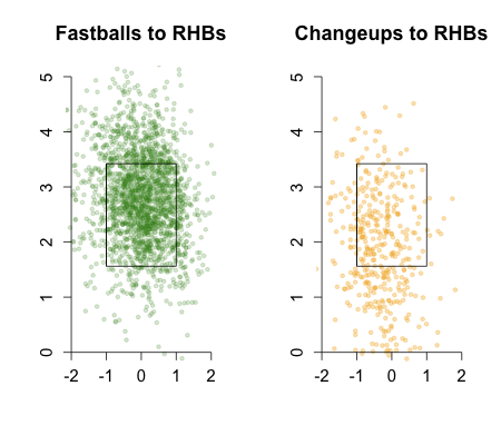
Just as the spin deflection would suggest the pitch ends up down in the zone or below the zone compared to his fastball.
A big reason for the pitch's success is its whiff rate, that is the percentage of time that a batter misses it when he swings at it. Lincecums' changeup has a whiff rate of 43%, while the average change just 28%. The rate at which batters swing at his change and whiff when they do swing is highly dependent on the height of the pitch. Here are those rates for Lincecum's change (orange) and the average change (gray).
Lincecum is better at inducing swings on his change and better at getting whiffs, particularly low in and below the strike zone.
In the middle of the season I checked in on Lincecum's chanegup over at FanGraphs and noted that its value was dependent on its speed differential from the preceding fastball and the number of fastballs preceding it in the at-bat. So we cannot say that Lincecum's changeup succeeds in a vacuum; its success is predicated on his fastball. That is one of the limitations of this pitch valuation system. Another is that Lincecum gets credit for the Giants excellent defense, pitching in the NL and pitching half his game in a pitcher's park.
With those caveats in mind, there you have it Tim Lincecum's changeup, 2009's best pitch.
| Touching Bases | November 05, 2009 |
Visual Scouting Reports (Beta)
What if I could just punch a couple lines into my computer and get to see the strengths and weaknesses of a player in graphical form? Harry Pavlidis does a good job using pitchf/x data to give a brief summary of pitchers, and Dave Allen is like King Midas graphing with R. I've set out to develop my own set of hitter graphs and I ask for your help in improving them for future, more in-depth, player analysis.
Here's what I've got so far, using Jayson Werth's 2008-2009 data as an example.
I'll break down the three components one by one. For now, the graphs represent the three most meaningful locations of the baseball's flight--from the pitcher's hand to the strike zone to the hit location. Here's Werth's "Batter Zone."

These are from the batter's perspective. Here, you can see Werth's expected run value is worst against pitches up in the zone and down and away. As you know, this holds true for most hitters. Where you see blue on the graph on the left, he performs worse than his average self. Then on the right, you see how he compares to the league average. He excels on pitches down and in, but is worse when challenged up.
So, how to improve these visualizations? I'm using a standard strike zone, but I'd like to create contour lines showing each batter's individual strike zones, and swing zones, showing where he's most likely to let it fly. I'm unsure how large the data frame should be. Right now, set at four feet by three feet, it captures the intricacies within the strike zone, but it might be leaving out some information for players like Vlad. The downside to expanding the frame is that for most graphs, the extra space will be occupied entirely by the average value of a ball, which will overwhelm the details of the visual. Lastly, for the graph on the right comparing Werth to average, I don't know whether to fix the color bar so that great hitters, like Chase Utley, appear red everywhere, since he's above average at everything, or to color in blue locations where he has a mere expected value of .01 runs better than average, since he's not as awesome in those locations as he is in others.
Here is how Werth does against release points, which is informative in showing his platoon splits.
It appears to me that Werth has a normal platoon split, but struggles a fair bit against righties with a lower arm slot.
Lastly, Werth's spray charts.

Werth pulls his grounders at a high rate. In the outfield, depending on the precision of the data, the center fielder should shade a bit towards left.
I'd appreciate any input on how to improve this set of graphs. I'd also like to come up with graphs to show how hitters fare based on velocity and movement, but nothing comes to mind, and I have ideas for how to present hitf/x data if we ever get more of it.
I ran through the Phillies lineup excluding switch-hitters, so here they are, with brief comments. A quick glance at these graphs certainly won't give you any answers, but it might give some food for thought.
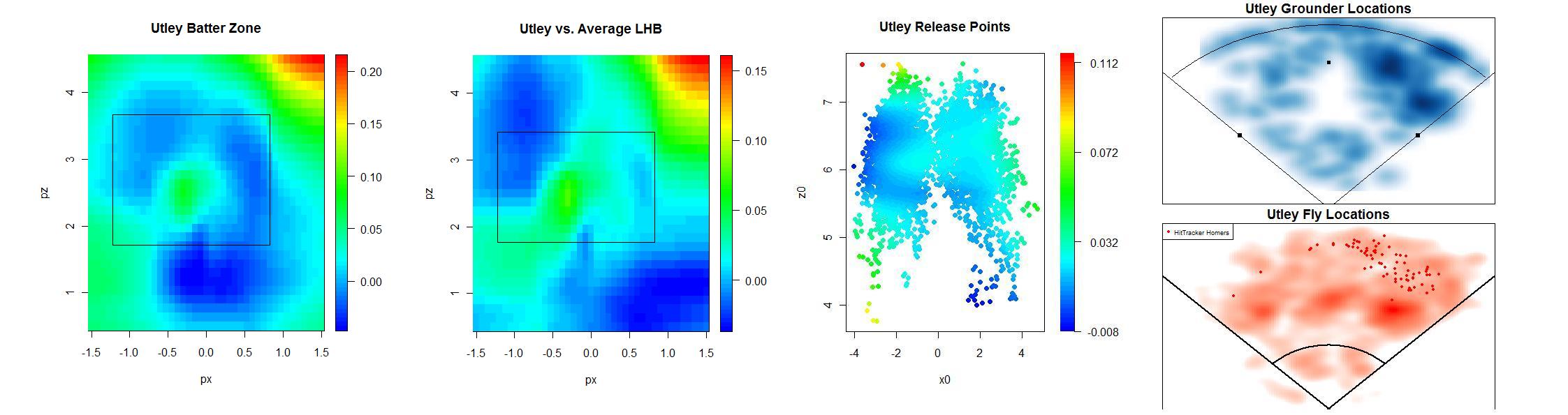
Utley is an insanely good hitter, no matter where you pitch him. However, don't try to brush him back, as Buster Olney suggested, because he will take his HBPs, which I'm guessing is what that graph's upper-right red portion consists of. He pulls almost everything.
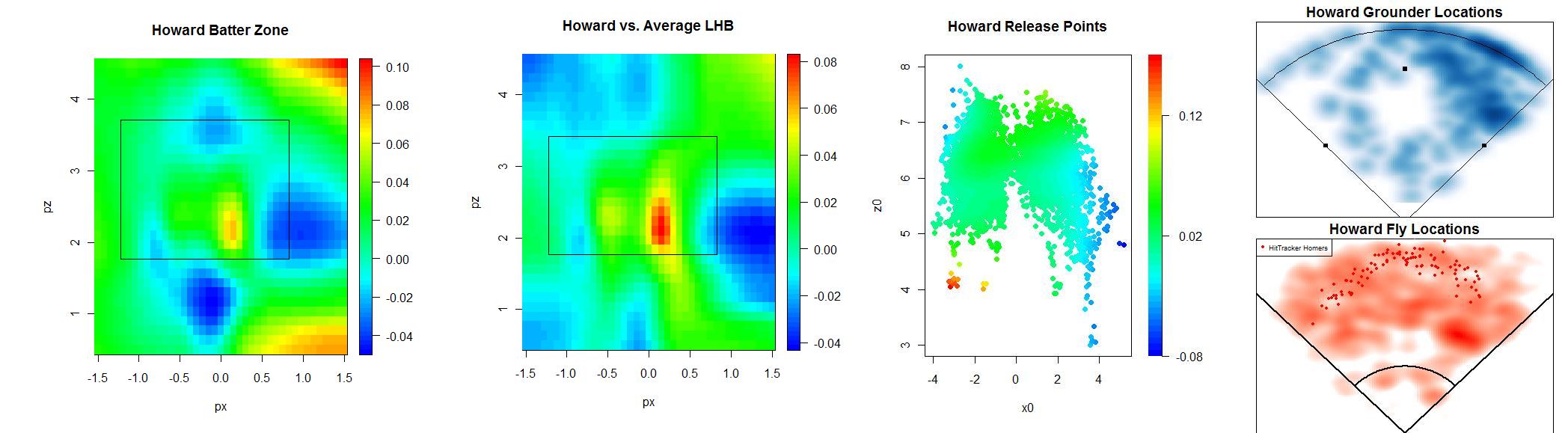
Howard also famously pulls his ground balls. Shifting against him is an obvious strategy, but the real question is where the third baseman should play.
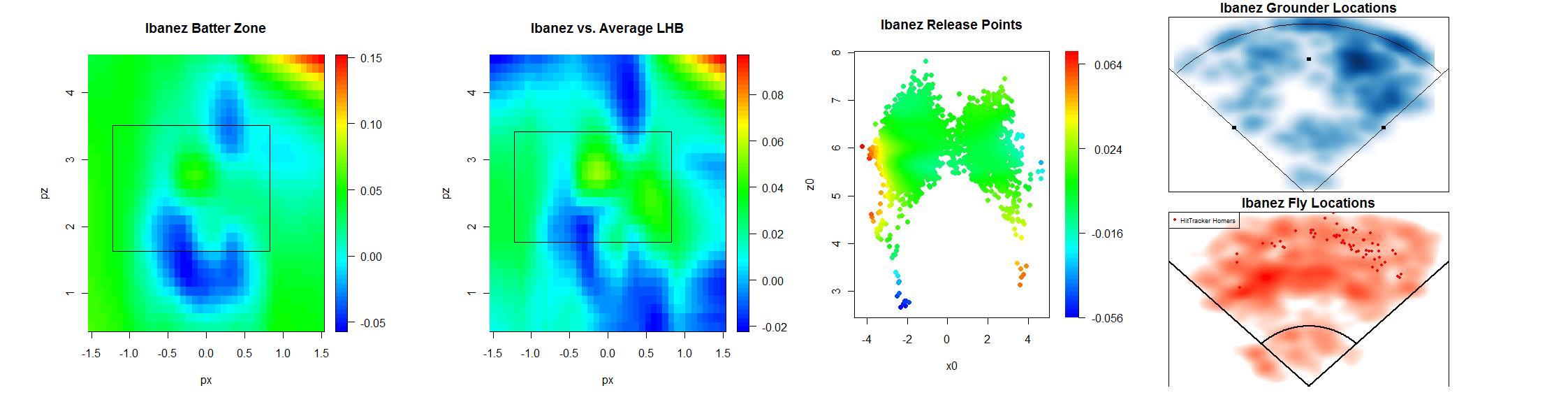
Ibanez has similar batter zones as Utley, but he's not as good anywhere.

Feliz is actually a good hitter on pitches away. I'd imagine that's because he lays off of most of them, since he can't hit them anyway. But he can be beat on the inner half. Feliz shows no platoon split and a normal spray chart.
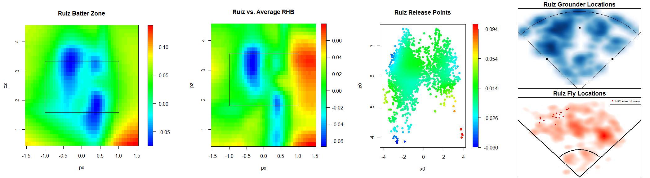
Boy did Ruiz have a great series. He hits most of his flies the other way,but has hit all of his home runs to his pull field.
Please don't shy from sharing your thoughts.
| Behind the Scoreboard | November 03, 2009 |
Should the Phillies Have Pulled Cliff Lee With A Big Lead?
The Phillies found themselves in a 3-1 hole going into Monday night. Luckily for them, they had their ace, Cliff Lee, on the mound for them. But the Phillies bats went into overdrive for them as well, putting up six runs in three innings.
After three, the Phillies had a commanding 6-1 lead, and Cliff Lee had thrown just 50 pitches. Should Manuel have pulled Lee at that point, saving him so that he had the ability to throw more innings in a potential Game 7?
The conventional wisdom of course, is that you have to win Game 5 to even get to a Game 7, so Lee should stay in the game as long as he can. Had Manuel removed Lee and had Brett Myers, J.A. Happ and Co. blown the game in the late innings, he would have been run out of town on a rail. There's no doubt about it that sticking with Lee was the safe choice, in terms of job security and avoiding criticism. But was it the right move in maximizing the Phillies chance of winning the World Series?
The Phillies chances to win the game at that point were approximately 93%. If they won that one, they'd have to win games 6 and 7 as well, giving them an overall series probability of .93*.5*.5 = 23.25%. Now, let's exaggerate things a bit, and assume that Lee is a perfect pitcher who will not allow a run. If Manuel lets him throw 7 strong innings, allowing no additional runs, he'll have increased the Phillies chance to win the game from 93% to 99%, raising the probability that the Phillies win the series to 24.75%. That's was the option Manuel chose.
His other choice was to remove Lee from the game, with the tradeoff that Lee would be able to pitch an extra couple of effective innings in Game 7 if it went that far - quite a reasonable assumption considering he had thrown only 50 pitches in Game 5. Again assuming Lee's perfection, two innings of scoreless work in Game 7 would have raised the Phillies probability of winning Game 7 from 50% to 60%. Therefore, the overall probability of winning the series would be .93*.5*.6 = 27.9%.
As we can see, removing Lee in order to allow him to pitch two additional Game 7 innings would have been a much better move than allowing Lee to throw seven innings Monday night. The move increased the probability by 4.65% whereas leaving Lee out there in Game 5 increased the probability by just 1.5% - making his use in Game 7 about three times more valuable than his continued use in Game 5 (since Lee is of course, not a perfect pitcher, these absolute percentages are larger than they are in real life, however, the ratio between the two choices should be about the same).
Even if you assume that Lee would be able to pitch only one additional inning in Game 7, removing Lee would still be a good idea, raising the probability to 25.6% (vs. 24.75% when letting Lee continue in Game 5).
Had the Phillies been leading 3-1 rather than trailing 3-1, Manuel would certainly have made the right move, but the fact that the Phillies needed to win all three games makes it a better idea to spread out their advantages throughout the series. Since Game 5 was already nearly in hand, the Lee's continued presence on the mound didn't help the Phillies a whole lot, while a couple of scoreless innings in a potential Game 7 would be a decided advantage.
It seems that removing Lee and saving him for Game 7 would have been the right call. Still I wouldn't have liked to be in the hot seat all-winter long had I pulled Lee and the Phillies gone on to lose Game 5.