Rich Lederer • Baseball Beat
Patrick Sullivan • Change-Up
Jeremy Greenhouse • Touching Bases
Dave Allen • F/X Visualizations
Sky Andrecheck • Behind the Scoreboard
Marc Hulet • Around the Minors
Al Doyle • Past Times
Retired Uniforms:
Bryan Smith • WTNY
Joe Sheehan • Command Post
Jeff Albert • The Batter's Eye
RSS Feed
Home
*Examining the Past, Present, and Future*
Lineup Card
Recent Entries
» Putting Together a Reality Team
» Historical Hall of Fame Vote Comparisons: 2012
» An All-Christmas Team
» The New-Look Angels
» John Denny: The Forgotten Cy Young Award Winner
» Money Isn't Everything
» What Would It Take to Hit .400 in the 21st Century?
» Halos Heaven
» Brandon McCarthy's Breakout Season
» Link-o-Rama
» Historical Hall of Fame Vote Comparisons: 2012
» An All-Christmas Team
» The New-Look Angels
» John Denny: The Forgotten Cy Young Award Winner
» Money Isn't Everything
» What Would It Take to Hit .400 in the 21st Century?
» Halos Heaven
» Brandon McCarthy's Breakout Season
» Link-o-Rama
Best of Baseball Beat
Abstracts From the Abstracts
1977 Baseball Abstract
1978 Baseball Abstract
1979 Baseball Abstract
1980 Baseball Abstract
1981 Baseball Abstract
1982 Baseball Abstract
1983 Baseball Abstract
1984 Baseball Abstract
1985 Baseball Abstract
1986 Baseball Abstract
1987 Baseball Abstract
1988 Baseball Abstract
1978 Baseball Abstract
1979 Baseball Abstract
1980 Baseball Abstract
1981 Baseball Abstract
1982 Baseball Abstract
1983 Baseball Abstract
1984 Baseball Abstract
1985 Baseball Abstract
1986 Baseball Abstract
1987 Baseball Abstract
1988 Baseball Abstract
Bert Blyleven Series
Meeting Up and Hanging Out with Bert
The Results Are In And...
Aficionado Heavily Invested in Blyleven
Latest on Blyleven's Chances for the HOF
The Internet Zealot Responds
400 Down and 5 to Go...
Bert Be Home By Eleven?
Blyleven's Forgotten Season (1973)
HeyMan, Your Comments Don't Hold Water
The Waiting is the Hardest Part
Another Addition to the Blyleven Series
Search for the Truth
As Dominant as His HOF Contemporaries
Listen, Buster
A Larger Step for Blyleven
Answering the Naysayers (Part Two)
Another Small Step for Blyleven
Q&A: Blyleven on the Twins
The Majority Rules, Right?
It's All Dutch to Some
The Hall of Fame Case for Bert Blyleven
Q&A: Blyleven on Felix Hernandez
Clemens Rocketing Up Charts
Poz: An Interview With a KC Star
A HOF Chat with Tracy Ringolsby
Up Close and Personal
A Peek Into the Mind of a HOF Voter
Answering the Naysayers
It's That Time of the Year (Again)
"If Cooperstown is Calling..."
The Bert Alert
One Small Step for Blyleven...
Only the Lonely
Exclusive Interviews
Lee Sinins
Alex Belth
David Pinto
Will Carroll
Mike Carminati
Aaron Gleeman
Joe Sheehan
Jay Jaffe
Jeff Peek
Tracy Ringolsby
Joe Posnanski
Bill James Part I, II, III
Jon Lalonde
Chuck Tiffany
Dayn Perry
Fay Vincent
Nate Silver
Alex Belth
David Pinto
Will Carroll
Mike Carminati
Aaron Gleeman
Joe Sheehan
Jay Jaffe
Jeff Peek
Tracy Ringolsby
Joe Posnanski
Bill James Part I, II, III
Jon Lalonde
Chuck Tiffany
Dayn Perry
Fay Vincent
Nate Silver
Bullpen
Rich Lederer
The Odd Couple (with Alex Belth)
The MostUnder Over Underrated Player in Baseball (with Brian Gunn)
Three Wise Men (roundtable by Alex Belth)
Infrequently Asked Questions (interview with Matt Welch)
Interview (Orioles Think Tank)
Bernie and the Yanks (Bronx Banter)
Hope and Faith: How the LAA Win the World Series (Baseball Prospectus)
NL West (The Soul of Baseball)
Greatest Living Hitter? (Sports Illustrated)
Roundtable: 2008 HOF Ballot (Armchair GM)
The Most
Three Wise Men (roundtable by Alex Belth)
Infrequently Asked Questions (interview with Matt Welch)
Interview (Orioles Think Tank)
Bernie and the Yanks (Bronx Banter)
Hope and Faith: How the LAA Win the World Series (Baseball Prospectus)
NL West (The Soul of Baseball)
Greatest Living Hitter? (Sports Illustrated)
Roundtable: 2008 HOF Ballot (Armchair GM)
Patrick Sullivan
Designated Hitters
David Bromberg (Q&A: John Denny)
Mark Armour (H. Killebrew and Versatility)
Joe Lederer (Soundtrack of a Prospect)
David Bromberg (Clemente's Autograph)
David Bromberg (Woody Fryman)
D. Baumstein (WAR Against Age: Pitchers)
Doug Baumstein (The WAR Against Age)
Doug Baumstein (A Lifetime on the Road)
John Fraser (Pick Six)
Mark Armour (How to Score More Runs?)
Bill Parker (What Opening Day Tells Us)
Stan Opdyke (Pat Rispole)
Chris Jaffe (Evaluating Baseball's Mgrs)
Stan Opdyke (Baseball Radio in NYC, 1953)
A. Nathan (Performance of Baseball Bats)
Michael Weddell (Edgar Martinez/HOF)
Jon Weisman (100 Things Dodgers Fans...)
Stan Opdyke (Connie Mack and Vin Scully)
Eric Walker (Evaluating Run Production)
Brent Mayne (The Intangibles of Catching)
Chris Moore (Best Fastballs in Baseball)
Dave Baldwin (The Batter’s Brain)
Shawn Haviland (Ivy League to MLB)
Larry Granillo (Walking Off)
Rob Iracane (Solo HR Won't Break You)
Tommy Bennett (Charm of AM Radio)
Harry Pavlidis (Johan Santana's Fast Start)
John Walsh (WAR and Remembrance)
Eric Walker (Precisely Inaccurate)
Bob Timmermann (As They See 'Em)
Geoff Young (Unicycles and Delusions)
Baseball Analysis at Tufts (Groundballers)
Baseball Analysis at Tufts (GB Out Rates)
G. Rybarczyk ('09 Hit Tracker Projections)
Joe Lederer (Curt Schilling/HoF)
Conor Gallagher (Hall of Fallacies)
Chris Green (Jim Rice, HoF, the Numbers)
Shawn Hoffman (Baseball's Bear Mkt?)
Paul Anthony (Manny Syndrome)
Ross Roley (World Series Odds)
B. Timmermann (Catcher's Interference)
R.J. Anderson (Waiting the Hardest Part)
Maury Brown (Cubs, MLB, and Cuban...)
Myron Logan (Dee-Fense, Dee-Fense)
Craig Calcaterra (Frivolity, Part I, Part II)
Chad Finn (Ode to Baseball Cards)
David Cameron (Mariners Foibles)
Chris Dial (Chipper Jones)
Pat Lederer (Memory Lane)
David Appelman (Clutch Pitching)
Bob Rittner (DH)
Jonathan Mayo (Roger Clemens)
Lisa Winston (My Son-in-Law...)
Russ McQueen (The Yellow Hammer)
Bob Rittner (I'm OK, You're OK)
Mark Armour (In Defense of the HOF)
Pat Jordan (Friends)
Dan Levitt (Analysis of Terry Ryan)
Doug Baumstein (Trading Econ 101)
Ross Roley (Runner's Reluctance II)
Ross Roley (Runner's Reluctance I)
Mark Armour (No-Longer Lovable Sox)
Bruce Regal (Stealthy and Wise)
Brian Gunn (Roid Monster)
Current/McEvoy (Value of the SB)
John Rickert (Sinister Thefts)
Nate Silver (Sabermetrics)
David Vincent (Home Run Production)
Joe P. Sheehan (Enhanced Gameday II)
Mark Armour (An Ode to Sport)
David Gassko (All-Time Worm Burners)
Joe P. Sheehan (Enhanced Gameday)
John Walsh (When Titans Clash)
Fox/Williams (Quantifying Coaches II)
Fox/Williams (Quantifying Coaches I)
Jacob Luft (Bull Durham Rant)
Chad Finn (Strat-O-Matic)
Lisa Winston (Rotisserie Baseball)
Dave Studeman (Baseball Stats)
Steve Treder (Roger Craig)
Marc Normandin (Jeff Bagwell)
D. Appelman (Expanding Strike Zone)
Jeff Sackmann (Worst MiL Defenders)
Jeff Sackmann (Best MiL Defenders)
Maxwell Kates (Van Lingle Mungo)
David Appelman (Pitch Location)
Kent Bonham (Danny Ray Herrera)
Glenn Stout (Two Baseball Poems)
Bruce Regal (The Challenge Round)
Mark Lamster (Barry & Ty)
Geoff Young (NL West)
Tom Lederer (The Ryan Express)
Brian Erts (Great Leap Forward)
David Pinto (Parity and the N.L.)
Jacob Luft (Fathers and Daughters)
Jamey Newberg (Pete's Sake)
Jeff Albert (A. Jones Swing Analysis)
Jeff Albert (A-Rod Swing Analysis)
Keith Law (Death, Taxes, and Waivers)
Peter Abraham (Tales of Torre Tales)
Larry Borowsky (Let 'er Rip II)
Dan Levitt (Empirical Analysis of Bunting)
Jonah Keri (If I Met Warren Cromartie...)
Bob Klapisch (War Stories)
Bob Timmermann (John F. Kennedy HS)
Kent Bonham (Aluminum Adjustments)
Al Doyle (More Than Superstars)
Ross Roley (Instant Replay)
David Vincent (Barry Bonds Homers)
Chad Finn (Our Favorite Obscurities)
Bill Deane (1979 NL MVP)
Mark Armour (Rise/Fall of Artificial Turf)
Jeff Angus (Wally Moon Camp)
David Berri (Money and Baseball)
Larry Borowsky (Baseball w/o the #s)
Derek Zumsteg (The Irrational Market)
David Regan (Free Agent Contracts)
Peter Schmuck (Steroids and the HOF)
David Appelman (Pitchers, Pitch by Pitch)
Dan Fox (Swinging, Taking, Fouling, Etc)
Patrick Sullivan (Study of NYY CF/BOS LF)
Will Leitch (Baseball Journalism)
Jeff Sullivan (Pitcher Release Points)
Steve Treder ('69-'70 Giants)
Maury Brown (Charlie Finley)
John Brattain (Bob Johnson)
Bob Klapisch (The Case for Bert Blyleven)
Jeff Peek (Pride and Prejudice)
Dayn Perry (Bert and Warren)
Rob Neyer (If Don Sutton Was Great...)
Lisa Winston (Minor League Memories)
Alex Belth (Otis Redding Was Right)
David Cameron (Long Live the King)
Jeff Angus (Baserunning Study)
Bert Blyleven (Baseball Playoffs)
Boyd Nation (Not a Prospect List)
James Click (Batters-Baserunners Study)
Jeff Shaw (Why I Love Baseball)
David Gassko (BIP/BFP Fielding Study)
Jay Jaffe (Milwaukee Sausage Race)
Jamey Newberg (Remember When)
Bob Klapisch (Press Box to the Mound)
Dan Levitt (Predictive Value of BB)
David Vincent (Official Scorer)
Jon Weisman (Rick Monday)
Larry Borowsky (Let 'er Rip)
Will Carroll (Fictional Short Story)
Bob Timmermann (Japanese Baseball)
Cyril Morong (Best Pitching Seasons)
Sean Forman (Monte Carlo Win-Loss)
Brian Gunn (My Little Blue Book)
Joe Lederer (My Dad and Baseball)
Bill Deane (Bob Gibson, 1968)
Mark Armour (1977 Yankees)
Darren Viola (Retrosheet)
David Pinto (RFK)
Dayn Perry (Brave Heart)
Matt Welch (Dave Hansen)
Kevin Kernan (Jack McKeon)
Tom Lederer (Dodgers Road Trip)
Steve Lombardi (Slider)
Studes (Picturing Baseball)
Mike Carminati (Luck of the Drawl)
Eric Neel (Vin Scully)
J.C. Bradbury (Leo Mazzone)
John Sickels (Bill James)
Search Baseball Analysts
Archives
By Category:
Around the Majors Content Only
Around the Minors Content Only
Baseball Beat Content Only
Baseball Beat/Change-Up Content Only
Baseball Beat/WTNY Content Only
Behind the Scoreboard Content Only
Change-Up Content Only
Change-Up/Around the Majors Content Only
Command Post Content Only
Crunching the Numbers Content Only
Designated Hitter Content Only
F/X Visualizations Content Only
Past Times Content Only
Saber Talk Content Only
The Batter's Eye Content Only
Touching Bases Content Only
Weekend Blog Content Only
WTNY Content Only
By Month:
February 2012
January 2012
December 2011
October 2011
September 2011
August 2011
July 2011
June 2011
May 2011
April 2011
March 2011
February 2011
January 2011
December 2010
November 2010
October 2010
September 2010
August 2010
July 2010
June 2010
May 2010
April 2010
March 2010
February 2010
January 2010
December 2009
November 2009
October 2009
September 2009
August 2009
July 2009
June 2009
May 2009
April 2009
March 2009
February 2009
January 2009
December 2008
November 2008
October 2008
September 2008
August 2008
July 2008
June 2008
May 2008
April 2008
March 2008
February 2008
January 2008
December 2007
November 2007
October 2007
September 2007
August 2007
July 2007
June 2007
May 2007
April 2007
March 2007
February 2007
January 2007
December 2006
November 2006
October 2006
September 2006
August 2006
July 2006
June 2006
May 2006
April 2006
March 2006
February 2006
January 2006
December 2005
November 2005
October 2005
September 2005
August 2005
July 2005
June 2005
May 2005
April 2005
March 2005
February 2005
January 2005
December 2004
November 2004
October 2004
September 2004
August 2004
July 2004
June 2004
May 2004
April 2004
March 2004
February 2004
January 2004
December 2003
November 2003
October 2003
September 2003
August 2003
July 2003
June 2003
Reference
Organizational Stats
Arizona Diamondbacks Bat / Pitch
Atlanta Braves Bat / Pitch
Baltimore Orioles Bat / Pitch
Boston Red Sox Bat / Pitch
Chicago Cubs Bat / Pitch
Chicago White Sox Bat / Pitch
Cincinnati Reds Bat / Pitch
Cleveland Indians Bat / Pitch
Colorado Rockies Bat / Pitch
Detroit Tigers Bat / Pitch
Florida Marlins Bat / Pitch
Houston Astros Bat / Pitch
Kansas City Royals Bat / Pitch
Los Angeles Angels Bat / Pitch
Los Angeles Dodgers Bat / Pitch
Milwaukee Brewers Bat / Pitch
Minnesota Twins Bat / Pitch
New York Mets Bat / Pitch
New York Yankees Bat / Pitch
Oakland Athletics Bat / Pitch
Philadelphia Phillies Bat / Pitch
Pittsburgh Pirates Bat / Pitch
St. Louis Cardinals Bat / Pitch
San Diego Padres Bat / Pitch
San Francisco Giants Bat / Pitch
Seattle Mariners Bat / Pitch
Tampa Bay Devil Rays Bat / Pitch
Texas Rangers Bat / Pitch
Toronto Blue Jays Bat / Pitch
Washington Nationals Bat / Pitch
All-Star Links
Official Websites
News and Notes
Baseball News Blog
Baseball Newstand
ESPN Baseball
Fox Sports Baseball
Pro Sports Daily
Roto World
The Roto Times
USA Today Baseball
Baseball Newstand
ESPN Baseball
Fox Sports Baseball
Pro Sports Daily
Roto World
The Roto Times
USA Today Baseball
Reference and Analysis
Baseball Almanac
Baseball America
Baseball Archive
Baseball Contracts
Baseball Cube
Baseball Graphs
Baseball Library
Baseball Musings Player Database
Baseball Page
Baseball Primer
Baseball Prospectus
Baseball Reference
Baseball Statistics
Baseball Truth
Boxscore Central
Diamond Mind Baseball
Doug's Stats
FanGraphs
Fast Balls (pitchfx catalog)
Hardball Dollars
Hardball Times
Hit Tracker
Retrosheet
Rotobase/Rotoblog
Stat Corner
STATS
Tango on Baseball
Yahoo Sports MLB
Web Gems
Bill James Primer
Sabermetric Manifesto (Grabiner)
Pitching and Defense (McCracken)
Pitching and Defense (Tippett)
Transactions Primer (Neyer)
Baseball Stats (Batter's Box)
Prospect Report (Cameron)
Pitcher Workloads (Sheehan)
Goodbye to Old Baseball Ideas (Rickey)
Sabermetric Manifesto (Grabiner)
Pitching and Defense (McCracken)
Pitching and Defense (Tippett)
Transactions Primer (Neyer)
Baseball Stats (Batter's Box)
Prospect Report (Cameron)
Pitcher Workloads (Sheehan)
Goodbye to Old Baseball Ideas (Rickey)
Columnists
Baseball Blogs
Around the Majors
Athletics Nation
Baseball Crank
Baseball Musings
Baseball-Reference Blog
Batter's Box
Big League Stew
Bronx Banter
Catfish Stew
Cub Town
Dan Agonistes
Dodger Thoughts
DRays Bay
Ducksnorts
Futility Infielder
Halos Heaven
Inside the Rockies
It Might Be Dangerous
Knuckle Curve
LoHud Yankees Blog
Lookout Landing
Management by Baseball
Metaforian
Metsgeek
Mike's Baseball Rants
Only Baseball Matters
Redbird Nation
Red Reporter
Sabernomics (Braves)
Seth Speaks
ShysterBall
6-4-2 (Angels/Dodgers)
The Book
TheCubdom
The Cutting Edge
The House That Dewey Built
The View From The Bleachers
Tiger Blog
U.S.S. Mariner
Viva El Birdos
Where's Kernan
Minor Leagues
Arizona Fall League
BA Player Finder
Cal Leaguers
Jamey Newberg
JDM's Scoresheet Baseball
Minor League Baseball
Minor League Park Factors
Minor League Splits
No Pepper
Sickels' Minor League Ball
Warm October Nights
BA Player Finder
Cal Leaguers
Jamey Newberg
JDM's Scoresheet Baseball
Minor League Baseball
Minor League Park Factors
Minor League Splits
No Pepper
Sickels' Minor League Ball
Warm October Nights
Amateur
Boyd's World (College)
Cape Cod Baseball League
College Baseball Blog
College Baseball Insider
Collegiate Baseball Newspaper
College Splits
College Splits Blog
Dirtbags Baseball (Long Beach State)
NCAA Baseball
NCBWA
Team One Baseball (High School)
Texas A&M & Baseball
Cape Cod Baseball League
College Baseball Blog
College Baseball Insider
Collegiate Baseball Newspaper
College Splits
College Splits Blog
Dirtbags Baseball (Long Beach State)
NCAA Baseball
NCBWA
Team One Baseball (High School)
Texas A&M & Baseball
Historical
Cuban Baseball
House of David
Jim "Mudcat" Grant's Web Page
Negro League Baseball Players Assoc
Negro Leagues Baseball Museum
1919 Black Sox
Pacific Coast League
Philadelphia Athletics Historical Society
Shoeless Joe Jackson Society
SABR-L Archives
Walter O'Malley
House of David
Jim "Mudcat" Grant's Web Page
Negro League Baseball Players Assoc
Negro Leagues Baseball Museum
1919 Black Sox
Pacific Coast League
Philadelphia Athletics Historical Society
Shoeless Joe Jackson Society
SABR-L Archives
Walter O'Malley
Miscellaneous
Forums
Credits
Ticket Center
Tickets to Baseball -
Premium Red Sox Tickets - Tickets to Marlins Games - Cardinals Game Tickets - NY Yankee Tickets - Tickets Oakland Athletics - Dallas Cowboys Tickets - Arizona Cardinals Tickets - Tickets Seattle Seahawks - Buffalo Bills Tickets Online - Tickets to Dolphins Football
Buy Boston Red Sox tickets,
Philadelphia Phillies tix,
NY Yankees tickets,
NY Mets tickets, and
MLB All Star game tickets at ABC tickets
Not sure where to find the best online sportsbooks? Start your search with PlayersJet.
Get deals at SportsMemorabilia.com on baseball apparel, including Phillies jerseys and more for adults and children.
Shop the largest selection baseball equipment on sale at Sports Unlimited. Check out tons of baseball gloves, youth baseball gloves and catchers gear from Rawlings, Wilson, Nike & Under Armour.
2011 Draft Order
Courtesy of Baseball America
First-Round:
 1. Pirates (57-105)
 2. Mariners (61-101)
 3. Diamondbacks (65-97)
 4. Orioles (66-96)
 5. Royals (67-95)
 6. Nationals (69-93)
 7. Diamondbacks (for B. Loux)
 8. Indians (69-93)
 9. Cubs (75-87)
10. Padres (for Karsten Whitson)
11. Astros (76-86)
12. Brewers (77-85)
13. Mets (79-83)
14. Marlins (80-82)
15. Brewers (for Dylan Covey)
16. Dodgers (80-82)
17. Angels (80-82)
18. Athletics (81-81)
19. Red Sox (from DET for Martinez)
20. Rockies (83-79)
21. Blue Jays (85-77)
22. Cardinals (86-76)
23. Nationals (from CWS for Dunn)
24. Rays (from BOS for Crawford)
25. Padres (90-72)
26. Red Sox (from TEX for Beltre)
27. Reds (91-71)
28. Braves (91-71)
29. Giants (92-70)
30. Twins (94-68)
31. Rays (from NYY for Soriano)
32. Rays (96-66)
33. Rangers (from PHI for Lee)
Supplemental First Round:
34. Nationals (Dunn)
35. Blue Jays (Downs)
36. Red Sox (Martinez)
37. Rangers (Lee)
38. Rays (Crawford)
39. Phillies (Werth)
40. Red Sox (Beltre)
41. Rays (Soriano)
42. Rays (Balfour)
43. Diamondbacks (LaRoche)
44. Mets (Feliciano)
45. Rockies (Dotel)
46. Blue Jays (Buck)
47. White Sox (Putz)
48. Padres (Garland)
49. Giants (Uribe)
50. Twins (Hudson)
51. Yankees (Vazquez)
52. Rays (Benoit)
53. Blue Jays (Olivo)
54. Padres (Torrealba)
55. Twins (Crain)
56. Rays (Choate)
57. Blue Jays (Gregg)
58. Padres (Correia)
59. Rays (Hawpe)
| Command Post | March 14, 2008 |
Finish Him
I've been looking at the run values of different pitch locations for the last couple of weeks and today I wanted to examine the frequency that pitches are thrown to a particular location. The frequency a pitch is thrown plays a huge part in it's effectiveness, and I believe the frequency it is thrown to a certain location is a further refinement on looking at just regular frequency. I found some interesting regarding the success against fastballs in certain areas last week and thought that maybe looking at the frequency could help clarify some of those findings.
In order to examine the locational frequencies I created density plots that show how often a pitch is thrown in a certain area. The dots on the plot are individual pitches and are colored based on the local frequency. The color scale follows the standard convention of a density plot, with "hotter" colors representing areas where events are more frequent. Another thing to keep in mind when looking at these graphs is that the scales are relative for each situation. This isn't ideal, because you can't easily compare frequencies across situations, but it works fine for each situational graph individually.
Starting in an 0&0 count, lets see how pitchers start right-handed hitters off. The four graphs below show the frequency that fastballs, changeups, sliders and curveballs are thrown in that situation.
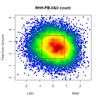
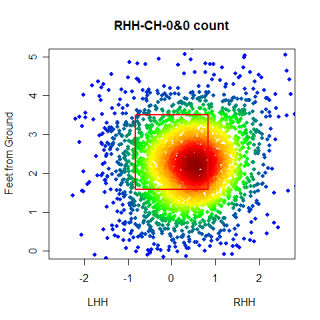
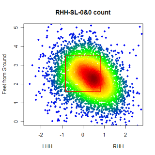
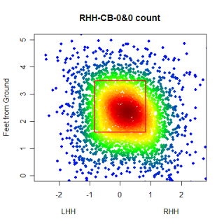
Again, you can't directly compare the scales from graph to graph, but you can get a good idea of where the different types of pitches are thrown. One thing that was somewhat interesting, especially after looking at these graphs, was the frequency that pitchers worked inside to RHH. 0&0 is a neutral count, so the pitcher has some choice with where he throws a pitch, but whats interesting is how the locations for different pitches in an 0&0 count compare to the locations for the same pitches in an 0&2 count.
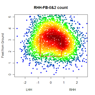
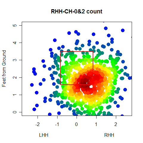
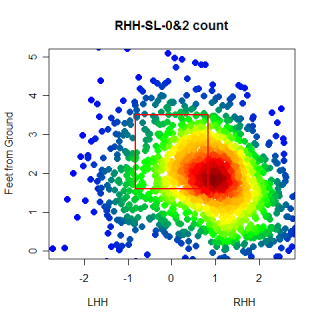
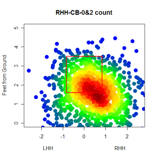
This is pretty neat. The locations are pretty much what we would expect, with more pitches being thrown out of the zone and at the corners than before. You can see that pitchers do go up in the zone with 0&2 fastballs and that 0&2 breaking balls are thrown down and out of the zone.
There is a ton more to learn from these graphs and similar pictures, however, I'm not going to be the person who does the majority of that discovering, at least not online. I've taken an internship with an MLB team and this is my last article for Baseball Analysts.
Sure the pay is low and the hours are long, but for a 23 year old baseball fiend, there's no cooler feeling than going to work at the ballpark everyday. Working in professional baseball is what I want to do. I'm deeply indebted to Rich for giving me the opportunity and space to write these articles on the pitch f/x system and I'm also in debt to the readers who forced me to be at (or near) the top of my game when I was writing articles. Writing for for Baseball Analysts has been a fantastic experience and I'm going to miss it, but I'm moving on and couldn't be happier with what the future holds. To quote The Boss, "good luck goodbye" (and thanks).
| Command Post | March 07, 2008 |
Tidying Up
I had some comments/requests for additional context about the charts I showed last week and other aspects of my linear weights articles, so I wanted to present those and clear up some confusion about the charts from last week.
Among others, Richard Aronson commented here last week about my statement that left-handed hitters liked the ball down and in, but mentioned that the linear weights in those areas were still negative. He suggested that I break up the charts by balls in play and balls not in play and see if the statement still held true. The chart below shows how left-handed hitters fared against all pitch types in any count, but only when they swung at the pitch.
The chart shows that pitches in the middle of the strike-zone, both horizontally and vertically, benefit the hitter, while pitches on the corners, especially the lower ones, favor the pitcher. In addition to only looking at swings, this chart differs from the one I presented last week in that it looks at all pitch types, not just fast balls. Maybe left-handed hitters are able to hit down and in fastballs very well. We can test that and...
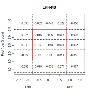
crap. They still can't hit pitches in that location very well, and its interesting to see that they are able to hit fastballs on the outside half of the plate much better than they can hit fastballs on the inside. Generally inside fastballs are thought of as places where a pitcher can get hurt, while outside fastballs are encouraged. One reason left-handed batters are able to hit outside fastballs better than inside fastballs could be because of the extra fraction of a second an outside pitch affords the batter. An outside pitch is hit slightly after it crosses the plate, and giving the batter an extra 'beat' to track the ball. In order to be driven, inside fastballs need to be hit in front of the plate, and the batter has slightly less time to react. This probably isn't a meaningful reason for the inside/outside difference, but with a fastball, the extra split-second could help the hitter.
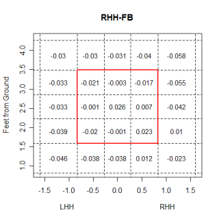
The chart below is shows the run value for fastballs that are put in play by right-handed hitters.
Apparently righties like low and inside fastballs more than lefties, and righties also don't hit fastballs on the outside as well as they hit inside ones.
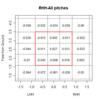
Looking at all pitch types, right-handed hitters actually hit all down and in pitches very well.
I also wanted to quickly go over the way I calculate the run value for each pitch. I take every event that resulted from a pitch being thrown and assigned it a weight, based on the count it occurred in. Different events are worth more in different counts, and for an extreme example, a 3&0 strike isn't worth as much to the pitcher as a strike thrown in an 0&2 count. By the same logic, any base hit in an 0&2 count hurts the pitcher more than the same hit would have in a 3&0 count. The process and weights are explained a little more in depth here.
There are some loose ends that I need to tidy up, such as if called strikes and swinging strikes should be weighed the same (currently I weigh all strikes, including fouls with less than two strikes, the same amount), and what to do with pitches that result in a steal or caught stealing (currently I'm ignoring this, but a pitcher is partially responsible for the running game, so his pitches should get some penalty/benefit if the runner steals or is caught stealing.)
| Command Post | February 29, 2008 |
Locational Run Values
In the last couple of weeks there have been several great articles written about the run value of different pitches. These articles have explored how much every pitch in baseball is worth on a per-pitch basis, and while some of the math behind the scenes might be slightly different from article to article, the general idea is the same. You need to find out how much every event is worth in a given environment (based on the count, pitcher, stadium, or any other type of environment you're working with), and then multiply those weights by the number of events caused by a given pitch to find the total number of runs above average that the pitch saved. One thing that none of these articles have discussed is exactly how location impacts the value of a pitch. Clearly the location of a pitch matters in determining it's value, but how big is the impact?
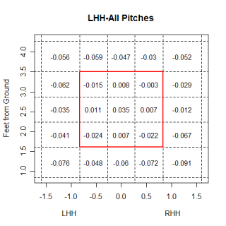
I split up the strike zone (and the surrounding area) into bins, and in each bin, I found the number of runs above average that were saved per pitch thrown to that area. Below is a chart showing the value of different regions for right-handed pitchers throwing fastballs against left-handed hitters. My calculations are based on the hitter's perspective, so negative values are saving runs compared to an "average location" and are good for the pitcher, while positive ones are the opposite.
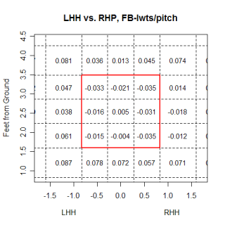
The most obvious thing I noticed on the graph is the value of the strike zone. Eight of the nine regions prevent runs from being scored compared to an average location, which initially seems high. This actually makes sense though, if you think about how often batters get out and the fact that when a batter doesn't swing at a pitch in the strike zone, it always puts him in a less advantageous position to hit from. In this chart, which is from the pitcher's perspective, you can see regions where, as a group, left-handed hitters are more vulnerable to a right-handed pitcher's fastball. The idea that left-handed hitters like the ball low and inside seems to be backed up a little bit, as the bins in that region of the strike zone have a higher value than the rest of the zone. Using rigid bins isn't the best method for looking at the strike zone because you run into problems with deciding where to put the edges of bins, and a continuous approach is probably the ideal way to do this in the future.
Even with this limitation, what else can we learn from this chart? One thing to notice is that left-handed batters are either swinging at pitches low and outside, or umpires are calling this pitch a strike against lefties. Either way, it appears to be an area that pitchers can possibly exploit. Looking at all fastballs thrown by a pitcher-batter grouping is interesting, but exploring how the count and location impact an at-bat is more interesting. The chart below has the same group of batters and pitchers, but is now showing the linear weights per pitch of each section in an 0&2 count (this includes all pitches, not just fastballs).
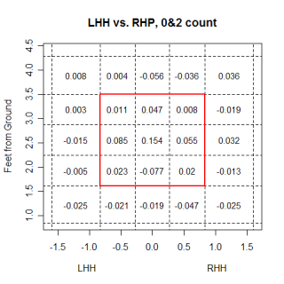
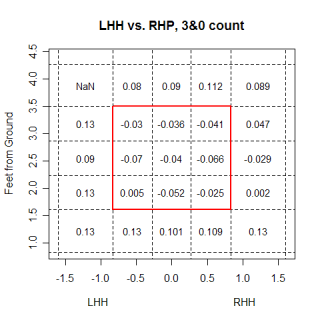
When reading this chart, you need to remember that the weights used to calculate the value of each region are based on an 0&2 count. The middle region being .154 runs means that compared to an "average" location on an 0&2 count, that area allows .154 runs per pitch more. This isn't saying that overall, a pitch down the middle is worth .154 more runs than an average pitch, just on an 0&2 count. With this in mind, the chart makes a ton of sense. You can see the expansion of the strike zone, as virtually all the regions around the strike zone now allow fewer runs than average.
The increased ability for a pitcher to work outside the strike zone makes any miss into the strike zone hurt that much more. Using the same logic that a hit in a 0&2 count hurts the pitcher more than giving up the same hit in an 0&0 count, throwing a pitch right down the middle in an 0&2 count is a worse idea than doing the same thing in an 0&0 count. The idea is reversed on a 3&0 pitch, which is plotted below. A pitch outside the strike zone is now a tremendous advantage for the hitter, so the pitcher is forced to throw a strike. Somewhat counter intuitively, even though hitters "know" a strike is coming, pitches thrown in the strike zone in 3&0 counts still favor pitchers. This just speaks to how hard hitting actually is.
One other point I wanted to mention is the magnitudes of the impact of location. Using 50 pitches to a type of batter as a rough cutoff point, I found that the best and worst pitches range from roughly -.07 runs/pitch for the best to .07 runs/pitch for the worst. The spread between the best and worse locations varies, and depends on the count, but it can be as large as almost 1 run/pitch. Obviously this will have a huge impact on the value of a pitch, and potentially could negate any value a pitch has. You could have the best pitch in baseball, but if you can't locate it very well, it won't do you any good. Creating these plots for every pitcher could give a good indication of how much location actually helps and hurts a pitcher, depending on the situation.
| Command Post | February 21, 2008 |
More Run Values
In the time I've been looking at the pitch f/x data I've occasionally stumbled onto something I thought was so interesting and so cool that I couldn't wait to share it with someone. The run value of different pitches is one of these things and whatever enjoyment you've gained from reading and discussing these articles, you can probably double it for me. The research I did for last week's article was some of the most interesting work I've done with the pitch f/x data, and without any more introduction, here's this week's article.
In the comments on last week's article and elsewhere, there were some questions about the methods I employed for calculating the run value of each pitch. There were some suggestions made and while I'm not here to talk about the past and explain how I made the calculations last week, in the interest of transparency, here's what I did this week and will be doing in the future. Starting with the wOBA for every ball-strike count, I subtracted the league average wOBA (.332) from each count to determine how much above or below average each count was for wOBA.
Using those wOBA values, I then determined how many runs were added in every count if the pitcher threw a ball or strike. This is the same process I used last week, but now instead of averaging the run values of a ball and strike, this time I kept the data separate, so that a strike thrown in an 0&2 count has a different value than a strike thrown in an 0&1 count. I repeated the same process for balls in play as well, which is something I didn't do last week, and kept them separated by count as well. This way, if the batter is up 2&0, but grounds out, the pitch that created the groundout gets more credit than if he had grounded out in an 0&0 count.
When I was done this process I had the value of almost anything that could happen to a pitch after it left the pitcher's hand, and if you're interested, a table with the data is presented below.
Count  wOBA    Runs/PA ValB    ValS    Val1B   Val2B   Val3B   ValHR   ValOut
3&0    0.570   0.207   0.131  -0.070   0.287   0.583   0.861   1.200  -0.496
3&1    0.490   0.137   0.201  -0.076   0.356   0.652   0.930   1.269  -0.426
2&0    0.443   0.097   0.110  -0.062   0.397   0.693   0.971   1.310  -0.385
3&2    0.403   0.062   0.276  -0.351   0.432   0.728   1.006   1.345  -0.350
2&1    0.372   0.035   0.103  -0.071   0.459   0.755   1.033   1.372  -0.323
1&0    0.371   0.034   0.063  -0.050   0.460   0.756   1.034   1.373  -0.323
0&0    0.332   0.000   0.034  -0.043   0.494   0.790   1.068   1.407  -0.289
1&1    0.314  -0.016   0.050  -0.067   0.510   0.805   1.083   1.423  -0.273
2&2    0.290  -0.037   0.098  -0.252   0.530   0.826   1.104   1.443  -0.252
0&1    0.283  -0.043   0.027  -0.062   0.537   0.832   1.110   1.450  -0.246
1&2    0.237  -0.083   0.046  -0.206   0.577   0.872   1.150   1.490  -0.206
0&2    0.212  -0.104   0.022  -0.184   0.598   0.894   1.172   1.511  -0.184
Once I knew the values of events by count, I just counted the number of events that each pitch created and multiplied them by their value to get the overall value of the pitch. One huge benefit to finding the value of pitches using this 'by count' method is that it automatically accounts for the usage of every pitch. Scott Kazmir's fastball (to righties) does very well in this analysis, but last week, when I looked at which pitches had prevented the most runs overall (which is slightly deceptive because certain pitchers had more games in pitch f/x enabled ballparks), Kazmir's fastball prevented 5.47 runs compared to an average pitch. However, this week, when I factored in the count, Kazmir's fastball to righties prevented 9.99 runs over an average pitch. Without thinking too hard, factoring in the count helps Kazmir's fastball because it's a pitch he uses to get swings-and-misses when he needs them. Other pitches, like Brandon Webb's sinker (13.28 RAA last week vs. 13.36 RAA this week) or Kason Gabbard's changeup (7.72 RAA last week vs. 7.67 RAA this week) were unaffected by the calculation change. Overall, the changes were not that big, but using the value by count is the correct way to account for situational pitching.
One thing I neglected to include in the article last week was any information about global averages. There's no such thing as an overall 'average' pitch, but I found the averages for all the different subgroups of pitches I had. Now, when comparing pitches, there's a handy reference for what an average pitch thrown by a certain type of pitcher to a certain type of hitter is worth. The table below has identifying information about the pitch, the frequency that the given group of pitchers threw it to the given group of batters, and the average run value for each type of pitch. The way to read the first line of the table is that of all pitches thrown to LHH by LHP, 14% were curveballs. A LHP to LHH curveball prevents .0117 runs more than an 'average' pitch, and given 100 pitches from a LHP to a LHH, distributed via the frequencies for his pitches, the curveball would prevent .20 runs more than an average pitch.
Pitcher Pitch   Batter  Freq.   Avg.     Per 100
L       CB      L       0.14   -0.0117  -0.18
L       CH      L       0.09    0.0000  -0.01
L       CT      L       0.03   -0.0081  -0.02
L       FB      L       0.55    0.0018   0.02
L       SL      L       0.17   -0.0033  -0.08
---------------------------------------------
L       CB      R       0.11   -0.0035  -0.05
L       CH      R       0.21    0.0062   0.11
L       CT      R       0.03    0.0143   0.04
L       FB      R       0.55    0.0072   0.31
L       SL      R       0.10    0.0076   0.07
---------------------------------------------
R       CB      L       0.10   -0.0022  -0.03
R       CH      L       0.16    0.0001  -0.02
R       CT      L       0.06    0.0006   0.00
R       FB      L       0.56    0.0056   0.23
R       SL      L       0.11   -0.0008  -0.02
---------------------------------------------
R       CB      R       0.10   -0.0032  -0.04
R       CH      R       0.07    0.0012   0.00
R       CT      R       0.06   -0.0051  -0.03
R       FB      R       0.56   -0.0017  -0.18
R       SL      R       0.20   -0.0049  -0.12
Not surprisingly, a curveball thrown by a LHP to a LHH has the saves the most runs compared to an average pitch. However, when examining Barry Zito's curve to LHH, I'm not interested in an 'average' pitch, I'm interested in other curveballs thrown by LHP to LHH. These averages let me make that comparison, and compare pitches to the baseline of an 'average' pitch of that type (RHP CB to RHH, RHP CB to LHH, etc.), rather than to an 'average' pitch. For the most part, the adjustments are small, but, again, its the right way to make the calculations, and gives a better indication of the actual value of the pitch.
However, without knowing how often Zito actually throws curveballs to left-handed hitters, it's impossible to get a feel for how effective the pitch truly is. It could be a really nasty pitch, but if part of the effectiveness is due to the infrequency that it's thrown, it won't be a great deal of help to the pitcher in preventing runs overall. The Per 100 field incorporates the pitcher's usage of every pitch to gauge how good the pitch is at preventing runs. To calculate this value, I multiplied the frequency a pitch was thrown by it's average value. Multiplying that number by a constant, in this case 100, gives the total number of runs the pitch would have saved compared to an average pitch of that type, for 100 pitches split up by the pitcher's normal pitch selection. I used 100 as the constant to have some internal consistency with Rich's work on strikeouts/100 pitches. 100 is fairly easy to calculate in your head too.
Last week I mentioned that collectively, Brandon Webb's pitches were 18 runs better than average and wondered if this sum would correspond to his wins above average. In my calculations last week I accidentally compared Webb to a replacement-level starting pitcher as opposed to an average pitcher, and got an answer that didn't make sense. I have 113 innings of pitch f/x data for Webb, and in that time he posted an ERA of 2.55. That works out to 2.8 wins above average, while Webb's pitches collectively were 26.9 runs better than average. Assuming roughly 10 runs/win, that's a pretty close match. I threatened to write a full article on this subject last week and I'm going to follow through on that threat once I get a better handle on the full data-set, but I just wanted to make this correction this week.
The next step with this type of analysis lies in refining the linear weights value of every event. Adjusting for park is probably the next easiest adjustment to make, and after that, the next adjustment would be for individual pitchers so that every pitcher is his own universe. I think some of those adjustments are overkill based on the amount of data that are in my database right now, but over the course of the 2008 season its something to look for. Properly regressing the pitch values and finding out how much of the value is based on skill and how much is based on luck is another very important adjustment to make. I've roughly regressed the LWTS/pitch values to account for different sample sizes, but actually determining how many of the runs that Kazmir's fastball prevents are due to qualities of the pitch and how many are due to luck is important.
| Command Post | February 15, 2008 |
Weighing In
Johan Santana's changeup has been on my mind for the past week. Ever since I learned that if right-handed hitters make contact with the pitch, which doesn't happen very often, they tend to drive it, I haven't been able to stop thinking about it. Santana's changeup is said to be one of the best pitches in baseball, so I thought that in addition to creating a lot of swings and misses, this pitch wouldn't be beaten like a mule when it was put in play. I wasn't sure how the relationship between the swings and misses he got and the hits he allowed impacted the perception of the pitch but some comments on the article offered different ways to look at the changeup. One suggestion was to find the run value of every pitch to see which pitches are most beneficial, so thanks to Renè's idea, I did just that.
Finding the run value of a pitch is not as hard as I initially thought it might be. Using Tango's linear weights generator I found the run value of a single, double, triple, home-run and out. Using those values, I was easily able to find the value of each pitch for balls that were put in play, but I also needed to account for pitches that weren't put into play. To find the value of an average ball and strike, I converted the wOBA for each count into runs for that count, and then found out how much adding one ball changed those values for every count. I did the same thing for strikes, with the end result being that a ball is worth about .097 runs and a strike is worth about -.124 runs. There's a huge difference in the value of a ball or strike depending on what the count is, but I used these average values for my analysis because I didn't want to slice my already somewhat small sample of pitches into 12 smalled samples. As I continue to sift through this topic, I'm going to have to account for the different counts.
Below are the 10 pitches that saved the most runs in the 2007 season. In addition to the run value of each pitch, the Sw% (swings and misses/total swings) and SLGBIP (includes home runs) are also shown. I broke the pitches up by batter hand to give a more accurate portrayal of exactly who is impacted by a pitch.
Name            Pitch   N       Batter  LWTS    Sw%     SLGBIP
Brandon Webb    FB      460     R       -13.28  0.12    0.270
Jake Peavy      FB      456     R       -9.16   0.22    0.288
Chris Young     FB      363     R       -7.91   0.22    0.328
Kason Gabbard   CH      147     R       -7.72   0.36    0.182
Roy Halladay    FB      224     L       -7.36   0.07    0.250
Felix Hernandez CH      124     L       -7.27   0.23    0.069
Greg Maddux     FB      443     R       -6.89   0.05    0.430
Brian Bannister FB      289     R       -6.86   0.14    0.333
Dan Haren       CB      264     R       -6.81   0.26    0.309
Cole Hamels     CH      176     R       -6.70   0.37    0.308
Brandon Webb's sinker was most valuable pitch in terms of preventing runs last year, coming in at 13 runs saved vs. a league-average pitch. Other stud pitches fill this list, which was actually made up of more fastballs than I would have anticipated. However, since this is just total runs saved and fastballs are thrown so frequently, the results really aren't surprising. Finding the raw number of runs saved is going to highlight quality pitches, but it also is impacted by the number of times the pitch is thrown. If I want to look at the quality of a pitch, independent of how often it's thrown, LWTS per pitch is going to be much more informative. Here is a list of the best pitches by LWTS/pitch, for pitches that were thrown a minimum of 50 times.
Name            Pitch   N       Batter  LWTS    LWTS/pitch
Matt Herges     CH      67      L       -5.95   -0.09
David Weathers  SL      50      R       -3.95   -0.08
Jon Rauch       FB      52      L       -3.78   -0.07
Ruddy Lugo      CB      59      L       -4.03   -0.07
Matt Capps      FB      68      R       -4.67   -0.07
Brandon Webb    CH      68      R       -4.23   -0.06
Felix Hernandez CH      124     L       -7.27   -0.06
Kason Gabbard   CH      147     R       -7.72   -0.05
J.C. Romero     CH      71      R       -3.36   -0.05
Brett Myers     FB      71      L       -3.11   -0.04
This list has some crossover from the first list, and the new list confirms that King Felix has a great changeup (vs. LHH), especially compared to other changeups thrown by right-handed pitchers to left-handed hitters. Kason Gabbard's changeup (vs. RHH) also makes an repeat appearance on the list, which is a bit of a surprise because I had no idea his changeup was that good. Changeups thrown to an opposite handed batter generally cost a pitcher .01 runs per pitch, but Gabbard, Hernandez and Matt Herges were all able to buck that trend last year. Webb is also on this list, but for his changeup, not his fastball. Webb actually has a higher ground ball percentage on his changeup than on his fastball, which helps to explain the inclusion of his changeup on this list, but it's interesting that while Webb's sinker is considered his money pitch, his changeup might actually be a more effective pitch.
Looking a little closer at Webb's pitch repertoire you can see the effectiveness of each of his pitches. He's tougher on right-handed hitters overall, although lefties have a tough time hitting his curveball. Against righties, his changeup is twice as effective as his sinker, although that could be because he throws it infrequently relative to the sinker.
Pitch     N     Batter  LWTS    LWTS/pitch
FB      460     R      -13.28  -0.03
FB      517     L       2.15    0.00
-----------------------------------------
CH       68     R      -4.23   -0.06
CH       89     L       0.90    0.01
-----------------------------------------
CB       77     R       0.28    0.00
CB      112     L      -2.17   -0.02
-----------------------------------------
CT       67     R      -1.32   -0.02
CT       97     L      -0.77   -0.01
=========================================
Total  1487     -      -18.42  -0.01
One thing that piqued my curiosity when looking at this list of pitches was if the 18 runs that Webb's pitches prevented could be something larger. Was Webb 2 wins above average in the starts that he made in Gameday parks? Could those wins be directly attributed to his pitches? Webb's pitches prevented 18 runs over what a set of average pitches would have done, so his pitches could be said to be responsible for 1.8 wins more than an average pitcher. Counting the playoffs, Webb made 16 starts in stadiums with the pitch f/x system in place, pitching 113 innings and posting an ERA of 2.55. 113 innings with a 2.55 ERA in the NL makes a pitcher 5 wins above average in his starts at enhanced parks. Perhaps fielding made up the 3 win difference over this time period, or perhaps Webb leveraged his pitches effectively, throwing strikes when it was important and throwing outside the strikezone when it wouldn't hurt him too much. Exploring this topic in more detail probably deserves a whole column at some point.
Getting back to all pitchers, I wasn't very happy with the list of LWTS/pitch that I showed earlier. There were a lot pitches that had great rates but had only been thrown a handful of times, making me wonder if the pitcher had just gotten lucky throwing them. I'm sure Rudy Lugo has a great curveball, but he's only thrown it 59 times. I could have raised the minimum number of pitches, but that would eliminate the interesting pitches. The solution in this case is to regress the LWTS/pitch values toward the mean. Using the average value of every subset of pitch (fastballs thrown by LHP to LHH and fastballs thrown by LHP to RHH are examples of subsets) I did a rough regression which gave results that matched the general perception of pitches.
Name            Pitch   N       Batter  LWTS/pitch (regressed)
Kason Gabbard     CH    147     R       -0.04
Roy Halladay      FB    224     L       -0.04
Felix Hernandez   CH    124     L       -0.04
Matt Herges       CH     67     L       -0.04
Cole Hamels       CH    176     R       -0.04
Scott Kazmir      FB    288     R       -0.03
Aaron Laffey      CT    226     R       -0.03
Bobby Jenks       FB    107     R       -0.03
Jonathan Papelbon FB    148     L       -0.03
Jonathan Papelbon FB    127     R       -0.03
Mariano Rivera    FB    187     L       -0.03
This list makes much more sense. Gabbard's changeup (vs. RHH) remains at the top, which is something that bears watching in 2008. The rest of the list is filled with most of the usual suspects, Cole Hamels' changeup (vs. RHH) lives up to the hype, Kazmir's fastball is up where you would expect it and Jonathan Papelbon's fastball is amazing. It's equally effective against both lefties and righties, which is impressive by itself, but its even more amazing that it's so effective against both types of hitters. The last pitch on this list is Mariano Rivera's cutter (vs. LHH), which is another pitch that has been on my mind recently. This pitch showing up is no surprise, and I wish we could have seen where it ranked when Rivera was on the top of his game. If you're wondering, Jared Burton's cutter, the closest thing Rivera's pitch has to a modern-dayclone, was the 12th most effective pitch in baseball, falling just outside of this list. He's someone else to to watch in 2008. Also, after doing the regression, Webb's sinker (vs. RHH) is slightly more effective than his changeup (vs. RHH).
So where does all this leave us with Santana's changeup against right-handed hitters? Compared to other left-handed changeups thrown to right-handed hitters, Santana's changeup is exactly average, with a regressed LWTS/pitch of 0. Last year, the swings and misses the pitch created were counterbalanced by the pounding the ball took when it was put in play. Against righties the pitch Santana was most effective with was his fastball, which was worth -.03 runs every time he threw it (it also fell just outside the top-10). There are a ton of factors that impact how effective a pitch is, and maybe right-handed batters have started to sit on Santana's changeup more at the expense of hitting his fastball, but for last year at least, his changeup was pedestrian while his fastball was tremendous.
| Command Post | February 07, 2008 |
Splitsville: Take 2
Last week I looked at different splits, and found some interesting things about Mariano Rivera's cutter and Takashi Saito's fastball. This week I'm going to continue looking at the splits and see what else I can find.
Rivera's cutter is ridiculously effective, especially against left-handed hitters. Nearly every single pitch he throws to a LHH is a cutter, yet they still swing and miss at the pitch. After writing about Rivera's cutter, I wondered if there were other pitchers who approached left-handed and right-handed hitters with only one specific pitch. Somewhat surprisingly, there were other pitchers who, perhaps unwittingly, were going after certain hitters with only one pitch. The table below shows these pitchers and how often they throw that pitch to LHH and RHH. The two columns labeled Freq. show the frequency that a particular pitch is thrown and Diff is just the Freq. LHH column subtracted from the Freq. RHH column.
Name              Pitch    Freq. to RHH    Freq. to LHH    Diff.
Mariano Rivera    FB       0.72            0.99           -0.28
Brian Fuentes     FB       0.70            0.99           -0.29
Trever Miller     FB       0.68            0.95           -0.27
Macay McBride     FB       0.87            0.95           -0.08
Kevin Cameron     FB       0.80            0.89           -0.09
Alan Embree       FB       0.89            0.72            0.17
Chris Young       FB       0.63            0.88           -0.26
Bartolo Colon     FB       0.67            0.85           -0.17
Jonathan Papelbon FB       0.85            0.74            0.10
David Riske       FB       0.85            0.81            0.04
All of the pitchers on the list would be considered fastball pitchers, but one thing to keep in mind when looking at the table is the different pitches each pitcher has and how that impacts pitch frequency. Macay McBride doesn't appear to have have a very extensive repertoire of pitches he feels comfortable with, so he throws mostly fastballs to both groups of batters. Every batter has a great chance of seeing a fastball from McBride, so there's really no secret about it. The more interesting cases are where batters from one side see a lot more fastballs than batters on the other side, like with Rivera, Fuentes, Miller, and Young. In these cases, knowing how the pitcher approaches different handed hitters is much more interesting and important than knowing how he approaches hitters overall.
In Brian Fuentes' case, the reason he throws so many more fastballs to LHH is because of his arm angle. He slings the ball from an arm slot between sidearm and three-quarters, which initially causes the ball to appear behind a LHH. If you check out Fuentes' career splits, the difference shows up there as well. Overall, LHH have hit him much worse than RHH, even though LHH should only be looking for fastballs.
I mentioned earlier that I thought it was interesting to look at cases where pitchers drastically altered their pitching style to different handed hitters, and the next step in examining those cases is to look at which pitches had the biggest differential.
Name            Pitch   FreqR   FreqL   Diff.
J.J. Putz       CT      0.71    0.27    0.43
J.C. Romero     FB      0.43    0.79   -0.36
Huston Street   SL      0.62    0.27    0.35
Joe Beimel      CT      0.76    0.42    0.34
Lance Cormier   CT      0.65    0.31    0.33
Justin Hampson  SL      0.30    0.61   -0.32
Kenny Rogers    CH      0.65    0.34    0.31
Edwin Jackson   SL      0.42    0.12    0.30
Todd Jones      FB      0.70    0.41    0.29
Brian Fuentes   FB      0.70    0.99   -0.29
These pitches all have different reasons for being thrown so much to hitters on one side. Putz's cutter/2-seam fastball gets a lot of swinging strikes when he throws it against both RHH and LHH, but his regular fastball and changeup aren't as effective against RHH as they are against LHH, which could be causing him to use more cutters at the expense of his changeup and 4-seamer vs. RHH. JC Romero's fastball is very hittable, but his arm angle is a slightly lower than normal, which lets him get away with frequently throwing the pitch to lefties. Even though both left-handed hitters and right-handed hitters posted identical SLGBIP and BABIP values on Romero's fastball(both of which count homers), when left-handed hitters swung at the pitch, they missed 26% of the time, while right-handed hitters swung and missed on only 6% of their swings.
Huston Street's slider also appears on this list. Street's slider is a great pitch against RHH, getting more swings and misses than an average slider (34% of swings against Street are misses vs. 24% overall) and when batters do put the ball in play, it is with far less authority than for an average slider (.296 SLGBIP vs. .502 SLGBIP). Street is pretty safe when he throws his slider to righties, because when they swing at it, there's a good chance they'll miss it and if they put it in play, there's a good chance it will turn into an out. That combination made me think about pitches that carried different amounts of risk for the pitcher throwing them, specifically pitches that not only posed a high risk (a high SLGBIP) but also had a high reward (high swing and miss percentage).
I created the list below by eyeballing my list of pitches and picking the ones that had both a high swing and miss rate and a high SLGBIP. The pitches are based on the handedness split, so for the line with Haren's changeup, you would read it as, against right-handed hitters, he threw a total of 819 pitches, 22% of which were changeups. When batters swung, they missed 47% of the time and when the ball was put in play, the slugging percentage was .652. For some perspective, the average amount of misses when the batter swings at a changeup or slider is 25% and the average SLGBIP for those pitches is right around .500.
Name              Pitch   Batter  Tot.  Freq    Sw%     SLGBIP
Dan Haren         CH      R       819   0.22    0.47    0.652
Chad Gaudin       SL      R       710   0.39    0.43    0.750
Jeremy Bonderman  SL      R       353   0.42    0.42    0.852
Rudy Seanez       SL      R       329   0.30    0.42    0.737
Shaun Marcum      SL      R       443   0.21    0.42    0.737
Jake Peavy        SL      R       820   0.21    0.41    0.630
Johan Santana     CH      R       456   0.34    0.41    0.897
Jonathan Broxton  SL      L       288   0.36    0.39    0.684
Wow, there are some good pitches and pitchers on that list. This is partly because half of the criteria to be included is to have a high swing and miss rate on a certain pitch. However, the other criteria is that the pitch is hit hard when it is put in play, so it's somewhat surprising that I have multiple Cy Young winners on the list. I'm not sure exactly what's going on, but the advantage of getting swings and misses must partially offset the high SLGBIP. Johan Santana'schangeup is the pitch whose appearance on the list surprised me most. His changeup is thought to be one of the best pitches in baseball, but when RHH put the ball in play, the SLG is on par with Bob Wickman's fastball to LHH. I'm almost as confused as I was last week when I found that lefties know Rivera's cutter is coming and still can't hit it.
| Command Post | February 01, 2008 |
Splitsville
Takashi Saito has a very unique fastball. When batters swing at an average fastball, they miss 13% of the time, but with Saito's fastball, they miss 42% of the time. Only Chris Ray and Chris Schroder generated a higher percentage of swings-and-misses with their fastballs, although they threw their fastball much less than Saito did. This week I'm going to look at pitches that move similarly, and see if their results are similar.
Several weeks ago, I used similarity scores to compare the movement on pitches. Using those scores, here are the most similar fastballs to Saito's, along with how often the pitches are swung and missed at.
Name              Speed  Pfx    Pfz    Sw%
Takashi Saito     93.2  -6.70   10.55  0.42
Roberto Hernandez 93.1  -6.63   10.09  0.09
Robinson Tejeda   93.8  -6.85   10.86  0.20
Santiago Casilla  93.8  -6.12   10.83  0.15
Joaquin Benoit    93.5  -7.45   10.17  0.23
Brandon Lyon      92.6  -7.32   10.09  0.13
All those pitches look similar, both in terms of speed and movement, but batters miss when they swing (Sw%) at Saito's fastball more often than at the similar pitches. The similar pitches mostly have an above average Sw% (the league average Sw% is 13%), but nobody is close to Saito. Moving outside the top-5 most similar pitches, there still aren't any pitches that can compare to the results that Saito gets with his fastball. The different results that come about from pitches that move almost identically further highlights the importance of the "hidden" aspects of pitching that are slightly harder to quantify, like deception, arm angle and pitch selection.
Anyways, lets look closer at Saito, especially his fastball, and how left-handed hitters and right-handed hitters fared against him. The table below shows Saito's splits for his different pitches. For the most part the column headings are self explanatory, but as a reminder, Sw% is swings and misses/total swings, SLGBIP includes home runs, and Tot. is the total number of pitches against that side hitter.
Name            Class   Hand  Tot.    Freq    TB   BIP  Sw%    SLGBIP
Takashi Saito	FB	L     189     0.62    5    18   0.29   0.278
Takashi Saito	FB	R     185     0.55    1     7   0.60   0.143
Takashi Saito	CB	L     189     0.24    2     8   0.28   0.250
Takashi Saito	CB	R     185     0.04    0	    0   -.--   -.---
Takashi Saito	CT	L     189     0.05    0     1   0.00   0.000
Takashi Saito	CT	R     185     0.09    1     2   0.30   0.500
Takashi Saito	SL	L     189     0.09    4     6   0.11   0.667
Takashi Saito	SL	R     185     0.31    3    10   0.46   0.300
The thing that really stands out here is how effective Saito's fastball is against right-handed hitters. 60% of the time, when a RHH swings against Saito's fastball, he misses it, which is an amazingly high amount of misses, for any type of pitch. Saito's fastball is still really good against LHH, but it's unbelievable (twice as good) against RHH. You can also see how Saito approaches LHH vs. RHH in this chart and it's interesting that while his fastball is so effective against RHH, due to the relative inefficiency of his off-speed pitches against lefties, he actually throws it more often against LHH.
Saito's split is cool, but what about other cases where splits are involved. One of my favorite splits to look at is Mariano Rivera's reverse split. Rivera is much harder on LHH than RHH, which is explained by his cut fastball, which moves in on LHH and is nearly impossible to hit with power. The chart below shows how Rivera approaches each type of hitter.
Name            Class   Hand  Tot.    Freq    TB   BIP  Sw%    SLGBIP
Mariano Rivera  FB      L     188     0.99    10   30   0.23    0.333
Mariano Rivera  FB      R     146     0.72    10   17   0.23    0.588
Mariano Rivera  SL      L     188     0.01     0    0   -.--    -.---
Mariano Rivera  SL      R     146     0.23     3    6   0.21    0.500
Mariano Rivera  CH      R     146     0.05     0    0   -.--    -.---
The thing to notice here is that Rivera throws only cut-fastballs when facing LHH. Of the 188 pitches he threw to LHH, 187 were cutters. Wow. Up in the count, down in the count, with runners on, or with the bases empty, LHH know with almost total certainty that Rivera is coming with a cutter. There is no other pitch in the back of their mind that they might see...yet they still can't hit it. They miss 23% of the time they swing and even when the ball is put in play, it isn't hit with any type of authority. I'm completely mystified at how Rivera is able to be a one pitch pitcher to lefties. I'm open to suggestions, but I think Rivera's cutter to a left-handed hitter is the best pitch in baseball.
I'm going to close with Rivera's reverse split because my head is still spinning with how bizarre it is. I think this type of analysis could be extended to examine if pitchers get different types of movement of pitches depending on the batter and different pitching patterns as well. Certain types of pitchers are able to survive with a suspect fastball by replacing fastballs with sliders depending on the hand of the batter. Examining the splits, based on pitch type, is another huge avenue for potential research with the pitch f/x data.
| Command Post | January 25, 2008 |
First Things First
The first pitch is thought to be very important in an at-bat. Young pitchers are taught to get ahead in the count and that the balance of an at-bat hinges on whether this pitch is a strike or ball. Throwing first pitch strikes is a mark of a good pitcher, and one of the most infuriating things to watch is a pitcher who can't throw first pitch strikes. Today I want to look at the value of the first pitch and what happens to those pitches after they leave the pitcher's hand.
Of the twelve counts, there are six (anything without three balls or two strikes) where the at-bat is guaranteed to continue if the batter does not swing at the pitch. Assuming no swing, here are the chances of seeing a fastball in a subsequent count, based on whether the pitch is a ball or a strike. The chart is based on what will happen in the future based on what happens in the current count. So starting in an 0&0 count, if pitch is a ball, there is a 59% chance the next pitch (in the 1&0 count) will be a fastball, but if the first pitch is a strike, there is a 48% chance of a fastball being thrown in an 0&1 count. The swing of 11% measures how valuable a strike is in each count, in terms of potentially seeing fastballs.
Count   FB%     If Ball   If Strike    Difference
0&0     0.59    0.59      0.48         0.11
0&1     0.48    0.49      0.47         0.02
1&0     0.59    0.70      0.49         0.21
1&1     0.49    0.59      0.44         0.15
2&0     0.70    0.78      0.59         0.19
2&1     0.59    0.76      0.47         0.29
The first pitch of an at-bat sets the tone of the at-bat due to the conditions it creates for ensuing pitches. In terms of seeing a fastball, there is relatively little difference between an 0&1 count and a 1&0 count, but if the first pitch is a strike the pitcher has put himself in a good position as the count progresses. An 0&1 count is a clear pitcher's count and even if he throws a ball in that count, a 1&1 count is still a pitcher's count and the pitcher arrived there through pitcher's counts. However, if the first pitch is a ball, the pitcher is now at a slight disadvantage because while 1&0 is a neutral count, it has the potential to turn into an extreme hitter's count. If the pitcher does throw a strike and evens the count at 1&1, he would have presumably been under more pressure to throw a strike after the first pitch. Sal Baxamusa explores this type of pitch sequencing in more detail here and actually finds that when batters put a 1&1 pitch into play, they do better when the order was strike-ball, despite apparently having an advantage in the other sequence.
Anyway, that tangent was just to establish the importance of the first pitch of an at-bat. Now that we have a rough idea of its importance, lets look at what actually happens on the first pitch. The table below shows all first pitches, broken up by pitch type, along with certain measurements about each pitch type. Freq. is how often the pitch was thrown, S% is strike frequency, or strikes balls in play/all pitches, Called% is called strikes/total pitches, Swing% is how often the batter swung at a pitch, Sw% is how often batters swung and missed when they swung, Fo% is how often batters fouled balls off when they swung, and SLGBIP is slugging percentage on balls in ball, including home runs.
Pitch   NP      Freq.    S%     Called%  Swing%  Sw/Swing  Fo/Swings   SLGBIP
CH      6271    0.11     0.55   0.23     0.33    0.33      0.28        0.557
CB      6437    0.11     0.55   0.37     0.18    0.29      0.31        0.552
FB      35131   0.60     0.60   0.32     0.29    0.13      0.44        0.551
SL      10728   0.18     0.60   0.30     0.31    0.26      0.35        0.506
============================================================================
Tot     58567   1.00     0.59   0.31     0.28    0.19      0.40        0.543
Fastballs are thrown slightly more often as first pitches than overall (60% on first pitches vs. 56% overall) which makes sense with pitchers trying to throw a strike and get ahead in the count, but generally, the rates are pretty similar for how often each pitch is thrown as a first pitch and overall. The most interesting thing to me on this chart is how often batters swing at a first pitch curveball. As a batter, a curveball isn't necessarily a pitch you would expect to see at the start of an at-bat, which probably explains the low number of swings because batters would only swing if it were a very hittable curve. This seems like a great example of how not being predictable helps a pitcher tremendously though. By occasionally throwing a curve as the first pitch, the pitcher is sometimes able to get a free strike because the batter swings so rarely.
A first pitch slider would also come as somewhat of a surprise from most pitchers, yet batters swing at that pitch relatively frequently. A slider looks more like a fastball immediately out of a pitcher's hand, so perhaps batters are fooled into swinging because of this. This would explain the low SLGBIP, because unlike curveballs where a batter is swinging preferentially at pitches he likes, with sliders, batters are swinging at a pitch they think is a fastball, but are forced to adjust their swing once the slider breaks. Overall, curveballs that are put in play lead to a SLGBIP of .484, but on the first pitch their SLGBIP jumps to .552, similar to SLGBIP for fastballs on first pitches, which supports the idea that batters are good at selecting which curves to swing at on the first pitch. One other interesting thing in the table is what happens when batters swing at certain pitches. Batters rarely swing and miss at first pitch fastballs, but they foul off those pitches so frequently that fastballs are only slightly less likely to be put in play than the other three pitch types. I'm unsure why batters foul off so many fastballs, but it might be because batters are be willing to swing at a wider range of locations and speeds if they recognize the pitch as a fastball.
In the past, I've looked at how batters of different quality are approached by pitchers. Using that method again, I wanted to see if there are differences in how these batters were pitched to on the first pitch as well. In the table below, columns labeled with -1 are the frequencies for first pitches while the columns labeled with -R are the frequencies for all other pitches.
SLG        FB-1   FB-R   SL-1   SL-R    CB-1    CB-R    CH-1    CH-R
>=.500     0.58   0.52   0.20   0.21    0.12    0.11    0.11    0.15
.499-.400  0.58   0.54   0.19   0.20    0.12    0.11    0.11    0.15
<=.399     0.68   0.58   0.16   0.19    0.08    0.10    0.08    0.13
I grouped hitters based on their Marcel projected SLG for the 2007 season and while the windows I used to group hitters are wider than in my previous examination, the overall idea is almost identical. Narrower windows would just show a more gradual increase in off-speed pitches as batters improved, but one other thing thats interesting is that it almost is as if there is a plateau for batters with a .400 SLG. A .400 SLG seems to be the level of hitter that prompts a pitcher to alter his first pitch repertoire.
Recently, I've been looking at different groups of pitchers and seeing if there are differences in the way they pitch based on their age and the quality of their fastball. I created two group, those pitchers 34 and older and those 24 and younger, and then split those two groups into pitchers with an average fastball speed of more than 91 MPH and an average speed less than 91 MPH. The table below shows just the first pitch fastball frequency for each type of pitcher throwing to each type of hitter, along with the average of all first pitches for each pitcher type.
SLG         Young/Slow  Old/Slow  Young/Fast  Old/Fast
>=.500      0.54        0.59      0.61        0.48
.499-.400   0.54        0.56      0.63        0.49
<=.399      0.66        0.62      0.69        0.63
==================================================
Avg.        0.56        0.57      0.63        0.51
The same pattern is evident here as well, with the bad hitters seeing a lot more fastballs than the other two groups of hitters. This trend holds regardless of the age of a pitcher or the quality of his fastball and the big difference between groups of pitchers is how many extra fastballs they throw to bad hitters. Even though there isn't a tremendous amount of difference between a 1&0 count and an 0&1 count, the first pitch is a crucial pitch in setting the tone of an at-bat and the importance placed on it is probably justified because of this.
| Command Post | January 10, 2008 |
Grouping Madness
Last week, I wrote about different age groups and differences in the way they pitch. I received a couple of comments about certain ways to further create groups and try to isolate the differences I saw, and in doing that, I came up with some interesting new material for this week's article.
In last week's article, I had two groups: old and young pitchers. This week, I split my age groups into two groups based on the speed of their fastball. The "young-slow" group was young pitchers who had an average fastball speed of 90.5 MPH or lower, and the "young-fast" group was comprised of the rest of the pitchers originally in the young group. I did the same thing with my group of old pitchers, and ended up with 4 different groups, which are summarized in the table below, along with the groups from last week for perspective.
Group        N    FB Spd  FB%    CH%    CB%    CT%    SL%
Young-slow   22   88.1    0.53   0.13   0.12   0.04   0.17
Young-fast   59   93.1    0.59   0.13   0.10   0.04   0.14
Old-slow     45   87.8    0.53   0.19   0.09   0.05   0.14
Old-fast     26   92.8    0.48   0.14   0.07   0.09   0.23
===========================================================
Old-all      71   89.9    0.50   0.17   0.08   0.07   0.18
Young-all    81   92.1    0.58   0.13   0.10   0.04   0.15
There are a couple of really interesting bits in the table, the first being the FB% of the old-fast group being lower than the FB% of the old-slow group. One reason for this apparent inconsistency is that the fast group is made up of players who have retained a very effective breaking ball even as they aged (mostly sliders and cutters), which they rely heavily on.
Here's a chart that highlights some important features about the sliders in each group. The old-fast group actually has the fastest slider, but the important parts of this table are the last two columns. One quick way for judging the "nastiness" or effectiveness of a pitch is to see how often a pitcher is able to get a swing and miss from it. The final two columns show the swing and miss percentage for sliders and fastballs in each group. These break down pretty nicely along speed lines, with the faster groups getting more swings and misses than the slower ones. What is a little bit surprising, especially in light of the frequency table, is how similar the speed groups are to each other for sliders and fastballs. The pitches move slightly differently for the two fast groups (and slow ones), but there isn't a whole lot of difference in how often batters swing and miss it. The similarity is surprising because of how often the two fast groups throw their fastball with the hard-throwing old pitchers throwing the fewest amount of fastballs with their younger counterparts throwing the most. Some of that difference is explained by difficulty controlling the slider vs. fastball, but it seems like hard-throwing young pitchers are being over-reliant on fastballs as a group. The flip side to this is that hard-throwing old pitchers could be throwing fastballs at closer to the optimal rate and preferentially throwing them when needed.
Group        SL Spd   pfx_x    pfx_z    SL-SandM%   FB-SandM%   FB-SLGBIP
Young-slow   82.3     4.74     3.44     0.11        0.05        0.552
Young-fast   85.1     2.98     3.43     0.14        0.07        0.592
Old-slow     81.1     2.66     4.02     0.10        0.05        0.580
Old-fast     86.2     3.00     4.13     0.15        0.07        0.509
This possibility of old hard-throwers leveraging their fastballs better than younger ones also shows up in the results as well. The young-fast group had the highest SLGBIP on their fastballs while the old-fast group had the lowest and while this isn't the strongest evidence for the old pitchers picking their spots with their fastballs, but it's a start. Looking at fastball selection either by count or hitter quality is the next step here.
I mentioned last week how the younger population was made up of both players who would eventually join the old group and players who wouldn't. This is a "duh" statement, but I think the pitchers who will survive and eventually make it into the old group would tend to come out of the young-fast group. That group can afford to lose some velocity on their pitches and still be effective, but the young-slow group is already on the edge of being very hittable and has nowhere to go if they suffer a drop in velocity. Obviously the attrition doesn't just come from the slow group, but everything else being equal, I would rather bet on a hard thrower having a longer career than a slow thrower. Looking at the list of names in each group reinforces this idea too. The slow group has only 22 names on it, but most of them wouldn't be considered top-prospects. The highlights include Dallas Braden, Kyle Kendrick, Zach Duke, and Carlos Villanueva. The fast list is full of either prospects or young guys who have already established themselves, including Justin Verlander, Matt Cain, Tim Lincecum, Felix Hernandez, and Scott Kazmir.
| Command Post | January 04, 2008 |
Old Man River
Tom Glavine has a reputation for consistently posting a better ERA than his peripheral statistics would otherwise suggest. Glavine's ability to change his approach based on the situation has been covered, and the basic idea is that he nibbles even more than normal in hitter's counts and is willing to allow some walks instead of giving in to hitters by throwing a meatball. Glavine's ability to leverage his walks is noticeable among all pitchers, but some other older pitchers have shown this "ability" as well. Is this nibbling an old-pitcher trait and are there other pitching patterns that old pitchers have compared to younger ones? How does the movement and speed on specific pitches compare across age groups? Where do different generations of pitchers locate their pitches? One year of data isn't going to give a great indication of how pitchers and their pitches age, but this is one step towards answering those questions. I created two groups of pitchers, old (34 years old and older), young (24 years old and younger), and looked at how each group pitched.
Glavine's willingness to sacrifice walks for a decrease in power provided the spark behind this article, so the first thing I wanted to see was if there was any difference in the location of pitches between the age-groups. Overall, there was very little difference between where the two groups located their pitches, but looking at specific situations some differences could be seen. Hitter's counts are times when nibbling would be especially advantageous, and when you compare the two groups of pitchers in hitter's counts, the differences become clearer. The images below are for extreme hitter's counts (3&0, 3&1 and 2&0) and only include fastballs. I included only fastballs because I wanted to see where pitches were located even when the pitcher "gave in" to the hitter's count and threw a fastball.
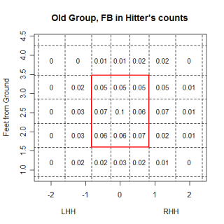 nbsp;
nbsp;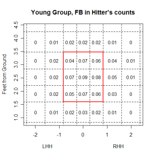
The older pitchers have a higher percentage of fastballs in almost all of the border regions at the edges of the strike-zone. The differences aren't huge in any one area, which is probably more of a result of the fairly large regions used, but the older group appears to be throwing more at the margins. Not surprisingly, older pitchers fared a little worse when balls were put into play, which is one reason they are nibbling more than younger pitchers. Despite the older pitchers throwing fewer pitches in the strike-zone, batters swung at almost the same percentage of pitches from older pitchers as they did for younger pitchers and older pitchers didn't get any more called strikes than younger pitchers.
All FB-Hitter's Counts
Group   BABIP   SLGBIP  Swing%  Called%
Young   0.352   0.664   0.39    0.31
Old     0.372   0.682   0.38    0.31
Looking at all pitches in hitter's counts, it's unclear how much nibbling is going on or how effective it actually is. However, if you just look at pitches thrown within a 4 inch window, centered on the black of both sides of the plate, the picture changes. In these windows, which I think is where the nibbling largely takes place, old pitchers dominate their younger counterparts. Not only do they get a higher percentage of called strikes, but the slugging average on balls in play is almost .200 points lower.
FB within 4 inches of either corner-Hitter's counts
Group   BABIP   SLGBIP  Swing%  Called%
Old     0.263   0.421   0.35    0.37
Young   0.383   0.617   0.35    0.32
If you expand the chart above to cover all pitches in all counts, but still only look at that limited region, the old pitcher advantage almost completely disappears. Older pitchers still get more called strikes, which could be the older pitchers throwing more to the strike-zone as it is called, but the SLGBIP and BABIP values get much closer, with younger pitchers doing a little better overall.
All pitches within 4 inches of either corner-All counts
Group   BABIP   SLGBIP  Swing%  Called%
Old     0.313   0.445   0.47    0.24
Young   0.308   0.439   0.46    0.21
Without a larger sample, I don't think you can make any huge conclusions about the power of nibbling, but there are fundamental differences between the two groups of pitchers. Getting back to the extreme hitter's counts again, the pitchers in the young group threw 79% fastballs in those counts, which is a totally different approach than the pitchers in the older group, who only threw 63% fastballs in those counts. To put those values into some type of perspective, I previously found that in hitter's counts, the amount of fastballs thrown was very dependent on the quality of the hitter, with better hitters seeing fewer fastballs than bad hitters. Hitters with a SLG above .550 saw roughly 61% fastballs, while those with a SLG below .350 saw 74% fastballs. My older group was pitching to every hitter like they were facing Albert Pujols while the younger group was pitching to everyone like they were facing Willie Bloomquist. In pitcher's counts, both groups of pitchers threw roughly the same amount of fastballs, which is also what happened with different calibers of hitters as well. Both Pujols and Bloomquist saw the same amount of fastballs when they were in a pitcher's count.
The differences in how the groups pitched is at least partially due to differences in the repertoire of the groups. The table below shows the frequency that they threw each pitch, with the big difference being the amount of time they threw fastballs. This is in all counts, not just hitter's counts, but the older pitchers still are more cautious throwing their fastballs than the younger ones are.
Group   FB%    CH%    CB%    CT%    SL%
Old     0.50   0.17   0.08   0.07   0.18
Young   0.58   0.13   0.10   0.04   0.15
One reason for this could be the quality of the pitch. The table below shows the average values for fastballs for each group, (the pfx values are the average of the absolute values to put LHP and RHP on the same scale), and the average fastball for the older pitchers is slower, probably making it a little easier to hit. Another interesting tidbit from this table is that the older group has less vertical drop on their curveball.
Group   FB-spd  FB-pfx  FB-pfz | CB-spd  CB-pfx  CB-pfz | CH-spd CH-pfx  CH-pfz
Old     89.9    6.43    9.02   | 75.3    5.13   -3.84   | 81.5   6.67    5.89
Young   92.1    5.57    9.43   | 77.0    5.63   -4.60   | 82.6   6.38    6.32
It would be interesting to see if there was a steady decrease in velocity or movement as a pitcher gets older, but the biggest problem with having just one year worth of data is that there is no good way to compare a player to himself at a younger age. Dividing them by age is a good start, but I'm really comparing two groups of pitchers, one group made up of players who have survived 10+ years in the major leagues (and possess certain traits that let them survive) and another group that is made up of some players with those traits (who will eventually make it into the old group) and some without those traits. When comparing the groups, I can't say that younger pitchers have certain traits, but rather that the younger group in my sample have certain traits.
This selection bias is going to be present in any study that looks at aging (only the players who do well will survive to be included in subsequent samples), but I think that the pitch f/x data is well suited to minimize the problem. If a certain number of pitches (say 100) is enough to establish how a pitch moves, the prior success needed for a pitcher to throw that many pitches in the future is much lower than the prior success needed to throw enough innings to show a realistic portrayal of skill as a pitcher ages. This won't eliminate the problem but in certain cases it could help minimize it.
| Command Post | December 23, 2007 |
Winter Wonderland
John Walsh wrote a fantastic piece on Thursday about the differences between fastballs, sliders, changeups and curveballs, and what happens when those pitches are put in play. I've done some research into this area myself and wanted to graphically present some of my findings.
One point that John made was fastballs, especially non-sinking fastballs, are hit on the ground the least often of any pitch. You can take this a step further, and look at the impact the location of a pitch has on how it is hit. The graph below looks at the percentage of each pitch type that are hit on the ground at different heights.
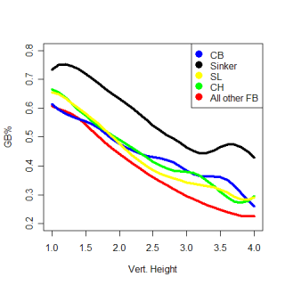
The most obvious thing is the huge advantage a sinker has in generating grounders compared to any other pitch. (I found sinkers the same way John did, by using all pitches with a pfx_z value of less than 6 inches). This isn't surprising, but what was a little surprising to me is how the groundball percentage of every pitch decreases at almost the same rate with increasing height. I would have thought that certain pitch types, especially curveballs, would have been much better, relative to other pitch types, when they were thrown low in the zone vs. high in the zone. I thought a curve would have a higher ratio of gb% on low pitches to gb% on high pitches than other pitch types did. This wasn't the case, so maybe the idea of a high curveball being a terrible pitch isn't totally accurate.
To get a better idea of what happens to high curveballs (and all pitch types), I looked at the slugging percentage for balls in play (including homers) based on which region of the strike-zone the pitch was thrown to. The table below shows those slugging percentages for the three vertical sections of the strike-zone. (The averages at the bottom are only for the pitches in the strike-zone and are higher than the averages in Walsh's article.)
        FB     SL     CH     CB     Sinker | Avg.
Top     0.564  0.565  0.692  0.579  0.580  | 0.596
Middle  0.622  0.590  0.612  0.559  0.558  | 0.588
Bottom  0.554  0.496  0.498  0.458  0.481  | 0.497
==================================================
Avg.    0.580  0.550  0.601  0.532  0.540  | 0.561
For pitches low in the strike-zone, batters have the lowest SLGBIP against curveballs, but if a curve is thrown at the top of the strike-zone, batters greatly increase their SLGBIP. Curveballs are hard pitches to hit, but the difference in SLGBIP between a low curve and a high curve is second only to the difference between a low changeup and a high changeup. Everything else being equal (speed, spin, movement, expectations of the batter, if the batter swings, etc.) a pitcher is increasing the batter's SLGBIP by roughly .100 points if he throws a curveball that isn't at the bottom of the strike-zone.
A changeup is potentially a great pitch, but changeups that aren't at the bottom of the strike-zone are hit much better than average. Low changeups are hit about as well as low sliders, but as the two pitches are elevated, the changeup gets hit much harder than the slider. A changeup above the knees is essentially a meat-ball and by throwing a changeup that isn't down in the strike-zone, the pitcher is increasing the batter's SLGBIP by at least .115 points.
| Command Post | December 14, 2007 |
The Same Things
Every pitch has a unique fingerprint that differentiates it from other all pitches. There are many factors that give every pitch a different identity, such as speed, how much movement it has, the handedness of the batter and pitcher, the location of the pitch, as well as the sequence of pitches that led to the pitcher throwing it. This week I want to look at how similar different pitches are. Do Brad Lidge and Joe Nathan throw a similar slider? (They don't). If so, how similar is it? (Not very, Lidge's is similar to Jonathan Broxton's, Nathan's is more like Bobby Jenks'). If not, what parts are different? (Nathan's is faster, and has a bigger pfx_z value, but a smaller pfx_x value)
Using the pitch classifications from wmy database, I found the average speed and pfx values for every pitch I had data for. For example, Josh Beckett's fastball has an average speed of 95 MPH, pfx_x value of -7.4" and a pfx_z value of 8.7". (Pfx_x/z values are how the pitch actually moved relative to a spin-less version of it. They measure in inches how much spin the pitcher put on the ball). Once I had the average values for all the pitches, I found the z-score for each value, relative to all other pitches. I then subtracted the z-scores of the pitch I was comparing from the z-score of the Beckett's fastball and squared the result. This gives the distance between each pitch and Beckett's fastball for each category, and summing those differences gives the total difference between Beckett's fastball and the other pitches.
Derek Lowe relies heavily on his sinker to produce a ton of ground ball outs. Lowe is reputed to have one of the best sinkers in baseball, which I won't argue, but what's the difference between Lowe's sinker and Brandon Webb's? How similar are the two pitches to each other and what other pitches are they similar to? If my similarity scores are measuring what I think they are, Lowe and Webb's sinkers will be most similar to other sinking fastballs, and hopefully will be similar to each other. The table below shows the pitches most similar to each sinker along with the similarity score for each pitch.
Name              Pitch  Throws  MPH     pfx_x    pfx_z   Score
Brandon Webb      FB     R       88.8   -10.13"   1.94"   100
Franquelis Osoria FB     R       90.8    -9.45"   2.15"    96
Kameron Loe       FB     R       88.6    -8.73"   3.79"    96
Derek Lowe        FB     R       90.3   -10.28"   3.87"    96
Shawn Hill        FB     R       89.6    -8.33"   3.80"    95
Jeremy Accardo    CH     R       86.0    -8.46"   1.97"    95
Name            Pitch   Throws  MPH      pfx_x  pfx_z   Score
Derek Lowe      FB      R       90.2   -10.28"  3.87"   100
Yorman Bazardo  FB      R       89.9    -9.38"  4.89"    97
Jake Westbrook  FB      R       91.1    -8.99"  3.71"    97
Luis Ayala      FB      R       89.6    -8.53"  4.57"    97
Shawn Hill      FB      R       89.6    -8.33"  3.80"    96
Kameron Loe     FB      R       88.6    -8.73"  3.79"    96
Webb's sinker is slightly more unique than Lowe's, primarily due to the spin he imparts on the ball (he has the smallest pfz_z number for a fastball and combines it with an large absolute value pfx_x value). One cool thing to notice is that the fifth most similar pitch to Webb's sinker is Accardo's changeup. Changeups typically have a smaller pfx_z value than fastballs, sinking more than a fastball thrown by the same pitcher, and Accardo's mirrors Webb's sinker. Overall though, I would classify the similar pitches in both cases (as well as other similar pitches that fell outside the top-5) as sinkers, giving some confidence that the system is actually finding similar pitches.
I wanted to look at breaking balls too. Just from observing the two, Barry Zito and Rich Hill appear to have very similar curveballs. Let's see what the list says.
Name             Pitch  Throws  MPH     pfx_x   pfx_z     Score
Barry Zito       CB     L	70.2    -0.69"  -11.48"   100
Ted Lilly        CB     L	71.0    -4.34"   -8.95"    92
Sean Marshall    CB     L	73.2    -4.26"   -9.91"    92
Rick VandenHurk  CB     R	71.0     4.47"   -9.79"    90
Jo-Jo Reyes      CB     L	73.3    -2.95"   -7.33"    90
Doug Davis       CB     L       68.4    -5.39"   -8.48"    90
The first thing to realize is that Zito's curve is much more unique than either of the two sinkers. The reason for this is the lack of horizontal spin. Zito throws almost a true 12-to-6 curveball, and as a result of that, a right-handed pitcher's pitch shows up on his list of most similar pitches. I'm not saying that Vanden-Hurk's curve is going to look like Zito's to a batter, but Zito's curve is so unique that there aren't many similar pitches to it, thrown by either LHP or RHP. Hill's curve doesn't show up at the top of Zito's list because Hill's is thrown faster, has a smaller pfx_z value, and has a larger pfx_x value. Zito's curveball is really a unique pitch.
Speaking of unique pitches, lets talk about Mariano Rivera's cutter. I've been somewhat fascinated with Rivera's cutter since I started working with the pitch f/x data. For those who might be unaware, despite being a right-handed pitcher, Rivera is hit harder by right-handed batters than left-handed batters. This is due to the cutter which moves in on left handed batters and causes lots of weak contact and broken bats. The list of similar pitches to Rivera's cutter has a pretty wide selection of pitches.
Name               Pitch  Throws  MPH   pfx_x   pfx_z   Score
Mariano Rivera     FB     R	  93.4  2.72"   7.72    100*
Jared Burton       FB     R	  93.4  1.57"   7.58     98*
Brandon Medders    SL     R	  91.2  2.27"   9.40     95
Juan Salas         FB     R	  90.9  1.02"   8.05     95*
Jon Lester         FB     L	  92.1  4.50"   9.56     95
Jason Isringhausen CT     R	  90.3  1.69"   7.92     95
Randy Flores       FB     L	  90.0  1.79"   7.41     95
Jonathan Broxton   CT     R	  96.3  1.03"   8.40     94
Brian Wolfe        CT     R	  92.6 -0.39"   6.97     94
Kevin Cameron      FB     R	  91.9 -0.11"   6.64     94
Again, these aren't necessarily pitches that will look like Rivera's cutter to hitters, but pitches that move like it. The release point a pitcher throws with plays a huge role in what a pitch looks like, but for right now, don't worry about that. Jared Burton's fastball actually looks like a close match to the cutter, but the horizontal movement for Rivera's cutter is the most unique aspect of the pitch, and Burton's pitch doesn't come close to matching it. Brandon Medder's slider looks close too, but drops less and is a little slower. The pitches that have similar horizontal movement to the cutter are all primarily thrown by left-handed pitchers, with very few pitches thrown by right-handed pitchers having that much movement in to left-handed hitters. The right-handed pitchers with a * next to their score in the list above have reverse splits (right-handed batters hit them better than left-handed ones), but only Burton and Rivera show a reverse split on the pitch in the list. I'm probably reading too much into a sketchy list (that also has sample size problems) but I'm going to keep an eye on Burton.
I think this is a cool way to look at pitches and see similarities that might have otherwise gone unseen. Right now, the similarity scores I'm using are based more on how the pitch moves, independent of how the batter perceives it, which isn't the ideal solution. In addition to just the movement and speed, the sequencing and location of pitches has a large impact on how they are viewed by the batter. For Jamie Moyer's fastball, the two most similar pitches are Cole Hamels' changeup and Johan Santana's changeup. The similarity speaks highly to the movement on Moyer's fastball, but without looking, I would guess that Moyer throws his fastball mostly in situations where Santana and Hamels throw their fastballs, not their changeups. If I can get the similarity scores to reflect how batters view the pitches, the scores will become much more useful.
---------------------------------------------------------
12/18 Update:
Here's what I've got with Burton...
The pitch I called his fastball could be 2 different pitches, one of which behaves like a regular 4-seamer and one of which behaves almost exactly like Rivera's cutter. The red cluster in the chart below is what I initially called Burton's fastball and if you look at the far left of the cluster, you can see a somewhat separate cluster that could be a regular 4-seam fastball, with the cutter occurring more on the right. Without having first-hand information about the types of pitches a pitcher throws I wouldn't be comfortable making a distinction between 2 such similar groupings, but it looks like this might be something.
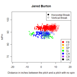
I have Burton throwing the cutter around 50% of the time, the 4-seamer 25%, and the slider and changeup being the other 25%...Justin, do you know if Burton throws his cutter that often?
If you're curious, here are the values of the 2 cutters...pretty much a dead on match, with Burton's actually having a higher (more "movement") pfx_x value. I would kill for data on Rivera's cutter when he was at his absolute peak though and I wonder maybe if he's lost an inch or two off his cutter since then.
Name MPH, pfx_x, pfx_z
Burton 93.50,2.92,7.94
Rivera 93.35,2.72,7.72
| Command Post | December 10, 2007 |
Dirty Jobs: part 2
Last week I looked at how pitchers approached each count, based on the amount of fastballs thrown and where they were thrown. Today I'm going to wrap up the topic, looking at what generally happens after the pitcher releases the ball and the hitter has to make a decision.
The most basic decision a hitter has to make at the plate (after determining what pitch is coming) is whether to swing or not so the next facet of each count I looked at was how often hitters took a pitch in each count. To remain consistent with the other results I've found, I only looked at fastballs and the table below shows how often fastballs were taken in each count, along with how often the pitch was either a ball or a strike. The most obvious thing is how often 3&0 fastballs are taken, especially for strikes. I realize there are a lot of good explanations/reasons for this behavior, but it seems that hitters are sacrificing a huge opportunity by taking so many pitches in these situations. A 3&1 count is still a hitter's count, so the actual loss of the strike doesn't hurt the batter too much, but they are ceding one their most potentially productive counts by showing pitchers they rarely swing in in it. A generic 3&0 pitch is a strike only 60% of the time, compared with the average across all counts of 63%, but that's not nearly enough of a difference to justify taking 93% of pitches.
Count    Take%  Called Strike%     Ball%   Called Strike/Ball Ratio
3&0      93%    59%                33%     1.77
0&0      71%    32%                40%      .81
2&0      59%    28%                31%      .90
1&0      57%    24%                33%      .71
0&1      54%    12%                42%      .28
0&2      53%     5%                48%      .09
1&1      47%    12%                35%      .33
3&1      45%    17%                28%      .60
1&2      43%     5%                38%      .14
2&1      40%    11%                30%      .36
2&2      35%     5%                30%      .18
3&2      25%     4%                21%      .20
If the batter is able recognize a 3&0 pitch as a fastball out of the pitcher's hand he's at even more of an advantage. 3&0 fastballs are strikes 67% of the time, which is higher than the average for fastballs among all counts (64%) and when batters do swing at 3&0 fastballs, they are very successful, posting the highest Slugging Percentage by swings (TB/Total Swings) for any count. I would think that success would encourage more swinging on 3&0, but it apparently doesn't. I know that I'm making this sound overly simplistic, and there are certainly valid reasons why different hitters might not swing at a 3&0 fastball, (among others, they could be looking for a specific pitch or a specific location), but I think there's an element of risk-aversion on the part of the batter to avoid "wasting" a 3&0 count and making a visible out right then.
I'm not sure how much more I'm advocating swinging at 3&0 fastballs, but if the whole point of a hitter's count is to force the pitcher into throwing more fastballs, then taking almost all of those fastballs can't be a good decision, especially when the pitch is nearly twice as likely to be a strike than a ball. Taking the pitch might not be as big of a problem as I'm making it out to be because even though a 3&1 count is a (slightly) worse hitter's count than 3&0, in terms of seeing fastballs, the two counts are very similar. This leads to the question, in which count is it worst to take a strike in? The table below has the FB% for each count, along with the FB% for the count that results from taking an additional strike and the difference between the two. Obviously it's suicide to take a called third strike, so those bottom four counts aren't very interesting, What is interesting is the top of the chart. Taking a 3&0 strike leaves the batter in roughly the same position he started in, at least in terms of possibly seeing a fastball. The lack of a "penalty" for taking a strike combined with the potential of getting a walk might contribute to the higher than normal take-rates in 3&0. The similarity in terms of seeing fastballs between 0&1 and 0&2 further emphasizes how important first pitch strikes are for a pitcher. 0&2 is obviously a better pitcher's count because the batter has a smaller margin for error, but in terms of fastball selection, once that first strike happens, the batter has a huge hole to dig out of.
Count   FB%     FB%-Called   Diff.
0&1     48%     47%          0.00
3&0     78%     76%         -0.02
1&1     49%     44%         -0.05
1&0     59%     49%         -0.10
2&0     70%     59%         -0.10
0&0     59%     48%         -0.11
2&1     59%     47%         -0.13
3&1     76%     61%         -0.14
1&2     44%      0%         -0.44
2&2     47%      0%         -0.47
0&2     47%      0%         -0.47
3&2     61%      0%         -0.61
Going back to the first table for a second, another interesting element is how the frequencies of taking a fastball for a called strike organize the counts based on the number of strikes a hitter has. When hitters have two strikes, regardless of the number of balls he has, there is only about a 5% chance of him looking at strike three. When he has one strike, there is about a 12% chance of taking strike two and with zero strikes and zero, one or two balls, a there is about a 28% chance of the batter taking strike one, but in a 3&0 count, that percent nearly doubles to 59%.
I mentioned that batters had the best results in 3&0 counts, and I based that on the slugging percentage per swing in each count. This is very similar to slugging percentage for balls in play, except swinging strikes and foul balls are added to the denominator. This is a more granular metric than anything else I've seen and measures the value of a swing. To give a feel for the size of these values, the league average (for all types of pitches) is .273, Alex Rodriguez led the league at .324 and among non pitchers, Jason LaRue was last, posting a .114. .270 and above is a pretty good performance, while below .180 is poor. (These are different than the values I posted on Saturday which were slightly off). This isn't a measure of the absolute value a player, but measures the value of one swing of his bat, something like his skill for recognizing which pitches to swing at and then hitting those pitches hard. The table below shows the SLGSWING in each count (for fastballs), and the rankings of the counts is very similar to how they've been ranked with other metrics.
Count   SLGSWING
3&0     0.381
3&1     0.333
2&0     0.298
2&1     0.267
3&2     0.256
1&0     0.247
0&0     0.233
2&2     0.205
1&1     0.202
0&1     0.192
1&2     0.190
0&2     0.163
The original question that prompted this article asked about classifying 2&2 and 0&1 counts and the way hitters and pitchers approached each count. I would call both counts pitcher's counts but in an 0&1 count, the fewer strikes gives hitters a much bigger margin for error and allows them to be relatively selective about which pitch they swing at. However, an 0&1 count also allows pitchers to be less concerned with forcing a strike than they are in a 2&2 count. 0&1 has some advantages for both batters and pitchers, although the pitcher's advantage is dominant. In a 2&2 count, the batter and pitcher are under different pressures. A batter can't afford to be very selective because he only has one strike left, but a pitcher doesn't want to throw a ball and go to 3&2. The batter is again in a worse spot, making it a pitcher's count, but if 0&1 is a count where both the batter and pitcher are under pressure to maximize their advantage, in a 2&2 count it seems like both players are under pressure not to screw up.
| Command Post | November 30, 2007 |
Dirty Jobs
I've looked at pitcher's counts vs. hitter's count before, and prompted by this comment on The Book's blog, I decided to revisit the topic. When doing research of any kind, the hardest thing to do is to find an interesting question to topic to examine, and Tango's comment had a whole lot of interesting questions, so I'm going to tackle some of those, pseudo-blog style, throughout the day. Anyway, without any more introduction, lets see some results.
The reason certain counts are considered hitter's counts or pitcher's counts is partially due to the likelihood of a fastball being thrown on that pitch. For most pitchers, a fastball is their least effective strikeout pitch, as well as the pitch they have the most control over. In an extreme example, on 3&0, most of the time a pitcher will throw a fastball to get a strike, but in doing so, gives the batter a better a good pitch to hit. The chart below shows the percentage of fastballs thrown in each count, and gives a slightly different view of what makes up a hitter's count vs. a pitcher's count.
Count    FB%    Pitches
3&0      78%       2643
3&1      76%       5083
2&0      70%       8282
-----------------------------------
3&2      61%      10096
2&1      59%      12084
0&0      59%      58849
1&0      59%      23982
-----------------------------------
1&1      49%      22900
0&1      48%      27712
0&2      47%      12943
2&2      47%      16947
1&2      44%      19802
With an average FB% of 59% and the number of pitches thrown in each count, there are four counts that see an "average" number of fastballs, while the others could be grouped into hitter's counts and pitcher's counts. Most of these percents make sense, and the top of the list corresponds very well to the top of the pass-through table in terms of ranking the counts in terms of hitter friendliness. Not surprisingly, hitters see the most fastballs in 3&0 and also have the best results if they pass through that count during their at-bat. The ranking of pitcher's counts doesn't match up as well, with 0&2 surprisingly not seeing the lowest FB%. I'm not sure exactly why this is, but the important thing is that the differences between groups is much bigger than any differences within the groups.
The "ownership" of counts changes slightly using FB% as a guide. It makes intuitive sense that 1&1 should be a neutral count, the results of plate appearances that end in a 1&1 count make it a neutral count, the pass-through results say it's a neutral count, yet pitcher's throw fewer fastballs in that count than in other ones. Pitcher's don't seem to agree that 1&1 is actually a neutral count, and have responded by throwing almost as few fastballs as they do for 0&1 and 0&2 counts. 1&0, 2&1 and 3&2 change hands too. Prior to looking at this table, I would have bet any amount of money that there were a lot of fastballs thrown in these counts, making them hitter's counts. All of them have more balls than strikes and it just seems like they favor the hitter. Tango's pass through data labels them as hitter's counts, but pitchers treat them like 0&0 counts, throwing an "average" amount of fastballs. The two gray-area counts that Tango mentions (0&1, 2&2) are both pitcher's counts by this metric.
Count   High%   Low%    Mid%
3&0     29%     27%     44%
3&1     27%     27%     46%
2&0     27%     29%     44%
----------------------------
3&2     32%     26%     42%
2&1     28%     28%     44%
0&0     29%     28%     43%
1&0     27%     30%     43%
----------------------------
1&1     29%     28%     43%
0&1     31%     28%     42%
0&2     51%     18%     31%
2&2     35%     24%     41%
1&2     41%     21%     38%
Now that we know a little about what pitchers throw in different counts, let's look at where they throw it. The table above shows the vertical locations in the strike-zone for fastballs thrown in each count. In a 3&0 count, 27% of fastballs thrown are higher than 6 inches below the top of the strike-zone, 29% are lower than 6 inches above of the bottom of the strike-zone and 44% are thrown between that. This doesn't account for the horizontal position of the pitch and there really isn't anything interesting to see in most cases. 0&2 has the lowest percent of pitches in the middle, which is expected, and it seems that when a pitcher is going to throw a waste pitch on 0&2 and 1&2, it is usually thrown high.
| Command Post | November 23, 2007 |
Post-Thanksgiving Quickie
I didn't have much planned today, but I was playing around with these conditional probability plots this week, and thought I'd share them. Conditional probability charts show the probability of an event happening, given one condition. In this case, they show the chance of a ball in play being hit on the ground given the height it crossed home plate.
The graph below shows the probability of a fastball (that is put in play) either being hit in the air or the ground, given the vertical height where it crossed the plate. The dark gray region is the probability of the ball being hit in the air, while the lighter region is the corresponding chance of the ball being hit on the ground. The curve is smoothed slightly and the general pattern of low pitches producing more groundballs is what you would expect. This isn't surprising, but what’s cool is that you can see the continuous relationship between height and the chance of a groundball.
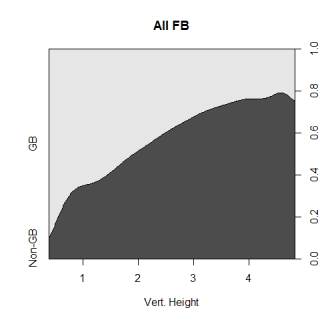
Moving on, the graph below on the left shows the same thing as the graph above (the chance of a random pitch to be hit in the air or on the ground), but only for fastballs with a pfx_z value of less than 5 inches. This means that the pitch ended up 5 inches higher than a non-spinning pitch would have, and while that value doesn’t mean anything by itself, that’s the cutoff point I used to define sinking fastballs. The graph below on the right is for all fastballs with a pfx_z value greater than or equal to 5 inches and just looking at the two graphs, you can tell that there is a big difference in the chance of a sinker being turned into a groundball compared to a regular fastball.
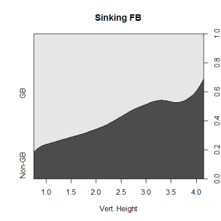
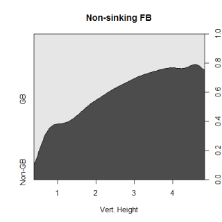
Very roughly, the strike zone goes from a height of 2 feet to 4 feet, so a sinker at the knees that is put in play has a 65% chance of being a groundball, while a non-sinking fastball at the same spot has a 45% chance to be a grounder if it is put in play. At the top of the strike zone, a sinker has a 40% chance of being a grounder, while a regular, non-sinking fastball has only a 25% chance, so a sinker up in the zone is almost as likely to get a grounder as a regular fastball at the knees. At almost every height, sinkers are 15-20% more likely to be hit on the ground than a regular fastball. There are a ton of other considerations to take into account if you were finding the true chance of a ball-in-play being a grounder, like the horizontal position of the ball and exactly how much a pitch "sinks" (or breaks or spins or whatever you call it), but this is just another illustration of why sinkers can be so valuable for a pitcher.
====================================================================
11/24 UPADATE: The 2nd and 3rd graphs I showed aren't very easy to understand, so here is a much more straightforward version of the information.
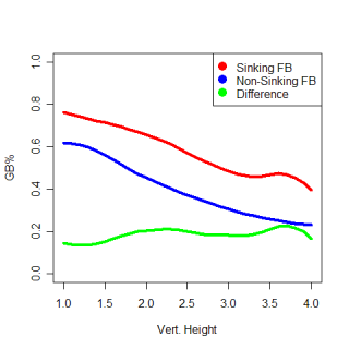
| Command Post | November 16, 2007 |
Predicting Pitches
Last time I checked in, I looked at the percentages of fastballs thrown to different types of hitters based on the count. Toward the end of that article, I threatened to try to predict via regression when a pitcher would throw his fastball and this article is the preliminary result of that threat. What I wanted to do was find whether a pitcher threw a fastball or not, a binary variable, based on a particular list of factors, which was made up of both continuous and discrete variables. Regular linear regression can't handle binary dependent variables, but there is a special type of regression, logistic regression , that is designed for just this type of analysis. Given an dependent variable and one or more independent ones, a logistic regression will solve for the logarithm of the odds that a binary event is going to occur. Unlike linear regressions, where the relationship between the dependent variable and independent variables is somewhat obvious based on the generated coefficients, the coefficients created from logistic regressions are more confusing because they're really referring to the log of the odds of the event happening. The methods of a logistic regression are similar to a linear one, in that it models the relationship between several variables, it just does so in a less straightforward fashion.
While that's sinking in, I'm going to backtrack a little. Before getting into the messiness of regressions, I wanted to see if there were any easy correlations to spot. The conditional probability charts below give a good idea of the magnitudes for possible ranges for FB%.
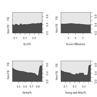
These charts graph the chance that a pitcher will throw a fastball on any pitch, based on one continuous variable. As slugging percent increases, the likelihood of seeing a fastball obviously decreases and there is an very (very) slight increase in the probability of throwing a fastball at the extreme ends of score differential. The two graphs on the bottom use two indicators of the quality of a pitcher's fastball. The graph on the left uses the percentage of a time the fastball is thrown for a strike while the one on the right uses the number of swings-and-misses generated as a percent of total swings taken at the fastball. Unfortunately, both graphs have several small sample outliers on the right that skew the graphs, but overall the trends are pretty strong and obvious. Good fastballs, both in terms of location and "nastiness" will be thrown frequently and these plots give an indication about what factors may be related to the likelihood of throwing a fastball.
Getting back to the regression, the first variable I tested was the 2006 slugging percent of the batter. Clearly there is a relationship between the amount of fastballs a hitter sees and his quality (I've beaten this point into the ground), but how strong is it? The coefficient for SLG was -.77, so for every .010 increase in SLG, the likelihood of seeing a fastball increases by .19 percent. This doesn't seem like that big of an impact, but is still a significant predictor of FB%. According to my regression, the factors that relate to the quality of a pitcher's fastball, the strike% and swing and miss% are also both significant factors if a pitcher threw a fastball.
Categorical variables, such as the count or the situation with base-runners are also important. This is again, a very obvious point, but as opposed to just looking at hitter's counts vs pitcher's counts, and saying certain types of batters see more fastballs in each type of count, with the regression, I can estimate what percentage of fastballs any type of hitter will see in any specific count. The chart below, which is a little confusing, attempts to do exactly that and also account for the quality of the fastball being thrown.
The green lines represent the estimated FB% in each count over a range of hitter abilities, for a fastball that gets a below average number of swings-and-misses. Looking just at the green lines, there are three relatively distinct bands. The top three lines (roughly starting around .8) are 3&0, 3&1 and 2&0, which are the three biggest hitter's counts. There are actually four separate counts in the next two distinct green lines (starting around .7), 3&2, 1&0, 0&0 and 2&1. The bottom cluster of lines has the remaining counts, 1&1, 0&1, 0&2, 2&2 and 1&2. These groupings end up matching pretty well with the groupings of counts found here.
The black lines on the graph are estimates of the exact same thing (FB% in a given count over a range of SLG), but they are for pitches that have a higher than average swing-and-miss%. The ranges of different counts are the same so this just shows the range where most MLB pitchers would lie.
Before I wrap this up, I have a caveat to add. I only recently learned about logistic regression, so it's entirely possible that there is a problem with my methods. If anyone sees something I butchered with the regression, let me know and I'll fix it. I don't think this is the case or I wouldn't be publishing my results, but fair warning.
The differences I'm looking at right now are mostly marginal, especially at the ranges MLB players perform at. The three bands of counts are distinct in the FB% that pitcher's throw, but within each band, its very tough to see any differences. The next step with this type of analysis is to break down pitch selection based on potential swings in win expectancy. Win expectancy would account for score difference, base-runners, and outs, which are very important in determining how a pitcher pitches. The quality of the on-deck hitter is probably important as well.
On an individual pitcher level you could also potentially see more variation within a specific count. If Josh Beckett is throwing 70% fastballs in a 0&0 count while other Josh Beckett-types (pitchers with three pitches and a similar quality fastball) are throwing 60% fastballs in that count, that could be very valuable. Those numbers are for illustration, but a discrepancy like that would be important.
| Command Post | November 02, 2007 |
Pitching to the Hitter
In my previous article, I looked at the decisions pitchers make about what pitches to throw. One thing I didn't look at, and was reminded of by a comment from MGL, was how this pertained to hitters. Do certain types of hitters see more fastballs than other types? I had some slight difficulties trying to determine if pitchers deviated from their normal pitching patterns in certain situations because I didn't have the ability to know what their "true" pitching patterns in different situations were. Since hitting is the reaction to the action of pitching, looking at hitters is much easier. I can look at how pitchers pitched in a given situation against certain hitters and then compare that to how the exact same pitchers pitched in the exact same situations, but against different hitters.
Including the post-season, I have 189 pitches in my database when David Ortiz was in a hitter's count. Those 189 pitches represent 17% of all the pitches Ortiz faced, which ranks him in the upper echelon of hitters as far as getting himself into a good count to hit in, but what happens once Ortiz is in a hitter's count? I've shown that certain pitchers exhibit an overreliance on their fastball in hitter's counts or pitcher's counts, but I haven't looked at how this impacts specific hitters.
When Ortiz is in a hitter's count, pitchers throw him 66% fastballs, which puts him right at the league average of 67% fastballs seen in those situations. However, Ortiz is far from a league average batter in terms of his power potential. How do pitchers approach other elite sluggers when they find themselves behind in the count? My definition of an elite slugger might be a little loose, but I took everyone with 300 ABs and a slugging average of .550 or higher this year and looked at how pitchers approached them in hitter's counts. Not surprisingly, pitchers gave these hitters fewer fastballs as a group in these situations. Instead of seeing 67% fastballs, elite sluggers only see 61% fastballs when in a hitter's count. Ortiz sees more fastballs than the other hitters in this group, but within a reasonable amount. Teammates Curtis Granderson and Magglio Ordonez are a different story. Granderson (73% fastballs) and Ordonez (72% fastballs) see the most fastballs out of the group. Perhaps pitchers didn't believe that Granderson was as good as he hit this season and kept challenging him with fastballs, even in hitter's counts. Using a hitter's career slugging average might fix that problem, but still wouldn't explain why Magglio saw so many fastballs. Maybe there is something with Comerica Park that is causing my labeling process screw up there and is impacting Granderson too.
At the other end of the spectrum lie Adam Dunn (50% fastballs) and Ryan Howard (45% fastballs). These two are very similar types of players according to their output and are both approached very cautiously by pitchers. Dunn and Howard see fewer fastballs than most of the group which is probably a result of their propensity to whiff and their power when they do connect. The chart below has all my top sluggers, the number of fastballs they saw in hitter's counts, the total number of pitches they saw in those situations, their overall slugging average and FB% in hitter's counts. There's a definite shift from the population mean to the group mean here that you can see from the table.
Name	           FBseen   TotPit.   SLG       FB%
Curtis Granderson   101      139       0.552     0.73*
Magglio Ordonez     78       109       0.595     0.72
Alfonso Soriano     38        54       0.560     0.70
Ryan Braun          73       108       0.634     0.68
Hanley Ramirez      31        46       0.562     0.67
David Ortiz         124      189       0.621     0.66
Prince Fielder      71       113       0.618     0.63
Alex Rodriguez      52        83       0.645     0.63
Carlos Pena         57        91       0.627     0.63
Chipper Jones       85       141       0.604     0.60
Albert Pujols       84       142       0.568     0.59^
Matt Holliday       62       105       0.607     0.59
Jim Thome           101      176       0.563     0.57^
Chase Utley         38        67       0.566     0.57
Barry Bonds         70       124       0.565     0.56^
Miguel Cabrera      29        54       0.565     0.54^
Adam Dunn           53       107       0.554     0.50^
Ryan Howard         53       118       0.584     0.45*^
*-significantly different from group mean (.61) at alpha=.01
^-significantly different from population mean (.68) at alpha=.05
Keep in mind, the FB% listed in the table are only for hitter's counts and while the chart isn't too revealing, I just think it's interesting to see the different ways each hitter was approached. I was surprised to see Soriano see so many fastballs, as he's a hacker, but maybe there's a good reason for it. Braun got a lot of fastballs, presumably even after started dominating offensively, so maybe there wasn't a good scouting report on him yet, although I'm not sure why there wouldn't be.
Getting back to how pitchers approached different types of hitters, I split up every batter (with a minimum of 300 ABs) based on their slugging average, and then found the FB% for that class of batters in hitter's counts. The table below shows the number of hitters in each group, the number of fastballs seen and total number of pitches seen in hitter's counts, the average slugging average for the group, and the percentage of fastballs the group saw.
Hitter Groups   #     FBseen   Totseen  SLG     FB%     PFB%
>=.550          18    1200     1966     0.591   0.61*   0.68
.549-.500       27    1761     2760     0.520   0.64*   0.67
.499-.450       68    4020     6142     0.471   0.65*   0.67
.449-.400       71    3871     5660     0.425   0.68    0.67
.399-.350       52    2626     3623     0.376   0.72*   0.67
<.350           20    975      1309     0.332   0.74*   0.67
*-significant difference from PFB% at alpha=.05
This table has a lot of things going on, but the most obvious one is that in hitter's counts, as the caliber of a batter increases (slugging goes up), FB% goes down. This isn't true for every batter individually, but the overall trend is really clear. I don't know exactly why pitchers are behaving this way, (maybe bad hitters as a group can't hit fastballs very well and there is less of a cost to the pitcher's stamina for throwing a fastball), but they do throw fewer fastballs to each progressive range of hitters. It makes sense that pitchers would avoid throwing fastballs to better hitters and try to fool them with junk, while getting after the weak hitters and not worrying about home runs and doubles. Even though all these batters are in hitter's counts, some got many more fastballs than others. Not every hitter's count is created equal.
The last column in the table, PFB%, is the other big thing to see. For every hitter, I found the different pitchers they faced in hitter's counts, and then found out what those pitchers had thrown in all other hitter's counts they were in during the season, regardless of hitter quality.
When any pitcher who faced one of my top hitters was facing any other batter, he threw 68% fastballs. These values are slightly more interesting on the individual hitter level (Willie Bloomquist saw 100% fastballs in hitter's counts, while those same pitchers threw 75% fastballs whenever the faced someone other than Bloomquist), but this value is my best guess about what these exact pitchers should throw in a hitter's count to a random batter. By comparing what they actually threw to that value, you find that the differences are not due to randomness but rather a decision on the part of the pitcher.
The next table uses the same hitter groupings, but looks at the pitches they saw in pitcher's counts. This chart tells a much different story than the first one. In hitter's counts, pitchers seem to be aware of the type of hitter at the plate and pitch accordingly. Ortiz gets fewer fastballs than Nick Punto. However, if both those types of hitters were in a pitcher's count, they could expect to see a virtually identical amount of fastballs. A pitcher doesn't seem to know or care who is at-bat when the count is in the pitcher's favor. Both good and bad hitters should expect close to the same proportion of fastballs in these counts.
Hitter Groups   #     FBseen   Totseen  SLG     FB%     PFB%
>=.550          18    2131     4522     0.591   0.47    0.47
.549-.500       27    3158     6559     0.520   0.48    0.48
.499-.450       68    7766     16210    0.471   0.48    0.48
.449-.400       71    7212     15606    0.425   0.46    0.46
.399-.350       52    4629     9856     0.376   0.47    0.47
<.350           20    1650     3414     0.332   0.48    0.48
*-significant at alpha=.05
MGL's comment that prompted this article, about whether Sabathia and Carmona throwing more fastballs to good hitters was a double mistake, proved to be spot on. Intuitively his premise made sense because good hitters usually see fewer fastballs than bad hitters in these cases and are able to hit the fastballs they do see, so it’s nice to see that the data back it up.
When looking at the relationship between slugging average and FB% for hitters, I thought about trying to predict the FB% of a pitcher, given any situation. For a pitcher with a given set of pitches, you could possibly figure out how often he should throw his fastball in a situation and then compare how often he actually threw it. I’m not sure exactly what factors I would use to predict this, but I think the quantity of pitches a pitcher throws, the nastiness of those pitches, the batter, and some measure of the pitcher’s control would play a big role. For a batter, I think the FB% that he should see would be primarily impacted by his quality as a hitter, in terms of batting eye, ability to make contact and ability to hit the ball hard, as well as any holes in his swing.
| Command Post | October 26, 2007 |
Pitch Frequency
There are many variables that impact what type of pitch a pitcher will throw on any given pitch. The type of hitter, the count, if there are runners on base, what the score is, what pitch was just thrown, as well as the different types of pitches a pitcher has in his arsenal all play a big part in what pitch will be thrown next.
Given any situation that a pitcher is in, be it close game or blowout, facing Ryan Braun or Ryan Freel, in a hitter's count or pitcher's count, there is a certain frequency that he should throw each of his pitches for optimal results. These frequencies are dependent on the situation and pitcher, and even though we don't know exactly what they may be in each situation, they do exist. A pitcher can't let a hitter get too comfortable in any situation, so even if the pitcher has an amazing slider, he is still going to have to occasionally throw a fastball to keep a hitter honest.
Last week I looked at the sequencing of pitches in an at-bat and used the overall percentage that a pitcher threw his fastball as a proxy for his true rate of throwing a fastball on any particular pitch. Prompted by these two threads on The Book's website, I went back into my database, and for every pitcher with at least 100 pitches, I found out how often they threw their fastball. I've created lists like this before, but this time I created splits based on the count the pitch was thrown in, either hitter's counts, pitcher's counts, or neutral counts. Using the overall percentage of pitches that were fastballs (FB%) for a pitcher as their true rate of throwing fastballs, I then looked to see if pitchers were throwing a significantly different amount of fastballs in each type of count. I used the frequencies of fastballs thrown because it is the easiest pitch to look at. Every pitcher throws a fastball and while they all don't move the same, fastballs have much more in common across different pitchers than any other pitch does.
I have 421 pitchers in my sample, and in hitter's counts 299 of them threw significantly more fastballs than their overall average, while only 4 threw significantly fewer. In pitcher's counts, 286 pitchers threw significantly fewer fastballs, while only 9 threw significantly more. This is pretty much what we would expect to happen. One reason why hitter's counts are considered advantageous to hitters is because they see lots of fastballs (more than the overall average), which are generally easier to hit than breaking balls.
Results like that also make me think that the overall fastball frequency of a pitcher isn't a good substitute for his frequency in different counts. In my article last week I looked at Josh Beckett, C.C. Sabathia and Greg Maddux and their pitching patterns. Splitting their fastballs by count yields this chart, which shows the number of pitches thrown by each pitcher and the percent that were fastballs, both overall and in hitter's counts. (Hitter's counts are 3-0, 3-1, 2-0 and 2-1. Pitcher's counts are 0-2, 1-2, 2-2, and 0-1. The other counts are considered neutral counts.)
Name            Total Pitches   FB%     Hitter's Counts   FB%-hitter's counts
Josh Beckett    1122            0.68    108               0.81
C.C. Sabathia   1232            0.62    136               0.71
Greg Maddux     1137            0.65    105               0.62
All three pitchers throw a lot of fastballs overall, and two of them throw more fastballs than their overall average when in hitter's counts. This pattern holds true for almost all the pitcher's in my sample, with the average FB% going from 55% overall to 68% in hitter's counts. In light of this difference, using the overall FB% doesn't seem like the best proxy for the true FB% in hitter's counts.
One way to estimate the true amount of "skill" involved in an act is to regress it toward the population mean. In this case, I'm looking to estimate the true level of decision making that impacts the FB% in hitter's counts (basically finding the amount of "skill" for a measurement given the observed frequencies, random standard deviation, population average and population standard deviation). Once the regressed FB% are found you've got a much more accurate idea about what to expect in a given count from a pitcher. The overall FB% of a pitcher doesn't really matter to a hitter because a hitter will always find himself in a situation that alters the base frequency. Here's a table showing the eight pitchers who throw the most and least fastballs in hitter's counts.
Name            Hitter's Counts   FB%-hitter's counts
Scot Shields    87                0.96
Daniel Cabrera  68                0.94
Jose Valverde   50                0.94
Brian Fuentes   65                0.94
Derrick Turnbow 75                0.93
Sean Green      82                0.93
CJ Wilson       71                0.92
C. Wang         77                0.91
----------------------------------------------------------------
Mark Buehrle    134               0.36
Ubaldo Jimenez  167               0.36
Jamie Moyer     162               0.35
Doug Davis      74                0.35
Andy Pettitte   93                0.29
Mike Maroth     63                0.26
Julian Tavarez  69                0.25
Kenny Rogers    88                0.20
The first thing I noticed about the list is that the top group are almost all relievers, while the bottom group is almost all starting pitchers. There are other starters besides Cabrera and Wang at the top of the list, but for the most part, relievers are more likely to throw a fastball in a hitter's count. This is probably because they don't usually have a good second or third pitch that they can throw strikes with. Fastballs for relievers are also usually faster than those of starters, so even if the batter knows the pitch is coming, they might not be able to do anything with it. Starters generally have more pitches than relievers, so they become less reliant on one pitch in any count, although as Cabrera shows, this isn't always the case.
I wouldn't take too much from that list as there are good and bad pitchers at both ends of the list. However, if you were to take absolute difference between the FB% in hitter's counts and the FB% in pitcher's counts, you would get a list of pitchers who are throwing their fastballs equal amounts in both counts.
Name             FB%-hitter   FB%-pitcher   Difference
Curt Schilling   0.50         0.50          0.00
Andy Pettitte    0.29         0.29          0.00
Livan Hernandez  0.44         0.44          0.00
Julian Tavarez   0.25         0.25          0.00
Mark Buehrle     0.37         0.36          0.01
Greg Maddux      0.62         0.61          0.01
-----------------------------------------------------
Jake Westbrook   0.82         0.39          0.43
Jack Taschner    0.89         0.45          0.44
Brad Lidge       0.80         0.35          0.45
Frank Francisco  0.91         0.45          0.46
Rafael Perez     0.74         0.27          0.46
Derrick Turnbow  0.93         0.43          0.51
The guys at the top of this list usually have the reputations for being "smart" or "crafty", willing to throw any pitch at any time. Without looking at their other pitches, I can't verify that they will throw anything in any count, but according to this list, they don't alter the amount of fastballs they throw based on the count, which means at least that they throw the same total frequency of off-speed pitches in the different counts. The bottom of the list is populated with pitchers who drastically change the amount of fastballs they throw depending on the count. Someone like Lidge, who just has two pitches, primarily throws fastballs in hitter's counts and sliders in pitcher's counts. Even if Lidge is throwing his fastball and slider at their optimal frequencies in these counts, the difference between frequencies gives hitters very good information about what pitch is coming.
Comparing the pitch frequencies for the same pitcher in two different time periods, like Fausto Carmona in the regular season vs. the playoffs, is another interesting application of these frequencies. Using his regressed regular season pitch frequencies as his true frequencies, you can see if he significantly changed his style of pitching in the playoffs. I looked at this briefly before, but here are the FB% for Carmona and Sabathia in the playoffs compared to how they usually pitch. For whatever reason, both pitchers threw significantly more fastballs in hitter's counts in the playoffs than in the regular season.
Name             Count type    True FB%   Playoff FB%   Playoff N
Fausto Carmona   Hitter        0.83       0.91*         44
Fausto Carmona   Pitcher       0.58       0.73*         80
-----------------------------------------------------------------
C.C. Sabathia    Hitter        0.71       0.89*         35
C.C. Sabathia    Pitcher       0.46       0.47          118
*-significantly different from true FB% (alpha=5%)
This is more of a backwards looking analysis that explains what happened rather than why it happened or what will happen in the future. Even still, it's fun to look at.
I think of the frequencies that pitches are thrown like the slices on a circular spinner. Making the correct decision about what pitch to throw is easy for a pitcher, just spin the Wheel-of-Pitches and throw whatever comes up. Knowing how big to make the slices for each pitch in different situations is much harder than actually deciding what pitch to throw. I didn't really look at this, but I'm curious how much the catcher contributes to setting the frequencies and spinning the wheel. At the top of the list of pitchers who throw fastballs in any count (the "smart" pitchers) were two pitchers on the Red Sox, with a third, Dice-K, just missing the cut. Jason Varitek generally gets credit for calling a good game, so I'm curious about his level of contribution to pitch selections.
| Command Post | October 19, 2007 |
Pitch Sequencing
I'm wanted to look at pitch sequencing this week and see how pitchers pitch in certain situations. What happens after a certain pitcher starts a hitter off with a fastball? What pitch do they throw for the second pitch? What if they start him off with a curve? Whats the most common first pitch to a batter? Do certain pitchers follow predictable patterns of pitches? Josh Beckett has dominated the ALCS so far, so I thought he was a good choice to start with.
Of the 1016 pitches that PITCH f/x has recorded for Beckett, he has thrown 67% fastballs, 27% curves and 6% changeups. He throws his fastball more than an average pitcher does, partly because he only has three pitches and partly because his fastball is such a good pitch. On the first pitch to a batter, Beckett pretty much throws his pitches at their normal frequencies (69% FB/23% CB/8% CH). It gets a little more interesting after he has thrown one pitch though. If Beckett starts the hitter off with a fastball (and the batter doesn't put it into play), the second pitch that Beckett throws is slightly more likely to be another fastball. Of the 155 pitches he has thrown after a first pitch fastball, 73% of them have also been fastballs. When Beckett throws a curve on the first pitch (and it isn't put in play, which happened on 61 pitches), his second pitch is a fastball only 53% of the time.
This is where I start to get a little hazy with the math, but if the decision to throw a fastball or not or every pitch were independent and Beckett has a 67% chance of throwing a fastball on any pitch, then given 155 pitches, you would be 95% confident that the range of fastball frequencies would be between 61-73%, which is what happened for the pitches after a first pitch fastball. However, when looking at the same 95% confidence interval for the pitch after a first pitch curveball (61 pitches), you get a range of 57-77% fastballs, but he actually only threw his fastball 54% of the time in those situations. Beckett significantly deviates from his "normal" pattern of pitching and throws fewer fastballs after he starts a hitter with a curveball.
This is easier to understand in a table, so here's a table with all the information from the previous paragraph. The numbers quoted above were frequencies that he threw different pitches. The way to read the table is that after a first pitch fastball that wasn't put in play, Beckett threw 155 pitches, 73% fastballs, 21% curveballs and 6% changeups.
        Overall   First    After First    After First    After First
Pitch   Freq.     Pitch    Pitch FB       Pitch CB       Pitch CH
FB      .67       .69      .73            .54*           .44*
CB      .28       .23      .21            .44            .17
CH      .05       .08      .06            .02            .39
==============================================================
N        1014      265      155            61             18
*-significant at 5% level, given number of pitches thrown in that situation and overall average.
There are plenty of obscure relationships between Beckett's pitches, such as what happens when he starts a batter off with two fastballs or curveballs, but before looking at those relationships, I need to make sure that my assumption of independence between pitches isn't going to be a problem. There are plenty of reasons why Beckett would throw more curves and change ups on the second pitch to a batter that he started off with a curveball. If a batter had a tough time hitting off speed pitches, it would make sense that Beckett would give him several in a row. In fact, if he starts a hitter off with two curveballs in a row, the chance that the third pitch is a fastball is 58%.
The assumption that his decision to throw a each pitch is independent isn't totally realistic, because the situation and type of hitter will impact his decision about which pitches to throw, but it doesn't really impact my results. The distributions will be different depending on the situation (I'd be more surprised if they weren't), but I'm more interested in how he changes his pitching patterns in certain situations, rather than if he changes or not. Is he throwing more fastballs on the first pitch than is expected? Does he follow up fastballs with curveballs? What does he throw after a fastball is fouled off? The assumption that he has a static 67% chance to throw a fastball on any pitch might end up being more of a problem, but I think that can be fixed with some regression toward the average values in each situation.
C.C. Sabathia is a power pitcher who throws his fastball more than average. Overall, for all pitchers, fastballs are thrown 55% of the time and 57% of first pitches are fastballs. Sabathia throws his fastball 61% of the time, but on his first pitches, he leans even more on his heater, throwing it 78% of the time. This is a significant difference given his overall average, but whether he starts the hitter off with a fastball or curveball, by the second pitch Sabathia is back to throwing pitches at their normal frequencies. The one oddity on the second pitch of an at-bat occurs if he starts the hitter off with a changeup. After a first pitch changeup, Sabathia throws a fastball only 44% of the time and throws more changeups instead. Sabathia's chart is below.
        Overall   First    After First    After First    After First
Pitch   Freq.     Pitch    Pitch FB       Pitch CB       Pitch CH
FB      .61       .78*     .59            .59            .44*
CB      .21       .08      .22            .32            .08
CH      .17       .14      .19            .09            .47
==============================================================
N        1101      298      199            22             36
*-significant at 5% level, given number of pitches thrown in that situation and overall average.
Greg Maddux is another roughly three pitch pitcher, but he has a slightly different pitches than either Sabathia or Beckett, as well as a pretty different overall style of pitching. Instead of just listing more frequencies for Maddux, his frequency table is below. The interesting things to notice here are how much he throws his fastball as the first pitch of an at-bat, and that if he starts an at-bat with a cutter there’s a good chance he’ll come back with a cutter as the second pitch of the at-bat.
        Overall   First    After First    After First    After First
Pitch   Freq.     Pitch    Pitch FB       Pitch CH       Pitch CT
FB      .66       .75*     .65            .68            .33*
CT      .15       .12      .16            .12            .59
CH      .19       .12      .19            .21            .07
==============================================================
N        1112      345      216            22             36
*-significant at 5% level, given number of pitches thrown in that situation and overall average.
It seems to me that pitchers would be most effective if they didn’t fall into tendencies regarding pitch sequencing. Beckett, Sabathia and Maddux are all essentially three pitch pitchers who throw fastballs more than average. They all throw slightly different amounts of fastballs, but on the first pitch of an at-bat, Sabathia and Maddux throw proportionally more fastballs than they do overall. Hitters are already probably looking for a fastball from these pitchers, but they can afford to look even more on the first pitch. On the first pitch of an at-bat, Sabathia and Maddux don’t exactly become 1-dimensional pitchers, but they do remove some of the uncertainty regarding pitch selection from a hitter’s mind, although they could be varying the location enough on the first pitch to make up for it. Beckett is much more in line with his overall pitch frequencies on the first pitch. He does throw 67% fastballs, so hitters should still be looking fastball on the first pitch, but no more than at any other time they face him.
The next step in this vein of research is to expand from looking at just three pitchers to all pitchers. Ideally, I would know what the average fastball (and other pitches) frequency is in the different sequencing situations I looked at, maybe split by hand orby type of pitcher. In addition to seeing if the pitch frequencies differed from a binomial distribution, I could also see how much they differed from the average frequencies in those situations. Using a static value for the frequency a pitcher throws a pitch is also not totally accurate and with average values for each situation, I could regress each pitcher’s situational frequency and get a better approximation of his true frequencies.
| Command Post | October 12, 2007 |
Beckett vs. Sabathia
With the ALCS starting tonight, I wanted to take a quick look at the Game 1 starting pitchers, Josh Beckett and C.C. Sabathia from a PITCHf/x perspective and show some charts that I enjoyed analyzing when I "scouted" Jake Peavy. There will be a full series preview up later today, so be sure to check back for that.
Here are two charts, showing the difference between each pitch and a non-spinning version of that same pitch, which compare Beckett and Sabathia.
Beckett
Pitch   N     Speed   Pfx    Pfz    BreakX   BreakZ
FB      624   94.7   -7.58   8.87   2.67     3.55
CB      252   77.3    5.24  -5.03  -2.29     12.38
CH      52    86.1   -8.47   3.47   3.08     6.98
Sabathia
Pitch   N     Speed   Pfx    Pfz    BreakX   BreakZ
FB      561   94.0    6.46   9.37  -2.19     3.38
CB      187   81.5   -4.49   0.27   2.31     9.31
CH      166   86.1    9.47   6.21  -3.44     5.89
SL      22    80.8    -0.02   1.47   0.41     8.95
There are some basic differences between the two pitchers, such as Beckett's curve having more downward movement than Sabathia's (which is probably closer to a slider in terms of movement), but overall, the way their pitches move are relatively similar. The biggest difference, besides throwing hands, is that Beckett throws his fastball more often and is pretty much a two pitch pitcher, while Sabathia uses three pitches.
Another graph I thought was interesting in my analysis of Peavy was the pitch frequency by inning.

One neat thing on Beckett's frequency chart is that he throws his fastball much less as the game goes on, almost following a linear pattern. The 6th inning is the only inning that deviates from this pattern, and rather than saying Beckett must throw a lot of curves in the 6th, I would think that this inning is when he would usually face the best hitters in the lineup for a third time, so he throws fewer fastballs than he otherwise would. For what its worth, the 6th inning has been one of Beckett's least successful innings this year. Sabathia appears to follow a similar pattern for fastball usage as Beckett does, but he has more off-speed pitches to work with. You can see from his chart how, unlike Peavy, he doesn't show the dramatic increases in certain pitches every couple innings. Sabathia throws his off-speed pitches more frequently as the game progresses, but it's a gradual increase, as opposed to the sharp transitions of Peavy.
Be sure to check back later for a Baseball Analysts staff preview of the series.
| Command Post | October 04, 2007 |
ALDS Preview: New York Yankees vs. Cleveland Indians
The Indians won the AL Central this year with a record of 96-66, accomplishing what many had been predicting of them for several years, and today will host the first playoff game in Cleveland since 2001. The Yankees used a furious second half charge to win their first wild card since 1997 and extend their streak of reaching the playoffs to 13 years in a row. The Indians have some great pitching and the Yankees have the best offense in baseball, so it could be an interesting series in terms of conflicting styles. I've gathered some information about the series and each team, and then have two guest writers, Earl from Pinstripe Alley and Ryan from Let's Go Tribe to break down the series, position by position.
****************************************
Hey fellas, I’m Earl Mitchell and I’ve been a writer for Pinstripe Alley since last year. I’m 33 years old and I do social work in the mental health field [insert creative jokes here]. I’ve been a diehard Yankee fan since 1985, living in the Chicagoland area surrounded by Cub fans. I became a Yankee fan because Don Mattingly was my idol. After 13 straight postseason appearances, the dark days of the late 1980s and early 1990s seem like a really long time ago. I’m honored to have been asked by Rich to voice my opinion on the series between the Yanks/Tribe. Should be a great series.
Hi, I'm Ryan Richards of Let's Go Tribe. After going through the late-season collapse of 2005, it was nice to have a boring last week of the season thanks to an early clinch. It's only been six years since the Indians were in the playoffs, but that was long enough for Kenny Lofton to play for eight teams before coming back to Cleveland.
Schedule
Game 1: Thu., Oct. 4, 6:30 pm on TBS, Yankees (Chien-Ming Wang) @ Indians (C.C. Sabathia)
Game 2: Fri., Oct. 5, 5:00 pm on TBS, Yankees (Andy Pettitte) @ Indians (Fausto Carmona)
Game 3: Sun., Oct. 7, 6:30 pm on TBS, Indians (Jake Westbrook) @ Yankees (Roger Clemens)
Game 4:* Mon., Oct. 8, 6:00 pm on TBS, Indians (Paul Byrd) @ Yankees (Mike Mussina)
Game 5:* Wed., Oct. 10, 5:00 pm on TBS, Yankees (Wang) @ Indians (Sabathia)
* if necessary
RECORDS
         HOME      ROAD     TOTAL
NYY     52-29     42-39     94-68
CLE     52-29     44-37     96-66
Head-to-head results: The Yankees swept the season series, 6-0.
OFFENSE
        RUNS   AVG   OBP   SLG   OPS   OPS+
NYY      968  .290  .366  .463  .829   123
CLE      811  .268  .343  .428  .751   105
PITCHING AND DEFENSE
        RUNS   AVG   OBP   SLG   OPS   ERA+
NYY      777  .268  .340  .417  .757   96
CLE      704  .268  .322  .407  .729   109
Position-By-Position Breakdown
Catcher:
Jorge Posada (.338/.426/.543, 20 HR, 90 RBI) was spectacular from the get-go and had the best offensive season of his career at the ripe old age of 36. Unlike most catchers who tend to get tired and rundown late in the year, Posada had his best offensive output in the month of September (.395/.511/.632) and is primed for a big postseason.
Victor Martinez (.301/.374/.505, 40 2B, 25 HR) threw out 32% of potential base stealers, a massive improvement over an 18% clip last season. He also posted career highs in home runs and doubles. He was remarkably consistent, not posting an OPS below .800 in any month this season.
Earl says: I would have said Martinez last season, but Posada has just been unbelievable in 2007. Edge to Yankees.
Ryan says: Even. Posada has the better rate stats, while Victor has the counting stats (thanks to some time at 1B) and a better arm.
First base:
Doug Mientkiewicz (.277/.349/.440, 5 HR, 24 RBI) missed three months of the season with a broken wrist as a result of a collision with Mike Lowell of the Red Sox back in May. He wasn’t expected to get much playing time after his return from the DL on Sept 1st, but the season-ending injury to Andy Phillips (who, ironically, also suffered a broken wrist) opened the door for Mientkiewicz to reclaim the starting role and has taken playing time away from Jason Giambi.
Ryan Garko (.289/.359/.483, 29 2B, 21 HR) had to convince the Indians he could play first base this spring. Drafted as a catcher, Garko moved up through the Indians' system because of his bat. After the Indians dealt Ben Broussard last season, Garko switched to first base in the minors, and was good enough by the end of March to make the club. His bat made sure he didn't go back to the minors; Ryan has a quick, short, and aggressive swing, and while he'll chase balls out of the zone, he is also adept at making contact.
Earl says: This one isn’t close. Big edge to Tribe.
Ryan says: Advantage Indians, assuming Doug Mienkiewicz comes back to earth.
Second base:
Robinson Cano (.306/.353/.488, 19 HR, 97 RBI, 41 doubles) struggled terribly for the first six weeks of the season (.234/.276/.312, 1 HR, 16 RBI, 8 doubles) then suddenly caught fire in the middle of May and continued to rake for the rest of the season (.328/.376/.540). Cano is emerging as one of the top second basemen in the league and may very well be a perennial .300, 25 HR, 100 RBI guy who can play Gold Glove caliber defense.
Asdrubal Cabrera (.283/.354/.421, 9 2B, 2 3B, 3 HR) wasn't supposed to be a contributor this season. The Indians traded for Josh Barfield in the off-season, and if anything, Cabrera was seen as Plan B at shortstop if Jhonny Peralta didn't rebound from a bad 2006. The Indians had Cabrera start the season in AA, and after a short stay in Buffalo, he was brought up to replace Barfield, who was hitting an abysmal .243/.270/.324. Cabrera's defense was a given, but his offensive contributions at such a young age were a very pleasant surprise.
Earl says: Cabrera is a nice player, but this one isn’t close either. Big edge to Yankees.
Ryan says: This one's easy: Yankees
Shortstop:
Derek Jeter (.322/.388/.452, 12 HR, 73 RBI, 15 SB) had another very good season at the plate and is still the heart and soul of this organization. The Captain remains one of the best clutch players in the game when his team needs him most (.418 w/ RISP and 2 outs). Jeter’s production was slowed for several weeks with a nagging knee injury, but did catch fire in mid-September and finished the regular season on a 15-game hitting streak.
Jhonny Peralta (.270/.341/.430, 27 2B, 21 HR) has rebounded both on offense and defense after a brutal sophomore season. His range is still among the worst in baseball, but he's cut down on his errors, and has always been good around the bag. Peralta had a bizarre home-road split this season, hitting .297/.367/.514 at Jacobs Field, as well as having 16 of his 21 home runs come at home.
Earl says: Tough to pick against the Captain in October. Edge to Yankees.
Ryan says: Advantage Yankees.
Third base:
Alex Rodriguez (.314/.422/.645, 54 HR, 156 RBI, 24 SB) had a season for the ages and will be the runaway AL MVP when the votes are tallied in November. While the rest of the club struggled during the first two months of the season, it was A-Rod who kept this team afloat and is the primary reason why they are playing in October. All eyes will be on A-Rod again with his struggles in the postseason in years past, but he has been a completely different player in 2007 dealing with the pressure of New York.
Casey Blake (.270/.339/.437, 36 2B, 18 2B) was originally slated to play mostly at first, but Andy Marte couldn't hit and later got hurt, so Casey returned to his old position. He's been very acceptable at the hot corner, perhaps because not much was expected of him. Casey is a streaky hitter, and very good when he's guessing right. He's coming into October on a hot streak after hitting .302/.344/.477 in September.
Earl says: You have to ask? This is A-Rod’s year. Edge to Yankees.
Ryan says: Yankees.
Left Field:
Johnny Damon (.270/.351/.396, 12 HR, 63 RBI, 27 SB) had the same problem as many of his teammates during the first two months of the season. Damon sustained nagging leg injuries for much of the first half and lost his centerfield job to Melky Cabrera. Not surprisingly, he has been the Damon of old since the All Star break once his legs got healthy (.296/.364/.450, 7 HR, 36 RBI).
Kenny Lofton (.296/.367/.414, 25 2B, 7 HR, 23 SB) returned for his third stint with the Indians this July. Kenny still has the wheels and the eye to play the same kind of game he played ten years ago. Instead of leading off and playing center, he's in left and hitting seventh because of Grady Sizemore.
Earl says: This is one pretty even. Lofton has had a good year back in Cleveland and Damon is healthy again and playing well.
Ryan Says: Lofton's provided what the Indians need, but Damon's been better. Point to the Yankees.
Center Field:
Melky Cabrera (.273/.327/.391, 8 HR, 73 RBI, 13 SB) brings a youthful energy boost and an aggressive style of play to this team. He unseated Johnny Damon as the everyday centerfielder early in the season and led all centerfielders with 14 assists. Cabrera is primarily a slap hitter with occasional power who generally doesn’t take a lot of pitches.
Grady Sizemore (.277/.390/.462, 34 2B, 24 HR, 33 SB) had another outstanding all-around season, taking walks, stealing bases, and hitting for power, to say nothing of his defense. Left-handed pitching can still neutralize Grady’s bat, though he won't see many southpaws beyond Andy Pettitte in this series.
Earl says: Melky on his best day doesn’t compare to Sizemore on his worst day. Big edge to Tribe.
Ryan Says: Indians in a no-brainer.
Right Field:
Bobby Abreu (.283/.369/.445, 16 HR, 101 RBI, 25 SB) was downright atrocious and completely lost at the plate from the beginning of the season until the end of May (.228/.313/.287, 2 HR, 22 RBI, 6 doubles). In a truly remarkable turnaround, Abreu’s offensive production the rest of the season coincided with the numbers on the back of his baseball card (.309/.396/.520, 14 HR, 79 RBI, 34 doubles).
Franklin Gutierrez (.266/.318/.472, 13 2B, 13 HR) gradually beat out Trot Nixon as the everyday right fielder. Franklin is a natural center fielder, though he has more than enough arm to play right. Hitting for corner-outfielder power has been a major stumbling block for Gutierrez, especially with Grady Sizemore entrenched in center. He answered those questions by slugging .472 this year, though, like Jhonny Peralta, he has an extreme home/road split, slugging .617 at home and .343 on the road.
Earl says: I thought Abreu was finished in May. He really turned it around and is a major cog in that lineup. Edge to Yankees.
Ryan says: Yankees
Designated Hitter:
Hideki Matsui (.285/.367/.488, 25 HR, 103 RBI) had another good season and seems to have regained the power stroke that he lost recovering from a broken wrist in 2006. Like the other left-handed hitters in the lineup, Matsui struggled early on but caught fire in July and August and finished with the kind of numbers Yankee fans have come to expect from him. Most of his playing time of late has been as the DH and I don’t expect that to change much in the postseason with Damon playing superior defense in left field.
Travis Hafner (.266/.385/.451, 25 2B, 24 HR) had a poor year by his standards. He still took his walks, but suffered from a power outage, becoming more of a ground ball hitter instead of a line drive slugger. He came on strong in September, hitting .316/.414/.551, and showing more of a line drive stroke.
Earl says: Matsui struggled in September because of his knee barking, but tends to hit well in October. Hafner scares me. Edge to Tribe.
Ryan Says: Even in a down year, I'll take Hafner over Matsui. Indians.
Off the Bench:
Jason Giambi (.236/.356/.433, 14 HR, 39 RBI) missed much of the regular season after having surgery on his foot at the end of May. Since his return from the DL on Aug 8th, he has essentially been a $20M+ reserve who comes off the bench late in the game as a pinch hitter and DH’s on occasion. Giambi could get a start or two as the DH in the ALDS, but don’t expect to see him at first base during the postseason.
Shelley Duncan (.257/.329/.554, 7 HR, 17 RBI) was another element of the Yankees youth movement who burst onto the scene by hitting 6 homeruns in his first 41 big league at-bats. Torre seemed to indicate that he could get the start at DH against Sabathia on Thursday and he has hit well against lefties (.303, 10-33) during his limited time in the majors. Duncan does have holes in his swing though, and will strikeout more than his fair share (20 K in 74 AB).
Others: Wilson Betemit (IF), Jose Molina (C)
Jason Michaels (.270/.324/.397, 11 2B, 7 HR) should get a start in Game 2, though a lack of left-handers in New York's bullpen should restrict his pinch-hitting opportunities overall.
Kelly Shoppach (.261/.310/.472, 13 2B, 7 HR) is Paul Byrd's personal catcher, but you might not see him in Game 4. Kelly hasn't hit at all in the second half (.178/.211/.356).
Others: Trot Nixon (OF), Chris Gomez (IF), Josh Barfield (PR/IF)
Earl says: The bench was a big problem for the Yanks earlier in the season. Not anymore. Edge to Yankees.
Ryan says: The Yankees have the more useful bench.
Starters:
Chien-Ming Wang (19-7, 3.70) is a ground ball machine who throws strikes and eats innings (almost 6.2 IP per start). After hitters around the league started to figure out his sinker, Wang has been mixing in his slider more often to keep them honest. Although he will get the ball on the road in both Game 1 and Game 5 if necessary, he has been a far better pitcher at Yankee Stadium (2.75 ERA) than on the road (4.91 ERA). He has also been the beneficiary of a ton of run support (7.04 runs per game).
Andy Pettitte (15-9, 4.05) was everything the Yanks could have hoped for when he came back to the Bronx in the off-season after a 3-year stint in Houston. He was the workhorse this team needed and didn’t miss a start after being plagued by elbow problems the last few years. As usual, Pettitte finished strong with an 11-3 record in the second half of the season with the team winning 13 of his 16 starts during that span.
Roger Clemens (6-6, 4.18) hasn’t pitched since Sept 16th and was sidelined most of the month due to elbow/blister/hamstring problems. He is scheduled to pitch Game 3, but could be replaced by Mike Mussina or rookie Phil Hughes if he can’t go. Of course, Clemens LOVES the big stage and loves the idea of playing John Wayne riding in on his horse to save the day.
Mike Mussina (11-10, 5.15) had the worst season of his career in 2007, but will likely get the start over rookie Phil Hughes because of Joe Torre’s preference of postseason experience over inexperience. As of this writing, he is scheduled to pitch Game 4 of the ALDS, but that could change if Clemens cannot go in Game 3 or if Torre opts for rookie Phil Hughes instead.
C. C Sabathia (19-7, 3.21) has increased his strikeouts and dropped his walks for the fourth consecutive year. He’s become very efficient on the mound, and averaged seven innings a start. He hasn’t faced the Yankees since 2004 and a long break between starts like that usually favors the pitcher.
Fausto Carmona (19-7, 3.06) rode his power sinker for his few starts with some success, and then started to spot his secondary stuff. As good as he was in the first half (107.2 IP, 3.85 ERA), he’s been even better in the second half (107.1 IP, 2.26 ERA). He ended last season back in the rotation after a disastrous stint as the Indians’ closer, and really took off this spring.
Jake Westbrook (6-9, 4.32) missed most of May and June with an oblique injury. He’s pitched well in the second half, posting a 3.44 ERA in 104.2 innings pitched.
Paul Byrd (15-8, 4.59) rebounded from a disappointing 2006 campaign, eating innings and sending hitters back to the dugout frustrated at making outs off of his batting practice fastballs. Byrd’s secret is control and movement, but he will lose it very quickly. I don’t like Byrd against the Yankees lineup at all.
Earl says: The 1-2 punch of Sabathia and Carmona certainly beats Wang and Pettitte. But the rest of the rotation on both sides pose a lot of questions marks. Edge to Tribe.
Ryan says: Ryan says: Sizable advantage for the Indians.
Relievers:
Mariano Rivera (3-4, 3.15, 30 Saves, 4 Blown Saves) is not consistently as unhittable as he has been in the past, but is still among the elite closers in the game. His very un-Mariano like ERA this season can be attributed to his struggles against two often seen AL East opponents; Red Sox and Orioles. Against those clubs he put up a robust 8.33 ERA and blew 3 saves, while his numbers against the rest of baseball were as good as ever (1.69, 1 Blown Save).
Joba Chamberlain (2-0, 0.38, 24 IP, 34 K, 0.75 WHIP!) has been spectacular since his arrival and has been the Yankees’ best weapon out of the pen. The kid throws gas consistently in the upper 90s and possesses a devastating slider in the upper 80s that he can locate. Much is made about the “Joba Rules” but it probably won’t be a major issue in the ALDS due to the off-days on Saturday and again on Tuesday if the series goes that far.
Luis Vizcaino (8-2, 4.30, 14 Holds) is another of the several Yankees who came back from the dead after struggling early. Under the tutelage of Mariano Rivera, he altered his mechanics and was lights out from June through August (1.31 ERA in 41.1 IP). Vizcaino was sidelined for eleven days in September as a result of shoulder fatigue and has been very shaky since his return (10.12 ERA in 8 IP).
Kyle Farnsworth (2-1, 4.80, 15 Holds) has always been very frustrating for Yankees fans. He can be completely lights out one night and get hit hard the next. Simply put, he is consistently inconsistent and often struggles to find the strike zone. He gets into trouble when he falls in love with his slider and cannot locate it and then has to come back with a fastball in a hitter’s count. Aside from a few stinkers, he has been okay for most of August and September.
Others: Phil Hughes (fifth starter)
Joe Borowski (4-5, 5.07, 45 SV) leads the league in saves, but it wasn't pretty. One of Joe’s most memorable (in a bad way) performances came against the Yankees in April. With two outs in the ninth, and 6-2 Indians lead, Borowski let the next six runners reach, culminating with an Alex Rodriguez walk-off home run. That game was the last time Borowski faced the Yankees.
Rafael Betancourt (5-1, 1.47, 31 HLD) has been a constant in recent Indians’ bullpens. He’s essentially a fastball pitcher, especially with runners on base. Hitters always seem to be late on his four-seamers, possibly because of his deliberate delivery, his release point, or both. However he gets hitters out, he’s been the Indians’ best reliever and one of the best relief pitchers in baseball.
Rafael Perez (1-2, 1.78, 12 HLD) relies on a fastball and slider. He’s held left-handed hitters to a .145/.209/.241 line, and doesn’t have too much trouble with right-handers (.213/.257/.324), either.
Jensen Lewis (1-1, 2.15, 5 HLD) was brought up in mid-July, and has worked his way into Eric Wedge’s trusted circle of relievers. He’ll pitch in the 6th and 7th innings.
Others: Tom Mastny (middle relief), Aaron Laffey (5th starter/long relief), Aaron Fultz (LOOGY)
Earl says: Mo over Borowski is obvious and Joba and Betancourt seems like a wash to me. Nonetheless, the rest of the Tribe pen is deep and much more stable. Edge to Tribe.
Ryan says: Even with Borowski dragging things down, the Indians have the better bullpen.
Earl's Prediction: The key to this series is how the potent Yankee offense will fare against the 1-2 punch of Sabathia and Carmona. If the Yanks manage a split in Cleveland, they will come back home to a raucous Yankee Stadium crowd, ready to feast on Westbrook in Game 3 and perhaps Byrd in Game 4. However, if the Tribe find themselves trailing the series 2-1 going into Game 4, I fully expect to see Sabathia ready to pitch on short rest because I can’t imagine the Indians relying on Byrd to keep their season alive with their big guns sitting on the bench. Yankees in 4.
Ryan’s Prediction: The Indians take the first two at home, the Yankees blow the Indians out in New York, and CC Sabathia pitches the Indians to the ALCS in Game 5.
| Command Post | September 28, 2007 |
Scouting Jake Peavy
With the season winding down, and as a bit of foreshadowing for the playoff preview I'm writing next week, I wanted to use my PITCH f/x database to look at Jake Peavy from something like an advance scouting point of view. Peavy, the ace of the Padres staff, has had a great season, highlighted by an unbelievable month of May and currently leads the Majors in ERA and WHIP as well as the National League in strikeouts and wins. I've been dancing around advance scouting in some my articles, by diagraming how a pitch moves or examining what pitchers throw in high leverage situations, but I haven't put it all together in one place yet. While I've never seen an MLB advance scouting report, I think a good place to start is with an examination of what a pitcher throws, when he throws it, and what happens once he throws it. Using this framework, you can identify a pitcher's strengths, weaknesses and tendencies.
Pitch Profile-What does he throw?
Here's a chart of Peavy's pitches, showing the differences between his pitches and their non-spinning equivalents.
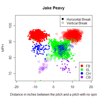
One thing that sticks out in this graph is the large group of sliders and when I looked at Peavy before I was unsure how to handle that group of pitches. If you look close enough, you begin to make out two groups, although overall they appear to be variations on his slider rather than two unique pitches.
Pitch   N     Speed   Pfx    Pfz    BreakX   BreakZ
FB      751   94.2   -8.69   10.68  3.11     3.09
SL      473   86.3    2.39   4.52  -1.25     6.74
CH      79    85.7   -8.10   4.36   2.90     6.81
CB      30    73.8    6.42  -5.57  -2.65     13.80
Peavy's fastball is thrown hard and hitters will see it as having slightly less "drop", relative to an average RHP fastball. The smaller amount of drop gives the illusion of a rising fastball, which is reflected by a higher than average pfz value. His fastball also has more arm-side movement than an average RHP fastball does.
Almost every pitcher throws their fastball the most and will throw their "out" pitch, if they have one, the next most, usually far more than average for that pitch type. Peavy is no exception to this pattern, and 35% of his pitches are sliders, compared to the average for RHP, which is 19%. His slider breaks away from RHH and drops less than an average slider, although in both cases, not by very much. It is thrown at roughly the same speed as his changeup, although they move in opposite horizontal directions. The wide range of possible slider movements makes comparisons against an average slider a little less precise than for fastballs. Sliders are essentially what's left over after fastballs, curveballs and changeups have been identified, the scrapple of pitches, and there is more variation among sliders (and cutters) thrown by different pitchers than any other pitch.
Peavy's changeup has similar movement to his fastball, except it travels 10 MPH slower. He doesn't throw his changeup much (6% of pitches) and his curveball even less (2%).
Situational Pitching-When does he throw it?
If hitters are curious about which pitches to look for, here's a graph showing the frequency that Peavy throws each of his pitches, by inning.
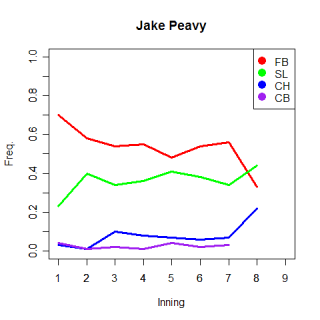
You can really see Peavy's reliance on his fastball and slider from this graph. 70% of Peavy's first inning pitches are fastballs (Avg. RHP throws 60%) and while there are any number of reasons why his first inning fastball percentage is higher than average (he doesn't want hitters to see his slider early in the game, he's trying to make sure he has command of his fastball, he's trying to establish his fasbtball as a pitch) it could just be because he really only throws two pitches. As the game moves along, he throws fewer fastballs and focuses more on his slider, which is consistent with how most pitchers operate. I only have data for 9 pitches of his in the 8th inning, so there probably isn't anything to the fact that only 3 of them are fastballs.
Now look closer at the staggered increases in his changeups and curveballs in the third and fifth innings respectively. These changes mirror the increase in sliders in the second inning. One possibility to explain these changes is that Peavy might not want to show his full arsenal of pitches to hitters early in the game. In the first inning he throws mostly fastballs, then adds his slider to the mix in the second innnig. It looks like he begins throwing his changeup in the third inning and adds his curveball in the fifth. These changes are pretty subtle and might just be artifacts, but if they’re real, it gives hitters another piece of information about what pitches to look for at various stages of the game.
That graph gives an overall pattern for Peavy, but which pitch does he throw when he needs a strikeout? In situations where the win value of a strikeout is the same as the run value of a ball that is put in play, you would expect a pitcher to not worry about getting a strikeout vs. a regular out, while when the value of a strikeout is high, you would expect a pitcher to try for a strikeout. One important thing to note is that I used the run value of a strikeout as opposed to the win value when splitting up situations. Using the win values of strikeouts, which is the correct way to do this, would cause my already small samples to shrink even more, and using the run values ignores the possibility of pitching in a blowout, where a pitcher would want to avoid walks and just get outs, even in situations where a strikeout might normally be needed. There's some error built into these values as a result.
With that disclaimer out of the way, Peavy gives the batter almost even odds on seeing a fastball (54%) and a 37% chance of seeing a slider when the value of a strikeout is the same as a ball-in-play out. However, in situations when the value of a strikeout is greater, Peavy throws more fastballs (61%) and fewer sliders (33%). Because he relies so heavily on two pitches, Peavy throws both of his slider and fastball more than average in each situation, but increasing the percent of fastballs when he needs a strikeout doesn't make sense, given his great slider (although it has worked for Peavy). Another idea to consider is that perhaps his fastball is actually his best strikeout pitch. Which pitch does he get the most swings and misses from? The table below shows the overall frequency that Peavy gets swings and misses from each of his pitches.
Pitch   N     Total     Freq.
SL      82    473       0.17
CB      3     30        0.10
FB      57    751       0.08
CH      4     79        0.05
For each pitch, Peavy generates more swings and misses than average, but it seems that his slider is being underutilized in big situations. There's undoubtedly a game theory element to his pitch selection in pressure spots, and perhaps his slider would lose some of it's effectiveness if he threw it more often, but it would appear that he's making his fastball less effective than it could be by throwing it so much in important situations.
Results-What happens when he throws it?
The final frontier when examining a pitcher is what actually happens once he throws a given pitch. The chart below shows where Peavy throws his fastball. Ideally, I would split this chart by batter type, and show where he throws all his pitches to LHH and RHH, as well as how they hit them. However, with so many splits you start running into sample size problems, and there just isn't enough PITCH f/x data to give this the treatment it deserves yet. One thing you can notice from this chart is that Peavy doesn’t throw his fastball low, but challenges hitters with it in the middle of the strikezone. This is counter to conventional wisdom, but again, Peavy has been effective with it.
The next best thing to showing how different hitters fared against different types of pitches is showing how hitters did overall against Peavy.
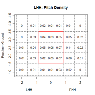
These charts show Peavy’s pattern of pitching to RHH and LHH. One quick thing you can see from the graph is that he works both groups of hitters outside more than inside, with the outer third of the strikezone and right off the plate being his primary targets. There seems to be a little bit evidence that Peavy pitches low in the strikezone, but he still throws a lot of pitches in the middle of the strikezone.
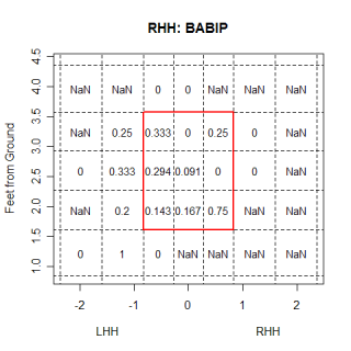
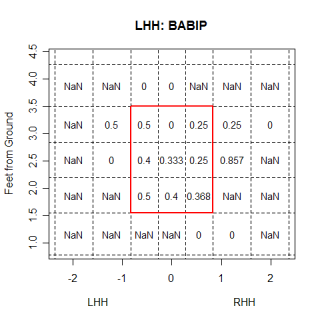
These BABIP graphs for LHH and RHH are probably not very accurate because of the small amount of ball-in-play data, but with a larger sample, they could be valuable for showing hot/cold zones.
Overall
Peavy’s fastball and slider are his two best pitches and he throws them the majority of the time. His slider has a couple different types of movement and could actually be two different pitches, although it looks more like the differences are variations of the same pitch. He also has a changeup and curveball that he throws much less frequently, and which aren’t as good. In pressure situations, it appears that he relies a little more on his fastball than normal, even though his slider creates more swings and misses. In the first inning he throws more fastballs than an average RHP, and throws a lot more fastballs than sliders, relative to how he pitches the rest of the game. He doesn't let the other team see all his pitches in the first inning and introduces his slider in the second inning, his changeup in the third inning and cuvrevball in the fifth inning.
*****************************************************************
I used Josh Kalk's player cards as a second opinion when analyzing pitches for Peavy and as I tried to improve my pitch clustering algorithm. If you've got an afternoon to kill, take a look through them...they're awesome. Josh has done some great work on standardizing the PITCH f/x data from different stadiums and different release points, so his data set is much bigger than mine right now (I'm only at the stage where I can look at pitches from 50 feet), and includes data for the entire season.
| Command Post | September 21, 2007 |
"Breaking" Away
When the PITCHf/x system debuted last year, the first thing I wanted to know (besides how hard Joel Zumaya actually threw) was exactly how different pitches moved. This was a basic question, and from watching baseball on television and playing it, I had a pretty good idea of how different pitches moved, but my knowledge lacked precision. I know a curveball from a left-handed pitcher breaks down-and-away from a left-handed hitter, but how much does it move? Where do you start measuring,? Where do you finish? How do you separate the downward movement from the away movement? Should you? That curveball ends up low and away, but would you say it broke 5 inches, down-and-away, or 3 inches down and 4 inches away? Which is "better"? Break is a tricky thing to define, let alone measure.
The first attempt to quantify break using PITCHf/x debuted during the 2006 playoffs and compared the actual pitch to a pitch thrown without spin. The system would capture the flight path of a pitch, then create a hypothetical pitch that was thrown with the same initial velocity and release point, but with only gravity and drag acting on it. The difference between where this pitch would have ended up and where the actual pitch ended up was given as the "pfx" of the pitch. There are a couple problems with this definition, the biggest being that nobody knows what a pitch without spin looks like. That isn't to say that it's path can't be calculated, but rather, that nobody has ever seen one, so people don't have a frame of reference for what the values mean. But it was a start. If you went into the XML files, there were two pfx values, one for the x direction and one for the z direction. Graphing these values, either alone or vs. the speed of the pitch remains an excellent method for identifying different pitches. Even if it's unclear how a pitch that ends up 10 inches higher than a non-spinning pitch would have actually moves, other pitches of this type will also have pfx_z's around 10 inches.
The next try at quantifying break arrived this season and is more in line with how people imagine break. This version of break is defined as the greatest distance between the path of the pitch and the straight line path from the release point to home. A 12-to-6 curve will have a large value, while a regular fastball will have a small one. It's confusing to think about this definition, so if you're having trouble understanding it, imagine holding a bow from one of the ends with the other end held away (and slightly down) from you. The end you're holding is the release point, the other end is where the ball crossed home, the string is the straight line path, while the ball would travel along the bow itself. If you rotate the bow around the string at given angle, you get the actual path of the pitch and break as given by PITCHf/x. (Thanks to John Walsh for the bow analogy).
This break value becomes even more valuable (at least to me) when you break it up into x and z components and Dr. Alan Nathan's website has some (more) helpful equations that allow you to calculate break-z and break-x values. To visualize break-z, imagine keeping the endpoints constant and rotating the bow around the string until the bow was above the string and perpendicular to the ground. Break-x is the same thing but the bow is parallel to the ground (don't worry if the bow is to the left or right of the string just yet). The break values are vary similar to the pfx values, except they are in reference to an imaginary straight line, something that is easy to visualize. If the break-z value is 17 inches for a Barry Zito curve, that means it really breaks 17 inches from it's "high point" to where it crosses home. If Mariano Rivera's cutter has a break-x value of -1.3 inches, that means it moves 1.3 inches in on a lefty between it's maximum horizontal deviation and end point . This makes a ton of sense and is much closer to how break is thought of.
Once you understand and are comfortable with the break values, they act pretty much the same as the pfx values, with the benefit of meaning something. Comparing the two Barry Zito graphs below show some of the similarities. The new definition of break in graphed on the left, while the no-spin version is graphed on the right. One thing to note is that because of a convention change, positive break x values (left hand graph) are negative pfx_x values (right hand graph), but the basic pattern of pitches is the same in both cases.
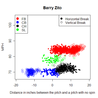
Negative break-x values mean movement away from a RHB, and you can see that Zito's pitches typically move away from a RHB. This type of horizontal movement (toward the arm-side) is what you would expect for a fastball and change-up from any pitcher. Zito's curveball breaks slightly away LHB, which is how curveballs from LHP are "supposed" to break, but the magnitude of Zito's horizontal break is less than normal. The table below shows other similar curveballs from LHP, sorted by their vertical break.
Name          Count    BreakX    BreakZ   MPH
Barry Zito    142      0.15"     17.18"   70.1
Doug Davis    165      2.31"     16.83"   68.0
Ted Lilly     157      1.73"     15.62"   70.8
Sean Marshall 62       2.24"     15.47"   73.2
Rich Hill     202      3.10"     14.93"   73.2
Lenny DiNardo 95       0.78"     14.68"   69.9
Zito's curveball actually has the biggest vertical drop of any pitch thrown this year, and comparing it to the other pitches in the chart, you see that the horizontal break is much lower. Zito has historically fared better when throwing to RHB than LHB (669/730 career OPS ) so maybe his unique curveball is the reason why. It's reasonable to think that because the curveball doesn't move away from LHB as much as normal, they would have an easier time hitting it. The only pitcher with a similar curveball is DiNardo and he too shows a reverse split (792 OPS career vs. RHB/814 OPS vs. LHP). Joe Saunders' curve is the next most similar to DiNardo's, although it has less vertical break and an almost normal horizontal break, but he doesn't have a reverse split. However, once you get past Saunders, no other curveballs have a horizontal break close to Zito or DiNardo's.
On The Book's blog this week, there was a discussion about comparing Mariano Rivera's cutter to other pitches and seeing if pitchers that threw those pitches had a reverse split like Rivera. The only problem with doing this for Rivera is you have a better chance of seeing Bigfoot as finding a pitch similar to his cutter. First of all, the horizontal movement on the pitch is totally unique. No other fastball (from either a lefty or righty) breaks as much to the pitcher's glove side as Rivera's does. The amount of movement he gets is consistent with a slider, but the cutter is thrown faster than an average fastball. A final difference is that it also breaks less vertically than a slider does. The table below shows some of the comparable pitches to Rivera's cutter, based on horizontal movement.
Name            Pitch    BreakX   BreakZ  MPH
Tim Hudson      Cutter  -0.66"    6.67    87.0
Miguel Batista  Cutter  -0.71"    5.27    89.6
Gil Meche       Slider  -0.97"    5.87    87.1
Mariano Rivera  Cutter  -1.30"    4.11    93.0
Buddy Carlyle   Slider  -1.44"    5.41    87.3
John Smoltz     Slider  -1.56"    6.31    87.2
Dustin McGowan  Slider  -1.66"    7.88    87.4
None of these pitches match Rivera's cutter very well and Meche is the only one of these pitchers to have a reverse split for his career. One idea I had as I was looking at Zito and Rivera is that uniqueness in horizontal movement might cause reverse splits. Rivera throws a fastball that breaks horizontally like nobody else's in baseball. Zito's curve is unique not due to it's vertical break (although it is large), but it's lack of horizontal break.
I had two topics I wanted to cover this week and while the second one is important to me, it's probably a little less interesting for other people, but I'm using a new algorithm to categorize pitches. It works better than applying a set of logical rules to each pitch and takes less time to run too.
As far as the nuts and bolts of the system, for each pitcher, the algorithm calculates the distance between each pitch using the their break and velocity. Once it has the distances between each pitch, it combines the two pitches that are closest together, recalculates the distances between that new cluster and the remaining pitches, and combines the next two objects that are closest together. It repeats this process until it reaches a certain level of difference between groups. Once the algorithm has run for an individual pitcher, all of their pitches are assigned to a certain group, and using some of the logical statements from my original filter, as well as other patterns regarding the speed and break of different types of pitches, I can label each group (and all it's members) as a specific pitch type.
Labeling pitches by group membership is better than applying a set of static rules to every individual pitch in the database because it allows me to compare different pitches to the rest of that pitcher's repertoire and not worry about how it compares to a global rule. One problem with my old filter was that I had to find a way to get Jamie Moyer and Josh Beckett's fastballs to both be recognized as fastballs, which wasn't easy given the differences in speed. With the new method, the fastest group for each pitcher is automatically labeled as a fastball...no fuss, no muss. This new algorithm is also more successful at identifying individual pitches at the edges of clusters. These pitches clearly belong with the rest of the cluster, but with the old system, these pitches would occasionally not match the logical rules used for classification and be labeled as unknown pitches.
While some of the kinks are still being worked out of this classification system, I can still generate a list of fastballs (for pitchers who have thrown at least 500 total pitches) and see which ones have the greatest vertical break.
Name            N       BreakX   BreakZ  MPH
Sean Green      300     3.64"    8.49"   89.8
Jesse Litsch    290    -0.59"    7.23"   84.8
Brandon Webb    637     3.71"    7.06"   89.0
Kameron Loe     428     3.14"    6.37"   88.6
Greg Maddux     555     3.56"    6.36"   86.3
Derek Lowe      670     3.93"    6.32"   90.3
Jake Westbrook  462     3.50"    6.28"   90.8
Justin Germano  466     3.38"    5.79"   86.9
Roy Halladay    268     3.51"    5.60"   93.9
Jamey Wright    320     3.02"    5.59"   89.1
Look familiar? Instead of saying Webb's sinker ends up 3 inches higher than a non-spinning pitch, while a 4-seam fastball ends up 6 inches higher (or whatever the numbers were), now you can say that Webb's sinker has a 7 inch downward break.
| Command Post | September 13, 2007 |
The Other Side of the Pitch
The majority of analysis performed on the PITCH f/x data has been from the perspective of the pitcher. This makes sense, as it is really interesting to see how a certain pitch from a specific pitcher moves and how it is put into play. It's much easier to classify pitches from the pitcher's perspective, and there are a host of other "pitcher" things to look at. However, there is another half of the data that hasn't been covered as in depth. Looking at the PITCH f/x data from the hitter's perspective could yield some interesting nuggets of info, so today I'm branching out, spreading my wings, and looking at the hitter's version of the data.
The easiest visual to create for a hitter is a chart showing how pitchers have approached him this season. Below on the left is a chart showing where Vladimir Guerrero has been pitched to this season. The number in each box is the percent of all pitches thrown that went to that area and while it seems that pitchers might be trying to avoid throwing high pitches to Vlad, overall there isn't too much going on here. On the right is a chart that shows Guerrero's BABIP for different regions. This is a much more interesting chart and is closely related to the results on the density chart. There's a very good reason that pitchers would avoid the top third of the strike-zone with Vlad...when he puts those balls in play, he hits .565! Before we call Guinness though, it's worth noting that hitting .565 in this case means going 13-for-23. Because of the sample size issue, reading too much into Vlad's hot zones is misleading, but there are some basic patterns, such as hitting high pitches well and what appears to be a weak area, located down and away from Guerrero.
I think these types of charts are fascinating and give you a good idea of a hitter's swing. You can easily pick out where batters feast on pitches and where they struggle. With a bigger sample than what I have right now, you could even have some confidence in your conclusions about those zones. Speaking of bigger samples, here is a chart that shows the BABIP for all RHB this season. Now instead of having 10 balls in play for a box, there are 10,000, which lets you say that low and away pitches appear to give most RHB trouble, not just Guerrero. Below on the right is a BABIP chart for Jason Kendall. Kendall has been anemic at the plate this season, and you can see exactly why when you look at the chart. Inside pitches give him problems, he hasn't done much better on outside pitches, and high pitches, well, he hasn't hit those either. The only place where Kendall has had any success this season is in the lower third of the strike zone, although judging by his density chart, pitcher's haven't figured that out yet.
I say that pitchers haven't figured out Kendall's strength yet and avoided throwing him low pitches, but (assuming I'm correct with my assessment of his weaknesses and strengths) do pitchers ever figure out these types of patterns vs. a hitter? How necessary is it to know, and pitch to, a hitter's weaknesses and strengths? Game theory might say that pitching too often to a hitter's weakness would eventually give him an advantage because he would have a good guess on the the location where the next pitch was coming. Whether that advantage would be offset by his inability to hit the pitch is unknown, but you are dealing with Major League hitter. If you gave most hitters the location of the pitch and let them focus primarily on that spot, even if it were a spot where they otherwise had trouble, I think they would be successful. Pitchers have to vary their locations, both in and around the strike zone, to avoid giving the hitter an advantage (duh). In the case of Kendall, and every other hitter I've looked at, pitchers appear to be somewhat varying their locations, although for Kendall, pitchers have thrown more low pitches than high pitches, which cues Kendall to look for more low pitches, and enhances his only strength.
Now with some idea of where pitchers throw to certain hitters and how the hitters respond, lets look at what pitchers throw different hitters. Building on my pitch filter, and some of the earlier work done by Dan Fox, ultxmxpx and Josh Kalk I went through my database and attempted to label every (currently only the ones tracked from 50 feet) pitch in it . Any automated process that attempts to classify pitches is going to have mistakes and mine is no exception, but after comparing the filter's results on individual pitchers to the results I got from manually clustering pitches, I was generally pleased with the results. The filter remains a work in progress (it can't differentiate between a split-fingered fastball and curveball or a 2 and 4 seam fastball and has trouble with certain pitcher's change ups) but the results are pretty good overall.
Here are the MLB averages for how frequently different pitches are thrown. This is for all pitchers vs. all batters in all situations, so it isn't the most telling statistic, but it gives a general sense of how often a fastball (or change up) is thrown.
Pitch             Freq.
Fastball (FB)     0.59
Change up (CH)    0.16
Curveball (CB)    0.13
Slider (SL)       0.08
Unknown (UK)      0.04
Without further ado, here are the batters who have seen the highest and lowest frequency of each pitch, with frequency being the number of a given pitch divided by the total number of pitches that hitter has seen. (Min. of 80 total pitches tracked by the PITCH f/x system.)
Name              Pitch  Count  Total   Freq.
Tony GwynnJr.     FB      92    118     0.78
Robert Fick       FB      66     88     0.75
Reggie Willits    FB     502    673     0.75
Frank Thomas      FB     504    693     0.73
Luis Rodriguez    FB      66     91     0.73
Brad Ausmus       FB     261    360     0.73
Willie Bloomquist FB     122    169     0.72
Scott Podsednik   FB     293    407     0.72
Fred Lewis        FB     117    163     0.72
Jason Kendall     FB     456    638     0.71
============================================
Josh Paul         FB      48    111     0.43
Hanley Ramirez    FB     136    315     0.43
Dan Uggla         FB     173    406     0.43
Moises Alou       FB      97    235     0.41
Delmon Young      FB     114    291     0.39
Todd Linden       FB      48    124     0.39
Jonny Gomes       FB     107    289     0.37
Eric Hinske       FB      54    149     0.36
Alejandro De Aza  FB      35     97     0.36
The players who have seen the most fastballs are hardly surprising. Names like Bloomquist, Ausmus, Podsednik strike such fear into the hearts of pitchers across the league that pitchers are afraid to throw any off speed pitches to these batters. Or not. These hitters are awful, so pitchers don't waste their good pitches on them because they can get them out with fastballs. If I had included pitchers hitting on the list, they would have filled the top-10. I was a little confused by the inclusion of Thomas and Willits on the list, both of whom are having good seasons, but perhaps advance scouts have seen something in their swings that suggests they can't hit fastballs (or that they hit off speed pitches better than fastballs).
Here's the same chart as above, but for curve balls. Wily Mo Pena has seen the highest frequency of curveballs of any hitter, which makes perfect sense after watching him hit. Pena can't make contact with, let alone hit, off speed pitches, so pitchers have responded by throwing more of them. The rest of the list is characterized mostly by powerful free swingers like Pena who have low walk totals and lots of strikeouts; guys who will chase pitches not necessarily in the strike zone.
Name              Pitch  Count  Total   Freq.
Wily Mo Pena      CB      53    186     0.28
Koyie Hill        CB      36    130     0.28
Felix Pie         CB      21    84      0.25
Jonny Gomes       CB      72    289     0.25
Delmon Young      CB      71    291     0.24
Pedro Feliz       CB     129    562     0.23
Alfonso Soriano   CB     103    453     0.23
Rondell White     CB      38    173     0.22
Aubrey Huff       CB      54    262     0.21
Ben Broussard     CB      67    326     0.21
============================================
Ronnie Belliard   CB      18    258     0.07
Chris Woodward    CB      10    144     0.07
Terrmel Sledge    CB      12    175     0.07
Cody Ross         CB       8    128     0.06
Esteban German    CB      19    308     0.06
Brian Buscher     CB       7    124     0.06
Alex Cora         CB       7    124     0.06
Trot Nixon        CB       6    107     0.06
Luis Rodriguez    CB       3     91     0.03
Tony GwynnJr.     CB       2    118     0.02
It isn't earth shattering that bad hitters will see more fastballs than good hitters, or that Wily Mo Pena-esque hitters will see more off speed pitches than normal. Is this what should be happening though? Intuitively, this makes sense, but it would be nice to see if the numbers back it up. Looking at the Pena's BABIP (or something similar), split by pitch type would be a great way to see which pitch he actually hits well and which ones he misses. Unfortunately, there aren't enough pitches in my database to actually do this for individual hitters now, but it is something to think about for the future.
I'm closing with a chart showing batters who have seen the highest and lowest frequency of sliders. Compared with fastballs and curve balls, there isn't as big a difference between the extreme frequencies and the average frequency for sliders , but its still fun to look at who sees the most sliders.
Name               Pitch   Count   Total   Freq.
Mike Napoli        SL      17       88     0.19
John Buck          SL      47      306     0.15
Jason LaRue        SL      29      191     0.15
Moises Alou        SL      35      235     0.15
Jonny Gomes        SL      43      289     0.15
Nomar Garciaparra  SL      46      314     0.15
Josh Barfield      SL      26      178     0.15
Brian Buscher      SL      18      124     0.15
Curtis Thigpen     SL      17      120     0.14
Toby Hall          SL      28      198     0.14
===============================================
Jason Giambi       SL       4      160     0.03
Frank Catalanotto  SL       9      371     0.02
Felix Pie          SL       2       84     0.02
D'Angelo Jimenez   SL       2       89     0.02
Orlando Palmeiro   SL       2       92     0.02
Jose Cruz          SL       2       93     0.02
David Murphy       SL       3      163     0.02
Tony GwynnJr.      SL       2      118     0.02
Cory Sullivan      SL       3      195     0.02
Brian Schneider    SL       1      165     0.01
| Command Post | September 07, 2007 |
That Sinking Feeling: Part Deux
Sinkers have been a popular topic for research with the PITCH f/x data so I'm going to that well once again and try to determine why sinkers are hit on the ground. One explanation given for why sinkers turn into ground balls is that sinkers are ordinary fastballs thrown low in the strike-zone, and pitches low in the strike-zone are more likely to be hit on the ground. This would mean that Derek Lowe's "sinker" is a similar pitch to Chris Young's fastball, but Lowe (and other pitchers with high ground ball percentages) frequently throw their fastballs low in the zone. Another possible explanation for the relationship between sinkers and ground balls is that there is something different about the flight of a sinker that causes a hitter to hit a ground ball when he puts it in play. This would mean that Lowe's sinker is actually a different pitch than a regular fastball, with hitters putting it in play on the ground, regardless of where it is thrown.
It is pretty easy to test whether there is something unique about the fastballs thrown by pitchers with low ground ball percentages (the amount of ground balls divided by all balls in play or GB%). I order to do so, I created three different groups of pitchers, based only on their GB% (the groups were pitchers with GB%>=.49 GB%<=.35, and all others) and looked for differences in their fastballs. After I had the pitchers grouped, I removed anyone I didn't have at least 450 total pitches worth of data. 450 pitches is a round, arbitrary number, but from eyeballing it, that was about the point where pitchers with only a couple of starts in Enhanced capable parks began to show up. The chart below shows a comparison between each group's average fastball.
Pitcher       MPH    Pfx_x   Pfx_z    Pitches   Group Size
Ground ball   91     -5.97   5.66     7385      16
Neutral       90     -2.95   9.14     29729     73
Fly ball      90     -0.80   10.71    4686      13
As a reminder, the pfx_x/z values are the horizontal and vertical differences between the actual pitch and a hypothetical pitch without spin. For ground ball pitchers, their fastballs end more than 5 inches higher than a spin-less fastball would, which might seem counter intuitive, except that every fastball ends up higher than a non-spinning pitch would, due to the backspin on a fastball. Fastballs thrown by neutral pitchers end 9 inches higher than a hypothetical pitch, so hitters are conditioned to seeing a pitch drop a certain amount between the mound to home, a distance that corresponds to ending 9 inches above a spin-less pitch. When a sinker is thrown, it drops 4 inches more than a "normal" fastball, so there is definitly something unique about sinkers and it makes sense that hitters would hit the top half of the ball and pound it into the ground.
If you followed that explanation, check out the chart again. If ground balls result from hitters expecting a pitch to be higher than it is, and hitting the top of the ball, fly balls seem to come from the opposite case. Rising fastballs, which are the opposite of sinkers, are fastballs that don't drop as much as "normal", due to higher amounts of backspin. A hitter will have an opposite reaction to a rising fastball compared with a sinker, as it will drop an inch less than a normal fastball does. The batter will usually hit the bottom of the ball, resulting in either a line drive or fly ball, but not a grounder. The actual values in the chart need to be taken with a grain of salt, due to tracking differences at different stadiums, but the overall pattern is there.
Now that we know sinkers are a unique pitch, it's time to test some of the other ideas from the first paragraph. Even though it is a unique pitch, the sinker could be thrown low in the strike zone, causing the ground balls. Below on the left is a chart showing what percentage of the 7385 sinkers in my sample were thrown to specific areas. There seems to be a slightly higher percentage of sinkers that end up low in the strike zone, compared both to all other sinkers and 'normal' fastballs (from the neutral group), but the differences don't seem to be anything too big, and pitchers with high GB% don't appear to throw their fastballs low in the zone any more than other pitchers.
A quick note about the charts, in the past when I have used graphs like this to show the location of pitches, I've always done so from the catcher's perspective. I've gotten several requests to show those graphs from the pitcher's perspective, which is how these are. Anyway, the chart shows where sinkers are thrown to, but is the location why the sinkers are turned into ground balls? Chris Constancio has already looked at this topic and while I only considered balls-in-play and used a different set of pitchers than Constancio, (and still have a relatively small sample) my conclusion is only slightly different.
Above is a chart showing ground balls as a percent of all balls put in play for each area. What you see is a wide range of outcomes, based on location, indicating that location does play a role in determining the outcome of a sinker. Sinkers thrown to the bottom of the strike zone are hit on the ground 60% of the time, which is comparable to Derek Lowe's GB%, while sinkers that are thrown at the top of the strike zone are hit on the ground 40% of the time, which is below league average.
However, in order to say that a sinker at the top of the strike zone results in less than an average amount of ground balls, you need to know what the average GB% is for each area. The chart below on the left shows the GB% of normal fastballs, which can serve as an average. This chart follows the same pattern as the sinker chart, where the height of a pitch influences the result and you can see that in every region, sinkers have a higher GB%. Even though the GB% for a sinker varies depending on its location, (and the percents are influenced by the small amount of balls in play), in every region sinkers are 20-30% better at getting ground balls than normal fastballs, as illustrated by the chart on the right. In fact, it looks like if you shifted the sinker chart down one set of boxes, it would line up pretty well with the normal chart. A sinker that ends belt high gets the same GB% as a regular fastball does when it ends at the knees.
So far we've looked at the PITCH f/x values of a sinker and what happens to it when it is thrown to certain areas. A sinker is a pitch with unique flight characteristics and is frequently thrown low in the strike zone, both of which contribute to very high ground ball percentages for sinkers. However, ignoring location for a second, the optical illusion that fools a batter into hitting the top of a sinker is only effective if it doesn't become the norm...so how does Derek Lowe keep getting ground balls?
Lowe only throws three pitches, a sinker, change-up and curve, and looking at the GB% for each pitch in the chart below, it appears that he has the highest GB% with his change-up. He gets more total grounders from his sinker, but on a percentage basis, his change-up is better at getting grounders. This is based on a sample of just 33 change-ups in play, so the numbers could be totally wrong, but if this phenomenon is real, it means that Lowe's change-up is really his ground ball pitch.
Pitch    GB%      # in play
FB       62%      122
CH       85%       33
CB       50%       32
Assuming for a second that Lowe's change-up is really his ground ball pitch, it might partially explain why hitters are unable to adjust to the sinker and keep pounding that pitch into the ground. Lowe's change-up has a vertical drop of 4.23 feet from release point to home, compared to a drop of 3.71 feet for his fastball. Does this 6-inch change result in hitters again being tricked into thinking a pitch was going to break less than it actually did and hitting the top of the ball? I don't know, and while most pitcher's change-ups have a greater vertical drop than their fastballs, not all pitchers get a higher GB% from their change-up than the fastball from that same pitcher.
Unfortunately the sample sizes in all these cases are very small, so the jury is still out. I am still curious though about how the Lowes of the world continue to get such a high percent of ground balls from their sinker. Wouldn't hitters eventually realize what's happening with the movement of a sinker and adjust their swings? MLB hitters are good as a group, so there has to be some reason for them to continue hitting sinkers into the ground.
The location of any pitch when it crosses the plate is related to what happens when it is put in play, and sinkers are no exception. Low sinkers are hit on the ground more frequently than high sinkers. However, regardless of where they are thrown, sinkers are hit on the ground more frequently than an average pitch in that same location. If I were to speculate, I'd say that the movement of a sinker is more important than the location because wherever a sinker is thrown, its gets more grounders than a normal fastball. I think batters have a tough time adjusting to the break of a sinker, and if the pitch is thrown low, it just increases the chances of a ground ball.
*********************************************************************************************
That's pretty much the end of the article, but after looking at sinking fastballs and rising fastballs for several days, I got curious and wanted to see who had the highest and lowest GB% when they threw a fastball. The chart below just looks at fastballs that were put in play (min. 50 fastballs) and has some cool results.
Name             GB     BIP     GB%
Zach Miner       38     57      0.67
Sergio Mitre     48     73      0.66
Felix Hernandez  83     128     0.65
Kameron Loe      47     73      0.64
Tim Hudson       74     118     0.63
====================================
Rich Hill        24     98      0.24
Ted Lilly        19     95      0.20
Chris Young      15     70      0.21
Barry Zito       12     62      0.19
Chuck James       9     61      0.15
While most pitchers have a similar overall GB% and fastball GB%, Kameron Loe has an overall GB% of 53%, but with his fastball, he gets ground balls 64% of the time. On the other side of the spectrum, Chuck James has an overal GB% of 29%, which drops to 15% on fastballs. Looking at the full list, you can get a better sense of how some pitcher's achieve their results.
I created another table along with the ground ball table that shows the percentage of fastballs that were swung at and not put in play (the batter either missed the pitch or fouled it off).
Name             SW    Foul    BIP    Not in play%
Takashi Saito    33     31     16     0.80
Jose Valverde    26     42     21     0.76
Johan Santana    26     71     30     0.76
Tony Armas        8     52     19     0.76
Jake Peavy       43    156     71     0.74
Huston Street    11     37     19     0.72
Scott Kazmir     29     39     27     0.72
Frank Francisco  23     47     28     0.71
Brandon Morrow   34     55     36     0.71
C.J. Wilson      30     36     28     0.70
==========================================
Dustin Moseley    8     50     79     0.42
Tom Glavine       4     37     56     0.42
J.D. Durbin       3     31     48     0.41
Lance Cormier     5     18     33     0.41
John Lannan       3     21     35     0.41
Kason Gabbard    17     26     66     0.39
Oscar Villarreal  2     26     44     0.39
Sergio Mitre      9     36     73     0.38
Livan Hernandez   6     46     87     0.37
Matt Morris       9     31     76     0.34
I made this chart just for fun, but eventually I want to be able to look through all pitch types and find who has the most unhittable (or ground ball inducing) pitch, rather than just fastballs. With that list, you can get more nuanced results and really compare things like whether Saito's fastball or Santana's change-up gets more swings-and-misses.
| Command Post | August 31, 2007 |
And Now for Something Completely Different...
Rich wrote an article last week about Ryan Braun and included a link to Braun's hit chart on Fox Sports. MLB.com provides a similar chart, both of which show where the balls that Braun has put in play this year have landed. Both these charts only let you look at one stadium at a time for each player though, which doesn't give a complete picture of his spray patterns. If the player has enough at-bats in one park you can get a general idea of where he hits the ball, but it would be ideal to see where every ball he hit ended up. Another feature that would improve these hit charts would be an indication of how the ball was hit, either on the ground or in the air. MLB.com does have the ability to show fly-outs and ground-outs, but it doesn't split up the hits based on their flight path, which is important too.
I try not to complain unless I have a solution (yeah, right), and after Rich's article prompted me to start to playing around with the XML files that support MLB.com's hit chart, I made my own hit charts that added my features. I think adding these features will make the hit charts much more informative and valuable, and you can get an more accurate idea of a hitter's hitting pattern and potentially visualize some other cool things.
Looking at an individual player is a good place to begin examining the new hit charts and below are two charts for Kevin Millar. The chart on the left shows how each ball was hit, independent of if it was a hit or an out, with the black dots being ground balls, red being line drives, the blue representing fly balls. Millar has a reputation as a pull hitter, which is apparently well deserved judging from his line drives and deep fly balls to left field. He only has five line drives to the right side of the field, which makes you believe when he does hit to right, he isn't driving the ball at all.
The results of his at-bats, shown in the chart on the right, confirm that Millar doesn't have much success hitting to right field. On this chart, the black circles represent all outs, while the green dots are singles, the yellow dots are doubles, blue are triples, and red are home runs. You can see when he does go the other way, it is usually not very well hit, and results in an out. If there were ever a right-handed hitter to use an over-shift against, Millar is the perfect candidate. (I had a problem adding legends to the charts, so any chart using just red, blue and black dots is showing how each ball was hit, regardless of if it was a hit or not, while any graph with red, blue, yellow and green dots shows the result of a ball in play, such as a single or double.)
David Ortiz on the other hand, frequently faces an over-shift and still hits very well. Based on the locations where he hits balls, Ortiz seems to be almost a mirror image of Millar, although Ortiz hits to left more than Millar hits to right. The big difference between Ortiz and Millar is how they hit the ball the other way. While Ortiz hasn't hit many home runs to left, he does have a bunch of doubles that way. One reason for this difference is the Green Monster, but opposite field hitting/power is important for Ortiz, if for no other reason than to make teams slightly wary of using the shift. You can actually see some of the results of the shift, with an extra cluster of groundball outs behind where the 2nd baseman usually plays.
Moving on from batters, the same hit charts can be created for pitchers, in this case for teammates Fausto Carmona and Paul Byrd who, respectively, have the highest and 2nd lowest groundball percentages in the American League. Carmona and Byrd are as far apart as you can get in terms of how they get outs and their graphs reflect the differences in their styles, with Carmona relying heavily on infielders and Byrd mostly using his outfielders.
Carmona:

Byrd:
Another interesting thing to do with the hit charts is get a rough idea of the defensive ranges of players. Below is a chart showing every ball in play that Yankee pitchers have allowed at Yankee Stadium this year. You can actually see where the outfield wall should be, based on the location of the doubles and home runs and while it's tough to see fine details on a chart like this, you can almost make out the deeper fence in left field compared to right field.
Continuing to look at the outfield, you can get an idea of where the Yankees' defense has allowed hits this year. Using the outfield hits and outs as a guide, there appear to be three zones where hits don't occur in the outfield, one for each fielder. These areas are surrounded by hits of all types, which give a rough idea where the zones end. There is some overlap between the zones, caused by different outfielders being in the game, different positioning by the outfielders and probably the different scorekeepers tracking the balls, but even with these three problems you can get an idea of the range showed by Yankee outfielders. The only problem with those ranges is they don't really mean much for individual players, except in right field for Abreu, because the other positions have been manned by several players for the Yankees this season.
However, if you have a fielder who has played in all of his team's games, the ranges become meaningful on an individual level. Above is a chart showing every ball in play that Indians pitchers have allowed this year, and while the Indians have used several outfielders at the corner positions Grady Sizemore has been a fixture in center the whole year. Sizemore is a great defensive outfielder, which is shown several ways on the chart, most obviously that there are few hits to center field. This could be due to a scorer bias of somehow mis-marking hits (which I don't think is happening), but it seems that Sizemore simply covers a lot of ground, especially compared to the Indians' left fielders, where there appear to be some doubles and triples on balls that are hit right at them. The range of the right fielders appears to be slightly larger than that of the left fielders, but still smaller than Sizemore's. Another bit of evidence for Sizemore's defensive prowess is the lack of hits directly over his head. A ball hit over the head of an outfielder is one of the hardest plays to make, but Sizemore has made virtually all of those plays. (There is one possible explanation for the lack of hits behind Sizemore that is not related to his defensive skills but rather based on the two clumps of doubles at the wall, on either side of Sizemore. Because balls are marked where they are picked up and not where they land, these balls could have landed directly behind Sizemore and been picked up off to the side. With the current data, you can't really tell for certain which actually happened, but comparing Sizemore to Yankee Stadium, it seems like the mis-marking is happening to some degree.)
The next step in analyzing where balls are hit to is to look at what pitches were hit to certain areas. In order to answer this question I needed to merge my hit location database with my pitch database. With this "super-database", I can show hitting charts based on any conceivable split. Want to see how and where balls have been put in play against Paul Byrd when he has two strikes on a left-handed batter? Look no further. Below on the left is Byrd vs. left-handed batters with two strikes. The same situation for right-handed batters vs. Byrd is on the right. Neither graph is drastically different than what you would expect, with the more balls being pulled than hit to the opposite field. Balls that are hit the other way are not hit as far and tend to be fly balls as opposed to line drives.
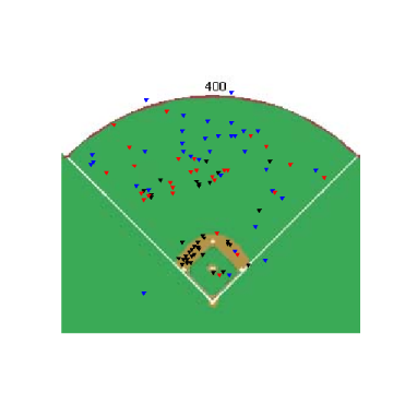
Getting a little more in depth, how about looking where different pitches are hit? Below are charts for where Justin Verlander's fastball has been hit by left-handed hitters (on the left) and right-handed hitters (on the right). Generally when hitters pull his fastball it is on the ground, but if it is hit in the air, it goes to the opposite field. This distribution of flyballs and groundballs doesn't appear to be unique for Verlander.
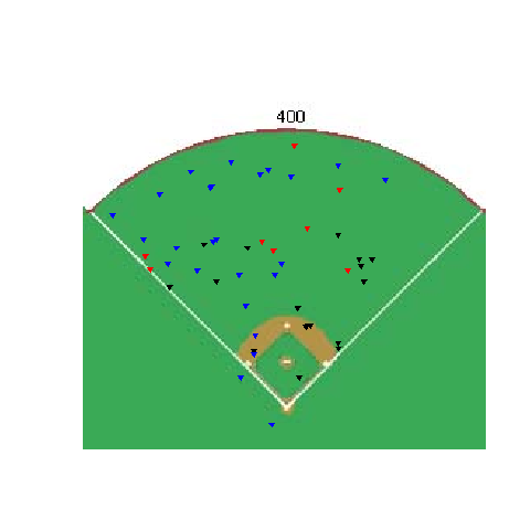

Going a little further, here's a chart showing every fastball, thrown by right-handed pitchers, that has been put in play by a right-handed hitter.
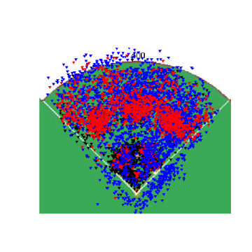
This is overkill, and if you can read anything into this graph you're a better man than me. I don't have the ability to sort every pitch based on reaction distance yet, but using reaction distances would probably be a better solution than just using "fastballs" and "change-ups". Using static definitions of a pitch, you run into the problem of groupingJamie Moyer's 84 MPH fastball with Verlander's 95 MPH fastball. Hitters are going to react and hit those pitches differently and this chart doesn't show that.
There are some problems with the MLB.com hit location data, primarily that the balls are marked based on where they are picked up by a fielder, not where they first hit the ground or where they go through the infield. By marking where a ball was picked up, you lose the information about where it should have/could have been fielded. Knowing where an outfielder picked up a ground ball is nice, but knowing exactly where that ground ball went through the infield or where a fly ball actually landed would be better. Another possible problem with the data is the ability of the scorekeeper to really know where the ball landed. There aren't any landmarks in the outfield to gauge where a ball was picked up which makes it harder to accurately plot the data.
These hit charts can help create informative profiles on hitters, pitchers and stadiums and on a large scale they can even help visualize player's defensive ranges. One big advantage with the hit location data as opposed to the pitch data is that the hit chart data is complete for all stadiums for the whole year. Scorekeepers manually enter this information for every ball in play, and it even goes back for several years, allowing for possible comparisons across years.
| Command Post | August 24, 2007 |
Park Differences and Reaction Distances
If you have been following the PITCHf/x data this season, you've probably realized that the system has been implemented in more stadiums since the All-Star break, and is in 23 stadiums now. You've also probably noticed that the data provided from each stadium is slightly different. The velocity isn't very consistent between starts by the same pitcher in different stadiums, the movement of pitches seems to change and the release point has been shown to jump around as well.
The release point differences are the most important because as I learned last week, there are only nine parameters captured for each pitch. The three dimensional location of the ball, as well as acceleration and initial velocity, are all captured by the camera system, with the rest of the values that are shown, either in Gameday or the xml itself, being calculated from those nine values. Any discussion about how parks affect the speed or movement of pitches has to begin with a look at the data captured at release point. Below is a table that has the average release point height (in feet) for a team's staff, both at home and in all road stadiums. The way to read the table is that the average release height for all pitchers on the Red Sox while at Fenway was 5.30 feet, and was 6.08 feet for Red Sox pitchers on the road. One problem with using this method is that it doesn't use exactly the same group of pitchers for home and road, which is due to a lack of data, but it gives a rough idea of the release point height at each stadium.
Team    Home    Road     Home-Road
BOS     5.30    6.08    -0.78
SDN     5.61    5.83    -0.22
MIL     5.75    5.97    -0.21
CHA     5.61    5.81    -0.19
SLN     5.96    6.08    -0.12
CHN     6.20    6.31    -0.11
LAN     5.95    6.04    -0.09
SEA     5.81    5.89    -0.08
ARI     5.99    5.98     0.01
CLE     6.00    5.98     0.02
KCA     5.93    5.87     0.06
ATL     5.97    5.91     0.06
OAK     6.06    5.97     0.09
ANA     6.20    6.11     0.09
HOU     5.86    5.76     0.10
DET     6.03    5.91     0.12
TOR     5.79    5.65     0.14
TEX     6.43    6.29     0.14
CIN     6.32    6.17     0.16
PHI     6.33    6.11     0.23
MIN     6.18    5.95     0.23
COL     6.29    5.85     0.44
SFN     6.59    6.11     0.49
Most of the home heights are within .2 feet of their road data, with the exception of Boston, Colorado and San Francisco. However, even among these three stadiums, Fenway stands out, with the release point being .78 feet lower than the road. Every Red Sox pitcher had at least a .40 foot higher release point on road and looking at the average starting velocity of a pitch at each stadium, Red Sox pitchers throw 6.5 MPH faster on the road than at home. Clearly something is going on with the PITCHf/x system at Fenway and to a lesser extent at Coors and AT&T, and could be going on at other stadiums as well. Until we have confidence in the release points being tracked at every park, comparing data gathered at different stadiums without adjusting it will give misleading results.
Park	Name                Pit    pfx_x(")   pfx_z(")    x0(')     z0(')    vy0(ft/s)
Home    Josh Beckett        338   -4.19       3.47       -1.69      4.85     127.59
Road    Josh Beckett        106   -4.51       8.36       -1.95      5.37     134.55
Home    Manny Delcarmen     103   -5.93       7.28       -0.95      5.55     127.83
Road    Manny Delcarmen     35    -4.07       10.07      -1.34      6.12     136.95
Home    Eric Gagne          32    -2.14       3.01       -0.84      5.23     116.06
Road    Eric Gagne          48    -3.54       9.03       -0.78      5.82     131.21
Home    Jon Lester          97     0.96       4.27        2.98      5.66     117.52
Road    Jon Lester          192    1.76       6.15        2.57      6.29     128.25
Home    Daisuke Matsuzaka   314   -2.31       5.47       -2.08      5.14     123.67
Road    Daisuke Matsuzaka   111   -3.56       9.06       -2.31      5.54     134.94
Home    Hideki Okajima      71     2.60       8.02       -0.01      5.82     118.96
Road    Hideki Okajima      27     3.34       6.38       -0.37      6.59     120.71
Home    Jonathan Papelbon   64    -7.68       6.35       -2.28      4.98     132.33
Road    Jonathan Papelbon   31    -6.57       9.84       -2.65      5.48     138.27
Home    Kyle Snyder         87    -1.81       1.58       -1.51      6.22     112.67
Road    Kyle Snyder         39    -1.69       6.28       -1.73      6.73     123.94
Home    Julian Tavarez      248   -7.04       2.80       -1.70      5.16     122.88
Road    Julian Tavarez      41    -6.90       5.31       -2.03      6.12     127.34
Home    Mike Timlin         96    -3.50       6.91       -2.14      6.06     124.26
Road    Mike Timlin         63    -2.86       8.44       -2.56      6.71     130.85
Home    Tim Wakefield       316    0.88       1.98       -0.65      5.80      94.85
Road    Tim Wakefield       71     3.03       3.65       -0.84      6.67     103.41
Looking at individual pitchers for the Red Sox, you can see how Fenway's camera system impacts the different pitchers. X0 and z0 are the coordinates for the release point, measured as a distance from the pitcher's body and from the ground respectively, and the release point is lower at home for all the pitchers. Almost all of the pitchers also get a smaller pfx_z value at home, which would seem to indicate that their pitches have more sink at Fenway, but is actually a result of the lower release height combined with the fact that, overall, the average height when a pitch crosses the plate at Fenway is similar to the height at other parks. The initial velocity is vy0, measured in feet/second, and is slower in every case. I didn't break this chart up by pitch, which is fine for examining the release points, but when looking at the velocity it gives an average that doesn't really mean anything.
Getting back to making an adjustment, the z coordinates of the release points are all roughly 10% too small at Fenway. If the Fenway x values were increased by 10% they would be a closer match for the release points on the road. However, once you make that adjustment, you need to adjust each of the other 8 parameters so that they are "measuring" at the new, adjusted release point, rather than the low release point. If you say that Fenway lowers the release point for every pitcher by 10%, and apply these adjustments to every pitch thrown at Fenway, here's what happens for Josh Beckett.
Park    Name       Pit     x0      z0      vy0
Road    Beckett    106    -1.95    5.37    134.55
Fenway  Beckett    338    -1.69    4.85    127.59
Adj.    Beckett    338    -1.99    5.39    136.53
Even through the adjusted numbers match the road numbers, I'm not very confident in using this method to make large-scale adjustments. For one thing, the road numbers could be off too. For Beckett I'm looking at one road start, made in Safeco, so I could be making too big of an adjustment. The lack of a large sample of road starts for pitchers is a major weakness of the type of separation I used in the home/road charts, but once there are more starts made in stadiums with the pitch f/x system, that hopefully can change. I think any true park factors are going to need to wait until there is more data captured at all stadiums.
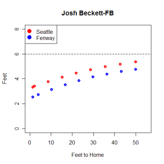
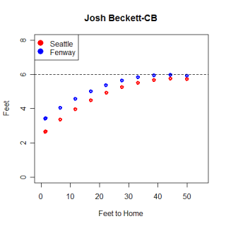
Here are two graphs of a randomly selected Beckett fastball and curveball at Fenway and Safeco, as viewed from the first base line. You can really see the difference that the release height makes from this view. There appear to be some differences in how the curveball moves at the different stadiums, but the fastball follows virtually the same path, just at different heights, in both cases. Each dot represents the ball's position in .05 second intervals, which segues nicely into my last section.
I received a comment yesterday on my article from last week that suggested a better way to quantify the speed of a pitch was to determine how far away the pitch is when the batter has to decide whether to swing. It probably is even more intuitive to think of it like this compared to how many seconds the ball takes to arrive, so I went ahead and calculated some distances.
You can test your reaction time here, and after some extensive research (emailing the link to five friends) I think a rough proxy for an MLB reaction time is around .2 seconds. If a pitch takes .513 seconds to reach the plate, as a Wakefield knuckleball does, then the hitter can let the pitch travel for .313 seconds out of Wakefield's hand before making a decision. The pitch is 19.75 feet from home plate at .313 seconds, so the hitter can wait until Wakefield's knuckleball is about 20 feet from him before making a decision. A hitter has to make a decision on a fastball on a Beckett fastball 27 feet from home, while on a Rich Hill curveball the hitter has to decide when the pitch is 21 feet from home.
The hard part of finding these numbers is determining the reaction time. The test above only involves clicking a mouse button, which is nearly instantaneous, but swinging a bat takes much longer. Even if the hitter had a reaction time of .2 seconds, once he recognized the pitch and reacted, actually swinging the bat would take some time as well. If you add on another .1 second to account for the swing, the distances are pushed back to 29 feet for Wakefield's knuckleball, 41 feet for Beckett's fastball, and 31 feet for Hill's curve.
I have no idea if the .1 second swing time is accurate, but at 41 feet from the plate most pitches look very similar. Hill's curveball hasn't began to break yet and it looks very similar to Beckett's fastball. If you had a reaction time of .2 seconds and a swing that lasts .2 seconds after the reaction time, you would need to artificially speed up your reaction time and decide whether to swing at Beckett's fastball before he even released his pitch. If he were throwing his curveball or changeup instead...well, Beckett does have 148 strikeouts this year. I believe there is some overlap on reaction time and when the swing begins, which lowers the overall time used, and I think there is also some element of "Blink" involved here, where good hitters "know" to swing at a pitch before they realize why they are swinging at it. Either way, hitting is hard.
| Command Post | August 17, 2007 |
May I have Seconds?
Despite playing with the PITCHf/x data since the playoffs last season, I didn't have a very firm understanding on how the values were captured until earlier this week when I was alerted to Alan Nathan's fantastic website on the physics of baseball. The whole site is good, but I was particularly interested in the section on the PITCHf/x system. In addition to Nathan's analysis on pitch data, this section contains a treasure trove of general information about the system as well as specific definitions for each data field. Using several of Nathan's equations, I was able to quantify where a pitch is in space at any time from release until it reaches home, and using these locations, I was able visualize the entire trajectory of each pitch, similar to what is shown for each pitch in the Gameday window.
The equation for finding the x position of a pitch is x(t)=x0+vx0*t+0.5*ax*t^2, where t is time, vx0 is the pitch's initial velocity in the x direction and ax is it's acceleration in the x direction. Vx0 and ax are provided in the xml, so finding the x coordinate of a pitch is as easy as plugging in a value for t. The y and z coordinates of a pitch are found using the same equation, but with the appropriate initial velocity and acceleration values. Here's the path of a Rich Hill curveball from July 21st.
Time(s)   x       y        z
0.00      1.31    50.00    6.76
0.05      1.24    44.78    6.81
0.10      1.15    39.61    6.77
0.15      1.02    34.49    6.62
0.20      0.86    29.42    6.38
0.25      0.67    24.40    6.03
0.30      0.45    19.43    5.58
0.35      0.19    14.52    5.04
0.39     -0.01    10.87    4.56
0.45     -0.40    4.84     3.63
0.49     -0.64    1.42     3.03
If I were really good I would have a 3 dimensional graph here, but it looks the same as the path they show in Gameday for the pitch. Each coordinate is measured in feet, with 0,0,0 being the back part of home plate and y=1.42 being the front of home plate. X measures left and right, from the catchers perspective, with negative numbers being on his left, y is the distance from the pitchers mound to home plate and z is vertical distance from the ground. This curveball ended in the high, inside quadrant of the strike-zone for a right-handed hitter.
The first thing I noticed in the chart is that the pitch reached the front edge of home plate in .49 seconds. Using radar guns to measure the velocity of a pitch is established practice throughout baseball, however, the speed of a pitch varies based on where the gun is aimed, so saying a pitch is 71 MPH doesn't really mean anything. Was it 71 MPH out of the pitcher's hand? Crossing the plate? "Fast" gun? "Slow" gun? You could get four correct, but different radar readings for the same pitch. What really matters is the time a batter has to react to a pitch. Saying Hill's curveball takes .486 seconds to travel from release point to home (from y=50 to y=1.417) while his fastball takes .387 seconds shows a clear, tangible difference between the pitches. For a rough comparison, a Joel Zumaya fastball takes around .353 seconds and a Tim Wakefield knuckleball takes .544 seconds to make the journey. I'm not sure which is more amazing, that Zumaya's fastball gets to the plate so fast, or that Wakefield's knuckleball, the slowest pitch in baseball, still gets to the plate in half a second.
Here's a list of the 10 pitches that have reached home fastest this season, along with the corresponding release point radar reading. (For simplicity, I only used pitches that were tracked for 50 feet, which is why Zumaya does not appear on the list.) Looking at the list and the rest of the fast pitches in my database, it appears that there might be a little bit of a park factor involved with the results, although the names are who you would expect.
Player                Date       Time(s)  MPH
Justin Verlander      7/15	.3477     101.7
Matt Lindstrom        7/24      .3479     99.6
J.J. Putz             7/28      .3482     101.3
Jonathan Broxton      7/15      .3488     99.6
J.J. Putz             7/28      .3492     101.6
J.J. Putz             7/28      .3492     101.5
Matt Lindstrom        7/3       .3496     100.3
Justin Verlander      7/15      .3497     100.8
Matt Lindstrom        7/3       .3499     100.4
Matt Lindstrom       7/24      .3500     99.4
Getting back to Hill, graphing the trajectory of his fastball and curveball shows the differences in flight paths. This graph is drawn as if you were looking down from above, showing movement in the x-direction, with the release points at the top right of the graph and home plate in the bottom middle.
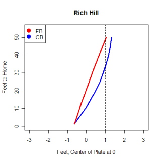
From the graph, you can see the different routes the pitches take. For the first 10 feet, Hill's curve looks very similar to his fastball, although after that the curve begins to break, moving away from left-handed hitters. The dotted line is a rough guess at the sight line for a left-handed hitter and illustrates how difficult it is for a left-handed hitter to hit a good curve from a left-handed pitcher. While both pitches begin at around the same location, the curveball actually goes behind a left-handed hitter's field of vision and appears that it will hit him for a split-second.
This graph is a side view of Hill's pitches, viewed from the first base line. Again the differences between the pitches are pretty clear to see, with the curveball taking a longer route to cover the same distance as the fastball. One thing to notice on this graph is that the curveball actually goes up after Hill releases it. It's not a big movement, but the pitch reaches it's maximum z-value .05 seconds after it has been released. On this graph the dotted line gives a rough idea of the eye level of a hitter and you can see that the curveball crosses the line much closer to home than the fastball does. I believe it is harder to look up and see a curveball that is above your eyes than it is to look down and see a fastball. Not only is the timing of a hitter thrown off by a curve, but where he's looking for the pitch is also thrown off.
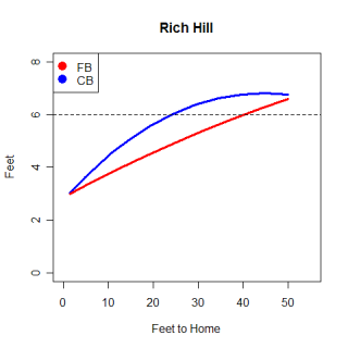
There has been research done that shows the release points measured by the PITCHf/x system are not very consistent for different stadiums, so any research that uses the release point information needs to take that into account. However, according to Dr. Nathan's website, the only values in the xml files that are observed directly are the accelerations and initial velocities and positions, all of which are based of the release point. Every other value in the xml, including where the pitch crosses the plate and the break values, are calculated from those nine observed values. This opens the door to all kinds of problems if the release points are still as inconsistent as they were at the beginning of the year. This could also help explain the park factor I mentioned with times, because if the release point is slightly off it will directly impact the time calculations.
There are a number of cases where pitches are badly tracked, and another problem with the system is that it occasionally picks up a ball transfer between the umpire and pitcher. I haven't done any digging into this, so this is pure speculation, but knowing more about how the values are calculated, I think perhaps these two problems are related. If the initial values are somehow wrong (they correspond with the ball exchange), the x,y coordinates for where the ball crosses the plate are going to be calculated correctly for the ball exchange, but will not match the reality of the pitch.
********************
I referred to Alan Nathan's website countless times while I was writing this article and his kinematic equations are the basis for this article. I also want to thank him for helping answer some questions I had about the data and his equations. I highly recommend checking out his site, particularly his analysis on the PITCHf/x data.
| Command Post | August 10, 2007 |
Makin' a Filter
Jamie Moyer and Josh Beckett both throw fastballs, but while Moyer's tops out around 85 MPH, Beckett's travels 10 MPH faster. Looking at each pitcher separately, it's easy to classify their fastball, but the only thing the two fastballs have in common with each other is that they are the fastest pitch each pitcher throws. In order to expand my examination of when pitchers throw certain pitches, I want to classify every pitch that has been tracked by the pitch f/x system as either a fastball or off-speed pitch. In order to effectively differentiate between the two groups of pitches, each pitcher has tobe compared to himself and not an outside standard that would classify Moyer's 85 MPH fastball as an off-speed pitch.
In each appearance by a pitcher, I found the average speed of his pitches as they crossed the plate, and then divided the velocity of each pitch in that appearance by the average, which gave me a value for each pitch, standardized for that day. I then classified each pitch as a fastball or off-speed, using only that standard value. Obviously this isn't a perfect method for classifying pitches, and there is some level of inaccuracy with the labels, but it's simple, relatively accurate for fastballs vs. off-speed pitches, and I think it's a good start in automating the classification process.
Testing the method on individual pitchers, the results generally agreed with a visual inspection of their pitch chart, but the algorithm I used to classify pitches had problems with certain types of off-speed pitches. To fix the problems I used a cut-off point of the standard value to separate fastballs from everything else. Generally speaking, a pitch that was faster than the average speed was usually a fastball and anything slower was off-speed. This was the case for every type of pitcher I examined, which will be important.
Some pitches are going to be improperly classified with this method as well, but the problem is smaller compared to using the algorithm and because of the similarity between different types of pitchers, this method worked better than the algorithm when classifying pitches for multiple pitchers. Here's a pitch chart from Roy Halladay to give a sense of where the distinction is being made between pitches.
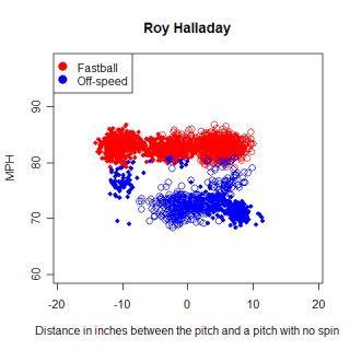
One thing to keep in mind, and it's shown clearly in Halladay's graph, is that I didn't make any attempt to separate 2-seam and 4-seam fastballs for pitchers that throw both pitches, which will slightly skew the results for those pitchers.
Once I was automatically classifying individual pitchers, I went back and classified every pitch in my database as either a fastball or an off-speed pitch. Before I looked at when pitches were thrown though, I needed to establish some baselines. Of all the pitches in my database, 62% have been fastballs. Some basic splits are in the table below.
Split     Fastball%   Total Pitches
Overall   62%         122072
RHP/RHH   63%         46849
RHP/LHH   61%         43197
LHP/RHH   61%         23415
LHP/LHH   63%         8611
It seems that pitchers throw more fastballs to same-side hitters, but overall 62% looks pretty good as an average. Here's a list of the 10 pitchers who throw the highest and lowest percentage of fastballs (min 100 pitches).
Name               FB%     Total Pitches
Scot Shields       75%     531
Todd Jones         75%     116
Darren Oliver      75%     357
Joakim Soria       75%     206
Alan Embree        73%     380
R. Betancourt      73%     173
Jay Marshall       73%     319
Mike Timlin        73%     146
Aaron Sele         72%     127
Macay McBride      72%     263
------------------------------
Cole Hamels        48%     341
Ian Snell          47%     285
Akinori Otsuka     46%     293
Tom Glavine        46%     324
Matt Wise          46%     121
C. Villanueva      45%     508
Royce Ring         44%     248
Kiko Calero        44%     314
Justin Speier      42%     363
Jamie Walker       37%     151
This list is pretty interesting and the full list it came from might be even more interesting. First of all, Jamie Walker throws a ridiculously small percentage of fastballs compared to the league average. 37% is more than 3 standard deviations from the mean, so he must have reasonably good off-speed pitches to rely on them so extensively. Comparing pitchers to each other gave me insight into some differences in pitch selection I was unaware of. I knew Hamels and Glavine relied heavily on pitches other than their fastballs, but I had no idea they threw their fastballs less than half the time. Similarly, I was surprised at how frequently the leaders threw their fastballs. Joel Zumaya missed the pitch limit cut-off, but he threw his fastball 84% of the time. Hitters essentially knew his fastball was coming, but there still wasn't much they could do with it. One other tidbit from this chart is regarding Beckett. He was subject to criticism last season that he was relying on his fastball too much. This season he has thrown it 65% of the time this season, which is above average, but not in the category of 'over-reliance'.
In a previous article, I examined the pitch selection of Jake Peavy and Dan Haren, based on the Leverage Index of the situation. I didn't have any baselines to compare their averages too, but now I do. Instead of using LI to separate situations, I took a suggestion from a comment by Tangotiger and created three groups of situations based on the run value of a strikeout vs. regular out. Using the win value of a strikeout vs. regular out would probably be a better distinction, but that's for another article. A strikeout is much more valuable than a regular out primarily when there are runners on third base and less than two outs, while the value of a regular out is higher than a strikeout if there is a runner on first or first and second, with one or no outs. The chart below shows the fastball percentages for each situation, split by the pitcher/batter matchup.
Split       High K     Low K      Everything Else
Overall     60%        64%        62%
RHP/RHH     62%        65%        63%
RHP/LHH     60%        64%        61%
LHP/RHH     58%        63%        61%
LHP/LHH     63%        64%        62%
In every case, the percentage of fastballs thrown is lower when the pitcher needs a strikeout, which is what we expected going in (and saw in the case of Peavy and Haren). The differences between situations aren't severe, but in the 'overall' case especially, the sample size is large enough that the differences are real.
Below is a table showing the pitchers who have thrown the highest and lowest percentage of fastballs when they need a strikeout (min 20 pitches). It is a little misleading to just compare the percentage of fastballs a pitcher throws when he needs a strikeout to the league average and say anything less than the league average (more breaking balls) is good while anything higher is bad. A pitcher should throw whatever pitch he has that can get the most swings-and-misses in a high K situation, and for some pitchers, their best swing-and-miss pitch happens to be their fastball. Pitchers rely on their fastballs generally, but certain pitchers should and do use it even more in situations where they need a strikeout.
Name             FB%      Total Pitches
Carlos Silva     88%      25
Matt Belisle     87%      23
Greg Maddux      84%      43
Chris Sampson    81%      21
Vicente Padilla  80%      111
Adam Eaton       79%      29
Manny Delcarmen  79%      33
Odalis Perez     77%      31
Scot Shields     77%      31
Jay Marshall     76%      34
-----------------------------------
Rudy Seanez      39%      28
Javier Lopez     39%      41
Vinnie Chulk     38%      21
Matt Cain        38%      29
Will Ohman       36%      22
C. Villanueva    36%      22
Mike MacDougal   35%      20
Kelvim Escobar   34%      62
Scott Baker      32%      25
Mike Thompson    32%      22
Manny Delcarmen is one of the pitchers who relies more on his fastball when he needs a strikeout and we can see whether he should be or not. Delcarmen gets a swinging strike 13% of the time he throws his fastball (in any situation), while he gets a swinging strike only 10% of the time with his off-speed pitches. If those ratios are real, and not the product of a small sample size so far, Delcarmen appears to be justified relying on his fastball more when he needs a strikeout. The downside to this is if hitters know a fastball is coming nearly 80% of the time with a runner on third and less than two outs, it would seem to lose some of it's swing-and-miss capabilities...unless it is such a good fastball that hitters can't hit it even when they know it's coming, in which case a pitcher should use it more heavily when he needs a strikeout. There should be some point where that circular loop ends and an equilibrium is reached between the amount a pitch is thrown and it's ability to cause swings-and-misses.
I've covered some of the flaws in the methodology I used to separate pitches, but overall I was quite happy with the results. When I compared the overall fastball percentages for individual pitchers to Inside Edge on ESPN and my own individual pitcher graphs, the percentages were close in all three cases. The next step in this type of analysis is to separate out the different off-speed pitches that I lumped together, which adds another layer of information about pitchers and pitch selection. A changeup and curveball are two very different pitches and could be used for very different purposes by a pitcher.
I'm going to close with one last table, this one showing the fastball percentage on extreme pitcher's counts (0&2 and 1&2) and extreme hitter's counts (3&0, 3&1).
Count             Fastball%     Total Pitches
3&0 and 3&1       83%           4340
0&2 and 1&2       54%           18091
I should have separated the 3 ball counts by the cost of a walk, but it seems amazing that pitchers are so afraid of walking a hitter in those counts that they become Zumaya-esque in terms of pitch selection, but without the amazing fastball to back it up. In a count that already favors the hitter, hitters see almost all fastballs, which is one big reason why hitters have a .630 SLG in 3&0 and 3&1 counts this year.
| Command Post | July 26, 2007 |
Not an Article about Pitching at Altitude
This entry was supposed to be about how pitches moved and behaved at different altitudes. I briefly wrote about differences in pitch movement for a Weekend Blog in May and I was planning to revisit the topic when there were more stadiums supplying the data. After the All-Star break, several new stadiums went on-line with the pitch f/x system, including Chase Field in Arizona, the stadium with the second highest elevation in baseball, and I thought I was in business. I examined how pitches moved at Chase Field (or Turner Field, the third highest stadium in baseball) compared with how they moved at parks closes to sea level, such as Petco, Safeco or McAfee, but I found virtually no changes in how pitches moved at the different altitudes. This didn't seem right intuitively and it wasn't.
To make a long story short, I had forgotten to account for the distance traveled by the ball. MLB.com has varied the distance they begin tracking the pitch, called y0, and although it appears to have recently stabilized around 50 feet, it began the season at 55 feet and after June 4th varied from 40-55 feet depending on the game. Needless to say, where the pitch is initially picked up is going to make a huge difference on the distance it breaks and after going back and looking at my results again, I didn't have enough pitchers who had the same y0 value at both a high-altitude and low-altitude park. That pretty much shot the column idea, so this post turned into a catch-all, with some updates and cool graphs that I haven't had a chance to post yet.
**********
Despite not writing about differences due to altitude, I wanted to share two conflicting results I got when looking at altitude differences. The first result is about Rich Hill. Curveballs are thought to be very adversely affected by the high altitude at Coors Field and while Hill hasn't made a start in Colorado, he did start at Turner Field in Atlanta, which is roughly 945 feet above sea-level. Comparing Hill's start in Atlanta to a start he made at sea level in San Diego, his curveball broke 12 inches down in San Diego, but only 8 inches down in Atlanta. All of his pitch types dropped roughly 3 inches more in San Diego compared to Atlanta. It makes sense that balls thrown in the higher altitude would tend to "hang" more and not break as much. However, a pair of starts by Noah Lowry makes it seem like this isn't the case. Lowry has made a start in both Coors Field and Petco Park, but all of his pitches had a bigger drop at Coors. This is the opposite of what is expected and I have no idea what could be causing it, other than possibly something technical. I'd still like to revisit this topic in the future, but it might end up being more complicated than just waiting for more data.
**********
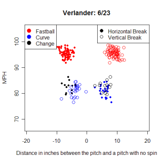
This is a pitch chart for Justin Verlander's start on 6/23 at Atlanta. The chart is remarkable for several reasons and I've been trying to come up with an excuse to use it for more than a month. One thing you need to know to appreciate the graph is that the initial tracking point for the pitches in the game was 40 feet from home, and his fastball is still averaging 95 MPH. Even when the initial point is 55 feet from home, which is where my most pitches were tracked from, very few pitchers are able to throw 95 MPH. Another cool feature on the graph is the mess of points around 75-85 MPH. Verlander's change-up and curveball both travel the almost exactly same speed, but they move in completely opposite directions. Not only does the hitter need to recognize a speed difference between Verlander's pitches, but he then has to react very quickly to hit the fastball or try to identify which off speed pitch is coming.
Not many pitchers have a graph this "clean", with no pitches thrown in a 10 MPH range. (81-91 MPH) Josh Beckett has a similarly "clean" graph, making me think that could be a trait of power pitchers who consistently throw their fastball hard, instead of occasionally taking something off of it. This graph is a very obvious example of Verlander's pitches, but even looking at other starts he has made in pitch f/x equipped stadiums, the "clean" pattern remains the same.
**********
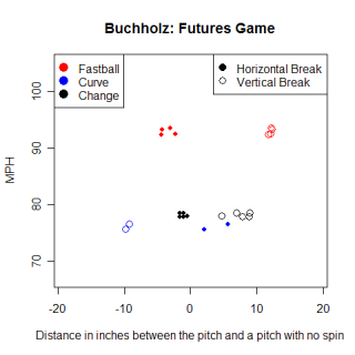
Speaking of "clean" graphs, here's Clay Buchholz's pitch graph from the Futures Game. Buchholz is a top-prospect in the Red Sox system, and while 11 pitches aren't nearly enough to say for certain, it appears that Buchholz relies on vertical movement for his success and throws his fastball consistently fast. His fastball and changeup both have little horizontal movement in this graph, although again, this is based on 11 pitches. He also appears to throw both his change and curveball at the same speed, and similar to Verlander, the two pitches move in opposite directions.
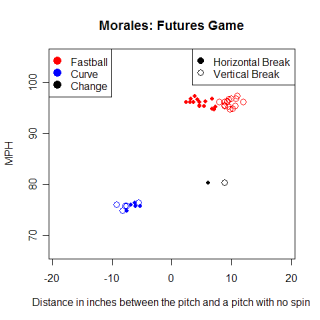
This chart is for Franklin Morales of the Colorado Rockies system. Morales is another young, hard throwing pitcher, this time a left-hander with a big curve. His curve has similar vertical movement compared with Rich Hill's curve, although Hill gets more horizontal movement away from LHH. There's a huge difference between pitching in an exhibition game against other minor leaguers and pitching in the majors and I'm not saying that Morales is going to be as good as Hill or Buchholz will be as good as Verlander, only that some of their pitches look similar right now. I don't know how movement on pitches translates from the minors to the majors, if there could be something like MLEs for movement, but wild speculation about prospects is always fun.
**********
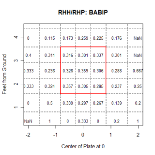
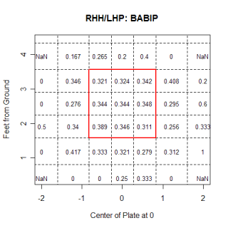
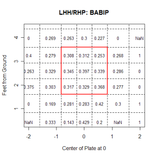
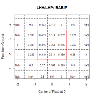
These graphs show the Batting Average on Balls in Play (BABIP), broken up by batter/pitcher splits. I ran these in one of my first posts and had been updating them every couple of weeks since then. As a reminder, they are from the catcher's perspective, so the right hand side of the graph is inside for a LHH. For the most part, they've stayed pretty constant for the duration, but there are a couple of changes of note. In the RHH/RHP graph, the middle of the strike zone now has the highest BABIP, which wasn't the case the first time I showed the graphs. Another interesting note is the difference between the BABIP on high-inside and outside pitches. This is particularly noticeable for LHH against LHP, but all hitters have a higher BABIP on high-outside pitches compared with high-inside pitches. This connects with Perry Husband's invention of "Effective Velocity", a theory on hitting and pitching. He writes why certain pitches are tougher to hit than others, and if you click on his name and go to the bottom of that page, there is a graphic explaining it. He found that, everything else being equal, a fastball thrown high and inside looks 4 MPH faster than the same pitch thrown outside. The MPH difference isn't the only thing that goes into hitting a ball solidly, but it is interesting to think about. I'm not sure where he came up with the 4 MPH, but Husband's philosophy makes intuitive sense. In order to hit an inside pitch, the hitter needs to react quicker and meet the ball in front of the plate, leaving less reaction time, which serves the same purpose as an increase in MPH. It's interesting when two people arrive at similar conclusions using different processes.
Also, I haven't done this yet, but it would be interesting to see what these breakdowns look like using the strike-zone as it is actually called by umpires.
**********
That's it for this entry. I promise that next time I have a good idea for an article, I'll make sure all the data are correct before I do the research and start writing.
Update: 11:20 AM- I fixed the BABIP charts that John mentions in his comment.
| Command Post | July 13, 2007 |
Under Pressure
Jake Peavy has been a fantastic success so far this season. Using a fastball that sits in the high 90's, a slider that breaks in on right-handed hitters and a changeup that breaks the opposite direction, Peavy has dominated the National League. A more accurate statement would be that he dominated the National League in May, allowing only three earned runs in 34.0 innings pitched, with opponents hitting just .164 against him. Even outside of May, Peavy has done very well this season, so what can the Pitch f/x system tell us about him and his pitches?
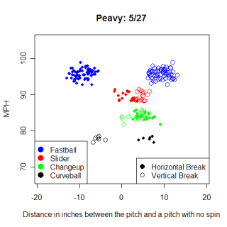
Here's a chart showing Peavy's start on May 27th vs. the Brewers. He threw all four of his pitches in this start and you can see the different breaks that they have. His fastball and slider both break toward a right-handed hitter, while his changeup moves away from righties. His curve is a standard curve from a right-handed pitcher and runs away from a right-handed hitter. There really isn't anything particularly special in this chart, and I put it in to get a feel for his pitches. In this article I'm going to examine when during a game Peavy throws his pitches, and specifically, does he pitch differently in high pressure situations or low pressure situations?
Before I could look at when Peavy throws his pitches I needed to classify them. As I was classifying the pitches it appeared that he had five pitches. However, when I looked at data from individual games, I could only find evidence for four pitches, the fastball, slider, changeup and curveball. I was pretty confident that he only threw those four pitches, but there was clearly another group in the season graph.
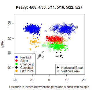
This wasn't a case of stadium variation, as all these games were in San Diego, and they were all prior to June 4th, which was when MLB.com began varying the "release point" distance. After another round of looking at the data from individual games, I found two problems. One was pitches that weren't classifiable. These pitches had similar movement to Peavy's fastball, but the velocity was much slower. I'm not sure what caused this, and I removed them from the data set, but it just serves as another reminder to be careful with these data. The second problem I ran into was that Peavy had some serious variation in how his pitches moved from start to start. This is pretty different from what I found in my last article, and I'm not sure what it means. There were some patterns where every pitch in certain starts varied the same amount, which would indicate a camera change, so the differences might just be another reminder to be careful. However, for the purposes of this article, variations between starts don't matter as long as each start is consistent with itself, which was the case for the starts I examined. I ended up using Peavy's starts from 4/30, 5/11, 5/16, 5/22, 5/27, 6/7 and 6/19. Here is a table showing the percentage of each pitch that Peavy throws overall.
Pitch         Total   Mix
Fastball      417     0.61
Slider        159     0.23
Changeup      98      0.14
Curveball     11      0.02
Total         685     1.00
The chart is very basic, but one thing that stuck out to me was that Peavy throws his fastball 61% of the time, which initially seemed like a lot of fastballs. However, after comparing him to other hard throwing right-handers, such as Josh Beckett (61% fastballs) and Justin Verlander (65% fastballs), 61% seems about right. How often does Peavy rely on his fastball when the pressure is on though?
Once I had all Peavy's pitches classified I matched them to the Leverage Index that they were thrown in. I assigned the Leverage Index (LI) at the beginning of a plate appearance to any pitch thrown during that plate appearance, with steals and other runner advancements during the play being accounted for. I split up Peavy's pitches into those that he threw when the LI was greater than one and when it was less than or equal to one. One is defined as average LI, so I'm splitting Peavy's pitches into above average (high) pressure situations and below average (low) pressure situations. Here are Peavy's LI splits according to his pitches.
High           Pitches   Mix     | Low      Pitches   Mix
Fastball       133       0.56    |          284       0.64
Slider         76        0.32    |          83        0.19
Changeup       25        0.11    |          73        0.16
Curveball      4         0.02    |          7         0.02
Total          238       1.00    |          447       1.00
You can see from the table that when the pressure is mounting, Peavy relies less on his fastball and much more on his slider, throwing it 32% of the time in high pressure situations, compared with just 19% in low pressure situations. Nearly half of all sliders that Peavy threw in my sample have come in high pressure situations, while just one-third of all his fastballs came in high pressure situations. In every game that I examined, Peavy's ratio of fastballs to sliders was smaller in high pressure situations compared to low pressure situations, as he threw 3.4 fastballs for every slider in low pressure situations, but only 1.8 fastballs per slider in high pressure situations.
I was a little surprised that Peavy used his slider so much more in pressure situations. One reason for the difference could be that in low pressure situations, Peavy is more focused on getting quick outs and using more fastballs to do so. The fact that he used his slider more in pressure situations isn't surprising, but I was surprised by the magnitude of the shift. However, without someone similar to compare him to I wouldn't know if he really went to it more or if that was a pattern all pitchers shared. I used the other starting pitcher in the All-Star Game, Dan Haren, as my comparison. Haren relies on three pitches, a fastball, a slider and a split-fingered fastball, with a very occasional changeup and curveball mixed in. Here's a chart for Haren showing the same pressure situation splits.
High           Pitches   Mix     | Low      Pitches   Mix
Fastball       128       0.44    |          280       0.57
Slider         76        0.26    |          100       0.21
Splitter       82        0.28    |          92        0.19
Changeup       4         0.01    |          13        0.03
Curveball      0         0.00    |          2         0.00
Total          290       1.00    |          487       1.00
Whatever Peavy is doing with his slider in pressure situations, Haren is doing something very similar with his slider and splitter. Haren threw 28% splitters and 26% sliders in high pressure situations, compared with 19% and 21%, respectively, in low pressure situations. The ratio of Fastballs/Sliders and Fastballs/Splitters shows the same inverse relationship with pressure for Haren that it did with Peavy. One thing that really jumps out from these splits is the "out" pitch for each pitcher, not necessarily their best pitch, but the one they rely on to get outs. Looking at the basic chart, Peavy threw 61% fastballs, which makes it seem like that was his out pitch. However, he went hog-wild with his slider in pressure situations because that is his true out pitch. Haren relied on both his slider and splitter in pressure situations and used both of them for outs.
Both Peavy and Haren have different patterns that they follow when pitching in high and low pressure situations. Both pitchers use their off-speed pitches more in high pressure situations than in low pressure situations. This seems like it would be the norm in the Major Leagues, as pitchers would rely more on fastballs in low pressure situations, possibly to avoid walking batters and turning low pressure situations into high pressure one, and possibly to avoid showing their out pitches to batters. However, I can't know for certain whether Peavy or Haren throw a relatively high percentage of fastballs in low pressure situations because I don't have the Major League average for fastballs thrown in low pressure situations. That would need to be calculated before this type of analysis goes much further. With the MLB averages for the types of pitches thrown at different levels of pressure, game theory could be applied to the analysis, and statements like "Jake Peavy throws too many (or too few) fastballs in high pressure situations" would have real meaning.
| Command Post | June 28, 2007 |
Is There Something in the Way it Moves?
Why do pitchers struggle in some starts? Without thinking too hard, I would guess poor starts are based on some combination of bad luck, bad location and bad stuff. Everyone can see when a pitcher is missing his spots and bad luck can be reasonably quantified with DIPs, but what about bad stuff? Frequently an announcer will say that a pitcher "didn't have his best stuff tonight" as a reason for his poor showing. What does that statement really mean, and is there any truth to it?
Roy Halladay has made 14 starts this season, posting a record of 9-2 and an ERA of 4.25. He began the season on fire, going 4-0 in his first six starts, racking up 33 strikeouts against only seven walks and allowing just three home runs in 47.1 innings. Opponents were hitting just .207 against him and he already had thrown two complete games. However, after April 30th, Halladay hit a rough patch. His next two starts were awful as he allowed 16 runs over 10.1 innings. His ERA rose by more than two runs because of those starts and after his start on May 10th against the Red Sox he was diagnosed with appendicitis. One reason he may struggled in those two starts was because he was hurt and unable to pitch effectively. This appeared to be the case when, upon his return, he held the White Sox scoreless for seven innings on May 31st (7 IP, 0 ER, 6 H, 7 SO, 0 BB). However, in his very next start, he got lit up by the Devil Rays in his shortest outing of the season (3.1 IP, 7 ER, 12 H, 1 SO, 1 BB) . Why did he pitch so well against the White Sox on May 31st but get destroyed by Tampa Bay five days later? While focusing on the bigger issue of what makes a pitcher struggle in certain starts, I'm going to examine these two starts closely and see if I can find an explanation for the differences.
There are a million possible reasons why Halladay could have dominated in one start and been dominated in the next. Although the White Sox and Devil Rays are both weak offensively, there may have been a subtle difference between them that allowed the Devil Rays to have success. The Blue Jays defense might have played extra hard against the White Sox and taken the night off vs. Tampa. The mound might even have been raked differently or the balls were shinier in one start. The point is it could have been anything. Probably though, it wasn't something as small as the dirt on the mound and perhaps Halladay, fresh off the DL and 20 days of rest when he made his start against the White Sox, wasn't ready to resume pitching on a normal four days rest. He might not have been able to locate his pitches where he wanted and if he did locate them, the pitches themselves might not move like he wanted.
Here are two charts showing the movement of his pitches in each start.
Halladay has four pitches, a 2-seam sinker that moves in toward right-handed hitters, a cut fastball that sinks and moves away from right-handed hitters, a changeup that mimics the movement on his sinker and a curveball. Looking at the graphs there aren't many striking differences to see, which is surprising due to the different outcomes of the games. There are some slight differences in these Rorschach-esque patterns of pitch movement, but on average, the way the pitches behaved was remarkably consistent. One difference that isn't instantly recognizable is that median speed for his two fastballs and changeup was at least one MPH slower in the start on June 5th. This lends a little bit of support to the idea that Halladay wasn't quite ready to return to pitching on normal rest after his trip to the DL. One MPH doesn't seem like a big difference, and I think the difference is primarily due to Halladay being extremely rested after coming off the DL, as the slower speeds were more consistent with earlier starts that Halladay made this season. The table below lists the medians for each category.
Date      Type           Speed       Pfx_x       Pfx_z       Break Length     Percent
4/13      Fastball       90.5 MPH   -9.98"       5.46"       7.6"             0.32
4/30      Fastball       92.1 MPH   -10.28"      3.23"       8.9"             0.49
5/31      Cutter         91.3 MPH   -1.79"       5.67"       6.5"             0.35
6/5       Cutter         89.9 MPH   -1.12"       3.90"       7.6"             0.31
5/31      Curveball      80.3 MPH    5.62"       0.80"       12.0"            0.30
6/5       Curveball      80.6 MPH    4.37"      -1.57"       12.7"            0.15
5/31      Changeup       85.8 MPH   -9.17"       7.11"       8.2"             0.03
6/5       Changeup       84.2 MPH   -9.64"       5.69"       9.3"             0.05
There aren't many differences in how his pitches moved between starts. The PITCHf/x system has a margin of error of plus/minus an inch, and only two parameters have differences of more than two inches, so most of the differences could be just noise. (There's also the problem with having a small sample for each pitch) The difference in vertical movement between starts on his curveball and fastball was more than two inches, with both pitches having greater drops on June 5th. It would seem that more movement on a pitch would be preferable, but Halladay's added movement didn't help him on June 5th. One other difference between the starts was that Halladay threw a lower percentage of curveballs on June 5th than on May 31st. I don't know if the difference means anything just by looking at these two starts, but it's interesting to note that the difference in curves was made up by throwing more fastballs. For whatever reason, on June 5th Halladay got no swings-and-misses with his curveball, but on May 31st, he had six swings-and-misses with his curve. Perhaps Halladay realized he couldn't get the results he needed with his curve on June 5th and went to his fastball, or he might have focused on his fastball if he thought he was going to have trouble throwing his curve around the strike zone.
The consistency of Halladay's pitches, regardless of the quality of his start, is striking. The table below details three starts he made in Toronto prior to going on the DL. Just from looking at the movement data, can you tell the difference between Halladay's 10 inning performance against the Tigers, a nine inning complete game where he allowed five hits, and the game when he allowed seven earned runs in five innings of work, possibly with appendicitis? There are a couple of differences among pitches between starts, mostly with his fastball and curve again, but nothing earth shattering. In fact, in cases like the vertical movement of the fastball, the value for the bad start is in between the values of the good starts. The start on April 13 was the 10 inning complete game and April 30 was the five-hitter. The start on May 10 was the stinker and his last start before going on the DL.
Date      Type           Speed       Pfx_x       Pfx_z       Break Length     Percent
4/13      Fastball       90.5 MPH   -10.85"      4.40"       9.0"             0.57
4/30      Fastball       92.7 MPH   -11.08"      1.82"       9.3"             0.40
5/10      Fastball       91.9 MPH   -10.81"      3.83"       8.8"             0.50
4/13      Cutter         89.6 MPH   -3.46"       4.64"       7.6"             0.18
4/30      Cutter         91.7 MPH   -3.92"       3.89"       7.4"             0.34
5/10      Cutter         90.5 MPH   -3.65"       5.59"       7.0"             0.30
4/13      Curveball      79.7 MPH    3.05"      -0.99"       12.6"            0.19
4/30      Curveball      80.3 MPH    5.83"      -2.59"       13.4"            0.21
5/10      Curveball      80.9 MPH    4.99"      -1.22"       12.6"            0.16
4/13      Changeup       83.1 MPH   -10.38"      5.34"       9.5"             0.06
4/30      Changeup       84.8 MPH   -9.94"       5.25"       9.3"             0.07
5/10      Changeup       84.0 MPH   -10.46"      5.13"       9.6"             0.08
While his movement remains the same in good starts and bad, how effectively does Halladay locate the ball in both types of starts? Here are two charts, from the perspective of the catcher, that show the location of Halladay's pitches in his good starts (left) and bad starts (right).
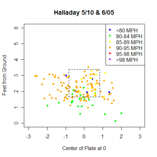
There doesn't appear to be a lot of difference between the top groups of data. A higher percentage of the pitches are around the strike zone in his good starts and he throws a couple more pitches up in the strike zone and inside to right handed hitters in his bad starts, but the differences don't appear to be major. The location differs slightly depending on the quality of the start and that probably helps make a good start better or a bad start worse (although there is a chicken and egg question about whether location causes a start to be good or if location is good because a start is good).
The movement on Halladay's pitches stays very uniform from start to start. He might not have the same success each time, but it doesn't appear to be as a result of not having good stuff each time he takes the mound. However, while the small differences that I did see could be explained away because of the limitations of the technology, they might be real and contribute to his success or failure on any given start. More importantly, and something I didn't touch on at all is the interplay between the different possible movements for a pitch and how that impacts the rest of a pitcher's repertoire. If his fastball is moving in a particular fashion, does he throw certain percentages of curves and cutters? If his fastball is sinking more, how does that impact the horizontal movement on it? How much can he control the movement of a pitch? Can he tell how his pitches are moving to make those adjustments? Halladay has had success with a range of horizontal and vertical movements on his fastball, so perhaps his pitches all work in harmony to create the effect having a constant amount of movement on his fastball (or curve or any pitch).
I haven't looked at other pitchers besides Halladay to see if the pattern of consistent movement across starts is true in general. Obviously Halladay is a very good pitcher, so it makes sense that he is able to maintain his skills for many starts in a row, and is more likely to get shelled because of bad luck than because his pitches are suddenly flat. I would guess that a less skilled pitcher would experience more of a change in the movement of their pitches in a good start vs. a poor start.
| Command Post | June 14, 2007 |
Ch-ch-ch-ch-changes...
Cole Hamels is 100 feet tall, sky dives without a parachute and stars in movies about gladiators. He invented the Internet, knocked over the Berlin Wall with a changeup and struck out Andruw Jones three weeks before their first meeting this season. NASA has asked him to throw a probe to Mars, which he would do, except he already destroyed Mars (he used a fastball this time) after some Martians questioned his pitching ability. In his spare time Hamels pitches for the Phillies, and this season is leading the NL in wins and strikeouts. He is also among the league leaders in WHIP, walks/9 and strikeout/walk ratio. Hamels features one of the best changeups in the majors as his out pitch, but what makes this pitch so effective? How does his changeup continue to baffle hitters?
Hamels has had two starts tracked by Gameday this season, both of which were in Atlanta. Additionally, the starts both took place in May, once the system had been operational for several weeks, so any differences in positioning of the camera systems should be minimal. Looking at a chart showing Hamels' pitches, there are two possible reasons why his changeup is so nasty. The first is the speed difference. His median velocity on his fastball is 92 MPH compared with his 82 MPH changeup. That 10 MPH difference means that his changeup takes (very) roughly an extra .05 seconds to reach home. .05 seconds obviously isn't much time, but when the reaction times for hitters are in the range of .4 to .5 seconds, maybe .05 seconds means more. It could be the difference between just fouling off a pitch and hitting it squarely. However, without looking at other changeups, its impossible to say whether a 10 MPH difference between his fastball and changeup means anything.
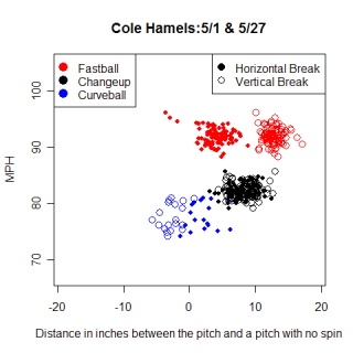
The other feature of Hamels' changeup that jumps out at me is the movement. His fastball has about four inches of movement in to a left-handed hitter (positive horizontal values on these images represent movement toward a left-handed hitter, while negative means movement in the opposite direction). However, his changeup doesn't move in exactly the same way as his fastball. The changeup breaks in on left-handers more than his fastball does, and looking at the vertical movement relative to the fastball, you can see it has some sink on it as well. One way to pick out changeups when reading these graphs for most pitchers is to look for pitches that break similarly to the fastball, but are slower.
Here's an extreme example of a changeup that moves almost the same as a fastball. This chart for Josh Beckett is remarkable for the fact that there is absolutely no overlap in speeds between any of his pitches, but it also shows the similarity of his changeup to his fastball. (For a couple more examples of changeups that move the same as fastballs, check out the article I wrote on sinkerballers. One correction though, on the graphs for Lowe, Cook and Webb I mislabeled changeups as sliders, so the black dots are changeups, not sliders.)
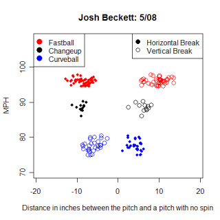
Beckett and others have succeeded with changeups that mirror the movement of their fastballs, but that little extra movement that Hamels gets might make his pitch that much harder to hit. The difference between Beckett's fastball and changeup was seven MPH, which is close to Hamels'.
I wanted to compare Hamels to other pitchers with great changeups and the first name I thought of was Trevor Hoffman, the inspiration behind Hamels' changeup. Despite a fastball that tops out around 90 MPH, Hoffman is still fooling hitters. How is he doing it? Here's a chart showing Hoffman's pitches in his 17 appearances at Gameday equipped stadiums. All but two of the appearances were in San Diego, so the inter-park effects should be small here as well.
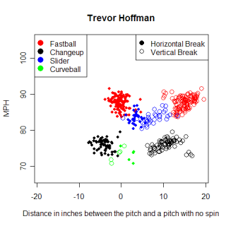
Hoffman's changeup appears to move like his fastball. However, upon closer inspection, you can see the changeup moves inside on a right-handed hitter almost four more inches more than his fastball does. In addition to the four inches of movement, Hoffman throws his changeup almost 12 MPH slower than his fastball. The added movement helps, but Hoffman's success primarily comes from his ability to upset a hitter's timing with his changeup. By showing a hitter the 76 MPH changeup, Hoffman is able to make his 88 MPH fastball seem much faster.
Hoffman and Hamels have never won a Cy Young (although in the future Hamels will win one Cy Young…and 11 Cole Hamels'.) but Johan Santana has ridden his changeup to two awards. Santana is similar to Hamels in that they are both left-handed, strike out a lot of hitters and don't walk many. How do their changeups compare though?
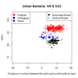
Here's a chart from Santana's starts on April 8 at Comiskey Park and May 22 at Texas. I looked at both starts separately before combining them and the pitch regions were similar in both ballparks. Santana's fastball is thrown around 93 MPH while his changeup is thrown at 83 MPH, giving him a difference of 10 MPH, the same as Hamels achieved in his starts. Santana also gets different movement on his changeup compared to his fastball, although the magnitude is smaller than the four inches that Hamels and Hoffman were able to achieve.
Name              # thrown       Speed          Horizontal Break       Vertical Break
Hamels-FB         96             91.90 MPH      4.00"                  12.69"
Hamels-CH         83             82.20 MPH      7.81"                  8.63"
Hoffman-FB        119            87.90 MPH     -0.20"                  14.96"
Hoffman-CH        70             76.00 MPH     -3.84"                  10.79"
Santana-FB        116            93.35 MPH      6.02"                  11.74"
Santana-CH        58             83.30 MPH      8.47"                  7.36"
This table shows the differences between the changeups and each pitcher’s fastball. Both types of pitches moved to the arm-side of a pitcher, but the for the same pitcher, changeups moved more than the fastballs did and also had less vertical break. Greg Maddux and James Shields both have good changeups and the table below shows the differences between them. There are very different ways to have effective changeups. Maddux has a five MPH difference between his fastball and changeup, but his changeup has less movement toward his arm-side than his fastball does. Without comparing any more pitchers, I’d venture to guess that Maddux’s movement is unique and has contributed to his success. Shields has been successful so far this season using a changeup. His changeup moves like Hamels’, Hoffman’s and Santana’s, but has less of a speed difference, so maybe the ideal speed difference between pitches is around 7-10 MPH.
Name              # thrown       Speed          Horizontal Break       Vertical Break
Beckett-FB        48             96.10 MPH     -8.19"                  10.09"
Beckett-CH        12             88.70 MPH     -8.80"                  6.40"
Maddux-FB         194            86.60 MPH     -10.01"                 6.72"
Maddux-CH         61             81.60 MPH     -5.26"                  6.87"
Shields-FB        154            91.20 MPH     -6.53"                  10.31"
Shields-CH        80             83.35 MPH     -9.29"                  4.78"
The changeup can be a very effective pitch if used properly. It seems that changeups tend to move more toward the arm-side of a pitcher and have less vertical break than that same pitcher’s fastball. This movement is one way to pick out changeups from the Gameday data. Pitcher’s with good changeups have different amounts of movement and velocity, so there are obviously multiple ways to be effective with the pitch and I think the most important factor in determining the success of a pitch is how it relates to the other pitches in a pitcher’s arsenal. However, Cole Hamels doesn't even need his changeup; he once struck a man out looking. Literally. Cole just gazed at him and the batter was retired on strikes.
I did all my research for this article at ColeHamelsFacts.com.
| Command Post | May 25, 2007 |
Dangerous Curves
Watching Rich Hill pitch reminds me of watching Barry Zito and I'm sure I'm not the only one who sees the similarities. Both are tall left handers with big, looping curveballs, but they have more in common than their physical appearances. Both pitchers are extreme fly ball pitchers, with 61% of balls in play against Zito in 2007 being fly balls and 65% for Hill. Despite the platoon disadvantage, left handed hitters have actually posted better offensive numbers against Zito and Hill than right handed hitters have. Their careers haven't followed similar trajectories, Zito made his major league debut at age 22 and had a Cy Young by 24, while Hill pitched in the minors until he was 25, hampered by injuries, but both lefties have a similar repertoire of pitches and appear to pitch in a similar fashion. Furthermore, the curveballs thrown by the two are practically begging to be analyzed via Enhanced Gameday. I've wanted to look closer at Zito since I had noticed his unique release point during the 2006 playoffs (more on that in several paragraphs) and comparing his curveball to Hill's was high on my to-do list for Gameday projects, so I figured I'd knock off both things in this article.
First off, here's a chart showing Barry Zito's start on May 15th in his return to Oakland. Zito struggled in this start, going four innings, while allowing seven runs on seven walks and six hits. From this chart you can see a couple of basic features of Zito's pitches. His fastball is pretty straight, although it does have some movement in on left handed hitters, the normal direction for a left handed pitcher's fastball to move. I'm not very confident in my identification of his slider and changeup, but based on what I have, the slider moves in on lefties, while his changeup moves slightly away. Zito's curve is the pitch I really want to look at in this article, so it was rather disappointing to see that Zito only threw 11 in the game. The curve ends up slightly more than 10 inches lower than a non-spinning pitch would, evidence of the tremendous topspin Zito imparts on his curve. Is a 10 inch "drop" an impressive number? The only way to check that is to examine other curveballs.
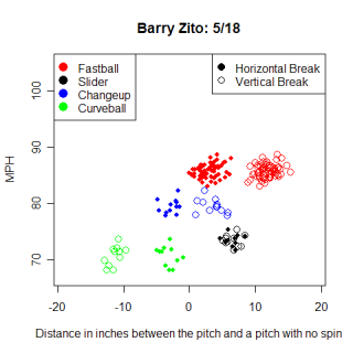
Before I move onto Rich Hill's curve though, I wanted to look at Zito's release point. During the 2006 playoffs, I noticed that Zito's release point was much closer to the center of the pitching rubber than I would have thought a left hander would be. His release point was very close to that of a right handed pitcher, and I speculated that it could be the reason left handed hitters had success against him. Here's a chart comparing his 2007 release point to his 2006 playoff release point, as well as the release point of Dan Haren and Joe Kennedy for perspective. All four release points were captured in Oakland, with the 2007 ones from consecutive days in an effort to control for park changes.
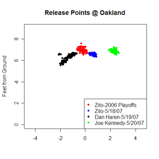
Even after accounting for the different versions of technology used, in 2007 Zito still releases the ball close to the middle of the rubber, but he's not as extreme as he was in the playoffs and other pitchers actually have similar release points.
Getting back to Hill, here's a chart showing his pitches from his start on May 22nd in San Diego. Despite striking out eight batters, Hill allowed five runs in six innings and took the loss in this particular start. Hill throws three or four pitches, clearly a fastball and curveball, as well as possibly a changeup and slider. I have the same uncertainty with classifying Hill's changeup and slider as I did with Zito and in the end I called one of the groups his changeup, while calling the other unknown. Looking at Hill's fastball, it has similar horizontal movement in toward left handed batters as Zito's had, although Hill's had a wider range of breaks. Even though Hill's fastball was faster, Zito's fell less vertically, possibly indicating greater backspin on the ball for Zito.
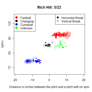
Hill's curveball is tremendous. The biggest difference between his curveball and Zito's is that his has more horizontal movement. In addition to breaking 12 inches down, Hill's curve moves roughly seven inches away from left handed hitters. Zito has the same drop on his pitch, but only gets three inches of movement away from left handed hitters. With everything else (pitch speed, release point, and vertical break) being just about equal, a curve that breaks laterally as well as vertically is harder to hit than a curve just moving vertically. The horizontal break also helps classify the curveballs from the hitter's point of view, with Zito's being 12-to-6, while Hill's is more of a 12-to-7 or 8.
Name         Pfx_x      Pfx_z      Speed
Zito        -3.0"      -11.3       72 MPH
Hill        -7.1"      -12.3       74 MPH
The chart above shows the median values for several variables that describe Zito and Hill's curveballs. Do other pitchers throw similar types of curveballs? After looking at some pitchers who throw curveballs (and doing a little fishing in my database) I found several pitchers that threw comparable curves, but Zito and Hill were still unique. The chart below shows the median values for the pitchers I looked at.
Name       Pfx_x      Pfx_z    Speed     Hand      Number of Curves

Wolf      -5.8"      -6.5"     67 MPH    L         116

Blanton    5.1"      -8.6"     74 MPH    R         108

Arroyo     9.8"       2.5"     76 MPH    R         36

Sheets     2.9"      -4.8"     80 MPH    R         29

Meche      2.0"      -12.6"    79 MPH    R         13
Gil Meche had a very similar curveball to Zito and Hill, although he didn't have as much horizontal movement and threw only 13 of them in the start I examined. In this chart, negative pfx_x values indicate movement in to right handed hitters. Bronson Arroyo had the most horizontal movement of any curveball, but interestingly, actually had his curve end up higher than a non-spinning pitch would have. Either he was hanging his curve on May 16th, or there was something wrong with the tracking system in San Diego on that day.
Obviously Hill and Zito have very unique curveballs. Even after looking for pitchers with the greatest vertical drops, I couldn't find other pitchers with similar curveballs. One thing I would like to look closer at is which pitches Zito and Hill actually get their fly balls on. Are the fly balls a direct result of curveballs or are they the result of a general pitching pattern? I don't have enough curveballs in my database from Zito and Hill to really get a good read on it yet, but I would guess the fly balls are more a result of a pitching pattern than actual pitches.
I had a couple of things I wanted to mention before I finished. I have more data for sinker ballers now, with Webb having a couple of starts and Wang making his debut in an Enhanced stadium. I'm going to look at sinkers again in the future, and hopefully should have something new to say. I also noticed that Wakefield had several starts in Toronto, also an Enhanced stadium, and looking at his pitch charts, its not surprising that nobody can hit him when his knuckleball is working as the break values on his knuckleball look virtually random. Certain hitters also finally have enough enhanced pitches that I can look at batting average on balls in play from the hitter's perspective and have it mean something.
| Command Post | May 11, 2007 |
Location, Location, Location
The location of a pitch is one important factor in determining its fate. If a batter swings at a pitch thrown low in the strike zone, he has a good chance of hitting a ground ball, while if he swings at a higher pitch, there is a greater chance of him hitting the ball in the air. A difference in location of a couple of inches can be the difference between a home-run and a shattered bat. Pitchers need to be able to throw to precise locations and hitters need to be able to recognize if a ball is going to be hittable. As you can probably guess by now, this article is going to focus on the location of pitches, in and around the strike zone.
Before I continue writing though, I need to mention something. John Beamer wrote an really interesting article earlier this week about the accuracy of the Enhanced Gameday data. Based on his examination of Kevin Millwood, John found that the tracking systems were inconsistent across stadiums. However, the biggest problems that John found were regarding the release point and the ball as it left the pitcher's hand. The chart he showed of the strike zone showed no stadium-to-stadium bias, which bodes well for my current article. I think the differences with release points are caused by difficulties aligning the cameras the same at different stadiums without a consistent reference point, but home plate should serve as a good landmark in every stadium to align the cameras for the strike zone.
John looked at the spread of pitches and thought they were random enough not to worry too much about a stadium bias, but I can do a little checking too. Enhanced Gameday provides an x,y location, tracked by the camera system, of pitches as they cross the plate, as well as an x,y location entered by a human stringer. The stringer enters the location where he thinks the ball crossed the plate. Here's a plot of the X coordinate for the computer generated values vs. the human entered values.
As you can see, it's a pretty good match overall. I'm not looking for a 100% match, and I don't totally trust human entry on this either, as it's pretty tough to actually tell where the pitch was when it crossed the plate, so I'm comfortable using the camera-tracked values in this case.
Getting back to the article, lets look at where right handed pitchers throw to right handed hitters. Of the 11,109 pitches I have from these confrontations, here is where they all ended up. The strike zone is the red box in the middle and the graph is from the catcher's perspective. The numbers in each grid are simply the number of pitches thrown in that region. I didn't convert these into percents because the raw numbers give a sense of the number of pitches I have for each split. The chart is cropped on the sides and the bottom to focus on pitches that were near the strike zone.
It's nice to see that most of the pitches are located in the strike zone. This seems obvious, but it serves as another quick check on the accuracy of the data. I liked the simplicity of this layout and some basic trends pop out right away. Right handed pitchers work away from right handed hitters, and when they work outside the strike zone, it's typically low and away. They throw below the strike zone more than they throw above it.
Digging a little deeper, the three regions just off the plate on both sides (three inside and three outside) are interesting. At each height, there were more pitches outside than inside, but as the height increases the number of inside pitches remains relatively constant and the amount of outside pitches decreases. I have no idea if this is an artifact or an actual pattern, so here's the same graph, but for left handed hitters.
For left handed hitters, pitchers again threw more pitches outside, and were more inclinded to throw pitches below the strike zone than above it. As the height increases with a left hander at the plate however, there is more of a chance of an outside pitch. Do these trends exist when left handed pitchers are on the mound? Here are the two charts for left handed pitchers, but there doesn't appear to be much of a continuation of the trend. The other trends about working outside and below the strike zone also don't seem as clear, if they exist at all.
It's nice to know where pitchers threw the ball, but what actually happened to those pitches when they reached home? Focusing on right handed pitchers throwing to right handed hitters, here is a chart showing the percentages of pitches in each region that are swung at.
Right handed hitters swing at anything in the strike zone, except pitches down and away. Those pitches are strikes but hitters will swing at them only half the time, similar the frequently they chase pitches in regions abutting the strike zone. My guess is that right handed hitters as a group are unable to drive the low and away pitch, so they don't swing at it. They can afford to take the pitch if they don't have two strikes. However, right handed pitchers have figured out that right handed hitters don't frequently swing at that pitch and consequently throw to that region more than any other region. Hitters may not swing at pitches in that region because they feel they are balls, although of the 406 pitches not swung at in that region, 69% (282) were called strikes. When hitters put pitches from that region into play, they had a .298 batting average on balls in play, which surprisingly isn't the lowest BABIP for pitches in the strike zone. Perhaps low and away isn't a utopia for pitchers after all. If fewer than half of right handed hitters swing at a strike, the only hitters who do swing at that pitch must be confident they can get a hit out of it, resulting in the average BABIP.
One surprising item on this chart is that the BABIP for pitches right down the middle is not the highest. Three corners are all hot zones for right handed hitters as a group. One explanation for the lower than expected BABIP is if 70% of pitches down the middle are swung at, a lot of those swings will be taken by bad hitters, swinging because of the location, as opposed to the pitch low and away, where the only hitters who swing at it know they can hit it.
The swing percentage and BABIP charts for left handed hitters facing right handed pitching are below. When left handed hitters face right handed pitchers, they think they can hit the pitch that is low and away, but despite swinging at it 59% of the time their BABIP is only .238. The location must be especially tempting for left handed hitters to get those results and continue swinging at it. Not surprisingly, right handed pitchers threw the second most number of pitches to that region. Lefties also appear to be vulnerable up and in, but right handed pitchers haven't targeted that area yet. Another interesting detail on the swing percentage charts is that despite a difference in the distribution of swings, both left handed hitters and right handed hitters swung at 63% of pitches in the strike zone.
Before I wrap up the article, I should mention that I do have the left handed pitching versions of the Swing Percentage and BABIP charts, but I don't have enough pitches in each region to draw any real conclusions from them, so I didn't include them. Even with the graphs I did use, I would feel more comfortable making the statements I made with a full season of data to back me up.
I learned a couple of interesting things while writing this article though. I had no idea how frequently batters swing at pitches in different areas of the strike zone. I knew roughly how much batters swung, but to actually see where they swing at pitches is pretty cool. With enough data, I would like to expand those charts, and do them for individual players. I would love to see what Vladimir Guerrero doesn't swing at or where someone like Scott Hatteberg swings. Are some pitchers able to consistently get batters to swing at pitches that aren't in the strike zone? I also learned that left handed and right handed hitters as a group have different holes in their plate coverage. Right handed pitchers as a group were able to exploit the aggressiveness of left handed hitters and throw pitches to an area where the batters couldn't hurt them. The pitchers were also able to exploit the passiveness of right handed hitters and throw pitches in an area of the strike zone where there was a smaller probability of the batter swinging. Maybe pitchers aren't as dumb as people think.
| Command Post | April 26, 2007 |
That Sinking Feeling
This week I wanted to look more in-depth at the aerodynamic fingerprints of different pitches, particularly sinkers. A sinker is a two-seam fastball that drops as it approaches the batter and is frequently pounded into the ground by a hitter. Pitchers who throw good sinkers tend to rely heavily on the pitch and don't need to worry as much as a "normal" pitcher about changing speeds.
The whole point of changing speeds and throwing different pitches is to induce weak contact (or strike-outs), but when a sinker is thrown properly, a batter generally makes poor contact and hits it on the ground anyway. Armed with detailed information about each pitch, I looked at three sinkerballers and made some interesting observations about each of them.
Derek Lowe was the first pitcher I studied. Here's a graph showing the breaks of Lowe's three pitches, a sinker, slider and curveball over parts of two starts this season, on 4/13 and 4/24. Lowe pitched well in both these outings, allowing four runs over 16 innings of work.
One thing that immediately jumps out to me in the chart is the consistent horizontal break, compared to a non-spinning pitch, of his sinker. Most breaks that I have seen, both horizontal and vertical, have been much more spread out, similar to how the vertical break of his sinker appears. As I mentioned in my previous article with regard to release point, I'm not sure whether consistency is necessarily a good thing for pitchers. While having a consistent break on a pitch would seem to help the catcher receive the ball and give the pitcher confidence that he knows where he's throwing to, it would also help a hitter who could prepare for only one type of break on the sinker. If Lowe is always this consistent though, it hasn't really been a problem for him.
Another thing to notice on this chart is Lowe's curveball. He throws the pitch infrequently, but both the horizontal and vertical break (compared to a pitch with no spin) are around zero inches. According to the data his curve ends up almost exactly where a pitch with no spin would, and with a speed of 82 MPH, appears to be a meat-ball. Fortunately for Lowe, this isn't the case. The pitch has some movement, measured by the length of the break (defined as the measurement of the greatest distance between the trajectory of the pitch at any point between the release point and the front of home plate, and the straight line path from the release point and the front of home plate) which is 11.5 inches, the greatest of any of his pitches. The hump in Lowe's curveball creates enough deception to allow him to throw it on occasion without getting burned.
Colorado's Aaron Cook is another sinkerball artist. While I had 200 pitches over two starts for Lowe, I only had 103 pitches from Cook, all of them from his start on 4/8. This was a fantastic start for Cook, despite a no decision, as he pitched 9 innings and allowed only one run. Here's a chart showing the break on his pitches in that start.
Comparing the horizontal break on Cook's sinker to Lowe's reinforces how consistent Lowe was. The chart on the right shows Lowe's start on April 13, and even though Lowe had a more consistent break (a tighter bunching of clusters) for all of his pitches compared to Cook, the horizontal break of the sinker was especially consistent. Cook's curve has a break pattern that is typical of a curveball, with the pitch ending up lower than would be expected with a non-spinning pitch. Compared with Lowe's curve, the vertical break is on the left of the horizontal break in the chart, which I believe is a graphic indicator of a curveball. Despite these differences in the way their sinkers moved, Lowe and Cook both had excellent starts in the games I examined, so there are clearly multiple ways to skin a cat here.
I wanted to look at another NL West sinkerball, Brandon Webb, but Gameday has only tracked 83 pitches for Webb so far this season, leading to a much murkier chart than Lowe's or Cook's. There are three basic clusters of pitches, but there is also a collection of scattered points, which I'm unsure how to identify. Even the clusters I'm able to identify are much further apart than most pitchers I've examined. I have noticed some obvious inconsistencies in the data so far, mostly involving the speed and release point, so this break information could be wrong too. The pitches I was unable to identify could be another pitch that Webb throws, but I'd like to see another start worth of information from Webb before I form an opinion on his pitches or their movement.
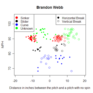
Excluding Webb, the only other true sinkerball I had a reasonable amount of data for was Carlos Silva. I have information on 110 pitches that Silva threw over two different starts, 4/07 and 4/18, and when I created his chart, I found he has only thrown two pitches, a sinker and change up. Because of the inconsistent way Gameday collected data from those two starts, Silva could have thrown other pitches that weren't collected by Gameday. However, I think if he did have another pitch, he would have thrown it more than a couple of times over 110 random pitches.
The table below shows some interesting information about the three sinkers examined. The numbers measuring the pitches are all median values as opposed to mean values. Silva relies on his sinker more than Cook or Lowe, but his sinker has less of a downward break, measured by both the vertical break compared to a non-spinning ball and the length of the break, which is the number I used to describe the hump in Lowe's curveball. Silva's average sinker ended roughly nine inches higher than a non-spinning pitch would have, while Lowe's and Cook's pitches ended roughly four inches above the imaginary terminus. The backspin on a pitch is what causes it to end up higher than a non-spinning pitch would, so Silva's sinker must have more backspin than Lowe's or Cook's. When a hitter hits a sinker with too much backspin, he still hits a grounder, but as Dan Quisenberry famously put it, "in this case, the first bounce is 360 feet away."
An average sinker from Silva reached its high point roughly seven inches above an imaginary line from release point to home plate, compared to roughly nine inches for Lowe and Cook, leading to a smaller vertical drop for Silva. These observations seem to jive pretty well with reality, as Lowe and Cook are both thought to have better sinkers than Silva, and one thing that could lead to a more effective sinker is getting more downward movement on the pitch.
Name   Sinker%   Speed    Horizontal Break   Vertical Break    Break Length
Lowe   65%       90 MPH   -10.75"            3.68"             9.00"
Cook   68%       93 MPH   -10.02"            4.60"             8.30"
Silva  77%       93 MPH   -10.74"            9.39"             6.85"
For the sake of comparison, and to make sure I wasn't drawing conclusions about a trend that didn't exist, I wanted to get the average values for several four-seam fastballs and see how they compare to these sinkers. For this, I used Matt Morris and Jake Peavy. The table below shows the same information as above, but for Morris' and Peavy's fastballs.
Name     Fastballs  Speed    Horizontal Break   Vertical Break    Break Length
Morris   79         89 MPH   -9.01"             9.47"             6.70"
Peavy    104        95 MPH   -10.32"            8.49"             6.60"
With all the usual warnings about a small sample size, the sinkers appear to be different from the four-seam fastballs, which is a great finding. The fastballs have different horizontal and vertical breaks and a much smaller break length relative to the sinkers. One interesting thing was the similarity of Silva's sinker to the four-seam fastballs. Silva struggled in spring training this year with controlling his sinker and maintaining the sink on the pitch, so perhaps this is numerical evidence of those struggles. Either that, or that's just how Silva's sinker typically behaves, and his normal sinker is different that Lowe's or Cook's.
I was very pleased to discover that pitches were able to be identified using just the horizontal and vertical break values from Gameday. In the future, I'd like to continue looking at different pitches and see the differences between say, Barry Zito and Rich Hill's curveballs, or Johan Santana and Cole Hamels' change up. The fact that there was a distinct difference between a four-seam fastball and a two-seam fastball gives me hope that sifting through the database to find the different types of pitches a pitcher throws is an attainable goal.