Rich Lederer • Baseball Beat
Patrick Sullivan • Change-Up
Jeremy Greenhouse • Touching Bases
Dave Allen • F/X Visualizations
Sky Andrecheck • Behind the Scoreboard
Marc Hulet • Around the Minors
Al Doyle • Past Times
Retired Uniforms:
Bryan Smith • WTNY
Joe Sheehan • Command Post
Jeff Albert • The Batter's Eye
RSS Feed
Home
*Examining the Past, Present, and Future*
Lineup Card
Recent Entries
» Putting Together a Reality Team
» Historical Hall of Fame Vote Comparisons: 2012
» An All-Christmas Team
» The New-Look Angels
» John Denny: The Forgotten Cy Young Award Winner
» Money Isn't Everything
» What Would It Take to Hit .400 in the 21st Century?
» Halos Heaven
» Brandon McCarthy's Breakout Season
» Link-o-Rama
» Historical Hall of Fame Vote Comparisons: 2012
» An All-Christmas Team
» The New-Look Angels
» John Denny: The Forgotten Cy Young Award Winner
» Money Isn't Everything
» What Would It Take to Hit .400 in the 21st Century?
» Halos Heaven
» Brandon McCarthy's Breakout Season
» Link-o-Rama
Best of Baseball Beat
Abstracts From the Abstracts
1977 Baseball Abstract
1978 Baseball Abstract
1979 Baseball Abstract
1980 Baseball Abstract
1981 Baseball Abstract
1982 Baseball Abstract
1983 Baseball Abstract
1984 Baseball Abstract
1985 Baseball Abstract
1986 Baseball Abstract
1987 Baseball Abstract
1988 Baseball Abstract
1978 Baseball Abstract
1979 Baseball Abstract
1980 Baseball Abstract
1981 Baseball Abstract
1982 Baseball Abstract
1983 Baseball Abstract
1984 Baseball Abstract
1985 Baseball Abstract
1986 Baseball Abstract
1987 Baseball Abstract
1988 Baseball Abstract
Bert Blyleven Series
Meeting Up and Hanging Out with Bert
The Results Are In And...
Aficionado Heavily Invested in Blyleven
Latest on Blyleven's Chances for the HOF
The Internet Zealot Responds
400 Down and 5 to Go...
Bert Be Home By Eleven?
Blyleven's Forgotten Season (1973)
HeyMan, Your Comments Don't Hold Water
The Waiting is the Hardest Part
Another Addition to the Blyleven Series
Search for the Truth
As Dominant as His HOF Contemporaries
Listen, Buster
A Larger Step for Blyleven
Answering the Naysayers (Part Two)
Another Small Step for Blyleven
Q&A: Blyleven on the Twins
The Majority Rules, Right?
It's All Dutch to Some
The Hall of Fame Case for Bert Blyleven
Q&A: Blyleven on Felix Hernandez
Clemens Rocketing Up Charts
Poz: An Interview With a KC Star
A HOF Chat with Tracy Ringolsby
Up Close and Personal
A Peek Into the Mind of a HOF Voter
Answering the Naysayers
It's That Time of the Year (Again)
"If Cooperstown is Calling..."
The Bert Alert
One Small Step for Blyleven...
Only the Lonely
Exclusive Interviews
Lee Sinins
Alex Belth
David Pinto
Will Carroll
Mike Carminati
Aaron Gleeman
Joe Sheehan
Jay Jaffe
Jeff Peek
Tracy Ringolsby
Joe Posnanski
Bill James Part I, II, III
Jon Lalonde
Chuck Tiffany
Dayn Perry
Fay Vincent
Nate Silver
Alex Belth
David Pinto
Will Carroll
Mike Carminati
Aaron Gleeman
Joe Sheehan
Jay Jaffe
Jeff Peek
Tracy Ringolsby
Joe Posnanski
Bill James Part I, II, III
Jon Lalonde
Chuck Tiffany
Dayn Perry
Fay Vincent
Nate Silver
Bullpen
Rich Lederer
The Odd Couple (with Alex Belth)
The MostUnder Over Underrated Player in Baseball (with Brian Gunn)
Three Wise Men (roundtable by Alex Belth)
Infrequently Asked Questions (interview with Matt Welch)
Interview (Orioles Think Tank)
Bernie and the Yanks (Bronx Banter)
Hope and Faith: How the LAA Win the World Series (Baseball Prospectus)
NL West (The Soul of Baseball)
Greatest Living Hitter? (Sports Illustrated)
Roundtable: 2008 HOF Ballot (Armchair GM)
The Most
Three Wise Men (roundtable by Alex Belth)
Infrequently Asked Questions (interview with Matt Welch)
Interview (Orioles Think Tank)
Bernie and the Yanks (Bronx Banter)
Hope and Faith: How the LAA Win the World Series (Baseball Prospectus)
NL West (The Soul of Baseball)
Greatest Living Hitter? (Sports Illustrated)
Roundtable: 2008 HOF Ballot (Armchair GM)
Patrick Sullivan
Designated Hitters
David Bromberg (Q&A: John Denny)
Mark Armour (H. Killebrew and Versatility)
Joe Lederer (Soundtrack of a Prospect)
David Bromberg (Clemente's Autograph)
David Bromberg (Woody Fryman)
D. Baumstein (WAR Against Age: Pitchers)
Doug Baumstein (The WAR Against Age)
Doug Baumstein (A Lifetime on the Road)
John Fraser (Pick Six)
Mark Armour (How to Score More Runs?)
Bill Parker (What Opening Day Tells Us)
Stan Opdyke (Pat Rispole)
Chris Jaffe (Evaluating Baseball's Mgrs)
Stan Opdyke (Baseball Radio in NYC, 1953)
A. Nathan (Performance of Baseball Bats)
Michael Weddell (Edgar Martinez/HOF)
Jon Weisman (100 Things Dodgers Fans...)
Stan Opdyke (Connie Mack and Vin Scully)
Eric Walker (Evaluating Run Production)
Brent Mayne (The Intangibles of Catching)
Chris Moore (Best Fastballs in Baseball)
Dave Baldwin (The Batter’s Brain)
Shawn Haviland (Ivy League to MLB)
Larry Granillo (Walking Off)
Rob Iracane (Solo HR Won't Break You)
Tommy Bennett (Charm of AM Radio)
Harry Pavlidis (Johan Santana's Fast Start)
John Walsh (WAR and Remembrance)
Eric Walker (Precisely Inaccurate)
Bob Timmermann (As They See 'Em)
Geoff Young (Unicycles and Delusions)
Baseball Analysis at Tufts (Groundballers)
Baseball Analysis at Tufts (GB Out Rates)
G. Rybarczyk ('09 Hit Tracker Projections)
Joe Lederer (Curt Schilling/HoF)
Conor Gallagher (Hall of Fallacies)
Chris Green (Jim Rice, HoF, the Numbers)
Shawn Hoffman (Baseball's Bear Mkt?)
Paul Anthony (Manny Syndrome)
Ross Roley (World Series Odds)
B. Timmermann (Catcher's Interference)
R.J. Anderson (Waiting the Hardest Part)
Maury Brown (Cubs, MLB, and Cuban...)
Myron Logan (Dee-Fense, Dee-Fense)
Craig Calcaterra (Frivolity, Part I, Part II)
Chad Finn (Ode to Baseball Cards)
David Cameron (Mariners Foibles)
Chris Dial (Chipper Jones)
Pat Lederer (Memory Lane)
David Appelman (Clutch Pitching)
Bob Rittner (DH)
Jonathan Mayo (Roger Clemens)
Lisa Winston (My Son-in-Law...)
Russ McQueen (The Yellow Hammer)
Bob Rittner (I'm OK, You're OK)
Mark Armour (In Defense of the HOF)
Pat Jordan (Friends)
Dan Levitt (Analysis of Terry Ryan)
Doug Baumstein (Trading Econ 101)
Ross Roley (Runner's Reluctance II)
Ross Roley (Runner's Reluctance I)
Mark Armour (No-Longer Lovable Sox)
Bruce Regal (Stealthy and Wise)
Brian Gunn (Roid Monster)
Current/McEvoy (Value of the SB)
John Rickert (Sinister Thefts)
Nate Silver (Sabermetrics)
David Vincent (Home Run Production)
Joe P. Sheehan (Enhanced Gameday II)
Mark Armour (An Ode to Sport)
David Gassko (All-Time Worm Burners)
Joe P. Sheehan (Enhanced Gameday)
John Walsh (When Titans Clash)
Fox/Williams (Quantifying Coaches II)
Fox/Williams (Quantifying Coaches I)
Jacob Luft (Bull Durham Rant)
Chad Finn (Strat-O-Matic)
Lisa Winston (Rotisserie Baseball)
Dave Studeman (Baseball Stats)
Steve Treder (Roger Craig)
Marc Normandin (Jeff Bagwell)
D. Appelman (Expanding Strike Zone)
Jeff Sackmann (Worst MiL Defenders)
Jeff Sackmann (Best MiL Defenders)
Maxwell Kates (Van Lingle Mungo)
David Appelman (Pitch Location)
Kent Bonham (Danny Ray Herrera)
Glenn Stout (Two Baseball Poems)
Bruce Regal (The Challenge Round)
Mark Lamster (Barry & Ty)
Geoff Young (NL West)
Tom Lederer (The Ryan Express)
Brian Erts (Great Leap Forward)
David Pinto (Parity and the N.L.)
Jacob Luft (Fathers and Daughters)
Jamey Newberg (Pete's Sake)
Jeff Albert (A. Jones Swing Analysis)
Jeff Albert (A-Rod Swing Analysis)
Keith Law (Death, Taxes, and Waivers)
Peter Abraham (Tales of Torre Tales)
Larry Borowsky (Let 'er Rip II)
Dan Levitt (Empirical Analysis of Bunting)
Jonah Keri (If I Met Warren Cromartie...)
Bob Klapisch (War Stories)
Bob Timmermann (John F. Kennedy HS)
Kent Bonham (Aluminum Adjustments)
Al Doyle (More Than Superstars)
Ross Roley (Instant Replay)
David Vincent (Barry Bonds Homers)
Chad Finn (Our Favorite Obscurities)
Bill Deane (1979 NL MVP)
Mark Armour (Rise/Fall of Artificial Turf)
Jeff Angus (Wally Moon Camp)
David Berri (Money and Baseball)
Larry Borowsky (Baseball w/o the #s)
Derek Zumsteg (The Irrational Market)
David Regan (Free Agent Contracts)
Peter Schmuck (Steroids and the HOF)
David Appelman (Pitchers, Pitch by Pitch)
Dan Fox (Swinging, Taking, Fouling, Etc)
Patrick Sullivan (Study of NYY CF/BOS LF)
Will Leitch (Baseball Journalism)
Jeff Sullivan (Pitcher Release Points)
Steve Treder ('69-'70 Giants)
Maury Brown (Charlie Finley)
John Brattain (Bob Johnson)
Bob Klapisch (The Case for Bert Blyleven)
Jeff Peek (Pride and Prejudice)
Dayn Perry (Bert and Warren)
Rob Neyer (If Don Sutton Was Great...)
Lisa Winston (Minor League Memories)
Alex Belth (Otis Redding Was Right)
David Cameron (Long Live the King)
Jeff Angus (Baserunning Study)
Bert Blyleven (Baseball Playoffs)
Boyd Nation (Not a Prospect List)
James Click (Batters-Baserunners Study)
Jeff Shaw (Why I Love Baseball)
David Gassko (BIP/BFP Fielding Study)
Jay Jaffe (Milwaukee Sausage Race)
Jamey Newberg (Remember When)
Bob Klapisch (Press Box to the Mound)
Dan Levitt (Predictive Value of BB)
David Vincent (Official Scorer)
Jon Weisman (Rick Monday)
Larry Borowsky (Let 'er Rip)
Will Carroll (Fictional Short Story)
Bob Timmermann (Japanese Baseball)
Cyril Morong (Best Pitching Seasons)
Sean Forman (Monte Carlo Win-Loss)
Brian Gunn (My Little Blue Book)
Joe Lederer (My Dad and Baseball)
Bill Deane (Bob Gibson, 1968)
Mark Armour (1977 Yankees)
Darren Viola (Retrosheet)
David Pinto (RFK)
Dayn Perry (Brave Heart)
Matt Welch (Dave Hansen)
Kevin Kernan (Jack McKeon)
Tom Lederer (Dodgers Road Trip)
Steve Lombardi (Slider)
Studes (Picturing Baseball)
Mike Carminati (Luck of the Drawl)
Eric Neel (Vin Scully)
J.C. Bradbury (Leo Mazzone)
John Sickels (Bill James)
Search Baseball Analysts
Archives
By Category:
Around the Majors Content Only
Around the Minors Content Only
Baseball Beat Content Only
Baseball Beat/Change-Up Content Only
Baseball Beat/WTNY Content Only
Behind the Scoreboard Content Only
Change-Up Content Only
Change-Up/Around the Majors Content Only
Command Post Content Only
Crunching the Numbers Content Only
Designated Hitter Content Only
F/X Visualizations Content Only
Past Times Content Only
Saber Talk Content Only
The Batter's Eye Content Only
Touching Bases Content Only
Weekend Blog Content Only
WTNY Content Only
By Month:
February 2012
January 2012
December 2011
October 2011
September 2011
August 2011
July 2011
June 2011
May 2011
April 2011
March 2011
February 2011
January 2011
December 2010
November 2010
October 2010
September 2010
August 2010
July 2010
June 2010
May 2010
April 2010
March 2010
February 2010
January 2010
December 2009
November 2009
October 2009
September 2009
August 2009
July 2009
June 2009
May 2009
April 2009
March 2009
February 2009
January 2009
December 2008
November 2008
October 2008
September 2008
August 2008
July 2008
June 2008
May 2008
April 2008
March 2008
February 2008
January 2008
December 2007
November 2007
October 2007
September 2007
August 2007
July 2007
June 2007
May 2007
April 2007
March 2007
February 2007
January 2007
December 2006
November 2006
October 2006
September 2006
August 2006
July 2006
June 2006
May 2006
April 2006
March 2006
February 2006
January 2006
December 2005
November 2005
October 2005
September 2005
August 2005
July 2005
June 2005
May 2005
April 2005
March 2005
February 2005
January 2005
December 2004
November 2004
October 2004
September 2004
August 2004
July 2004
June 2004
May 2004
April 2004
March 2004
February 2004
January 2004
December 2003
November 2003
October 2003
September 2003
August 2003
July 2003
June 2003
Reference
Organizational Stats
Arizona Diamondbacks Bat / Pitch
Atlanta Braves Bat / Pitch
Baltimore Orioles Bat / Pitch
Boston Red Sox Bat / Pitch
Chicago Cubs Bat / Pitch
Chicago White Sox Bat / Pitch
Cincinnati Reds Bat / Pitch
Cleveland Indians Bat / Pitch
Colorado Rockies Bat / Pitch
Detroit Tigers Bat / Pitch
Florida Marlins Bat / Pitch
Houston Astros Bat / Pitch
Kansas City Royals Bat / Pitch
Los Angeles Angels Bat / Pitch
Los Angeles Dodgers Bat / Pitch
Milwaukee Brewers Bat / Pitch
Minnesota Twins Bat / Pitch
New York Mets Bat / Pitch
New York Yankees Bat / Pitch
Oakland Athletics Bat / Pitch
Philadelphia Phillies Bat / Pitch
Pittsburgh Pirates Bat / Pitch
St. Louis Cardinals Bat / Pitch
San Diego Padres Bat / Pitch
San Francisco Giants Bat / Pitch
Seattle Mariners Bat / Pitch
Tampa Bay Devil Rays Bat / Pitch
Texas Rangers Bat / Pitch
Toronto Blue Jays Bat / Pitch
Washington Nationals Bat / Pitch
All-Star Links
Official Websites
News and Notes
Baseball News Blog
Baseball Newstand
ESPN Baseball
Fox Sports Baseball
Pro Sports Daily
Roto World
The Roto Times
USA Today Baseball
Baseball Newstand
ESPN Baseball
Fox Sports Baseball
Pro Sports Daily
Roto World
The Roto Times
USA Today Baseball
Reference and Analysis
Baseball Almanac
Baseball America
Baseball Archive
Baseball Contracts
Baseball Cube
Baseball Graphs
Baseball Library
Baseball Musings Player Database
Baseball Page
Baseball Primer
Baseball Prospectus
Baseball Reference
Baseball Statistics
Baseball Truth
Boxscore Central
Diamond Mind Baseball
Doug's Stats
FanGraphs
Fast Balls (pitchfx catalog)
Hardball Dollars
Hardball Times
Hit Tracker
Retrosheet
Rotobase/Rotoblog
Stat Corner
STATS
Tango on Baseball
Yahoo Sports MLB
Web Gems
Bill James Primer
Sabermetric Manifesto (Grabiner)
Pitching and Defense (McCracken)
Pitching and Defense (Tippett)
Transactions Primer (Neyer)
Baseball Stats (Batter's Box)
Prospect Report (Cameron)
Pitcher Workloads (Sheehan)
Goodbye to Old Baseball Ideas (Rickey)
Sabermetric Manifesto (Grabiner)
Pitching and Defense (McCracken)
Pitching and Defense (Tippett)
Transactions Primer (Neyer)
Baseball Stats (Batter's Box)
Prospect Report (Cameron)
Pitcher Workloads (Sheehan)
Goodbye to Old Baseball Ideas (Rickey)
Columnists
Baseball Blogs
Around the Majors
Athletics Nation
Baseball Crank
Baseball Musings
Baseball-Reference Blog
Batter's Box
Big League Stew
Bronx Banter
Catfish Stew
Cub Town
Dan Agonistes
Dodger Thoughts
DRays Bay
Ducksnorts
Futility Infielder
Halos Heaven
Inside the Rockies
It Might Be Dangerous
Knuckle Curve
LoHud Yankees Blog
Lookout Landing
Management by Baseball
Metaforian
Metsgeek
Mike's Baseball Rants
Only Baseball Matters
Redbird Nation
Red Reporter
Sabernomics (Braves)
Seth Speaks
ShysterBall
6-4-2 (Angels/Dodgers)
The Book
TheCubdom
The Cutting Edge
The House That Dewey Built
The View From The Bleachers
Tiger Blog
U.S.S. Mariner
Viva El Birdos
Where's Kernan
Minor Leagues
Arizona Fall League
BA Player Finder
Cal Leaguers
Jamey Newberg
JDM's Scoresheet Baseball
Minor League Baseball
Minor League Park Factors
Minor League Splits
No Pepper
Sickels' Minor League Ball
Warm October Nights
BA Player Finder
Cal Leaguers
Jamey Newberg
JDM's Scoresheet Baseball
Minor League Baseball
Minor League Park Factors
Minor League Splits
No Pepper
Sickels' Minor League Ball
Warm October Nights
Amateur
Boyd's World (College)
Cape Cod Baseball League
College Baseball Blog
College Baseball Insider
Collegiate Baseball Newspaper
College Splits
College Splits Blog
Dirtbags Baseball (Long Beach State)
NCAA Baseball
NCBWA
Team One Baseball (High School)
Texas A&M & Baseball
Cape Cod Baseball League
College Baseball Blog
College Baseball Insider
Collegiate Baseball Newspaper
College Splits
College Splits Blog
Dirtbags Baseball (Long Beach State)
NCAA Baseball
NCBWA
Team One Baseball (High School)
Texas A&M & Baseball
Historical
Cuban Baseball
House of David
Jim "Mudcat" Grant's Web Page
Negro League Baseball Players Assoc
Negro Leagues Baseball Museum
1919 Black Sox
Pacific Coast League
Philadelphia Athletics Historical Society
Shoeless Joe Jackson Society
SABR-L Archives
Walter O'Malley
House of David
Jim "Mudcat" Grant's Web Page
Negro League Baseball Players Assoc
Negro Leagues Baseball Museum
1919 Black Sox
Pacific Coast League
Philadelphia Athletics Historical Society
Shoeless Joe Jackson Society
SABR-L Archives
Walter O'Malley
Miscellaneous
Forums
Credits
Ticket Center
Tickets to Baseball -
Premium Red Sox Tickets - Tickets to Marlins Games - Cardinals Game Tickets - NY Yankee Tickets - Tickets Oakland Athletics - Dallas Cowboys Tickets - Arizona Cardinals Tickets - Tickets Seattle Seahawks - Buffalo Bills Tickets Online - Tickets to Dolphins Football
Buy Boston Red Sox tickets,
Philadelphia Phillies tix,
NY Yankees tickets,
NY Mets tickets, and
MLB All Star game tickets at ABC tickets
Not sure where to find the best online sportsbooks? Start your search with PlayersJet.
Get deals at SportsMemorabilia.com on baseball apparel, including Phillies jerseys and more for adults and children.
Shop the largest selection baseball equipment on sale at Sports Unlimited. Check out tons of baseball gloves, youth baseball gloves and catchers gear from Rawlings, Wilson, Nike & Under Armour.
2011 Draft Order
Courtesy of Baseball America
First-Round:
 1. Pirates (57-105)
 2. Mariners (61-101)
 3. Diamondbacks (65-97)
 4. Orioles (66-96)
 5. Royals (67-95)
 6. Nationals (69-93)
 7. Diamondbacks (for B. Loux)
 8. Indians (69-93)
 9. Cubs (75-87)
10. Padres (for Karsten Whitson)
11. Astros (76-86)
12. Brewers (77-85)
13. Mets (79-83)
14. Marlins (80-82)
15. Brewers (for Dylan Covey)
16. Dodgers (80-82)
17. Angels (80-82)
18. Athletics (81-81)
19. Red Sox (from DET for Martinez)
20. Rockies (83-79)
21. Blue Jays (85-77)
22. Cardinals (86-76)
23. Nationals (from CWS for Dunn)
24. Rays (from BOS for Crawford)
25. Padres (90-72)
26. Red Sox (from TEX for Beltre)
27. Reds (91-71)
28. Braves (91-71)
29. Giants (92-70)
30. Twins (94-68)
31. Rays (from NYY for Soriano)
32. Rays (96-66)
33. Rangers (from PHI for Lee)
Supplemental First Round:
34. Nationals (Dunn)
35. Blue Jays (Downs)
36. Red Sox (Martinez)
37. Rangers (Lee)
38. Rays (Crawford)
39. Phillies (Werth)
40. Red Sox (Beltre)
41. Rays (Soriano)
42. Rays (Balfour)
43. Diamondbacks (LaRoche)
44. Mets (Feliciano)
45. Rockies (Dotel)
46. Blue Jays (Buck)
47. White Sox (Putz)
48. Padres (Garland)
49. Giants (Uribe)
50. Twins (Hudson)
51. Yankees (Vazquez)
52. Rays (Benoit)
53. Blue Jays (Olivo)
54. Padres (Torrealba)
55. Twins (Crain)
56. Rays (Choate)
57. Blue Jays (Gregg)
58. Padres (Correia)
59. Rays (Hawpe)
| Behind the Scoreboard | May 11, 2010 |
Final Pitch
It's with a great deal of excitement that I'm announcing today that I've taken a job as a Baseball Analyst in the front office of the Cleveland Indians. I'm thrilled that I'll be joining the great Keith Woolner and Jason Pare in the Indians front office, and I'm excited to contribute to the club. As you can imagine, the Indians will be wanting to keep all of my ideas to themselves, so it's with some sadness that I say that this will be my final post here at Baseball Analysts.
There aren't a whole lot of jobs out there that are like this one, and I feel lucky to have landed one them. Upon getting the job, I thought back to Malcom Gladwell's book Outliers, the crux of which can be summed up in a statistical concept that sabermetricians know well: people with outcomes on the tail end of the distribution are likely to have been both very good and lucky. While a player who led the league in batting was probably a very good hitter, he also likely caught some breaks as well. The same concept applies to pretty much anything in life, be it career, money, etc. Looking back on my own experience I was very lucky to have had a number of helpful people in my sabermetric career.
Most of all, I'm indebted to Rich Lederer, the leader of this great site. After studying sabermetrics on my own for years, back in March of 2009 I started my own blog on sports and statistics. Getting about five readers per day, I emailed Rich an article I had written in hopes of drumming up a little more publicity. Instead of just linking to the article, he offered me a weekly column at the site. I jumped at the chance and never looked back. It was also my good fortune to come on to the site right as Dave Allen and Jeremy Greenhouse also joined Sully and Rich at Baseball Analysts. Their great writing and analysis helped make Baseball Analysts a go-to place for sabermetric research during the 2009 and 2010 seasons and I'm grateful to have been a part of that.
I also have to thank Dave Studenmund, who not only tapped me for an article in the Hardball Times 2010 Annual, but also introduced me to the good folks over at SI.com, where I had been writing since November. Through some hard work and more helpful people, I was able to parlay that into a full-blown weekly column which was a terrific experience. After starting at SI, I was then fortunate enough to be contacted by another MLB club (not the Indians) to do some consulting for them, giving me invaluable experience working with an MLB front office and setting me on a path for further success. To all who have helped me on my journey, I thank you.
My Two Cents
Perhaps like some people reading this, working as a statistician in an MLB front office was a dream of mine growing up. Now that I've achieved that goal, I'm excited to start the next chapter in my career and take my ideas inside the game. As I've told people about my new job, a common reaction I got was "How can I get that job?" And, during my time at Baseball Analysts, I've gotten emails from at least one young fan asking for advice on getting into baseball. For what it's worth, here's mine:
A) Start blogging: the surest way to a career in baseball is by consistently putting good stuff out there. Don't wait until you get that one earth-shattering finding. Consistency will prove you know what you're talking about and over time you'll build a solid reputation which will lead to other opportunities.
B) Get a degree: As sabermetrics becomes more advanced, there's going to be more need for people with technical skills. I personally have an MS in Statistics, and I think it's helped tremendously. Not only will the knowledge from your degree help in your analysis, but jobs in and around sabermetrics will likely start requiring one.
C) Don't worry about the competition: There was a time when I wondered if most of the sabermetric gold had already been mined. However, as I discovered, that's not even close to true. While many topics have already been looked at, it doesn't mean that other studies have all the answers. If you have an idea for an investigation, go for it - chances are you'll have a twist on it that makes your analysis a little different from what has come before. Sabermetric studies can always benefit from a second opinion.
D) Work hard: I challenged myself to write one in-depth study per week here at Baseball Analysts. It wasn't always easy, but pushing yourself to perform your best work pays off. By the end I was not only writing here, but writing weekly for SI, as well as consulting, meaning I was spending more time on baseball than at my actual job. Like anything, serious payoff requires serious hard work.
Thanks for Everything!
I've truly enjoyed writing for this site and being part of the sabermetric community at-large. All of your comments and readership have been wonderful and it will be tough to leave that behind. However, I'm really looking forward to going inside baseball and bringing my best work to the Cleveland Indians. From Baseball Analysts to Baseball Analyst, thanks for everything!
| Behind the Scoreboard | April 24, 2010 |
The Science of Playoffs
What is the point of having playoffs? I mean this not as a snarky rhetorical, but as a real question. Playoffs are a given in every major sport today, but it wasn't always that way. Before 1969, there were no playoffs in baseball, just one seven-game series between the winners of two completely separate leagues. Other sports were more quick to adopt playoffs. The NFL adopted playoffs in 1933 - a one game championship between the winners of the East and West divisions. The NBA had extensive playoffs almost from its inception, allowing 12 of its 17 teams to make the playoffs in 1950. The NHL was also an early adopter. The NBA scaled back its playoffs. Meanwhile, MLB has expanded its playoffs. With all of these different approaches to playoffs, who is right? To answer that, the point of the playoffs must be determined.
One way to look at it is that playoffs shouldn't be necessary at all unless there's a tie for first place. If the goal is to choose the best team and crown them as champion, then that would be the ideal approach. For instance, in 2009, the Yankees had a record that was six games better than any other AL team. Is there anything that could have happened in the playoffs to overturn the evidence that the Yankees were the best AL team in 2009? Not really. If we assume that teams remain static over the course of a season, the best way to evaluate a team's skill is to look at its overall record including the playoffs (schedule adjusted). Even had the Yankees been swept out of the first round, the evidence would point to the conclusion that New York had the best ballclub. So if it's a certainty that the Yankees were the best AL team, then what's the point of having any playoffs? Why not just send them straight to the World Series? That's one view, and a view baseball had until 1969.
But here's another view. The statement above is actually incorrect. It is not a certainty that the Yankees are the best team. It is a certainty that no matter what happens in the playoffs, that the Yankees are most likely the best team. But, because of variability we can't ever be certain who's the best, and sometimes we may not be very close to certain at all.
Consider a scenario in which, based on their records, one team has a 70% chance of being the "true" best team. Meanwhile, there's a 30% probability that a second team is the "true" best team. What do we do? One approach is to simply give the first team the championship. They are most likely the best team, and so they should be given the title. But the second team might be mad. "Hey, we deserve 30% of that championship!" Well, they don't give out parts of championships. But you could, in essence, give them 30% of a championship by giving them a 30% chance to win one whole championship. This could take place by having the commissioner pick a ball out of a lottery at the end of the season. The lottery machine would be filled with 70% of Team A's balls and 30% of Team B's balls. If your team's ball comes up, it is awarded the championship. They could do that. But it would a pretty awful way to end a season.
Championships should be decided on the field, not by ping pong balls. The solution to the uncertainty? Playoffs. Instead of drawing a lottery, you can simply set-up playoffs. And, if you structure the playoffs so that Team A has a 70% chance to win and Team B has a 30% chance to win, then you will have achieved the same effect. Except now the championship is decided on the field. These playoffs give each team a chance to win in proportion to the probability that it was the best team in the regular season. If your team, based on the regular season, has a 10% chance of being the "true" best team, then you will have a 10% chance of winning the playoffs and claiming the championship. Seems fair to me.
Of course, that's only if you set-up the playoffs just right. If you were to make the National League playoffs a 16-team NCAA-style single elimination knockout tournament, those two probabilities would not even be close to matching one another. The chance that a bad team could win would the tournament would be much higher than the probability that they were the best team during the regular season.
An Example
Let's take a simple example with just two teams. In 2008, the Cubs won 97 games, with a .602 WPCT. The Phillies won 92 games, with a .568 WPCT. If we regress these to the mean, which I won't go into here, you get the Cubs with a predicted "true" WPCT of .569 and the Phillies with a predicted "true" WPCT of .548. Each of these has a standard error of about .032. Hence, the probability that the Cubs are "truly" better than the Phillies is about 68%. So, in order to be "fair", a playoff series should be structured so that the Cubs have a 68% chance of winning. However, in a seven-game series with home field advantage to the Cubs, Chicago has only a 56% to win (this includes the fact that Cubs are likely better than the Phillies). But 56% is too low. Their five game lead is substantial, and should not be able to be so easily erased by a simple best of seven series. So how about we change things up? We still play a seven game series, but we spot the Cubs a 1-0 lead. Running the numbers again, now the Cubs have a 69% chance of winning the series. That's almost perfect! It gives the Cubs an advantage, but the Phillies still have a chance to win. And they can do it by winning just four out of six games.
The above set-up is the fairest one to determine the championship between the Phillies and Cubs. Of course, purists will say that the Cubs should be awarded the championship regardless. After all, if the Phillies win 4 out of 6 games, the Cubs will still have a better record than Philadelphia. Hence, the Cubs still are the team that's most likely the best "true" team in the league. Even though the above system is "fair", it still quite easily allows for the championship to be awarded to a team which is probably inferior. And that's part of the point. Likely inferior teams can win, but only if they do something extraordinary in the playoffs.
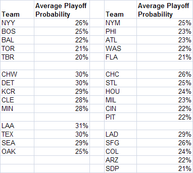
2009 AL Playoffs
Now let's take a larger example. In the 2009 AL, any baseball fan could tell you that there were three dominant teams: the Yankees, the Angels, and the Red Sox, with the Yankees likely being the best of the bunch. The probabilities I calculated of being the true best team back that up. The Yankees, with six more victories than any other team, have a probability over 50%, while the Red Sox and Angels are significantly lower. The probabilities for other teams are close to 0%. So did the AL playoffs match those probabilities well? Take a look at the chart below:
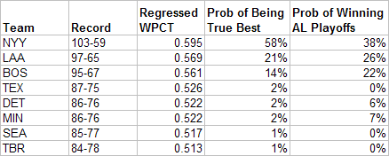
The Yankees were not amply rewarded for their regular season dominance, and their playoff probabilities were much too low. Additionally, the Twins and Tigers' probabilities were much too high. And as a final issue, the Red Sox also had too high of a probability. So how could the 2009 AL playoffs have been made fairer? First, by limiting the teams to just New York, Boston, and Los Angeles, you can set the Tigers and Twins probabilities down to zero. Then, since New York is far ahead and LA and Boston close together, it makes sense to have Boston and LA play each other in a five game series, with the winner playing the Yankees. What happens if we test that scenario, with LA and New York having the home field advantage? We get the following: probabilities:
Yankees: 58%
Angels: 23%
Red Sox: 19%
The Red Sox probability is a little higher than we'd like, but overall it's a pretty spot on match to the probabilities that each is the true best team in the league. Additionally, in their guts, I think most fans would agree that this would have been a fair playoff setup given the results of the regular season.
2009 NL Playoffs
Now I'll move to the NL and get a little wild. The NL was more evenly spread. The Dodgers had the best record, but several other teams were close behind. Additionally, there were several lagging contenders who, because of the overall parity, could potentially be the best true team in the league. The chart below shows the probabilities for the 2009 NL:
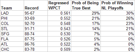
Overall, the probabilities are not way off like they were for the 2009 AL, however, there are still some inequities. The actual playoff probabilities are too high for each of the playoff team and they are too low for the teams that did not make the playoffs. Playing around with the numbers - here's the closest I could come to evening this out:
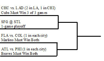
As you can see, the lowly Cubs do make the playoffs. But it will take a three-game sweep of the mighty Dodgers to advance. Additionally, teams such as Atlanta and Florida also have a shot, but will need to win two straight games against their superior foes to advance. The probabilities in this scenario match well with the probabilities of each team being the best true NL team. The results are below:
Dodgers: 28%
Phillies: 21%
Rockies: 19%
Cardinals: 13%
Giants: 9%
Marlins: 4%
Braves: 4%
Cubs: 1%
Conclusion
In this way, this playoff set-up is actually both more fair and often allows more teams to actually make the playoffs. Obviously, the drawback is that the playoffs aren't set in advance, with the additional drawback being that it's hard to match the probabilities exactly. So at least one team will end up getting the short end of the stick, and then they'll be mad. Additionally, really complicated playoff systems don't exactly have the best track record in major sports (see the BCS). Still I think a scenario like this is something that is inherently fairer in that it rewards teams in proportion to their accomplishments during the regular season - something that the current system famously does not do.
Ideally a system like this would work pretty well for a non-major sport that was a little more flexible on its scheduling and a little less rigid in its traditions. But, to be honest, it's likely impractical at any level. Still this method can be used to evaluate playoff structures and see where the holes are. In baseball, it's clearly that inferior teams have too large an edge in the playoffs. In other sports, depending on the structure, length of season, true talent distribution, the size of the home field advantage, etc, things may be different.
| Behind the Scoreboard | April 13, 2010 |
Structural Unfairness In Baseball's Divisions
A couple of weeks ago, I had planned on penning an article for SI.com on MLB's wild-haired proposal to reshuffle the divisions in order to make them more equitable. My thesis was to be that there was little reason to do so. Teams ebb and flow and the shuffling is unnecessary. The record of AL East teams against the other divisions is barely over .500 since 1996, so the AL East isn't that much of a powerhouse anyway. To boot, when looking at 90-win teams that missed the playoffs, the AL East housed fewer of these teams than either of the other two AL divisions. I'm glad I didn't write that article, because I'd have been wrong. Here, I'll show why.
Let it be known, I still think the proposal is a hare-brained scheme. Swapping strong AL East teams with weaker ones would be tantamount to just handing the flag to Boston and New York. Additionally it wouldn't be fair to those "weak" AL teams - after all, maybe they'd surprise people and make a run. Plus the whole thing just seems jury-rigged and unseemly. Still, there is a real question of what structural advantages and disadvantages are built into the current system.
The Effect of Market Size on Winning
Certainly some teams figure to be better than others long-term. Market forces are a very real phenomenon, and the fact is that big-markets and owners with deep pockets can have a strong effect on a team's performance. How those big-market teams are distributed among the divisions can have a strong impact on the game.
As a first step, I ranked all 30 teams based upon "market size", and when I mean market size, I mean not only the size of the market, but also things like ownership's willing to spend money, etc. This was somewhat subjective, however I think my ordering was reasonable. I then assigned each team a market "value" according to the normal distribution, so teams like the Dodgers and Yankees got the highest scores, and teams like the Rays and Pirates got the lowest. I then did a regression to predict WPCT (data pulled from 1995-2009) from this market size variable. As expected, the two were significantly correlated. The predicted WPCT for the biggest team (the Yankees), was .558. That translates to about 90 wins, which I think is a pretty good over-under for a future undetermined future Yankees team. The market size advantage drops off quickly after that. The Red Sox have an average WPCT of .537, translating to 87 wins. Meanwhile, most teams are clustered close to .500. As you can see, market size matters but doesn't hand a team anything. Overall, the WPCT's predicted from market size had a standard deviation of .027.
True Talent
Now, the standard deviation of team WPCT as a whole since 1996 has been .072. The factors adding up to this .072 SD can be described in the following equation:
Total Variance = (Between Franchise Variance Due to Market Size) + (Within Franchise Variance Due to Other Factors) + (Team Variance Due to Luck)
The "Other Factors" translates to teams' ebb and flow of talent - sometimes the same franchise will produce a good team, and sometimes it will produce a bad team. Since we know all of the other variables except this one, we can easily solve for it and we get the following values:
Total SD = .072
Market Size SD = .027
Within Team SD = .054
Luck SD = .039
And it all adds up: (.072)^2 = (.027)^2 + (.054)^2 + (.039)^2
Knowing all of the factors that go into a team's performance, I set up a simulation to estimate the probabilities of each team making the playoffs. The simulation was set up to play a balanced schedule against each of the other teams in the league, plus a handful of "interleague" games against a .500 opponent (I didn't have time to program in the unbalanced schedule unfortunately, although I think this is a relatively small issue). So, how much structural disparity is there in baseball? Are teams like the Rays really at a huge disadvantage due to playing in the AL East?
Long Term Playoff Probabilities
The following chart shows what happens in the simulation:
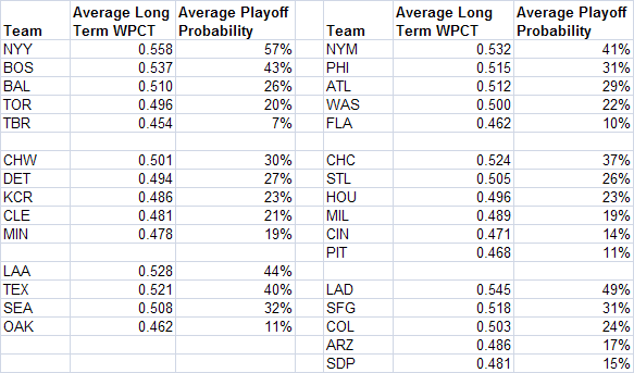
Indeed, the Rays are at the biggest disadvantage of any team in baseball. As one of baseball's smallest market teams, and in one of baseball's toughest divisions, they have just a 7% chance to make the playoffs. To clarify, these percentages are for some theoretical year in the future, NOT taking into account the personnel currently on the club, the quality of the management, etc. The team with the biggest advantage is the Yankees, who have a 57% chance to make the playoffs in any given year. Of course, these numbers are quite dependent on the market size ratings I assigned teams earlier. And, my guesses aren't exactly the gold standard.
Additionally, it's not Bud Selig's fault if the Rays and Pirates are small market clubs. A large part of the reason for the small probability for teams like the Rays is due to their own small-market nature. That's useful to know, but the impetus of the piece was whether the divisions themselves were unfair to certain teams.
Playoff Probabilities Given an Average Team
To take the nature of the particular team out of it, I changed the team in question's long-term average WPCT to .500. For instance, if the Rays were not small market, and instead had an expected WPCT of .500, how often would they make the playoffs? And is that probability higher or lower than it would be in other divisions? Below is a chart showing the probability of making the playoffs, assuming that the target team has an average WPCT of .500.
As it turns out, the Rays are still getting the shortest stick in baseball. Even assuming they have no market disadvantages (or advantages), they have just a 20% probability of making the playoffs in a given year. How does this compare to other teams? The most favorable structural advantage goes to the Los Angeles Angels. Assuming no market advantages, their probability of making the playoffs is 31%. That means that just due to their competition, the Angels will make the playoffs three times for every two times that Tampa makes the playoffs. Not surprisingly, besting the Yankees, Red Sox, Orioles, and Blue Jays is tougher than beating the Rangers, Mariners, and A's. For one, it's easier to beat three other teams than four. And for another, the Red Sox and Yankees are usually tougher to beat than any of the other AL West teams. Those are observations any fan could make, but the effect on the probability of winning is quantified here.
The rest of the AL West is also substantially easier than the AL East. Oakland has a 25% chance of making the playoffs, while the Mariners and Rangers push 30%.
Additionally, the AL Central is a great place to call home. Again, assuming no market advantages or disadvantages for the target team, each team has a 28%-30% chance of making the playoffs. Again, this is a far cry from the Rays' 20%.
How about the Yankees themselves? Again, making their average ability equal to .500, they figure to make the playoffs 26% of the time. These odds are higher than that of the Rays (because they don't have to face a powerhouse Yankee team), but still lower than any AL Central team or most of the AL West. The AL East is tough even for the big dogs.
Now let's move over to the National League. The first thing to notice is that it's generally tougher to win in the NL than the AL. This makes sense because there are more teams to beat in the NL, but the same number of playoff spots. Many of the teams approach the Rays' probability of winning. In the NL East, the Marlins have a 21% chance of making the playoffs, in the NL Central the Pirates have a 22% chance of winning, and in the NL West, the Padres have a 21% chance of winning. However, there is not quite as much disparity among the larger market clubs. Of the large market players, the Cubs have just a 26% chance to make the playoffs, while the Mets have a 25% chance, and the Dodgers have a 29% chance. This is in contrast to the AL, where a number of teams have probabilities approaching 30%. A summary of the average probability of making the playoffs in each division is below.
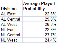
Conclusion
So what's the conclusion? Yes, some teams face significantly higher hurdles than others. It's not just the Rays that face the problem, but many other National League clubs as well. Paradoxically, because they don't have to play themselves, the large market teams face an easier schedule than their small market counterparts. Situations like these create the imbalances we see here.
The AL East is indeed a tough division, but it's actually about the same toughness as the NL East. It's actually the AL Central and the AL West that are the outliers, in that they are easier divisions than the rest of baseball. If MLB is keen on evening that up, one potential solution is to move Toronto to the AL Central and the Twins to the AL West. That would make the AL East a four-team division and hence easier to win, would toughen the AL Central by adding the Blue Jays instead of the Twins, and would toughen the AL West by adding a fifth team. The NL's division imbalance is solved nicely by having the smaller market teams populate the NL Central. The fact that it has six teams counteracts the fact that the teams are likely to be of a little lower quality, and hence the NL Central is about as easy to win as the West or East.
Is the model perfect? No, because it's difficult to estimate each team's average long-term WPCT. Still, the underlying conclusions, especially regarding which divisions are easiest or hardest, should hold. The teams from the AL East have a legitimate beef, especially the Rays. However, compared to other AL divisions, the National League is also getting a raw deal. These types of inequities are part of the game, but they should be minimized if possible. With these numbers, it hopefully be more clear on how large these inequities really are. Whether baseball will do something about it remains to be seen.
| Behind the Scoreboard | April 06, 2010 |
How Do Experts Make Their Predictions?
Yesterday, we at Baseball Analysts revealed our "expert" predictions. Now there's so much luck that goes into winning baseball games, that making predictions on Opening Day is basically a fool's game. Still, everyone loves to make them. It was my pleasure this season to be able to publish my picks for the first time, both here, and over at SI.com.
However, I'll have to admit that I was a little bit conflicted when asked to provide my pre-season selections. What, exactly, is the goal in making the picks? Do I merely choose the teams who I think have the best chance to win each division, league, World Series, etc? Or do I choose teams that I think are underrated by others, but might not necessarily be the teams I would stake my life upon? What does the average sportswriter do? Do they make selections just to make a statement or show how smart they are or do they stick to those that they really think are the best clubs?
Putting it into a more economic context, what is the payoff function which most sportswriters use? One possible method is a simple one, where the goal is simply to make as many correct picks as possible. If this is the goal, the best method is to simply pick teams which have the highest probability to win. The problem with this method is that there isn't a whole lot of room for creativity. Think the Marlins are an underrated ballclub, who has a good chance to contend? Perhaps you handicap the NL East as the following: PHI 33%, ATL 32%, FLA 30%. That's probably a lot more favorable towards the Marlins than most people would say, and a lot less favorable towards the Phillies. But, under this method of making predictions, you'd have to go with the conventional wisdom pick of the Philadelphia Phillies to win the East, just like the rest of the world.
Another drawback of this method is that when looking at a bunch of "expert" picks, there isn't much to choose from between the experts. Over at SI.com, all 13 experts, including yours truly, picked the Phillies to win the East. There's not much to choose from between the writers, and as a fan, it doesn't tell you much about what the Phillies chances actually are. Assuming writers use this method of making their selections, all it means is that each thinks that the Phillies have the best chance to win the East. Whether that chance is 30%, 50%, 80% or 99% is unknown.
However, there's some evidence that not every expert makes their picks this way. Jim Caple, at ESPN, is picking the Giants over the Twins in the 2010 World Series. SI's Tom Verducci is picking the Twins to win the AL Pennant. SI's Albert Chen has the Rays winning it all. Could these things happen? Sure, all of these teams have the potential to go all the way. However, I can't image that any of these experienced baseball writers would really stake their lives on these picks. More likely, these experts wanted to select teams which were underrated. On the off chance that the Giants do knock off Minnesota in the World Series, Jim Caple will look like a genius. If the Yankees defeat the Phillies, like I picked, I simply look like a purveyor of conventional wisdom. Thus, there may be incentive to make upset picks.
A payoff function that would reflect this thinking would give experts credit in inverse proportion to the number of other people making that same selection. Thus if a 60% of people were picking the Phillies to win the East, then you would get 1.67 points of "credit" (1/.6 = 1.67) if you also picked the Phillies and they actually won. If only 5% of people were picking the Marlins, you would get 20 points of credit (1/.05) for making that correct selection. This would give someone an incentive to pick the Marlins if they thought they were underrated, even if they didn't think they necessarily were the team most likely to win.
As a matter of fact, if all experts used this type of payoff function, the result would be an efficient marketplace, in which the percentage of writers making each pick would correspond to the probabilities that each team would actually win. This would occur, because an equilibrium would be reached where, according to the market, the expected payoff for selecting any of teams would be equal. To maximize points, you'd have to not pick the teams you thought would win, but instead pick the teams you thought were underrated by others. This would truly become efficient if experts could change their picks after viewing what the other experts had chosen, as it would reach an equilibrium where no expert could gain an advantage by changing his or her selection. A made-up example with 10 writers and the probabilities they assign to each team winning the AL East is below:
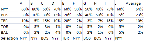
Writer G, though he thinks the Yankees are better than the Red Sox, thinks more highly of the Red Sox than most other writers, and hence he has incentive to pick the Boston over New York. The same goes with writer C and with writer E concerning the Rays. The result is that none of the writers have an incentive to change their picks, hence it reaches an equilibrium of six writers choosing the Yankees, three writers choosing the Red Sox, and one writer choosing the Rays. This roughly corresponds to the consensus probabilities of each team winning the AL East (it would match-up more exactly if there were more than just ten people making predictions). This is a more interesting outcome than if each writer simply chose the team they thought most likely to win. In that case, all but one would have chosen the Yankees - a far cry from the actual consensus handicapping of the division.
If this were actually done this way, this would actually yield the fan some cool information. Getting the collective probabilities of success from experts would be interesting and useful info. Unfortunately, it doesn't appear that writers make their picks this way either. None of the 49 writers for either ESPN or SI chose either the Indians or the Athletics to win their division. These teams certainly aren't the favorites, but they definitely have a better chance of winning than 1 in 49. If experts made their picks in the above manner, at least a few would have chosen these sleeper teams to win. Likewise, at SI, every writer picked the Phillies to win. However, the Phillies have far from a 100% chance to win the division. Were the payoffs doled out as above, a fair amount of writers (including me) would have changed their picks to the Braves or perhaps even the Marlins or Mets. Hence, it's pretty obvious that experts don't make their picks with this payoff in mind.
So, if experts don't go with either of these payoff functions, then how do they make their selections? Good question. For most, it's probably a combination of the two. I would say most probably pick the team that is most likely to win, however, if it's close they'll likely choose an upset, just to go against the conventional wisdom. At least, that's my hunch. It's pretty tough to tell what's actually going on inside the head of the average sportswriter. For me personally, the one area I went out on a limb was in picking the Tigers to win the AL Central. If my life depended on making the right selection, I might have gone in another direction, but seeing as I thought it was pretty much a 4-team crapshoot, I went with Detroit, a pretty good ballclub that no one else seemed to be picking. In all, the various ways people make selections, and of course, the uncertainty surrounding any Major League season, makes preseason picks fairly useless. Still, I'd love to see how writers would respond to participating in a system like the above, where the payoffs were inversely proportional to the number of experts making that same pick. At least then we could glean some interesting information out of them.
| Behind the Scoreboard | March 30, 2010 |
Hitter Scouting Reports
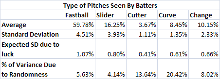
One of the interesting statistics that can be found over at Fangraphs is how hitters perform against different types of pitches. Presumably using this data, we can see how well hitters handle various pitches, be it fastballs, sliders, curves, cutters, etc. The statistic of interest is the Runs Above Average per 100 pitches statistic (for instance, for fastballs, the stat is wFB/C, denoting the runs above average the player contributed per 100 fastballs).
At first blush it would seem that we could identify the best fastball hitting players in baseball from this statistic. Likewise, with curveballs, sliders, change-ups, etc. However, one of the big problems with this data is it is very noisy. One year, a player may appear to hit best against fastballs, while the next year it may be curveballs. For instance, in 2007 it appeared that Aramis Ramirez hit very well against curveballs (wCB/C of 5.09), while the next year he hit curveballs very poorly (wCB/C of -2.53). This past year, he appeared to be about average. One of the key questions is whether these fluctuations are real, and whether these stats, in general, can be trusted.
For this analysis, I looked at five pitches: the fastball, the slider, the cutter, the curveball, and the changeup. For each of these pitches I gathered data for all 212 players with 400 or more PA's in the 2008 season.
Here's how the basics broke down: Relative to their overall abilities, hitters did best against fastballs (.20 RAA per 100 pitches) and change-ups (.14 RAA per 100 pitches), about average against curveballs (-.05 RAA per 100 pitches), and worse against cutters (-.34 RAA per 100 pitches) and sliders (-.55 RAA per 100 pitches).
These averages are fine, although what I'm really interested in is how individual batters varied. Are some hitters really better at hitting the fastball? And what's the spread of the distribution?
As a first step I subtracted each hitter's RAA per 100 pitches for each pitch by their overall average RAA per 100 pitches. Obviously someone like Albert Pujols hits well against pretty much all pitches, but I'm interested in which pitches he hits best. This adjustment takes care of that.
More interesting is the distribution of talent regarding the ability to hit each type of pitch. The standard deviation of hitter abilities for each pitch (weighted by the number of plate appearances) is the following:
Fastball: .444
Slider: 1.06
Cutter: 2.61
Curve: 1.68
Change: 1.39
Again, at first glance, it appears that the fastball has the smallest variation in the ability to hit them, while cutters have the least. But of course, a lot of this variation is due to chance alone. Not that many cutters are thrown, so of course the variation on RAA per 100 pitches will be fairly high.
What we can do is to calculate the expected variance due to chance alone. Knowing that the standard error for RAA on a typical 600 PA season is 10.75 runs, we can work backwards and find that the standard deviation for RAA on a single pitch is .2243 (10.75/(600*3.83)^.5). Knowing this, we get the following estimates for amount of variability that is expected to occur just by chance:
Fastball: .391
Slider: 1.09
Cutter: 2.47
Curve: 1.58
Change: 1.43
As you can see by comparing these figures to the ones above, most of the variability in performance against various pitches can be explained by chance alone. In some cases (change-ups, sliders), the variability expected by chance even slightly exceeds the actual variability in the data. This indicates that basically there is no "real" difference between batters in the ability to hit the change-ups and sliders thrown to them (more on this in a moment).
For the other pitches, the ratio of the variances tells us how much we need to regress each hitter's data. For fastballs, we have to regress 77%, while cutters and curves must each be regressed 89%. Most of the variability is due to chance alone. For instance, in 2008, Adam Dunn had an RAA that was 1.11 runs per 100 pitches better than his average production. However, when we regress based on the above, we get than Dunn was just .43 runs per 100 pitches better against fastballs - not all that much different than a normal hitter, who was .22 runs better against fastballs.
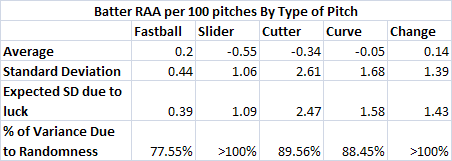
With luck accounting for so much of the variability in the above data, the RAA per 100 pitches figures for Fangraphs are fairly limited in their use. In fact, for all pitches except for fastballs, the observed variability was not significantly different from the variability expected by chance, leading one to believe that there may not be any true talent difference at all.
So what does this all mean? We've all seen players who "can't hit the curveball" or are "great fastball hitters". Does this analysis show that these players don't exist at all. Not so fast. While it does show that the players don't seem to actually hit pitches differently, we are ignoring another extremely important factor - how often the batter sees each pitch.
It stands to reason that pitchers would throw more curveballs to the player who "can't hit the curve" and less fastballs to great fastball hitters. And presumably they'll throw fewer and fewer fastballs and more and more curveballs until the batter starts to expect the curve and his efficacy against the curveball actually begins to match his ability against the fastball. In a game theory sense, the game would reach an equilibrium when expected RAA was the same for each pitch. A batter may be a truly better fastball hitter and a weak curveball hitter, but as pitchers throw fewer fastballs, their fastballs become tougher to hit because the batter sees them less often. Likewise if the pitcher throws mostly curveballs, the batter can sit on the curve and he will begin to hit better against that pitch. In a nutshell, pitchers throw fastball hitters fewer fastballs, making them more of a surprise and tougher to hit, and as a result, the batter's RAA per fastball decreases. At least, that's my theory.
So, an important follow-up is whether some hitters do indeed see fewer fastballs than others. The average and standard deviations of how often hitters see each type of pitch can be seen below.
As you can see, very little of the variation in the types of pitches seen is due to chance. This means that there is a reason that some batters see more of one type of pitch than others. Presumably, the reason is due to scouting reports which indicate how to best pitch particular hitters. Alexi Ramirez saw a fastball a league-low 47% of the time. Meanwhile, Juan Pierre saw a fastball over 70% of the time. Those differences are no fluke. Unlike the RAA per pitch data, these percentages are stable. Ramirez was pitched fastballs just 50% of the time in 2009, while Pierre has seen about 70% fastballs in each year of his career.
So, given that there are very little "true" differences in the actual RAA per pitch, but there are significant and consistent differences in the way that hitters are actually pitched, this leads me to believe that the best indicator of a hitters strengths is the proportion of pitches thrown to him. RAA per pitch, while a cool stat, has so much variability that it's rendered nearly useless. The percentage of fastballs (or other pitches seen) is a much more stable and reliable indicator of a batter's strengths and weaknesses. In essence, the advance scouts have already done our work for us in identifying a batter's abilities. To find a hitter's strengths and weaknesses, all we have to do is watch how teams pitch to him.
A last look at this subject is examining the relationship between RAA per 100 pitches and the percentage of each type of pitch seen. If my game theory presumption were true, we would see basically no relationship between the two variables. The graphs below show the relationships.
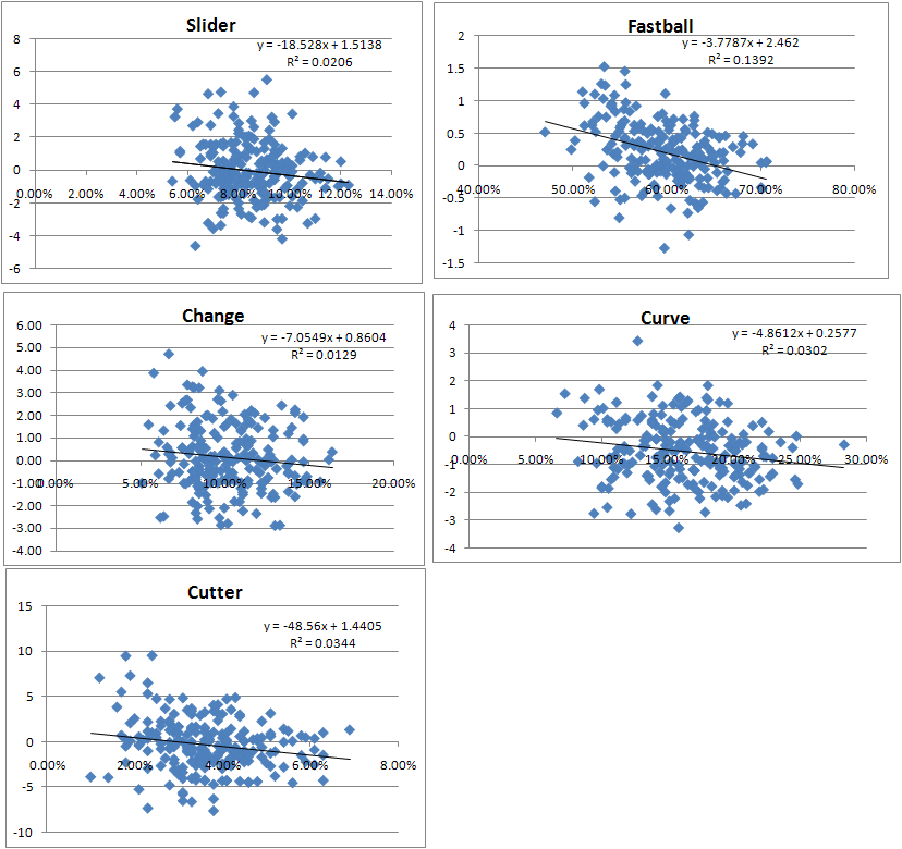
As you can see, the RAA per 100 pitches and the percentage of pitches seen have basically no relationship for sliders, cutters, change-ups, or curve balls. For fastballs there is a weak relationship, showing that hitters who get fewer fastballs are better at hitting them. From a game theory perspective it shows that pitchers could throw even fewer fastballs than they do already to good fastball hitters (there may be other factors to consider besides just optimizing the outcome of each individual pitch, however, so there may be other good reasons why pitchers would continue to throw fastballs to a good fastball hitter).
Overall, this has been a somewhat sprawling piece on a tricky topic, so I'll sum up. Looking at the evidence, it appears that when trying to identify a hitter's strengths and weaknesses against particular pitches, looking at how he actually did against those pitches is not a particular useful measure. More indicative is the frequency which a batter was thrown each pitch. The better a hitter is against a particular pitch, they less often he will see it. This entire issue of selection bias is an important one to consider, especially when doing pitch f/x analysis or other pitch-by-pitch studies.
| Behind the Scoreboard | March 23, 2010 |
Stakeholders - Kansas City Royals
From now through the beginning of the regular season, we will not be posting in-depth round-tables previewing each division like we have in years past. Instead we will feature brief back-and-forths with "stakeholders" from all 30 teams. A collection of bloggers, analysts, mainstream writers and senior front office personnel will join us to discuss a specific team's hopes for 2010. Some will be in-depth, some light, some analytical, some less so but they should all be fun to read and we are thrilled about the lineup of guests we have teed up. Today it's Joe Posnanski on the Kansas City Royals.
Sky: Honestly, how difficult is it to be a Royals fan right now? They've been arguably the least successful franchise over the past 15-20 years, and they aren't showing a ton of upside right now either. Additionally, being someone who appreciates that sabermetric side of the game, how frustrating is it to watch the Royals continue to make moves which seem to run counter to that style of thinking? Of course anything can happen in baseball, but do you see Dayton Moore ever turning this ship around?
Poz: OK, let's see here ... I think it's pretty difficult being a Royals fan right now, but I'm not sure that it's easy to separate how much more or less difficult than it has been the last decade or more. The bad tends to blur together. It has been youth movement followed by veteran leadership followed by youth movement followed by veteran leadership for about as far back as most people in Kansas City care to remember. The Royals are currently in the "veteran leadership" stage of their development, and they hope to follow that in the next couple of years with another "youth movement." So, it at this point it all just feels like it's part of the natural cycle of things.
I think that is disappointing for people -- the hope really was that Dayton Moore would turn things around. And he may. The Dayton Moore plan, unquestionably, revolves around acquiring talent and developing it in the minor leagues. Good scouts. Good instructors. The Royals have spent a lot of money on the draft the last couple of years, and they have been real players in signing top young guys in Latin America. They spent 7 million -- an almost unfathomable amount of money in Kansas City -- to sign Cuban pitcher Noel Arguelles. That speaks most directly to the Dayton Moore plan.
Unfortunately, not one of those young players has emerged quickly ... so people keep HEARING about the plan (or "the process" as people have bitterly started to call it) but they're not SEEING any improvement. While the Royals believe their future is strong with prospects like Eric Hosmer and Mike Montgomery and Aaron Crow and several other young pitchers, the fans are seeing the team sign retreads like Jason Kendall and Scott Podsednik and even Rick Ankiel. It's just hard to convince anyone that you're heading in the right direction when you are spending spring training trying to figure out what Jose Guillen's role is for the team. I think Dayton Moore has proven, pretty convincingly, that he is not overly gifted at the miracle work of building a major league roster with dazzling trades and brilliant free agent pickups. But that's not really his reputation nor his purpose. He's a draft and develop guy. And, a lot of people I talk with like what the Royals have done there, even if it hasn't yet paid off.
I think the sabermetric thing with the Royals is interesting ... it DOES seem, with Rob Neyer and Rany Jazayerli and, of course, Bill James, that the Royals fan base has a higher percentage than its share of saber-inclined fans. I don't know if that's really true, but it seems that way. And the Royals have been rather openly hostile toward some saber ideas such as the idea that defensive value can be quantified. So it does seem like there's a clash there ... I have written about how difficult it is to root for a team, in any sport, that has a philosophy that goes counter toward your own as a fan. But I think, more than anything, the Royals are just treading water and have been for some time now. Prospects, real prospects, do seem to be on the way. The launch dates for those propsects should begin later this season and in earnest at the beginning of next season. Until then, I'm not really sure anything really counts.
Sky: That's a great take. Even if you blow a few free agent signings like Guillen, it's easy to paper over those mistakes if you've got a great drafts and a great farm system. We'll see if those guys develop. One of those guys DID develop, in the form of Cy Young Zack Greinke. Do you see him as a future Hall of Fame-type pitcher? And do you see him wearing a Royals cap? He's signed to a very reasonable deal through 2012, after which he'll be a free agent. If the Royals can't reasonably contend before then, is there any scenario in which you consider dealing him?
Poz: Well, I'm one of the world's leading exporters of Greinke tributes, so I suspect I'm not the most unbiased source on the subject. I predicted he would win the American League Cy Young Award last year, which has to go down as one of my best-ever predictions. By the way, I'm picking Colorado's Ubaldo Jiminez to win the N.L. Cy Young this year -- not as much of a reach, probably, but I see many of the same things.
Anyway, Greinke -- with his stuff and his pitching mind, I think he can be a big star year after year after year. He has a flawless delivery, a mid-90s fastball, an assortment of great secondary pitches and spectacular command. A lot of people around the country seem to misunderstand him ... they think, because of the issues he has had with social anxiety, that he is somehow unconfident or unmotivated or something. Nothing could be further from the truth -- I think of the great line Richard Ben Cramer line on Ted Williams, something to the effect of: "The roar with which he speaks has nothing to do with his hearing. It's your hearing he's worried about." So it is with Greinke; he doesn't have any doubts about his own ability; it's other people who irk him. He's extremely confident, extremely competitive and extremely driven. His change-up showed new life at the end of last year; with a good change-up, Greinke is just scary good.
The question about him staying with the Royals is an interesting one ... here's my take. I think Greinke would be perfectly content to stay with the Royals his whole career if the team was winning. I think he's comfortable with Kansas City, comfortable with the media setup, comfortable with the people in town. He signed an extension with Kansas City -- and at what now looks like a very reasonably price-- because if he has his choice, he would prefer to stay in town. I suspect he has no real interest in pitching for the Yankees no matter how much money they offer.
But he absolutely will not stay if the Royals don't show some real, tangible signs of improvement. I know that's true. Losing wears on him. I know there were some people around the country who thought that he should have been docked Cy Young points because he didn't pitch in meaningful games. But I think if he HAD pitched in meaningful games, he would have been even better. I think he craves pressure and enjoys the big moments. So, if the Royals are looking hopeless in 2011 and 2012, then yeah, I would expect him to leave. The Royals have to prove to him that they're on the right track.
If it becomes clear that the plan has failed and that Greinke is leaving then, sure, a trade might be the only viable option. But the Royals have not done well in those trades. What they really need is for their young talent to start performing, for their old talent to move on, and for this team to start looking like a blossoming young team like the Rays a couple of years ago. If that happens, I think Greinke would stay.
Sky: You bring up a great point about Greinke's past and how that would make him likely unwilling to pitch for a big market, media-intense team like the Yankees. Statheads sometimes tend to ignore the mental aspect of the game, be it dealing with the media, "chemistry" with the other players, pressure from fans, etc. I do think that stuff is often overused by the media as to explain away variation in player performances, but in a case like Greinke's it can be a real factor. As someone who's been in and around MLB clubhouses for years, but also appreciates the statistical angle of the game, what's your take on how strongly the mental aspects of the game can affect player performance?
Poz: My basic take on it is that for so long -- for SOOOO long -- baseball fans have been hammered with a whole lot of the mental stories from sports. And I suspect a lot of them were pretty specious. Of course, there's a whole lot to the importance of a players mental approach, but for years and years all you ever seemed to read was that players were successful because they were somehow superior human beings, teams were successful because they were marvels of chemistry and so on. I mean, that was pretty much you read about baseball anywhere for about 80 years.
So, I think it was revolutionary -- and a great thing for baseball fans -- when Bill James and others came along to ask what now appear to be obvious questions. Who says pitching is 75% of baseball? How do we come up with that number? Is it really possible for hitters consistently to be better in clutch situations than they are in non-clutch situations? And, if so, what does that say about them? (It was actually John Updike who asked this question first, I believe). Do the players on the best teams really get along better than the worst teams? And if they do, is that why they are successful? Why does batting average exclude walks? Why are starting pitchers credited with entire team victories? Do they really win the games? If they don't win, is it because of their own failings? And so on and so on and so on. And I think that as the answers came back -- and many the answers seemed pretty lacking -- that more questions came in and more unconvincing answers came out and so on.
Now, people do wonder if it has swung too far the other way ... have people started to discount entirely the mental aspect of baseball, the chemistry aspect of a clubhouse, the importance of a players approach, and so on. In some ways, I think it's probably true. You can't say the word "leadership" without making a whole segment of baseball fans laugh -- and I fall for this myself from time to time -- and yet I think we all believe that there IS something to leadership. These obviously are human beings involved with the various strengths, frailties, overconfidence, doubts that we all have. I have seen that in the clubhouses, I know it's true. And I think the mental aspect of baseball is extremely important and fascinating ...
I guess I think the problem for me is that people tend to oversimplify things -- tour search for easy answers. This guy failed because he couldn't handle the pressure. That guy succeeded because he's got great intestinal fortitude. This other guy couldn't handle the pressures of New York. That other guy hits better when there's no pressure. And all the vice versas. I just think it's a lot more involved than that.
Sky: I think you put it nicely. Like many things (like clutch hitting, etc.) sabermetrics has shown that the effect of those things is a lot smaller than people used to think, but though the effect is small, I really don't think it's zero.
Moving on to someone who has no problem with the mental aspect of the game, let's talk about one of your favorite players, Brian Bannister. He's probably one of the most sabermetrically inclined players in the majors. Do you see players like him becoming more widespread and how much do you think his style of thinking helps in actually playing the game?
Poz: I do think more and more players will study their own advanced stats because players always have and always will look for an edge. And it's possible that studying your own stats will tell you something about your game that you did not know. There is actually quite a long history of players who studied their own stats closely. Steve Garvey, for instance, had this rather involved formula he used in order to get 200 hits -- which, at the time, was viewed as some sort of holy grail. Pete Rose could always tell you his numbers -- against lefties, righties, night, day, on turf and so on. Baseball is such a mental game and such a confidence game ... I think it's likely that as the advanced stats become more circulated, players will use them to build up their confidence.
With Banny, it's interesting, a lot of people think that his statistical study actually hurts him, that he thinks too much on the mound. He's a tinkerer by nature, and the feeling among those critics is that he needs to think less and throw more -- the Nuke Laloosh style. My own feeling is that there's a balance between thinking and doing -- I do think Brian tied himself up in knots in 2008 -- but I remain convinced that Brian Bannister is pitching in the big leagues because of his mind. He doesn't throw hard and doesn't have great secondary pitches and his arm tends to tire late in the year. But he has some good late-breaking movement on his fastball, and he has good command, and he's constantly breaking down things so he comes into games with a good plan and a good sense of what he's doing. The guy's really smart. He pitched very well his first 20 starts in 2009 before he started to wear down ... he has spent a lot of time in the off-season working on his conditioning. That's what I think he does with his study of advanced stats -- see a problem, attack the problem, see a weakness, develop a counter strength. In the end, you need talent to play baseball at the Major League level -- no doubt about that. But I think studying the numbers the way Brian does can certainly bridge the talent gap.
Sky: This has been great Joe. Thanks a lot for taking the time to answer so thoughtfully. One last question - it may be the most challenging: Is there even one silver lining in having Yuniesky Betancourt in the line-up this season?
Poz: Silver lining with Yuni. No.
Ha ha, I jest. If there's one thing that you can say about Yuniesky, it is that until last season he had been very durable. I know that sounds like faint praise, but I don't mean it that way. He played in 153-plus games three years in a row ... even last year, with his issues, he played in 134 games. That means the last four years, he has played in 599 games at shortstop -- only six shortstops in the game have played in more (believe it or not, Orlando Cabrera has actually played in the most games at shortstop the last four years).
So what does this mean? It means that for all Betancourt's failings -- his statuesque range to his left, his pathological need to swing at anything he sees, his unique ability to put outs in play, and his occasional lapses into daydream land -- history suggests he will be out there playing every day. And because he will be out there playing every day, he will do some good things -- bang 8 to 10 home runs, maybe, make a few dazzling plays, put enough balls in play to hit .275 or .280, come through in the clutch now and then. And because he will do some good things, people will say, "Hey, he's not that bad." And because people will say "Hey, he's not that bad," the Royals will be able to keep him out there without too much grief while they wait for one of their young players to develop.
That's the important thing to remember about the Royals: They are not trying to win this year. Oh, they are trying not to lose -- that's what the Betancourt trade was about, that's what the signing of veterans like Podesdnik, Ankiel and Kendall was about -- but trying not to lose is not the same thing as trying to win. The Royals future is tied up in a wave of prospects that should be hitting Class AA this year. They Royals would like to believe that with the veteran experience they've brought in -- and Betancourt is part of that -- they can win 75-81 games and take a step forward. Well, 75 wins is on the high end of my projection scale, but the larger point remains: This year is a holding pattern year. Yuniesky Betancourt is a holding pattern player. I was (quite demonstrably) peeved when the Royals traded for him because he was possibly/probably the worst every day player in the American League in 2009. But my feeling now is that the Royals just need to GET THROUGH the 2010 season, and Betancourt should help them do that.
I wonder if that comes across sounding like a silver lining argument.
Sky: Thanks again Joe. Best of luck to you and the Royals in the 2010 season.
Joe Posnanski is a Senior Writer at Sports Illustrated. He was sports columnist at The Kansas City Star from 1996 to 2009, and during that time he was twice named the best sports columnist in America by The Associated Press Sports Editors.
| Behind the Scoreboard | March 16, 2010 |
Franchise Strengh Index History for All 30 Teams
Apologies for the short post today. Recently, I presented a model of predicting attendance for major league teams. Last week, I presented "Franchise Strength Index", an index measuring the strength of the franchise controlling for the quality of the team on the field, new ballparks, playoff appearances, etc. Essentially, the Franchise Strength Index is just the residuals of the attendance model. A Franchise Strength Index of greater than 1 indicates the team draws better than one would expect, while an index less than one indicates a weaker franchise that is drawing fewer fans than expected.
In response to some readers, I've decided to present graphs of every MLB team's Franchise Strength Index throughout their history. What follows are the graphs, followed by a few brief comments. Last week many commenters made some great observations concerning the expansion era moves and I encourage people to do the same here.
Notes:
- The Tigers used to be one of the power franchises in the MLB. Now, even though they are sometimes considered "small-market", they rate as about average.
- The last few years aside, the White Sox have franchise strength has steadily declined since the Black Sox era.
Interesting Notes:
- The Orioles were actually the AL East's strongest franchise during the 1990's and 2000's.
- The Red Sox actually haven't been all that strong throughout their history (recent history should be disregarded however, since the Red Sox have a small ballpark that has reached capacity).
- The Yankees brand actually fell below average in the early 1990's.
Interesting Notes:
- Despite playing second fiddle to the Dodgers, the Angels are still a tremendously strong franchise.
- The Mariners popularity increased dramatically with the presence of Ken Griffey Jr. and was further cemented by the 1995 team.
Interesting Notes:
- The Cubs are the strongest they have been since the 1920's.
- The Cardinals franchise benefited tremendously from the St. Louis Browns leaving town.
- The Pirates are actually in a stronger position now than they were when they were winning in the 1970's.
Interesting Notes:
- The Mets of the 1960's were baseball's most popular team ever relative to their performance.
- Despite their big market reputation, the Phillies don't have tremendous attendance. Veteran's Stadium was one of the biggest ballpark boosts ever received.
- Florida's in real trouble and has been for some time.
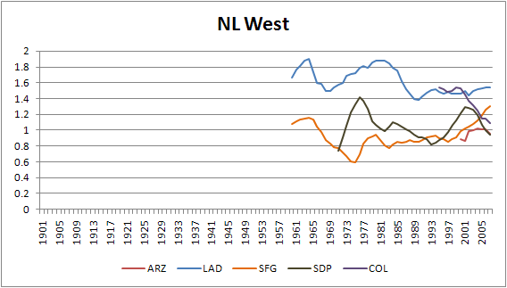
Notes:
- The Dodgers are bar-none baseball's strongest franchise.
- The Rockies started as one of baseball's strongest expansion teams, but have fallen considerably.
Thoughts?
| Behind the Scoreboard | March 10, 2010 |
Moves of the Expansion Era
Last week I wrote a piece explaining a model of major league attendance through history. The important drivers of fan attendance turned out to be the team's winning percentage over the past three years, as well as its recent playoff experiences. Being an expansion team or having a new ballpark helped as well. Not surprisingly, even when accounting for these factors, there was still a fair amount of variation between teams - the Pirates and Yankees don't draw the same even when all other factors are equal.
Looking at a team's innate ability to draw fans apart from it's success on the field was one of the impetuses for coming up with the model. I was curious to look at how teams' attendance fared compared to their predictions. Teams which consistently outdraw their predictions based on WPCT, playoff appearances, etc are obviously very healthy clubs with strong fan bases. Teams which consistently draw fewer than they should are teams which are struggling as a franchise.
I created an Franchise Strength Index based on the residuals of the model. The index was defined as Actual Attendance/Predicted Attendance. The index attempts to tease out the strength of the fan base while controlling for factors such as whether the current ballclub is good or bad. Teams that drew more than expected are strong franchises and have an index greater than one, while weak teams have an index less than one. The graphs below are of the 5-year moving average of the Franchise Index.
Using this index, I'll look back and rate the franchise relocations which took place during the expansion era. Did moving the Dodgers from Brooklyn really make the team more prosperous? How about when the A's moved out of Philadelphia? Without further ado, here are MLB's moves and how they've fared.
1957: Brooklyn Dodgers move to Los Angeles
In one of the most maligned franchise relocations of all-time, Walter O'Malley broke hearts all over Brooklyn when he demolished Ebbets Field and moved the Dodgers to the west coast. To hear old Dodgers fans talk, one would think that Brooklyn sold out every game and that there was no reason for the move. A look at the graph below shows that after a mediocre first 20 years as a franchise, the Dodgers did become one of the premier draws in the National League through WWII, despite being a fairly poor team for much of that time. During this period, Brooklyn drew nearly 50% more fans than a comparable team would have. However, after the war, for whatever reason, attendance dropped. The team was very good, but attendance was not as high as one would expect. During the 1950's Brooklyn drew only about 90% of their expected attendance.
Hence, the move west. The move was a smashing success as the Dodgers - according to the Franchise Index - currently enjoy the best fan base of any team, including the Yankees. During their time in LA, they've drawn over 70% better than a comparable team in another city would draw. Today, that figure has dropped to 50%, but it's still the best in the baseball.
Had O'Malley decided to stay in Brooklyn, the closest comparable team would be the New York Mets. The Mets clearly draw better than average and they currently draw about 40% better than the average team - one of the best in baseball. It's clear the Dodgers likely could have continued to have success in New York, but as the graph shows, the LA market is an even better place to be.
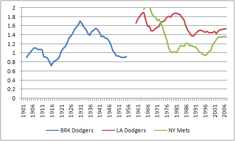
Verdict: Great Success
1957 New York Giants to San Francisco
Of course, the Dodgers move was accompanied by the Giants, who moved to San Francisco that same year. The Giants were a consistently popular team through WWII, drawing 20-40% better than the average club. However, like the Dodgers, their attendance strangely dropped after World War II. During the 1950's the Giants were a good ballclub, but their attendance didn't seem to get the boost you would expect (does anyone have any ideas on why New York baseball experienced a drop in popularity during this era?). For the first time in their history, the Giants became a below average gate draw relative to their performance. It was enough to make them move to westward.
Did the Giants move have the same success as their fellow New York team? Not nearly. Until the past few years, the Giants have consistently underperformed at the gate. Throughout most of its history, the San Francisco Giants have drawn more poorly than even the darkest days in the New York era. Pac Bell seems to have helped remedy that (and I'm sure the end of Candlestick Park played no small role in that as well) and the Giants are now a strong market. Still, compared to what might have been had they stayed in New York, the Giants did not do well for themselves. Compared to New York's new National League team, the Giants have clearly performed much worse.
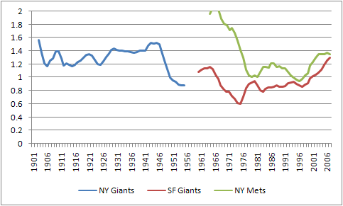
Verdict: Major Mistake
1953: Boston Braves move to Milwaukee
In 1953, the Boston Braves, long one of baseball's sorriest teams, moved west to Milwaukee. Except for a brief period in which they managed to draw decently despite being terrible in the 1930's, the Braves consistently underperformed at the box office, with an Franchise Index of just .80. Being bad so long, doesn't do wonders for morale, however things didn't change after winning the NL pennant in 1948. By 1952, they were drawing just 70% of expected attendance.
Fans in Milwaukee were thrilled to get a new team, and the Milwaukee Braves were wildly popular, drawing 40% more fans in their first years than expected. However, this quickly wore off, and despite going to back-to-back World Series in 1957 and 1958, they began underperforming. Still, the situation was never dire. The year before they left, their attendance index was .90, worse than average, but still respectable. When the team announced they would be leaving for Atlanta the following season, fans boycotted the team and their attendance predictably plummeted. The Braves popularity in Milwaukee had surely declined as time went on, but they were still a respectable franchise. In all, the Braves time in Milwaukee was far more successful than it had been in Boston, making the move a good one.
Verdict: Success
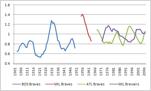
1966: Milwaukee Braves move to Atlanta
Much to the ire of Bud Selig, in 1966, the Braves moved to Atlanta. Since the Braves were still doing well in Milwaukee, it was a risky move. Did it pay off? The graph above shows mixed results. The Braves, by and large, have been less successful than they were in Milwaukee. They've fluctuated largely between drawing about average, which they did at their high points in the early 1980's and early 1990's, to drawing about 80% of expected. Despite dominating the National League for over a decade, Braves fans didn't turn out in droves like you would expect.
We can see what might have been by looking at the success of the Milwaukee Brewers. In all, the Brewers and Braves have had about the same franchise strength over the past 40 years, each having a Franchise Index either fluctuating between 1.0 and 0.8 during course of their histories. Overall, the move was probably a wash, with Milwaukee debatably being a slightly better market.
Verdict: Wash
1961 Washington Senators Move to Minnesota
The Washington Senators were never one of baseball's premier clubs. A look at the graph below shows that they always were one of baseball's lower drawing clubs, consistently drawing only about 80-90% of what other teams would have done. After World War II, the situation got worse, and attendance dropped to just 70-80% of the expected gate. So, in 1961, the team's owners decided to pack up and leave for greener pastures, heading to Minnesota and renaming the franchise the Twins. The move started as a great success. The Twins drew better than most new teams, and it looked as though the move to Minnesota might pay big dividends, especially when the team went to the World Series in 1965. It wasn't long however, before the city became bored of the team and attendance once again dropped to just 70% of the expected gate. Recently, the Franchise Index has increased to .80 or .90, but Minnesota is still a struggling market. The overall effect of the move was negligible. Aside from the first few big years, the team drew about the same as it had in Washington. The new Washington team has drawn better in its first five years than the Twins franchise, leading one to wonder if they shouldn't have just stayed there all along. Overall, the move was pretty much a wash.
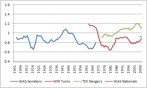
Verdict: Wash
1973 Washington Senators Move to Texas
In one of the stranger moves of all-time, baseball allowed the Senators to move to Minnesota, but then thought enough of the Washington market to allow them an expansion team. As it turned out, the new Senators drew about as well as the old Senators. Who knew? Still, drawing just 80% of expected attendance is probably not what the new owners had in mind. So, the team packed up for Texas, to become the Rangers. As you can see from the graph above, the Rangers became quite a strong market team, despite not winning a lot of games. After a slow start, they've consistently drawn more fans than expected. Currently, they're certainly in a better position than the Washington Nationals, and are clearly in much better shape than when they left Washington in 1973.
Verdict: Success
1955: Philadelphia A's to Kansas City
The Philadelphia A's were one of baseball's more successful teams. The franchise had its ups and downs (interestingly, the team drew worse than expected when they were winning, but better than expected when they were losing), but overall tended to draw better than the average team. They certainly drew better than their cross-town rival Phillies. However, after WWII, their attendance began to plummet. By the mid-1950's they were drawing just 60% of their expected attendance. With Connie Mack running the franchise into the ground, the team was moved to Kansas City. When the team moved to KC, they were more successful than most new teams. Even after the newness wore off, Kansas City remained at least an average market for a major league club - a vast improvement over their abysmal gates in Philadelphia. The move certainly had to be deemed a success, though proper management in Philly probably shouldn't have made the move necessary at all.
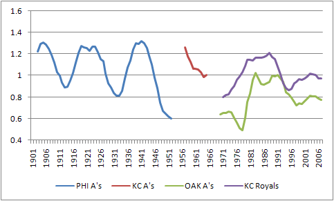
Verdict: Success
1968: Kansas City A's to Oakland
Apparently, being an average market team wasn't enough. Once in Kansas City, the Charlie O. Finley started looking around for a new home which would earn them even more revenue. Perhaps he had not seen that the San Francisco Giants were struggling at a below average clip themselves. It wouldn't take a genius to see that adding another team to that market wouldn't be the smartest of all ideas. But nevertheless, the White Elephants moved westward once again. Oakland did indeed prove to be a tough market. Throughout much of their time there, they have hovered at around 80% of a typical team's gate. They stand today as the team with the 2nd worst fan base (behind the Florida Marlins). Meanwhile, the Royals are about at the middle of the pack. KC hasn't put a good product on the field for quite some time, but once we account for that, the fans come out at an average rate. Overall, the A's would have been much better off staying in Kansas City, and perhaps even sticking it out in Philadelphia rather than moving to the already saturated San Francisco market.
Verdict: Major Mistake
1954: St. Louis Browns to Baltimore
The St. Louis Browns hold the distinction of being the saddest team of all time, but this wasn't always the case. St. Louis was actually a "Browns Town" for the first 20 years of the 20th century and they were a more popular than average team. However, after the Cardinals success in the 1920's the Browns popularity faded tremendously. By the 1930's they were drawing just 40% of their expected attendance. It's surprising that the team stayed as long as it did. An NL Pennant in 1944 was nice for long suffering fans, but there were too few of them to make a difference. By 1954, it was time to move east to Baltimore.
The Orioles started off slowly, and for a while it looked as though the Orioles might become just as unpopular as the Browns. Despite having a good ballclub, during the 1970's they drew just 70% of what most teams would have drawn. However, the championship 1983 team with Cal Ripken put them back on a popular path. Since then they've become one of baseball's strongest and most popular teams, drawing 40% more than one would expect. However, Peter Angelos may have had a legitimate point when protesting the Washington Nationals move from Montreal. Since the Nats came to town, the Orioles' Franchise Index has dropped to 1.2. This still makes them one of the most popular teams in baseball, but they're now at the lowest point since the early 1980's.
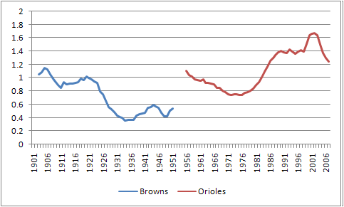
Verdict: Major Success
2005: Montreal Expos to Washington
When the Expos started in Montreal, they were one of baseball's hottest teams. Drawing better than most expansion teams, they slowly declined under poor ownership. They were still a stronger than average team through the mid-1980's but went downhill fast from there. Their attendance slowly declined from there until hitting the low point at just 50% of expected attendance in their final years in the league. With an attendance index of just 50%, they were the second least successful team in the history of baseball, falling behind only the St. Louis Browns. Obviously something had to be done, and playing in Puerto Rico was not a long-term solution. The move brought baseball back to Washington. While the Nationals attendance has been worse than average thus far, the franchise is far healthier than it was in Montreal. This move was a success - not because Washington has been so wonderful, but simply because the team needed to get out of Montreal.
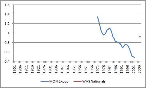
Verdict: Success
Who's next?
Which team might be next? The average Franchise Index of a relocated team was .78 at the time of departure. Do any of today's teams meet this threshold? The Florida Marlins currently have the lowest Franchise Index at .67, meaning they draw just 67% of what a team in a comparable position might draw. They've been below 70% for the past 7 years, indicating major trouble in Florida. They are not yet in St. Louis Browns or Montreal Expos territory, but they do have similarities to the Boston Braves or Philadelphia A's. To be fair there have been other teams in nearly as much trouble that have survived. The Giants and Orioles in the 1970's, the Pirates in the 1990's, and the White Sox in the early 2000's are a few such examples. The Giants and Orioles are now quite popular and the White Sox are averagely so. So there is hope.
When Florida gets its new stadium, it will be interesting to see if they get the expected attendance boost or whether they continue to fade into obscurity. The next most troublesome teams are the Oakland A's and Tampa Bay Rays, which each are currently drawing 78% of expected attendance. While this is probably out of the danger zone, it's not great news for these teams either. Rounding out the bottom 5 are the Cincinnati Reds and the Pittsburgh Pirates, though they are drawing 86% and 88% of attendance, which is certainly respectable.
| Behind the Scoreboard | March 02, 2010 |
What Puts Fans In the Seats?
One of the important questions to team management is how to put fans in the stands. Obviously winning ballgames helps, but the question is how much and in what way? Using data going back to 1950, I set out to create a model to help answer this question.
Attendance has varied wildly from baseball's inception. In 1950, the St. Louis Browns drew just 3,300 fans per game. Meanwhile, teams now routinely draw more than 10 times that amount. Clearly the shape of this data is not going to be linear. To deal with this, I transformed the data by taking the log of the per game attendance and used that to build my models.
There were several things I wanted to test out. For one, what is the relationship between attendance and WPCT in a particular year? What relationship is there for the previous year? Did it matter if the team made the playoffs? How about if they made the playoffs the year before? How about if they had recently won the World Series? How much did a new park affect attendance, and how long did it take before this effect wore off? Likewise with a team that just moved to a new city?
These were all questions I wanted to find out. I decided to get a little more rigorous than usual and create a mixed model to tackle some of the assumptions that might be broken by using a plain old general linear model. Obviously attendance varies by team as well as by the factors above. However, to get at the questions above we don't really care exactly what the effect sizes are for each team. The mixed model allows us to model this "random effect" of different attendance baselines by team. The mixed model also accounts for the fact that the errors are likely to be correlated from year to year by team. By accounting for this autocorrelation, we can get a better model. These changes have the advantage of more properly estimating the variance and standard errors of each of the variables that we care about.
So enough with the stats, what was important?
Winning Games
For one, not surprisingly, team winning percentage is very important. The average .500, non-playoff team that does not have a new park or any other advantages draws about 24,500 fans. Every extra game won adds about 300 fans per game. Of course, the relationship is not linear, but that's an approximate estimate. All else being equal, a .400 team will draw about 20,100 fans, while a .600 team will draw 29,900 - difference of about 10,000 fans per game. Obviously, winning teams draw more fans and the effect is quite large.
But, that's not even the half of it. As you might expect, the team WPCT from the year before also has a very large effect. This effect is not as large, but a .500 team who was a .400 team the year before draws 22,700, while a .500 team who was a .600 team the year before draws 26,400. This "year before" effect makes sense. At the beginning of the season, fans don't really have an idea if their team will be good, so it makes sense that they use last year's performance as a guide. The previous season's success draws fans back to the park, even if that success isn't repeated the following year.
The effect of winning continues up to two seasons later. As you would expect, however, the effect is smaller. Having a .600 team three seasons ago only puts about an extra 500-600 fans in the seats per game. However, this effect is statistically significant.
The chart below shows how the modeled effect of a team's WPCT is diminished as time goes on. The chart assumes that the team went .500 in all other years and that the team did not make the playoffs.
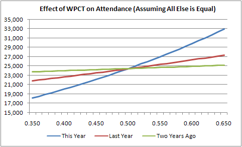
While WPCT obviously helped attendance overall, I was also curious to see if the slope of the lines changed depending on whether the team was over or under .500? Did an extra win provide different attendance value to a .450 team vs. a .550 team? I refit the model to test this out and found there was no significant difference. The relationship between WPCT and attendance was the same whether the team was good or bad. While of course an extra few wins won't help a poor team get any closer to a championship, it will help at the box office, and the attendance effect of those wins is just as important to poor teams as to good teams. Next time you deride a bad team for "wasting" their money by signing a free agent when they have no chance of winning anything, realize that the difference between stinky and mediocre can have a strong effect at the box office, even if it won't win any flags.
Making the Playoffs
Of course, that's without accounting for the attendance draw of being a playoff team. How does making the playoffs affect attendance? In general, a .550 team which did not make the playoffs will expect to draw 27,000, while a .550 team who did make the playoffs can expect to draw an extra 1,800 fans. Of course, this isn't an exact correlation. Whether a team makes the playoffs on the last day of the season has little effect on their average attendance for the year. However, the playoff effect is a proxy for the excitement surrounding the team being involved in a pennant race, and that's why it's included in the model.
How about the effect of making the playoffs the year before? As you might think, that has an even greater effect. Making the playoffs the year before raises a .500 team's attendance by about 3,000 fans per game - a major boost. Obviously making the playoffs raises hype around the team, and this appears to manifest itself in the form of increased attendance.
There are also significant interaction effects surround making the playoffs. Here we see evidence of a significant diminishing returns for playoff appearances. If you made the playoffs last year, making the playoffs this year won't create the same excitement as it might have had the team been experiencing success for the first time. The graph below shows expected attendance depending on when teams made the playoffs.
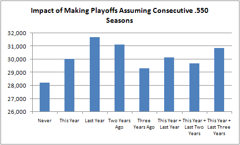
The first four bars on the graph above gives expected results. The effect of having made the playoffs diminishes over time. However, when teams make the playoffs multiple times in a short span, the results can be counterintuitive. The biggest oddity is that among teams who made the playoffs last year, attendance is higher for teams who miss rather than make the playoffs the following year. To me this doesn't make a lot of sense. The only explanation I can come up with is that a team coasting to a second straight playoff appearance might draw less because its fans will think "I'll watch 'em in the postseason", while fans may be more apt to come support a contender who fights for, but ultimately fails to earn a postseason spot. However, this explanation seems like a reach.
While I'm skeptical that making the playoffs can actually ever be a hindrance to attendance, the data definitely support the conclusion that multiple playoff appearances don't help attendance much more than just one playoff appearance. Simply put, making the playoffs isn't such a big deal after it's been done already. The data are an indication that fans can become bored with persistent winners (are you listening Braves?) and that excitement reaches a kind of maximum level which can't be exceeded no matter how successful the team has been in recent years. Of course, winning multiple years in a row is still better than never making the playoffs at all, as the chart above shows.
Winning the World Series
Winning the World Series has an effect, but it's not as strong as you might think. A .500 team which finished with a .600 WPCT last year and made the playoffs is expected to draw 28,100 fans. If that team also won the World Series last year, the expected attendance increases to 29,700. This increase of about 1,600 fans is significant, but it won't make or break the franchise. Additionally, the World Series effect lasts only for the year directly following the World Series victory. While winning a championship is every team's ultimate goal, it appears that making the playoffs has a stronger attendance effect than actually winning it all. As for appearing in the World Series, but not winning it, no statistically significant effect was found. Likewise for advancing beyond the first round of the playoffs.
A New Ballpark
None of these effects are as large however, as the new park effect. A look at its effect on attendance shows why every team has been clamoring for a new stadium. A regular, .500, non-playoff team usually draws 24,500. When the same team gets a new stadium, their expected attendance increases to 33,600. That's nearly a 10,000 fan per game increase! It's also a gift that keeps giving. The new park effect has a statistically significant effect for the next 10 years. The graph below shows the new park's effect on attendance. Adding all of the expected attendance increases over 10 years shows that the new park boosts attendance by about 4.5 million visitors. No wonder Selig and company have been so obsessed about building new ballparks.
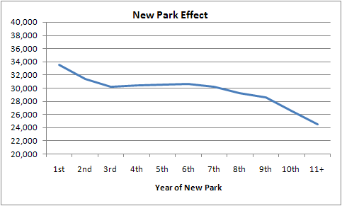
One other caveat is that the effect of the winning is diminished during the first year of a new ballpark. Fans are apt to come out to see the park no matter whether the team is good or bad, and the effect of winning (or losing) games is only about half as important as usual.
A New Team
The effect is even larger for being a new expansion team (or a team moving to a new city). A .500 expansion team can expect an increase of over 10,000 fans more than what another .500 team would expect to draw. However, the expansion effect lasts a bit shorter than the new park effect, lasting about four or five years before the novelty wears off. The chart below shows the expansion effects.
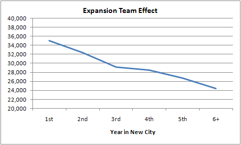
The Team Brand
Another important factor is the team "brand". The mixed model modeled the team itself as a random effect. In essence, it assumed that there may be differences between teams inherent abilities to draw fans. For instance, the Dodgers and Pirates may draw very different crowds even if the product on the field is the same. The model assumed that this core ability to draw crowds was a random, normally distributed variable. One of the tests the model performed was whether or not there really was a difference in inherent ability to draw fans between teams.
As you would expect, the model did indeed identify that this was the case. This inherent difference could be due to factors such as the team history, the city itself, the type of fans it has, the market size, and how well run the team is.
According to the model, the average team playing .500 ball, not making the playoffs, etc would draw 24,500 fans. However, some teams have an inherent ability to draw better than others. Teams that are one standard deviation better in this regard will have a "base" attendance level of 28,700. Teams two standard deviations above the norm have a base drawing level of 33,800. On the other end of the spectrum, teams one SD below the norm draw 20,700, while teams two SD's below the norm draw 17,500. As you can see this inherent difference in team brand can have a major effect on the attendance. Even when all other factors are equal, the actual team playing makes a big difference. Next week I'll be delving into specific teams and whether they are over or underperforming with regards to fan attendance.
Another team-specific factor we might be interested in is whether the effects of winning differ by team. By making team WPCT a random effect rather than a fixed effect, we can test this out. Do some fans respond to winning better than others? In Chicago, it's thought that Cubs fans come out no matter how the team is playing, while White Sox fans are more apt to support the team in proportion to its success. Do we really find this kind of varying effect of team success? The model finds no such thing. Each team's fans are about the same "fair-weatheredness", and each city responds to winning and losing in about the same way. How about when we do this same test for the "playoff" variable? Again, no effect. Each teams' fans seem to respond to making the playoffs in about the same way.
Conclusions
The conclusions have significant implications on team building strategies as well as what teams should expect at the gate. While its every team's goal to win a World Series, teams must turn a profit and keep their fans happy as well. Attendance certainly drives the bottom line and is also a key measure of fan happiness. Hopefully this model sheds some light on the what the main drivers of attendance happen to be. The full model is at the link below. If there's interest, hopefully I can publish a little calculator that can be used to predict attendance based on the key variables.
![]()
| Behind the Scoreboard | February 23, 2010 |
Spring Training, PECOTA, and the Regular Season
Over at Sports Illustrated last week, I wrote an article on how spring training records aren't all that meaningless. It's been a blast writing over at SI.com, but one of the downsides is that I can't delve into as much nitty-gritty as I can here. When I run a regression or do a study, I like to be able to report things like p-values, standard errors, and other things that baseball analysts use to assess a study's validity. I know it would be tough for me to take a study seriously without those kinds of metrics, so I'm going to provide some of that detail here. The discussion is particularly salient in light of Richard Lederer's recent criticism and discussion of PECOTA.
If you haven't read my original article, the point of my study was to determine whether spring training games had any predictive value at all. Like most fans, I was of the mind that spring stats and standings had pretty much no bearing on what will occur during the regular season. David Cameron had a piece over at Fangraphs saying as such last week (anecdotal evidence only though). I set out to find if this was true.
To measure the impact of spring training, I first needed a "gold standard" prediction. For this I used Baseball Prospectus' PECOTA projections. If spring training data could improve on PECOTA's predictions, I would feel confident in saying that spring training could really be worth a second look.
The Results
To do this, I did a regression analysis which tried to predict a team's season WPCT going back to 2003. Obviously the PECOTA prediction was one key variable. The second variable, which was of more interest, was whether a team under or over-performed in spring training, measured by (Spring Training WPCT - PECOTA WPCT).
The results of the model are below:
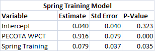
This gives the formula:
WPCT = .040 + (PECOTA WPCT) *.916 + (Spring Training WPCT - PECOTA WPCT) * .079
As we see, the spring training variable is significant and positive even when accounting for a team's expertly predicted WPCT. This means that indeed spring training records actually do have some predictive value and do add to our prior knowledge of a team's skills. As I wrote last week, the most surprising spring training teams should adjust their projections by about 3 games or so.
One important thing to note however is that while adjusting a team's projected WPCT by using spring stats is a statistically significant improvement, don't expect a huge boost in accuracy. The Root Mean Squared Error (RMSE) goes from .055 using only PECOTA, to .054 using PECOTA and spring training records. That issue is one that plagues any type of projection system. Even if you include things that really are important and really do increase accuracy, the net result is quite small. To drive home the point, PECOTA's .055 RMSE is not even all that much better than just predicting every team will go .500. The Everybody Plays .500 Projection System has an RMSE of .070.
PECOTA will be correct within 9 games 67% of the time, while the Everybody Plays .500 System will be correct within 11 games 67% of the time. The difference between one of the top projection systems and knowing absolutely nothing is not all that great. That's not a knock on PECOTA, it just underscores the fact that it's really difficult to predict what's going to happen. Knowing spring training records is an improvement, but it still leaves us relatively in the dark.
Do We Have to Regress PECOTA?
Another interesting thing I found in my research into this was that PECOTA's predictions may be overzealous. I had assumed that PECOTA did not regress to the mean in the 2003 and 2004 seasons, when they were predicting the Yankees to win 109 games. They said they did some major overhauls and I assume this was one of them. In my research above, I corrected this for them and regressed to the mean in '03 and '04. The problems were not nearly as bad in subsequent years and I assumed they had been fixed. However, they still seem to persist.
Unbiased predictions would cause a regression of PECOTA to WPCT to have a slope of 1 and no intercept. However, using just 2005-2009 data, we see that this is not the case. We see a quite significant intercept of .10 (p-value of .02). Meanwhile the coefficient for PECOTA is .8, where it should be 1. In essence, PECOTA has been too overzealous in its predictions. If it predicts a team to go 10 games over .500, the best statistical estimate is that the team goes 8 games over .500. When betting against PECOTA, it pays to take the under on good teams and the over on bad teams.
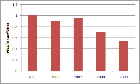
The chart above shows the PECOTA to WPCT regression coefficient, where the ideal is 1. As you can see, from 2005-2007, they accounted well for the regression effect. But in the past two years they've gone downhill. While luck can wreak havoc with any projection system, the problem is beginning to look a little more systematic. Looking at the 2010 projections, they seem to pass the eyeball test (Angels notwithstanding), but I'll be curious to see whether this problem persists in 2010 as well. As I showed above, it wouldn't hurt for them to use spring training stats in their projections as well.
| Behind the Scoreboard | February 16, 2010 |
There Are Two Types of Pitchers....
Two weeks ago, I used a principal component analysis to try to separate hitters into two distinct groups. The hitters broke down between "three-true-outcome" players like Adam Dunn (lots of homers, walks and strikeouts) and small-ball type players like Ichiro Suzuki (contact hitters with a lot of singles, but not many walks or homers). This week I'll attempt to do the same for pitchers. As I mentioned last week, the principal component anaylsis basically attempts to create a "component" that maximizes the variance between players. The created component will be the one metric that best differentiates between the players.
A principal component analysis depends greatly on the variables fed into it. For hitters, I used the singles, doubles, triples, homers, walks, and strikeouts per plate appearance as the input variables. While I could do that here, I thought I would use variables over which the pitcher had more direct control. Using Fangraphs pitch data, I used the following: % of Fastballs Thrown (including cutters), % of Sliders, % of Changeups, Velocity of Fastball, Ground Ball%, Walks per PA, and Strikeouts per PA. I thought about using Hits per PA, and HR per PA, but since those are largely a function of luck and I didn't want to measure that, I decided to leave them out. Like before, each variable was normalized before putting it into the model.
For hitters I was uncertain of what to expect, however for pitchers I had a fairly good idea. I expected that the two groupings of pitchers would be between power pitchers and control pitchers. However, I wasn't exactly sure how it would break it down. Running the analysis, the factor loadings for the first principal component were as follows:
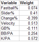
As it turns out, my intuition was correct - it does indeed separate pitchers into power pitchers and control guys. Higher scores indicate power pitchers. A pitcher's strikeout rate is the biggest determinant of his power score, followed by his velocity, and how often he throws his slider. Another indicator of being a "power pitcher" is walking more hitters. Predictably, pitchers who threw a lot of changeups had a lower power pitcher score. Meanwhile, somewhat surprising (to me, at least) was that whether the pitcher was a flyball or groundball pitcher didn't really make a bigger difference one way or another. I suppose I had expected power pitchers to throw high fastballs and hence give up more flyballs. With a coefficient of -.111, this was in that direction, but was not very strong. Also surprising was that the percentage of fastballs thrown was not a major factor.
So who were the top and bottom pitchers in terms of "power" score? Like last week, the scores were standardized to have an average of 100 and a standard deviation of 15. The top 10 power pitchers were all relievers, many of them very good. This is perhaps to be expected. After all, relievers have the luxury of being one-pitch or two-pitch pitchers, and hence they can throw harder and likely don't rely on the change-up. The number one power pitcher is Cubs reliever Carlos Marmol, who Richard Lederer has profiled recently. Marmol relies heavily on his slider, throws hard, and gives up a ton of walks, as well as getting his fair share of strikeouts. At #2 is the Dodgers' Jonathan Broxton, who throws a flaming fastball and strikes out a ton of hitters as well.
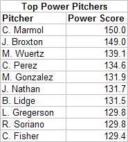
How about the "craftiest" pitchers? The leaderboard is below:
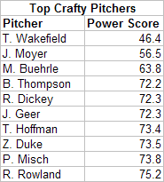
As you might expect, Tim Wakefield is the craftiest. Throwing no sliders, and only 10% fastballs at an average speed of just 72 mph, he's the direct opposite of Jonathan Broxton or Carlos Marmol. Jaime Moyer also is the quintessential "crafty left-hander". Righties can be crafty as well, with the Cardinals' Brad Thompson listed as the fourth craftiest pitcher, throwing very few sliders and not giving up many walks or dishing many strikeouts.
An interesting case is #7, Trevor Hoffman. Most closers are power pitchers, with closers comprising about half of the top 10 most powerful pitchers. Hoffman, used to be that guy, but he now has below average velocity and relies heavily on the change-up (he does still get his fair share of K's however, which is why he isn't listed higher).
With the top 10 power pitchers all relievers, you might wonder who the most powerful starting pitchers were. The list of leaders is below:
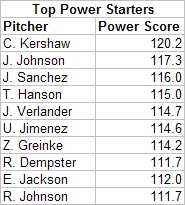
As you can see, it's a pretty exclusive group. While some of the power pitching relievers aren't necessarily all that effective, the top 10 power starters are all pretty much All-Star caliber. Apparently, if you're a starting pitcher who has the ability to pitch like a reliever for an entire game, you're going to be really effective. Sitting at #1 is the 21-year old phenom Clayton Kershaw. The biggest reason he's on the list is that he both strikes out a ton of batters and walks a lot as well. Couple that with a huge fastball, and you've got a true power pitcher. The rest of the list is a who's who of young, outstanding flamethrowers. The only exception is Randy Johnson, who can miraculously still pitch like a power pitcher well into his 40's.
Unlike the hitting breakdown, where three-true-outcome hitters were about as good as small-ball hitters, that wasn't true here. Here, power pitchers are clearly generally more effective than "crafty" pitchers. Not that there aren't effective crafty pitchers such as Mark Buerhele or Trevor Hoffman, but as a rule power pitchers are better. There's a reason that teams love guys who can throw hard. The results of the analysis wasn't too surprising, but it was interesting to see how the principal component analysis divided the pitchers into two groups. In theory, we could look to find other orthogonal traits by looking at the second and third principal components. However, as with the hitting data, I wasn't able to make much substantive sense out of the other components.
You can check out the full list of pitchers (with 50 or more IP) at the link below:
| Behind the Scoreboard | February 02, 2010 |
There Are Two Types of Players...
In this article, I'll attempt to finish the title's sentence by doing a principal component analysis on player statistics. Going into this I had no idea what I would find or whether the principal component analysis would find anything interesting at all.
For those unfamiliar with the type analysis, the point of it is to reduce a large number of potentially correlated variables down to a few key underlying factors that explain the variables. The researcher feeds the computer a bunch of records (in the this case, players) and several key variables (in this case, their statistics), The computer, blind to what those variables actually mean, spits out a set of underlying factors which explain the "true" underlying causes for the variables in question. It does this by maximizing the variability between the players. It's then up to the researcher to interpret what each factor represents. In this case, I'm looking for the one underlying factor that best describes a player.
In the baseball world, I wondered what one underlying factor best determined a player's statistics. Normally, this type of analysis would be done on many more variables, but I wanted to see what it would pick out from players' basic, non-team influenced statistics: 1B, 2B, 3B, HR, BB, K.
The principal component analysis spits out a bunch of factors, each with decreasing importance in determining a player's statistics. Only the first one really had much meaning to it, and with only six variables to analyze, this wasn't much of a surprise. The analysis attempts to differentiate players as much as possible, but the big question was how did it divide the players? It could have pitted good players vs. bad players, power hitters vs. contact hitters, patient players vs. free swingers, etc. But what happened?
In fact the factor loadings for the first principal component were as follows:
1B -.556
2B .132
3B -.259
HR .502
BB .382
SO .456
As it turns out, the analysis shows that if you want to put the players into two distinct camps, one camp (whose overall scores will be positive) is made up guys who hit with power, walk a lot, and strikeout a lot, while another camp (whose scores will be negative) is made up of guys who hit a lot of singles and triples and make contact.
I actually think this makes a lot of sense in describing a player's hitting style in just one number. While of course there are plenty of metrics out there to determine a player's skill and value to a team, there isn't a single metric that describes a player's playing style on a sliding scale. A Batting Style score using these values as weights does just that.
On one end of the spectrum are contact hitters, small-ball, Mike Scioscia/Ozzie Guillen type players who make their living with singles, triples, and not striking out much. The other end are Earl Weaver/Billy Beane type players who hit homers and draw walks. Which type of player a man is best determines his statistics. It's Moneyball vs. small-ball. This one number represents the spectrum of playing styles.
To get a Batting Style score for each player, we can simply multiply their normalized statistics by the weights above. Doing so gives a normally distributed set of players with a range going from about -4 to 4. To make the results a little more intuitive, I converted this to a scale where the average was 100 with a standard deviation of 15. Players with high scores are "three true outcome" type players while those with low scores play with the opposite style.
How does the Batting Style number look according to 2009 data? The top ten most extreme players of each batting style are shown below:
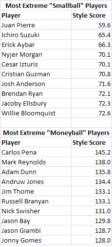
Now, it's hard to imagine a two more different sets of players. Everything that the first group of players does well, the second group does poorly, and vice-versa. Both sets have some good players and some bad players, and whether a player is good or bad doesn't much affect his Style score. Adam Dunn and Jason Bay provided good hitting value to their clubs, as did Jacoby Ellsbury and Ichiro, they just did it in different ways. A stat like wOBA tells you the value of a particular player. For instance, in 2009 Russell Branyan had a wOBA of .368 and Ichiro had a wOBA of .369. So they seem like pretty much the same player, right? Of course not. Ichrio and Branyan have two completely opposite styles of play. Ichiro has speed, gets a ton of singles and rarely homers, walks, or strikes out. Meanwhile Branyan's entire value is based on the long ball and the base on balls. The Batting Style score shows the immense difference between the two players. Branyan has the fifth highest Batting Style score, while Ichiro has the second lowest score.
Of course, not every player falls into one of these two types. Players who have a "medium" style can have moderate scores on each metric. For example, Ronnie Belliard does everything about average, hence his Batting Style score is about average. It also includes unusual players who don't fall into the usual patterns. Aaron Hill doesn't walk much or strikeout much, but he hits homeruns. Hence, his overall style falls in the middle. Meanwhile Bobby Abreu walks a lot, but also gets a lot of singles. Hence, he doesn't fall into either extreme either. The Batting Style doesn't discriminate based on the skill of the player, although as you might expect, guys who have the power/walk Batting Style are as a whole slightly more valuable simply because guys who hit a lot of homeruns and take a lot of walks, are generally more valuable than singles hitters, though the difference is not major. Guys on the contact end of the spectrum have a wOBA of about 10 points lower than guys on the power end of the spectrum. You can check out the full list of player Batting Style scores here:
It's also interesting to look at this same list through history. Which players had the most extreme styles of during each decade? The list below (including all players with at least 1000 career PA's) shows the top three extreme players in each decade.
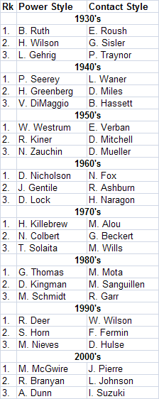
As you might expect, Babe Ruth is the original power/walk/strikeout player. As someone who revolutionized the game in that regard, it comes as no surprise. Harmon Killebrew, Mark McGwire, Dave Kingman, are others that famously fall into that same mold and are identified here. Meanwhile, Willie Wilson, Nellie Fox, and Matty Alou are on the other end of the spectrum - precisely the guys that you would expect. The analysis was run on the dataset as a whole (though to really be correct, it really should be run on each individual year). Over time, the styles have definitely shifted away from the contact approach and towards the power/walk style. Overall, there's not really a surprise in the bunch except for the fact that I've never heard of some of the older, more obscure players. Personally, I find both styles of player fun to watch as their extreme styles seem to make them more colorful, though I think that the power guys have historically caught more grief from fans and have been underrated up until the recent sabermetric revolution.
Whether a statistic like Batting Style has any real value to it or not, I think it's fun. Obviously, a line of six statistics isn't too hard to digest, but I like the idea of a single number describing a player's hitting style. In any case, it was interesting that the principal component analysis picked up on the two distinct styles and drew the scale the way it did. I think if you asked fans to name two completely opposite hitters, you would get a lot of Juan Pierre/Adam Dunn responses, which shows that the principal component analysis picked out an intuitive result.
| Behind the Scoreboard | January 26, 2010 |
Stolen Base Strategies Through History
This week's subject is a little lighter fare, focusing on how the stolen base has changed through time, and whether there is any rhyme or reason to why that has occurred. The amount of stolen bases has fluctuated throughout history. The early days of baseball saw a lot steals until the live-ball era began. As teams started scoring more and hitting more home runs, the speed game went on the decline, picking up again as scoring decreased throughout the 1980's.
A major explanation for the difference in stolen base strategies is that teams were rationally reacting to run environments. As scoring became harder, teams played "small ball" in order to scratch out runs. The goal here is to find out if teams actually did this and whether it was a rational strategy.
First, the relationship between runs and stolen bases. One would think that stolen bases would increase as run scoring decreased. Is this the case? According the above scatter plot, we see a very tenuous relationship. The points out to the right are deadball era years, where stolen bases are high. However, contrary to popular perception run scoring wasn't all that low during the deadball years. The relationship isn't any stronger after 1920 either - the rest of the scatter points are basically in a big clump. That pretty much puts to rest the myth that stolen base trends are a reaction to run scoring.
But is there another relationship between offense and stolen bases? Indeed, the graph above shows the relationship between steals and home runs over time. As you can see, steals and homers seem to be inversely related. Meanwhile, it doesn't have much of a relationship with scoring. A scatter plot doesn't tell quite as strong of a picture, although it's very easy to identify various eras based on these two statistics, which is something that I found pretty cool, even though it wasn't the point of the study.
It would make sense that teams would limit their steals when run scoring was high, but it might make even more sense when those runs are coming via the longball. Obviously, there's no point in taking an extra base if you're likely to be knocked in with a homerun anyway.
The real test of looking at the value of the stolen base is the break-even point. How often must a stolen base attempt be successful, before it is a good play? And how did this breakeven point change over time? Using Tom Tango's Run Expectancy Generator (which didn't do a perfect job across eras mainly because of differing error rates, but it's close enough) I calculated the break-even points on a no-out steal of second base. Obviously there are other situations in which a steal takes place, but being a common one, it's reasonable to use this as a baseline for how advantageous the stolen base is across eras. Picking the most typical point in each of the eras above, and tossing in anomalies 1968, 1930, and today, we can see that while the breakeven point has changed some, there's not a huge difference.
1905: 74.0%
1923: 80.3%
1930: 81.8%
1937: 80.5%
1959: 79.3%
1968: 75.2%
1985: 79.3%
2001: 81.1%
2009: 81.0%
Obviously looking at the break-even rates, we would expect that the number of steals would be highest in the dead-ball era and in 1968. While steals were higher in the dead-ball era, the number of stolen bases in the 1960's was eclipsed by the 1980's and even the current era, which has much higher scoring. While stealing was a better proposition in the 60's, it was used as much as it is today.
Of course, there is a final factor that comes into play: the likelihood that a stolen base attempt is successful. I can't think of much good reason for why the stolen base success rate would change over time, but the fact is that it has changed dramatically. Modern base stealers are vastly more successful than they have been in the past. Why this is, I'm not sure. Perhaps players are faster now, without a corresponding increase in catcher arm strength and accuracy. Perhaps teams are better at reading and timing pitchers' moves to the plate. Or perhaps teams are just better about stealing bases they know they can make. In any case, the chart below combines the data.
As you can see, the stolen base success rate varied tremendously over time. The variation here is far more than the variation in the break-even rate. Hence it would make sense that teams would steal more bases today than in the past. Certainly there is more stealing in the modern 1974-2009 era, than there was between 1930-1973. However, the odd scenario is the deadball era and the 1920's, where stealing was still prevalent, despite abysmal success rates. In the 1920's stealing was about as lucrative as it is today, but with about a 55% success rate vs. a 73% success rate. Nevertheless, stealing was a common tactic.
Looking at the data as a whole, there's not a lot of rhyme or reason about why some eras are high stolen base eras and others are not. The rate of stolen base tends to go up and down without any real correlation between rate of success or strategic value. Part of the problem seems to come from the fact that homeruns seem to be the biggest determinant of whether teams steal or not.
However, home runs don't have a major impact on the breakeven rate. Using today's data, I kept the number of runs constant but doubled the number of homers. The breakeven point went up, but slightly (from 81.0 to 82.9). Similarly I brought the number of home runs down to zero (keeping scoring constant), and the breakeven point again changed very slightly (from 81.0 to 80.5). With the breakeven point barely moving despite dramatic differences in homerun rate, using homers or lack of homers to justify base-stealing strategy isn't a good move. However, I have a feeling that if home runs dropped precipitously today, teams would begin to employ vastly more basestealing - likely an irrational move. More important to a team's strategy is the run-scoring environment, no matter how the runs are scored.
In conclusion, baseball teams have behaved irrationally with their base-stealing strategies through history. It seems that steals have been a function of homers, or simply fashion, and not based on the actual value of the steal. But did you really expect John McGraw to have read the Hidden Game of Baseball?
| Behind the Scoreboard | January 18, 2010 |
The Value of a Good Farm System
Baseball America's farm system rankings are one of the most respected rankings of a club's minor league talent around. Since 1984, they've been rating and ranking minor league systems in terms of their potential for major league impact. In this post, I try to determine just how much of an impact a team's farm system has on future performance.
Recently, the Baseball America came out with its December farm system rankings. Baseball America had the Houston Astros dead last, while the Rangers were ranked #1. If you're a Rangers fan, you might be smiling ear to ear, believing that the Rangers, who were also ranked #1 in 2009, would be poised for a long-term dynasty. Meanwhile Astros fans might despair, knowing that good young talent is not on the way.
But really, how predictive are these rankings? Does a good ranking actually lead to future success? If so, just how much?
To test this, I obtained Baseball America's organizational rankings from 1984-2010. I first transformed the rankings into a ratings, assuming that teams' minor league talent was normally distributed. This reflected the likely reality that the difference between having the #13 and #17 farm system is pretty small, but the difference between the #1 and #5 farm system is quite large. Transforming the ratings into normally distributed scores (which range from about -2.1 to 2.1) reflects this nicely.
I then used statistical regression to find the relationship between Baseball America ratings and team winning percentage. Doing a simple, single-term linear regression, it appears that the Baseball America rankings have predictive power for many years forward. One year's Baseball America ranking has a statistically significant effect on winning percentage for each of the next 8 years. As you would expect, those with higher rankings will tend to do better. If the only information you have is a team's 2010 Baseball America ranking, you would predict that a team with good rankings now will have an advantage come 2018.
But of course, we have more information than that. To really get at the heart of the matter, we need to take into account potential confounding variables. We can take these into account by using a multiple regression. To predict the next year's WPCT, significant important factors were:
a) WPCT from last year
b) WPCT from two seasons ago
c) Salary from this season
d) Salary from last season
e) Market size
Now, to test the effect of farm systems, we can add in the Baseball America rankings data. When we do, we get an interesting, yet difficult to interpret model, the results being the following:
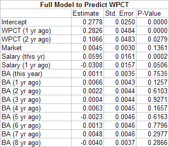
*market size was also transformed from a ranking to a normalized rating
**salary variables were expressed as a ratio of team salary to league-average salary
Clearly the salary and previous winning percentage variables are the main predictors of a team's success in a season, with market size close to significant. Less clear is the Baseball America rankings, which don't have a clear pattern. The years with most predictive power are the rankings from the previous season and from four seasons ago. Rankings from two years ago and from seven years ago show some predictive power, but not a lot. Meanwhile the other years show very little predictive power, with the effect being negative in some years.
The reason for this volatility of course is that the sample size is fairly small, so the estimates are not all that accurate. While using these weights would give the best fit, it doesn't seem to make sense that a BA ranking from one or four years ago would have much more predictive value that the BA ranking from two or three years ago. What does appear clear however, is rankings from the previous four years combined have a pretty strong correlation with WPCT, while rankings from after that time, on the whole, don't really a strong much effect.
My imperfect solution, then is to put the average of the previous four years of BA rankings into the model. When I do this, I get the following result.
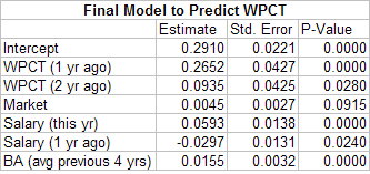
Overall, the values of the other terms are relatively unchanged, but we get a nice, highly significant, result for the Baseball America rankings. What does it all mean? Those ranked as the #1 farm system for the previous four years would get the maximum Baseball America score of 2.1. Multiplying 2.1 by .0155 gives means that it would be expected to add about .033 points to its WPCT in the next season. That translates to about 5.3 wins. Now five and a half wins is nothing to sneeze at, but it’s also not an enormous factor. Teams with weak farm systems do take a hit in future production, but it's certainly not insurmountable. The Astros, ranked last now for three consecutive years, figure to take a hit of 3.3 wins in 2010 and 4.4 wins in 2011. While that's certainly not desirable, there's no reason they still can't compete in the coming years, despite a poor farm system.
The model can be extended to predict values further into the future as well. Using only known, WPCT's, salaries, market size, and Baseball America rankings, we can build models for years down the road. For instance, using only known 2010 variables, how many wins does the #1 farm system provide in 2015? The models show that being the best farm system in 2010 correlates to about 4 extra wins in 2015.
The Rangers should feel good, but not get too overconfident, despite having the #1 system in both 2009 and 2010. The Rangers, who were ranked #1 in '09 and '10, were ranked #27 in 2008 and #15 in 2007. What do the models show the Rangers farm system producing over the next several years? The models predict the following boost in wins:
2010: 1.2 games
2011: 2.6 games
2012: 5.2 games
2013: 5.6 games
2014: 4.9 games
2015: 3.8 games
2016: 3.3 games
2017: 3.1 games
2018: 2.1 games
Since the Rangers' system was rated #27 as recently as 2008, the expected farm impact in 2010 is small. However, the impact increases dramatically starting in 2012. Overall, over the next 9 years, the Rangers farm system will likely net them 31 extra wins, meaning that while their system won't have a huge effect in any one particular year, it's likely to have a strong impact on the Rangers franchise over the next decade.
How about for their Texas counterpart, the Houston Astros? For them, the following 9-year outlook looks as follows:
2010: -3.3 games
2011: -4.4 games
2012: -6.0 games
2013: -5.6 games
2014: -4.9 games
2015: -3.8 games
2016: -3.3 games
2017: -3.1 games
2018: -2.1 games
For the Astros, it's nearly the opposite situation. Their farm system projects to cause them to lose over 36 games over the next ten years. So, is the difference between the Rangers and Astros farm systems really 67 wins over the next nine years? It would appear that way, although there are some caveats. For one, the year-to-year farm system rankings are correlated with one another, so the fact that the Rangers have a good farm system now is also indicative that they will have a good system in the future. That undoubtedly accounts for some of the large difference in wins. While the Rangers may not be still reaping fruit from their 2010 farm system in the year 2018, the fact that they have a good farm team now bodes well for their future farm teams, and hence their future major league teams.
Another factor to consider is how teams go about team-building. The fact that the Rangers have a good farm system means that they may be in strong contention in the next few years. With the team blossoming, this may spur the front-office to go out and sign free agents to supplement the team. Thus, the wins the future free agents provide are also correlated with the Rangers having a good farm team. While the Rangers may win more because of the free agents, this boost (reflected in these numbers) is not necessarily a direct product of having a good farm system in 2010.
For these reasons, I would hesitate to put a dollar value on having the #1 farm system in baseball vs. the #30 farm system in baseball - at least using this analysis. There are too many potential confounding variables here such as the ones I mentioned above. Still, if you are a fan, it matters little where your team's wins are coming from. Rangers fans really do have a reason to be smiling. While a handful of wins each year may not have a major impact, 30 wins over the next 9 season is a significant force. Whether the Rangers can parlay those wins into championships remains to be seen.
The following graph shows some trajectories for some of the more extreme teams in the league:
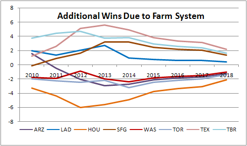
The results also are a testament to the accuracy and relevance of the Baseball America organizational rankings. While obviously a #1 ranking doesn't guarantee championships, the ranking is significant predictor of major league wins far into the future. Kudos to Baseball America for doing these rankings. Their well-respected reputation is well-deserved.
| Behind the Scoreboard | January 12, 2010 |
Biases of Hall of Fame Voters
Last week over at Sports Illustrated, I wrote an article on the biases of modern Hall of Fame voters. In it I highlighted five ways that Hall of Fame voters either overrated or underrated candidates. While, I provided mostly anecdotal evidence at SI, here I'll use a statistical approach to analyze whether or not my hypotheses were true (and what else I may have missed).
My goal here is to determine if voters are underrating or overrating certain types of players. But to do so, first I need to determine how to define the true "value" of each player. For example, if I say a particular player is overrated, what is the gold standard which defines how voters should consider a player?
Here I choose to use career Wins Above Replacement (WAR), taken from Rally's WAR database. Rally's WAR considers all aspects of a player's performance, including hitting, defense, baserunning and pitching, and by all accounts gives a pretty accurate picture of a player's contributions.
If the Hall of Fame voters are completely unbiased, they will simply use WAR and only WAR to consider a player's credentials for the Hall. My goal here is to determine empirically, what factors apart from WAR contribute to a player's Hall credentials - in other words how are Hall of Fame voters biased?
To set up the problem, I took all players eligible for the Hall of Fame going back to 1986. I then put them into five categories:
1. HoF on first ballot,
2. HoF in 2-4 years,
3. HoF in 5-15 years,
4. >5% of vote, but did not make HoF
5. <5% of vote on first ballot
I then used a multiple logistic regression to model the players' chances of falling into each of these categories. Obviously, the model included a player's WAR. However, the goal was to see if the model had any other significant variables. Significant variables besides WAR, would show a Hall of Fame voter bias.
Hitters
For hitters, a reduced model broke down as the following (here shown for the probability of making the Hall of Fame at all):
Probability of HoF = exp(a)/(1+exp(a))
where a is equal to:
(-38.5 + .172*WAR - 75*BB_RATE + 94.4*BAV + .0032*PA + 57.9*HR_RATE)
Here we see that, obviously, the more WAR, the better. However, what we also see is a positive bias for batting average, homerun rate, and for the total number of plate appearances. This indicates that Hall of Fame voters are biased towards guys with high batting averages who hit a lot of homeruns. In other words, voters overvalue these statistics in their evaluations. However, we see a strong negative bias towards a player's walk rate. This indicates, that players who walk a lot are being unfairly punished by Hall voters. These findings pretty much confirm what is expected. Hall voters have the same biases that most mainstream media do, in undervaluing walks and overvaluing batting average.
RBI rate, while not significant in this model, is significant if homeruns are removed (the two variables are fairly correlated). As one would expect, RBIs also are overvalued by Hall of Fame voters.
Interestingly, Hall of Fame voters are also biased towards players who have long careers. I had expected voters to possibly have a bias toward high peak performance, but instead the voters seem to have the opposite bias. They overvalue a player's longevity, rewarding mediocre and bad years from players and undervaluing peak performance. In other words, Hall Voters set the bar for replacement level too low.
Pitchers
For starting pitchers, we get an entirely different model of course:
Probability of HoF = exp(a)/(1+exp(a))
where a is equal to:
(-39.8 + .037*WAR + 40.2*WPCT + .053*Wins)
In this case, the model boils down to three key variables. As you'll notice, WAR is not a very important factor in the model. In fact, with a p-value of .37 it is not even significant! Highly significant however (p-value <.003) are a pitcher's winning percentage and career wins. In fact, these seem to be the only two variables necessary to predict Hall of Fame induction. ERA, strikeout rate, and other factors are not necessary (at least with this dataset, though it may be noted that we haven't had a short career Koufax-type pitcher inducted in the last 25 years). Obviously the message is clear, a pitcher's wins and losses are vastly overrated by Hall of Fame voters. Again, Hall of Fame voters overvalue a long career (wins is a more significant proxy for innings pitched). Surprisingly, a voters are not only biased towards wins and losses, but these statistics almost totally replace the pitcher's true WAR value as predictors.
Relievers
As for relievers, the dataset was fairly small, however, here are the results:
Probability of HoF = exp(a)/(1+exp(a))
where a is equal to:
(868.4 + .181*WAR-.446*First_Year + .022*Saves)
For relievers, I added a term for the year in which a player started his career. This year variable had a p-value of .06, indicating that voters may have given early relievers an advantage for "pioneering" the role of short reliever. Saves were only marginally significant with a p-value of .11, however, the effect appears to be positive. Since there are relatively few relievers enshrined or even considered for the Hall of Fame there is not a lot of power to figure out what's going on.
Hitters vs. Starters vs. Relievers
Another effect, not seen in the above models is the bias between hitters, starters, and relievers. Doing another model including only WAR and a dummy variable indicating whether the player was either a position player, starter, or reliever, shows strong differences between the three groups.
The results? In order to have a 50% chance of making the Hall, a reliever has to only amass 43 WAR. For a position player, he has to amass 59 WAR, while a starting pitcher has to amass 72 WAR. Here we see a big difference in the standards set up for each of the three roles. Although only four modern relievers currently occupy the Hall of Fame, voters have been giving relievers a break. Meanwhile, starting pitchers have been getting the shaft. For starters to make the Hall, they must provide more value to their teams than a position player does.
A similar analysis of just position players broken down by type of position, shows that those in "fielding positions" (2B, 3B, SS, C) have it tougher than those in "hitting positions" (OF, 1B, DH). This seems to agree with the common perception that outfielders are overrepresented in the Hall of Fame, while players such as third basemen have a tough time.
Conclusions
In all, the empirical analysis shows the following:
1) HoF voters undervalue walks (p-value .001)
2) HoF voters overvalue batting average (p-value .001)
3) HoF voters overvalue longer careers (p-value .001)
4) HoF voters undervalue starting pitchers (p-value .001)
5) HoF voters overvalue relief pitchers (p-value .001) though this bias seems to be decreasing
6) HoF voters overvalue Wins and Losses for pitchers (p-value .003)
7) HoF voters undervalue players at defensive positions (p-value .005)
8) HoF voters overvalue homeruns/RBI (p-value .06)
Fun Stuff
While, it's not the point of the exercise, you may be wondering about the values predicted for each player. To satisfy your curiosity here are the following breakdowns in order of likelihood of making the Hall of Fame:
Likely (80% or higher)
Henderson
Schmidt
Eckersley
Ripken
Carew
Brett
Jackson
Boggs
Molitor
Rose
Seaver
Yount
Gwynn
Carlton
Murray
Morgan
Dawson
Winfield
Sutton
Palmer
Gossage
Neikro
Ryan
Fingers
Probable (50-80%)
Fisk
Alomar
E. Martinez
Perez
Puckett
Sandberg
L. Smith
Rice
McGriff
W. Clark
Blyleven
Larkin
Unlikely (10-50%)
John
Dw. Evans
Trammell
Parker
Burks
Whitaker
McGraw
Raines
Carter
M. Williams
Morris
B. Bell
K. Hernandez
Oliver
Garvey
Baines
Sutter (8%)
*Ozzie Smith was removed from modeling, as he is the only player ever inducted (or really even given consideration) solely for his defensive efforts.
As Rich alluded to yesterday, some of these biases may (and hopefully will!) disappear as voters become more savvy about how to properly evaluate players. It will be interesting to see what happens during the next 25 years, and how voting will have changed after the "sabermetric revolution".
| Behind the Scoreboard | January 05, 2010 |
The Hall of Fame in an Alternate Universe
The Hall of Fame will announce its 2010 class this Wednesday. While the Baseball Hall of Fame is perhaps the most prestigious of all Hall of Fames, its procedures and standards aren't exactly organized nor are they truly fair. It would be great if the Hall of Fame had one clear standard for admission which remained the same across time. Unfortunately this hasn't been the case during its 75 year history.
The Hall's caretakers would likely disagree with me, saying that throughout history, it has kept in place its requirement that players receive 75% of the vote. While this ironclad 75% requirement seemingly makes the Hall of Fame fair and consistent throughout time, in reality the Hall has tinkered with and manipulated the vote in order in increase or decrease the number of players being enshrined. In reality, the Hall has messed with the process by creating several voting bodies at various times including the Old-Timers Committees, two separate Negro League Committees, and several incarnations of the Veterans Committee, in addition to the regular BBWAA writers' election.
Part of the problem is that the concept of a "Hall of Fame" is ill-defined, particularly with regards to the quality of player who deserves to be enshrined there. One could create a Hall of Fame of 50 players, 100 players, or 500 players, and all would be equally as valid. But for the voters, the Hall's size was never well-defined. Hence, the quality deemed necessary for Hall inclusion evolved organically over-time, rather than adhering to a set standard.
Initially, the standard was 5 players selected over an approximately 40 year period of baseball. However standard necessary for the Hall of Fame quickly deteriorated after the induction of Ty Cobb, Walter Johnson, Christy Mathewson, Honus Wagner, and Babe Ruth.
After adding a handful over players later in the 1930's, by the 1940's the Hall of Fame decided that the club was too small after several years of no new elections. In reaction, they had run-off elections in 1946, and also instituted the Old Timers commission to induct more players from the olden days of baseball, which writers seemed to have forgotten.
In the 1950's the Veterans Committee was created to include even more old-time players - a move which resulted in a vast overrepresentation of players from the 1920's and 30's.
Additionally, somewhere along the line, voters picked up the peculiar habit of making players wait to enter the Hall. Rather than voting on players on their merits, voters would haze players by not voting for them right away. While this practice has lessened in recent years, most players still increase their vote totals over time. Considering the voters are largely the same, and the players accomplishments remain the same, this practice only serves to cast doubt upon the validity of the process.
As a result of all of these inanities, the Hall of Fame is now a multi-tiered structure, with Veterans Committee selections clearly adhering to a different standard of greatness, and with many modern players not immortalized clearly more deserving than many old-time players who are enshrined.
Rules for an Alternate Universe
How could the Hall of Fame have avoided all of these troubles? Here, I'll set out some rules and reconstruct what the Hall of Fame might look like today had these procedures been in place from the beginning.
First, to maintain an equal standard over time, the Hall of Fame ought to have fixed the number of players allowed to enter the Hall of Fame each year. In addition to maintaining a consistent standard, this would also give the Hall the publicity of honoring one great player each year, without the embarrassing situation of having no player selected or flooding the Hall with too many selections in a given year. A forward-thinking panel would have enacted the following rule in 1936: One player shall be inducted each year.
Of course to guarantee that exactly one player is admitted each year, the 75% rule is out the window. Instead, the BBWAA would vote for the player most worthy of induction similar to how the MVP is selected. Each voter ranks the most worthy players for induction, and the player finishing with the most points is elected to the Hall of Fame. The rest would wait until next year.
While forcing players to wait 5 years before voting on them is a reasonable rule, there is no reason take players out of consideration after 15 years as the rule is currently. In the Alternate Universe Hall of Fame, players would remain eligible indefinitely. Since voters can vote in only one player per year, the best players would usually get in on the first try. Lesser players might have to wait for a lull in newly eligible players before getting in. Meanwhile, those not worthy will soon be forgotten. Still, allowing players to remain on the ballot indefinitely allows voters to correct mistakes of the past. When voters finally realize that Ron Santo is the best player currently not in the Hall of Fame, they will have an opportunity to vote for him and include him. However, as long as voters think another player is more deserving, he'll have to wait.
Each year, voters would be instructed to vote for the most deserving player, regardless of the time he has been on the ballot. This will be easier for voters to do under this system, since voters are directly comparing players to each other, rather comparing players to some arbitrary Hall of Fame standard.
The Alternate Universe Hall of Famers
In 1936, the Hall of Fame would kick off with a mega-election which elected 15 players who had retired between the years 1910 and 1930. There would also be a separate Old-Timers election which admitted 10 19th-century players who had retired before 1910. This initial class of 25 players is a good start to the Hall of Fame and roughly adheres to the same one player-per-year standard that would be used from then on. Players who failed to be selected in this initial election would of course be eligible for election in subsequent years. Basing the selections on the actual votes at the time, the players elected would likely have been the following 15 players:
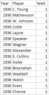
And the Old-Timers Commission likely would have selected the following 10 players:
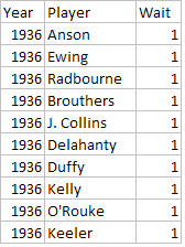
Moving on, the Hall of Fame would use its current five-year waiting rule (no exceptions) when considering new candidates. To determine who the voters likely would have selected, I ranked eligible players in each year according to how many years it took them to crack the real Hall of Fame. The highest ranked player in each year got in my "Alternate Universe" HoF. The voters would vote on the best players in each year. The likely selections through 1981 would probably be the following:
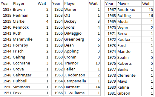
Clearly some years are tougher competition than others. The mid-1960's had a relatively weak crop of newly eligible players, and this allowed some older players to finally make the cut after a long period of waiting. Borderline Hall of Famers like Pie Traynor, Lou Boudreau, or Red Ruffing eventually make it in after a long time, while true greats like Lefty Grove or Babe Ruth are sure to make it in on the first try. Since all players are eligible indefinitely, there is no need for a Veterans Committee to water down the Hall of Fame by inducting lesser players. Since each year the voters select the best player not currently enshrined, fans can be confident that the Hall of Fame maintains a consistent standard and that the players enshrined really are the best of the best.
In 1982, the Hall of Fame realizes that it needs to expand the number of Hall of Famers due to MLB's expansion. Since there are more teams, there are more dominant players, and the Hall of Fame needs to make room for them. Major League Baseball expanded to 24 teams 13 years earlier and to keep the same amount of players per team in the Hall of Fame constant, the Hall of Fame must increase the number of players inducted into the Hall of Fame by a proportional amount. Therefore, in 1982, the Alternate Universe Hall of Fame begins electing two Hall of Famers every other year, reflecting the 50% increase in the number of teams in the majors. Doing the same process as above to get the likely selections through today, here are the rest of the players in the Alternate Universe Hall of Fame:
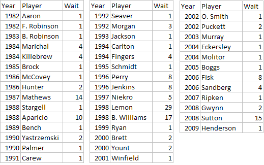
Again, the Hall of Fame goes through cycles of weak and strong classes, with the weak periods allowing some older deserving candidates to get a shot an enshrinement. In 2013, the Alternate Universe Hall of Fame would expand once again to account for the most recent expansion, now moving to enshrining two players in each year.
How does the Alternate Universe Hall of Fame look overall? The new Hall of Fame is not diluted by the Veterans Committee selections, and consists of most players elected by the BBWAA. These 112 players represent the best of the best, and it’s hard to argue against the greatness of any of these players.
There are a handful of players elected by the BBWAA, but thus far not in the Alternate Universe Hall of Fame and they are: Bill Terry, Dazzy Vance, Joe Medwick, Hoyt Wilhelm, Duke Snider, Ralph Kiner, Don Drysdale, Tony Perez, Gary Carter, Goose Gossage, Bruce Sutter, and Jim Rice. While certainly there is an argument to be made that some of these players deserve enshrinement, these players were ranked by the writers below the other 112 players - an assessment I would generally agree with. Each of these players also still has a chance to make the Hall in future years when there is the inevitable lull in new top candidates. One of those lulls occurs in 2010, when at least one of these players would likely have a chance to make the Hall of Fame in what is otherwise a fairly weak crop of new candidates.
Of course the Hall of Fame would be remiss without any Negro League players as well. In the real Hall of Fame, a Negro League Committee was created to include worthy Negro Leaguers. They inducted 9 players, while the Veterans Committee inducted a few more in later years. Then in 2006, 12 more Negro League players were inducted. Who knows how many more might be inducted in the future?
In the Alternate Universe Hall of Fame, in 1971 it was decided that a set number of 10 Negro Leaguers would be inducted into the Hall of Fame, spread over the next ten years. Considering that the Negro Leagues were only in their heyday for about 25 years, had fewer teams, and had several teams with questionable quality of play, ten players seems like about the right number to complement the 60 other Alternate Universe Hall of Famers in 1971. Of course, any players not making the cut would also be eligible for the regular BBWAA election in later years. The likely inductees would have been:
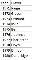
Comparing the Halls
In all, I much prefer this trimmed down, and fairer list of 122 men for the Hall of Fame, instead of the bloated, unrepresentative, and multi-tiered current Hall of Fame of 232 men. In the Alternate Universe Hall of Fame, you can say that these men are the 122 greatest players who ever played the game. You can't really say that that the current Hall includes the 232 greatest players. Does anyone really believe that Joe Gordon is a more qualified candidate than Ron Santo? No, but due to the Hall's strange election procedures, Gordon is in the Hall of Fame while Santo is not. Is there any chance that anyone thinks Rube Marquard was a better pitcher than Bert Blyleven? No, but Marquard is in and Blyleven is out. Is there any reason that hitters from the 1930's should be vastly over-represented? No, but thanks to the inanities of the Veterans Committee, we now have Lloyd Waner and his ilk permanently watering down the field. With a bit more foresight, the Hall of Fame could have set up a system similar to the Alternate Universe Hall of Fame and we would have a better Hall of Fame today.
The reason they didn't of course, is that nobody likes quotas. Players should be chosen on their merits, not based on some artificial numbers, you can hear the critics saying now. But in deciding on a shrine for the "greatest players", one way or another, the definition of how great is great enough gets defined. The Hall of Fame's founders should have taken the chance to define the size of the Hall of Fame explicitly, rather than the organic growth that has seen the Hall of Fame's standards become inconsistent over time. But the Hall of Fame didn't do that, and as a result we have the skewed, multi-tiered, irrevocably broken system we do today. I wish they had.
| Behind the Scoreboard | December 29, 2009 |
Comparing the Hall Candidates
With the Hall of Fame selections approaching rapidly, I thought I would take a look at how some of the top candidates compare.
Given that the Hall of Fame is supposed to recognize a player's career accomplishments, Wins Above Replacement is the perfect stat to look at when comparing players' careers.
There are 133 Major League players that have been elected into the Hall of Fame via either the baseball writers (BBWAA) or the Old-Timers commission which selected 19th century and dead-ball stars for inclusion back in the 1940's. Of course, there are countless more players who have been elected by the Veterans Committee, but it would be a slippery slope to lower the BBWAA standards down the the threshold necessary for the Veterans Committee, so I'm going to ignore those players for now.
So how many WAR did the 133rd best player who is eligible for the Hall of Fame earn? 58 WAR. If we use 58 WAR as our starting cut-point, who among the players looking for induction meets that criteria?
Of perhaps the 13 most qualified, or at least the 13 most talked about candidates up for election this year, here's how it breaks down:
1. (90) Blyleven
2. (69) Larkin
3. (67) Martinez
4. (67) Trammell
5. (65) Raines
6. (64) Alomar
7. (63) McGwire
8. (57) Dawson
9. (56) Ventura
10. (51) McGriff
11. (50) Appier
12. (44) Murphy
13. (39) Morris
As we can see, there are a number of borderline candidates. The one slam dunk candidate, according to WAR, is Bert Blyleven, who toiled in relative anonymity for most of his career. The one candidate nowhere near Hall of Fame caliber is Jack Morris, who racked up just 39 WAR throughout his career.
However, there are 9 candidates within 10 WAR of the magic 58 cutoff. The list doesn't likely jibe with the opinions of the voters. Of the following list, Larkin and Alomar are probably the only new players who will get significant support, while voters are likely to underrate Martinez and have already shown a propensity to overrate Jack Morris.
Of course, it's simplifying a bit to simply look at one number to determine a player's value. More useful, might be to look at how a player's career progressed. Below are a series of graphs which show a player's WAR sorted from his best year to worst year. From these graphs we can differentiate a player who had a strong peak, or a long career.
The Pitchers
First let's take a look at the pitchers. Looking at Blyleven, Morris, and Appier together, it's no question that Blyleven is head and shoulders above the other two. While Appier's best seasons matched Blyleven's best, Blyleven showed incredible consistency, being nearly a 4 WAR player even in his 15th best season. In contrast, both Appier and Morris were pretty much useless in by their 12th best season.
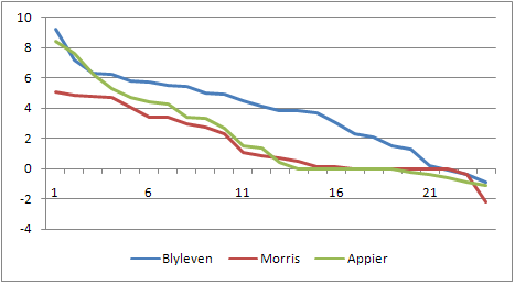
Corner Infielders
Now let's take a look at the corner infielders. Through their best 13 seasons, Edgar Martinez was clearly the best of the field, besting the other in every year but two. After that, however, Martinez was a rather useless player, giving him a short but brilliant career. Michael Weddell here at Baseball Analysts went over the case for Martinez in detail yesterday and I largely agree. Still, I have the nagging feeling that Martinez doesn't "feel" like a Hall of Famer. However, this can simply be attributed to his toiling in Seattle for all those years, playing a non-defensive position, and most importantly, drawing a ton of walks - a skill which was undervalued at the time he played. Martinez may not feel like a Hall of Famer, but he is one. Moving on down, the graphs pretty clearly show McGwire as a better player than Ventura, and Ventura as a better player than McGriff. My "gut" says McGwire is a Hall of Famer and Ventura and McGriff are not, and my gut agrees with WAR. However, with McGwire only 5 WAR above the threshold, a case could be made not to include him, given his alleged steroid use.
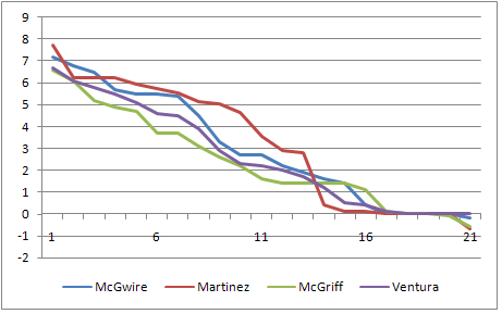
Now, we'll go to the outfield, where we compare Dawson, Raines and Murphy. Dale Murphy had the peak of a Hall of Famer, but didn't have the rest of the career. In his best six years Murphy was right there with the Hawk and Rock, but he quickly fell to earth. While Murphy's peak was good, it's not good enough to compensate for just 44 career WAR when 58 WAR is the standard. In the stat-oriented blogosphere, there's been a fair amount of cheering on of Raines and bashing of Dawson, but they really are not too far apart. While I'll agree that Dawson is probably a bit over-rated by the mainstream and Raines is underrated, as players there's not a huge difference. Raines is slightly better, but not by a lot. If you factor in Dawson's considerable leadership, the difference becomes even closer. In my opinion, both players are worthy of induction.
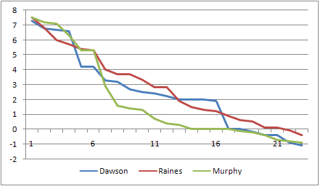
In a final comparison, we'll go to the middle infield, and boy there is little to choose from. Alomar, Larkin, and Trammell all had pretty much the same career with respect to WAR. Larkin, with the overall most WAR, had a lower peak, but a more productive rest of his career. Between Trammell and Alomar, their paths are virtually indistinguishable. In the mainstream, the Alomar and Larkin are sure to get more love than Trammell has thus far. One factor in Alomar's favor is that he has a reputation as a great defensive player (including 10 Gold Gloves), despite the fact that WAR and other advanced metrics show his defense as average or below average. If you pay attention to the Gold Gloves rather than the stats, he'll be ahead of both Larkin and Trammell, and that's likely how he'll be percieved by the Hall of Fame voters. I think all three players are deserving of the Hall, though it wouldn't bother me terribly if none of them got in.
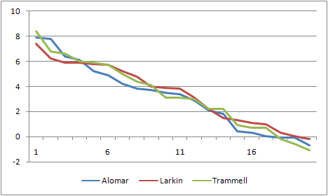
In a year with many and new borderline candidates, it will be interesting to see which directions the voters go in 2010. There are very few open and shut cases (and the one open and shut player is teetering on his 13th year of eligibility!), but there are a lot of maybes, should-bes, and could-bes in this year's crop of Hall of Fame contenders. I can't wait until January 6th to see how it all shakes down.
| Behind the Scoreboard | December 22, 2009 |
The Bradley Effect
This past week, the Cubs finally dealt the ever-cranky, overpaid, outfielder known as Milton Bradley. Bradley, who was owed $22 million over the next two years, was a massive disappointment in Chicago. While, he actually ended up hitting for a league average OPS, the bigger problem was his attitude. When he didn't hit early on, his mood soured, the fans and media turned on him, and he became the dreaded "clubhouse cancer".
While Cubs fans everywhere rejoiced at the departure of Bradley, the Cubs didn't exactly get much for him. Jim Hendry ended up taking on an even bigger albatross, as the Cubs took on Carlos Silva and his bloated contract, which is actually worth more than Bradley's. As you'll recall Silva was a decent pitcher in Seattle, before totally tanking the last two years with ERA's of 6.46 and 8.60, spending a lot of last year on the disabled list. While Silva is basically a replacement level pitcher these days - a guy who could make a turnaround, but who in his current state is not a major leaguer - Milton Bradley is still an above average hitting outfielder. With the Mariners transfer of $9 million to the Cubs and the fact that Silva was owed $3 million more than Bradley, the calculus on the trade was the following:
2 years of Bradley = 2 years of Silva + $6 million
or, if you prefer,
2 years of Bradley - 2 years of Silva = $6 million
If we assume that Silva is now a replacement level pitcher who would sign for league minimum on the open market, that would place Bradley's effective value at $3 or $4 million per year. But surely, Bradley is worth more than that. Even if he repeats his disappointing 2009 performance, in which Bradley earned just 1 WAR, he still would be a bargain considering that the average team had to pay $6.5 million to net a 1 WAR player last year. Given that the Mariners will be paying an effective salary of $3 million, Bradley is a steal.
So why were both teams happy about the deal?
Back in September, I talked about Bradley in an article about clubhouse chemistry, and calculated that teams seemed to consider an extreme clubhouse cancer's attitude worth about -1.5 WAR at max. Given this, the Cubs placed Bradley's value at around zero. Getting $6 million bucks for a player you consider worthless isn't a bad move at all.
However, it's likely that Bradley's attitude is valued very differently by the Cubs than the Mariners. With the Cubs, he's already shown he can't fit in with the other players, the front office, and the media - hence the -1.5 WAR attitude. Meanwhile, Bradley's attitude is an unknown for Seattle. Perhaps he will fit in fine and his attitude won't be a major problem. Or perhaps, he will be as big of a problem as he was in Chicago. But given that it's an unknown, Seattle probably values Bradley's head at -.5 WAR rather than -1.5 WAR. This gives Bradley more value to the Mariners than the Cubs and allows both teams to be happy with the deal. The Cubs unloaded a worthless player (to them) for $6 million, and the Mariners got a good hitting outfielder for a song.
Supposedly, Seattle has all of the things he needs to thrive - a small market media with a large clubhouse. However, the biggest determinant of Bradley's attitude is likely to be Bradley's own production. If after two months, Bradley's numbers resemble what he did in Texas, look for the media and Seattle fans to laud him for how much he has matured and improved his attitude. If his numbers look like they did in Chicago, then it will be a stormy tenure in Seattle.
While the Cubs may be happy with the deal, it seems that they should have gotten more for Bradley. Seattle got a good player for very little, and it's surprising that other teams didn't bid up the value for Bradley to give the Cubs a better deal. Part of the problem, was that given Hendry's handling of Bradley at the end of last year, they absolutely had to move him and everybody knew it. Hendry saw chance to gain cash for Bradley and he took it. However, Seattle is getting a steal of a deal. How Bradley performs this April and May may well determine how much of deal they actually get.
| Behind the Scoreboard | December 14, 2009 |
Wins Above Replacement vs. Salaries in 2009
A couple of weeks ago, I did an analysis of the the wins provided per dollar in Major League Baseball for free agent eligible players, arbitration eligible players, and players under team control. I did this using a regression using Rally's WAR data as well as salary data from the Lahman database. After a rousing and lengthy discussion over at the Book Blog over the dollar per win value of free agent eligible players (defined as any player with 6 or more years of service), my 2008 estimate of about $6 million dollars per win, was shown to be a bit higher than the commonly held $4.5 million mark that is usually used. However, since Rally gives out fewer WAR than Fangraphs, this was cited as one possible reason for the difference. Additionally, the fact that I estimated service time and the fact that contracts could be backloaded were other potential sources of bias.
For the 2009 season, I took different data, this time using contract data from Cot's Contracts and getting the WAR data from Fangraphs. Cot's data lists the deal the player is currently in, including the length of the contract as well as the overall contract value. Cot's Contracts also gives the exact service time for the 2009 season. Wins Above Replacement was gleaned from Fangraphs, since it is the mostly widely used form of WAR.
Here I look at only at players with over 6 years of MLB service to try to determine this same fact for 2009. To account for contracts potentially being backloaded or frontloaded, I used the average yearly salary over the life of the contract, rather than the actual salary given to the player in 2009. Another data caveat was that I threw out all players who had signed contracts before they were actually free agents. Since their average salary would include years when they were only arbitration-eligible, simply using the average salary of these players would be artificially low. Additionally, these players were never eligible on the open market, so they are not really in the population we are interested in.
Running the regression on this data set I expected to find a dollar per win value around $5 million or so. What I found was vastly different. The equation for the number of WAR expected to be gained for each million dollars spent is below:
WAR = .216 + .138*(Salary)
This translates to a whopping $7.25 million per win spent on free agents in 2009. This means that a free agent with a $20 million average contract would be expected to produce only 3 WAR while a player with a $2 million average contract would be expected to produce 0.5 WAR. This seems surprising, but the data points seem to back up the analysis as you can see below.
There is an argument to be made that the intercept should be locked in to zero to represent the fact that a player earning zero dollars should be expected to produce zero WAR. This is also reasonable, and here I do the same equation fitting the regression with no intercept.
WAR = .156*(Salary)
While this brings down the dollars per win value slightly, it still translates to $6.4 million per win, far higher than the common $4.5 million figure.
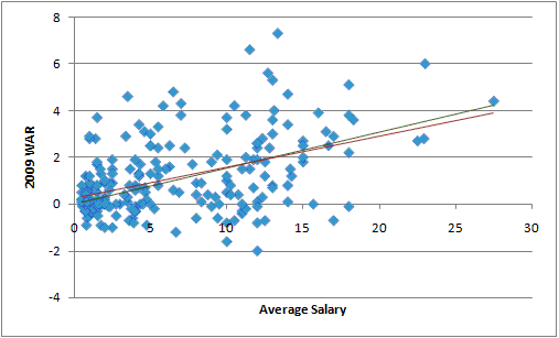
Perhaps the relationship between dollars and wins would show more strongly if other factors were accounted for. For instance, someone in the first year of a long term contract will probably be expected to produce more WAR than someone in the last year of a long term contract, even at the same salary. Here I tried accounting for average salary as well as the length of the contract and how many years into the contract the player was. I also included an interaction term of salary*length to account for the fact that the salary-to-WAR slope might be different for longer contract lengths.
I came up with this model:
WAR = .456 + .118*(Salary) + .029*(Length of Contract) - .171*(Year of Contract) + .005*(Salary)*(Length)
Unfortunately, while the theory may have been good, the data didn't back it up. With the exception of average salary, none of the terms in the model were significant. The p-value for the Year of Contract variable was the closest to being significant at .16. Paring down the model or adding other interactions were also futile, and as a result, attempts to include only significant terms leads right back to the basic salary-to-WAR model, though the Year of Contract variable was close to signficant. If more data were available, I would guess this would be a factor. In any case, controlling for these other terms does not strongly change the amount of dollars paid per WAR of free agents.
As a final attempt, I looked at only players who were in their first year of their contracts in 2009. These are players who were actually available on the free agent market in 2009 (as opposed to the other analyses which included all players who would be eligible based on service time, whether they were actually free agents or not). As you might expect, the value of these players were higher than those who were still working off of old contracts. However, the change was not huge. Controlling for whether the player had signed a multi-year contract or not, I got the following formula:
WAR = .277 + .184*(Salary) - .407*(MultiYear)
The dollar per win mark here was lower at just $5.4 million, however, this doesn't capture the true cost, since players signing mult-year contracts will likely be worse at the end of their contract than during the first year studied here. Even with this bias, the $5.4 million mark is far more than the usual $4.5 million mark. An additional counterintuitive finding is that players signing multi-year contracts tended to perform worse than their single-year contract contemporaries. This multi-year term was not significant, however, so the result isn't generalizable. Still, it was surprising to find the effect going in the opposite direction than what one would expect in 2009.
While 2009 could have been just a bad year for free agents - this is further evidence that the $4.5 million per win mark commonly used may be, if not wrong, at least obsolete. Using this 2009 data from two different data sources, again shows the dollars per win value above $6 million. While estimates based on projected WAR may yield a different figure, the reality is that teams are paying much more than that (or at least they did in 2009). Interestingly, 2009 was seen at the time as being a depressed free agent market, where teams could pick up relatively cheap bargains. At $6.5 to $7 million per win, there were very few bargains to be had.
Update: I had a few missing players in my dataset and the numbers have been changed to reflect that. However, the difference with these players added was very slight.
| Behind the Scoreboard | December 08, 2009 |
Was Marvin Miller Snubbed?
Marvin Miller was once again denied entry into the Hall of Fame this year by the Veterans Committee. The committee did induct two new members, with manager Whitey Herzog and umpire Doug Harvey gaining entrance, but the exclusion of Miller was widely seen as an injustice and an outrage.
A few weeks ago here at Baseball Analysts and over at Sports Illustrated, I talked about how the small sample size of voters for postseason awards could potentially select players for awards even if the larger consensus disagreed. With the Hall of Fame Veterans Committee this was an even larger issue. Of 12 former players, writers, and executives, people in consideration for the Hall needed just 9 votes.
Does Tom Seaver really deserve to have that much power to bestow people with baseball's highest honor? Why are there so many executives on the committee? Can they really be objective about a man who bested them time and time again? Is this in any way a fair process? Of course, it's not fair at all, but that's not what I'm focusing on here.
Despite Seaver's adamant support, Marvin Miller was barred access from the Hall. Should he have been? Miller changed the game to be sure. His contributions were instrumental in allowing the birth of free agency. In that sense few men have had the impact on the game that Miller did - he transformed the game from one in which the owners had most all of the power, to one in which players also had a say in where they went and how much they would be paid.
According to Bud Selig in 2007, "The criteria for non-playing personnel is the impact they made on the sport. Therefore Marvin Miller should be in the Hall of Fame on that basis. Maybe there are not a lot of my predecessors who would agree with that, but if you're looking for people who make an impact on the sport, yes, you would have to say that."
Certainly no one can argue with Selig's assertion that he had a huge impact on the sport, however, nowhere can I find that impact alone is the only basis for the Hall. One would assume that a positive impact is required, and on that Miller's induction is debatable.
There's no question that Miller made a positive contribution to players' wallets. Before free agency in 1975, the average major league salary was $45,000 - today the average player makes $3,260,000. Even with inflation, that 72-fold increase isn't too shabby. But baseball doesn't exist for the players - it exists for the fans.
And the advent of free agency has had questionable consequences for fans of the game. For one, Miller's hardball tactics allowed the MLB players to transform from "well-paid slaves" to being part of one of the nation's most powerful unions. While that's nice for them, it's had consquences. Before Miller came upon the scene, there had been zero work stoppages. After he was elected head of the MLBPA in 1966, we have seen strikes or lockouts in 1972, 1973, 1976, 1980, 1981, 1985, 1990, and 1994, five of which came under Miller's guidance which lasted until 1982.
Miller did his job well, and his transformation of the MLBPA and bamboozling of the fragmented owners and was masterful work. But along the way, the sport got changed as well. While players' wallets got a boost, their reputations took a hit. In the pre-Miller era, the greedy prima donna athlete stereotype so ubiquitous today did not exist. Nor did fans boo their former heroes for bolting town for the highest offer once they became free agents. Back in 1966, athletes of all stripes seemed to share more with the common man than the fat cats in the owners boxes. Today, fans are more inclined to view them as one in the same.
In an alternate, Miller-less world, A-Rod would perhaps be toasting his longtime teammates Ken Griffey and Randy Johnson in Seattle on another World Series title, with all three enjoying the same kind of local working-man's hero status that players like Ted Williams and Ernie Banks used to share. Perhaps also in this alternate world, the owners would have actually had the power to implement steroid testing with teeth before so many enhanced players made a mockery of the game. Perhaps Bud Selig as commissioner could have done something about the competitive balance problem which has plagued the game. In the post-Miller world of free agency and MLBPA power, these are all impossibilities. The game has changed, but is it better?
But perhaps this all gives Miller too much credit. It's a different world than it was in 1966, and the game was bound to follow suit with or without Marvin Miller. Still, it's likely that Miller ushered in an era of maximized profits and transformed baseball from primarily a game to primarily a business. Players were getting treated unfairly, and Miller gave them the power to negotiate for salaries equivalent to what they were truly worth. For that he should be celebrated. However, the fallout from his bold transformation was not all positive. While Miller was a godsend to the players and professional athletes everywhere, whether he had a positive impact on the game and on the fans is far from an open and shut case. It could be said that Miller was intrumental in forming the modern era of sport. Miller's case for the Hall of Fame probably depends on whether you like this modern era or not. As for me, I'm not so sure.
| Behind the Scoreboard | November 30, 2009 |
WAR, Salary, and Service: Estimating Dollars Per Win
The Hot Stove League is in full swing, and what better way to dig in than by estimating player salaries. In this post I'll attempt to find a simple relationship between salaries, Wins Above Replacement (WAR), and years of service. In particular, how much of a pay cut do those in arbitration or under team control make compared to those eligible for free agency?
The WAR data is from Sean Smith, and the salary data comes from the Sean Lahman database. Data on service years is scarce, so I estimated years of service based on playing time - it's not perfect but it will do for now - I crossed checked it with actual service time for 2007 players and my method of estimating service wasn't too terrible (130 PA, 20 games pitched, or 50 inning pitched equaled one year of service). I divided the service time into three groups - those with less than three years of service, who presumably are held under team control. Those with 3-5 years of service, who are arbitration eligible, and those with 6 or more years of service, who are eligible for free agency.
There are two ways to examine the relationship between WAR and salary. One is to estimate the salary of the player based upon the player's WAR. Another way is to estimate the player's WAR based upon the salary.
Predicting Salary from Performance
Let's go with the first approach first. My independent variable is player salary and I want to estimate it by WAR, service category, and year. Lahman's salary data goes back to 1985, but for now I'll look at just 2008.
As others have found, the relationship between salary and WAR is linear. The model I estimated can be boiled down to three equations - one for each level of service . Here I'll present the results for 2008:
When under team control: Salary = .51 + WAR*.001
When Arb eligible: Salary = 2.26 + WAR*.31
When FA eligible: Salary = 5.53 + WAR*1.23
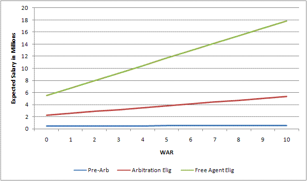
The $500,000 salary of pre-arbitration players seems reasonable. Not surprisingly, the players' actual contribution to the team is of very slight importance. Basically these players get close to the minimum for their efforts no matter what.
However, when looking at the free agent eligible players, things get interesting. According to the formula, a player producing absolutely nothing for the team is due to be paid $5.5 million. What team in their right mind would do that? Well, none of course, but plenty of teams DO pay a lot of money for no production. In fact, there's probably a do-nothing overpaid free agent sitting on your favorite team's bench right now. Chances are that if a team has a 0 WAR producing free agent, he'll be making over $5 million. Bad signings, injuries, bad luck, and a host of other problems can often cause a worthless free agent to be paid a lot of money.
High producing free agents do make more, of course, but not way more - $1.3 million per win. While a worthless free agent would be expected to make $5 million, a free agent player producing an MVP-type season of 6 WAR is expected to have pulled in $13.4 million.
Arbitration-eligible players fall in the middle as you might expect, with 0 WAR players making an expected $2.3 million, and players with great seasons making $4.1 million. What's the relationship between arbitration-eligible players and free agent-eligible players? It appears from the data that low-value free agents make about double the amount of low-value arbitration eligibles ($5.5 mil vs. $2.3 mil). However, as the player increases his performance, the gap widens. For a 5-WAR season, the free agent will make three times as much as the arbitration eligible player ($11.7 mil vs. $3.8 mil). Meanwhile, non-arb eligible players earn the same no matter what. As one might expect, the better the player, the greater the benefit of being a free agent.
How does this compare to the results from years past? Just for fun, here are the formulas from 1990:
When under team control: Salary = .14 + WAR*.02
When Arb eligible: Salary = .51 + WAR*.09
When FA eligible: Salary = .95 + WAR*.10
Obviously, these salaries are much lower than salaries of today. What's interesting is that the high WAR players did not make much more than low WAR players, even for free agents. In 1990, a 6 WAR player would be expected to make 64% more than a 0 WAR free agent. However, in 2008, a high WAR player would make 144% more than a 0 WAR free agent. Perhaps this is a sign that teams are getting more for their money, or a sign of some other change in the market. Perhaps I will explore this relationship over time in a later post.
Predicting Performance from Salary
While predicting salary from performance is interesting, perhaps more relevant is predicting performance from salary. A player's salary is determined before the player performs, so it makes more sense to analyze it this way. It's also useful to ask, "if we spend $10 million on a free agent, how many wins should we expect?"
We can answer this question using the same sets of models, with Salary and WAR swapped in the equations. In 2008, the numbers were:
When under team control: WAR = .84 + Salary*.002
When Arb eligible: WAR = .62 + Salary*.21
When FA eligible: WAR = 0 + Salary*.16
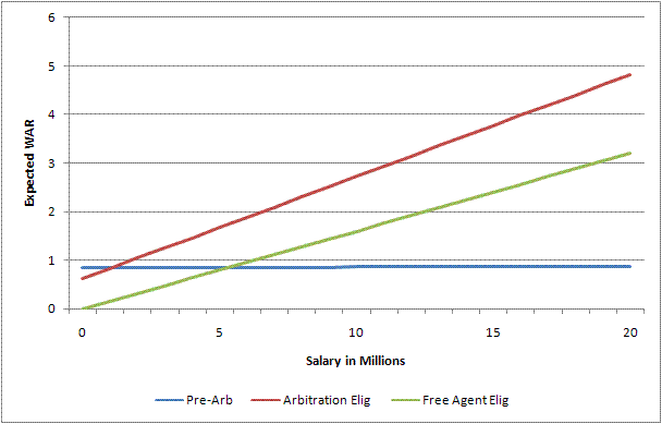
As expected the numbers are vastly different for each of the three categories. For those under team control, the player's salary basically has no correlation with the number of wins he is expected to produce - everybody is getting paid the same, good, bad, or ugly - hence the flat curve. For those arbitration eligible, a player getting paid the league minimum will be expected to produce 0.7 WAR, while producing .21 WAR for every million dollars after that. A star arbitration eligible player making $7 million will be expected to produce 2.1 WAR. In general, as the graph shows, teams get more value from high-priced arbitration eligible players than from high-priced free agents.
For free agents, the link between salary and performance is more tenuous. Those making the league minimum will be expected to produce 0.1 WAR. For every million dollars paid out after that, the average player will return .16 WAR. This means that a $10 million free agent will be likely to produce just 1.6 WAR. There are a lot of overpaid free agents out there.
The data show that on the open market, teams will have to pay about $6 million for an expected return of one win. This $6 million figure is a bit more than the $4.5 million that is commonly used as the dollar per win ratio. The Fangraphs method differs from mine in that it calculates the expected win value based upon an estimate of "true performance level," and then compares that to the amount that players are actually signing for on the free agent market. In contrast, my method compares salary to WAR in a particular year for all players, regardless of when a player was signed or what his true talent really is. Since there is more noise in a player's actual yearly WAR than in a player's true talent estimate, WAR and salary will have a lower correlation - hence the higher cost to gain an expected win.
In 2008, Albert Pujols made a salary of $13.9 million and contributed a league best 9.6 WAR. A free agent eligible player making $13.9 million would have been expected to contribute 2.3 wins. The fact that Pujols actually contributed 9.6 wins means that he gave the Cardinals 7.3 wins more than they bargained for, making him the league's best value. To get an expected return of 9.6 WAR on the free agent market, a team would have to pay $59 million - making Pujols a huge bargain. While $59 million seems like a lot, think of all of the Jason Schmidt's and Andruw Jones' that might have been bought instead with no value to the team.
From Pujols' perspective however, he didn't make all that much less than expected. An average 9.6 WAR producer would have been expected to make $17.3 million compared to $13.9 million. Why the major discrepancy in Pujols' dollar value? The reason is the regression effect of course. Since dollars and wins are only loosely related, both will regress to the mean quite strongly. For teams, it means that you have to pay a lot to get a little. For players, it means that a season of great performance doesn't earn too much more than a season of mediocre performance.
As fans, we're probably more apt to care about how many wins can be squeezed out of dollars rather than the other way around, making the first formulation (where Pujols is worth $59 million) more apt. Since teams would have to spend $59 million to get an average return of 9.6 wins, this would have been a fair price had Pujols' value been guaranteed in advance to provide 9.6 wins.
In the next week or two, I'll be exploring this relationship a bit more in depth. However, this simple formulation does provide some insight on just how much teams are paying for marginal wins.
Update: I've had a few requests to see the data points plotted, so here they are for free agent eligibles in 2008. The data looks linear to me, and although the variance of the errors does get a little larger as salary increases, it doesn't seem like a major problem.
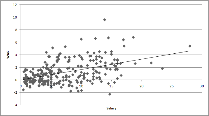
| Behind the Scoreboard | November 24, 2009 |
MVP Award Probabilities: Accounting for Sampling Variation
This week wraps up the MLB awards. In the AL, Joe Mauer took home the MVP and Zack Greinke took home the Cy Young. In the NL, the hardware will likely go to Albert Pujols for MVP. Meanwhile, in one of the tightest three-way races in recent memory, Tim Lincecum squeaked out a victory for the Cy Young. Since these four players won the awards, they must be the top players of 2009, right?
Surely, I jest. If you’re reading this, you probably have figured out long ago that the Baseball Writers Association of America does not always award the MVP and Cy Young to the most productive or valuable players (this year, however I happen to agree with all four of their picks). However, even making the quantum leap that the BBWAA is the population most qualified to determine the winners of these awards, there is still no guarantee that the small group of writers who actually get to vote for the awards will accurately mirror the opinions of the group they represent. The reason: simple statistical sampling variability. If we consider the actual voters as a simple sample of 32 voters (or 28 in the AL) who represent a hypothetical universe of similarly qualified baseball writers, analysts, and experts, we can see that there is natural variability in the votes of the MVP and Cy Young, and that the “right” player (defined as the consensus pick among the entire universe of qualified baseball experts) may not always be chosen.
On the basis of the 32 BBWAA writers’ votes, Tim Lincecum was deemed the best pitcher of 2009 by the baseball establishment. But was Lincecum’s really the consensus pick for the NL Cy Young? Or did Lincecum just get lucky while the majority of qualified experts really preferred somebody else? Based on the results of the voting, it’s clear that some baseball experts preferred Lincecum (11 first-place votes), some preferred Wainwright (9 first-place votes), and some preferred Carpenter (12 first-place votes). When the Cy Young votes were tallied, the group of 32 voters as a whole preferred Lincecum, but it was very close. Perhaps Lincecum simply got lucky and, just by chance, had more of his supporters in the sample of 32 voters. Perhaps the universe of qualified baseball experts as a whole actually thought Carpenter or Wainwright was most deserving of the award.
This article attempts to find the probability that Lincecum really did have the most support among the baseball establishment, and that the 32 voters who happened to have a vote this year really did select the “right” candidate.
Calculating the Probabilities
One way to estimate the variability associated with the MVP and Cy Young awards is to use a statistical resampling method, in which you basically take a sample of the 32 ballots with replacement. This method of essentially simulating the MVP balloting many times based upon the real MVP balloting would be great, except for one snafu: it appears very difficult, if not impossible, to find the results of each individual ballot. Without having the individual ballots, we can’t use this technique.
In the end I settled on a different kind of approach. To start with, I calculated both the mean and standard deviation of each player’s point total. I then used the normal distribution (which is applicable due to the Central Limit Theorem) to determine how likely it was that a player, given a certain “true” expected point total, would have scored as many points as he actually did in the Award voting. For instance, if Lincecum’s true expected Cy Young point total among the universe of all writers was 90, what was the probability that he would have scored the exactly the 100 points that he actually scored? In this case, about 2.4%. How about if Lincecum’s true average was 91? As expected, it's a little higher, at 2.7%. We do this for every potential “true” expected value of Lincecum’s point total.
In the end, we want to determine the probability that Lincecum’s “true” expected point value was the highest of all the Cy Young contenders? The problem of course is that Lincecum’s point total is highly correlated with the other contenders, so we can’t use assume independence among each pitchers to determine this probability. Furthermore determining the exact correlation between two players’ point totals is very difficult.
Instead, what we can do is estimate a point total required for victory, and calculate the odds of each player having a true value greater or equal to this necessary total. In a two-person race, this necessary total is usually simply half-way between the winner and the runner-up’s point total. In a three-way or other type of race, the number is a little trickier to figure. In the end, we can determine expected point value necessary to win by choosing the value for which the sum of all players’ probability totals 100%. For example in the 2009 Rookie of the Year voting, the points “necessary for victory” was 100. The probability that Chris Coughlin, who actually scored 105 points with a standard error of about 12 points, had a “true” expected point value of 100 points or higher was 70%. For J.A. Happ, who scored 94 points, the probability of having a true point value of 100 or higher was just 30%. This means that based on the sample of 32 votes, there was a 70% chance that Coghlan really was the consensus choice for Rookie of the Year among a greater universe of voters, and a 30% chance that Coghlan just lucked into the award and that Happ actually had more support among all potential voters.
The 2009 Awards
How did the rest of the awards go? In the AL MVP, Joe Mauer won 27 out of 28 first place votes and crushed Mark Teixeira with a point total of 387 to 225. In this case there was little doubt that the baseball writers as a whole preferred Mauer as the AL MVP, and this method shows Mauer with a virtually 100% chance of being the “true” writer’s choice. The same was true with the AL Cy Young, where Zack Greinke was almost certainly the writers' choice for the award.
In the NL however, things went much differently. Lincecum scored 100 points and was the winner of the Cy Young. Carpenter scored 94 points, while Wainwright scored 90 points. If just a handful of voters had switched his first-place vote from Lincecum to either Carpenter or Wainwright, the outcome would have been different. So, what was the probability that Lincecum was truly the choice of the baseball writers as a whole? Lincecum scored 100 points with a standard error of 9.2 points. Carpenter scored 94 points with a standard error of 9.2 points, while Wainwright scored 90 points, with a slightly higher standard error of 10.5 points.
So what was the probability that each pitcher’s true point value was greater than the roughly 99 points that were required to win the award? Lincecum had a 53% chance of having a true expected point total above 99. Carpenter had a 28% chance, and Wainwright had a 19% chance. This analysis shows that because there were only 32 voters in such a close vote, the true writers’ choice could have been any of the three. In the end, Lincecum was the lucky one, in garnering the most support from the 32 writers that actually had a vote. However, there is only a 53% chance that Lincecum had the most support from the hypothetical universe of all expert baseball writers. Carpenter or Wainwright may have been the ones who actually “deserved” the award. However, because MLB only surveys 32 writers, we’ll never know who the greater universe of writers’ true choice was.
Looking at the Rookie of the Year voting, we see similar uncertainty. The AL Rookie of the Year vote was fairly close, with Andrew Bailey winning 13 of 28 first place votes and winning by the margin of 88-65 over Elvis Andrus and Ricky Porcello. However, because of the small sample size, it’s no guarantee that Bailey truly had the writers' backing. There was an 80% chance that Bailey was the true choice, however Andrus and Porcello also may have been the true RoY winners, with an 11% and 9% chance respectively. Meanwhile the NL Rookie voting was a 70%-30% split as I mentioned previously.
Probability of Being the True MVP/Cy Young/RoY 2003-2009
Below you can see the probability of being the “true” MVP, Cy Young, and Rookie of the Year for each league over the several years.
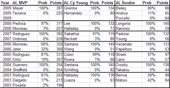
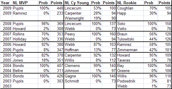
As you can see from the chart, many MVP and Cy Young Award winners were not certain winners. Had a different set of writers been voting, things might have turned out differently. As a general rule, one cannot be sure that the MVP has been selected "correctly" unless one candidate has about a 70 point lead in the voting. For instance, in 2008, Albert Pujols garnered 18 first-place votes and bested Ryan Howard by 61 points in the voting. However, there was still a 2% chance that Albert won by luck and that Ryan Howard was the true writers choice for MVP. A win of 40 points means that the winner had about a 90% likelihood of being the “true” MVP. Meanwhile a win of 20 points corresponds to about a 75% probability of being the true consensus selection.
In the Cy Young or Rookie of the Year, the margins required are not as steep. A 50-point lead or more virtually guarantees that the right person got the award. A 20-point lead means that the winner had about a 90% chance of being the true consensus pick, a 10-point lead corresponds to a 70% probability, while a 5-point lead corresponds to about a 60% probability.
MVP Award Probability vs. MVP Award Shares
This system, which I'll call MVP Award Probabilities is an alternative to the “MVP Award Shares” statistic, though they really measure seperate things. In that system, a player is given award shares even when it is clear that there was absolutely no chance that he was considered the most valuable player by the writers. For example, Mark Teixeira had an MVP award share of 57% this year, despite getting no first place votes and being undeniably NOT considered the best player in the AL by the BBWAA. Additionally, players can have very similar award shares even when it is fairly clear that one player was the consensus pick. For example, in the 2008 NL MVP race, Albert Pujols had a 98% chance of being the “true” MVP, but the difference in award shares was not very great (82% to 69%).
This Award Probability system also has the advantage of handing out exactly one award - if you sum the award probability percentages, they add to exactly 100%. With this method, we can give Albert Pujols 98% of an MVP and Ryan Howard 2% of an MVP in the 2008 race. Though Howard certainly had some support among the writers for MVP, it was fairly clear that the consensus choice was Pujols, hence we give him credit for nearly an entire MVP award. In the case of the 2009 Cy Young Award, even though Lincecum won the award, there was only about a 50% chance that he “deserved” it. Hence, we can award him about 50% of a Cy Young Award. This, in contrast to 2008, when Lincecum was clearly the Cy Young choice of the writers over Brandon Webb.
In the end, these Award Probabilities are useful for giving out partial awards in years when there was no consensus award winner. Because the sample size of voters is quite small, often we can't be sure who really had biggest backing of baseball experts. Calculating these probabilities is an interesting way of accounting for this uncertainty.
| Behind the Scoreboard | November 17, 2009 |
MVP Award Balloting: Is It Fair?
The MVP and Cy Young Awards are closely upon us, and soon we'll know this year's choices. As you know, the balloting for these awards is done by two baseball writers from each city. I'll spare the indignation about why award choices are limited to just two BBWAA members when there are a host of other highly qualified people who could be consulted on the awards, and concentrate on the balloting process.
For the MVP award, voters rank their top 10 choices for the award. Each 1st place vote receives 14 points, each 2nd place vote receives 9 points, each third place vote receives 8 points, etc, down to where each 10th place vote receives 1 point. The candidate with the most total points is the MVP. This weighting system seems fair enough. But is it? Why shouldn't a first place vote be worth 10 points? Or 20 points?
What's more, the Cy Young does things differently. There, the writers only select their top three players for the award. A first place vote gets 5 points, a second place vote gets 3 points, while a third place vote gets 1 point. This strikes me as odd, since it would seem that a system good enough for the MVP would be good enough for the Cy Young, and vice-versa.
Ballot Weighting Based on Empirical Win Values
An alternate, perhaps more accurate, method of balloting would be to have each voter assess the value of each player (perhaps measured in wins). Each voter would give a value score and the player with the highest average value among the writers would be the MVP. While in theory this would work, in practice this would probably be a mess. Writers would be working off of different internal scales and the votes would be all over the map. One guy might think that his first place choice is 10 times as valuable as his 10th place choice, while another guy might think that his first place choice is only twice as valuable. While this could represent real differences between the two writers' valuation of these players, more likely it would be a function of different perceptions of value, and the different scales each writer is using in their heads.
Because of these issues, the 1 through 10 balloting that currently takes place is probably the way to go. This essentially forces everyone to be on the same valuation scale. The #1 choice gets 14 times the weight as a #10 choice regardless of the individual writer's evaluation of their relative worth. But is the scale 14-9-8 scale that is used a good one?
Going with the theory that the weighting system should correspond proportionately to the value of the player, let's look at the Wins Above Replacement (WAR) values for the top players over the past 25 years. The following list shows the average WAR value for players ranked 1 through 10. The #1 player averaged 9.4 WAR, while the #2 player averaged 8.3 WAR. Meanwhile the #10 player averaged 5.9 WAR.
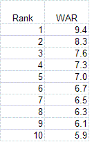
Needless, to say if we used these weights for the MVP balloting, the results would be vastly different. However, this wouldn't be right either, because it assumes that anybody left off of a ballot altogether has a value of 0. Of course, any writer would consider a serious MVP candidate to have a value far greater than zero, even if he did leave that player off his ballot. So, how to evaluate those unranked players? Since the writer didn't rank that player, we don't know how he values him. Assuming an 11th place vote for players left off the ballot seems a bit too optimistic, but a serious MVP candidate couldn't be too far behind. Subjectively, it seems reasonable to me to assume a 13th place ranking for unballoted MVP candidates - giving them an estimated WAR of 5.5.
Using this WAR scale (9.4 points for a 1st place finish, 8.3 points for 2nd place...5.9 points for 10th place, and 5.5 points for unranked players) would probably be the most fair ballot weighting system. How does this compare with the system MLB actually uses? While the weights seem to be very different, this is mostly because the systems are on two different scales. To make them comparable, we can convert the WAR system to a scale where 0 points are given to a player left off the ballot and there are 59 total points doled out altogether. When we do this, we see that in fact the two balloting systems are extremely similar.
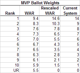
Overall, the WAR system advocates giving slightly more weight to players who finish 1st and 2nd in the balloting, while giving slightly less weight to those thereafter, with the exception of the 10th place vote. In particular, second place votes are undervalued (they are worth 9 points, whereas they should be worth 10.3 points). In all however, there is very little to quibble with. If I were starting from scratch I would choose a 15-10-8-7-etc system instead, however this is a very small difference. Kudos to Major League Baseball, which has used the same ballot weights since 1938. It really got it right with its MVP ballot system.
How about the Cy Young? As I mentioned previously, the current system gives 5 points for first place, 3 points for second, and 1 point for third. Going through this same process above for pitchers only, the WAR scale recommends 4.9 points for first place, 2.6 points for second and 1.4 points for third. Again, the this scale is fairly similar to the one used by MLB, though MLB slightly overvalues second place votes and undervalues third place votes. Though it might be better to go with a 14-9-8-etc system (or a 15-10-8-etc system) just so writers have a chance to rank more players, the current system works pretty well too.
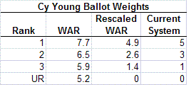
Conclusion
Overall, the method which MLB chooses its MVP and Cy Young Awards isn't the most important thing on Earth. However, it's nice to know that MLB is doing something right. It would have been fairly easy to screw these up. For instance, a 10-9-8-etc MVP ballot system would be off from reality by quite a bit. However, the systems currently in place do a good job of reflecting the actual differences in value of players as ranked by the sportswriters. Whoever was initially responsible for this system did his job well. For once, it's nice that the traditional way of doing things is also the right one.
| Behind the Scoreboard | November 10, 2009 |
Economic Theory and Player Movement Throughout Baseball History
With the end of the World Series last Wednesday, the season is over and the Hot Stove League has begun. While there has always been a Hot Stove League, the general feeling is that it has become more intense since the advent of free agency since a plethora of players are easily available to any team. While free agency has perhaps made the winter more interesting, it's debatable whether it's improved the game overall. One of fans' biggest complaints is the effect it's had on increasing player turnover. It's reputed that today's players change teams so often that year-to-year continuity is lost. Of course, just because players are reputed to change teams more often doesn't make it so. There was plenty of player movement in the pre-free agency era from trades, player sales, players being released, etc. So have things really changed? And if so, for which types of players are things different?
The Theory
In the Wages of Wins (excerpt here), the authors cite the Coase Theorem and the Rottenberg Invariance Principle to argue that free agency has not changed the distribution of MLB players and that player movement remains the same as it would be under the reserve clause. These theories, they say, debunk claims that the free agency allows players to move too freely and kills competitive balance. According to Rottenberg's economic theory (posited in 1956), "a market in which freedom is limited by a reserve rule such as that which now governs the baseball labor market distributes players among teams about as a free market would." As a baseball fan, I tend to not quite believe that player movement would be the same under the reserve clause vs. free agency. To test this out, let's take a look back through history.
Player Movement
I examined all players in the modern baseball era and measured the turnover rate of all MLB players. The key measurement was what percentage of players changed teams each year?
The graph below shows the percentage of players who changed teams in a particular year. The data is smoothed to be a 5-year average of this turnover rate. As you can see, the early days of baseball were very unsettled, as leagues were forming and rules on player movement were being established. By the end of the first decade of the 20th century, however, things had settled down. This changed once again with the introduction of the Federal League and the turnover rates spiked dramatically during the years between 1914-1916.
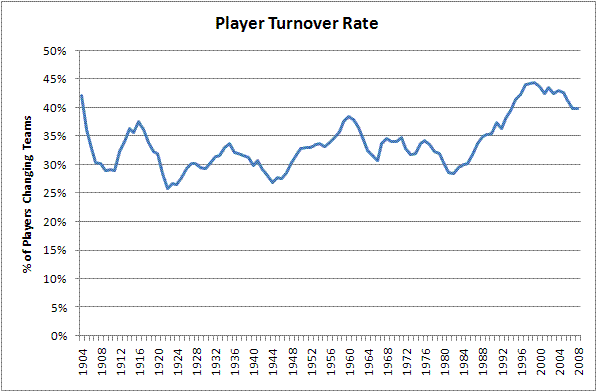
From the 1950's through the 1980's, the level of turnover fluctuated between 30%-35%. There was indeed, no noticeable bump in player movement during the first few years of free agency. The late 1980's however, saw a dramatic shift in the increase of player movement, continuing through the 1990's and 2000's. These decades saw player turnover hit almost 45%, meaning that from one year to the next, a club could have nearly half its roster changed around.
What About Star Players?
As a fan, I wouldn't really mind this as long as the key players remained constant. Were the players moving around team stars, or were they bit players and scrubs? The graph below shows the data split into four groups: Players who were worth less than 1 Win Above Replacement (WAR) in the previous year, players who were worth between 1-3 WAR, players who were worth 3-5 WAR, and players worth more than 5 WAR in the previous year. Each team usually has about half of their roster made up of players with WAR>1, several players worth 3-5 WAR, and just a couple of elite players worth greater than 5 WAR.
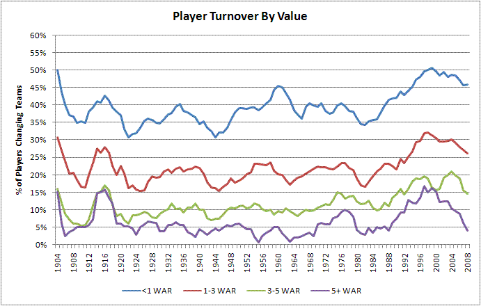
As we can see from the graph, the roster turnover for each type of player follows roughly the same pattern throughout baseball history. We can also see that, not surprisingly, the scrubs have a far higher turnover rate. For the bulk of baseball history, about 40% of these lower-tier players changed teams from one year to the next. For players who are real contributors to the team but not stars, this number drops to about a 20% player turnover rate. The handful of team stars usually changed teams about 10% of the time, while truly great players changed teams just 5% of the time. We saw an initial increase in player movement in the first years of free agency, particularly among better players, but this decreased again by the 1980's.
However, this all changed during the 1990's. In 1988, the (5-year average) rates were in line with the rest of baseball history. However, after the end of MLB collusion, the rates skyrocketed, particularly for the best players. By 1997, the landscape was entirely different. While the turnover rate for poor players increased somewhat from 41% to 50%, the turnover rate for 3-5 WAR players nearly doubled from 11% to 19%. For the truly elite, the turnover rate increased even more dramatically, going from 4% to 17%.
I'm not quite sure what caused this surge. Obviously, the lack of owner collusion was a big part of it. It was also during this period that salaries truly exploded and small-market clubs began to be unable to keep their star players. Prior to this period, most teams were able to sign and keep their stars if they so chose. But during the 90's some teams became simply unable to afford to sign their own top talent. This high turnover trend continued through much of the 2000's as well. Interestingly, and probably not coincidentally, this period of high turnover also coincides with baseball's period of greatest concern over parity between teams.
For fans, this high turnover rate is very disheartening. Having a 15-20% chance that your team's MVP-caliber player will fly the coop every winter is no way to go through life. Fans, being human, become attached to their teams stars and are disappointed when they leave in the prime of their careers.
However, there are signs that this trend has begun to reverse itself. Teams now seem more willing to lock up their stars to long-term contracts and elite player movement has been on the decline. Fewer teams seem willing to build through free agency, and thus more players are staying home. Average turnover rate has declined as a whole over the past 4 or 5 years. Turnover rate, particularly among star players, is back down to its late 1980's and early 1990's level. My data does not include the 2008-09 off-season, but there is reason to hope that player movement is on the downswing.
Player Turnover and Years of Service
Another way to analyze the data is by the number of years of service. While service year data was not available to me, I estimated it based upon the playing time for each player. The graph below shows the data based upon service time completed in the Majors for players who earned at least 1 Win Above Replacement in the previous year.
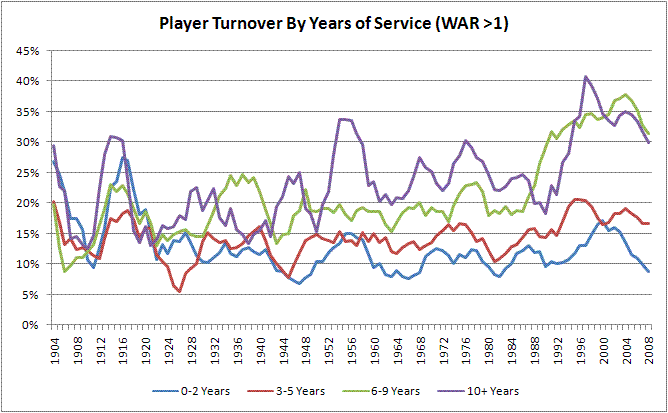
As we can see, the amount of player movement among players with 0-5 years of service is basically unchanged throughout baseball history, hovering about 10-15%. Also discernable from the graph is that veteran players have always been more likely to change teams than younger ones. As one might expect, players with 6 or more years of MLB service increased their likelihood of changing teams dramatically after the advent of free agency. Of course, this makes sense, since these are the very players who are eligible to be free agents. This number starts to increase at the beginning of the free-agent era, but particularly skyrockets during the late 1980's and 1990's. Players with 6-9 years of service went from about a 20% turnover rate in the late 1980's to a 35% turnover rate by the late 1990's. Here we see proof that the increase in player turnover is almost entirely coming from players who are free agent eligible.
Conclusion
As we can see, clearly there have been significant changes in player movement over time. A lot of these changes have been due to free agency. This has particularly manifested itself with players who are eligible for free agency (obviously), and with players who are especially valuable.
Though free agency surely played a part in this transformation, it's interesting that the turnover rate increased most prominently in the late 1980's, not at the beginning of the free agent era. There could be a few possible causes of this. Did players and teams take several years to figure out the free agent system? Did owners participate in collusion during the early 1980's as well as from 1985-1987? Or were other factors independent of free agency at play to create the increase in player movement? The bump in veteran and star player turnover at the beginning of free agency as well as a skyrocketing effect in the late 80's through today gives a hint that free agency likely played a large part in the changing player turnover rates.
So is the economic theory wrong? Not really. Both economic principles outlined earlier assume that things stay the same only if there are no transaction costs. But in Major League Baseball there are significant transaction costs and other barriers. Rottenberg's economic theory would argue that if the reserve clause still existed, the best players would still end up on the Yankees because the Yankees could buy or trade for the players directly. In reality though, the Yankees cannot simply buy Joe Mauer from the Twins for $50 million dollars. The Commissioner's Office would never allow it. Additionally there is the time and hassle that comes with identifying potential trade partners and hammering out a deal. Finally, no small matter is that selling Mauer would come at a significant public relations cost to the Twins, hence discouraging a deal. These restrictions are the reason why the Yankees haven't bought Mauer already and simply will wait to sign him after he becomes a free agent.
In theory, if no transaction costs existed we probably wouldn't see the dramatic differences in the graphs that we do today. However, the significant costs and barriers to the buying and selling of players means that the reserve clause likely does limit player mobility. Even so, we have seen a significant reduction in player mobility in the last few years. It will be interesting to see if this continues, and as a fan I hope that does.
| Behind the Scoreboard | November 03, 2009 |
Should the Phillies Have Pulled Cliff Lee With A Big Lead?
The Phillies found themselves in a 3-1 hole going into Monday night. Luckily for them, they had their ace, Cliff Lee, on the mound for them. But the Phillies bats went into overdrive for them as well, putting up six runs in three innings.
After three, the Phillies had a commanding 6-1 lead, and Cliff Lee had thrown just 50 pitches. Should Manuel have pulled Lee at that point, saving him so that he had the ability to throw more innings in a potential Game 7?
The conventional wisdom of course, is that you have to win Game 5 to even get to a Game 7, so Lee should stay in the game as long as he can. Had Manuel removed Lee and had Brett Myers, J.A. Happ and Co. blown the game in the late innings, he would have been run out of town on a rail. There's no doubt about it that sticking with Lee was the safe choice, in terms of job security and avoiding criticism. But was it the right move in maximizing the Phillies chance of winning the World Series?
The Phillies chances to win the game at that point were approximately 93%. If they won that one, they'd have to win games 6 and 7 as well, giving them an overall series probability of .93*.5*.5 = 23.25%. Now, let's exaggerate things a bit, and assume that Lee is a perfect pitcher who will not allow a run. If Manuel lets him throw 7 strong innings, allowing no additional runs, he'll have increased the Phillies chance to win the game from 93% to 99%, raising the probability that the Phillies win the series to 24.75%. That's was the option Manuel chose.
His other choice was to remove Lee from the game, with the tradeoff that Lee would be able to pitch an extra couple of effective innings in Game 7 if it went that far - quite a reasonable assumption considering he had thrown only 50 pitches in Game 5. Again assuming Lee's perfection, two innings of scoreless work in Game 7 would have raised the Phillies probability of winning Game 7 from 50% to 60%. Therefore, the overall probability of winning the series would be .93*.5*.6 = 27.9%.
As we can see, removing Lee in order to allow him to pitch two additional Game 7 innings would have been a much better move than allowing Lee to throw seven innings Monday night. The move increased the probability by 4.65% whereas leaving Lee out there in Game 5 increased the probability by just 1.5% - making his use in Game 7 about three times more valuable than his continued use in Game 5 (since Lee is of course, not a perfect pitcher, these absolute percentages are larger than they are in real life, however, the ratio between the two choices should be about the same).
Even if you assume that Lee would be able to pitch only one additional inning in Game 7, removing Lee would still be a good idea, raising the probability to 25.6% (vs. 24.75% when letting Lee continue in Game 5).
Had the Phillies been leading 3-1 rather than trailing 3-1, Manuel would certainly have made the right move, but the fact that the Phillies needed to win all three games makes it a better idea to spread out their advantages throughout the series. Since Game 5 was already nearly in hand, the Lee's continued presence on the mound didn't help the Phillies a whole lot, while a couple of scoreless innings in a potential Game 7 would be a decided advantage.
It seems that removing Lee and saving him for Game 7 would have been the right call. Still I wouldn't have liked to be in the hot seat all-winter long had I pulled Lee and the Phillies gone on to lose Game 5.
| Behind the Scoreboard | October 28, 2009 |
A World-Class World Series
The World Series begins tonight and it should be a real treat for baseball fans everywhere (except maybe those in LA). The Fall Classic doesn't always produce great match-ups, but this year the playoffs have produced a doozy. The 2009 Series features an outstanding a Yankees team and a good defending champion Philadelphia club - both historic franchises laden with stars. The teams are so compelling that the 2009 World Series might just be one of the greatest World Series matchups in recent memory.
Before we declare that, let's explore what makes a great World Series matchup. Of course, the subject is a matter of opinion, but I think we can identify the six key factors that matter to fans when evaluating a great World Series matchup (defining the matchup as a seperate entity from the outcome and excitement of the actual games themselves).
1. The Quality of the Teams One of the most important factors is the quality of the teams. Fans have to feel that the World Series participants really are the best in their league and that they've earned their trip to the Fall Classic. Nothing takes away from a World Series more than when fans feel that one or both of the teams don't deserve to be there. Case in point, nothing was really wrong with the 1973 Mets or the 2006 Cardinals, but enthusiasm for these series were tempered by the fact the they had won so few games while better teams were sitting at home. Likewise, a series between two truly great teams makes for great theatre.
2. Franchise History The history and mystique of the two franchises, both old and recent, also really affects the fan enjoyment. Teams with deep history such as the Yankees, Cubs, and Red Sox can make for great viewing and high fan interest. In contrast, the enthusiasm wasn't high for Tampa Bay's World Series appearance in 2008 or Colorado's appearance in 2007. Compelling recent franchise storylines can also add to the appeal.
3. Fan Fanaticism Many people watch sports for the emotion of it, and it makes for great atmosphere to see stadiums full of rabid fans cheering their teams on at the World Series. While the games are going to be sold out no matter what, some cities' fans are just more enthusiastic about their teams, which makes for great viewing. Getting the sense that the fans and cities are desperate for victory really adds to the experience and atmosphere of the games. Meanwhile, if a team's own fans aren't into it, nobody else will be either.
4. Star Quality of the Players Aside from the question of talent, fans want to see baseball's biggest stars performing on baseball's biggest stage. All else being equal, it's more entertaining to see a team with big stars in the World Series rather than a team of relative nobodies - even if the talent levels of the two clubs are comparable.
5. Fan Fatigue Even when a series has everything else going for it, one thing that can detract is if baseball fans are just plain sick of seeing a team in the playoffs and World Series. Watching the Braves in 1991 was fine, but by the end of the decade, fans were jonesing for some variety.
6. Interaction While the previous five categories can be evaluated separately for each team, the interaction between the teams can be important as well. Sometimes, a World Series is more than the sum of its parts (ex. a Joe Torre return to NY would have been great theatre) and sometimes it is less (while the 1989 Giants and A's were fine as individual World Series teams, nobody really wanted to see an all-San Francisco World Series). It's usually not a huge factor one way or another, but sometimes it can make a difference.
Now that we've identified the criteria, let's put it to work. Going back to the strike of 1981, which series produced the greatest World Series matchup? I've identified six contenders that could be considered the greatest: this year's matchup between the Phillies and Yankees, the 2004 Series between the Red Sox and Cardinals, the 1999 and 1996 Series' between the Yankees and Braves, the 1995 Series between the Indians and Braves, and the 1986 World Series between the Red Sox and Mets.
Below, we'll evaluate and rank each series according to the above six criteria. Keep in mind, we're only evaluating the matchup, not the games played in the series itself (so if you're wondering why I didn't mention the '91 Series, that's why).
Talent of the teams:
#1 1999 NYY (.618) vs. ATL (.640)
#2 1995 CLE (.699) vs. ATL (.638)
#3 2004 BOS (.610) vs. STL (.647)
#4 2009 NYY (.640) vs. PHI (.579)
#5 1986 BOS (.586) vs. NYM (.667)
#6 1996 NYY (.579) vs. ATL (.601)
Both the 1999 and 1995 World Series featured teams that were easily the class of their leagues. In the 1999 Series, the Braves and Yankees were both supremely talented teams and their outstanding records were no fluke - in fact both teams' records were even better in the year before, posting 114 and 106 regular season wins in '98 respectively. For this reason, I'm putting the '99 Series talent over the impressive '95 Series featuring the Braves and Indians. At #3, the 2004 Series featured a dominating 105-win St. Louis team and an outstanding 98-win Boston club. At #4, this season's matchup features one of the best Yankee teams in recent memory vs. a good but not truly great defending champion Phillies team. In 1986, there was no disputing the Mets greatness, but Boston was a surprise success as they did not contend either before or after '86. The 1996 Series, last on a very impressive list, featured two very good clubs, which both got better later in the decade.
History of the Franchises:
#1 2004 BOS-STL
#2 2009 NYY-PHI
#3 1986 BOS-NYM
#4 1999 NYY-ATL
#5 1996 NYY-ATL
#6 1995 CLE-ATL
In terms of franchise history, it's hard to beat the '04 Series' long-suffering historic Boston team and the history-laden Cardinals club. This year's series is #2. Few clubs can match the Yankees cachet and the Phillies, while historically losers, have had a great recent run that makes for a compelling storyline. The '86 Series was also strong in the history department with the long suffering Sox and the more recent, but still high-profile, Mets franchise. After that, there is a drop-off in history. The '96 and '99 Series featured the historic Yankees and a city which had little baseball cred until the early 90's. Meanwhile, the 1995 Series ranks last, featuring the modern Atlanta franchise and the long-suffering, but low-profile Cleveland Indians.
Fan Fanaticism:
#1 2004 BOS-STL
#2 1986 BOS-NYM
#3 2009 NYY-PHI
#4 1995 CLE-ATL
#5 1996 NYY-ATL
#6 1999 NYY-ATL
In terms of fan fanaticism, you can't get any hungrier than Boston fans in 2004. They were pretty hungry in 1986 as well. Meanwhile, the Cardinals and Mets both had great fans to match their enthusiasm. While the 2009 Series may not match that intensity, New York and Philly fans have quite a reputation of their own, ranking this series third. The list drops off after that. While the Indians fans were rabid in '95, the Braves fans had begun to get progressively more bored with winning. By 1999, the novelty had worn off nearly completely for Atlanta, while Yankees fans had gotten used to winning as well, detracting from an otherwise great matchup.
Star Quality of Players:
#1 2004 BOS-STL: Manny, Ortiz, Schilling, Pedro, Pujols, Rolen, Edmonds
#2 2009 NYY-PHI: A-Rod, Jeter, Teixeira, Rivera, Sabathia, Howard, Rollins, Utley
#3 1999 NYY-ATL: Jeter, Bernie, Rivera, Clemens, Chipper, Maddux, Smoltz, Glavine
#4 1995 CLE-ATL: Thome, Belle, Manny, Chipper, McGriff, Maddux, Smoltz, Glavine
#5 1996 NYY-ATL: Tino, Bernie, Jeter, Chipper, McGriff, Maddux, Smoltz, Glavine
#6 1986 BOS-NYM: Boggs, Rice, Clemens, Carter, Hernandez, Strawberry, Gooden
In terms of star-quality, all six World Series had them in spades, and I could be persuaded to rank the top 3 in any order. Feel free to disagree, but I ranked the '04 Series as #1, with juicy Pujols/Schilling and Pujols/Pedro matchups irresistible. This year is a close second however, with both clubs having loads of marquee players. And, if you like pitching, the Atlanta's trio of starters was a joy to watch, particularly against the 1999 Yankee team. Last in a tough category, the 1986 Series featured some great players, but fewer first-ballot HOF players than the other series.
Fan Fatigue:
#1 1986 BOS-NYM
#2 2004 BOS-STL
#3 2009 NYY-PHI
#4 1995 CLE-ATL
#5 1996 NYY-ATL
#6 1999 NYY-ATL
The 2004 and 1986 Series both featured teams which had not been on the national stage in quite some time, and I ranked them #1-2 in least amount of fan fatigue. While this year features the defending champs vs. the Yankees, the Phillies haven't yet worn out their welcome and the Yankees haven't been in the World Series for a while. Casual baseball fans were starting to get bored of the Braves by 1995, ranking that series #4 on the list. 1996 saw fans get further annoyed by the Braves' World Series presence, and by 1999, fans all over the country were saying "Yankees and Braves again?!"
Interaction Between Franchises:
#1 1986 BOS-NYM
#2 2009 NYY-PHI
#3 2004 BOS-STL
#4 1996 NYY-ATL
#5 1995 CLE-ATL
#6 1999 NYY-ATL
A Boston/NY rivalry is awfully tough to beat, but as this year proves, a Philly/NY rivalry comes pretty close. The 2004 Series ranks third with a little history going back to 1946 as well as an appealing East Coast/Midwest matchup. Ranking fourth, the 1996 Series featured a decent matchup between the legendary old-school Yankees vs. a smaller-market, newer, Atlanta franchise. Dropping off considerably, the 1995 Series saw two small-market, underdog-type franchises with the Braves and Indians - not an ideal combo. Last by a wide margin, the 1999 World Series was marred by the fact that the same two teams had just played in 1996, adding to the already palpable fan fatigue.
The following chart shows a summary of the rankings for all-six World Series.
How to summarize this chart into choosing the greatest World Series matchup of the last 27 years? It really depends on your personal preferences. Taking everything into account, it seems clear to me that the 2004 Boston/St. Louis World Series was the greatest World Series matchup, given the high talent levels of the two clubs, plus a wealth of history and great fans. After that, it's a very tough call.
This year's series is similar to the 1986 Series, featuring one great team and one very good team with two very dedicated fanbases and historic franchises. Likewise, the 1999 and 1995 Series were similar in the respect that the quality of the teams was superb, but the fan interest and franchise history wasn't as high. If you prefer great baseball and care less for the history or atmosphere, then the 1999 or 1995 Series would probably be preferred. Otherwise, the upcoming 2009 Series or the 1986 classic would probably round out the top of your list. For me personally, I tend to prefer the latter.
Overall, there is a very good case for saying that the 2009 World Series may be the second most exciting matchup since the 1981 strike. It almost certainly is in the top 5. However, not all great matchups make for great series. Of the World Series mentioned, the 1986 Series turned out to be a classic, the '95 and '96 Series were enjoyable, while the '99 and '04 Series were busts. In 2009, one can only hope that the Yankees and Phillies deliver some great games to match the hype.
| Behind the Scoreboard | October 20, 2009 |
Izturis Error Has 95-Year Old Cousin, Modern Sportswriter Does Not
The walk-off error. A fielder's nightmare. One minute the game is tense as can be and in the next the ball is thrown away or through the legs of the fielder to end the game. On Saturday, Maicer Izturis had the misfortune of making a walk-off error in a crucial playoff game, putting his Angels in an 0-2 hole. If the Angels lose the series, and despite their victory on Monday it's a likely scenario, that play will likely be looked back upon as one of the turning points of the series.
But Izturis is not the first player to literally throw away a playoff game. Saturday's error was the fifth walk-off error in playoff history, and so far the offending team has lost the series each time (in yesterday's contest there was very nearly a sixth walk-off error, saved only by good back-up defense by Johnny Damon).
Of course, the most famous of these plays came in the 1986 World Series as the ball got past Bill Buckner and the Mets' winning run crossed the plate in the infamous Game 6. But while that play has been written about ad nauseam for the last 23 years, perhaps more interesting is the very first walk-off error in postseason history, which came in the 1914 World Series. For those too young to remember, the '14 Series was a classic matchup between the defending champion and perennial powerhouse Philadelphia Athletics and the Cinderella underdog Boston Braves, who had spent the first half of the summer in the cellar before storming back to win the pennant.
After two games, the underdogs were in prime position for an upset, besting both of Philadelphia's aces by taking game one in a 7-1 rout, and winning game two with a 1-0, two-hit performance by one-season wonder Bill James.
The third game was a tight affair which went into extra innings. Philadelphia took the lead by scoring two in the top of the tenth, but the Braves came back to tie it in the bottom of the inning. From there, the teams battled into the twelfth, where the fatal walk-off error would occur. Setting the scene was the New York Times:
The purple haze of eventide was gathering over Fenway Park, and the 35,520 persons who had sat for more than three hours were restless and fatigued as they looked down, from all sides of the solid banks of humanity, at the figures which moved about phantomlike in the twilight. The score was 4 to 4, and Boston was at the bat in the last half of the twelfth inning.
After pitcher Joe Bush allowed Hank Gowdy to lead off with a double and intentionally walked Larry Gilbert, light hitting right-fielder Herbie Moran laid down a sacrifice bunt almost identical to the one fielded by Mariano Rivera last night.
He dropped a bunt down along the third-base line. It was Bush's play to get the ball to Baker at third and force Mann. Poor Bush! Cool under fire all afternoon, the strain had been too much for him. He got the ball, whirled about and made a ghastly throw to third which was out of Baker's reach and Mann rushed home with the victory. The crowd went wild. All the feeling and enthusiasm which had been bottled up as the game seesawed one way and then the other, burst forth with unrestrained fury. The mob jammed down to the field and smothered the Boston players in a demonstration of fanatical joy which has rarely been seen at a baseball game.A heart-broken youth, his eyes blurred with tears, slunk away under the big stands as the paeans of victory rang in his ears. His had been a great responsibility. His team mates, the fading world's champions, had played masterful ball behind him, and they were all fighting shoulder to shoulder to try to stem the relentless onslaught of an all-powerful enemy.
Then, by one tragic throw, he had knocked the foundation from under the Mackian machine and it came tumbling down in ruins. There was no comfort for Bush. Not even the soft, fatherly forgiveness of the Athletic leader could push back that strangling lump which lodged in the youngster's throat. O fickle fame!
While the play itself had a lot in common with both Izturis' and Rivera's errors 95 years later, it's interesting to note how things have changed. First of all, sportswriters and beat reporters don't write articles like that anymore. The description is astounding and brings the reader right into the ballpark. While the invention of TV and radio perhaps made descriptive writing like this obsolete, perhaps people would buy a few more papers if the articles were this vivid.
The entire account is a rip-roaring read, from the description of the crowd ("the howling, yelling, hostile populace making [Bush's] eardrums ache with clamor") to the tension in the ballpark in the 10th inning ("For once in the game the multitude was still. It was so quiet that one could hear the big fat man sitting next to him breathing hard.") Somewhere along the line, word count restrictions and newsprint space cut out things like descriptions of the guy breathing next to you. In the age of internet, somebody should start writing like that again.
Second of all, how great is it that the fans were allowed to rush onto the field after the Braves victory? I'd like to have seen the Yankee Stadium crowd rush onto the field last Sunday night after the Yankees took a 2-0 lead. Of course, on second thought, 50,000 Yankees fans mobbing the field might not be the safest of all ideas. Still, you can't beat the fun.
Third, I was struck by the description of a tearful and inconsolable pitcher leaving the mound. While of course, such a description makes you feel bad for the guy, such is an innocence rarely seen on the diamond today. The last I remember crying in baseball was Joey Cora sitting in the dugout after Seattle lost the 1995 ALCS.
In contrast to the whole scene, consider the New York Times' description of the similar play this past Saturday night:
Cabrera bounced a ball to the left of Izturis, the second baseman. Trying for the inning-ending double play, he whirled and whipped an off-balance throw to second, nowhere near shortstop Erick Aybar. It skipped on the dirt toward third base, where Chone Figgins dropped it. Hairston, who had stopped running, raced home and slid for the winning run.“I was trying to be a little aggressive there, but that stuff happens in baseball,” Izturis said through an interpreter. “That’s the way I am. I’m aggressive. I’m not afraid to be aggressive, but, sadly, it cost us the game.”
While nearly everything surrounding the game is different - the sportswriting, the fans, the interpreters, the excuses, the post-game press conferences, the lack of bloggers incredulous over how Mack allowed Bush to hit for himself in the 10th and 11th innings - the actual game itself remains nearly the same as it was during the 1914 World Series. I can only imagine what the writers of 2104 will think of our antiquated customs of today, but we can all hope that the game on the field will remain constant as it has for the previous 95 years.
| Behind the Scoreboard | October 15, 2009 |
NLCS Preview: Phillies vs. Dodgers
Today some of the Baseball Analysts team will be previewing the National League Championship Series between the Phillies and the Dodgers. Dave Allen will be talking about the hitting matchups, I'll be tackling the pitching staffs, and Sully will be taking on the fielding of the two clubs.
The Hitting:
Catcher
Russell Martin
588 PA | .250/.352/.329 | 82 OPS+
Carlos Ruiz
379 PA | .255/.355/.425 | 103 OPS+
Martin is having a down year offensively as his BABIP has fallen to a career low of .285, taking his batting average and power with it. Still he has been able to take enough walks to keep a good OBP. Ruiz, similarly, has a low batting average, but takes walk and has a good OBP. With Ruiz, though, that is expected as he has a history of poor BABIP.
The difference between the two is power, with Ruiz besting Martin. I am going to call this position a wash with Ruiz's edge in performance this year equalizing Martin's edge in past performance.
First Base
James Loney
651 PA | .281/.357/.399 | 100 OPS+
Ryan Howard
703 PA | .279/.360/.571 | 139 OPS+
Howard is clearly the better hitter, as the two have nearly identical on base skills by Howard has the huge edge in power. The only issue here is Howard's extreme platoon split, against lefties his numbers this year collapse down to .207/.298/.356. He is a horrible hitter against lefties, he really should be platooned. The Dodgers have two lefties in their rotation (Clayton Kershaw and Randy Wolf), so at least half of the games will be started by a lefty. With this taken into consideration the position is a lot closer than at first appearance.
Second Base
Ronnie Belliard
83 PA | .351/.398/.636 | 168 OPS+
Chase Utley
687 PA | .282/.397/.508 | 135 OPS+
Looks like Belliard is the better hitter. Edge to the Dodgers. Oops, no. It turns out that funny things can happen over a sample of just 80 PAs.
Joe Torre is playing the hot hand, choosing Belliard over Orlando Hudson, a questionable decision. Either way second base is a huge edge for the Phillies.
Shortstop
Rafael Furcal
680 PA | .269/.335/.375 | 88 OPS+
Jimmy Rollins
725 PA | .250/.296/.423 | 85 OPS+
Pretty close here. Two guys who have had down years: Furcal because his power evaporated and Rollins because his BABIP fell to uncharted depths (.253, ouch). Furcal still takes some walks to keep his OBP up, while Rollins still hits for some power to keep his SLG up. OPS doesn't properly weight OBP versus SLG, giving too much credit to slugging, so I guess I will give Furcal the slight edge here.
Third Base
Casey Blake
565 PA | .280/.363/.468 | 118 OPS+
Pedro Feliz
625 PA | .266/.308/.386 | 80 OPS+
No surprises at third. Big offensive edge to the Dodgers here.
Right Field
Andre Ethier
685 PA | .272/.361/.508 | 127 OPS+
Jayson Werth
676 PA | .268/.373/.506 | 127 OPS+
Two very good young outfielders with similar numbers. Looks like a push to me.
Center Field
Matt Kemp
667 PA | .297/.352/.490 | 120 OPS+
Shane Victorino
694 PA | .292/.358/.445 | 109 OPS+
Again two solid outfielders. The edge goes to the Dodgers and Kemp because of the advantage in power.
Left Field
Manny Ramirez
431 PA | .290/.418/.531 | 149 OPS+
Raul Ibanez
565 PA | .272/.347/.552 | 130 OPS+
Manny nearly had another .300/.400/.500 season, it is clear he can still hit. The edge goes to the Dodgers, but Ibanez is no slouch.
Overall
Overall two very good offenses. I call it a push at catcher and right field, give the Philllies a big edge at 2nd and, to a smaller degree because of the platoon issues, at 1st. The Dodgers have a small edge at short and bigger, but not huge, ones at center left, and a big edge at third.
The matchup is an interesting study in offensive contrasts. I really like how the Hardball Times displays team offense as OBP by ISO. Generally a team scores runs but not making outs (OBP) and hitting for power (ISO). The Dodgers have a middling ISO, but the best OBP. They have a number of guys who take walks and get on base in spite of having not much power, like Martin, Loney and Furcal. The Phillies, on the other hand, have far and away the best ISO and an ok, but not great, OBP. Two different ways to score lots of runs. Overall I think the offenses are pretty close.
The Pitching:
Like team's offenses, the pitching staffs of the two clubs are built completely differently. The Phillies have a top-heavy starting rotation with Lee and Hamels as their aces, and then have a significant drop off with Happ, Blanton, and Martinez as the options at the back half. Meanwhile the Dodgers have an extremely balanced pitching staff with no true aces, but six above average starters: Randy Wolf, Clayton Kershaw, Vicente Padilla, Hiroki Kuroda, Chad Billingsley, and Jon Garland. Meanwhile the bullpen has been a major strength for LA, but a major weakness of Philadelphia.
Let's look at the stats of the Dodgers potential starters:
One of these starters is going to be left off the roster and one will be relegated to bullpen duty in an already strong pen. From the stats, it appears there is one candidate who clearly stands out as the worst of the bunch: Padilla. His ERA and FIP are significantly higher than most of his peers and 3-year ERA is pretty poor. Even if you subscribe to the hot-hand theory he's only the 5th best out of 6. As for bullpen duty, Garland has a fairly strong case with his ERA, FIP, and 3-year ERA near the bottom of his peers. While it seems like Kershaw has a strong case for ace of the staff, the other three starters all are fairly comparable.
So what does Torre make of the situation? Not only is Padilla on the roster, but he'll be starting two games. According to Torre and Colletti, the Dodgers figure to use Kershaw in games 1 and 5, Padilla in games 2 and 6, Kuroda in games 3 and 7, and Wolf in game 4. Torre seems to be relying not only on the hot hand theory, but in the case of Kuroda, amazingly he thinks the hot hand theory carries over from last postseason! Not to say that Kuroda doesn't deserve a spot, but I'd say that pitching well in two playoff games a year ago isn't the best reason. While the Dodgers' have a superior staff to Philadelphia, I think Torre's management of the staff causes LA to lose some of that edge. Throwing Padilla out there for two starts, Wolf for just one, and Billingsley for none doesn't seem like a good move to me.
How about the Phillies? They have similar choices to make. With Hamels and Lee obviously starting twice for them, they need to choose among the other three - who starts twice, who starts once, and who goes to the pen? The stats are below:
As you can see there's not a lot to choose between the three. Of the three I'd rank them the following way: 1) Happ, 2) Martinez, 3) Blanton. Manuel hasn't disclosed anything more than starting Hamels as his game 1 starter, he's hinted that he'll start Martinez in game 2, and Happ in game 4, with Blanton out of the pen. Of course that assumes that each can come out of the bullpen equally effectively. Happ has the most bullpen experience of the three, although Blanton did so in the LDS and Martinez did it back in his glory days.
While the Phillies can compete with the Dodgers in the starting rotation, the Dodgers have a major edge in the bullpen. With Broxton (FIP 1.97), Sherrill (FIP 3.17), Belisario (FIP 3.51), and Kuo (FIP 3.33) they're well equipped to dominate the game in the late innings. Kuo and Sherrill are especially important as they'll need lefties to shut down the left-handed thunder in the Philadelphia lineup.
The Phillies on the other hand, feature a bullpen in flux. Manuel seems to have decided on Lidge as his closer. Despite getting two saves, he didn't exactly blow away the Rockies in his two outings. His robust 5.45 FIP gives confirms that his stuff hasn't been good this year. The rest of the bullpen isn't hugely better with Madson (FIP 3.23), Eyre (FIP 4.63), and Durbin (FIP 5.14) rounding out their top four. Manuel will also have whoever he decides not to start out there in the pen, but overall it's a pretty sorry staff for a playoff team.
The Defense:
Defensively, these two teams are close. Let's start from a high level. Philadelphia strikes out fewer batters on the mound than Los Angeles does, and the Phillies also make less contact at the plate. So before diving into specific advantages and disadvantages that either team may have at a given position, I should note that Philadelphia's defense figures to be working harder. I don't think this point will have too much of a bearing on the series, however, because it looks to me like the Phillies field the slightly better defensive unit anyway. They're equipped to handle a few more balls in play.
While the Phils may lack the defensive standouts that Los Angeles boasts, they're solid all the way through. While it's difficult to quantify defensive catching, based on observation and reputation, Carlos Ruiz does a splendid job behind the dish. On the right side of the field, Chase Utley once again shows as one of the very best defensive second basemen in the game, while Jayson Werth and Ryan Howard both more than hold their own with the glove. On the left side, Jimmy Rollins and Pedro Feliz still constitute a rock-solid shortstop-third base combination. In left field, while he had been one of the very worst fielders in baseball coming into this season, Raul Ibanez has actually shown up favorably according to UZR in 2009. I'll let you decide if you think that's for real. In center field, Shane Victorino's range leaves a bit to be desired but his strong arm can cover some of that up. He still nets out a bit below average, however, and with the Dodgers running the great Matt Kemp out there in center field, it's a position where the Phillies are giving a bit back defensively to Los Angeles.
But while the Dodgers may field Kemp - and Rafael Furcal and Casey Blake for that matter - they also field Manny Ramirez and Andre Ethier. In other words, Kemp had better cover a lot of ground. For the Dodgers, Furcal, Blake and Kemp are all excellent - top of their class for their respective positions. Moreover, James Loney and Ronnie Belliard are just fine with the glove, too. Russell Martin is not considered to be particularly strong with the glove, and their corner outfield is atrocious. Net it all out and the Dodgers are a fine defensive team, just not the unit Philadelphia can claim. But then again, as I noted earlier, given their pitchers' ability to notch K's and the Phillies' propensity to strike out, the Dodgers shouldn't have to be quite as good as the Phillies anyway.
For anyone really interested in digging into the teams' fielding ability, you have to check out the data available at Fangraphs.
Now that we've given you the rundown, Dave, Sully, I will make our bold predictions:
Sky: Despite Torre's rotation choices, I think the Dodgers bullpen advantage will be too great to overcome for Philadelphia. The series will be won or lost in the late innings, and I predict the at least one blown outing by the Phillies bullpen will swing the series. Dodgers in 6.
Dave: I like the Dodgers in 6 because of home field advantage and their much stronger pen.
Sully: I was on the record in the LDS with a Red Sox and Cardinals win on this site, so take this for what it's worth. But this will be Clayton Kershaw's coming out party. He's absolutely hell on lefties, and has a chance to negate Howard, Utley and Ibanez. I think he wins twice and takes the NLCS MVP. Dodgers in 6.
| Behind the Scoreboard | October 13, 2009 |
Did Charlie Manuel Effectively Manage the Phillies' Staff?
Going into the Colorado series, much of the Phillies pitching staff was in flux. While everybody knew Lee and Hamels were going to pitch games one and two, that was pretty much the only known quantity. With everything up in the air, did Manuel pull the right strings in effectively using his staff? Let's look at it decision by decision.
Game 1, 9th inning: With Lee pitching a gem with a 5-1 lead at just under 100 pitches, Manuel chose to keep going with Lee rather than use his bullpen. At this point the probability of winning the game is 99.3%. While Lee could easily finish the game, you're going to need him to be a horse later in the postseason, and there's no reason to tax him with game in hand. If I'm Manuel, I bring in the bullpen, perhaps going with Lidge to build confidence in a non-pressure situation. Manuel's choice was defensible, but not ideal.
Games 3 and 4 Starting Pitchers By his words and actions, Manuel seems to have decided that his strongest starting pitchers were 1) Happ, 2) Martinez, and 3) Blanton. His plan appeared to have Martinez pitching Game 3 and Happ pitching in Game 4, with Blanton coming out of the pen. His ordering is fine enough, but if that's the case, he should have tuned up Blanton with a few relief outings as the Phillies wrapped up the NL East. By not doing so, he threw Blanton into an unfamiliar situation and off of his usual pitching schedule.
Game 2 Relief: If that was his plan, it's curious why he would risk throwing Happ out there for one batter in the 6th inning of Game 2, rather than just going straight to Scott Eyre. Later, with the bases loaded in the 8th, it was very surprising to see Antonio Bastardo (ERA 6.46) come into the game in a high leverage situation (1.61) when both Lidge and Madson were rested and available in the bullpen with an off-day the following day. Bastardo got the job done, but the move was still puzzling.
Game 3 Relief: With the snow day, Happ started Game 3, meaning that Martinez would be available for relief. After Happ was knocked out early, I found it curious that he would go with Blanton and not Martinez in long relief in a close game - after all, he had considered Martinez superior to Blanton just hours earlier. Later in the game, with a 5-5 tie in the 8th (LI 1.83) Manuel strangely went with Chad Durbin, a passable but not great reliever (6.1 BB/9 IP), while he had the superior Martinez and Lidge in the bullpen. Considering the state of the Phillies pen, I probably would have inserted Lidge in the 8th and gone with Martinez for the 9th and beyond. In a huge Game 3, you have to use your best, and Manuel didn't do that here. Of course, it worked out as both Durbin and Lidge got the job done.
Game 4 Relief: Game four was managed rather well, with Lee going deep into the game and Madson, the Phillies #2 reliever, coming in to relieve him. His use of Eyre, the only reliable lefty, was also commendable, using him to face a string of tough left-handed bats in the 9th. Manuel then brought on Lidge to get the final out against the righty.
Overall, Manuel's moves obviously worked and it's hard to argue with success. Still, I think he made some mistakes, especially in not defining his roles for his starters and relievers. Will Manuel come out and say who will be starting in the NLCS, so he can define a clear strategy? Only time will tell.
| Behind the Scoreboard | October 12, 2009 |
Should Francona Have Intentionally Walked Hunter to Get to Guerrero?
The easy answer to this is no. With two outs and runners on second and third in the top of the ninth inning, the Red Sox led by one run. Torii Hunter stepped to the plate against Papelbon and Terry Francona promptly chose to give Hunter a free pass to load the bases. As you know, Guerrero came through with a single to centerfield to drive home the tying and go-ahead run, sealing the Red Sox fate.
While obviously the walk didn’t pay off for Francona and the Red Sox, was it a good move strategically? With runners on second and third, a single most likely scores the go-ahead run. A walk, however, does not immediately hurt you.
However, with the bases loaded, a hit OR a walk blows the lead. While a walk didn't hurt before, it makes a huge difference now.
Taking their 2009 stats as "true" probabilities, let’s look at the probabilities of the Red Sox getting out of the jam with both Torii Hunter and Vlad Guerrero at the plate (in fact Hunter somewhat overperformed his usual year, while Guerrero somewhat underperformed, but let's ignore this for now).
Francona chose to load the bases for Guerrero, so let's examine that first. With the bases loaded and two outs, the probability of the Sox getting out of the jam was simply 1 minus Guerrero's OBP, meaning the Sox had a 66.6% chance of getting him out and escaping with the lead.
How about if they don't walk him? In that case, there is a 63.4% chance of retiring Hunter (1 minus Hunter's OBP). There is also an additional 9.3% chance of walking Hunter and getting to Guerrero anyway. If that happens, there will still be a 66.6% chance of retiring the side without a run. Therefore, the probability of escaping by pitching normally to Hunter is 63.4% + 9.3%*.666 = 69.6%. As we can see, the intentional walk decreased the Red Sox chances of getting out of the jam by about 3%.
The end result is that Francona' walk was an ill-advised move. While Hunter may be a better hitter than Guerrero (though that is debatable), Francona failed, as many managers do, to take into account the fact that a walk hurts much more with the bases loaded than with runners on second and third. While Papelbon blew the game, Francona deserves some of the blame as well.
| Behind the Scoreboard | October 09, 2009 |
Misplays and Curses
All Matt Holliday had to do was catch the ball. If he does, the Cardinals go back to St. Louis with a split and have a good chance to win the series. But he doesn't. He muffs it. Dodgers come back, win the game, and cripple the Cardinals chances to advance.
Yes, the error was costly, and put the hearts in the throat of many a Cardinal fan last night. But, I can't help thinking what might have been, had that same occurrence happened to another city last night - namely their rivals to the north, the Chicago Cubs.
To the Cardinals it was just one bad play made by made a normally solid outfielder. The game was blown, but it was just one game. And the series, now likely lost, is just one series. But had the identical play happened in Chicago, it would have been the latest in a long string of signs of the apocalypse. LaRussa and his teammates stood by their man, and the fans in St. Louis will likely give Holliday an ovation of support when he takes the field on Saturday. He will not run out of town, and a prominent St. Louis restaurant will not blow the Matt Holliday ball to smithereens as a publicity stunt. I'm not so sure if that wouldn't be the case in Chicago.
This type of thing happens, and in fact one could make the case that the Cardinals have had more of these freak occurrences and "cursed events" than the Cubs have. The Cubs have never had a playoff game literally in hand that was then dropped. Sure, part of the Cubs curse involves Don Young muffing two balls in the 9th inning in 1969 against the Mets, but that was in July! The Cubs had an out snatched away in 2003, but as you'll recall, they were pounded for eight runs later that game.
The Cardinals meanwhile, did have an entire World Series championship taken away by a blown umpire's call in the 1985 World Series. But for St. Louis, that wasn't a curse, it was a bad call. The Cardinals knew they would be back, and they were, reaching the World Series four more times in the next 21 years, and winning in 2006. And they know they'll be back now.
Winning organizations don't believe in curses because they know they can overcome misfortune by playing good baseball. But in Chicago, where chances are few and far between, every missed opportunity, every failing, and every blown play only increase the howling of demons in every Cubs fan's head. And if the Red Sox are any indication, the only way to exorcise them is by winning it all.
| Behind the Scoreboard | October 05, 2009 |
Cubs Close the Tribune Era
Sunday's home loss to the Arizona Diamondbacks capped a 29-year ownership by the Chicago Tribune. The Cubs, which were bought by the Tribune for just $20 million in 1981, made for a handy investment - they sold this year to the Ricketts family for $900 million. While the Tribune was clearly a winner when it came to the bottom line, a 4400% return isn't bad, how did the Trib fare for the Cubs and their fans?
Much as the Tribune ownership is maligned in Chicago, the Cubs were a success under their ownership. While they didn't win the big one, the Cubs under the Tribune made the postseason six times in a 29-year period and came within a hair's breadth of going to the World Series. They boosted the team's attendance and popularity from a low-point when they took over the club. As tough as it is to imagine, the Cubs were 11th out of 12 teams in attendance in 1981, the year the Tribune took over. Nearly 30 years later, the Cubs are obviously one of the country's most popular teams, towering over their cross-town rivals, and have one of the toughest tickets to get in baseball.
Yes, the Cubs are blessed with Wrigley Field, one of baseball's crown jewel ballparks, but this didn't always attract fans to the park. One can quibble with the Tribune's handling of the park; the lights they installed in 1988, the 1989 skyboxes which make the game nearly unwatchable for the last half of the Terrace Reserve section of the park, the expanded bleachers disrupt the elegant arc of the bleachers which had been in place for decades, the eye-sore signage on the outfield wall; but overall, the park has the same charm and elegance as it always had.
For all the Tribune's foibles, it could have been much worse. They didn't rip out the grandstands or put up a jumbotron, the lights are tastefully done, and the change in the bleachers, while not the same as they once were, is relatively unnoticeable to the untrained eye. Most of all the park still stands. When retro-parks weren't the craze they are today, the Tribune stuck with Wrigley, choosing not to build a saucer-like stadium in the suburbs and have Wrigley meet the same fate as Tiger or Yankee Stadium. Not that they wouldn't have had they thought it profitable, but all things considered the Tribune was a good caretaker of the Cubs and its fans.
Perhaps the Tribune's greatest contribution to the Cubs has been the Cubs airing on WGN, the superstation that brought the Cubs to households across the country. It allowed the country to experience the majesty of Wrigley and the fun of Harry Caray from miles away, simultaneously taking the Cubs brand to new heights. It proved, perhaps more than anything, that putting games on television isn't giving away your product, it's an advertisement for your product. Under the Tribune's ownership, it's undeniable that the Cubs have been transformed from lovable losers to one of baseball's premier franchises.
While I'm pleased that the Cubs are being sold to a family - the Tribune is and always has been a corporation out for dollars, not the best interest of the fans - I think credit should be given where credit is due. The Tribune hasn't been a perfect owner, but they've left the Cubs in a far better state than when they bought them, and for that I'm thankful for their ownership.
| Behind the Scoreboard | September 29, 2009 |
Do Catchers Wear Down in September?
It's getting down to crunch time in the final week of the baseball season. While most of the playoff spots are locked up, this week provides some huge games between the Detroit Tigers and Minnesota Twins, both of whom are looking to win the AL Central crown. The Twins have been carried by potential MVP catcher Joe Mauer and they'll likely need him to produce going into tonight's three game series in Detroit.
But for Mauer and catchers everywhere, it's been a long season and the physical strain of the position has to be taking its toll after 150+ games (though because of injury, Mauer himself has only played in 130). They call the catchers' gear the "tools of ignorance" and no small part of that is due to the pain and fatigue which a catcher goes through during the course of a long season. Surely, due to the grind, everyday catchers' cannot be at the same performance level in September as they were in the spring. At least, that's the conventional wisdom. But is it true, and if so, how large is the effect?
Catchers' Drop In Performance
To take a look at this, I studied all catchers who had caught at least 800 games in the retrosheet era. This narrowed the list down to 97 guys who had long careers and played in many Septembers. I then looked at the OPS of these catchers during their careers as a whole and during the months of September and October and measured the difference.
The average catcher in the group had a career OPS of 718 and a September OPS of 707, representing an 11-point drop, which is some evidence that our hypothesis is true. The drop of 11 points of OPS is not huge, but is it significant? The standard deviation of the difference between the career OPS and September OPS was 4.4 points, meaning that indeed there was a statistically significant drop in production from catchers during the month of September (p-value .005). It would appear that yes, the extra wear and tear on catchers does lead to decreased September performance.
But wait. While we do see a drop in September performance, is this unique to catchers? In fact, from the years 1954 to 2008, hitters hit at an OPS that was 11 points less than their full season OPS. So, while we saw an 11-point drop in catchers' performances, we see exactly the same drop in production from all position players. The conclusion is that while hitting sees a drop in September in general, catchers are no more prone to a drop in performance than any other player (a 95% confidence interval for the September catchers effect is between -10 and + 10 points of OPS). The result is somewhat surprising: catchers are able to withstand the grind of a 162-game schedule just as easily as those playing far less demanding positions.
September Changes
An interesting aside to the question is the way that September offensive performance has gradually been increasing over the past 50 years. The graph below shows the September/full season difference for each year since 1954. As you can see, September OPS was about 20 points lower than the full season OPS in the 50's, but this difference is now close to 'nil. This shift is occurring at about the rate of 0.3 points of OPS per year and a linear model has a p-value of .003, meaning that it is nearly certain that this isn't due to random fluctuation alone. Why this would change is up for debate. One could chalk it up to better conditioning, but of course pitchers are also subject to the rigors of a 162-game schedule and it would seem that they would also improve their conditioning as well, especially considering that teams are far more apt to put their pitchers on pitch counts, presumably helping them stay fresher at the end of the season. I'll let the readers debate this question, but it's an interesting aside to note.
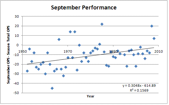
Conclusion
While it seems that September hitting as a whole is improving as time goes on, catchers don't seem to be at any extra disadvantage compared to other position players. The surprising result is that despite playing by far the toughest position on the diamond, they manage to stay fresh throughout the season without any noticeable let-up in performance. As for the Twins, they can rest easy that Mauer will be at his best for this week's series in Detroit. As for the rest of us, it's just another reason to admire the men behind the plate.
| Behind the Scoreboard | September 22, 2009 |
Can We Measure Clubhouse Chemistry?
This past weekend brought the news that Milton Bradley, the underperforming Chicago Cubs right fielder, was being suspended for the rest of the season. The suspension was brought about by his comments to the Daily Herald newspaper, in which he told reporters he was unhappy in Chicago, and that he was not surprised the Cubs had not won in 100 years due to the aura of negativity which permeates the team.
One can assume that the comments, inflammatory to be sure, but hardly the stuff that usually warrants a 3-week suspension, weren't really the whole story. Bradley, known around the league as one of baseball's biggest troublemakers, has been a clubhouse distraction and has had problems all season long, including a spat with manager Lou Piniella in June when he was kicked out of the clubhouse.
For the Cubs and GM Jim Hendry, the value of Bradley's on-field performance had been eclipsed by his attitude and behavior in the clubhouse. To be sure, part of what went into Hendry's calculus was the fact that Bradley has been a disappointment on the field - it's hard to imagine the Cubs benching him if he were having the kind of year he had in Texas in 2008. And it's that kind of calculation that is the focus of today's article.
The Intangibles
With the sabermetric revolution, one of the great immeasurable things is a player's contribution to the clubhouse. How much extra value does a "good guy" bring more than just your average player and, more importantly, how much of a determinant are those infamous "clubhouse cancers"?
These types of questions are tough to get a handle on with statistics alone. One could attempt to measure the impact on his teammates' performance, but of course, the variability is so high, the confounding variables so numerous, and the impact so small, that there would never be enough power to see any real results. Nevertheless, players' intangible qualities and clubhouse presence are purported have an impact on the teams' behavior.
While we probably can't really measure the actual impact of a player's clubhouse demeanor on his team's W-L record (sorry if that's what you came here looking for), it might be possible to examine of how teams seem to value a player's intangible clubhouse presence based upon their behavior.
A case in point is Milton Bradley. Despite the fact that Bradley is not having a year up to his usual standards, he has still been an average right fielder this year, and has been worth 1.2 Wins Above Replacement. Factor in that Bradley probably has been getting a bit unlucky this year due to the regression effect, and his true on-field value is probably more than that. Yet, the Cubs made the calculation that the 1.2 wins he was gaining on the field were less than what he was losing off the field. Hence, the suspension for the rest of the year.
Going with another Cubs example, Sammy Sosa, who was never a peach even when he was breaking home run records, was similarly ousted due to non-performance related issues. After a stormy but productive 2004 season, the Cubs felt the need to practically give away Sosa the following year. His 2.4 offensive WAR was gone and the Cubs received nearly nothing in return, eating most of his salary as well. While age and swirling steroid fears probably made Sosa's 2005 projection only about half of his 2004 value, he was still likely to be a productive player. Yet the Cubs and their fans were happy with the decision to give away Sammy because they were rid of the "clubhouse cancer".
Shea Hillenbrand comes to mind as well. With a 3-year average WAR of 1.4, he was a decent player for Toronto in 2006, and was hitting over .300 at the time, when he was outright released by the Blue Jays for disrespecting the team and the management. The Jays lost Hillenbrand's 1.4 wins on the field, but presumably, in the Jays' minds, gained back at least 1.4 wins by sending Hillenbrand's attitude packing.
Of course, there is a limit to the quality of skill that a team will jettison. Plenty of reported "clubhouse cancers" have had long, productive careers. Albert Belle comes to mind. So does Barry Bonds. Had these players been lesser talents, they would have likely been gone long ago, but teams don't release MVP-caliber players. In fact, I can't think of even a 3 or 4 WAR all-star caliber player ever having been given away or released largely due to clubhouse attitude. Instead, teams learn to deal with these players, rather than oust them. At most, they'll trade them, usually taking less value than his on-field value would normally merit.
It would appear that at max, a team considers even the jerkiest behavior worth about -1.5 wins over the course of a season. From the examples above, and some intuition, it seems that league average players can be released due to serious "cancerous" behavior, but that above that level, teams would rather deal with the player's attitude than give up his talent.
An interesting question is the distribution of a player's clubhouse impact. This is purely theoretical, but I would imagine that the impact of player's attitude is skewed heavily to the left, so that there are many players with small, but positive impacts, but that it's pretty much impossible for someone to have a very large positive impact. Meanwhile, I would imagine that the distribution skews well into the negative, where a few players can have a large negative impacts on a team. As most people who have been in group situations can tell you, the maximum positive impact that any one person can have on morale and attitude is relatively small compared to the disruption and difficultly caused by a few bad apples. At least, that's my hypothesis. As a result, while 1.5 wins may be the maximum negative win contribution a player can have on a team, the maximum positive clubhouse impact is probably much smaller. My best guess at the distribution of clubhouse attitude would something like the following:
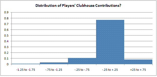
No Replacement Level Jerks
The distribution of course, is just a guess, but let's see if it makes sense in another context by looking at bench players. If the average bench warmer has a WAR of 0.5, it would make sense that there would be no benchwarmers who's attitude would be worth -0.5 WAR. If we use the distribution above, it means that that bench caliber players who are among the 90th percentile of jerkiness would not make the major leagues due to their attitude. Put another way, of the 10% jerkiest players in baseball, none are scrubs.
Does this calculation reflect reality? I've never been inside a major league clubhouse, so it's tough to know. However, relief pitcher Todd Jones seems to agree. According to Jones' article for the Sporting News, there are very few jerks who are bench guys and long relievers and most scrubs are usually good guys. Bad players with bad attitudes are non-existent, but bad players with good attitudes might make the club.
All About Chemistry
So, if we assume that each player has a clubhouse contribution, with the mean centered at zero and a small standard deviation of about 0.2 wins, how much can clubhouse chemistry really affect the team's overall performance? Multiplying the SD by the square root of 25, we see that clubhouse chemistry would have a standard deviation of 1 win, meaning that the team with the worst chemistry in baseball will lose about 2 extra games because of it, while teams with the best chemistry gain about 2 extra wins. At least, that's the best estimate we have from looking at teams' behavior with regard to their personnel decisions.
The true value of chemistry is probably so difficult to determine, that it cannot be ascertained directly. If teams are under or over valuing clubhouse chemistry, then theoretically a team could take advantage by assembling an all-jerk team or an all good-guy team to take advantage of the inefficiency. However, by looking at teams' behavior, we have attempted to estimate at least what clubhouse attitude is currently valued at among major league teams. Is it valued correctly? For that, perhaps an even more subjective view is needed.
| Behind the Scoreboard | September 14, 2009 |
Better Baseball Tiebreakers
Major League Baseball has always been particularly inept when it comes to their tiebreaking rules. Amazingly, for the first few years of the wild card, no rules were in place at all as to what happens when various multi-way ties occur in division and wild card races. To the outside, it seemed that MLB was making up the rules as it went along. Finally in 2003 some rules were codified as to what happens in the event of multi-way ties. Being the end of the baseball season, I found it an appropriate time to discuss baseball's uneven tiebreaking rules. Believe it or not, the current rules for most multi-way ties are quite inequitable and do not give all teams even close to a fair chance at the playoffs. Thankfully no multi-way ties have ever occurred, but were it to happen, baseball's current rules don't allow for the fairest of all possible outcomes. Here I'll walk through various tie scenarios, break down MLB's current rules, and propose better, fairer solutions to many multi-way ties.
Three-Way Tie for Wild Card (or Division)
One of baseball's most common multi-tie scenarios (and I use "common" loosely since it has never occurred) is the three-way tie for a wild card or division title. In this case, three teams are fighting for one playoff spot. You're probably already aware how this works - it's what baseball calls its A/B/C tiebreaker. Team A hosts Team B and the winner of that game hosts Team C. The winner of that game is the champion. In a hypothetical example, the Mets would host the Cubs and the winner of that game would host the Giants.
The Flaw: The solution indeed resolves the issue in just two games, but does so very inequitably. The Mets and Cubs are forced to win two games, while the Giants must win just one. Calculating the probabilities, I've assumed that the home team has a 56% chance of winning each game (bumped up slightly from the usual 54% because of playoff crowds and the increased travel hassle for unexpected tiebreaking games). When we do so for this scenario, the Giants (playing just one game on the road) have a 44% chance to win, while the Cubs (playing one on the road and then one at home) have just a 25% chance to win. A good tiebreaker gives each team an equal chance for victory, and the current tiebreaking rules do a terrible job, giving one team nearly double the advantage over the another. If I am the Cubs, I am going to be very angry with this set-up.
The Solution: While there's no way to remedy inequity this in just two games, I believe it would be worth just one more game to more fairly determine the outcome. In this solution, the champion would have to win two games to advance. In the example, the Giants would host the Cubs and the winner would then go to New York for a potential double-header (or games on back-to-back days if you must). To advance, the Mets would be forced to win both games, while the Cubs or Giants would need just one win in New York to advance. In this scenario, the probabilities are more fairly distributed at 38%-31%-30% instead of the current 44%-31%-25% breakdown. The solution would require only one potential extra game, no extra days, and would require no extra travel by any team. The probability chart below shows the improvement and the flow chart shows how the tiebreaker would work in a graphical form.
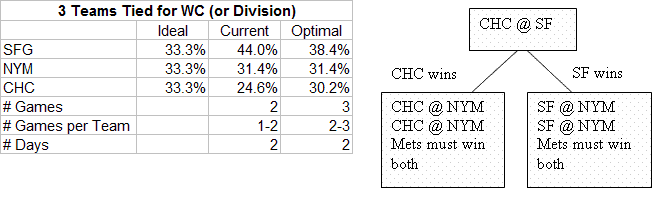
Three-Way Tie for the Division and the Wild Card
Another common three-way tie scenario is one in which three teams from one division are tied for both the division and the wild card. In this case, three equal teams are fighting for two playoff spots. I actually haven't come across this codified anywhere, but I presume MLB would again employ the A/B/C tiebreaker albeit in a slightly different form. In the case of a Dodgers-Giants-Rockies tie, LA would host SF and the loser would play the Rockies in Colorado. The winners of each game would go to the playoffs.
The Flaw: In this case, the Rockies are clearly getting the short end of the stick. They are in a must-win situation while LA and SF must win just one of two. Probability-wise, the Rockies have just a 56% chance to advance, with the Dodgers' chance is 75%. This is seriously unfair and is no way to decide the season.
The Solution: The way to fix this is much the same as the scenario above. By extending the tiebreak by just one potential extra game at the same site, we can even the odds. In the improved scenario, the Dodgers host the Giants. The winner advances while the loser goes home to host the Rockies for two games. If the Rockies win just one game, they advance, while the loser of the LA-SF matchup must sweep both games in order to salvage the wild card. This plan, seen below, provides a far more equitable 70%-69%-61% distribution of probabilities rather than the currently unfair 75%-68%-56%. Again, this solution requires just one potential extra game with no extra travel to decide things more fairly.
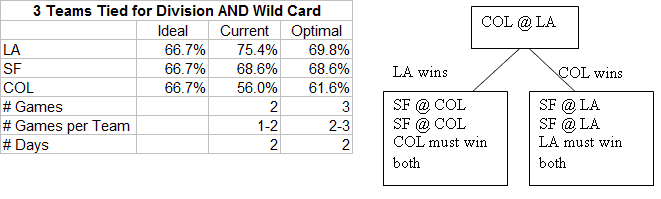
Two Tied for Division and One Other Tied for the Wild Card
This scenario, in which two teams are tied for the division and also are tied with one other team for a wild card spot, was the doomsday scenario for MLB for the first few years of the wild card era. In a theoretical LA-SF-CHC scenario, MLB would have had LA and SF play for the division title, while the Cubs were gifted the wild card. The theoretical ideal playoff odds should have LA and SF with a 75% chance to make the playoffs, and the Cubs at a 50% chance. However, this resulted in a 56%-44%-100% split instead - a major error. Thankfully, Selig and Co. have corrected this so that the LA-SF loser would play against the Cubs for the wild card.
The Flaw: This new solution is by far a better one, but is not optimal by any means. With the home field advantage determined by head-to-head records, it's possible for one team to gain a far larger advantage than it should. The current tiebreaker could have a LA having the home field in both games, while SF could be on the road in both games. This would lead to LA having an 81% chance to advance, while SF's probability would be just 69%. Other unfair possibilities include having the Cubs with home field against either team, giving them a 56% chance of advancing rather than 50%.
The Solution: This can be fixed easily enough, and unlike the above prescriptions, can be done without any additional games. The solution is simple. If one team has the home field in the first game, they should not have it in the second game, and vice-versa. This leads to a more equitable 75%-75%-49% split, nearly a perfect match to the theoretical ideal probabilities. This scenario can happen under the current rules if the head-to-head matchups fall correctly, but MLB should codify it so that it is always the case. The charts below show the difference in probabilities (with the scenario discussed above as the "current" scenario, though there are other ways the probabilities could fall under current rule as well) as well as the way the improved tiebreak would work.
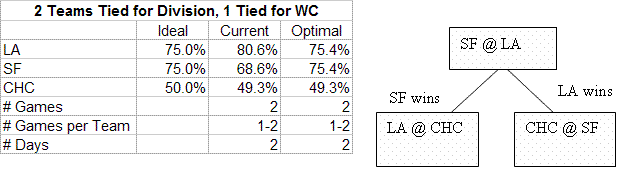
Four Tied for Wild Card (or Division)
Getting into unlikelier four team scenarios, we also see flaws in the MLB's method. This one is where four teams are tied and fighting for just one playoff spot. According to the MLB rules, "Club"A" shall play Club"B" at the ballpark of Club "A" and Club "C" shall play Club "D" at the ballpark of Club"C". The following day, the winner of these games shall play one game, at the ballpark of Club "A" or Club "B," whichever has won the game between the two."
The Flaw: The MLB solution sounds fine enough, but they again blow it with the home field advantage. Under the MLB rule, in a LA-COL-SF-SD tie, where COL hosts SD and SF hosts LA, if the Rockies and Dodgers win their games, Colorado would host it's second game while the Dodgers would go on the road for the second time in a row. There's no reason why Colorado should have the advantage of getting both home games, while the Dodgers suffer twice on the road. The flaw results in a 31% chance of advancing for Colorado, while the Dodgers' probability is just 19%.
The Solution: Again the solution is as simple as allowing the road team in the first game to play at home for the second game and vice-versa. Of course, if both home teams (or both road teams) win their respective games, then one of them must be at home again, giving them an advantage, but this can hardly be avoided. The improved tiebreaker allows for a 28%-25%-25%-22% split rather than the current 31%-25%-25%-19% probabilities. Since this requires no extra games or travel, this fix is a no-brainer. The probability charts and flow charts are below.
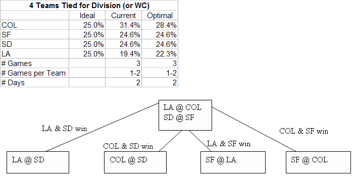
Four Tied for Division and the Wild Card
When four teams are tied for the division and also tied for the wild card, this is the one scenario where MLB gets it right. Since four teams are fighting for two spots, the simplest and best solution is to play two games, with the winners of each advancing. In the NL West scenario, where LA, SF, COL, and SD are tied, the easiest solution is to have LA host COL and SF host SD, where the winners advance.
The Flaw: The system is not perfect, since obviously the home teams in each of the games have the advantage, but this can't be improved without playing many more games (or playing at neutral sites, which would be awful).
The Solution: MLB's solution is a good one that is as fair as can be. Below are the probabilities and the (extremely simple) accompanying chart.
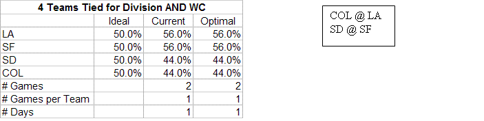
Three Tied for Division and One Additional Team Tied for the Wild Card
Another scenario where MLB's policies are egregious is where three teams are tied for the division lead and one additional team is tied for the wild card. Under current rule, the three teams tied for the division title play an A/B/C tiebreaker (A hosts B and the winner hosts C). Then the two losers play another A/B/C tiebreaker with the wild card team as the third team. In a hypothetical situation, the Dodgers, Giants, and Rockies would play an A/B/C tiebreaker. Then the two losers would play an A/B/C tiebreaker with the Cubs, who had an identical record as the other three teams.
The Flaw: There's nothing terribly wrong with the format, but when MLB does not control for who gets the advantage of being Team C, we can get some skewed probabilities. In the perfect world, the three NL West teams should have a 55.55% chance of advancing, while the Cubs should have a 33.33% chance of advancing. However, depending on who gets lucky or unlucky in being Team A, B, or C, these can be thrown off wildly. For instance, if the Giants get to be Team C (playing just one game on the road) for both A/B/C tiebreakers, then their probability to advance to the playoffs is 69% - far higher than it should be, while if the Rockies are Team B for both A/B/C tiebreakers then their chance to advance is just 43%. This is big disparity for two teams that should have the same chance of advancing.
Furthermore, in another scenario (not reflected in the table), the Rockies could be Team B for both tiebreakers, while the Cubs could be Team C for the second tiebreaker. This would actually give the Cubs a higher probability (44%) of advancing than the Rockies (43%), when in fact the Colorado should have a major advantage over Chicago.
Another oddity is that theoretically SF could advance by going 1-1 (losing as Team C in the first tiebreaker and winning as Team C in the second tiebreaker) while Colorado could be eliminated while going 2-2 (winning and then losing in both the first and second tiebreakers). This would be a very peculiar way to break a tie, since both teams' records would be essentially tied again after the extra-curricular play. I have a feeling the Rockies and their fans wouldn't be too pleased with this outcome.
The Solution: The solution of course is to control for who gets the A/B/C advantage in each round, so that one team cannot benefit by being Team C in both rounds. The improved scenario would work like this: This Giants would host the Rockies in the first tiebreaker. The winner would then host the Dodgers for the NL West title. In the second round, the Dodgers (if they had not won) would get the worst of it as Team B, while the loser of the SF-COL game would become Team C. This ensures that the Dodgers, who got the best draw in round 1, will get the worst draw in round 2. If the Dodgers end up winning the first tiebreaker, the winner of the COL-SF game gets to be Team C, while the loser becomes Team B. Meanwhile the Cubs are constantly fixed at Team A in the second round tiebreaker.
Confused? The chart below probably shows it more clearly than it can be explained in words. Overall the Dodgers, as Team C in the first tiebreaker and Team B in the second tiebreaker have a 58% chance of advancing - close to the ideal 55.6%. The Giants, who were home as Team A in the first tiebreaker, also have a 58% chance of advancing. The Rockies draw the short straw by being the road team in the first game and have a 53% chance of advancing. Meanwhile, the Cubs, fixed as Team A in the second tiebreaker, have a 31% chance of advancing - very close to the ideal 33.3%. Overall, the solution comes very close to matching the ideal probabilities - something that the current MLB rules do not do. This is a must fix.
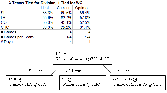
Two Tied for the Division and Two Additional Teams Tied for the Wild Card
Another possible four team scenario is where two teams are tied for the division and two other teams are tied with them for a potential wild card spot. For example, say LA and Colorado are tied for first in the NL West, while the Cubs and Mets have identical records and are hoping for the wild card. Under current rules, the Rockies and Dodgers will play first. The winner advances while the loser plays an A/B/C tiebreaker with the Cubs and Mets.
The Flaw: This scenario is again fine, except for the fact that the same NL West team can get lucky (or unlucky) in both tiebreakers and gain an unfair advantage regarding their home field and whether they become Team A, B, or C. The theoretical odds should give LA and Colorado a 66.7% chance to advance, while the Cubs and Mets should have a 33.3% chance to advance. However, if LA plays at home in the first tiebreaker and also becomes Team C for the second tiebreaker, their odds increase to 75%. Meanwhile, Colorado, if they are unlucky enough to become Team B in the second tiebreaker, has just a 58% chance to advance. This disparity is unacceptable.
The Solution: Clearly the solution is to make sure that one team does not get the advantage in both tiebreakers. An improved method is to have Colorado host LA just as before. If Colorado wins, LA moves on to the wild card tiebreaker, but since they were on the road before, they get to be Team C in the second tiebreaker. Likewise, if LA wins, the Rockies must be Team B in the wild card tiebreaker, since they had home field the first time. The Mets are fixed as Team A, while the Cubs become either Team B or Team C depending on the outcome of the LA-COL game. The new solution creates a probability breakdown of 69%-67%-33%-31%, which is much better than the potential 75%-57%-38%-28% scenario which is possible under current rule. Below is a chart of potential probabilities and a flow chart of how the improved tiebreaker would work.
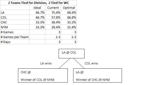
Two Teams Tied for Two Different Divisions and the Wild Card
The final four team scenario we'll look at is if two teams are tied for one division, another two teams are tied for another division, and all four teams are tied for the wild card. In a hypothetical example, LA is tied for Colorado in the West and the Cubs and Cardinals are tied for the Central, with all four teams also eligible for the wild card. Under current rule, both divisions will be decided by one-game playoffs with the losers playing for the wild card.
The Flaw: As with the other scenarios, one team can gain a double advantage by being the host of both games, while another team may be forced to go on the road for each game. If Colorado hosted LA, and the Cardinals hosted the Cubs, it's possible that LA would end up going to St. Louis, giving the Cards two home games and LA two road games. All teams should theoretically have the same probability of advancing (75%), so this clearly is unfair to the Dodgers.
The Solution: The scenario above can be rectified by forcing the Cardinals to go to LA rather than vice-versa. Like the other tiebreaking solutions, teams with the advantage in the first tiebreaker should not be given the advantage again where possible. The charts below show the improved solution, where we see more equitable probabilities.
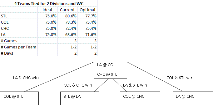
Conclusion
As you can see, there is much room for improvement in MLB's tiebreaking procedures (I haven't explained the probability calculations in detail, but feel free to ask questions in the comments). While at least now they have some procedures in place, they are not the fairest solutions to the ties. Tied races are one of baseball's rarest and most exciting events, and when a three-way or four-way tie inevitably occurs, baseball should make sure it has the procedures down right (I've also developed some 5 and 6 way tiebreaking procedures, but that will be saved for a later post if there's interest). Implementing the procedures just outlined can go a long way towards making things more fair and avoiding controversy in the future.
| Behind the Scoreboard | September 08, 2009 |
Defense Never Slumps (Or Does It?): Estimating the Variability of Defensive Performance
One of the oldest adages in baseball is that speed and defense never go into slumps. The thinking goes that while hitting and pitching are subject to a lot of variability, fielding and speed remain relatively constant and unaffected by luck and other factors. Due to random chance, a hitter may have a fairly good or fairly poor season simply by luck, all while his true batting skill remains the same. However, it's thought that a fielder's performance will remain steady and be mostly unaffected by chance. However, I'm not convinced that defense is as constant as the old adage states. In this article, I'll try to estimate the inherent variability of a fielder's performance during the course of a season.
When the ball is hit in play towards a fielder, that fielder has a chance to make a play on the ball. Sometimes he'll be able to make a play and record an out, and other times he won't. This uncertainty leads to the variability. For instance, suppose the batter hits a ball up the middle, and the shortstop dives to make a stop and throw to first for the out. The shortstop made a fine play, but if 100 of those exact same balls are hit to the same fielder, he probably does not make that play all 100 times. Maybe he only makes that play 50 times, while on the other 50 balls, he doesn't get quite as good of a jump on the ball, or mis-times his dive, or can't get enough mustard on the throw. Overall, based on his fielding skill, the location of the ball, speed of the batter, etc, he had about a 50% chance to make the play, and in this case he got a little bit lucky in being able to convert that 50% chance to record an out.
Just as with hitting, this luck doesn't necessarily even out over the course of a game, a week, or even a season, and hence, it's possible a player may have a good (or poor) fielding season simply due to luck. But is fielding subject to the same random fluctuations as hitting?
Of course, not every ball in the field is a 50-50 proposition. Many balls are either sure hits or (nearly) sure outs and there is not much room for chance with these balls. Obviously if every ball were a sure hit or sure out, fielding wouldn't be subject to any variation at all. To determine the amount variability associated with fielding, we'll need to know the distribution of out probabilities for a batted ball.
Distribution of Out Probabilities
Many defensive metrics, such as Ultimate Zone Rating (UZR), already estimate the probability of an out on each batted ball by dividing the field into small areas and measuring proportion of plays made in each area. But, while these systems are good for measuring the skill of defenders over the course of a season, these systems aren't designed to get an accurate probability on a single play. While UZR may say that a ball has a 30% chance of becoming an out, the actual probability of an out may be as low as 0% or as high as nearly 100% when factoring the exact location and trajectory of the hit, position of the fielder, skill of the fielder, speed of the runners, etc. Due to these limitations, data from UZR or other systems won't be of use here.
So, how can we get the distribution we are looking for? The best way I could think of was to put on my scouting hat and estimate it with my own eyes. Using MLB.TV's condensed game feature, I picked a random sample of games and looked at 200 balls in play. On each ball, I estimated the probability that an out would be recorded - in other words if the same ball was hit in the exact same spot again, with the same fielder, runners, etc, how often could the fielder turn the play into an out? While my estimates surely won't be perfect, it should get us the rough distribution of probabilities we are looking for.
Overall, in 200 balls in play, 96 balls were nearly sure outs, in which I estimated the probability of an out to be 98% or higher. These were routine flies and grounders which we are all so accustomed to seeing. 35 balls were likely outs, in which I estimated the probability of an out to be between 80%-95%. 22 balls were toss-ups, with a probability of an out estimated between 25%-75%. 13 balls were likely hits, with a probability between 5%-20%. And 34 balls were sure hits, where I estimated an essentially 0% probability of an out being recorded.
A histogram showing this distribution is below:
As you can see from the histogram and the text above, the distribution of out probabilities is bimodal, in that most balls are either certain outs or certain hits, while there are relatively few balls in between. This finding probably matches your intuition.
Calculating the Variation
This type of evaluation gives us a rough distribution of the probability that a batted ball will be turned into an out. From this we can calculate the standard deviation of a player's fielding ability. If the same players were to field the exact same 200 balls over again, according to the probabilities I assigned, we would expect them to record 139.3 outs with a standard error of 3.3 outs. The standard deviation on one ball in play is 3.3/SQRT(200) = 0.23.
What does this mean over the course of a season? Usually there are about 4000 balls hit into play against a team during a year. Using the standard deviation of 0.23 we see that we would expect that the number of outs recorded by the defense would have a standard error of 0.23*SQRT(4000) = 14.5 outs. If we assume that the run value of each hit is .55 (mostly singles, with some doubles) and the run value of each out is -.28, we find that the standard error of the number of runs allowed by the defense over the course of a season is 14.5*(.55+.28) = 12.0 runs.
So, after a lot of math, the bottom line is that the plays made by the defense will vary by give or take about 12 runs simply due to luck, even when the fielders' true skill remains the same throughout the year.
How does this compare to the variability of offense? In contrast, the standard deviation of linear weights batting runs in one plate appearance is about 0.43 runs (compared to a SD of 0.19 runs for fielding). Over the course of a season's worth of 6200 plate appearances, the standard error of the number of runs produced is 34.2 runs. As we can see, this is much larger than the standard error of 12 runs surrounding a team's defensive efforts.
Conclusion
We see that over the course of a season, indeed, the old adage is right in some respects - the amount of luck associated with fielding is much less than the amount of luck associated with batting. However, the standard error of 12 runs is also nothing to sneeze at, and from these calculations we see that lucky fielding can give a team one or two extra wins over the course of a season (and of course the reverse is true for unlucky fielding).
From an individual player's standpoint, the average fielder has about 500 balls in play in his area over the course of the season (of course, this varies by position, and we can adjust accordingly) . Using the numbers above, we see that the average fielder has a standard error of about .23*SQRT(500) = 5.14 outs over the course of a season. This means that he is prone to make about 5 or so more or 5 or so less plays in a season than his true talent would usually call for. This corresponds to a difference of about 4 runs in a season. While this is fairly small, it does show that random variability can play a part in a fielder's performance just as it can for hitters.
Since not all balls are identical, the variability associated with fielding performance is not easily calculated like it is for offensive performance. By doing this calculation, this article hopefully sheds some light on the natural variability we can expect to be associated with fielding. More research can be done by checking to see how the probability distributions (and hence the variability) might differ by position.
| Behind the Scoreboard | September 01, 2009 |
Waiver Deadline Round-Up
Several teams made deals in the final hours of the trade deadline, giving some teams' rosters a boost in the final month of the season. Teams on the other end of those deals had the opportunity to cut costs and restock their rosters for the future. Today I'll be looking at those deals and reviewing the winners and losers.
D'Backs trade Jon Garland to Dodgers
The Dodgers get a solid starting pitcher in Garland, who has had a fine season - one that's about average for his career. With Arizona he posted a 4.29 ERA while putting up a 4.61 Fielding Independent Pitching (FIP) number. Garland had signed with Arizona for a salary of $6.25 million with a $10 million mutual option in 2010 ($2.5 million buyout if the club declines and $1 million buyout if Garland declines). According to late reports, the Diamondbacks will pick-up the rest of the Garland's salary as well as any buyout money for 2010. In terms of cash the Dodgers have nothing to lose and all Arizona gains from the deal is the player-to-be-named later.
From the Dodgers perspective, it would seem like a good deal. However, with an already strong rotation, Garland will drop into the 5th spot in the rotation, replacing knuckler Charlie Haeger. With Wolf, Billingsley, Kershaw, and Kuroda all more effective than Garland, it's hard to see where he would fit into the post-season roster, especially since the bullpen is equally as stocked. While Garland can help the club by taking the ball every 5th or 6th day (which is it, Joe Torre?), with the Dodgers already having a 99% probability of making the playoffs, this won't really change much.
In actuality, while the pickup of Garland surely won't hurt, it's tough to see how the move really helps the Dodgers a whole lot. The deal, in total, is a bit puzzling, with Arizona receiving little for a player who only marginally helps LA. Garland could have been a big help on a few other clubs such as Texas, Minnesota, or Colorado, where he could have helped the team make the playoffs and been a solid #3 or #4 contributor in the playoffs as well. Since he would have been more valuable in those locations, it would seem these teams would be able to give a little more in return for Garland, making both sides happier than the deal which actually occurred.
White Sox trade Jose Contreras to Rockies
The aforementioned Rockies also needed some pitching help, and got some from the White Sox, with 37-year old Jose Contreras packing his bags for Denver. By traditional metrics, Contreras has had a dismal year, posting a 5.27 ERA and a 5-13 record for Chicago. His tRA and FIP are pretty good however, at 4.37 and 4.12 respectively, indicating that perhaps he has been the victim of some bad luck, bad defense, or both.
For Colorado, it's worth taking a flyer on Contreras especially considering the state of their rotation. Still, Contreras is not the horse he used to be, getting roughed up and removed in the 5th or earlier in five of his last six starts and averaging just 5.4 IP/start on the year. Colorado, may also have been wooed by Contreras' reputation as a "big game pitcher" as the Rockies figure to have plenty of them down the stretch this year. It should be noted however, that many of Contreras' big games came in seasons in which he pitched terrifically during the regular season as well - something he is clearly not doing this year.
In return, Chicago will get Brandon Hynick, a 24-year old right-hander who has pitched pretty well in AAA this year, not a terrible return for a 37-year old pitcher having a bad year on team that is close to falling out of the pennant race.
White Sox trade Jim Thome to Dodgers
As if the Contreras deal wasn't enough, the Jim Thome trade officially waves the white flag for the White Sox, who still had a small, but possible chance to make the playoffs (BP has it a 5.5%). The loss of Thome, who had become a fan favorite in Chicago and is one of baseball's all-time good guys, will be a blow to the Sox and their fans both on and off the field. The mini-fire sale from the Sox is interesting, since only a month ago they were buyers in picking up the big contracts of both Jake Peavy and Alex Rios (neither of which has thus far paid dividends), but an 11-17 August has a way of changing things. The Sox get virtually nothing in return (a 26-year old Class-A player) except savings on an undisclosed amount of Thome's remaining salary. I don't like this move for the Sox - giving up a fan favorite and giving up on the season when you're still just six games out isn't the way to endear fans - especially when the return on such a move is quite small.
Nevertheless, the White Sox' loss is the Dodgers gain as they gain a bona fide masher in Thome, who at age 38 can still hit. GM Ned Colletti has already said Thome won't play first-base, but he'll be dangerous as the Dodgers top pinch-hitter and only left-handed power off the bench. That will come in handy during the playoffs. The trade will also pay off doubly if the Dodgers can reach the World Series where he will almost certainly be the starting DH. Thome is hitting just .249 but has a .372 OBP and 23 homers in just 417 AB's.
For my money, the Dodgers ought to test Thome at first base in any case. Thome had a career UZR per 150 games of -2.4, while James Loney, the Dodgers current first baseman, has a career UZR per 150 games of -2.2. While it's been awhile since Thome has played first regularly, it might be worthwhile to see if he can still perform there. Thome would be an improvement over Loney at the plate which may (or may not according to the Dodger's calculations) offset the defensive loss. Why not try out Thome at first during the relatively meaningless regular season and see how he does?
UPDATE: Here's why not. According to Ned Colletti: "In fact, the night before the deadline he called me. … He just said: 'I just want to be honest with you. I’d love to come. I want to help you guys any way I can. But playing first base is not something I’m going to be able to do — maybe in an emergency situation, perhaps.' "
Giants sign Brad Penny
The final big acquisition Monday night was the signing of Brad Penny by the Giants. The move should be a boost to San Francisco as Penny will step into the #5 spot which was vacated by the Randy Johnson injury. Penny is another guy who has had a poor season by usual standards (7-8, 5.61), but a less terrible FIP (4.49) and tRA (5.21). Penny is clearly not in his old form, but considering the Giants' other options (Ryan Sadowski, Joe Martinez), Penny is a good pick-up, especially considering the move cost them less than $100,000. With a 24% shot at the playoffs according to Baseball Prospectus, every game will be big. While Penny won't likely be much use once the playoffs begin, with luck he can help them get there. For Penny, the signing is an opportunity to revitalize what has been a lost past two years.
With the final moves made, and the postseason rosters set, the GM's and front offices can simply sit back and watch as the teams they have assembled push for the final few playoff spots. Time will only tell how these big four moves will work out.
| Behind the Scoreboard | August 24, 2009 |
The Best Team (A Reasonable Amount Of) Money Can Buy
We're entering the dog days of the baseball season and, with about a month and a half to go, I thought it would be a good idea to look back on the free agent class of 2009. An old adage claims that you can't build a team around free agency alone. And, while this is pretty accurate, there are of course, ways to dramatically improve a team's fortunes through free agent pickups. The problem of course is that free agents cost dramatically more than players in their first six years, so to building a great team out of free agents alone is fairly difficult unless your team happens to be in the American League and hail from New York.
But, with outstanding foresight, is it possible to build a pennant contender entirely out of free agents for only the league average payroll of about $80 million dollars? In this article, I'll take a crack at that, and along the way, take a look at the best bargains of 2009.
Building a Ballclub
I'll start my theoretical team full of replacement level players, which I'll assume, as Fangraphs does, will play at a level equivalent to a .300 winning percentage. To evaluate a potential free-agent's contribution thus far to my team, I'll simply look at the Wins Above Replacement (WAR) as calculated by Fangraphs. Since I am defining all of my other players as replacement level, I can simply add the free-agent's WAR to my team's expected win totals to see how their addition would impact the club. After 120 games, we would expect our replacement-level team to have a 36-84 record, but with good free agent signings, we can increase our win total.
There are about 700 plate appearances at each position over a full season, and since we've so far played about 3/4ths of a season, we have about 525 PA's to allocate at each position if we so choose. I'll also assume that each player could have been signed for the same amount of money that he actually signed for before the 2009 season.
Infield
Starting at catcher, we'd like to sign David Ross (1.3 WAR in 122 PA) for $1.5 million and Gregg Zaun (1.4 WAR in 227 PA) for $1.5 million. Our replacement level catcher worth 0 WAR will take over the duties for the remaining 176 PA's.
At first base, the pickings are slim. Of course, Teixeira is out there, but we don't want to break the bank. The best we can do on the cheap is to sign Wes Helms (0.8 WAR in 173 PA's) for $1 million. Our replacement level first baseman can take over the rest of the first base position's PA's.
At second, the obvious free agent choice is Felipe Lopez, who currently is tearing it up with Milwaukee for the total of $3.5 million - pricier than our other selections, but well worth it at 3.1 WAR over 511 PA's.
At third base, our theoretical "20-20 hindsight" team will go even pricier to sign Casey Blake away from the Dodgers. At $5.8 million he's not found in the bargain bin, but has provided 3.1 WAR over 474 PA's so far this year.
Our pick at shortstop is Juan Uribe, who has been decent, but not great for the Giants this year with 1.2 WAR over 278 PA's. However, he can be had for just $1 million.
Rounding out the infield is jack of all trades, Craig Counsell, who in 378 PA's can fill out the missing PA's at shortstop, third, second. He actually goes slightly over the allotted PA's, so we'll proportionately scale back his 2.2 WAR to just 1.8 WAR. He's been a bargain for just $1 million.
Though the infield, and at catcher, we've spent a total of just $15.3 million, but so far have a total of 13.1 WAR, bringing our win total up from 36 to 49 and bringing the WPCT up to .408.
Outfield
In the outfield, we'd like to emulate Angels' GM Tony Reagins, and sign both Bobby Abreu and Juan Rivera. Right fielder Abreu can be had for just $5 million and gives us 2.7 WAR in 501 PA's, while Rivera signs for $4.25 million but is the MVP of our team, adding 3.3 WAR in 421 PA's. In centerfield we'll sign Scott Podsednik for $500,000, providing us with 1.2 WAR in 431 PA's. At DH, we can make our biggest free agent buy yet, signing Raul Ibanez, who is having a career year in Philadelphia for $10 million. He provides 3.1 WAR over 413 PA's.
That rounds out the offense. Adding up the WAR, we've raised the team record to 59-61 - not bad on just $35 million worth of free agent hitters. In fact, had we not signed Ibanez, we could have still been competitive on a Marlins-esque $25 million - the difference being that our club came together entirely through free agency.
Pitching
Moving on to the pitchers, one would think we could power our way to the playoffs with $45 million to shore up a replacement-level pitching staff. Starting off, we can sign Dodgers' starter, Randy Wolf, for a fairly pricey $7 million. However, he's been good this year, adding 2.7 WAR to the team. We can also add Mike Hampton - he hasn't been great, but he's worthwhile at 0.8 WAR for $2 million. Rounding out the rotation is Brad Penny at 2.1 WAR for $5 million and Carl Pavano at 2.5 WAR and about $6.5 million (including performance bonuses he is likely to earn).
The Team
At this point, we've got a pretty good team (67-53) for just $55.5 million. We've already plucked the lowest hanging fruit, and to squeeze more wins will take substantially more cash. At this point, the best return on a full $80 million may be signing the dominant Sabathia and paying his enormous contract of $23 million for a return of 4.2 WAR. That's the highest WAR on the team but he's by far the worst deal at over $5.5 million per win. Out of cash, the bullpen is left to fend for itself with replacement players - there were no good bargains out there anyway. However, the Sabathia signing brings the team to an outstanding record of 71-49, with a playoff bound winning percentage of .591, good for 4th best in the majors for only $78.6 million dollars. Below, you can see the "All-Bargain" team as a whole and their contracts and values:
Caveats
Looking at the team, a few things jump out at me. One is the relative ease in which we were able to find cost-effective position players contrasted with the difficulty in finding cost-effective pitchers, particularly relievers. It would seem as though this would either show an inefficiency in the free-agent market or a problem in the calculation or definition of Fangraph's WAR values. After all, WAR should be equal to the player's marginal win value to a team regardless of position. Without doing an in-depth examination, I can't be sure what's going on or if it was just a fluke in this particular 2009 season.
Another potential issue is the calculation of WAR for pitchers. According to their WAR, Brad Penny and Carl Pavano were good bargains and quite valuable to their teams this year. However, with ERA's of 5.61 and 5.20 respectively, these players have been widely seen as busts in Boston and Cleveland this year. In the case of Penny, he's actually being removed from Boston's rotation. Fangraphs uses Fielding Independent Pitching (FIP) as the basis for their calculations and indeed both Penny and Pavano have good peripheral statistics - but the fact is that they gave up a lot of runs this year. A lot of that may be due to bad luck, but nonetheless, that is part of their performance, so I'm not quite convinced that the Fangraph's WAR based on FIP is completely the right statistic to use here. This has been debated before and you can check it out the debate here.
Conclusion
These issues aside, it is interesting to see how well you can build a team with 20-20 hindsight. The moral of the story is, yes, you can build a playoff bound team entirely built through free-agency. However, it's really hard. Even with the enormous advantage of knowing how a player would perform in advance, we were still only able to become the 4th best team in baseball after spending the league average in payroll. Not to mention that most, if not all of these players are playing over their heads (that's why they were such good bargains), and thus I would expect the performance of the team to drop precipitously during the month of September. Nevertheless, creating the team has been a fun exercise for the dog days of August.
| Behind the Scoreboard | August 18, 2009 |
Strasburg, The Nats, and Game Theory
Last night, the big news around the baseball world was the Nationals coming to an agreement with Stephen Strasburg, the most touted college pitcher in perhaps the history of the draft. For those still waking up, Strasburg signed a foul-year deal worth $15.1 million, making him the richest draftee ever, but falling far short of the $50 million figure agent Scott Boras tossed around at the time of the draft.
Last night's 11th hour dealings were an interesting study in game theory, with super-agent Scott Boras, matching wits with Nationals owner Ted Lerner, team president Stan Kasten, and GM Mike Rizzo. Oh yeah, and Stephen Strasburg himself also had a say in the process. The baseball world watched intently last night because while both parties had a lot to gain from making a deal, both had much more to lose by not signing. Strasburg had a powerful incentive to sign, because if he did not, he would have to sit a year, risking injury or regression, just to be back in the same situation a year later. The Nationals of course, had an incentive not to let a can't miss prospect that the franchise so desperately needs to slip through their fingertips.
In fact, both sides were likely miles apart on the value of the contract....but not in the way you might think. For the Nationals, the value of the wins Strasburg will produce may be $30-$40 million dollars, at least as valued by the WSJ and Biz of Baseball. If they pay more than that theoretical "break-even" dollar amount, that means they could get those wins more cheaply elsewhere. If they pay less, they'll be getting a bargain.
Strasburg also had a break-even point, except his was determined by the amount of money he could likely get the following year, if he decided to sit out the season. Of course this has to factor in any depreciation that might occur, due to injury and the decreased leverage he'll have the following year if he decides to sit. When factoring the uncertainty and the risk, plus the fact that the young man wants to play big league baseball, a guess for his break-even point would probably be somewhere around $11 million. Anything more than that would be gravy, while anything less and he would be hurting himself by signing rather than holding out and re-entering the draft next year.
Graphing the intersection of these two (admittedly hypothetical) value curves, we see that the both sides should have been willing to do a deal valued anywhere between $11-$35 million. While the lines intersect where each side gets an equal gain from the deal at about $23 million, any deal struck within that range should have be acceptable. So why did the negotiations come down to 11:59 last night? Well, each wanted to get the best deal of course. When the possible value acceptable deals ranges so widely, it's hard to come to an agreement - after all there is big difference between $11 million and $35 million, and while both sides would theoretically gain with a deal anywhere in that range, neither side wants to be seen as chumps.
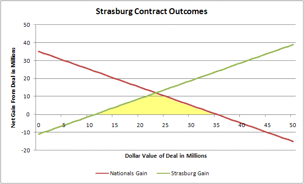
Of course, using those break-even points, the final deal, at $15.1 million, was far more advantageous to the Nationals than Strasburg. Why? For one, I mentioned that the Nationals would be getting a bargain at anything less than a $35 million dollar deal. But, in the MLB draft, teams are accustomed to getting big bargains. That is why having high draft picks is a good thing - the draft is a place where you can sign valuable players for less than you could elsewhere. If teams paid market value according to their projected Wins Above Replacement, there would be no advantage to having high draft picks or even drafting many players at all.
Second, the deal does not occur in a vacuum. The Nationals are aware that their negotiations with Strasburg will affect how other players negotiate with them in the future. If the Nats broke down and gave Strasburg a $30 million deal, this might be worthwhile in the short-term, but they would also raise the expectations for every other high profile player they picked in the future (including a likely Bryce Harper selection next year, which will almost assuredly entail the same type of negotiations as this year's drama with Strasburg). When this is factored in, the true break-even point for the Nationals is lowered considerably.
Strasburg, on the other hand does not have this same kind of recurring scenario. At most, Strasburg will be back at the bargaining table with the Nats one or two more times, and those will be under completely different pretenses since he will by then be eligible for either arbitration or free agency. As a result, Strasburg's break-even point isn't changed much by the possibility of future deals (Boras, on the other hand does have an incentive to draw a hard-line and raise the break-even point since he will be back at the same bargaining table many times - however, as the player, Strasburg has the final say).
Third, the way the negotiations are structured gives the Nationals an advantage. With a firm deadline imposed by MLB, the parties must come to an agreement by a specific time. Since it is the team that offers the player the contract, and not the other way around, this gives teams the final leverage to push the value of the contract towards the player's break-even point. For instance, the team can tender a "final offer" to the player before the deadline and refuse to entertain other scenarios. With the clocking ticking and the offer on the table, it is Strasburg, not the Nationals, who must decide in the final moments whether or not the deal is satisfactory. And, if that deal is worth more than Strasburg's break-even point, he'll sign it. The Nationals, knowing this, can offer a deal worth slightly higher than his break-even point, and he should still sign.
Of course, if there is no deal on the table, and the team is still listening and cowing to Boras' demands at 11:55, the Nats lose a lot of their leverage. In fact, under the game-theory principle of eliminating options, it might have been a good idea for the Nats brass to take a mid-August jaunt to a remote, unreachable island in the Pacific, or an expedition to cellphone-towerless Antarctica. By giving Boras a contract, saying "take it or leave it, see you later" and truly being unreachable at the deadline, the Nationals would eliminate the possibility of extending a higher offer, thus putting the onus on Boras and Strasburg to accept the the Nats offer or go without.
As it turns out, the Nationals didn't have to go to the South Pole or the Moon to sign Strasburg to a very reasonable deal. Considering that virtually every scout projects him as a future #1 starter and someone who can immediately step into a major league rotation and produce, the Nationals came away with a bargain. If Strasburg's value was truly $35 million, the Nationals just saved $20 million over the price they would have had to pay for getting those wins elsewhere. Here in DC, having watched the Nationals bungle move after move, I was pleasantly surprised that Washington seemed to handle the negotiations very well, signing the new face of the franchise with 77 seconds to spare, and putting them in good position to sign Bryce Harper to a similar deal the following year.
Now that the anticipation of the deal is over, the anticipation of Strasburg's first major league start begins....
| Behind the Scoreboard | August 11, 2009 |
How Best to Measure a Team's True Talent
One of the first sabermetric principles that many people learn about is how a team's winning percentage can be predicted by the number of runs scored and allowed. This Pythagorean winning percentage takes the following form: WPCT= RS^1.81/(RS^1.81 + RA^1.81). It was introduced by Bill James and is purported to detect whether a team is underperforming or playing over their heads and is billed as a better guide of a team's true talent. This concept has reached so far into the mainstream that it is even included in the MLB.com standings.
Furthermore, sabermetricians can dig deeper into a team's performance, and estimate the amount of runs that a team is expected to score or allow, based on the components of hits, walks, and outs tallied by a team or its opponents. Applying these run values to the Pythagorean winning percentage method can supposedly provide an even better guide to a team's true talent level, since even more of the variability is removed from the equation. Talking to some sabermetricians leaves the impression that W-L record should be thrown out all together and only these deeper metrics should be examined.
Hail Pythagoras?
But while some claim that the Pythagorean winning percentage or its counterparts are a better guide to a team's ability, is this actually so? This concept has been studied before, but here I take another look at it. Which one of these three metrics (WPCT, Pythagorean WPCT, and component Pythagorean WPCT) is best and is there some way to combine all three metrics to get the the best possible estimator of a team's ability?
Using retrosheet data going back to 1960, I obtained the statistics to calculate WPCT, Pythagorean WPCT, and component Pythagorean WPCT (based upon Bill James' Runs Created). I then randomly selected 25% of each team's games and calculated these metrics from these games only. From these 40 or so games, I attempted to predict the team's actual WPCT in the remaining games that were not sampled. How did each of these metrics fare?
Fitting a Model
First, using teams' regular WPCT from the sample 25% of games, we can fit a simple model to predict the teams' WPCT in the other 75% of games. To increase the power of our dataset, we can randomly draw many such 25% samples and average the outcomes. I drew 100 such random samples and ran the results. When doing so, we get the following formula:
Remaining WPCT = .363*(Current WPCT) + .319.
The RMSE of this estimate of WPCT is .0659, meaning that the winning percentage for the remaining games has a fairly wide range of outcomes - no surprise to any baseball fan. Also no surprise is the fact that the teams' WPCT over 25% of its games is regressed to .500 fairly strongly. A team playing .650 baseball over 40 games has an expected true winning percentage of just .555. The RMSE underscores the uncertainty - a 95% confidence interval has the team's true WPCT somewhere between .424 and .686.
But, does this improve at all when using the Pythagorean formula for estimating WPCT from runs scored and runs allowed? The formula for this is following:
Remaining WPCT = .440*(Pythagorean WPCT) + .280.
In this case, the teams' WPCT regresses less strongly - a team with a .650 Pythagorean WPCT has an expected true WPCT of .566 rather than .555. The accuracy is improved, but the RMSE is still .0648, only slightly better than using regular WPCT.
How about for the Component Pythagorean WPCT using Runs Created? The formula is nearly the same as that for the regular Pythagorean WPCT. It performs the best of the three methods, with a RMSE of .0643, though again, the increase in accuracy is small.
So from the above, we see that with 40 games of information, all three methods have similar accuracy, though the Runs Created Pythagorean formula fares best, and real WPCT fares the worst.
Combining All Three Metrics
How about when all three measures are used to try to predict WPCT? Putting all three measures in the model, we get the following formula:
Remaining WPCT = .103*(Current WPCT) + .094*(Pythag WPCT) + .268*(RC WPCT) + .268.
When comparing the three types of estimated WPCT's, real WPCT gets about 20% of the weight, another 20% goes to the Pythagorean WPCT, and the final 60% of the weight goes to the Runs Created Pythagorean formula. Of course, this is all regressed back to the mean as well, so that a team with a .650 WPCT in each of the three metrics would be expected to have a true WPCT of .570. The RMSE of this estimate is of course lower than each of the three measures separately, but is still high at .0638. This compared to .0659 for using WPCT alone.
What can we take from this information? We see that indeed the sabermetricians are right - a team's performance broken down into runs created components is a better gauge of a team's true talent level than just looking at a team's winning percentage alone. However, using all three metrics provides the best estimate of a team's true talent.
Much Ado?
But is all of this worth it? The increase in accuracy when looking at all three metrics is very small. Taking the expected random variability out of the RMSE, using the formula Variability in the Prediction of True Talent = RMSE^2 - Variability of WPCT by Chance, we see that the standard error of our prediction of true talent is .0450 when using the full model, while the standard error is .0479 when using WPCT alone.
This means that a 95% confidence interval around .500 would be (.410,.590) for the full model, while it would be (.404,.596) when using WPCT alone. Is this increase in accuracy really worth all of the trouble? You can make your own judgment, but I think it's fair to say that looking at a team's Pythagorean WPCT or component Runs Created WPCT doesn't necessarily tell you a whole lot more than looking at WPCT alone.
Extensions of the Model
Of course, this discussion has so far only concerned the case where the team has played just 25% of its games. What happens when the result of more of the season is known? Below is a table of model results, showing the coefficients for each metric after 25%, 50%, and 75% of the season is known respectively.
As you can see from the results above, the weights given to each metric remain relatively stable no matter how many games have been played. The WPCT estimated from Runs Created remains the metric with the most weight in the full formula, while the Pythagorean WPCT and real WPCT are about equal in importance. As we approach the 3/4ths mark of the season, we can see that when trying to assess a team based on its performance thus far, about 50% of our estimate should come from the Runs Created measure, and about 25% should be from the team's real WPCT and the team's Pythagorean WPCT respectively. The formula is as follows:
Remaining WPCT = .173*(Current WPCT) + .194*(Pythag WPCT) + .365*(RC WPCT) + .135.
This is slightly more accurate than using WPCT alone, decreasing the SE of the true talent estimate from .0399 under WPCT alone to .0365 by using the full model.
Conclusion
As I said earlier, this increase in accuracy is quite small, so this entire debate may be a matter of much ado about nothing. Someone simply looking at W-L records is apt to have nearly as good of an idea of a team's true talent as someone calculating complicated formulas. Nevertheless, it comes as no surprise that using all three measurements gives a better result than using any one of the metrics.
While the Pythagorean method may be a more accurate measure of a team's true value, it hardly makes the a team's true WPCT obsolete. Simply knowing the components that go into winning a game cannot replace the knowledge of a team's actual record. Things such as bullpen usage, managerial strategy, and player motivation are not modeled in the Pythagorean method. The results of these models show that these factors cannot be ignored and thus, a team's actual W-L record is still relevant.
| Behind the Scoreboard | August 04, 2009 |
Staying Alive: Who Has the Advantage After Fouling Off Multiple 3-2 Pitches
You've probably heard your local announcer say it at one time or another after a hitter has fouled off pitch after pitch on a 3-2 count: As the at-bat is extended the pitcher has to show more of his arsenal, and the advantage shifts to the hitter. In this week's article, the last in a series which has analyzed baseball by the count, I check in to see if this is true, or if it's simply one of baseball's old wives tales.
While obviously the hitter helps himself by fouling off pitches to stay alive rather than striking out, it's unclear if a hitter really gains by extending the at-bat, or if he just puts himself back in the same position on the pitch before. I remember watching a Cubs-Dodgers game in 2004 when Alex Cora battled through an 18-pitch, 13-minute at-bat to eventually hit a home run off Matt Clement. Did Cora gain an advantage by fouling off so many pitches, or was he just as likely to hit that home run on the first 3-2 pitch of the at-bat? Or on the other hand, was his home run even more unlikely due to the mental and physical drain or fouling off so many pitches?
Who Has the Advantage?
While there aren't many data points on 18-pitch at bats, I used 2007 retrosheet data to take a look at this question (removing intentional walks and at-bats with bunt attempts, pitchouts, etc). Focusing just on the number of foul balls with a 3-2 count, I looked to see whether hitters who fouled off a lot of pitches really did fare better than those who resolved the at-bat soon after it reached 3-2. The table below shows how hitters fared after various numbers of 3-2 foul balls.
The result shows that there is some truth to the old wives tale, but does not back it up whole-heartedly. At-bats that resolved after the count first reached 3-2, made up the majority of the data. These batters hit .225 with a .465 OBP and a .373 SLG average. This was virtually identical to the numbers hitters put up when the count resolved on after one foul ball. The numbers there were .229/.461/.384.
However, we start to see the myth become reality after two foul balls. When the at-bat is resolved after two fouls, we see a dramatic increase in all three key measures, with the numbers measuring .260/.496/.432. With over 2500 PA's in the sample, this was a statistically significant difference from 3-2 at-bats that resolved earlier. The standard error of BAV and OBP is approximately 10 points. When the at-bat gets to this point, it appears that the batter does indeed gain an advantage as conventional baseball wisdom would suggest.
However, these numbers decrease again after 3 fouls, and after the 4 or more foul balls, they decrease sharply, with batters putting up a .201/.414/.312 line. In this case, only 599 plate appearances contributed to the data, so the standard error is fairly high at 20 points, making the difference from the average 3-2 count BAV not quite significant. The differences in OBP and SLG however, are significant, showing that not only does the batter not gain from a long at-bat, in fact, it is the pitcher who earns the advantage.
At this point you may be wondering if perhaps there was some sort of selection bias. Perhaps good hitters simply don't foul off pitch after pitch, so this is the reason that we see the difference results. As a matter of fact, this isn't the case. The chart below shows virtually identical overall batting averages for the hitters in each of the situations.
0 Foul Balls: .269
1 Foul Balls: .270
2 Foul Balls: .271
3 Foul Balls: .270
4+ Foul Balls: .271
If there were selection bias, we would expect there to be a different quality of hitter in each situation. Since we don't see this, we can be reasonably confident in the above results. Conventional baseball wisdom is right: Fouling off pitches does favor the hitter - but only to a point. Four or more fouls sees the pitcher re-take the advantage for the remainder of the count.
Why?
The results are basically that after two foul balls, the batter does indeed gain the advantage, but after four or more fouls, the pitcher has the edge. However, why this is the case is unclear. The pitcher "showing all of his pitches" argument could be a factor in why the hitter has the advantage after two foul balls. However, why would that advantage decrease after four fouls? Perhaps this is simply an indication that the batter is struggling against a pitcher and not getting good swings against him. Rather than being the cause of decreased plate performance, it may instead be a sign of decreased ability to get a hit. Since there are no randomized experimental trials in baseball, it's difficult to tell.
Thinking back to the Cora at-bat, I wonder if this result is not unexpected. Part of the reason his at-bat was so incredible was the fact that it went on so long, but part of it was the fact that, after all of it, he actually hit a homerun. If batters really gained the advantage during a long count, then we would not have been surprised to see a home run, or at least a hit, after so many foul balls. Instead, people were calling it an amazing and incredible plate appearance. Had Cora struck out, we likely would not have heard much about the amazing pitching performance by Clement to get a strikeout after so many of his good pitches were fouled off - in fact it feels as though the strikeout would be more expected.
This intuitive expectation is backed up by the data. The batter gains an advantage up to a point, but after four fouls or more, it's clear he is just staying alive and is more likely struggling against the pitcher rather than building an advantage. The probability of a making an out is increased and his walks and power and decreased dramatically.
| Behind the Scoreboard | July 28, 2009 |
Two Strikes, You're Out? Could Baseball Improve the Game By Altering One of Its Fundamental Rules?
Last week I wrote an article analyzing how batters and pitchers work the count. I led off the piece by talking about how the rules codifying four balls for a walk and three strikes for an out were fundamental foundations of the game. While it's hard to imagine otherwise, there's no real rhyme or reason why these numbers were chosen - they simply worked well and over time they became tradition.
The rules weren't always the same. In 1879, the rules were originally nine balls for a walk. The number of balls for a walk were gradually reduced to four balls to a walk by 1889. The number of strikes for an out was also temporarily changed in 1887 from three strikes to four. For the last 120 years however, the rules have been the same.
Of course, today nine balls to a walk sounds ludicrous - pitchers would simply dally and work around the strike zone trying to get a batter to chase a pitch outside, leading to interminable at-bats and increasingly long games. Clearly, reducing the number of balls required for a walk was a wise move and the same goes for reducing the number of strikes from four to three. But did the founders of the game go far enough?
The Long Count
One thing I noticed last week when I looked at how pitchers and hitters work the count, is how most of the action happens deep into the count. The ball is rarely hit into play on the first pitch. Why this occurs is understandable. With plenty more opportunities, the batter wants to swing only at pitches he thinks he can drive. Meanwhile the pitcher, with four balls to work with, is not going to give in and throw a get-me-over pitch on the first pitch. Hence, the pitcher nibbles and the batter takes the pitch a large majority of the time. The result is while 46% of all pitches are swung at, batters swing at only 28% of first pitches. Meanwhile, while 19.7% of all pitches are put into play, this is reduced to only 12.6% on the first pitch. A table of the percentage of pitch outcomes in each count is reproduced from last week's article below.
This is fine from a player's standpoint, but from the stands, this is an unappealing outcome - it's simply not exciting to watch a batter take a pitch - it prolongs the at-bat and doesn't add a lot to the game. As you can see, the counts involving no balls or no strikes have lower in-play rates than deeper counts. This is especially true when the count is 3-0 - the batter swings just 3% of the time - not exactly action packed excitement. From the fans point of view, if these types of actionless counts could be eliminated, it might be a good thing.
What If?
So, what if the founders had continued reducing the number of pitches required for a walk or a strikeout? Would the game look basically the same, except with the number of pitches reduced, or would the game be radically altered?
What would happen if it only took three balls for a walk and two strikes for an out? We can get a fair approximation of what that would look like by taking a look at how hitters fared once the count had already reached 1-1. At that point, it takes three balls for a walk and two strikes for an out - exactly the rule change we are considering. Now, things of course might be slightly different with the batter essentially starting from a 1-1 count rather than working to a 1-1 count, but I think the parallel is a fair one.

Taking a look at the above chart (for 2007 data), I'm struck by how similar the data for 1-1 counts are to the overall data. Granted, the overall production is slightly less - instead of a .268 BAV, players would hit just .250, with similar reductions in OBP and SLG, but the change is hardly drastic. Additionally, the doubles, triples, and homers would be very similar to what they are now.
What is most surprising perhaps, is how constant the walk and strikeout rates are. With the rules set at three balls and two strikes, one would think there would be vastly more walks and strikeouts than currently exist - and if this were true, it would likely be an aesthetic drawback. But surprisingly, the walk rate with a 1-1 count is nearly exactly the same as the walk rate with an 0-0 count! Despite the fact that pitchers only have three balls to work with, they are able to limit base-on-balls to the same levels as when they have four balls to work with. There would be slightly more strikeouts with a 3 ball, 2 strike rule, but the number is not vastly different - an increase from 17% to 21%.
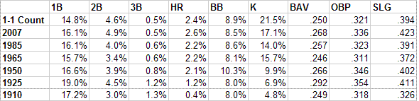
Comparing these numbers to those from other eras in baseball history, we see that the game under this proposed rule change fits right in with other periods of baseball history. The chart above shows the rates of hitter outcomes under the new rule change, and rates of outcomes during various eras of baseball history. As we can see, many other fluctuations in the game's history were much stronger than what we would likely see if the game adopted the three ball, two strike rule. In fact, the game, in terms of run scoring, would look very similar to the game in 1985, with very similar BAV/OBP/SLG splits. The only real difference would be that a higher proportion of the outs would be strikeouts.
While one can debate the aesthetic merits of the strikeout, the number of strikeouts has steadily increased throughout baseball history and nobody has seemed to mind all that much. The proposed rule change would increase the number of strikeouts by about 25% over its current level. That may sound like a lot, until you consider that baseball has increased the number of strikeouts by about that same percentage during the last 25 years and nobody has really seemed to complain or notice much at all.
Advantages of a 2-1 Full Count
The advantages of the reduction in the number of balls and strikes required for a walk or a strikeout respectively is obvious. Less downtime and more action. The rule change would force pitchers and batters to get down to business sooner. The pitch data indicates that the batter and pitcher are nibbling and being selective early in the count (with good reason), and the fact that the hitter outcomes are basically the same with a 1-1 count indicates that there is no fundamental reason for such a long count.
With three balls to a walk and two strikes to an out, a fair amount of the fat would be cut out of the game. Currently, there are 3.77 pitches per plate appearance. With the reduced count, this number would decrease to just 2.81 pitches per plate appearance. This would cause a 25% reduction in pitches, meaning that the games would be much shorter and pitchers would be able to go much deeper into games. Instead of the average game taking 146 pitches to complete, the average game would take just 109 pitches, meaning that pitchers could once again consistently throw a complete game - another aesthetic plus (from my point of view). Of course, since the best pitchers could now pitch longer, this would likely reduce scoring even a bit more than the table above, but it's not clear by just how much. Game lengths, if they were reduced by the same percentage, would be cut from 2 hours 47 minutes down to 2 hours 6 minutes - all while keeping basically the same amount of action and excitement in the game.
If the rule were truly adopted, it might be wise to couple it with an advantage for the hitter, such as a lowering of the mound, to limit the increase in the strikeouts and keep run scoring more similar to the current levels. Still, even if no such rules were adopted, the run scoring environment would likely be similar to that of many other eras in baseball history.
Blasphemy!
Of course, such a change in practicality is unimaginable. Baseball simply doesn't change 100 year old rules and purist fans simply would never have it. The public outcry would be huge. The association of three strikes to an out is so strong that it has permeated not only the consciousness of every baseball fan, but has worked its way into many other parts of American society. To many, it just wouldn't be right to be called out on only two strikes. Of course, tradition alone does not make something right.
While I propose this rule change in half-jest, I do believe that had the founders reduced the number of balls and strikes in the 19th century, we might have a better and more enjoyable game today - one that at its core is essentially unchanged, with the same outcomes and action we are used to, without a lot of the downtime which many fans find unappealing about the game.
| Behind the Scoreboard | July 24, 2009 |
Perfect Games and Probabilities
As everyone is surely aware, Mark Buehrle pitched baseball's 18th perfect game yesterday afternoon. Now that Buehrle has joined one of baseball's most exclusive clubs, let's see where he fits in. Buehrle is an outstanding pitcher, but not one of the game's all-time greats, and likely not a Hall-of-Famer. However, the group of players to throw a perfect-game ranges from legends (Cy Young and Randy Johnson) to scrubs (Charlie Robertson). Was Buehrle's feat a mere fluke, or did he "deserve" to throw a perfect game.
A very simple analysis shows the probability of throwing a perfect game in one's career. Taking each pitcher's opponent's on-base-percentage and adding the percentage of players reached on errors we can estimate the probability of a hitter reaching base. Using the following formula, we can see the probability of throwing a perfect game as the following:
Probability of Perfect Game = (1-%onbase)^27
And we can use this number and the number of games started to estimate the probability that the pitcher throws a perfect game over his entire career:
Probability of Perfect Game in Career = 1-(1-probPerfect)^#GS
Of course, this assumes that the probability of throwing a perfect game is equal in each of a pitcher's career games, which is not true. A player usually has a peak in which the probability of a perfect game is higher, and thus the formula underestimates the probabilities especially for pitchers who had a peak much higher than the rest of his career, such as Sandy Koufax, Randy Johnson, or Cy Young (actually Young remained quite consistent, but his chances were much higher in the latter half of his career due to the context of the game).
For what it's worth here is a quick list of the 16 modern-era pitchers to have thrown a perfect game, and their rough chances of doing so.
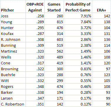
In general, the probability of throwing a perfect game is very low, so all perfect games are "flukes" to some extent. Even a great like Cy Young only had about an 8% chance to throw a perfecto in his career during all of those games he pitched.
As we can see, Mark Buehrle is one of the more unlikely pitchers to have thrown a perfect game. Despite having a very good ERA+, the high scoring era in which pitches makes it difficult to throw a perfect game.
At the top of the list is Addie Joss, but Cy Young should be. He is unfairly hurt by the formula for having pitched in a hitters environment in the first part of his career, raising his career OBP. Taking the second half of his career alone, his probability of throwing a perfect game is over 8%.
There are a few other things that stand out. For being an above average, but not fantastic pitcher, Catfish Hunter enjoyed a very high probability of throwing a perfect game. His Achilles' heel was the homerun ball, which hurts effectiveness as a pitcher but doesn't much affect the chances of throwing a perfect game. He also enjoyed a pitcher's environment.
The luckiest pitcher to throw a perfect game, not surprisingly, was Charlie Robertson who threw a perfect game for the 1922 White Sox. At 49-80 and a 90 ERA-plus, he wasn't great, but he sure had his moment in the sun. Still, at least he had a career - the list of players who have thrown simply a no-hitter is littered with players far inferior to Robertson.
Nevertheless, throwing a perfect game is a rare feat, and anyone who was there yesterday afternoon will have memories to savor for a lifetime.
| Behind the Scoreboard | July 20, 2009 |
Do Pitchers and Hitters Work the Count Efficiently?
The count is one of the most basic parts of the game of baseball. The rules have been the same for over 100 years: 4 balls for a walk, 3 strikes and you're out. The pitcher/batter interaction is also one of the most fascinating parts of the game, with each side often trying to out-think and out-guess the other. The batter may think he knows what's coming, but he can never really be sure, while the pitcher may think he can outfox a hitter, but he never really knows what the batter is looking for either.
Of course, everybody knows that the count is integral to a player's chances of success. Give even a mediocre pitcher an 0-2 count to work with and he can retire the game's greats with ease, while even the best pitcher has trouble pitching to a batter with a 3-0 count. But does the count really change the pitcher's and the batter's strategy, or do players essentially approach each pitch the same, regardless of count. Furthermore, if the strategy and approach does change, does either side gain an advantage?
Pitch Outcomes by Count
Using Retrosheet data from the 2007 season, I first looked to see how often each potential outcome of the pitch occurred. Excluding any at-bats in which there were bunt attempts or intentional balls, the results were the following:
36.8% of the time, the pitch was thrown for a ball.
26.6% of the time, the pitch was thrown for a clean strike (either called, or swinging).
16.9% of the time, the pitch was fouled off (which means 43.5% of pitches were either clean strikes OR fouls).
19.7% of the time, the pitch was hit into play
But, do these numbers stay constant no matter the count? After all, the goal remains the same. For the pitcher: get a strike past the batter. For batters: either take a ball or hit the ball hard. Perhaps strategy remains the same as well? The following table shows the same breakdown by count. If the pitcher and batter do not adjust their strategies according to the count at all, we would expect these percentages to stay the same no matter the count. Do they?
To even casual fans of baseball, it is no surprise that the rates of balls, strikes, fouls, and hits changes depending on the count. It comes as no shock that the percentage of strikes goes up in hitters counts such as 3-0 and 3-1, and the percentage of balls rises in pitchers' counts such as 0-2. Likewise, the batter is much more likely to put the ball into play in deep counts, while he is not very likely to hit it into play on the first pitch, or especially on a 3-0 count. None of this really comes as a surprise to anyone, and falls in line with conventional baseball wisdom.
It's clear then, that players do indeed change their strategy based on the count. But how does this shift in strategy change the final outcome of each plate appearance? To test this, I ran a simulation to simulate whether each at-bat turned out to be a walk, strikeout, or a ball in play, assuming that each pitch had the same ball/strike/foul/inplay probability regardless of count. I then compared this to the actual outcomes.
The following chart shows the difference between the BB/K/In-play rates in the simulation (where it is assumed both the batter and pitcher are blind to the count) and the real outcomes.
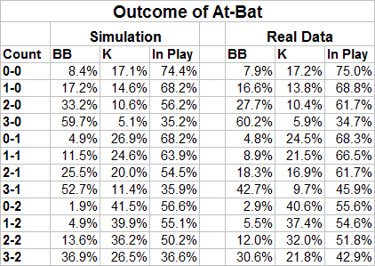
One thing to notice is that the overall walk and strikeout rates are generally slightly higher in the simulation than in real life. This is due to the fact that the batter and pitcher are more cautious on the first pitch - the pitcher is less likely to throw a strike and the batter is less likely to put the ball into play (12.6% in-play on the first pitch vs. 19.7% in-play overall). When all pitches are averaged, this lack of action carries over into other counts and decreases the in-play rate and increases the amount of K's and BB's for the simulation.
However, this effect is small and many of the simulation estimates are quite close to the real outcomes. For instance, on the 1-0 count, the simulation, which assumes that the batter and pitcher do not change their strategies, shows a strikeout occurring 14.6% of the time, while real 1-0 count data shows that the batter strikes out 13.8% of the time. Meanwhile the walk rate changed from 17.2% in the simulation, to 16.6% in real life. This indicates that there is not a major strategy shift on a 1-0 count, but in fact pitchers and batters go after each other much in the same way as they would if they did not factor the count into their approach.
Major differences occur mainly in hitters counts, such as 2-1, 3-1, and 3-2, where the true propensity to put the ball in play is higher than the simulated results, and the walk rate is much less than the simulated results. This also is no surprise, seeing that the pitcher is more likely to throw a hittable pitch when he is down in the count, and hence the batter is more likely to put it into play and less likely to walk.
A Simulation to Find Who Gains A Strategic Edge
These first two charts leave no doubt that the pitcher and batter do change their strategies, especially on more extreme counts such as 0-2, 2-0, 2-1, 3-0, 3-1, and 3-2. Of course, this shift in strategy changes the outcome of the at-bats. For instance, on a 3-0 pitch, the pitcher may change his strategy to throw a fat strike just to get one over the plate. The batter, knowing that it is a 3-0 count is more likely to try to take a pitch to draw a walk. Of course, the batter knows that the pitcher is likely to groove one, so this changes his strategy too. The pitcher in turn knows that the batter knows and he has to adjust his strategy as well. Eventually an equilibrium is reached.
Now, theoretically, If both hitters and pitchers are equally able to adjust, the equilibrium will result in neither the batter or pitcher gaining an advantage. For instance, by throwing a pitch down the middle, the pitcher may indeed avoid more walks on a 3-0 pitch, but he will have to pay for it in the form of harder hit balls and more home runs. If this trade-off becomes so extreme as to become disadvantageous to him, he will scale back this tactic and pitch more normally, varying his pitches so that the batter cannot hit him so hard, but at the expense of giving up a few more walks. The batter, likewise, is making similar adjustments. His natural inclination is to take a 3-0 pitch, but if the pitcher is consistently throwing a get-me-over fastball for a strike, he may find himself at a disadvantage, in which case he will mitigate the pitcher's change in strategy by swinging more normally. The result of all this cat-and-mouse should be theoretically that neither side gains and advantage. This final equilibrium may still be less walks and more hard hit balls, but the expected run value of the at-bat should be the same as if neither the pitcher nor the batter were paying attention to the count at all.
Of course, this is in theory. If this is not true, it indicates that the one side is gaining an advantage because the other side either cannot adjust or is playing a bad strategy and failing to adjust his thinking to the situation. We can see if this is happening by looking at the run value outcome in various counts and comparing the simulation to the real data. Below is a chart doing just that.
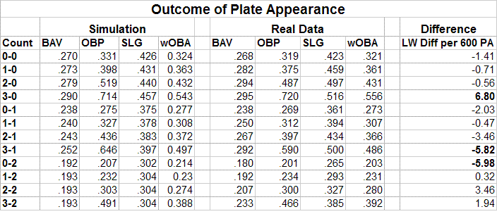
The chart above gives the BAV, OBP, and SLG percentages for both the simulation and the real data. It also gives the wOBA for each. The last column uses Pete Palmer's Linear Weights and shows the difference between the simulation and the real data over the course of 600 PA's at each count. This is perhaps the most useful column. Those with a positive value indicate that the batter is creating more runs than would be expected in that count via the simulation, while a negative value indicates that the batter is under-performing relative to the count.
In many counts, the simulation and the real data both produce about the same amount of runs. For instance, on the 2-0 pitch, the hitter's batting average is higher than we would expect if the players were blind to the count (.292 vs. .279 in the simulation) and the batter hits the ball much harder (.497 SLG vs. .440 SLG in the simulation), but it comes at the expense of fewer walks, with the OBP falling from .519 to .487. The overall difference in production is less than a run over 600 PA's with a 2-0 count. As we would expect, the net result is that the increased power is offset by fewer walks, and neither the pitcher nor the hitter gain an upper hand. This indicates both players are likely using an efficient strategy and not allowing the opposition to use the knowledge of the count to their advantage.
However, this offsetting does not occur at every count. The 3-0 count is obviously a hitter's count - the simulation predicts a .290/.714/.457 line from hitters with a 3-0 count. However, the true data shows hitters taking an even greater advantage of the count. The real line is .295/.720/.516 (intentional walks are removed from the data), indicating that hitters hit the ball with much greater power without sacrificing walks. The result is an advantage for the hitter above and beyond what we would expect a 3-0 count to entail if players were not strategizing about the count. This indicates that the pitcher is not able to effectively counter the batter's 3-0 strategy.
Is this true for other highly favorable hitter's counts? Looking at the 3-1 count, we see that in fact the opposite is true! In this case, the pitcher takes the strategic edge. The expected hitting line is .252/.656/.397, while the true line is .292/.590/.500. Here we again see a big increase in power, with both the slugging average and batting average increased, but it comes at a cost of fewer walks. The result is a loss of about 6 runs due to the strategizing about the count. Pitchers are more likely to throw a strike to avoid a walk, but unlike on the 3-0 count, the batters are unable to generate enough power to offset the loss of walks. The result is that the pitchers are gaining an edge.
The 0-2 count is another extreme count, in which either the pitcher or batter may take a strategic edge. In this case, it's a pitcher's count and the expected line is .192/.207/.302. This is better however, than the real line of .180/.201/.265. In this case, the batter is sacrificing power and average, without increasing his on-base percentage. The result again is a loss of 6 runs by the batter over the course of 600 PA's. The pitcher is throwing more balls dancing around the plate, and the result is less power for the hitter, but without a corresponding increase in walks. Thus the pitcher is gaining an upper-hand on the hitter.
The result of the other counts don't show either the pitcher or hitter gaining a huge edge. 3-2 and 2-2 show the batter gaining a slight strategic edge, and 2-1 and 0-1 show the pitcher taking a slight strategic edge, but the effect is small. These results don't account for the fact that potentially stronger batters are more likely to reach 3-0 counts, and weaker batters are more likely to reach 0-2 counts, which may somewhat explain the advantages seen in the real data vs. the simulation. However, this does not explain the fact that 3-1 counts seem to show the pitcher gaining an edge.
Conclusion
It's interesting to find inefficiencies in how pitchers and hitters handle the count, and it appears that the extreme counts of 3-2, 3-1, and 0-2 expose the most inefficiencies. Unfortunately, though we can see who gains an upper-hand due to knowledge of the count, it's hard to tell whether the reason is that the players are not adjusting properly due to a lack of strategy or simply have an inability to adjust. It also is difficult to see exactly how players should change their strategy to put the game back into a neutral equilibrium. Because we only have the outcome data and not how exactly the pitcher and hitters are adjusting independently, it's hard to see how hitters and pitchers could improve.
Perhaps with data such as Pitch F/X, it might be possible to tell who is adjusting in what way and recommend how hitters or pitchers can adjust differently to erase the edge that the other enjoys. For now we see that pitchers enjoy a strategic edge on 0-2 and 3-1 counts, while hitters enjoy a strategic edge on 3-0 counts. It's something to think about next time a you're watching a big at-bat.
| Behind the Scoreboard | July 14, 2009 |
How to Manage the All-Star Game
One of the most exciting events of the season takes place tonight, as the AL and NL All-Stars play in the 80th annual All-Star game. The game, as I showed last week, takes on great importance to some teams, particularly those likely to make the World Series. Managers have always faced a series of competing interests in their managing strategies, and these dilemmas are perhaps even more pronounced since the game now “counts”. The main competing interest is between managing to win and managing to play everybody, but managers also have to have an eye for entertaining the fans, preventing injuries, and of course making sure that enough pitchers are available to finish the game.
These goals appear to be mutually exclusive. For instance, it would seem that if all players get in the game, then that means less time for the best players, and a lessened chance of victory. However, the purpose of this article is to show how, if a manager plays it properly, all of these goals can be satisfied. A smart manager can maximize his team’s chances to win as well as get most players in the game, while simultaneously showcasing the game’s greatest stars and making sure that the team is well equipped to go deep into extra innings without jeopardizing the health of any of his players. How can a manager do such a thing?
Managing the Pitchers
First of all, let’s address the pitching problem. The problem was brought to a head in 2002 when both managers ran out of pitchers and forced a tie. It nearly happened again last year when reliever Brad Lidge was brought in for the NL and a gimpy and unrested Scott Kazmir was brought in for the AL in the 15th inning. Had the game gone on only a couple more innings, both managers would have had a major crisis on their hands. How to prevent such potential disasters? The solution here is simple: Have the last pitcher in the bullpen be a well-rested starter who has the ability to throw a complete game if necessary. The manager should wait until the 13th or 14th inning to put him in and he should be able to finish the game. As a starter on full rest, he’ll be able to pitch 7 or 8 strong innings if necessary, which should be enough to finish even the longest of All-Star contests.
Had Carlos Zambrano, on 5 days rest, been the last man in the bullpen instead of Brad Lidge, he could have pitched well past the 20th inning without difficulty. Similarly, in 2002, if Freddy Garcia had pitched the 3rd and the well-rested Roy Halladay pitched the 10th instead of the other way around, the AL squad would have been able to potentially last 18 innings, forcing an NL forfeit instead of a tie. Instead, managers seem to have short-men or fragile pitchers as their pitcher of last resort, leading to potentially disastrous scenarios as occurred in 2002 and almost happened again in 2008.
Since this emergency pitcher will usually not get in the game at all, ideally this well-rested last man isn’t one of the squad’s best pitchers and has already made an All-Star appearance so he won’t mind not getting into the game. The emergency man strategy is a good one because most pitchers can still get into the game even if it doesn’t go extra innings, but if the game does go into extra frames, the team is equipped to go 20 innings or more without risk of injury or overwork.
The rest of the pitching staff is usually fairly well handled by the managers, with a few exceptions. With 13 pitchers on the staff, it’s not a bad idea to throw pitchers one inning at a time, as current managers usually do, so that they can leave it all out on the mound. Combining this with the fact that each pitcher is not necessarily well-rested, and this is a fairly good strategy for getting a lot of players into the game as well as maximizing (or at least not decreasing) the chance of winning.
While managers consistently use starters earlier in the game and relievers later in the game, statistically there is no difference as to when the pitcher enters the game – in a one-game situation, each inning is equally important since the expected value of the leverage in each inning is equal for all innings. The result is that a manager should make sure to get his best pitchers in the game regardless of the inning or score. This is opposed to Clint Hurdle’s strategy last year of leaving Brad Lidge, one of the better NL pitchers, in the bullpen, waiting for a traditional save situation. Hence, the pitchers reserved in case of extra innings should be among the staff’s worst, used in order of talent as the game gets deeper into extra innings, until the emergency pitcher is called in to finish the game.
Managing the Position Players
Except for an occasionally mismanaged bullpen, managers have handled their pitching staffs fairly competently over the years. However, when it comes to playing the position players, most All-Star managers have been baffled. Managers seem to be torn between playing the starters and maximizing their chances of winning, and replacing the starters to give the reserves more playing time. It’s possible to do both, but not when managers traditionally resort to the most caveman of strategies: position-for-position wholesale changes midway through the game. I had hoped for a change in this strategy when the All-Star game was given more meaning, but the basic tactic has still been employed. The only difference is that instead of removing the starters after 3 innings, they are removed in the 6th or 7th.
In fact, maximizing the chances of winning actually does involve the use of most of the team's 33 players on the roster. First of all, in NL parks, teams should always pinch-hit for the pitcher. There are too many great pitchers and players on the roster to burn an at-bat with a pitcher hitting. This sounds obvious, but the manager has chosen to send a pitcher to bat as recently as 1998 when David Wells hit in the second inning (Mark Mulder also hit in 2004, but he was forced to remain in the game since he had not yet faced a batter). Pinch hitting for the pitcher every time up is an obvious way to use an additional 3-5 players and increase the probability of winning, but what to do with the other 7 or 8 other players left on the bench?
Similar to what good American League managers do every day, All-Star managers can pinch-hit good-hitting, powerful reserves for (relatively) poor-hitting players at defensive positions. Usually, there are a few positions on each squad which are relatively weak. In key situations with runners on base, these players can be removed for better hitting first basemen/outfielders/etc who are sitting on the bench. This maximizes the team's chance of winning by putting better hitters at the plate in key situations.
This tactic also has the benefit of getting an additional two players in the game - the pinch-hitter and the player who replaces him on defense in the next half inning. It also gets these players in the game without removing the presumably outstanding starter at the offensive position. If the 2009 NL team were to use this tactic, Albert Pujols could play the entire game, while Fielder, Howard, and Gonzalez could all hit in high leverage situations with runners on base. Using this tactic just twice gets an additional 4 players into the game, without removing the heavy-hitting starters who are the best players on the team. In AL parks this tactic can be used even more often since the manager does not have to worry about running out of players to pinch-hit for the pitcher.
The remaining 3 or 4 players on the bench can be used as either platoon guys, who can be substituted for the starter when a handedness advantage presents itself, or used as pinch runners or defensive replacements. All of these useful and legitimate reasons are preferable to the gratuitous replacement strategy which managers currently employ. The result is that usually all but 1 to 3 players can get in the game (most with an at-bat) and the four or so best players on the team end up playing the entire game. Imagine that - the same amount of players get into the game, but the biggest stars are showcased for the entire night and the team's chances of winning are dramatically increased!
One tactic All-Star managers do seem to employ is the double-switch, pushing the pitcher's spot further down in the order. While it's a good move in the regular season, it's not one I generally endorse in the All-Star game. For one, the manager wants to get a lot of players into the game, so being forced to pinch-hit is not necessarily a bad thing. Two, the players off the bench may be better hitters than the player who just entered in the double-switch, meaning that the team is actually hurt by the switch. And three, the having the pitcher's spot come up gives the manager extra flexibility in just who will come up in that spot, and that flexibility is a good thing. In fact, in some cases, it's reasonable to double-switch in order to bring the pitcher's spot closer in the order for the above reasons, especially if the new position player is a relatively weak hitter compared to his benchmates.
The key to employing the overall substitution strategy that I just outlined is patience and the ability to alter the game plan on a moment's notice. This is probably the reason that no manager has employed this strategy to date - they want to have a relaxing time and a predetermined plan to assure that everybody has a role. However, employing this technique requires much more strategy and thinking than even a regular season game does, precisely because so many players are available. Managers are also not practiced at this style of substitution, since the All-Star game is a unique situation. However, a few practice games of Strat-o-Matic (or even the simplest baseball board game) should get them the feel for their roster so that the moves they should make will become routine.
So how can this strategy be specifically employed by Joe Maddon and Charlie Manuel tonight? Here are a few guidelines:
American League
Pitchers:
Maddon has announced Roy Halladay as his starter, and I can't quibble with that. He should go two unless the AL bats around after two innings. After that, a good rotation would be Greinke, Hernandez, Jackson, Verlander, Nathan, Rivera, and Papelbon. Maddon needs an emergency extra-inning guy, and for me that player is Tim Wakefield. I feel bad since this means he likely won't get into his only All-Star game, but frankly he doesn't deserve to be there anyway. The only other pitchers on full rest are Greinke, Halladay, and Hernandez - all far too good to be left sitting in the bullpen. Josh Beckett and Mark Buehrle, guys who have been to the game before and are not the aces of this staff, are the other two guys left for extra inning duty. Fuentes, the only lefty reliever, can be used to play the lefty/righty matchup game along with Andrew Bailey as his right-handed counterpart.
Hitters:
Of the starters, Mauer, Teixeira, Longoria, Bay, and Ichiro are either head and shoulders above their peers at their position, or far too good of hitters to remove, so Maddon should plan to play them the entire game (the exception is Ichiro who can be pinch-hit for if the situation desperately calls for power). Second base (Aaron Hill) and shortstop (Derek Jeter) are the "weak" hitting positions that can be pinch-hit for if they come up with multiple runners on base. As righties against an almost entirely righty pitching staff, pinch-hitting for these players is even more appealing. After the pinch hitters take their hacks, Ben Zobrist can take the field at second and Jason Bartlett can play shortstop. Centerfield can be platooned, with Hamilton removed for Adam Jones when facing a lefty. He in turn can be replaced by Granderson if a righty re-enters the game for the NL.
I'm not a fan of the way Joe Maddon has constructed his bench, leaving two of the league's best hitters - A-Rod and Cabrera - off the roster entirely and leaving it surprisingly bereft of proven mashers. Off the bench, Justin Morneau is by far the best lefty and the biggest power threat. Kevin Youkilis is the best option from the right side. It doesn't matter if they are used early or late, as long as they hit in a big spot with runners on base. With three spots in the batting order to choose from (2B, SS, or P) that big spot is all but guaranteed to come.
Victor Martinez, Carl Crawford, and Carlos Pena are the other best pinch-hitting options since they are either lefties or switch hitters against a mostly right-handed NL pitching staff. They can be used according to the game situation. If Crawford enters the game late, he can also replace Bay in left field for defense. Nelson Cruz, Michael Young, and Brandon Inge should be held in reserve in case of extra innings. Young can also take over at either second or short in case a second big pinch-hitting opportunity arises at either of those spots in the lineup. In the case of Cruz, pinch-running late in the game is also an option, presuming Maddon has enough players left on the bench.
National League:
Pitchers:
Charlie Manuel has announced Tim Lincecum as his starter, and as the ace of the staff he should go two innings, followed by Santana, Haren, and Billingsley. Ted Lilly and the hometown Franklin can divide the 6th, with Lilly coming in to face the left-handers. The 7th through 9th can be handled by Cordero, Hoffman, and K-Rod. The emergency pitcher should clearly be Zack Duke, a pitcher who is only a marginal All-Star and will be on three days rest. The only other NL starter on four days rest is Lincecum, who is clearly too good to be an option there.
With no left-handed relievers, Manuel can't play the matchup game effectively. Heath Bell, Josh Johnson, and Jason Marquis are the other pitchers who can go in case of extra-innings. Bell can also fill in if another starter gets into trouble (or if the NL surprisingly bats around in the bottom of the first and Lincecum must be removed for a pinch hitter).
Hitters:
Starters Albert Pujols, Chase Utley, Hanley Ramirez, David Wright, and Ryan Braun should be left in for the duration, as they are head and shoulders above their peers. While it was previously reported that Brad Hawpe would be forced to start the All-Star game in Carlos Beltran's absence, recent news lists Shane Victorino as Manuel's starter. If the former were true, I would advise Manuel to remove Ibanez from the order after taking his first at-bat in order to shore up the shoddy outfield defense. That doesn't appear necessary now.
The "weak" positions which can be removed for pinch hitters are centerfield and catcher. Molina, clearly the weakest hitter on the squad should be pinch-hit for early and then replaced by the superior, left-handed Brian McCann. Manuel should also pinch-hit for Victorino if a big situation arises, and then replace the pinch hitter with Hunter Pence. Pence in turn can also removed for a pinch-hitter if another key situation arises, and Jayson Werth can take over in center field.
Manuel has three incredibly dangerous left-handed bats on his bench in Howard, Fielder, and Gonzalez, and he should use them for pinch-hitting situations with runners on base when any of the three light-hitting positions come up in the order.
Other options for pinch-hitting for the pitcher are Miguel Tejada, Ryan Zimmerman and Justin Upton. Brad Hawpe provides yet another potent left-handed bat. If a left-handed pitcher enters the game, Manuel should also take the opportunity to replace Ibanez with Werth or Upton - this should also be done if the NL gets a lead to improve the outfield defense. Freddie Sanchez and Orlando Hudson can be used as the last men on the bench if the game goes to extra innings - they should by no means be replacing Wright or Utley in the batting order.
Conclusion
Will Manuel and Maddon follow this advice, playing their best starters the whole game, while still getting a majority of players into the game? If they are anything like the previous All-Star managers, we'll see wholesale changes mid-way through the game, and hence the inferior reserves will be taking the big at-bats at the end of the game.
Taking my own advice and playing several sets of simulated games, I was very successful in getting 26 to 29 players for each side into the game (about as many as previous managers have done), while still making sure that the biggest bats are up in the biggest situations and keeping the best players in the whole time. Of course, sometimes the game played perfectly into my strategy and other times I was not as lucky, but no matter the course of the game, the main goals were achieved every time. The key is to stay flexible and let the game dictate the decisions. It's a strategy that's best for the players, the fans, the teams, and the game. I'd love to see it tonight, but I'm not holding my breath.
| Behind the Scoreboard | July 06, 2009 |
Is The All-Star Game The Biggest Remaining Game for Dodgers?
A week from today, the Major League All-Star Game will be played between the American and National leagues. Traditionally the greatest exhibition in all of sports, the game changed in 2003 when Bud Selig decreed that the winner of the All-Star game would have home field advantage during the World Series. While the move (which I love) has largely accomplished its purpose of rejuvenating the game and inspiring competitive instincts in the players, the game is still somewhat treated as an exhibition. Players still occasionally beg out of the game and the managers still try to get everybody in the game, even if it means taking some of the best players out. Terry Francona actually said he was hoping for a game ending NL homer last year as the game went to extra-innings. For him, the All-Star game was secondary to regular season games.
The All-Star game's slogan is "This Time It Counts", but how much does it really count? Obviously Francona and company don't think it counts for very much. Is home field advantage in the World Series really worth playing for? Or are players better off focusing on the regular season?
Earlier this season, I debuted Championship Leverage Index, an attempt to measure the impact and importance of a game on a team's chances of winning the World Series. We can apply this same methodology to the All-Star game. Of course, during the regular season, an additional win adds to the probability of winning the World Series by increasing the team's chances of making the playoffs and thus winning a championship. In the case of the All-Star game, winning the game helps only if the team makes it to the World Series.
How Much Is An All-Star Game Win Worth?
Assuming that a team does make it to the Fall Classic, how much does having the home field help? Historically, having home field in an individual game adds about 4% to a team's probability of victory. This number has been larger during the playoffs, but this likely has something to do with the best teams playing more home games, so it's a misleading guide. Taking this 4% mark and assuming the teams are even, a World Series team would have a 54% chance of victory in its home games and a 46% chance of victory in its road games. How does this translate during an entire 7-game series? Turns out that the mathematics show that a team which has the home field advantage in the series as a whole will win 51.26% of series.
Overall, the extra 1.26% is pretty small - there's probably a reason that MLB doesn't tout this number in its "This Time It Counts" promos for the All-Star game - but in something as big as the World Series, it helps to have every advantage possible. Of course, the game only adds 1.26% for a team actually playing in the World Series - to other teams, the game is worthless. Apportioning this advantage blindly among an average of 15 teams per league, an All-Star win adds 0.084% to each team's chances of winning the World Series. Thus, if you were oblivious to the standings, and your league won the All-Star game, you could rejoice that your team's chances had just gone up by 8 one hundredths of one percent. This time it counts, eh?
Indeed, 0.08% sounds impossibly small, until you consider that the average regular season win doesn't help you much more, clocking in at a mere 0.28% according to my prior work linked to above. Dividing these figures, we find that the All-Star game has a Championship Leverage Index of .30, meaning that the game is about 30% as meaningful as the average regular season game.
You can be the judge of whether 30% of an average regular season game is more or less than you might have thought. I suspect it's more. 30% of an average game is not a lot, but it's more meaningful than any Nationals game has been since May, and it's more meaningful than many teams' regular season games will be in about a month's time. What's more, I doubt that Francona would be willing to wish away even 30% of a regular season Sox game.
All-Star Championship Leverage Index by Individual Team
Of course, while on average the All-Star game is worth about 30% of an average regular season game, we can calculate this separately for individual teams, with dramatically differing results. Teams which are far back in the race need every win they can get their hands on, and home field advantage in the World Series means little. The chance that one regular season win will prove decisive is low, but the chance that home field advantage in the World Series will make a whit of difference is even lower. For teams in the thick of a pennant race, the World Series advantage is useful, however each regular season win has a fairly high chance of being crucial, rendering a regular season win far more valuable than an All-Star game win.
However, the All-Star game takes on the most importance to teams which are far ahead in the standings and have a high likelihood of making it to the Fall Classic. For these teams, a regular season game also means relatively little, since a playoff berth is all but locked up. In this scenario, is the All-Star game actually more important than a regular season game?
Looking at this year's Dodgers, let's aim to find out. As of Sunday night, the Dodgers were sitting at 52-30 with a 7.5 game lead in the NL West and a 9 game lead in the NL Wild Card. When I previously calculated Leverage Index, I assumed each team had a 50% chance to win each game and that each team had a 50% chance to win each playoff series. Here I used a more refined method, using Baseball Prospectus' PECOTA-adjusted winning percentages as the probability of victory and playing out the play-off series according to baseball's home field advantage rules.
Using this methodology and simulating 10 million seasons, I calculated that the Dodgers have a 39.0923% chance of advancing to the World Series. After a regular season win, this chance increased to 39.2781%, while after a regular season loss, this chance decreased to 38.8368%. On average, this resulted in a change of 0.215% in probability to advance to the World Series and hence, a 0.108% change in probability of winning the World Series (0.215% times 50%). Thus, a regular season game is worth about 0.108% in championship probability to the Dodgers (only about 39% as important as an average game). An All-Star win, however, will increase their chances of winning the World Series from 19.5462% (39.0923*.5) to 20.0387% (39.0923*.5126), a difference of 0.4925%. Comparing this mark to 0.108% for a regular season game and we find that the All-Star game is not only worth more than a regular season game to Los Angeles, it is worth vastly more than than a regular season game. In fact, the All-Star game is worth somewhere on the order of 4 to 5 times more than a current regular season Dodgers game.
A fuss was made over Chad Billingsley bowling over the catcher during a Dodgers-Padres game this past weekend. Would Billingsley have done so at the All-Star game? Likely not. But this analysis shows that if there is one game the rest of the season in which LA players should sacrifice life and limb, it is Tuesday night's "exhibition" contest.
The following chart shows a few other teams, and the All-Star game vs. regular season game impact on the team's chances of winning the World Series. The Championship Leverage Index for each was computed relative to the baseline of the average game (0.28%).
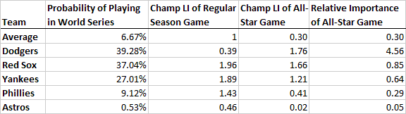
As you can see, only the Dodger players have more incentive in the All-Star game than in their next regular season game. With an All-Star game Championship Leverage Index of 1.76, the All-Star game is not only more important than their next regular season game, but is likely the most important game of the entire season. Regular season Champ LI's don't usually get that high until at around mid-season, and considering the way that the Dodgers have run away with the NL West, they likely have not had a game this important during the entire year.
However, the game also means a great deal to Boston and other AL East contenders who expect to be playing October baseball. For these teams the game is not merely an exhibition, but a game nearly as important as any other on the schedule. For the Red Sox, the All-Star game is about 66% more important than the average game, although not as important as the key games they are playing now. Still, for Francona's Sox, the All-Star game is about 85% as important as their next regular season game. For the other teams listed, the All-Star game is not nearly as important as their next regular season game, drifting to nearly meaningless for fringe teams like the Astros.
For baseball fans, the All-Star game is must-see TV because it's the one chance to see baseball's stars compete against each other. For fans of the Dodgers, it's must-see TV because it's by far the most important game LA will play until October.
| Behind the Scoreboard | July 02, 2009 |
Team Draft Success: Calculating the Effect of a General Manager's Drafting Ability (WAR and the Draft Part 3)
This is the third part of what has been a three part series on the MLB Draft. Part one created a model for the expected value of each draft pick, while part two calculated probabilities of becoming a certain caliber player, as well as expanded on the conclusions in part one.
Today's article focuses on individual teams and how much control they have over the draft process. Is drafting more or less a complete crapshoot, or does the success of a draft vary greatly depending on the front office and the team who is doing the drafting (and oftentimes developing the players as well). Is there much to distinguish a great drafting franchise from a poor one, or is the difference mostly due to luck?
To review, the data I had at hand was gleaned from Sean Smith's WAR database and Baseball Reference, and contained overall picks #1-50, as well as a handful of picks after that (every 5th pick through #100, every 10th pick through #500, and every 25th pick through #1000). While not every pick for every team is covered, this data gives each team a sample of well over 100 draft picks, including all of a team's very high selections. Data used in this study, will focus only on each player's "first six year" WAR, since the team only gains from drafting a valuable player during the years in which it does not have to pay market value. The data is also limited to those players drafted in 2001 or earlier, since more recently drafted players have not had a chance to come up and show their full value.
Draft WAR By Team
So, how did the teams fare? For what it's worth, the table below shows team's drafts based on the sample of picks which I have (which includes all top picks and a smattering of picks after that).
As you can see, the Red Sox are the clear #1, while the Padres, Cubs, and Rangers rank near the bottom. As a Cubs fan, the news comes as no surprise, since for nearly all of my first several years of following the team (I started following in 1987), the Cubs never seemed to have a home grown player contribute to meaningfully to the team. Likewise, it seems as though the Red Sox have had an endless array of talent coming up through their farm system.
Of course, this still doesn't account for the fact that teams have undoubtedly changed a great deal since 1965, and the philosophy and scouting behind a team's drafting and development strategy when the draft first began likely bears no resemblance to the operation of today. Additionally, the WAR Above Average per Pick value is tough to extrapolate to the entire draft since the data I have is heavy on top picks and those top picks have higher WAR and a higher variability in WAR.
While the numbers are interesting, and give a snapshot of how teams have done with their past drafts (again, this is only a sample of picks, not all picks - perhaps another study has shown WAR by team for all picks - if so, that would be superior to the above table), we can't fully get at the question of how large a difference there is between a smart drafting organization and a poor drafting organization without fuller data and a more refined unit of analysis.
Draft WAR by General Manager
Perhaps more relevant than a team's drafting record is the record of individual general managers. For study this I compared 10 current general managers with substantial draft records dating to back before the 2001 draft. I went back and obtained all picks (not just the sample I previously had) for each of these GM's during their tenure so that I had a substantial amount of data to work with.
Comparing each GM's actual WAR to the expected WAR from the model and then comparing the GM's to each other, gives us an idea of how successful each GM has been relative to the others. The table below shows each GM and his drafting record.
As you can see, of the 10 GM's studied, Billy Beane is unsurprisingly at the top of the heap, followed closely by Walt Jocketty, former GM of the Cardinals and current GM of the Cincinnati Reds. Bringing up the rear are Brian Cashman of the Yankees and Brian Sabean of the Giants.
So, Beane has had good drafts and the Sabean has had bad drafts. Is this a real difference, or is this a simple artifact of luck? To investigate this, we first calculate the weighted variance of the GM's WAR Above Average per pick. This observed weighted variance is .036. Then we calculate the expected weighted variance if all teams were equally good at drafting (with an expected WAR Above Average value of 0 and a SD of 2.0, which is the SD of WAR Above Average over all picks). This expected variance is .013. Taking the square root of the difference of the two variances gives an estimate of the standard deviation of the true drafting talent across GM's. (Observed Variance - Expected Variance due to Noise = True Variance). Calculating this with our numbers tells us that the true distribution of GM talent (including scouting, development, etc.) has a standard deviation of .150 WAR per pick.
With each team making about 45 picks per year, this means that the SD of the GM talent over an entire draft is a staggering 6.75 WAR. Basically a good GM will net his team an extra 6 or 7 wins above that of an average GM in a single draft. An outstanding GM (top 3% of all GM's) can net his team 13 wins above that of an average GM. Of course the signs can be reversed when talking about poor GM's. This distribution shows just how valuable a good GM can be. As we can see here, the difference in draft quality is more due to skill than chance (though of course, chance plays a major role), and a good GM and scouting system can make all the difference.
According to Moneyball, Billy Beane at one point was to be essentially traded for Kevin Youkilis. While Youkilis has become an outstanding player, the trade would not have been a good one. Beane, in just 4 years of the draft between 1998-2001, brought the A's essentially the equivalent of a Hall of Fame player, giving the A's 46 extra WAR over what the average GM would have been able to acquire. This advantage was gained on his drafting skills alone, not even accounting for his ability to make expert trades or sign free agents. Of course, time will tell how Beane's drafts will turn out during the years that followed the proposed trade, but the point is made - GM's have an enormous impact on a team's successes, even when considering their ability to draft alone.
Even when we scale back the WAR Above Average per Pick by about 25% to account for the regression effect (.15 estimated true standard deviation divided by the .20 observed standard deviation = .75), we still find that Beane is good for about 9 extra WAR per draft, while Sabean and Cashman are losing their teams about 9 WAR per draft.
Unfortunately, because draft picks take so long to develop, it makes it difficult to tell in "real time" how a GM is doing. However, this short study of 10 current long-time GM's shows us just how valuable a good GM can be.
| Behind the Scoreboard | June 23, 2009 |
The Draft and Wins Above Replacement (Part 2)
Last week I provided a model for the expected value of Wins Above Replacement (WAR) for a particular draft pick in the MLB amateur draft. The model showed the top pick having an expected lifetime WAR of about 20, dropping quickly to about 6 WAR for the number 10 overall pick, and leveling to about 2 WAR for the #100 pick. The model also backed the conclusion that college players and hitters had higher expected WAR than other types of players.
Some readers suggested looking only at players' pre-free agency WAR to make the model more useful to major league teams. Others suggested that the advantage of college players over high schoolers has decreased over time. Still others wanted to see not only the expected value of a player's WAR, but the distribution of WAR's surrounding each pick. In this article, I intend to examine these suggestions and ideas to help provide a better understanding of the value of these draft picks.
Before I get started, I should say that I improved the quality of the data I was working with. I now have picks 1-50, every 5th pick until #100, every 10th pick until #500, and every 25th pick up to #1000 in my database. I also now have Sean Smith's full WAR database used to calculate WAR.
A Player's First 6 Years
First, as Tom Tango suggested, it's more useful to major league teams to have data on a player's first 6 years of WAR, rather than their career WAR, since the benefit of selecting a good player in the draft only lasts until they reach free-agency, after which a team must pay market value like everybody else. Here I fit the model using only the first 6 year WAR as the dependent variable (a year of service was defined as 130 AB, 20 games pitched, or 50 innings pitched in a season). As you might suspect, the data follows the same form and shape of the career WAR data. As it turns out, a player's pre-free agency WAR is almost exactly half of their career WAR. Both models are listed below:
Expected Career WAR = (21.67 + (-11.7 * pitcher) + (6.1 * college)) * selection ^ (-.54)
Expected First 6 Year WAR = (10.9 + (-5.1 * pitcher) + (3.1 * college)) * selection ^ (-.52)
where pitcher is equal to 1 if a player is a pitcher, college is equal to 1 if he is a college player, and selection is equal to the # overall selection in the draft.
As you can see, the shape, determined by the exponent, is nearly the same in both models. Additionally, the scale parameter is about half of what it was in the career model, as are the bonuses and penalties for college players and pitchers respectively. While a player earns only a small percentage of his total earnings in his first 6 years, he earns half of his career value. Because the shape of the models are the same, this seems to be true for players on all levels of the draft spectrum.
Changes Over Time
Over time, the draft has evolved, along with teams' scouting methods and drafting strategies. One interesting thing to examine is whether the parameters in the model would change over time. Have teams started drafting more efficiently as time goes on? Have pitchers been better draft selections over time? How about college players?
I adjusted my model to include a parameter for year. Since the overall WAR for a draft must necessarily stay relatively constant throughout time, I also needed to add a year parameter in the exponent. The new model was of the form:
Expected WAR = (a + (p * pitcher) + (c * college) + (y1*year)) * selection ^ (b + y2*year)
The result of the model was a significant positive parameter for the y1 variable, but a corresponding negative y2 value (y2 was not significant in a test, but as I mentioned, if we include y1, y2 must also be included to maintain the proper balance). This indicates that teams are now drafting more efficiently - high picks have a higher WAR than in years past, while low picks have a lower WAR than in years past.
According to the model, #1 selections in the year 2000 expect to have a career WAR of 26.1 , while #1 selections in the year 1970 were expected to have a career WAR of 19.4. However, as the rounds go on, this advantage decreases until after approximately pick #200, after which the old picks are expected to do better than recent picks. Overall, the result is approximately the same total WAR for both modern and old drafts, but the early picks are more valuable in recent drafts than in years past.
This makes sense because scouting methods and statistical analysis have given teams more accurate prognosticating abilities about a player's future major league potential. With this increase in information, the better players are drafted sooner, clustering the WAR distribution more heavily in the early part of the draft. Below, is a zoomed in graph of 1970 vs. 2000 WAR by draft picks where you can see the lines cross.
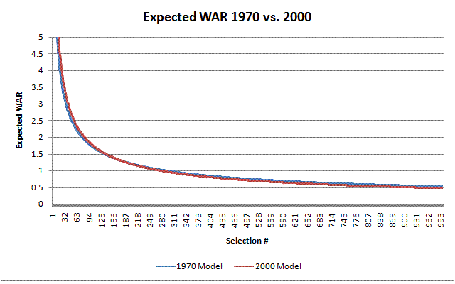
It's also been hypothesized that the value of pitchers and college players has changed over time. To test whether this is true, I added interaction terms to account for this possibility. The model now takes the following form:
Expected WAR = (a + (p * pitcher) + (c * college) + (y1*year) + (py*year*pitcher) + (cy*year*college)) * selection ^ (b + y2*year + p2*pitcher + c2*college)
A reader had suggested that college players were more valuable in the past, but that this advantage no longer existed. The model finds some evidence of this claim - the cy variable is negative, indicating a decrease in the relative value of college players over the years. Another way of looking at this is that highly drafted high school players have increased their value more rapidly than college players over the years. For #1 selections, high school hitters are expected to gain 20 more WAR now than in 1970, while this advantage decreases to only 10 WAR for college hitters. This result is not significant for the first-six-year WAR model, but it is significant for the career WAR model.
The value of pitchers over time however, has decreased strongly. Despite the fact that #1 picks as a whole have much a much higher expected WAR now than in prior years, the expected WAR of a pitcher drafted overall #1 is actually less than it was in the early years of the draft. The is in stark contrast to the strong increases over time for #1 hitters. Whether this is the result of teams trying extra hard to build "pitching organizations" or is due to other reasons, it appears highly drafting pitchers is an even riskier proposition today than when the draft began.
Below is a table of the two full models in determining the expected WAR by draft position.
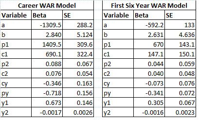
Distribution of WAR by Pick
Also interesting is not only the expected WAR for each pick, but the probability of becoming a certain caliber player. Using a model of the logistic form, I estimated the probabilities of gaining a certain level of WAR. The model was of the form:
P(WAR) = exp((a+p1*pitcher+c1*college)*selection^(b)+int)/(exp((a+p1*pitcher+c1*college)*selection^(b) + int) + 1)
The models often had troubled converging, so the year terms and the exponential terms for pitchers and hitters were left out of the model. However, you can expect that they would have the same pattern as the models based on the expected value of WAR. Below you can see a graph of the probabilities of hitting various career WAR cutoff values, based on the above model. The graphs are for high school hitters.
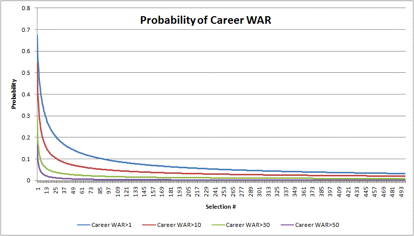
As you can see the #1 overall selection has about a 2 in 3 chance of making a positive impact on a major league club. The probability for a decent impact of 10 WAR is 54%. The probability of a 30 WAR career, which is a career which probably includes a couple of All-Star appearances and several solid seasons is 29%. The probability of a 50 WAR career, which is close to that of a borderline Hall of Famer, is about 16%. Overall, there is a fair chance that a number one selection will never make an impact, but also a non-trivial probability that he will end up in the Hall of Fame. This indicates the obvious large variability in a player's potential career.
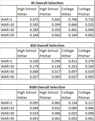
The chart above shows the model outcomes broken down by type of player and pick. One interesting finding is that pitchers are about as likely as hitters to make a positive impact on the major leagues with WAR>1. However, they start to slip when measuring the probability of having a great career. A college pitcher actually has a greater chance than a high school hitter of having a WAR>1 (71% vs. 68% for the #1 pick). However, the odds of having a WAR>30 are very much in the hitter's favor (9% vs. 29% for the #1 pick). While teams appear just as likely to get their pitching prospects to the majors, the probability of having a great career is quite small, even for top picks. This is the driving force behind the reasoning that teams should take hitters over pitchers in the draft.
For those more interested in players' pre-free agency WAR, below is a graph of this result, which largely follows the same shape as well as the same college/pitcher tendencies.
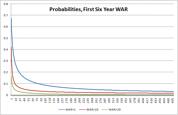
Conclusion
In conclusion, the following things can be said:
1) The first few draft picks are worth vastly more than later picks - a fact that is becoming more and more true as time goes by.
2) College players are a better bet than high school players, although this advantage has decreased through the years.
3) Pitchers, on the other hand, are less likely to bring value, a fact that is more true today than it was years ago.
4) Finally, highly drafted pitchers are about as likely as hitters to make a positive impact in the majors, but are much less likely to be truly great players.
I hope this study brings a greater understanding and insight into the value of draft picks and what type of player is likely to contribute at the major league level.
| Behind the Scoreboard | June 15, 2009 |
Draft Picks and Expected Wins Above Replacement
Last week here at Baseball Analysts, we covered the baseball draft in detail with player interviews, scouting reports, and a live blog of the draft. Each team of course has high hopes for the players they draft - hopes that often go unrealized. Of course, a great deal of the expectations heaped upon a player are determined by the pick which he was drafted. Teams understandably expect more out of the #1 overall pick than they do with a 30th round choice. But how much contribution can a team really expect out of each pick?
This is a subject which has been covered before, over at Beyond the Boxscore, by Hardball Times' Victor Wang, and by other places. Here I intend to add to the discussion by adding a theoretical model to the mix to predict the lifetime win contributions from a particular draft pick. Obviously, it's no secret that the higher the pick is, the more production we can expect from a player, but just what is the difference between, say, the #1 and the #500 pick?
Baseball Reference recently has listed all draft picks in the history of the draft, which provides a handy reference from which to start this research. I collected all picks from #1 to #50 and then the picks from every 25th pick after that. This gave me a database of over 2,500 picks to analyze. I then matched this data with Sean Smith's lifetime Wins Above Replacement (WAR) values (due to data issues I actually used a home-brewed method of calculating WAR for very low achieving players - however the vast majority of WAR are from Sean's actual data).
WAR is probably the best metric out there for assessing a player's total value to major league teams, and so I use this as my statistic of interest. I use career WAR rather than WAR over the first six years (pre-free agency), although I think both are probably useful. Since I used career WAR, I had to either make some assumptions about the rest of recent players' careers or throw out a lot of data. I chose to impute the rest of recently drafted players' careers. I assumed that players drafted in 2001 had by now accumulated 50% of their lifetime win shares, gradually going back and increasing that amount to assume that the 1996 draft class had already earned 100% of their win shares. Draft classes 2002 and after were thrown out since it is too soon to predict a player's career win shares.
Fitting A Model
Looking at all data gives quite a messy picture. Of course there are many, many players at every pick clustered at the point where WAR equals zero. These players either succumbed to injury, flamed out, or otherwise never made it to the big show. A few players have slightly below zero values, meaning that they made it to the majors but performed so poorly that they played worse than a replacement player could. Then of course, there are the players with positive contributions, ranging from Barry Bonds' 174 Wins Above Replacement to Harold Baines' 40 WAR, down to the many, many Dave Clark's and Franklin Stubbs' who made a positive, but quite small contribution to their teams.
We can clean this data picture up, by plotting the average WAR at each draft pick, rather than plotting all possible data points. What we see is below:
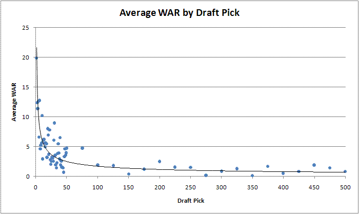
As you can see, there is a lot of variability even when looking at the average WAR of each pick. However, you can also see that the data follows a definite curve. There is a major advantage to having the very first pick in the first round vs. having the last pick in the first round (#30 overall). The point where the expected WAR tends to level off also seems to be around the end of the first round of the draft. Mathematically we'd like to fit this curve to a model to get a theoretical valuation of each pick. The data certainly isn't linear, but instead seems to follow a definite power law and can be explained by the following formula:
WAR= a * (selection#)^ b, where a and b are the parameters of the model.
Running a non-linear regression, we find those parameters equal to a=19.8 and b=-.50. The model fits very well as you can see from the graph above.
What can we learn from it? Plugging the picks into the formula, we see that the #1 overall selection will accumulate an average of about 19.8 WAR over the course of his career. Meanwhile, it drops significantly to 14.0 WAR for the #2 pick. From there it drops rapidly to an expected 6.2 WAR for pick #10 before leveling off at 3.6 WAR for #30, 2.0 WAR for #100, and 0.9 WAR for #500. The model-based approach makes sense because it uses a relationship which both fits the data and matches our preconceived notions that the #1 pick is likely to become an excellent player, followed by a sharp drop-off in value with each successive pick until leveling off.
Other Factors Affecting Expected WAR
The beauty of a model is that we can also add other variables to the data to determine if other factors affect the curve. Going back to the full dataset (which gives the same parameter estimates as using the average by pick data), we can add terms to our model to differentiate between college players and high school players as well as between pitchers and hitters. The model was defined as the following:
WAR= (a + college*c + pitcher*p)* (selection#)^ b, where a and b are the usual parameters and c adds or subtracts to the scale parameter if the player is in college and p adjusts the scale parameter if the player is a pitcher.
We get the following results from our model. Others have talked about the wisdom of choosing hitters as well as college players and here we have a model that backs up this assertion. The results are below:
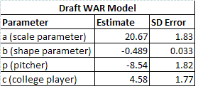
In formula form we get:
Expected Lifetime WAR = (20.7 + (-8.5 * pitcher) + (4.6 * college)) * selection ^ (-.49)
where pitcher is equal to 1 if a player is a pitcher, college is equal to 1 if he is a college player, and selection is equal to the # overall selection in the draft.
Here we see a major penalty in WAR for teams choosing a pitcher. If the player is a #1 selection, we would expect a difference of 8.5 WAR between a hitter and a pitcher. Meanwhile choosing a college player is indeed a benefit. The benefit of choosing a college player as the #1 pick amounts to about 4.6 WAR. Both of these numbers of course decrease in proportion to the power law as the draft goes on, so the difference between choosing a high school pitcher and a college pitcher is quite small in absolute terms by the time you get down to the 100th selection in the draft. Below is a pair of charts showing the expected WAR for each type of player at both the 1st and the 100th overall selection.
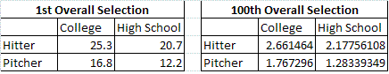
You can also take a look at a graph of each of the 4 types of players according to the model. As you can see, the shapes remain the same, with the hitters and college players having a higher expected WAR.
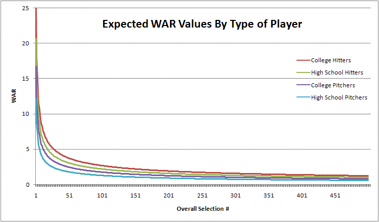
The model given above is just the final model with significant terms. I also tried using parameters for college players and pitchers in the exponent to see if the overall shape of the WAR curve changes depending on the type of player. However, this gave a null result, indicating that the pitchers, hitters, college players, and high schoolers all follow the same basic curve - just that hitters and college players start with a higher win expectation. An interaction term between the pitcher and college parameters also came up null, as did parameters distinguishing between various types of position players.
Conclusion
Overall, this analysis backs up the assertion made by others that college hitters have historically been best type of player to draft on draft day, meaning that sabermetrically minded teams can take advantage of this information (and some have been!). Of course, the more teams that catch on to this trend, the less advantageous taking hitters and college players will be. If all teams were drafting with an eye for maximum value with this information, all types of players would eventually have the same Expected WAR. However, I don't believe we are at that point yet.
Aside from measuring the effects of drafting pitchers and college players, this study is useful because it fits a nice smooth curve to easily quantify the expected WAR of each pick, allowing teams and fans to know what type of player to expect with each pick using a simple formula. Armed with this information, we can know what to realistically expect from the players recently selected on June 9th.
| Behind the Scoreboard | June 13, 2009 |
Chasing Baseball's Milestones: How Tough Is Winning 300 Games?
Last week I was lucky enough to be one of the 2,500 or so people to witness Randy Johnson win his 300th game against the Washington Nationals. In the days surrounding the victory, there were a host of articles wondering whether Johnson would be the last 300 game winner, as well as a host of other articles refuting the notion. So how hard is it to win 300 nowadays anyway?
The game certainly changed a lot since Cy Young was hurling, and that certainly has changed pitchers abilities to win 300 games. While a statistician would know better than to say anything will never happen, consensus seems to indicate it is indeed harder to win 300 games than it used to be. What I set out to do here is create an index which indicates how many wins a great pitcher can expect to earn over the course of a great career. Do the statistics back up the notion that a great pitcher will rack up fewer wins in his career today than in the 1960's or the deadball era?
Creating the Index
Usually when comparing statistics across eras, using league averages are useful in normalizing player statistics, however, this isn't much use when it comes to wins - after all, the total number of league wins is constant. A better way of examining this is to look at the MLB leaderboard in each season to determine the amount of wins earned by a high performing player. For the years up through the expansion era, I looked at the majors’ #5 win leader and took his win total as a benchmark for a high performing player. I adjusted accordingly using percentiles as expansion added more teams, so that currently I was looking at approximately the #9 ranked win leader. Looking at the leaders is useful because it measures high-performing pitchers only, which is what we are interested in. It also automatically takes into account usage patterns, strike-shortened seasons, changes to the schedule, and other changes to the game throughout the years.
Of course, a player looking to join a milestone club such as 300 wins will have to repeat this high-level benchmark performance over many years of his career. To create our index, I had our hypothetical great hurler pitch 15 years at the benchmark level of wins stated above to calculate a career win total.
So how many wins will he achieve in his career during each era of baseball history? The graph below shows the number of expected career wins with each year on the x-axis being the peak year of the player's career.
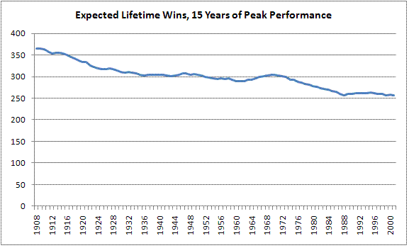
As you can see, this formulation is indexed at exactly 300 wins at several points throughout history: 1952, 1966, and 1973. This means our hypothetical pitcher would be expected to earn 300 wins whether his peak was in any of those three years. Glancing at the graph we see that it was much easier for a great pitcher to rack up wins in the early days of baseball. Our pitcher with a peak in 1908 would expect to win 366 games. From there the expected win total drops off gradually until it plateaus in the 1930's around 300 wins. After that we see that the amount of wins expected by a great pitcher remains remarkably constant for a long stretch of baseball history, never straying outside of a 10 win radius between the years 1934 and 1977.
After 1977 however, we see a steep drop in the number of expected wins, with the total dropping from 299 in 1975 to 271 in 1986. This almost certainly reflects the switch to a 5-man rotation, which dramatically decreased the number starts, and thus the opportunities for wins for hall-of-fame caliber pitchers. After 1986, the expected number of wins has stayed relatively constant, although it has dropped slightly to its current (peak year=2001) level of 263 wins.
This analysis provides an index for us. It appears that winning 262 games in the modern era is equivalent to winning 300 games in 1966, which is in turn equivalent to winning 347 games in 1917. Based on this, it appears that indeed the modern pitcher has a major disadvantage compared to hurlers of old. In order to get to 300 wins, he has to win approximately 37 more games than if he had been pitching in the golden era of baseball history.
Reflecting Longevity
But does this tell the whole story? The above assumes that a pitcher pitches at an outstanding level for 15 years, but modern conditioning and the 5-man rotation may help a modern hurler pitch longer than his old-school counterpart. This should be reflected in the methodology as well.
How to measure longevity? Since we are interested in looking only at high performing pitchers, I simply looked at the number of years pitched (with over 100 IP) by the top ranked win leaders in each year. While I wasn't able to compile this for all years, I did so surrounding three main points in baseball history. In the years between 1905-1915, top 5 win leaders averaged 12.5 years of service. I then looked at the years surrounding 1960. From 1955-1965, top 5 win leaders averaged 12.3 years of service, very similar to the longevity of the deadball era hurlers. I then looked at top 8 win leaders in the years surrounding 1990. From 1987-1993, the leaders increased their longevity to 13.8 years of service. While the standard errors on these estimates were rather high at around .6, this preliminary investigation indicates that indeed top-flight pitchers are pitching longer in today's game, increasing their longevity by about 10% since the 1960's.
So, how does one adjust for this increased longevity when estimating a player's lifetime wins? An increase of 10% in longevity indicates a corresponding 10% increase in the number of wins - simple enough. But when did this shift occur? Here I'll make a major assumption. The number of starts and innings dropped dramatically in the period from 1975 to 1985, causing the aformentioned steep drop in wins during this period. I'd be willing to say that it was during this period that the increase in longevity occurred. After all, the 5-man rotation was created in large part to protect a pitcher's health and longevity, so it would make sense that longevity would increase during this period. Portioning out the increase gradually in 1% increments between these 10 years, we can create a new index of expected wins. Below is a new graph reflecting the increase in longevity.
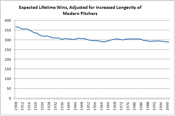
Looking at the latter end of the new graph, we see that the effects of increased longevity largely cancel out the decreased number of wins per season. The expected number of wins remains above 300 well into the 1980's and rests today (with a peak year=2001) at 289. This generally refutes the notion that getting to 300 wins is much harder today than it used to be. What's remarkable is that throughout the last 70 years of baseball history, the milestone has remained a consistent standard of excellence. It's probably one of the truest milestone clubs in any sport, and it's largely as reachable for Tim Lincecum or Carlos Zambrano as it was for Whitey Ford or Early Wynn. The only blemish on the 300 club is the fact that several "undeserving" pitchers from the early days were able to reach 300 when it truly was an easier feat to accomplish. The era-neutral 300 win club according to this methodology consists of the following 16 pitchers (wins are indexed to 1952/1966/1973 levels):
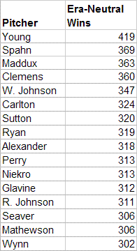
Looking at this list, Cy Young is still at the top followed by Spahn, Maddux, Clemens, and Walter Johnson. The rest of the list skews modern, which could convince me that the effects of modern longevity are even greater than I previously estimated. My methodology was certainly not air-tight on determining longevity, and more research could verify whether my assumptions were valid. Nevertheless, it appears the 300-club is alive and well. If the modern pitcher is at a disadvantage, it is a small one on the order of 10 wins or so. While it's true there are no 300-game winners on the immediate horizon, it's a fair bet that another one will come soon enough.
The 500-HR Club
While I had this system in place, I thought I would also apply it to the 500-Home Run club. Since hitters generally play longer than pitchers, I increased the number of years at peak performance to 16 instead of 15 years. This sets the 500 HR index points at 1934, 1949, and 1977. The following graph shows the expected number of home runs by players performing at peak level for 16 years.
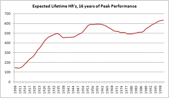
As you can see, the 500-HR club is not nearly as true of a milestone club as the 300-win club. As can be expected, in the early days of baseball the HR bar was set very low. It then rises to a peak of 500 in 1934 before going into a trough through the 1940's. It reaches another peak point of 594 homers in 1958 before dipping back down to around 500 in the late 70's. From the late eighties to today, the expected number of home runs has risen dramatically to its peak level today (peak year=2001) of 634 HR's. This means that a player with a peak year in 2001 has a 134 HR advantage over players who played just 20 years earlier.
I didn't adjust for longevity here, since the usage of hitters has not changed throughout baseball history (although one could argue that the DH has enabled players to hit more lifetime HR's). A list of the "era-neutral" 500-HR club is below and consists of 11 members from a well-balanced smattering of eras (HR’s are indexed to their 1934/1949/1977 levels).
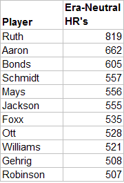
As if you needed more proof of Ruth's dominance, here it is. He's at the top by a wide margin. Aaron and Bonds follow, and there's a large dropoff after that. The list is devoid of the plethora of modern sluggers who have recently joined the ranks, although Griffey is about 13 HR's away from joining. It also leaves off a number of 50's and 60's players. The era correction makes the feats of Reggie Jackson and Mike Schmidt look even more impressive as well as adds Lou Gehrig to the club. Of course, if you wanted to index to a different year, you could make the club either more or less exclusive.
While 300-wins remains a good marker for a ticket to Cooperstown, the 500 HR club is far more volatile and if Hall voters haven't figured it out already, they will be writing a lot of unwarranted tickets if they use that as their standard with modern players. The 300-club however, remains a gold standard which is both reachable, but difficult to achieve.
| Behind the Scoreboard | June 03, 2009 |
2009 Draft Day Spotlight: Zack Wheeler
Continuing with our series of Draft Day Spotlights, I recently caught up with Zack Wheeler, a high school pitcher out of Georgia. Wheeler finished his high school season impressively, taking the East Paulding Raiders deep into the Georgia state playoffs. Recently he has been climbing the draft boards, drawing the most interest from teams selecting #4 through #8. The right-hander, long and lanky at 6'4'' and 170 pounds, has a tremendous arm and can throw up to 95 mph with good movement on his fastball and breaking pitch.
Scouting reports have described him as having a "projectable body", and cite his poise and make-up under pressure in addition to his obvious arm strength. From talking to him, Wheeler has a low-key and easy going manner about him, which likely helps keep his cool on the mound.
Zack was kind enough to answer a few questions for Baseball Analysts before the June 9th draft.
Zack Wheeler pitching during his no-hitter
(Photo from East Paulding Raiders Baseball website)
BA: Thanks a lot for taking the time to talking us today. You’re obviously one of the top prep pitchers eligible for the draft, and it’s been said you’re a lock to be a first round pick. Where will you be on draft day and who will you be watching with?
Wheeler: I’m going to be up at a place called Stars and Stripes. They’ve got bowling and everything, some big screen TV’s, it’s like a family hangout. That’s where I’ll be watching it. I’m going to have friends, old coaches, current coaches, family…that’s about it.
BA: What’s your favorite ballclub? Are there any teams you’re particularly hoping to be drafted by?
Wheeler: I really don’t have one. There’s really none….I don’t really don’t care who picks me, I just want to go out and play.
BA: I’m sure you’ve had a lot of scouts come watch you, including from what I understand, some general managers. How does it feel to be pitching in front of those guys? Any added pressure?
Wheeler: Ah, no, I don’t think so. I’ve been playing over at East Cobb, on the number one team, the past two summers. Playing over there on the number one team, you get that all the time. I think I’m pretty used to it. The Aflac All-American game, Under-Armor All-American game, those really helped a lot – all the people watching you all the time and stuff. I don’t think there’s really any more pressure than usual.
BA: Have any teams taken a particular interest in you?
Wheeler: Teams…the Pirates, the Orioles, the Giants, and Braves. Those are the main four.
BA: Speaking of pressure, you recently threw a no-hitter in the state playoffs. Describe what was going through your mind when you were on the mound?
Wheeler: I really didn’t know about it until the seventh inning, when I had three outs to go. My second baseman came up to me and told me I had a no hitter. He jokes around with people all the time, he’s like the jokester on the team – so he just let me know about it. I just tried to go up there and get three more outs. I really didn’t know about it until the 7th so, there was really no pressure until the end.
BA: Well congratulations, that must have been really exciting.
Wheeler: I appreciate it.
BA: Are there any pitchers that you really model yourself after?
Wheeler: No, not really, I don’t think so. I mean, I like Carlos Zambrano, but it’s kind of hard to model yourself after him. I just like how he loves the game and how he plays it.
BA: There’s definitely a lot of intensity with him.
Wheeler: Yeah.
BA: What’s your greatest strength as a pitcher? Something you’re really proud about?
Wheeler: I think my mound mentality. If something goes wrong behind me I just keep on pitching, you know, try to get more outs – don’t try let anything get to me really. I think that’s a good strong key to have.
BA: That’s definitely important. Can you describe the pitches in your arsenal and maybe your approach to facing hitters in terms of pitch selection?
Wheeler: I’ve got my 4-seam fastball, my 2-seam fastball. Then I’ve got my slurve, and I’ve got a change-up. When I get two strikes on somebody, I want to make them chase an 0-2 curve ball. I usually try to throw a swoopy curveball that just dives out of the zone. If I have a 3-2 count and I want to throw a curveball to strike them out, I’ll throw more of a harder curveball that has a bit more bite downward.
BA: You feel confident throwing that curve ball with a 3-2 count?
Wheeler: Yes sir.
BA: Have you given much consideration to pitching in college or are you pretty much set on going straight to the pros?
Wheeler: I mean, if it doesn’t work out when the draft comes around, I’d definitely consider pitching in college. But, you know, I want to go play, so I hope it works out.
BA: Your older brother Adam also played professional ball from what I understand. What lessons have you learned from watching him?
Wheeler: You know, just keep your poise on the mound. Don’t let anything bother you and just have command. Be strong every time out.
BA: What kind of personality do you have in the clubhouse? Are you a vocal leader? A lead by example guy? A prankster? What’s your personality?
Wheeler: I lead more by example. I’m not quite a vocal leader. But, you know I like to play jokes on some people too sometimes, just to keep things live in the locker room.
BA: First round draft picks can command a lot of money. Are you nervous at all about the contract negotiations? Do you have a plan for that?
Wheeler: I don’t know, me and my agent haven’t talked about it very much. We’re just gonna let it flow and everything. When the time comes around I’m sure we’ll figure it out.
BA: I'm sure you will. One more kind of fun question. You mention you like Carlos Zambrano, and I notice that you’re a switch hitter yourself, which is unusual for a pitcher. Do you think you’ll keep that up or do you think you’ll settle into one side of the plate?
Wheeler: I think I’ll keep it up – I still hit both ways right now. I mean, I hit better lefty, but I can hit righty too.
BA: Big Z certainly seems to handle it perfectly well himself.
Wheeler: Oh yeah.
BA: Well that’s all the questions we have for you today. I want to thank you for taking the time to talk to Baseball Analysts.
Wheeler: No problem.
BA: Thanks again and good luck on June 9th.
Wheeler: Alright – appreciate it.
Wheeler at the Under Armor All-American Game at Wrigley Field in 2008.
| Behind the Scoreboard | June 01, 2009 |
Runs Allowed vs. ERA
I picked up a copy of Baseball Between the Numbers, the Baseball Prospectus tome which debunks conventional baseball wisdom, and I couldn't help but be struck by the chapter in which it damned baseball's Earned Run Average as an archaic statistic. While of course, ERA has its problems, I was surprised that its prescription for ERA's shortcomings was to user the simpler Run Average (RA), which is calculated the same way as ERA except using total runs instead of earned runs. This idea was also championed by Michael Wolverton among others at BP. Disputing the notion was Kevin Shearer on Rob Neyer's blog site.
While the arguments are convincing on both sides, neither side convinced me to my satisfaction. I decided to examine things statistically via simulation. The key questions regarding ERA vs. RA concern the concepts of variance and bias. ERA was created for a reason - to remove the effects of defense from a pitcher's record. The creators knew that defense could be a source of bias in a pitchers record - a defense which makes a lot of errors will artificially inflate a pitcher's runs allowed, while a good defense will artificially deflate a pitchers runs allowed.
ERA does remove the bias - by reconstructing the inning without the error it indeed removes the effects of defense. Over the long run, ERA will be neither helped nor hindered by good or bad defense. While it does remove bias, the problem with ERA is that it is not very efficient in doing so. By removing the effect of defense, ERA also throws out a great deal of information - namely everything that happens after the third out of the inning should have been made. After a two out error, it matters not whether the pitcher strikes out the next batter or gives up 5 runs, all of this information is lost by ERA (the fact that ERA fails to capture additional outs as well as additional runs seems to be lost on those who simply claim ERA is too lenient and bails out pitchers with poor defenses). Simple RA captures this information (and thus reduces variance by effectively increasing sample size), but of course is subject to bias due to good or bad defense.
Simulation 1
I wrote a baseball simulation program, which keeps track of a pitchers runs allowed and earned runs. The program doesn't take into account different batters, relief pitchers, etc, but that's not the point here. In my simulation I ran 10,000 seasons of pitchers with 200 IP. Pitchers gave up 4.59 runs per 9 IP and 4.24 ER per 9 IP. The same pitchers pitching in an errorless environment also gave 4.24 ER per game, which was no surprise - as I said earlier, ERA is an unbiased metric of a pitcher's run prevention skills.
What's more interesting is to look at the standard deviation of these numbers. The better statistic will have a smaller SD. Of course, this is not quite a fair comparison because the SD of RA will be larger than the SD of ERA because RA is inflated by the errors. We can deal with this by deflating the RA back to an ERA scale by multiplying RA by a factor of 4.24/4.59. Now that we have this fair comparison we can take a look at the SD of these averages. The statistic which has the smaller SD will more closely adhere to the true ERA of 4.24, and thus be a more precise statistic. The results? The SD of ERA was .625 runs per 9 IP. The SD of the adjusted RA was slightly smaller at .608 runs per 9 IP. This indicates that indeed RA is superior in this situation - RA was more closely clustered around the true value of 4.24, whereas ERA was slightly more spread out.
In the ERA vs. RA comparison there are two competing forms of variability. With RA, variability increases due to the presence of errors which create random noise. However, as we've just shown, this is more than counteracted by the fact that the RA effectively has a larger sample size to work with than ERA, since it throws out no data.
Simulation 2
Of course, this assumes that the defense's rate of error is known and RA can be adjusted perfectly to account for unearned runs. In real life, the defensive liability due to errors is largely unknown. We know that teams make roughly around .017 errors per PA, but this can vary by team and other factors.
To account for this, I reran the simulation, this time making the error rate vary randomly in order to match the rough error rate distribution among major league teams. This change is likely to favor ERA over RA, since extra variability is now be added to RA, while no extra variability will be added to ERA. What were the results? In the end, this extra variability did very little to change the results. The SD of ERA was .628 runs per 9 IP while the SD of RA was .610 runs per 9 IP. The change in the SD of RA is almost negligible and is not significant. The end result is that adding this slight amount of variability into the simulation does virtually nothing to change the argument of ERA vs. RA. This indicates to me that indeed the people at Baseball Prospectus are correct and that RA is a better measure of a pitcher's run prevention skills than ERA.
A Combined Measure
But should ERA be thrown out all together, as BP suggests? Using the simulation data, I ran a regression on the simulated data with a fixed 4.24 ERA as the dependent variable and the pitchers' RA and ERA as independent variables to see the relative weights it would assign ERA and RA. Running the data through the regression (with no intercept), we get the following.
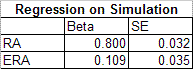
As you can see, RA gets the bulk of the weight, but ERA has usefulness as well. Nevertheless, the regression indicates again that RA is a better indicator than ERA. About 90% of the weight should be given to RA and only 10% should be given to ERA. The standard error on the regression indicates that the standard error of this combined average is .604 points of ERA - down from .610 when using RA alone. However, obviously this distinction is very slight, so using this combined measure is of questionable value, especially since if you are going to go with an advanced statistic, there are many other measures better than either RA or ERA.
Extreme Situations
So, we have shown that RA is a better statistic than ERA in the current MLB environment, but what about other environments? When the propensity for errors is much higher, does ERA become more meaningful? In fact, the opposite is true. With more errors, there will be more plays that ERA throws out. When a lot of errors are made, it actually provides us as observers more sample to observe a pitcher. When the % of PA reached on error is jacked up to 8%, the SD of RA actually decreases strongly from .608 to .533, while the SD of ERA remains the same. This makes RA even more superior in environments where many errors are made.
How about environments where the variability of error rate is high between pitchers? The variability in error rate among MLB teams is very narrow and we saw that factoring this in had little effect. However, if we increase this variation in error rate significantly to range from 0% to 2%, what happens? In this situation, indeed ERA does become a better statistic, with the standard deviations comparable and the importance of ERA nearly matching the importance of RA in a regression. Of course, this is not a realistic situation which occurs in baseball.
Conclusion
In conclusion, I hope I have advanced the debate between ERA and RA. The simulation approach is an advantage because it creates a controlled environment. While ERA does have some usefulness, it's unbiased nature is more than offset by its problems of throwing out too much information. It's neither too lenient nor too harsh on the pitcher, but is simply inefficient. Of course, some pitchers have certain characteristics which make unearned runs systematically more likely (such as extreme groundball pitchers and knuckleballers), which only RA can capture. The simulation didn't take these types of pitchers into account, but this is even another reason to use RA over ERA. While I first viewed the use of RA over ERA with skepticism, this simulation convinced me of its merits as the better of two imperfect statistics.
| Behind the Scoreboard | May 23, 2009 |
Measuring the Taint: Steroids and the Court of Public Opinion
After the Mitchell Report was released last year, baseball hoped to put its steroid past behind it. However, with this year's allegations of Alex Rodriguez and Manny Ramirez both juicing, steroids are once again back on baseball's front burner.
How A-Rod and Manny's legacies will be tainted by steroid accusations remains to be seen, but one of questions for fans, baseball media, and hall of fame voters is how to treat alleged steroid users in the steroid age. While no player has actually been tried for taking steroids, all players stand in front of the court of opinion, and this court, fair or not, will determine a player's legacy.
While the list of players somehow connected with steroids has grown to over 125 according to Baseball's Steroid Era, some alleged users seemed to have escaped the taint and shame that comes with steroid use, while others have felt the full wrath of public scorn crash upon them. Watching a nationally televised early season game this year between the Cubs and Cardinals, the announcers lauded the amazing feel-good story of Rick Ankiel, the wild pitcher turned slugger, while conveniently not mentioning that he completed the transformation with the help of Human Growth Hormone. Ankiel had a prescription from a doctor and was not banned by Major League Baseball, but he still took HGH - it seems that he has been given him a pass where other HGH users have been vilified - at least according to Miller and Morgan.
But while no polls of fans' perceptions have been taken, it got me thinking about how tainted certain ballplayers were due to steroids. While a poll might be ideal, another measure of steroid taint might be how many mentions of steroids linked with a player are in the media. Another might be how often fans refer to a player as a steroid user. Where's one place that the media and fans intersect to provide commentary on baseball? The internet of course.
One way of measuring the steroids stain is by using the all-powerful Google. To get a player's baseline number of mentions, I put a player's name in quotes and searched for all references within the past year. Then, to measure the stain of steroids, I searched for that player's name with the word "steroids" next to it and took note of how many hits were found in the last year for that search. Dividing the number of hits for a player and steroids, by the number of hits for the player overall, gives an estimate of the "percent tainted" for a particular player. I limited the searches to references within the last year to eliminate hits for that player before the steroids were found, as well as to give the controversy time to calm down - we're not as interested in how widely reported the story was at the time it broke, but in how a player is perceived after some time has passed.
Obviously this is an inexact science - the number of hits change over time, and is subject to the unknown inner workings of Google. And of course, if you've ever searched for something on the internet before, you'll know that sometimes you might get results that don't result in what you want - a hit from a search of Ankiel and steroids might talk about Ankiel in one place and mention steroids in a totally different context further down the page. Ideally, we'd like to filter those out, but this method should still give a decently accurate results.
Another potential problem, was that if there was recent news on the particular player and steroids, this tended to give some bizarre results - Tejada was recently pled guilty to lying to Congress, so for a few weeks this led there to be more hits for Tejada and steroids than Tejada alone. Now that inconsistency seems to have gone away. I'm not sure how this happens, but it's reason for caution when there has been recent news surrounding a player. For this reason, Manny Ramirez and A-Rod are not in the table below - the verdict is still out on how their usage will affect their legacy. The data I present here is about a week or so old - hopefully things haven't changed much.
For what it's worth, here is the table of the "Percent Tainted" for the alleged or proven steroid users. It's not a comprehensive list, but covers the highest profile players along with their usage and the source of their allegations.
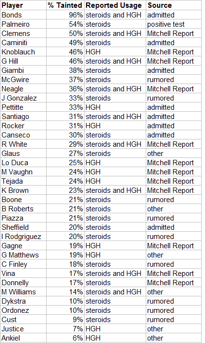
Is there a pattern that can explain why some players seem to be more tainted than others? Not surprisingly, it's Bonds that tops the list. He's followed by Palmeiro, Clemens, and Caminiti, all high-profile steroids cases to be sure. A few guys, Knoblauch, Hill, Neagle, are high on the list, but are probably more an artifact of the method rather than real public perception. These were players who were out of baseball and out of the public eye when their names surfaced in the Mitchell Report, leading to a high percentage of recent hits linking them to steroids. On the other hand, this didn't seem to affect Fernando Vina or David Justice, who were also out of baseball when the report surfaced, but their percentages were fairly low.
Of the other Mitchell Report guys, some players got off relatively easily. You don't hear much about Eric Gagne's steroid use, and the Google data backs this up, at only 19% tainted. Gary Matthews Jr. and Brendan Donnelly also seemed to get a pass from the public. Why I'm not sure, but my perceptions seem to match the Google data - the guys at the bottom of the list aren't guys you generally associate with steroids, even though there's evidence that they did them. Meanwhile, the guys at the top are the players I tend to link with steroids more readily.
Players that were simply rumored to have juiced, or were implicated via hearsay, were less likely to be judged harshly by the public. A guy like Bret Boone, who's numbers surely would indicate steroid user, but was implicated only by Jose Canseco, came in fairly low at 21%. Ivan Rodriguez and Magglio Ordonez were even lower. Puzzling is Canseco himself, who was 30% tainted - high but not as high as some others - even though he seems to have made his entire existence revolve around steroids.
At the bottom of the list is our man Rick Ankiel, who was found to have taken HGH, but claimed he had a good reason for it. The ESPN announcers weren't the only ones giving Ankiel a pass; it seems that most others did as well.
In general, it seems that the players who took a low profile - no lawsuits, no interviews, no public outrage - seemed to fare the best. Guys like Clemens or Palmeiro, admittedly bigger stars to begin with, tried to refute the claims and ended up high on the list. It also seems best not be linked with one of those guys - Andy Pettitte probably handled his situation as best he could, but being linked with Clemens assured his own use would be brought up time and time again. Ditto with Benito Santiago and Bonds.
While it's interesting to see the perception of players who have already been busted, we can use the same method to try to track which players - past and present - are most perceived to have taken steroids, even if no actual evidence or credible allegations have been made. This isn't a witch hunt, but rather simply taking measure of who the public suspects of possibly taking steroids.
For this, we must take additional steps of manually filtering out results that actually suspect a player of steroids vs. results that say, have a player commenting on steroid use without any implication at all. A search of Derek Jeter and steroids may turn up a lot of results, but they will be talking about him in relation to A-Rod’s use, not suspecting Jeter of steroid use himself. To do this, I manually looked at the first 20 hits and saw which were relevant suspicions, and which were not, and proportionally scaled back the "taint percentage." To be fair I also went back and did this for the proven steroid users as well, so the table above also reflects this methodology. It's not foolproof to be sure, and it's somewhat subjective, but it's a way to combat the above problem.
Below is a table of players who have never been actually reported to have used steroids, and their taint percentages. The list consists of big power hitters and a few other all-star type players - the type of player who usually falls under suspicion, or at least attracts the attention of fans.
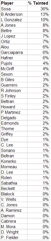
The most suspected, but never proven, player of all is not surprisingly Sammy Sosa. He's always been a face of the steroid era, despite never having actually been linked to using them, and his percent tainted is larger than most players who actually have been proven to take steroids. The other biggest suspicions seem to be based largely on statistics, which makes sense in light of the lack of actual evidence. Brady Anderson, Luis Gonzalez, Andruw Jones, and Adrian Beltre all had bizarre seasons of extremely high or extremely low production, presumably leading to their steroid suspicion.
Still, the lack of hard evidence leaves these players well below the average taint of players with actual allegations against them. Among active sluggers, David Ortiz and Albert Pujols, who many regard as the greatest clean slugger, are not above suspicion either. As luck would have it, I was playing around with these numbers the day before the Manny Ramirez steroids story broke - he was pulling around 5% - which would have made him one of the more suspected sluggers in the game today.
Of course, these numbers are not hard and fast - a couple of wackos making baseless allegations can significantly increase the % tainted in the table above so there's probably a fairly large variance to these numbers - but of course baseless allegations are exactly the type of thing we are trying to measure.
While I'd really like to see a public opinion poll of baseball fans asking how much they thought a variety of players were helped by steroids, this admittedly flawed method seems to be a decent approximation for the public's opinion on many players. My main concern is my lack of knowledge about Google’s inner workings, and how these percentages might fluctuate based on unknown reasons. Still it’s pretty interesting to see how players stack up. It will be interesting as time goes on, to see how the perception of players change. For some the scandal may fade away, while others may be permanently branded as cheaters. The lists above may give an indication of which players will be which.
| Behind the Scoreboard | May 16, 2009 |
Do Hitters Change Their Approach During a Hitting Streak?
As I am sure everybody has heard, Ryan Zimmerman recently completed a 30-game hitting streak, putting him alongside 52 other players in the history of baseball who have hit in 30 consecutive games or more. The streak was a nice bright spot in another otherwise dismal season for the Nationals, but unfortunately, as so often happens, the streak ended right as he began to gain national recognition for hitting in 30 straight games.
Thirty games is a kind of marker of when a streak really becomes serious. The national media start paying attention, the fans begin to invest in it, and the pressure really starts to build for the player. Nobody takes notice of a 10-game streak and few recognize a 20-gamer, but when player he approaches and reaches 30 games, it becomes serious. My question is how having a serious streak changes a player's performance. This will be the last in a three-post “streak” of posts about streaks.
As I said earlier, there have been 53 such streaks in the history of baseball. First, let's take a look at how they break down.
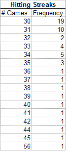
As you can see, a lot of the streaks were broken up after either the 30th or the 31st consecutive game. Is this some evidence that players buckle under the pressure of a high profile streak? Let's try to fit a theoretical model to the data and see if theory fits reality, or if something else may be going on. One would think the data would take shape of the following: y = 53 * (a ^ (x-30)), where x is the length of the streak, y is the number of players completing an x length streak, and a is some coefficient to be fit by the model, basically representing the probability of continuing the streak an additional game. When the model is fit, we find a=.755, meaning that all things being equal, the probability of continuing a 30+ game streak an additional day is about 75.5 percent. Let's look at the graph to see how well it fits.
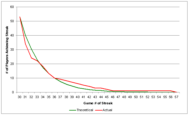
As you can see, the model slightly over estimates the chances of extending the streak to 32 games, but underestimates the chances of extending the streak to around 40 games. It also predicts an exceedingly low probability of a 30-game streak reaching 56 games (1 in 1500), when in fact one did occur. Is this just an artifact of chance, or is there something going on? Largely due to DiMaggio, a chi-square test strongly rejects the theoretical model. However, if we put DiMaggio in a "46 games and over" category, we still find that the model fits only marginally well, with a p-value of .12.
The difference between the real data and the model is basically that instead of having the same probability of continuing the streak in each subsequent game, the real data seems to suggest that probability of continuing the streak gets higher as the streak goes on. However, this is largely due to the fact that a player who has hit in 40 consecutive games is likely to be better than one who has hit in 30 consecutive games. Indeed, the three-season average of hits/plate appearance was .287 for those who had streaks between 30-34 games, but the H/PA was .301 for those who had streaks of 35 games and higher. So while an unknown player with a 40-game hit streak is more likely to extend his streak than an unknown player with a 30-game hit streak, it's unclear whether the chances differ for a specific player.
Perhaps more interesting is to compare players' overall statistics to their performance while they have a 30+ hit streak brewing. Do players change their approach to try to extend the streak? If so, we might expect to see less walks and less homers during the pressure filled portion of the streak. Also, what happens to their overall batting average? Obviously, these players are "hot," but they are also under a lot of pressure and pitchers may especially bear down to try to get them out. The comparison in BAV, HR/PA, unintentional BB/PA, and IBB/PA are listed below (the expected values are based on three-season averages weighted for the number of games over 30 that each player had his streak going).
As you'd expect, players with streaks have a good batting average at .303. They also don't homer much, clocking in at .022 HR/PA, which is good for 13 HR's over the course of a 600 PA season. As you'd expect, they also don't walk much, as they're OBP is only .358 - not great considering a .303 BAV. Below, we can take a look at the comparison of total stats vs. the stats during games in which a player had a 30+ game streak (including the game where the streak was broken).
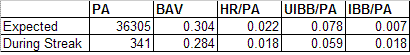
Perhaps the most surprising thing is the fact that the batting average during games where a player has a streak going is 20 points lower than his usual batting average. This statistic has a high standard error (.026), so due to small sample size, it's hard to prove anything with statistical significance, but it's still interesting. It certainly blows a hole in the "hot hand theory" (which of course has been done many, many times before), but does give some credibility to the theory that pitchers are bearing down and/or pitching carefully to hitters with a streak.
The batters, for their part, seem to be taking 25% less walks with a streak on the line (again, not enough power to prove statistical significance however), which is good for the streak, but bad for the team. However, if it comes down to the late innings and the player is without a hit, it makes sense that he would hack away when a walk would likely end the streak.
While it might be sporting to avoid intentionally walking a player with a long hit streak, pitchers don't seem to care, and actually intentionally walked hitters more than expected (where we expected 2 IBB, there were actually 6). So, while Nats fans may have been angry when Zito intentionally walked Zimmerman in the 7th inning with the streak on the line, it wasn't unprecedented. The increase in intentional passes is probably due to a perception that the player with the streak is "hot" and more dangerous than usual, even though a look at these statistics will show that pitchers have no reason to worry.
While more data (and thus more streaks) are needed to draw hard conclusions, preliminary evidence shows that players may have a tough time getting hits with the streak on the line, and while their power remains the same, they do tend to walk less. So while it may be exciting to watch your favorite player with a long hit-streak, there is some evidence that the effect may not be as positive for your favorite team.
| Behind the Scoreboard | May 09, 2009 |
The Greatest Scoreless Innings Streak Ever
On Tuesday, I posted about Zack Greinke's 38-inning scoreless streak and showed how it was the equal of the famous Don Drysdale streak in 1968. Due to the context of the times and the quality of the opponents, Greinke's 38-inning streak was actually just as difficult as Drysdale's 58-inning streak. But of course Drysdale and Greinke are not the only pitchers to ever compile long streaks. This article follows up on the last one, and tries to determine the most impressive scoreless inning streak of all-time.
The record holder of course, is Orel Hershiser, who pitched in 59 consecutive scoreless innings, dramatically pitching 10 innings in the final game of the season to overtake Drysdale. Other contenders for the title of toughest scoreless inning streak are Walter Johnson, in the American League, who pitched 55 2/3 scoreless innings in 1913 for Washington, and Sal Maglie's 45-inning streak in a tough pitchers' environment in 1950 for the New York Giants. There are other notable streaks, such as Bob Gibson's 47-inning streak in 1968 and Jack Coombs' 53-inning streak in 1910, but because they were accomplished in even stronger pitchers' environments than Hershiser's, we can see right away that they won't be tougher than his record-holding streak.
Looking back at all three of the streaks, we can determine about how likely it was that a quality pitcher could complete each streak. The streak with the lowest probability of course was the toughest.
Using the same methodology from Tuesday's article, I calculated the expected runs allowed for each game of the streak, based on the opponent, the park, and whether the pitcher was playing at home. I then made a small adjustment for defense to account for poor defenses having a higher probability of giving up unearned runs (which would end the streak).
Let's first take a look at Hershiser's streak. Performed in 1988, it was a pitchers' environment. Dodger Stadium was significantly less pitcher friendly than during Drysdale's streak, but was still a pitchers' park. However, only 18 of his innings were at home, making the streak even more impressive. The following chart shows the seven games that composed his streak.
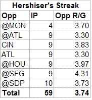
Based on opponent, park, and home field, the average expected runs per 9 IP during the streak was 3.74. Cutting this number down by 25% to get the expected number of runs given up by a good pitcher, not simply an average one, we get 2.99 expected runs per 9 IP. This translates roughly into a probability of throwing a scoreless inning at .801, which he accomplished 59 straight times - very impressive. The probability of completing the streak was .801 ^ 59 = 1 in 485,000. With those odds, the Bulldog certainly pulled off an incredible feat. This was about 5 times tougher than Greinke or Drysdale's feat, but was it the best ever?
Next let's look at the dark horse of the group, Sal Maglie. Being a younger fan, I had not heard of Maglie's scoreless inning streak until recently, and it certainly doesn't have the cache of Drysdale's or Hershiser's. But was it as good or better? Maglie started his streak on August 16th against Brooklyn and ended it September 13th against Pittsburgh, throwing four shutouts in between. 1950 was certainly a hitters year, which made the streak all the more impressive. Below is a chart of the opponents and the expected runs given up by an average pitcher in each of the games.
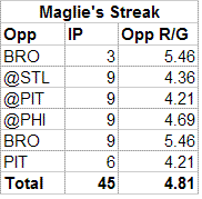
Maglie's opponents varied between the tough Brooklyn Dodgers and the lowly Pirates, but on average, the average pitcher would be expected to give up 4.81 runs per 9 IP during the streak. For a "good" pitcher, we reduce this to 3.85. Translating this to the probability of throwing a scoreless inning, we get approximately .750. Therefore, the probability of completing the streak was approximately .750 ^ 45 = 1 in 419,000. The Barber's feat was nearly as good as Hershiser's! While he wasn't quite as good the numbers are extremely close, especially considering that there is some estimation error. Still, it's surprising that the unknown Maglie streak is nearly the equal of Hershiser's celebrated feat. The context means that much. But could anyone best both Maglie and Hershiser?
Now let's turn our eyes to Walter Johnson's feat. In 1913 he broke Jack Coombs' record in a tougher pitching environment by throwing 55 2/3 scoreless innings. He started the streak after giving up a run in the first inning of opening day, and didn't allow another one until May 14! Pitching in a combination of starts and relief, he was dominant in his first nine outings. I was able to cobble together the games of his streak (partly due to this nice blog on the Senators and Twins) except for one two inning April relief appearance against whom I could not determine. Below is a chart showing his opponents and the average expected runs per 9 IP.
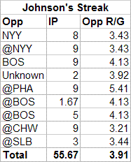
The average runs per 9 IP was 3.91 for an average pitcher and for a good pitcher this number is reduced to 3.13. Converting this to a probability of a scoreless inning we get about .792. Therefore, over 55.2 innings pitched, the probabilty of a good pitcher completing his streak was .792 ^ 55.67 = 1 in 435,000. This makes Johnson's streak not quite as impressive as Hershiser's, but very close. Due to potential errors in the conversion of runs per nine innings to probability, I think a case could be made for either Maglie, Hershiser, or Johnson to have had the toughest streak, as all three are very close. The difference between them is only one or two innings on a level playing field, so had any of them continued their streak for just a little longer, they would have had clearly the toughest streak of the three.
Can the trio's "record" for most impressive streak be broken? In today's environment, a pitcher (such as Greinke, who now has another 13-inning streak going), would need to reach about 44 innings to match Maglie, and 45 innings to surpass all three streaks. Of course, the fanfare won't start until he reaches 60, but he'll have beaten the toughest streak ever long before that.
| Behind the Scoreboard | May 04, 2009 |
Was Greinke's Streak Better Than Drysdale's?
Last week, Zack Greinke wrapped up a 38 consecutive scoreless inning streak, garnering him a Sports Illustrated cover, and the most attention a Kansas City player has received in quite some time. Greinke, the 25-year old righty who's been flying under the radar the past several years, made headlines by challenging the pitchers' version of Joe DiMaggio's 56 consecutive game streak.
But while Greinke's streak was impressive, surely it was not the quality of Don Drysdale's 1968 feat of 58 innings, which broke Walter Johnson's 55 year-old record and stood for 20 years on its own. Right? Perhaps... To test this, we'll try to calculate the probability of a typical "good" pitcher accomplishing both streaks.
Let's take a look at the two streaks:
Drysdale's streak of 58 innings started with a May 14th shutout of the Cubs at Dodger Stadium and he pitched 5 additional shutouts before letting up a run in the 5th inning against Philadelphia on May 31st. Greinke's streak of 38 innings started at the end of 2008 and continued through this year until he gave up an unearned run last week in the 5th against Detroit (he finally gave up his first earned run in the first inning of the following game).
On the face of it, it would appear that the Drysdale's streak was vastly superior to Greinke's, but let's look at the hitting prowess of each of the opponents they faced.
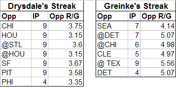
Opponents
Drysdale made his run during 1968, The Year of the Pitcher. Greinke on the other hand made his during a relatively good hitting era (the stats in the above chart are the 2008 runs/game for Greinke's opponents). The average number of runs per game of Greinke's opponents was nearly a full run and a half higher than Drysdale's!
Greinke's opponents did however, play in slightly more favorable hitters parks than Drysdale's. When adjusting the teams' runs per game by their 3-year park factor, the weighted average of Drysdale's opponents scored 3.48 runs per game and Greinke's opponents scored 4.93 runs per game. This means that an average pitcher facing Drysdale's opponents would give up about 3.48 R/G, but that same pitcher facing Greinke's opponents would give up 4.93.
Home Field
This however, still ignores where the games during the streak actually took place. Here Drysdale clearly had an easier go of it. Forty of his 58 innings were thrown at home, which increases his performance by about 5%, and only 18 innings came on the road, where the average player's performance decreases 5%. On top of that, his home games were played in the spacious Dodger Stadium. In the early years of Dodger Stadium, the park depressed runs by 16%, making things much easier for a hurler. On top of that, his road games were played in Houston and St. Louis, also both pitchers parks - depressing scoring by 4%. When you factor all of that in, the expected runs per 9 IP of a pitcher throwing those same innings drops from 3.48 to 3.00.
Greinke on the other hand didn't enjoy those advantages. Only 16 of his 38 innings came at home, making it tougher for him to complete his streak, while the park factors generally cancelled each other out. Overall, the expected runs per 9 IP went up from 4.93 to 5.03.
Defense
Since the streak includes earned runs and unearned runs, the proficiency of the defense also makes a difference (of course, defense is a factor no matter what, but I don't have the UZR for the 1968 Dodgers). In 1968, the average number of unearned runs allowed per team was about 14% of the number of earned runs. The Dodgers were slightly worse, giving letting in additional runs to the tune of 18%. When this is factored in, the expected R/G for Drysdale's innings increases from 3.00 to 3.08. The Royals defense was also slightly worse than average, increasing the expected R/G for his innings from 5.03 to 5.06.
The following chart gives the expected number of runs allowed per 9 IP for each game of both streaks, after taking into account the opponent, park, home field advantage, and defense.
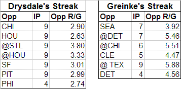
Of course, these numbers are for the average pitcher. We want to calculate the probability that a good pitcher, like Drysdale or Greinke, would be able to complete the streak. Of course, a good pitcher would be expected to give up far fewer runs. The ERA+ numbers for both pitchers were around 125 (128 for Drysdale and 123 for Greinke in 2008) so it makes sense to use that as a benchmark. Dividing by the 125 ERA+ number, we would expect a good pitcher to give up 2.47 runs per 9 IP during Drysdale's streak and 4.05 runs per 9 IP during Greinke's streak.
Which Streak Was Better?
Using these numbers, and the number of innings in each successful streak, we can determine the likelihood that the same "good" pitcher could complete each pitcher's streak. First we have to translate those run per game averages into probabilities of scoring. I'm sure there's been work done to do this theoretically, but instead I used empirical data from Retrosheet courtesy of John Jarvis to estimate that the probability of pitching a shutout inning during Drysdale's streak was about .825 and the probability of pitching a shutout inning during Greinke's streak was about .745.
Using these numbers we can compute the probability of our typical "good" pitcher completing each streak. For Drysdale, the chances were (.825) ^ 58 = 1 in 70,000. For Greinke, the chances were (.745) ^ 38 = 1 in 72,000. So in fact, due to the far tougher environment, Greinke's streak was actually tougher to accomplish than Drysdale's!
Actually, the numbers are so close that you would have to conclude that both streaks were equally as difficult - the potential error in making our above estimates and assumptions are far greater than this tiny difference. Even so, to the average fan it probably comes as a shock that the two streaks are even in the same company - Drysdale's streak is a celebrated piece of history, while in 40 years Zack's streak is unlikely to be remembered by anyone other than Mrs. Greinke and a few die-hard Royals fans.
In any case, it illustrates the importance of considering the time and place of a player's performance. If the two players were competing in equal environments, there's no question that Drysdale's streak would be a far greater accomplishment (when both have a shutout inning probability of .80, the chances are 1 in 5,000 for a 38 game streak, 1 in 400,000 for a 58 game streak). But they weren't and as a result, Greinke's streak is actually every bit as impressive as the Hall of Famer's. So while he won't get the acclaim, here's one writer who wants to say congrats to Greinke for matching Drysdale's timeless accomplishment.
| Behind the Scoreboard | May 02, 2009 |
How Not to Price Your Tickets - A Look at New Yankee Stadium
This week brought the news that the Yankees - yes those Yankees - were lowering ticket prices on their most expensive premium seats due to sagging demand and embarrassing empty seats.
The problem, of course, was the outrageously expensive cost of sitting in the premium seats, compared to the relatively modest cost of sitting elsewhere. Sure, there will be a few people who will pay top dollar to sit in the best seats in the house, but how many people are willing to pay $2,500 when you can get in the park for just 14 bucks?
Steinbrenner has admitted that he's overpriced the tickets, but just how badly did the Yankees botch their ticket prices? For this I compared the Yankees prices from their ticketing website to the median ticket price for all other stadiums built in this same neo-classic era for a variety of approximate seat locations. I then compared this to the prices you could get for the same seats on StubHub, the ticket re-seller which has thousands of tickets sold by fans for each game. Since markets tend to get closer to their true value as the event nears, I took two upcoming games - this Sunday's game against the LA Angels (for which the weather is supposed to be terrible) and for Tuesday's game against the Red Sox (the weather still won't be great, but it's the Red Sox) for comparison. The following chart shows the difference between the prices in a variety of sections.
As you can see, the true value of the tickets according to StubHub are closer to the MLB median ticket prices than the exorbitant face value of the seats in a lot of cases. Anyone planning to go to the games this week ought to think twice before buying tickets at the box office because clearly deals can be had. It's also readily apparent that the Yankees did indeed overprice their high-priced tickets compared to their nosebleeds and bleachers.
For the Angels game, the only tickets going for more than face value were the bleacher seats. Meanwhile, the $100-plus seats were going for about a third or a quarter of their face value. For Tuesday's Red Sox game, the tickets were going for about double the price of the LA game across the board. This means that while bleacher seats are going for double their face value, the fancy seats are still going for well under face, meaning that a lot of them are presumably unsold, leading to a lot of pictures such as this one.
So what did the Yankees do wrong? The average team was selling their excellent (but not “premium” seats) for about $70, while their decent seats (poor lower level seats or good upper level seats) were going for about half of that. The cheap seats in the outfield or down the lines in the upper deck were going for about a quarter of that amount. But the Yankees didn’t follow that pricing structure at all. Instead, they priced the good seats at $375, about four times more than the decent seats, and about eight times more than the nosebleeds and bleachers. This leads to a huge chasm in pricing sections and the empty seats in the good sections that we keep hearing so much about. As the StubHub data shows (which is similar to most teams’ pricing structure of half-price for decent seats, one quarter of the price for nosebleeds), it’s simply not worth that much extra to get that much closer at a ballgame.
However, the Yankees were just the latest team to push the envelope in what has become an increasing trend. Baseball ticket prices have undergone a revolution in the last 10 to 15 years, with teams figuring that people are willing to pay a lot more based on seat location. It used to be that when you walked up to the ticket counter, you'd ask for the best available seat. Usually the really good seats were already sold, or taken by season ticket holders, but if you could get your hands on a good ticket, you'd take it, knowing that you could do so without breaking the bank. It was usually worth the extra few bucks to sit up front.
A look at National League ticket prices based on the 1993 National League Greenbook (ticket price information is that annoying type of data that's ubiquitously available at the time, but surprisingly difficult to find even a short while later) shows a few surprising things. You can see the approximate pricing difference here, though with less detailed seat locations than the previous charts:
First off, the prices in general were a lot lower. Even after adjusting for inflation, the median highest priced ticket among the 12 teams was $20. Those prices today are unfathomable in any ballpark, not just in New York. The median ticket price has tripled over the past 16 years from $14 to $40 (again this assumes the same number of seats in each section, so it's not perfectly accurate - it's probably on the high side).
Second, there were far fewer price levels. A cruise around the MLB ticket websites will reveal a dizzying array of price levels and seating options. You can't really tell from this chart, but in 1993 each team had just three to five price levels, with the typical arrangement being a box seat, terrace seating, reserved seating, and general admission or bleacher seating
Today of course, teams have realized that seat location matters a great deal, and four or five price sections won't do. Their theory is that more price points make for a fairer pricing system, with each patron getting the seat they paid for. In the old days however, there wasn't that much difference in price between the good and bad seats anyhow, which brings me to my next point.
Not only have ticket prices been raised dramatically since 1993, but it's primarily the good seats that have gone up the most. While ticket prices have tripled, the spread of the ticket prices has also increased. No longer can you pay an extra $10 and get the best seat in the house. While the top seats used to be $20, now the best seats in the house have increased tenfold at over $200 a pop. Even among the non-premium seats, this trend is true. Nosebleed seats have doubled from about $7 to $14, but the field boxes, the mezzanine seating and the best outfield seats have increased three or four fold. The standard deviation of the 1993 ticket prices (and again this is very crude because it assumes there are the same number of seats in each section I outlined) was just $4.80, but in 2009 this standard deviation was a whopping $55.80 - a remarkable increase in spread. Even when excluding the "premium" seats the standard deviation was over $20.
Another interesting difference is that in 1993, all teams priced their tickets around the same. The following chart shows the standard deviation between teams for each type of ticket.
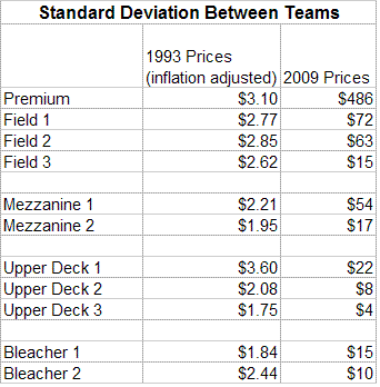
As you can see, there was fairly little difference in pricing between teams in 1993 - the ticket prices for each team are the same give or take a couple bucks. Now however, the differences in ticket prices are dramatic, particularly for good seats. The only real consensus is in the back of the upper deck where teams think they should be priced at $12, give or take $4. If you walk into a random ballpark and ask for a decent lower level seat, you'll get a vastly different answer depending on the ballpark - the median price is $52, but the standard deviation of that price is $63! You can get one for as little as $27 in Pittsburgh or as much as $375 at New Yankee Stadium.
A final observation about the 1993 ticket prices is that teams didn't have differing prices based on opponent, time of the year, etc, like they do today. The Chicago Cubs were the only team which practiced any type of this, and they did so by raising their prices by $1 for weekend and night games. Now, almost every team varies their prices based on a myriad of factors, and charges "premium" prices for certain games.
So, where does that leave us as fans? Certainly the tickets are never going back to the way they were when we were kids. Teams have realized that certain games and certain seats demand higher prices and they are charging those higher prices. But this latest Yankees debacle may be the beginning of a reversing trend. The Yankees and Mets both have been burned by their gouging and the Nationals also were burned by this pricing structure last year in their new ballpark. For many games, the attendance would be fairly low, but all of the decently priced seats would unavailable, locking out the average fan and creating quite an odd pattern of seating at the ballpark. The long term effects of this pricing is unknown and teams may be wise to that fact that this could be detrimental. For instance, one of the incentives of getting season tickets used to be that over time you could move up into really good seats - but now, the really good seats are unaffordable to a lot of people - so where's the incentive?
How baseball teams go forward with their pricing is unknown, but taking a look back sure makes you long for 1993 again.
| Behind the Scoreboard | April 27, 2009 |
Ellsbury's Steal of Home
Last night, Jacoby Ellsbury pulled off the rare play of a straight steal of home. The feat electrified the Fenway crowd, but was it a good play? It was the bottom of the 5th with the Red Sox leading 2-1. The Yankees' southpaw Andy Pettitte had just intentionally walked Kevin Youkillis to get to JD Drew to load the bases with two outs. Pettite threw a fastball for a swinging strike one, then a breaking ball outside for a ball. Then Ellsbury took off....
Let's look at the factors which affect the chances that a player is able to steal home or not and whether Ellsbury had them in his favor.
1) Speed of the runner. Obviously, this is vital and Ellsbury has great speed.
2) Pitcher's stance. It's far easier to steal home if the pitcher is working from a windup - Pettitte was.
3) Pitcher's handedness. A lefty turns his back to third during his windup, meaning he can't see the runner take off. Pettitte's a lefty.
4) Batter's handedness. It's easier to steal home with a righty at the plate, since he blocks the catcher's view to third base. With a lefty, he can see the runner coming. Drew was a lefty, which was a drawback for Ellsbury.
5) Pitch selection. Obviously a curve or a change-up are the best pitches to run on since they take longer to get to the plate. Previously, Pettitte got a fastball for a swinging strike one and threw a breaking ball for a ball. Ellsbury guessed right on the third pitch as Pettite threw a big slow curve ball.
6) Attention. In order to steal home, the defense has to be oblivious to it. The third baseman was playing well off the bag, and Pettitte paid no attention to Ellsbury. He was able to get an enormous jump down the third base line.
Overall, Ellsbury had 5 of 6 factors in his favor, meaning he had a decent chance to pull off what's become an increasingly rare feat. However, did the game situation call for a steal of home? Let's look at the factors relating to this.
1) Score/Inning. The best time to run is late in the game when the game is tied or you are down by one. The Red Sox were up by one in the 5th, which wasn't ideal.
2) Outs. The play must be done with two outs, since with less than two outs there are plenty of easier ways to get a man home from third. There were indeed two outs in the inning.
3) Other runners. Ideally, nobody else is on base - that way you don't take yourself out of a potential big inning if you get thrown out. The Red Sox had the bases loaded, which means Ellsbury was really gambling by running.
4) The batter. A weak hitter at the plate is ideal since it makes it harder for the runner to score by means other than a steal of home. JD Drew is a good (but not outstanding) hitter, so Ellsbury was also gambling by potentially taking the bat out of his hands.
5) The count. A pitcher's count is best since it limits the chances that the runner can score by other means. The runner can't go on two strikes since the batter must swing, so an 0-1 count is ideal. Ellsbury ran on 1-1, which isn't great, but better than a 2-1 or 3-1 count.
Ellsbury only had 1 out of 5 of these factors really in his favor, meaning while he might be capable of stealing home, it would be a risky play. From a WPA perspective (not taking into account batter or count), the Red Sox had a 72.1% chance of winning before the steal. Afterwards it increased to 79.8%. Had he been thown out, the chances would have dropped to 65.8%. The break-even point for the steal was 45%, meaning that if Ellsbury were safe 45% of the time, it would be a good play.
Stealing home is so difficult, that ideally all 11 factors that I outlined would have to be in a runner's favor before attempting a straight steal of home. Ellsbury had only about half working for him in this case, meaning that while exciting, it might not have been the smartest baseball play ever. But Ellsbury beat the throw (and beat it fairly easily), so it's hard to argue with results - perhaps he knew something we didn't. In any case, cheers to him making the most exciting play in baseball thus far in 2009.
| Behind the Scoreboard | April 25, 2009 |
Updating Preseason Predictions
We're coming up on three weeks into the 2009 season and as usual there have been plenty of surprises. Here at Baseball Analysts, Patrick Sullivan has been breaking down those teams which have underperformed and over-performed their expectations. I'll be tackling the same subject from a simply numeric standpoint.
When a surprising start occurs, such as the Florida Marlins' remarkable first two weeks of the season, we have two strongly conflicting pieces of information. On one hand, the Marlins were predicted to be a very bad team (PECOTA's prediction had them winning 72 games) and such teams rarely turn out to be any good. On the other hand, the Marlins started the season 11-1, and teams that start 11-1 are rarely poor clubs. So how can we marry these two pieces of information to determine a ballclub's true skill level?
To do this, first we need some information about the accuracy of such preseason predictions. Baseball Prospectus' PECOTA predictions have been shown to be the most accurate out there, so let's take a look at their accuracy. From 2003 to 2008, the predictions had a root mean squared error of .053 points of WPCT, which means that the predictions were on target give or take about 9 games - not bad at all for preseason prognostication.
Next, we'll have to make sure the predictions aren't biased. PECOTA had major systematic problems in 2003 and 2004, causing the good teams to be overrated and bad teams to be underrated. If Nate Silver had been setting the Vegas lines you could have cleaned up ('03 Yanks at 109 wins? I'll take the under please). Eight out of the top 10 predicted teams won less than predicted, while 8 of the bottom 10 predicted teams won more than predicted. It seems they forgot to regress their predictions to the mean, which would be a major factor in our work here. Luckily since 2004, they've corrected the problem and the over-under on their predictions for good and bad teams have been dead on.
So, for 2009 we can be fairly confident that the PECOTA predictions will be unbiased and our best estimate for the error is about .053 points of WPCT (re-calculating the RMSE based on regressed 2003 and 2004 data reduces the RMSE slightly, but it's still about .053). However, a lot of this potential error in PECOTA's predictions is not PECOTA's fault. Teams play only 162 games in a year, and contrary to the old adage, it doesn't all even out of the course of a season. Even if we know the exact true WPCT of a team, there will still be substantial variation in a team's record. Using the binomial distribution, we can calculate that the standard error of a team's WPCT over a 162 game season is .039 points of WPCT (or about 6.3 games). So, even a perfect prognosticator who could tell you the true WPCT of every team in the league would be off by at least that much (this is over the long run - in the short run of course, anything can happen).
So how much of the error is PECOTA's fault, and how much is random chance that can't be accounted for? If we subtract the variances, we can see that (.053)^2 - (.039)^2 = (.035)^2, meaning that PECOTA's estimate for the true winning percentage of each team has a standard error of .035.
Armed with this information we now have what we need to get started. When the Marlins' started the season 11-1, this was indeed a very unlikely result - but now we can look at each potential true winning percentage to see the likelihood of the Marlins having that true WPCT. The following graph of WPCT distributions shows the results.
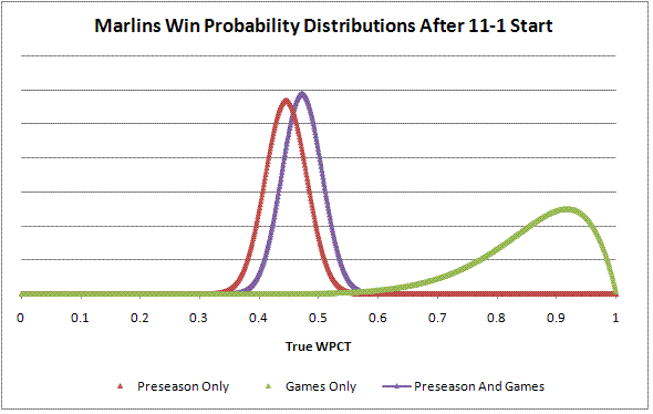
The green line indicates the distribution of the Marlins likely true winning percentages based solely on their 11-1 record. Obviously, based on this information alone we would think the Marlins had an extremely high true WPCT - far higher than any major league team could possibly sustain. However, because relatively few games have been played, the distribution is wide, allowing for a wide range of true WPCTs. The red line indicates the likelihood that the Marlins have a particular true WPCT based on PECOTA's preseason prediction. PECOTA predicted the Marlins to have a WPCT of .444, so you can see that the distribution peaks at .444. This distribution is far narrower, reflecting the fact that we know that the true WPCT of an MLB team is almost always somewhere between .350 and .650.
The purple line takes account of both factors. By multiplying the probability of having a certain WPCT under the prediction distribution with the probability of having a certain WPCT under the game distribution, we can derive the probability of having a certain WPCT given both the prediction and game distributions. As we can see, this final distribution is still normal shaped, but is shifted over, reflecting the fact that the Marlins' 11-1 start means that they are likely significantly better than we thought before the season began. The peak of this distribution is now at .471 - much better than .444, but still not over .500. Using this .471 mark to predict a win total in their remaining 150 games and adding it to their win total thus far, we would upgrade their predicted record from 72-90 to 82-80, based on their 11-1 start.
Using this methodology, PECOTA's 2009 predictions, and the current standings, we can make updated predictions for the rest of the 2009 season.
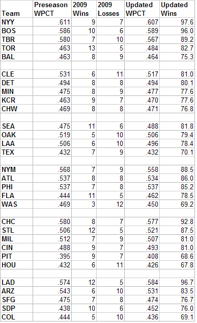
As you can see, two and a half weeks into the season, the preseason predictions still hold a lot of weight. The biggest changes in estimated true WPCT have been Toronto (+.021), Washington (-.019), Florida (+.018), and St. Louis (+.015). This changes the expected final standings as well, with now incredibly, the Seattle Mariners being the favorite to win the AL West. In the AL East, we can see that Tampa has dug itself a major hole behind the Yankees and Red Sox and no longer appears to be their peer.
In the NL, we can see the toll that Florida's four-game losing streak has taken on their predicted true WPCT - when they were 11-1 their estimate was .471, but now they've been downgraded to .462. Elsewhere in the NL, the Dodgers have overtaken the Cubs as the best team in the NL, while the Pirates, despite their 9-7 start, remain baseball's worst (though Houston is now predicted to have the lowest number of wins).
So what happens as the season goes on? Obviously, the more games that have been played, the more weight they will have in the resulting distribution, and the less reliant we are on the pre-season prediction. However, as we showed earlier, the standard error for the pre-season prediction is .035, while the standard error due to random chance after 162 games is .039. What this means is that even after the season is over, the PECOTA prediction is still a more accurate predictor of a team's true talent than the actual record of the team over the course of 162 games!! Based on the standard errors, PECOTA's predictions actually have the accuracy of about 204 major league games!
The following example shows the Chicago White Sox of last year. In this case PECOTA predicted a 77 win season while they actually won 89 - so what's the best estimate of their true WPCT? The following graph shows the result.
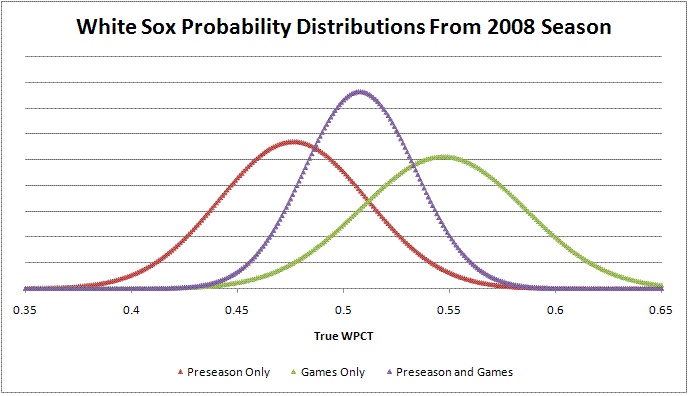
As you would expect, the best estimate of the true WPCT is somewhere in the middle (.507). Not only will you notice that the final distribution is in between the other two, but you'll notice that it's also a more narrow distribution with a higher peak and shorter tails. This is because with both pieces of information, we now have more confidence in our estimate of the White Sox' true WPCT. The standard error of the White Sox' final true WPCT estimate is .026, which is better than either the standard error of the PECOTA estimate or the standard error from luck of playing 162 games (actually 163 games for the 2008 White Sox!).
All in all, this is a simple yet powerful way to calculate a team's true skill level based on preseason predictions and the actual games played thus far. This would make it ideal for creating the "power rankings" that every sports related publication seems to release. Of course, it doesn't take into account things like a team's Pythagorean WPCT, trades, or injuries (though these are built into the variance), but this gives a great quick estimate of a team's true skill level based on just two simple pieces of information.
This result also shows just how powerful good preseason predictions are. However, the weight of the preseason prediction is not limited to just PECTOA - even a casual fan's prediction will likely have a weight of over 100 MLB games, which is why fans and commentators "don't believe" in a team even after they've won a lot of games over a 162 game season. Likewise, it's why people can still consider a team dangerous even after a finish around .500. They know that their "gut" perception of a team is actually about as indicative of a team's true talent as the team's record.
As the season goes on and even after it's over, we can keep updating these estimates to keep track of how our perceptions and reality converge to get an estimate of a team's true talent level.
| Behind the Scoreboard | April 18, 2009 |
Does a Quirky Home Field Cause a Road Disadvantage?
Last week I wrote an article on home field advantage and what types of parks are conducive to particularly large or small home field advantages for a team. Its conclusion was that unusual and idiosyncratic parks give teams the biggest home field advantage. This week's column expands on the topic, tweaking the model a bit and studying additional effects of home and road performance of teams in various ballparks.
Last week I suggested that since unusual parks give the largest difference between home and road WPCT, that unusual parks were the most advantageous to teams overall. The assumption was that all teams play to their true skill level on the road, with the home park effect taking hold only when the teams were at home.
Several people challenged this assumption and hypothesized that perhaps an especially high difference between home and road performance may be due to an unusual home park giving teams a road disadvantage. This is a very difficult distinction to make, but here I'll try to do so statistically.
One way to look at this is to test for a correlation between overall winning percentage and the difference between home and road records. A positive correlation would indicate an overall positive effect for having a high home/road difference, while a negative correlation would indicate the road disadvantage that others have hypothesized about. However, the correlation (which we would expect to be very weak in any case) between home/road difference and overall winning percentage was not significant either way. The p-value of the correlation was .61 when using year-by-year data, and was .96 when using aggregated winning percentages for each park. So this is an inconclusive test - we don't see evidence of a high home/road difference really helping teams, but we don't see it hurting either.
Another approach is to take a look at players who moved from a regular park to an idiosyncratic park, or vice-versa. If the road disadvantage hypothesis is correct, then we would expect the raw road performance of players to decrease when playing for the team with the unusual park.
For this, I did a case study of two parks with extremely high home/road splits where this road disadvantage might be evident: Coors Field and the Astrodome. One of course, is an extreme hitters park, whereas the other is an extreme pitchers park. Both conferred a very large home field advantage to their teams.
Overall I found 131 cases of players moving either in or out of these two parks in adjacent years with significant playing time (250 PA's for hitters, 100 IP for pitchers). For both hitters and pitchers I looked at the difference in Road OPS when playing for either the Rockies or Astros and when they were playing for another team in an adjacent year.
Unfortunately, this method is fraught with variance. Players' statistics can change dramatically from year to year for many other reasons besides what park they are playing in, and this clouds the study. Additionally, bias could be introduced due to the effects of coaching staffs and other factors. Due to this and a relatively few number of cases, it is difficult to detect if such a road disadvantage is occurring. The results of the study can be seen below.
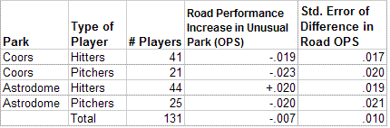
Both Rockies hitters and pitchers tended to have better road statistics in years when they were not playing for Colorado. Astros pitchers also had this same result, but Astros hitters performed better on the road when they were playing for Houston than for another team. When taking all 131 players together, we see an overall decrease in road performance when playing for the team with an unusual park of 7 OPS points. However, the standard error of this estimate is 10 points of OPS, meaning that we are far from being able to make any conclusions on whether an odd home park really causes players to perform more poorly on the road.
In lieu of concrete statistical results, a discussion might be useful. The original findings were that teams with unusual home parks tend to have larger home/road splits. A good reason for this may be that visitors, not familiar with the park, may not be able to deal with the park's quirks as well as the home players can, since they have had more practice.
Certainly it would seem that learning one park's difficult oddities wouldn't cause a player to forget how to play in normal parks. A sailor who learns on rough seas can sail in calm seas as well. It seems doubtful that an outfielder who learns the Wrigley wind and ivy should suffer any disadvantage when playing elsewhere - after all, the conditions are easier and he still gets plenty of practice playing 81 games per year on the road. Similarly, will a player who plays in a dome forget what it's like to play outside even though he does so for nearly half the season on the road? To me it seems as though if unfamiliarity is the main reason for high home/road splits, then a player's road performance would be consistent, since all players are familiar with playing on the road (in a variety of parks) half the year.
However, it does seem as though a player playing in an extremely unusual ballpark could develop bad habits that would carry over to his road games, giving him a road disadvantage. For instance, playing one's home games in the LA Coliseum could cause players to get into the habit of popping up balls down the line for cheap homers - a habit that would cause him great harm in most normal parks. How much players can control their habits depending on their surroundings is unknown, but this could be a reason why an odd home park could cause a road disadvantage. Whether the road disadvantage would outweigh the home advantage in this case is a matter of debate.
After reviewing all of the evidence and arguments here, I'm still inclined to say that teams with quirky home parks are helped overall by their park and I would highly doubt that teams are actually hurt overall by having a quirky park. I will say this with one caveat however, and that is that teams with an odd park could have trouble attracting top talent (such as pitchers to Coors Field or hitters to the Astrodome) and in the era of free agency, this could be a very big disadvantage indeed. However, that is a conversation for another day.
Update to Last Week's Study
Last week, a thoughtful commenter made a great point that perhaps Coors Field carried too much weight in my study, considering the fact that the magnitude of its home field advantage is an outlier and its altitude makes it a unique park, not replicable elsewhere. Looking at a few regression diagnostics, indeed Coors Field had a large impact on the findings in the model - and while its inclusion is defensible, it's probably preferable to have its influence lessened by reducing its weight considerably. After doing so, the basic results are the same - unusual parks are of the most advantage - however, I'd like to share a few additional findings that this change produced.
The findings were, in order of importance:
1) Parks which were subjectively considered "quirky" had a greater home field advantage. This was still the most important predictor of home field advantage. P-value <.001
2) Parks which produced a lot of doubles still produced a high home field advantage. P-value=.002
3) Domed stadiums produced a higher home field advantage. This new finding was partially due to a reconfiguring of the "dome" variable, as well as the reduction of influence of Coors. P-value=.016.
4) Pitchers parks provide a greater home field advantage, though being a hitters park is not a disadvantage. In fact, playing in a hitters park is better than playing in a neutral park. The following graph shows the relationship between park factor and home park advantage. This is a change from last week's findings, which showed that hitters and pitchers parks were both equally superior to neutral parks - however, without the over-influence of Coors, we find that pitchers parks clearly provide a higher advantage.
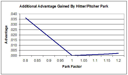
5) Strikeouts and triples, which were marginally significant before, are now not at all significant.
Additionally, I wanted to give a complete list of ballparks and their predicted home field advantages for readers to use as a reference. It's also particularly interesting for relatively new parks, where the predicted value may be more accurate than the actual empirical home field advantage since this is highly variable over only a few seasons.
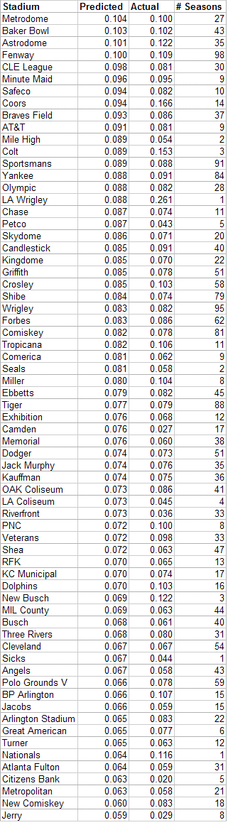
Of parks built in the last 10 years, Minute Maid Park and AT&T Park should continue their excellent home field advantage, while Petco Park, so far not giving the Padres much advantage, should improve to be a very advantageous parks. On the other side, Citizens Bank Park, which has so far provided a very poor advantage, should continue to do so (though not quite as bad as its been), and New Busch and Nationals Stadium should see their home field advantage decline from what it has been during each stadium's first few years. When we check back in 20 years or so, we'll see if these assessments have been correct.
| Behind the Scoreboard | April 11, 2009 |
A Study in Home Field Advantage - Will the New Stadiums Be Friendly to NY Teams?
On Monday, Major League Baseball will christen two new stadiums, New Yankee Stadium and Citi Field. The previous New York stadiums were known as intimidating places to play in, and fans are probably wondering whether the new ballparks will confer as great of a home field advantage as the old buildings - particularly in the case of Yankee Stadium, where the ghosts of Babe Ruth, Lou Gehrig, and others were said to give Yankee Stadium a certain aura of invincibility. This article attempts to explore the relationship of a stadium to home field advantage, and how it might affect the two New York ballparks.
Of course everybody knows that playing at home is indeed an advantage. Over the course of modern baseball history, the difference between playing at home vs. on the road has been about 80 points of team WPCT - a road team will win about 46% of its games, and a home team will win about 54% of its games, all else being equal. But do some parks confer more of an advantage than others? Or is the "Yankee mystique" no more potent than the Padres mystique?
Gathering data from all major league home parks during the modern era (thanks to Retrosheet), I found the average home field advantage (as defined by home WPCT minus road WPCT) of each park during each year. A quick chi-squared statistical test shows that indeed the home park is highly significant, and not all home parks are identical. To the average baseball fan, this comes as no surprise - we expect that some parks are more advantageous than others, and indeed we see this born out in real data: Fenway Park has a lifetime average advantage of .109 while Seattle's Kingdome had a lifetime home field advantage of .070. So what is it about a park that gives one place a bigger advantage than others?
Home Field Advantage Over Time
One factor to consider is the year - throughout history, home field advantage has fluctuated and it's been suggested that there has been a strong decrease in home field advantage over time. A cursory look at the data implies that surely this is the case - from 1901-1910 teams had a home field advantage of .104, but by the 1980's, the advantage was down to .080. Cyril Morong finds a statistically significant decrease in home field advantage over time, and people have suggested that it's due to shorter travel times, increased luxuries and amenities for the players, more comfortable hotels, etc.
It's a nice theory, but I find it not to be true. Modeling home field advantage using year alone does indeed suggest a powerful effect. However, this theory leaves out an important confounding variable - the fact that ballparks have also changed over time. If the decrease in home field advantage was due to things like air travel and player amenities, we would see decreasing home field advantages even when looking within the same ballpark over time. However, when we run a model with both year and ballpark included, we see that the effect of year on home field advantage is no longer significant, with a p-value of .50 (in fact, the direction of the year effect actually switches to being positive!) Nearly all of the variability over time is due to the parks themselves, not the year. I also ran the model with a pre/post-1960 variable (around the time that travel became easier and cushier for visiting players) instead of using the continuous year variable, and again there was no effect. From this, we see that the reason for the decrease in home field advantage over time actually is due to different ballparks being built, not due to things like air travel and amenities as commonly believed.
With this knowledge, we can move forward more confidently. If individual ballparks do have a major effect on home field advantage, then what are the features that make up this advantage?
What Features Are Advantageous?
For this I looked at several statistical variables for each park, as well as several qualitative variables for each. From the retrosheet data, I was able to calculate park indices for several different statistics: runs, hits, doubles, triples, home runs, walks, and strikeouts. A number greater than 1 indicates the park was more likely to have those events occur, while a number less than 1 indicates the park was less likely. I also created additional variables for each of the above statistics by taking the absolute value of the difference from 1 (so the value for homers would be high if the park either allowed a lot of homers or allowed very few). I also created several subjective variables: whether or not the park's features were "quirky" (odd dimensions, wild wind, strange ground rules, etc.), whether the park strongly favored one handed batter over another, whether the park was in a hot outdoor climate, whether the park was grass or turf, whether the park was a dome, whether the park had "rabid" fans (confined to old baseball cities mostly on the east coast, NY, BOS, PHI, etc.), and what era the park was built in (wooden era, classic era, modern era, nostalgic era).
Running this all in a model (weighted for the number of seasons the park was used), we find that most of the variables are not significant at all. Of the qualitative variables there was no advantage to being in a city with rabid fans, no advantage to a dome, no advantage if the park strongly favored one hand over the other, no advantage to being in a hot climate, and no advantage based on what era the park was built. Of the statistical variables, most had no effect as well. The most interesting result was that the amount of homers allowed by the park had no effect on the home field advantage (all that time agonizing over whether to build a homer happy park, homer deprived park, or simply a homer neutral park was time wasted).
After taking out the insignificant terms, we are left with this final model:
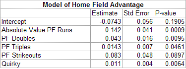
As you can see, the 5 factors of home field advantage are, in order of significance:
1) Having either a good hitters park or a good pitchers park - not a neutral park.
2) Having a "quirky" park (weird field dimensions, difficult fences, weird wind patterns, etc)
3) Having a park conducive to doubles
4) Having a park conducive to triples
5) Having a park conducive to strikeouts
From the above list, all of the variables seem to favor more unusual parks. Parks which deviate from the normal amount of runs scored seem to be advantageous. Parks that allow a high proportion of doubles and triples also tend to be more unusual, with odd angles and odd dimensions. This makes intuitive sense as well. The more unusual a park is, the more difficult it would be to play in it for the first time - giving the home team, who is already familiar with the park, a significant advantage. Likewise, cookie cutter parks, requiring little adjustment on the part of visiting players, have the lowest advantage. It also could be the case that teams bring in specific players who are particularly suited for an unusual home park, also increasing home field advantage. However, if this were the main reason, I would think we would see a spike in home field advantage after the free agent era, when it became much easier to bring in specific players - since we don't see this, it's likely not the driving force.
The quirky variable is an attempt at a subjective definition of unusual and the model sees it as highly significant - even when considering the statistical variables above. Obviously, the "quirky" variable is highly subjective and is simply a binary variable that doesn't take into account just how quirky a park is, but the inclusion gives some information that statistics alone cannot. It also varies a lot depending on the era of the park - in the wooden/classic era 18 of 23 were considered quirky, in the modern era just 3 out of 27 were considered quirky, and in the nostalgic era 5 out of 17 were considered quirky.
The strikeout variable was perhaps the most interesting of the bunch (though it's only marginally significant) - parks which increase strikeouts tend to increase home field advantage. My guess is that this is related to the hitting background - with more difficult or unusual hitting backgrounds being advantageous to the home team since they have more practice hitting under those tough conditions.
Below is a table of the top and bottom 5 parks in each of the statistical categories (with 10 years or more as an MLB park).
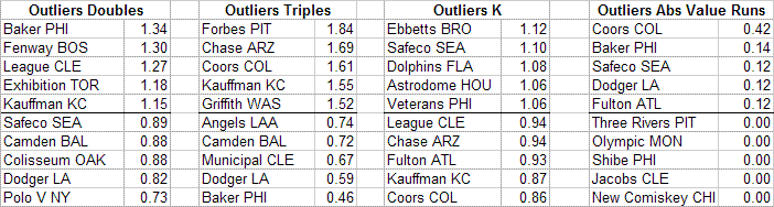
Additionally you can see a chart of the top and bottom 5 parks according to predicted home field advantage according the model. As you can see, the model predicts Coors Field to be by far the #1 biggest home field advantage in the history of baseball. It's followed by Baker Bowl, that wacky Philadelphia ballpark, and classic Fenway Park. The other parks rounding out the current top 5 most advantageous parks according to the model are Minnesota's Metrodome, Minute Maid Park in Houston, and AT&T Park in San Francisco. The bottom 5 parks are dominated by the more modern ballparks, with New Comiskey Park being the lowest and the other current low advantage parks being Angels Stadium, Jacobs Field, Turner Field, and Camden Yards.
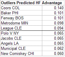
With an R-squared of .38, the model is far from a perfect fit, explaining only 38% of the variability in home field advantage between parks. The model misses considerably on several parks (in fact, New Comiskey has enjoyed a decent home field advantage over its 18 years). Of the misses that the model makes, its most egregious (accounting for the number of seasons) are overestimates of Camden Yards and Riverfront Stadium and underestimates of Crosley Field and the Astrodome. A graph of the predicted and actual home field advantage of each park can be seen here. As you can see, there are still other unknown factors at play, but the model does a fair job of predicting how much home field advantage a park will bring.
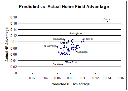
What Does This Mean?
So, some parks have a greater home field advantage than others, and we now have some idea of why, but is it significant in a baseball sense? Over the course of the year, if we assume a team plays .460 ball on the road, a team with a healthy home field advantage may play .560 ball at home, while a team with a small home field advantage may play only .520 ball at home. The team with the big advantage will win over 3 games more than the team with the small advantage. This is not insignificant at all and could easily be the difference between winning and losing the pennant. Additionally, a good home field advantage is the gift that keeps on giving, with the team reaping the advantage year after year. In the extreme case, Coors field, the ballpark makes a .500 team into an 86 win team - so far a lifetime gain of 70 wins for the park, making it likely the most valuable member of the Rockies franchise.
So what does this mean for new parks being built? If I were building a new park for maximum home field advantage, I would choose one which had a difficult hitting background, increasing strikeouts and making it a low scoring park, with short but high fences down the lines to maximize doubles, and spacious alleys to maximize triples and further minimize scoring. Astroturf also would also help (while astroturf is not significant in itself, it is positively correlated with doubles and triples). Throw in gale force winds, hard brick walls, and a hill in right field, and you'd have yourself a ballpark. It may be baseball's most hideous park, but it'd probably net a fairly decent home field advantage.
Thankfully, neither the Yankees nor Mets decided to go this route and it remains to be seen how their new parks will play. Shea Stadium actually gave the Mets poor home field advantage (.063 actual, .074 predicted), so Citi Field should be a boon to the team. It's not particularly quirky, but is being billed as a hitters park. After a year or two, we'll see how it plays.
Yankee Stadium, in contrast, did give the Yankees a healthy home field advantage (.091 actual, .086 predicted). However, the advantage predictably decreased after the 1970's renovation, when the outfield walls were brought in. Before the renovation, Yankee Stadium had a home field advantage of .094, but in the 20 years since the walls have been brought in to their current dimensions, the advantage has dropped to .070. This can be attributed in part to the triples park factor decreasing from 1.40 to .73. Since the New Yankee Stadium will have the exact same dimensions as the old park, we can expect the park to confer about the same advantage - which is to say, not nearly the advantage that Ruth, DiMaggio, and Mantle enjoyed. Of course, that doesn't consider the ghosts.
An update to this study can be found here.
| Behind the Scoreboard | April 07, 2009 |
Opening Day
Well, Opening Day is in the books. What can you take away after one game? Not a whole lot, but I'll do my best here to look at who's smiling and who's worrying after Day 1.
Worrying - NY Yankees: The Yanks went and spent big money on CC Sabathia and he did not reward them on Opening Day, getting pounded for six runs, eight hits, five walks, and zero strikeouts. We now get to see whether the heavy workload the Brewers put on him will take its toll in 2009. A few more starts like this and fans will be giving him the Bronx cheer all year long. In other news, Mark Teixeira went 0-4 with 5 left on base. Perhaps it's good that the Yanks started on the road this year.
Worrying - Cleveland Indians: Cliff Lee had a Cinderella story in 2008. He entered the season with a lifetime ERA of 4.64, but dominated the league going 22-3 with a 2.54 ERA. After Monday's performance (5 IP, 7 ER, 10 H), should the Tribe be worried he'll turn back into a pumpkin in 2009? He clearly turned a corner last year, but he hasn't exactly been the model of consistency throughout his career. Opening Day didn't exactly instill confidence that he can keep it going in 2009.
Worrying - Kosuke Fukudome: He set the world on fire in his first two months in 2008, but then the league caught up to him and his second half consisted of looking lost at the plate. Monday's performance was more of the same - ground out to second, strikeout looking, ground out to second for a double play, fly out to left. Fukudome is an outstanding right fielder, but that advantage is negated when they put him in center as they did last night. Only Piniella knows how long they'll stick with him - as a Cubs fan, I hope it's not long.
Worrying - St. Louis Cardinals: Any time you go with a closer who has 12 innings of major league experience, you are playing with fire. On Monday, Tony LaRussa got burned with Jason Motte (1 IP, 4 ER, 4H). Motte dominated the minor leagues the past few seasons, but the Cards will have to determine quickly if he can close at the major league level. If not, they'll need to find an answer at the back end of their pen soon if they are to contend.
Smiling - Atlanta Braves: Derek Lowe, Atlanta's big free agent acquisition, pitched a gem (8 IP, 2 H, 0 BB). He's been a consistent performer over the past several years, but he will be 36 this year - if the Braves are to contend they'll need him in top form. Additionally, hot prospect Jordan Schafer homered in his first at-bat - can't beat that. Defeating the World Champs and division rival Philadelphia was a nice bonus too.
Smiling - NY Mets: J.J. Putz and K-Rod did what they were paid the big bucks to do (1 inning apiece, 0 runs, 0 hits). If they pitch like they are supposed to, the combo of Santana, Putz, and K-Rod will be awfully tough to beat in the post-season this year. Now that the Mets have fixed their leaky bullpen, it's a lot more likely they'll actually get there this season.
Smiling - LA Angels: Yes, it's only Game #1, but their game against the Oakland A's had probably the biggest pennant race implications of the day. For teams that most picked to go 1-2 in the AL West, every game between them will be big. The Angels now have a 1 game head start.
Now that opening day is over, there are 161 more games to find the other storylines in what should be another exciting season of baseball.
| Behind the Scoreboard | April 04, 2009 |
Championship WPA: What Portion of a Title Did A Player Contribute?
Last week I introduced Championship Leverage Index, an index for measuring the impact of a game on a team's World Series title chances. This week I expand on the idea, and introduce Champ LI's sister stat, Championship Win Probability Added.
To review, Champ LI, similar to Tango's Leverage Index, measures the importance of a game relative to an average, neutral game. Last week I showed off the potential of Champ LI by showing graphs of each NL team's Champ LI as the season progressed. Last week's graphs, while informative, lacked one key component - they did not take into account the opponent of the game. It was nice to see the smooth graphs, taking into account only the standings without any odd spikes due to opposition, but to really measure a game's impact, the team's opponent must be considered.
Contrary to what some players and managers may say, all games don't count the same. A Red Sox-Yankees game isn't "just another game", as much as players may try to frame it that way. When a team plays a division rival also contending for the crown, the game takes on added impact - the team not only gets a needed win, but deals a loss to a competitor. So just how much additional impact does playing a division foe bring?
Let's look at a couple of graphs of last season's races to find out. Below is a graph of the Arizona Diamondbacks' Leverage Index over the course of the season. The red bars indicate games against Los Angeles, the D'Backs main rival for the 2008 season.
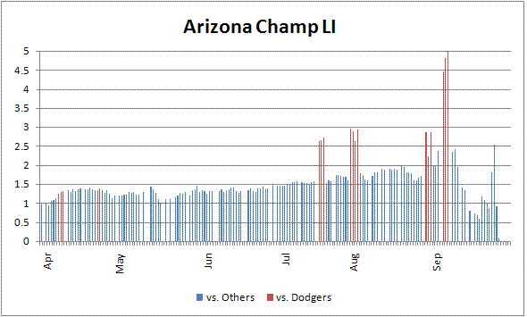
As you can see, games against LA have an enormous impact compared with games against other teams around the league. However, it varies greatly depending on the time of year. Early season games against LA were not particularly important - only as important as games against other division rivals, which were in turn, only slightly more important than games against non-division rivals. In April, it wasn't yet clear who Arizona would have to compete with for a playoff spot, so the LA games had relatively little additional impact on Arizona's Champ LI. However, by the next time LA rolled into town, it was after the All-Star break and Arizona was up by 1 game on LA and up 7 on the next closest rival. They were also 6 games out of the wild card, so it was becoming clear that LA was the team to beat. Accordingly, their Champ LI skyrocketed from 1.5 to 2.5 for the first game of the Dodgers series. This was cemented even further by the time of their late August and September series, when the Champ LI was nearly doubled for the Dodger games.
Another example, Philadelphia, can be seen below. Games against the Mets and the Brewers are highlighted in red and green respectively.
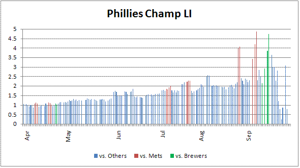
Again, early in the season, games against New York had little additional impact and games against Milwaukee had no additional impact. However, when it looked like a two team race between Philly and New York in late August, the Phillies' Champ LI dramatically spiked during the New York series. The same happened when Philadelphia dramatically swept Milwaukee in four games in September to get back in the race.
The moral of the story is that, yes, games against rivals contending for the crown really are big games - counting for as much as double the importance of games against non-contending teams. In fact, as it becomes increasingly clear that it is strictly a two-team race, the Champ LI gets closer and closer to doubling when playing the other team in the race.
As a point of curiosity, I'll present this chart of each team's "biggest" games of the year. Most of the games are indeed against a division rival, and were usually the game where everything started to go downhill (for the non-playoff teams) or where the team really took off (in the case of playoff teams). For some, that game came very early in the season (opening day for the Giants), and for others it came late (astute readers will notice slight differences in Champ LI from last week's post. Last week the baseline of the index was an opening day game against a team not contending for the playoffs - however when the possibility of playing a pennant race opponent was factored in, this average used as a baseline increased slightly, making the Champ LI numbers you see here slightly smaller than last week.) Of course, it comes as no surprise that the most important regular season game of the year was the 1-game playoff between the White Sox and Twins.
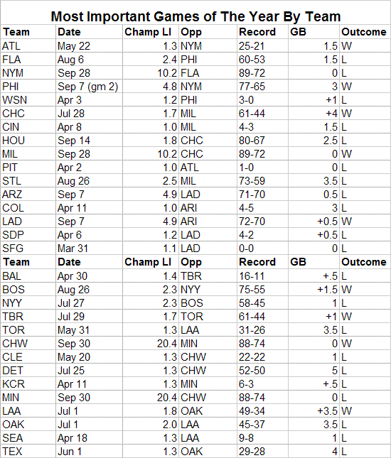
Now that we finally have the effect of playing division rivals well-understood, I'll explain Championship Win Probability Added. As you've probably already guessed, Champ WPA is analogous to regular WPA, except that instead of measuring how many games a particular play or player won (or lost), it measures how many championships a particular play or player contributed.
The formula for this is very simple. Having already calculated the impact of a win on a team's chance to win the championship, we can simply multiply this number by a particular player's individual WPA to get Champ WPA. Taking account of the impact of both the game and the play within the game, we get the number of championships won. Intuitively, a player who had an individual game WPA of 1.0 (or 100%) during the 7th game of the World Series, would have contributed exactly one world championship to his team.
Let's look at an example in the case of C.C. Sabathia - a player who many consider to have practically carried Milwaukee on his back on the way to the playoffs. Below is a chart of his game by game results with the Brewers and we can see just how much of a World Series championship he earned.
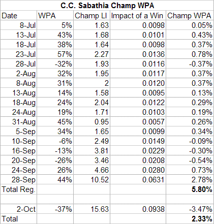
As everyone knows, Sabathia was dominant in his stint with the Brewers - he was 11-2 with a 1.65 ERA. What's interesting is to see that he won about 6% of a World Series title due to his work during the regular season - the biggest game of course being his masterpiece against the Cubs on the final day of the season. However, in his one playoff appearance, he choked away much of his value when he was pounded for 5 runs in 3 2/3 innings - on that single day alone, he gave back 3.5% of a championship, leaving him with a net value of 2.33% of a World Series title with the Brewers. This may not sound like a lot for a player who played so well down the stretch in big games, but the way MLB is set up, the playoffs are what really matter, and it's difficult to make huge impacts without your team going deep into the postseason.
Let's take a look at another guy who was lauded for his big game performance after coming to a new team: Manny Ramirez. I won't print the whole chart here, but Ramirez earned 4.4% of a World Series title during the regular season with the Dodgers, with his most valuable performance coming in a September 7th game against Arizona (Champ WPA of 0.7%), the team's most important game of the year. It took Manny two months of MVP-caliber play in a pennant race to earn 4.4% of a championship, but in the postseason Ramirez bettered it in only 8 games (his most valuable game coming in Game 3 of the NLCS), racking up 7.3% of a World Series title for a total championship contribution of 11.7% with Los Angeles.
It's important to note that I'm not billing Champ WPA as the end all or be all of MVP-stats. Champ WPA does in fact give you the percentage of a championship won by a player, but of course, that is not necessarily the criteria that I would recommend using for the MVP. Champ WPA of course, is also not predictive, and thus is not very useful in player evaluation, but it does measure the actual impact that a player did have in terms of championships. I think that's a fairly noteworthy thing to keep track of, if just from a historical perspective. Francisco Cabrera, in one swing, contributed greater share of a championship (37%) than thousands of better players did in their entire careers. It doesn't mean he was better, it just means he really did contribute more - even if only by luck.
With that disclaimer, I'll wrap up with some fun stuff. Last week I left you hanging in the most important at-bat of the year - the 8th inning of the 7th game of the ALCS - when JD Drew struck out against David Price. How much of a championship did Drew lose with that at-bat? With a WPA of -13% and the game itself worth half of a championship, he lost 6.5% of a World Series title!
However, while that was the at-bat with the largest leverage, that wasn't the biggest championship changing event of 2008. What was? In Game 3 of the World Series, Grant Balfour came on in the bottom of the 9th with no outs and a man on first in a tie game. One pitch later, a wild pitch and a throwing error by Dioner Navarro put the winning run on third. Net result: 8.25% of a World Series title lost.
In the regular season, the biggest play of the year belonged to Ryan Braun's 2-out 8th inning home run giving the Brewers the lead against the Cubs on the last day of the season. The game was meaningless to the Cubs, but to Braun and the Brewers the play earned 2.4% of a World Series title.
Like WPA, Championship Win Probability Added doesn't tell you everything, but it does paint an informed picture of how plays and players impacted a team's chances for a championship over the course of a game, a season, and a career. While you may not want to choose your MVP by it, it's a fun an informative stat in its own right.
| Behind the Scoreboard | March 28, 2009 |
Championship Leverage Index: How Meaningful Is This Game?
Opening day is right around the corner and soon your favorite team will be taking the diamond for its very first game. Hope springs eternal and the beauty of opening day is that every team starts at 0-0. As the season wears on, the games either become more or less meaningful depending on the standings. As a Cubs fan growing up in the 80's and 90's, I remember many a year when opening day was the most meaningful game of the year, with the rest of the season a slow march into irrelevance. In a lucky few years, the games took on more importance as the year progressed as the Cubs fought for contention. It's easy to tell which games are big and which games are meaningless, but this article attempts to put a quantitative number on the relative meaning of each game of the season.
Tom Tango's Leverage Index is a great tool for measuring the impact of a particular in-game situation. A Leverage Index of greater than 1.0 indicates the at-bat is more meaningful than an average play, and an LI of less than 1.0 indicates the at-bat is less meaningful, with LI's ranging from nearly 0 up to more than 5.
Taking this to the next level, we can create the same type of metric, except instead of producing it at a game level, we can produce it at a season level, with a value of 1.0 indicating an average regular season game's impact on a team's chances of winning the World Series. LI's larger than 1.0 will indicate the game has additional meaning, and LI's less than 1.0 indicate the game is less meaningful than an average regular season game. Dave Studeman touched on this subject at Hardball Times, but his index and mine, which I'll call "Championship Leverage Index" give quite different results.
Each team's Champ LI for a particular game is calculated by first getting the current probability of winning the World Series. Then we calculate this probability again, this time assuming that the team wins the game. The difference between the two is then found and this difference is the potential impact of the game. Tango's regular Leverage Index has to deal with multiple potential events, and thus has to calculate the standard deviation of the impact of winning depending on several outcomes, however in this case, because there are only two potential events in a game (win or loss), taking the difference in probability between the pre-game and post-game is sufficient.
For instance, in 2008, after 81 games, the Cubs probability of winning the World Series was 10.22% (81.8% to make the playoffs). A win in the 82nd game would up the probability of winning to 10.54% (84.3% to make the playoffs). This difference of 0.32% is the basis of the calculation of Champ LI. The difference is then indexed to the increase championship win probability of an average regular season game.
This average game, is also, not coincidentally, the same as opening day. Because nobody knows what the rest of the season will hold, the opening day game is, by definition, the average regular season game - depending on what happens sometimes it will be much less meaningful than other games, and sometimes much more. This increase in championship probability due to winning this average game is 0.28% (the increase in probability of making the playoffs is 2.25%). Using the example from above, 0.32/0.28 gives a Champ LI of 1.14, meaning the 82nd game (played with a 49-32 record and a four game lead over the Cardinals) was slightly more meaningful to the Cubs championship hopes than the average regular season game.
As you can imagine, the work that goes into this requires a lot of simulation. With simulations come assumptions, and here I assumed that all teams were of equal strength. This assumption is certainly not true, but it's acceptable because actual team strength is largely unknown, especially early in the season, and there is a nice symmetry to placing teams on equal footing. This is analogous to Tango's leverage index assuming opposing teams are of equal strength within an individual game. My current simulation also does not take into account the schedule of the teams, though that would be possible, changing the results very slightly.
Below are a few graphs to illustrate the Championship Leverage Index. First, are simply three graphs of each NL team's chance of making the playoffs in 2008 (to get the probability of winning the World Series, simply divide by 8).
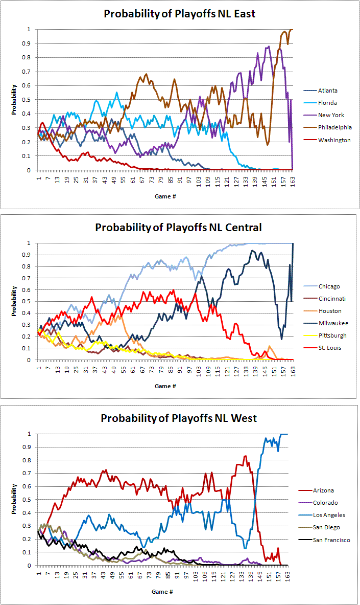
Now let's look at the same graphs for each team's Champ LI. How much do the standings affect the importance of each game? As I mentioned before, each of the teams start opening day with an LI of 1.0.
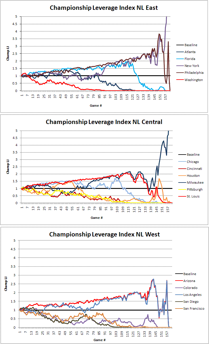
To illustrate the Championship Leverage Index, let's focus in on the NL Central, which has a variety of teams that illustrate various scenarios nicely.
There are several interesting things to point out. As you'd expect, right off the bat, the teams that start poorly see their Champ LI decrease, while teams that do well see their games grow in importance. By late season, those teams that were out of the race, Pittsburgh and Cincinnati, had a Champ LI of essentially zero.
Similarly, the Champ LI also decreases dramatically when a team becomes too far ahead. After the Cubs 100th game, with a 1 game division lead and a two-game lead in the wild card, the Cubs games had a Champ LI of 1.70. But after they went on a tear and built up a 5 game lead three weeks later, their games' importance dropped dramatically, with the Cubs' Champ LI reduced to only 0.50. Because the playoffs seemed so likely, their games took on less importance. A few weeks later, coasting with a large lead, their Champ LI was reduced to essentially zero because the playoffs were assured.
We also see that the Champ LI of teams who remain in contention (but not too far ahead), grows as the season goes on. Furthermore, as long as a team is in contention, the game's meaning doesn't change much whether the team's prospects for the playoffs are on the high side or the low side. By the 125th game, the Cardinals and Brewers were both in contention, but had vastly different probabilities for the postseason (Brewers at 65% and the Cardinals at about 30%), however their Champ LI was about the same at around 2.0.
Another finding is, not surprisingly, all things being equal, late season games mean more. Eleven games into the season the Astros were struggling at 3-8, their playoff probability had dropped to 11%, and their Champ LI was down to 0.65, far less than an average game. However, fast forward to game #147 and the Astros, three games out of the wild card, had a playoff probability that was also about 11%. However, now the Champ LI was at 1.67, far more than an average game and certainly far more than their mid-April games when they had the same probability of making the playoffs. All things being equal, September games mean more than April games.
Furthermore, as the season draws to a close, if a team is still fighting for a playoff spot, their Champ LI grows exponentially. The Brewers' Champ LI was so high by the last games of the season (when they were fighting for a wild card spot with the Mets and Phillies), that their Champ LI is off the chart. By the last game of the season, which they went into tied with New York, their Champ LI was 11.1, meaning that the final game was 11 times more important than the average game (this is the maximum Champ LI for a regular season game, unless Milwaukee and New York had been playing each other, in which case the Champ LI would have doubled to 22.2).
Of course, the Champ LI applies in the postseason as well. You can see from the following chart below, the Championship Leverage Index of each possible postseason game, depending on the status of the series.
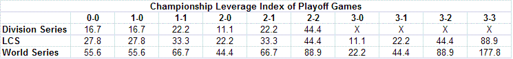
As you can see, every postseason game takes on vastly more importance than an average regular season game. The maximum Champ LI is of course, the 7th game of the World Series, with the game taking on 178 times as much meaning as an average regular season game.
Like Tango's individual game Leverage Index, the Championship Leverage Index doesn't exactly tell you anything new, but just quantifies a game's importance into a useful number. It can be useful in analyzing players' performance in "big games" as well as looking at things like attendance or TV ratings. It's also fun just to realize in quantitative terms exactly how much each game matters.
Another handy feature is that to figure out the importance of an individual at-bat within an individual game, you can simply multiply Tango's Leverage Index with the Championship Leverage Index. For instance, can you name the most important at-bat of the season last year?
It was Game 7 of the ALCS (Champ LI of 88.9) when JD Drew came to bat with the bases loaded, two outs, in the bottom of the 8th inning of a 3-1 game (game Leverage Index of 5.19). The total Championship Leverage Index of the at-bat is 461.4 (5.19 x 88.9), meaning that the at-bat was 461.4 times more important than an average regular season at-bat.
As Sox fans recall, Drew struck out, ending the inning. In one at-bat as big as some players entire seasons, he blew it. So what proportion of a championship did Drew lose by striking out? For that you'll have to wait until next week, when I introduce Championship Leverage Index's sister stat, Championship Win Probability Added.
| Behind the Scoreboard | March 21, 2009 |
What Will Make the WBC a Real Classic?
[Editor's note: Sky Andrecheck is the latest addition to the Baseball Analysts team. He is a statistician for a research company in Washington D.C. Originally from Chicago, Sky, who holds bachelors and masters degrees from the University of Illinois, has been cursed as a Cubs fan. He thinks the 101st year will be the charm.]
In a few days, the World Baseball Classic, the locust of the baseball world, goes back into the ground and allows the real season to begin - until then I'm here to analyze the Classic, how it's fared in its first two incarnations, and what it should look like when it re-emerges in 2013.
I'm not so much here to analyze it from a player or team standpoint, but from the point of view of a fan or commissioner. Certain aspects of the games have been grand successes - the thrilling game in Canada against the US, a packed Tokyo Dome for Japan vs. Korea, and Latin American fans cheering on the home team in Hiram Bithorn Stadium. Others images have been that of failure - half empty houses and blowout games shortened by mercy rule.
It's clear that MLB wants to attract as many eyeballs as possible with this Classic and at times has had trouble doing so, so to diagnose with problems the WBC we'll have to start with a clear-eyed analysis of WBC's attendance or lack thereof.
As of this writing, 75 WBC games have been played. We can start by classifying the games into 5 groups ranging from excellent attendance to simply terrible. This is trickier than it sounds due to the fact that the games were played in widely varying sized stadiums, but the games were roughly categorized into the following groups:
Now having the games classified into groups, we can perform an ordinal logistic regression to analyze what's driving the dramatic differences in attendance. Data from the 3 semifinal and finals games were excluded because they were sold out likely because of this very reason.
What I found was the following:
A summary of the chances of excellent or good attendance success can be seen in this chart below.
For completeness, I also re-ran the model with the venue as a covariate. While this somewhat overfits the model, it's useful to see which venues were the most and least successful. The following list shows LA as the best and Miami as the worst (by far) of the 9 venues for the WBC.
1. LA
2. Tokyo
3. Mexico City
4. San Juan
5. San Diego
6. Toronto
7. Orlando
8. Arizona
9. Miami
So, what can be done with this data to doctor up the tournament and it's lacking attendance and interest? While there was an improvement in 2009, only 36% of the games had excellent or good attendance - surely not the numbers MLB hoped for when they conceived of the WBC.
Currently the WBC is a tournament style affair with the winners advancing on to subsequent rounds. However, as we've just shown, attendance to the WBC isn't driven by building drama as the tournament gets deeper, but rather it's driven by specific match-ups played in specific locations regardless of whether the game is a must win or an opening round matchup. The WBC doesn't have the cache to sell fans simply on the fact that they are getting to see a late-round WBC matchup - but fans will come out to see specific match-ups (usually involving their own team), especially if they know they are coming more than one or two days in advance.
The prescription? More home games, more host countries, less terrible teams, and a set schedule hand-picked by the WBC to appeal to the fans. The WBC could do well to pare down the field to 10 teams rather than 16. Perhaps 8 of the teams, the US, Dominican, Puerto Rico, Venezuela, Japan, Korea, Mexico, and Cuba would be permanent members, with the other 8 playing for two spots into the tournament in an off year. In my example, I have Canada and Panama as the other two teams to get the tournament to 10.
But how can we get more home games and more appealing match-ups without ruining the integrity of the competition or running teams ragged going from country to country? MLB consists of a regular season and a postseason and I see no reason why that can't be the case in the WBC as well. The advantage of a "regular season," I propose a six-game long affair, is that the WBC can pick the match-ups and locations well in advance, maximizing the fan appeal and giving fans enough time to figure out which tickets they want to buy.
My example schedule, as seen below, has each team playing in three different locations and a total of 8 host countries, up from just 5 in 2009. The schedule has a home team in 60% of the games and features a lot of the match-ups that fans would love to buy tickets for: DR @ PR, Korea @ Japan, USA @ Venezuela, USA @ Cuba, Venezuela @ DR, Cuba @ PR, Japan @ USA to name a few. In 2006, the WBC passed by without a marquee US vs. Latin America matchup - now we get these juicy games guaranteed and locked in with enough time to build excitement and ticket sales around the games. Some of the best match-ups are scheduled for back-to-back games, increasing the intensity of the rivalries while having the added scheduling effect of increasing the percentage of home games without running the teams ragged flying from place to place.
The final round, which would advance the top 4 teams from the regular season, would proceed as it did in 2006 and 2009 - a format that worked fairly well given the sold-out nature of the games.
One of the chief drawbacks of the format is that the strength of schedule may not be the same for all teams. However, the WBC is already de facto setting the competitive balance and likely match-ups with its pool selection, so this is probably no worse. What's better is that this format should cut down the number of repetitive contests (the US may play Venezuela five times before 2009 is over).
Another criticism may be that some later games may have little championship significance. However, this was the case in 2006 and the 2009 "pool championship" games also took on little significance with no attendance drop-off. As we've seen above, it's the matchup, not the significance of the games that have the biggest effect on attendance.
The main advantage of course, is a slate of games far more appealing that those played in either 2006 or 2009. Plugging the projected schedule into the logistic regression model, we see that now approximately 57% of the games will have "good" attendance and 38% of the games will have "excellent" attendance, up from the 36% and 17% respectively in 2009.
The new format, while not perfect of course, is an improvement over the current structure. With more home games, more home cities, and more exciting match-ups, the attendance will grow and the reputation of the WBC will grow in accordance. This new format would play to the tournament's strengths, showcasing intriguing match-ups and international fans eager to root on their country, rather than trying to pretend the games are of grand significance simply because it's the World Baseball Classic.