Rich Lederer • Baseball Beat
Patrick Sullivan • Change-Up
Jeremy Greenhouse • Touching Bases
Dave Allen • F/X Visualizations
Sky Andrecheck • Behind the Scoreboard
Marc Hulet • Around the Minors
Al Doyle • Past Times
Retired Uniforms:
Bryan Smith • WTNY
Joe Sheehan • Command Post
Jeff Albert • The Batter's Eye
RSS Feed
Home
*Examining the Past, Present, and Future*
Lineup Card
Recent Entries
» Putting Together a Reality Team
» Historical Hall of Fame Vote Comparisons: 2012
» An All-Christmas Team
» The New-Look Angels
» John Denny: The Forgotten Cy Young Award Winner
» Money Isn't Everything
» What Would It Take to Hit .400 in the 21st Century?
» Halos Heaven
» Brandon McCarthy's Breakout Season
» Link-o-Rama
» Historical Hall of Fame Vote Comparisons: 2012
» An All-Christmas Team
» The New-Look Angels
» John Denny: The Forgotten Cy Young Award Winner
» Money Isn't Everything
» What Would It Take to Hit .400 in the 21st Century?
» Halos Heaven
» Brandon McCarthy's Breakout Season
» Link-o-Rama
Best of Baseball Beat
Abstracts From the Abstracts
1977 Baseball Abstract
1978 Baseball Abstract
1979 Baseball Abstract
1980 Baseball Abstract
1981 Baseball Abstract
1982 Baseball Abstract
1983 Baseball Abstract
1984 Baseball Abstract
1985 Baseball Abstract
1986 Baseball Abstract
1987 Baseball Abstract
1988 Baseball Abstract
1978 Baseball Abstract
1979 Baseball Abstract
1980 Baseball Abstract
1981 Baseball Abstract
1982 Baseball Abstract
1983 Baseball Abstract
1984 Baseball Abstract
1985 Baseball Abstract
1986 Baseball Abstract
1987 Baseball Abstract
1988 Baseball Abstract
Bert Blyleven Series
Meeting Up and Hanging Out with Bert
The Results Are In And...
Aficionado Heavily Invested in Blyleven
Latest on Blyleven's Chances for the HOF
The Internet Zealot Responds
400 Down and 5 to Go...
Bert Be Home By Eleven?
Blyleven's Forgotten Season (1973)
HeyMan, Your Comments Don't Hold Water
The Waiting is the Hardest Part
Another Addition to the Blyleven Series
Search for the Truth
As Dominant as His HOF Contemporaries
Listen, Buster
A Larger Step for Blyleven
Answering the Naysayers (Part Two)
Another Small Step for Blyleven
Q&A: Blyleven on the Twins
The Majority Rules, Right?
It's All Dutch to Some
The Hall of Fame Case for Bert Blyleven
Q&A: Blyleven on Felix Hernandez
Clemens Rocketing Up Charts
Poz: An Interview With a KC Star
A HOF Chat with Tracy Ringolsby
Up Close and Personal
A Peek Into the Mind of a HOF Voter
Answering the Naysayers
It's That Time of the Year (Again)
"If Cooperstown is Calling..."
The Bert Alert
One Small Step for Blyleven...
Only the Lonely
Exclusive Interviews
Lee Sinins
Alex Belth
David Pinto
Will Carroll
Mike Carminati
Aaron Gleeman
Joe Sheehan
Jay Jaffe
Jeff Peek
Tracy Ringolsby
Joe Posnanski
Bill James Part I, II, III
Jon Lalonde
Chuck Tiffany
Dayn Perry
Fay Vincent
Nate Silver
Alex Belth
David Pinto
Will Carroll
Mike Carminati
Aaron Gleeman
Joe Sheehan
Jay Jaffe
Jeff Peek
Tracy Ringolsby
Joe Posnanski
Bill James Part I, II, III
Jon Lalonde
Chuck Tiffany
Dayn Perry
Fay Vincent
Nate Silver
Bullpen
Rich Lederer
The Odd Couple (with Alex Belth)
The MostUnder Over Underrated Player in Baseball (with Brian Gunn)
Three Wise Men (roundtable by Alex Belth)
Infrequently Asked Questions (interview with Matt Welch)
Interview (Orioles Think Tank)
Bernie and the Yanks (Bronx Banter)
Hope and Faith: How the LAA Win the World Series (Baseball Prospectus)
NL West (The Soul of Baseball)
Greatest Living Hitter? (Sports Illustrated)
Roundtable: 2008 HOF Ballot (Armchair GM)
The Most
Three Wise Men (roundtable by Alex Belth)
Infrequently Asked Questions (interview with Matt Welch)
Interview (Orioles Think Tank)
Bernie and the Yanks (Bronx Banter)
Hope and Faith: How the LAA Win the World Series (Baseball Prospectus)
NL West (The Soul of Baseball)
Greatest Living Hitter? (Sports Illustrated)
Roundtable: 2008 HOF Ballot (Armchair GM)
Patrick Sullivan
Designated Hitters
David Bromberg (Q&A: John Denny)
Mark Armour (H. Killebrew and Versatility)
Joe Lederer (Soundtrack of a Prospect)
David Bromberg (Clemente's Autograph)
David Bromberg (Woody Fryman)
D. Baumstein (WAR Against Age: Pitchers)
Doug Baumstein (The WAR Against Age)
Doug Baumstein (A Lifetime on the Road)
John Fraser (Pick Six)
Mark Armour (How to Score More Runs?)
Bill Parker (What Opening Day Tells Us)
Stan Opdyke (Pat Rispole)
Chris Jaffe (Evaluating Baseball's Mgrs)
Stan Opdyke (Baseball Radio in NYC, 1953)
A. Nathan (Performance of Baseball Bats)
Michael Weddell (Edgar Martinez/HOF)
Jon Weisman (100 Things Dodgers Fans...)
Stan Opdyke (Connie Mack and Vin Scully)
Eric Walker (Evaluating Run Production)
Brent Mayne (The Intangibles of Catching)
Chris Moore (Best Fastballs in Baseball)
Dave Baldwin (The Batter’s Brain)
Shawn Haviland (Ivy League to MLB)
Larry Granillo (Walking Off)
Rob Iracane (Solo HR Won't Break You)
Tommy Bennett (Charm of AM Radio)
Harry Pavlidis (Johan Santana's Fast Start)
John Walsh (WAR and Remembrance)
Eric Walker (Precisely Inaccurate)
Bob Timmermann (As They See 'Em)
Geoff Young (Unicycles and Delusions)
Baseball Analysis at Tufts (Groundballers)
Baseball Analysis at Tufts (GB Out Rates)
G. Rybarczyk ('09 Hit Tracker Projections)
Joe Lederer (Curt Schilling/HoF)
Conor Gallagher (Hall of Fallacies)
Chris Green (Jim Rice, HoF, the Numbers)
Shawn Hoffman (Baseball's Bear Mkt?)
Paul Anthony (Manny Syndrome)
Ross Roley (World Series Odds)
B. Timmermann (Catcher's Interference)
R.J. Anderson (Waiting the Hardest Part)
Maury Brown (Cubs, MLB, and Cuban...)
Myron Logan (Dee-Fense, Dee-Fense)
Craig Calcaterra (Frivolity, Part I, Part II)
Chad Finn (Ode to Baseball Cards)
David Cameron (Mariners Foibles)
Chris Dial (Chipper Jones)
Pat Lederer (Memory Lane)
David Appelman (Clutch Pitching)
Bob Rittner (DH)
Jonathan Mayo (Roger Clemens)
Lisa Winston (My Son-in-Law...)
Russ McQueen (The Yellow Hammer)
Bob Rittner (I'm OK, You're OK)
Mark Armour (In Defense of the HOF)
Pat Jordan (Friends)
Dan Levitt (Analysis of Terry Ryan)
Doug Baumstein (Trading Econ 101)
Ross Roley (Runner's Reluctance II)
Ross Roley (Runner's Reluctance I)
Mark Armour (No-Longer Lovable Sox)
Bruce Regal (Stealthy and Wise)
Brian Gunn (Roid Monster)
Current/McEvoy (Value of the SB)
John Rickert (Sinister Thefts)
Nate Silver (Sabermetrics)
David Vincent (Home Run Production)
Joe P. Sheehan (Enhanced Gameday II)
Mark Armour (An Ode to Sport)
David Gassko (All-Time Worm Burners)
Joe P. Sheehan (Enhanced Gameday)
John Walsh (When Titans Clash)
Fox/Williams (Quantifying Coaches II)
Fox/Williams (Quantifying Coaches I)
Jacob Luft (Bull Durham Rant)
Chad Finn (Strat-O-Matic)
Lisa Winston (Rotisserie Baseball)
Dave Studeman (Baseball Stats)
Steve Treder (Roger Craig)
Marc Normandin (Jeff Bagwell)
D. Appelman (Expanding Strike Zone)
Jeff Sackmann (Worst MiL Defenders)
Jeff Sackmann (Best MiL Defenders)
Maxwell Kates (Van Lingle Mungo)
David Appelman (Pitch Location)
Kent Bonham (Danny Ray Herrera)
Glenn Stout (Two Baseball Poems)
Bruce Regal (The Challenge Round)
Mark Lamster (Barry & Ty)
Geoff Young (NL West)
Tom Lederer (The Ryan Express)
Brian Erts (Great Leap Forward)
David Pinto (Parity and the N.L.)
Jacob Luft (Fathers and Daughters)
Jamey Newberg (Pete's Sake)
Jeff Albert (A. Jones Swing Analysis)
Jeff Albert (A-Rod Swing Analysis)
Keith Law (Death, Taxes, and Waivers)
Peter Abraham (Tales of Torre Tales)
Larry Borowsky (Let 'er Rip II)
Dan Levitt (Empirical Analysis of Bunting)
Jonah Keri (If I Met Warren Cromartie...)
Bob Klapisch (War Stories)
Bob Timmermann (John F. Kennedy HS)
Kent Bonham (Aluminum Adjustments)
Al Doyle (More Than Superstars)
Ross Roley (Instant Replay)
David Vincent (Barry Bonds Homers)
Chad Finn (Our Favorite Obscurities)
Bill Deane (1979 NL MVP)
Mark Armour (Rise/Fall of Artificial Turf)
Jeff Angus (Wally Moon Camp)
David Berri (Money and Baseball)
Larry Borowsky (Baseball w/o the #s)
Derek Zumsteg (The Irrational Market)
David Regan (Free Agent Contracts)
Peter Schmuck (Steroids and the HOF)
David Appelman (Pitchers, Pitch by Pitch)
Dan Fox (Swinging, Taking, Fouling, Etc)
Patrick Sullivan (Study of NYY CF/BOS LF)
Will Leitch (Baseball Journalism)
Jeff Sullivan (Pitcher Release Points)
Steve Treder ('69-'70 Giants)
Maury Brown (Charlie Finley)
John Brattain (Bob Johnson)
Bob Klapisch (The Case for Bert Blyleven)
Jeff Peek (Pride and Prejudice)
Dayn Perry (Bert and Warren)
Rob Neyer (If Don Sutton Was Great...)
Lisa Winston (Minor League Memories)
Alex Belth (Otis Redding Was Right)
David Cameron (Long Live the King)
Jeff Angus (Baserunning Study)
Bert Blyleven (Baseball Playoffs)
Boyd Nation (Not a Prospect List)
James Click (Batters-Baserunners Study)
Jeff Shaw (Why I Love Baseball)
David Gassko (BIP/BFP Fielding Study)
Jay Jaffe (Milwaukee Sausage Race)
Jamey Newberg (Remember When)
Bob Klapisch (Press Box to the Mound)
Dan Levitt (Predictive Value of BB)
David Vincent (Official Scorer)
Jon Weisman (Rick Monday)
Larry Borowsky (Let 'er Rip)
Will Carroll (Fictional Short Story)
Bob Timmermann (Japanese Baseball)
Cyril Morong (Best Pitching Seasons)
Sean Forman (Monte Carlo Win-Loss)
Brian Gunn (My Little Blue Book)
Joe Lederer (My Dad and Baseball)
Bill Deane (Bob Gibson, 1968)
Mark Armour (1977 Yankees)
Darren Viola (Retrosheet)
David Pinto (RFK)
Dayn Perry (Brave Heart)
Matt Welch (Dave Hansen)
Kevin Kernan (Jack McKeon)
Tom Lederer (Dodgers Road Trip)
Steve Lombardi (Slider)
Studes (Picturing Baseball)
Mike Carminati (Luck of the Drawl)
Eric Neel (Vin Scully)
J.C. Bradbury (Leo Mazzone)
John Sickels (Bill James)
Search Baseball Analysts
Archives
By Category:
Around the Majors Content Only
Around the Minors Content Only
Baseball Beat Content Only
Baseball Beat/Change-Up Content Only
Baseball Beat/WTNY Content Only
Behind the Scoreboard Content Only
Change-Up Content Only
Change-Up/Around the Majors Content Only
Command Post Content Only
Crunching the Numbers Content Only
Designated Hitter Content Only
F/X Visualizations Content Only
Past Times Content Only
Saber Talk Content Only
The Batter's Eye Content Only
Touching Bases Content Only
Weekend Blog Content Only
WTNY Content Only
By Month:
February 2012
January 2012
December 2011
October 2011
September 2011
August 2011
July 2011
June 2011
May 2011
April 2011
March 2011
February 2011
January 2011
December 2010
November 2010
October 2010
September 2010
August 2010
July 2010
June 2010
May 2010
April 2010
March 2010
February 2010
January 2010
December 2009
November 2009
October 2009
September 2009
August 2009
July 2009
June 2009
May 2009
April 2009
March 2009
February 2009
January 2009
December 2008
November 2008
October 2008
September 2008
August 2008
July 2008
June 2008
May 2008
April 2008
March 2008
February 2008
January 2008
December 2007
November 2007
October 2007
September 2007
August 2007
July 2007
June 2007
May 2007
April 2007
March 2007
February 2007
January 2007
December 2006
November 2006
October 2006
September 2006
August 2006
July 2006
June 2006
May 2006
April 2006
March 2006
February 2006
January 2006
December 2005
November 2005
October 2005
September 2005
August 2005
July 2005
June 2005
May 2005
April 2005
March 2005
February 2005
January 2005
December 2004
November 2004
October 2004
September 2004
August 2004
July 2004
June 2004
May 2004
April 2004
March 2004
February 2004
January 2004
December 2003
November 2003
October 2003
September 2003
August 2003
July 2003
June 2003
Reference
Organizational Stats
Arizona Diamondbacks Bat / Pitch
Atlanta Braves Bat / Pitch
Baltimore Orioles Bat / Pitch
Boston Red Sox Bat / Pitch
Chicago Cubs Bat / Pitch
Chicago White Sox Bat / Pitch
Cincinnati Reds Bat / Pitch
Cleveland Indians Bat / Pitch
Colorado Rockies Bat / Pitch
Detroit Tigers Bat / Pitch
Florida Marlins Bat / Pitch
Houston Astros Bat / Pitch
Kansas City Royals Bat / Pitch
Los Angeles Angels Bat / Pitch
Los Angeles Dodgers Bat / Pitch
Milwaukee Brewers Bat / Pitch
Minnesota Twins Bat / Pitch
New York Mets Bat / Pitch
New York Yankees Bat / Pitch
Oakland Athletics Bat / Pitch
Philadelphia Phillies Bat / Pitch
Pittsburgh Pirates Bat / Pitch
St. Louis Cardinals Bat / Pitch
San Diego Padres Bat / Pitch
San Francisco Giants Bat / Pitch
Seattle Mariners Bat / Pitch
Tampa Bay Devil Rays Bat / Pitch
Texas Rangers Bat / Pitch
Toronto Blue Jays Bat / Pitch
Washington Nationals Bat / Pitch
All-Star Links
Official Websites
News and Notes
Baseball News Blog
Baseball Newstand
ESPN Baseball
Fox Sports Baseball
Pro Sports Daily
Roto World
The Roto Times
USA Today Baseball
Baseball Newstand
ESPN Baseball
Fox Sports Baseball
Pro Sports Daily
Roto World
The Roto Times
USA Today Baseball
Reference and Analysis
Baseball Almanac
Baseball America
Baseball Archive
Baseball Contracts
Baseball Cube
Baseball Graphs
Baseball Library
Baseball Musings Player Database
Baseball Page
Baseball Primer
Baseball Prospectus
Baseball Reference
Baseball Statistics
Baseball Truth
Boxscore Central
Diamond Mind Baseball
Doug's Stats
FanGraphs
Fast Balls (pitchfx catalog)
Hardball Dollars
Hardball Times
Hit Tracker
Retrosheet
Rotobase/Rotoblog
Stat Corner
STATS
Tango on Baseball
Yahoo Sports MLB
Web Gems
Bill James Primer
Sabermetric Manifesto (Grabiner)
Pitching and Defense (McCracken)
Pitching and Defense (Tippett)
Transactions Primer (Neyer)
Baseball Stats (Batter's Box)
Prospect Report (Cameron)
Pitcher Workloads (Sheehan)
Goodbye to Old Baseball Ideas (Rickey)
Sabermetric Manifesto (Grabiner)
Pitching and Defense (McCracken)
Pitching and Defense (Tippett)
Transactions Primer (Neyer)
Baseball Stats (Batter's Box)
Prospect Report (Cameron)
Pitcher Workloads (Sheehan)
Goodbye to Old Baseball Ideas (Rickey)
Columnists
Baseball Blogs
Around the Majors
Athletics Nation
Baseball Crank
Baseball Musings
Baseball-Reference Blog
Batter's Box
Big League Stew
Bronx Banter
Catfish Stew
Cub Town
Dan Agonistes
Dodger Thoughts
DRays Bay
Ducksnorts
Futility Infielder
Halos Heaven
Inside the Rockies
It Might Be Dangerous
Knuckle Curve
LoHud Yankees Blog
Lookout Landing
Management by Baseball
Metaforian
Metsgeek
Mike's Baseball Rants
Only Baseball Matters
Redbird Nation
Red Reporter
Sabernomics (Braves)
Seth Speaks
ShysterBall
6-4-2 (Angels/Dodgers)
The Book
TheCubdom
The Cutting Edge
The House That Dewey Built
The View From The Bleachers
Tiger Blog
U.S.S. Mariner
Viva El Birdos
Where's Kernan
Minor Leagues
Arizona Fall League
BA Player Finder
Cal Leaguers
Jamey Newberg
JDM's Scoresheet Baseball
Minor League Baseball
Minor League Park Factors
Minor League Splits
No Pepper
Sickels' Minor League Ball
Warm October Nights
BA Player Finder
Cal Leaguers
Jamey Newberg
JDM's Scoresheet Baseball
Minor League Baseball
Minor League Park Factors
Minor League Splits
No Pepper
Sickels' Minor League Ball
Warm October Nights
Amateur
Boyd's World (College)
Cape Cod Baseball League
College Baseball Blog
College Baseball Insider
Collegiate Baseball Newspaper
College Splits
College Splits Blog
Dirtbags Baseball (Long Beach State)
NCAA Baseball
NCBWA
Team One Baseball (High School)
Texas A&M & Baseball
Cape Cod Baseball League
College Baseball Blog
College Baseball Insider
Collegiate Baseball Newspaper
College Splits
College Splits Blog
Dirtbags Baseball (Long Beach State)
NCAA Baseball
NCBWA
Team One Baseball (High School)
Texas A&M & Baseball
Historical
Cuban Baseball
House of David
Jim "Mudcat" Grant's Web Page
Negro League Baseball Players Assoc
Negro Leagues Baseball Museum
1919 Black Sox
Pacific Coast League
Philadelphia Athletics Historical Society
Shoeless Joe Jackson Society
SABR-L Archives
Walter O'Malley
House of David
Jim "Mudcat" Grant's Web Page
Negro League Baseball Players Assoc
Negro Leagues Baseball Museum
1919 Black Sox
Pacific Coast League
Philadelphia Athletics Historical Society
Shoeless Joe Jackson Society
SABR-L Archives
Walter O'Malley
Miscellaneous
Forums
Credits
Ticket Center
Tickets to Baseball -
Premium Red Sox Tickets - Tickets to Marlins Games - Cardinals Game Tickets - NY Yankee Tickets - Tickets Oakland Athletics - Dallas Cowboys Tickets - Arizona Cardinals Tickets - Tickets Seattle Seahawks - Buffalo Bills Tickets Online - Tickets to Dolphins Football
Buy Boston Red Sox tickets,
Philadelphia Phillies tix,
NY Yankees tickets,
NY Mets tickets, and
MLB All Star game tickets at ABC tickets
Not sure where to find the best online sportsbooks? Start your search with PlayersJet.
Get deals at SportsMemorabilia.com on baseball apparel, including Phillies jerseys and more for adults and children.
Shop the largest selection baseball equipment on sale at Sports Unlimited. Check out tons of baseball gloves, youth baseball gloves and catchers gear from Rawlings, Wilson, Nike & Under Armour.
2011 Draft Order
Courtesy of Baseball America
First-Round:
 1. Pirates (57-105)
 2. Mariners (61-101)
 3. Diamondbacks (65-97)
 4. Orioles (66-96)
 5. Royals (67-95)
 6. Nationals (69-93)
 7. Diamondbacks (for B. Loux)
 8. Indians (69-93)
 9. Cubs (75-87)
10. Padres (for Karsten Whitson)
11. Astros (76-86)
12. Brewers (77-85)
13. Mets (79-83)
14. Marlins (80-82)
15. Brewers (for Dylan Covey)
16. Dodgers (80-82)
17. Angels (80-82)
18. Athletics (81-81)
19. Red Sox (from DET for Martinez)
20. Rockies (83-79)
21. Blue Jays (85-77)
22. Cardinals (86-76)
23. Nationals (from CWS for Dunn)
24. Rays (from BOS for Crawford)
25. Padres (90-72)
26. Red Sox (from TEX for Beltre)
27. Reds (91-71)
28. Braves (91-71)
29. Giants (92-70)
30. Twins (94-68)
31. Rays (from NYY for Soriano)
32. Rays (96-66)
33. Rangers (from PHI for Lee)
Supplemental First Round:
34. Nationals (Dunn)
35. Blue Jays (Downs)
36. Red Sox (Martinez)
37. Rangers (Lee)
38. Rays (Crawford)
39. Phillies (Werth)
40. Red Sox (Beltre)
41. Rays (Soriano)
42. Rays (Balfour)
43. Diamondbacks (LaRoche)
44. Mets (Feliciano)
45. Rockies (Dotel)
46. Blue Jays (Buck)
47. White Sox (Putz)
48. Padres (Garland)
49. Giants (Uribe)
50. Twins (Hudson)
51. Yankees (Vazquez)
52. Rays (Benoit)
53. Blue Jays (Olivo)
54. Padres (Torrealba)
55. Twins (Crain)
56. Rays (Choate)
57. Blue Jays (Gregg)
58. Padres (Correia)
59. Rays (Hawpe)
| Touching Bases | December 31, 2010 |
The Bert Blyleven Awards
In all likelihood, Bert Blyleven will be inducted into the Baseball Hall of Fame next week. This marks Blyleven's 14th year on the ballot, which places his year of retirement at 1992. I have never, not once in my life, watched Bert Blyleven pitch, but I sure have read a lot about the man. Blyleven was a workhorse who amassed piles of strikeouts, shutouts, and wins. His HOF candidacy over the years has taken a roller coaster ride. Detractors point to his merely decent winning percentage and lack of cultural impact, whereas his supporters make note of Byleven's sterling postseason record and legendary curveball.
What current pitcher is most similar to Bert Blyleven? The nominees:
When you think of big curveballs nowadays, you think of Adam Wainwright. Over the last two years, Wainwright’s curveball has been worth 45.7 runs according to FanGraphs, 20 runs better than the runner-up. Wainwright doesn’t shy away from the pitch, throwing it a quarter of the time, the third-highest rate in the Majors. However, nobody can match the 40% rate Blyleven estimated that he threw in 1978. Blyleven was known for freezing batters with his curve, and Wainwright had at least one such famous moment. Both Wainwright and Blyleven threw their curveballs in unusual fashions. According to pitch grip expert Mike Fast, Wainwright's curve "is not quite a standard curveball grip in that his index finger is completely off the ball. Most pitchers lay it down alongside the middle finger on the ball." Blyleven, on the other hand, said that he "holds both his fastball and curveball across the seams." Blyleven recalled Sandy Koufax and Bob Feller pitching the same way, but at the time knew of no one else who did. I asked Mike Fast, and he is unaware of any current pitcher who exhibits this trait. Here's an image of a potential Blyleven curve.
Like Blyleven, Oswalt has been a durable pitcher, averaging 200 innings per year in his career. According to Blyleven's manager Ray Miller, Blyleven was able to hold up year after year thanks to a smooth delivery with "a lot of leg drive," and Blyleven himself said "my durability as a pitcher comes from my legs more than my arm." 60ft6in's Sven Jenkins describes Roy Oswalt as "the ultimate 'drop and drive' pitcher.' He uses his legs to get the most out of his slight frame."
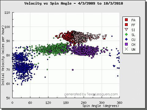
Blyleven's curve was the subject of Baseball Digest stories in 1978 and then again in 1989. Both times, he described two different variations of his curve. One, a "roundhouse curve" had a big, lazy break. The other, his "overhand drop" became his specialty. Several current pitchers throw multiple curves, including Bronson Arroyo, who can add and subtract from all of his pitches, and Chad Billingsley, who mixes in up to seven distinct pitch types. And Mike Mussina would have been a great Blyleven comp, given their durability, their propensity to throw breaking pitches, throw breaking pitches for strikes, and willingness to pitch to both sides of the plate. But Moose retired, so I'm not including him as a nominee. Instead, I think Roy Oswalt's array of curveballs aligns best with Blyleven's description. Oswalt has a standard overhand curve that clocks in the high 70s, but Oswalt has explained that he also throws a slower curveball by choking the ball deep into his hand. Jenkins notes that Oswalt can vary the velocity on his signature 12-to-6 curve from the upper 70s to down into the 60s. On the left side of this image, you can see the distinct clusters forming Oswalt's curveballs. You can also see that the ball's axis of rotation approaches zero degrees at times.
Verlander throws a monster breaking ball. He is generally around the plate with his curve, too. Verlander's curve baffles hitters, but more importantly, it fools umpires as well. In one famous incident, Blyleven got so fed up with an umpire's refusal to call his curveball for strikes that he began to throw batting-practice fastballs, afterward saying, "if he's not going to call my curveball for strikes, then I'm just going to throw my fastball down the middle." Verlander had a notable argument with an umpire this year for "not getting the strike call on back-to-back breaking balls around the inside corner."
Here is the called strike zone for Verlander's curve over the last two years.
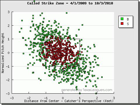
I guess the only way you can tell whether the zone is fair or not is by counting the number of green points inside the strike zone box and the red points outside it. The method I used in determining that Verlander's curveball was the most umpire-unfriendly in baseball controlled for batter handedness, batter height, and pitch movement. It showed that Verlander has been screwed out of about 50 strikes, 20 more than anyone else. By comparison, here's the curveball strike zone for Javy Vazquez, to whom umpires have been more generous. Pay particular attention to the area down and away from RHBs.
Ranking in terms of "stuff," Stephen Strasburg and a plethora of relievers boast the nastiest curveballs. But for starters with some degree of longevity, Burnett's is the hardest to hit. Burnett's curveball induces whiffs on 45% of swings, an obscene number. That's partially because he's so wild, throwing his curve in the zone under a third of the time. Blyleven and Burnett had similar philosophies about where to throw their curves, if not similar execution. Blyleven said that he "keeps the ball low and away to a righty," which appears to be Burnett's intention. Against lefties, Blyleven would try to "nick the outside corner" or "break it low and in." Again, this fits a visualization of Burnett's curve vs. LHBs. The problem is that where Blyleven threw strikes, Burnett throws wild pitches. Like Blyleven, Burnett is almost exclusively a two-pitch fastball/curveball pitcher, at times tinkering with a show-me change. Blyleven said that he threw his fastball in the low 90s and his curveball in the mid 80s. Burnett comes as close as it gets to fitting that profile.
Burnett also gets a nod for reportedly loosening up the Yankee clubhouse. His trademark is the cream pie, while Blyleven was a master at the hot foot.
Carpenter, like Wainwright, throws a whole lot of curveballs, and he throws them well. Carp and Waino throw with similar velocity, movement, and release points. Few can spin the ball like these two. What sets Carpenter apart is that, like Blyleven, his fastball might be his better pitch. Wainwright's curveball has dominated baseball over the last two years, but Carpenter is the only pitcher in baseball with a fastball ranking in the top ten in terms of run value in addition to his top ten curveball. Blyleven said that, "my fastball was my best pitch, because it set up my curve. The control of your fastball is the key to success for any pitcher -- and not being afraid to pitch hard inside." Just last week, he said on the Jonah Keri Podcast, "my curveball was a very good pitch for me, but it’s my fastball that set it up. Establishing the fastball on both sides of the plate set up my curveball." Carpenter pitches to both sides of the plate with his fastball. Pretty much anywhere so long as it's a strike. And when he is able to set up his curveball with a fastball, nobody has a chance. Carpenter's curve is on average 1.5 runs per 100 pitches above average, but when preceded by his fastball, it's 3.5 runs above average.
I submitted my ballot to Rich Lederer, who was given the final say on whom to elect for the Bert Blyleven Award:
-----
Rich: Jeremy sent an email a few days ago informing me that he wanted to "compare Blyleven to modern-day pitchers using PITCHf/x data for people like me, who never got to see Blyleven pitch." Here is my return email to Jeremy.
I believe Roy Oswalt, Adam Wainwright, Mike Mussina, Josh Beckett, and Chris Carpenter are good comps. Those would be my top five. All of these pitchers make sense if you think in terms of fastball velocity, wCB and wCB/C, WHIP, and K/BB.Blyleven was a fastball/curveball pitcher. He threw an occasional changeup but it wasn't a significant part of his repertoire. His roundhouse was the so-called "slow curve" and the overhand drop the "12-to-6 hammer curve" that was his out pitch. With no public postings of radar-gun readings in those days to measure his fastball, my guess is that Blyleven threw a low-90s heater with the ability to dial it up to the mid-90s on occasion during the first half of his career. He definitely threw hard but his fastball more or less set up his curve. He could throw strikes with his fastball and curveball on both sides of the plate and at any point in the count.
Bert was also a workhorse. He threw more than 270 innings in eight different seasons. Of note, the 293.2 innings he pitched in 1985 has not been surpassed in the past 25 years. Leading the AL in home runs allowed in 1986 and 1987 had as much to do with ranking first and fourth, respectively, in innings pitched as it did with being around the plate a lot and hanging a few curveballs. However, for Blyleven's career, he was right at the MLB average for allowing homers (2.1% vs. 2.0%) and, in fact, gave up fewer HR/9 than a composite of his eight most similar HOF pitchers.
As it relates to his comps, Oswalt's fastball has averaged 93.1 mph during his career. Wainwright 90.6. Mussina 88.3 since 2002, probably more like 90ish in the earlier part of his career. Beckett 94. Carpenter 91.5 since 2002. The latter took much longer to develop and has missed more time to injuries than Blyleven. I think these are all good comps though. 90-94 mph fastballs with outstanding curveballs, excellent control and command, and somewhat similar K and BB rates.
I didn't realize I had final say on the Bert Blyleven Award (singular) until Jeremy returned with his nominations. The truth of the matter is that I believe a composite of Oswalt and Wainwright would be one heck of a match. A righthanded starting pitcher with a 92 mph fastball and a hellacious curveball with outstanding control and the ability to miss bats.
The winner? Roy Wainwright. Or is it Adam Oswalt? OK, make it Roy Oswright. Or even Adam Wainwalt. Yeah, it's one of those guys.
For what it's worth, here is a statistical comparison between Blyleven's career through his 32-year-old season and Oswalt:

Similarly, here is a statistical comparison between Blyleven's career through his 28-year-old season and Wainwright:

-----
This marks my final piece as a regular contributor to Baseball Analysts. I'm no longer a student, which means that I now have to make my way out in the real world--the one with all the hard knocks. I'm much obliged to Rich for giving me a writing platform and always providing thoughtful comments on my work. Thanks to my fellow authors at Baseball Analysts for giving it 100% and no more because they knew doing so would be mathematically impossible. And thanks to the readers, especially to those who were generous enough to offer criticism. Catchphrase.
| Touching Bases | December 24, 2010 |
The Year in PITCHf/x Calibration
This week, I handed in potentially the final paper of my academic career. It was titled, "The History of PITCHf/x." That is to say that I greatly enjoy thinking about, reading about, and writing about PITCHf/x data. So I don't mean to cast PITCHf/x in a negative light by bringing up its calibration issues, but data is kind of worthless without knowing the error involved. And while PITCHf/x is precise within a fraction of an inch, the accuracy is not always there, as some ballparks can report errors more along the lines of fractions of a foot.
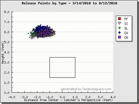
The list of public analysts who have completed data correction systems is only a few names long. I believe Mike Fast, Josh Kalk, Harry Pavlidis, and Ike Hall have done some quality work in the area. My first pass is likely not as rigorous as their methods, but I feel I stumbled upon enough points of interest to warrant writing something up. My sample consisted of the fastest 25% of pitches thrown by each pitcher in each game. I compared the actual properties of those pitches to a set of expected values. These expected values were generated by finding the average properties of pitches thrown in other ballparks by the same pitchers. There were five values that I tested: the initial horizontal and vertical position (release point), the resultant horizontal and vertical position (plate location), and the pitch velocity.
One mid-august homestand in Houston jumped out at me. The graphs I present below contain the actual and expected values as detailed above, as well as the difference between the two, which loosely represents the magnitude of correction needed.
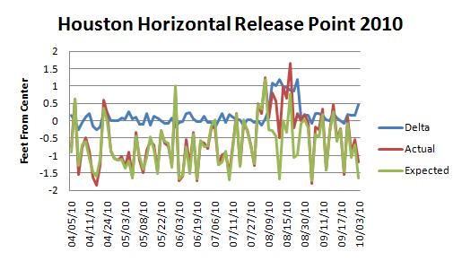
You can see that the actual release points and the expected release points follow each other quite well over the first half of the season. For instance, when two left-handed pitchers start, the average release point jumps to the opposite side of the graph. But then in August, the blue delta line spikes by a foot. I created a gif comparing all of Brett Myers' release points leading up to his August 13 game and his recorded release points in that game. Without context, it would be easy to draw the conclusion that Myers had altered his approach.
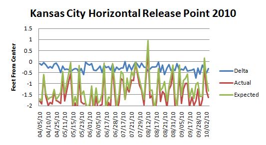
Some parks were consistently miscalibrated the entire year. Or perhaps the rubber on the pitching mound was off-center. Kansas City had on average a three-inch difference between the actual and expected horizontal release points. This was certainly the fault of Dayton Moore.
More importantly, Kansas City overstated velocity, a trend fortunately spotted by Jeff Zimmerman early on in the season. Here, the delta line is plotted on a different axis.
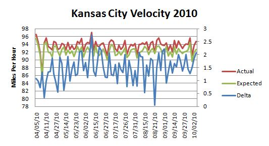
On average, the delta was 1.1 miles per hour, the exact same number reported by Mike Fast.
Mike published his own 2010 velocity corrections on THT, and I found the correlation coefficient between his and mine to be 0.8.
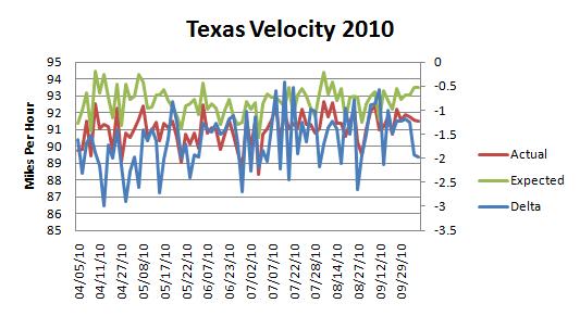
Texas was at the other end of the spectrum.
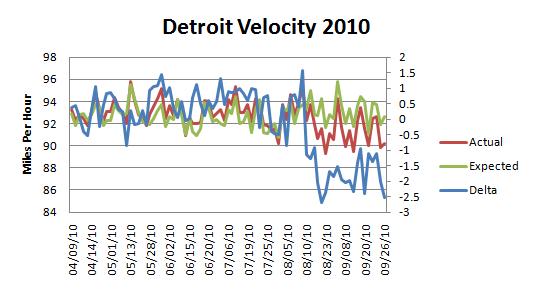
And Detroit was fine until the final months of the season.
Like Kauffman, Dodger Stadium was on average three inches off with its horizontal release points. Several parks deviated a couple inches from what we'd expect with their vertical release points. Again, rubber position and mound heights are not standardized across MLB, so it could be that pitchers do throw from different release points depending on the stadium. Citizens Bank and Yankee Stadium reported high release points, while Safeco and Petco came in lower.
Plate location adjustments are much harder to nail down. For one, the values reported by PITCHf/x around the plate are generally accurate, as they are more directly observed by cameras, as opposed to the release points which are extrapolated. Furthermore, pitchers vary their intended pitch locations much more than they do their release points. The park with the greatest pitch location abnormality is Yankee Stadium, and the reason is clear. The Yankees possess such a disproportionate number of left-handed batters that pitchers throw to the third-base side of the plate more than they would against any other team.
Correcting PITCHf/x data seems hard. Differences in a ballpark's configurations and a pitcher's intentions are difficult to separate from an oddity in PITCHf/x calibration. Including batter handedness appears vital, given that pitchers shift their position on the rubber or throw to a different side of the plate depending on batter handedness. I do not think that an automated correction system is the answer to correcting PITCHf/x data. I envision how hard it would be to pick up on sudden shifts in the data that stem from recalibrations without picking up on the random game-to-game noise. It would possibly be easiest to simply eyeball a span of time during which one fixed level of adjustment is needed.
| Touching Bases | December 16, 2010 |
More Observations on Pace
One month ago, Lucas Apostolereris explored how much time pitchers take in between pitches, and FanGraphs added pace to its player pages shortly thereafter. Dave Allen went on to analyze batter's pace and make some other observations. It's taken awhile for this PITCHf/x timestamp data to be mined, but I've finally decided to get my hands dirty with it.
Like Dave, the way I'm calculating pace results in a 22.4-second difference between pitches, which is slightly slower than the FanGraphs calculation. (FanGraphs' method excludes pickoffs, which I'm not sure I agree with. I've always felt that a pitcher is pitching slowly if he throws to first a bunch.) Dave found that two-strike counts are the most time-consuming. There's certainly something there, but even more significant might be the pitch sequence of the at-bat. On average, 20 seconds pass between the first and second pitches of an at bat, while 30 seconds pass between the 10th and 11th pitches.
| 1-2 | 19.7 |
| 2-3 | 22.2 |
| 3-4 | 23.2 |
| 4-5 | 24.3 |
| 5-6 | 26.0 |
| 6-7 | 27.4 |
| 7-8 | 28.2 |
| 8-9 | 28.7 |
| 9-10 | 29.0 |
| 10-11 | 30.0 |
Batters are more likely to step out of the box the deeper into the at bat they go, and pitchers take more time to determine about their pitch selection. There is no such clear trend in the relationship between overall pitch count and pace.
Pitchers start out blazing coming out of the gate. Many pitchers don't even think, but rather try to solely establish the fastball. Pitches 10-20 cover the most difficult part of the batting order, when it is also likely that there are runners on base, so the pace slows down dramatically. After that, the data smooths out, and pitchers slow down the further along they go.
Back in April, Mike Fast* used the timestamp data to check on why Yankees vs. Red Sox games take so long, and he found that the reason was more than simply batters and pitchers taking a lot of time between pitches. It turns out that the average time between innings is a little over two-and-a-half minutes, which can fluctuate depending on teams. I believe that the umpire, under directions to restart the game following commercial breaks, controls the time between innings. Home teams with a lot of nationally-televised games (Dodgers, Mets, Yankees, Braves) are those that take over 2:40 between innings, while others (Royals, Blue Jays, Athletics) take under 2:30.
Mike has also done a very cool study on pace and defense.
Mid-inning relief changes last on average 3:15. Interestingly, Colorado, where there is an average break length between innings, allows pitchers the most time to warm up at 3:29. It is notoriously difficult to pitch in Coors, so it would make sense for relievers to be given some leeway with warm-up time. In Oakland, mid-inning changes only last 2:54 on average. Furthermore, the incoming reliever can dictate when he resumes play. Mike Adams and, unsurprisingly, Jonathan Papelbon, are in a league of their own, as it takes them four minutes to pick up play. A few A's pitchers (Andrew Bailey, Brad Ziegler, Jerry Blevins) keep it well under three.
The average time between at bats is 50 seconds. Carlos Pena is slow.
Pitchers only spend 11 seconds between pitches when issuing intentional walks. Otherwise, the game moves most quickly following called strikes. Balls in the dirt result in a loss of 10 seconds as compared to regular balls. Fouls with the runner going result in a loss of 10 seconds as compared to regular fouls.
How else might a game's pace be affected?
| Touching Bases | December 04, 2010 |
Thoughts on In Depth Baseball
I like baseball heat maps. Really like them. They have captured the heat map that is my heart. I feel I should get that out of the way before I provide my thoughts on In Depth Baseball, TruMedia's baseball analytics platform.
During the 2010 postseason, I became aware of a new baseball analytics blog that specialized in such heat mappery. Behind the blog was one Rafe Anderson. Anderson had been a Boston Red Sox employee for six years before moving to TruMedia Networks, where he holds the titles of President and CEO. Now, Anderson has, along with programmer Jeff Stern, developed an analytics platform being marketed to MLB teams. I've had the opportunity to speak with Anderson on a couple of occasions, and he was generous enough to offer me a demo of In Depth Baseball (IDB).
IDB enters the marketplace in the same year as Bloomberg Sports (BBG). As they are in direct competition, I thought it would be natural to start by comparing IDB to BBG. Admittedly, I have had little experience with BBG.
BBG has a far sleeker layout than IDB. Here, take a look at screenshots of leaderboards from BBG and IDB. But IDB prides itself on not being "flashy," a possible dig at BBG's Flash-based platform. Consequently, IDB runs much more smoothly than BBG, while potentially at the same time making more sophisticated computations.
Now we arrive at the heat maps, a department that sets IDB apart from any platform I've seen before. Let's say you want to see the best contact hitters in the league. You go to the leaderboard and sort by contact rate, just as you would do on FanGraphs or anywhere else. But meanwhile, you can see an adjacent heat map showing the league average contact rate by strike zone location. And then, if you want to break that down into splits, such as LHBs vs. LHPs, both the leaderboards and heat maps update instantaneously. Furthermore, the heat maps are interactive in that you can isolate zones you want to look at by dragging your mouse into a certain area. After that, you can see who the best player in the league is in that zone, click on his name, and be taken to his player page, where the chosen filters remain constant. Other heat maps that I'm aware of are created in R, and it would take, conservatively, over a minute to process that much data. But it's not like the R ones even look any better than IDB's. The explanation I've been given is that Stern custom developed his own program, borrowing some fancy techniques that are used by chemical engineers. Well it's great, whatever it is. You can find quality heat mapping using IDB here and here.
Where IDB's heat maps sometimes fail are with smaller samples. For example, check the in play slugging heat maps used here. It's impossible to tell whether the observed trends are anything more than noise. Anderson says that the heat maps consider statistical significance, but from my experience, I've found that determining the right smoothing parameters is often more art than science. I would rather have an over-smoothed heat map than an under-smoothed one, as a heat map that shows no trends will at least tell you the player's mean performance, whereas a heat map with too much noise can lead you to draw false conclusions. It might be a failing of the analyst more so than the system to draw conclusions from such heat maps, because when you're looking at individual players, you probably want to choose metrics that stabilize quickly, like contact rate, called strike rate, or pitch frequency. But for analysts who don't regularly work with this sort of data, it would help if the smoothing parameters were refined for metrics such as in play slugging, which will rarely have a large enough sample to be highly consistent for individual players.
While the heat map is the bread and butter of In Depth Baseball, I feel that the most important part of any database system is how well it integrates video. Just as you can click on a player's splits to view different heat maps or spray charts instantaneously, his pitch-by-pitch log also updates. I don't think I can overstate how strongly I feel that every team should be using something more sophisticated than BATS to view video, and IDB obviously qualifies as a solution. The problem is that the pitches aren't directly linked to video streams, and instead, one must select certain pitches to a queue before watching them. If you want, you can pull up video of all Ryan Howard vs. LHP off-speed pitches in the last two years, but it would take a lot of clicks. I think it would make more sense if every video from the pitch log started on the queue, and then if you wanted to filter from there by using the splits section, videos would subsequently be removed.
I was highly impressed by the video quality, an area where IDB truly is "flashy." The Flash Player allows one to use slow motion, go frame by frame, or even change camera angles if multiple ones are available. I'm sure the playlists can be exported easily to hard drives if scouts don't want to come up with them on their own.
Bloomberg Sports holds an agreement with MLBAM, but IDB is fully independent outside of its team partnerships. Therefore, IDB has no license to video, and must borrow from teams. IDB has been able to work around this, as one thing Anderson stresses is that they use an Open API. You might be able to infer what that means, but from the TruMedia site, "This enables our partners to seamlessly integrate MLB analytics with relevant pitch by pitch video play lists within their own customizable user interface. Most importantly it allows organizations to keep their algorithms and metrics confidential." IDB has tools to incorporate HITf/x data or any other advanced data.
IDB already has an impressive advisory board, which gives them saber cred. I wouldn't be surprised if the fine folks at Complete Game Consulting have already played a hand in developing some of IDB's more advanced metrics. They have incorporated the "paint" set of metrics I believe to have been invented by Dan Brooks. IDB features "expected" values, too, and although I'm not quite sure how these are calculated, any metric with the word expected before it grabs my attention.
Another big thing is their "PZX" and "PVX" values, which measure angular velocity at the plate. They sound like something Matt Lentzner and Mike Fast discussed at this year's PITCHf/x summit, and if if I understand PVX and PVZ correctly, they could be the future way we measure movement (from the batter's point of view as opposed to the ball's). In addition, there are PVX vs. PVZ heat maps, so you can break down players by pitch movement the same way as by pitch location.
Alongside player heat maps are standard spray charts. The spray charts unfortunately use Gameday data, showing where the ball was picked up as opposed to where it was hit. Though you can mouse over a single hit to see the pitch details and video of it, for some reason you can't isolate zones like you can with the heat maps. So if I don't have the option of seeing video of all of a player's ground balls to the right side of the infield. It would make sense for IDB to add this feature.
There are other tools besides the league leaderboards and player dashboards, which contain the spray charts, heat maps, and video. One section which I didn't spend much time on is the "graphs" section, where you see a bunch of line graphs: a pitcher's fastball usage over the course of the season; a batter's contact rate by pitch velocity; a frequency distribution of a batter's ground ball angle. Pretty much any stat in line graph form. There's also a "comparisons" section, where you get an assortment of a player's heat maps side by side, such as how he does in different counts or by pitcher/batter handedness.
According to Anderson, umpire reports will be launched for the 2011 season, and they plan to venture into defense eventually as well.
While Bloomberg employs a team of programmers in research and development, Stern mostly by himself has created an incredibly powerful and efficient tool. Now, I've been wildly blown away by every database platform I've come across, but IDB certainly exceeds what is out there at all but a handful of MLB teams. What I could see making IDB so attractive to teams is that it is web based, and therefore available at all times. IDB looks fantastic on the iPad (I don't own one, so I guess everything I've seen on an iPad looks fantastic). Imagine watching a game in real time with iPad in hand and taking one click to instantly update a set of heat maps based on a change in the count or batter. So far, according to the Sports Business Journal, IDB calls the Padres and one other undisclosed team their clients. I have little doubt that IDB will continue to expand into a number of front offices, and with the news that TruMedia will be collaborating with Sportvision to provide MLB clubs with a minor league analytics platform, I am confident that the product will be that much better come Opening Day. I just hope that by then I'll still have the chance to see what IDB has had in store.
| Touching Bases | November 26, 2010 |
The Decade in Basic Fielding: Adjustments
Last week, I looked at the decade's leaders in plays made per ball in play. Now, I'll take a look at the context in which they played.
This might not qualify as basic anymore, given the intensive amount of computation time that goes into these adjustments, but I do find them intuitive. I attempted to replicate the "without" part of Tom Tango's "With or Without You" system by finding how many plays the average fielder would have made given a specific fielder's set of circumstances. That entails deciding on a situation to control for, finding how often a fielder was in that situation, and calculating the rate of plays other fielders made in that situation. For example, third basemen are twice as likely to record an out on a ball in play if the batter is right-handed as opposed to left-handed. Therefore, if Eric Chavez faced right-handed batters 60% of the time this decade, while the league normally faces 58%, then we would need to take away a couple dozen plays made by Chavez to adjust for his advantage.
Below, I present the chart for batter handedness adjustments. The adjustment figure is the number of plays you would need to add to or subtract from each fielder's plays made due to context. The adjusted rate incorporates that adjustment.
A batter handedness adjustment doesn't make much of a difference for catchers, pitchers, or center fielders, but for players in the corners, it can be huge.
Last week, I found that Freddy Sanchez had the lowest rate of plays made at 2b, and Jack Wilson the highest at SS, and here we see that the Pirates must have faced a ridiculous number of RHBs.
The number of left-handed hitters the Yankees roll out could impact the numbers, as Nomar Garciaparra and Bill Mueller earn large adjustments, while Manny Ramirez comes out even worse than before.
Feel free to click on the links below to see similar charts to the one above.
Pitcher handedness adjustments correlate with batter handedness adjustments. It seems to me, however, that batter handedness adjustments are way more useful in measuring fielding.
Those are easy to calculate and to comprehend. he next several are trickier. Calculating park adjustments when some players play every single day limits the "without" part of the sample. Here, take a look.
Let's use, you guessed it, Derek Jeter and the Yankees as our starting point. Both Yankee stadiums have seemingly played exceedingly difficult for shortstops. Shortstops make plays in the Bronx on under 11% of balls in play, and the average is 12%. You might be thinking that Jeter drags down the average, but remember, I controlled for this by finding the rate of plays made when he wasn't on the field. You might also be thinking that the Yankees wide array of left-handed hitters drag down the average. That, I didn't account for. So it's tough to say what can be attributed to the ballpark. Maybe the grass is shorter or greener or something. Or maybe the Yankees play with poor fielding shortstops and hit with players who don't hit to that side of the field. The same could be said for Jimmy Rollins, who has dominated the shortstop position for the Phillies over the last decade, and his own lineup is also dominated by left-handed hitters. I think it would be too hard and probably not worthwhile to try to determine ballpark adjustments for infielders.
The conclusion that I think can be drawn from these ballpark adjustments is that Coors Field kills outfielders.
I think there's some good stuff in there.
Jimmy Rollins and Orlando Cabrera have played in front of stingy pitchers, whereas Miguel Tejada and Rafael Furcal have benefited from pitcher generosity. Chipper Jones as both a left fielder and third baseman moves close to average when you control for the pitchers he's had to deal with.
Rollins, playing behind pitchers who were unfriendly, fielded in front of hitters who helped him out a fair deal.
These next two will be heavily biased, but I thought they might be interesting.
There are a lot of conflating factors here, as first basemen and center fielders might play every day with their teammates, killing the "without" sample, and they share a ballpark every day, bringing in other effects.
Anyway, I wasn't surprised to see that Chase Utley and Jimmy Rollins might have made more plays with a different first baseman.
With center fielders, I was looking for evidence of ball-hogging, but don't think I found any.
This is the only time I'm not using the entire 2000-2009 dataset, as a significant portion of balls were not classified. Most, if not all, unclassified balls went for hits, so the adjusted rates are all higher than the league average rates.
Three of the top five pitcher adjustments go to guys who played for the Braves, which means they generated a lot of ground balls. This results in the Joneses getting underappreciated as outfielders, especially Andruw, who I showed last week was one of the best at catching balls in the air, and now we see that he had hundreds of fewer opportunities than he would have playing for another team.
The information used here was obtained free of charge from and is copyrighted by Retrosheet. Interested parties may contact Retrosheet at 20 Sunset Rd., Newark, DE 19711.
| Touching Bases | November 18, 2010 |
The Decade in Basic Fielding: Leaderboards
The Gold Gloves were announced last week, and I know what you're thinking; if only there was another metric to evaluate fielders. Well, sorry to disappoint, but I don't have it in me to come up with an original acronym. Anyway, there was this really interesting thread on The Book Blog in which Tangotiger posted a simple yet powerful leaderboard consisting of outs made per ball in play for all active shortstops. Derek Jeter came in last. Spanning the entire 2000-2009 timeframe, one would have to have faced extraordinary luck to not deserve one's place at the very top or bottom of such a basic leaderboard. There's really no arguing with it. (If you want to argue, Colin Wyers went in depth on the subject at Baseball Prospectus.)
I found every fielder's out-per-ball-in-play rates as well as the average conversion rates at each position. Nothing special. No handedness or batted-ball adjustments, no plays-to-runs conversion. Below, I present the top five and bottom five at each position sorted by total plays above and below average.
Going from one to nine:
Greg Maddux was probably something like three standard deviations from the Major League mean with his pitching ability. That pales in comparison to his fielding prowess. He turned balls in play into outs as often as Carl Crawford and Ichiro Suzuki. Daniel Cabrera did not do a single thing well on the baseball field other than throw hard.
I've always said that Yankee fans should give Jorge Posada more credit for his fielding. Wait, that's not right. Maybe I mean Brett Gardner. Seeing Posada top a defensive leaderboard is throwing me off.
Albert Pujols: good at baseball.
Orlando Hudson is over 100 plays better than the next closest fielder at any position. You might say he's the basic man's Adam Everett. Freddy Sanchez rates as well as Hudson in several advanced fielding metrics. Considering Jack Wilson played counter Sanchez for many years, there could be a large ball-hogging effect going on.
There has been no ball-hogging effect on the left side of the Yankee infield. A-Rod finishes last for third basemen, and of course Jeter lags all shortstops.
I wonder why Carl Crawford never picked up center field, considering his greatness in left. I've noticed that Garret Anderson is often called underrated by television announcers, given his ability to rack up hits. When I learned about secondary offensive skills, I decided then he was overrated. Then I saw his fielding numbers, and it turns out he's pretty good in left. Maybe he's been rated properly all along.
Darin Erstad had a run where he was something like a true +30-run center fielder. The astute reader will notice a similarity between the LF and CF leaderboards. Foreshadowing.
Yes, Randy Winn appears in the top five of all three outfield positions. Also, Brad Hawpe: bad at fielding.
I made a bunch more leaderboards by varying the data I used as opposed to adjusting the original dataset, which I will do next week. For example, I restricted my sample to only RHBs or only LHBs.
If you click on the links, you will see an image similar to the one I used in this article. Different data, same methodology. I don't expect anyone to click on more than a couple, so I will provide brief commentary.
Batters pull grounders and go the other way on fly balls. This results in shortstops making fewer outs against left-handed batters than second basemen, first basemen, left fielders, or center fielders. At some point, it must be optimal for fielders to switch positions depending on the batter's tendencies. I'm sure once that started to happen, a rule would be put in place to deter such delays.
Mariano Rivera turned 10.55% of balls in play into outs himself when facing LHBs. Maddux was 7.52%, the league average was 4.36%, and Cabrera came in at 1.76%. That 10.55% mark can explain a fair amount of Rivera's extraordinary .263 career BABIP. He's a gifted athlete who is said to play a quality defensive center field. Plus jamming LHBs with his cutter can result in easy bouncers right back to the mound.
I don't know if any advanced fielding metrics control for pitcher handedness, but I'd imagine any adjustments made would be negligible.
Jeter has been very good at catching balls in the air in his career, but that only highlights his inability to field grounders. At least he might be better than Yuniesky Betancourt. A-Rod showed up in the top five among shortstops on air ball plays, but bottom five among shortstops and third basemen on grounders. Robin Ventura blew away the third base field by converting over 20% of grounders into outs. Damion Easley was first on grounders and close to last on balls in the air. Jason Varitek was last on grounders and first on popups.
Ichiro has forced out four players on ground balls.
There's a massive range for pitchers in how often they field their own bunts. Javier Vazquez and Carlos Zambrano control 50% of bunts themselves, while Jon Lieber and Ben Sheets make outs on under 25%.
Overall defensive efficiency is ten points higher with two outs than it is otherwise. I don't know if it follows that their should be a fielding adjustment.
DERs at Coors and Fenway were .665 and .676, respectively. Brad Hawpe and Manny Ramirez were both 80 plays below average in their respective parks. It's tough to say if Jason Bay played good defense in Fenway or if Manny's insane awfulness made it appear that way. I've been under the impression that J.D. Drew is a really good defensive outfielder, yet he's made only 6.6% of plays in Fenway's oddly-shaped right field, while most RFs turn around 7.5% of balls into outs. Maybe there's a Coco Crisp ball-hog effect?
Juan Pierre showed up on the bottom five overall list for center fielders, but he played in an impossibly difficult Coors Field, and actually did well there.
Next week I'll take a look at basic fielding adjustments.
The information used here was obtained free of charge from and is copyrighted by Retrosheet. Interested parties may contact Retrosheet at 20 Sunset Rd., Newark, DE 19711. 2010 data is out!
| Touching Bases | November 11, 2010 |
Thoughts on the AL Cy Young
I don't much mind groupthink so long as I'm part of the group. Well, then I don't really consider it groupthink, do I? Just a bunch of people being right. And I like being right.
So when Baseball Prospectus released its Internet Baseball Awards, I was confused. Felix Hernandez won the greatest consensus of any category. My pick for AL Cy Young was Cliff Lee. Either I'd badly miscalculated, or people have been converging on an opinion that could well be wrong.
Now, I'm not saying people are wrong. (Of course I do think they're wrong. I chose Cliff Lee.) It's just that there's no way Felix was so dominant that he deserves 80% of the vote. Lee and Price and Liriano and Lester and Weaver and Sabathia were all fantastic. So what makes Felix stand out?
Felix led the league in both innings pitched and ERA. I'm not really sure that I care about innings or ERA, though. Hold on. I obviously do care about innings pitched and ERA. But I see the numbers and I just think wouldn't it be nice if some smart people converted those numbers into a total value metric? Fortunately, the good folks at Baseball Reference, FanGraphs, and StatCorner have taken it upon themselves to provide us with WAR. Felix tops the AL on B-Ref, while Cliff Lee leads the Majors in WAR according to FanGraphs and StatCorner.
The difference between the methodologies is that Baseball Reference relies on ERA, whereas the others use defense-independent metrics. And why did Felix have such a superior ERA compared to Lee's all-time great strikeout-to-walk ratio?
Cliff Lee suffered a .347 BABIP with men on base while Felix Hernandez held opponents to a .239 mark.
It's easy to attribute ball-in-play results and event sequencing to luck, but if I were to do that I wouldn't have much else to write about. Therefore I looked into Lee's and Felix's pitching approaches with men on base and nobody on.
Felix's first full season was 2006, when he allowed a .357 BABIP with men on base. Since then, he has lowered his BABIP by at least 24 points in each successive year. If you believe in such trend analysis, then this would be evidence that Felix is doing something right with men on. Cliff Lee, in the two years since his reinvention, has allowed .306 and .264 BABIPs in man-on situations, indicating this year could have been nothing more than a fluke.
Most pitchers throw somewhat softer with men on base than with nobody on. Pitching from the stretch can lead to diminished velocity. Trying to induce groundballs means sacrificing velocity for movement. Justin Verlander is one guy who pitches with another gear at times. I found that he adds over a mile per hour to his fastball with men on, while previously it was shown that he adds velocity in high leverage spots and with higher pitch counts. On the other hand, Stephen Strasburg not only went to his two-seamer more often with men on base, but he also suffers pitching from the stretch.
Both Felix and Lee throw slightly harder with men on base, and both also significantly up their groundball rates. Lee throws more cutters with men on while Felix throws more tailing fastballs. The thing is, they've kept rather constant approaches from 2009-2010. Considering that Lee has better DIPS numbers with men on than does Felix, I fail to see evidence that Felix deserves credit for achieving better results than Lee. Felix added a full win in Clutch value this year. Lee lost a win. I don't think either deserved their respective fortunes.
I've looked at the numbers for quite a while, and I'm not all too confident with my pick. But I don't see how everyone else can be that confident with theirs. The competition was really really tight. I think Felix winning the AL Cy would mark a sign of progress for sabermetric thought. Felix winning by a landslide could mark a step backwards.
| Touching Bases | November 08, 2010 |
Batted Ball Location Leaderboards
There has been a distinct void in batted ball leaderboards this year, as Dave Studeman has been saving up all the good stuff for this year's THT Annual. (Buy it!) This is the third and final year I'll be writing my tangential column, and now you can find the relevant data yourself in FanGraphs' player splits section. Without further ado, here are the best and worst pull hitters of 2010. I have a feeling who will be number one.
Value of Pulled Batted Balls
The past couple of years, I've had an idea who would be the top pull hitter. Some hitters like Ryan Howard, Jim Thome, Adrian Gonzalez, and Derek Jeter are renowned for their opposite-field prowess. But this year, Jose Bautista's batted ball distribution made the mainstream, getting written up in Sports Illustrated, USA Today, and ESPN. His 57-run mark is the highest I've ever seen, and his 47 pulled homers are the fourth most in the Retrosheet era. The requisite spray chart:
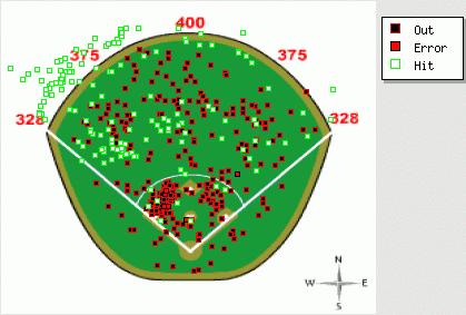
There was definitely something about the Blue Jays approach this year as a team. They led the league in home runs with 257, 46 more than any other team. They hit fewer line drives but more fly balls than anyone. Their 13.6 home run per fly ball rate was also tops, and way higher than last year's 10.4% mark. Bautista added ten percentage points to both his fly ball rates and home run per fly ball rates. Less noise was made over Vernon Wells, who somehow went from 0 WAR to 4 WAR, also posting a career-high number of pulled homers.
Dan Uggla, aided by Florida's short left-field fences, has added at least 30 pulled runs of value in every year of his career. Albert Pujols is the only player to appear in the top ten each of the last three years.
Juan Pierre appeared at the plate 734 times this year. Is that not dumbfounding? He is a really good baserunner, I suppose.
Value of Center Field Batted Balls
Josh Hamilton hit 19 homers out to center, which is impressive. But I'm more interested to know about the ground rules concerning that lawn out there in straightaway center in the Ballpark at Arlington. Is it like the black at the old Yankee Stadium?
Good things happened when Hamilton, Carlos Gonzalez, and Joey Votto got the bat on the ball, as they boasted respective BABIPs of .384 and .390 and .361. Gonzalez and Votto have the 22nd and 23rd highest BABIPs of all-time. Only Shin-Soo Choo, Ichiro Suzuki, and Derek Jeter have higher BABIPs among active players, and I wouldn't be surprised to see CarGo or Votto pass all three of them.
Carlos Lee hit more balls to center field this year than he did last but wound up with 23 fewer hits
Value of Opposite Field Batted Balls
The pull list is dominated by right-handed hitters while the opposite-field list is dominated by left-handed hitters, which suggest there is value to hitting the ball to left field. The BABIP on balls to left is about 40 points higher than on balls to right.
It's crazy that Adrian Gonzalez does this damage in PETCO. As a Padre he's hit only a third of his home runs at home. He'd make a lot of sense on the Marlins or Red Sox.
Votto did it. He ended the year without a single popup. He hits the ball with power to all fields. His worst results came from pulling the ball, and when he did so he still added 16 runs thanks to a 47.6% HR/FB.
Jim Thome slugged .125 on grounders and 1.405 on balls he put in the air. On first thought, I thought that might be something to exploit, but interestingly, according to Baseball Reference, he has the exact same career .958 OPS facing groundball pitchers and flyball pitchers.
Aaron Hill had a .196 BABIP, so unless he was pulling the ball in the air, it wasn't happening for him.
Remember, you can now find all of this stuff on FanGraphs. My hope is that soon we'll be able to take the next step and analyze these numbers using HITf/x.
| Touching Bases | November 04, 2010 |
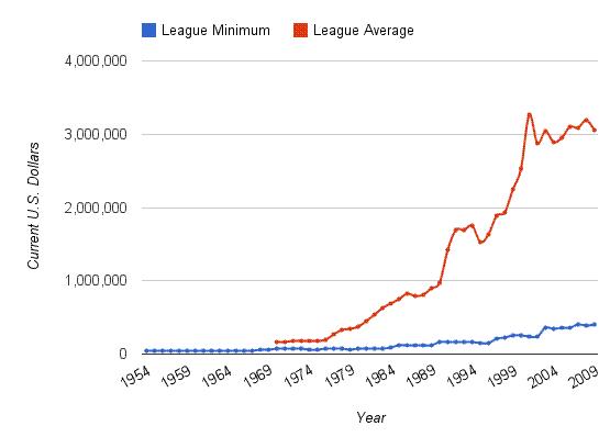
| Touching Bases | October 28, 2010 |
Three-Ball Strategies
The folks at Basketball Prospectus recently found that three-balls were undervalued. Does that mean that there's been an inefficiency in the accepted market inefficiency? I don't know. Commenter Guy also had ideas for how to study three-ball strategies.
Some batters never swing on 3-0 counts. Take the difference between the average 3-0 swing zone and strike zone.
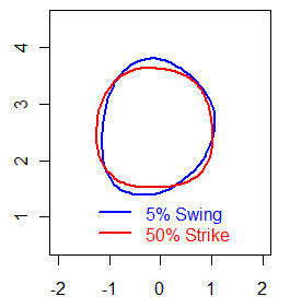 Overall, only 6% of those pitches are swung at. Of those 6%, I estimate 17% would be called balls. If batters never swung at 3-0, that means they would walk about 36% of the time on that pitch, as opposed to the current rate of 35%. Sounds negligible, and it's likely that if batters are able to do damage on 3-0, then they're right to swing at times.
Upon swinging, batters hit .390 with a .760 slugging average. That does not include the 54% of swings that either miss or result in fouls, thereby bringing the count to 3-1. Using linear weights, I estimate that batters currently add about a run per 100 pitches by swinging on 3-0 rather than always taking. I don't think the pure strategy "always take 3-0" is correct. That said, I also think that there are some pitchers who are so bad at throwing strikes or hitters so bad at hitting that such a strategy would be viable.
Along similar lines, batters are more likely to swing at full-count pitches than 2-2 pitches. What if we were to map out 2-2 strategies on 3-2 pitches? Well, I'm not entirely sure this makes sense, but I tried to do it.
I made the payoffs on 2-2 counts equal to those on 3-2 counts, then predicted run value while controlling for batter/pitcher handedness and pitch type. Mapping both predictions onto the 3-2 distribution, I found the overall difference in expected output to be similar to the difference I found between never swinging on 3-0 and the current strategy. Again, the current strategy proved more optimal. Unfortunately, graphing the differences didn't produce anything intelligible.
Decades of baseball evolution have brought us to the point where radical changes to current strategies can mostly be ruled out. But achieving equilibrium is a complicated process, and we would be doing the game of baseball and baseball players a disservice to think that there is no room for improvement. I'm more comfortable saying that batters might swing too often on three-ball counts than I am suggesting what their strategy should be.
| Touching Bases | October 21, 2010 |
Count Oddities
I've been doing a lot of thinking about game theory and how it relates to pitch selection and swing rates. I finally decided to run some numbers to find the baselines for swinging, pitch selection, and strike throwing based on the ball/strike count.
The rate at which pitchers throw strikes aligns perfectly with the average run expectancy in each count. However, batters' swing rates are not likewise dictated by run expectancy. Instead, batters like to swing more the deeper they get in the count.
Batters swing 74% of the time on full counts, by far the highest percentage of any count. At the other end, they swing at only 6% of 3-0 pitches.
Pitchers simply aren't good enough at throwing strikes on 3-0 to warrant batters mixing their strategy between swinging and taking. Pitchers only hit the zone about 60% of the time 3-0, whereas they would need to hit it at least 70% of the time to make batters consider swinging I believe. Strangely, batters are eight times as likely to swing on 3-1 as they do 3-0. I think straight takes on 3-1 might be a viable strategy at times.
We already know and accept that batter's don't act completely rationally on the first pitch. Some players just don't like swinging 0-0, so they don't, and that's that. Yet they up their swing rates from 27% on 0-0 to 40% on 1-0, even though pitchers have similar pitch selections and locations and more importantly, the reward of taking is greater.
There is a 50/50 split between fastballs and off-speed pitches on 0-2 and 1-2 counts. Naturally, fastballs are thrown in the zone at a higher frequency. What's odd is that batters swing at more off-speed pitches on those counts.
The big question is, How much do batters learn from pitch to pitch? The deeper into his repertoire a pitcher must go, the greater the advantage is for the batter. There are probably advantages to taking pitches besides drawing balls. I don't think this applies to the full count, though, which might be why the swing rate is too damn high.
Here's the relevant data. I should note that I used the same strike zone model for all counts, which means that more pitches would be called strikes on 3-0 than listed as being in the zone, and fewer strikes would be called than listed on 0-2.
| Count | FB% | Zone% | Swing% |
|---|---|---|---|
| 3-0 | 95.2% | 58.5% | 6.6% |
| 3-1 | 85.0% | 57.5% | 54.3% |
| 2-0 | 81.6% | 55.3% | 40.0% |
| 3-2 | 69.4% | 54.0% | 73.7% |
| 2-1 | 68.5% | 52.6% | 58.7% |
| 1-0 | 68.6% | 52.0% | 40.7% |
| 0-0 | 68.1% | 50.2% | 26.7% |
| 1-1 | 56.4% | 46.5% | 52.9% |
| 2-2 | 54.0% | 43.8% | 65.4% |
| 0-1 | 55.3% | 41.8% | 46.1% |
| 1-2 | 49.2% | 35.7% | 57.8% |
| 0-2 | 52.4% | 29.0% | 49.4% |
| Touching Bases | October 16, 2010 |
A Look at Optimal Swing Rates
There's been some discussion over at The Book Blog on whether or not batters swing too often at full count pitches. For me, this line of thought started when I read Dave Allen's research that showed that batters are more likely to swing 3-2 than 2-2. I'll get back to Dave's work in a moment, but first an aside on my theoretical understanding of the situation.
In equilibrium, pitchers want to throw strikes at such a rate that batters are indifferent toward swinging. The way I've figured it, and I really might have figured it wrong, that means that on 0-2 and 1-2 counts, pitchers want to throw at least 80% balls, while on 3-0 and 3-1 counts, they want to throw at least 70% strikes. In turn, that means that batters want to swing at 0-2 and 1-2 counts when they are at least 20% sure that a pitch is a strike and take on 3-0 and 3-1 when they are at least 30% sure that a pitch is a ball. The benefit of taking a pitch on 3-2 is obviously much greater than it is on 2-2, as the reward of a ball is a walk. What I've found unique about the 3-2 count, and again, my theoretical prediction might be off, is that it is the only hitter's count that dictates that pitchers throw more balls than strikes and that batters swing at pitches that are probably balls.
Back to Dave's work, because it turns out that he did a followup study asking, "do batters swing too often in a full count?" Dave showed the difference in value between taking a pitch and swinging at a pitch based on pitch location. The area in which batters are just as well off swinging as they are if they were to take should also be the area where batters swing 50% of the time. However, on a full count, batters swing 75% of the time in that area, according to Dave's research. I really like his methodology, and to me it is proof that batters do swing too often on full counts. Unless I'm missing some flaw, which is why I tried to repeat Dave's process at the player level.
The first player I tried was Albert Pujols, and he proved to be a good test case.
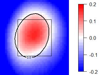
Red means swing, blue means take, and white means indifference. The black contour line estimates the player's 50% swing rate.
The best hitter in the game seems to know exactly when he should be indecisive, so to speak.
My hope was that this type of analysis would vindicate guys like Vladimir Guerrero and Brett Gardner, above average hitters with unique hitting styles. Unfortunately, the data indicate that Vlad swings at too many pitches out of the zone and Gardner at too few. It's easy to say that Jeff Francoeur should learn to take a pitch, but to offer such advice to Vlad is tricky, and probably wrong. And if umpires didn't call such an absurd strike zone to Gardner, it's possible that he would be correct to swing so little.
One hitter who never swings, and correctly so, is Elvis Andrus. He must recognize his historic lack of power.
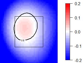
And J.D. Drew knows where his bread is buttered.
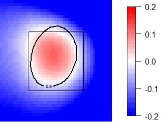
It was difficult to find evidence of any batter who should swing at pitches out of the strike zone. I was hoping that would be the case with Vlad. Miguel Cabrera is one such batter who might have good reason to be a free swinger.
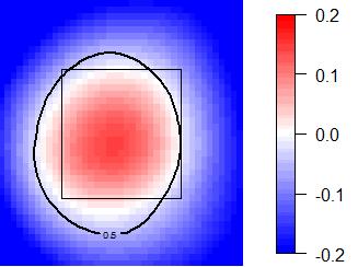
And lastly, Colby Rasmus is the most extreme low-ball swinger in the league, and this type of graph shows that he's also a low-ball hitter.
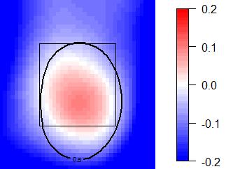
I like the type of information that these charts display. Using it as a prescriptive tool to say how often a specific batter should swing would be wrong, but I continue to think that on a league-wide level, batters swing too often on full counts.
| Touching Bases | October 14, 2010 |
Two Potential Reasons for Lower Scoring
This year, scoring is down by almost a quarter of a run per game.
At the beginning of the season, Mike Fast showed that fastball velocities were rising. FanGraphs data indicates a continued upward trend. I spotted only two pitchers from 2009 who threw 96 MPH and were out of the league in 2010 (Juan Morillo and Tyler Yates), while there were about a dozen rookies who came in throwing that (Aroldis Chapman, Jordan Walden, Stephen Strasburg, Dan Cortes, Andrew Cashner, Alexi Ogando, Joe Bisenius, Jhan Martinez, Chris Sale, Greg Holland, Sergio Santos, Gregory Infante). I suppose it's normal for there to be more hard-throwing rookies entering the league than hard-throwing veterans retiring. Still, only 30 pitchers averaged 96, and that nearly half of them were rookies sounds exceptional.
Also, I checked to see whether the strike zone has changed. Red zones indicate a higher rate of called strikes, and blue lower.
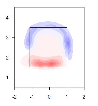
I'm not too confident in drawing any conclusions from this, but it appears that umpires might have gotten better at calling strikes on pitches at the knees.
| Touching Bases | October 07, 2010 |
Searching for Unusual Pitch Selections
Michael Lewis and Bill Simmons have written that "baseball is an individual sport masquerading as a team one." Some have reasoned that this is why baseball lends itself to statistical analysis, but I don't think that's the reason. Sure, some individual sports, like tennis, are great for analysis, but with others like boxing, I wouldn't know where to begin. I believe that what sets baseball apart from other team sports is that it can better be classified as a sequential game as opposed to a simultaneous one.
Basketball, hockey, and soccer are good examples of simultaneous games, as concurrent player interaction makes it extremely difficult to isolate any single event from the play as a whole. Football is difficult to categorize, as there are ten minutes of high-octane game action which I'd call simultaneous play, but the rest of the game involves more discreet decision-making. Play calling lends itself beautifully to analytics. As for baseball, most of the game is played in turns. Each defender positions himself, the pitcher chooses a pitch type and location, and the batter decides whether or not to swing. The rest is a matter of execution.
David Gassko wrote an awesome article using game theory to explore the batter pitcher match-up. In his analysis of pitch selection, he used Brad Lidge as his example. Lidge throws a fastball and a slider. Really good ones at that. His task is to mix his pitches in such a way that the batter cannot gain an advantage by anticipating one way or the other. That mix will depend on the batter (it's often convenient to assume that pitchers have perfect information with regards to the batter; they do not.), the park, the umpire, and a bunch of other stuff. I'm going to focus on the count. The count should only matter in determining the rate at which he chooses to throw strikes. Now, there's strong evidence to suggest that baseball players don't act rationally with regards to the count. Dave Allen has shown that batters swing more often 3-2 than they do 2-2. But most pitchers will follow the count in the sense that they throw more fastballs when they need strikes and mix in their harder-to-control off-speed pitches when they can afford balls. Here is Lidge's pitch mix for his career, data courtesy of FanGraphs.
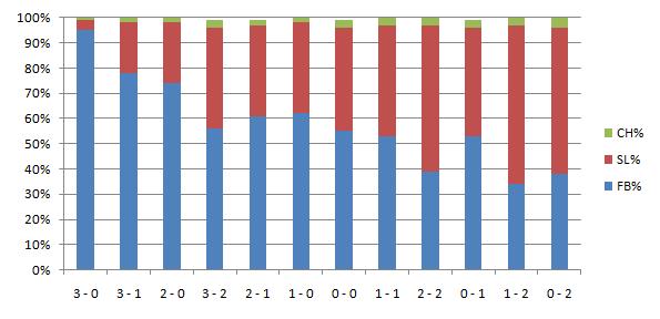
That seems fine to me. I ordered the ball/strike count from from highest run expectancy to lowest, which should theoretically follow with highest fastball percentage to lowest.
A.J. Burnett, like Lidge, mainly sticks to two pitches. He might even adhere more strictly to the count than Lidge. When he falls behind, he refuses to throw a breaking ball. He hasn't thrown a 3-0 curveball since 2008. But when he has two strikes, he relies heavily on it.
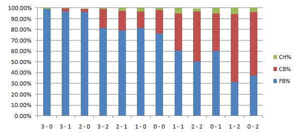
And the best example of pitch selection based almost entirely on the count comes from Tim Wakefield.
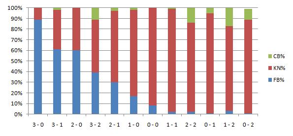
I wanted to find a few pitchers who defy this trend. "Pitching backwards" is a common way to describe such an approach. I looked at a fair number of pitchers, and while some guys depend less on the count in selecting pitches than others, I didn't think I would find anybody who truly "pitched backwards." I e-mailed Rich Lederer, and he suggested I look into Bronson Arroyo. You should too.
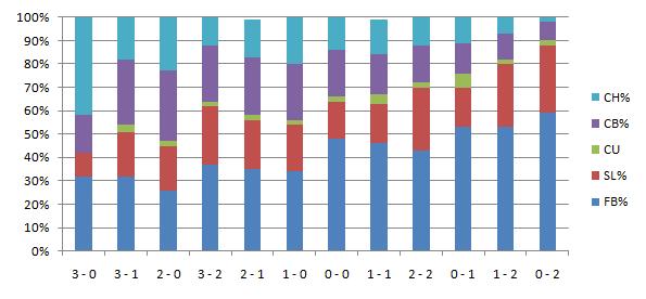
I would guess that something funky's going on here. Arroyo's changeup probably isn't like your normal change. But since 2002, Baseball Info Solutions video scouts have been consistent in calling that pitch -- whatever it is -- a changeup. I don't know what to make of that. Still, how can he throw his curveball 30% of the time on a 2-0 count and 8% on an 0-2 count? Has Arroyo ever given an interview explaining his thought process? Are there any other pitchers at all similar to Arroyo?
The other way that pitchers can defy convention, other than by pitching backwards, is by not following a trend at all. Certain pitchers will only employ a certain pitch in certain counts.
Bobby Jenks has embraced the idea of the "out pitch." He’s a fastball-slider pitcher early in the count. When he gets to three balls, he’ll use the fastball exclusively. But when Jenks gets the count to 0-2 or 1-2, he busts out a curve nearly half the time. He neglects the pitch on other counts, but it’s this huge weapon in these scenarios.
Jenks isn’t alone. Another A.L. Central Closer who embraces his curveball as an out pitch is Joakim Soria. Soria, a four-pitch pitcher, mixes his fastball, slider and change regularly. His curveball, however, he keeps in his pocket until he gets to two strikes at which point it enters the hitters mind.
If you can think of any pitcher whose pitch selection puzzles you, please let me hear them.
| Touching Bases | September 23, 2010 |
Pitching vs. Pitchers
Somehow I got it in my mind that Vicente Padilla was the villain of baseball. Opponents hate him and teammates hate him even more. I'm not really sure how the idea got implanted in there (inception?), but it did, and I began to envision games in which Padilla simply exchanged beanballs with the opposing pitcher. This would go on until Joe Torre brought in Scott Proctor to relieve.
In fact, Padilla has been hit by a pitch once since 2004 and hasn't hit any opposing pitcher, although he does have one of the highest overall HBP rates of all-time. I started thinking whether any pitchers are prone to hitting other pitchers or getting hit themselves and the answer is no. Sure, big fat Joe Blanton has been hit twice this year, but that's only because he's big and fat. Kind of like Padilla. And Chris Volstad has hit three pitchers while having faced 131, which is rather impressive when you think about it. But he's never been hit himself. Unfortunately, I didn't find any evidence of pitcher's retaliating against each other. Still, I had the data, so I looked into how some approach pitching vs. pitchers
Again, I had envisioned Padilla breaking out his eephus pitch against other pitchers and embarrassing them, which would result in nobody throwing him any fastballs. Not the case. To think that there's some "I throw you fastballs, you throw me fastballs" code is rather silly. There's no correlation between throwing fastballs against pitchers and receiving them in return. It's more a matter of good hitting pitchers like CC Sabathia, Dontrelle Willis, Yovani Gallardo, Micah Owings, Mike Leake, Adam Wainwright, and Carlos Zambrano who receive a fair amount of breaking stuff. And for some reason pitchers like throwing Brad Penny junk, even though he can't hit. Jhoulys Chacin is one guy who has proven inept enough with the bat to be fed nothing but fastballs.
Cliff Lee is an interesting case. He's thrown over 100 offerings to pitchers, and all but 2% were fastballs. Furthermore, his fastballs against pitchers have been clocked one mile per hour faster than against regular batters. That means that he's probably not even throwing his cutter against pitchers, but instead only throwing his straight fastballs for easy strikes. The thing is, he's only been average against pitchers, and he's been Cliff Lee against everyone else.
Lee is an exception as a guy who throws his fastball harder against pitchers than others, which might only be the case because I'm including his cut fastballs, which skew the data. Only 10% of pitchers recorded higher fastball velocities against pitchers than otherwise. Roy Halladay has treated pitchers and non-pitchers most evenly. Andrew Miller, Javier Vazquez, Homer Bailey, Felipe Paulino, and Edinson Volquez all ease up a lot on their fastballs when facing pitchers.
Even fewer—under 5%—throw a higher rate of fastballs against pitchers than against non-pitchers, and Andrew Miller is the biggest oddity in that regard. I suppose a bigger enigma surrounding Miller is why he's still pitching in the Majors.
Although Lee throws the highest rate of fastballs against pitchers, that isn't especially exceptional, considering his already high usage of fastballs against everyone (75-80%). Knuckleballer R.A. Dickey throwing nearly half fastballs against pitchers might be the biggest change in approach of any pitcher. I was surprised to learn that Jorge De La Rosa, trusts his fastball 93-plus mile per hour enough to throw to pitchers, dealing it 85% of the time, but in normal situations, he throws it only 59% of the time. Other notable pitchers who throw more fastballs while facing their counterparts: Rich Harden, Edwin Jackson, Edinson Volquez, Pedro Martinez, Ian Kennedy, Ted Lilly, Chris Carpenter, Tim Lincecum.
James McDonald has allowed a .375 OBP against pitchers in his career.
| Touching Bases | September 16, 2010 |
Year to Year Spray Charts
Rich Lederer covered Jose Bautista's home run scatter plot on Tuesday, noting that he has yet to hit one out the other way. Bautista's spray chart this year differs sharply from last year's as well.
Perhaps Bautista's new patterns can be explained through mechanical changes. According to Frankie Pilliere, Bautista is moving his hands through the zone quicker, is starting his leg kick slightly sooner, and opening up on inside pitches.
Still, former teammate Alex Gonzalez, who Rich profiled way back when, also adapted the Blue Jays swing-for-the-fences approach. Can his change in batted ball locations be explained by a new-found approach?
On the other hand, Elvis Andrus is no longer pulling the ball, and has seen his ISO drop to 40 points, the lowest mark in the leagues, and he plays half his games in Arlington.
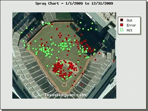
Similarly, Matt Kemp, possibly the most disappointing player in the league this year, evidently hasn't gotten around on pitches. He might have lost speed over the offseason, considering he went from a plus center fielder/baserunner to a guy with right around the worst UZR and stolen base numbers I've ever seen, and maybe he lost bat speed too.
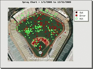
I tend to think of BABIP luck for a batter as a dying quail that drops in for a hit once in a while. He controls where he hits it, but not how often it falls in. I'm beginning to think that I've underestimated the amount of randomness that can effect a batter's spray charts. A split second difference in timing is the difference between hitting the ball well and popping it up or rolling it over or something. Even though Bautista is undoubtedly hitting the ball with more authority, he's probably lucky to have done so. While I think that looking at spray chart differences can signal a change in approach, I would still expect all of these guys to regress heavily to their mean next year, both in terms of performance and batted ball locations.
| Touching Bases | September 09, 2010 |
Another Quantitative Approach to Studying Release Point Consistency
Jeff Sullivan in this very space on January 19, 2006:
We know an awful lot about pitchers. We know how hard they throw, how many batters they strike out, what kinds of pitches they have, and whether their deliveries are fluid and easy or violent and rough. This is all objective and indisputable information that has a lot of value when it comes to projecting a pitcher's future health and success.One thing we don't know much about, though, is the consistency of a pitcher's release point. The fact that we don't have a good way of measuring what's arguably the most important part of being a good pitcher is one of the more ironic twists of modern analysis.
Well, by 2007, PITCHf/x had become all the rage. The data is available now, but I'm not sure how widely release points have been studied.
PITCHf/x estimates the ball's location at a mark 50 feet from home plate. Pitchers often shift their spot on the rubber, resulting in variations of the horizontal component of the release point. This doesn't doesn't necessarily mean that the pitcher isn't repeating his delivery, though. Therefore, I decided to only look at the vertical component. Furthermore, some pitchers use different arm slots for different pitch types, and curveballs have a higher initial trajectory than fastballs. My methodology was the find the standard deviation of a pitcher's vertical release point for the fastest 20% of his pitches. Since cameras are calibrated ever so slightly differently in every ballpark, and even in every series to some extent, I looked at pitchers at both the season and game level.
While intuitive reasoning would suggest release point consistency is automatically a positive, I didn't immediately notice anything that would allow for such a broad claim. Still, I did see how release point consistency correlates with some other things.
Pitchers with lower arm slots have more trouble with release point consistency. This makes sense because pitchers with low arm angles tend to be less skilled and practiced than more traditional over-the-top pitchers. The sidearm motion could be naturally harder to repeat. It could also be a PITCH/x issue. Higher variance in release points coincide with higher variance in movement and velocity as well.
On to some examples. Javier Lopez, a sidearmer, is the worst at maintaining a consistent release point.
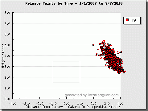
Perhaps he's changing his arm slot intentionally. Jose Contreras has been an effective pitcher who deals from multiple release points. Unlike Lopez, though, Contreras has separate, consistent release point clusters, which makes it easy to see that it is part of his approach.
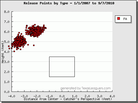
And now for something different, Alberto Castillo:
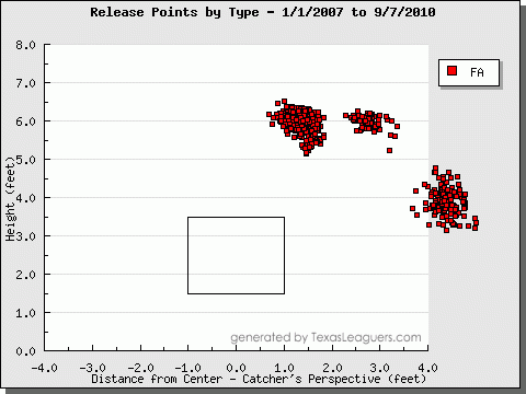
David Huff is a good example of a pitcher who has a very consistent release point.
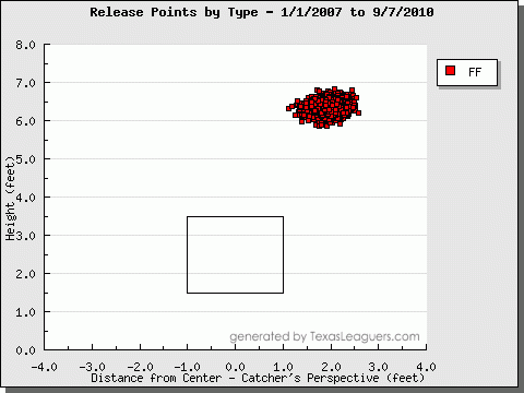
In fact, Frank Viola said in 2009, ""Huff has textbook mechanics. Everything is right there. His release point is consistent with all his pitches."
Chris Carpenter and Kevin Slowey have consistent release points, too.
| Touching Bases | August 24, 2010 |
Contrasting Swing Zones
One of my favorite players in baseball is a gritty corner outfielder who plays for my hometown team, and although fans derided him as a backup during the off-season, he's proven the doubters wrong so far by playing in 116 games in spite of his lack of power and ridiculed style of hitting. I decided to compare him to Brett Gardner.
What you see above are the players with the highest swing rate in the league (60.9%) and the lowest (31.1%). The contour lines indicate the area inside which each batter is 50% likely to swing at a pitch. This means that a pitch that might hit Jeff Francoeur's knee, and he's as likely to swing at it as a pitch right down the pipe to Gardner.
These graphs are all from the catcher's point of view, and the handedness of the batter is indicated by which side his name is on.
Finding players who have the biggest and smallest swing zones is the easy part. What about inside/outside? For interesting left-handed hitters, that's Andres Torres and Justin Morneau who differ most sharply.
As for righties, Michael Young and Shane Victorino are notable. Victorino, like Torres, is a switch-hitter, but I only included pitches when they were batting from the relevant side of the plate.
I was surprised to learn that Colby Rasmus extends his 50-50 swing zone a foot below the strike zone. Ronny Paulino hits from the opposite batter's box which makes his zone appear shifted, but it's actually very similar to that of Rasmus, but shifted a foot up.
And the only player to compare to Pablo Sandoval is himself.
| Touching Bases | August 19, 2010 |
On Count-Based Linear Weights
Ever since the work of Joe P. Sheehan, pitch-by-pitch run values have been a staple of PITCHf/x analysis. More recently, Bloomberg analysts Craig Glaser and Pat Andriola really got me thinking about what these values might mean.
We all know that Cliff Lee's walk rate is otherworldly. But last week, Jeff Sullivan wrote, "Of the 201 pitchers in baseball with at least 50 innings pitched, Lee's three-ball count rate is lower than 67 individual walk rates." That is an awesome piece of information. Let's say you have a pitcher who somehow manages a walk rate identical to Lee's, and we can say he has the same strikeout and home run rates too. But what if we knew that this pitcher had, say, twice as many three-ball counts as Lee. They may have been of equal value, but surely Lee projects better going forward.
FanGraphs has a whole assortment of what they call plate discipline stats. In essence, these stats are trying to separate the process from the results. A pitcher has a high strikeout rate. Does he throw a lot of strikes or does he induce out-of-zone swings? A batter has a high strikeout rate. Does he never swing or does he never make contact?*
*To those who do such things, please don't use contact rate to predict strikeout rate.
Here's where count-based linear weights come into play. Everything that happened before the result of a plate appearance can be summed up best by the count. A pitcher who walks nobody has better process if he never even goes to three-ball counts, like Cliff Lee.
Using Retrosheet data since 2002, I found the expected run value of the final pitch of every plate appearance, excluding intentional walks. So if a player homers on the first pitch of an at-bat, that goes down as 0 runs toward his count-based linear weights. In turn, a pitcher will have a worse score if he walks a batter on a 3-0 count than a 3-2 count. Here are the values straight from Joe's article. Harry Pavlidis and others have used updated values.
Count  Runs/PA
3&0    0.207
3&1    0.137
2&0    0.097
3&2    0.062
2&1    0.035
1&0    0.034
0&0    0.000
1&1   -0.016
2&2   -0.037
0&1   -0.043
1&2   -0.083
0&2   -0.104
Barry Bonds and Curt Schilling stand unparalleled in getting into quality counts. Angel Berroa and Kirk Rueter not so much. Players who get into good counts but have bad results more often than not are burned by BABIP.
As for the top and bottom performers of 2009, here are the hitters:
| Player | PAs | Total lwts | Count lwts |
|---|---|---|---|
| Chipper Jones | 577 | 9.5 | 11.1 |
| Lance Berkman | 546 | 24.6 | 8.7 |
| Albert Pujols | 665 | 59.0 | 8.6 |
| Adrian Gonzalez | 657 | 35.8 | 8.2 |
| Nick Swisher | 655 | 15.6 | 7.7 |
| Ivan Rodriguez | 447 | -20.8 | -10.9 |
| Jose Lopez | 642 | -5.8 | -10.9 |
| David Eckstein | 553 | -16.4 | -10.9 |
| Miguel Olivo | 414 | -1.8 | -11.1 |
| Clint Barmes | 607 | -10.9 | -16.1 |
And the pitchers:
| Player | PAs | xFIP | Count lwts |
|---|---|---|---|
| Cliff Lee | 1103 | 3.69 | -20.9 |
| Roy Halladay | 962 | 3.05 | -20.8 |
| Justin Verlander | 968 | 3.26 | -19.6 |
| Johan Santana | 689 | 4.13 | -16.6 |
| Cole Hamels | 885 | 3.69 | -16.1 |
| Kyle Davies | 532 | 5.12 | 4.8 |
| Doug Davis | 871 | 4.68 | 5.1 |
| Joe Saunders | 837 | 4.8 | 5.2 |
| Trevor Cahill | 764 | 4.92 | 5.2 |
| Zach Miner | 405 | 4.86 | 6.1 |
After spending some time with the data, I've unfortunately yet to find much predictive power in the metric, beyond what we can get out of normal peripheral stats. Nevertheless, I think there's value to a count-based linear weight as a DIPS-type metric for pitchers.
| Touching Bases | August 13, 2010 |
Prince or Hall vs. Paul?
Paul Maholm was recently named the most underhyped player in baseball. Perusing his opposing batter history on Baseball Reference, I could see why some would think he was underhyped. Prince Fielder has a .071/.152/.071 line against Maholm in 46 career plate appearances. On the other hand, Bill Hall, sporting a .581/.639/1.032 clip in 36 PAs, probably doesn't really see what all the fuss is about. So who would you rather have against Paul Maholm?
Going by The Book, first we look at career numbers to get the largest possible sample. Better yet, we can look at a projection system, which distills those career numbers, adjusts them for age and weighs them by season. ZiPS projects Fielder at a .401 wOBA and Hall at a .302 wOBA. Fielder is a superstar while Hall is a utility man. We've got that out of the way. So how to explain the Maholm divide?
The Book says to next look at platoon splits. Fittingly, Hall and Fielder have identical .348 wOBAs against southpaws. Furthermore, Maholm has a massive career platoon difference of 100 points in wOBA. That closes the gap, and that's about as far as The Book goes. To get the rest of the way there, I thought PITCHf/x might come in handy, so using movement, velocity, and location as my inputs against LHPs, I tried to predict their success against Maholm's offerings.
Maholm throws both his two-seam and four-seam fastballs around 88-90 miles per hour, and throws them on just over half of his pitches. His two-seamer has better movement in my opinion, and has certainly achieved better results, yet interestingly, he throws it less often to same-handed hitters. I'm not sure this is a wise move overall—he might be handicapped by wanting to throw his two-seamer only to his arm side—but against Prince Fielder, his choice of fastball has certainly paid off. I grabbed 1,000 fastballs against Fielder from LHPs and plotted Fielder's success (RV100) by pitch movement. I also added lines to indicate the average movement of Maholm's two fastballs.
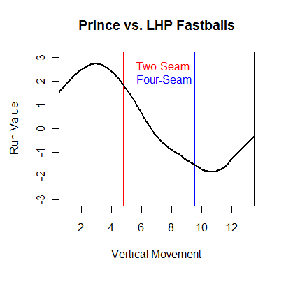
Fielder is above average on risers but below average on sinkers. Movement is not the only reason that Maholm's four-seam fastball stifles Fielder. The location of Maholm's four-seamers also coincides with Fielder's weakness
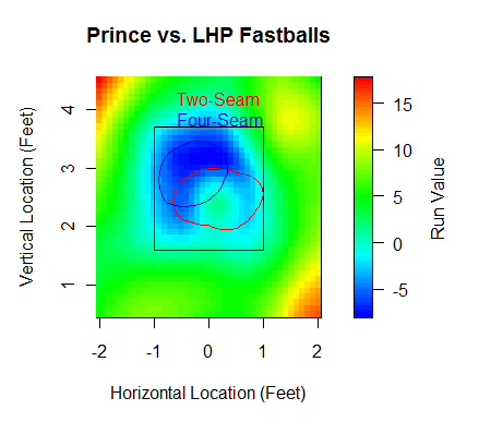
In fact, Fielder has swung at 23 Maholm four-seamers. All but five he has either fouled off or swung through. As for the five he put into play, all of them were grounders, and only one was a single. Two were double plays. So to sum up, Maholm uses his four-seam fastball a lot facing lefties, and it just so happens that said fastball matches up perfectly against Fielder.
Furthermore, Maholm's slider, his best pitch, is death on Fielder, and LHBs in general. However, Maholm only uses his slider 7% of the time against righties. Instead, he takes the changeup out of his pocket and also uses the curve a bit more. But his changeup isn't as good a pitch as his slider, even when accounting for the platoon differential. And against Hall, Maholm's choice of off-speed pitches is asking for trouble.
Maholm's changeup comes in at 83, his slider at 80, and his curve at 73, and they follow the PITCHf/x spectrum of movement. His changeup is in the top-right quadrant, dropping the least out of his off-speed pitches and moving the most toward his arm side. His slider is right near the origin, with average values of 0 inches in horizontal and vertical movement. And his curveball is diametrically opposed opposed from his changeup, as it breaks down and in towards righties. Conventional wisdom and PITCHf/x analysis both say that the slider has the largest platoon split of all off-speed pitches, so perhaps Maholm is right to scrap it against righties. But Hall apparently isn't a normal righty. Against off-speed pitches, here is how he does based on horizontal and vertical movement:
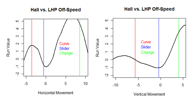
The troughs in both charts appear in the areas where Maholm throws his slider. This means that sliders might be the best pitch to throw Hall. There's room inside to throw the slider, and he's also willing to chase them in the dirt when LHPs try to backfoot him. But Hall destroys offspeed pitches left out in the zone.
Hall has been thrown twelve curves from Maholm. He swung at three of them, connecting for two singles and a double. He was also hit by one of them, and most of the rest went for balls. Hall's put four changeups into play, good for a groundout, a single, a double, and a home run. Again, most of the rest were balls.
Prince Fielder is soon to sign a contract worth over $100 million, while Bill Hall might be out of baseball in a year. Yet in certain contexts, Hall might be the better player. Given both batter's substantial platoon split, and more importantly the large platoon split of Paul Maholm, you could project Fielder and Hall to hit Maholm equally. And digging deeper, it is evident that Maholm's strengths match Fielder's weaknesses and Maholm's weaknesses match Hall's strengths. The case can be legitimately made that Bill Hall projects to be a better hitter than Prince Fielder against Paul Maholm.
| Touching Bases | August 12, 2010 |
WAR and the Rule 5 Draft
The Rule 5 Draft dates back over a century, and Retrosheet has a fair chunk of Rule 5 data. The Rule 5 draft as we know it began somewhere around 1965, so I took all drafted players since then and their WAR in the following years. As it turns out, the Rule 5 Draft is a market for more-or-less freely-available replacement-level talent.
Most years, 80-90% of one-time Rule 5 picks either don't play or accumulate 0 WAR. That means that in the first year after being drafted, 35% don't play, while 55% occupy a Major League roster and play at replacement level. Five years removed, 70% of Rule 5 picks aren't playing, but at least most of those who do are competent Major Leaguers.
Many Rule 5 picks don't play for the team that drafted them. For example, Bobby Bonilla was a Pirate before he was taken by the White Sox, but he was traded back to Pittsburgh before he became Bobby Bonilla. Johan Santana was drafted by the Marlins, but that was only in a pre-arranged swap of picks with the Twins. And Josh Hamilton played only a year for the Reds, yet that in turn was only because the Reds were able to buy him from the Cubs, who had selected him in the Rule 5 Draft.
Only 14 players have amassed 2 WAR the year after they were taken. Doug Corbett picked up a whopping 5.9 WAR. Ted Abernathy, 10 years into his Major League career, was somehow a Rule 5 pick, and he quickly had the best year of his career at 5.6 WAR, finishing 20th in MVP voting. After that, the familiar faces of Joakim Soria, Dan Uggla, and Josh Hamilton made the most immediate impacts. 14 players have been drafted twice, and Shane Victorino is the most successful.
The Twins have been the best drafters, and that doesn't even count their trade for Santana. Minnesota was the team that got that value out of Corbett, and the Twins also sapped all the talent out of Shane Mack after selecting him in December of 1989, which you can see from the table below.
| Year | Age | Tm | Lg | PA | WAR | Salary |
|---|---|---|---|---|---|---|
| 1987 | 23 | SDP | NL | 267 | -0.2 | $62,500 |
| 1988 | 24 | SDP | NL | 140 | 0.7 | $73,500 |
| 1990 | 26 | MIN | AL | 353 | 2.5 | $105,000 |
| 1991 | 27 | MIN | AL | 489 | 4.9 | $270,000 |
| 1992 | 28 | MIN | AL | 692 | 6.0 | $1,075,000 |
| 1993 | 29 | MIN | AL | 553 | 1.1 | $3,050,000 |
| 1994 | 30 | MIN | AL | 347 | 4.0 | $3,250,000 |
| 1997 | 33 | BOS | AL | 146 | 0.7 | $1,850,000 |
| 1998 | 34 | OAK | AL | 2 | -0.1 | $450,000 |
| 1998 | 34 | KCR | AL | 229 | 0.2 |
The Pirates have seemingly been pillaged by the Rule 5 draft, but again, they were able to reclaim Bonilla, which offsets some of their losses. The real question is, why didn't the Pirates protect Bonilla in the first place? They took another hit when they let Bip Roberts go. The Pirates had drafted Roberts twice, and were able to sign him when they used their first-round pick on him the second time, but he was plucked clean by the Padres, and went on to develop into a nice player. The Diamondbacks, in their short time, have only had a handful of players taken from them, but those include Dan Uggla and Luis Ayala.
The Giants and Red Sox have made about 20 Rule 5 picks each, and have had 0 pan out as players, unless you want to count Javier Lopez. I don't. In fact, many teams have gotten no return from the Rule 5.
Evaluating a Rule 5 pick is in parts straightforward. The drafted player will make the league minimum salary. $50,000 per selection is $50,000. The tricky part is how much value to place on losing the flexibility of a 40-man roster spot. Most Rule 5 picks never become more than replacement level, especially not in that first year when they're guaranteed a roster spot. I'd say that five players a year are, or become, better than replacement level, while 15 picks are made per year. So if a team covets a player, using a Rule 5 pick on him can be worth the while, but 10 picks in, teams are just as well off passing on their selections, which they often do. I don't see any hidden value in the Rule 5 Draft. I struggle to even see the purpose of this outdated draft model. A boring draft makes for boring analysis.
| Touching Bases | August 05, 2010 |
Does Pedigree Matter?
Ben Zobrist was a sixth-round pick who had done nothing special in the first three years of his Major League career, but then put up one of the best seasons in baseball in 2009. Ryan Zimmerman, the fourth overall pick of the 2005 draft, put all the pieces together and became one of the best players in baseball in 2009. We perceive them differently mainly because Zimmerman is a much better player, but the point I'd like to make is that their original draft status--their pedigree--also factors into how we think of these guys. Should it affect our projections going forward?
Projections are hard. Instead, I broke players into three groups depending on whether they surpassed their previous year's WAR, fell short of their previous year, or they didn't play at all. Data courtesy of baseballprojection.com. And using Retrosheet, I broke players' pedigrees into five grades. Top 10 draft picks, rest of the first round, second-third rounds, third-tenth rounds, and anything after that.
As you can see below, from the first year in the Majors to the second, first-round draft picks (the As and Bs) have a much higher improvement rate than lesser prospects.
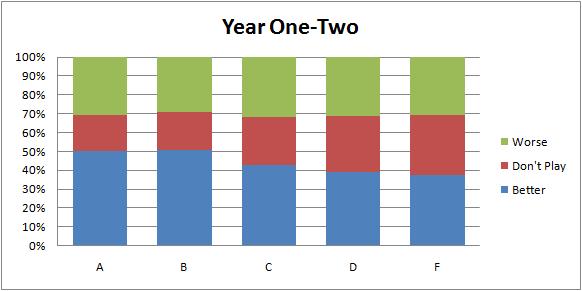
There are a lot of things going on here. First of all, The better prospects are younger, and are therefore more likely to improve. Also, The better prospects are given more leeway to fail, so there is a much lower percentage who do not play in the subsequent year. And yes, I think that at this point, they are probably better players than their counterparts, production being equal.
How about year two to year three?
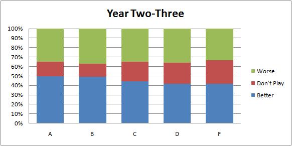
More of the same. Higher pedigree players are still improving at a higher rate.
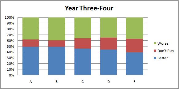
This effect is starting to appear consistent. Let's keep going.
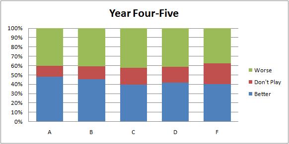
We need until the fifth year to see pedigree becoming negligible.
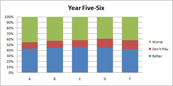
Controlling for the quality of the player by creating a projection is necessary to make any conclusions. Nevertheless, I think the matter warrants further consideration. Projection systems are sometimes built to use data as far back as college, but I haven't heard of any that include draft position, really the only prospect grading system for which there is a large volume of discrete data. A draft pick provides a snapshot of what up to 30 MLB teams all with presumably independent and sophisticated thought processes thought of a single player at a single time. That picture fades, but even when a player makes the Majors, it's still part of his history.
| Touching Bases | August 03, 2010 |
| Touching Bases | August 03, 2010 |
Velocity and Height
Although tall pitchers have the advantages of long arms and long strides, there is a larger player universe of shorter pitchers, so shorter pitchers compensate with other attributes. Therefore, one would expect there to be little correlation between height and fastball velocity for Major Leaguers. I took the top 10% fastest pitches for each pitcher 2008-2009, and found little relationship between velocity and height.
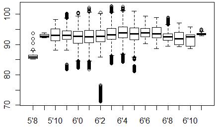
Clearly, that's Wakefield who is the only pitcher unable to reach 80 MPH. Only pitchers between 6 feet and 6'6" have hit 100, which I suppose is interesting.
The inherent advantages of being tall are masked by looking at things this way. Still, I thought that I would be able to find some sort of height benefit by looking beyond raw velocity. I was wrong.
My idea was to look at the difference between the velocity normally estimated at the 50-foot mark by PITCHf/x cameras and the velocity estimated at home plate. Hypothetically, I thought, tall pitchers should release the ball closer to home plate than shorter pitchers, and therefore there should be a smaller difference between the starting and ending velocity of such a pitch. The data didn't back that up, and the more I think about it, the less the hypothesis makes sense.
I tried to fit a model using height, velocity, release point, and spin to predict the drop in velocity from start to finish. Kei Igawa lost the least velocity, and Igawa's been known in his brief time for an extremely long stride, while Shaun Marcum lost the most velocity, and I was able to find some research showing he had a short stride. Yet I think the list is mostly random.
If two objects, acted upon by different forces, are traveling at the same velocity at any given point with the same atmospherics, then the original point of impetus shouldn't really make a difference in their rate of deceleration. So unless a pitcher is releasing the ball within 50 feet, I think the initial velocity is the only PITCHf/x recording one needs, and height doesn't matter with this type of data.
Be sure to check out Eric Seidman's work on perceived velocity.
| Touching Bases | July 29, 2010 |
The Bridge to Mariano
Once upon a time, there was a man named Jeff. A man named Jeff and a man named Joe. Well, maybe you already know how the story begins.
The Great Mariano Rivera, the Hammer of God, had been banished to the bullpen, a failed starter. But John Wetteland welcomed him with open arms.
“You hand the ball to Buck,” Wetteland explained. “And Buck hands the ball to me.”
“Thank God for that,” said Mo.
But on October 8, 1995, Game 5 of the ALCS, Mariano handed the ball to Buck, and Buck handed it to Jack McDowell.
A man named Jeff. Jeffrey Allan Nelson had an idea. And a man with an idea is a powerful thing. Nelson was sitting in the Mariners bullpen during this, the first night of the Yankees Dynasty. Instead of celebrating his team’s victory, Nelson lost himself in thought. If only Wetteland had followed Mariano. What if bullpen roles were rigidly defined? No way would the Yankees give up runs! Bullpen roles so defined that the Yankees can forfeit wins by adhering to meaningless statistics used only in rotisserie leagues, arbitration cases and in deciding the Rolaids Relief Man Award!! Mmm, Rolaids.
Within a month, Joe Torre replaced Showalter as Yankees manager. Another month, and Nelson was shipped to the Bronx. The rest, as they say, was history, as they say.
In 1996, Nelson pitched in a team-leading 73 games, Rivera became the best reliever in baseball, and the Yankees won their first World Series in 18 years. And Wetteland won his Rolaids Relief Man Award.
But Wetteland left New York, and here’s where the story gets interesting.
Jeff pitched his plan to Joe.
Step 1: Assemble the best group of position players and starting pitchers in baseball so that the bullpen doesn’t really matter.
Step 2: Install Rivera as closer, ensuring a dominant bullpen.
Step 3: Build a fucking bridge.
And so it was. Joe Torre commissioned the building of a bridge. The Bridge to Mariano. Jeff was the architect, but he recruited his childhood friend Mike Stanton to help him build. Together, alternating shifts, they built the bridge. And what a bridge it was. It had aqueducts and arches and triangles and suspensions and all that stuff that makes bridges not spectacularly collapse. Quieter than the Bridge on the River Kwai. More flip than the Flipper Bridge. It was the most important bridge in the history of bridges. From 1997-2000, Stanton pitched to a 4.17 ERA and Nelson pitched to a 3.08. Their pitching was fine, and not much was made of it at the time. But what a bridge! How can you blame them for being pedestrian relievers when they were so busy building a fucking bridge?!?
Alas, in 2000, Jeff was passed over from the All-Star team by Joe, and upon leaving the Yankees, Nelson bitterly decreed, “Tear down this bridge.” Mariano was left bridgeless.
“Thank God for that,” said Mo.
The Yankees Dynasty crumbled with the departure of Nelson. Who could have known that the guy pitching 70-80 slightly leveraged innings per year could have been so influential? But as it turned out, Jeff was more than baseball. Jeff had pioneered, engineered and maintained the Bridge to Mariano. And Jeff left the bridge in ruins.
Upon Jeff’s departure, trolls could be seen patrolling the remains of the Bridge to Mariano. Yes, the trolls were the only ones who had realized the importance of the bridge. To the trolls, Jeff had been more than a decent relief pitcher. Old Nellie had also been blessed with the ability to try to pick a runner off first when there was already a runner on third! The gall! The ingenuity! There was once a dream that was the Yankees Dynasty, the trolls thought. And we fear that it will not survive the offseason. The trolls sought the bridge’s resurrection.
The Yankees acquired better relievers in those later years, having led the Majors in WPA in the decade since, but nary a relief man could pay the troll toll. Not a Flash, not a Proctor, not even the Rules Joba could recreate the Bridge to Mariano. For Farnsworth’s fastball flew forever straight. The eighth inning! And the dulcet melodies of the rotation beckoned Hughes. The eighth inning! Who can be the bridge to Mariano? The eighth inning!!
Years from now, when the Yankees struggle to find Mariano’s successor; most fans will miss the Greatest Closer of All-Time. But let this serve as a reminder; the trolls were right. Bullpen is principal to victory, yet Rivera was never key to the bullpen. It was always the Bridge to Mariano.
So we march on, analysts against the trolls, traversing an endless bridge to nowhere.
| Touching Bases | July 26, 2010 |
Working Hard or Working Fast?
"The wrong way, but faster." Max Power
I could point to a dozen articles discussing the varying shapes and sizes of the strike zone, but when my friend Don asked whether umpires really change their zone depending on the score, I drew a blank. Factors such as the identity of the pitcher and the ball-strike count influence an umpire's process, but only so that he can do the job to the best of his ability. Yet for some reason, it's been casually accepted by some that umpires might be so unprofessional that they call a larger strike zone in a blowout to quicken the pace of the game.
Fortunately, this assertion is not backed up by any evidence, as umpires appear to call consistent zones depending on the score. Below, I plot the 25%, 50%, and 75% contour lines for called strikes based on four different score differentials. The zones are jumbled and mostly indistinguishable, so, on the whole, umpires do not call to the score.
Perhaps there are some umpires who regularly schedule early dinner reservations, but the only ump I'm willing to openly critique is the only umpire who invites such criticism: Joe West.
I graphed West's strike zone at the point where he is equally as likely to call a strike as he is a ball. I also dug up the two Red Sox vs. Yankees games that West umpired, and plotted those ball/strike calls. West, you may remember, publicly denounced the length of these games. However, I found no evidence of bias. If anything, West has squeezed batters in Sox/Yanks games and batters in blowout games (blue line).
Umps aren't alone in being accused of unprofessionalism. Weeks ago, Patrick Sullivan* questioned the commonly-held wisdom that players try to get out of the ballpark ASAP during getaway games. It's hard to believe that batter would swing at bad pitches just because they're playing in the final game of a series, but that's what I checked for.
*You can follow Sully on Twitter, if only to observe him incessantly hound the insufferable Boston media. For example, "Shaughnessy on May 9: 'Beltre is emerging as an Edgar Renteria or Rasheed Wallace, take your pick.'"
| Getaway | Rest of Series | |
|---|---|---|
| Time | 2:56:27 | 2:55:15 |
| Day Game | 68% | 14% |
| Innings | 9.20 | 9.16 |
| Runs | 4.54 | 4.67 |
| Hits | 8.94 | 9.03 |
| Errors | 0.60 | 0.60 |
| P/PA | 3.83 | 3.81 |
You'd be hard-pressed to find statistical evidence that umpires and players sacrifice quality for expediency.
| Touching Bases | July 20, 2010 |
How Does Time on the DL Affect Fastball Velocity?
Rotobase's injury database contains disabled list data dating back to 2002. Incidentally, that is as far back as FanGraphs carries Baseball Info Solutions' velocity data. So my question is, how long does it take a pitcher to get back up to speed?
First, I've plotted the number of days a player spends on the DL against the difference in velocity between the month he was put on the DL and the month he returns.
Joe Martinez, returning from three hairline fractures caused by a line drive off his skull, displayed the biggest jump in velocity, as you can see in the 2009 section of this graph.. And Brad Penny in 2008, who was plagued with tendinitis in his right shoulder, took the biggest hit of any pitcher, as demonstrated here.
To the point, there's no correlation between the two variables. That's not to say that the severity of an injury has no bearing on fastball velocity-it most certainly does. It means that the sampling biases in this study may overwhelm the effects of an injury. No pitcher will return to Major League Baseball if his injury is too debilitating. The pool of players who do return from injury is strongly biased towards those players who were not cripplingly injured. Even so, perhaps pitchers continue to show effects after they return from the DL to the Majors. Below, I present a table showing the average difference in fastball velocity between the month he hit the DL and all subsequent months after coming off.
| Return Month | Velocity Difference |
|---|---|
| First | 0.02 |
| Second | 0.07 |
| Third | 0.23 |
| Fourth | 0.41 |
Velocity increases the further removed a pitcher is from the DL. Players are continually recovering. Still, velocity is generally higher in months after hitting the DL than the immediate month before. What about if we look at the month before that. If a player was on the DL from June 1 to June 30, then how did he throw in April as compared to July?
| Return Month | Velocity Difference |
|---|---|
| First | -0.20 |
| Second | -0.12 |
| Third | 0.07 |
| Fourth | 0.12 |
Not surprisingly, this shows that pitchers exhibit symptoms of injury (diminished velocity) in the immediate month prior to hitting the DL more so than in the preceding months.
This effect was exacerbated when I looked at pitchers recovering from Tommy John surgery. Because recovery from Tommy John takes over a full year, this was the only time that I used data from different seasons for a single pitcher, but I still identified over 50 cases where a pitcher recovered from TJ.
| Return Month | Before (1) Difference | Before (2) Difference |
|---|---|---|
| First | -0.12 | -0.51 |
| Second | 0.08 | -0.29 |
| Third | 0.41 | -0.02 |
| Fourth | 0.26 | -0.15 |
Tommy John alumni pick up velocity the longer they are allowed to stay in the Majors. But most of them do not find the velocity they had in the months before the surgery.
Back to the original 826 players who made the trip to and from the DL in a single year. The injury database is set up in such a way that there are many binary variables indicating whether the injury was to this body part or that, so what else to do but run a linear regression? Nothing was statistically significant, but upper arm injuries seem to exhibit the greatest negative effect on velocity.
Methodological Details:
FanGraphs provides monthly velocity splits, so, for every pitcher who hit the DL, I found all the months they pitched before coming off the DL and all the months they pitched after going on the DL. So if a pitcher's stint was from June 15-July 15, I used his June month as before (1) and his July month as return (1). May and August would therefore be before (2) and return (2), respectively. If a pitcher was on the DL from June 5-June 25, then I excluded June, and used May and July as the before and after months. I adjusted each pitcher's fastball velocity reading by the month and by his team. More pitchers go on the DL in April than come off it, which could have skewed results, as seasonal temperature effects could throw off velocity by a full MPH. So the two Chicago teams and the Indians were bumped up nearly a percent in fastball velocity in April, while the Angels in July were knocked down a bit, for example.
Again, thanks to Rotobase and FanGraphs.
| Touching Bases | July 15, 2010 |
Stuff of the Futures
One of my favorite qualities of the incredibly rich PITCHf/x data is that it allows one to analyze a small sample and draw some substantial conclusions about a pitcher. Harry Pavlidis has been publishing his Arms of the Week series for some time, and he's already taken a look at the southpaws of the Futures Game. Twenty-four pitchers unveiled their stuff to a world-wide audience on Sunday, and here's what I got.
When I say that conclusions are there for the drawing, I mean that with a guy like Tanner Scheppers, whose fastball reads 98 miles per hour, we can comfortably say that he could fit right in with the Rangers' bullpen. The Rangers, to their credit, want Scheppers to start, but he's got the classic power fastball you see from late-inning dynamos like Jonathan Broxton, Brian Wilson, and Daniel Bard. Scheppers flashed a breaking pitch twice, which was very solid. As a starter, he profiles as A.J. Burnett 2.0.
Scheppers was the most impressive, whereas Jeremy Hellickson was the most important. Hellickson is breathing down the neck of Wade Davis, and his performance did little to quell the fears of the Rays' fifth starter. Reportedly a pitcher who sits 91-93, Hellickson was able to work at 93-94 with average movement on his fastball. He probably was dialing it up a bit for his brief stint in the limelight. There have been reports that he's been tinkering with a two-seam fastball, and he might have thrown a couple, but I'd say it's his weakest pitch, unless it is used exclusively to same-handed batters. His breaking pitches were fine (he throws two types of curves), he didn't show his cutter, and I try to stay away from analyzing the effectiveness of changeups based on velocity and movement (his was an 84-MPH straight change).
The next-best prospect who pitched was Julio Teheran. He showcased his 96-MPH four-seam fastball, which should be a plus pitch. His breaking stuff is advanced enough that it's easy to see why he would be dominating the low levels of the minors. I'd guess his perfect-world comp would be Josh Beckett.
Henderson Alvarez of the Blue Jays is currently starting, and impressing, in High-A, but to me he profiles more as a right-handed reliever. His best pitch appears to be a sweeping low-80s slider, and his hard fastball runs away from RHBs, so unless his changeup develops into something, Alvarez looks like a sinker/slider guy out of the pen.
Simon Castro has a good enough slider, but his fastball lacked luster. A 91-MPH tailing fastball will get hit in the Majors, so he'll need to cut down on his walk rate. He pitches with very little separation between his fastball and his change.
The Rays' Alexander Torres displayed some strong stuff, but he obviously has trouble commanding it, with a career Minor League walk rate above five per nine. His boring fastball ran 94-95 and he threw one breaking pitch with serious life. Unfortunately, it sailed a foot high. Very similar pitcher to Gio Gonzalez for me.
Trystan Magnuson's best pitch is a cut fastball that comes in at 88, moving across the plate. He also throws a split-finger fastball at 88. And his actual fastball is only a bit harder at 92-93, which makes for a unique repertoire. I don't know how much success it'll have.
What exactly is Anthony Slama the future of? He's 26 years old and he strikes guys out in relief. Fastball, slider, change. He'll destroy righties, but I don't think he'll ever be a closer/setup guy due to his projected massive platoon split.
Jordan Lyles' off-speed stuff has developed past his limited fastball. His changeup dives away from lefties, his slider can neutralize righties, and his curve will most definitely play. But it's telling that in a game where he had to throw a total of 15 pitches, only six of them were fastballs. They say pitching backwards can work in the N.L. Central, though.
Bryan Morris threw exactly one pitch, and oh what a pitch it was. 93.3 miles per hour. Bad movement. 0.38 StuffRV/100. Thanks for coming.
I like Mike Minor. Renowned as a collegiate, command, polished, you might as well say crafty, lefty, he came out with a surprisingly strong fastball. 93 with life. He threw changeups as his other offering, neglecting to toss in a breaking ball.
Stolmy Pimentel's pitch of note is his curve. Thrown at only 72 miles per hour, it moves nearly a foot across the plate, but doesn't drop much at all. Bronson Arroyo has a curveball like that in his arsenal, but not many others do.
Zach Britton threw only fastballs and sliders, but both of those pitches are more than big league ready. He has a hard, heavy sinker that will give lefties nightmares, can add some velocity with his four-seamer, and he boasts a true slider. You just don't see a left-handed pitcher with that biting slider and power fastball too often, and when you do, he can dominate. I think Britton's a stud, and the strikeouts will come.
Shelby Miller's got a live arm, and if you didn't know about his 95-MPH rising fastball, now you do.
Hector Noesi has been terrific this year, with a 6.35 strikeout-to-walk ratio in the minors. One of many Yankees between A and AA dominating the competition. His stuff, highlighted by a 93-MPH heater, does profile as a back-end guy, but that doesn't mean his impeccable command can't pull him to the front end.
Philippe Valiquette might have been throwing two types of fastballs. He might not have been. Tune in next time to find out. Why was this guy pitching in this game? Bleh.
Jeurys Familia dialed it up to 98. I'm very surprised to see that he's a starter in the minors, considering. At 20 years old, he can afford to throw one off-speed pitch out of a dozen offerings. Lots of time to work on that secondary stuff and that command. For now, that velo will do.
Zach Wheeler, a 2009 draft pick, throws hard, and he threw a single changeup with extreme movement. Very good changeup. He didn't get a chance to use his curve, which he called his out pitch last year.
Christian Friedrich threw three fastballs, and that was it. It was a rising fastball, and you never know how that will play in Coors.
Eduardo Sanchez also threw nothing but fastballs. A couple ticks harder than Friedrich, but he doesn't have the advantage of being left-handed. The most interesting note about Sanchez is that he was born a week apart from me. Therefore, I will pretend to be his distant cousin in order to obtain free access to Redbirds games. He will gain more from our relationship than I ever could.
| Touching Bases | July 13, 2010 |
Testing Outfield Arms
Over at The Hardball Times, John Walsh used to write one of my favorite pieces of the year; a ranking of the game's best outfield arms. Walsh would find every outfielder's "kill" and "hold" rates in five distinct situations. Walsh has taken a hiatus from the exercise this year, so I'd like to pick up on the research, adding Gameday's hit location data to the mix.
Walsh has already covered 2008, yet I've chosen to use both 2008 and 2009 data in my study. The hit location coordinates provided by Gameday make it difficult to decipher the exact distance of a ball to the outfield. But the batted ball angle relative to home plate can be calculated. Fortunately, Walsh outlined two parameters in which distance is more or less immaterial, and only the angle matters.
1. Single with runner on first base (second base unoccupied).
2. Single with runner on second base.
All singles land somewhere in front of the outfielder. And it turns out, the success of the base runner depends little on whether the outfield single was a grounder, a line drive, or a fly ball.
Excluding all two-out plays, I found the rates at which base runners advanced or were thrown out attempting to advance, depending on the batted ball angle.
On singles directly at the left fielder, base runners attempt to advance first to third only 5% of the time. Right at the center fielder, base runners risk it 15% of the time, and 25% of the time on balls to the right fielder. 40% in the left-center gap and 60% in the right-center gap. These figures coincide with how often balls are hit to each location, meaning that outfielders align themselves sensibly. What doesn't make sense is that runners are thrown out trying to advance on balls to center as often as they're thrown out trying to advance on balls to right. Sure, right fielders have better arms than center fielders, but center fielders are closer to third base and get to the ball faster. I don't know what the numbers should look like if base runners advanced optimally, but I do know that the rate at which runners attempt to advance should be directly proportionate to the the rate at which runners are thrown out attempting to advance.
That theorem holds when base runners on second try to score on singles.
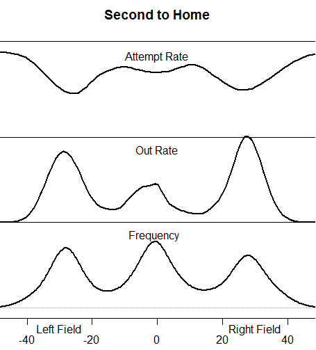
Singles targeted at corner outfielders are 50-50 plays for the third-base coach/base runner, and that risk/reward proposition can fluctuate depending on the number of outs, the upcoming batter, the current pitcher, and all that stuff. Center fielders, who are positioned farther from the plate and have to circumvent the pitcher's mound with their throws, are tested at a 75% rate. There is a higher frequency of singles to center, specifically of the ground ball variety, with a man on second than with a man on first due to the infield alignment.
I compared the expected rates to what actually happened to evaluate base runners and outfield arms. So if a runner advanced first to third on a ball right at the right fielder, they would both accumulate .75 extra bases and -.05 extra outs.
Here are my top five and bottom five base runners at advancing on singles.
| Name | Extra Bases | Extra Outs |
|---|---|---|
| Chone Figgins | 23.1 | -2.4 |
| Erick Aybar | 15.7 | -0.5 |
| Troy Tulowitzki | 12.0 | -1.3 |
| Ian Kinsler | 11.0 | -1.4 |
| Matt Kemp | 10.1 | -1.6 |
| Carlos Lee | -10.0 | 1.4 |
| Brian McCann | -14.0 | 0.5 |
| Bengie Molina | -13.5 | 0.7 |
| Jorge Posada | -4.1 | 4.4 |
| Prince Fielder | -12.6 | 2.4 |
The Angels are a very aggressive base running team, which pays off with guys like Figgins and Aybar. Matt Kemp's fielding and base running production have taken significant, almost shocking, hits this year. Jorge Posada is the worst base runner I've ever seen, and he's probably one of the worst of all-time. Considering his defense, which has never drawn positive reviews either, his Hall of Fame case will be very interesting.
To evaluate outfield arms, I included a regressed version of these base running scores.
| Name | Extra Bases | Extra Outs |
|---|---|---|
| Hunter Pence | -11.3 | 8.3 |
| Michael Bourn | -1.1 | 6.3 |
| Jeff Francoeur | -1.2 | 5.8 |
| Jayson Werth | -11.0 | 3.4 |
| Adam Jones | -17.6 | 1.2 |
| Jason Bay | 6.7 | -2.9 |
| Jermaine Dye | 10.3 | -2.3 |
| Shin-Soo Choo | 11.9 | -2.1 |
| Brad Hawpe | 13.5 | -2.5 |
| Brian Giles | 11.4 | -3.3 |
Baseball Reference actually carries these stats. Hunter Pence, a right fielder, was tried 100 times on singles with a man on second. He held the runner at third 40 times, leaving 60 tries for him to nail the runner. He succeeded on ten, which is quite an impressive rate. All three of the Phillies outfielders have been successful holding the running game. Bourn was also an above average base runner, and Ichiro, renowned for his arm and base running, was merely good in each. Shin-Soo Choo is the biggest surprise I found, as I've heard that he has "80" arm strength before.
And the rest:
| Touching Bases | July 07, 2010 |
Stolen Bases and PITCHf/x
I tend to think that pitchers have more control over the running game than catchers. Catchers control their "POP" times, while the pitcher controls his time to the plate, pickoff move, pitch location, and pitch type. The last two factors are probably the least significant in determining the success of a stolen base attempt, but they're the most quantifiable thanks to PITCHf/x.
Below is the success rate of stolen base attempts from 2008-2009 based on the pitch location.
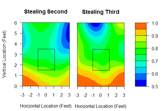
The trendline is clear. The catcher has no chance at throwing out a baserunner on anything that's less than a foot off the ground. Balls at the belt and up give the catcher a 70% chance at throwing out the runner, and pitches (pitch outs) in either batter's box really level the playing field.
Looking at these charts, I don't see why there aren't more lefty-throwing catchers. SB success rates are even at 76% regardless of the batter handedness, so throwing through the batter doesn't pose much of a problem. In fact, a pitch has to be located a foot off the plate for the batter's handedness to have a 10% difference on SB%. And, again, most of that is just due to pitch outs being thrown in the opposing batter's box.
Speaking of pitch outs, base runners were safe only 45% of the time on pitches classified as 'PO' by Gameday stringers. And considering the 70-75% success rate on regular fastballs, a couple tenths of a run are gained by pitching out when the runner is on the move. However, the data I'm using show that runners were in fact running during only 15-20% of all pitch outs. Furthermore, The difference between a pitch out and a regular fastball in terms of pitch type linear weights is at least a tenth of a run. Therefore, as currently employed, pitch outs would have to nab runners about 90% of the time to break even. I've always believed that the pitch out (and hit-and-run) have been over-utilized tactics, and I'm waiting to see some data refute that.
Jorge Posada and Mike Napoli, who both struggle throwing out runners anyway, call for a very high rate of pitch outs. Backups Jeff Mathis and Jose Molina, who are far from defensively challenged, also call for their share of pitch outs, so those calls are likely coming from the bench. Humberto Quintero and the lethally armed Lou Marson never call for pitch outs.
There are several reasons to throw more fastballs with a man on first than with the bases empty; there's a chance for the double play, incentive to avoid the passed ball, and, of course, to control the running game. John Baker and Joe Mauer both caught about 60% fastballs with nobody on, but 70% with a man on first. Along that same line, here's a snippet of the leader board for pitchers who throw more fastballs with a man on than with the bases empty.
| Rank: Pitcher | Bases Empty | Man On First | Team |
|---|---|---|---|
| 1: Anibal Sanchez | 53.20% | 71.30% | Marlins |
| 2: Sean West | 59.08% | 76.69% | Marlins |
| 3: Josh Johnson | 61.83% | 79.05% | Marlins |
| 4: Boof Bonser | 53.72% | 70.38% | Twins |
| 5: Matt Guerrier | 52.94% | 69.35% | Twins |
| 6: Chris Volstad | 62.31% | 78.64% | Marlins |
| 8: Leo Nunez | 53.67% | 66.89% | Marlins |
| 9: Burke Badenhop | 65.83% | 78.80% | Marlins |
| 11: Scott Baker | 59.56% | 71.87% | Twins |
| 12: Mark Buehrle | 69.74% | 81.39% | White Sox |
| 13: Andrew Miller | 66.02% | 77.34% | Marlins |
| 14: Nick Blackburn | 53.02% | 64.23% | Twins |
I don't know if it's Mauer and Baker, or if these organizations stress this strategy, or pure coincidence, but it's something. I included Mark Buehrle on the list because the man is, or he surely should be, legendary at fielding his position.
Of note, Gerald Laird, a terrific thrower, received fewer fastballs with a man on first than otherwise. Bartolo Colon and Trevor Hoffman shied away from their fastballs with a man on.
As for the other pitch types, base runners are successful 80-85% of the time running on off-speed pitches. Interestingly, on SB attempts of third, the lowest success rate has come on the knuckleball. Tim Wakefield must do a better job holding runners on second than he does on first. From the following, you can see that due to Wakefield, it appears that diminished velocity deters steals of third.
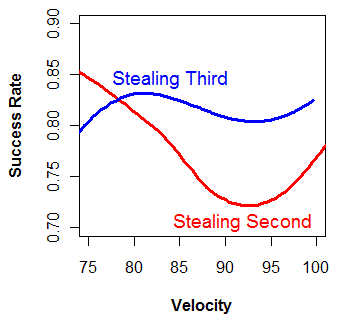
Combining velocity and location in a regression doesn't accomplish as much as I was hoping in terms of sorting out what catchers have had more or less difficult opportunities to gun down runners. Every catcher, save two, was expected to throw out 74-79% of base runners based on these factors alone. Only Wakefield's personal catchers Kevin Cash and George Kottaras have been forced to throw on especially difficult pitches. And they still have better numbers than Jason Varitek and Victor Martinez.
| Touching Bases | July 01, 2010 |
Strike Zone Sizes Crouching Batters
We consider the strike zone a static area, although, in reality, it is a moving target. "As the batter is prepared to swing at a pitched ball," an umpire has to guess the height of the batter's letters and his knees. This moment is imprecise, yet PITCHf/x analysts must try to capture the top and bottom of the strike zone to get the most out of the PITCHf/x data.
As I see it, there are several ways to either directly observe or infer the parameters of the strike zone. One is to follow the work of John Walsh, Dan Fox, Ike Hall, Josh Kalk, Dan Turkenkopf, Mike Fast, Jeff Zimmerman, Ike Hall, and others, who all find the probability of a pitch being called a strike at any given location. It is helpful to know the edges of the zone without such rigorous analysis as these, as they necessitate large volumes of data. Instead, we know the plate is 17 inches wide. That serves just fine for the width of the zone. And we hope that we know the batter's height. Unlike weight, which varies year to year and is sometimes a touchy subject for athletes, height is consistent throughout a player's playing career, and should be fairly accurate. In some Pedroian cases, we'll hear that the guy is even smaller than listed. That's not the a big problem, though. The issue with using height, and height alone, is that batters have different stances. Fortunately, there are stringers at every game who mark what they believe to represent the top and bottom of the strike zone are for each batter. By linking the Retrosheet and Gameday databases, I found each batter's height and average top and bottom strike zone values.
Mike Fast has looked into the subject before, and I'm borrowing ideas from him, as well as an image from him below. The other guy whose data has proven useful to me in this study is actually the "Batting Stance Guy." BSG claims to offer "the least marketable skill in America," though, for me, it's quite useful.
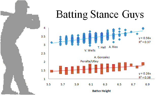
You can estimate the top point of a batter's strike zone as 56% of his height, and the bottom as 26%. But I think we can do better. I took 130,000 pitches vs. RHBs that crossed over the heart of the plate, spanning a foot in width. Using the top and bottom strike zone values provided for each pitch, the average top and bottom strike zone values for each batter, the batter's height, and finally a regressed version using the 2nd and 3rd categories, I found the percent of pitches that agree with the umpire's ball/strike call.
| Stringer SZ | Average SZ | Height | Regress'd | |
|---|---|---|---|---|
| High | 85.08% | 88.03% | 89.92% | 89.99% |
| Strike | 85.46% | 85.78% | 85.83% | 85.95% |
| Low | 95.60% | 97.28% | 97.66% | 97.67% |
It would appear that height is the best predictor, but certainly the values inputted by the stringers can add some value. Yet there are still outliers.
Toby Hall is one of the crouchiest players in baseball, and Batting Stance Guy demonstrates as much in this video. He also stresses the bent knees of Vernon Wells and Albert Pujols, whose crouches I can envision, but unfortunately they can't be fully captured in a regression. And Alex Rios has a big crouch, which was even commented on by Christina Kahrl in a past BP Annual. She wrote, "Alex Rios' stance reminds me of Von Hayes--spread low, slightly knock-kneed, and will he, like Hayes, always just be that slightly less than expected but still-good player," to which I say, bite your tongue, Christina Kahrl. Von Hayes is an icon.
Most of the batters who have higher strike zones than their height would indicate are pitchers. Many pitchers stand at the plate stiff as a board. As for position players, BSG accentuates the straight front leg in Adrian Gonzalez's stance. Jhonny Peralta's stance is unique, too. And Chase Utley also has an upright stance, which is somewhat notable, but more importantly, Batting Stance Guy also does an impression of the Von Hayes crouch in the linked Phillies video, and any time you have the opportunity to reference Von Hayes, it's a no brainer.
| Touching Bases | June 29, 2010 |
Shifts Happen
Last week, I explored the difference between those players who hit with the shift and those who do not. It would be useful to show that the shift does, in fact, play a part in BABIP, and the observed effect was not only a product of different player pools. So I took the 16 players I believe to be semi-regularly shifted and found their groundball data with men on base vs. with no men on. This serves as a proxy that shows whether the defense is shifting them or not. Below is a plot of the 16 batters' groundball average based on trajectory angle and, below that, a plot showing the frequency at which these batters hit to each angle.
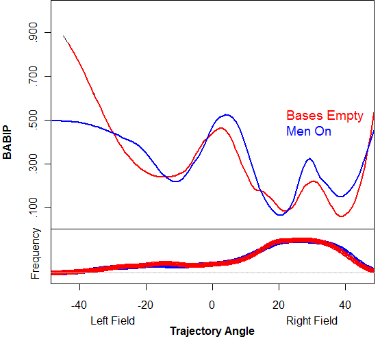
With men on, these pull hitters are able to pick up more hits on balls up the middle and in the 3-4 hole. The shift is most effective on balls in these locations, so this makes sense that these vacated holes result in hits. However, I think balls directly at the first baseman go for hits more often with men on base because the first baseman has to hold the runner on and not because the shift is off. The only place where there is an improved BABIP when the bases are empty is on balls down the third base line.
I've heard the argument that the shift takes away the outer part of the plate from the pitcher. Under this logic, the shift actually works to the hitter's advantage, as any ball that's on the outer half can be easily taken the other way for an automatic hit, and therefore the pitcher must pitch predictably inside. Using the same sample, I split the plate into halves and found the groundball distribution.
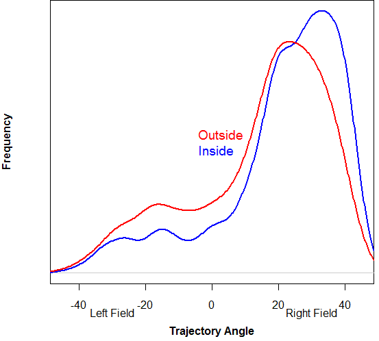
I think the takeaway here is that it's not natural for these guys to hit down the third base line. So unless they decide to change their approach dramatically, i.e. bunt, the defense can vacate third base, and the pitcher can pitch outside with no fear of a hit going right down the line.
The other unusual infield alignment, besides the shift, is the infield in. I searched for all grounders with a man on third in the seventh inning or later, which is when the infield might be drawn in. I just began the process of linking the Gameday database to Retrosheet, so unfortunately, I don't yet have data that indicates the number of outs or the score during each at bat. Instead, I broke the data into two groups based on whether the final score of the game was close (one or two runs) or not. In a blowout, teams never bring the infield in.
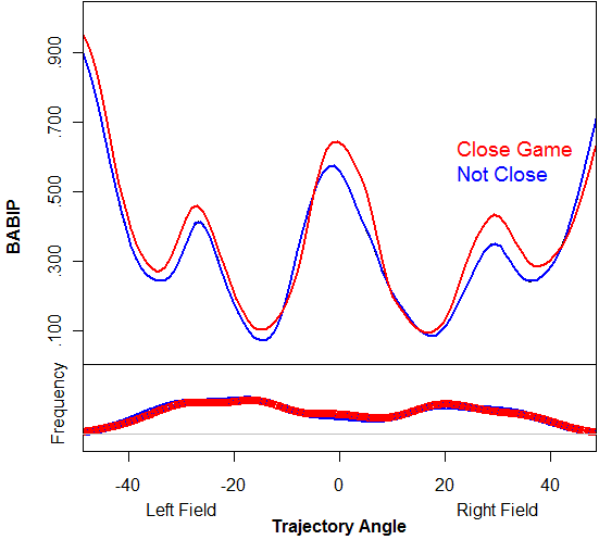
I don't have much confidence in the crude distinction between these two groups. This neither proves nor disproves that that batting average on groundballs goes up .100 points with the infield in. There might be evidence that bringing the infield in surrenders hits on balls in the holes, but not necessarily at the fielders.
Finally, I looked at bunts. I took all bunts that occurred with the bases empty, so I knew the batter was bunting for a hit, and split the data by handedness.
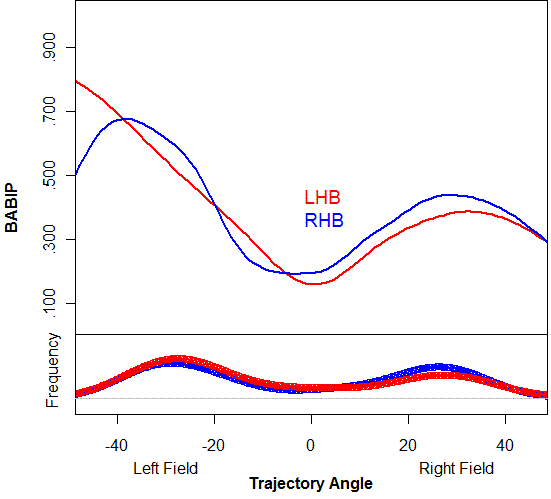
RHBs are most successful bunting down the first base line, where they bunt more often than LHBs. LHBs are most successful bunting toward third, where they bunt more often than RHBs.
I feel like there are wins to be had here. The difference between a third baseman playing in for a bunt or playing behind 2nd base in a shift isn't trivial in preventing runs. I don't know if it would be asking too much for the bench coach to study spray charts and plan defensive alignments for the opposition, but then again, I don't know what a bench coach does. What does a bench coach do?
| Touching Bases | June 24, 2010 |
Shift Morneau Shift?
Inspired by my possible doppelganger Ben Lindbergh, I decided to revisit the topic that brought me to this here very site: the shift. Ben wrote an in-depth piece at Baseball Prospectus about J.D. Drew and the shift on Monday, concluding that, "We don’t know precisely how Drew would respond to an escalation of the shift, and if the current state of affairs persists, we never will, but it’s probably worth it for teams to find out; it seems fairly certain that Drew is winning this battle of offense-against-defense game theory thus far." So my question is, who else might benefit from an altered defensive alignment?
Max Marchi and Ricky Zanker have explored aspects of graphing batted ball distributions. Building on their work, I came up with my own model. Using MLBAM-provided batted ball location data from 2008-present and Peter Jensen's gameday translations, I found the batted ball angle of all non-bunt grounders from left-handed hitters with no one on base, as well as whether or not the batter reached safely. I sorted the data into two groups, the first of which contained 2,500 grounders from 15 "shifted" batters, your Howards and Giambis. The rest of the 32,000 grounders formed the second group. I then fitted a binomial LOESS smoothing curve to the data. Here is the resulting model:
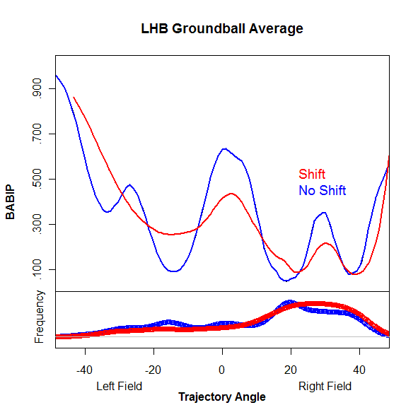
Allow me to explain. The top portion of the graph shows BABIP on grounders. There are three big differences between the red line (shift) are the blue line (no shift). First, at -15 degrees, shifted players have the benefit of a vacated shortstop position, and are therefore better than twice as likely to pick up a hit on a batted ball to that vector. Next, at 0 degrees, straight up the middle, shifted players have under a 50% chance at reaching base, while non-shifted players are up above 60%. And finally, balls directed toward the 3-4 hole are much more likely to go for hits when there is no shift. So, to sum up the obvious, implementing a shift allows hits on batted balls toward left field, but in exchange, balls up the middle and in the hole are converted into outs at a higher rate. On the bottom of the graph is a histogram. On average, shifted players hit a higher percentage of balls toward the second baseman, and many fewer balls toward the shortstop. The other notable difference is that shifted players have hit fewer balls up the middle than their counterparts, even though the defense is aligned to prevent hits on balls up the middle.
While it would be nice to have reliable measures pf batted ball speed and batter speed (the two other considerations that help determine groundball average), I had to make do without. So I predicted both of the above fits against my dataset to come up with expected averages for shift and no shift. Here's how the shifted players stack up:
"Angle" is the average batted ball angle. "BABIP" is the rate at which the batter reaches base safely. "No Shift" is the predicted BABIP using the no shift model, and "Shift" is the predicted BABIP using the shift model.
| Name | Angle | BABIP | No Shift | Shift |
|---|---|---|---|---|
| Ryan Howard | 19.7 | .167 | .238 | .199 |
| Carlos Pena | 23.7 | .212 | .213 | .174 |
| Adam Dunn | 19.6 | .203 | .232 | .193 |
| Jim Thome | 16.6 | .141 | .239 | .201 |
| Jason Giambi | 20.1 | .147 | .226 | .190 |
| Jack Cust | 18.5 | .205 | .223 | .189 |
| Chase Utley | 17.9 | .273 | .242 | .208 |
| David Ortiz | 19.2 | .168 | .221 | .189 |
| Travis Hafner | 10.9 | .203 | .257 | .227 |
| Ken Griffey | 17.4 | .180 | .225 | .196 |
| Mark Teixeira | 18.6 | .259 | .227 | .198 |
| Carlos Delgado | 18.1 | .128 | .234 | .207 |
| Prince Fielder | 11.0 | .271 | .261 | .235 |
| Mike Jacobs | 16.4 | .199 | .227 | .202 |
| League Average | 11.9 | .243 | .246 | .225 |
| Justin Morneau | 9.8 | .239 | .248 | .231 |
You might notice that the league-average BABIP on non-shifted players is 20 points higher than it is for shifted players. This doesn't mean that the shift uniformly lowers BABIP by 20 points. This means that the type of player who gets shifted is bad at reaching base via groundballs. So when comparing the two models, keep the averages in mind, and for players who are speedy, such as Jimmy Rollins, understand that the shift may not be a viable option.
I might be wrong about Justin Morneau, and maybe he isn't shifted regularly, but if he is, it's a mistake. So when it comes to Shift Morneau Shift,* I say "No Shift!"
*Credit to my friend Pat for starting the baseball T.V. shows Twitter topic and my buddy Steve for coming up with Deal Morneau Deal.
Carlos Pena has far and away the most skewed groundball angle toward his pull side. Most of these guys are obvious shift candidates. Fielder and Morneau maybe not so much. But these aren't the only players for whom the shift matters. So how about the non-shifted guys?
I found the difference between the "Shift" column and the "No Shift" column for those batters with at least 25 groundballs hit. Three rookies and J.D. Drew himself top the list. Brennan Boesch, Jason Heyward, and Ike Davis have all been hugely successful, exceeding even the most optimistic of expectations. But maybe their pace will slow once defenses learn how to play them. The exaggerated infield shift is certainly an option. It's also likely that their luck will soon run out, as their grounders have simply found holes. Luck has nothing to do with J.D. Drew's success on grounders. If people would just take a look at his spray chart data, they'd know to shift him, but unfortunately, too many are of the line of thought that it doesn't matter how you play him, since he's hit 30 homers in a season only once and is paid $70 million. J.D. Drew does something funny to people's minds.
Here are five players I would strongly consider shifting against, followed by the rest of my dataset.
| Name | Angle | BABIP | No Shift | Shift |
|---|---|---|---|---|
| J.D. Drew | 18.6 | .253 | .256 | .203 |
| Garrett Jones | 17.4 | .304 | .248 | .203 |
| Chase Headley | 20.0 | .236 | .241 | .196 |
| Adam LaRoche | 20.4 | .178 | .225 | .187 |
| Alex Gordon | 19.4 | .309 | .234 | .197 |
| Touching Bases | June 22, 2010 |
Expected Platoon Splits
A couple of weeks ago, MGL formulated a regression equation that estimated platoon splits based on different pitch types. Max Marchi has found the average run values for different pitch types by batter handedness as well. I ran my own regression equation using pitch velocity and movement to find an expected value of pitches against batters of different handedness.
Pitchers are often placed in the bullpen if they prove incapable of getting opposite-handed batters out. In relief, the ability to get same-handed batters out can be leveraged. In fact, the majority of players with large expected platoon splits are relievers.
Mike Macdougal, a sinker/slider pitcher with a tailing sinker and a sweeping slider has the largest expected platoon split in my sample. As for left-handed pitchers, I was very surprised to learn that Daniel Ray Herrera has a strong platoon split. The changeup is the great neutralizer when it comes to the platoon advantage, and I've always thought of the screwball as a mutant changeup in that it also moves toward same-handed batters. But Herrera is useless against righties. That Herrera has a high LOOGY score is just another mark in his favor for sabermetric fans. I hope by now we all know about the joy of his screwball. But even when he was in college, one stat-savvy fan wrote a ballad for Herrera, and Herrera has since become the mascot for collegesplits.com* Similarly, Hideki Okajima, whose over-the-top delivery I would think allows same-handed hitters to see the ball out of his hand, actually has much greater success against lefties than righties.
*I like to think of Yankee farmhand Pat Venditte as the current Herrera. Seen as trick-pitchers by scouts (Herrera because of his screwball, Venditte because he's a switch-pitcher), both Herrera and Venditte have encountered nothing but success. Venditte has been putting up better numbers in the Minors than he did as a walk-on-turned-All-American at Creighton. At 25 years old, Venditte has thrown 36 innings in High-A this year, striking out 48, walking 9, and allowing one homer. People say that his gimmick won't work when he has to face Major League hitters, but I say the game's the same, just gets more fierce. I fear that the only reason the Yankees have yet to promote him is that they don't want to disrupt the structure of every baseball database in the world, as pitcher-handedness has never been tracked by at-bat. Anyway, if I had to guess, I'd think Venditte would perform better as a southpaw, given that he has subpar stuff from both sides, yet he still tries to get it done conventionally as a righty. His sidearm approach as a lefty could at least give Major Leaguers a different look.
Sinkerballer Fausto Carmona has the largest expected platoon split for a starter. He's struck out as many lefties as he's walked in his career, but for some reason he's found more success as a starter than he did in the bullpen, where he had one of the most disastrous runs as a closer of all-time. Carmona's former battery-mate CC Sabathia is also Carmona's counterpart when it comes to left-handed starters expected platoon splits. However, Sabathia is fine against righties, and otherworldly against lefties, which is why he's never been considered as a reliever.
I think J.A. Happ would have the most to gain of any starter by being placed in the bullpen, in spite of his quality changeup. Dontrelle Willis, too. Why hasn't he been tried in the bullpen? Junkballer Matthew Mahoney has one of the few expected reverse platoon splits, although that hasn't come to fruition in his time in the Majors. Chris Tillman, too, has an expected reverse platoon split, so I think it's wise that the Orioles break him in as a starter and keep him in the rotation if only at AAA. And Jennry Mejia's cutter, like Mariano Rivera's, should be either \as good or better against lefties as it is to righties, so that's another reason he should be given every attempt to start. It's Oliver Perez who might be better suited for the bullpen, as he would have utility as a LOOGY.
Joe Maddon and the Rays have surrendered the platoon advantage against changeup specialists a couple times this year. Maddon has stacked the lineup with same-handed batters against such pitchers, and even ordered switch-hitters to bat from their unnatural side. The switch-hitter thing is just crazy, but maybe there's something to a reverse platoon splits with changeup guys. The Rays' front office is known for going the extra 2%, which includes PITCHf/x analysis. But if the decision is coming from any higher up than Maddon, I don't know what data they're looking at. (If Maddon is making the decision, it's off of splits from this year and whatever biases come from being no-hit twice by chaneup artists.) RHP Shaun Marcum and LHP John Danks have been better against opposite-handed batters than same-handed batters, but I don't see anything in their PITCHf/x profile that would suggest their projected platoon splits should be so far from the mean. It's much easier to say which pitchers' reverse platoon splits are fake (I'd say a couple of Giants in Jeremy Affeldt and Sergio Romo) than whose are real.
In doing this analysis, the pitcher in whom I was most interested was Justin Masterson. Ever since he broke into the Bigs, the word was that his sidearm delivery was more suited for relief than starting. His performance has been acceptable as a starter, but his enormous platoon split has reinforced the notion in some minds that he should start. I didn't include him in my sample, since he's a sidearmer, but I predicted his out-of-sample performance anyway. His slider is a fine pitch to both RHBs and LHBs. To righties, both of his fastballs are truly unique pitches, and have been hugely successful. The problem is that his sinker is his best pitch, and he chooses not to throw it to lefties. And his four-seam fastball is rendered ineffective against LHBs, so he's handcuffed himself to only his breaking ball. Without another offering, I don't think he'll ever be able to get lefties out.
| Touching Bases | June 17, 2010 |
Stuff on Stuff
So I ran my StuffRV numbers yesterday, and you know what that means? Gallimaufry!
Chad Cordero is back and pitching in the Major Leagues. I predict that, like this, won't end well.
| Touching Bases | June 15, 2010 |
Bimodal Distributions
Dave Allen has written at length about Mariano Rivera's pitch locations. PITCHf/x has recorded over 2,500 Mo-thrown pitches, and from the following graph, you can see that Rivera spots his fastball on either side of the plate, but is able to avoid the middle.
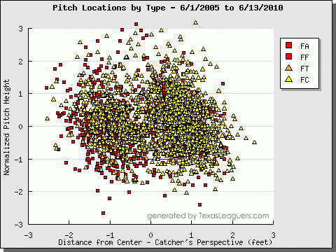
Dave described this horizontal scattering as a bimodal distribution, which Rob Neyer in turn called his "new favorite baseball term." Chris Moore, too, was intrigued, and he found that Rivera is indeed the best at hitting the corners. "On average, Rivera places his pitches 4.4 inches away from the very edge of the plate."
I'm interested in who can throw to both sides of the plate, but avoid the middle. So I broke the plate into thirds and counted the number of each pitcher's separate pitch types in each zone. Overall, I came up with a list of about 60 pitchers who threw fewer pitches in the middle zone than they did in either of the outer thirds. Andy Pettitte, Carl Pavano, Jake Peavy, and Livan Hernandez command multiple pitches on both sides of the plate. Rivera, of course, stood out, as he throws only 20% of pitches over the plate in the middle third, while other pitchers are 25% and up. But using the invaluable Texas Leaguers' PITCHf/x tool, which provided the above graph for Rivera, I'd like to take a look at some other pitchers who manage visible bimodal distributions.
Here's Shaun Marcum, who throws the third-softest fastball in the American League, but commands it better than nearly anyone.
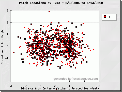
Livan Hernandez's fastball shows a bimodal distribution, but unlike Rivera and Marcum, he doesn't keep the batters guessing. He only throws his fastball outside.
Livan vs. RHB:
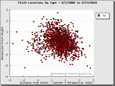
Livan vs. LHB:
Since Livan demonstrates the ability to throw his fastball to both sides of the plate, shouldn't he keep hitters honest by coming in on them once in a while?
Hiroki Kuroda follows a similar approach to Livan, but more impressively, he avoids the heart of the plate with his slider.
Kuroda vs. RHB:
Kuroda vs. LHB:
But I prefer pitchers who can throw the same pitch to both sides of the plate against the same batter, like Jamie Moyer's cutter to righties.
| Touching Bases | June 10, 2010 |
Spitballing on Command
At best, quantifying command is really difficult. At worst it's a foolish endeavor. The reason is that, while we may know the precise location of a pitch thanks to PITCHf/x data, we have no idea of the pitcher's intention. Perhaps pitchers could fill out a survey after every inning, or perhaps someone could track the target of the catcher's glove. Maybe these data are being collected somewhere, but they certainly aren't publicly available. But we beat on.
Mike Fast in the 2009 Hardball Times Annual took a shot at measuring Cliff Lee's command, and Dave Allen tried with Mariano Rivera. Borrowing ideas from both of them, I attempted to rank a group of pitchers by command.
My sample consists of pitches that I have classified as four-seam fastballs in RHB vs. RHP matchups on 0-0 counts. 100 pitchers have thrown at least 200 such pitches, giving me over 60,000 data points.
First, I came up with a heat map. It shows what you'd expect. Fastballs up-and-in or down-and-away are most successful. Then I predicted each pitch's expected run value based on such location. Here are the top six:
Greg Maddux
Trevor Hoffman
Yusmeiro Petit
Phil Hughes
Paul Byrd
Maddux's command is legendary, so it speaks wellthat he ranks so highly. I'm pretty sure all of these guys have good reputations for command. And the bottom 5:
Seth McClung
Fausto Carmona
Rich Harden
Dennis Sarfate
Matt Albers
Looking at a pitcher's walk rate usually suffices in grading command. Since 2007, all of these guys have surrendered their fair share of walks, and all those balls show up in the numbers.
So I think that method has legs. I controlled for a fair amount of things (batter/pitcher handedness, count, pitch type), but one could go even further and regress the league-wide locational run values to each batter's own heat map. The sample sizes get small, so for left-handed fastballs to left-handed batters, I'd probably combine 0-2 counts with 1-2 counts, and use both two-seam and four-seam fastballs. Regression to the mean and stuff.
I also tried clustering analysis. In a situation as specific as RHB vs. RHP, 0-0 count, pitchers generally have more types of pitch offerings to choose from than pitch locations. With fastballs, you either go high heat or throw at the knees. With sliders, there's back foot or back door. Curves are intended to be thrown either anywhere in the dirt or anywhere in the zone. Anyway, those are the assumptions you need to make if you believe clustering makes sense. Furthermore, if you're limited to k-means clustering, you might as well assume that all pitchers have two intended locations for their fastballs. That's what I did, anyway. So I gave each pitcher his own two separate cluster centers, and found each pitch's standard deviation from those centers, grouping by pitcher. Here were the leaders:
Greg Maddux
Brett Myers
Joakim Soria
Ricky Nolasco
John Lackey
Maddux is no Rivera, but he's head-and-shoulders above the other 99 pitchers in my sample when it comes to command, so it lends validation to the power of PITCHf/x that two rudimentary analyses can pull out Maddux's needles from the haystack. The bottom five:
Matt Garza
Brandon Morrow
Seth McClung
Rich Harden
David Aardsma
I believe that Aardsma's four-seam fastball is an outlier in several ways. Though I'm not disregarding this piece of data, I don't think it means what it's supposed to mean. But all of these guys are prone to the walk. It would be weird be if somebody had excellent command outside the strike zone, so that his expected run values based on location graded out poorly, but he had really tight clusters of pitches. This would indicate good command but poor approach. I always get that feeling watching Dice-K.
So Maddux, Nolasco, Hughes, and Petit are in the top ten of both lists. I know Maddux and Nolasco have great reputations for control; I'm unsure about the other two. Garza, Sarfate, Harden, and McClung show up in the bottom ten of both lists, Sarfate and McClung definitely have no aptitude for command.
The ultimate goal here is to evaluate pitchers. I feel confident that with a sample of 50 pitches, I could assess a guy's stuff. I think a pitcher would need to have thrown over 1,000 pitches, assuming he's not walking the ballpark, to provide an ample PITCHf/x sample for evaluating command, given the need to drill down the data by pitch types, batter types, and counts. And it takes precisely 4,242 pitches to get a good read on a pitcher's intangibles.
| Touching Bases | June 08, 2010 |
Dollars per WAR
When it comes to free agent signings, baseball fans love making snap decisions and playing GM. Some contracts, like Evan Longoria's or Ryan Howard's, are rather easy to judge. To objectively evaluate others, you need a whole lot of context. I'd like to provide a bit of that context using the informative and interactive Google Motion Charts. (If you want to view the charts, you need Flash, and if you're using Chrome, you need to open them in a new tab or incognito. For some reason, Google doesn't want its browser to have access to its apps.)
The baseball databank has salary data going back to 1985, and Sean Smith's WAR database well covers that time frame. As the Collective Bargaining Agreement stands, players in their first few years of MLB service time have their salary set by the team (league minimum $400,000). After that, players face several years where they are eligible for arbitration, and finally, with over six years of service time, they can become free agents. Here is how each group of players has been valued over time.
The less experienced players have seen their salaries rise steadily since 1985. But I'd like to focus more on the more interesting group of players who have over seven-plus years experience. Many mark 1998 as the year that baseball recovered from 1994. Indeed, from 1998 to 2003, the market rate for "free agent" WAR rose $500,000 per year, which signifies financial health. Consequently, over half of all MLB salaries went to these "free agent" players during the time period. However, these players produced approximately 75-80% of the league's WAR, whether they accounted for 40% or 65% of the league's salary. Free agents are no longer in vogue, as teams realize the value of the more inexperienced players, and are less willing to pay for for production from more experienced players. From the chart, you can see that over the last couple years, free agent prices might be on the decline, while cheap talent has become less cheap.
I'm also interested in dollars per WAR at the team level. I broke down the data into five increments of five years apiece stretching from 1985-2009, and found the average yearly WAR, salary, and dollars per WAR for all 30 teams. You might be familiar with a graph of this nature, plotting a team's payroll against a team's success.
This demonstrates the positive, non-linear relationship between pay and performance. The size of each point represents whether a point falls above or below an imagined regression line. I've highlighted both teams from Florida, and both teams from New York. The Marlins and Rays, occupied by the smallest dots, appear to get the most out of limited resources since 2005. But have they identified market inefficiencies, or are they just cheap? The Yankees and Mets portray the most bloated dots, and perhaps dole out the most bloated contracts. So are their payrolls' driven by reckless spending, or is the free agent market more practical to them?
In Baseball Between the Numbers, Nate Silver penned a seminal piece in which he stated that the marginal value of a win is most valuable for teams closest to the playoffs. Many point out that the more a team spends, the more it wins Few point out that the more a team wins, the more it should spend. Breaking the data down further, I ran the salary and WAR numbers by team for only players with over six years experience. This way, we can see if the Rays and Marlins have shrewdly spent in the free agent market, or if they simply stayed away from signing veterans altogether, thereby controlling costs. If the Yankees and Mets have been winning games by outbidding other teams in free agent auctions, they would be afflicted by the winner's curse. They would pay above-market rates for free agents. However, they do not, as evidenced by the color of their dots. The shading of each point represents the Dollars per WAR paid for a team's most experienced players. Due to their position in the standings, the Mets and Yankees find more value in the free agent market than others do, so New York teams allocate more resources in it. But they spend about as efficiently as others.
While the Marlins may spend their money efficiently, this is only because they more or less avoid free agents, not because they make wise free agent signings. In fact, the teams that have spent least on free agents over the last five years have been less successful when dipping their toes in the free agent waters. The average Dollars per WAR for seven-plus year players has been around $4.5 million, which shows up as greenish-yellowish in the chart. The yellow/red points indicate teams that have spent inefficiently on free agents. Turns out, Seattle, San Francisco, Baltimore, San Diego, Washington, Kansas City, Pittsburgh, and Florida have had the worst fortune in the free agent market. None of these teams have dabbled too heavily, but they've all paid well above market rate, and the Padres are the only one of them to have made the playoffs. Meanwhile, the Yanks and Mets pay right around market rate. The Blue Jays have somehow managed to acquire good, experienced players on the cheap.
| Touching Bases | June 03, 2010 |
WAR Aging Curves
WAR, short for Wins Above Replacement, is an all-encompassing metric of a player's value. It incorporates hitting, defense, baserunning, durability, and spits out one number. Using Sean Smith's invaluable WAR database, I studied positional player aging.
We know that speed and defense peak early and that power and walks peak late. With WAR, we can throw everything together. Overall player value was originally posited to peak between ages 28-32, but the subject has been revisited and peak age revised to somewhere around 26-30. Here's my basic aging curve.
To develop this curve, I found all examples of players playing in two consecutive seasons, excluding the first and last year's of a player's career, since those tend to be somewhat fluky. I then computed the average difference in WAR between such seasons.
While players between 30 and 35 years old are often the best in the Majors, they are likely in decline. In general, I find that players improve at a decreasing rate until they're 27 or so and then decline at an increasing rate. I'm not trying to toss my hat into the J.C. Bradbury vs. MGL debate, but I'm using that as my benchmark for further aging curves.
My intention is to find how players, given a certain set of characteristics, age as compared to others. Height and weight are fairly consistent attributes, but unfortunately, height and weight data are unreliable for baseball players. Nevertheless, it would make sense that players with different body types would age their own separate ways, so I used body mass index to differentiate between big and small players.
Bigger is better, although the aging curves move along more or less parallel lines. You might say that bigger players age less gracefully than smaller players, but that could be just because they are better and therefore have more room to collapse. Regression to the mean works more heavily on players farther from the mean.
Next, I separated players by career defensive ability, as defined by the sum of the positional and total zone components of WAR.
Bad defenders are good hitters, otherwise they wouldn't play. I would imagine that during a bad defender's peak, he is a passable fielder. But as he ages and his defense deteriorates at a pace that outstrips the offensive decline of good defenders, the good defenders become better all-around players than the bad ones.
Separating by career hitting value,
Bad hitters peak two years earlier than good hitters. My guess is that good hitters use their power, which peaks late, while bad hitters get by with their speed, which peaks early.
Bill James once submitted that "young players with old player's skills...tend to peak early and fade away earlier than other players." Old player skills consist of striking out, walking, hitting for power, and being slow. Separating players by career baserunning value yielded no trend. I also looked at strikeout and walk rates. To do so, I had to limit my sample to years after 1954.
This evidence indicates that high-strikeout players do indeed peak a year earlier than low-strikeout players, but they also have a smoother aging curve than their counterparts. If they fade away faster, it's only because they weren't as good in the first place
By walk rate,
High-walk players actually peak a year later than low-walk players, but fade faster.
There are some lessons on regression to the mean in here. Better players appear to decline quickly because there's more room for them to collapse in case of an injury. I'm not making any conclusions about aging curves for types of players with old player skills or any such subset, since the more specifically I drill down a type of player, the smaller the sample becomes. Even so, big or small, old player skills or no, the Ryan Howard contract was a mistake.
| Touching Bases | May 27, 2010 |
A PITCHf/x Look at Drew Storen
Drew Storen is, for a variety of reasons, one of my favorite baseball players. I interviewed Storen this time last year, after which (because of which?) he was drafted with the tenth pick by the Washington Nationals due to his ability to throw 92 with movement.
Storen is one of the few players I've seen comment on the PITCHf/x sytem, telling Baseball Prospecus' interview laureate David Laurila,
"It’s awesome because you’re able to see how much movement you get on the ball, although it almost feels like you need a college degree to check out and understand some of the graphs they have on that Brooks site. But it’s interesting to see how much movement you get on your fastball, because you don’t really realize it. When you’re on the mound it’s kind of tough to see the movement that you have and a lot of times you have to rely on the catcher. "How was that?" or "What do you think?" It’s good to be able to see what the difference in movement is that you get on each pitch."
Storen fast-tracked his way to the big leagues, posting a gaudy 64-11 strikeout-to-walk ratio (his stated metric of choice) in the minors, and has made five appearances in middle relief for the Nats in the month of May, throwing nearly 100 pitches.
Storen has thrown four pitch types thus far: two types of fastballs and two types of breaking pitches.
Starting off with his fastball, Storen throws a four-seamer between 94 and 96 miles per hour and his two-seamer a tick slower. His four-seamer flies a little too true for my liking, averaging ten inches in vertical movement, which is a danger zone for a pitch of that velocity. Coming into last night, Storen had used his four-seamer 13 times, twelve to right-handed hitters, throwing only two of them in the strike zone. Last night, however, he threw the pitch eight times, inducing four swinging strikes. His two-seamer is a quality pitch, similar in velocity and movement to an A.J. Burnett two-seam offering. He throws both types of fastballs to any hitter, regardless of batter handedness. His choice of fastball depends on whether he wants to locate the pitch on his arm side or his glove side.
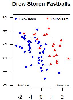
As for his off-speed pitches, he throws a true slider you often see from power righties coming in from the bullpen, and he also has mixed in a slurve a handful of times. Only two miles per hour slower than his slider, Storen's slurve achieves seven inches greater movement. Few pitchers (Burnett, Felix, Jepsen, Anderson, Lindstrom) can make a breaking ball drop seven inches at the type of velocity Storen throws his slurve, so I hope he mixes it in even more than he has.
Coming up as Stanford's closer, Storen supposedly threw about 92, getting by thanks to excellent command. He's continued to throw strikes as a pro, but from what he's shown in the Majors, his velocity was either being under-reported, or he's kicked it up a notch, and his breaking pitches also have shown good bite. I look forward to watching him close games for the Nationals in the near future.
| Touching Bases | May 25, 2010 |
90>95?
Power vs. finesse. It's the classic debate. Spanning over 60 feet 6 inches, the difference between a 90 mile-per-hour fastball and a 95-MPH heater makes up a couple hundredths of a second. More importantly, those 5 MPH represent the difference between fringe stuff and an above-average Major League fastball. So how do pitchers compensate for shortcomings in velocity?
Throwing left handed is the simplest solution. The demand for southpaws is so great and the supply so scarce that the price for a lefty far surpasses that of an equally talented righty. Put another way, left-handed pitchers can accomplish more with less. So left-handed pitchers were excluded from my sample.
My sample consisted of of over 100,000 pitches from the past two calendar years. I grouped pitches by batter handedness as well as by velocity--depending on whether the velocity rounded off to 90 MPH or 95.
First, I looked at pitch location. The color scales that portray run value are the same for both images, so you can compare them directly.
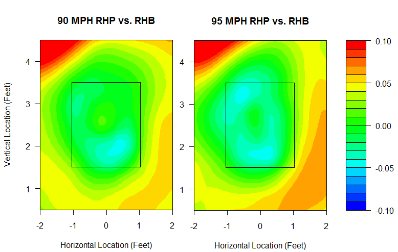
Soft tossers can't survive by living up in the zone. A 90-MPH pitch can be thrown in the perfect spot in on the hands, and it still won't have the same success on average as a 95-MPH pitch that misses by half a foot. However, pitchers who throw 90 experience just as much success throwing down and away to same-handed batters as pitchers who throw 95. In this regard, pitch location can be a true equalizer. Joakim Soria locates his 90-MPH fastball so well that it's in the upper echelon of all fastballs, while Daniel Cabrera has located his 95 MPH fastballs so poorly that he's out of the league.
I also looked at pitch movement. The magnitude of the effect of pitch movement is much smaller than that of pitch location. Below, run value is plotted against horizontal movement in the solid-line portion of the graph, while a histogram for horizontal movement can be found at the bottom.
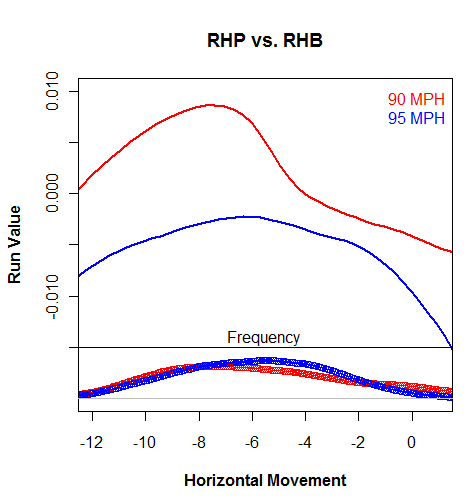
A 90-MPH pitch with average movement is a disaster. Even a 90-MPH pitch with great tail can't match an average 95-MPH pitch unless the 90-MPH pitch also has sink on it. But if a pitcher can really cut the ball so that it acts as a cutter, or even a slider for some, it can match an average 95-MPH fastball.
And vertical movement:
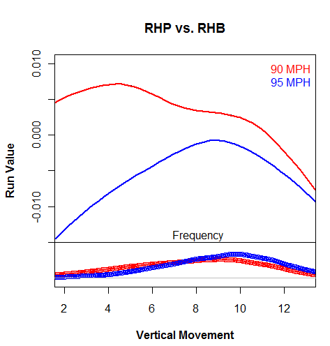
I find this to be an interesting trend. The 90-MPH pitchers are better off throwing rising fastballs, while 95-MPH pitchers are just as well off throwing sinkers or risers, so long as they stay out of that ten-inch danger zone to which the batter is accustomed.
In combining both horizontal and vertical movement, it's evident that Peter Moylan generates enough movement on his fastball to throw it at elite levels, while Cabrera, again, has a mediocre-to-awful fastball in spite of his velo. Remember, I'm only including 95 MPH pitches, so imagine how bad his fastball must have been in 2009 at 91 MPH. Cabrera is the poster boy for pitchers who can throw gas but have no command or movement, rendering their fastball ineffective. Kevin Jepsen, Jonathan Broxton, and Brian Wilson are examples of pitchers whose 90-MPH pitches are better than most pitchers' 95s, since those guys are throwing off speed at 90. Also of note: Jenrry Mejia's fastball has excellent movement.
Mixing location and movement into a regression, here are the best 90-MPH fastballs with at least 100 thrown:
Jared Burton
David Robertson
Peter Moylan
Ryan Franklin
Brian Sanches
Joakim Soria
Zack Greinke
Cory Wade
Roy Halladay
Mariano Rivera
David Robertson continues to be the man. No pitcher's 90-MPH fastball penetrates the top tenth of my sample, but all of these pitchers are squarely above average. They show that 90 MPH can beat 95, especially when the 95 is coming from the likes of:
Manny Acosta
Jason Bulger
Mitchell Boggs
Craig Hansen
Daniel Cabrera
Cabrera's 95 MPH fastball was the third worst fastball in my sample, and no other 95-MPH fastball fell in the bottom 40. The 90-MPH version of Cabrera's fastball was arguably better than his previous iteration.
| Touching Bases | May 20, 2010 |
Lidge's Pitches
Brad Lidge is a two-pitch pitcher. His arsenal consists of mid-90s fastball and a high-80s slider. From 2008-2009, Lidge faced a few hundred 0-2 and 1-2 counts in which he had to choose a putaway pitch. While Lidge generally splits his pitch selection right down the middle, in situations when he's well ahead of the batter, he goes to his slider over 60% of the time. And he gets results.
| Fastball | Slider | |
|---|---|---|
| Strikeout | 9% | 26% |
| Ball | 57% | 43% |
PITCHf/x analysts like to use a metric called run value to assess the value of a pitch. Basically, you control for the count and measure the change in run expectancy for a given pitch. So for Lidge, his fastball has been worth a negative 1.5 runs per 100 pitches, while his slider has been worth a positive 1.5 runs per 100. In these 0-2 and 1-2 situations, the trend is similar. So why does he throw fastballs at all if the slider is his bread-and-butter?
Well, we don't really care about the result of the pitch as much as we do the outcome of the at bat. So how did Lidge ultimately fare at the end of each plate appearance?
| Fastball | Slider | |
|---|---|---|
| Out Made | 81% | 74% |
Turns out, Lidge's fastball wasn't ineffective. In a way, it was more effective than his slider. That 57% ball rate might be intentional. Perhaps his advantage in the count allows him to use his fastball as a setup pitch.
Against righties, Lidge threw 50 fastballs that resulted in a prolonged plate appearance. He proceeded to strike out over half of these batters and allowed only six to reach base. Of course, any pitcher's numbers will seem otherworldly when the context is restricted to two-strike counts, but as Dave Allen has shown, a fastball generally makes for a better setup pitch than a slider.
How Lidge's slider works off his fastball.
Whether or not Lidge tries to raise the eye level of the batter with his mid-90s fastball, when his heater goes for a ball, it's the perfect setup for his slider.
While some pitchers' off-speed pitches exhibit superior run values, the fastball's grunt work may be the driving force behind such off-speed success.
| Touching Bases | May 13, 2010 |
Pitching to the Ump
A couple of days ago, Ben Walker of the Associated Press reported that teams are scouting umpires. I decided to check on the data to see whether pitchers have been changing their approach based on the umpire.
Umpires' zones vary from game to game, yet some umpires develop reputations around the league for perhaps calling the high strike or maybe sleeping next to an ice bucket. For most umpires, the PITCHf/x system has recorded enough data for an analyst to create a strikezone probability distribution. I'm not going to name any specific umpires, since that might come off like I was trying to evaluate them, which I'm really not, but I did make these probability distributions for the league on average as well as for each umpire, controlling solely for batter handedness. I hypothesized that the difference in a pitcher's expected called strike percentage without controlling for the umpire vs. the same pitcher's expected called strike percentage while controlling for the umpire could be attributed to the pitcher's knowledge of the umpire.
I found that, given the internal consistency in the data, there is certainly some skill to this effect, but the magnitude of the effect was small I think. , Livan Hernandez, who you may recall was on the same page as Eric Gregg back in 1997, actually has, by the numbers, done the worst job of adjusting for the umpire, as his pitches were 4% less likely to be called strikes given his distribution of umpires than given an average umpire. While the reliability tests I ran showed that Livan was consistently below average at "pitching to the umpire," I dug deeper, and I can't shake the feeling that luck plays a huge part of it. Sorting through umpires, I couldn't find any difference in Liva's approach. But maybe that's the problem. His approach is consistent, and it's the umpires who change. Here, I present a pair of charts displaying data on Livan Hernandez pitching to an umpire who has called a couple of his games.
I've taken the difference between the average strike zones and a given umpire's strike zone. Blue areas represent spaces where this umpire calls fewer strikes than average, and red areas represent spaces where an umpire is more generous. I made a density estimation to model the distribution of Livan Hernandez's pitches against batters of each handedness, and then plotted a contour line that displays where he's generally pitched over the last few years. I finally plotted the locations of the individual pitches that Livan has thrown with this specific umpire calling the game.
It turns out that against righties, this has been Livan's favorite umpire. The ump does a great job calling pitches below the knees, and he gives pitchers the down-and-away strike, which is right in the center of where Livan generally pitches. So Livan, who has been 7% more likely to have a pitch called a strike with this umpire behind the plate than an average ump, hasn't actually done anything different. This ump just suits his style.
Meanwhile, against lefties, Livan pitches exclusively away, and he hasn't changed up his approach, even though this umpire does not tend to give pitchers that call. So in this way, Livan, without doing anything differently, is failing to "pitch to the ump."
This type of information could also be of value to a manager in deciding whether to throw a sinkerballer who pitches down in the zone or a power pitcher who goes up the ladder. I don't think that pitchers should, or do, change their approach much based on the umpire behind the plate. However, every inch counts, so the information can't hurt.
| Touching Bases | April 28, 2010 |
Some Research on BABIP Using PITCHf/x Data
The advent of PITCHf/x has created a contingent of DIPS apostates. Dave Allen has done a substantial amount of research on how to evaluate the quality of a pitch in terms of run value, and I'd like to use similar methods while focusing solely on BABIP.
First, heat maps for plate location, a topic which Dave has already researched. You can click on the image to enlarge it, but the gist is that pitchers who can jam batters or force them to put low-and-outside pitches in play will achieve low BABIPs, while pitches extending from down-and-in to up-and-away yield high BABIPs.
However, few pitchers actually have significant control over both the location of the pitch and whether or not the batter puts it in play. It turns out that the range of expected BABIP for pitchers based on the location of pitches put in play is 25 points, except for one outlier. The average BABIP in RHB vs. LHP matchups is around .310, and the maximum expected BABIP for such situations was .325. The second-lowest was Scott Feldman at .300, whose actual BABIP against lefties these last couple of years was .265. I think Feldman's cutter has successfully jammed lefties, and if you look at the RHB vs. LHP heat map, you can see a thick blue area up at the hands where lefties manage a BABIP of about .100.
Mariano Rivera's expected BABIP against LHBs based on pitch location came out to .270 compared to an actual BABIP of .225. No other pitcher had an expected BABIP below .290. Dave has written extensively about Rivera's ability to control his BABIP by commanding his pitches. I think Mo is unique in this regard. Maybe Greg Maddux in his prime was controlling BABIP by locating his pitches, but I think any pitcher who can consistently force batters to put well-located pitches into play is an exception.
Next, release points. You can see that those pitches thrown at extreme release points result in different BABIPs than pitches at traditional release points. Some of this is the nature of local regression not regressing, or "smoothing," enough for outliers, but nevertheless, I think sidearmers can legitimately control BABIP. The range in expected BABIP for pitchers when based on release points is three times as large as it is when based on pitch location.
Darren O'Day, Peter Moylan, Joe Smith, Justin Masterson, J.P. Howell, Brian Shouse, and Trever Miller all throw at low arm angles and I think that is why they have been able to control BABIP against same-handed batters. Hideki Okajima and Trevor Hoffman, while not sidearm, also have unusual release points against same-handed batters that I think have contributed to deflated BABIPs.
Sidebar: Dave jinxed Brett Anderson with his fantastic post on FanGraphs about Anderson's release points varying by batter handedness. Even though Anderson has switched to a uniform release point regardless of the batter, he still has had one of the ten most extreme differences in horizontal release points depending on batter handedness. Alberto Castillo shifts 2.5 feet on the rubber, while Ben Sheets, Hoffman, Fu-Te Ni, and Francisco Liriano are the only other pitchers who move approximately a foot in the direction of the batter. At the other end, Jose Contreras, Darren O'Day, Felipe Paulino, and Manny Corpas shift about a foot the other way. Turns out there's no evident relationship between how much pitchers move on the rubber and their platoon splits. I suppose if there was a correlation, you'd see more guys doing it.
The effect of release points on BABIP might actually be the effect of pitch movement. I've yet to break BABIP down by pitch movement, but I did find the average BABIPs on pitch types.
| Pitch Type | RHP vs. RHB | RHP vs. LHB | LHP vs. RHB | LHP vs. LHB |
|---|---|---|---|---|
| CB | 0.289 | 0.299 | 0.302 | 0.307 |
| CH | 0.303 | 0.292 | 0.290 | 0.296 |
| F2 | 0.309 | 0.330 | 0.319 | 0.306 |
| F4 | 0.300 | 0.312 | 0.301 | 0.309 |
| FC | 0.275 | 0.295 | 0.305 | 0.298 |
| SF | 0.303 | 0.289 | 0.303 | 0.304 |
| SL | 0.286 | 0.309 | 0.308 | 0.276 |
| KN | 0.283 | 0.284 |
Part of the reason sinker/slider guys have large platoon splits is because those two pitches exhibit the largest BABIP platoon splits. Changeups and splitters show reverse platoon splits with regards to BABIP. The first group of pitchers found with the ability to maintain a sub-.300 BABIP was knuckleballers, and knuckleballs do indeed have the lowest BABIP of any pitch type.
| Touching Bases | April 22, 2010 |
Clusters in the Outfield (Part 2)
Last week in this very space, I used cluster analysis to try to quantify a hitter's spray chart. Commenter "Nightfly" asked, "Are the sample sizes for switch-hitters large enough to run a comparison of, say, Victor Martinez against himself, from each side of the plate?" So instead of comparing hitters to each other as I did last time, I'm going to juxtapose players against themselves. I ran the numbers to see which switch-hitters had the biggest gap between cluster centers, grouping by handedness. It turns out, Carlos Beltran is a pull hitter from both sides of the plate, which forces outfielders to shade five yards in either direction depending on whether he's batting righty or lefty. And to answer your question, Nightfly, no, Victor Martinez cannot throw out baserunners.
I changed the color scheme and symbols of the graph at the suggestions of commenters Studes and Alex, and as always, I'd appreciate any advice on how to improve the visuals provided.
That outfielders position themselves differently based on the batter's handedness is intuitive, but what other more subtle clues might improve outfielder positioning? Rich Lederer and commenter Fat Ted suggest I incorporate PITCHf/x data into my analysis.
For the upcoming analysis, I'm going to adhere to Peter Jensen's advice that I only look at balls that were caught by outfielders which improves the accuracy of the data but limits the sample.
First, I looked at how batted ball location fluctuates based on pitch type. It turns out that an outfielder only has to move several feet in general if he knows whether a fastball (two-seam, four-seam, cut) or an off-speed pitch (curve, slider, change, split, knuckle) is coming.
Juan Rivera, a right-handed batter, is one player who really gets around on off-speed pitches.
Meanwhile, Miguel Montero, a left-handed batter, nearly broke my clustering algorithm with his inability to pull fastballs. A visiting right fielder might fare just as well turning balls in play into outs by positioning himself in the Chase field pool when Montero is gearing up for a fastball.
I also looked at patterns dealing with pitch location by splitting the plate into halves. In addition to the fact that batters tend to go the other way with outside pitches and pull inside pitches, Balls on the outer half are also driven slightly farther than balls inside
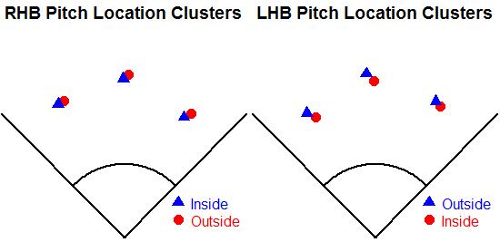
Some hitters, like Jacoby Ellsbury and Ian Kinsler, can't drive inside pitches the other way with authority, which I imagine would be useful information to outfielders.
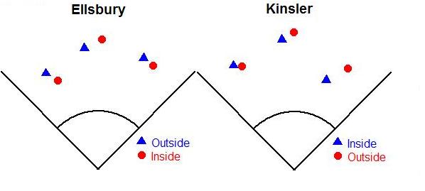
| Touching Bases | April 15, 2010 |
Clusters in the Outfield
"I waved in my outfielders. When they got in around me, I said, 'Sit down there on the grass right behind me. I'm pitching this last guy without an outfield.'" -- Satchel
Outfielder positioning has been a hot topic over at The Book Blog recently. Max Marchi has done some great research on the topic of defense positioning.
Using MLBAM data, which reports the location of where the ball was fielded, as well as Peter Jensen's Gameday translations, I queried the hit locations of balls in the air that left the infield but stayed in the ballpark. I restricted my sample to only hitters who had at least 100 balls in the air from one side of the plate through 2008-2009. I then ran a k-means algorithm that split the spray chart into three different clusters. I wouldn't say that the centers of each cluster indicate where a fielder might be positioned, since a lot more than just getting to balls goes into positioning, but one might put it that they indicate the middle of a fielder's area of responsibility. I think of it as a tidy way to quantify someone's spray chart.
For example, Joe Mauer hits the ball in the air the other way a lot. The left-fielder is responsible for three times as many fly balls off Mauer's bat as the right fielder. Conversely, Carlos Pena pulls a fair share of his fly balls. Assigning each ball to a fielder yields the following chart:
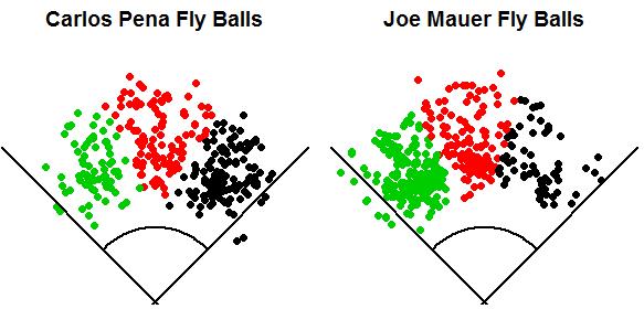
Logically, a fielder would get to the most balls the fastest by standing in the middle of his zone. Again, that often doesn't align with the actual job of the fielder, which is to prevent runs. Averaging the clusters produces the following centers:
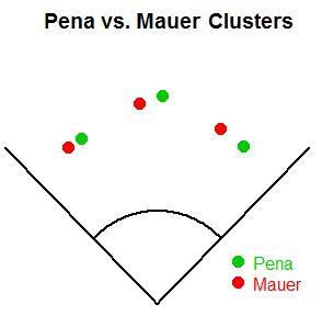
So the difference in the average hit locations between a great pull hitter and a great opposite-field hitter comes out to around 30 feet.
The most interesting and informative chart is probably the one that splits batters by handedness.
On average, corner outfielders have to move 15-20 feet depending on the handedness of the batter. This is the result of pulled balls traveling farther than opposite-field balls. The center fielder only moves five feet in general. Grouping by pitcher handedness didn't produce any visibly different results.
Now, I'll look at some of the most extreme differences in cluster centers. While Pena and Mauer have an extreme difference in the rate of balls they put in play to each field, their clusters were in close proximity as compared to Scott Podsednik and Ray Durham, whose centers were 50-100 feet apart.
As for right-handed batters, Derek Jeter is the only player who hits a higher rate of balls in the air to the opposite field than Joe Mauer. Jeter leaves the right fielder responsible for over half of his fly balls, and he forces the right fielder to play closer to the line than any other right-handed batter. I'll compare him to Jesus Flores.
All of the previous charts have dealt with fly ball angle, but fly ball distance is just as important in outfield positioning. The first pair I noticed was Cody Ross and Gregor Blanco
Here, we see some of the unreliability in either the GameDay location data or the pixels-to-feet. Cody Ross has power, and power to center, but something is off. He doesn't routinely hit 400-foot flies that stay in the ballpark. Oh, well.
Looking at pull power to left, there's a more realistic difference between Chris Iannetta and Ryan Roberts.
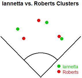
And the obvious choice for the final coupling is Luis Gonzalez and Paul Bako.
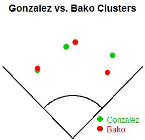
The only player for whom my clustering algorithm spat out something funky was Clete Thomas. His spray chart is unusual in that he appears to have decent power to left-center, but not so much to right-center, which creates a distinct region in left-center where no fielder would ever play, and leaves a neighboring vacancy where the center fielder is traditionally positioned.
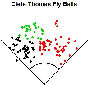
| Touching Bases | April 05, 2010 |
Finally Joining the Old Guard
Bill Simmons is one of my favorite writers on the planet. An inspiration. The highlight of my 11th-grade Physics class was being pulled from class by a friend who told me that I had made Simmons’ mailbag. Reading his latest piece on Friday made me smile. Profusely. But I thought it would be funny for a Sabermetrician to write the exact opposite type of piece.
Question: Who’s going to have the biggest decline in baseball this year -- Ben Zobrist, Joel Pineiro, J.A. Happ, or Joe Mauer?
Answer: None of the above. The answer is me.
See, I’ve loved writing about baseball these past two years, developing stats too complicated for the common fan’s liking. Did I respect the work of ESPN, Murray Chass, Dan Shaughnessy, Mike Lupica, and everyone else in that community? Of course not. I just hated the ignorance of it, the concept that opinion could trump data. If whimsies always prevailed, what was the point of analysis? I longed for the future when I could say things like, “Brett Gardner has had the 11th highest WAR rate among outfielders in the last two years. Calling him a fourth outfielder is batshit crazy.” And there wouldn’t be some dude calling WFAN and WEPN saying, “Well, I think…”
Look at that last sentence again.
Fundamentally, it’s fundamental. I just admitted I longed to be objective with my analysis.
My first favorite player was Scott Brosius, New York's flappable third baseman. I don’t know why. I was a third baseman as a kid and I guess I just thought he was a really good defender. Fun to watch. Don’t really care if he stood the test of time, although he does rate well by WOWY. I just enjoyed watching him barehand bunts and hit World Series home runs off BYK like any True Yankee. Hence, my attitude for the past few years could be summed up like this:
“Who cares if your favorite player/team sucks? I’m just presenting the data, no need to take offense. Shouldn’t change how you enjoy watching the game.”
Things shifted this winter when a guy told me that I live in my mother’s basement. Instinctively, I understood that I don’t live in my mother’s basement. I live in a dorm room on campus. Why would somebody tell me that I live in my mother’s basement when he has no bearing for that remark? Why would you try to purposely offend me, when you don’t even know me? Why are you so angry? Calm down, bro. Have a beer.
Baseball friends I trusted kept telling me, “Think of it existentially. The mother’s basement is a metaphor for “the past,” and the guy was really talking about himself. So in actuality, he was saying that he lives in the past and feels that you’re encroaching upon his territory. He’s getting older and more out of touch, and he’s uncomfortable with change.”
I wanted to believe it. Cautiously, nervously, I started researching where my tuition and room and board were coming from, begrudgingly coming to one conclusion: I do “live in my mother’s basement.” My mother’s basement is a painfully unoriginal insult disguised as a cliché. I am my parents’ genes with arms and legs. I am dependent on my parents. Does this paragraph make sense? No. Ignoring logic…that’s the trick. And the nonsense indicated that my sensibilities were wrong.
Little did I know, the ball was rolling for me. I spent March making myriad friends and clearing my acne and losing my virginity and GTLing, and not speaking with a nasally voice for mostly unselfish reasons (The world is a better place when I’m socially active.), but also because I realized that the only way to avoid insults from the old guard is to conform. I even understand why mainstream guys take it so personally whenever a stat junky spouts out an informed baseball study. It’s too hard to be a Sabermetrician these days. Takes a lot more time than you might think.
Without further ado, I am leaving the world of Sabermetrics. Getting out of my mother’s basement makes life more fun. At least for me.
| Touching Bases | April 03, 2010 |
Stakeholders - Minnesota Twins
From now through the beginning of the regular season, we will not be posting in-depth round-tables previewing each division like we have in years past. Instead we will feature brief back-and-forths with "stakeholders" from all 30 teams. A collection of bloggers, analysts, mainstream writers and senior front office personnel will join us to discuss a specific team's hopes for 2010. Some will be in-depth, some light, some analytical, some less so but they should all be fun to read and we are thrilled about the lineup of guests we have teed up. Today it's Aaron Gleeman on the Minnesota Twins.
![]() Jeremy Greenhouse: If you were the Twins new stats guy, what would be your first order of business?
Jeremy Greenhouse: If you were the Twins new stats guy, what would be your first order of business?
Aaron Gleeman: Order lunch. I never crunch numbers on an empty stomach. After that, I'd push to set up a meeting with the decision-makers to present some of the concepts and stats I'd be using, because the analysis means nothing if the front office doesn't understand or value the underlying concepts and based on their statements so far they don't yet.
JG: Bill Smith seems to be guided more by faith than science. So is Locke his best "Lost" comp?
AG: Well, he can't be Hurley any more because he dropped something like 50 pounds, so Locke might be the best comp. Right now I suspect the new stat guy's best "Lost" comp is probably Artz or maybe even the pilot who got yanked out of the plane in the first episode. Also, if there's a Kate comp working in the Twins' front office my head may explode.
JG: How many wins does the loss of Joe Nathan cost the team, and how would you handle the Twins bullpen?
AG: My best guess is that Joe Nathan's injury costs the Twins three or four wins. I'd like to see them try a true "closer-by-committee" because they have 4-5 capable right-handers and Jose Mijares is death on lefties, but despite Ron Gardenhire using that phrase to describe his ninth-inning plans I think he'll settle on one guy for the job within a few weeks.
JG: Twins starters don't strikeout many guys. The defense rated poorly in terms of UZR last year. Something's gotta give. Do you think the defense turns it around this year, or would the staff be better served with starters who strike out more than 4.5 batters per nine (Nick Blackburn)?
AG: It'll be an interesting experiment, for sure, because the Twins' pitching staffs have long been fly-ball heavy with great control and mediocre strikeout rates, yet their outfield defense has the potential to be pretty bad if past numbers prove accurate and their infield defense has the potential to be very good with J.J. Hardy and Orlando Hudson up the middle and Nick Punto getting most of the starts at third base. Beyond that no one knows how the new ballpark will play and they're switching from turf to grass. I think the key will be whether Denard Span's scouting reports or small-sample size UZRs end up telling the story about his ability in center field.
JG: Delmon Young. Positive or negative WAR?
AG: Positive, but not by a ton. Delmon Young lost a bunch of weight this offseason, he's still pretty young, and everyone takes any positive thing he does as a sign that it's all coming together finally, but I'm definitely not a believer. He swings at everything, his bat speed is often sluggish, and he's yet to show any of the supposed power potential Twins fans have been hearing about for years now. He's also a horrible, clumsy defender, so he'd need to really have a strong year at the plate to post a solid WAR.
JG: Joe Mauer. That's not a question. That's a statement of fact.
AG: Preach.
JG: What are you hearing about Target Field in terms of aesthetics and how it will play?
AG: Everyone seems to love it, which I think is a combination of the Twins doing a really nice job putting the place together and the fact that Minnesotans have been watching baseball in a warehouse for a couple decades. It seems very tough to predict how new ballparks will play, but I suspect it'll be more hitter-friendly than the Metrodome was in recent years. I'm just hoping it's not too extreme in either direction.
JG: Have you ever considered calling yourself Aaron Gleeman III to gain credibility with Twins fans?
AG: I don't have the je ne sais quoi to pull that off like LaVelle E. Neal III (or LEN3, if you're nasty). I'd probably go with "Trey" in that scenario, although Hillman has kind of ruined that for all the III's out there.
JG: The Twins are the best, most talented team in the division to be sure. So what are you most nervous about heading into the season?
AG: I think the impact of losing Nathan has generally been overstated, but the bullpen is definitely in flux right now and whether or not the closer role is overvalued he's still one hell of a reliever. I'm probably most nervous about that, along with Justin Morneau's health. But at the end of the day I think you're right that they have the most talented team in what figures to once again be a pretty weak division.
Aaron Gleeman is the Senior Baseball Editor at Rotoworld and owner of aarongleeman.com. He was the co-founder and main operator of The Hardball Times before leaving to write for NBC Sports, where he writes the Baseball Daily Dose column for Rotoworld, and he, along with Craig Calcaterra, D.J. Short, and Drew Silva write the constantly updated HardballTalk blog.
| Touching Bases | April 01, 2010 |
Whose Stuff Plays Up?
Relievers hold several advantages over starters. For one, relievers don't have to worry about pacing themselves. Moreover, they never have to face the same batter twice in one outing. So Steve Treder has determined that throughout history, "reliever ERAs have been consistently better, almost always by a factor of between 5% and 10%" To prove that the difference in ERA is, in fact, a difference in difficulty rather than skill level, you need to find pitchers who have both started and relieved, and compare their performance in each role. Tangotiger has come up with a rule of thumb to quantify what you'd expect if you were to convert a starter to a reliever. "Basically, use the “rule of 17”: difference in BABIP is 17 points higher as starter. K/PA is 17% higher as reliever. And HR per contacted PA is 17% higher as starter. Walk rate is FLAT."
But every pitcher is different. You'll hear every now and then that somebody has a "bullpen mentality." And some are more suited for the bullpen because their stuff "plays up." So I went into my PITCHf/x database and pulled out the pitch-by-pitch data for all 118 pitchers who had thrown at least 100 fastballs as both a starter and a reliever from 2007-2009.
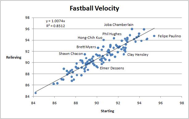
85% of the variance in a pitcher's fastball velocity when he switches roles can be explained by his previous fastball velocity. In general, pitchers add about 0.7 miles per hour to their fastball by making the switch from starter to reliever. But there are exceptions. Hong-Chih Kuo is a true outlier. His fastball has been 3.4 MPH faster in the pen. It's possible that Kuo has built up arm strength since he quit starting a couple years ago. But maybe he was simply more suited for the pen, and the Dodgers found the right position for him. Conversely, Felipe Paulino has pitched to better results as a starter, which could be attributable to his unusual ability to throw harder in that role. As a starter, he's managed to break the 95-MPH threshold with his fastball, which makes him a breakout candidate for 2010, especially considering his career 6.40 ERA vs. 4.23 xFIP.
How about changes in pitching styles? In the bullpen, a pitcher can survive with only two pitches, while starters need to keep extra pitches in their back pocket for the third and fourth times through the order.
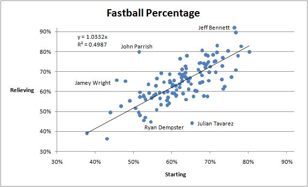
Pitchers throw 3% more fastballs in relief, but there are wide swings depending on the pitcher. I'm still including only pitchers with at least 100 fastballs thrown in both roles, and it takes much longer for fastball rate to stabilize than fastball velocity, so that explains some of the variance. I think that some pitchers throw more breaking balls in the bullpen because they've pick up a platoon advantage. This certainly applies to Julian Tavarez, who has used his breaking balls more often than his fastballs since entering a relief role and becoming something of a ROOGY.
Finally, a Google Motion Chart containing number of pitches, StuffRV/100, fastball percentage, and fastball velocity for the 118 pitchers in my data set.
| Touching Bases | March 25, 2010 |
Most Impvoved PITCHf/x Pitches of 2009
At Fangraphs, you can find the most valuable pitches in baseball. FanGraphs uses Baseball Info Solutions data and assigns pitches a run value based on the results of each pitch. Tim Lincecum's changeup comes out on top. A couple weeks ago, I tried my hand at finding the best pitches of 2009 by using PITCHf/x data and assigning each pitch a run value based on the pitch's physical characteristics. I didn't grant a winner, but gun to my head,* I'd have to say Matt Thornton's four-seamer or Zack Greinke's slider. As I learned in 8th-grade tee ball, no award series is complete without handing out trophies for the most improved. (Thanks again Coach Hover!)
*Actually, gun to my head, I'd have to say, "Please stop holding a gun to my head." I can't imagine anyone would be willing to use lethal force to obtain my opinion on this matter.
A quick-and-dirty, yet effective, way to tell whether or not a pitcher has improved in a given year is to simply find the difference in his fastball velocity from the previous year. Check out Dave Allen's take from this time last year. In 2009, Homer Bailey, Carl Pavano, Barry Zito, Justin Verlander, and Jon Lester all exceeded expectations. Their success could be tracked back to substantial increases in fastball velocity. I'm hoping that by looking at differences in "fxRV," which incorporates measures of velocity as well as movement and location, I will be able to find some pitchers who improved their fastballs by sacrificing velocity in favor of movement or command. Here are the top five most improved fastballs of 2009. The velocity delta is represented in terms of miles per hour and the fxRV delta in units of run value per 100 pitches.
| Pitcher | Pitch Type | Velo Delta | fxRV Delta |
|---|---|---|---|
| Mark Lowe | F4 | 1.66 | -0.87 |
| Wandy Rodriguez | F2 | 0.87 | -0.69 |
| Joel Pineiro | F2 | -0.65 | -0.60 |
| Scott Feldman | FC | 0.91 | -0.55 |
| David Aardsma | F4 | -0.57 | -0.50 |
Mark Lowe's fastball jumped from Jon Garland to Jonathan Broxton quality. Velocity was evidently the trick for Lowe, who upped his pre-2009 four-seam velocity from 94.6 MPH to 96.2 MPH. Wandy Rodriguez also greatly benefited from a boost in velo, but at the same time, he managed to add sink to his two-seamer. That's a tough task to pull off. Scott Feldman's cutter was one of the most valuable pitches in baseball last year, and there's good reason why. He broke the 90-MPH threshold with the cutter while generating an extra inch of horizontal movement. He threw it about twice as often in 2009 as he did in 2008. It wasn't the best cutter in the game—we know who that belongs to—but it was easily the most improved.
And then there's Joel Pineiro and David Aardsma. I'm not sure what I can possibly add to the discussion concerning Joel Pineiro and his sinker. I love that the numbers back up the excessive number of stories. Pineiro traded velocity for movement and command, and it made his sinker a better pitch that yielded better results. Pineiro's fastball was thrown 71% of the time last year as compared to sub-60% in years past, and its effectiveness went from 20 runs below average to 20 runs above average. I think that PITCHf/x data can be an aid to coaches in that the data can show what pitchers might want to focus on in terms of release point, velocity, movement, or location. I think Dave Duncan might inherently possess this knowledge. There's an adage that sinkerballers with tired arms throw heavier and better sinkers. PITCHf/x data can determine if the adage holds water.
Aardsma threw the highest rate of fastballs in the league last year at 87%, and he did so because he traded in velocity for overall quality. And like Pineiro's sinker, Aardsma's impressive four-seamer was well chronicled. Geoff Baker doesn't miss a beat.
The other key was Wetteland, pitching coach Rick Adair and manager Don Wakamatsu convincing Aardsma he didn't have to blow hitters away by overthrowing. They told him his fastball could still get hitters out if he took a little off it in order to hit his targets more consistently."If your strength is a fastball, then your strength is a fastball," Wetteland said. "Just work on where you can control it to all spots of the zone. Get the control down to the point where you can do what you do best..."
The key to me was, if I was already beating them with my fastball, don't try to throw it any harder," Aardsma said. "Whenever I get in trouble, it isn't because I'm throwing fastballs, it's because I'm getting behind in the count with them.
In addition, Dave Allen found reason for Aardsma's four-seam improvement.
At the other end, Rich Hill's four-seamer was the antithesis to Lowe's. Pre-2009, both pitchers' fastballs were mediocre. Lowe's became one of the best in baseball whereas Hill's became possibly the worst.
As for the most improved breaking balls...
| Pitcher | Pitch Type | Velo Delta | fxRV Delta |
|---|---|---|---|
| Ubaldo Jimenez | SL | 0.24 | -0.66 |
| Erik Bedard | CB | 0.23 | -0.62 |
| Justin Verlander | CB | -0.28 | -0.62 |
| Barry Zito | CB | 2.42 | -0.59 |
| Zach Duke | CB | 0.25 | -0.57 |
Ubaldo Jimenez found his slider last year, and he didn't shy away from it. In 2008, Ubaldo ran his fastball at 94.9 miles per hour. Even though no starting pitcher threw harder than his 96.1 MPH in 2009, Ubaldo actually dropped his fastball usage to 62.7% in 2009 against 69.8% in 2008. That's because his slider was his most improved pitch. I'm having trouble pinpointing exactly what Jimenez changed, but I think it was just a matter of throwing more strikes. Justin Verlander's curve was an entirely different animal last year. Same velocity, but twice as much movement. Erik Bedard's curve has always been really, really good. It was possibly the most unhittable pitch in baseball last year, though.
Meanwhile, Cole Hamels' curveball regressed so badly last year that he might want to rethink the pitch. He didn't throw it for strikes, he didn't get any swings, he didn't get any whiffs. I'm not sure what he was trying to accomplish with the curve last year, but he didn't get it done. Buster Olney reports that Hamels is indeed working on his curve.
I'm skeptical that the fxRV system adds any value to measuring the effectiveness of changeups and other off-speed pitches, since they're mainly built on deception and sequencing. Anyway, as compared to past years, Justin Verlander's change had better fading action, and Ryan Dempster's splitter had better bottom.
| Touching Bases | March 18, 2010 |
Kevin Jepsen: Sleeper
He's got Brian Wilson's fastball/slider combo plus A.J. Burnett's curve. Kevin Jepsen's stuff is that good.
I first noticed Jepsen when he topped my "Stuff" leaderboard back in September. He had only thrown 330 pitches on the year at that point, so I didn't make much of it, but the numbers ranked him right up there with Wilson.
He then burst upon my radar in the ALCS last year when his stuff blew away a couple Yankees as well as Carson Cistulli and myself. In 2002, Francisco Rodriguez was the Halo rookie who made waves in the playoffs. In 2008, Jose Arredondo captured some of that K-Rod magic. Now I'm not saying Jepsen will have the subsequent success of K-Rod or the sophomore slide of Arredondo. But I'm thinking he's closer to the former than the latter.
Jepsen had allowed 5.4 walks per nine innings before being called up to the Majors in 2008. Since then, he's proven that he can harness his electric stuff in 63 regular season innings. His career MLB BB/9 is 3.3, better than both Wilson's and Burnett's. His strikeout rate has been somewhat lower than expected, though at nearly eight Ks per nine, it's nothing to sneeze at. Kept the ball on the ground? Check. Career 55% ground ball rate. So what's with that glaring 4.86 ERA that's holding him back from being widely regarded as a potential breakout candidate in 2010? A .360 BABIP and 61.9% strand rate. Gotta love it when bad-luck indicators line up like that. Jepsen's career 2.86 FIP is a full two runs lower than his ERA. In the last two years, Damaso Marte's ERA-FIP of 1.32 is the next closest to Jepsen's among relievers with at least 60 innings pitched.
PECOTA and ZiPS project Jepsen for an earned run average well north of five. CHONE is more bullish, projecting an ERA of 4.14. Still, every projection system forecasts major regression in 2010 from last year, which is fair, considering he has outperformed in MLB compared to his Minor League numbers. Why should you believe that Jepsen can continue to outdo his pre-2008 track record?
On the PITCHf/x front, The Orange County Register's Sam Miller's got you covered. The whole article is worth a read, but allow me to quote heavily from it.
Here’s what changed:The first photo shows Jepsen’s pitch movement (from the catcher’s perspective) in April and June. The second one is his pitch movement from July 1 on.
In the first photo, Jepsen basically has two pitches — a fastball that usually bores in on righties, and a curveball with downward movement. In the second photo, allllll that space in between them is filled with the green pitch. It’s labeled a slider, and it behaves like a hard slider — 89 mph, with movement away from the right-hander — but is perhaps best called a cutter. The LA Times quoted the Angels as saying it’s a cutter that Mike Butcher taught Jepsen in early July. Later in the season, Jepsen seems to refer to it as his slider. Cutters and sliders aren’t that different, and the label isn’t as important as how well it worked.
When hitters swung at it from Aug. 1 on, they got nothing but air 55 percent of the time. Zack Greinke’s slider might be the best in the game, and he got whiffs on 42 percent of swings. Frankie Rodriguez gets whiffs on 28 percent. Billy Wagner, 37 percent. Mariano Rivera’s cutter: 25 percent. It was, for Jepsen, a massively good pitch. (Here’s a not-very-good example of it.)


There's not really much to add to that. Miller concludes that Jepsen "now projects as a possible future closer. Maybe by the end of this year." I'm inclined to agree. Brian Fuentes wavered down the stretch last season, which cast a seed of doubt in manager Mike Scioscia's mind. Pre-All-Star break, Fuentes added 1.4 WPA, but from the midsummer classic on, he lost -0.5 WPA.
"Both guys have been an important part of the back end of the bullpen," Scioscia told Brittany Ghiroli in mid-September. "But if there are some matches that could be advantageous [to use Jepsen], we will try to take advantage of [them]."
Fuentes had the lowest fastball velocity of his career since he inherited the Closer role. His 19.7% whiff rate fell well short of his 26.4% career average. He also threw only 47.7% of his pitches in the strike zone compared to a 51.95% career rate. While Jepsen's FIP has fallen short of his ERA, Fuentes pitched to better results than his peripherals would suggest. His tentative hold on the ninth inning job is slipping. If you're playing fantasy baseball, I doubt you'd even need to draft Kevin Jepsen to own him. But be ready to scoop him up off the waiver wire, because I have a feeling that once the season starts and he gets another chance to show everybody his stuff, he's going to pick up helium.
| Touching Bases | March 04, 2010 |
Best PITCHf/x Pitches of 2009
The PITCHf/x system uses two cameras to track pitches between pitcher and batter, determining the coordinates of the ball x(t), y(t), z(t) at times t in 1/60-sec intervals. The resulting trajectory is a nine-parameter (or 9P) fit corresponding to constant acceleration in each of the three coordinates. The 9P fit is an approximate solution to the exact equations of motion. All quantities reported in the PITCHf/x data base, such as the pitch speed, the location of the pitch as it crosses the plate, the break (or pfx) of the pitch, etc., are derived from the fitted trajectory rather than from the original data. -- Alan Nathan
Velocity, movement, location, release point are age old-terms in the baseball lexicon that have been quantified thanks to pitchf/x. Chris Moore in August published a groundbreaking study ranking the best fastballs in baseball using factors given by pitchf/x including velocity, horizontal location, vertical location, horizontal movement, and vertical movement. I will try my hand at a similar analysis. The goal is to measure a pitch's quality using only the inputs provided by pitchf/x. I've decided to use the same five parameters as Moore, also opting against adjusting for release point, and instead simply excluding all pitchers I classified as sidearm. I've tried to control for count and handedness as well. I'm calling the metric fxRV, as its units are in terms of run value.
Top Five Fastballs
| Player | Type | Pitches | Usage | rv100 | fxRV100 | Velocity |
|---|---|---|---|---|---|---|
| Matt Thornton | F4 | 857 | 75.04% | -1.42 | -1.27 | 95.74 |
| Lance Cormier | FC | 617 | 51.25% | -1.68 | -1.11 | 87.46 |
| Cliff Lee | FC | 587 | 15.31% | -0.38 | -0.96 | 85.85 |
| Justin Verlander | F4 | 2220 | 57.05% | -1.29 | -0.81 | 95.99 |
| Jason Motte | F4 | 634 | 68.32% | 0.04 | -0.77 | 96.17 |
Matt Thornton has top five stuff of any reliever in baseball and Justin Verlander has top five stuff of any starter. That type of velocity from a respective lefty and starter is unparalleled. Clayton Kershawas a left-handed starter will be entering that territory soon with his 94-MPH fastball. Verlander elevates his fastball more than just about anyone in the game with the exception of Kevin Millwood. According to FanGraphs, Lance Cormier has increased his cutter percentage each of the last four years to the point that he is now throwing it over half of the time. And looking at his pitch type values, he might want to entirely scrap his four-seam fastball, since it has never been an above average pitch while his cutter was fantastic last year. I'm puzzled by Motte's poor run value on his fastball. He's too good to fail as a reliever. Patience, TLR.
My numbers say that Danys Baez' fastball is in line for some regression this year, despite successful results. At the other end of the spectrum, Baez' teammate Chris Tillman has a quality fastball, even though it was ten runs below average last year. And Barry Zito's fastball is aggressively bad.
Top Five Breaking Balls
| Player | Type | Pitches | Usage | rv100 | fxRV100 | Velocity |
|---|---|---|---|---|---|---|
| Erik Bedard | CB | 438 | 32.57% | -1.50 | -1.85 | 77.67 |
| Zack Greinke | SL | 765 | 22.12% | -2.90 | -1.57 | 85.63 |
| Gio Gonzalez | CB | 515 | 28.61% | -1.41 | -1.48 | 78.68 |
| Bronson Arroyo | CB1 | 596 | 17.85% | -2.00 | -1.47 | 75.00 |
| Daniel Bard | CB | 221 | 25.46% | -2.12 | -1.46 | 83.93 |
Erik Bedard* and Gio Gonzalez both have big yakkers. Watching these guys on TV is fun, since a sweeping curveball from a left-handed pitcher as viewed from the off-center center field camera appears to be heading right for a left-handed batter's skull only to break over the inside part of the plate, hopefully as the batter's knee buckles: the old Barry Zito phenomenon. Joe Posnanski has called Zack Greinke's slider "devastating," "the best in the American League", and "his "God-given gift." It's a good pitch. Bronson Arroyo is to pitch classification systems as Bronson Arroyo's name is to Tim McCarver's brain. Nevertheless, his curveball(s?) are good pitches.
Kevin Jepsen didn't qualify for the leaderboard, but his curveball is superb. It gets similar movement to Bedard's curve, but comes in six miles per hour faster, albeit from the right side. Jepsen gets his curve down in the zone very well, too. He also throws a 96 MPH fastball and 90 MPH slider. I'm very, very high on Kevin Jepsen. Jonathan Broxton's four-seam fastball and slider were both within a spot of the top five. Daniel Cabrera? Yeah, he's bad.
*Ironically**, there's also a Canadian speed skater named Eric Bedard. If short track were regularly televised, I swear I would watch.
**I find it ironic that I don't know what irony means.
Top Five Off-Speed Pitches
| Player | Type | Pitches | Usage | rv100 | fxRV100 | Velocity |
|---|---|---|---|---|---|---|
| Burke Badenhop | CH | 142 | 12.40% | -1.88 | -1.09 | 82.19 |
| Bronson Arroyo | CH | 518 | 15.51% | -1.98 | -0.92 | 79.29 |
| Jered Weaver | CH | 594 | 16.56% | -1.36 | -0.84 | 80.21 |
| Brandon League | SF | 181 | 16.54% | -2.32 | -0.80 | 85.22 |
| Sean O'Sullivan | CH | 145 | 16.08% | -3.56 | -0.78 | 76.13 |
The four pitchers besides Brandon League are all on this list because they can command their off-speed pitches. Nothing in my system accounts for the deception of a change. League's splitter, however, was labeled by Matthew Carruth as the toughest pitch in the league to hit because of its 35% whiff rate. Burke Badenhop does a terrific job of getting his changeup down and away from opposite-handed hitters, and his pitch has a lot of "sink." Jered Weaver and Sean O'Sullivan generate a lot of "rise" on their changeups, though that's not necessarily a good thing, since Clayton Kershaw gets the second most rise on his change in the league, but it's a highly crude pitch. He can't locate it either.
Interestingly, Jonathan Papelbon had one of the worst splitters in baseball last year. He rarely threw it in the strike zone. I was happy to see that Daniel Ray Herrera's screwball was listed as a quality off-speed pitch. The world needs more screwballs.
| Touching Bases | March 02, 2010 |
Stakeholders - Pittsburgh Pirates
From now through the beginning of the regular season, we will not be posting in-depth round-tables previewing each division like we have in years past. Instead we will feature brief back-and-forths with "stakeholders" from all 30 teams. A collection of bloggers, analysts, mainstream writers and senior front office personnel will join us to discuss a specific team's hopes for 2010. Some will be in-depth, some light, some analytical, some less so but they should all be fun to read and we are thrilled about the lineup of guests we have teed up. Today it's Joe P. Sheehan on the Pittsburgh Pirates.
![]() Jeremy Greenhouse: As an alumnus of Baseball Analysts, is it difficult dealing with the constant presence of fans and media?
Jeremy Greenhouse: As an alumnus of Baseball Analysts, is it difficult dealing with the constant presence of fans and media?
Joe Sheehan: No, but I get confused with the other Joe Sheehan a lot.
JG: Can you describe Neal Huntington's style as general manager, and if you'd like, you can also compare him to a character from "The Wire."
JS: I've never really seen "The Wire."
JG: I recommend it.
JS: I really don’t have anything to compare him to. He’s been very open to different ideas. I don’t work directly with him, though. It appears he listens to the different sides of an argument whether it’s what (director, baseball systems development) Dan Fox has to say or a scout. It seems as if he’s not wedded to one side or the other. I don’t want to over-state what I do, as I only have a slightly closer perspective than an outsider. I don’t want to make it sound like I know what Neal’s doing. It appears he’s doing what we would expect—using all forms of information he can get to make informed decisions. Some work out, some aren’t 100%, but that's the nature of decisions. It's very comforting to know that the process appears to be sound.
JG: Turning to baseball, I'm most interested in a Pirates' outfield that has a lot of potential. Can you talk about your expectations for all of them?
JS: Andrew McCutchen is great. Watching him last year come up from the minors without missing a beat to replace a lot of the production we were getting from Nate McLouth was exciting. He handles himself really well. His style defensively is fun to watch. He hit a couple triples that when watching the game, it’s like, "Oh my God. He hit another gear going second to third." Garrett Jones, I don’t want to say came out of nowhere, since we liked him as a minor league free agent, but I don’t think anybody expected him to do what he did this year at the start of last year. Even though he was old for a rookie, he has a shot of building on what he did last year. As for Lastings Milledge, for a long time Milledge was known with Cole Hamels for their facts, but he's coming along. I’m not really that connected with the player development side, but everything you hear since we've acquired him, the work he's put in, everything was positive. He's still on the younger side. While he hasn’t had the tremendous success at the Majors that he has at AAA, we hope that he can continue some of that minor league success going forward. Ryan Church is solid, and he'll find some at bats. And our Rule 5 pick John Raynor is going to contribute, and we've got Brian Myrow banging on the door at AAA too, depending on whether he plays first base or the outfield.
JG: I assume you still work with pitchf/x data, so what minor league pitcher do you most look forward to pitchf/xing?
JS: This year, probably Brad Lincoln because he’s the closest out of our minor leaguers. Rudy Owens is another interesting guy, but in terms of guys who are close, I’d probably say Lincoln. Rudy was in A-Ball this year, so he's further away. In the future, I'm looking forward to seeing all the high school pitchers we drafted last year.
JG: I was doing some pitchf/x work of my own and I noticed that Ryan Doumit can’t layoff pitches below his knees. He probably already knows he doesn't have the best plate discipline, but if you find something like that, will you approach the player or how does the team go about doing that? What's that process like?
JS: I haven’t interacted with any players. It’s a little tough to go to a player with very specific instructions, because it's almost like you don’t want to make them over-think things. If you tell any player that a pitcher is throwing 55% fastballs, 40% something else, 5% something else, then the right play is to wait for the fastball. But if you tell that to the player, and he doesn't get fastballs for two at bats, then he’s not going to trust you anymore. Over a huge timeline you would be right, and you’d come out ahead, but if for two at bats he’s listening to you and you get bad luck, you lose some trust and he'll think you don’t know what you’re talking about.
JG: So do you filter information through the coaching staff?
JS: That’s primarily where the interaction will take place. Dan or an advanced scout, there's something they might see, and they might communicate it to (pitching coach) Joe Kerrigan or (batting coach) Don Long. You can tell the coaching staff different stuff you can't tell players because if you're overwhelming the player, it's slowing their at bat down, and they're missing pitches. So you can talk to the coaching staff in more detail. I would think that that’s more the way the process happens.
JG: What are your and the Pirates' goals for this season?
JS: It’s to improve. It's to be better than we were last year. That's the goal for every team every year. I don’t know if there’s a number you want to say if you don’t win "x" games, you fail, and if you win "x" games you succeed. We want to get better. We want to improve our depth at the minor league level and get better at the major league level. I want to get better at my job. Everyone wants to get better at their jobs. If we do that for a good stretch of the season, the talent, wins and results will come.
Joe P. Sheehan is the Baseball Operations Data Analyst for the Pittsburgh Pirates. Before that, he wrote the Command Post column for Baseball Analysts.
| Touching Bases | February 28, 2010 |
Stakeholders - New York Mets
From now through the beginning of the regular season, we will not be posting in-depth round-tables previewing each division like we have in years past. Instead we will feature brief back-and-forths with "stakeholders" from all 30 teams. A collection of bloggers, analysts, mainstream writers and senior front office personnel will join us to discuss a specific team's hopes for 2010. Some will be in-depth, some light, some analytical, some less so but they should all be fun to read and we are thrilled about the lineup of guests we have teed up. Today it's Pat Andriola on the New York Mets.
Pat was one of the first people to introduce me to sabermetrics. I returned the favor by introducing him to "The Wire", which he had finished the night before our interview. We used that as a jumping off point.
![]() Jeremy Greenhouse: If Omar Minaya were a character from "The Wire," who would he be?
Jeremy Greenhouse: If Omar Minaya were a character from "The Wire," who would he be?
Pat Andriola: I need a minute to think about this...You know who I think it is, it’s Pryzbylewski. Prezbo is clearly a guy, like Omar as a GM, who is thrown into a certain situation. Prezbo was in the police department where everything lines up for him to be there, but maybe it’s not the best situation for him. Like Prezbo was better off at school, maybe Minaya should be on the sidelines as a scout—head of scouting—because he gets a deer in the headlights look as GM. He makes some silly signings, like Prezbo shoots a cop accidentally. I think that’s it. That’s my on the spot answer.
JG: Nice one. I like that. Let’s talk about the core a little. Or you can just rant on Francesca.
PA: I wrote an article a couple years back on MetsGeek about the core. Right now, Wright, Reyes, Beltran, and Santana I would say is the core.
JG: Is Bay in that core?
PA: Right, I mean what is the core? It means nothing. It’s such a silly term. It’s basically a group of really good players. Like a lot of teams have a core of really good players. The Phillies have a core of really good players. The Yankees have a core of really good players. The question is: can you surround this bunch of really good players with other good players to be competitive? I think Wright is going to have a really good year this year. I think Reyes is going to have a nice year. Santana, we’ll see about the surgery. We’ll see about Bay and how he handles left field in Citi. I think they’ll all be fine. I’m not really worried about them. There are bigger question marks than the core.
JG: So what are your thoughts on Citi Field so far? How do you think Wright and Bay handle it this year?
PA: Aesthetically, I love Citi Field. And I think it does work well for the Mets. It’s very simplistic, but it really does help Reyes to have more room in the outfield to spray the ball and get triples. I mean he didn’t have enough time to take full advantage of it and understand the park and play to the park. If you saw Angel Pagan, Pagan had a bunch of triples last year. And for Pagan to be able to hit liners into the gap and get to third base, that’s the least Reyes could do.
JG: What has to happen for the Mets to make the playoffs?
PA: For the Mets to make the playoffs, I think it comes down to the rotation. Basically, you have Johan at the front. I think he’ll be fine. I think Pelfrey will have a better year than he did last year. I’m a huge Pelfrey fan. So basically it comes down to Perez, Maine, and Niese or whoever else they put in the fifth spot. I’m overly optimistic about the rotation. I’m not about the lineup. But I feel like Perez is going to have a good year. People forget he had some pretty good years 2-3 years ago. I think Maine's fine as a fourth starter. Niese I’m a huge fan of. He’s coming back from a really, really tough injury—the guy literally collapsed on the mound—so it’s tough. Even if it doesn’t work out, they got some good backup options. I wrote an article on The Hardball Times a couple weeks ago about how much I like Nelson Figueroa. I think he can step in if necessary. And if the Mets are competitive at the deadline, they have the prospects to trade for a starting pitcher.
But will the offense produce? Obviously there are so many question marks. Other than David Wright, who’s something of a question mark in himself, there’s no guarantee. We don’t know how Bay’s going to adjust to Citi Field and the NL. We don’t know about Beltran. We know about Francoeur, but that’s a different story. Murphy and Tatis at first, Castillo at second, Reyes coming back, the catcher is now Barajas, Thole, Santos, Chris Coste, everyone else you want to throw in there. The offense has so many question marks. It's clearly possible, they have enough talent, the question will be when they play out the season, how’s the talent going to come together?
JG: How many WAR would you say for that first base platoon?
PA: Assuming for just the guys on the Mets right now, basically just Tatis and Murphy, it all depends on how Murphy does defensively. I think Murphy will put up one WAR. I think Tatis will put up—I say two WAR combined. I think they both put up one. That’s basically because I think Murphy will be pretty good defensively this year.
JG: How good defensively? I mean considering the positional adjustment. Do you think he’s a league average hitter?
PA: Oh yeah, he’s definitely a league average hitter. I’m not a big Murphy fan personally. I don’t think he’s good enough to play first base every day. I definitely think he’s good enough to hit .270/.335/.4-whatever.
JG: I know you're an atheist, but how do you explain the existence of Jenrry Mejia?
PA: If you’re going to say that it’s God, it has to be that God hates the Dominican Republic to the point where he makes it so destitute that the only option young kids can turn to is baseball, and that’s why Mejia is so good. So maybe that’s the only God point rather than God created his right arm.
I love Mejia, I’ve talked about him forever. I’m really worried the Mets are going to put him in the bullpen to start the season. I hope that doesn’t happen. I hope they put him back in Binghamton next year. His peripherals in Binghamton were really solid last year. I hope he continues to prosper there and move up the ranks. I don’t want to see him get thrown in. He has that look of a set-up guy or closer that people can think "Oh, this is one of those late-inning guys, a K-Rod because of that electric arm." And they can forget that he can actually be a very good starter if they leave him in the minors for long enough.
JG: Where would you rank Fernando Martinez in the top 100?
PA: You saw what I wrote on THT. I got a little heat for that. Project prospect, which I think is the premier web site for prospect analytics right now, they put him 10. I would actually be less bullish than that. I would probably put him at 20 right now. So I did my rankings for the Mets, I put F-Mart first. He’s proven so much at such a young age, I don’t buy into the ceiling argument for Mejia just yet because I think F-Mart’s ceiling is just as high if not higher. So I would put F-Mart 20, and I need to see more from Mejia than just the one year. I know the scouts drool over him. I drool over him. But I would still put him around 40-45ish.
Pat Andriola is a junior at Tufts University who writes for The Hardball Times. He just finished an economics internship in Major League Baseball's Labor Relations Department. He can be followed on Twitter @tuftspat.
| Touching Bases | February 25, 2010 |
Shot Location Efficiency
A couple weeks ago, I wrote an article using data from basketballgeek showing shot location visualizations. The logical next step from visualizing the data is to use it for more analytical purposes. So I set about to build a model to predict points based on shot location.
Here is the expected field goal percentage based on shot location. The data set runs from 2006-2007 to this year's All-Star Break and contains over 600,000 shots.
That is the starting point for my model. I take the expected field goal percentage for a given spot on the floor, and multiply it by either two or three, depending on whether the shot is an attempted two pointer or three pointer.
Another part of my model is offensive rebounding rate. From the field goal percentage chart, you can see that some three point locations are as high percentage shots as some two point locations, yet the value of a three pointer is inherently higher. Offensive rebounding rate on three pointers as compared to long two pointers is another reason that mid-range jumpshots are inefficient plays.
The value of an offensive rebound is contested in the basketball analytics community, as I recently learned. I understand why player evaluations based on linear weights don't work at all in basketball, but I'm not sure why they wouldn't work on the team level. Why can't we say that the average value of an offensive rebound is roughly equal to the average value of adding another possession. If somebody can enlighten me on if and why this assumption is faulty, I would appreciate it. Regardless, the average possession yields something like 1.05 points, so for each shot location, I multiplied the expected missed field goal percentage by the expected offensive rebounding percentage and again multiplied that by 1.05.
Then, I found the shooting foul rate based on shot location. This was a challenge, since the play by play files don't chart foul locations. I therefore used three resources to try to predict shooting foul locations. Ryan Parker collected data that tracks the locations of nearly every event over ten games, including 200 or so shooting fouls, which definitely helped. 82Games has charted shooting fouls, though the data isn't very granular, and they don't mention the magnitude of the study. Lastly, I found the shot locations of all made baskets where there was an and1. Here's what I came up with.
I think the above graph reasonable. It's too smooth, since I think there is probably a steep breaking point where players stop taking mainly jump shots and start playing with their backs to the basket. Jump shots are much less likely to draw fouls than post-ups, however my model can't capture that since I use smoothing techniques. The play-by-play data does include shot type information, so if I had a do-over, I would do some testing based on jumpers vs. other shot types. Anyway, what I do with my shooting foul model is multiply the rate of missed shots at a given location by the shooting foul percentage at that location, and then multiply that by either 2 or 3, and again by either 0.76 or 0.81, depending on whether the respective shot was a 2 or a 3, which represent the number of free throws a player earns for a shooting foul on a missed shot and the made free throw rates on those shots. I also multiplied the rate of made shots by the expected And1 percentage, which is much lower than the shooting foul percentage.
Put that all together, and here's my ultimate point expectancy model.
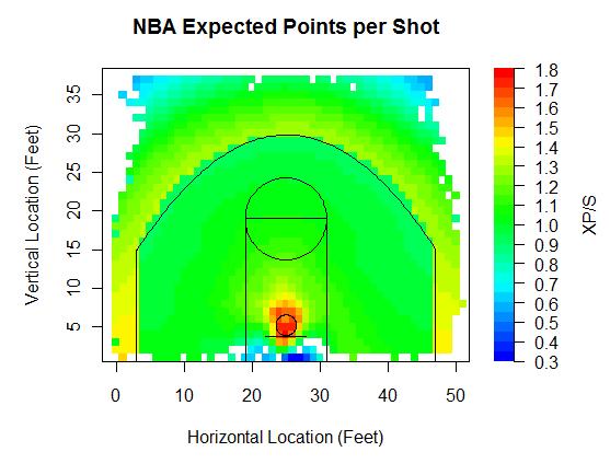
The average is up around 1.25. That's about 0.2 points better than the average possession, since plays that don't result in shots either end up as personal fouls or turnovers, mainly turnovers, which net 0 points. I applied the model on five-man units as well as individual players.
First, the top and bottom five five-man units in shot location efficiency, or expected points per shot. Ideally, some of the shooting, free throw, and rebounding percentage would be customized but I'm using league average rates for this entire study. Minimum 500 shots.
| Unit | Shots | Efficiency | eFG% |
|---|---|---|---|
| Dwight Howard Hedo Turkoglu Jameer Nelson Maurice Evans Rashard Lewis | 768 | 1.34 | 60.81% |
| Boris Diaw Gerald Wallace Nazr Mohammed Raymond Felton Stephen Jackson | 629 | 1.31 | 51.67% |
| Amare Stoudemire Leandro Barbosa Raja Bell Shawn Marion Steve Nash | 598 | 1.31 | 55.52% |
| Dwight Howard Hedo Turkoglu Jameer Nelson Keith Bogans Rashard Lewis | 1480 | 1.30 | 55.07% |
| Boris Diaw Emeka Okafor Gerald Wallace Raja Bell Raymond Felton | 1147 | 1.30 | 53.10% |
| Antonio McDyess Chauncey Billups Rasheed Wallace Richard Hamilton Tayshaun Prince | 1974 | 1.20 | 50.48% |
| Derrick Rose Joakim Noah John Salmons Luol Deng Taj Gibson | 546 | 1.20 | 45.79% |
| Kevin Garnett Mark Blount Mike James Ricky Davis Trenton Hassell | 1243 | 1.20 | 51.05% |
| Brandon Roy Joel Przybilla LaMarcus Aldridge Martell Webster Steve Blake | 1036 | 1.19 | 50.43% |
| Earl Watson Jeff Green Johan Petro Kevin Durant Nick Collison | 517 | 1.19 | 45.16% |
I'm happy to see that the Eastern Conference Champion Magic are the top team on this list because I'd always assumed that their offense last year was extremely efficient. The Magic had two options on offense. Dwight Howard took shots at the rim, while Hedo Turkoglu and Rashard Lewis hoisted threes. That unit was also by far the best in effective field goal percentage in the league, so they were getting high percentage shots, making high percentage shots, and though I can't include their free throw rates or offensive rebounding rates since those would be pains to calculate, I'm sure that with Dwight Howard, the Magic were successful at getting to the line and grabbing rebounds. The Suns, of course, are one of the top five teams.The Bobcats, surprisingly, take highly efficient shots, but don't make many of them. On the other end, we already knew the Bulls run an inefficient offense, and I'm not surprised to see the Pistons do too. That Thunder offense last year must have been absolutely brutal.
Now turning to defense, teams that force the least efficient shots.
| Unit | Shots | Efficiency | eFG% |
|---|---|---|---|
| Dikembe Mutombo Juwan Howard Rafer Alston Shane Battier Tracy McGrady | 766 | 1.20 | 46.54% |
| Dwight Howard Hedo Turkoglu Jameer Nelson Maurice Evans Rashard Lewis | 845 | 1.21 | 48.58% |
| Aaron Brooks Luis Scola Ron Artest Shane Battier Yao Ming | 670 | 1.21 | 46.19% |
| Bruce Bowen Fabricio Oberto Michael Finley Tim Duncan Tony Parker | 858 | 1.21 | 48.95% |
| Chuck Hayes Rafer Alston Shane Battier Tracy McGrady Yao Ming | 1007 | 1.21 | 43.15% |
| Emeka Okafor Gerald Wallace Jason Richardson Jeff McInnis Raymond Felton | 766 | 1.29 | 52.87% |
| Marc Gasol Mike Conley O.J. Mayo Rudy Gay Zach Randolph | 1700 | 1.29 | 52.56% |
| Jeff Green Kevin Durant Nenad Krstic Russell Westbrook Thabo Sefolosha | 1691 | 1.29 | 49.91% |
| C.J. Miles Deron Williams Mehmet Okur Paul Millsap Ronnie Brewer | 768 | 1.29 | 54.75% |
| Boris Diaw Gerald Wallace Nazr Mohammed Raymond Felton Stephen Jackson | 631 | 1.29 | 55.23% |
It's no surprise that the Rockets force teams into low percentage shots, as they boast three of the top five five-man units. That defensive lineup containing Chuck Hayes, Shane Battier, and Yao must be impregnable. And what do you know, but the Magic offense that generated the most efficient shots also had the defense that allowed the second most inefficient shots. Interestingly, the Bobcats offense that ranked second in shot efficiency actually allowed the most expected points per shot on the other end of the floor. I don't think I've watched a Bobcat game this year, but I'd be interested to know what's going on with that unit. A couple surprises on the bottom five list. The Thunder have made noise throughout the league for their much-improved defense, yet it's not a matter of holding opponents to inefficient shots. Instead, their opponents have gotten quality shots off, but have not made them, which would point to an impressive ability to contest shots. Also, the Thunder might do a good job of defensive rebounding and not fouling, which wouldn't appear in the numbers I'm showing.
The next table includes defensive stats for individual players, but still uses data based on the entire five-man opposition. I raised the minimum to 1,000 shots.
| Name | Shots | Efficiency | eFG% |
|---|---|---|---|
| Dikembe Mutombo | 2826 | 1.21 | 43.77% |
| David Harrison | 1360 | 1.21 | 47.65% |
| Shaquille O'Neal | 8909 | 1.22 | 49.34% |
| Yao Ming | 8181 | 1.22 | 45.74% |
| Jacque Vaughn | 2878 | 1.22 | 45.95% |
| Sam Young | 1334 | 1.28 | 50.64% |
| Salim Stoudamire | 1815 | 1.28 | 48.51% |
| Russell Westbrook | 6876 | 1.29 | 49.45% |
| Chris Douglas-Roberts | 2590 | 1.29 | 51.51% |
| Louis Williams | 3580 | 1.29 | 49.50% |
I could've guessed that the top defenders at forcing low percentage shots would be centers, since preventing shots at the rim is the best way to force inefficient jump shots. Dikembe Mutombo, even at (insert whatever made-up hilarious age here), remained an astonishingly good defender. He forced opposing teams into inefficient shots, and no player held rivals to as low an effective field goal percentage as Deke. I'm not sure if any of the guys who show up on the bottom five have reputations as poor defenders. Basketballvalue exhibits poor defensive ratings for Russell Westbrook and Lous Williams and says that by adjusted +/- Sam Young has been a flat-out awful player in general this year, though the guy who runs basketballvalue is the stats guy for Sam Young's team, the Grizzlies.
This table shows how a player's five-man unit performed while he was on the court.
| Name | Shots | Efficiency | eFG% |
|---|---|---|---|
| Steve Francis | 1405 | 1.31 | 48.01% |
| Eddy Curry | 5605 | 1.30 | 49.02% |
| Stephon Marbury | 5168 | 1.30 | 48.13% |
| Renaldo Balkman | 3842 | 1.30 | 47.07% |
| Donyell Marshall | 2634 | 1.30 | 46.70% |
| Antonio McDyess | 9614 | 1.21 | 48.42% |
| Cuttino Mobley | 8225 | 1.21 | 46.33% |
| Earl Barron | 1592 | 1.21 | 44.91% |
| Will Solomon | 1127 | 1.21 | 49.56% |
| Sam Cassell | 4017 | 1.20 | 46.93% |
The top four players were all Knicks during this time frame, as were three of the next eight on the leaderboard. All this is telling us is that Stevie Franchise, Starbury, and Baby Shaq all excel at hanging and banging, and that Isiah is attracted to that type of player. Sam Cassell, on the other hand, can't get to the rim. So I decided to take out a player's own shots, and include only shots by a player's teammates while he was on the floor.
| Name | Shots | Efficiency | eFG% |
|---|---|---|---|
| Steve Francis | 1161 | 1.32 | 49.61% |
| Jameer Nelson | 7475 | 1.31 | 52.49% |
| Stephon Marbury | 4137 | 1.31 | 48.65% |
| Steve Nash | 11406 | 1.30 | 56.11% |
| D.J. Augustin | 2986 | 1.30 | 48.44% |
| Amir Johnson | 3566 | 1.21 | 47.80% |
| Joel Anthony | 3196 | 1.21 | 47.70% |
| Roko Ukic | 1124 | 1.21 | 50.09% |
| Joel Przybilla | 7054 | 1.20 | 48.28% |
| Erick Dampier | 8368 | 1.20 | 49.46% |
At one end are players who spread the ball around and at the other end are players who inhibit floor spacing. Steve Nash's teammates had easily the highest effective field goal percentage, and oh by the way, Nash's own eFG% beats out that of his his teammates. Erick Dampier and Joel "Prezbo" Pryzbilla clog the paint like a hot fudge sundae clogs one's arteries.
| Touching Bases | February 18, 2010 |
The Verducci Effect
On Monday, Will Carroll noted that the Verducci Effect was being discussed on MLB Network. On Tuesday, Tom Verducci posted his ten young pitchers at risk of the Effect. Then to top it off, yesterday Josh Hermsmeyer unveiled a free player injury database. I've been meaning to research the Verducci Effect for some time, so this seemed like as good a time as any.
The Verducci Effect, also known as the Year-After Effect, is defined by BP as "a negative forward indicator for pitcher workload," Specifically, pitchers under the age of 25 who have 30-inning increases year over year are at risk. David Gassko's research pointed to the opposite. With pitch by pitch data from FanGraphs and disabled list data from Rotobase, I attempt to expand on Gassko's preliminary analysis, although purely numerical research on injury prediction and pitch limits will never come close to showing conclusive results.
I found 340 pitchers who pitched three consecutive years in MLB at ages 25 and under since 2002. 140 of them fit the Verducci Effect, while 200 did not. Here's the data.
| IP | FBV | K/9 | BB/9 | GB% | BABIP | WHIFF | ZONE | DL | DAYS | |
|---|---|---|---|---|---|---|---|---|---|---|
| Year One | 48.3 | 90.4 | 7.3 | 3.7 | 41.5% | 0.313 | 20.6% | 51.4% | 18.71% | 51.6 |
| Year Two | 126.5 | 91.1 | 7.0 | 3.4 | 44.2% | 0.302 | 19.7% | 52.0% | 20.14% | 36.6 |
| Year Three | 113.1 | 90.9 | 7.2 | 3.3 | 43.3% | 0.305 | 19.6% | 51.4% | 29.50% | 59.4 |
| Difference | -13.3 | -0.2 | 0.2 | -0.1 | -0.8% | 0.003 | -0.1% | -0.6% | 9.35% | 22.8 |
| IP | FBV | K/9 | BB/9 | GB% | BABIP | WHIFF | ZONE | DL | DAYS | |
|---|---|---|---|---|---|---|---|---|---|---|
| Year One | 80.5 | 91.3 | 7.0 | 3.6 | 42.1% | 0.301 | 20.6% | 52.0% | 20.49% | 48.9 |
| Year Two | 65.7 | 91.3 | 7.1 | 3.6 | 42.2% | 0.326 | 20.2% | 51.4% | 34.63% | 69.5 |
| Year Three | 85.2 | 91.5 | 7.3 | 3.5 | 41.9% | 0.306 | 20.7% | 51.0% | 36.10% | 57.6 |
| Difference | 19.5 | 0.1 | 0.2 | -0.1 | -0.3% | -0.019 | 0.5% | -0.4% | 1.46% | -11.9 |
The first point of interest is the decrease in innings pitched for those under the influence of the Verducci Effect. I should preface the rest of this analysis with a few popular credos: TINSTAAPP, regression to the mean, and small sample size. First, pitching is an inherently risky business. Dave Cameron recently wrote a great piece on how successful young pitchers often peak early. This problem is exacerbated by the nature of the Verducci Effect, which dictates that pitchers establish a career high in innings pitched. If you take any group of players who establish a career high in any category, chances are that they will regress to the mean the following year. Finally, my sample again only contains 140 Verducci pitchers. One can't draw important conclusions from a sample of that size. You've been given fair warning.
In general, 25-and-under pitchers improve their peripherals in their third year. Their strikeout rate trends up while their walk rate trends down. Gassko found similar results. I'm not so interested in whether or not young pitchers improve; I'm looking to see where Verducci Effected pitchers differ from other pitchers.
Therefore, the Difference row is the row of interest, as it represents the change from the innings-jump year to the Year After. There are four terms in the Difference row that report different positive/negative signs (besides innings pitched) between each group. BABIP, velocity, whiff rate, and days per DL trip. That Verducci Effected pitchers suffer worse luck based on BABIP and that their counterparts exhibit better fortune speaks to the infallibility of regressing to the mean. I'm not so interested in the contact rate of pitchers, but I decided to further explore the possible velocity and injury aspects of the Verducci Effect. So I turned to the statistical technique of regression analysis.
First, I tried predicting fastball velocity using several separate variables for age, past velocity, and past workload. I've looked at the topic of velocity curves before. Velocity generally peaks during a pitcher's mid twenties. Here are the regression results, which I've broken down by variable type.
| Age | Coefficient | P-Value |
|---|---|---|
| 32 Up | NA | NA |
| 29-32 | 0.14 | 0.03 |
| 26-29 | 0.30 | 0.00 |
| 26 Down | 0.55 | 0.00 |
Younger pitchers have a .5 MPH advantage over older pitchers in velocity.
| Velocity | Coefficient | P-Value |
|---|---|---|
| Year One | 0.18 | 0.00 |
| Year Two | 0.78 | 0.00 |
Fastball velocity from the previous year has nearly five times as much predictive value as fastball velocity from two years ago.
| Workload | Coefficient | P-Value |
|---|---|---|
| Year One Pitches (1000) | 0.06 | 0.11 |
| Year Two Pitches (1000) | -0.14 | 0.00 |
| Verducci Effect | -0.30 | 0.02 |
The previous year's workload helps predict velocity. Throwing a thousand pitches in a year coincides with a drop in velocity of more than a tenth of a mile per hour. This could represent the difference between starters and relievers, in that starters throw more pitches at a lower velocity than relievers. Also, pitchers who have undergone the Verducci Effect have thrown softer than non-Effected pitchers to the tune of 0.3 MPH.
Next, I ran another linear regression to predict days spent on the disabled list in a pitcher's third consecutive year of pitching.
| DL History | Coefficient | P-Value |
|---|---|---|
| Year One DL Trips | 4.19 | 0.09 |
| Year Two DL Trips | 5.90 | 0.01 |
| Year One DL Days | -0.03 | 0.46 |
| Year Two DL Days | 0.18 | 0.00 |
First off, predicting future health is hard. While I was able to predict nearly 90% of a pitcher's fastball velocity without developing a very sophisticated model. The disabled list model explains only 6% of a pitcher's health. Nevertheless, injuries from the previous year are significant, as each trip to the DL tends to yield another several days on the DL the following year.
| Age | Coefficient | P-Value |
|---|---|---|
| 32 Up | NA | NA |
| 29-32 | -1.31 | 0.60 |
| 26-29 | -3.72 | 0.13 |
| 26 Down | -0.16 | 0.96 |
Age isn't a very strong predictor of future injuries. Pitchers on either extreme of the age spectrum are most at risk, but the results aren't significant. Verducci might've chosen a wise cutoff at age 25, as this table shows that there could well be a point at which pitchers grow less vulnerable.
| Workload | Coefficient | P-Value |
|---|---|---|
| Year One Pitches (1000) | 0.6 | 0.78 |
| Year Two Pitches (1000) | 4.3 | 0.06 |
| Verducci Effect | 0.63 | 0.90 |
The Verducci Effect, like most everything else I tested, is not significant in predicting future injuries. Injuries are hard enough to predict as is, and there's certainly no straightforward rule of thumb. A high workload does coincide with a trip to the DL the following year, though the causative effect may be that pitchers who throw a lot of pitches have more opportunities to get injured, rather than the pitches placing more stress on their arms.
Verducci identifies the likes of Felix Hernandez and Josh Johnson as pitchers at risk. Verducci Effect or not, those guys aren't going to replicate their spectacular seasons. But Verducci also points to lesser pitchers such as Homer Bailey and Joba Chamberlain, who failed to live up to their prodigious potential last year. Bailey's fastball velocity leaped up three MPH last year while Joba's velocity dipped by a similar amount. I say if they stay healthy, they both improve on their performance from last year, but chances are at least one of them hits the DL. The data show that workload and age help predict production, velocity, and injuries, but the jury's still out as to whether the Verducci Effect helps explain the nexus between injury and risk beyond what one would expect from young pitchers with taxing workloads.
| Touching Bases | February 11, 2010 |
Shot Location Visualizations
There's been an influx of publicly-available NBA data over the last few years. While there's no data with the detail of pitchf/x or databases with the sophistication of FanGraphs that analysts can get their hands on for basketball, there have been gradual improvements. My favorite type of basketball data to look at is shot location data, which is why I regularly visit HoopData. On Saturday, I came across the last few years of raw shot location data on BasketballGeek. I'm far from an expert in APBRmetrics, and I don't know whether the basketball blog-dome has its own Dave Allen, but I felt like it might be fun to produce some visualizations using this data. Eli Witus has previously charted this data in several ways, so I'm going to be reproducing some of his work. Click on images for a larger view.
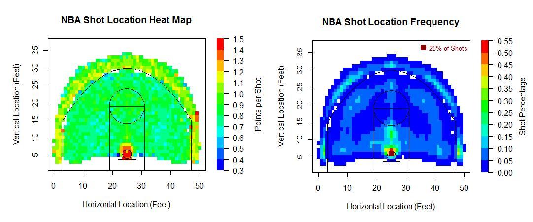
Each point represents one square foot and the goal is located 5.25 feet from the baseline and 25 feet from the sideline.
The most efficient shots are those at the rim or those from three. The least efficient are ten-foot jumpers it would seem. None of this data includes free throws or offensive rebounding, so the only inputs are missed shots, made two-point shots, and made three-point shots. Witus' chart on offensive rebounding suggests that mid-range jumpers, in addition to being low-percentage shots, yield the lowest rate of second-chance points.
Something I find interesting in the shot location frequency chart is that there are equally-spaced patches along the three-point arc as well as the 17-foot arc where players like to shoot, which I call the corner, the wing, and the middle. I understand a lot of this has to do with floor spacing, and the corner three has such a high frequency since it is 1.75 feet closer to the basket than threes along the arc, nevertheless I feel like players are predisposed to wanting to take shots from normal angles (0, 45, 90 degrees). Maybe it's just me.
I also made splits of the above graphs. Home vs. away. 1st, 2nd, 3rd, and 4th quarters. The first minute of a quarter vs. the final two minutes of the fourth or overtime.
I chose to only include points where significant amount of shots have occurred, and therefore didn't need to use any smoothing. The charts are plenty smooth already. But I did smooth out and pretty up the chart I made for field goal percentage.
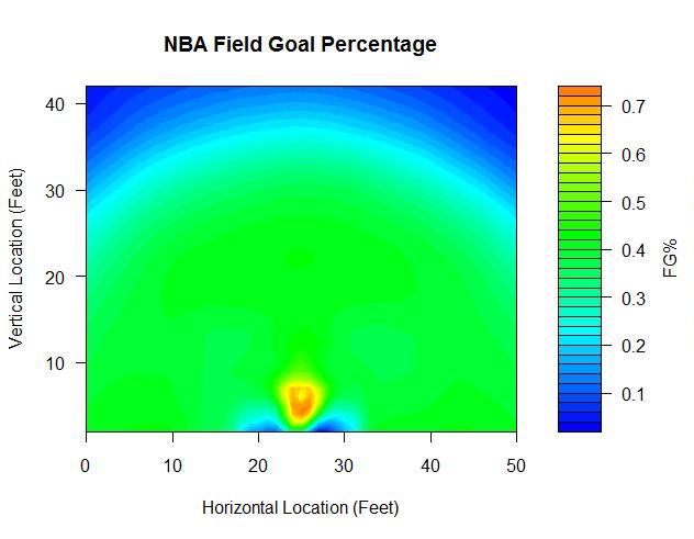
I also thought it might be nice to break down this data on the team and player level. The first team I considered was of course everybody's favorite statistically-oriented team, the Houston Rockets. You may recall that, nearly a year ago to the day, Daryl Morey penned a self-aggrandizing self-profile in the New York Times titled "Moreyball."* In it, Morey wrote
"The 3-point shot from the corner is the single most efficient shot in the N.B.A. One way the Rockets can tell if their opponents have taken to analyzing basketball in similar ways as they do is their attitude to the corner 3: the smart teams take a lot of them and seek to prevent their opponents from taking them."
The Chicago Bulls are not what you would call one of the smart teams, if this statement is taken at face value. According to HoopData, The Bulls lead the league in long twos attempted, but are last in threes attempted. That makes no sense. I've plotted each point where the Rockets and Bulls have attempted at least ten shots since 2006 along with the points per shot.

You can see that the Bulls have a much fuller area where they shoot long twos—those shots from 15 feet out to the three-point line. The Rockets area outside the arc contains a higher number of points. Also, the Rockets paint area is green, representing 0.8-1.2 points per shot by the scale, while the Bulls paint area is blue, good for 0.6-1.0 points per shot by that scale.
*I wouldn't be Daryl Morey first of all. I wouldn't write the story "Moreyball." I understand that when you write a profile, you want to be the hero. That is apparently what Morey has done. But it's not going to make him popular with the other GMs or the other people in basketball.
Now I didn't actually read the piece, as why would I want to read a story about a computer that gives computer numbers? After all, how do you think we got Madoff? But if Morey is so smart, then why hasn’t he won a championship? Statistics don’t tell the whole story, especially with players like Shane Battier. I mean, if Morey thinks Shane Battier is so good, then how come he only scores six points a game? The Rockets have only made the playoffs because 75% of basketball is play from the center and Houston lucked out by drafting Yao Ming.
Finally, I wanted to look at individual players. Since players have taken at most 5,000 shots or so over the last few years, I decided to smooth out their heat maps. I also added contour lines showing where players like to shoot. Here's a look at the consensus two best players in the game:
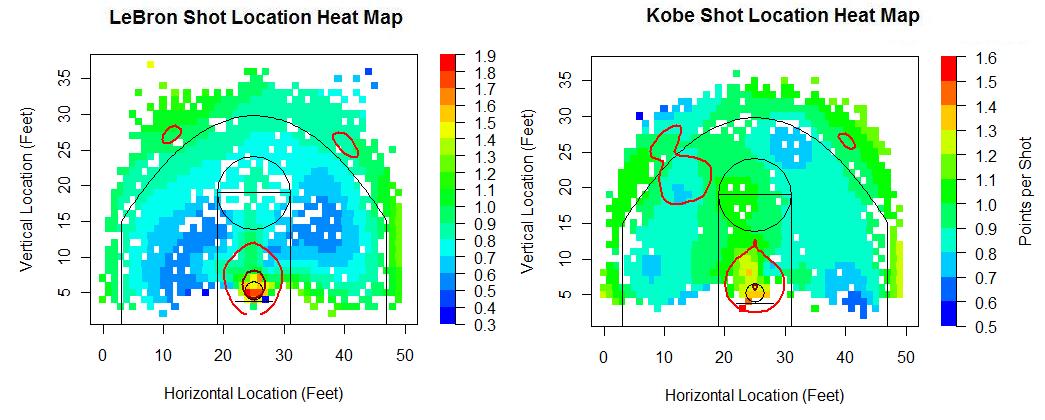
They have similar shot location distributions. Both shoot from anywhere on the floor, but are especially drawn to the three point shot from either wing. Kobe also likes to step in from the right wing and pull up from the free throw line extended. LeBron takes a higher rate of shots at the rim.
As for their success when shooting, Bryant would appear to trump James by color alone. Note that the color scales are different, but even so, Kobe has a better mid-range game than LeBron. LeBron has blue patches where he earns less than 0.6 points per shot, while Kobe has no points from reasonable shooting locations on the floor where he shoots that poorly. Thing is, there's that tiny little area right underneath the rim that accounts for over a third of James' shots, and he's the best player in the league when shooting from the restricted area. The color scale for LeBron extends up to 1.9 points, while it only goes up to 1.6 for Kobe, and those figures represent how effective each player is when shooting from spots in close proximity to the rim.
I made these graphs for several other players I was interested in, which you can view by clicking on the player names. Dwyane Wade, Tim Duncan, Kevin Garnett, Kevin Durant, Chris Bosh, Carmelo Anthony, Dirk Nowitzki, Paul Pierce, Steve Nash, Rashard Lewis, and Joe Johnson.
| Touching Bases | February 11, 2010 |
Shooters by Zones
Last week, I looked at Hitters by Zones, and I'm going to use the same format this week. My sample includes all NBA regular season games since the 2006-2007 season up to Saturday. Data from BasketballGeek. First, a crude chart showing the percentage of shots in each zone and how players fare when shooting, indicated by color. I didn't include any data on free throws, so the only inputs are missed shots, made two-point shots, and made three-point shots.
Shots at the rim yield the highest return, followed closely by three pointers, specifically the corner three. Mid-range jumpers are the worst.
Getting right to the leaderboards, highlighting the top five and bottom five. There are sixteen of these this time, but I’m going to again leave the commentary short and I’ll leave a spreadsheet at the end. The listed leaderboards will be limited to players with at least 50 shots in a zone, but I'm including all players in my spreadsheet, and you might just want to skip straight to that.
I'm defining the side of the floor as that side you would face if you were standing on a basketball court, so the left side of the chart provided is actually the right side of the floor.
Right-Corner Threes
| Player | Shots | Points/Shot |
|---|---|---|
| J.J. Redick | 54 | 1.69 |
| Mike Miller | 70 | 1.53 |
| Vince Carter | 73 | 1.52 |
| Courtney Lee | 69 | 1.43 |
| Anthony Parker | 256 | 1.42 |
| Rasheed Wallace | 64 | 0.70 |
| Baron Davis | 64 | 0.70 |
| Earl Watson | 56 | 0.70 |
| Shawn Marion | 126 | 0.69 |
| Luke Ridnour | 51 | 0.67 |
The word on the street is that the NBA's grand market inefficiency is long-range shooters. As much as I dislike Reddick, I have to admit that he's clearly a valuable, and likely undervalued player. Parker has taken the most threes from the right corner in this time span, making his continued success more impressive.
Left-Corner Threes
| Player | Shots | Points/Shot |
|---|---|---|
| Steve Blake | 166 | 1.51 |
| Jason Kapono | 87 | 1.48 |
| Jameer Nelson | 85 | 1.45 |
| Bobby Simmons | 139 | 1.45 |
| Nick Young | 55 | 1.42 |
| Matt Barnes | 116 | 0.81 |
| Antawn Jamison | 98 | 0.80 |
| Baron Davis | 66 | 0.77 |
| Monta Ellis | 62 | 0.74 |
| Devean George | 66 | 0.68 |
I'd be very interested to see what players have large differences between how they shoot from the right side of the floor vs. the left side of the floor. Have there been any public studies based on handedness and shot location?
Baron Davis might want to stop shooting threes. Monta Ellis has surprisingly had the worst offensive rating in the NBA this year, though Kevin Pelton points to small sample size.
Right-Wing Threes
| Player | Shots | Points/Shot |
|---|---|---|
| Anthony Morrow | 69 | 1.51 |
| Chris Quinn | 63 | 1.49 |
| Delonte West | 104 | 1.38 |
| D.J. Augustin | 79 | 1.37 |
| Steve Nash | 373 | 1.36 |
| Sebastian Telfair | 101 | 0.66 |
| Ronnie Brewer | 59 | 0.66 |
| Kyle Lowry | 54 | 0.61 |
| Bobby Brown | 51 | 0.59 |
| Antoine Wright | 54 | 0.41 |
I can't remember ever having seen Steve Nash miss a three. He's so ridiculously efficient, but I still feel like he should be shooting more of them, even though he's already taken the third most of any player over the last few years from the right wing.
Left-Wing Threes
| Player | Shots | Points/Shot |
|---|---|---|
| Anthony Morrow | 81 | 1.41 |
| Danilo Gallinari | 104 | 1.35 |
| Juan Dixon | 76 | 1.34 |
| Daniel Gibson | 216 | 1.31 |
| Juan Carlos Navarro | 157 | 1.30 |
| Greg Buckner | 50 | 0.64 |
| Eddie Jones | 61 | 0.64 |
| Anthony Carter | 59 | 0.61 |
| Kyle Lowry | 63 | 0.52 |
| Josh Smith | 76 | 0.36 |
Boy, is it a good thing Josh Smith has stopped shooting 3s this year. He and Zach Randolph both. Smith and Randolph have been key parts to the Hawks' and Grizzlies' surprising success, and I like to think their much improved shot selection has played a role. I'm happy to see my man Gallo is already on the leaderboard. He's got to be the favorite in the weekend's three-point contest. And after his YouTubing of Roy Hibbert, he should be in the dunk contest too. Shades of Shawn Kemp, and Gallo's been as potent on the floor as Kemp was off it.
Middle Threes
| Player | Shots | Points/Shot |
|---|---|---|
| Jonny Flynn | 52 | 1.50 |
| Jason Kapono | 59 | 1.34 |
| Kelenna Azubuike | 88 | 1.33 |
| Troy Murphy | 517 | 1.32 |
| Matt Bonner | 156 | 1.28 |
| Sergio Rodriguez | 90 | 0.59 |
| Marquis Daniels | 54 | 0.57 |
| Adam Morrison | 61 | 0.52 |
| Darrell Armstrong | 61 | 0.49 |
| Andre Miller | 59 | 0.27 |
Impressive stuff from Troy Murphy. He and Andrea Bargnani stand alone in threes attempted from straight on, with Rasheed Wallace, another 6-11 big man coming a distant third.
Right-Corner Mid-Range
| Player | Shots | Points/Shot |
|---|---|---|
| Anthony Morrow | 56 | 1.14 |
| Dirk Nowitzki | 314 | 1.13 |
| Vince Carter | 125 | 1.10 |
| Andre Miller | 242 | 1.04 |
| Luke Ridnour | 56 | 1.04 |
| Adam Morrison | 73 | 0.63 |
| Jason Richardson | 115 | 0.63 |
| Emeka Okafor | 75 | 0.61 |
| Bonzi Wells | 53 | 0.60 |
| Josh Smith | 73 | 0.60 |
Luke Ridnour was dead last at shooting threes from the right corner, but is fifth when he takes a few steps in.
Left-Corner Mid-Range
| Player | Shots | Points/Shot |
|---|---|---|
| Kyle Korver | 76 | 1.16 |
| Al Horford | 74 | 1.11 |
| Randy Foye | 87 | 1.08 |
| Malik Allen | 76 | 1.08 |
| Brandon Bass | 110 | 1.07 |
| Kenyon Martin | 73 | 0.60 |
| Darius Songaila | 70 | 0.60 |
| Andray Blatche | 93 | 0.58 |
| Ronald Murray | 77 | 0.55 |
| Josh Smith | 64 | 0.44 |
I'm starting to get the feeling that Josh Smith can't shoot.
Right-Wing Mid-Range
| Player | Shots | Points/Shot |
|---|---|---|
| Tyronn Lue | 87 | 1.15 |
| Steve Nash | 307 | 1.12 |
| Ray Allen | 201 | 1.08 |
| Chris Bosh | 300 | 1.03 |
| Antoine Wright | 51 | 1.02 |
| Jerry Stackhouse | 86 | 0.58 |
| Devin Brown | 59 | 0.58 |
| Adam Morrison | 88 | 0.57 |
| Quinton Ross | 107 | 0.54 |
| Anderson Varejao | 55 | 0.47 |
Now that Bruce Bowen's retired, Varejao might be my least favorite player in the NBA, so I like seeing him there.
Left-Wing Mid-Range
| Player | Shots | Points/Shot |
|---|---|---|
| Nate Robinson | 130 | 1.02 |
| Jose Calderon | 245 | 1.01 |
| Jamario Moon | 91 | 1.01 |
| Kurt Thomas | 113 | 1.01 |
| Jamal Crawford | 292 | 0.99 |
| Rodney Carney | 53 | 0.53 |
| Zaza Pachulia | 67 | 0.48 |
| Trevor Ariza | 67 | 0.48 |
| Anderson Varejao | 67 | 0.48 |
| Marcus Camby | 76 | 0.45 |
Five Knicks/former Knicks on this list. Nate Robinson and Jamal Crawford have a whole lot of things in common.
Middle Mid-Range
| Player | Shots | Points/Shot |
|---|---|---|
| Mikki Moore | 94 | 1.15 |
| Steve Nash | 179 | 1.09 |
| Chris Webber | 53 | 1.09 |
| Kyle Lowry | 66 | 1.06 |
| Juwan Howard | 129 | 1.02 |
| Lou Williams | 70 | 0.54 |
| Rasual Butler | 71 | 0.51 |
| Darko Milicic | 56 | 0.50 |
| Jeff Green | 77 | 0.49 |
| Sasha Pavlovic | 53 | 0.45 |
Isn't Pavlovic supposed to be a shooter?
Right-Corner Short
| Player | Shots | Points/Shot |
|---|---|---|
| Tony Parker | 107 | 1.18 |
| David Lee | 52 | 1.15 |
| Paul Pierce | 59 | 1.12 |
| Carlos Boozer | 54 | 1.11 |
| Richard Hamilton | 71 | 1.10 |
| Spencer Hawes | 58 | 0.62 |
| Kevin Durant | 81 | 0.62 |
| Hedo Turkoglu | 53 | 0.60 |
| Jeff Green | 60 | 0.60 |
| Rudy Gay | 60 | 0.60 |
Wayne Winston says that Kevin Durant and Jeff Green don't play well together. I'm surprised that Durant is inefficient from anywhere on the floor.
Left-Corner Short
| Player | Shots | Points/Shot |
|---|---|---|
| Ronald Murray | 50 | 1.20 |
| LeBron James | 88 | 1.14 |
| Rajon Rondo | 57 | 1.09 |
| Carlos Boozer | 72 | 1.08 |
| Elton Brand | 102 | 1.08 |
| Chris Wilcox | 122 | 0.64 |
| Andray Blatche | 56 | 0.61 |
| Lamar Odom | 51 | 0.59 |
| Mehmet Okur | 65 | 0.58 |
| Allen Iverson | 57 | 0.53 |
Wilcox has taken the tenth most shots in the league from this spot on the floor, and he is the only player to have taken at least 65 shots (up to Okur) and net less than 0.7 points per shot.
Right-Wing Short
| Player | Shots | Points/Shot |
|---|---|---|
| Mikki Moore | 74 | 1.24 |
| Ray Allen | 178 | 1.13 |
| Maurice Evans | 62 | 1.13 |
| Kendrick Perkins | 165 | 1.13 |
| Fabricio Oberto | 87 | 1.13 |
| Peja Stojakovic | 51 | 0.63 |
| Richard Jefferson | 135 | 0.61 |
| Andrei Kirilenko | 52 | 0.58 |
| Desmond Mason | 124 | 0.56 |
| Ben Wallace | 67 | 0.51 |
Mikki Moore is a surprisingly effective shooter from the floor, as the only player to top two leaderboards. This year, he's made 29 of his 34 shots at the rim.
Left-Wing Short
| Player | Shots | Points/Shot |
|---|---|---|
| Fabricio Oberto | 65 | 1.29 |
| Kendrick Perkins | 128 | 1.20 |
| Adam Morrison | 59 | 1.15 |
| Luis Scola | 87 | 1.13 |
| Tony Parker | 257 | 1.12 |
| Tracy McGrady | 81 | 0.62 |
| Ron Artest | 117 | 0.62 |
| Tyrus Thomas | 55 | 0.51 |
| Brad Miller | 60 | 0.50 |
| Larry Hughes | 87 | 0.44 |
You may recall that Larry Hughes had a web site devoted to his poor shooting called heylarryhughespleasestoptakingsomanybadshots.
Middle Short
| Player | Shots | Points/Shot |
|---|---|---|
| Luke Ridnour | 116 | 1.28 |
| Matt Bonner | 81 | 1.19 |
| Kevin Garnett | 295 | 1.13 |
| Mike Miller | 63 | 1.11 |
| Richard Hamilton | 190 | 1.11 |
| Delonte West | 95 | 0.59 |
| Sasha Pavlovic | 55 | 0.55 |
| JaVale McGee | 61 | 0.52 |
| Ben Wallace | 81 | 0.49 |
| Trevor Ariza | 58 | 0.45 |
I'd love to know whether Ben Wallace is a good player or not. I like to think defense and rebounding can outweigh being a zero on offense.
At Rim
| Player | Shots | Points/Shot |
|---|---|---|
| LeBron James | 1438 | 1.49 |
| Shaquille O'Neal | 919 | 1.48 |
| Dwight Howard | 1639 | 1.48 |
| Brendan Haywood | 575 | 1.45 |
| Kevin Garnett | 536 | 1.45 |
| Rodney Stuckey | 715 | 1.02 |
| Raymond Felton | 959 | 1.00 |
| Ben Gordon | 555 | 0.99 |
| Russell Westbrook | 627 | 0.99 |
| Rafer Alston | 579 | 0.93 |
I limited this leaderboard to players with at least 500 shots. My conclusion last week was that Albert Pujols is good, and I'll close this piece out by saying the same of LeBron James.
| Touching Bases | February 04, 2010 |
Hitters by Zones
Few in MLB can beat a well-located pitch down and away. I wanted to look up those who could, so I broke the plate area down into nine zones, scaling the vertical component of the pitch for the batter’s height. For this analysis, I decided to restrict my sample to only 2009 pitches at which the batter swung. Here’s a crude chart showing the percentage of swings in each zone and how batters fare when swinging, indicated by color.
Batters have the advantage when the pitch is middle-middle, and for the other eight zones, the run value is negative.
Getting right to the leaderboards. There are nine of these, but I’m going to leave the commentary short and I’ll leave a spreadsheet at the end.
Down-In
| Name | Runs | Swings |
|---|---|---|
| Derrek Lee | 5.6 | 57 |
| David Wright | 3.8 | 72 |
| Corey Hart | 3.6 | 60 |
| Hunter Pence | 2.8 | 73 |
| Carlos Delgado | 2.6 | 11 |
| Chase Headley | -5.9 | 58 |
| Ryan Braun | -6.1 | 84 |
| Aubrey Huff | -6.2 | 56 |
| David Ortiz | -6.2 | 64 |
| Ryan Howard | -6.6 | 84 |
Ryan Howard and David Ortiz are similar type hitters who like the ball out over the plate but can get beat inside. Carlos Delgado hit a homer, three doubles and a single on his eleven swings at pitches down and in.
Down-Middle
| Name | Runs | Swings |
|---|---|---|
| Joey Votto | 10.6 | 193 |
| Brian Roberts | 9.9 | 204 |
| Miguel Cabrera | 9.7 | 191 |
| Dustin Pedroia | 6.9 | 150 |
| Nick Markakis | 6.8 | 160 |
| Garret Anderson | -11.7 | 174 |
| Nate McLouth | -12.3 | 125 |
| Jack Cust | -12.7 | 124 |
| Dan Uggla | -13.4 | 185 |
| Derek Jeter | -13.9 | 173 |
I’m surprised Derek Jeter’s on this list, as he’s a successful groundball hitter. Dan Uggla and Jack Cust on the other hand are fly ball hitters.
Down-Away
| Name | Runs | Swings |
|---|---|---|
| Carlos Gonzalez | 1.8 | 69 |
| Denard Span | 1.5 | 68 |
| Ichiro Suzuki | 1.4 | 121 |
| Robinzon Diaz | 1.2 | 18 |
| Trevor Crowe | 1.2 | 17 |
| Hideki Matsui | -12.8 | 107 |
| Adam LaRoche | -13.4 | 145 |
| Jayson Werth | -13.5 | 138 |
| Ryan Howard | -13.8 | 231 |
| Brandon Inge | -14.0 | 120 |
It appears foot speed is instrumental if one is to succeed by swinging at pitches down and away. I’m assuming the highest percentage of grounders are on pitches in this location, and speed is important to get on base via the grounder. Pitching Howard down in the zone seems to be a good idea.
Middle-In
| Name | Runs | Swings |
|---|---|---|
| Martin Prado | 13.2 | 87 |
| Michael Young | 10.9 | 132 |
| James Loney | 10.2 | 83 |
| Mike Cameron | 8.8 | 113 |
| Derrek Lee | 8.3 | 116 |
| Willie Bloomquist | -7.1 | 121 |
| Lyle Overbay | -7.2 | 42 |
| Jeff Francoeur | -7.6 | 172 |
| Edgar Renteria | -8.5 | 132 |
| Mark DeRosa | -14.1 | 125 |
Derrek Lee likes the ball inside.
Middle-Middle
| Name | Runs | Swings |
|---|---|---|
| Prince Fielder | 30.7 | 249 |
| Mark Teixeira | 29.9 | 294 |
| Ryan Braun | 29.6 | 281 |
| Adam Dunn | 25.3 | 294 |
| Andre Ethier | 25.2 | 323 |
| Augie Ojeda | -10.9 | 128 |
| Nick Punto | -11.3 | 191 |
| Luis Rodriguez | -11.8 | 129 |
| Ty Wigginton | -12.0 | 219 |
| Dioner Navarro | -13.1 | 174 |
This is clearly the most telling list in terms of quality of hitter. To be successful swinging the bat, you have to be able to hit the ball pitched down the middle.
Middle-Away
| Name | Runs | Swings |
|---|---|---|
| Adrian Gonzalez | 8.2 | 156 |
| Robinson Cano | 7.2 | 175 |
| Ryan Braun | 7.2 | 101 |
| Nick Markakis | 6.3 | 178 |
| Brad Hawpe | 5.9 | 228 |
| Pedro Feliz | -10.5 | 129 |
| Jimmy Rollins | -10.7 | 301 |
| Chase Utley | -11.1 | 232 |
| Curtis Granderson | -13.3 | 252 |
| Aaron Hill | -13.6 | 152 |
I already knew that Adrian Gonzalez and Robinson Cano excelled hitting the ball the other way, so it makes sense that they also excel at hitting outside pitches. The Phillies are not so good at hitting the ball when pitched away. They are good at baserunning, however.
Up-In
| Name | Runs | Swings |
|---|---|---|
| Casey McGehee | 5.1 | 84 |
| Michael Young | 5.0 | 85 |
| Marco Scutaro | 3.8 | 43 |
| Seth Smith | 3.8 | 14 |
| Pablo Sandoval | 3.1 | 81 |
| Hunter Pence | -7.1 | 77 |
| Matt Holliday | -7.7 | 85 |
| Clint Barmes | -8.0 | 75 |
| Jhonny Peralta | -8.6 | 85 |
| Michael Cuddyer | -10.3 | 123 |
Michael Young also likes the ball inside. He beat out Lee by six runs last year on pitches at least half a foot inside. Seth Smith had seven hits on the 14 pitches he swung at up and in, including four for extra bases.
Up-Middle
| Name | Runs | Swings |
|---|---|---|
| Michael Cuddyer | 10.7 | 186 |
| Raul Ibanez | 9.7 | 114 |
| Aaron Hill | 9.6 | 223 |
| Kevin Youkilis | 7.5 | 172 |
| Todd Helton | 7.4 | 168 |
| Orlando Cabrera | -10.3 | 204 |
| Jason Giambi | -11.3 | 109 |
| Mike Cameron | -11.6 | 122 |
| Jose Bautista | -11.9 | 136 |
| Mark Reynolds | -13.5 | 177 |
Michael Cuddyer was last at pitches up and in, but first at pitches up and over the plate. I find this very interesting. If you’re a pitcher, you can jam Cuddyer, but you better not miss.
Up-Away
| Name | Runs | Swings |
|---|---|---|
| Albert Pujols | 5.5 | 82 |
| Matt Wieters | 4.7 | 42 |
| Chris Coghlan | 4.7 | 76 |
| Matt Kemp | 3.9 | 56 |
| Jacoby Ellsbury | 3.8 | 58 |
| Jimmy Rollins | -6.0 | 110 |
| Rafael Furcal | -6.1 | 93 |
| Jorge Cantu | -6.4 | 56 |
| Brian Roberts | -7.3 | 76 |
| Emilio Bonifacio | -8.0 | 73 |
It took you a whole article to find Albert Pujols at the top of a leaderboard. My analysis confirms Rich Lederer's preliminary hypothesis. Pujols continues to be good.
Here's a spreadsheet containing all hitters with at least ten pitches swung at in a zone. And why not? Pitchers too.
| Touching Bases | February 01, 2010 |
Thoughts on Bloomberg Sports
Bloomberg Sports unveiled its two new products to the media on Sunday afternoon, and I was one of those fortunate enough to be in attendance. Thoughts:
The fantasy product, to be released this month on a trial basis, contains a draft kit and in-season tools. Player news, stats, and data visualizations are all available with at most three clicks of the mouse. Bloomberg Sports is not providing any new data sources to the consumer, but in partnerships with MLB and Rotowire, BBGSports aggregates relevant player statistics and news, laying the data out in a friendly and efficient interface. Pretty much all of the offensive and pitching stats/splits available on Baseball Reference and FanGraphs are available in Bloomberg’s product. Even better, those stats that aren’t included can be written into the system. You can create new stats and the product is adaptable to the most obscure fantasy league settings. All of these stats can be easily ranked and charted.  The best visualization I saw was their “spider” chart, which is similar to Justin Bopp’s DiamondView and Kevin Dame's 5 Tool Analyzer.
Attached to the fantasy product will be a team of writers led by Jonah Keri, whose background in business and baseball analysis makes him a neat fit, but more importantly, Keri’s refined post-up game and precise outlet passes are reminiscent of a younger, Jewish Wes Unseld. BBGSports has decided to produce some of its written content for free, and lock some behind a pay wall. I imagine the free content will be similar to FanGraphs’ written content, in that it will use progressive analysis to inform the reader as well as to promote the site’s statistical engine. But what will be behind the pay wall? The Baseball Prospectus model is sensible in that BP leaves its more random material, for lack of a better term, in the open (Interviews, TWIQ, Roundtables), while leaving its selling point—progressive analysis—behind the pay wall. However, BBGSports isn’t selling its analysis. In fact, BBGSports is selling others' analysis, as Bloomberg specializes in collecting and distributing relevant news from thousands and thousands of web sites. So I wonder if BBGSports is just going to put some of its written content behind the pay wall to satisfy the consumer who likes to feel that he’s getting more bang for his buck. I hope that BBGSports finds a way to differentiate its free analysis from that which is paid for. I look forward to seeing what Keri and Co. have in store, and who it is that composes Keri’s company.
My chief criticism of BBGSports’ fantasy product is, oddly enough, with its only never-before-seen-to-me data. Again, I don't think the product was built to harvest any new data, but rather to provide an incredibly convenient database that consists of already-available information. In that mission, BBGSports has succeeded. But BBGSports went ahead and set up a proprietary algorithm to rank players in a traditional 5x5 fantasy league. The rank, called “B-Rank,” is not customizable to league settings as of yet and the methodology behind the ranking system was not explained despite multiple questions from the audience. The speakers, headlined by the impressive Stephen Orban, did not share any intentions to market the B-Rank, nor did they explain the B-Rank’s value, yet they nevertheless insisted on keeping it entirely secret. Now, to be fair, there is a very nice ranking feature that allows you to rank players using whatever categories and filters you’d like, and exclude drafted players or put players on your watch list and all that good stuff. But the B-Rank looms over it. One of my favorite things about my fantasy experience at ESPN is the player rater, which rates players in each category based on a Z-Score, and then sums those scores to form a comprehensive rating. This is intuitive and understandable, and I can adjust these rankings to my own whims since I understand what goes into them. But with the B-Rank, I have no idea why players are ranked where they are.
Same with the new projection system. Even if BBGSports is releasing the new PECOTA, we wouldn’t be buying it, since BBGSports hasn’t shown that it is an expert in sabermetrics, and the speakers were in fact adamant that they are not baseball experts. So why should I care that BBGSports is launching a projection system? If you were to follow the projection’s advice and draft Ryan Howard fourth or Matt Kemp sixth, I would take pity on your children, for they would have been born to a poor fantasy baseball player. Instead of taking its cue from Baseball Prospectus, whose initiative it is to develop new and progressive analytics, BBGSports should follow in FanGraphs’ footsteps and assemble an assortment of projections. And if BBGSports wants its own projection system, I feel the user should have the ability to modify the projections however he or she pleases. If BBGSports wants B-Rank to catch on, then BBGSports will need to treat it the same way as FanGraphs treated WAR. FanGraphs went through pains to ensure that readers understood the thought process and calculations behind WAR. It would be a big plus and potential selling point for BBGSports to create a ranking system that can become universally accepted among fantasy players, but that’s not happening if fantasy players don’t know what the hell B-Rank consists of.
BBGSports might want to allow one of its programmers to play around with the data and periodically release new metrics that incline to the sabermetric bent. As I’ve stated, I don’t think Bloomberg should be trying to introduce any proprietary metrics, but along the same lines as BBGSports' written analysis, perhaps a quantitative analyst can demonstrate how the product in place can be utilized to develop one’s own projections/rankings/metrics using only the data provided by BBGSports. The B-Rank would be a great start, if only its purpose wasn't defeated by protecting the algorithm.
Fortunately, BBGSports appears genuinely interested in consumer feedback. I feel that its willingness to accept and respond to feedback will be instrumental to BBGSports' success. The fantasy product exists to make the fantasy player’s job easier and more fun, which necessitates the fantasy player’s input. As for the pro product, with only 30 teams to sell to, BBGSports will have to cater individually to each and every team. To get a glimpse of the the pro product, see David Appelman’s post. Incorporated into the pro product are pitchf/x data and and the tools to integrate whatever proprietary information teams are already holding into the BBGSports database, which can only be accessed via a proper bar code and finger print. The visuals provided by Appelman and Ben Kabak speak to BBGSports as an innovative and interactive product. And from what I've heard and seen so far, improvements will be ongoing.
Already in an advantageous relationship with MLB and MLB advanced media, Bloomberg Sports will likely want to partner up with STATS, Baseball Info Solutions, and Baseball America. Bloomberg Sports will eventually become the leading distributor for all private data collectors, as BBGSports does a better job of presenting that data than any other provider I’ve seen.
| Touching Bases | January 28, 2010 |
On the Out Pitch
Tim Lincecum retired 89% of batters he got to 0-2 or 1-2 counts. They had no chance. Here's how Lincecum's pitch selection breaks down on 0-2 and 1-2 counts, and the results of each pitch type.
| FB | CH | SL | CB | |
|---|---|---|---|---|
| Usage | 43% | 31% | 20% | 6% |
| Ball | 36% | 36% | 39% | 31% |
| Out | 32% | 43% | 46% | 51% |
| Hit | 7% | 4% | 4% | 1% |
| RV100 | 0.3 | -4.6 | -5.4 | -7.8 |
I'm grouping his four-seam and two-seam fastball. When I split the two, I find his two-seamer is much more effective than his four-seamer, but still not even as valuable as his off-speed offerings. I mean his changeup and slider are true out pitches. In fact, his change might be the best out pitch in baseball. You probably already know that. Yet his fastball on these counts is merely average. Would he be better off sacrificing some of the effectiveness from his changeup in exchange for some added effectivenss on his fastball? Theoretically, yes, this would be the right move, and theoretically, he could do this by throwing his changeup so often that batters come to expect it, and at the same time throwing his fastball so rarely that it acts like an out pitch, in that batters are fooled by it.
Yet for some reason, whenever I look at a pitcher's different pitch type run values, I notice disparities. Check out the A's duo of Brett Anderson and Mike Wuertz, who possibly possess the two best sliders in the game. Apparently, their fastballs suffer in spite of their extraordinary sliders. My guess is that they use their sliders as out pitches, so I wanted to see if there's a trend among pitchers to have a disparity in value between their out pitch and their fastballs. This type of analysis could, and probably should, be done for all counts, but I've been intrigued by the theory of the out pitch, so I'm limiting my sample to only pitches on 0-2 and 1-2 counts.
For the sake of simplicity, I'm grouping all fastballs together (four-seam, two-seam, cutter), and all off-speed pitches together (curve, slider, change, splitter, knuckler). So, in the following plot each pitcher represents a data point (minimum 200 pitches, Mo excluded), and the color of each dot represents how often a pitcher throws his fastball.
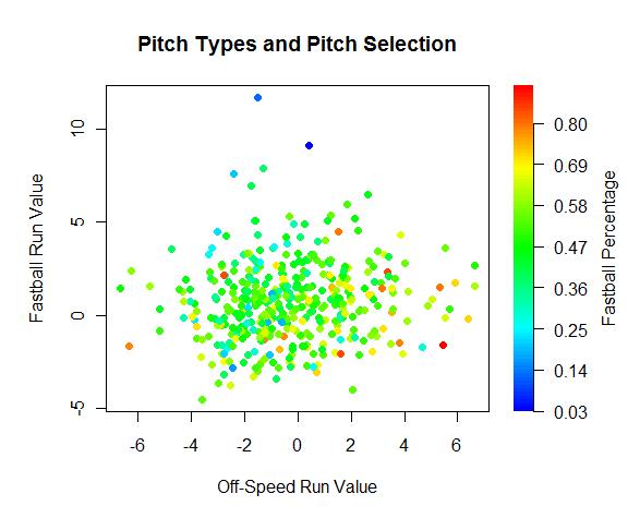
There appears to be a slightly positive trend line heading in the direction we would expect. Pitchers who extract value from one pitch type tend to get some value out of their other pitch types. Also, I see more yellow and red points on the right side and more blue points on the left side, meaning pitchers who throw more off-speed pitches have had better success with them than pitchers who throw fewer off-speed pitches.
Given that the average run value is defined as zero, 59% of pitchers perform at an above average rate with their off-speed offerings, while only 38% are above average with their fastballs. There are two and a half times more pitchers who have above average off-speed pitches and below average fastballs than pitchers who have below average off-speed pitches and above average fastballs.
As for correlation coefficients, which are on a scale of -1 to 1 with 1 representing a strong positive relationship, -1 representing a strong negative relationship, and 0 representing little or no correlation, I found that there is a weak correlation of .09 between fastball and off-speed run values. In addition, there is a correlation of -.25 between pitch type run value and pitch type frequency. Again, all of these data suggest that pitchers are not throwing their best pitches often enough in out pitch situations.
Returning to the above graph, one interesting note I made is that the two bluest points also show up as the two highest points on the graph. This means that the two pitchers who have the lowest fastball percentage have also had the poorest fastball results. Want to take a guess at the names behind the data points?
Well, it turns out knuckleballers should stick to the knuckleball. R.A. Dickey and Tim Wakefield aren't fooling anybody by trying to sneak a fastball in there. Wake's thrown 34 fastballs in 0-2/1-2 counts, and he's generated nine outs compared to six hits. That's abysmal. Dickey is just as bad, with 14 outs against nine hits. They're doing batters a favor by throwing fastballs.
There seems to be a stigma to pitching backwards, but if your out pitch is your best pitch, and you can throw it for strikes and it doesn't add stress on your arm, then you should consider turning your fastball into a secondary pitch, making it a potential out pitch as well
Pitch type run values don't tell the whole story. It's important to look at what happens in the entire at-bat, not just the one pitch. For example, it's possible that pitchers are throwing fastballs outside the strike zone to set up breaking balls as their out pitch. So they're intentionally lowering the value of their fastballs, and therefore are getting better overall results when they throw the fastball even though the fastball doesn't get the glory in the run value column. However, the conclusions I found when looking at the linear weights value of the entire at bat remain the same as when I analyzed single pitch run values.
I'm including a scatter plot of the categories I've used--fastball/off-speed percentage, fastball/off-speed run value, and fastball/off-speed linear weights-the overall linear weights value of the at-bat following the 0-2/1-2 fastball/off-speed pitch). Use the scroll bar on the bottom right to locate your pitcher of interest.
| Touching Bases | January 21, 2010 |
I've Seen That Before
While a pitcher's stuff diminishes over the course of game, the effects I found were relatively small. So why do batters gain an edge over pitchers as the game goes on? Well, baseball is a game of adjustments. Batters get their timing down and start picking up the ball out of the pitcher's hand. All that good stuff.
The first time a batter faces a curveball, he might be caught off-guard. That’s why pitchers throw predominantly fastballs the first time through the order. And that’s why batters do so well the third time they face a pitcher. They’ve seen most of his repertoire, and are able to recognize the curve. As the saying goes, “Fool me once, shame on you. Fool me…you can’t get fooled again.”
First, here is the average run value per 100 pitches based on the number of times a batter has seen a given type of pitch. I include all data points for which I have approximately 1,000 pitches.
For reference:
F2: Sinker/Two-Seam Fastball
F4: Four-Seam Fastball
CB: Curveball
SL: Slider
CH: Changeup
FC: Cut Fastball
This chart indicates that a batter facing a fastball from the same pitcher for the 12th time will perform better than a batter facing a pitcher's first fastball. Chances are, however, that batters who face 12 fastballs are better from those who only face a few. One way to get around this bias might be to take the difference in run value between the 11th fastball and 12th fastball. This method, called the delta method, allows you to compare apples to apples as each change in measurement is at least composed of players from the same sample. This produced the following chart:
The magnitude of the results is enormous, if the results are to be believed. A batter facing a changeup for a fifth time is expected to perform over five runs per 100 pitches better than he performs the first time he saw the changeup. That's pretty much the difference between the best and worst hitter in the league. Unfortunately, I have to say that I don't think the delta method is the way to go here, and I'm not sure how to fix my sampling problems. Batters who face at least three changeups have a rv100 of 0.2 on the third changeup, but they only have an rv100 of -1.1 on the second change. This is a delta of 1.3 runs. Meanwhile, batters who face at least four changeups have an rv100 of -1.3 runs on the third change and 0.3 on the fourth, another huge delta of 1.6 runs. This would mean that batters perform three runs per 100 pitches better on the fourth changeup they see than on the second. The oddity here is that batters who face at least three changeups are above average on the third changeup, but batters who face at least four changeups are well below average on the third changeup. I think what this means is that once pitchers get burned on a given pitch, they quit throwing it to that batter the rest of the game. I don't know how to solve for these biases.
I went on and produced the same two charts, except this time at the at-bat level instead of the game level.
Batters who face seven fastballs in an at-bat are good, in that they are able to work the count. Meanwhile, pitchers who throw five sliders in an at-bat are good, in that they are either ahead in the count or can locate their breaking balls.
Using the delta method:
No pitch gains in effectiveness after its been thrown once already in an at-bat. This finding was applicable at the game level as well. However, there are differences between the at-bat and game level. Off-speed pitches such as the changeup and curveball lose more value than fastballs during the game, given an even distribution of pitches. But in an at-bat, off-speed pitches do not lose as much effectiveness as fastballs when they're repeatedly thrown. It makes sense to me that changeups are the worst pitch to show multiple times to the same batter throughout the game, since the success of changeups is built on deception. Yet I'm not sure why changeups don't lose as much effectiveness in an at-bat once thrown multiple times as fastballs do. I think it has something to do with the count in which they're thrown and the theory of the out pitch.
| Touching Bases | January 14, 2010 |
Pitch Counts and Pitch Classifications
Consider this part two to my study on pitch counts and pitchf/x.
The first time through a lineup, pitchers traditionally throw fastballs, and then switch to off-speed pitches when facing batters a second time. In order to isolate the effects of pitch counts on a pitcher's stuff as opposed to his pitch selection, I had to classify a whole lot of pitches. That was fun.
There were about 5,000 games in which a pitcher threw 100 pitches during the pitchf/x era. These pitchers performed admirably to have lasted that long into a game, so this sample won't be representative of all, or even most, starters. To illustrate the point that pitchers mix up their repertoire over the course of a game:
Six pitches are regularly thrown throughout any given game. The four-seam fastball (F4) belongs in most every pitcher's repertoire, though some sidearmers or sinkerball specialists will only throw fastballs of the two-seam variety (F2). These two pitches are often difficult to distinguish from one another, be it by the human eye, or by the detailed pitchf/x data. Cut fastballs (FC) are also difficult to make out at times from four-seamers and sliders at times. Sliders (SL), curveballs (CB), and changeups (CH) increase in usage over the course of the game. Knuckleballs and splitters are thrown only one or two percent of all pitches, so I won't include them in this study, and I made no attempt to classify screwballs, shuutos, or gyroballs, since I'd guess they compose about .001% of pitches in the last three years.
Perhaps some pitches are more useful later in the game than others. In theory, all pitch types should have the same effectiveness. Game theory would dictate that if a pitcher's curveball is better than his fastball, he should throw his curveball so often that batters come to expect it. Therefore his fastball gains value. Eventually, the two pitches become equal in terms of overall effectiveness. For one reason or another (maybe there is credence to the notion of the "out pitch"), this theory does not hold true for many pitchers, or at a league-wide level. The run value of fastballs is higher than the run value of breaking balls, which would signify that pitchers are under-using their secondary pitches. (Keep in mind, the main advantage to using run values is that they take the count into account.) As you will see in the below image, this trend narrows, but still exists, even as pitchers use more off-speed offerings deeper into the game.
All run values per 100 pitches.The high points and low points in the graph represent the high points and low points in the opponent's batting order.
It seems to me that changeups are ineffective pitches at the start of the game, but gain effectiveness later in the game. This makes sense intuitively. The graph also lends merit to the manager's decision to leave these pitchers in for 100 pitches, as the sample of pitchers is clearly above average through 90 pitches. However, these pitchers were also undoubtedly lucky. They would not make it to 100 pitches if they gave up runs. That's where my metric for measuring a pitcher's stuff based on a pitch's physical characteristics comes into play.
First, the two least impressive types of pitches in terms of stuff: the sinker and changeup.
As you'll see with each of these charts, there's something funky going on in the first several pitches of the ballgame. I'm not even going to attempt to form a guess as to why changeups appear to have a better StuffRV as the game goes on. The success of changeups is obviously not built on how "nasty" they are.
Again, for some reason, we should disregard the first dozen points or so. Pitchers throw fastballs an inordinate amount of time on the first pitch, and apparently, anything they throw lacks in stuff. They're warming up or something. Maybe they know batters tend to not swing at the first pitch of the game. I don't know. But you see that with all three types of fastballs, from the tenth pitch to the hundredth, a pitcher loses about a 10th to a 20th of a run in StuffRV per 100 pitches.
Finally, breaking balls.
So, even pitchers who have successful games lose a significant amount of stuff over the course of a game. Since this sample represents an above average group of pitchers, I'd imagine lesser ones deal with inferior durability. I would be comfortable saying that the quality of a generic starting pitcher's stuff decreases by at least .05 runs per 100 pitches from his first pitch to his last.
| Touching Bases | December 31, 2009 |
Pitch Counts and Pitchf/x
I remember Randy Johnson throwing 99 to finish a complete game. Back in their day, Nolan Ryan and Bob Feller probably did that on a regular basis (if you were to ask them). There's a lengthy list of early 20th century pitchers who pitched complete games in both ends of a doubleheader. So what's the driving force behind the pitch count craze? Are we going soft?
I don't think there's some grand scheme to baby pitchers. I do think that pitchers nowadays exert exponentially more effort on each pitch than pitchers of yesteryear, but our contemporaries could still probably hold up past the hundred pitch mark. The main reason pitchers get pulled before they reach their limit is because there's little incentive not to pull them. Take a look at baseball reference's splits. Pitchers allow a .726 OPS the first time through the order, then the OPS jumps 40 points the next time through and another 40 points after that. So managers make the correct decision to insert a reliever who has the advantage of facing batters for the first time. With eight-man bullpens, there's no reason not to go to a reliever early. So the question becomes not if, in the current environment, we should continue to adhere to pitch counts, but why? Does the pitcher lose effectiveness, or does the batter adjust to even the fastest of fastballs having already seen in in his three previous plate appearances?
With pitchf/x data, you can tease out the pitcher's part in the pitcher/batter matchup. A pitcher really controls five things:
-Where the ball is released
-Where the ball lands
-How hard the ball is thrown
-How much the ball spins
-What direction the ball spins
Here, I will concern myself with the final three components, which I believe define what we call a pitcher's "stuff." For example, the average fastball from a right-handed pitcher (92 MPH, nine inches of rise, seven inches of run) is worth about half a run below average per 100 pitches. I will call that its StuffRV. The following graph demonstrates the average StuffRV (per 100) and a smoothed out actual run value (per 100).
There's a lot going on here.
-Our main concern is with a pitcher's endurance with regards to his stuff. The takeaway from this graph, then, is that from a pitcher's 10th pitch to his 60th pitch, his stuff will deteriorate by about a 10th of a run per 100 pitches.
-My methodology grades out fastballs as inferior to breaking balls. You can tell by looking at the very first mark on the graph. A pitcher's first pitch of the day is a fastball about 80% of the time, while in total, pitchers throw fastballs 60% of the time. On an 0-0 count otherwise, pitchers throw fastballs just under three quarters of the time. Same as on pitches two through ten: 70-75%. For some reason, pitchers like to start their outings off with a fastball.
-A pitcher's success is, of course, largely dependent on the batter, and you can see when each lineup spot tends to hit by following the true run value curve. Pitchers face the eighth and ninth batters in the order generally during their 25th to 35th pitches and again their 60th to 70th pitches. The two peaks of the True RV line occur when starting pitchers are generally facing the 4th and 5th batters in the lineup.
-Relievers have better stuff than starters. The section from 1-15 pitches is composed mostly of relievers, and that's the lowest trough in the StuffRV curve.
-Those pitchers who managers leave in past the 100-pitch mark are well above average, and their stuff continues to be above average. I'll account for this survivor bias another time. For now, I'd rather do brief case studies of one pitcher who maintains his stuff throughout the game, and another who does not.
I correlated every pitcher's pitch count with his StuffRV on that pitch. Brett Anderson seems to pick up steam the deeper he goes into a game. I classified his pitches into four clusters: fastball, slider. changeup, curveball So the first thing I did was look to see trends in his velocity and movement. Well, nothing really stood out. His slider gains almost an inch in movement by the end of the game, but I don't think that's it. Then I remembered that Anderson's slider was the most valuable slider in baseball last year, and it edges out Zack Greinke's as the *nastiest* starter's slider in baseball by my rankings.
| Pitches | FB | SL | CH | CU |
|---|---|---|---|---|
| 1-25 | 67% | 23% | 6% | 4% |
| 26-50 | 51% | 28% | 14% | 8% |
| 51-75 | 43% | 31% | 12% | 14% |
| 75+ | 39% | 38% | 11% | 12% |
So there you go. He challenges hitters with fastballs the first time through the lineup and then switches to mainly off-speed pitches, which are his bread and butter. Hence, you might say, he improves his stuff as the game goes on.
Jered Weaver, on the other hand, has worse stuff by my calculation as the game goes on. Weaver throws his fastball 68% of the time in his first 25 pitches, compared to 52% from his 51st pitch on, and in exchange his changeup usage increases from 10% to 23%. Not only is there a difference in Weaver's pitch selection, but there's also a notable change in his pitch quality. Here are the characteristics of his fastball as the game goes on:
| Pitches | Velocity | StuffRV | True RV |
|---|---|---|---|
| 1-25 | 90.0 | -0.19 | -0.29 |
| 26-50 | 89.7 | -0.13 | 0.06 |
| 51-75 | 89.2 | -0.10 | 0.63 |
| 75 | 89.0 | -0.07 | 0.16 |
But pitchers who have a changeup as good as Weaver's don't rely on stuff to get by. Weaver's all about deception. And that stuff I don't know how to measure.
| Touching Bases | December 26, 2009 |
Batted Ball Location Leaderboards
My first post on this site in February borrowed the main idea of Dave Studeman's batted ball reports, except instead of looking at the trajectory of batted balls, I grouped them by vector. A full season has passed, so who were the best pull hitters in baseball this year?
Value of Pulled Batted Balls
Chase Utley and Hanley Ramirez were both worth about 40-45 runs above average with the bat on the year. Utley got some value out of walking and taking his HBPs, but the bulk of their value at the plate came from them pulling balls. Reading John Walsh's piece in this year's Hardball Times Annual, I realized that Utley and Hanley weren't fully appreciated because their contributions outside the batter's box were equally valuable. Their baserunning, position, fielding value, and ability to stay on the field add another 40-45 runs to their value.
Albert Pujols and Kevin Youkilis returned from last year's top ten, while Dan Uggla, second last year, finishes one spot outside the top ten.
I think part of the reason that Youk and Jason Bay are listed is that they play get to take advantage of the Green Monster. I'm not trying to discredit them, since they're both excellent right-handed hitters, but I am trying to discredit Dustin Pedroia and Mike Lowell. Here is the average run value of pulled fly balls and line drives for Boston's four main RHBs since 2008.
| Player | Home | Away | Diff |
|---|---|---|---|
| Kevin Youkilis | 0.58 | 0.48 | 0.10 |
| Jason Bay | 0.52 | 0.43 | 0.09 |
| Mike Lowell | 0.47 | 0.26 | 0.21 |
| Dustin Pedroia | 0.40 | 0.22 | 0.18 |
Lowell pulls half his balls in play, too, so I doubt there's any park that he'd rather play in than Fenway. As for Pedroia, he has a career .332/.391/.505 line at home. On the road, he hits .283/.350/.406. He has never hit a 400-foot home run in his career according to Hit Tracker. I doubt anybody is more suited for his home park than Pedroia is for Fenway.
At the bottom of the list is Casey Kotchman, who I believe is the only first baseman to have totaled a negative value on pulled balls. Over a quarter of Kotchman’s balls in play were pulled groundballs, and he hit .073 on those. In 2008, a whopping third of his balls in play were pulled grounders, though he managed to hit .154 on them, so it's possible defenses have figured him out.
Value of Center Field Batted Balls
Both Phillies repeat on this leaderboard from last year, while O-Cab and Pedroia again prove their ineptitude at hitting the ball up the middle.
Ryan Howard focused his prodigious power to center this year. Previously, Howard hit the plurality of his home runs the opposite way three times in his career, and in 2007, he had pulled the highest share of his homers, but this year, he hit a remarkable 21 of his 45 homers to center. Mark Reynolds came closest to matching Howard with 17 home runs to center.
Value of Opposite Field Batted Balls
Joe Mauer’s 35-run total is absurd. He was worth 13 runs going the other way last year and his -10 runs on pulled balls actually was a league low. Now, he's cracked both the center field and opposite field top ten, and his futility pulling the ball was skimmed down to -5 runs. Mauer hit 34% of his balls to the opposite field, while the league average is 27%. His backup Mike Redmond hits the highest rate of balls the other way in the league.
Only Adrian Gonzalez hit more opposite-field homers than Joe Mauer this year. Adrian Gonzalez in Fenway Park would be scary. Derek Jeter, who’s always had opposite field power, hit the most home runs to right field batting right handed this year, possibly rejuvenated by the even shorter short porch at the New Yankee Stadium. In 2008, Jeter had better luck going the other way with his fly balls when he was on the road than he did when he was at home. That split did not continue in 2009. Jeter produced slightly better results on flies to right in the New Yankee Stadium than he did while playing on the road.
Jimmy Rollins' batted ball profile continues to perplex. He hit an anemic .200 on grounders this year, below his already mediocre .231 career average. Though speed is important for batters to reach base safely on grounders, spraying the ball to all fields might be even more weighty. Rollins hit only 7% of his groundballs the other way, which allows defenses to shift their fielders to one side of the field, and signifies that he's rolling over on the ball when he hits grounders. Placido Polanco, Jermaine Dye, and Joe Crede all hit over a third of their flies to the opposite field, but under 5% of those balls fall for hits.
A spreadsheet containing the full results can be found here. Batted ball location data via MLBAM. The field was partitioned equally into thirds to classify right/center/left.
| Touching Bases | December 23, 2009 |
Aybar vs. Greinke
Marc Topkin of the St. Petersburg Times on July 18:
Manager Joe Maddon had his reasons for starting Willy Aybar on Saturday.Some he could explain, such as wanting to keep Aybar fresh for his primary duties as the Rays' top pinch-hitter. And some Maddon couldn't, and wouldn't, derived from extensive research and data analysis by the Rays front office staff that deduced Aybar would be a prime weapon against Royals ace Zack Greinke…
"Free Willy," Maddon said. "This is something we do back at the office, and we really crunch numbers, just so many different things. And Willy came out on top vs. Greinke, so we had to throw him out there."
The research is based on what Maddon called "an esoteric system" and had to be thorough and complex because Aybar had never faced Greinke. And it went beyond the more visual "swing planes" they have discussed before in arranging matchups.
It is also proprietary, Maddon said, joking that revealing it would carry the potential penalty of banishment to semipro ball back in eastern Pennsylvania.
"I would probably end up managing the Japan-Jeddo Stars," he said.
Aybar went 3 for 3 off Greinke.
On December 7, Tommy Rancel of DRaysBay published this exchange he had with Tampa Bay Rays coordinator of baseball operations James Click:
TR: what does Willy Aybar know about Zack Greinke?JC: Whatever it is, I hope he's told our other hitters.
I’m intrigued.
The Idea
Use pitchf/x data to create a projection system for individual batter/pitcher matchups.
The Qualifications
I have none. The idea is overly ambitious, and I quickly realized I'm not the man for the job.
The Method
Chris Moore rather brilliantly ranked the best fastballs in baseball using five parameters: horizontal location, vertical location, velocity, vertical movement, and horizontal movement. Zack Greinke unsurprisingly came out on top.
Chris only looked at fastballs from right-handed pitchers against right-handed batters. If Chris were to have looked at RHP vs. LHB matchups, I’m sure Greinke would not have come out ahead, and instead Mariano Rivera would have topped the list. But what about RHPs against only Willy Aybar?
So I came up with a way to predict Aybar’s performance given certain pitch tendencies. For example, Aybar does best against slow fastballs around 90 MPH and he likes the ball down the middle. Plots to illustrate these points.
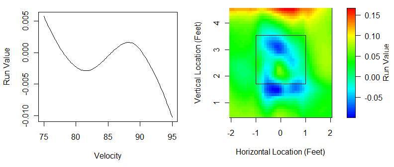
You can't plot all five dimensions together, but the point is that I made a model using all five variables. I then predicted that model onto a data set containing only Greinke pitches. So the model doesn't have any idea how Greinke would pitch Aybar, but it knows that Greinke likes to throw 94 MPH fastballs on the outer part of the plate, and it knows that Aybar likes to hit 88 MPH fastballs down the middle. After some regression to the mean, you have yourself a projection.
The Technical Details
My first data set consisted of all pitches Aybar faced from 2008 to July 18, 2009, and I tried to limit my sample further to only non-sidearming/knuckleballing RHPs. I ran a local regression to predict run values, weighing recent data the most heavily. My second data set contained all pitches from Greinke to LHBs over the same time span. I predicted my model onto that data set. Next, I regressed the expected run values for Aybar against Greinke toward the actual run values of Greinke vs. all LHBs he faced. I then regressed my projection even further to the the average performance of switch-hitting LHBs against RHPs, which I found to be around the league average .330 wOBA.
The Results
I predict Aybar to be precisely league average against Greinke.
My analysis gleans hardly any new insight into player projections. Aybar is below average against RHPs, but Greinke isn’t a world-beater himself against LHBs, having allowed an .824 OPS against LHBs in 2008.
Pretty much, I don’t think you’re going to get enough data from 1,000 pitches from hitters to beat out traditional projection systems. (For pitchers, however, any amount of pitchf/x data adds significant value.) So I guess I'm not on the same track as Friedman, Click, Kalk and the rest of whatever the Rays have going on in baseball ops.
I actually projected Aybar against all RHPs, and for what it's worth, I predict Aybar will do well against Pedro Martinez and poorly against Mariano Rivera. My model tells me Aybar will do surprisingly well against Roy Oswalt and surprisingly poorly against Armando Galarraga. It's not worth much.
The Loosely-Related Tim McCarver Quote
"I said it was Izturis who didn't get the bunt down last year. It was actually Manny Aybar. Excuse me, Erick Aybar, not his younger brother Manny who plays for Tampa Bay."
| Touching Bases | December 10, 2009 |
Crowding the Plate
Roger Dorn earned back some respect when he showed that he was willing to take one for the team. But really, that pitch was so far up and in, it would’ve been more impressive to have seen him in his old age avoid it.
Some players, though, do have the ability to dodge pitches. Orlando Cabrera has seen over 5,000 pitches in the last two years, and has been able to get out of the way of all but one of them. At the other end of the spectrum, Chase Utley has taken his base on 51 HBPs in the last couple years, 21 more than the next closest batter.
Batters are hit in just over 1% of plate appearances when facing same-handed pitchers, while opposite-handed matchups result in half as many HBPs. 10% of pitches are inside in same-handed plate appearances, while 7% are inside in opposite-handed plate appearances. This explains some of the difference in hit by pitch probability. Using 2008-2009 pitchf/x data, I found the expected probability of a batter getting hit by a pitch that is at least a foot from the center of the plate—more or less all pitches that would normally be called for a ball inside.
The figure of the batter (borrowed from Mike Fast) stands approximately a foot off the plate.
Here you see that if you’re a pitcher and have the intent of throwing a bean ball, you should throw at the batter’s back, where 80-90% of pitches will hit him.
The portion from the knees down—about one and a half feet off the ground and lower—protrudes more gray area from the opposite-handed graphs from than from the same-handed graphs. The head area is also more of a danger zone for same-handed batters. My guess is that batters of the same handedness as the pitcher pick up the ball later in the pitcher's delivery than they do facing opposite-handed pitchers, and therefore same-handed batters have less time to react to the pitch as they realize it’s going to hit them.
I also considered that velocity might be a factor in hit by pitch expectancy. Again, my sample is restricted to pitches inside.
I’d imagine this trend has to do with the relationship between a pitcher’s velocity and his control. Breaking balls and 100 MPH heaters are not located as well as 90 MPH fastballs. But maybe batters are also more willing to get hit by the slowest pitches and not as able to get out of the way of the fastest pitches. I decided to include horizontal location, vertical location, and velocity as components in a regression to find the probability of HBPs.
| Player | Inside Pitches | Extra HBPs | HBP Probability |
|---|---|---|---|
| Chase Utley | 266 | 40 | 449% |
| Carlos Quentin | 288 | 26 | 442% |
| Jason Giambi | 255 | 22 | 502% |
| Kelly Shoppach | 231 | 21 | 414% |
| Aaron Rowand | 352 | 20 | 340% |
| Billy Butler | 526 | -13 | 13% |
| Vladimir Guerrero | 544 | -14 | 37% |
| Edgar Renteria | 501 | -16 | 6% |
| Michael Young | 510 | -16 | 15% |
| Adrian Gonzalez | 587 | -17 | 39% |
HBP probability is the rate at which a batter is hit by pitches over what would be expected from the average batter of that handedness.
I imagine this list is most indicative of how far batters stand from the plate. I also believe that pitchers are aware of the reputations of most batters' willingness to take his HBPs, so such batters are not pitched inside as often as they would be otherwise.
The charts of the best and worst at being hit by pitches, though I'm not sure you want to be the best in this category.
Solid points are HBPs, while hollow points are everything else. The background portrays the HBP probability for all LHBs.
Utley’s getting hit by anything at least a foot inside, where 16 of 21 pitches went for HBPs. He’s getting hit by anything at all inside and four feet up, about the location of his elbow, where eight of 11 pitches went for HBPs. In fact, Utley’s been hit on 10 pitches not charted, as they were less than a foot inside. All of those pitches were also at the letters or higher, so I’d imagine he leaned into at least a couple of them.
Meanwhile, Adrian Gonzalez has been hit by a few more pitches than anyone else on the list of laggards. He just gets pitched inside quite a bit and is more adept at dodging balls than Patches O’Houlihan.
Full results, including pitchers, can be found here.
| Touching Bases | December 03, 2009 |
Controlling the Zone
"The STRIKE ZONE is that area over home plate the upper limit of which is a horizontal line at the midpoint between the top of the shoulders and the top of the uniform pants, and the lower level is a line at the hollow beneath the knee cap. The Strike Zone shall be determined from the batter's stance as the batter is prepared to swing at a pitched ball."
Eddie Gaedel knows not a called strike. The 3-foot-7 dwarf took four balls in his lone Major League plate appearance. (If you want to see a discussion on the practicality of short pinch-hitters taken well beyond its logical extreme, follow this link.
Gaedel physically shrunk the strike zone. I’m interested to see what batters can control the strike zone without any such advantage. Who manages to earn a ball on a pitch on the black or a strike on a pitch at the letters? That’s where pitchf/x comes into play.
John Walsh and Dave Allen have found the true dimensions of the strike zone using pitchf/x data. Jonathan Hale has studied individual umpire strike zones and found that Cy Young winners and control pitchers get better calls, and Hale dispelled the myth that rookies get big leagued by umps.
I assigned every pitch since 2008 an expected called strike probability based on the horizontal location of the pitch and a scaled vertical location*, while also accounting for batter handedness, pitch movement/velocity, and the umpire. After that, I added up the expected balls and called strikes of players, and the actual ball/strike numbers for all players. Here are the batters who have the largest disparity between their expected ball probability and the actual rate at which balls are called on them.
| Player | Balls:Called Strikes | Extra Balls | Ball Probability |
|---|---|---|---|
| Nelson Cruz | 2.9 | 49 | 115% |
| Chris Iannetta | 3.1 | 64 | 115% |
| Rick Ankiel | 3.6 | 47 | 115% |
| Michael Young | 2.5 | 98 | 114% |
| Ryan Raburn | 2.7 | 37 | 114% |
| John Buck | 2.9 | 38 | 113% |
| Josh Hamilton | 4.3 | 40 | 112% |
| Brad Wilkerson | 2.2 | 28 | 112% |
| Justin Morneau | 2.6 | 82 | 112% |
| Ken Griffey Jr. | 2.6 | 79 | 112% |
| Hunter Pence | 2.5 | -69 | 90% |
| Carlos Beltran | 2.5 | -75 | 89% |
| Alfonso Soriano | 2.8 | -56 | 88% |
| Travis Hafner | 2.2 | -52 | 88% |
| Brandon Phillips | 2.7 | -73 | 87% |
Michael Young and Carlos Beltran (who I suppose is synonymous with the called strike to Met fans) have the highest and lowest number of extra balls among all players, respectively. The average difference between a called strike and a ball is between a tenth and an eighth of a run. So Young has gotten nearly 20 runs of value out of controlling the strike zone better than Beltran has. To look deeper into this, I plotted their respective strike zones (Beltran's a switch hitter, so two for him) against the league average strike zones. Inside these contour lines, a pitch is more likely than not to be called a strike, while outside the contour lines, pitches are called for balls greater than 50% of the time.
The difference between Beltran and Young can be seen at the knees. I should note the caveat that this entire effect could be caused by a few stringers listing Beltran’s bottom of the strikezone too high and Young's too low.
I don't want to make any rash conclusions on what type of players get the benefit of the doubt from umpires, but with three Rangers in the top ten, and another five Rangers in the next dozen on my list, I feel that I can say with confidence that Rudy Jaramillo is paying off umpires. Just throwing it out there. But I'm pretty sure it's true.
Seriously, though, one of the first things I noticed was that 10 of the top 30 players on the leaderboard were catchers. It turns out catchers are 2-3% more likely to have a pitch called a ball than average. It's fully possible that that's just noise, of course.
I was especially interested in batters' luck in full count situations. The leverage of a full count is double that of any other count, with the disparity in value between a walk and out coming in at around 0.6 runs. It turns out that Jack Cust, who has taken more full count pitches in the last two years than anyone but Adam Dunn, has had easily the best luck on full counts, with ten more balls called than expected. (Dunn's had one fewer than expected.)
Here I've plotted Cust's called strikes in green, balls in red, and the average LHB strike zone contour in blue.

I count two strikes easily outside the zone, and nine balls that were easily inside the zone. Most batters experience a smaller strike zone on full count than on average, but Cust has been particularly lucky. Serves him right for not swinging too often in a full count.
How about on the pitcher's side?
| Player | Balls:Called Strikes | Extra Strikes | Strike Probability |
|---|---|---|---|
| Tom Glavine | 2.1 | 88 | 178% |
| Peter Moylan | 2.3 | 45 | 130% |
| Derek Lowe | 1.9 | 288 | 129% |
| Gary Majewski | 1.9 | 28 | 126% |
| Francisco Cordero | 2.2 | 73 | 123% |
| Jorge Campillo | 1.8 | 87 | 122% |
| B.J. Ryan | 2.2 | 40 | 118% |
| Jamie Moyer | 2.0 | 171 | 118% |
| Matt Maloney | 1.9 | 18 | 117% |
| Tim Hudson | 2.2 | 61 | 117% |
| Dontrelle Willis | 2.7 | -30 | 86% |
| Luke French | 2.4 | -29 | 86% |
| T.J. Beam | 2.5 | -16 | 86% |
| Brandon League | 2.9 | -35 | 85% |
| Denny Bautista | 2.4 | -42 | 83% |
| Ryan Tucker | 3.6 | -22 | 78% |
It seems like control pitchers have better luck with umpires, which Hale has already shown. (The correlation between balls to called strikes ratio, which I'd consider a decent measure for control, is -.32.) Mariano Rivera, the best control pitcher in baseball, is 13% more likely to have his pitches called for strikes than you would expect. While watching Mo, you can sometimes actually see him intentionally try to expand the zone. When Hale did his study in 2007, he found that Derek Lowe had the highest rate of extra strikes per game. Demonstrating this ability for three straight years might be worth looking into further. Jamie Moyer and Lowe have also gotten five more strikeouts than expected on full counts, the most in the majors.
About the reliability of these ball and strike probabilities: For batters, the split-half correlation for "ball probability," (which I'm defining as the probability of a called pitch being called a ball above what is expected) reaches .5 when I limit my sample to batters with minimum of 125 called pitches. It takes batters with at least 600 called pitches to reach a .7 correlation. The league average pitches per plate appearances is 3.8, and an average of 2.1 of those pitches are called for a ball or strike by the umpire. So I’d say that it takes about 300 plate appearances for this metric to stabilize. You can compare that to more common metrics by reading the series by Pizza Cutter. or a sample of players with at least 50 plate appearances to know to regress halfway to the mean. For pitchers. r = .5 when pitchers the sample of pitchers has thrown at least 60 called pitches, and 300 called pitches to reach an r of .7.
*And Glove Slap to Tango on how to scale vertical location. I unfortunately decided to use the mean values of every batter's top and bottom strike zone values as inputted by MLBAM stringers. I probably should have scaled to the median, or better yet the median by month. Maybe next time.
| Touching Bases | November 19, 2009 |
Holliday-Bay: Visual Scouting Reports 1.0
Jason Bay and Matt Holliday are the two best hitters on the market. Holliday is a year younger than Bay, and will likely command a more lucrative contract. If you'd like to know how they stack up in left field, check out ESPN's recent articles analyzing the matter. But I’d like to concentrate on their hitting. Here’s how they stack up, per FanGraphs
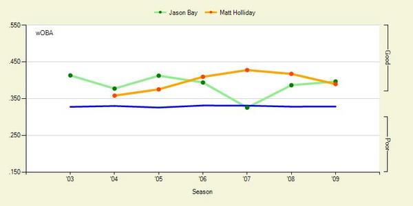
Over the past two years, they’ve been rather even hitters. Using 2008-09 pitchf/x data, I’ll take a deeper look
A couple weeks ago, I introduced a series of graphs that try to provide a visual scouting report of sorts for hitters. Here's how each batter performs by pitch location.
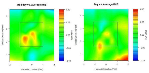
(Click on images to enlarge.)
They are strikingly similar compared to league average. Middle and lower in, they’re well above average, but they have weaknesses up and in. I'm surprised that hitters the caliber of Holliday and Bay perform worse than league average in any spots. Holliday also struggles more than the average batter on pitches down and out of the zone, while Bay appears to excel at pitches way down and away, likely a result of his excellent plate discipline.
No matter how I break these guys down, they'll turn out above league average at almost everything, so I prefer to compare them to themselves. The next set of graphs shows how they do relative to their own averages, as opposed to the league average. Therefore, every single batter will have some blue—even Pujols—and every single batter some red—even Tony Pena, and that's because every single batter has relative strengths and weaknesses.
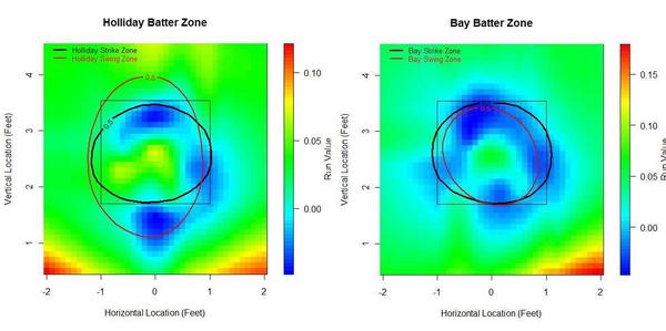
Bay appears to have a great knowledge of the strike zone, as his “swing zone” and “strike zone” nearly overlap. (These contour lines indicate where the probability shifts from greater than 50% to less than 50%. For example, pitches outside the black elipse are more likely to be called for a ball than a strike, and pitches inside the red elipse are more likely to be swung at than taken.) Holliday, however, has a distinct region outside the strike zone where he owns a negative run value. This seems to stem from Holliday's propensity to expand the strike zone. Yet he doesn’t face the same problems up in the zone, even though he’s willing to swing at high balls too.
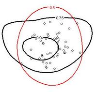
To look deeper into this, I plotted the same red 50% swing zone, and also included Holliday's contact zones at 75% and 90% intervals, which show where he's most likely to make contact when he swings. You can also see 50 separate points that indicate the location of pitches that resulted in Holliday's home runs.
What we're interested in is the very top and very bottom of his swing zone—the portions that extend beyond his strike zone. It turns out that these regions also extend beyond his 75% contact zones. There is slightly less area up top between his swing zone and contact zone as there is in the bottom region, meaning he is better at making contact on pitches at high pitches out of the strike zone than low pitches out of the strike zone. But he hasn't hit homers in either of those regions. He has swung half the time at these bad balls, and whiffed over a quarter of the time when he does pull the trigger. The most important thing to remember is that both of these swing-and-miss regions would be called for balls more often than not if he would just lay off.
How about their platoon splits? I use release point data for these. Like the previous graphs, these are from the batter's point of view.
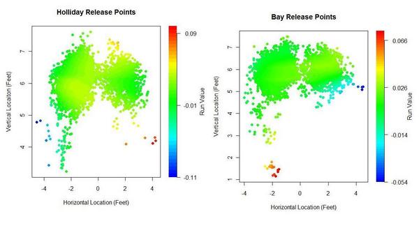
Bay exhibited a reverse platoon split two years ago, but over his career he has maintained a normal split. Normally I exclude Chad Bradford's release points, since they’re outliers, but I wanted to include them to show Bay’s success against submariners and sidearmers. He’s five-for-eight against Bradford in his career. Bay’s had less success against lefties with lower arm slots. He’s 0 for 16 with three walks against the likes of Brian Fuentes, Billy Wagner, and Javier Lopez. In 2009, Bay and Holliday both faced the highest rate of LHPs of their careers.
Now, I’m not sure if this next set of graphs will catch on, but I wanted to know how batters fare by pitch type, so here’s what I came up with. You have to have some knowledge of pitchf/x data to fully comprehend these graphs, but really all that I look for is to quickly see if there’s some type of obvious gradient from blue to red or red to blue that would suggest a batter does better against pitches of a certain velocity and break.
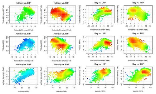
You can see very distinct sections in Bay's graphs where he excels against both LHPs and RHPs. These pitches have the same velocity and movement as your league average fastball (about 85-95 miles per hour with 5-10 inches of horizontal and vertical movement), which meshes with Bay's reputation as a fastball hitter. Over the past two seasons, Bay has been the fourth best hitter in baseball against the fastball. He’s not as good against curveballs, especially slower breaking pitches. I didn’t note anything remarkable in Holliday’s release point graphs nor his velocity/movement graphs, but Holliday does have interesting pitch splits. He saw 65% fastballs with the A’s and 55% with the Cardinals. In exchange, he saw his slider rate nearly double in St. Louis. The increase in slider percentage might have been part of the reason Holliday found renewed success, as he has been the top hitter in the Majors against the slider over the last two years.
Finally, hit locations.
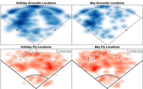
Holliday was shipped out of Coors Field in the offseason, and he might have felt the hangover effect, having tailored his game to Coors where he has boasted a career OPS 160 points better than he has at all other venues. Or a combination of Oakland's pitcher's park, increased quality of competition, and decreased slider percentage plagued him. Or the first half of the season was just noise. His BABIP shot up from a career low .318 in Oakland to a career high .391 in St. Louis. Once he was traded, he hit more line drives and fewer infield flies. Due to its spacious foul grounds, the Coliseum's park factor for infield fly balls is around 104. More importantly, Holliday's home run per fly ball rate was just 9.7% in the Coliseum, well below his career rate of 16.5%. The average batter would see his homes runs per fly ball plummet some 30% in a move from Colorado to Oakland. (Batted ball park effects from David Gassko.)
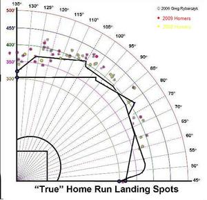 Meanwhile, Bay pulls balls at an extraordinary rate. Infielders should shift him to the pull side as much as is acceptable against right-handed batters. He pulls his fly balls at a high rate too.
Bay was traded to a haven in Fenway Park, where he could take advantage of the green monster in left field. Using Hit Tracker Online data, I plotted Bay's 2009 homers against his 2008 homers along with Fenway's and PNC's outfield dimensions.
15% of Bay's balls in play last year were fly balls to left, compared to 10% in 2008. Could this have been a conscious effort? In 2008, 43% of his flies to left were hits and 25% were homers. In 2009, 63% of Bay's flies to left were hits and 40% were homers. Thanks to the monster, He managed more more homers on flies to left last year than he had all of hits on flies to left two years ago. I'm sure the trade-off in opposite-field power for pull power yielded a net positive for Bay.
As always, these graphs are works in progress, so please feel free to leave comments on how to improve them.
| Touching Bases | November 13, 2009 |
With the Jumping and the Diving and the Whole Thing
First there was the error. A century later, we finally have the natural antithesis to the error: the Web Gem.
The good people over at ESPN track all the best defensive plays in baseball on a daily basis, and come up with that short minute segment which is often a highlight of my night. This year, they began keeping track of who made each Web Gem, and were kind enough to share the data with me. Web Gems are intended solely for the purposes of the television viewer. They are simply the most entertaining plays to watch, and aren’t supposed to be used as a defensive measure. But errors really never should have been used as a defensive measure either. Nonetheless, these are all valuable data points, so my first order of business was to see how errors and Web Gems stack up. Here you have error to Web Gem ratio.
| Position | Ratio |
|---|---|
| C | 14 |
| 1B | 6 |
| 2B | 4 |
| 3B | 4 |
| SS | 4 |
| RF | 2 |
| CF | 1 |
| LF | 2 |
| P | 16 |
I assigned every player a position based on where he played the most innings, and all stats count toward that position.
There were five players who made no errors but tallied three or more Web Gems.
| Name | Position | Web Gems |
|---|---|---|
| Grady Sizemore | CF | 5 |
| Jason Bay | LF | 5 |
| David DeJesus | LF | 4 |
| Austin Kearns | RF | 3 |
| Omar Vizquel | SS | 3 |
Here, you see some hits and some misses. Sizemore and Vizquel are, by all accounts, excellent defensive players. David DeJesus and Austin Kearns are average. And then there’s Jason Bay. For the Jason Bays of the world, I submit to you the Gary Matthews Jr. effect. Matthews, you may recall, made a stupendously phenomenal catch a couple years ago that was replayed and analyzed like the Zapruder film. His defensive reputation was built off of one play. And you can't point out the number of errors for outfielders to disprove the reputation, since outfielders don't make errors. Anyway, I hope nobody signs Jason Bay to a GMJ-type contract.
But it’s the aughts, and we’ve moved past errors. In fact, Baseball Info Solutions came up with a similar method presented in the Fielding Bible II called Good Plays/Misplays that uses objective criteria to come up with a more advanced Web Gems/Errors. These data aren’t available to the public, but some BIS defensive data is. FanGraphs lists the number of expected outs each non-catcher position player should make based on the distribution of balls in his zone. So I'm going to call the amount of Web Gems per expected out each player's Web Gem percentage.
| Position | Percentage |
|---|---|
| 1B | 0.88% |
| 2B | 0.93% |
| 3B | 1.49% |
| SS | 1.11% |
| RF | 0.89% |
| CF | 1.25% |
| LF | 0.82% |
That looks much more like the defensive spectrum. Third basemen get a boost for playing the hot corner, where there are myriad opportunities to show off quick reactions as right-handed batters scorch balls down the line at over 100 MPH. 3Bs Ryan Zimmerman, Mark Reynolds, Brandon Inge, and David Wright were the only players to total double-digit Web Gems this year.
How does the ability to make the spectacular play match up with UZR, the most popular advanced defensive metric? For the rest of this article, I'll use the statistical method of correlation. A correlation coefficient returns the strength of the relationship between two variables. Closer to 1 indicates that there is a positive correlation, closer to -1 indicates a negative correlation, and closer to 0 means that there is no relationship. The overall correlation was .08, which is very weak. I think that on the Opening Day Web Gem segment, Karl Ravech should ask John Kruk* whether he knew that the .26 correlation coefficient between UZR and Web Gem percentage for third basemen was easily the strongest correlation of any position.
*How is it possible that someone who is so outspokenly anti-statistics literally walked away from the game the moment he reached a .300 career batting average?
I would venture that Web Gem percentage correlates with UZR not because Web Gems assess skill, but because they track the most influential plays. The average runs saved per play defensively is .8, a tick higher than that for outfielders. I’d venture that most Web Gems are plays made no better than 10% of the time on average. So for every web gem, you can probably attribute at least half a run to that player's value.
Tangotiger’s invaluable Fans' Scouting Reports finished balloting this week. I’m guessing that Web Gems will be even more influential in shaping the fan’s opinion than in swaying any defensive statistics. Here, I'll report the correlation coefficients between Web Gem percentage and several ratings from the FSR.
| Average Rating | Reaction | Acceleration | Velocity | Hands | Throwing Strength | |
|---|---|---|---|---|---|---|
| 1B | 0.28 | 0.26 | 0.30 | 0.33 | 0.23 | 0.27 |
| 2B | 0.24 | 0.21 | 0.24 | 0.25 | 0.22 | 0.21 |
| 3B | 0.47 | 0.49 | 0.56 | 0.43 | 0.38 | 0.41 |
| SS | 0.31 | 0.31 | 0.36 | 0.27 | 0.28 | 0.22 |
| LF | 0.24 | 0.15 | 0.22 | 0.15 | 0.19 | 0.15 |
| CF | 0.00 | -0.01 | 0.09 | 0.07 | 0.05 | -0.06 |
| RF | -0.16 | -0.11 | -0.08 | -0.17 | 0.00 | -0.18 |
You see that fans are likely more influenced by spectacular plays made by infielders than by outfielders. Since such a significant portion of a third baseman's fielding ability is making the remarkable play, Web Gems correlate well for 3Bs in both UZR and scouting reports. The only surprising result I found is that there isn't a positive correlation between throwing strength from right and center fielders and Web Gem percentage. I figured a lot of outfield Web Gems would be a result of throwing strength. Perhaps throwing strength isn't strongly correlated with outfield assists. Something to look into.
And since the Gold Gloves were announced this week, I'll leave you with a table of each Gold Glovers relevant statistics as well as the guys at each position who I consider to be the best not to have won the award. Adam Jones over Franklin Gutierrez really stands out as a poor selection.
| Name | Position | Errors | Gems | Rating | UZR | Dewan |
|---|---|---|---|---|---|---|
| Adam Wainwright | P | O | O | - | - | -1 |
| Mark Buehrle | P | 1 | O | - | - | 11 |
| Brad Bergesen | P | O | O | - | - | 6 |
| Yadier Molina | C | 5 | 3 | 4.6 | - | 4 |
| Joe Mauer | C | 3 | 1 | 4.5 | - | -1 |
| Gerald Laird | C | 3 | O | 4.3 | - | 5 |
| Adrian Gonzalez | 1B | 7 | 1 | 4.1 | 3.8 | 8 |
| Mark Teixeira | 1B | 4 | 3 | 4.1 | -3.7 | O |
| Albert Pujols | 1B | 13 | 3 | 4.2 | 1.3 | 12 |
| Orlando Hudson | 2B | 8 | 8 | 4.2 | -3.3 | 6 |
| Placido Polanco | 2B | 2 | 1 | 4.2 | 11.4 | 2 |
| Chase Utley | 2B | 12 | 2 | 4.3 | 10.8 | 11 |
| Ryan Zimmerman | 3B | 17 | 19 | 4.4 | 18.1 | 21 |
| Evan Longoria | 3B | 13 | 2 | 4.5 | 18.5 | 16 |
| Chone Figgins | 3B | 14 | 8 | 4.4 | 16.7 | 31 |
| Jimmy Rollins | SS | 6 | 4 | 4.6 | 2.7 | -2 |
| Derek Jeter | SS | 8 | 2 | 3.6 | 6.6 | 4 |
| Jack Wilson | SS | 12 | 9 | 4.4 | 14 | 27 |
| Matt Kemp | OF | 2 | 6 | 4.4 | 2.6 | -8 |
| Adam Jones | OF | 5 | 7 | 4 | -4.7 | -10 |
| Michael Bourn | OF | 3 | 7 | 4.6 | 8.6 | 5 |
| Torii Hunter | OF | 1 | 5 | 4.3 | -1.4 | 4 |
| Shane Victorino | OF | 1 | 4 | 4.5 | -4.1 | -13 |
| Ichiro Suzuki | OF | 4 | 3 | 4.6 | 10.5 | 12 |
| Franklin Gutierrez | OF | 7 | 4 | 4.6 | 29.1 | 31 |
| Carl Crawford | OF | 6 | 1 | 4.5 | 17.5 | 24 |
| Nyjer Morgan | OF | 4 | 6 | 4.7 | 27.8 | 23 |
Thanks to the Baseball Tonight staff for giving me access to the Web Gem data. The Baseball Tonight schedule can be found here, and Web Gem leaderboards are updated during the season on the BBTN Clubhouse page here.
| Touching Bases | November 05, 2009 |
Visual Scouting Reports (Beta)
What if I could just punch a couple lines into my computer and get to see the strengths and weaknesses of a player in graphical form? Harry Pavlidis does a good job using pitchf/x data to give a brief summary of pitchers, and Dave Allen is like King Midas graphing with R. I've set out to develop my own set of hitter graphs and I ask for your help in improving them for future, more in-depth, player analysis.
Here's what I've got so far, using Jayson Werth's 2008-2009 data as an example.
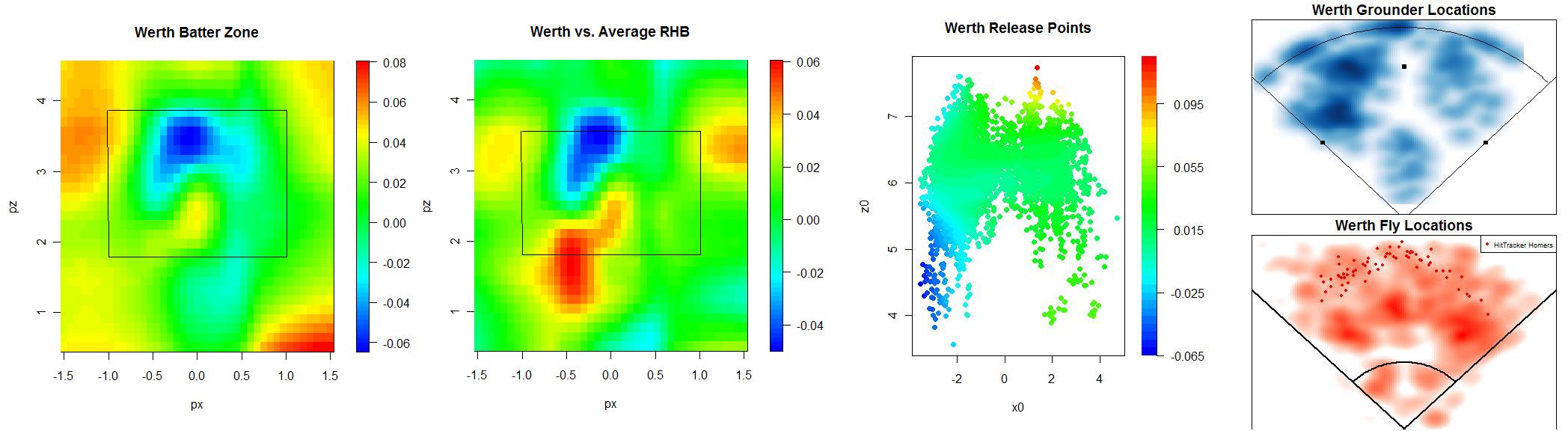
I'll break down the three components one by one. For now, the graphs represent the three most meaningful locations of the baseball's flight--from the pitcher's hand to the strike zone to the hit location. Here's Werth's "Batter Zone."

These are from the batter's perspective. Here, you can see Werth's expected run value is worst against pitches up in the zone and down and away. As you know, this holds true for most hitters. Where you see blue on the graph on the left, he performs worse than his average self. Then on the right, you see how he compares to the league average. He excels on pitches down and in, but is worse when challenged up.
So, how to improve these visualizations? I'm using a standard strike zone, but I'd like to create contour lines showing each batter's individual strike zones, and swing zones, showing where he's most likely to let it fly. I'm unsure how large the data frame should be. Right now, set at four feet by three feet, it captures the intricacies within the strike zone, but it might be leaving out some information for players like Vlad. The downside to expanding the frame is that for most graphs, the extra space will be occupied entirely by the average value of a ball, which will overwhelm the details of the visual. Lastly, for the graph on the right comparing Werth to average, I don't know whether to fix the color bar so that great hitters, like Chase Utley, appear red everywhere, since he's above average at everything, or to color in blue locations where he has a mere expected value of .01 runs better than average, since he's not as awesome in those locations as he is in others.
Here is how Werth does against release points, which is informative in showing his platoon splits.
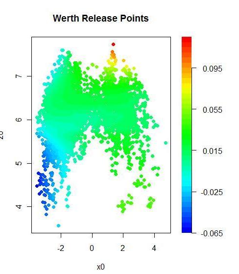
It appears to me that Werth has a normal platoon split, but struggles a fair bit against righties with a lower arm slot.
Lastly, Werth's spray charts.

Werth pulls his grounders at a high rate. In the outfield, depending on the precision of the data, the center fielder should shade a bit towards left.
I'd appreciate any input on how to improve this set of graphs. I'd also like to come up with graphs to show how hitters fare based on velocity and movement, but nothing comes to mind, and I have ideas for how to present hitf/x data if we ever get more of it.
I ran through the Phillies lineup excluding switch-hitters, so here they are, with brief comments. A quick glance at these graphs certainly won't give you any answers, but it might give some food for thought.
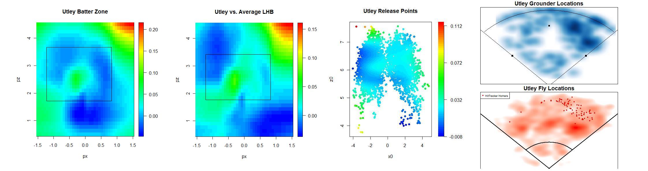
Utley is an insanely good hitter, no matter where you pitch him. However, don't try to brush him back, as Buster Olney suggested, because he will take his HBPs, which I'm guessing is what that graph's upper-right red portion consists of. He pulls almost everything.
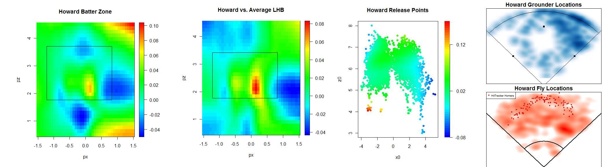
Howard also famously pulls his ground balls. Shifting against him is an obvious strategy, but the real question is where the third baseman should play.
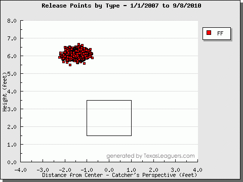
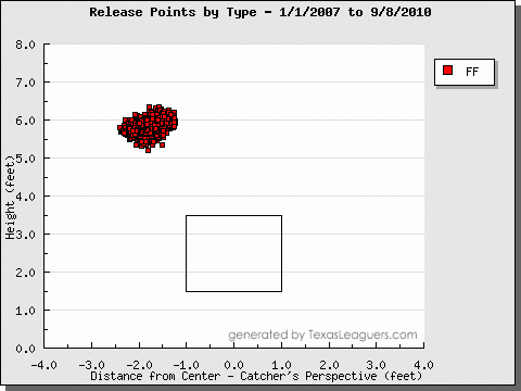
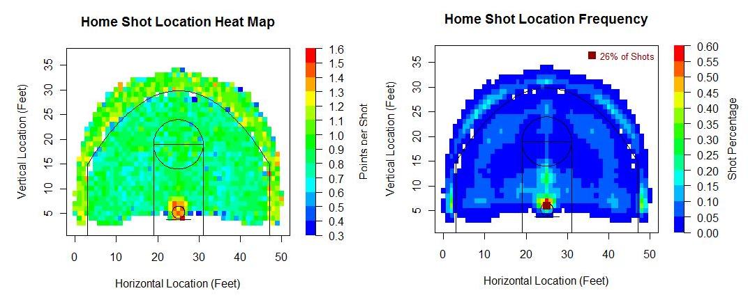
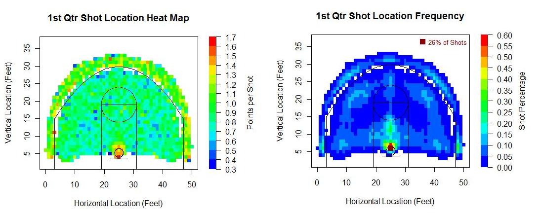
Ibanez has similar batter zones as Utley, but he's not as good anywhere.

Feliz is actually a good hitter on pitches away. I'd imagine that's because he lays off of most of them, since he can't hit them anyway. But he can be beat on the inner half. Feliz shows no platoon split and a normal spray chart.
Boy did Ruiz have a great series. He hits most of his flies the other way,but has hit all of his home runs to his pull field.
Please don't shy from sharing your thoughts.
| Touching Bases | October 29, 2009 |
A Quick Take on Velocity
A few weeks ago, Max Marchi wrote an article for The Hardball Times analyzing pitchers' fastball velocity trends throughout the year. Last year on THT, Josh Kalk developed a preliminary aging curve for fastball velocity. Both Marchi and Kalk used pitchf/x data, which began being recorded reliably back in 2007. I decided to try to more or less replicate their studies, except using Baseball Info Solutions data from FanGraphs.
FanGraphs has monthly splits for all of its offensive and pitching statistics going back to 2002. My sample consisted of just a shade over 2,000 single seasons in which a pitcher recorded fastball velocities in each month. Borrowing the idea from Marchi, I divided a pitcher's monthly velocity by his yearly velocity to come up with a speed index for that month. The average velocity trend looks a lot like a temperature graph.
However, I'm not too concerned about adjusting for the weather. We understand that velocity increases from April to May, but I'm interested in the rate of increase among certain groups of players. I don't know how real these trends are, but for example, Zack Greinke over the last three years has averaged 92 in April and 94 in September. That's a dramatic increase in velocity, so is there something special about him that allows him to pick up steam? On the other hand, Pedro Martinez from 2002-2006 averaged 89.6 MPH on his fastball in April, but actually decreased his velocity as the year went on, averaging 88 MPH in September. Why would he wear down?
I've heard that it takes longer for taller players to find their mechanics, and they therefore throw harder later in the season than they do in April. So I grouped players by height, labeling those at least 6'6" as tall, and those who stand less than six feet as short.
The data seem to weakly support the notion that taller players take a bit more time to reach their velocity than shorter players. I repeated this process with a bunch of different groups of players. Graphs follow.
For girth, I used body mass index, which adjusts for weight by height. Weight recordings are never reliable, so take this for what it's worth.
It looks like heavier players might suffer a bit in the dog days of summer, which makes sense intuitively. Similarly, older pitchers (33 and older) might wear down in the summer months more so than younger pitchers (25 and younger).
And how about a velocity trend based on how hard the pitcher throws? Hard throwers averaged at least 93 miles per hour on their heater for the year while soft tossers were clocked at 88 MPH and below.
There appears to be a large difference in how hard they throw coming out of the gates in April. Or perhaps it's just that faster pitches are more affected by the temperature changes than slower pitches. Many of these groups will correlate with each other, so it could be that the reason tall pitchers start off slow is that they throw hard. Or vice versa.
Finally, I checked to see if velocity trends might be influenced by early workload. I grouped pitchers by those who threw greater than approximately 500 pitches in April, those who threw between approximately 100 and 500, and those who threw fewer than approximately 100.
Might a light pitch count in April pay dividends in August and September?
On to year-to-year trends, also known as aging curves. I tried to copy Kalk's method of using matched pairs and finding the difference in year1's velocity to year2's. My sample consisted of 3,275 matched pairs, with between 100 to 400 pairs in each group. However, unlike Kalk, I do not use a weighted average based on pitch count. I'm not entirely sure that an increased sample of pitches yields a more reliable average fastball velocity. I'm also not sure how to address the selective sampling issues, so for now, I don't.
My conclusions differ from Kalk's. He found that pitchers increase their velocity until they reach age 28 or 29. I find that velocity remains around constant until that age, at which point there is a rather sharp decline in fastball speed. Pitchers who survive in MLB into their thirties tend to lose around two MPH on their fastball.
Again, I'll separate players into groups and come up with aging curves. First by height, with 6'2" as the cutoff.
Strong evidence here that taller pitchers maintain their velocity better than shorter pitchers. How does this bode for Tim Lincecum, who already lost a couple miles per hour of hop on his pitches this year? Before making any assumptions, let's take a look at aging curves by weight class.
Perhaps Lincecum can take solace in the possibility that bulk might be a detriment in aging gracefully.
That's it. Let me know if there are any other types of players who you think might exhibit unusual velocity trends.
| Touching Bases | October 01, 2009 |
Bullpen Management
It's the manager's job to get the most out of his players. With regards to the bullpen, this means optimally inserting relievers depending on such factors as the current baserunners, batter, and score. Hence, relief contributions tend to be measured by Win Probability Added. Having a bullpen ace makes the managers job easier in that he doesn't even have to think about whom to give his highest-leveraged innings. LOOGYs are always nice too. FanGraphs has a statistic that compares a player's WPA in high-leverage situations vs. his WPA in low-leverage situations, to see how relatively Clutch that player is. Looking at the bullpen as a collective unit, we can more or less make the assumption that a Clutch bullpen has been managed well, which is to say that better relievers are pitching in well-deserved, higher-leveraged innings.
I collected all data from FanGraphs since 1979 on team bullpens. Here it is in the form of a Google Motion Chart. What you will see is this year's team bullpen's Clutch score plotted against their WPA/LI, which is a measure of how well the bullpen performed, treating high-leverage and low-leverage situations as equal.
While this data could be used to rank managers historically, I've chosen to focus only on this year for now. The Yankees, Red Sox, and Twins have been best at deploying their top relievers at opportune times thanks to three of the top closers in the game in Mariano Rivera, Jonathan Papelbon, and Joe Nathan. Meanwhile, the Pirates blow everybody else out of the water in bullpen mismanagement. Let’s see how they’ve gone about this. Sorted by the average leverage index for each reliever, here are the WPA figures for all Pirate relievers with at least 20 innings pitched.
| Name | pLI | WPA |
|---|---|---|
| Matt Capps | 1.6 | -2.68 |
| Sean Burnett | 1.23 | -0.04 |
| John Grabow | 1.23 | 1.19 |
| Joel Hanrahan | 0.92 | 1.04 |
| Jesse Chavez | 0.9 | -0.83 |
| Steven Jackson | 0.88 | -0.2 |
| Jeff Karstens | 0.78 | -0.75 |
| Evan Meek | 0.65 | 0.14 |
Providing Matt Capps with the highly leveraged innings was a decent idea to start the season, but he’s been struggling this year. His walk rate has skyrocketed and his .370 BABIP isn’t helping matters. Meanwhile, Joel Hanrahan has been phenomenal with the Pirates so far, boasting a double-digit K/9 mark without having allowed a homer, yet he has been riding the pine when it’s mattered most.
A look at the Yankees, who have had the "Clutchiest" bullpen in baseball this year.
| Name | pLI | WPA |
|---|---|---|
| Mariano Rivera | 1.71 | 3.58 |
| Phil Hughes | 1.43 | 2.4 |
| Phil Coke | 1.29 | 0.88 |
| Alfredo Aceves | 1.07 | 1.92 |
| Brian Bruney | 0.99 | 1.02 |
| David Robertson | 0.68 | -0.3 |
| Brett Tomko | 0.66 | -0.55 |
| Jonathan Albaladejo | 0.65 | -0.22 |
| Jose Veras | 0.62 | -0.2 |
| Edwar Ramirez | 0.44 | 0.15 |
As a Yankee fan, it kills me that Phil Coke pitches more important innings than David Robertson. Other than that quibble, it’s hard to argue with what Joe Girardi’s done with the bullpen pieces he’s been given. Ramirez, Veras, and Albaladejo are clearly the three worst relievers to have seen time in the Yanks’ pen, and Girardi did a good job hiding them. Mo and Hughes make it easy at the top.
Equal time to the Red Sox, who have a highly-touted bullpen which has performed at a merely average level when factoring out leverage.
| Name | pLI | WPA |
|---|---|---|
| Jonathan Papelbon | 2.19 | 4.83 |
| Hideki Okajima | 1.31 | 1.78 |
| Ramon Ramirez | 1.23 | 0.47 |
| Manny Delcarmen | 1.11 | -0.31 |
| Daniel Bard | 0.93 | -0.25 |
| Justin Masterson | 0.75 | 0.32 |
| Takashi Saito | 0.68 | -0.26 |
I’m sure Sox fans would rather see Bard in higher-leverage situations, but besides that minor note, I would think the Nation would also be satisfied with Francona’s usage of the pen.
Having an elite closer the likes of Mo and Papelbon doesn't make the decisions that go into bullpen management that cut and dry, though. Two teams at the bottom of the rankings who have terrific closers are the Dodgers and Royals. How did they go about possibly mismanaging their bullpens?
| Name | pLI | WPA | Name | pLI | WPA |
|---|---|---|---|---|---|
| Jonathan Broxton | 1.85 | 2.87 | Joakim Soria | 2 | 3.23 |
| George Sherrill | 1.71 | 1.08 | John Bale | 1.24 | -1.36 |
| Cory Wade | 1.66 | -0.95 | Jamey Wright | 1.04 | -0.13 |
| Hong-Chih Kuo | 1.55 | 0.6 | Juan Cruz | 1.02 | -0.81 |
| Ramon Troncoso | 1.34 | 2.16 | Kyle Farnsworth | 0.92 | -2.18 |
| Ronald Belisario | 1.19 | -1.17 | Roman Colon | 0.82 | -0.84 |
| Jeff Weaver | 1.14 | 0.53 | Robinson Tejeda | 0.69 | 0.1 |
| James McDonald | 0.91 | 0.14 | Ron Mahay | 0.6 | -1.22 |
| Brent Leach | 0.86 | -0.16 | |||
| Guillermo Mota | 0.71 | -0.97 |
First, it’s clear the Dodgers had a tremendous bullpen, while the Royals, well, not so much. The main problem for the Dodgers appears to be Joe Torre’s reliance on Cory Wade to start the year. With so many other terrific options, Torre waited too long to pull the plug on Wade, who's been in the minors for the last couple of months.
As for the Royals, at least Hillman was able to get Soria right. I’d love to know what the Royals saw in John Bale to make them think he was one of their top relievers. And how do they go out and sign Kyle Farnsworth to an $9-million deal, have him pitch better than they would have expected—better than he’s pitched in years—but put him in the least meaningful innings that he’s ever pitched? To be fair, his high-leverage stint against the Yankees Tuesday night didn’t work out too well. The Royals are also burying Robinson Tejeda at the bottom of their bullpen chain, which hasn’t worked out too well for them. And free Carlos Rosa!
In addition to using the best relievers in the most critical situations, managers also have to find a way to get the most out of their relievers by playing to their strengths. Which brings me to platoon splits. Failed starters can always get jobs as relievers if they have the ability to shut down same-handed batters.
The Braves have had a superb bullpen this year, and their Clutch score might be penalizing them for being equally awesome in both high- and low-leverage situations. Part of the reason for their success was their closer-by-committee tandem of righty Rafael Soriano and lefty Mike Gonzalez. For the following table, I went to Baseball Reference's splits pages and found how often each reliever the platoon advantage as well has how much better he fared when facing same-handed batters. Baseball Reference calls the split that compares a pitchers production to himself tOPS+, and for pitchers, lower is better, so Peter Moylan's ptnOPS+ of 65 would mean that Moylan allows an opposing OPS 35% worse against right-handed batters. Therefore, Bobby Cox should try to have Moylan face mainly righties.
| Name | Throws | Ptn% | ptnOPS+ | Name | Throws | Ptn% | ptnOPS+ |
|---|---|---|---|---|---|---|---|
| Peter Moylan | R | 61% | 65 | Eric O'Flaherty | L | 50% | 85 |
| Jeff Bennett | R | 58% | 69 | Mike Gonzalez | L | 34% | 78 |
| Manny Acosta | R | 54% | 95 | ||||
| Buddy Carlyle | R | 53% | 114 | ||||
| Rafael Soriano | R | 52% | 49 | ||||
| Kris Medlen | R | 46% | 150 |
I was surprised to see that Soriano and Gonzalez, who do exhibit traditional platoon splits, have not been given the advantage of facing same-handed batters that often. Instead, it appears that O’Flaherty and Moylan have been used as the righty and lefty specialists while Bobby Cox has opted to allot Soriano and Gonzalez the eighth and ninth innings.
Running the numbers for the Nationals, nothing of note really came up.
| Name | Throws | PTN% | ptnOPS+ | Name | Throws | PTN% | ptnOPS+ |
|---|---|---|---|---|---|---|---|
| Jay Bergmann | R | 64% | 76 | Ron Villone | L | 50% | 94 |
| Jorge Sosa | R | 60% | 65 | Sean Burnett | L | 50% | 101 |
| Julian Tavarez | R | 60% | 64 | Joe Beimel | L | 40% | 98 |
| Saul Rivera | R | 58% | 92 | ||||
| Logan Kensing | R | 55% | 110 | ||||
| Kip Wells | R | 55% | 72 | ||||
| Joel Hanrahan | R | 50% | 97 | ||||
| Mike MacDougal | R | 49% | 83 | ||||
| Tyler Clippard | R | 47% | 173 |
The fact that Mike MacDougal, he of the 32/38 K/BB ratio, is closing this year in Washington should say all you need to know about the state of the Nats' bullpen. But hey, they won the Harper lottery.
This type of analysis is essentially made for Tony La Russa, so I’ll put both parts together to try to grade his management.
| Name | pLI | WPA |
|---|---|---|
| Ryan Franklin | 1.94 | 2.23 |
| Kyle McClellan | 1.45 | 0.89 |
| Jason Motte | 1.04 | 0.17 |
| Dennys Reyes | 1.04 | 0.26 |
| Trever Miller | 0.89 | 1.2 |
| Chris Perez | 0.84 | 0.38 |
| Blake Hawksworth | 0.79 | 1.24 |
| Brad Thompson | 0.5 | -0.32 |
Franklin has emerged as a reliable bullpen ace, and La Russa thankful for that fact. Coming into the year, the likes of Jesse Todd, Jason Motte, and Chris Perez were names you heard vying for that closer job. After Franklin, though, La Russa has had struggles. He’s given high-leverage appearances to Motte, who has not been one of his better relievers. Hawksworth also may be a guy who's emerging that La Russa can start to trust more.
| Name | Throws | PTN% | ptnOPS+ | Name | Throws | PTN% | ptnOPS+ |
|---|---|---|---|---|---|---|---|
| Chris Perez | R | 70% | 88 | Trever Miller | L | 62% | 30 |
| Jason Motte | R | 61% | 71 | Dennys Reyes | L | 60% | 60 |
| Kyle McClellan | R | 57% | 121 | ||||
| Ryan Franklin | R | 54% | 109 | ||||
| Blake Hawksworth | R | 53% | 65 | ||||
| Brad Thompson | R | 52% | 99 |
La Russa does a fantastic job of platooning. Both lefties he’s utilized out of the pen have had the benefit of facing a majority of same-handed batters. Trever Miller has put up great numbers this year, and La Russa would be well-served to use him as the southpaw in a righty-lefty combination with Kyle McClellan who has been holding his own as La Russa's go-to guy after Franklin. There is a dilemma in the case of Miller, who is truly exceptional against lefties to the tune of 37 strikeouts to six walks this year. So in a relatively close game, should La Russa bring him in once the starter is out and a lefty is up to ensure quality innings from Miller, or should La Russa at times wait and hope that Miller might have the chance to face a couple lefties in the 8th or 9th when the leverage is highest, but risk not pitching Miller at all?
There’s a lot more than what I've addressed that goes into bullpen management, but I think bullpen management is one of the more important in-game aspects of managing a baseball team, and it might be a subject that's possible to objectively grade.
| Touching Bases | September 30, 2009 |
Thoughts from the 2009 New England Symposium on Statistics in Sports
On Saturday, Harvard hosted NESSIS, a gathering of sports statisticians that could be billed as the little brother of the sports analytics conference at MIT, only geekier. I say that as a compliment.
Academia vs. Industry (vs. Internet?)
A couple of the best of both worlds were on display, as two names I've become familiar with, Shane Jensen and Tom Tippett, presented their analysis. Tippett, Director of Baseball Information Services for the Red Sox, presented research on special baseball tactics such as the bunt and stolen base. His findings often dissented with conventional sabermetric wisdom. A base stealer must steal at a clip of at least 70% to be deemed successful? Well, the break-even rate fluctuates wildly based on the game state. With nobody out in a one run game, the break-even rate of stealing second is only 54%. In a two-plus run game, it’s 84%. With regards to the bunt, Tippett found that good bunters should continue to bunt thanks to the possibility of an error or hit, and that in the context where you’re playing for one run, bunting is often sensible depending on the hitter and upcoming batters. It seems to me that the guys who wrote The Book came up with similar conclusions. Of course, the real stuff Tippett does for the Red Sox is proprietary and can hardly be discussed.
Tippett said that the more he studied an issue, the more often he found that managers tended to be right, without even knowing the data. Mike Zarren, a statistician for the Celtics, agreed. Zarren brought up two points of interest. First, he said that the reason it's hard for people within his industry and those from academia to collaborate is that academics are always interested in publishing while teams need to keep their research private. Secondly, Zarren was fond of mentioning the fact that the Celtics led the league in technical fouls last year, and that was before signing Rasheed Wallace. I pray for Tommy Heinsohn’s health.
Meanwhile, Jensen was one of three baseball analysts representing academics from the Wharton School at UPenn who presented their work. In a comparison of fielding metrics, Jensen's SAFE was deemed the most statistically advanced defensive metric publicly available. However, the guys on the Internet who distribute their data for free, in the forms of UZR and PMR, hold their own. Jensen's system also showed that Derek Jeter has been a subpar fielder in the past, so I have to question whether Jensen has an anti-New York bias, whether he's ever watched baseball, and the credentials of the Department of Statistics at the Wharton School.
Talking About Practice?
The topic of team practice was addressed by Gilbert Fellingham, a statistician at Brigham Young University and volleyball enthusiast. Fellingham studied point-by-point volleyball data to see what skills matched up best with results, he determined that, for instance, women’s volleyball teams should spend more time on their transition offense. Of course, there are some skills that are important but are difficult to improve upon, even with countless hours of practice. I’d imagine that every baseball player has a different skill that they should practice, but how can we quantify it? We can quantify player performance and we can detect player weaknesses, but we don't know what areas of weaknesses can be most efficiently improved upon through practice. I have no idea whether there's a uniform practice structure among teams or whether some teams have specific agendas.
The Lesser Sports
Benjamin Alamar of JQAS in researching play-calling in the NFL found that teams under-utilize the pass. When I was watching the Colts play the Cardinals Sunday night, it made my head hurt every time the Colts ran the ball. Keeping the Cardinals’ defense on its toes so that it can’t sit on the pass is important, but that really only matters when there’s a Nash equilibrium (no idea if I'm using that term correctly). What I mean is that if there are more than six people in the box, I really don’t see why the Colts would ever run. Ever. Even if the Cardinals are expecting pass, they still won't be able to defend it since they have x-number of linebackers who can’t do a thing when Peyton Manning airs it out. Alamar said that there’s even a greater chance of a play yielding negative expected points (think run expectancy) on a run than on a pass. The only downside to passing all the time is the risk put on the quarterback through wear to his arm and the threat of the crushing sack.
My favorite presenter may have been Wayne Winston, who provides Mark Cuban with his adjusted plus/minus numbers, which strongly appeal to me. In baseball, plus/minus is also known as WOWY, which I believe is most useful in assessing defensive value, catcher/pitcher batteries, and batter protection. I’ve long known that the statistics presented in an NBA box score are of much less value than those in a baseball box score. The interaction between teammates in basketball can be so subtle that we often don't know what to track. It's difficult to pinpoint why the Timberwolves perform better with Sebastian Telfair on the floor, but apparently they do. Plus/minus confirms in no uncertain terms that playing Ben Wallace in the series against the Cavs was a disaster. It also gives credence to this decade's Kevin Garnett vs. Tim Duncan and Kobe vs. Shaq debates.
Information on NESSIS can be found at its web site here.
| Touching Bases | September 24, 2009 |
It's Not Whether You Win or Lose, It's Whom You Play
An oft-overlooked piece of information by baseball analysts is strength of schedule at the player and team level. As the regular season winds down and we try to determine who has been the best team in baseball , as well as the Most Valuable Players and Cy Youngs of both leagues, I took a look at quality of opponent to see who has been helped and who has been hurt by the competition.
Giving credit where credit is due, to my knowledge Baseball Prospectus continues to hold the best readily available data on quality of opposition. On BP's adjusted standings page, there is a column for expected runs based on a team's batting line (UEQR) and another column for that same stat, except adjusted for strength of schedule (AEQR).
I plotted the difference between how many runs a team should have scored/allowed with the same number adjusted by strength of schedule. The scale is not very intuitive, so I will explain that teams in the upper-right quadrant have scored more runs and allowed fewer runs due to a relatively easy strength of schedule, while the reverse holds true for teams in the lower-left quadrant.
If you look closely, you may noticed that each quadrant is made up of mainly teams from the same division. You see that the AL East may have the highest quality of play, the AL West the best run prevention or worst run scoring, the NL East the best run scoring or worst run prevention, and the NL Central the lowest quality of play.
Given a fair strength of schedule, the Orioles would have been expected to score some 20 runs greater and allow some 20 fewer with a fair strength of schedule. Given this fact, as well as Baltimore's youth, and the concept of regression to the mean, you can already mark me down for the Orioles' over next year. Because of the potency of the Yankees’ lineup, the rest of the AL East actually should have earned better run production marks. Unsurprisingly, the Jays and Orioles have the largest difference between their second-order wins and third-order wins, or in English, they have faced the most skewed schedules in baseball.
Adjusting for luck and schedule, the Indians have carried the strongest offense in their division by a fair margin, and will surely make for a trendy pick, as usual, among analysts in next year's predictions. With my apologies to Rich Lederer, who is probably tired of his Angels’ Pythagorean record being discussed, I have to mention oddities in the Angels’ record. Not only have they managed to outplay their run differential, but according to BP, the Angels’ have gotten lucky in the number of runs they've scored and allowed. The Halos are really the only team in their division that can hit, so their staff is likely not as good as we think. Furthermore, Angels hitters lead the league in BABIP and have been unusually successful with runners on base as compared to their production with the bases empty. However, each team in the AL West plays defense ranging from above average to excellent, so to be fair, the entire division's run-scoring has been depressed by playing each other.
The American League owned a .546 winning percentage in Interleague Play this year, marking the fifth straight year of American League utter superiority. I do wonder whether any National League team would have boasted a winning record playing in the American League East.
To check out individual players' quality of opponent, I moved on to BP's quality of batters and pitchers faced reports. The reports give quality of opposition in terms of the triple-slash-stat line.* I limited my sample to pitchers with at least 300 batters faced and batters with at least 300 plate appearances.
*Instead of GPA and OPS, why haven't we ever used what I believe to be the most sensible combination of OBP and SLG, 1.75 multiplied by OBP and then added to SLG? We could then keep it on that scale, which has a league average of exactly one, as in 1.00. Wouldn't that be a rough measure of offensive production that makes everyone happy, more or less?
The eight pitchers in baseball, and 14 of the top 15, who have faced the highest quality of opposition all hail from the American League East, including Roy Halladay coming in second to David Hernandez. Roy Halladay is awesome. Again, to illustrate the difference in quality of play between the leagues, I will refer to John Smoltz and Brad Penny. The opposing batter's quality of slugging percentages against Smoltz and Penny have gone down 20 and 11 points respectively since the pair left the AL East. Cliff Lee's difference has been a mere seven points in slugging. Todd Wellemeyer has had the easiest go of any pitcher this year.
You may not know of the stat kept at Baseball Reference called platoon percentage, but I feel it is an important piece of information in showing the competition a player has faced. Paul Maholm, whose platoon split I looked at last week, has been unlucky enough to have had the platoon advantage least often among pitchers with at least 100 innings.
The top six pitchers of the year in each league, in my opinion, excluding Lee who split time between leagues and whom I already mentioned:
| First | Last | AVG | OBP | SLG | PTN% |
|---|---|---|---|---|---|
| Roy | Halladay | .268 | .344 | .433 | 0.43 |
| Justin | Verlander | .265 | .338 | .425 | 0.43 |
| Felix | Hernandez | .264 | .337 | .424 | 0.45 |
| Jon | Lester | .262 | .334 | .424 | 0.26 |
| CC | Sabathia | .261 | .333 | .416 | 0.23 |
| Zack | Greinke | .261 | .333 | .420 | 0.53 |
| Adam | Wainwright | .255 | .329 | .403 | 0.54 |
| Javier | Vazquez | .254 | .328 | .403 | 0.49 |
| Dan | Haren | .253 | .328 | .401 | 0.48 |
| Tim | Lincecum | .251 | .329 | .397 | 0.45 |
| Chris | Carpenter | .252 | .325 | .393 | 0.53 |
| Ubaldo | Jimenez | .253 | .323 | .394 | 0.47 |
Chase Headley and Kevin Kouzmanoff, who both might actually be quality Major Leaguers, have had the misfortune of not only playing half their games in Petco, but also facing the most difficult slate of pitchers among hitters. This list may well be flawed, since pitchers who get to throw multiple times against the Padres will have their stats inflated. This might be the reason that Padre hitters appear to have faced quality pitchers. Following this logic, it makes sense that Melky Cabrera and Derek Jeter have faced the pitchers with the aggregate highest opposing OBP and SLG against since these pitchers have been subjected to the Yankees. I'll present the list anyway.
| First | Last | AVG | OBP | SLG | PTN% |
|---|---|---|---|---|---|
| Derek | Jeter | .256 | .338 | .414 | 0.28 |
| Mark | Teixeira | .255 | .335 | .412 | 1.00 |
| Kevin | Youkilis | .254 | .336 | .406 | 0.28 |
| Miguel | Cabrera | .252 | .334 | .400 | 0.27 |
| Ben | Zobrist | .250 | .333 | .396 | 1.00 |
| Joe | Mauer | .249 | .332 | .396 | 0.62 |
| Hanley | Ramirez | .251 | .337 | .399 | 0.26 |
| Chase | Utley | .249 | .336 | .397 | 0.65 |
| Derrek | Lee | .250 | .335 | .400 | 0.18 |
| Albert | Pujols | .247 | .334 | .398 | 0.26 |
| Prince | Fielder | .247 | .336 | .395 | 0.73 |
| Adrian | Gonzalez | .241 | .328 | .388 | 0.62 |
| Touching Bases | September 15, 2009 |
How Release Points Affect Platoon Splits
Dave Allen I am not, but I will do my best at an F/X visualizations-style piece. Below is the expected run value of a pitch based on its release point, which is defined as the point where the ball is measured 50 feet away from home plate. The image is from the batter's perspective, so points on the left tend to be thrown by righties and vice-versa.
Kind of like a rainbow, kind of like a tie-dyed afro.
Looking at the image, my guess is that the graph says more about the context of the pitches than content. Managers can control when they deploy pitchers of a given arm slot, so in all likelihood, lower release points occur when the pitcher has a platoon advantage over the batter. For example, see that cluster of pitches about a foot off the ground and two feet on the third base side of the rubber? All 1,000 or so were thrown by righty one-out guy extraordinaire Chad Bradford, whose numbers exceed his talent thanks to his manager placing him in situations where he can be expected to succeed. So what I’m saying is that the above graph is more descriptive of batters than it is of pitchers.
The plots are more or less mirror images. Against same-handed batters, southpaws who stand far to the first-base side of the rubber and sling the ball from a low three-quarter arm slot are expected to shut down the opposition. Release points seem to have a much greater effect against left-handed batters than they do right-handed batters, as you can see in the range of the color map. This is likely why LOOGYs are all the rage, while you rarely hear about ROOGYs other than the aforementioned Bradford.
I decided to try an analysis of individual players with large gaps in their platoon splits. Billy Butler would be one of the American League's elite hitters were pitchers only allowed to throw left-handed.
He hits standard righties at a rate of one run below average per 100 pitches, while he hits standard lefties to the tune of a couple runs above average per 100 pitches. However, pitchers with untraditional arm slots are where it gets interesting with Butler. He can't touch righty sindwinders, and he's grounded out weakly three times while facing those several submarine pitches from Bradford. Conversely, he has apparently picked up the ball quite well against lefty sidearmers in the limited time he's had against them. You win a prize if you said small sample size.
For my lefty hitter, I chose Ryan Howard, who might be out of a job playing baseball if all of us could only throw lefty.
Oddly, Howard not only does poorly against lefties who sling the ball, but also righties who release the ball from the extreme third-base side of the rubber.
Paul Maholm exhibits an interesting split.
He's much better against lefties in general, but it seems to me that his worst pitches against both sets of batters when he releases the ball from straight on according to the batter's point of view. This is not what we saw the the league average split. It is abnormal that Maholm has performed better against righties when releasing the ball closer to the first-base line.
For such a great starting pitcher in the past, Brandon Webb sure shows a large platoon split. His go-to pitch, the sinker, does happen to be prone to the largest platoon split, on average, of any type of fastball. Keep in mind that the sets of graphs for Maholm and Webb vs. RHB and vs. LHB are set to different scales, so it appears as if they're dramatically altering their release points based on batter handedness, but it's actually just a fault of mine in setting the axes.
Webb is best when pitching from a higher release point that is closer to his body. Just a hunch, but I'd guess this has to do with the movement on his sinker he gains from a higher arm angle.
| Touching Bases | September 09, 2009 |
On That Stuff
Justin Verlander. A.J. Burnett. Ubaldo Jimenez. These are the names that make scouts salivate. Why? One word. Stuff.
Two components determine how nasty a pitcher’s stuff truly is: velocity and movement. We’ve had radar guns to track the league’s hardest throwers for some time (that would be Joel Zumaya, of course) But now, with the help of pitchf/x data and a local regression technique picked up from Dave Allen, we can come pretty close to quantifying a pitcher’s stuff. We can assign every single pitch an expected run value given its physical characteristics—be it velocity, movement, location, release point, or any other data point given by the pitchf/x data. For the purposes of measuring expected run value based on stuff (StuffRV), I used velocity, horizontal movement, and vertical movement as my three independent variables, and restricted my sample to only righties who released the ball from at least five feet off the ground, with a minimum of 1,000 pitches over the last three years. To the leaderboards.
| Name | StuffRV |
|---|---|
| A.J. Burnett | -46 |
| Felix Hernandez | -31 |
| Zack Greinke | -26 |
| Edwin Jackson | -26 |
| Ubaldo Jimenez | -26 |
| Chad Billingsley | -23 |
| Brian Wilson | -22 |
| Brandon Morrow | -21 |
| Roy Halladay | -21 |
| Matt Garza | -20 |
| Dave Bush | 15 |
| Jeff Suppan | 17 |
| Braden Looper | 19 |
| Livan Hernandez | 20 |
| Greg Maddux | 23 |
Really no surprises on this list, which at least gives some validity to this method for evaluating stuff. I probably could have guessed 10 of these names correctly given 20 tries. One pitcher with lightning stuff who often goes overlooked is Gil Meche, who registered twelfth. One pitcher with deplorable stuff who does not go overlooked is Livan Hernandez.
Justin Verlander showed up a bit lower down in the rankings than I would’ve thought, sandwiched between Brett Myers and Jeremy Guthrie, and good for 30th out of 250 pitchers. But actually, Verlander's worse-than-expected ranking just goes to demonstrate that last year's off-putting performance was more than just random fluctuation. His average fastball velocity dipped below 94 miles per hour for the first time in his career last year, which was reflected in the actual run value of his fastball. However, his reputation as a flamethrower is well-deserved. Limiting the sample to only the top quartile of a pitcher’s stuff knocks Ubaldo Jimenez out of the top five in favor of Verlander, who, at his best, might be the league's best. Verlander has a very large difference between his best stuff and his worst stuff. By the numbers, it looks like Scot Shields owns the widest disparity between best and worst stuff. The difference in Verlander's fastball last year, which clocked in at 94 MPH with eight inches of run and ten inches of rise, and his fastball this year, which has the same average movement (to the nearest inch), but has picked up two miles per hour in velocity, is .4 runs per 100 pitches in expected value. The actual difference in Verlander's fastball, according to fangraphs, is even greater than that, at just over a full run per 100 pitches. That uptick in velocity has made a big difference.
How about the best stuff on a per-100-pitch basis?
| Name | StuffRV/100 |
|---|---|
| Brian Wilson | -1.08 |
| Matt Lindstrom | -0.99 |
| Jonathan Broxton | -0.97 |
| Joel Zumaya | -0.96 |
| Brandon Morrow | -0.87 |
| Heath Bell | -0.85 |
| Dennis Sarfate | -0.83 |
| Grant Balfour | -0.78 |
| Mariano Rivera | -0.78 |
| A.J. Burnett | -0.73 |
| Josh Geer | 0.41 |
| Edwar Ramirez | 0.42 |
| Livan Hernandez | 0.48 |
| Greg Maddux | 0.53 |
| Joe Nelson | 0.56 |
Max-effort relievers and a couple of Yankees top the pitch-for-pitch list. Also, Dennis Sarfate has apparently followed the route of Daniel Cabrera—an Oriole with eyebrow-raising stuff who lost his velo and thus, likely his place in the Majors.
Greg Maddux really survived the latter part of his career on his pitching moxie. Even when I restrict the sample to the top 25% of his pitches, he continues to show below-average stuff. Nevertheless, he accumulated five WAR over the last couple years.
Come to think of it, setting a minimum of 1,000 pitches for this analysis might have been a mistake. Given the precision and granularity of the data, this technique could be used to assess a pitcher's stuff given only a handful of pitchers. For example, I had never heard of Carlos Rosa before conducting this analysis, but now, from a sample of just 50 pitches, I can’t stop wondering why he’s not in the Majors. Great stuff. Decent control. The only evident knocks against him are his 2-8 Win-Loss record in AAA and 4.56 ERA. Maybe Dayton Moore knows something I don’t, or perhaps Rosa brought it just for his brief appearance in the Majors, or it’s possible GMDM is undervaluing a young talent who can get Major League hitters out. Actually, all three of these scenarios have probably taken place.
Who has made the most of his stuff? For this ranking, I subtracted the actual run value that each pitcher has been worth from the expected run value based on his stuff.
| Name | StuffRV-RV |
|---|---|
| Roy Halladay | 61 |
| Brandon Webb | 60 |
| Derek Lowe | 54 |
| Dan Haren | 51 |
| Greg Maddux | 46 |
| Jake Peavy | 45 |
| Jonathan Papelbon | 38 |
| Justin Duchscherer | 37 |
| Joakim Soria | 35 |
| Brad Penny | -28 |
| Carlos Silva | -30 |
| Adam Eaton | -32 |
| Bronson Arroyo | -32 |
| Miguel Batista | -36 |
This group consists of pitchers who can succeed without the strikeout. While Webb and Lowe both have heavy sinkers that are able to generate grounders like clockwork, the location of these pitches down in the zone has likely had more to do with their success than the tremendous movement on their pitches.
And at the bottom, there are two types of pitchers. The Batistas and Pennys are granted roster spots because their passable stuff at least gives them upside, but the Eatons and Silvas of the world, who have crummy stuff and can’t even pitch up to their already limited abilities, well, those are the guys to whom you don’t give multi-year deals.
A spreadsheet containing most of the data used in this article.
Pitchf/x data from wantlinux.net via MLBAM. Thanks to Dave Allen and all others who helped me with the code used in this analysis.
| Touching Bases | May 26, 2009 |
David Price's Debut
For Cleveland sports fans, I don’t know if any moment could top LeBron James’ game-winning three pointer from Friday night. Last night’s ninth-inning comeback by the Indians wasn't half bad.
For Tampa Bay fans, though, last night's game was of greater importance than its bullpen collapse. Last night, David Price made his first start of the year.
Pitching in five regular season and five postseason games last year, Price served as an instrumental part in the Rays’ playoff run. Nevertheless, Price retained his rookie eligibility, and the Rays, managing a surplus in pitching, opted to option the 23-year old southpaw down to AAA and keep youngsters Andy Sonnanstine and Jeff Niemann in the rotation as well as limit Price’s innings.
Following Price's phenomenal postseason performance, Josh Kalk penned everything you need to know about the man, who was named the second-best prospect in baseball (behind Matt Wieters) by Keith Law, Kevin Goldstein, and Baseball America.
In spring training, Price went 2-0 with a 1.08 ERA, but his six walks allowed in 8.1 innings of work were a bad sign. After Price’s second spring appearance, he admitted that he was experiencing difficulty.
"I've worked on my changeup so much, my slider's gone away," Price told mlb.com. "It's something I'm going to have to get back."
Considering the hype Price received, it's hard to believe that he still had areas where he needed to improve, but he's still just a kid with only a year of professional ball under his belt.
Price’s first six starts with AAA Durham were worrisome, as he posted a 1-4 record due to a disappointing 21:16 K:BB ratio. Price was drawing fewer swinging strikes and he was not inducing nearly as many ground balls in his 2009 stint with Durham as he had in 2008 across four levels. Yet Price seemed to have turned it around in the last couple of weeks leading up to his start yesterday. In what might be his final Minor League appearance of his career (knock on wood) Price went five innings of no-hit ball while striking out nine. Price entered the Rays' rotation when Scott Kazmir, to whom Kalk compared Price, hit the Disabled List. I set out to break down the second start of Price's Major League career.
Price came out firing. His first 14 pitches were four-seem fastballs clocking in between 94 to 98 miles per hour. Jamey Carroll drew for a leadoff walk, followed by Grady Sizemore hitting a pop up down the left field line, Carl Crawford made a futile attempt at a diving catch, which allowed runners to advance to second and third with no outs. Then Price really flashed his potential.
Price worked ahead of the count on Victor Martinez with fastballs, and with two strikes, Martinez had little chance. Price busted Martinez inside with sliders which Martinez could do little else but foul off. Price then blew Martinez away with a 98-MPH fastball on the outside part of the plate. Price worked ahead of Jhonny Peralta with inside fastballs and finished him off with a hard slider inside. Price finished the inning by testing Shin-Soo Choo with fastballs up in the zone, and on 2-2 Price threw a heater over the heart of the plate that Choo took for a called strike three.
Needless to say, that stretch was Price’s most impressive, which is fair since it doesn’t really get much better than that.
The Rays gave Price a fiive-run cushion heading into the bottom of the second. However, Price walked the leadoff batter on four pitches, which just makes you wonder. There’s no reason that any Major League pitcher with a five run lead should be walking the leadoff batter on four pitches. Price allowed five walks, which is the second time in his last four starts that he’s allowed that many. Walks have been a problem for Price. Since being promoted to AAA last year, Price has walked well over four batters per nine innings.
Let's take a look at Price's strikezone plot. This is from the catcher’s perspective, so pitches on the right are towards Price’s arm side, or inside to left-handed batters. Blue markers are pitches against righties, while red markers are pitches against lefties. Circles indicate fastballs while triangles indicate sliders.
It looks to me like he tried to work away from lefties. His off-speed stuff was saved almost exclusively for righties, and he tried to keep his sliders in on them. Looking at his strikezone plot, I don't think Price was wild, but he didn't shy away from working himself into long at bats, which is unnecessary given that defense behind him and his ability to blow batters away.
Despite the leadoff walk in the second, Price retired the next three batters in order. With a full count on Ryan Garko, Price demonstrated the ability to keep the ball in the zone when necessary, as he forced Garko to foul off five pitches in the zone before popping out on a slider on the outside corner.
Price allowed two more baserunners in the third, but came out unscathed. The fourth inning was where it all started falling apart for Price and the Rays. The Rays had a 10-0 lead, yet Price was already at 77 pitches by the start of the inning, and his fastballs to the first two batters of the inning were down in velocity to 92-94 MPH. Mark DeRosa lined a single the other way and Garko pounded his third homer of the year on a knee-high fastball. Price picked the velocity back up against Matt LaPorta, working at 95-97 with his fastball to strike LaPorta out. Yet Price was up at 90 pitches, and he had apparently lost his command. Price walked the next two batters and was pulled by Joe Maddon, who had said in a pre-game interview that it was a goal for Price to go deep into the game. Neither of those baserunners came around to score, but Price was fortunate to forfeit only two runs after allowing nine baserunners in 3.1 innings.
Price, as usual, was 95% fastball/slider. He showed his spike curveball and changeup once or twice, but they were all wasted for balls.
I’d say he found his slider. Like last year, it averaged a velocity of 86-88 miles per hour. While Price doesn't generate significant horizontal movement, he actually got the ball to dive more in yesterday's start than he did on average last year. He releases his slider a couple inches farther from his body than he releases his fastball on average. There aren't many sliders thrown at 86-88, especially from the left side. Last year, Francisco Liriano and Randy Johnson threw the hardest sliders among left-handers. Both of them had little horizontal movement, like Price, and Liriano's and Johnson's sliders actually generated less vertical movement than Price's has. Nevertheless, all of these sliders have solid reputations and they have all accounted for above-average run values, which can now be found on Fangraphs. Swinging at Price's slider simply isn’t a good idea. Out of eight swings on his sliders, there were five fouls, two misses, and one pop out. However, when batters took the slider, only two called strikes were called out of twelve pitches. If he can locate the slider down in the zone, I believe it would be nearly untouchable.
His fastball averaged 96 MPH, which, for a starter, for a lefty, and for a human whose arm must follow the laws of biomechanics, is positively exceptional. The movement on it is nothing to write home about, though, in my opinion.
Price’s stuff is unbelievable. There’s no denying that. But walking that many batters is inexcusable, and it cost his team the game. Price has yet to have an outing of over six innings since he was called up to the Majors last year. Part of that is due to the Rays’ attempt to limit his innings. And part of that is Price’s propensity to throw too many pitches. The Rays were forced to go to their bullpen early, and they ended up not having enough arms to close out the game. Well, that’s not really fair. A bullpen should be able to close out a ninth-inning seven-run lead. Here’s the WPA chart from the biggest comeback of the year.
| Touching Bases | May 19, 2009 |
HitTracker F/X
What happens when you combine Hit Tracker data with Pitch f/x data? You get a whole lot of data.
First, I looked at batter age in relation to standard home run distance. Standard home run distance is the distance a home run would travel in neutral conditions if it were to land at field level. My sample contains data on home runs from 2007 and 2008, totaling nearly 10,000 data points.
It appears to me that the age 25-29 peak holds true. I had data on 16 homers hit by players before their 21st birthday and the average distance was 420 feet. This is because Justin Upton is an absolute monster. The oldest grouping of players is likely biased since players who maintain the ability to hit home runs at that age are almost entirely power-happy first basemen and designated hitters. That group will be lighter on lighter-hitting middle infielders than the younger groups.
There are about 500-1000 home runs per grouping, which leaves it prone to skewness. Albert Pujols and Adam Dunn were born two months apart and their tremendous power probably contributed to the large break between ages 28-29 and 29-30.
Next up I graphed standard distance against a batter's weight. It’s a standard assumption that heavier players have more raw power. And even though listed player weights are some of the more unreliable baseball data available, the relationship is still undeniable.
Less obvious is the relationship between home run distance and batter height. Yet the trend is just as distinct.
When it comes to raw power, short players are at a greater disadvantage than light players while heavy players are at a greater advantage than tall players.
All of our assumptions about quantifiable measures that contribute to a batter’s power seem to hold true. Age, height, and weight are important in determining power. With pitch f/x data, we can also see what effects pitchers have on home run distance. This is getting into Defensive Independent Pitching Statistics theory. Max Marchi wrote a couple of great articles combining hit location and pitch f/x data. A good chunk of gameday data from 2007 did not have pitch f/x data, so I am working with closer to 7,000 home runs.
One would think that pitch velocity plays a part in determining how hard a ball is hit. To compare apples to apples, I used Hit Tracker’s speed off bat measure instead of standard distance.
It looks to me like pitch velocity is insignificant. Perhaps on the slowest of pitches, the ball doesn’t receive the same force off the bat, but every group faster than 80 miles per hour generates a speed off bat within half a mile per hour of each other. That’s nothing.
I wanted to see if there were any balls that left the pitcher’s hand with a greater velocity than that which they flew off the bat. There were about a dozen cases, with the biggest disparity in velocity coming on a 345-foot, 96 mile per hour Carlos Pena homer off a 99 mile per hour A.J. Burnett fastball.
Now, if I were Dave Allen I would come up with some awesome heat charts to demonstrate the relationship between pitch location and standard distance. I am not. But I do have bar charts. Here is pitch height plotted against standard distance.
I’m 6’2” and the top of my knee is exactly two feet high. Meanwhile, the top of my belt would be 3.5 feet high, but there just aren’t that many homers hit in the top layer of the strike zone. It would appear that home runs are hit the farthest on pitches at or around the knees. I’m not a physicist, or a physician for that matter, but I believe there are two factors a batter can control in how far he hits the ball: force and trajectory. I decided to break these down by pitch height.
Batters hit the ball hardest on pitches down in the zone. But the elevation angle—which is defined by Hit Tracker as the angle above horizontal at which the ball left the bat, in degrees—might actually determine why balls fly farther when batters go down to get them. The increase In elevation angle is uniform, and in general the lower the elevation angle, the higher the home run distance. The correlation coefficient between the terms is -.25. Furthermore, there is a correlation coefficient of -.5 between elevation angle and speed off bat, which affirms that batters want to get on top of the ball, so to speak. Of course, the reason for the negative correlation between home run distance and pitch height could actually be the horizontal launch angle. Maybe low pitches are easier to turn on than higher pitches.
I broke down horizontal pitch location by batter handedness.
This is from the batter’s perspective, so pitches 2-6 inches from the center of the plate (on the right) are outside to right-handed batters.
I’m extremely surprised to see that batters hit pitches outside farther than they hit pitches inside.
I incorporated pitcher handedness as well as home run field location to find the differences in platoon splits.
Lefties not only hit longer homers on outside pitches than righties, but they also hit longer opposite-field home runs. These two points are probably intertwined. Other than that, I don’t see anything notable in platoon splits.
Finally, I looked at the count’s effect on home run distance. I might have saved the best for last, as there is quite a clear relationship, which strongly signifies a change in hitter approach.
On 3-0, hitters get better pitches to hit and might even swing harder when they choose to let it fly, and with two strikes hitters get worse pitches to hit and might shorten their swing to protect the plate. Again, this is selective sampling. Batters will only hit home runs on decent pitches. And pitchers are even more likely to throw fastballs over the heart of the plate when behind in the count than they are when ahead.
Thanks to Greg Rybarczyk and MLB for making all this wonderful data freely available.
| Touching Bases | May 12, 2009 |
Micah Owings the Hitter
Maybe Dusty Baker knows what he’s doing.
On Sunday night the Cincinnati Reds trailed the St. Louis Cardinals by a run with two outs in the bottom of the ninth inning with the bases empty. Baker pinch hit pitcher Micah Owings for the fifth time this season. Clearly, Owings is not your average pitcher. He pitches respectably, but carries a big stick. Owings had been 2-4 on the year as a pinch hitter which was better than his 2-3 Win-Loss record as a starter.
From MLB.com's gameday, here's a summary of Owings' at bat.
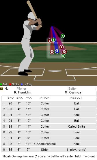
Owings took the first two offerings for balls, though they appear to be borderline strikes by the blurred edges of the strike zone shown in the graphic. Owings then fouled one off before taking another ball. Up 3-1 in the count, Owings took a pitch that might have been an inch or two off the corner—which is to say that it wasn’t a clear-cut call. Well, Owings thought it was. He tossed his bat to the dugout and decided to take his base before it was granted. The ump called him back. Owings wasn’t going to take another pitch after that. He fouled three straight off when Ryan Franklin, who, I should mention, had not yet blown a save on the season, resorted to his first off-speed pitch of the at-bat. Not a good idea. Franklin left a slider right over the heart of the plate that Owings crushed 384 feet to left-center field to tie the game at 7-7. The shot gave the Reds a 49% shift in win expectancy which, in one swing, made Owings the most valuable player of the game by WPA. The Reds went on to drop the contest 8-7, but Owings as usual received his fair share of accolades for his performance.*
*An aside, and my first Pozterisk on this site.
Pitchers like Owings, Carlos Zambrano, Dontrelle Willis, and Mike Hampton who have had nice runs with the bat tend to have their value overstated a bit since we in the media tend to focus on oddities. But it is my belief that the relative value of a pitcher's hitting ability is understated on the whole, considering most people don't give a second thought to how skilled a pitcher is with the stick.
Last year, Nate Silver took a look at several notable hitting pitchers in the game. He found that the difference in true talent between the best and worst hitting pitchers is worth about ten runs per year. Since pitchers are rarely allowed to bat in high-leverage situations, Tom Tango approximated that a pitcher's hitting ability could be equivalent to roughly -.125 to +.25 points in earned run average, or some 10%-20% of a pitcher's value. Last year, there were 120 pitchers who had at least 10 plate appearances and 120 pitchers who tossed at least 120 innings. The standard deviation in their pitching WAR was 1.74 wins compared to a standard deviation of .36 hitting WAR.
David Gassko penned a comprehensive history of hitting pitchers and the decline in such skill over the years. Silver had hypothesized that the lost art was a cause of the specialization of position players and pitchers. The best hitting pitchers tend to be those those who spent the least amount of time in the minors since hitting is a skill that takes constant practice and the minors are the only place where pitchers can forget how to hit. Gassko concluded that even the half win that some pitchers provide with the bat can be worth half a million dollars. Should teams work with pitchers more on hitting?
This year, Ubaldo Jimenez had led the league in batting runs among pitchers before Owings went deep on Sunday. Jimenez had the highest average fastball velocity in the league last year and has been a productive pitcher each of the last two years thanks to above-average strikeout and home run rates from a Coors field product. At 4.4 WAR, he would have been a solidly above average pitcher last year—if not for a league worst -1.5 WAR on offense. This year, though, he has yet to allow a homer and is posting a positive batting WAR which has made for a solid season.
Wandy Rodriguez is having a nice year too but is due for some regression as his BABIP is down 60 points from last year to .263 and he, like Jimenez, has yet to allow a home run despite allowing 64 balls in the air. Still, his curve ball is one of the best in the league, year after year , and he has thrown it more often than all pitchers but A.J. Burnett thus far.Yet while he is ninth in the league for pitchers with 13.5 runs above replacement, he has given away a pitcher-worst -3.9 runs with the bat.
Owings is hitting .346/.414/.692 in 29 career plate appearances as a pinch hitter, a step up from his .315/.336/.556 line in 115 plate appearances as a pitcher.
Owings owns Georgia's high school home run record. A transfer at Tulane, Owings hit .355/.470/.719 before being drafted by the Arizona Diamondbacks as a 22-year old. While rarely seeing time with the bat in the minor leagues, he more than held his own with a .359/.373/.500 line in 64 at bats.
Owings has taken a step back on the hill this year, but right now we’re concerned about his performance in the box. He’s managed an incredible .435 career BABIP thanks to an impressive 24.4 line drive percentage. In 2007 when he won the silver slugger award, Owings hit four homers, all 400+-foot blasts including two shots off Buddy Carlyle on August 18 that traveled further than 440 feet each. Now, I'm not saying Owings owns Carlyle, but Owings did hit doubles off him the other two times they met, so I wouldn't be surprised if Owings at least paid rent on Buddy. Owings has shown a strong reverse-platoon split, as demonstrated by this graph.
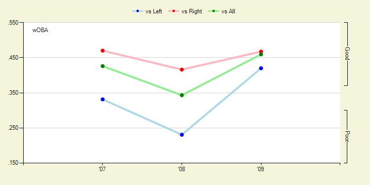
On balls in play, Owings follows a profile similar to most hitters. He pulls four times as many ground balls as he hits the other way and has a rather even distribution of fly balls while demonstrating most of his power on balls he pulls. Owings swings at well over half the pitches he sees and is not too sharp at making contact. But for some reason pitchers are willing to give him offerings inside the strike zone more often than not. And when he does make contact, he inflicts serious damage to the tune of a .261 ISO and 21.4% HR/FB. He has average speed and is an average baserunner too.
We always see pitch f/x breakdowns when hitters pitch, and Chone Smith just gave a neat overview of recent velocity for hitters on the mound, but how about breaking down how a pitcher hits with pitch f/x data?
Using all gameday data available for Owings plate appearances since 2007, his rookie year, I’ll try to break down Owings' performance by pitch location. Here's my first shot at these types of graphs.
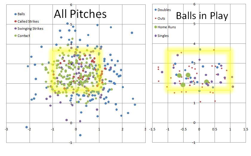
He’s 6’5”, so his strike zone is a couple inches higher than average. It looks to me like he’s willing to chase pitches low out of the zone. The four home runs for which gameday has data for appear to be standard locations for right-handed hitters, as Dave Allen showed. I'd call him a low-ball hitter. But there are too many data points in here for my liking, so I’ll break it down Harry Pavlidis style. I made each zone about a foot in diameter, which appears to have been a mistake, but here it is...
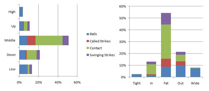
Owings will swing at anything over the plate or inside.He likes the ball down and in, but pitchers can get him to chase balls that are low and he's not too strong at making contact on pitches up in the zone.
So the real question is what should be done with Owings. What do you do with a slightly below-average pitcher with some potential who adds value with the bat? I’ve had the idea of batting him third in away games and then subbing in the starter in the bottom of the first, but that idea is admittedly radical. I don’t at all advocate trying to turn him into Rick Ankiel, since Owings still has value as a pitcher. Maybe he could be turned into a reliever who comes into games as a pinch hitter. Well, what I hope is that Dusty Baker carves out a unique role for him or keeps giving him at bats as a pinch hitter. Players like Owings make the game more fun.
| Touching Bases | May 07, 2009 |
Findings from the Free Agent Market
Curt Flood really started something with this whole free agency thing, huh? Using ESPN’s Free Agent Tracker, I collected data for all free agents since 2006 and used regression analysis to pick up on some trends.
WAR to Wages
This offseason, Fangraphs unveiled its Wins Above Replacement measure in the Value section of its stats pages. WAR is a statistic that combines offensive, defensive and positional value and sets it against a replacement-level baseline to find the marginal wins a player contributes to his team. There has been debate over how to convert these marginal wins into a marginal value in terms of dollars. One of the first things I looked at was whether the relationship between WAR and salary was linear or nonlinear. I plotted the WAR from each free agent's contract year—excluding those who were injured all year or who came over from Japan—against the average annual value of the contract they signed.
I admit that before having seen any data, I had a bias toward the nonlinear relationship, since it just makes intuitive sense to me.
The regression lines look rather similar. It would appear that the nonlinear regression has an advantage at the extremes, since it won’t predict negative salaries for very negative WAR and it better captures the exponential value of superstar players. However, there is little difference between the regression lines for the vast majority of players, those between 0 WAR and 5 WAR. The R2 values, which measure the percentage of variance of Average Annual Value that is explained by WAR,, are similar at an impressive .62-.64 range. This affirms that a single year of WAR captures a lot of a player’s value. Keep in mind when looking at these R2 values that the R2 will always increase in a polynomial equation due to the nature of adding a new term, so we definitely cannot make any conclusions about either method from this graph alone.
Time 100’s own Nate Silver, in deriving Marginal Value Over Replacement Player, used a nonlinear form of WARP . I have duplicated his graph here which projects WARP for 2005's free agent class by using three years of WARP from 2002-2004 instead of the one previous year of WAR I used for 2006-2008 free agents. I have superimposed a rough line of best fit to portray the difference between a linear and nonlinear model.
The thinking behind a nonlinear model is that there is an abnormal distribution of talent in baseball, which makes top talent disproportionately more valuable than average talent.
Phil Birnbaum shows that individual skills in the major leagues may be normally distributed. Anecdotally, this is reaffirmed by the 20-80 scouting scale, which is based on a normal distribution with a mean of 50 and standard distribution of 10. Furthermore, Tom Tango shows that “when you consider the number of opportunities each player gets (in the Major Leagues), the total effective talent distribution is rather typical.”
However, when observing only the Major Leagues, we neglect the fact that most subpar baseball talent resides at another level. There is an abundance of freely available talent that could provide marginal upgrades to current Major Leaguers. What this means in terms of player value is that below-average players will be disproportionately underpaid compared to above-average players due to the difference in the supply within each pool.
Bill James once wrote “talent in baseball is not normally distributed. It is a pyramid. For every player who is 10 percent above the average player, there are probably twenty players who are 10 percent below average.” I believe this theory holds if by baseball he means the total baseball universe and by average he means the Major League average. So, Tango may be right that, at the Major League level, talent follows a normal distribution, but when we add talent from all player pools, the curve does begin to look like the right tail of a normal distribution.
Think of it this way: would you rather have the right side of the Cardinals’ infield or the Reds’ infield? The combinations of Albert Pujols/Skip Schumaker and Joey Votto/Brandon Phillips will both produce 8 WAR, give or take. Through the currently dominant model for fair-market evaluation, both sets of players are worth some $35 million if you simply multiply their WAR by $4-5 million. But my intuition tells me that I'd rather have the pair on the Cardinals. The key is that Pujols takes up only one roster spot and provides the same value of a pair of players who take up two. I might be able to upgrade over Schumaker on the cheap eventually. We also must account for the fact that freely available talent is, well, free, while the superstars who bring in 5+ WAR will need to be acquired through trading or bidding.
Furthermore, I found statistically significant evidence that the Type A tag for free agents is correlated with increased pay. In a practical sense, the Type A label decreases a player's value in a free market since it costs prospective teams a first-round pick to acquire the player or the label costs the player in leverage if he tries to re-sign with his former team. However, Type A free agents tend to be the best players in my sample, so it is evident that teams ignore the Type A tag and are willing to spend what it takes to reel in superior players.
Separating position players and pitchers, I find that is much easier to predict position players' salaries in general, and the nonlinear regression fits better for position players than it does for pitchers. In separating the two pools of players, I decided to test for some skills that do not translate into a hitter’s or pitcher’s WAR, but still might directly relate to his salary.
General Managers dig the fastball
Fangraphs keeps track of pitch usage and velocity for all pitchers since 2002, and all the data can be easily exported to a spreadsheet. This is a good thing for baseball analysts. Dave Allen and Dan Turkenopf both used pitch f/x data to show how velocity relates to production. In these regressions, I account for a player’s WAR, and therefore can try to isolate the effect of a pitcher’s fastball velocity on his salary. Here is the regression output.
      Source |       SS       df       MS              Number of obs =     149
-------------+------------------------------           F(  4,   144) =   62.82
       Model |  1.7252e+15     4  4.3131e+14           Prob > F      =  0.0000
    Residual |  9.8863e+14   144  6.8655e+12           R-squared     =  0.6357
-------------+------------------------------           Adj R-squared =  0.6256
       Total |  2.7139e+15   148  1.8337e+13           Root MSE      =  2.6e+06
------------------------------------------------------------------------------
         aav |      Coef.   Std. Err.      t    P>|t|     [95% Conf. Interval]
-------------+----------------------------------------------------------------
         WAR |    2399138   153233.6    15.66   0.000      2096260     2702016
         fbv |   164514.8   72588.22     2.27   0.025     21038.76    307990.9
          o7 |  -423055.5   545027.9    -0.78   0.439     -1500344    654233.1
          o8 |   -1365307   508682.7    -2.68   0.008     -2370757   -359857.4
       _cons |  -1.19e+07    6496299    -1.83   0.069    -2.47e+07    954444.2
------------------------------------------------------------------------------
This means that there is statistically significant evidence that fastball velocity (fbv) contributes to a pitcher’s salary. Every additional mile per hour harder a pitcher throws, he is paid about $165,000. Fastball velocities typically range from 85 MPH to 95 MPH, so if two players were to put up the same WAR, but one was a soft tosser and the other a flame thrower, in an auction teams may bid up to a couple million dollars more for the harder thrower, based on that skill alone.
I created two player pools, separating those with above-average fastball velocities and those with below-average fastball velocities. The average fastball in my sample of 149 pitchers travels 89.7 miles per hour. The WAR of both player pools is nearly identical, as the harder throwers average .97 WAR compared to .96 WAR for the softer throwers. Yet the harder throwers earned $4.9 million per year in free agency compared to $4.2 million for the latter group. Perhaps fastball velocity predicts future performance, or perhaps there is an allure to signing a player who can light up the radar gun, or maybe fans come out to see fast pitchers. No matter the case, throwing hard gets you paid.
I also included time-fixed effects in this regression, setting dummy variables to represent the year during which the pitcher became a free agent. We find statistically significant evidence of deflation in 2008. While 2006 and 2007 appear stable in terms of free agent salaries, pitchers with similar production in 2008 were liable to lose on average a million dollars per year on their contract because they hit the market at the wrong time.
General Managers dig the longball
By longball, I don’t mean home runs. I mean actual distance. From Hit Tracker, I included the average true distance in feet of home runs for all players in my dataset..I also included weight of a player in pounds, which might measure raw power or might measure nothing, but was significant in the regression. Unfortunately, weight is also probably the least accurate data point I could use since there are no reliable sources for it.
      Source |       SS       df       MS              Number of obs =     169
-------------+------------------------------           F(  3,   165) =  123.05
       Model |  2.5996e+15     3  8.6653e+14           Prob > F      =  0.0000
    Residual |  1.1620e+15   165  7.0421e+12           R-squared     =  0.6911
-------------+------------------------------           Adj R-squared =  0.6855
       Total |  3.7616e+15   168  2.2390e+13           Root MSE      =  2.7e+06
------------------------------------------------------------------------------
         aav |      Coef.   Std. Err.      t    P>|t|     [95% Conf. Interval]
-------------+----------------------------------------------------------------
         WAR |    2256088   125521.3    17.97   0.000      2008253     2503923
        true |   28062.52   13259.32     2.12   0.036     1882.712    54242.32
      weight |    24497.9   10709.87     2.29   0.023     3351.842    45643.95
       _cons |  -1.49e+07    4881150    -3.05   0.003    -2.45e+07    -5253468
------------------------------------------------------------------------------
These measures are essentially independent of WAR but do affect salary. I believe home run distance and weight are actually capturing the phenomenon that has shown that there is a stronger correlation between slugging percentage and salary than between salary and most any other basic statistic. Weight and True Distance correlate very well with slugging percentage. We can say with confidence that there is a bias toward heavier players who hit for power, all else being equal. For every ten pounds of weight or ten feet in home run distance, a hitter can expect a positive return averaging around 250 grand.
This is not to say whether paying these players more for the ability to throw fast or hit long home runs is efficient or not. I did this analysis to observe trends in the market over the last few years, and I am not trying to comment on any sort of inefficiencies that may exist.
Thanks to all the data sources I used in this study including ESPN, Fangraphs, Hit Tracker, Forbes, and Fantasypitchfx
Edit: At Jake's request, I have separated the data series by year and added separate trendlines for each year.
| Touching Bases | April 27, 2009 |
Derek Holland Analysis
I wrote this post last Wednesday night, and Derek L. Holland has since made another appearance, tossing three innings of one-run ball. His velocity was a bit down, but his pitch usage and movements were similar. He gave up two walks and threw a lot more balls as well. Here's what I wrote Wednesday in what seemed to me auspicious introduction to a promising career.
Rookie Derek L. Holland made his Major League debut on Wednesday night against the Blue Jays, pitching two and a third scoreless innings.
Holland, 22, was drafted out of junior college in the 25th round of the 2006 Rule 4 draft. From there, Holland’s stock as a prospect rocketed upwards coinciding with the increase in his velocity. In his stint in A-ball in 2007, Holland threw 67 innings with a 3.22 ERA and 3.95 K/BB ratio. In 2008, across three leagues—the highest being AA Frisco—Holland made even more strides, lowering his walk and home run rates in 150.2 innings, which culminated in a 2.27 ERA and 157 strikeouts—third in the Minor Leagues. The performance garnered him Rangers Minor Leaguer of the year.
“What worked so well for me was being able to communicate with my catchers and staying ahead of the hitters,” Holland told mlb.com. “It was huge, and that was what helped me to keep having the hitters guessing. I feel as the year went along, I got stronger and my pitches became a little better.”
Coming into the year, Holland was a prospect on everyone’s radar, as he was ranked 40th by Kevin Goldstein, 31st by Baseball America, and 21st by Keith Law.
Here’s what Goldstein had to say about the flame-throwing left hander:
“The Good: Holland's velocity only got better during the year, as he began the year in the low 90s but was sitting at 94-96 mph while touching 99 by season's end. His arm speed rivals that of any southpaw in the minors, and the pitch also features excellent late life. His top secondary pitch is a plus changeup with depth, fade, and good arm-side deception.
The Bad: Holland is still struggling to come up with a consistent breaking ball. He throws a slider which either flashes plus or is below average depending on the day, and he can flatten the pitch out by overthrowing it. The leap he made last year was so unexpected that he still has some skeptics.”
And Law:
“He was 88-91 mph the following spring, then was 90-93 in the summer of '07 in Spokane. By the middle of 2008, he was already in Double-A, sitting 93-95 and touching 98, with natural bore and cut to the pitch and uncanny command. His changeup is already an above-average pitch, and he held right-handed hitters to a .215/.268/.305 line across three levels this year. His slider is still a work in progress, but it's improving, and he has enough command and deception to get left-handed hitters out in the minors. He doesn't have the raw upside of (Neftali) Feliz, but he's not far behind him in potential and is ahead of him in command and feel for pitching, and is the most likely of Texas' horde (pun intended) of pitching prospects to contribute to the big club in 2009.”
With that in mind, I broke down Holland’s first appearance in the show.
Holland entered in the 6th inning of a 6-3 game with the bases loaded and two outs. He had the platoon advantage against Adam Lind and promptly challenged Lind with two consecutive 96-MPH heaters. Ahead 1-2, Holland threw Lind a slider that broke off the plate outside that Lind just barely spoiled. Holland worked outside with another 95 MPH fastball and Lind fought it off for an infield hit. Holland again worked ahead of the count on Scott Rolen with fastballs before throwing a 1-2 slider that Rolen popped up.
Holland breezed through the seventh. He retired Kevin Millar on the first pitch of the inning, and then got into a ten-pitch duel with Rod Barajas. Holland fell behind with two high-and-wide fastballs. Yet he continued to work up in the zone, and Barajas was unable to catch up any of his next four fastballs, fouling three off and swinging through another. When the count worked full, there was no doubt Holland would stay with the hard stuff, and after a couple more foul balls, Holland eventually induced a fly out on a letter high fastball.
Holland picked up two strikeouts in the eighth. His best pitch of the night might have been a 1-2 ankle-high slider to Aaron Hill which was swung over for strike three. But he tried a 1-2 slider on the very next batter, and this time Alex Rios stayed on it for a single. Holland worked inside to Vernon Wells, and Wells was caught looking at a 92 MPH fastball right over the heart of the plate, a pitch Holland got away with.
He had lost his velocity by the 9th inning. In the seventh, Holland’s fastball averaged 96-97, but it fell to 93-94 in the ninth. He also missed his target on each of the first three pitches against his final batter. On 2-0, the catcher set up outside and the pitch sailed over the inside part of the plate, hammered for a single by Adam Lind. Lind was the only lefty Holland faced, and he got base hits on both encounters.
Holland certainly was able to work ahead of hitters, as he indicated was one of the keys to his success. He got into only one three-ball count and six two-strike counts.
Courtesy of Brooks baseball, here’s what his location chart looked like.
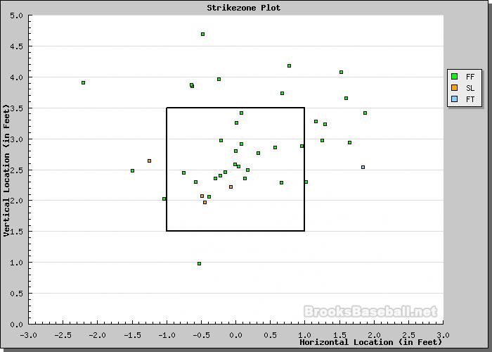
Holland worked up. His shoulder might have been flying open a bit, because something caused him to consistently miss high and wide to his arm side.
Holland showed that plus velocity Goldstein referred to. In addition to his 94 MPH fastball, he generated solid movement on the pitch. However, he didn’t throw any pitch listed as a changeup, which Goldstein and Law called his best offspeed pitch. I could see why Goldstein referred to his slider as inconsistent. He was able to keep it down in the strikezone, which is always a positive, and coming in at 84-85 MPH, his slider has a nice speed differential with his hard stuff, but the break on the pitch was suspect. Though harder than most sliders, Holland’s had below average vertical and horizontal movement. Law noted Holland’s possible reverse platoon split, and the fact that Holland’s slider doesn’t break away from lefties certainly contributes to this.
Holland’s going to want to work on getting some more tilt on his slider. He also might want to start working down in the zone with his fastball, though his nerves might have made him overthrow a bit Wednesday night. His biggest asset is simply being a southpaw who can dial up 97 and throw strikes. He can survive with just that pitch if he comes out of the bullpen. I think Holland, and Neftali Feliz, will be tremendous assets to the Rangers decrepit pitching situation in the future. But considering how wide open that A.L. West division is, we could see the fruits of the Ranger’s superlative farm system pay dividends this year.
| Touching Bases | April 27, 2009 |
Parks and Conversation
These notes don't fit into the post that I will hopefully have up tomorrow, but I thought I'd include this graphic of average ballpark dimensions from 2006-2008 here. I converted the dimensions found on Hit Tracker from pixels into feet, and here are the results by quartiles.
Also, last week I linked to a couple excellent studies on park factors by Greg Rybarczyk and David Gassko, but I forgot to to link to Jeff's excellent post on park factors, which I will be referencing as well in the future. Fortunately, his study used the same years of data as I did. It contains several useful pieces of information that I have not seen used in many other places, such as foul area, and average wall height, which is a key part of information missing from the above visual, but which can also be found at ballparks.com
Lastly, I'm interested in hearing thoughts on whether it would be more informative to list numbers other than just averages for home run characteristics. For example, the bottom 10% of home runs in a certain park might tell us how easy it is to hit short home runs, while showing perhaps the top 25% could tell us how well the ball carries in a park. Or for certain players, the top quartile will give an indication of a player's raw power, while the bottom half may tell us more about how he used his park to his advantage.
| Touching Bases | April 21, 2009 |
Personal Park Effects (Part 1)
There's been a lot of talk on this site about park effects, as Eric Walker and Sky Andrecheck just this week delved into home-field advantage, precision, and accuracy.
My idea is that not all park effects are uniform. For example, I believe that Mike Lowell and Dustin Pedroia are largely aided by the Green Monster, to a greater extent than most hitters and Johnny Damon's home run production has been largely influenced by the short porch in Yankee Stadium's right field. So what I've set out to do is use Hit Tracker data to compare players' home runs at home and away from home, and perhaps come to conclusions about certain ballparks effects on certain players.
I will not attempt to come up with my own home run factors. One reason for this is because if I look at only home runs here, I will face terrible selective sampling issues which would make my results neither precise nor accurate. The other is that I'm not that smart. I'll just present the data, and try to infer results from it. For actual park effects, Walker linked to a paper by my friends at the Harvard Sports Analysis Collective, and in the future I will be referring to a couple of articles at The Hardball Times by David Gassko and Greg Rybarczyk.
Here are the averages for all regular season home runs from 2006-2008 for which Hit Tracker has information. Here is the glossary for the terms. I've broken the fields into left, center, and right. I'd love to get more granular if I had more data. The second column refers to how many home runs were hit over the timespan, and the percentage hit to each field. The rest are Hit Tracker terms.
| Field | 497.6 | True | Speed | Elevation | Apex | Wind | Temperature | Altitude | Standard | Parks |
| Left | 51% | 394.7 | 104.2 | 29.9 | 91.0 | 1.9 | 1.0 | 2.1 | 389.6 | 24.2 |
| Center | 12% | 421.7 | 106.6 | 28.9 | 94.7 | 2.6 | 1.3 | 2.3 | 415.6 | 20.5 |
| Right | 37% | 393.8 | 103.9 | 29.9 | 90.7 | 1.9 | 1.1 | 2.1 | 388.6 | 23.9 |
I defined the dimensions so that 12% of balls went out to center, so as to be consistent with the work I did last week. However, Hit Tracker also gives horizontal launch angles, with which you can define your own dimensions rather accurately. As there are more right-handed batters than left-handed batters, there are more left-field home runs than right-field home runs. Other than that, the differences between left and right are negligible. Homers to center are hit harder and farther, but also need more help from atmospheric effects. On to specific ballparks. Click on the ballpark names to view their dimensions.
Homers in Arlington certainly travel. They have by far the greatest impact from temperature of any ballpark. There have actually been more home runs to right field than left, which would likely mean that it is easier to hit home runs in that direction. Indeed, home runs to right have to travel a lesser distance than those to left. This is likely compounded by the home team, the Texas Rangers, trying to exploit this advantage by stocking up on lefties or switch-hitters. This effect is most prominent with the Yankees and Yankee Stadium, who have been well-known to go after left-handed batters as their production will be enhanced by the short right-field fences.
| Field | 545 | True | Speed | Elevation | Apex | Wind | Temperature | Altitude | Standard | Parks |
| Left | 38% | 403.1 | 105.2 | 29.7 | 92.3 | 0.9 | 4.6 | 2 | 395.2 | 27.7 |
| Center | 14% | 423.1 | 106.5 | 29.3 | 97.3 | 0.5 | 4.9 | 2 | 415.3 | 20.2 |
| Right | 47% | 396.2 | 103.8 | 29.6 | 90.4 | 2.2 | 4.5 | 2 | 387.3 | 22.6 |
Angels Stadium seems to play true to most of the league averages. It might be a bit easier than normal to hit home runs out to center.
| Field | 417 | True | Speed | Elevation | Apex | Wind | Temperature | Altitude | Standard | Parks |
| Left | 48% | 401.3 | 104.7 | 29.8 | 91.4 | 5.5 | 1.3 | 1 | 394.0 | 25.2 |
| Center | 18% | 413.8 | 105.2 | 28.5 | 89.8 | 4.9 | 1.0 | 1 | 407.5 | 15.1 |
| Right | 35% | 394.8 | 103.6 | 30.1 | 90.9 | 3.2 | 1.3 | 1 | 389.7 | 24.1 |
I'm surprised that AT&T Park has one of the strongest negative temperature effects. I guess being by the bay really cools the weather. This, and an endemic offense from the home team, contribute to the very small amount of homers to have been hit in AT&T. However, the wind will ratchet up at times. It's clearly a pitcher's park. I imagine it would have been helpful to break up this park into right-center and right field.
| Field | 363 | True | Speed | Elevation | Apex | Wind | Temperature | Altitude | Standard | Parks |
| Left | 64% | 395.5 | 104.1 | 29.3 | 86.9 | 9.1 | -2.6 | 0 | 388.8 | 22.9 |
| Center | 11% | 423.1 | 106.7 | 28.0 | 89.4 | 9.4 | -2.2 | 0 | 415.6 | 19.0 |
| Right | 25% | 386.5 | 103.2 | 29.9 | 86.9 | 7.6 | -2.5 | 0 | 381.3 | 24.4 |
It can get windy in Busch, which will inflate the actual distances of home runs. Overall, the park is fair.
| Field | 463 | True | Speed | Elevation | Apex | Wind | Temperature | Altitude | Standard | Parks |
| Left | 54% | 399.7 | 104.5 | 30.1 | 91.8 | 5.0 | 2.6 | 2 | 390.4 | 26.0 |
| Center | 9% | 424.5 | 106.0 | 29.4 | 95.9 | 7.2 | 2.9 | 2 | 412.9 | 19.3 |
| Right | 37% | 399.5 | 104.2 | 30.3 | 92.8 | 4.0 | 2.3 | 2 | 391.5 | 25.5 |
Chase Field is clearly a home run park, but it is quite deep to center. There aren't many cheap home runs hit at Chase.
| Field | 522 | True | Speed | Elevation | Apex | Wind | Temperature | Altitude | Standard | Parks |
| Left | 54% | 406.0 | 105.5 | 29.6 | 92.1 | 0.7 | 3.6 | 5 | 397.2 | 26.6 |
| Center | 7% | 439.8 | 109.0 | 29.3 | 101.6 | 0.1 | 3.7 | 5 | 431.2 | 28.0 |
| Right | 39% | 397.7 | 104.3 | 30.2 | 93.1 | 0.1 | 3.3 | 5 | 389.9 | 24.6 |
Citizens Bank Park's dimensions are right around league average, but the walls don't just out toward right-center and left-center making home runs attainable in those directions.
| Field | 654 | True | Speed | Elevation | Apex | Wind | Temperature | Altitude | Standard | Parks | |
| Left | 53% | 387.5 | 103.4 | 29.8 | 89.0 | 2.3 | 1.3 | 0 | 383.8 | 21.3 | |
| Center | 11% | 423.5 | 106.9 | 29.5 | 98.4 | 4.2 | 1.7 | 0 | 417.5 | 22.2 | |
| Right | 36% | 391.0 | 103.9 | 29.8 | 90.2 | 3.4 | 1.1 | 0 | 386.5 | 22.8 | |
Comerica is built for triples with its insanely deep walls in center field. Anyone who can hit homers out there is a man. For such a difficult home run park, its impressive how many homers have been hit there.
| Field | 538 | True | Speed | Elevation | Apex | Wind | Temperature | Altitude | Standard | Parks |
| Left | 64% | 394.7 | 105.1 | 29.3 | 89.2 | 0.9 | 0.2 | 2 | 391.2 | 26.0 |
| Center | 4% | 440.2 | 109.8 | 28.6 | 99.1 | 3.5 | -0.3 | 2 | 434.1 | 28.9 |
| Right | 32% | 388.2 | 103.9 | 29.3 | 87.3 | -0.5 | 0.3 | 2 | 386.0 | 25.1 |
Mile-high air is worth 21 feet in home run distance. Aside from that, there's not much notable about the park. The deep fences do a decent job of canceling out the extreme altitude effects.
| Field | 522 | True | Speed | Elevation | Apex | Wind | Temperature | Altitude | Standard | Parks |
| Left | 48% | 415.5 | 104.7 | 30.0 | 91.5 | 2.1 | 1.1 | 21 | 391.1 | 24.5 |
| Center | 13% | 441.1 | 106.8 | 29.4 | 96.1 | 3.6 | 0.6 | 21 | 416.0 | 19.3 |
| Right | 39% | 414.3 | 104.4 | 29.4 | 88.8 | 1.9 | 0.2 | 21 | 391.6 | 23.1 |
Dodger Stadium's center field doesn't reach 400 feet, so a rather high percentage of homers travel that way.
| Field | 423 | True | Speed | Elevation | Apex | Wind | Temperature | Altitude | Standard | Parks |
| Left | 42% | 402.6 | 105.1 | 29.6 | 91.5 | 2.8 | 0.9 | 2 | 396.8 | 24.5 |
| Center | 18% | 416.6 | 105.8 | 28.6 | 91.8 | 1.7 | 1.3 | 2 | 411.7 | 18.3 |
| Right | 39% | 399.0 | 104.2 | 29.8 | 91.1 | 2.9 | 0.7 | 2 | 393.5 | 23.5 |
Dolphins Stadium is conducive to righties, so long as they can get some loft on their fly balls. Right field is the opposite, as home runs travel farther but not as high. Straightaway center is 400 feet, which is normal, but the walls jut out from there, making home runs into the power alleys difficult. Fly balls are aided by the temperature, though I'm not sure the temperature data accounts for whatever effect humidity might cause.
| Field | 503 | True | Speed | Elevation | Apex | Wind | Temperature | Altitude | Standard | Parks |
| Left | 61% | 390.4 | 103.8 | 29.7 | 90.2 | -0.2 | 4.2 | 0 | 386.3 | 22.8 |
| Center | 7% | 426.5 | 107.9 | 27.3 | 90.5 | 0.9 | 4.4 | 0 | 421.1 | 24.4 |
| Right | 32% | 396.6 | 104.9 | 28.8 | 87.9 | 0.3 | 4.4 | 0 | 391.6 | 26.2 |
You can see how high home runs have to go to clear the Green Monster. Though the relationship is far from strict, ten feet in distance correlates with an extra foot and a half in apex height. But in Fenway, homers to center are 40 feet longer but only half a foot higher on average than those to left.
| Field | 442 | True | Speed | Elevation | Apex | Wind | Temperature | Altitude | Standard | Parks |
| Left | 54% | 385.2 | 102.4 | 31.4 | 93.6 | 5.0 | -0.7 | 0 | 377.7 | 21.7 |
| Center | 9% | 423.3 | 106.7 | 28.8 | 94.1 | 7.3 | -1.6 | 0 | 417.6 | 20.6 |
| Right | 37% | 397.7 | 105.2 | 29.1 | 88.1 | 5.0 | 0.5 | 0 | 393.3 | 25.8 |
Great American seems to be a bit harder on righties than it is to lefties, but it overall plays as a home run hitter's park.
| Field | 675 | True | Speed | Elevation | Apex | Wind | Temperature | Altitude | Standard | Parks |
| Left | 44% | 399.5 | 104.9 | 29.9 | 92.5 | 1.6 | 1.6 | 2 | 394.1 | 24.4 |
| Center | 14% | 418.5 | 105.9 | 29.0 | 93.8 | 2.4 | 2.4 | 2 | 411.6 | 18.1 |
| Right | 42% | 393.7 | 103.8 | 29.9 | 90.5 | 2.3 | 2.1 | 2 | 387.3 | 22.2 |
I would think that it shouldn't be too hard to hit balls out of the Jake to center, but there haven't been too many hit in that direction for some reason.
| Field | 481 | True | Speed | Elevation | Apex | Wind | Temperature | Altitude | Standard | Parks |
| Left | 44% | 392.3 | 103.6 | 30.2 | 91.9 | 0.1 | -0.1 | 3 | 389.7 | 24.4 |
| Center | 11% | 412.2 | 104.8 | 29.0 | 91.6 | 3.3 | 1.2 | 3 | 405.4 | 15.0 |
| Right | 45% | 385.7 | 102.4 | 30.2 | 89.6 | 2.2 | -0.2 | 3 | 381.2 | 20.9 |
Looking at the atmospheric effects, I'm surprised it's so difficult to hit home runs at Kauffman, though the fences are kind of deep to right-center and left-center field.
| Field | 413 | True | Speed | Elevation | Apex | Wind | Temperature | Altitude | Standard | Parks |
| Left | 49% | 404.8 | 105.7 | 30.0 | 94.3 | 0.7 | 2.6 | 4 | 397.9 | 28.0 |
| Center | 15% | 429.0 | 107.8 | 28.6 | 95.4 | 0.3 | 3.5 | 4 | 421.8 | 23.9 |
| Right | 37% | 403.5 | 104.9 | 30.5 | 96.0 | 1.0 | 2.4 | 4 | 396.5 | 26.8 |
I always thought McAfee was a more difficult home run park, but the dimensions aren't bad at all. It does have the worst wind and temperature effects of any park, though.
| Field | 407 | True | Speed | Elevation | Apex | Wind | Temperature | Altitude | Standard | Parks |
| Left | 53% | 389.6 | 104.6 | 29.4 | 89.1 | -1.9 | -1.6 | 0 | 393.0 | 26.2 |
| Center | 12% | 409.5 | 106.5 | 28.9 | 93.5 | -4.7 | -1.7 | 0 | 416.0 | 22.6 |
| Right | 36% | 390.3 | 105.3 | 30.1 | 92.8 | -3.6 | -2.1 | 0 | 396.0 | 26.2 |
It takes some elevation to hit home runs over the baggy in right, but there are a lot of cheap home runs hit in that direction too. A 32.9 degree elevation angle is the highest figure for any field I came up with and 370 feet in standard distance is the lowest to a field either direction of center.
| Field | 413 | True | Speed | Elevation | Apex | Wind | Temperature | Altitude | Standard | Parks |
| Left | 50% | 392.4 | 104.2 | 29.7 | 89.9 | 0.3 | 0.0 | 3 | 388.9 | 25.2 |
| Center | 16% | 426.2 | 108.5 | 27.3 | 89.6 | 0.0 | -0.1 | 3 | 423.1 | 24.4 |
| Right | 34% | 373.6 | 100.2 | 32.9 | 97.4 | 0.0 | 0.1 | 3 | 370.3 | 18.0 |
Down the line to right is nice and short. The apex of home runs to center is unusual.
| Field | 556 | True | Speed | Elevation | Apex | Wind | Temperature | Altitude | Standard | Parks |
| Left | 51% | 397.2 | 104.5 | 29.5 | 90.9 | 0.2 | 0.0 | 2 | 394.8 | 21.7 |
| Center | 15% | 419.4 | 106.7 | 29.9 | 100.0 | 0.2 | 0.5 | 2 | 416.3 | 22.9 |
| Right | 34% | 393.2 | 104.0 | 29.9 | 91.3 | 0.9 | 0.1 | 2 | 389.9 | 20.7 |
That hill out in center sure makes things difficult for power hitters. It's unusual that the wind had an adverse effect on center-field home runs, since normally balls need a little help from the wind to carry that far.
| Field | 531 | True | Speed | Elevation | Apex | Wind | Temperature | Altitude | Standard | Parks |
| Left | 59% | 376.6 | 101.9 | 31.5 | 93.5 | 0.2 | 1.7 | 0 | 374.6 | 19.2 |
| Center | 4% | 429.0 | 108.9 | 28.2 | 95.7 | -0.2 | 0.8 | 0 | 427.9 | 26.7 |
| Right | 37% | 393.7 | 104.9 | 29.1 | 88.3 | 0.3 | 1.8 | 0 | 391.5 | 24.2 |
There's not much of a sample for Nationals Park, but it seems to play around league average, unlike RFK which was cavernous.
| Field | 145 | True | Speed | Elevation | Apex | Wind | Temperature | Altitude | Standard | Parks |
| Left | 50% | 397.2 | 105.1 | 29.0 | 88.1 | 1.6 | 1.2 | 0 | 394.5 | 25.6 |
| Center | 19% | 412.2 | 105.5 | 28.4 | 90.2 | 1.8 | 2.2 | 0 | 408.1 | 16.7 |
| Right | 32% | 389.1 | 102.5 | 30.8 | 92.6 | 1.5 | 2.5 | 0 | 384.9 | 21.7 |
Oriole Park is definitely a home run haven thanks to friendly atmospherics and a short fence in left.
| Field | 570 | True | Speed | Elevation | Apex | Wind | Temperature | Altitude | Standard | Parks |
| Left | 50% | 388.1 | 102.9 | 29.7 | 87.7 | 2.3 | 2.6 | 0 | 383.1 | 21.3 |
| Center | 12% | 415.6 | 105.9 | 28.7 | 92.8 | 1.4 | 2.1 | 0 | 412.1 | 18.9 |
| Right | 37% | 393.4 | 103.5 | 30.3 | 91.7 | 2.7 | 2.8 | 0 | 387.8 | 23.9 |
Petco is death to righties. Wind might blow from left to right in Petco more often than not. Straightaway center isn't so deep, but the fences in the alleys extend out to 400 feet.
| Field | 414 | True | Speed | Elevation | Apex | Wind | Temperature | Altitude | Standard | Parks |
| Left | 54% | 390.1 | 104.3 | 29.7 | 90.4 | 0.5 | -0.6 | 0 | 390.0 | 26.1 |
| Center | 18% | 417.5 | 106.5 | 28.8 | 93.7 | 4.1 | -0.9 | 0 | 414.3 | 18.5 |
| Right | 29% | 396.5 | 104.3 | 29.7 | 89.5 | 5.9 | -0.3 | 0 | 390.7 | 26.7 |
PNC plays similarly to Petco, except it is even harder on righties and even easier out to center. Jason Bay must be happy getting out of that ballpark and into Fenway where he can pepper the left-field wall.
| Field | 418 | True | Speed | Elevation | Apex | Wind | Temperature | Altitude | Standard | Parks |
| Left | 46% | 401.5 | 105.3 | 29.2 | 89.5 | 2.1 | 1.3 | 3 | 395.1 | 27.6 |
| Center | 15% | 415.2 | 104.8 | 29.8 | 95.9 | 2.6 | 1.8 | 3 | 407.7 | 16.2 |
| Right | 39% | 394.1 | 103.8 | 31.0 | 95.3 | 1.1 | 0.9 | 3 | 388.9 | 24.7 |
I almost feel bad for Nationals hitters who had to play in this behemoth of a stadium.
| Field | 285 | True | Speed | Elevation | Apex | Wind | Temperature | Altitude | Standard | Parks |
| Left | 54% | 395.6 | 104.5 | 30.3 | 93.5 | 0.9 | 2.5 | 0 | 392.1 | 27.3 |
| Center | 11% | 426.8 | 108.4 | 27.7 | 93.0 | -0.2 | 0.9 | 0 | 425.8 | 26.3 |
| Right | 35% | 397.5 | 104.5 | 30.9 | 96.9 | 1.8 | 2.1 | 0 | 393.4 | 27.8 |
It's impressive that there was an above average amount of home runs in the Rogers Centre and also above average distances.
| Field | 505 | True | Speed | Elevation | Apex | Wind | Temperature | Altitude | Standard | Parks |
| Left | 54% | 398.3 | 105.8 | 29.6 | 92.1 | 0.9 | 0.0 | 1 | 396.1 | 26.3 |
| Center | 12% | 425.9 | 108.5 | 28.1 | 94.7 | -0.5 | 0.1 | 1 | 425.1 | 25.3 |
| Right | 34% | 397.6 | 105.6 | 29.4 | 90.9 | -0.3 | -0.2 | 1 | 396.9 | 27.1 |
Safeco is awful for right-handed power hitters. It was an odd decision for the Mariners to go after Adrian Beltre and Richie Sexson.
| Field | 448 | True | Speed | Elevation | Apex | Wind | Temperature | Altitude | Standard | Parks |
| Left | 48% | 386.2 | 103.8 | 30.2 | 91.2 | 1.2 | -1.7 | 0 | 386.7 | 27.2 |
| Center | 9% | 413.9 | 106.7 | 28.7 | 94.0 | 0.4 | -2.0 | 0 | 415.6 | 23.2 |
| Right | 43% | 385.8 | 103.1 | 29.9 | 88.9 | 2.5 | -2.3 | 0 | 385.5 | 23.7 |
If you thought Shea Stadium was a pitcher's park, wait until you see how Citi Field plays.
| Field | 499 | True | Speed | Elevation | Apex | Wind | Temperature | Altitude | Standard | Parks |
| Left | 48% | 391.6 | 103.2 | 30.8 | 93.8 | 4.5 | 0.5 | 0 | 386.6 | 23.7 |
| Center | 6% | 420.6 | 106.2 | 30.2 | 100.4 | 3.6 | 0.9 | 0 | 416.2 | 21.0 |
| Right | 46% | 397.0 | 105.1 | 29.4 | 90.2 | 1.9 | 0.7 | 0 | 394.4 | 24.8 |
The Trop conforms to league averages except to center where the walls are very deep.
| Field | 528 | True | Speed | Elevation | Apex | Wind | Temperature | Altitude | Standard | Parks |
| Left | 52% | 388.9 | 103.7 | 30.0 | 90.6 | 0.2 | 0.9 | 0 | 388.0 | 24.2 |
| Center | 10% | 422.6 | 107.5 | 28.6 | 95.3 | 0.0 | 0.9 | 0 | 421.9 | 26.4 |
| Right | 39% | 392.2 | 104.5 | 29.0 | 87.4 | 0.0 | 0.8 | 0 | 389.7 | 24.7 |
Turner Field is deep down the lines, but hitters get a lot of help from altitude, wind, and temperature.
| Field | 502 | True | Speed | Elevation | Apex | Wind | Temperature | Altitude | Standard | Parks |
| Left | 49% | 404.3 | 105.7 | 29.4 | 91.6 | 0.5 | 2.9 | 4 | 397.1 | 26.2 |
| Center | 17% | 423.6 | 106.0 | 29.7 | 98.0 | 2.6 | 3.3 | 4 | 414.1 | 19.5 |
| Right | 34% | 400.9 | 104.3 | 30.3 | 93.4 | 2.3 | 2.8 | 4 | 392.0 | 25.9 |
I had always thought that there was a jet stream of wind that forced balls out of U.S. Cellular, but it appears that the park is friendly to home runs only because of the crazy-short fences. The deepest part of the park might not even reach 390 feet.
| Field | 662 | True | Speed | Elevation | Apex | Wind | Temperature | Altitude | Standard | Parks |
| Left | 59% | 387.6 | 103.4 | 30.5 | 92.3 | 1.3 | -0.4 | 2 | 384.3 | 21.5 |
| Center | 12% | 417.5 | 105.6 | 28.9 | 92.7 | 2.9 | 1.0 | 2 | 411.4 | 18.3 |
| Right | 29% | 391.0 | 103.8 | 29.2 | 87.3 | 1.5 | -0.4 | 2 | 387.6 | 22.4 |
Wrigley Field is windy, who would've guessed? I don't think that the park has much to do with the Cubs' decision to stock up on right-handed bats.
| Field | 552 | True | Speed | Elevation | Apex | Wind | Temperature | Altitude | Standard | Parks |
| Left | 62% | 393.5 | 103.2 | 29.6 | 87.9 | 4.6 | 0.9 | 2 | 386.0 | 19.0 |
| Center | 15% | 421.2 | 105.2 | 30.5 | 98.6 | 9.6 | 1.1 | 2 | 408.5 | 15.9 |
| Right | 23% | 401.0 | 104.4 | 30.2 | 92.5 | 5.9 | 0.9 | 2 | 392.0 | 23.9 |
There's been a lot of talk about the new Yankee Stadium playing like a bandbox, but the old stadium wasn't so bad itself. The short right-field porch allowed the Yankees to stack up on lefties, so there has been a higher percentage of homers hit to right in Yankee Stadium than any other park.
| Field | 533 | True | Speed | Elevation | Apex | Wind | Temperature | Altitude | Standard | Parks |
| Left | 37% | 397.1 | 105.4 | 30.0 | 92.9 | 2.9 | 0.4 | 0 | 391.7 | 26.8 |
| Center | 10% | 425.0 | 107.5 | 28.1 | 91.7 | 5.2 | 0.8 | 0 | 418.8 | 21.7 |
| Right | 54% | 379.1 | 101.8 | 30.6 | 89.3 | 2.8 | 0.6 | 0 | 375.5 | 21.4 |
Next time, I will look at a team's home runs at home compared to a team's home runs away from home. The ultimate goal is to find how certain park's effects on certain players.
| Touching Bases | April 14, 2009 |
All-Time Home Run Location Leaderboards
I’ve hypothesized, along with others, that Ryan Howard might be the best opposite-field power hitter of all time. Thanks to the wonders of Retrosheet (and Colin Wyers), we can get closer to answering that question.
I queried for all home runs in the retrosheet era, and came up with about 185,000 homers. I then tried to eliminate all home runs that didn’t have a field location or were inside-the-parkers. That cut around 20,000 homers. And not all the homers cut were from the 50s. I think the worst year for data on home run location in the retrosheet era (1953-2008) was 1984. The most accurate years are probably during the ‘90s. Anyway, Here’s the diagram retrosheet uses. I coded all three zones left/right of center as pull/opposite field respectively, and the straightaway zone as center field. Onward.
+----------+---------+-----------+-----------+
|   Bats   |  Pull%  |  Center%  | Opposite% |
+----------+---------+-----------+-----------+
|  Left    |  76.3   |    11.8   |    11.9   |
|  Right   |  76.6   |    12.1   |    11.3   |
+----------+---------+-----------+-----------+
Somewhat odd that lefties hit more opposite field homers than center field homers. This won't really shed light on the matter, but I felt like looking at splits against pitchers.
+----------+-----------+---------+-----------+-----------+
|   Bats   |  Pitches  |  Pull%  |  Center%  | Opposite% |
+----------+-----------+---------+-----------+-----------+
|  Left    |   Left    |  77.6   |    11.6   |   10.9    |
|  Left    |   Right   |  76.0   |    11.8   |   12.1    |
|  Right   |   Left    |  77.0   |    11.7   |   11.3    |
|  Right   |   Right   |  76.4   |    12.3   |   11.2    |
+----------+-----------+---------+-----------+-----------+
So it appears that lefty pitchers have their homers pulled more often than righty pitchers—likely a result of southpaws being softer throwers. I wonder why lefties appear to hit homers to the opposite field against righties at an abnormal rate.
Alright, let’s look at the top home run hitters of all time.
This was a convenient place to stop, as the next three in line hitters were switch hitters in Chipper Jones, Mickey Mantle, and Eddie Murray. Unfortunately, I messed up coding home run locations for them.
I had a feeling Jim Thome hit a very high percentage of homers to the opposite field. He and Ryan Howard are linked in more ways than one. I have to give credit to Rich Lederer for guessing that Mike Piazza would be among the tops in percentage of homers to the opposite field. But just wait until we get to my man Howard. Sheffield, not surprisingly, pulled twenty times as many homers as he hit the other way. I can’t say that I knew Ernie Banks was that extreme a pull hitter.
With a minimum of 100 home runs in my sample set, here are those with the highest pull percentage.
No, not that Frank Thomas. You can see his splits above on the all-time leader list.
These are guys who don’t have the power to hit it out any other way. I’m impressed that so many batters have hit 100 homers without using an entire third of the field. The only other member of this group is Don Baylor, who hit 277 homers without an opposite field blast. I wanted to check on Ichiro Suzuki, since he fits in this school of hitters, but didn’t reach the 100 home run threshold. He’s hit a single opposite-field home run in his career. I hope it was memorable.
Center Field Percentage
Mike Marshalls have played a large part in my life over the last year. I recently learned that one Mike Marshall was as an outcast Cy Young award-winning former teammate of Jim Bouton, who later became a doctor who developed radical pitching mechanics. Now I know that the year he retired another Mike Marshall, of whom I had never heard, debuted as an impressive home run hitter to center field. They both had their best years with the Dodgers.
These guys all seem to have tons of raw power, as that’s what it takes to hit balls out to center. Chipper Jones belongs on this leaderboard, but was excluded due to my glitch with switch hitters.
Opposite Field Percentage
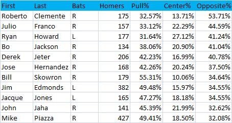
It’s always a pleasure to see Roberto Clemente top any list. The fact that he was such an extreme opposite field power hitter might be a tidbit not many knew about, so I’m glad I can contribute one of the more trivial pieces of information to his legend. I’m surprised to see Julio Franco here. I saw a game or two of his in my day (who didn’t), and I always thought his unique batting stance would be conducive to pulling balls, kind of like Gary Sheffield’s bat wiggle. I guess holding the bat parallel to the ground delays his swing so he makes contact with the ball as it travels further in the zone. Chuck Knoblauch, who was the opposite of Franco in that he held his bat practically parallel to the ground behind him instead of over his head, pulled 75% of his homers. Also irrelevant: Franco's hit multiple homers against both Oil Can Boyd and Russ Ortiz. I doubt many others can say that.
So Ryan Howard is clearly up there. When I made my claim about Howard, it was after seeing that he was the only player in the last four years to have recorded greater than 15 homers in a season to his weak side. I was looking at Baseball Info Solutions data then, which has Howard’s 177 career homers distributed as 37.29% to left, 32.20% to center, and 30.51% to right. So the center field zone I’m using is a bit smaller than that of BIS. I think we can say pretty definitively that he’s a great opposite-field home run hitter, but Clemente seems to be in a class by himself when it comes to opposite%. I assume that Clemente’s and Skowron’s opposite field numbers are somewhat inflated, since their center field numbers are depressed as a result of the much deeper fences back in the day. Additionally, the right-field line at Forbes Field was 300 feet, which may have padded Clemente's totals.
Was Bo Jackson the beginning of the hype machine? Or was it Brian Bosworth? I believe that Bo Jackson hit a home run to the opposite field so far that it went into orbit, only to be knocked down by a homer Matt Wieters hit last week, which I’m sure will in turn be bumped by Stephen Strasburg and then Bryce Harper.
Derek Jeter’s opposite-field prowess is well known, and I believe he’s the only batter in this group to have added to his tally this year. (I wrote that, and then on Monday, Howard hit a three-run shot to left-center field. We’ll have to see where they score that one.)
On to the single season leaderboards.
Single Season Pulled
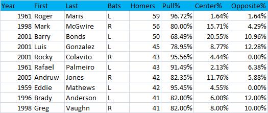
Roger Maris is the home run king!
Single Season Center Field
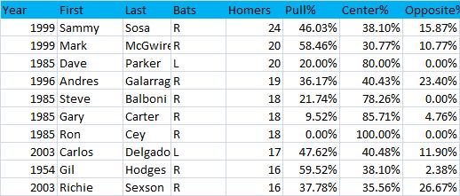
Chipper had 17 in 1999 as well, but he is not included. '99 was an interesting year. 1985 was also an interesting year. Clearly, home run location data from that year are not reliable.
Finally, here's the leaderboard that started this whole ordeal.
Single Season Opposite Field
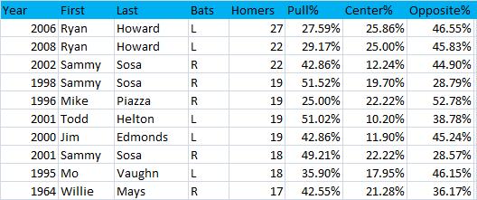
There you have it. Howard is demonstrating opposite field power the likes of which we have never seen before.
Actually, one more note. Since I regret messing up the coding for switch hitters, I decided to go back and check on the five most notable I could think of in Mickey Mantle, Eddie Murray, Chipper Jones, Lance Berkman, and Mark Teixeira. Here are their career splits.
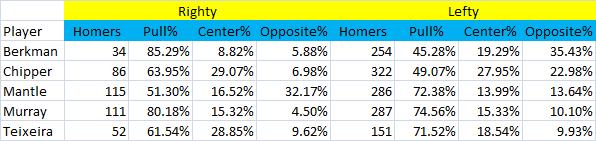
Looks like Murray and Teixeira were similar from both sides of the plate while Berkman has a split personality.
If you've made it this far, here's something that might interest you. In a google docs spreadsheet, I’ve included all batters with 50 career home runs in my dataset and on another sheet all batters with seasons of at least ten recorded home runs. If you want to search for a specific player, I’d suggest that you check out baseball reference's home run logs. Sean Forman does good stuff over there.
| Touching Bases | April 10, 2009 |
Thursday Thoughts
No scheduled column today, so I'll be throwing a Barry Zito changeup. Luckily for us, Dave might also post later, so he'll bring the vintage Pedro change of pace. Here's what I got from yesterday's slate of games.
Kyle Davies threw seven scoreless innings yesterday. He got some buzz in the preseason as a potential breakout pitcher, as Joe Posnanski and scouts alike noted his September surge and excellent spring training. Last year, he posted a 4.06 ERA in spite of a mediocre 1.65 strikeout-to-walk ratio. However, in September, he improved those marks to a 2.27 ERA and 3.43 K/BB. Last afternoon, he was lights out as he struck out eight in seven innings.
Davies is a standard four-pitch righty. He’s been making steady improvement since a disastrous second year in the Majors. Per fangraphs, his fastball velocity since 2006 has risen from 90.6 to 91.3 to 91.5, and yesterday it was clocked at 91.7. Meanwhile, He’s improved his rate of drawing swinging strikes from 17.5% to 18% to 18.3%. Yesterday, he managed to induce 14 swing and misses on 52 swings.
Davies throws a rising fastball which made him vulnerable to homers two years ago. Last year, his HR/FB dipped to 7%, which will probably regress to the mean this year. Even so, his peripherals are improving, so while he might continue to improve his GB/FB rate, he'll almost certainly allow more homers. Davies snaps off a curve with above average velocity, vertical, and horizontal movement, which I would say makes it a plus pitch. However, he shows a noticeably higher release point for his curve than other pitches, which can only serve to tip pitches. Nevertheless, his curve was awesome yesterday. He threw only three of his 13 curves for balls, as he was able to draw a groundout, three swinging strikes, a foul ball, and five called strikes from the yakker. Davies’ changeup had some serious tail yesterday, and he threw it for strikes three quarters of the time yesterday which is excellent. He began using the changeup more often in September of last year in favor of his fastball, as he threw the change 16% of the time as compared to 10% earlier in the season. His changeup and curve are both strong pitches, which makes him formidable against both right-handed and left-handed batters.
Davies' slider and fastball have minimal differential in terms of velocity, but sometimes with sliders, not mixing speeds helps to conceal the pitch. Sinkerballers will often complement their two-seemer with a strong sweeping slider, so they stay on the same plane and have similar velocity, and therefore are unrecognizable until about 30 feet from the plate. Davies, on the other hand, works up and down, complementing his rising fastball with a slider that has little horizontal movement but dives down. I would think his slider is his worst pitch, but he might just use it as a show-me pitch against righties. I could see Davies showing a reverse platoon split, since his slider seems to be substantially worse than his curve and change. I could buy him as a league average pitcher this year too.
Other thoughts: We saw a rather telling difference in managing philosophies in the Mariners’ and Cardinals’ games. Young flamethrowers Brandon Morrow and Jason Motte both got their first save opportunities of the year earlier this week, and they imploded, forfeiting ninth inning two-run leads. Up 2-0 yesterday , Don Wakamatsu decided to give Brandon Morrow another chance, and Morrow promptly came in and walked the first batter on four fastballs out of the zone. But Wakamatsu’s confidence in the youngster paid off, and so did Morrow’s confidence in his heater, as Morrow threw nothing but fastballs all inning, resulting in two strikeouts and a can of corn to center to end the game. Tony LaRussa, however, was in the precarious position of trying to preserve a one-hitter. Did this game have any added significance as it was Chris Carpenter's first healthy start in three years? I don’t know, but LaRussa must have somehow considered it a must-win, as he abandoned his bullpen strategy, leaving Jason Motte on the bench and trotting out Dennys Reyes. Reyes got the job done, but I still prefer Wakamatsu’s approach to bullpen usage thus far. Don't panic after one game.
My favorite moment of the day was in the Dodgers Padres game. Vin Scully was calling the game, so you know it’s good. Heath Bell came on to pitch the ninth, and he had the luck of facing the heart of the Dodgers’ imposing lineup. Things looked bleak for the new Padres’ new closer when Orlando Hudson led off with a triple, sending one Manny B. Ramirez to the plate with the tying run on third and no outs. But with the infield in, Bell got Manny to ground out to short, halting Hudson at third. Following an Andre Ethier walk, Russell Martin bounced into a double play, and thus the Padres were tied for third place with the Dodgers. We might have our first divisional race of the year on our hands.
| Touching Bases | April 07, 2009 |
GameDay, MLB.TV, and Instant Replay
The new MLB gameday and mlb.tv are unreal. MLBAM unveiled GameDay Premium, which will cost $20 for the season , but I’ll be sure to make the investment for the comprehensive pitch f/x data presentations including hot/cold zones velocity charts, pitch type charts movement charts, and release point charts. Now that Josh Kalk took his player cards down, the only two sources left for real-time pitch f/x graphs and data are brooksbaseball and mlb gameday.
MLB.tv offered every game’s home, away, and radio broadcasts, and the DVR as well as “jump to inning” functions will be useful later on when I’m not watching games live. The option of displaying four games at once is awesome. Unfortunately, MLB’s archaic zoning laws prevents friend of mine who lives in Pennsylvania from watching Mets, Yankees, Pirates, and Phillies games due to blackout restrictions.
As for actual baseball, It looks like the closer’s job in St. Louis may still be up for grabs. Jason Motte entered the ninth inning with a two run lead and immediately brought the heat. His first pitch was a fastball in, and a hitter as experienced as Freddy Sanchez knew what to do, raking it for a double. Motte got the next two batters out before he unraveled. Motte was too predictable, as Adam LaRoche, Eric Hinske, and Jack Wilson all sat dead red. He challenged LaRoche with three fastballs, and LaRoche picked up his second hit of the game. Hinske pounded the first-pitch fastball for a double. Finally, Motte loaded the bases with two outs up one when he challenged Jack Wilson. Wilson was overmatched, swinging through the first-pitch fastball he knew was coming. He was able to foul off the second, but then went to the well once too often as Wilson caught up with a letter-high fastball for a game-winning three-run double. In all, Motte threw 22 fastballs in the 95-98 MPH range, but he might want to use his slider more often when he’s ahead in the count.
I already saw a couple contested home run calls for which replay wasn’t used. I think it was Yunel Escobar who hit a shot to center in the Sunday night that might or might not have cleared the wall. The hit ruled a double in spite of a fan’s protest that the ball had hit him in the chest. The next day Cesar Izturis lifted a ball to deep left which Johnny Damon had a beat on, but as he jumped at the wall a fan reached over and interfered with his arm, allowing the ball to travel into the stands. Is replay only going to be used during the playoffs or are we going to take this tool seriously?
| Touching Bases | March 31, 2009 |
Can Albert Pujols Win the Triple Crown?
“My guess is that we will see another Triple Crown winner in the next ten years. The historical trend lines are heading in that direction. That doesn’t necessarily mean anything, as, as I said, the historical trend lines may be simply a result of a random clustering of talent. It’s difficult, and it hasn’t happened for a long time, but it has not become impossible for some player to win the Triple Crown.” Bill James—June 6, 2008
Albert Pujols has a serious shot at winning the first Triple Crown since Frank Robinson and Carl Yastrzemski did so back in the 60s. It's been over 70 years since a National Leaguer led the league in home runs, batting average, and runs batted in. The only time Pujols has led the league in any triple crown category was when he boasted a .359 batting average back in 2003. He’s finished second in every category at least once. But this year might be different.
This year, Pujols might have a fully healthy elbow. This year, Chipper Jones might not threaten .400. This year, Ryan Howard might not pound 50 home runs. According to Joe Posnanski, you just have to have The Power to Believe. This is the year of Pujols.
Here's how Pujols has stacked up thus far in his career. This table shows Pujols' marks followed by the league leader's in parentheses.
+-------+-------------------+-----------+----------------+-------+-------------------+
| Year  |   Batting Average | Home Runs | Runs Batted In | Games | Plate Appearances |
+-------+-------------------+-----------+----------------+-------+-------------------+
| 2008  |     .357  (.364)  |  37  (48) |  116  (146)    |  148  |       641         |
| 2007  |     .327  (.340)  |  32  (50) |  103  (137)    |  158  |       679         |
| 2006  |     .331  (.344)  |  49  (58) |  137  (149)    |  143  |       634         |
| 2005  |     .330  (.335)  |  41  (51) |  117  (128)    |  161  |       700         |
| 2004  |     .331  (.362)  |  46  (48) |  123  (131)    |  154  |       692         |
| 2003  |     .359  (.359)  |  43  (47) |  124  (141)    |  157  |       685         |
| 2002  |     .314  (.370)  |  34  (49) |  127  (128)    |  157  |       675         |
| 2001  |     .329  (.350)  |  37  (73) |  130  (160)    |  161  |       676         |
+-------+-------------------+-----------+----------------+-------+-------------------+
Let’s break it down by category. I've looked at six projection systems—Bill James, CHONE, Marcel, Oliver, PECOTA, and ZiPS—to give us an idea of what to expect.
Batting Average
Last year, Chipper Jones'.364 average narrowly edged Pujols’.357 average for the batting title. This year, every projection system shows Pujols consistently hitting between .327 and .339. Chipper has a much wider range. CHONE and PECOTA, currently the two most trusted systems out there, completely disagree on Chipper. CHONE puts him at .310 while PECOTA shows Jones posting a .341 average to edge out Pujols. Jones’ true talent level with regards to batting average was the subject of much discussion here, here, and here. It's tough to say who has the edge between the two.
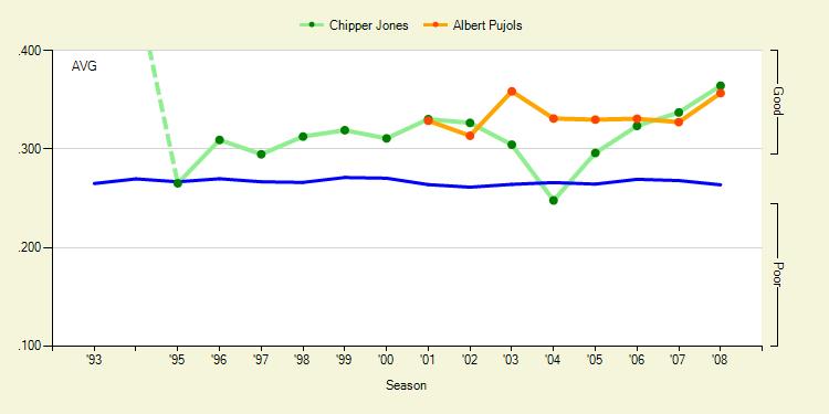
Pujols and Chipper both excel in their plate discipline skills. Last year they had the lowest first-strike percentage of all National League batters to qualify for the batting title. They rarely see pitches inside the strike zone, and neither is prone to swing at pitches in general. In fact, Pujols and Chipper both walked more than they struck out. Pujols has achieved this feat seven straight years. When shooting for a high batting average, the importance of not striking out is, of course, that one has a greater chance at getting a hit if the ball is put into play.
Chipper and Pujols also excel at earning surefire hits by putting the ball out of play and over the fence. Low strikeout and high homerun totals give players a good chance at having a high average. The rest is dependent on BABIP. The factors that go into BABIP, according to an article by Peter Bendix and Chris Dutton, boil down to pitch recognition, speed, the ability to make solid contact, and the ability to spread the ball to all fields. Pujols hits a lot of line drives (20% career), and has incredible power (22.7% HR/FB, 84 XBH/year). He rarely swings, but when he does swing, he makes contact 90% of the time, which is above average and exceptional for someone who swings so hard. However, Pujols doesn’t spray the ball particularly well and isn’t too fast down the line. (He’s not slow, though. Fans gave him 46 out of 100 on speed, he’s an average to good baserunner, and he has a great glove.) Overall, xBABIP says that Pujols has gotten very lucky with BABIP lately, but nevertheless, Pujols' best shot at any of the categories is in batting average, where he and Jones are almost in a class by themselves.
Other batting average contenders: David Wright and Hanley Ramirez project to hit better than .300 almost across the board. Their problem is that they strike out too much, having both eclipsed the century mark last year. Garrett Atkins. Milton Bradley. Matt Kemp, if his .376 career BABIP is sustainable. Chase Utley. Jose Reyes. Brian McCann. Manny Ramirez has a hitter's haven in Los Angeles. Pablo Sandoval is my sleeper.
Home Runs
Ryan Howard is going to be Pujols’ biggest challenger in home runs and runs batted in. Howard, unfortunately, simply is more one dimensional than Pujols. There are no average specialists like Ichiro is in the AL, but Howard is the National League specialist in hitting the ball a long ways. A third of his fly balls clear the fence. Howard has hit 48, 47, and 58 long-balls over the last three years. Not a single projection system has Pujols hitting greater than 41 homers. Meanwhile, not a single projection system has Howard hitting fewer than 40. But there is hope.
Looking at their skillsets, Pujols may actually be the better homerun hitter, but is simply in worse circumstances. If we can establish that he has a higher talent level when it comes to homers, I say we can at least give him a legitimate shot to take the category.
Howard’s home park is hugely beneficial to his power output. Statcorner’s park factors show a crazy 116 HR/FB park factor for Philly and an equally ridiculous 87 HR/FB for St. Louis. (That’s Petco level. I had no idea.) Greg Rybarczyk used his Hit Tracker system to come up with a new method for calculating home run park factors. Howard is 15% more likely to hit homers in Citizen Bank Park to any field except for straight away center, where Pujols would have an edge.
Howard’s average homer traveled 400 feet last year and the speed off bat was 104 MPH. But Pujols demonstrated more raw power, as he hit his average homer went 406 feet and 106 MPH off the bat. Furthermore, Howard's power figures seem to be declining, as his distance and speed figures are trending downward. Pujols shows more consistent power, averaging distance and speed off bat figures of 406, 412, 407, and 106, 109, and 110 in past years.
Here's the placement of their home runs from last year. Pujols' home runs and Busch's outfield walls are in red, Howard's home runs and Citizen Bank's outfield walls are in blue.
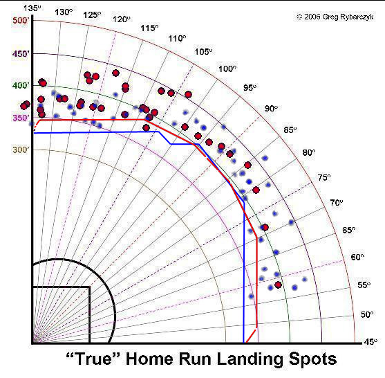
See that 20 foot discrepancy between Busch's left field wall and Citizen Bank Park's? It looks like Howard got three or four extra homers in that area, and there's little doubt in my mind that Pujols hit some fly balls out there that went for mere doubles.
Other home run contenders: Adam Dunn won the "golden sledgehammer" with an average of 419 feet and 109 MPH. Fortunately for Pujols, he's now playing in Nationals Park. Four straight seasons of exactly forty homers will likely come to an end. Ryan Braun and Prince Fielder are The Brewers Young Duo That Needs A Nickname. They're 24-25 years old and Fielder's already logged a 50 home run season while Braun's getting there. Joey Votto. Lance Berkman. Adrian Gonzalez was just profiled by Marc Normandin on Baseball Prospectus using Hit Tracker data, and it's crazy to think what he'd be hitting if he were still in Texas. Manny Ramirez. Alfonso Soriano. Chris Young is my sleeper, and who knows what Justin Upton is capable of?
Runs Batted In
Ryan Howard is out in front of the RBI race, but we all know how team-dependent those are. Last year, Chase Utley made up 32 of Howard's 146 RBI, but if Utley is dinged up, his decline, coinciding with Howard’s decline, would severely impact Howard's RBI potential. PECOTA, in fact, shows Pujols driving in more runs than Howard.
Last year, Pujols batted 3rd behind Aaron Miles and Skip Schumaker, who did well getting on base in front of him. Schumaker should bat leadoff this year, which is a plus, since he's OBPed around .360 the last couple of years and upped that to .370 last year when he was the leadoff man. Hopefully Ryan Ludwick bats second, which would give the Cardinals' top two batters higher OBPs than the Phillies top two of Jimmy Rollins and Shane Victorino. Pujols batted third most of last year, but it looks like Tony La Russa will switch Pujols to cleanup and insert Ryan Ankiel into the three hole. The trio of Schumaker, Ludwick, and Ankiel ought to set the table nicely for Pujols, at least better than did Miles, Schumaker, and Cesar Izturis, who La Russa batted ninth most of last season season in place of the pitcher.
Of note, Howard had fewer extra base hits than Pujols, despite all the homers. The lack of doubles is a large part of the reason why Howard is overrated. Howard had 146 RBI to Pujols’ 116. They both earned just over half their RBI on homers, but Howard was able to earn twice as many RBI on singles, while hitting thirty fewer singles. This suggests Howard had men in scoring position more often than Pujols did. Indeed, Howard had 50 more plate appearances with runners in scoring position. Perhaps that evens out this year.
Pujols has been getting intentionally walked more and more, and last year was given a free pass twice as often as Howard. That doesn't bode well for Pujols, considering all those walks come during RBI chances. Furthermore, Howard’s BABIP with RISP was .383 compared to an overall .285 BABIP. This is likely explained by the infield shift, as Rich Lederer noted last year. On the other hand, Pujols faced terrible luck in RBI situations, suffering a BABIP with RISP 50 points below his season total. Check out this graph from fangraphs, and first off notice the age. Ryan Howard is older than Albert Pujols! Again, I had no idea.
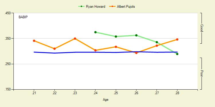
If Howard can't collect hits within the field of play, and continues his strikeout percentage trend, he'll simply be relying on his homers for RBI. I've already shown that that faucet of production might run drier for Howard than it has in previous years. Howard has a strikeout percentage three times that of Pujols, and when they swing, Howard swings and misses three times more often too. Howard's skills are in decline. I’m going to say there’s a chance for Pujols to out ribeye Howard.
Other RBI contenders: David Wright, Carlos Beltran, and Carlos Delgado. The top of the Mets' lineup is really dangerous. Lance Berkman. Manny Ramirez. Joey Votto. Aramis Ramirez. Braun and Fielder. Garrett Atkins. Andre Ethier is my sleeper. The top of the Dodgers lineup is awesome too, and Ethier slugged .510 last year. If Adrian Gonzalez were to get traded, he could compete, but the Padres aren't scoring many runs this year.
In my opinion, Pujols is the best hitter for average, best hitter for power, and best hitter at driving in runs in the National League. The problem is that the pieces around him have yet to fall perfectly into place. His park, his lineup, and other Triple Crown category contenders have not been kind to him. I won’t predict that Pujols wins the Triple Crown, if only for the fact that no matter how overwhelming a favorite is in any category, the field is generally a better play thanks to random variance. But if Pujols does pull it off, don't tell me I didn't warn you.
| Touching Bases | March 24, 2009 |
Fun With Hit Tracker: Home Runs Over Time
All home runs are not created equal. Over the course of a six-month season, things are bound to change. Players wear down or maybe some heat up. In the past, we've been able to find player trends by analyzing first-half and second-half splits or maybe even game logs. But now with new data sources, we can try to find out how or why players produce different outcomes over a season. Are they lucky? Do their skills improve? Do they fatigue?
Josh Kalk used pitch f/x data to show how pitchers fatigue during starts and he unveiled wear pattern charts for specific pitchers to show how some fatigue over the course of a season.
Another great new data source that has not received the same attention as pitch f/x is Hit Tracker. Developed by Greg Rybarczyk, Hit Tracker tracks every physical aspect of the home run. So how did the distance of home runs vary over the course of the 2008 season?
"True Distance" measures how far the ball actually traveled, or how far the ball would have traveled had it landed uninterrupted. I know, if only we could project how far Mickey Mantle’s and Ted Williams' legendary shots traveled. Well, Hit Tracker can. Here and here you go.
The chart seems to show that home run distances trend upward until early August and then fall slightly. It also appears that we can say with confidence that over the course of a week, the mean home run distance will be right around 390-400 feet. The first data points on the chart are a bit whacky, since the March average was 399 feet per home run, but then the first three days of April averaged 390-foot homers per day. Hence, the five-day rolling average is somehow much lower than the same month's average. But the main observation is that from April until July, there is a rather distinct increase in home run distance—around five feet per dinger. So what causes the change? Perhaps players need some time to get into their groove, or perhaps the environment becomes progressively more conducive to home runs. But how do we measure that? Did I mention that Hit Tracker also records the two most important components a batter can control? It captures where and exactly how hard the ball is hit. With the upcoming advent of hit f/x, we might get this data for all types of batted balls. The launch angle is measured in horizontal and vertical degrees from the point of contact three feet above home plate, while the speed off bat is measured in miles per hour. I chose to use the speed off bat as a measure for the player’s skill over time. I believe that a hitter's objective when he is at bat is to hit the ball as hard as possible. Here are the results:
Well, that appears to directly contradict what we saw in the first chart. Players seem to start off hot in the opening weeks of the season, but then by late May the average speed off bat flattens out at around 104 MPH until playoff time when there is a pretty decent rise. It would make sense that the select few who are able to hit homers in October do so with more power than the average hitter.
If it’s not the hitter who controls the change home runs, then it must be the hitter’s environment. Fortunately, Hit Tracker also records atmospheric effects such as temperature, wind, and altitude. Altitude should theoretically remain constant over time, as stadiums don't traditionally switch locations. But wind and temperature flow with the seasons. Since both factors can negatively impact the distance a ball travels, I plotted the absolute average impact as well as the actual average.
The impact due to temperature is defined as “the distance gained or lost due to the impact of the ambient temperature, in feet, as compared to a 'standard' temperature of 70 degrees." Temperature, along with the Speed Off Bat appear to largely explain the opening chart which showed the average true distance of home runs over the course of 2008. I’m not a physicist, but I figure a change in one mile per hour is equivalent to about 1.5 feet per second, and the average home run stays in the air around 3-5 seconds. So if the speed off bat decreases half a mile per hour in the early months, then the batter is responsible for about a three-foot decrease in distance. Yet the average true distance of home runs increases from about 395 in April to 398 feet in July. While the batter might cause at most a five-foot dip as the season progresses, the temperature appears to rise from a minimum average of -5 feet to a high of 5, which would explain the rise in distance. I’m also not a meteorologist, but the symmetry makes sense to me as the temperature rises in the spring, then peaks around the June 21 solstice, maintaining that point through the dog days of August, until the temperature declines going into the Fall classic. Not exactly shocking results.
Putting it all together with the standard distance, which controls for atmospheric effects and simply measures how far the ball would have been hit in neutral conditions:
Looks pretty even throughout the season, with the exception that distance possibly curls up at the start and end points. This could all be contributed to small sample size, but the fact that better players make the playoffs may have something to do with it, but do better players also start out hot? I'll be sure to keep note of it over the next few weeks.
Here's a chart of the three year's worth of data. Out of about 15,400 homers, Hit Tracker was missing data on less than 300 of them. The table should be read as the mean of each category, followed by standard deviation in parentheses.
Month     Amount True Distance Speed Off Bat Wind Effect Temp Effect Standard Distance
March     26     399.8 (25.3)  105.6 (5.7)   5.4 (17.5)  -4.0 (2.4)  396.7 (33.5)
April     2214   395.6 (24.7)  106.1 (5.2)   1.7 (13.2)  -2.5 (4.3)  393.8 (27.1)
May       2522   396.0 (25.3)  105.6 (5.2)   1.8 (11.7)  -0.2 (3.7)  392.1 (26.2)
June      2545   396.6 (25.5)  105.1 (4.9)   2.0 (10.6)   2.0 (3.4)  390.0 (25.8)
July      2446   397.9 (26.1)  105.3 (5.0)   2.3 (11.0)   3.3 (3.2)  390.4 (25.3)
August    2641   397.0 (24.8)  105.9 (5.0)   1.4 (9.7)    2.7 (3.6)  392.7 (26.6)
September 2508   398.0 (26.1)  105.9 (5.2)   1.5 (10.0)   0.9 (3.1)  392.7 (26.6)
October   242    393.8 (24.8)  105.8 (5.1)   3.0 (10.6)  -2.0 (3.4)  391.2 (26.7)
I wanted to do a mini-case study applying changes in home runs over time, and the clear choice for any such study is Ryan Howard. He gives us a nice sample to work with and such a large part of his value is built on home runs. He’s been on a clear decline since his age 26 season, so we can see whether there have been changes in his home runs year by year. Plus, if you look at his day-by-day graph on fangraphs, he’s been a rather remarkable second-half hitter.
Over his career, he's held a 168 point difference in OPS between the first and second halves of the season. I'm not predicting that he'll continue the trend this year—I'm just pointing out that the trend has existed.
Howard also intrigues me since I believe he might be the best opposite field power hitter of all-time. But that’s a subject I’ll tackle another time hopefully. Again I decided to forego the launch angles and stick to the effects of speed off bat, temperature, wind, and distance. Presented without much commentary:
It's evident that he's been hitting the ball with less force in recent years. I also like that you can easily see trend lines with positive slopes each year, confirming him as a late bloomer.
Wind impact appears to be random, but you can almost make out those parabolic curves in temperature impact. A power hitter might be prone to mid-summer surges thanks to those extra five to ten feet in fly ball distance from less dense air.
Not much notable. He averaged 403 feet in 2006, 406 feet in 2007, and 398 feet in 2008. Here's his table. It includes his home runs from 2006-2008 but is missing three from 2007. It should be read category mean followed by standard deviation.
Month     Amount True Distance Speed Off Bat Wind Effect Temp Effect Standard Distance
April        13   414.2 (27.3)  109.1 (5.1)   5.3 (12.5)  -3.0 (4.3)   408.3 (28.9)
May          29   394.9 (29.1)  105.7 (5.5)   3.4 (9.7)    0.5 (4.4)   390.1 (33.0)
June         24   410.7 (32.9)  105.1 (5.2)   3.2 (11.4)   3.3 (2.8)   402.5 (30.9)
July         28   398.1 (27.7)  107.7 (6.0)   2.8 (7.9)    3.0 (2.9)   391.2 (29.0)
August       26   404.8 (30.8)  108.0 (6.9)  -3.6 (13.2)   4.3 (3.0)   403.2 (35.0)
September    30   400.2 (22.9)  106.4 (4.6)   1.0 (6.9)    2.1 (2.8)   396.8 (24.8)
October      4    390.5 (25.0)  104.5 (6.5)   3.7 (4.5)   -2.5 (6.3)   389.3 (32.2)
All data was obtained from Hittrackeronline.com. Interested parties may contact webmaster@hittrackeronline.com
| Touching Bases | March 18, 2009 |
The UZR Era
"The interesting question is why defense is so much more difficult to quantify than offense in all sports. Perhaps defense by its nature involves more interaction between individuals than individual actions, and perhaps the way to get past that is to embrace the concept and measure combinations of players." -- Bill James
Over the offseason, fangraphs unveiled Ultimate Zone Rating, a defensive metric developed by Mitchel Lichtman that measures how efficient a fielder is at turning balls in his area of responsibility into outs. The data, tracked by Baseball Info Solutions, ranges back to 2002 and is converted neatly into a runs saved figure. I’d like to give an overview of some notable teams and players throughout the years UZR has been available. As defense is a team effort, here’s a visual representation of how each team’s outfield has performed during the UZR era. The best outfield defenses, that convert balls in play into outs at a high rate and limit advancement of baserunners with their arms, will be in the top right, while the worst will be in the bottom left.
ARM rating is uncorrelated with an outfielder's range, though the measures are not independent, since the amount of time it takes a fielder to reach the ball affects how he is able to hold baserunners. The value of outfield arms, which is usually not mentioned when evaluating team defense, can add or subtract 20 runs a year, so it’s definitely significant. However, to find an outfield’s true talent when it comes to arms, any figures would probably have to be heavily regressed.
The 2004-2007 Braves consistently had the best outfield in the Majors. With Andruw Jones patrolling center, the Braves were set at the second most influential defensive position on the diamond when it comes to fielding.* Jones was flanked in left by the likes of Ryan Langerhans, Matt Diaz, and Willie Harris, who all had great range. And in right, the Braves trotted out stalwart Jeff Francoeur and his rocket arm. Meanwhile, the Yankees from 2002-2006 consistently fielded the worst outfield in the Majors.
*The traditional defensive spectrum is well-known, but for reference—shortstops and center fielders are expected to make just over 2.5 outs per nine by UZR, followed by second basemen. Right fielders and third baseman come in at two expected outs per nine and left fielders a bit less. The fact that right fielders are expected to make more outs than left fielders goes against traditional baseball knowledge, which I believe states that fielders with more range should play left. Batters tend to hit more fly balls to the opposite field than to the pull field, and righties bat more than lefties, so this makes sense. Perhaps if there's a defensive whiz in right, say Ichiro Suzuki or Jayson Werth, they should switch fields if at the same time there's an albatross in left, say Raul Ibanez, depending on batter handedness and spray-chart information. Finally, first basemen come in at about one expected out per nine, though that of course does not account for throws first basemen handle.*
The Nationals/Expos franchise has put up the best ARM rating in the UZR era. In each of the final three years of their existence, the Expos' outfield led the league in ARM thanks to Vladimir Guerrero, Juan Rivera, Endy Chavez, and Brad Wilkerson. Of course, only Chavez had any range, so their defense as a whole trended around average. The collective outfield arms of the 2003 Detroit Tigers, the worst team ever (?), cost the team 20 runs, one of the worst marks on record. However, that number doesn’t really stand out among that team’s .300 on-base percentage, and 1.37 strikeout-to-walk ratio. What's the opposite of nitpicking?
The Rays' worst-to-first success has been fairly well documented. Their biggest improvement may have been their outfield defense, which saved nearly 70 runs more in 2008 than it did in 2007—the largest improvement by any outfield in the UZR era. B.J. Upton and Carl Crawford's numbers skyrocketed while Eric Hinske and Gabe Gross were great replacements for Delmon Young. and Jonny Gomes. Considering left and right fielders have remained constant for the Rays both years, I wonder to what extent the difference can be attributed to individual improvements from Upton and Crawford, and how much of the success was thanks to the unit meshing together in terms of positioning. The Rays went on to the World Series, where they met the Phillies, who incidentally posted the exact same 74.3 team UZR. The Phillies were aided by their ARM rating of 22.1, the highest single-season mark to date. Pat Burrell was the only bad defender on the team, but his arm almost made made up for what he lacked in range, while Shane Victorino and Jayson Werth are stellar all-around players.
Now let's take a look at the infield.
Though the Rays improved their infield by 50 runs in UZR from 2007-2008, the second biggest year-to-year leap by an infield, they trailed well behind the 2006 Kansas City Royals. In 2005, the Royals infield was 47 runs below average. In 2006, they were 32 runs above average. Nevertheless, the pitching staff still allowed more runs in '06 than in '05! In 2006, KC’s 5.29 FIP was the highest single season mark of any club ridiculous run environments seen in 2000. But their defense did make a marked improvement. The Royals saved over 110 total runs on defense in 2006 compared to 2005, thanks to the additions of Mark Grudzielanek, Doug Mientkiewicz, and Reggie Sanders. The following year, 2007, the Royals 78.5 UZR in was the highest single-season total for any team since 2002. Mark Teahen was terrible in 2005, but he found his footing on both ends of the field in 2006, posting an average UZR and an .874 OPS. Then in 2007, he put together another solid year, losing production with the bat but gaining ground with the glove in his move to right field. Unfortunately, it all fell apart for him last year, and now we’ll see how he does at second base. Also in 2007, Tony Pena actually merited playing time, finishing second in UZR for shortstops behind only Omar Vizquel.
Remember that All-Star studded Rangers infield of Hank Blalock, Michael Young, Alfonso Soriano, and Mark Teixeira? It turns out they gave away a whole lot of their value on defense. In 2005, the Rangers infield had a UZR of -62.4, the worst ever. The 2007 Giants had the best infield on record. In the same vein, the Athletics infield last year had the highest double play run total though it's a matter of only a dozen or so runs. Lastly, The Phillies have had the best infield defense in the last seven years, while the Rangers and Yankees have been worst.
The 2008 Phillies infield defense has been the topic of some discussion. Ryan Howard was so bad that the entire defense shifted to cover him, maximizing the range of Chase Utley, Jimmy Rollins, and Pedro Feliz.. The Phils' infield saved 40 runs last year, an excellent figure, no matter how you slice it. To actually isolate Utley from Howard, it would probably be best to use a "With or Without You" analysis, comparing Utley's performance with Howard on the field against his performance with other first basemen, though the sample would be impossibly small.
I am forever on a quest to find why teams or players are "clutch," and out-perfrom their expectations in high-leverage situations. I constantly correlate variables with fangraphs' clutch score, and I have so far found very weak correlations with strikeout rate and baserunning on offense, meaning teams that run the bases well and rarely strike out for some reason do better in more important situations. Now, with fielding, I found a weak correlation between clutch and double play runs. I suspect some teams are adept at employing relievers who specialize in inducing groundballs at opportune times, and therefore leverage their double play runs. It's also possible that some teams are able to effectively manage the intentional walk to their advantage late in games, setting up the double play.
I think splitting up defenses into infield and outfield units is a comprehensive method for evaluating team defenses, but it's often more interesting to look at individual players, so I'll leave you with the time leaders and laggards in UZR for all seasons from 2002-2008.
Andruw Jones has by far the highest career UZR. By Sean Smith’s Wins Above Replacement leaderboard, Jones is 77th in WAR, making him a borderline Hall of Fame candidate. Any sort of resurgence would make him a near lock, but it’s currently looking bleak as is.
Arms are an area of study that have belonged to John Walsh, but UZR's ARM metric shows similar results, and confirms many players' reputations. Alex Rios has paced the league in ARM runs, while Ichiro and Francoeur trail slightly. In 2007, Francoeur's arm was the most valuable of any outfielder during the UZR era. On the other end, Juan Pierre's arm has been laughably bad, coming in nearly 20 runs worse than anyone else's over the years.
Jack Wilson was slickest at turning the double play in the UZR era, and he certainly does make it look pretty, if I do say so myself.
Finally, the Yankees. Bernie Williams and Hideki Matsui show up on the bottom ten list, and Derek Jeter, Gary Sheffield, Bobby Abreu, Jason Giambi and Johnny Damon also show up in the bottom 10th percentile, so yeah, the Yankees haven't valued defense highly.
| Touching Bases | March 10, 2009 |
Baserunning and Leverage
Let’s set the scene.
2004 ALCS. Yankees vs. Red Sox. Game 4. Red Sox down a run, Dave Roberts on first, ninth inning, no outs.
Dave Roberts advanced on a stolen base to 2B.
2007 National League one-game playoff. Padres vs. Rockies. 13th inning tie game, Matt Holliday on third, no outs.
Jamey Carroll hit a sacrifice fly to right (Liner). Matt Holliday scored.
That’s how it looks in the box score, but those two baserunning plays might be the two most momentous swings in baseball over the last five years.
Baserunning statistics are rarely looked at, yet the difference between the best and worst individual baserunners is about 20 runs, or two wins. Pretty significant. Players like Holliday, Carlos Beltran and Ichiro Suzuki, and other efficient baserunners become underrated when this skill isn't accounted for. So is baserunning an underrated commodity in the grand scheme of things?
There are several advanced metrics for baserunning, but my choice for this analysis is Bill James Online’s “net gain,” which takes into account “basestealing, avoidance of the double play, and success at taking the extra base while avoiding being thrown out.” I tend to think of four bases as equivalent to about one run, though I could be off base there. Here's the relationship between runs scored and net bases. Each dot represents a team's single season total over the time span 2002-2008.
The r-squared between runs and net bases is .17, so it’s pretty clear that the least important part out of the four facets of the game—hitting, pitching, baserunning, and defense—is baserunning. The difference between the best and worst baserunning teams in the majors is around 50 runs. That can be compared to 125 run swings in fielding, and between 200-300 run differences in pitching and hitting, depending on the year.
As demonstrated by "The Steal" and "The Sac Fly," mentioned at the beginning of this article, baserunning can at times be the make or break factor in any given game. Tom Tango developed, and statistically quantified, the concept of a leverage index to provide context to any game state. Baserunning, defense, hitting, and pitching can all be leveraged, be it through pinch-runners, pinch-hitters, defensive substitutions, or relief pitchers. I’d like to look at whether good baserunning teams also perform better in high-leverage situations. So, using one of my favorite statistics in fangraphs “clutch” score and one of my favorite types of visual presentations in google’s motion chart, I compared a team’s baserunning to its ability to come through when it matters most. Here's a year-by-year graphic of all 14 American League teams' baserunning metrics plotted against their clutch score.
And now the National League:
The correlation coefficient between net baserunning and clutch score is .12, which isn’t significant, but it’s not zero. Furthermore, going from first to third or scoring from first has a bit of a stronger correlation than avoiding the double play and stealing bases. Strikeout percentage has an inverse relationship of similar strength to baserunning, so there are a couple variables that might weakly relate to how well teams can come through when it matters most.
The average American League team is seven bases a year better than National League teams. I still don’t know what a National League style of play means other than inferior baseball. The Phillies have been the best baserunning team over the time frame, but they have been rather unclutch. The Angels rank sixth in baserunning, right behind the Yankees ironically enough, and the Halos have been twice as clutch as any team in the time period. Meanwhile, the Ozzieball White Sox and Bowdenball Nationals lagged in basferunning, while they put up neutral clutch scores.
How about a leaderboard of the most and least clutch teams since 2002?
I find the bottom five teams on this list interesting. Well, the Tigers .265 winning percentage is interesting too. But the Astros, Cubs, Indians, and Giants were all quality teams that won in spite of bad luck, unlike the Angels and Red Sox at the top who won because of it. Anyway, it looks like the clutch teams are better baserunners, but barely.
People sometimes try to explain the difference between a team’s Pythagorean winning percentage and their true winning percentage by the strength of that team's bullpen, baserunning, and "smallball" in general. But however a team creates or prevents runs, it is accounted for in the Pythagorean record. Then again, in many situations these aspects of the game are leveraged. So I decided to look at the difference between a team’s winning percentage and its Pythagorean winning percentage and winning percentage in one-run games. The results indicated that overall baserunning can’t explain how a team fares in close games at all, despite Dusty Baker's claim that "you gotta have some speed to win close ball games."
I attempted to break the data down further by looking at pinch-runners and performance in different situations, but unfortunately the only data readily available were stolen base and caught stealing scores.
- The Athletics last year had the two most steals from substitute players of any team since 2002, thanks to pinch-runner extraordinaire Rajai Davis. Davis had 42 plate appearances as a sub, picking up 11 singles and one walk, but he pinch-ran so often that he had more stolen base attempts than times he reached first base. Oddly, Davis was a better hitter than basestealer as a sub on the A’s, as he hit to a tune of .341/.357/.561, while he was successful in just 11 of 16 theft attempts. It didn’t really matter for the A’s, who showed unremarkable splits in clutch situations. However, I wouldn't dismiss the idea of keeping a 25th-man on the roster as a specialist pinch runner.
- The Phillies, the best baserunning team in the league each of the last two years, have topped the league in contributions from substitutions on the bases as well. Their sub-baserunners have put up 28 steals compared to a single caught stealing, while in the ninth inning the entire team has recorded 31 steals to one caught. But again, it seemingly makes no difference in the team’s record in tight games.
- The incredibly unclutch Indians of 2005 were 3 for 11 stealing bases in situations with a leverage index above 1.5, and it probably did take them out of a game or two.
The sample sizes in these situations are small, so it’s hard to make conclusions using this data. But I think that the small sample size is a decent conclusion. While baserunning might be under-appreciated in today's game in a macro sense, it might be over-valued in explaining how an individual game is won and lost. Teams can leverage their baserunning to add a few runs over the course of a season, if that. Teams hold constant true-talent levels for baserunning, and it doesn't appear that the better clubs are able to achieve greater success by leveraging the ability at opportune times. Over 162 games, the difference between a team's offensive performance in high-leverage situations relative to their normal run production levels can't be explained by their baserunning.
| Touching Bases | March 03, 2009 |
To What Extent Do Batters Control Pitches?
Ninety percent of the game is half mental, and that Yogiism is most apparent when it comes to the pitcher vs. batter matchup. Every at-bat has a story. Every pitcher has a repertoire of pitches from which to choose and he will use context and game theory when making his decisions. But perhaps the most important factor in determining pitch selection is the type of batter at the plate. So do batters control the type of pitches they see?
Dave Cameron recently got the ball rolling when he noted that that the percentage of fastballs a batter sees is inversely tied to his isolated power. The relationship makes intuitive sense, and the correlation coefficient of -.59 suggests that power is one of the most important determinants in how often a pitcher will challenge someone with a fastball. I decided to test out a whole lot more correlations to see what effects what. To better understand correlations and regressions in baseball, I’d suggest reading this article by John Beamer. The main points: the correlation coefficient is “a statistic representing how closely two variables co-vary; it can vary from -1 (perfect negative correlation) through 0 (no correlation) to 1.” Also, correlation does not imply causation. There will be a significant amount of interaction between the variables. For example, a batter who swings quite often will receive plenty of breaking balls, as those pitches are harder to make contact with. The flip side is that a batter may only swing so much because he sees a lot of curves and can't lay off them.
First, let's take a look at who saw the most fastballs, breaking balls, and off-speed pitches in any season over the last four years.
It looks like hitters with no power saw the most fastballs, free swinging power hitters saw the most breaking balls, and I don't see any rhyme or reason to the list of batters who saw a lot of change ups and split fingers.
My first test was to run a correlation four years with ISO and fastball percentage using my sample of about 1700 batters. The correlation coefficient was -.45. My initial guess was that as my sample had a lower minimum plate appearance, those batters with little reputation were being pitched differently than those whom the pitcher knew the book on. Limiting the plate appearance minimum from 100 to 300, and then to 500, I was proven wrong, as limiting the plate appearance minimum to 100, 300, or 500 resulted in correlation coefficients of -.45 as well. The low coefficient of correlation in my data was consistent with most of my results, as running the same statistical tests using plate discipline stats that Dave Appelman ran resulted in smaller coefficients.
Correlating fastball percentage with other traditional statistics confirms a lot of conventional baseball wisdom. The more a batter strikes out, the fewer fastballs and the more breaking balls he receives. There is also a positive relationship between strikeout percentage and fastball velocity. Unfortunately, no pitch type information correlates with batting average on balls in play. I had hoped that pitch type might be a factor in improving BABIP prediction models, but I guess not.
However, certain batted ball statistics do co-vary with pitch type. The stronger a batter’s pull tendency or fly ball tendency, the fewer fastballs he will likely receive over a year. Conversely, groundball hitters face a much higher percentage of fastballs. These types of hit trajectories and vectors are closely intertwined with power output, so this just further shows that pitchers tend to throw more fastballs to hitters who can’t do significant damage to them. This fear factor again comes through in testing how a pitcher will approach the zone against power hitters. There is a positive correlation between the number of wild pitches and passed balls and a batter's power based on stats like homerun per fly ball or ISO.
Plate discipline stats align quite well with pitch type stats. Showing a willingness to swing at pitches results in fewer fastballs, but making contact results in, or is the cause of, many fastballs. Moreover, free swingers face a higher fastball velocity than patient hitters, and contact hitters face a lower fastball velocity than power hitters. So when pitchers do challenge a scary hitter with a fastball, it appears that they dial it up. Or perhaps, only pitchers who can bring the heat will go after power hitters, while those with subpar fastballs simply avoid throwing fastballs altogether in those situations. And is there anything more frustrating than watching a batter swing at a slider in the dirt? There is a correlation between a batter's slider percentage and his swing percentage on pitches outside the strike zone, but the relationship only holds strong for batters who have established reputations in the league as hackers.
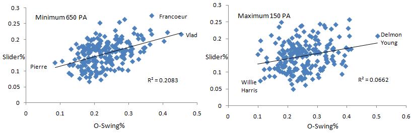
Notice the much lower coefficient of determination for players with between 100 and 150 plate appearances. There is a wider range of talent in this pool of players, but the spread in fastball percentage is also greater, suggesting a pitcher's choices are more random when they have less information on a batter.
Without expecting to find much, I tested the relationships between win probability statistics and pitch types. Though the results were rendered statistically insignificant, they all made sense. Batters who have higher leverage indexes over the course of a year tend to see fewer fastballs and curveballs, but more changeups and sliders. Furthermore, batters who come up with more on the line face increased velocity from each type of pitch. Then I looked at one of my favorite statistics, the clutch score—a measurement of how much better or worse a player does in high leverage situations than he would have done in a context neutral environment. Nothing significant or interesting came up with regards to pitch type, but I like the idea of clutchiness so much that I correlated it with other variables. As reported in Tango's clutch project, fans prefer batters who can put the bat on the ball. Batters who hit for power and strike out a lot do indeed perform slightly worse in the clutch, while those more adept at making contact perform slightly better.
Unfortunately, I didn’t account for any type of platoon situation, which is of course one of the more important things in determining pitch type. Same-handed batters vs. pitchers matchups see more breaking pitches while different-handed batters vs. pitcher matchups see more off-speed pitches in the variety of changeups and splitters. Running a basic test to see how well this theory holds up, I coded lefties as 0 and righties as 1 and correlated the handedness with pitch type. The percentage of sliders seen returned a correlation coefficient of .65, which confirms our suspicions. As righties see many more same-handed pitchers, they get a higher percentage of breaking pitches moving away from them. So even though lefties don't show up when searching for the leaders in slider percentage, that's just because they face a disproportionate number of different-handed pitchers.
Ryan Howard has never been able to hit left-handed pitchers (300 point difference in OPS in his career), and as such, he has received the highest percentage of sliders of any lefty each of the last two years with 200 plate appearances, but it still doesn’t place him in the top 25 either year. On the other side of the spectrum, the correlation between changeups and handedness was -.54. Lefties face different-handed pitchers much more often than same-handed, and therefore receive the changeup much more often than righties. Going a step further, we see that righties receive faster sliders and lefties get faster changeups because right-handed pitchers throw harder than lefties in general. Righties are also more likely to see pitches in the strikezone than lefties.
Lastly, park factors were not accounted for, though they play a large role in determining why pitchers throw certain pitches. As Josh Kalk showed, pitchers are much more likely to throw their fastball/sinker (which are classified as the same pitch by fangraphs) in Coors than in other parks. Matt Holliday, who is much more of a power hitter than a contact hitter would normally receive few fastballs, but playing in Coors, a pitcher’s best option is to bring the heat, as any kind of breaking ball in the thin air might get crushed. Therefore, Holliday has received a well above average amount of fastballs in his career, and it'll be interesting if his hitting approach changes as his pitch type profile changes.
Plugging a bunch of these variables into a multiple regression for fastball percentage yields an r-squared of .5 , meaning that half the variance in how often a batter is thrown a fastball can be explained by the hitter's contact skills, power, and plate discipline. So what I'm interested in is what the rest of the variance can be attributed to. Game state and randomness will certainly affect a pitcher's decision on what he will throw. And pitchers will often simply disregard the batter’s reputation, pitching their own game based on their own strengths. The last possibility is that pitchers are actually using more advanced data in their decisions. You can observe a lot by watching, and if pitchers study batter film or actually learn batter tendencies with the advent of pitch f/x data, it could change the art of the batter vs. pitcher matchup from what it was in Yogi's days.
| Touching Bases | February 24, 2009 |
Batted Ball Location Leaderboards
With apologies to Dave Studeman, whose batted ball leaderboards on The Hardball Times are always must reads, I decided to try a similar data presentation, breaking up batted ball stats by fields of play instead of by type. Using linear weight run values, I developed lists showing who the most productive players were in 2008 when pulling the ball, taking the ball back up the middle, or going to the opposite field.
Value of Pulled Batted Balls
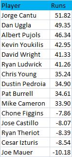
Every one of the top ten players when it came to pulling the ball happened to bat right-handed, which can be explained by their relative advantage when hitting ground balls. Righties who pull grounders force longer throws than lefties who pull grounders. These players are mainly fly ball hitters. In the case of switch-hitters like Chone Figgins, I combined their pulled/center/opposite field stats from each side of the plate, so right-handed balls to left are added to left-handed balls to right to come up with pulled batted balls.
Jorge Cantu and Dan Uggla—who would’ve thunk? Uggla is a former Rule 5 pick and Cantu spent time last year in two different minor league systems before both found their rightful spots on the Marlins. I’d have to attribute their appearance on the leaderboard to coincidence. Dustin Pedroia and Kevin Youkilis, on the other hand, are given a bit of an extra push, as both are clearly aided by the green monster. Pedroia might be the perfectly suited player for Fenway. Just check out his home run chart. He has yet to hit a 400-foot homerun in his career. You have to wonder whether he’d be the MVP outside of that park, as it would certainly be a challenge to find a voter who checks park-adjusted stats.
I don’t think I ever expected to see the universally beloved Joe Mauer on the bottom of any list, but he gets murdered by pulled groundballs. Only three of his nine long balls went to right field in 2008, as he unfortunately never developed the 20 homerun power people were hoping for. Chone Figgins, Ryan Theriot, and Cesar Izturis all had one homerun apiece last year, while Castillo tallied six, so it appears that a minimal amount of power is necessary to be successful pulling the ball.
Value of Center Field Batted Balls
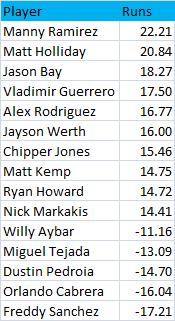
It’s interesting that the top six players on this list bat right-handed. But the bottom four players do too, so that would suggest that the trend of righties is random. It’s tough to choose between the hitters best at pulling the ball and best at going up the middle, but I’m siding with the latter set of players. I’d classify the first set of hitters more as homerun hitters and the second set as line drive types. Pedroia appears at the bottom of this list, likely because in Fenway he doesn’t derive the same benefit from his fly balls to center as he does to the left-field wall. He picked up just three hits on 73 center-field flies.
Value of Opposite Field Batted Balls
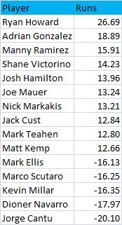
What Mauer lacks in pulled balls he makes up for with his approach going the other way, as he is the only catcher to appear on a leaderboard. Nick Markakis, Matt Kemp, and Manny Ramirez all show up as top center and opposite field hitters. These guys are at times described as "pure" hitters, and there's why. I'd presume each one is quite talented at going with the pitch.
Without trying to sound hyperbolic, I have to ask: is Ryan Howard the greatest opposite-field power-hitter ever? His 2006 and 2008 seasons in which he crushed 25 and 20 opposite-field blasts, respectively, are the only years in the last four in which any player has hit more than even 15 homers to their weak side. Howard does have his opposite-field numbers skewed by his groundball run value, which is likely only positive due to the vacated side of the infield.
Analyzing Howard’s trends piqued my interest in a specific batted ball type and location: pulled groundballs. There were seven players who cost their team 20 runs on pulled grounders: Mark Teahen, Prince Fielder, Adrian Gonzalez, Ryan Howard, Jimmy Rollins, Casey Kotchman, and Carlos Delgado. Several of these players do indeed receive the defensive shift, but I immediately noticed one of these names is not like the other. Jimmy Rollins sticks out like a sore thumb. He’s a switch-hitter, and as such is the only non-lefty to appear on the list. He is far and away the fastest player in the group and an absolutely awesome baserunner, but he apparently wasn’t able to make the most of his speed last year when he put the ball in play, compiling a well below league average 19% hit rate on grounders and legging out a single bunt hit in seven attempts.
Adrian Gonzalez might actually have power that approaches Howard’s but we’ll never know until he gets out of Petco. At the other end, one thing’s for certain: pitchers need to find ways to prevent Cantu from pulling the ball. Here's what the spray chart for Cantu—perhaps the best pull hitter and worst opposite field hitter in the game—looks like.